


 ChatGPT
 Perplexity
 Gemini
 Claude
 Grok
Grok
Medical color palettes are designed to communicate cleanliness, safety, and calm—perfect for clinics, healthcare apps, patient education, and wellness brands.
Below are medical color palette ideas with HEX codes you can copy, plus prompt-based examples you can recreate with Media.io.
In this article
- Why Medical Palettes Work So Well
-
- sterile aqua
- clinic calm
- minted hygiene
- surgical steel
- pediatric cheer
- wellness spa
- lab lavender
- emergency accent
- pharmacy fresh
- telehealth night
- soft bandage
- dental bright
- rehab earth
- radiology dark
- neonatal hush
- immunity citrus
- research paper
- caregiver warmth
- operating room green
- accessible contrast
- calm pulse
- hygiene minimal
- What Colors Go Well with Medical?
- How to Use a Medical Color Palette in Real Designs
- Create Medical Palette Visuals with AI
Why Medical Palettes Work So Well
Medical color schemes lean on soft blues, greens, and cool neutrals because they read as clean, stable, and professional across cultures and age groups.
They’re also naturally UI-friendly: light tints support spacious layouts, while deeper navies and slates create dependable hierarchy for headings, navigation, and CTAs.
Most importantly, these colors reduce visual stress. In patient-facing materials, a calm palette can make information feel easier to process and trust.
20+ Medical Color Palette Ideas (with HEX Codes)
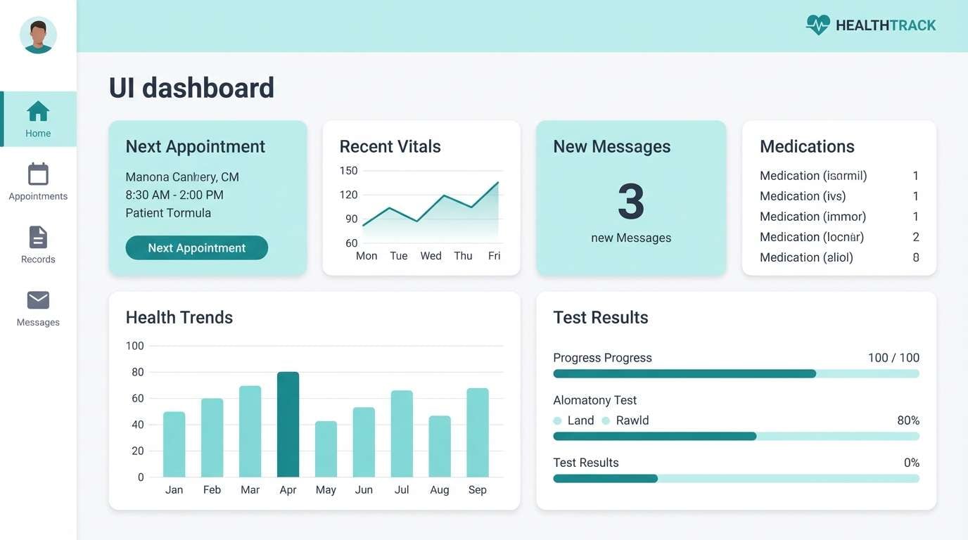
1) Sterile Aqua
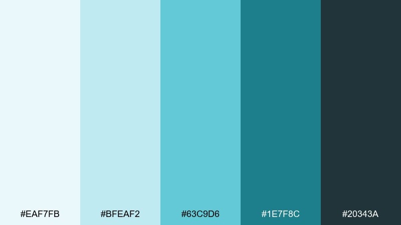
HEX: #EAF7FB #BFEAF2 #63C9D6 #1E7F8C #20343A
Mood: crisp, clinical, airy
Best for: patient portal UI dashboard
Crisp aqua and cool teal feel like filtered light in a spotless exam room. Use it for patient portals, appointment flows, and clear data panels where readability matters. Pair the deep slate with white space for strong hierarchy, and keep the aqua as a calm background wash. Tip: reserve the darkest tone for headings and key CTAs so the interface stays calm, not busy.
Image example of sterile aqua generated using media.io
Create palette-perfect visuals with Media.io. Powered by Wan 2.7 Image, it helps you generate and edit images with precise color control, consistent tones, and ready-to-use styles in your browser.

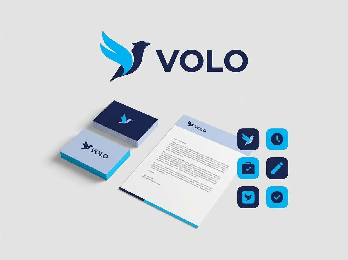
2) Clinic Calm
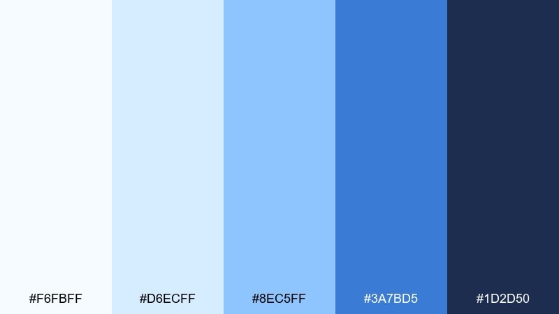
HEX: #F6FBFF #D6ECFF #8EC5FF #3A7BD5 #1D2D50
Mood: reassuring, orderly, trustworthy
Best for: clinic brand identity kit
Reassuring sky blues and navy suggest trust, structure, and steady care. This medical color palette works especially well for clinics that want to feel modern without looking cold. Keep the lightest blue as your primary background, and use the navy for logos, signage, and body text. Tip: add generous margins and simple iconography so the palette reads premium, not corporate.
Image example of clinic calm generated using media.io
3) Minted Hygiene
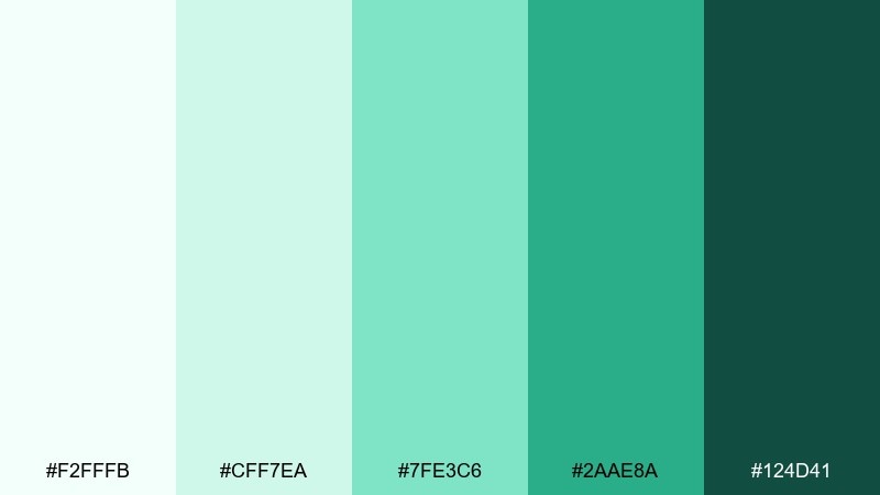
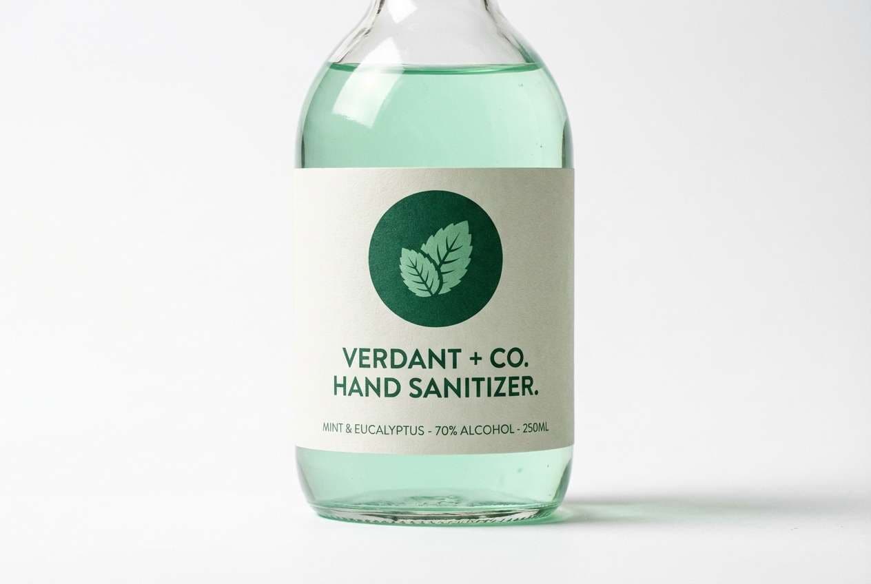
HEX: #F2FFFB #CFF7EA #7FE3C6 #2AAE8A #124D41
Mood: fresh, hygienic, uplifting
Best for: hand sanitizer label design
Fresh mint and deep green evoke clean hands, cool air, and a just-sanitized shine. Use these medical color combinations on hygiene products where clarity and trust are the priority. Pair the mid mint with plenty of white, and use the dark green for ingredients and compliance text for strong contrast. Tip: keep the label typography simple and spacious so the greens feel refreshing, not medicinally harsh.
Image example of minted hygiene generated using media.io
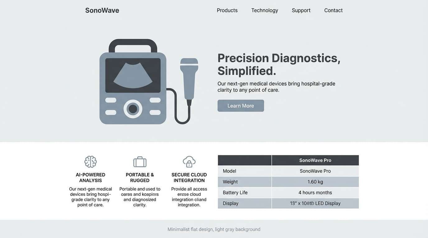
4) Surgical Steel
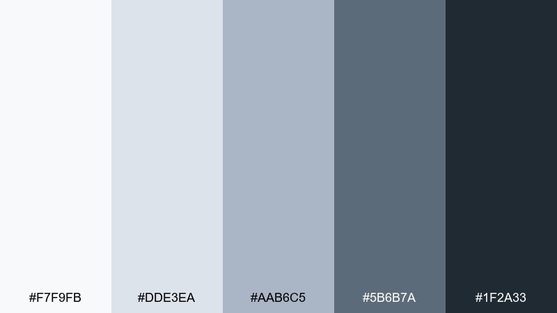
HEX: #F7F9FB #DDE3EA #AAB6C5 #5B6B7A #1F2A33
Mood: precise, modern, technical
Best for: medical device landing page
Steel grays and cool blue-gray feel precise, engineered, and quietly confident. They suit device specs, comparison tables, and pages that need a clean technical tone. Pair the charcoal with white for maximum legibility, then use the mid gray for borders and dividers. Tip: add one small accent color elsewhere (like a teal CTA) to avoid a flat, overly monochrome look.
Image example of surgical steel generated using media.io
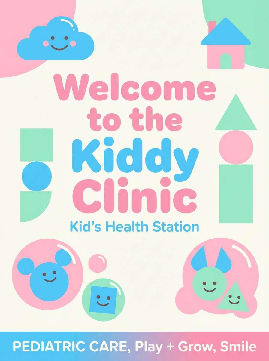
5) Pediatric Cheer
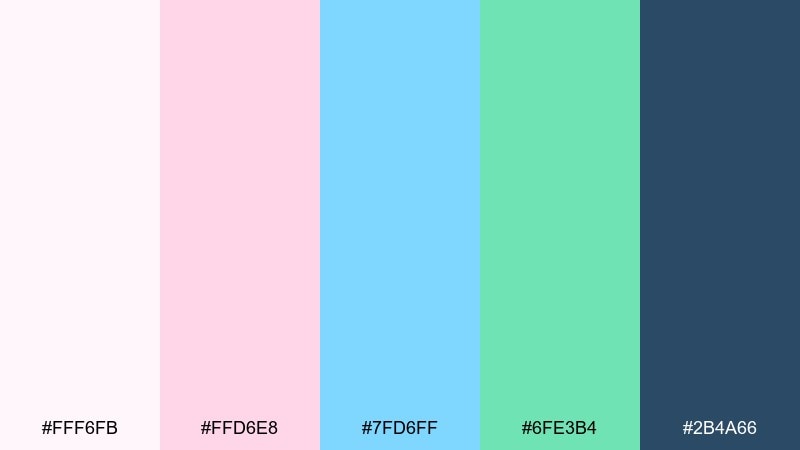
HEX: #FFF6FB #FFD6E8 #7FD6FF #6FE3B4 #2B4A66
Mood: friendly, playful, comforting
Best for: pediatric clinic waiting room poster
Playful pink, bright sky, and a soft green bring a friendly, kid-safe energy without turning neon. These medical color combinations help pediatric visuals feel warm while still credible. Pair the dark blue-gray with rounded type and simple illustrations for a gentle tone. Tip: keep the pink as an accent for icons and headings so the overall poster stays balanced.
Image example of pediatric cheer generated using media.io
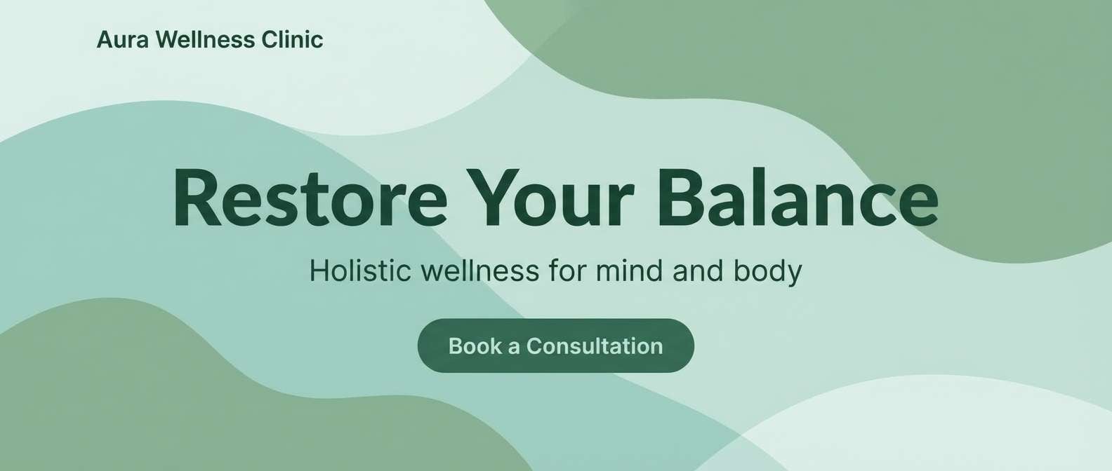
6) Wellness Spa
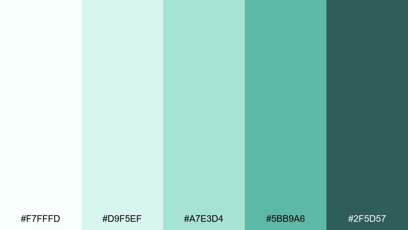
HEX: #F7FFFD #D9F5EF #A7E3D4 #5BB9A6 #2F5D57
Mood: soothing, restorative, natural
Best for: wellness clinic homepage hero
Soothing seafoam and sage feel like a quiet inhale and a warm towel. Use it for wellness clinics, physical therapy studios, or recovery programs that want a softer presence than standard blue. Pair the deepest green with cream backgrounds for a calm, premium look. Tip: add subtle gradients in the light tones to create depth without visual noise.
Image example of wellness spa generated using media.io
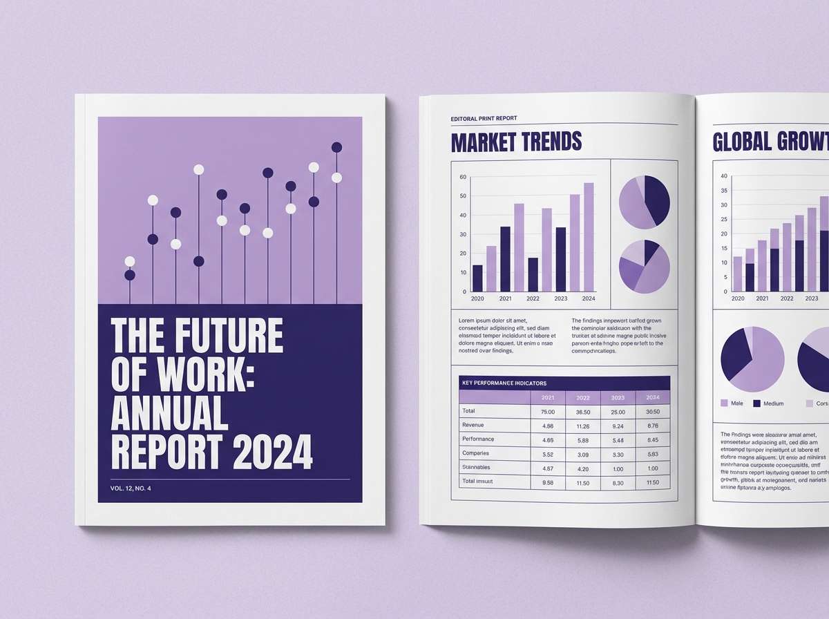
7) Lab Lavender
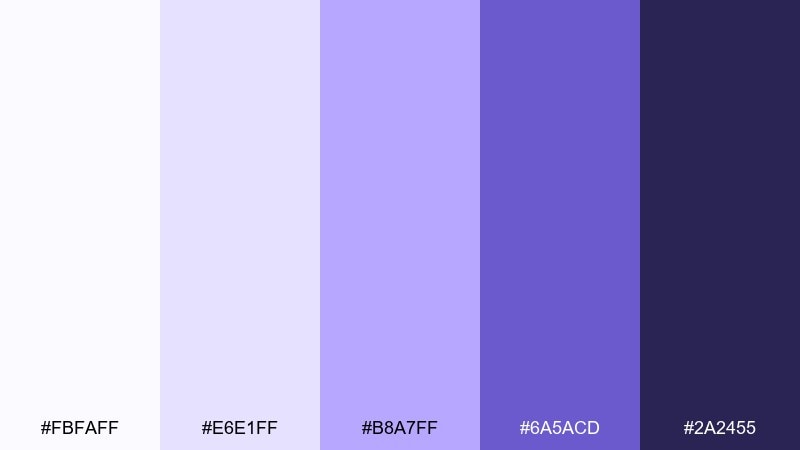
HEX: #FBFAFF #E6E1FF #B8A7FF #6A5ACD #2A2455
Mood: innovative, calm, intelligent
Best for: biotech research report layout
Lavender and indigo feel innovative and intelligent, like a late-night lab breakthrough. They work well for biotech reports, investor decks, and research summaries that need a modern edge. Pair the pale lavender with crisp grids and fine-line charts for clarity. Tip: use indigo sparingly for emphasis so headings pop without darkening the page.
Image example of lab lavender generated using media.io
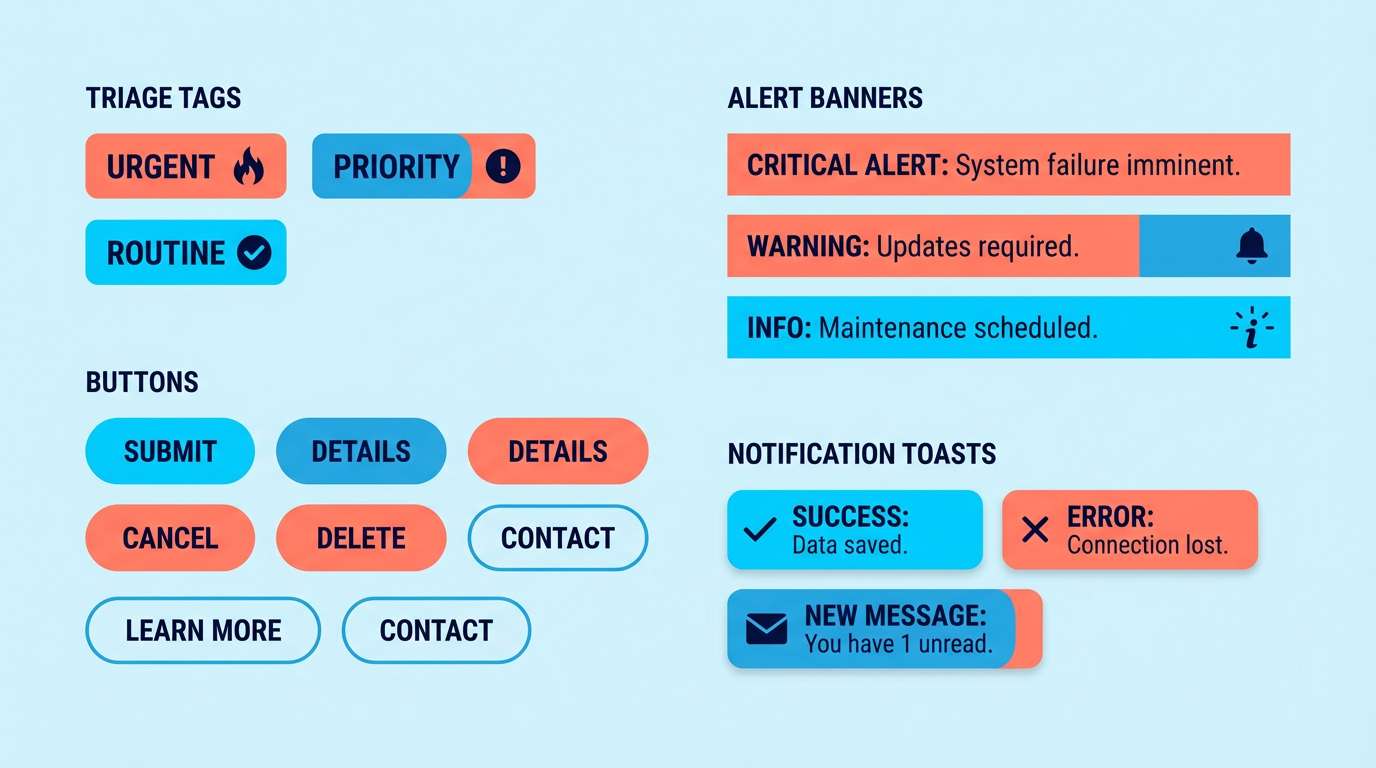
8) Emergency Accent
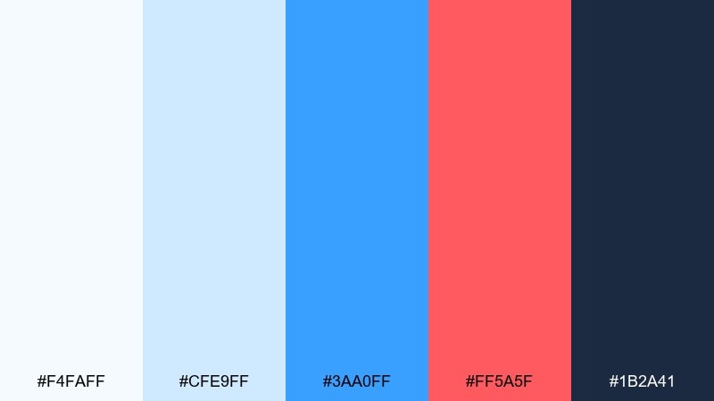
HEX: #F4FAFF #CFE9FF #3AA0FF #FF5A5F #1B2A41
Mood: alert, clear, high-contrast
Best for: triage alert UI components
Bright blue with a sharp coral accent signals urgency without sacrificing clarity. Use this medical color scheme for alert states, triage tags, and critical notifications where users must act quickly. Pair the coral with navy text for readable warnings, and keep the rest of the UI in pale blues. Tip: limit coral to true error or high-priority states to avoid alarm fatigue.
Image example of emergency accent generated using media.io
9) Pharmacy Fresh
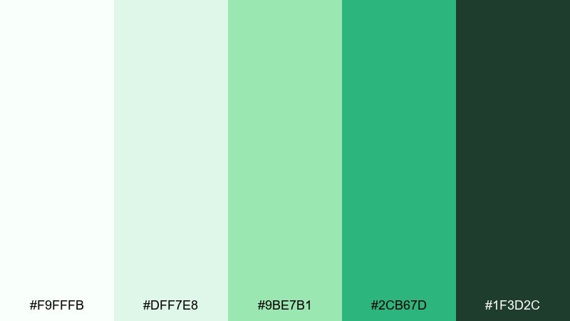
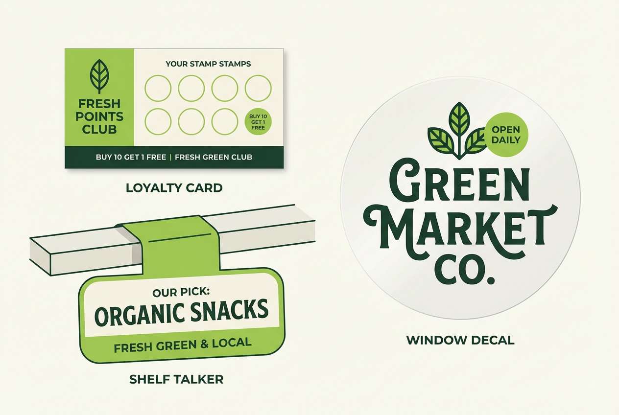
HEX: #F9FFFB #DFF7E8 #9BE7B1 #2CB67D #1F3D2C
Mood: clean, dependable, approachable
Best for: pharmacy loyalty card and signage
Fresh greens with soft white space feel dependable, like a well-stocked counter and clear guidance. These hues suit loyalty cards, in-store signage, and pickup reminders where quick scanning matters. Pair the bright green with dark evergreen text, and keep backgrounds near-white for a clean finish. Tip: use the mid green for icons and directional arrows so wayfinding stays intuitive.
Image example of pharmacy fresh generated using media.io
10) Telehealth Night
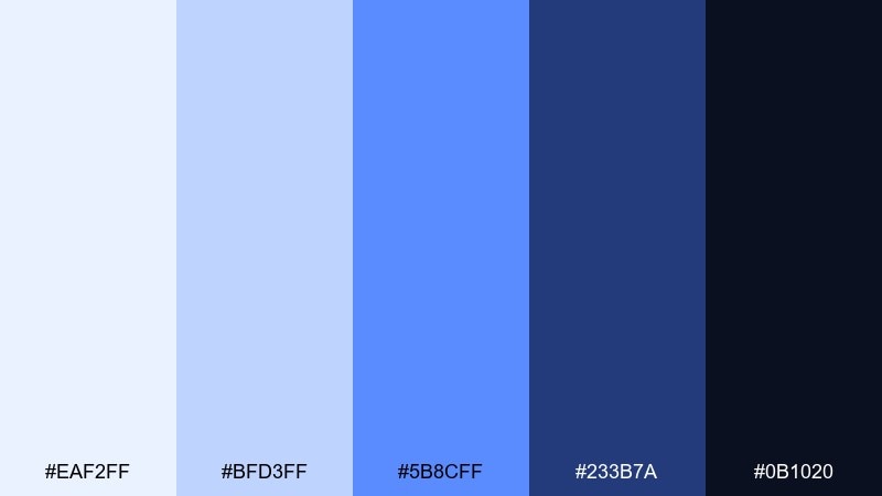
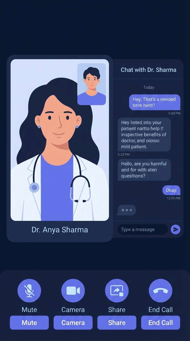
HEX: #EAF2FF #BFD3FF #5B8CFF #233B7A #0B1020
Mood: secure, focused, digital
Best for: telemedicine app dark mode UI
Deep navy and electric periwinkle feel secure and focused, like a quiet video consult at night. This medical color scheme fits dark mode interfaces where glare control and legibility are key. Pair the near-black with soft blue surfaces, then reserve the vivid blue for active states and call buttons. Tip: increase line height and use the palest tint for secondary text to reduce eye strain.
Image example of telehealth night generated using media.io
11) Soft Bandage
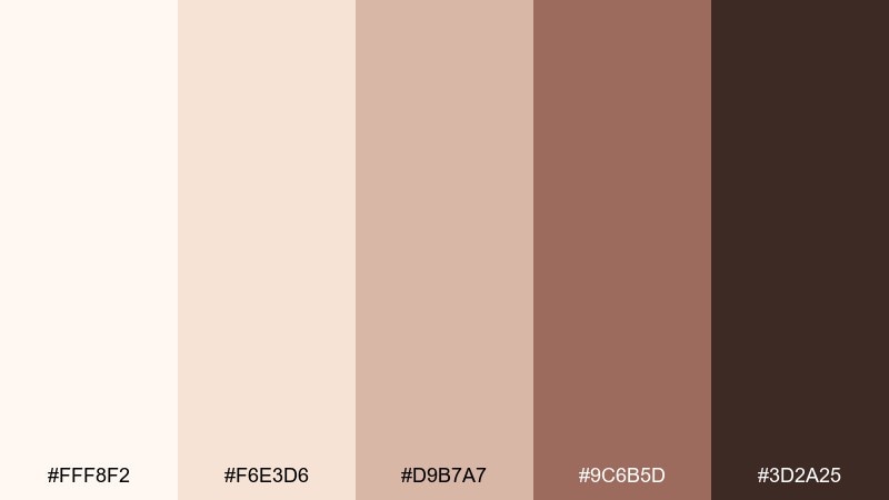
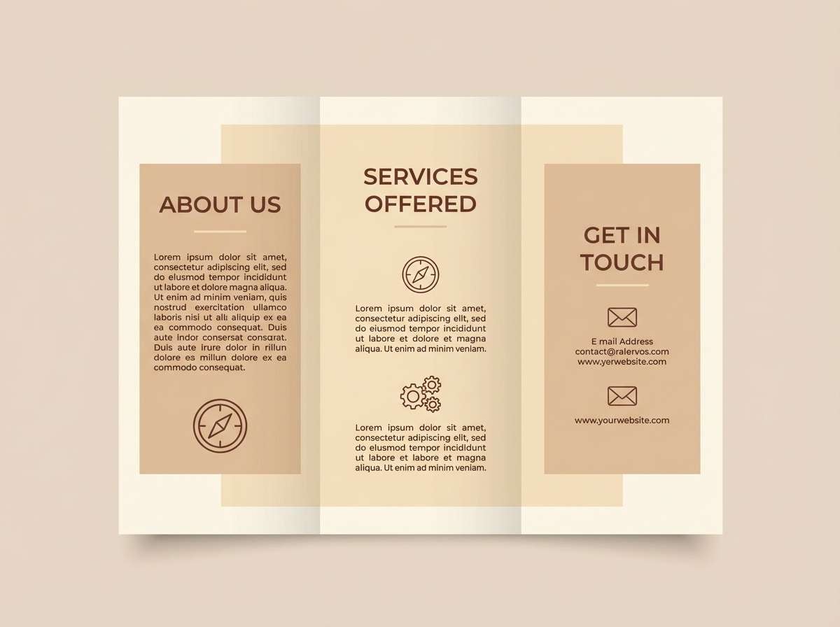
HEX: #FFF8F2 #F6E3D6 #D9B7A7 #9C6B5D #3D2A25
Mood: gentle, human, comforting
Best for: patient education brochure
Warm creams and soft browns feel human and reassuring, like a calm voice explaining next steps. Use these medical color schemes for patient education where empathy matters more than clinical sharpness. Pair the cream background with dark cocoa text for easy reading, and use the muted tan for callout boxes. Tip: combine with simple line illustrations to keep the content approachable and clear.
Image example of soft bandage generated using media.io
12) Dental Bright
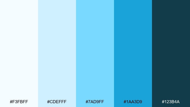
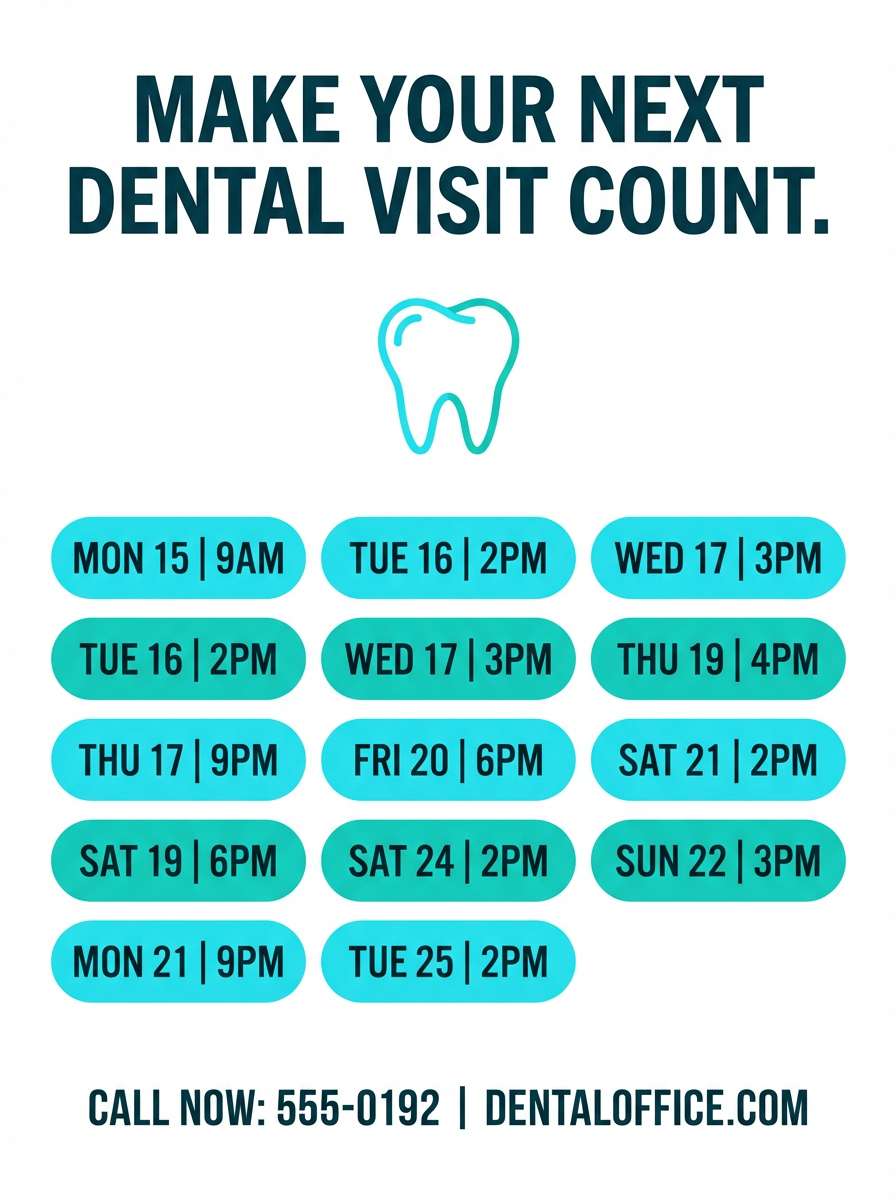
HEX: #F3FBFF #CDEFFF #7AD9FF #1AA3D9 #123B4A
Mood: sparkling, clean, optimistic
Best for: dental clinic appointment flyer
Sparkling cyan and ocean teal evoke polished enamel and fresh breath. This medical color palette is ideal for dental marketing that needs to feel clean, upbeat, and modern. Pair the brightest cyan with white for a crisp look, then anchor details in the deep blue-green for trust. Tip: keep photos minimal and let the color blocks carry the freshness.
Image example of dental bright generated using media.io
13) Rehab Earth
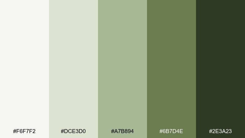
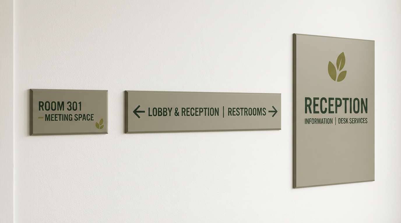
HEX: #F6F7F2 #DCE3D0 #A7B894 #6B7D4E #2E3A23
Mood: grounded, supportive, steady
Best for: physical therapy clinic signage
Grounded olives and soft neutrals feel steady, like slow progress and supportive coaching. Use it for rehab and physical therapy spaces that want warmth without losing professionalism. Pair the pale neutral with dark forest text for readable wayfinding, and use the mid olive for directional accents. Tip: choose matte finishes on signage so these earthy tones stay calm under bright lights.
Image example of rehab earth generated using media.io
14) Radiology Dark
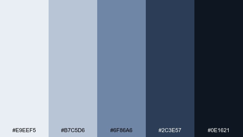
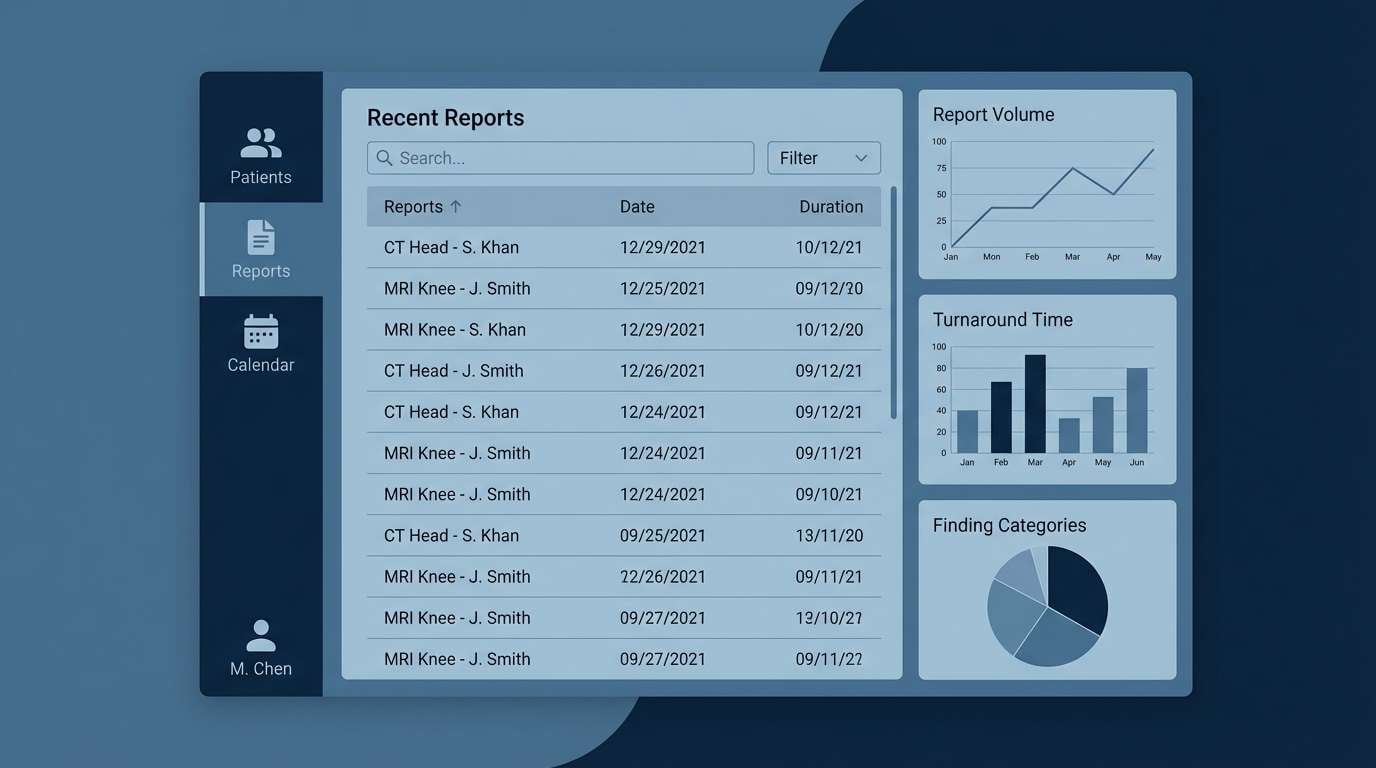
HEX: #E9EEF5 #B7C5D6 #6F86A6 #2C3E57 #0E1621
Mood: serious, quiet, high-tech
Best for: radiology report portal UI
Quiet steel blues and deep midnight tones feel high-tech and confidential. They fit radiology portals, imaging viewers, and report screens where focus is everything. Pair the light gray-blue with crisp tables, then use the darkest tone for navigation and persistent headers. Tip: keep accent usage minimal so results and charts remain the visual priority.
Image example of radiology dark generated using media.io
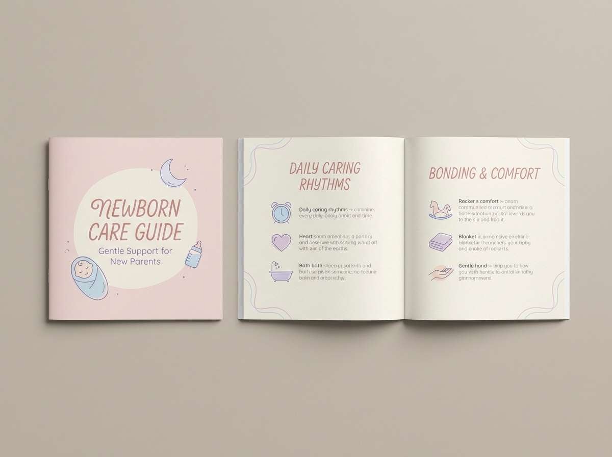
15) Neonatal Hush
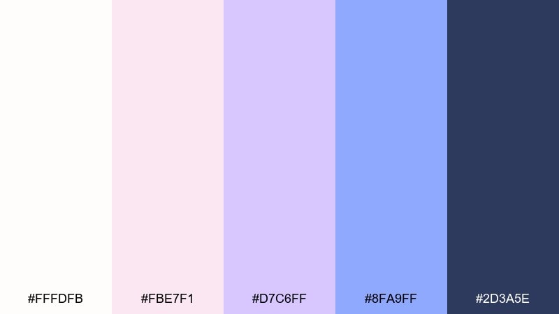
HEX: #FFFDFB #FBE7F1 #D7C6FF #8FA9FF #2D3A5E
Mood: tender, protective, quiet
Best for: newborn care guide booklet
Tender blush, lilac, and soft blue feel protective and quiet, like dimmed lights and gentle routines. Use it for neonatal care guides, postpartum support resources, and family-first communications. Pair the off-white with the deep slate for readable body text, and keep the blush to small highlights. Tip: choose rounded headings and plenty of leading to reinforce the soothing tone.
Image example of neonatal hush generated using media.io
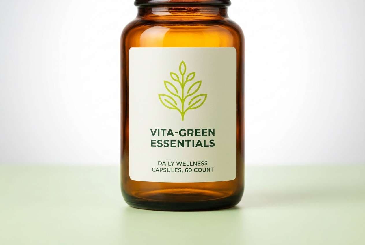
16) Immunity Citrus
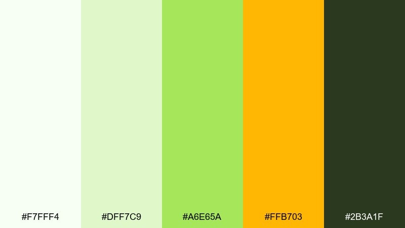
HEX: #F7FFF4 #DFF7C9 #A6E65A #FFB703 #2B3A1F
Mood: energizing, optimistic, active
Best for: vitamin supplement product ad
Zesty lime and sunny amber feel energizing, like a morning routine that actually sticks. These medical color combinations can add life to prevention, nutrition, or wellness messaging without turning childish. Pair the amber with crisp white to keep it premium, and use the dark green for ingredient callouts. Tip: let one bright tone lead and keep the second as a small accent for balance.
Image example of immunity citrus generated using media.io
17) Research Paper
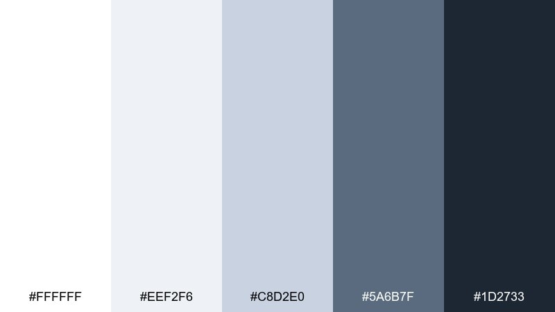
HEX: #FFFFFF #EEF2F6 #C8D2E0 #5A6B7F #1D2733
Mood: academic, neutral, organized
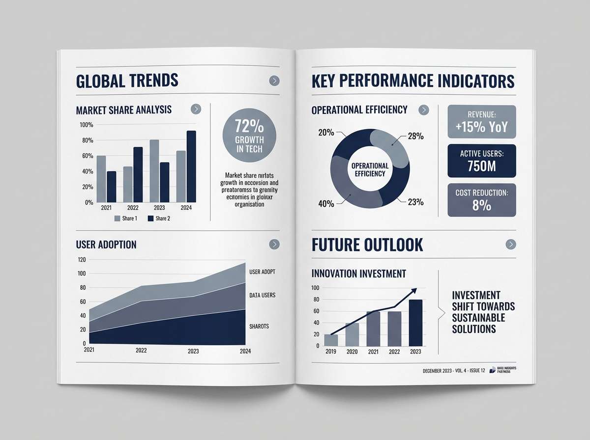
Best for: journal infographic layout
Cool neutrals and ink-like navy feel academic and organized, like peer-reviewed clarity. Use it for journal infographics, study summaries, and conference handouts that need to read cleanly in print. Pair the light gray with thin rules and consistent spacing, then lean on the navy for labels and chart axes. Tip: keep charts simple and use one mid-gray for secondary series to avoid clutter.
Image example of research paper generated using media.io
18) Caregiver Warmth
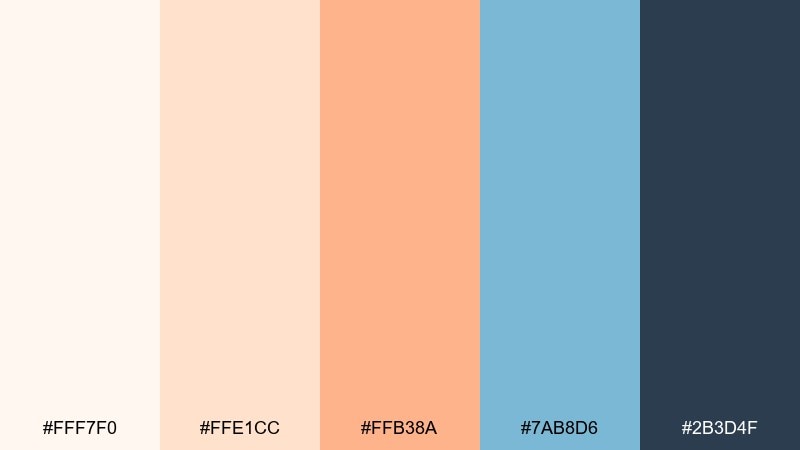
HEX: #FFF7F0 #FFE1CC #FFB38A #7AB8D6 #2B3D4F
Mood: welcoming, compassionate, balanced
Best for: home care service website
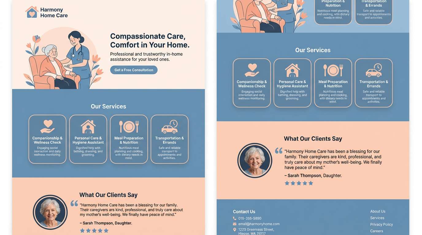
Soft peach and muted blue feel welcoming, like a reassuring check-in and warm conversation. Use this medical color palette for home care, elder support, and services that need compassion as much as professionalism. Pair the peach tones with plenty of white space, and use the deep blue-gray for navigation and trust marks. Tip: keep the warm accent in buttons and highlights so the site stays calm and readable.
Image example of caregiver warmth generated using media.io
19) Operating Room Green
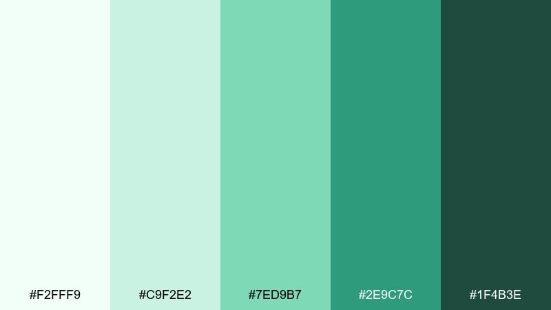
HEX: #F2FFF9 #C9F2E2 #7ED9B7 #2E9C7C #1F4B3E
Mood: focused, sterile, steady
Best for: surgery department wayfinding
Cool greens recall scrubs, clean surfaces, and steady hands. They are ideal for surgery department signage where calm direction matters more than decoration. Pair the pale mint with bold dark text for visibility at a distance, and use the mid green for arrows and symbols. Tip: test contrast under fluorescent lighting to keep the greens from washing out.
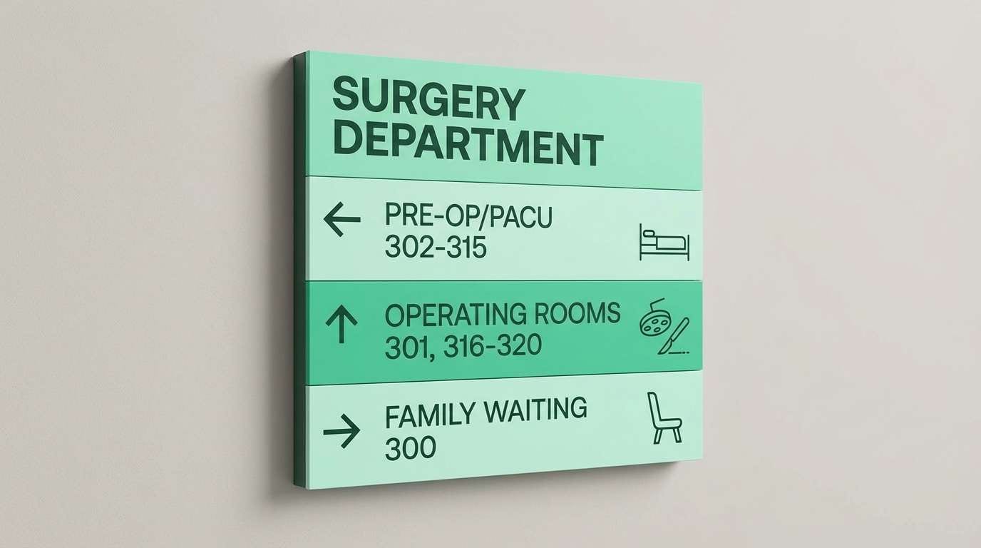
Image example of operating room green generated using media.io
20) Accessible Contrast
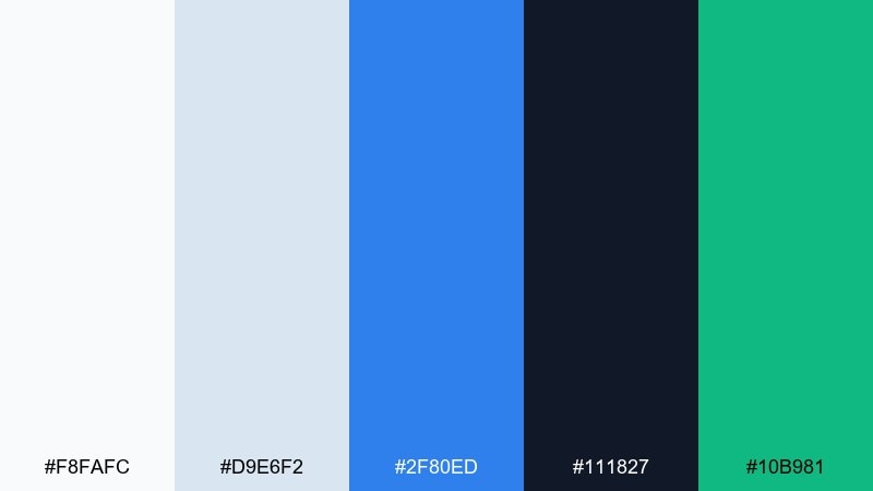
HEX: #F8FAFC #D9E6F2 #2F80ED #111827 #10B981
Mood: clear, accessible, modern
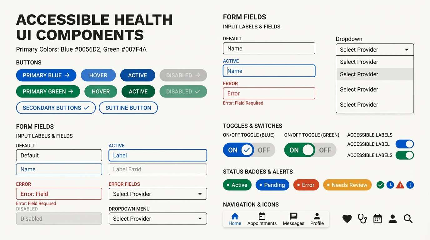
Best for: accessible healthcare app UI kit
Clean neutrals with strong blue and green accents feel modern and highly readable. Use it for UI kits where accessibility and quick scanning are non-negotiable. Pair the near-black with the off-white for text-heavy screens, then use blue for primary actions and green for success states. Tip: maintain consistent button styling so color supports meaning instead of becoming decoration.
Image example of accessible contrast generated using media.io
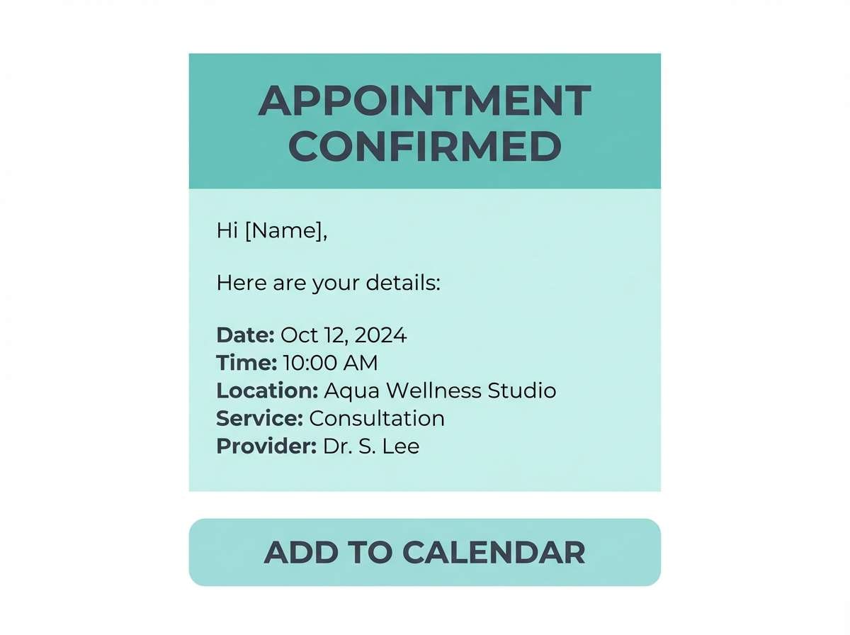
21) Calm Pulse
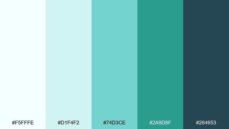
HEX: #F5FFFE #D1F4F2 #74D3CE #2A9D8F #264653
Mood: balanced, refreshing, composed
Best for: appointment reminder email template
Refreshing teal and soft aqua feel like a steady pulse and a calm, clear plan. Use these medical color tones in email templates where you want trust without heavy visuals. Pair the pale tint with simple dividers and dark text to keep the layout scannable on mobile. Tip: use the deeper teal only for one primary button so clicks are effortless.
Image example of calm pulse generated using media.io
22) Hygiene Minimal
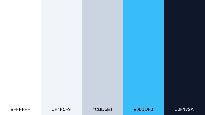
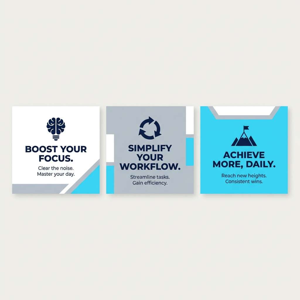
HEX: #FFFFFF #F1F5F9 #CBD5E1 #38BDF8 #0F172A
Mood: minimal, spotless, contemporary
Best for: clinic social media post set
Spotless whites and cool grays with a bright cyan accent feel contemporary and clean. They work well for a social post set where text and icons need to do the heavy lifting. Pair the cyan with generous padding, and anchor captions in the deep navy for contrast. Tip: keep gradients out and rely on crisp blocks so the feed looks consistent and professional.
Image example of hygiene minimal generated using media.io
What Colors Go Well with Medical?
Medical palettes pair naturally with cool neutrals like off-white, mist gray, and slate because they keep layouts clean and let information breathe.
For a classic healthcare look, combine soft blues with navy or charcoal for structure. For a wellness-forward feel, swap in seafoam, mint, and sage with warm cream backgrounds.
If you need urgency or status cues, add a single high-contrast accent (coral, amber, or vivid blue) and reserve it for alerts, primary actions, or key highlights.
How to Use a Medical Color Palette in Real Designs
Start with a light tint as your primary background, then choose one deep tone (navy, slate, or forest) for body text and navigation to maintain strong readability.
Assign meaning to accents: blue for primary actions, green for success/confirmed states, and warm tones (coral/amber) for warnings—so color supports UX instead of decoration.
Finally, test your palette in real contexts: forms, charts, signage, and printouts. Medical design often lives under harsh lighting and on small screens, so contrast and spacing matter as much as color choice.
Create Medical Palette Visuals with AI
Want to see your medical color palette in a UI, poster, brochure, or product ad before you commit? Generate realistic mockups in minutes using text prompts.
With Media.io, you can create consistent visuals for patient apps, clinic branding, or wellness campaigns—then iterate quickly by adjusting tone, layout, and lighting.
Pick a palette above, reuse its prompt, and tweak keywords like “minimal,” “high-contrast,” or “print-ready” to match your exact use case.
Medical Color Palette FAQs
-
What is a medical color palette?
A medical color palette is a set of colors commonly used in healthcare design to signal cleanliness, trust, and clarity—often built around soft blues, greens, and neutral grays with a darker anchor for text. -
Why are blues and greens so common in healthcare branding?
Blue tends to feel stable and trustworthy, while green suggests freshness and wellbeing. Together, they create a calm visual tone that works well for clinics, hospitals, and patient-facing apps. -
What are the best medical colors for UI and dashboards?
Use an off-white or very pale tint for backgrounds, a deep navy/slate for text, and one clear accent (blue or teal) for primary actions. Palettes like Sterile Aqua, Accessible Contrast, and Clinic Calm are especially UI-friendly. -
How do I add an “emergency” accent without overwhelming the design?
Limit warm accents (coral/red/amber) to true high-priority states such as errors, critical alerts, or urgent CTAs. Keep most surfaces neutral or pale blue so users don’t experience alarm fatigue. -
What medical palette works best for pediatrics?
Look for soft, friendly accents (pink, sky blue, mint) balanced by a trustworthy dark blue-gray for text. Pediatric Cheer is designed to feel comforting without looking neon or chaotic. -
Can medical palettes work for wellness brands too?
Yes. Choose seafoam, sage, and cream-based neutrals to soften the “clinical” vibe while staying credible. Wellness Spa and Calm Pulse are good starting points for wellness or recovery brands. -
How can I generate medical-themed visuals that match my palette?
Use Media.io’s text-to-image tool with a prompt that specifies the design type (UI kit, brochure, signage), “clean/minimal” styling, and your dominant colors. Then iterate by refining the prompt for contrast, spacing, and tone.
Next: Nautical Color Palette


