

Teal green is a versatile in-between shade that can feel coastal and airy, grounded and earthy, or sleek and modern depending on what you pair it with.
Below are 20+ curated teal green color palette ideas with HEX codes, plus AI-generated visual examples you can use as inspiration for branding, UI, packaging, and interiors.
In this article
- Why Teal Green Palettes Work So Well
-
- sea glass studio
- deep lagoon
- mint cream calm
- coastal retreat
- forest pool
- art deco teal
- teal noir
- aqua clay
- scandinavian teal
- tropical canopy
- pebble shore
- copper teal contrast
- vintage apothecary
- neon teal punch
- teal blossom
- stormy harbor
- teal chalkboard
- desert oasis teal
- glacier teal
- midnight spruce
- botanical wash
- museum tile teal
- What Colors Go Well with Teal Green?
- How to Use a Teal Green Color Palette in Real Designs
- Create Teal Green Palette Visuals with AI
Why Teal Green Palettes Work So Well
Teal green sits between green’s natural calm and blue’s clean reliability, which makes it feel balanced across many styles—spa-soft, corporate-neutral, or bold and trendy.
It also plays nicely with both warm and cool companions. Add cream or sand to make it inviting, charcoal and gray to make it modern, or gold and coral to make it energetic.
From a practical standpoint, teal greens can anchor layouts without feeling as heavy as pure navy, while still providing enough contrast for readable typography and clear UI hierarchy.
20+ Teal Green Color Palette Ideas (with HEX Codes)
1) Sea Glass Studio
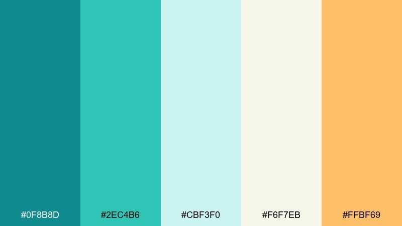
HEX: #0F8B8D #2EC4B6 #CBF3F0 #F6F7EB #FFBF69
Mood: airy, coastal
Best for: wellness branding, beachside cafes, lifestyle blogs
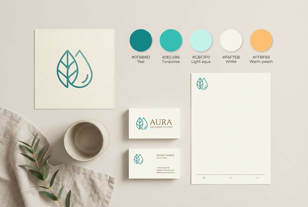
Airy and sunlit, it feels like sea glass scattered on a pale shore. Use it for friendly brands that want freshness without looking childish. Pair the warm coral-orange accent with lots of off-white space to keep it crisp. Tip: reserve the brightest accent for buttons or prices so the teal tones stay dominant.
Image example of sea glass studio generated using media.io
Media.io is an online AI studio for creating and editing video, image, and audio in your browser.

2) Deep Lagoon
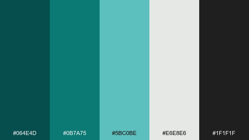
HEX: #064E4D #0B7A75 #5BC0BE #E6E8E6 #1F1F1F
Mood: moody, modern
Best for: tech dashboards, finance apps, premium reports
Moody lagoon depth meets sharp, modern contrast for confident interfaces. This teal green color palette works best when the near-black is used for typography and the pale gray is your main background. Add the lighter teal for hover states and secondary charts. Tip: keep saturation consistent across components to avoid a muddy, underwater look.
Image example of deep lagoon generated using media.io

3) Mint Cream Calm
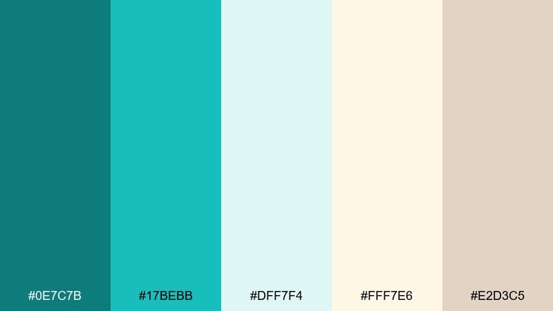
HEX: #0E7C7B #17BEBB #DFF7F4 #FFF7E6 #E2D3C5
Mood: soft, soothing
Best for: skincare packaging, spa menus, calm product pages
Soft and comforting, it reads like mint tea with a splash of cream. The gentle warm neutrals keep the teal from feeling clinical, making it ideal for self-care design. Pair with thin sans-serif type and subtle line icons for a modern spa vibe. Tip: use the beige tone for borders and dividers instead of gray to maintain warmth.
Image example of mint cream calm generated using media.io
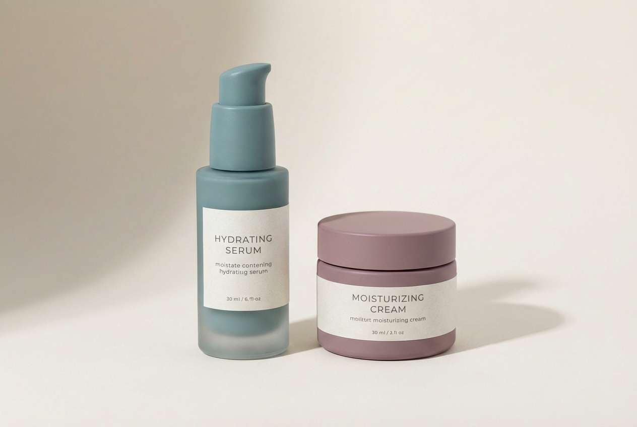
4) Coastal Retreat
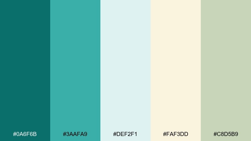
HEX: #0A6F6B #3AAFA9 #DEF2F1 #FAF3DD #C8D5B9
Mood: relaxed, natural
Best for: hotel websites, travel brochures, home decor shops
Relaxed and breezy, it evokes shaded verandas and salt air. The pale mint and cream make a welcoming base, while the deeper teal anchors headers and navigation. Pair with textured photography, light wood tones, and organic shapes. Tip: keep the darkest teal for key CTAs so the page feels calm but still navigable.
Image example of coastal retreat generated using media.io
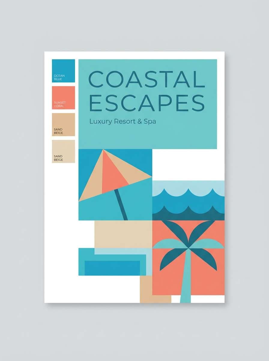
5) Forest Pool
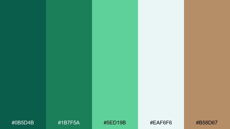
HEX: #0B5D4B #1B7F5A #5ED19B #EAF6F6 #B58D67
Mood: earthy, fresh
Best for: outdoor brands, eco labels, sustainable packaging
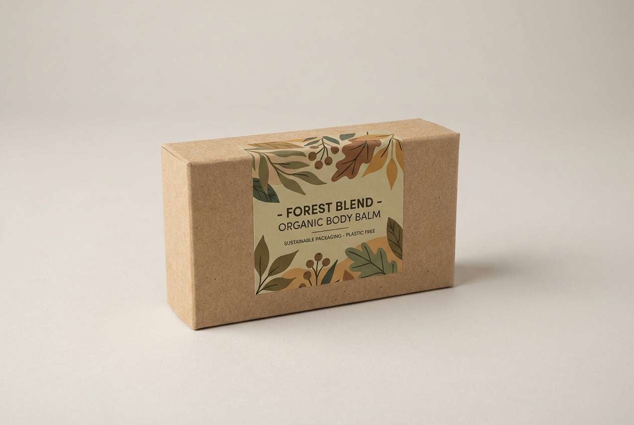
Earthy freshness with a hint of woodland water makes it feel grounded and alive. These tones are strong teal green color combinations for eco-focused brands when paired with kraft paper textures and matte finishes. Use the tan-brown as a natural accent for badges, seals, or product info panels. Tip: let the pale aqua act as breathing room so the greens do not overpower the layout.
Image example of forest pool generated using media.io
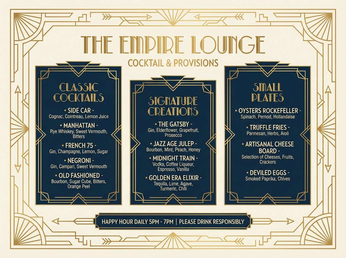
6) Art Deco Teal
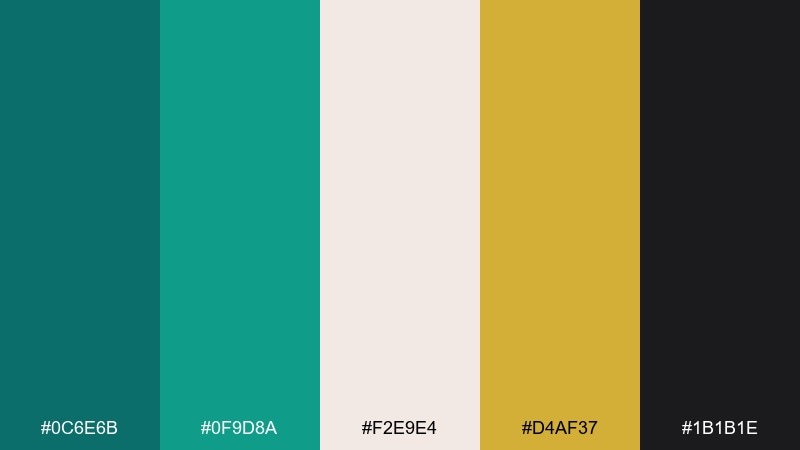
HEX: #0C6E6B #0F9D8A #F2E9E4 #D4AF37 #1B1B1E
Mood: glam, structured
Best for: event posters, boutique branding, cocktail menus
Glamorous and architectural, it echoes deco tiles and brass details. The gold plays beautifully against teal for premium highlights, while the off-white keeps typography readable. Pair with geometric patterns and high-contrast photography for a refined look. Tip: apply gold sparingly to rules and icons so it reads luxurious, not loud.
Image example of art deco teal generated using media.io
7) Teal Noir
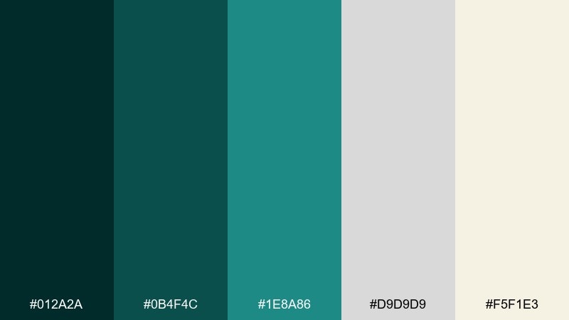
HEX: #012A2A #0B4F4C #1E8A86 #D9D9D9 #F5F1E3
Mood: cinematic, elegant
Best for: luxury landing pages, editorials, high-end portfolios
Cinematic and elegant, it feels like a night scene lit by neon reflected on water. Use the darkest tones for immersive headers and the light neutrals for generous content spacing. Pair with serif headlines to amplify the luxe mood. Tip: keep body text on the warm off-white to avoid eye strain against deep backgrounds.
Image example of teal noir generated using media.io
8) Aqua Clay
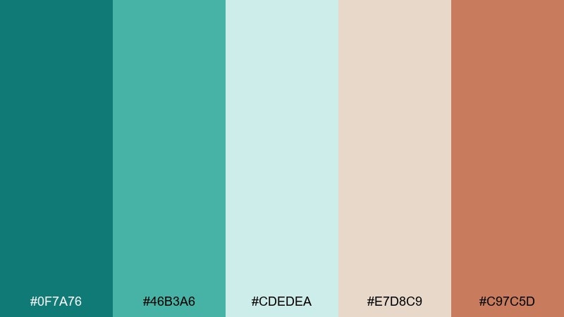
HEX: #0F7A76 #46B3A6 #CDEDEA #E7D8C9 #C97C5D
Mood: artisan, warm
Best for: handmade shops, ceramics brands, craft fair flyers
Artisan and warm, it suggests glazed pottery beside a cool basin. These teal green color combinations shine when you balance the clay tones with plenty of pale aqua. Pair with tactile photos, hand-drawn icons, and simple blocks of color. Tip: use the terracotta accent for stamps and callouts so it reads handmade, not rustic.
Image example of aqua clay generated using media.io

9) Scandinavian Teal
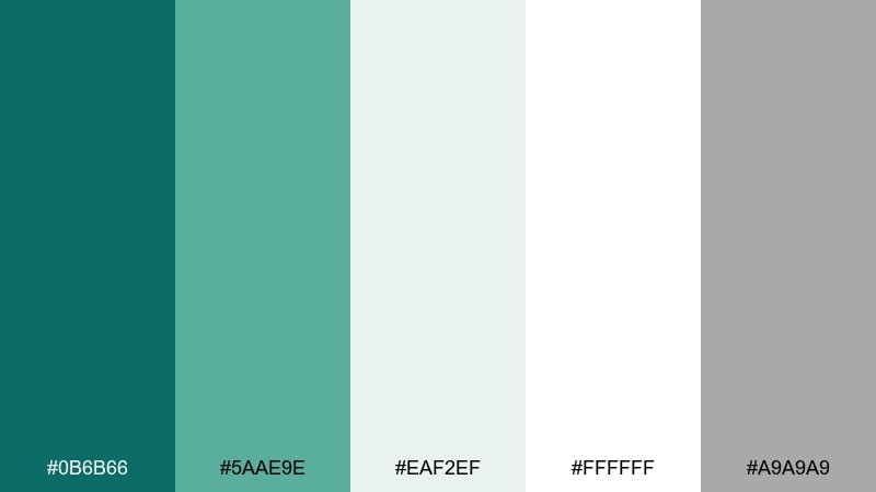
HEX: #0B6B66 #5AAE9E #EAF2EF #FFFFFF #A9A9A9
Mood: clean, minimal
Best for: product UI, SaaS websites, modern presentations
Clean and minimal, it feels like winter light on painted wood. The near-white and soft gray keep layouts airy, while teal adds gentle emphasis. Pair with lots of negative space, thin dividers, and calm photography. Tip: use the muted teal for secondary buttons and save the deeper teal for primary actions.
Image example of scandinavian teal generated using media.io
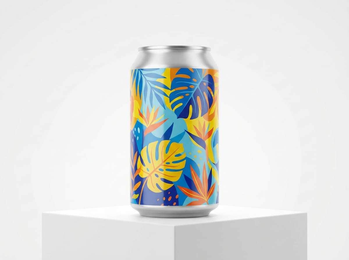
10) Tropical Canopy
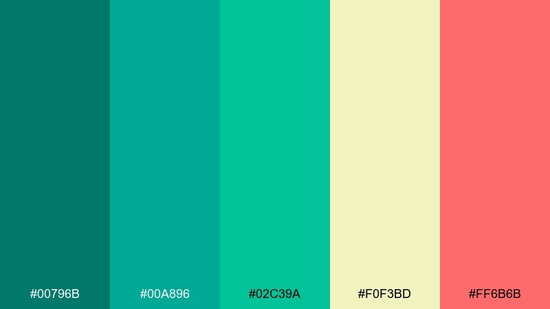
HEX: #00796B #00A896 #02C39A #F0F3BD #FF6B6B
Mood: vibrant, playful
Best for: summer campaigns, beverage labels, social ads
Vibrant and playful, it brings to mind lush leaves and bright fruit. The warm yellow-green and coral create lively contrast against saturated teals. Pair with bold sans headlines and punchy illustrations for maximum energy. Tip: keep coral to small bursts like stickers and promo tags so the greens stay fresh.
Image example of tropical canopy generated using media.io
11) Pebble Shore
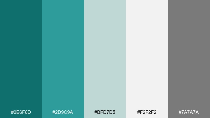
HEX: #0E6F6D #2D9C9A #BFD7D5 #F2F2F2 #7A7A7A
Mood: neutral, balanced
Best for: corporate websites, reports, service brands
Balanced and steady, it feels like smooth pebbles beside cool water. The grays make the teal read professional, not trendy, which is great for services and B2B design. Pair with structured grids and clear icon sets. Tip: use the mid-teal for section headers to create hierarchy without heavy borders.
Image example of pebble shore generated using media.io
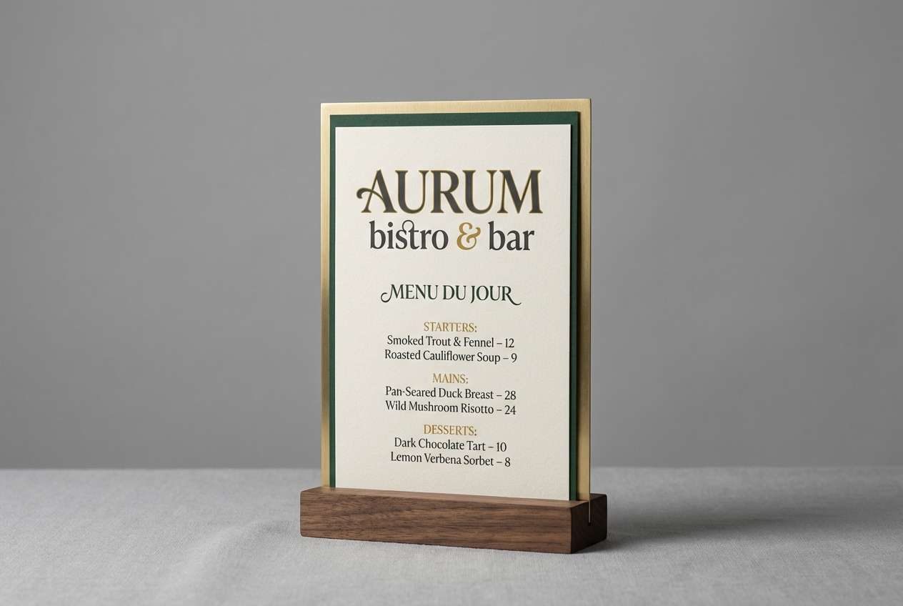
12) Copper Teal Contrast
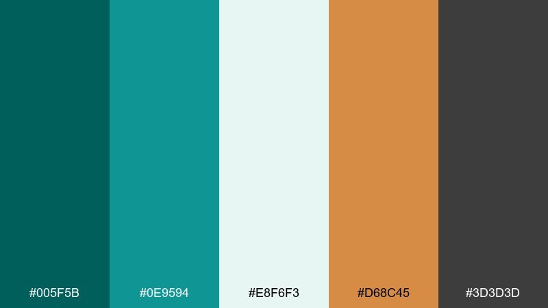
HEX: #005F5B #0E9594 #E8F6F3 #D68C45 #3D3D3D
Mood: bold, crafted
Best for: restaurant branding, product ads, signage
Bold and crafted, it resembles oxidized metal paired with warm copper. This teal green color palette excels in high-contrast layouts where the copper becomes a premium accent. Pair with dark charcoal type and textured backgrounds for a sophisticated edge. Tip: use copper on small UI elements like icons or separators to avoid overpowering the teal base.
Image example of copper teal contrast generated using media.io
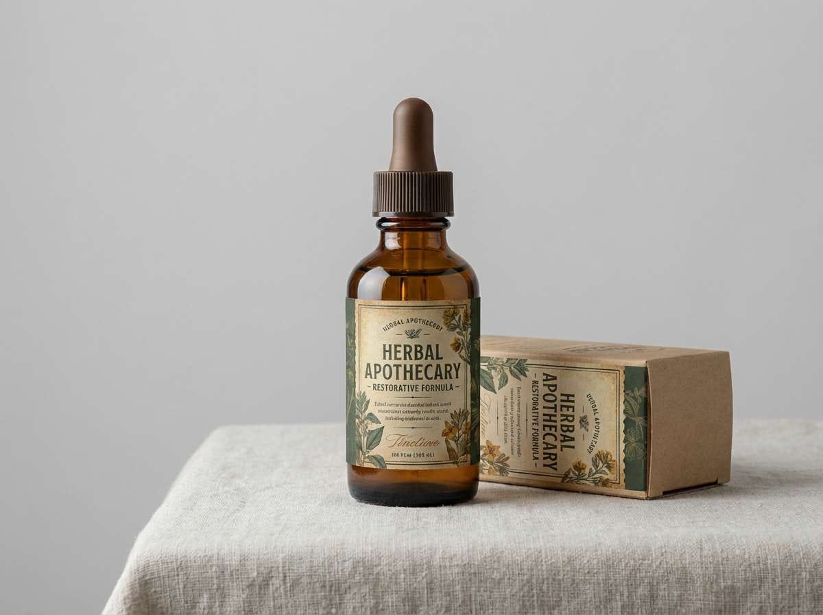
13) Vintage Apothecary
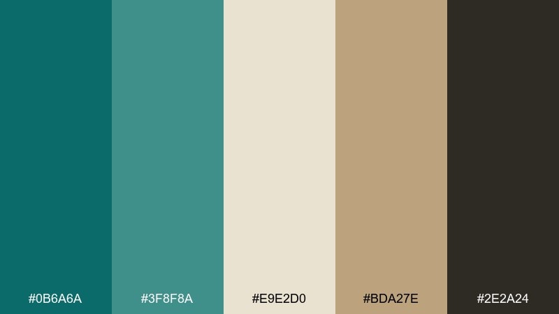
HEX: #0B6A6A #3F8F8A #E9E2D0 #BDA27E #2E2A24
Mood: nostalgic, earthy
Best for: herbal products, boutique labels, gift sets
Nostalgic and earthy, it recalls glass bottles on wooden shelves. The warm parchment and tan tones soften teal into something timeless and approachable. Pair with serif labels, small ornaments, and a touch of grain texture. Tip: set the darkest brown for ingredient lists and fine print to keep readability high.
Image example of vintage apothecary generated using media.io
14) Neon Teal Punch
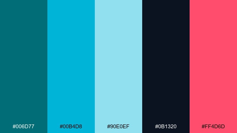
HEX: #006D77 #00B4D8 #90E0EF #0B1320 #FF4D6D
Mood: electric, youthful
Best for: music posters, gaming overlays, nightlife promos
Electric and youthful, it feels like club lights cutting through deep shadows. The bright pink adds instant pop, while the navy-black keeps everything grounded. Pair with bold display type and sharp gradients for an energetic look. Tip: use the light cyan as a glow effect behind key elements rather than as a large background fill.
Image example of neon teal punch generated using media.io

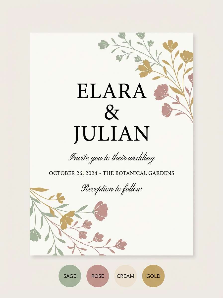
15) Teal Blossom
HEX: #0A7E78 #3CB7A9 #F7CAD0 #FFF1E6 #B8E0D2
Mood: romantic, light
Best for: wedding invitations, beauty brands, spring promos
Romantic and light, it suggests spring petals floating on clear water. The blush pink softens teal into something graceful and celebratory. Pair with delicate script accents and simple floral line art for stationery and event design. Tip: keep the blush as a background wash and use teal for names and headings to maintain contrast.
Image example of teal blossom generated using media.io
16) Stormy Harbor
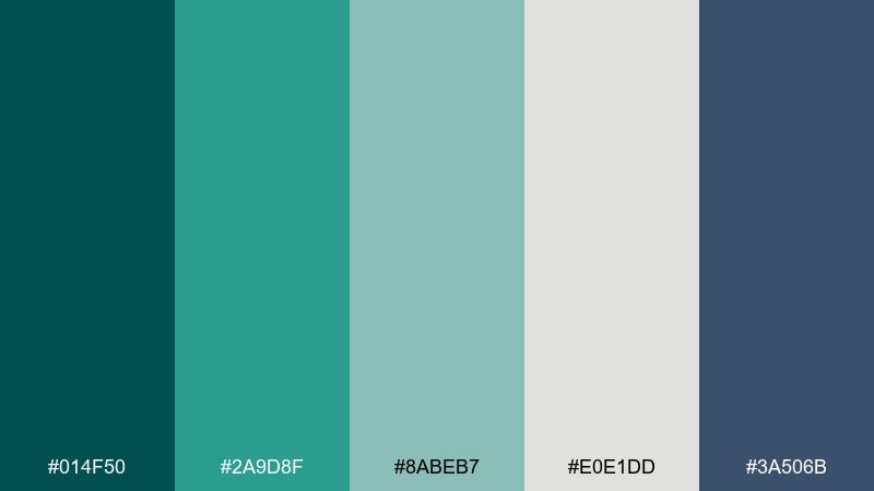
HEX: #014F50 #2A9D8F #8ABEB7 #E0E1DD #3A506B
Mood: cool, confident
Best for: editorial websites, nautical brands, presentations
Cool and confident, it captures a stormy harbor with slate skies. The blue-gray adds seriousness, making the mix ideal for editorial layouts and data-heavy slides. Pair with crisp white margins and strong typographic hierarchy. Tip: use the muted teal as a background panel color to separate sections without heavy lines.
Image example of stormy harbor generated using media.io

17) Teal Chalkboard
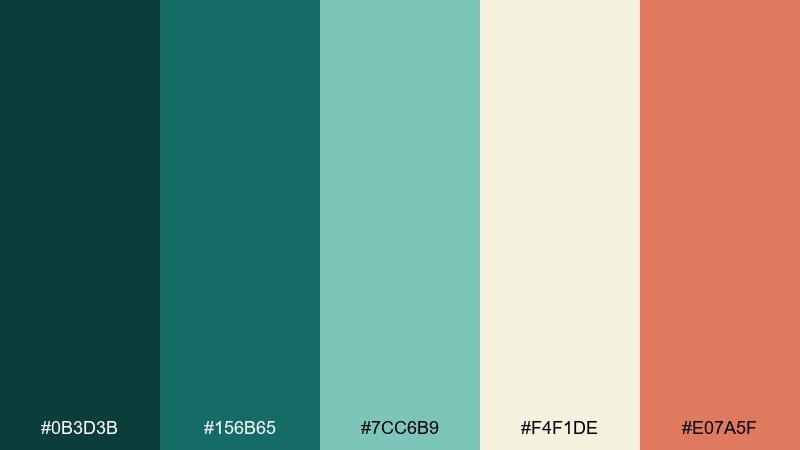
HEX: #0B3D3B #156B65 #7CC6B9 #F4F1DE #E07A5F
Mood: cozy, casual
Best for: coffee shops, menu boards, classroom materials
Cozy and casual, it feels like chalk on a café board with a warm pastry accent. The dark green-teal sets a welcoming base, while cream keeps text legible and friendly. Pair with hand-drawn icons and simple, chunky type for an approachable tone. Tip: use the coral as a highlight for specials so the layout stays tidy.
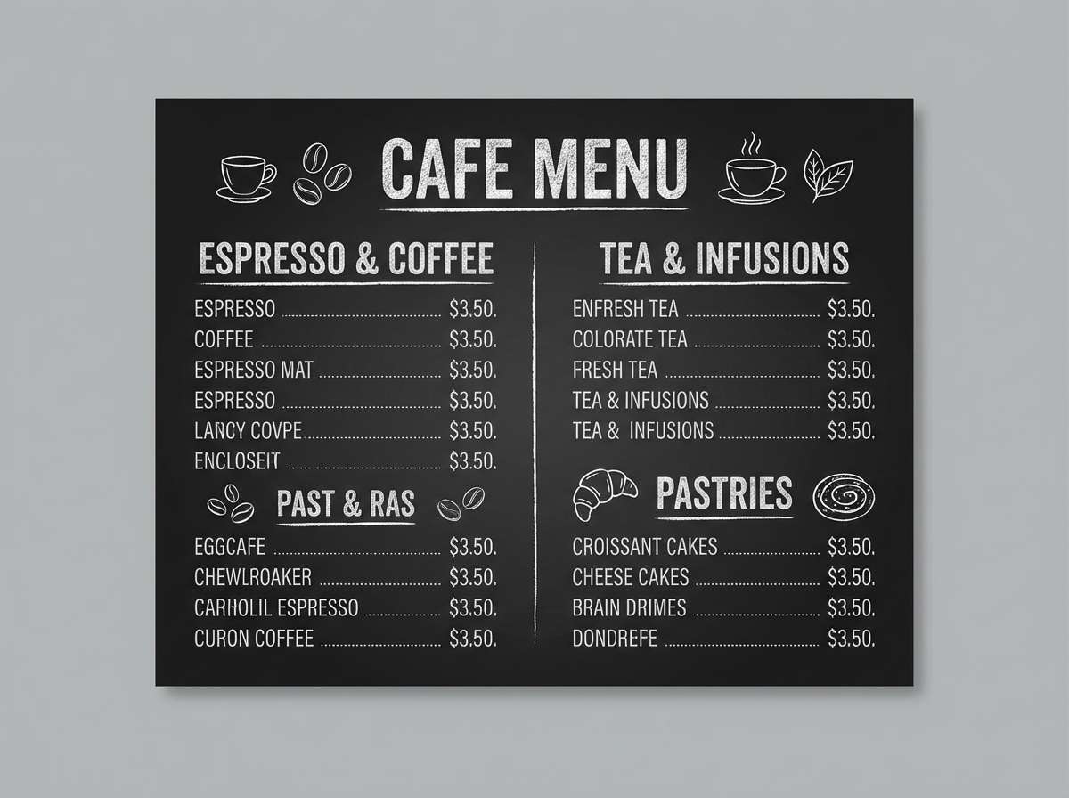
Image example of teal chalkboard generated using media.io
18) Desert Oasis Teal
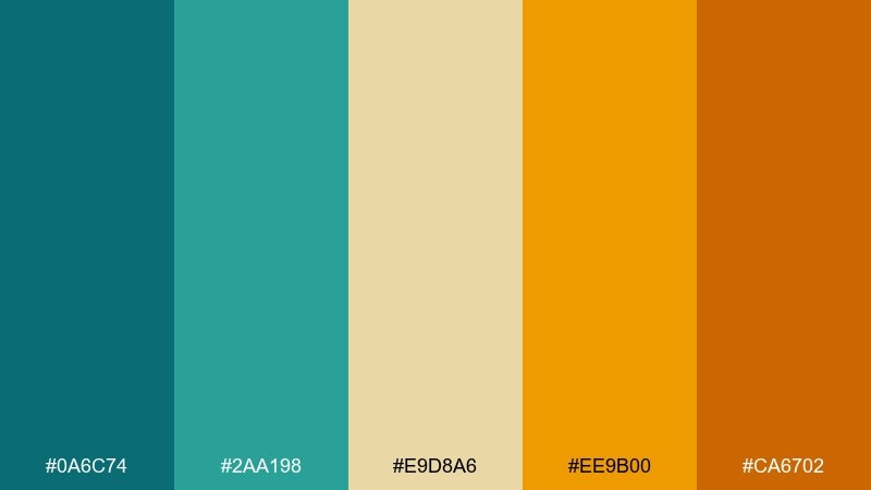
HEX: #0A6C74 #2AA198 #E9D8A6 #EE9B00 #CA6702
Mood: sun-baked, adventurous
Best for: travel ads, outdoor gear, festival graphics
Sun-baked and adventurous, it looks like an oasis against golden sand. The warm yellows and oranges make the cool teal feel even more refreshing. Pair with bold photography, sandy textures, and simple iconography for energetic campaigns. Tip: keep the strongest orange for a single focal element like a badge or discount callout.
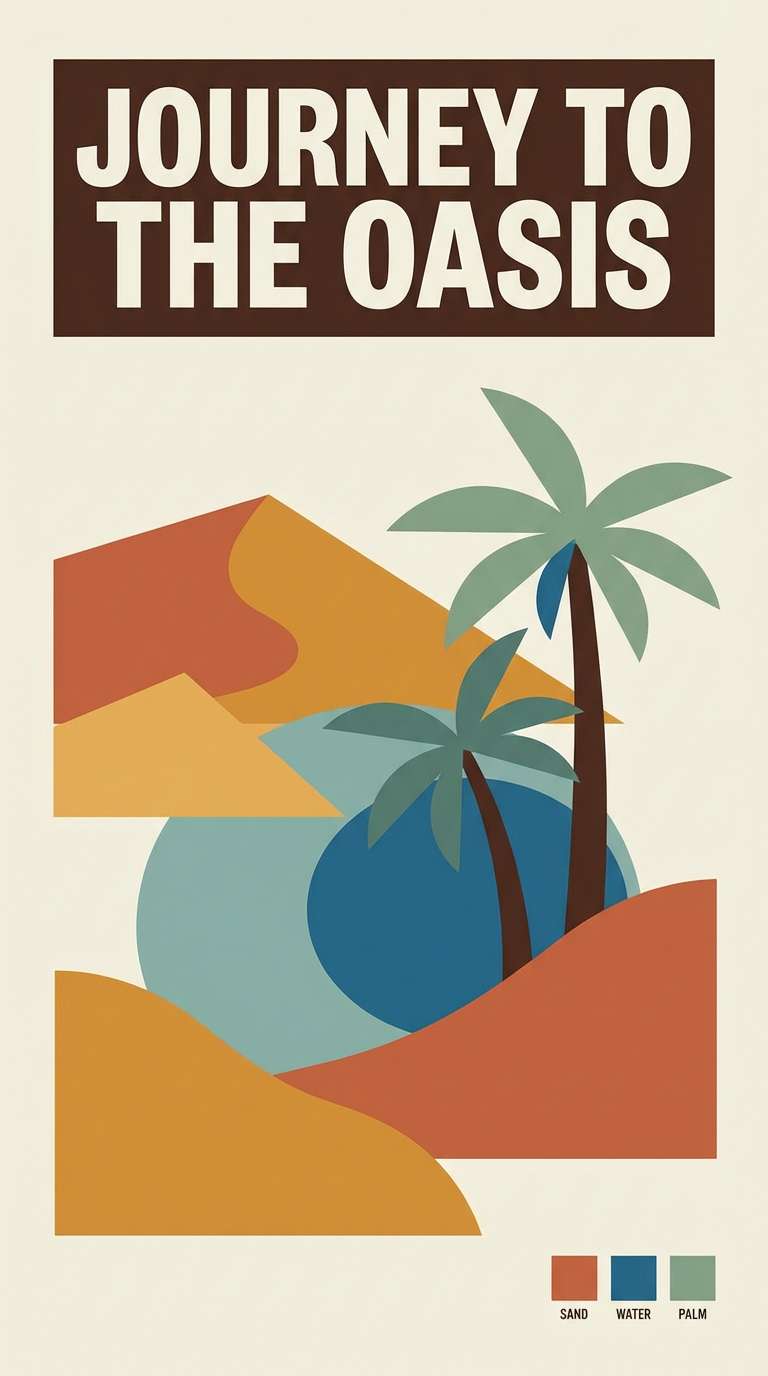
Image example of desert oasis teal generated using media.io
19) Glacier Teal
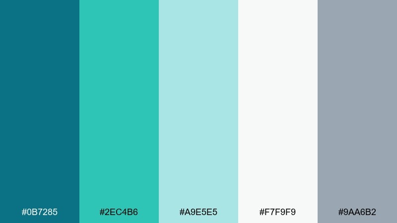
HEX: #0B7285 #2EC4B6 #A9E5E5 #F7F9F9 #9AA6B2
Mood: icy, calm
Best for: health apps, meditation UI, clean ecommerce
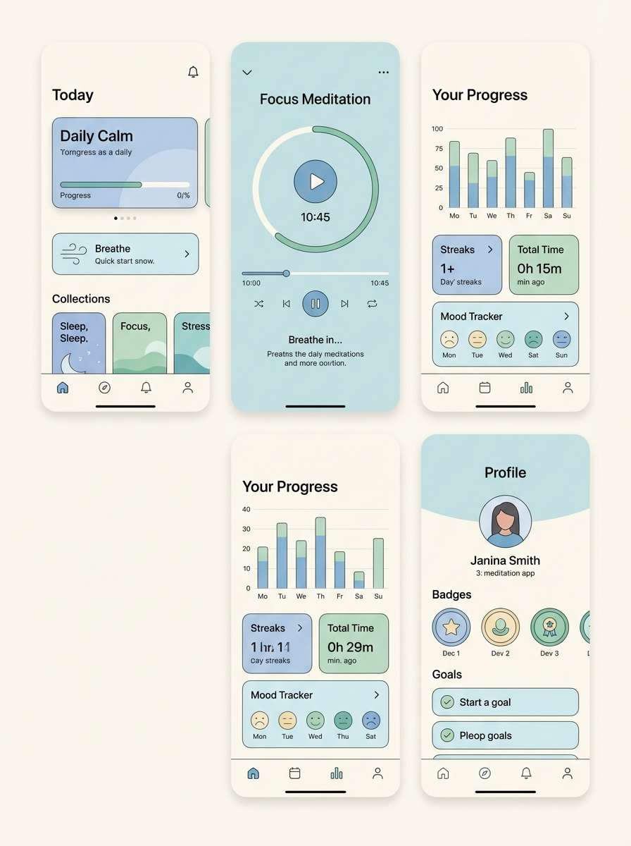
Icy and calm, it resembles glacier water under a pale sky. The cool grays support a soothing teal green color scheme for wellness-focused digital products. Pair with rounded corners, soft shadows, and minimal iconography for a gentle feel. Tip: make the lightest tone your main background and use mid-teal for emphasis to keep contrast accessible.
Image example of glacier teal generated using media.io
20) Midnight Spruce
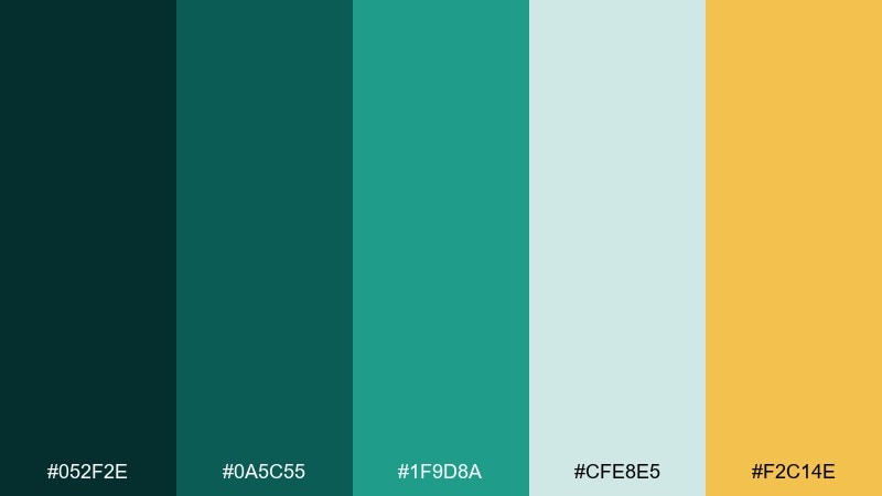
HEX: #052F2E #0A5C55 #1F9D8A #CFE8E5 #F2C14E
Mood: rich, festive
Best for: holiday campaigns, premium packaging, hero banners
Rich and festive, it feels like spruce needles lit by warm evening lights. The golden accent adds celebration without leaning overly seasonal. Pair with deep photography, metallic print finishes, and strong headline type. Tip: use the gold as a thin highlight line or small icon fill to keep the look premium.
Image example of midnight spruce generated using media.io
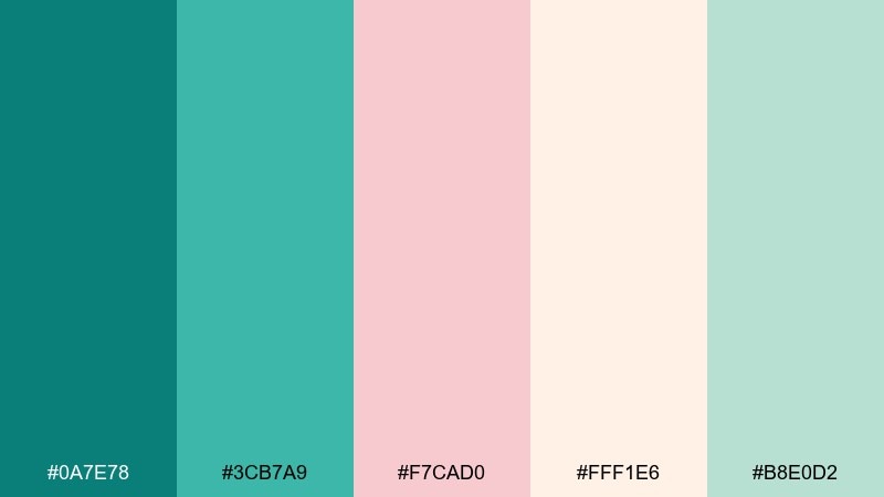
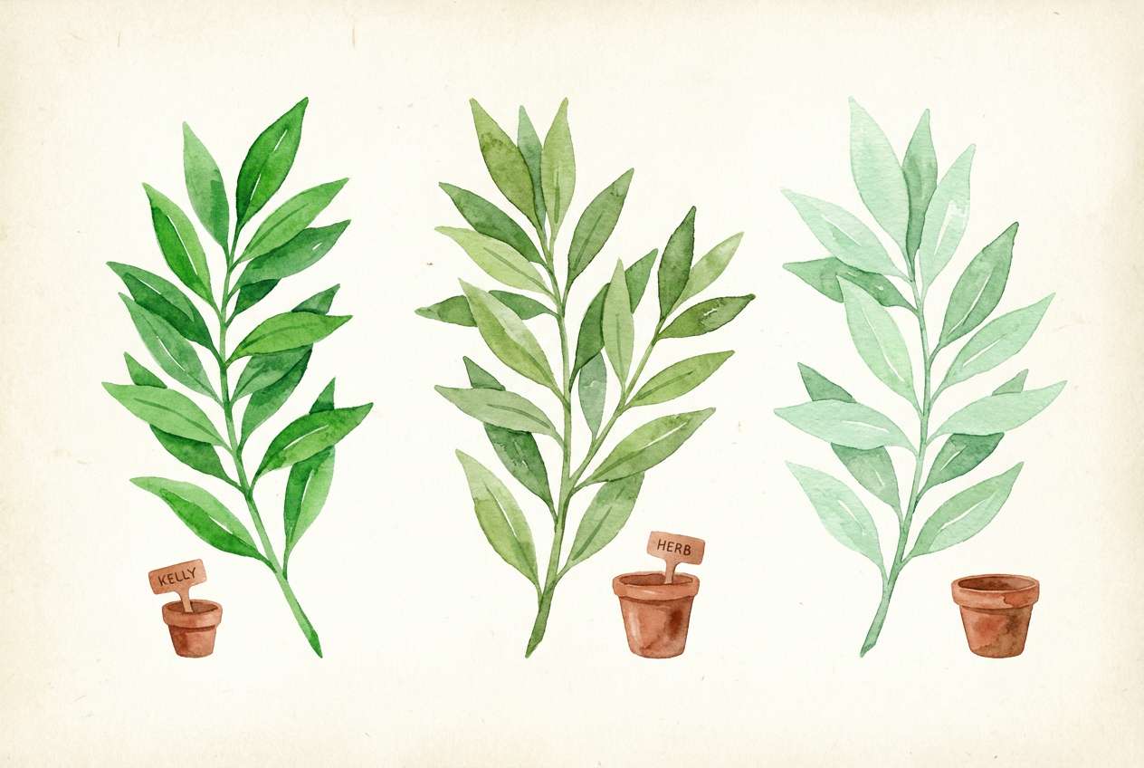
21) Botanical Wash
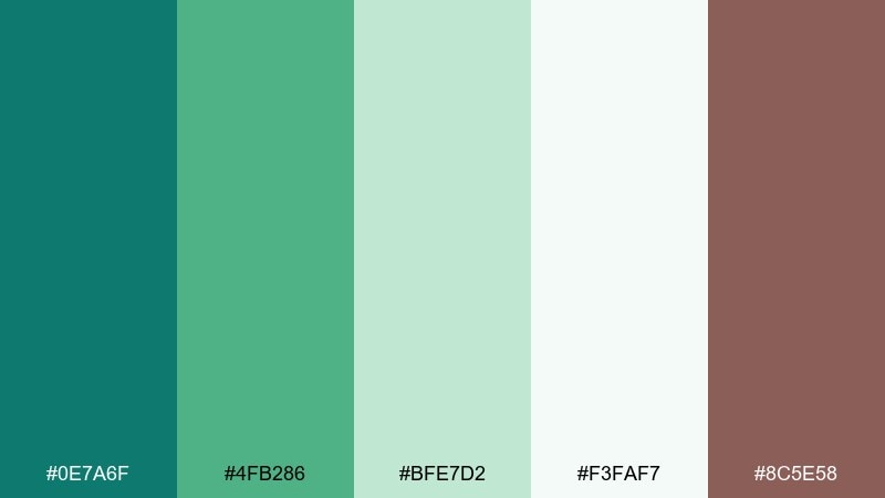
HEX: #0E7A6F #4FB286 #BFE7D2 #F3FAF7 #8C5E58
Mood: garden, gentle
Best for: botanical illustrations, spring prints, stationery
Garden-gentle and fresh, it reads like watercolor leaves layered over paper. The soft minty greens feel airy, while the muted mauve-brown adds a natural, earthy counterpoint. Pair with botanical line art, deckled edges, and light textures for a handmade finish. Tip: keep outlines in the darker teal and wash large areas with the palest tone to preserve softness.
Image example of botanical wash generated using media.io
22) Museum Tile Teal
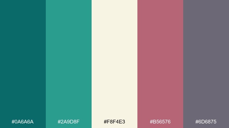
HEX: #0A6A6A #2A9D8F #F8F4E3 #B56576 #6D6875
Mood: cultured, eclectic
Best for: museum posters, artsy brands, editorial graphics
Cultured and eclectic, it evokes patterned tiles in a quiet gallery. The dusty rose and muted violet create surprising teal green color combinations that still feel tasteful. Pair with collage-style layouts, serif headlines, and generous margins. Tip: use the violet for captions and small labels to add depth without competing with the main teal.
Image example of museum tile teal generated using media.io

What Colors Go Well with Teal Green?
Warm neutrals like cream, sand, and beige make teal green feel softer and more welcoming—great for lifestyle brands, interiors, and packaging.
For a modern look, pair teal green with charcoal, cool gray, and near-white. This combination keeps interfaces clean and improves readability with reliable contrast.
If you want higher energy, add accents like coral, terracotta, or gold. These warm pops complement teal’s cool base and help key elements (CTAs, badges, highlights) stand out.
How to Use a Teal Green Color Palette in Real Designs
In branding, choose one deep teal as your anchor, a lighter teal for supporting areas, and a warm accent for differentiation—then keep backgrounds mostly off-white to avoid visual heaviness.
In UI design, use teal for primary actions and states (active, hover), while keeping text on charcoal or near-black. Reserve the brightest accent for notifications, prices, or key highlights.
In interiors and print, teal green works well as a feature color (tile, wall, label panel). Balance it with natural textures like wood, linen, and stone to keep the space feeling grounded.
Create Teal Green Palette Visuals with AI
If you have a palette you love but need visuals to match—product mockups, posters, UI scenes, or brand boards—AI can generate consistent examples quickly.
Start by describing your design (e.g., “skincare packaging set in studio” or “dark dashboard UI”), then include your teal green tones and a single accent color for clarity and contrast.
Once you get a strong result, reuse the same prompt structure across assets so your teal green color scheme stays cohesive from concept to campaign.
Teal Green Color Palette FAQs
-
What is a teal green color palette?
A teal green color palette is a coordinated set of colors built around teal-leaning greens, usually supported by light neutrals (white, cream, gray) and one or two accent colors (like coral, gold, or terracotta) for contrast. -
What HEX code is “teal green”?
Teal green doesn’t have just one HEX code, but common teal-green anchors include #0F8B8D, #00796B, and #0A6F6B. Pick the exact teal green HEX based on whether you want it to feel more blue (cooler) or more green (earthier). -
Does teal green work well for branding?
Yes. Teal green is often associated with freshness, balance, and trust, which makes it popular for wellness, tech, finance, travel, and sustainable brands—especially when paired with clean neutrals and a controlled accent color. -
What are the best accent colors for teal green?
Great accents for teal green include coral/pink for energy, gold for a premium feel, terracotta for warmth, and mustard/yellow for a sunlit contrast. Use accents sparingly so teal remains the dominant brand color. -
How do I keep teal green palettes from looking “muddy”?
Avoid mixing too many mid-saturation colors at once. Use one strong teal, add breathing room with light neutrals, and keep secondary colors either clearly lighter or clearly darker than the main teal for cleaner separation. -
Is teal green good for UI and accessibility?
It can be, as long as you check contrast. Use near-black or deep charcoal for body text, keep backgrounds light (or very consistently dark), and test buttons/links to ensure teal-on-white or white-on-teal meets readability requirements. -
Can I generate teal green palette mockups with AI?
Yes. With Media.io, you can generate brand boards, packaging mockups, posters, and UI concept images by describing the scene and style, then refining prompts until the teal green color scheme matches your palette.
Next: Yellow Color Palette


