

Indigo sits between blue and violet, so it naturally feels both trustworthy and imaginative. That balance makes it a favorite for brands, interfaces, and print pieces that need depth without looking harsh.
Below are 20 curated indigo color combinations with HEX codes, plus practical pairing tips and AI-ready prompts you can use to generate matching visuals.
In this article
- Why Indigo Palettes Work So Well
-
- midnight ink cream
- indigo aurora
- denim sandstone
- royal indigo gold leaf
- stormy harbor
- lavender dusk
- neon nightlife
- heritage tartan
- minimal indigo ui
- botanical indigo garden
- cocoa indigo cozy
- oceanic indigo drift
- indigo blossom wedding
- techno violet grid
- indigo terracotta studio
- winter indigo frost
- gallery indigo editorial
- retro indigo pop
- indigo clay packaging
- quiet library tones
- What Colors Go Well with Indigo?
- How to Use a Indigo Color Palette in Real Designs
- Create Indigo Palette Visuals with AI
Why Indigo Palettes Work So Well
Indigo has the stability of blue with a hint of violet intrigue, which helps designs feel confident and premium. It reads “serious” without being as stark as pure black.
Because indigo can swing cool or warm depending on surrounding colors, it pairs easily with creams, metallics, pastels, and neons. That flexibility makes it suitable for both minimal UI and expressive poster work.
In print and digital, indigo also holds contrast well, giving you strong hierarchy for headlines, navigation, and key accents while keeping the overall look polished.
20+ Indigo Color Palette Ideas (with HEX Codes)
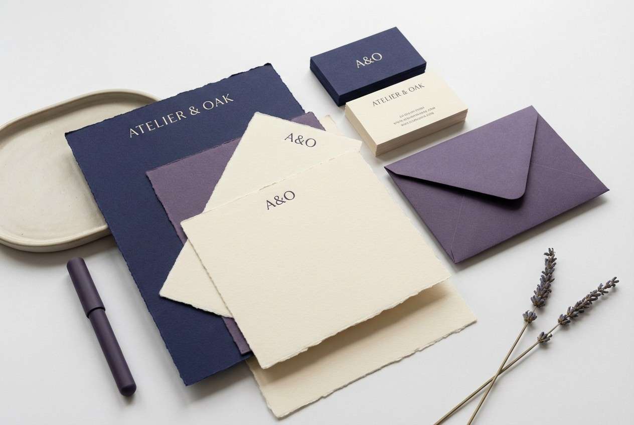
1) Midnight Ink Cream
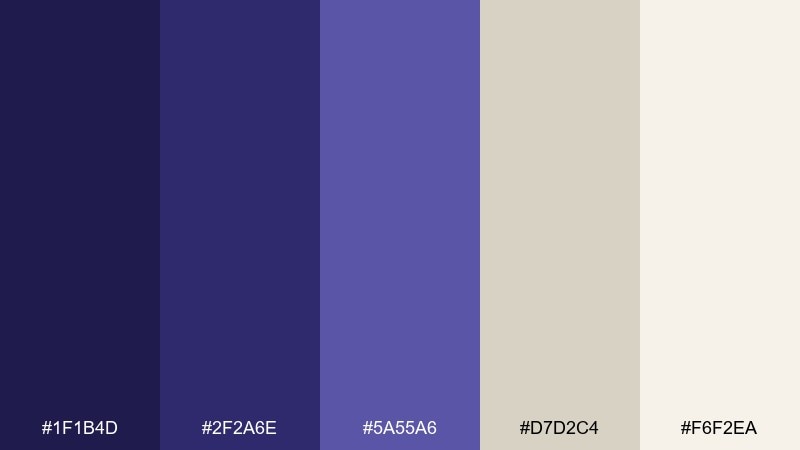
HEX: #1f1b4d #2f2a6e #5a55a6 #d7d2c4 #f6f2ea
Mood: moody, refined, editorial
Best for: luxury brand identity and stationery
Moody midnight ink against warm cream feels like a hardcover book and soft lamp light. Use the dark indigo tones for headers and monograms, then let the creams carry the negative space. Pair with matte paper textures, subtle embossing, and minimal line icons. Tip: keep body text in the deepest shade and reserve the lightest cream for margins so the layout stays airy.
Image example of midnight ink cream generated using media.io
Media.io is an online AI studio for creating and editing video, image, and audio in your browser.

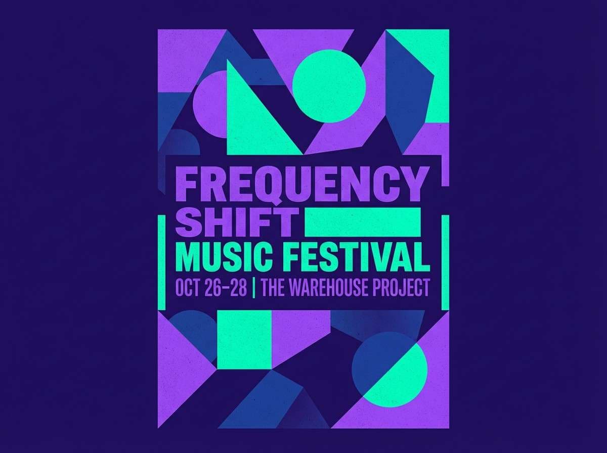
2) Indigo Aurora
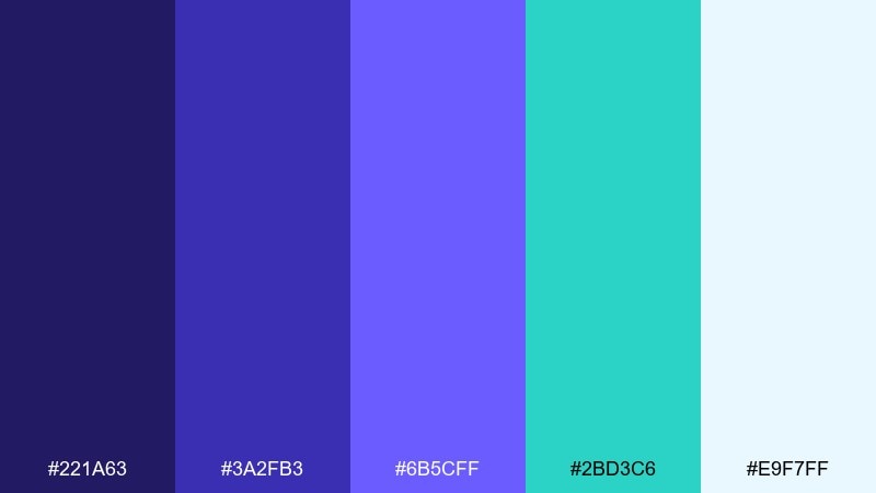
HEX: #221a63 #3a2fb3 #6b5cff #2bd3c6 #e9f7ff
Mood: electric, futuristic, optimistic
Best for: music event poster design
Electric aurora vibes glow with neon teal and bright violet highlights. These indigo color combinations work best when you push contrast: use the darkest shade for the backdrop and let teal act as the spotlight. Pair with bold condensed type, gradients, and simple geometric shapes. Tip: limit neon accents to key info like date and venue so the poster stays legible.
Image example of indigo aurora generated using media.io
3) Denim Sandstone
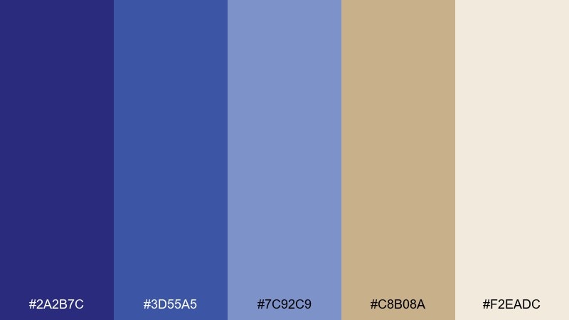
HEX: #2a2b7c #3d55a5 #7c92c9 #c8b08a #f2eadc
Mood: casual, outdoorsy, approachable
Best for: lifestyle blog header and thumbnails
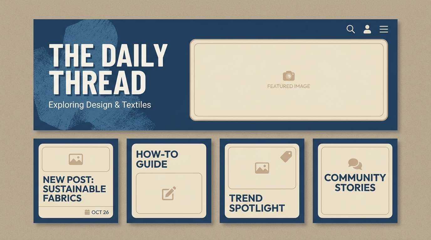
Worn denim blues and sun-baked sandstone read relaxed and familiar, like weekend road trips. Use the mid indigo for titles, and balance it with sandy neutrals for backgrounds and borders. Pair with natural textures, film-grain overlays, and warm photography. Tip: keep thumbnail labels in the darkest shade so they stay crisp over images.
Image example of denim sandstone generated using media.io
4) Royal Indigo Gold Leaf
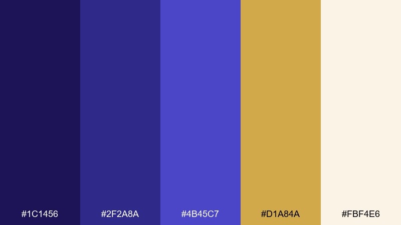
HEX: #1c1456 #2f2a8a #4b45c7 #d1a84a #fbf4e6
Mood: regal, celebratory, premium
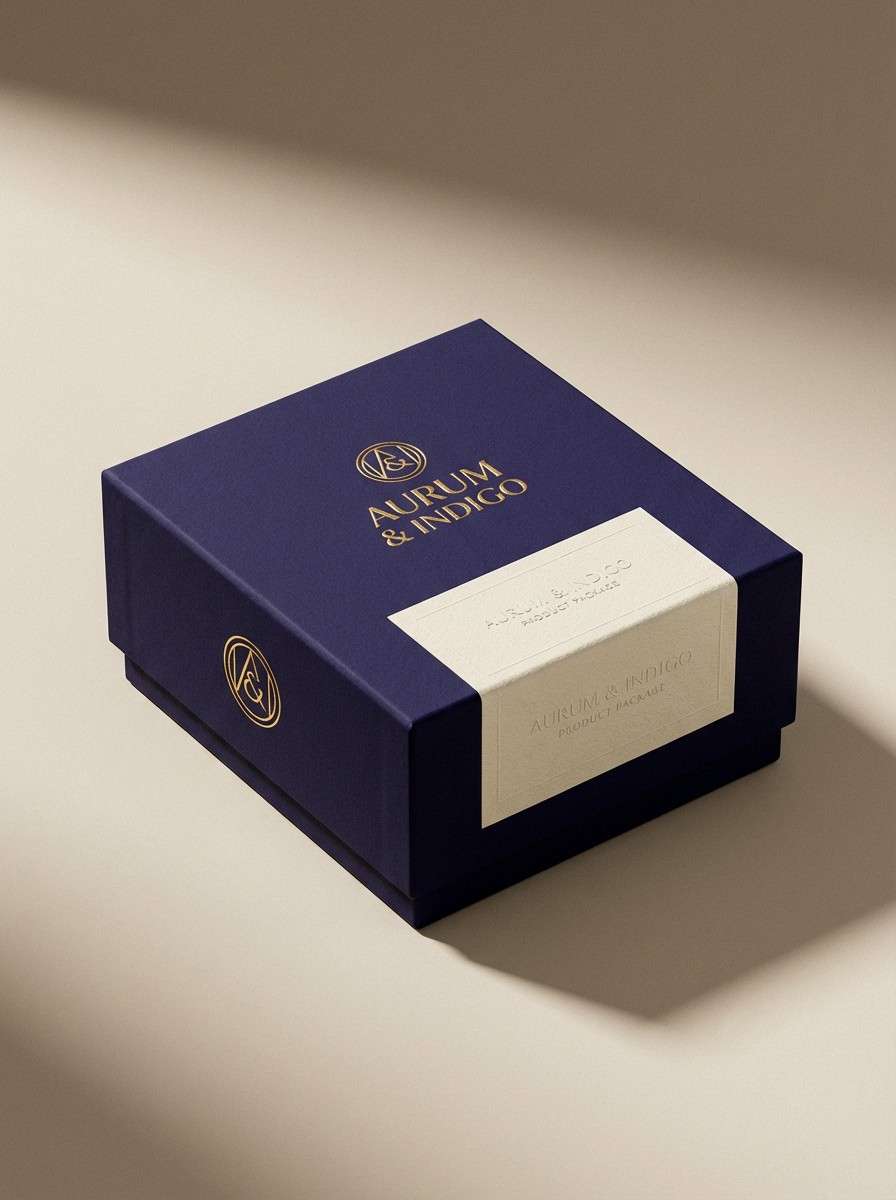
Best for: premium product packaging design
Regal indigo with gold leaf feels ceremonial, like a special edition release. For indigo color combinations that look expensive, anchor the design in the darkest tone and use gold only for logos, seals, or trim. Pair with cream as a soft buffer to avoid harsh contrast. Tip: simulate metallic ink with subtle gradients and sharp highlights on the gold elements.
Image example of royal indigo gold leaf generated using media.io
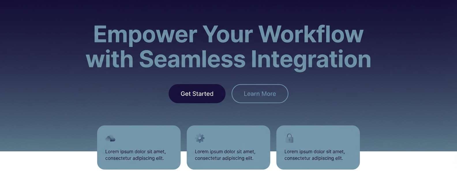
5) Stormy Harbor
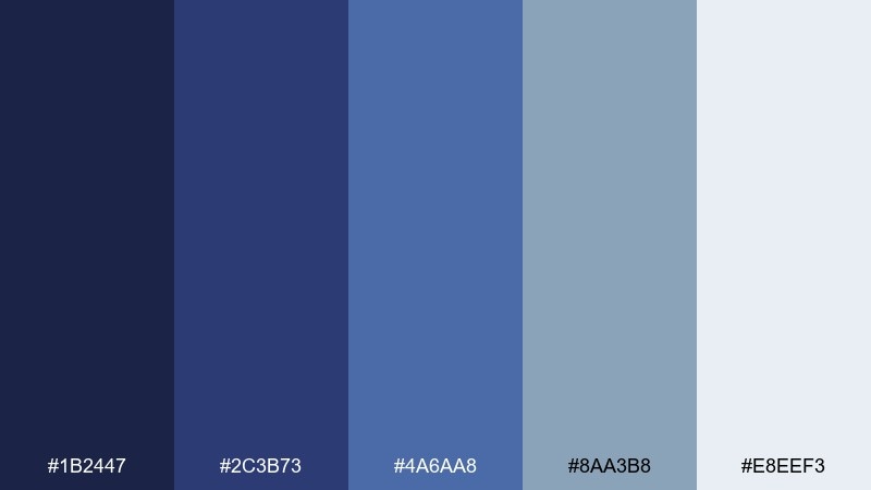
HEX: #1b2447 #2c3b73 #4a6aa8 #8aa3b8 #e8eef3
Mood: calm, coastal, dependable
Best for: SaaS landing page hero section
Stormy coastal blues feel steady and trustworthy, like waves under an overcast sky. Use the deepest indigo for your hero headline and navigation, then build sections with misty blue grays. Pair with simple line icons and generous spacing to keep it modern. Tip: reserve the palest tint for cards and feature blocks to improve scanability.
Image example of stormy harbor generated using media.io
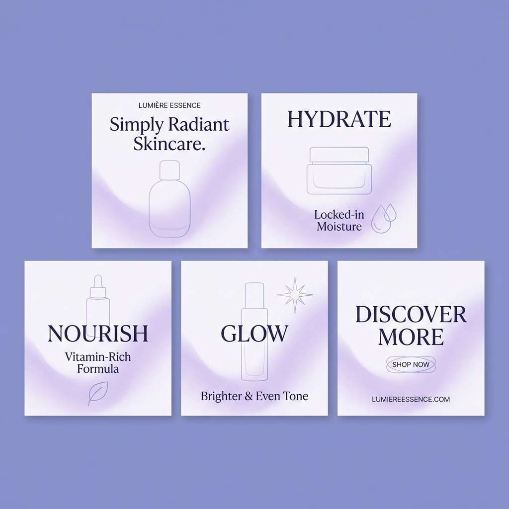
6) Lavender Dusk
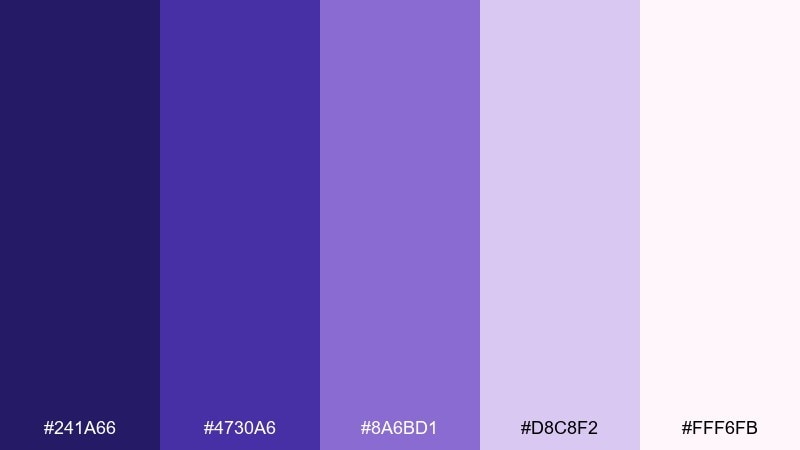
HEX: #241a66 #4730a6 #8a6bd1 #d8c8f2 #fff6fb
Mood: soft, dreamy, romantic
Best for: skincare social media carousel
Lavender dusk feels gentle and romantic, like twilight fading into a quiet evening. Use the deeper indigo for product names and keep the light lavender tints for backgrounds and soft shapes. Pair with clean sans-serif type and minimal product photography cutouts. Tip: add a subtle gradient from indigo to lilac on the first slide for an instant premium feel.
Image example of lavender dusk generated using media.io
7) Neon Nightlife
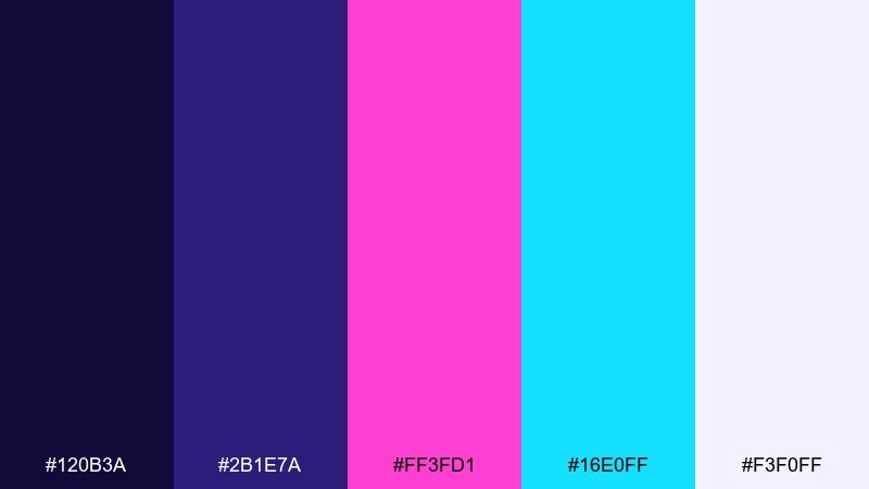
HEX: #120b3a #2b1e7a #ff3fd1 #16e0ff #f3f0ff
Mood: bold, clubby, high-energy
Best for: DJ flyer design
Neon nightlife hits hard with hot magenta and icy cyan against a dark base. Keep the indigo nearly-black for maximum glow and use neon accents only for names and key details. Pair with oversized type, angular shapes, and light streak effects. Tip: set secondary text in the pale lilac so it stays readable without competing with the neon.
Image example of neon nightlife generated using media.io

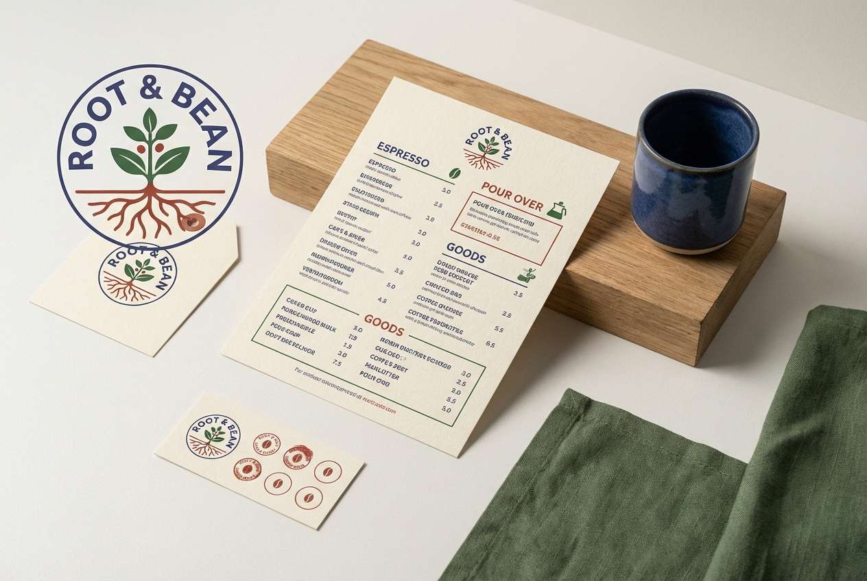
8) Heritage Tartan
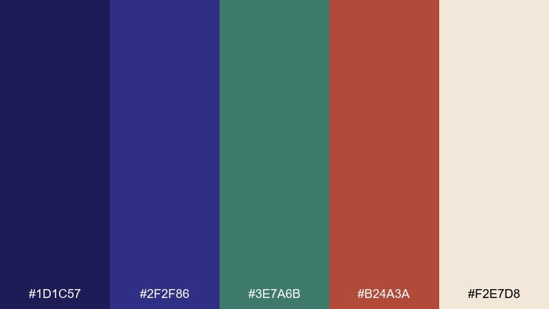
HEX: #1d1c57 #2f2f86 #3e7a6b #b24a3a #f2e7d8
Mood: heritage, warm, handcrafted
Best for: coffee shop brand identity
Heritage tartan warmth mixes deep indigo with evergreen and a brick-red accent. Use the indigo for logotypes and menu headings, then bring in the red sparingly for stamps, buttons, and calls to action. Pair with paper textures, serif type, and simple badge icons. Tip: keep backgrounds creamy to avoid a heavy, overly dark look.
Image example of heritage tartan generated using media.io
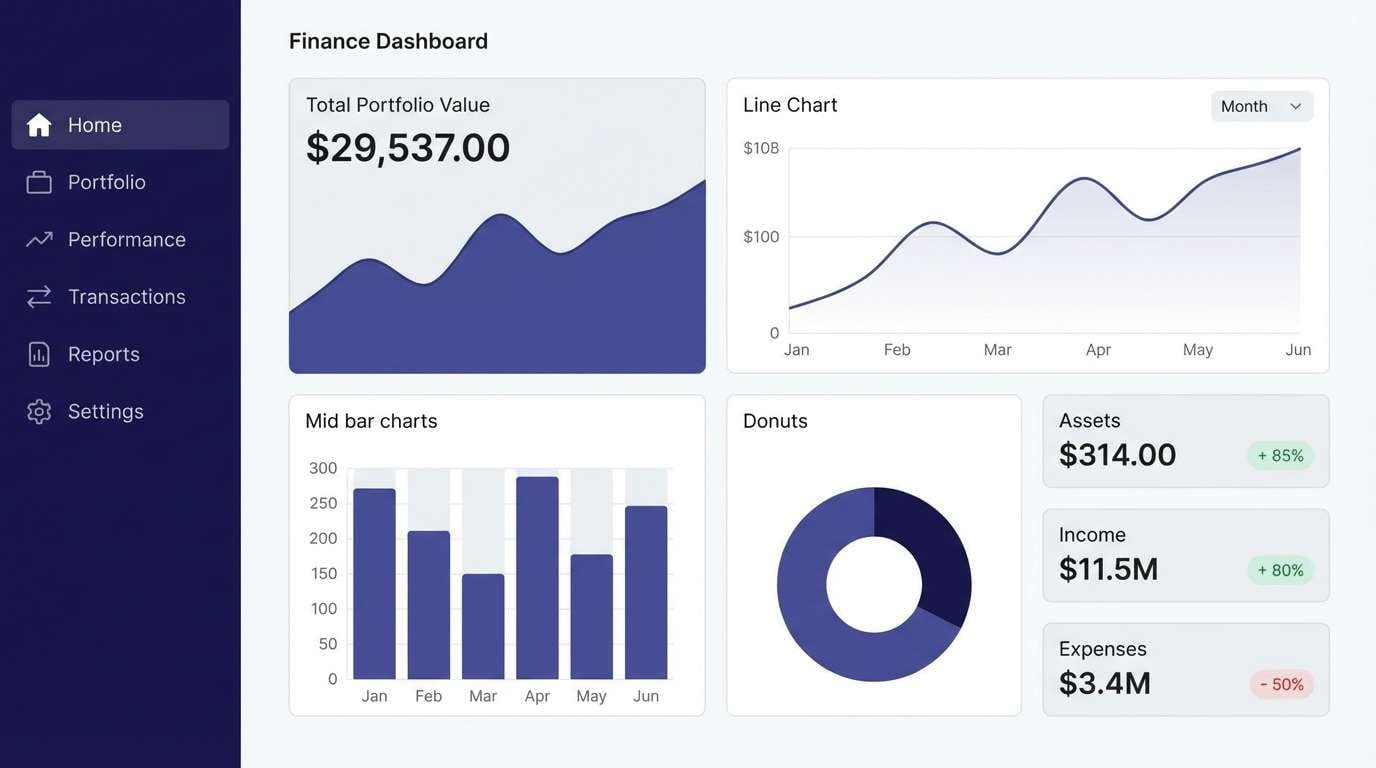
9) Minimal Indigo UI
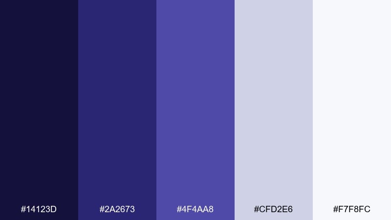
HEX: #14123d #2a2673 #4f4aa8 #cfd2e6 #f7f8fc
Mood: clean, modern, focused
Best for: finance dashboard UI mockup
Clean indigo neutrals feel focused and professional, like a well-organized workspace. This indigo color palette is ideal for dashboards: use the darkest tone for navigation, mid indigo for charts, and the pale grays for surfaces. Pair with thin dividers, rounded cards, and restrained iconography. Tip: reserve the brightest white for key metrics so your hierarchy is instantly clear.
Image example of minimal indigo ui generated using media.io
10) Botanical Indigo Garden
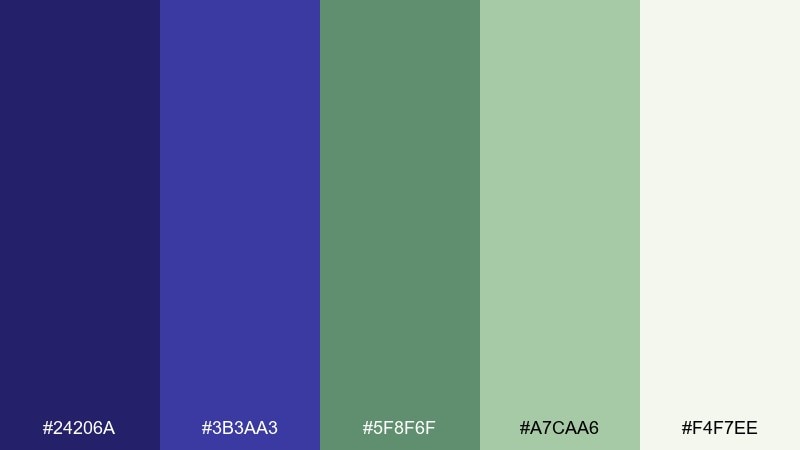
HEX: #24206a #3b3aa3 #5f8f6f #a7caa6 #f4f7ee
Mood: fresh, natural, calming
Best for: watercolor botanical illustration
Fresh garden greens with indigo shadows feel calming and alive, like leaves after rain. Use indigo for outlines and deeper petals, then layer soft greens for stems and background washes. Pair with off-white paper texture and delicate hand-lettering. Tip: keep your darkest shade limited to focal flowers so the illustration stays light and airy.
Image example of botanical indigo garden generated using media.io

11) Cocoa Indigo Cozy
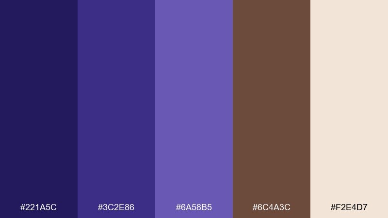
HEX: #221a5c #3c2e86 #6a58b5 #6c4a3c #f2e4d7
Mood: cozy, intimate, artisanal
Best for: handmade candle label design
Cozy cocoa browns with velvety indigo feel like winter evenings and warm mugs. Use indigo for the brand mark and scent name, then let cocoa tones frame the label and add warmth. Pair with kraft textures, minimal line drawings, and rounded serif type. Tip: print the darkest shade as a spot color to keep small text crisp on textured stock.
Image example of cocoa indigo cozy generated using media.io
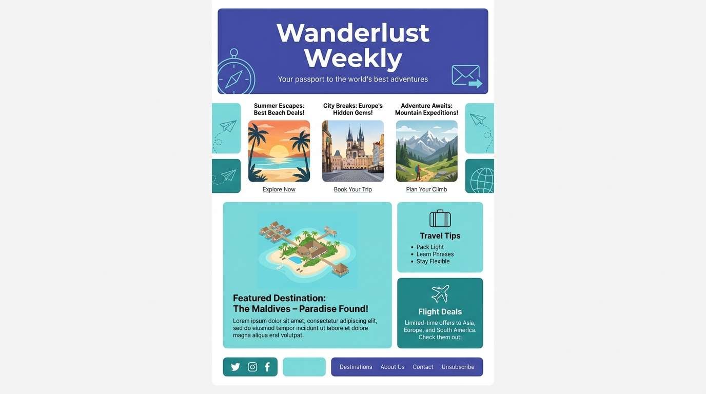
12) Oceanic Indigo Drift
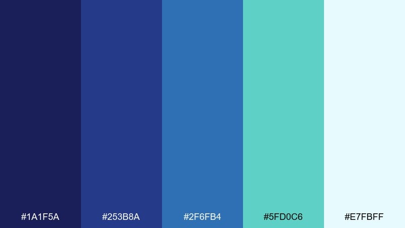
HEX: #1a1f5a #253b8a #2f6fb4 #5fd0c6 #e7fbff
Mood: refreshing, airy, adventurous
Best for: travel newsletter header
Oceanic drift feels refreshing and open, like sunlit water seen from above. Use indigo for the masthead and section titles, then let aqua and teal carry highlight blocks and dividers. Pair with clean grids, wide hero photos, and simple map icons. Tip: keep call-to-action buttons in teal with indigo text to stay bright but readable.
Image example of oceanic indigo drift generated using media.io
13) Indigo Blossom Wedding
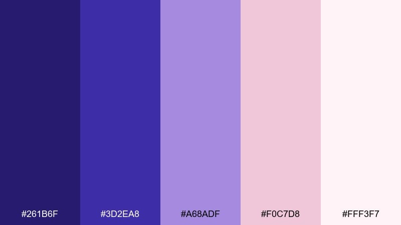
HEX: #261b6f #3d2ea8 #a68adf #f0c7d8 #fff3f7
Mood: romantic, elegant, celebratory
Best for: wedding invitation suite
Romantic blossoms with deep indigo feel elegant and timeless, like petals pressed into a keepsake book. Use indigo for names and borders, blush for accents, and the palest pink as the paper tone. Pair with script fonts sparingly and rely on a clean serif for readability. Tip: add a thin indigo frame to unify the suite across RSVP and details cards.
Image example of indigo blossom wedding generated using media.io

14) Techno Violet Grid
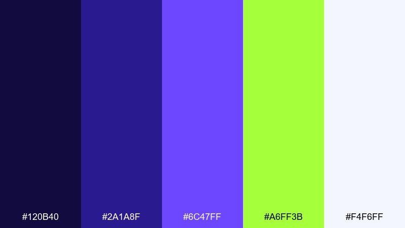
HEX: #120b40 #2a1a8f #6c47ff #a6ff3b #f4f6ff
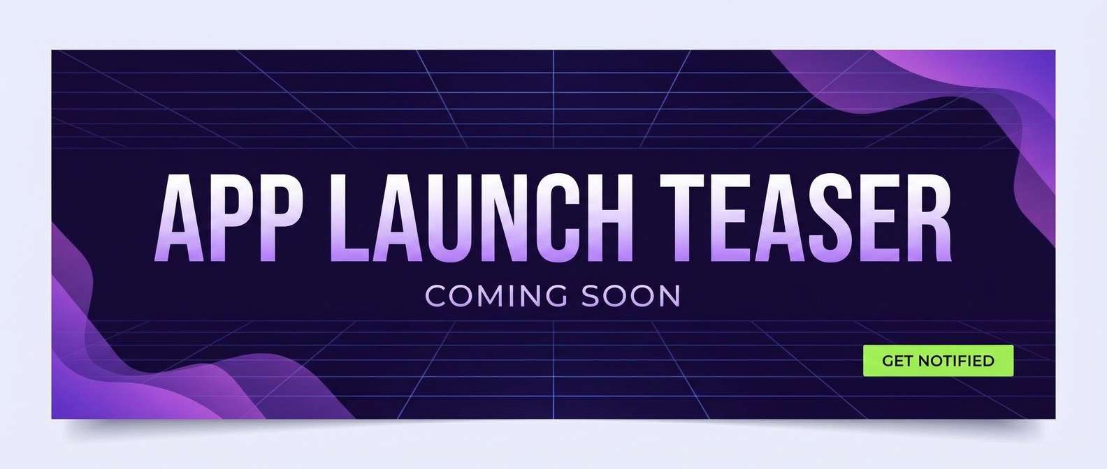
Mood: techy, edgy, high-contrast
Best for: app launch teaser banner
Techno violet with a sharp lime accent feels fast and futuristic, like LEDs on a dark console. Use indigo as the base for bold type and grid lines, then deploy lime only for buttons and short highlights. Pair with monospaced type, simple icons, and clean gradients. Tip: keep lime away from large blocks so the banner does not overwhelm the message.
Image example of techno violet grid generated using media.io
15) Indigo Terracotta Studio
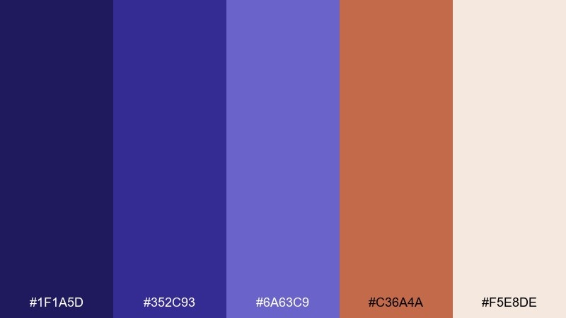
HEX: #1f1a5d #352c93 #6a63c9 #c36a4a #f5e8de
Mood: creative, grounded, contemporary
Best for: interior design portfolio website
Grounded terracotta with crisp indigo feels like a modern studio with clay, textiles, and sketches. These indigo color combinations shine when terracotta becomes the warm accent for buttons, links, and highlights. Pair with plenty of off-white space and large image grids for projects. Tip: use the mid indigo for captions and tags to keep typography softer than pure black.
Image example of indigo terracotta studio generated using media.io
16) Winter Indigo Frost
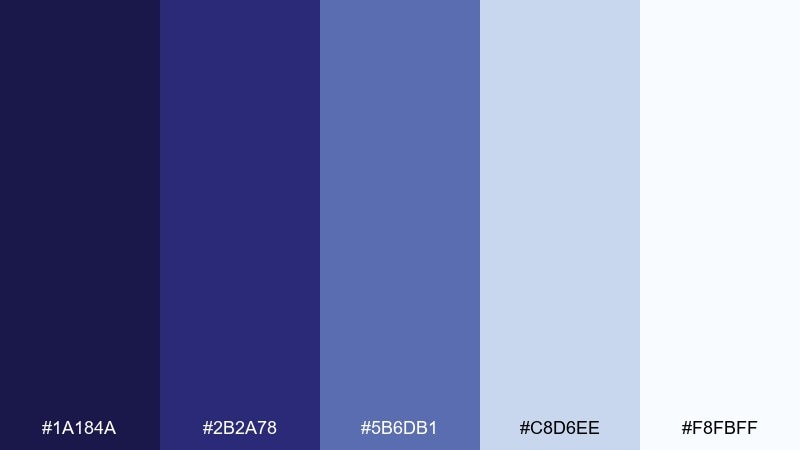
HEX: #1a184a #2b2a78 #5b6db1 #c8d6ee #f8fbff
Mood: cool, quiet, minimalist
Best for: corporate annual report cover
Winter frost tones feel quiet and polished, like fresh snow under a blue evening sky. Use dark indigo for the title and data callouts, and build the rest with icy blues for calm structure. Pair with thin rules, clean charts, and lots of breathing room. Tip: add a subtle indigo gradient bar to create depth without cluttering the cover.
Image example of winter indigo frost generated using media.io

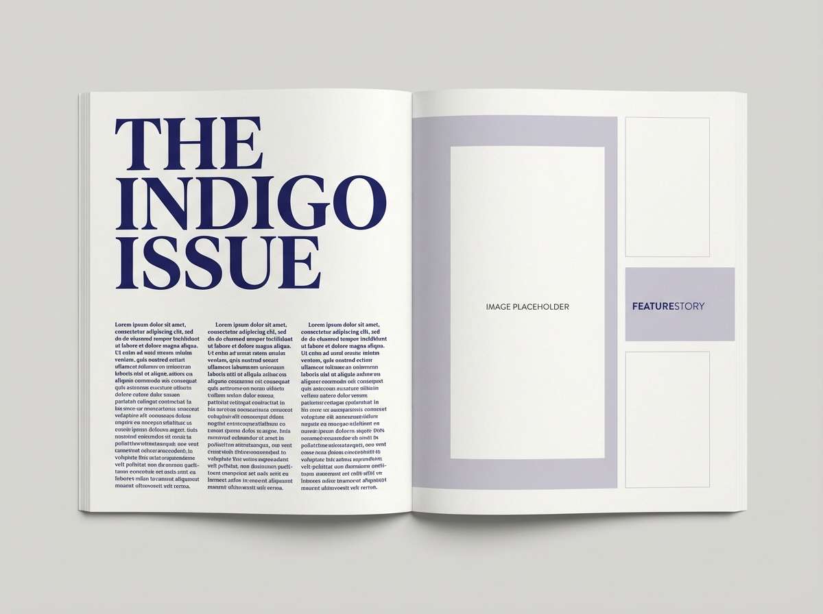
17) Gallery Indigo Editorial
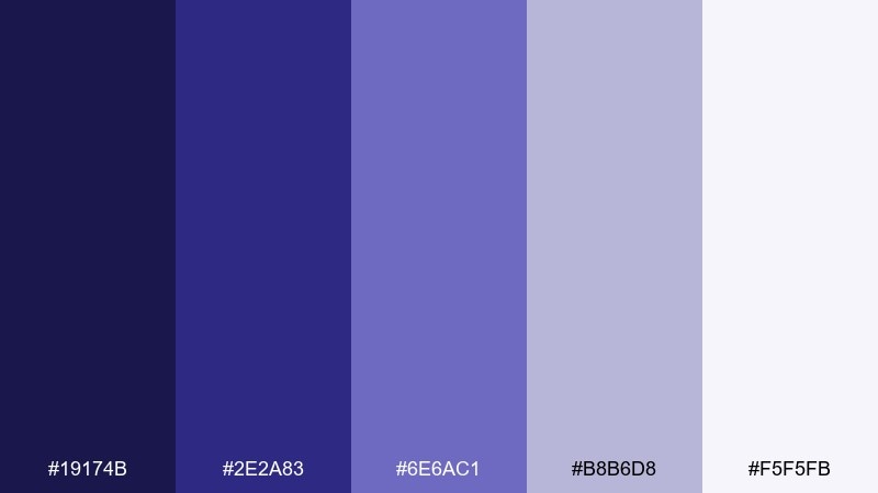
HEX: #19174b #2e2a83 #6e6ac1 #b8b6d8 #f5f5fb
Mood: artsy, structured, sophisticated
Best for: magazine feature layout
Sophisticated gallery tones feel curated, like a quiet exhibition with soft spotlights. An indigo color scheme works beautifully in editorial grids: use the darkest tone for headlines and pull quotes, and the pale lilac-gray for columns and captions. Pair with high-contrast photography and generous margins. Tip: keep one accent shade for section markers to guide the reader through long pages.
Image example of gallery indigo editorial generated using media.io
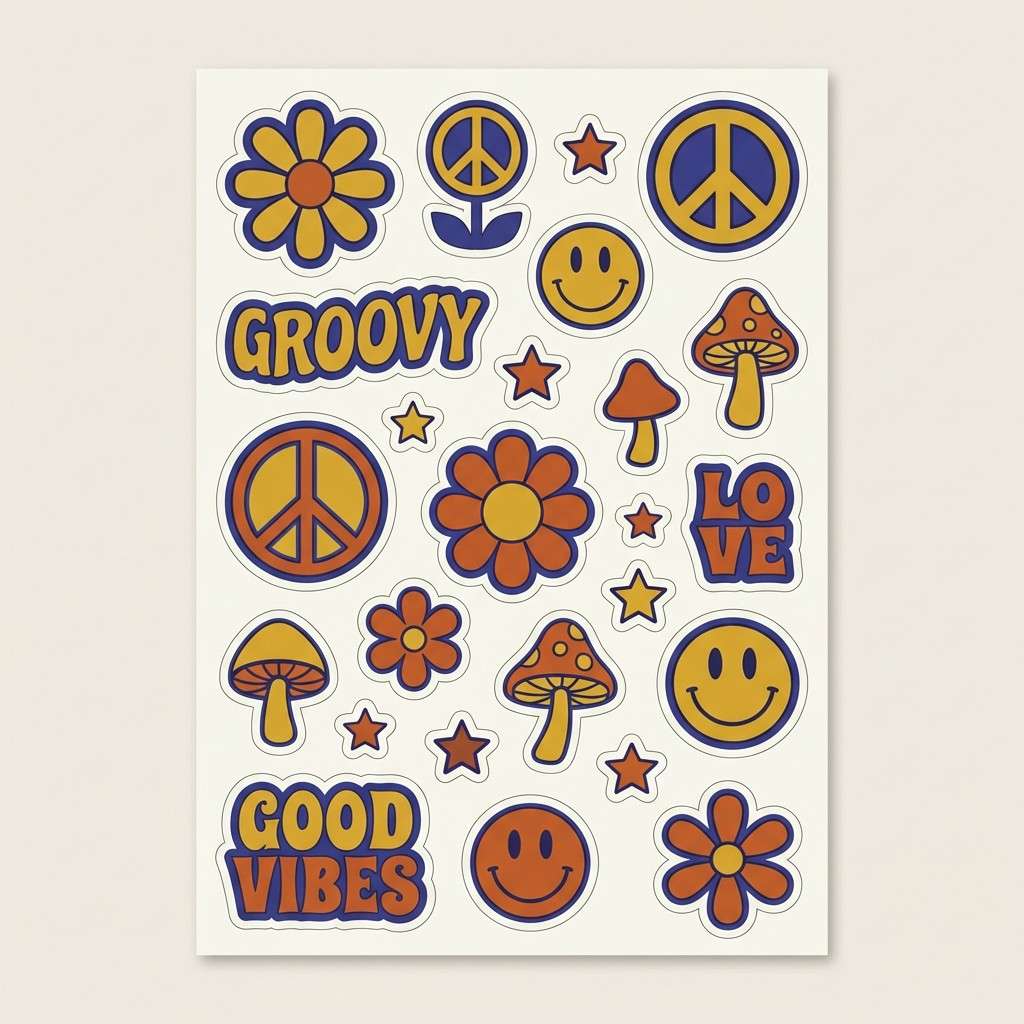
18) Retro Indigo Pop
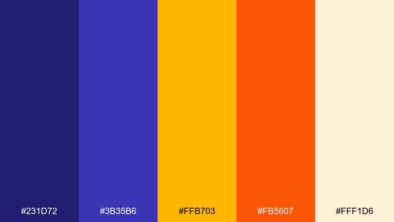
HEX: #231d72 #3b35b6 #ffb703 #fb5607 #fff1d6
Mood: playful, retro, punchy
Best for: brand sticker pack design
Retro pop energy jumps off the page with warm oranges and sunny yellow against indigo. Use indigo for outlines and type to keep the set cohesive, then let the warm hues fill shapes and badges. Pair with chunky typography and simple illustrated icons. Tip: keep backgrounds creamy so the orange and yellow do not feel too harsh.
Image example of retro indigo pop generated using media.io
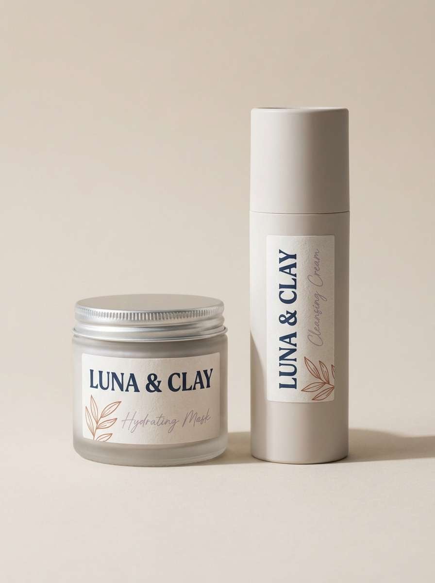
19) Indigo Clay Packaging
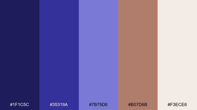
HEX: #1f1c5c #35319a #7b79d6 #b07d6b #f3ece6
Mood: modern, earthy, boutique
Best for: cosmetic packaging mockup
Earthy clay with cool indigo feels boutique and tactile, like ceramic jars on a studio shelf. Use indigo for brand marks and ingredient highlights, while clay tones soften the overall look. Pair with minimal labels, fine-line illustrations, and warm off-white backgrounds. Tip: keep the brightest lavender only for small secondary elements so the packaging stays grounded.
Image example of indigo clay packaging generated using media.io
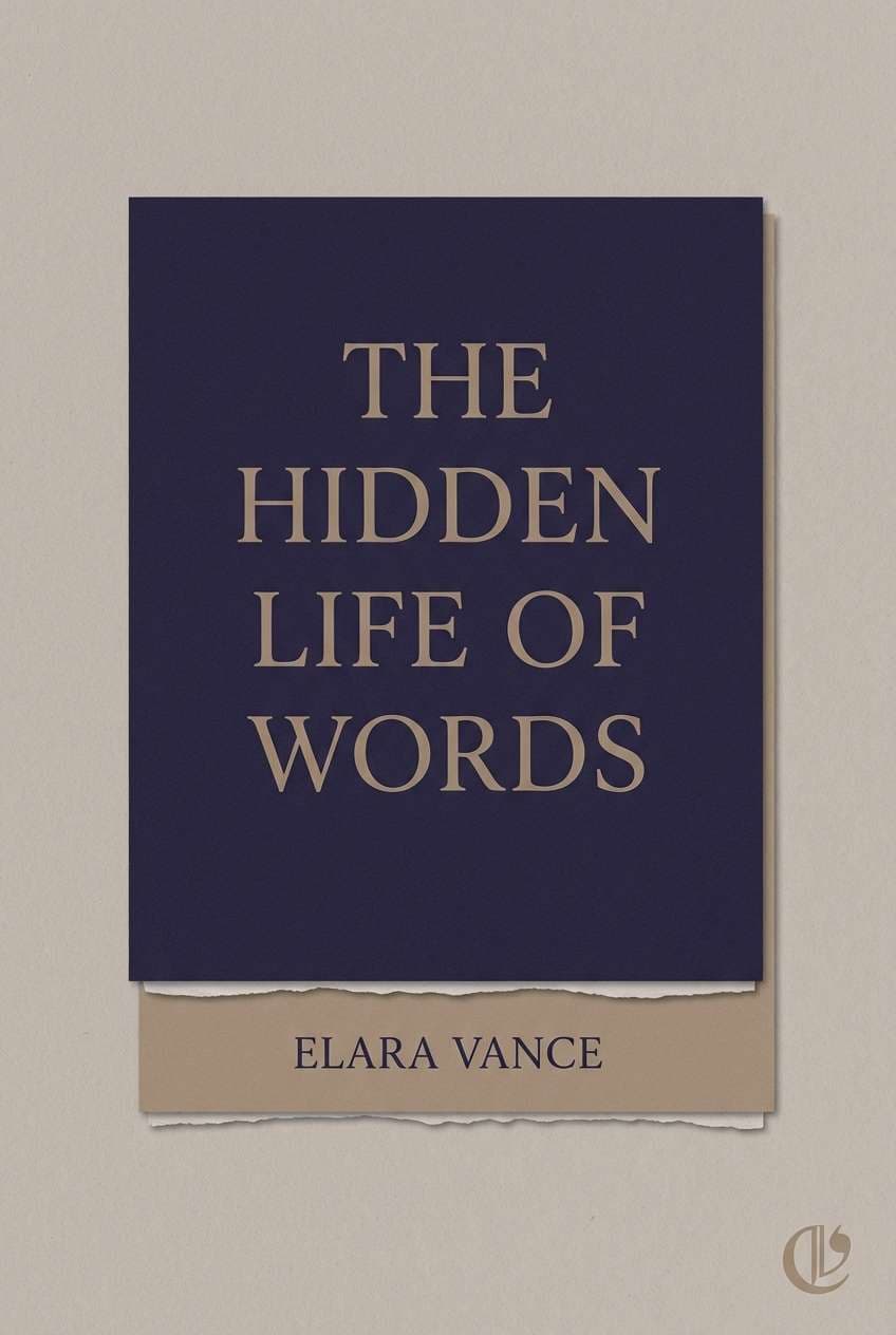
20) Quiet Library Tones
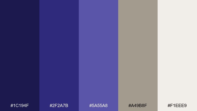
HEX: #1c194f #2f2a7b #5a55a8 #a49b8f #f1eee9
Mood: calm, scholarly, timeless
Best for: book cover design
Quiet library tones feel calm and timeless, like stacked volumes and soft linen. This indigo color palette pairs beautifully with warm taupe for a mature, literary mood without looking dated. Pair with classic serif typography, subtle texture, and minimal ornament. Tip: set the title in the darkest shade and use taupe for author name to create a clear hierarchy.
Image example of quiet library tones generated using media.io
What Colors Go Well with Indigo?
Indigo pairs beautifully with warm neutrals like cream, ivory, beige, and taupe, which soften its depth and keep layouts readable. These combinations are especially strong for editorial design, packaging, and stationery.
For a modern contrast, try indigo with bright accents like teal, cyan, lime, or magenta. Keep the accent color limited to buttons, icons, or key details so the palette stays clean and intentional.
If you want a gentle, premium look, combine indigo with lilac, lavender, and soft blush tones. This creates smooth transitions for gradients, backgrounds, and brand systems that need a calm mood.
How to Use a Indigo Color Palette in Real Designs
Start by assigning roles: use the darkest indigo for headlines, nav, and primary text; reserve mid indigos for UI components and charts; and keep light tints for surfaces, cards, and spacing. This keeps hierarchy consistent across screens.
In print, indigo works best when you balance it with warm paper-like tones (cream, blush, off-white) and add texture through matte finishes, embossing, or grain. Metallic gold or copper can be a strong accent, but it should stay secondary.
For branding, choose one “signature” indigo and one accent color, then build supporting tints for backgrounds and hover states. A small, repeatable system will look more premium than using too many saturated hues at once.
Create Indigo Palette Visuals with AI
If you already have HEX codes, you can generate consistent concept visuals by describing the scene, layout type (poster, UI, packaging), and where indigo should dominate. Adding materials (matte paper, foil, glass) helps the AI match the intended finish.
Use the prompts included under each palette as a starting point, then swap the subject (e.g., “candle label” to “coffee bag”) while keeping the same color direction. This is a fast way to explore multiple mockups without rebuilding designs from scratch.
With Media.io, you can create indigo palette visuals for moodboards, brand explorations, and presentation slides in just a few clicks.
Indigo Color Palette FAQs
-
What HEX code is considered “indigo”?
There isn’t one universal indigo HEX, but many design-friendly indigos sit around deep blue-violet values (for example, shades like #2f2a6e or #221a63). Pick a base indigo that works well with your text contrast and brand mood. -
Is indigo closer to blue or purple?
Indigo is typically between blue and violet. Some palettes push bluer for a calmer, more corporate feel, while others lean more purple for a creative, editorial vibe. -
What colors pair best with indigo for a luxury look?
Cream/ivory plus gold accents is a classic premium pairing. You can also use warm taupe or soft blush to keep indigo feeling refined instead of overly stark. -
Can I use indigo in UI design without hurting readability?
Yes—use deep indigo for navigation and headings, but keep main surfaces light (off-white or pale gray). Always verify contrast ratios for text, especially on mid-indigo backgrounds. -
What’s a good accent color for indigo in modern branding?
Teal/cyan gives a crisp, tech-forward contrast, while terracotta adds a grounded, contemporary warmth. For high-energy designs, magenta or lime can work well when used sparingly. -
How do I avoid making an indigo palette feel too dark?
Increase negative space with warm light neutrals, limit the darkest shade to key elements, and use softer mid-tones for large areas. In print, matte finishes and light paper tones also help keep the look airy. -
How can I generate matching images for an indigo palette quickly?
Use a text-to-image prompt that specifies the design type (poster, packaging, UI), lighting/materials, and that indigo is the dominant color with specific accent hues. Media.io lets you iterate quickly by tweaking the prompt while keeping the palette direction consistent.


