


 ChatGPT
 Perplexity
 Gemini
 Claude
 Grok
Grok
Dark blue palettes are a go-to for brands and interfaces that need instant trust, calm authority, and a premium feel. From midnight navy to slate and sea tones, dark blue is versatile across web, print, and interiors.
Below are 20 curated dark blue color palette ideas with HEX codes, plus practical pairing and contrast tips to help you use them confidently.
In this article
Why Dark Blue Palettes Work So Well
Dark blue communicates reliability and competence without the harshness of pure black. That’s why it’s common in finance, healthcare, logistics, and B2B SaaS where clarity and trust are essential.
It also plays well with both warm and cool accents: gold for luxury, mint for modern tech energy, terracotta for an earthy lifestyle vibe, or soft neutrals for editorial calm.
From a usability standpoint, dark blues offer flexible contrast options. With the right off-white background and a consistent “blue ladder” for UI layers, you can create depth while keeping text readable.
20+ Dark Blue Color Palette Ideas (with HEX Codes)
1) Midnight Harbor
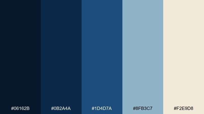
HEX: #06162B #0B2A4A #1D4D7A #8FB3C7 #F2E9D8
Mood: moody, maritime, confident
Best for: brand identity for finance or shipping startups
Moody harbor blues and sea-glass highlights evoke late-night docks and steady confidence. Use this dark blue color palette for logos, pitch decks, and landing pages where trust matters. Pair it with warm ivory for approachable contrast and keep the light blue for charts or secondary buttons. Tip: reserve the deepest navy for headers and use ivory as the main background to improve readability.
Image example of midnight harbor generated using media.io
Create palette-perfect visuals with Media.io. Powered by Wan 2.7 Image, it helps you generate and edit images with precise color control, consistent tones, and ready-to-use styles in your browser.

2) Ink and Ivory
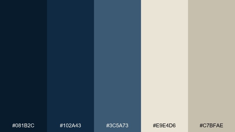
HEX: #081B2C #102A43 #3C5A73 #E9E4D6 #C7BFAE
Mood: editorial, minimal, refined
Best for: magazine layouts and long-form blog design
Inky blues against warm ivory feel like classic print on textured paper. The mid-slate blue supports subheads and pull quotes without overpowering body text. Pair with muted beige for margins, dividers, and subtle UI states to keep the layout calm. Tip: use the darkest ink for headings only and keep paragraphs in the slate tone for less eye strain.
Image example of ink and ivory generated using media.io
3) Stormy Slate
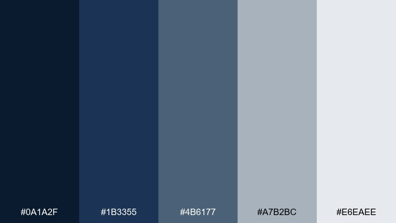
HEX: #0A1A2F #1B3355 #4B6177 #A7B2BC #E6EAEE
Mood: cool, overcast, professional
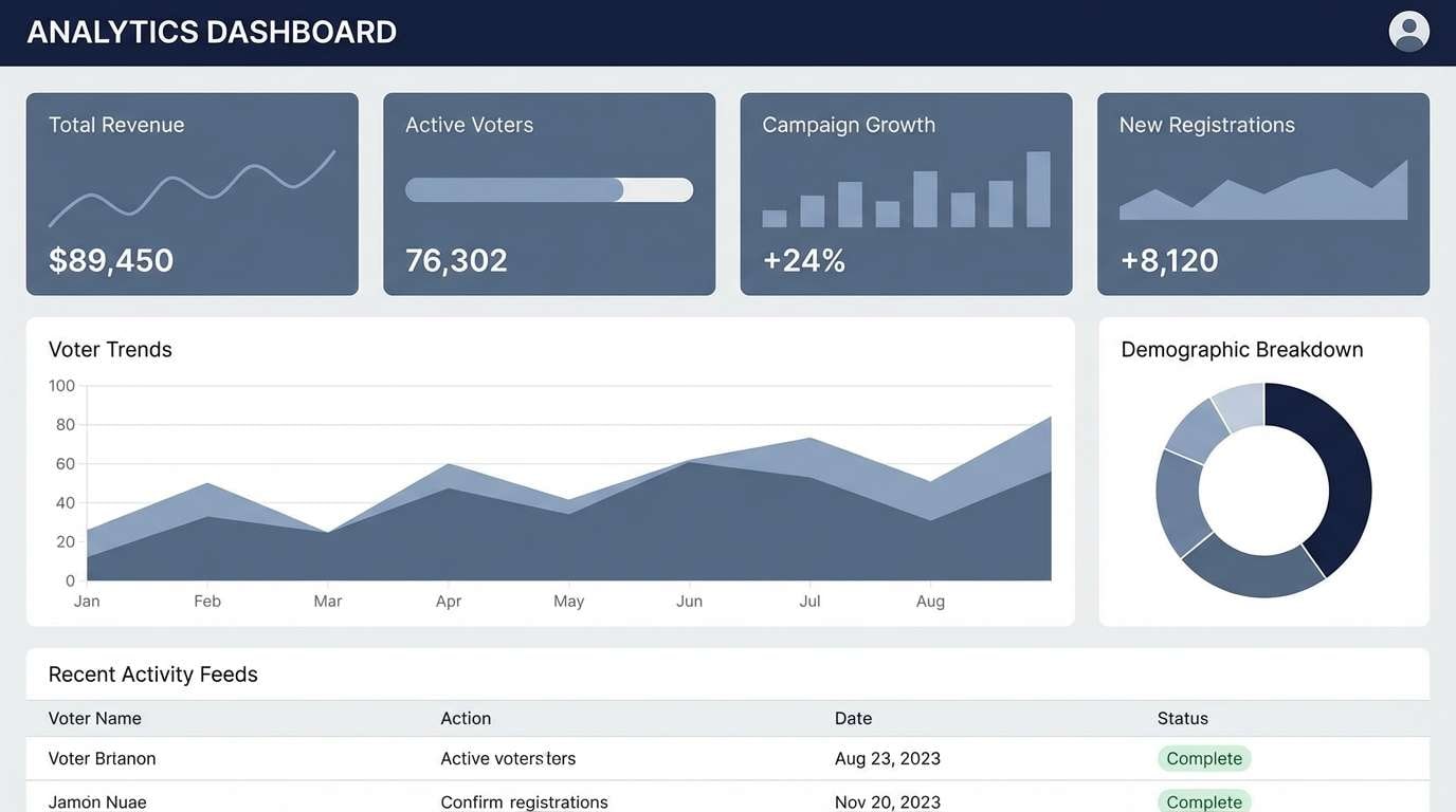
Best for: corporate reports and data-heavy dashboards
Cool storm tones suggest focus, clarity, and a calm under pressure. The slate gradient gives you multiple neutral steps for cards, tables, and hover states. Pair the near-white with the deep navy to keep contrast accessible, and let the mid blues do the supporting work. Tip: assign each blue to a UI layer so components stay consistent across pages.
Image example of stormy slate generated using media.io
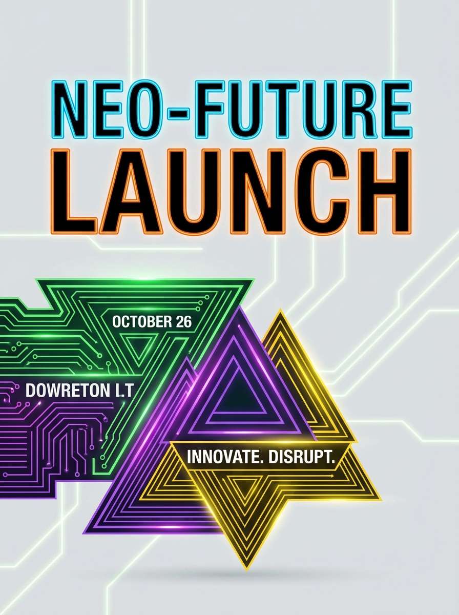
4) Sapphire Neon
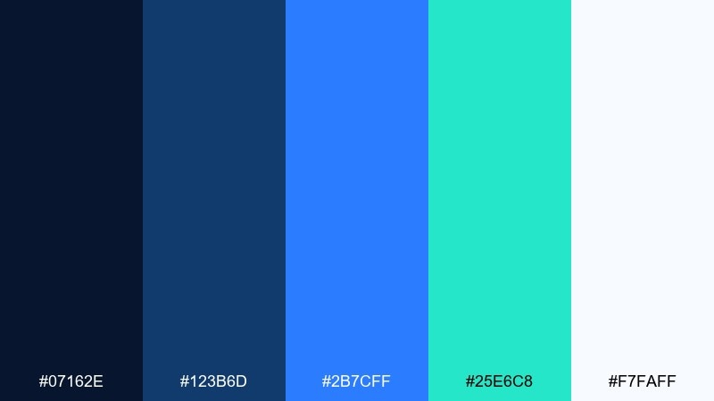
HEX: #07162E #123B6D #2B7CFF #25E6C8 #F7FAFF
Mood: electric, futuristic, high-contrast
Best for: gaming posters and tech launch banners
Electric sapphire with neon mint feels like city lights cutting through midnight. Use the bright blue for calls to action and the mint for highlights, badges, or progress indicators. The deep base keeps everything grounded while the near-white prevents the look from turning too heavy. Tip: keep neon accents under 15 percent of the layout to avoid visual fatigue.
Image example of sapphire neon generated using media.io
5) Deep Sea Botanica
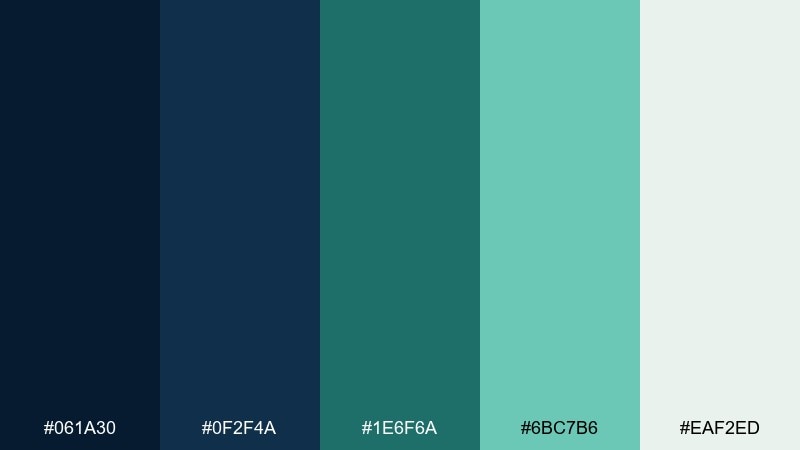
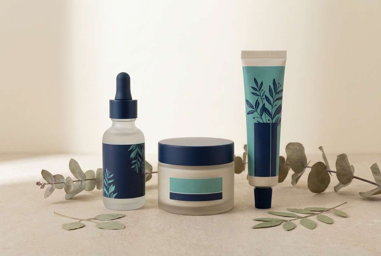
HEX: #061A30 #0F2F4A #1E6F6A #6BC7B6 #EAF2ED
Mood: fresh, aquatic, calming
Best for: spa branding and botanical packaging
Deep sea blues with algae greens evoke coastal air and clean water. The teal steps are ideal for labels, ingredient callouts, and subtle patterns, while the pale mist keeps it airy. Pair with matte paper textures or soft gradients to enhance the soothing feel. Tip: use the darkest tone for brand marks and the light mist for product backgrounds.
Image example of deep sea botanica generated using media.io
6) Observatory Gold
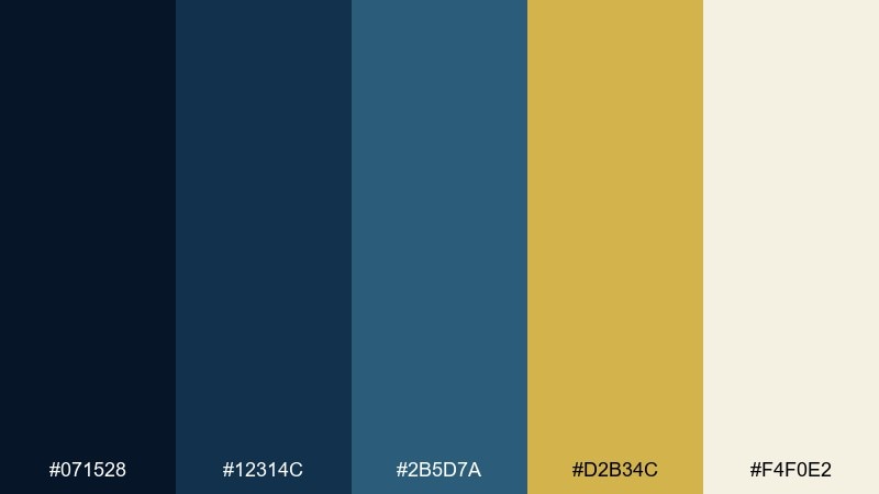
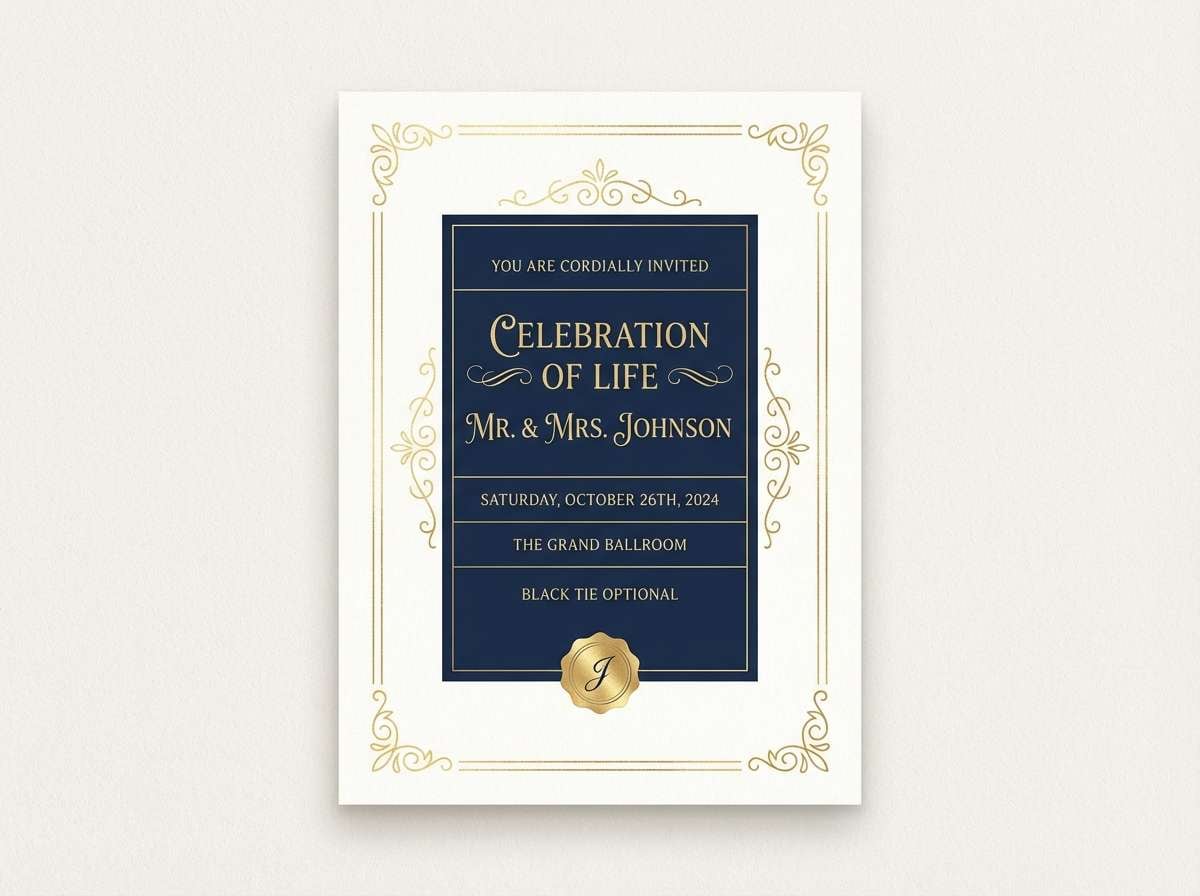
HEX: #071528 #12314C #2B5D7A #D2B34C #F4F0E2
Mood: luxury, scholarly, timeless
Best for: premium branding and event invitations
Night-sky blues with a gold accent feel like stargazing through a polished brass telescope. The metallic note adds instant hierarchy for seals, monograms, or key pricing details. Pair with warm off-white to keep the palette elegant rather than flashy. Tip: use gold sparingly on only the most important elements for a truly premium finish.
Image example of observatory gold generated using media.io
7) Denim Clay
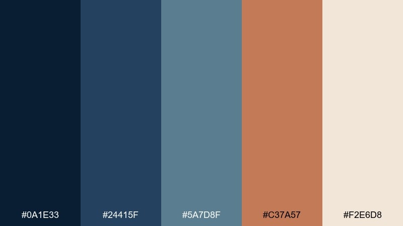
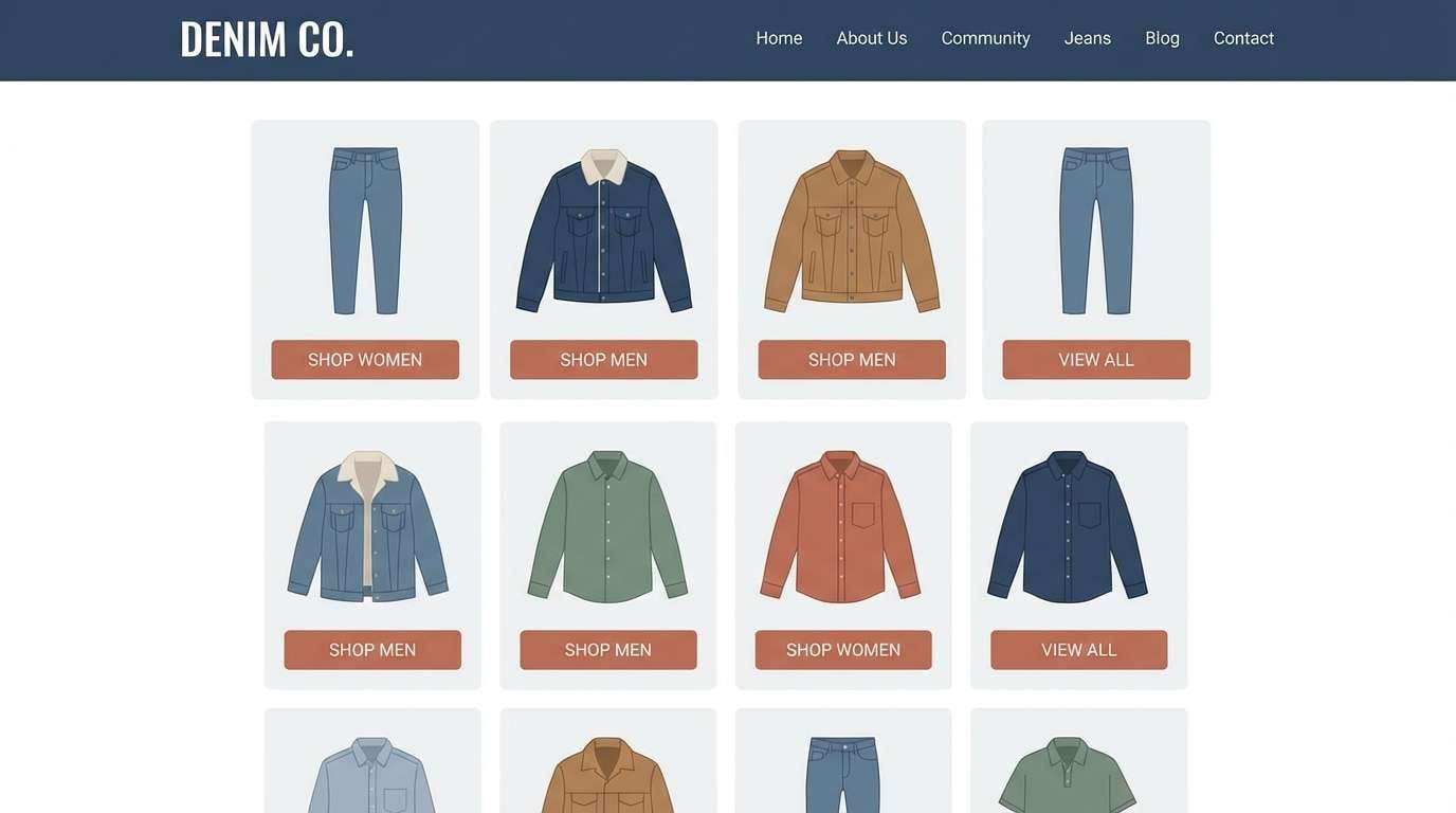
HEX: #0A1E33 #24415F #5A7D8F #C37A57 #F2E6D8
Mood: earthy, casual, approachable
Best for: lifestyle blogs and handmade product shops
Denim blues with warm clay create a grounded, friendly look that feels lived-in. Use clay for buttons, price tags, or featured quotes, and lean on the lighter blue for backgrounds and sections. Pair with natural textures like linen, kraft paper, or light wood to strengthen the handmade vibe. Tip: keep the cream as your main canvas so the clay reads as a confident accent.
Image example of denim clay generated using media.io
8) Northern Lights
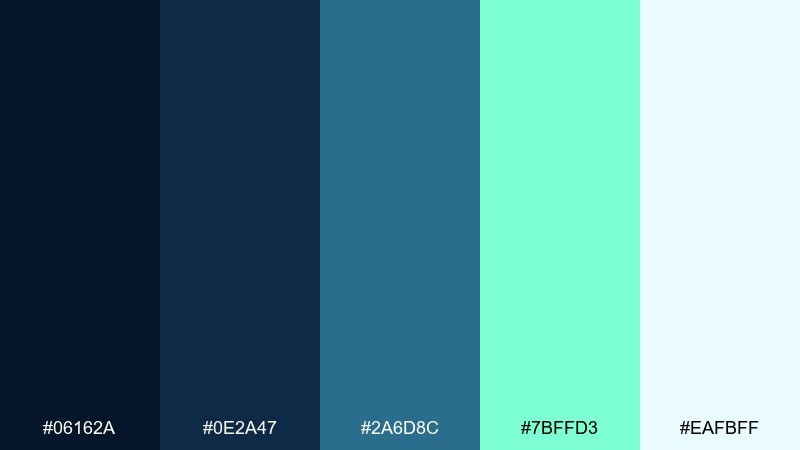
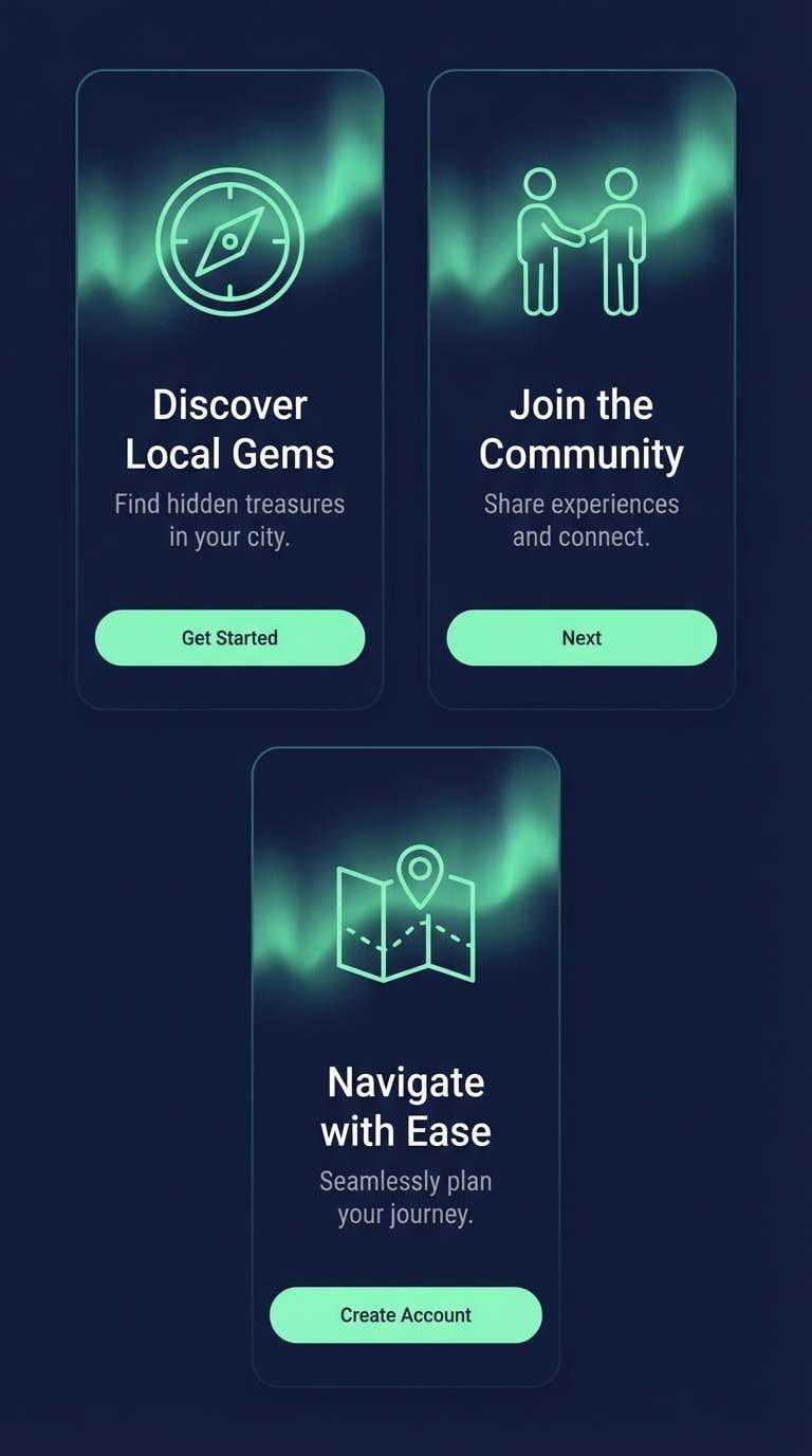
HEX: #06162A #0E2A47 #2A6D8C #7BFFD3 #EAFBFF
Mood: icy, luminous, adventurous
Best for: travel campaigns and outdoor app onboarding
Icy blues with an aurora green pop evoke crisp air and wide-open skies. These dark blue color combinations work best when the neon-like mint is used as a guided highlight for steps, pins, or key icons. Pair with plenty of white space to keep the glow effect believable and modern. Tip: test the mint on dark backgrounds for accessibility, then dial it back with a softer teal if needed.
Image example of northern lights generated using media.io
9) Museum Marble
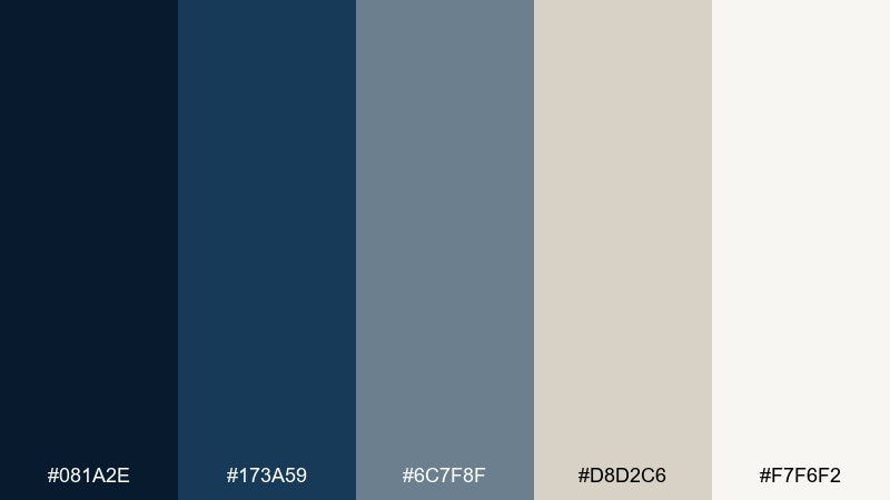
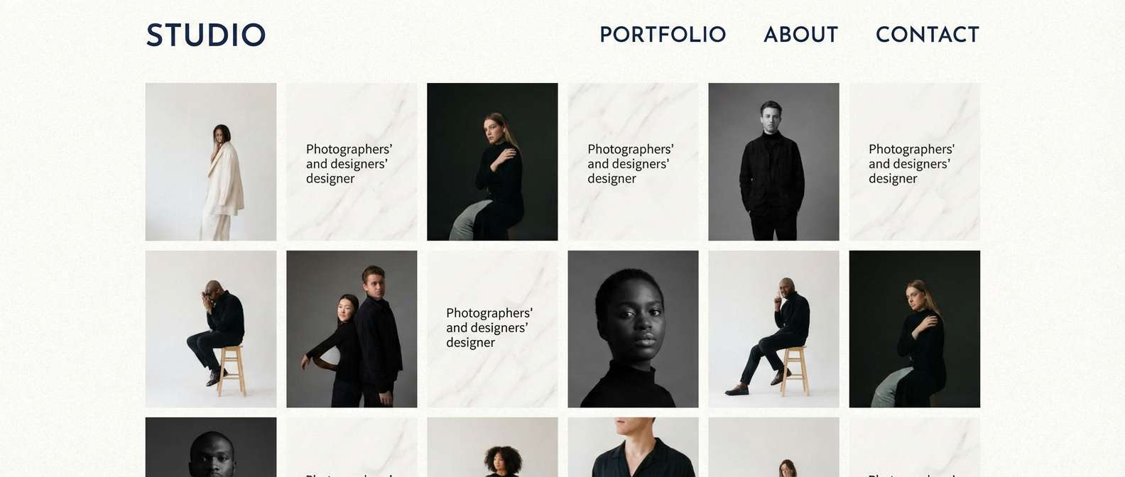
HEX: #081A2E #173A59 #6C7F8F #D8D2C6 #F7F6F2
Mood: quiet, curated, sophisticated
Best for: portfolio sites and gallery signage
Quiet blues and marble neutrals feel like a calm museum hall with soft spotlights. The greige and off-white give you gallery-wall breathing room, while the darker tones provide structure for navigation and captions. Pair with subtle linework and generous spacing to keep the work front and center. Tip: use the medium gray-blue for secondary text so titles stay crisp in navy.
Image example of museum marble generated using media.io
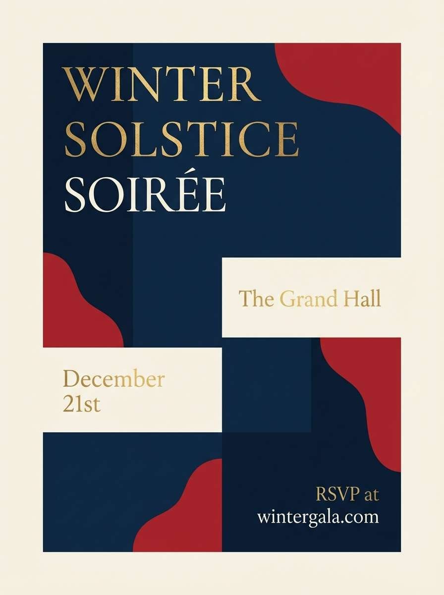
10) Winterberry Night
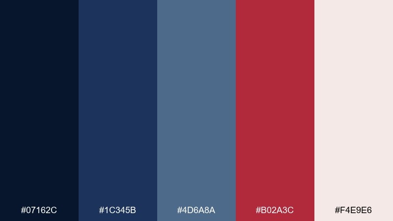
HEX: #07162C #1C345B #4D6A8A #B02A3C #F4E9E6
Mood: festive, dramatic, romantic
Best for: holiday promos and evening event branding
Berry red against deep blues feels like candlelight on a winter evening. Use the red for emphasis, sale tags, or RSVP details, and keep the blues for the main structure and typography. Pair with soft blushy off-white to prevent harsh contrast while staying elegant. Tip: limit red to a single accent role so it reads intentional rather than noisy.
Image example of winterberry night generated using media.io
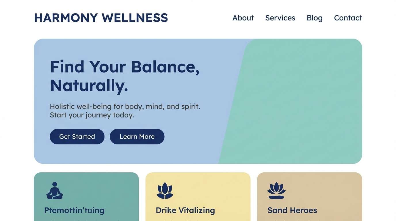
11) Coastal Chalk
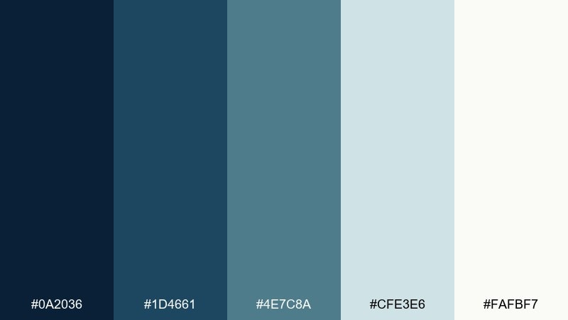
HEX: #0A2036 #1D4661 #4E7C8A #CFE3E6 #FAFBF7
Mood: airy, coastal, clean
Best for: wellness sites and beach rental branding
Chalky sea tones bring a breezy, sun-washed calm without losing depth. The pale aqua works beautifully for section backgrounds, while navy keeps navigation and headlines sharp. Pair with soft photography and minimal icons to maintain that coastal simplicity. Tip: avoid pure black type here and use the darker blue for a gentler reading experience.
Image example of coastal chalk generated using media.io
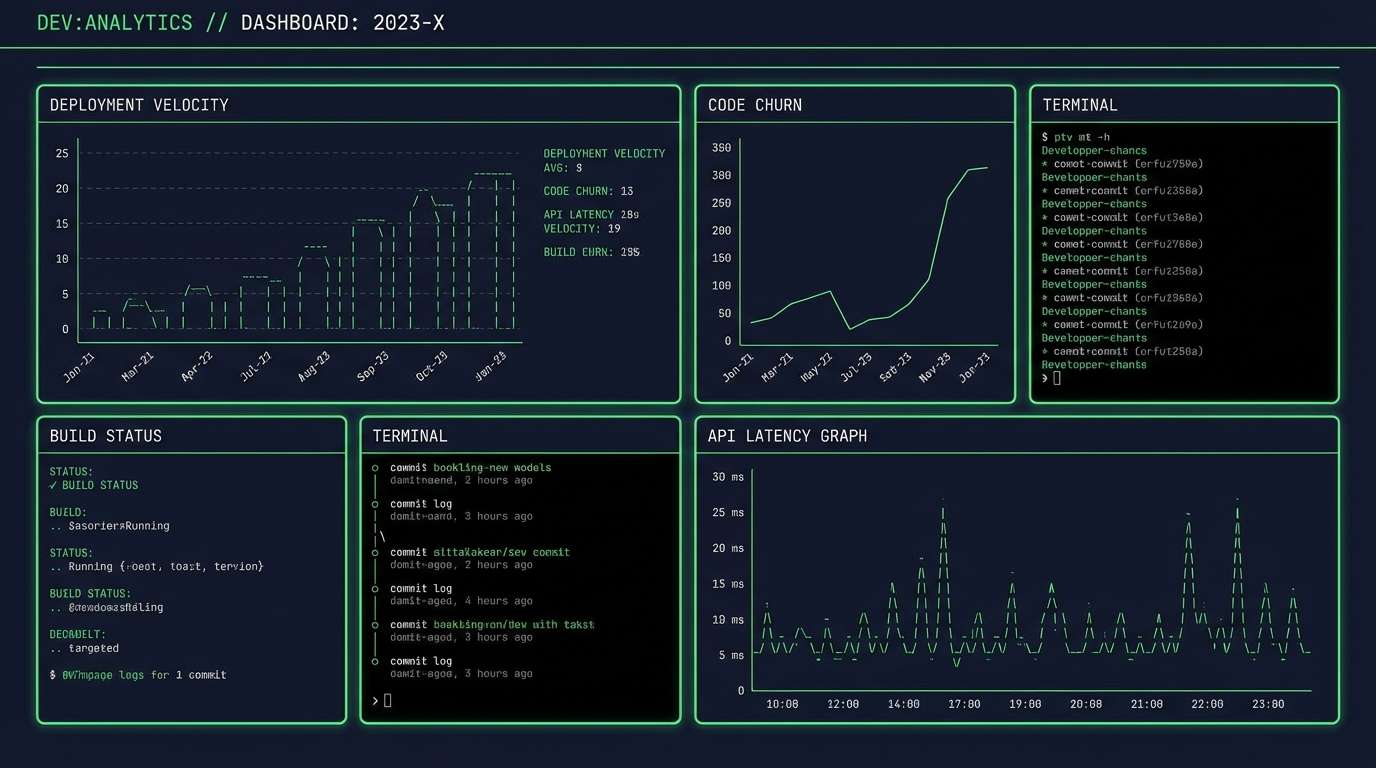
12) Tech Noir
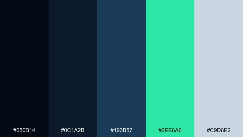
HEX: #050B14 #0C1A2B #193B57 #2EE6A6 #C9D6E2
Mood: sleek, nocturnal, high-tech
Best for: SaaS dashboards and developer tools
Noir navy with a sharp green accent feels like a command center at night. The bright green is perfect for success states, toggles, and key metrics, while the grayed blue supports secondary panels. Pair with subtle dividers and consistent spacing so the dark UI stays readable. Tip: use the light gray-blue for body text and keep pure white for only the most critical numbers.
Image example of tech noir generated using media.io
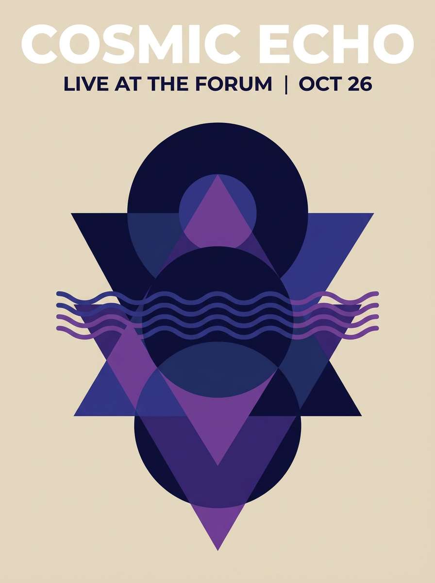
13) Velvet Stage
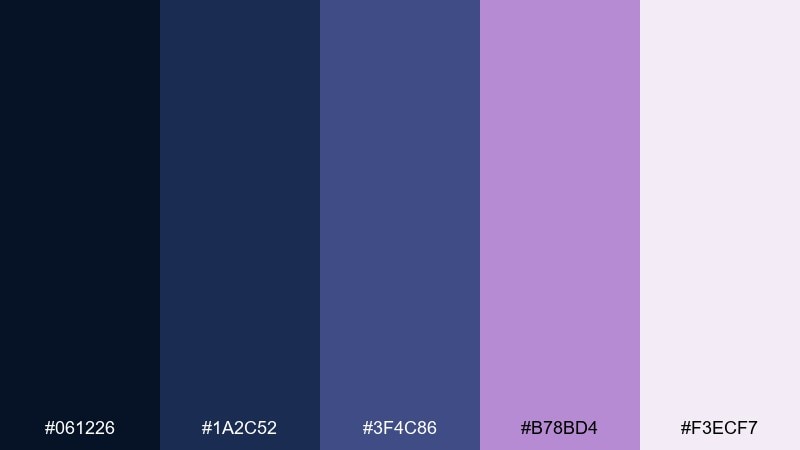
HEX: #061226 #1A2C52 #3F4C86 #B78BD4 #F3ECF7
Mood: theatrical, plush, artistic
Best for: music promos and creative studio branding
Velvet blues with lilac lighting feel like a stage curtain opening to a dreamy performance. Use the purple accent for artist names, featured dates, or highlight strokes, and keep navy for the main type. Pair with soft gradients or grain to add depth without clutter. Tip: set the light lavender as a background tint to make the darker blues feel richer.
Image example of velvet stage generated using media.io
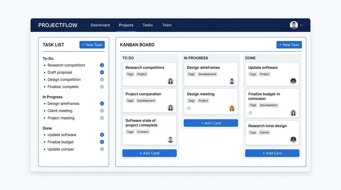
14) Blueprint Workspace
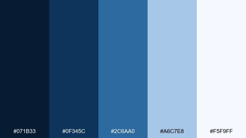
HEX: #071B33 #0F345C #2C6AA0 #A6C7E8 #F5F9FF
Mood: focused, structured, modern
Best for: project management UI and B2B landing pages
Blueprint blues feel methodical and optimistic, like plans coming together on a clean desk. The brighter mid-blue is ideal for primary buttons, links, and chart series, while pale sky tones handle backgrounds. Pair with simple icons and a clear grid to reinforce the organized feel. Tip: keep the darkest navy for the top bar and use the lightest tone for cards to create instant hierarchy.
Image example of blueprint workspace generated using media.io
15) Arctic Steel
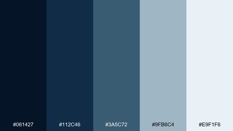
HEX: #061427 #112C46 #3A5C72 #9FB6C4 #E9F1F6
Mood: crisp, industrial, calm
Best for: enterprise presentations and infographics
Crisp steel blues evoke winter air and polished metal surfaces. The stepped blues make it easy to build charts, diagrams, and slide systems without reaching for extra colors. Pair with thin line icons and plenty of spacing so the palette stays light and professional. Tip: assign one mid tone to data series and keep the rest for layout to avoid confusing visuals.
Image example of arctic steel generated using media.io
16) Classic Prep
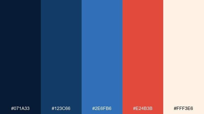
HEX: #071A33 #123C66 #2E6FB6 #E24B3B #FFF3E6
Mood: preppy, bold, energetic
Best for: sports branding and campus merch
Bold prep colors bring varsity confidence with a crisp, clean edge. This dark blue color palette shines on uniforms, badges, and merch where you need strong contrast from a distance. Pair the orange-red with plenty of warm cream to keep it upbeat, not aggressive. Tip: use the brightest blue for outlines and secondary marks so the deepest navy stays dominant.
Image example of classic prep generated using media.io
17) Rainy Window
HEX: #061525 #16314A #3E5B72 #7EA2B8 #DDE7EE
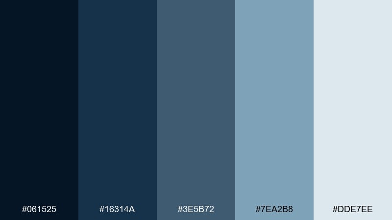
Mood: pensive, soft, cinematic
Best for: film posters and photo portfolio themes
Soft rain-blues feel like city reflections on a windowpane. The gradient from deep to misty tones helps you build layered overlays for photography without crushing details. Pair with monochrome images or subtle grain for a cinematic finish. Tip: use the lightest tone as a translucent overlay rather than a solid block to keep photos lively.
Image example of rainy window generated using media.io
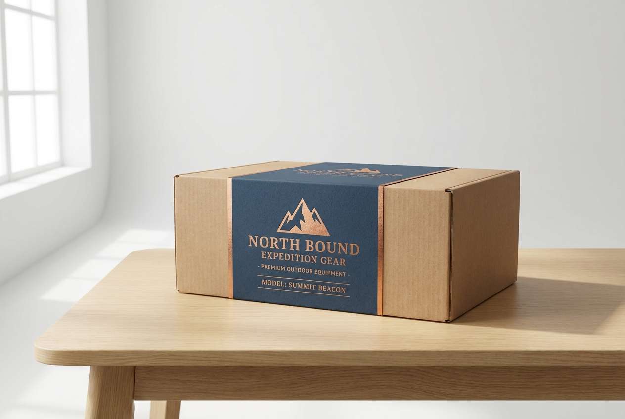
18) Copper Compass
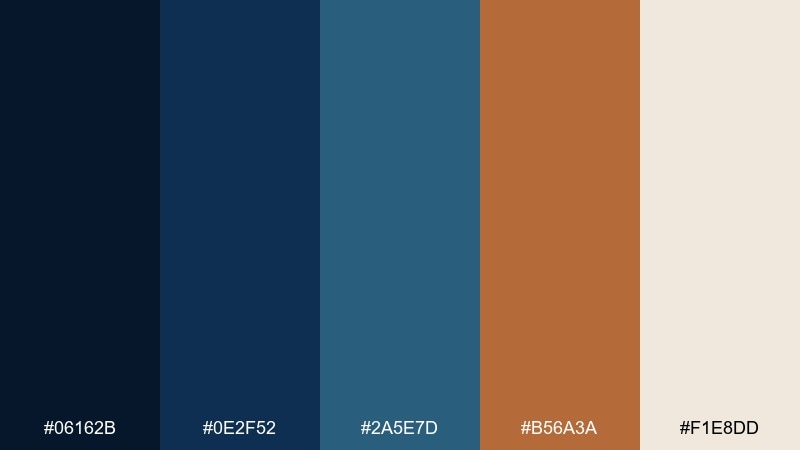
HEX: #06162B #0E2F52 #2A5E7D #B56A3A #F1E8DD
Mood: adventurous, warm, heritage
Best for: outdoor gear packaging and travel brands
Heritage navy with copper warmth evokes worn leather, maps, and compass needles. These dark blue color combinations are especially strong for labels and badges where you want a classic, trustworthy feel. Pair with textured off-white and minimal illustration to keep it premium and legible. Tip: use copper for small focal points like seals and product names, not full backgrounds.
Image example of copper compass generated using media.io
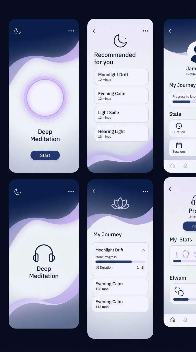
19) Lunar Lavender
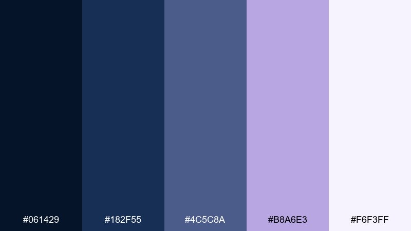
HEX: #061429 #182F55 #4C5C8A #B8A6E3 #F6F3FF
Mood: dreamy, calm, modern
Best for: beauty brands and meditation apps
Moonlit blues with lavender haze feel serene and slightly futuristic. Use lavender for gentle emphasis like selected states, tags, or supportive highlights, while the deeper blues carry the structure. Pair with soft rounded type and airy spacing for a calmer interface. Tip: keep the lightest lilac as the primary background to make the navy typography feel crisp, not heavy.
Image example of lunar lavender generated using media.io
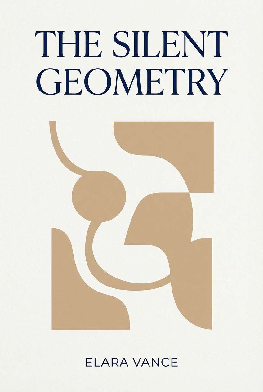
20) Quiet Library
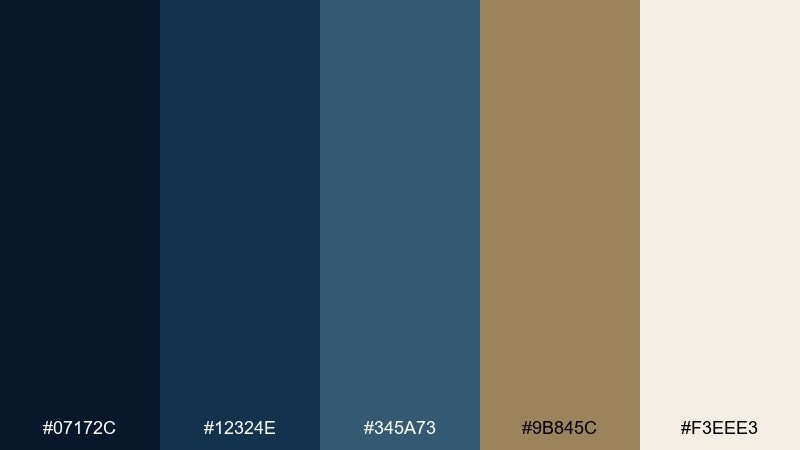
HEX: #07172C #12324E #345A73 #9B845C #F3EEE3
Mood: cozy, academic, understated
Best for: book covers and educational platforms
Quiet navy and bookish browns evoke worn wood shelves and soft reading lamps. The warm tan makes an excellent accent for buttons, chapter markers, or callout panels without breaking the calm tone. Pair with serif headings and subtle paper textures for an instantly literary feel. Tip: keep the mid blue for body text links so they stand out without shouting.
Image example of quiet library generated using media.io
What Colors Go Well with Dark Blue?
Warm neutrals (ivory, cream, sand) soften dark blue and improve readability for web backgrounds. They’re a safe choice for editorial layouts, portfolios, and premium landing pages.
Metallic-style accents like gold and copper make dark blue feel more luxurious, while vivid pops like neon mint, electric blue, or berry red add modern contrast for tech, events, and promos.
If you want a calmer look, pair dark blue with cool grays, slate blues, and misty off-whites. This keeps the palette professional and helps charts, tables, and UI components stay consistent.
How to Use a Dark Blue Color Palette in Real Designs
Start with roles: pick one darkest navy for headers/navigation, one mid blue for links and buttons, and one light tone for cards or section backgrounds. This “layering” approach makes interfaces feel structured.
For branding, let dark blue carry the logo and typography, then reserve the accent color for only a few high-priority moments (CTA, badges, pricing highlights). It keeps the design confident, not busy.
Always check contrast: dark blue on off-white is usually excellent, but accents (mint, gold, red) need testing for text and icon legibility—especially on dark backgrounds.
Create Dark Blue Palette Visuals with AI
If you want to preview these palettes in real-world designs (posters, packaging, dashboards, or landing pages), generate fast mock visuals before committing to production files.
With Media.io Text-to-Image, you can paste a prompt, describe the style (minimal, luxury, futuristic), and iterate quickly—perfect for moodboards, client concepts, and UI exploration.
Dark Blue Color Palette FAQs
-
What is the best background color to pair with dark blue?
Warm off-whites (ivory, cream, eggshell) are the most reliable because they keep contrast high without feeling as stark as pure white. They also make dark blue typography look more premium and less “corporate.” -
Is dark blue better than black for UI text and headers?
Often, yes. Dark navy can feel softer than pure black while still delivering strong contrast. Many brands use navy for top bars and headings to reduce harshness and add personality. -
What accent colors make dark blue look luxurious?
Gold and brass-like yellows are classic luxury pairings, and copper/terracotta can feel heritage and premium. Keep metallic-style accents small (seals, rules, key numbers) so they read intentional. -
What accent colors make dark blue look modern or techy?
Neon mint/green, electric blue, and bright cyan instantly modernize dark blue. Use them for CTAs, highlights, and status states, and keep the rest of the UI more neutral for balance. -
How do I keep a dark blue palette from feeling too heavy?
Increase the proportion of light neutrals, add a pale blue/gray for spacing, and use the deepest navy only for key structure (navigation, headings). Avoid filling large areas with the darkest tone unless it’s a deliberate dark-mode design. -
What’s a good dark blue palette for data dashboards?
Choose stepped blues and cool grays (like “Stormy Slate,” “Arctic Steel,” or “Blueprint Workspace”) so you have clear UI layers and consistent chart colors without introducing too many hues. -
Can I use dark blue for brand logos across print and web?
Yes. Dark blue reproduces well across digital and print, and it’s easy to build a system around it (tints for backgrounds, mid-tones for UI, and a single accent for hierarchy). Just confirm ink/CMYK conversions for very deep navies in print.
Next: Royal Color Palette


