

Olive (#708238) is a grounded, modern green that feels natural without being too bright. It’s a go-to for brands and interfaces that want calm confidence, warmth, and usability.
Below are 21 curated olive color palette ideas with HEX codes, plus practical tips for UI, branding, print, and interiors.
In this article
- Why Olive Color Combinations Work So Well
-
- tuscan grove
- mossy minimal
- golden olive glow
- sage and ink
- eucalyptus clay
- olive and blush balance
- forest olive night
- olive denim contrast
- vintage picnic
- herbal apothecary
- olive stone neutrals
- citrus grove pop
- military modern
- olive orchid dusk
- desert olive sand
- olive copper luxe
- botanical sketchbook
- charcoal olive tech
- olive plum heritage
- rainy olive gray
- olive cream cottage
- What Colors Go Well with Olive?
- How to Use a Olive Color Palette in Real Designs
- Create Olive Palette Visuals with AI
Why Olive Color Combinations Work So Well
Olive sits in a sweet spot between green and brown, so it reads as “natural” and “stable” rather than loud. That makes it easy to use across brands that want an earthy tone while still feeling contemporary.
In UI and editorial layouts, olive is strong enough for navigation, labels, and emphasis, but muted enough to avoid visual fatigue. It also pairs cleanly with creams, stones, charcoals, and warm metallics for a premium finish.
For print and interiors, olive behaves like a neutral with personality: it anchors warm palettes (terracotta, sand) and balances cooler accents (denim, gray, ink). The result is a scheme that feels intentional, not trendy.
20+ Olive Color Palette Ideas (with HEX Codes)
1) Tuscan Grove
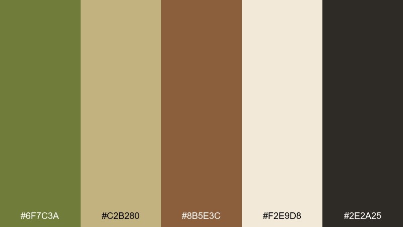
HEX: #6F7C3A #C2B280 #8B5E3C #F2E9D8 #2E2A25
Mood: warm rustic
Best for: restaurant branding
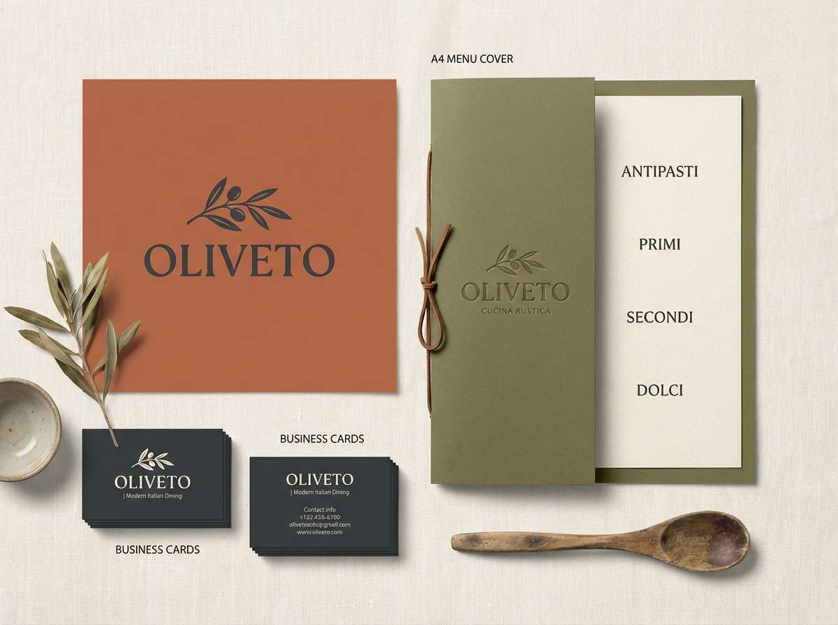
Warm rustic tones bring to mind sunlit hills, herb gardens, and weathered terracotta. Use this olive color scheme for restaurant logos, menus, and signage where you want a grounded, appetizing feel. Pair the olive with creamy paper textures and dark espresso type for readability. Tip: keep the dark charcoal for headlines and reserve terracotta for small accent marks or icons.
Image example of tuscan grove generated using media.io
Media.io is an online AI studio for creating and editing video, image, and audio in your browser.

2) Mossy Minimal
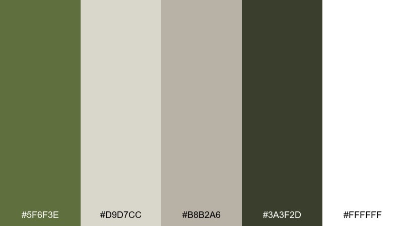
HEX: #5F6F3E #D9D7CC #B8B2A6 #3A3F2D #FFFFFF
Mood: clean and calm
Best for: ui dashboard
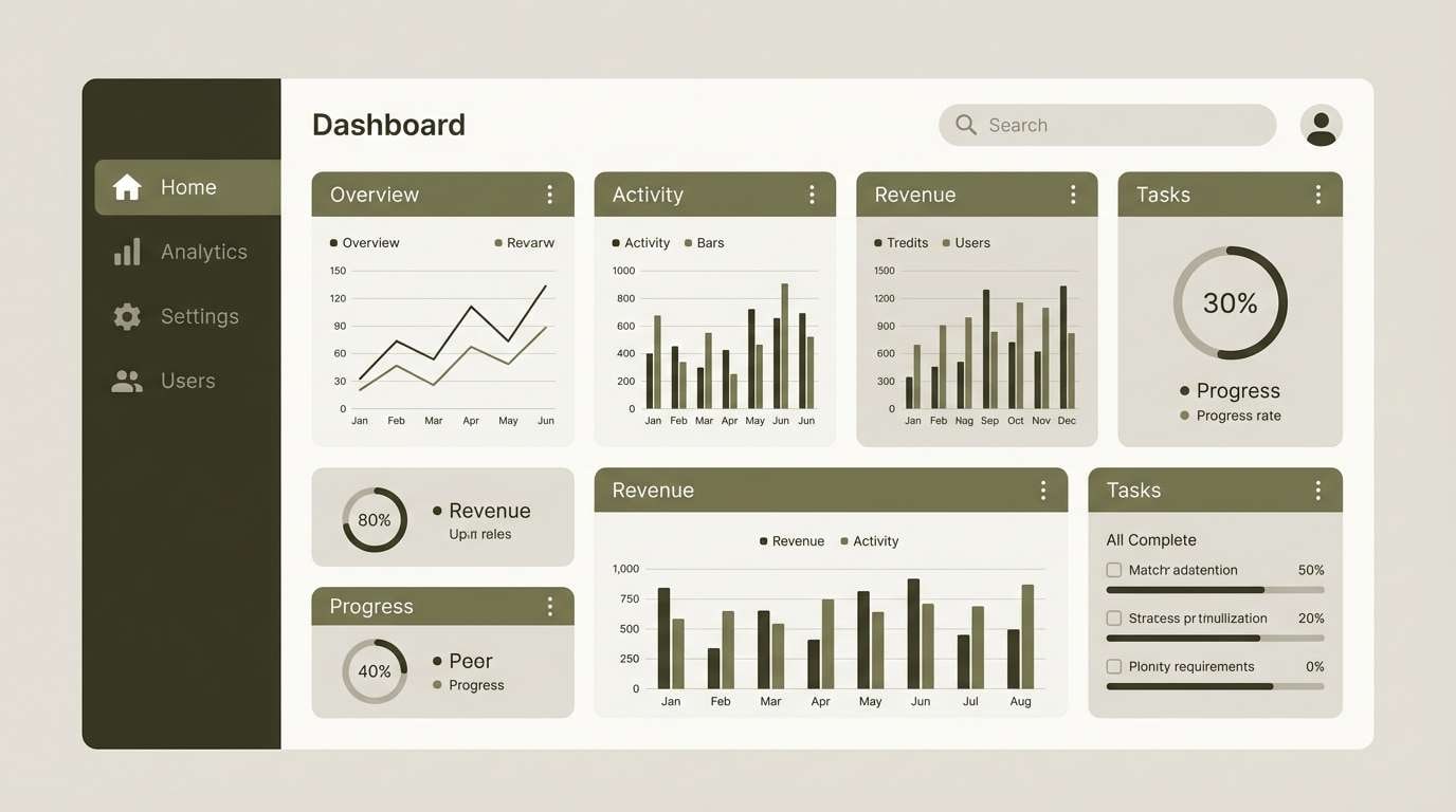
Clean, calm neutrals feel like soft daylight on stone and moss. These olive color combinations shine in dashboards and admin panels where you want low visual noise and clear hierarchy. Use the off-white as the main canvas, then lean on deep olive for navigation and key controls. Tip: apply the mid greige for borders and dividers to avoid harsh contrast.
Image example of mossy minimal generated using media.io
3) Golden Olive Glow
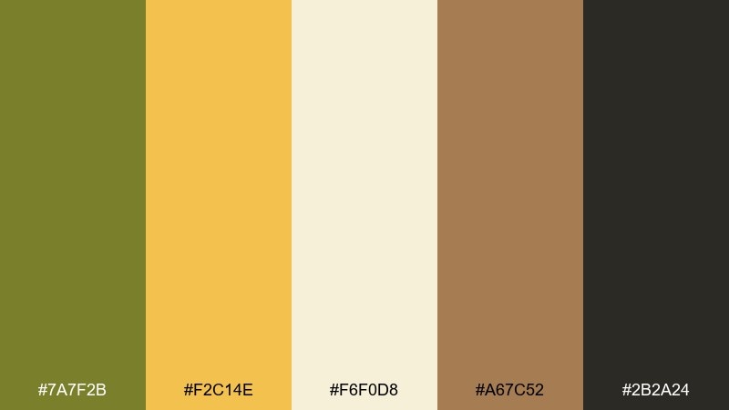
HEX: #7A7F2B #F2C14E #F6F0D8 #A67C52 #2B2A24
Mood: sunny and inviting
Best for: product ad banner
Sunny, inviting hues evoke late afternoon light and a gentle golden sheen. It works beautifully for banner ads and hero sections when you need warmth without loud saturation. Let the gold carry calls to action, with olive anchoring the layout and keeping it sophisticated. Tip: keep body text on the pale cream for a softer, premium feel.
Image example of golden olive glow generated using media.io
4) Sage and Ink
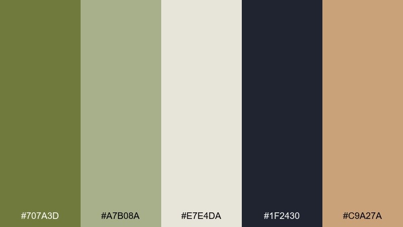
HEX: #707A3D #A7B08A #E7E4DA #1F2430 #C9A27A
Mood: editorial and refined
Best for: magazine layout
Editorial, refined tones suggest linen pages, pressed leaves, and crisp ink. Use the olive color palette for magazine spreads, lookbooks, or long-scroll articles where typography needs to feel intentional. The inky navy keeps text sharp while the muted greens soften the page. Tip: limit the tan accent to pull quotes or page numbers for a polished rhythm.
Image example of sage and ink generated using media.io
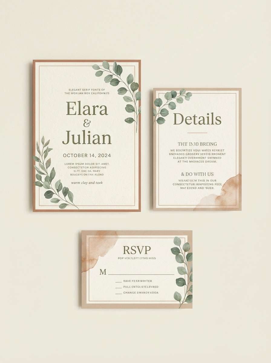
5) Eucalyptus Clay
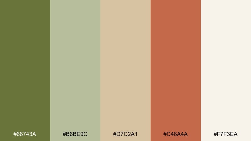
HEX: #68743A #B6BE9C #D7C2A1 #C46A4A #F7F3EA
Mood: soft earthy
Best for: wedding invitation set
Soft earthy shades feel like dried florals, handmade paper, and a quiet desert breeze. They fit wedding invitations and day-of stationery where romance meets modern restraint. Pair the clay and terracotta with plenty of negative space to keep it airy. Tip: print olive text in a slightly warm black to avoid a greenish cast on textured stock.
Image example of eucalyptus clay generated using media.io
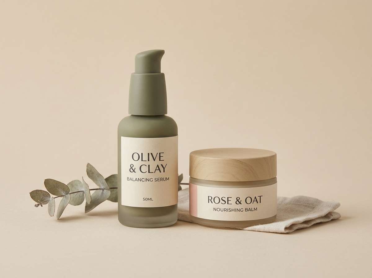
6) Olive and Blush Balance
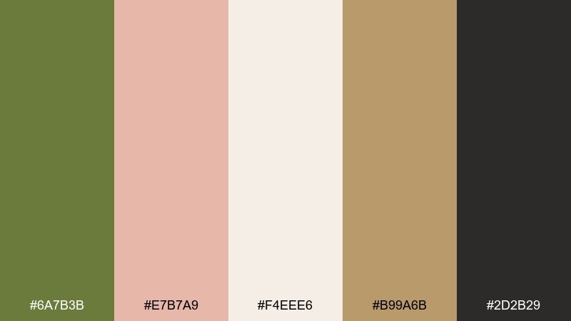
HEX: #6A7B3B #E7B7A9 #F4EEE6 #B99A6B #2D2B29
Mood: romantic modern
Best for: beauty packaging
Romantic modern color energy blends botanical calm with a soft blush warmth. These olive color combinations are ideal for beauty packaging that needs to feel natural yet elevated. Use the cream as the label base, then anchor the brand mark in deep olive and add blush for secondary panels. Tip: keep metallic effects subtle by leaning on the warm sand tone instead of shiny gold.
Image example of olive and blush balance generated using media.io
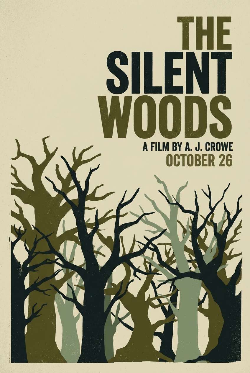
7) Forest Olive Night
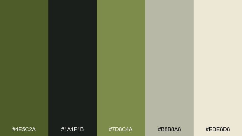
HEX: #4E5C2A #1A1F1B #7D8C4A #B8B8A6 #EDE8D6
Mood: moody and grounded
Best for: movie poster
Moody, grounded tones evoke pine shadows, night air, and vintage paper. It suits thriller or indie movie posters where contrast and atmosphere matter more than bright color. Push the near-black for dramatic type and use the dusty cream to keep credits readable. Tip: add grain or subtle texture so the mid olive does not look flat in print.
Image example of forest olive night generated using media.io
8) Olive Denim Contrast
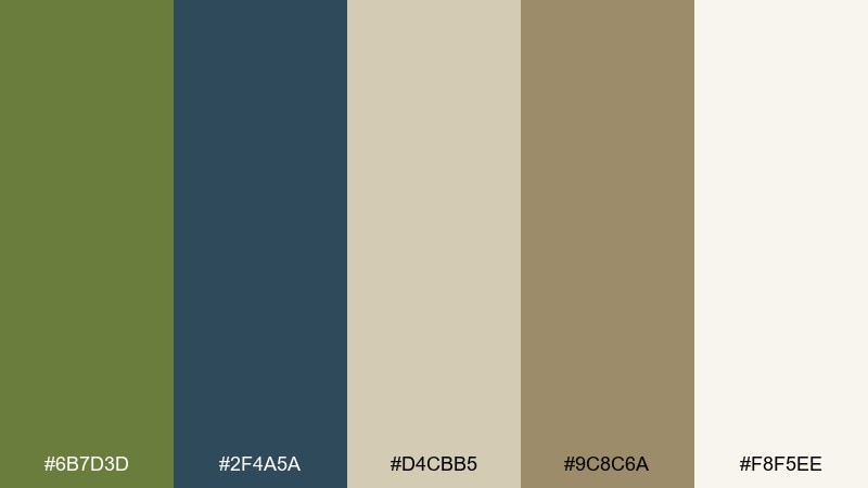
HEX: #6B7D3D #2F4A5A #D4CBB5 #9C8C6A #F8F5EE
Mood: casual and contemporary
Best for: streetwear lookbook
Casual, contemporary tones feel like worn denim, canvas, and clean studio light. Use this olive color palette for a lookbook or ecommerce editorial where you want an earthy base with a cool counterpoint. Let denim blue carry section headers while olive supports backgrounds and buttons. Tip: keep product photos neutral so the blue stays intentional, not accidental color cast.
Image example of olive denim contrast generated using media.io
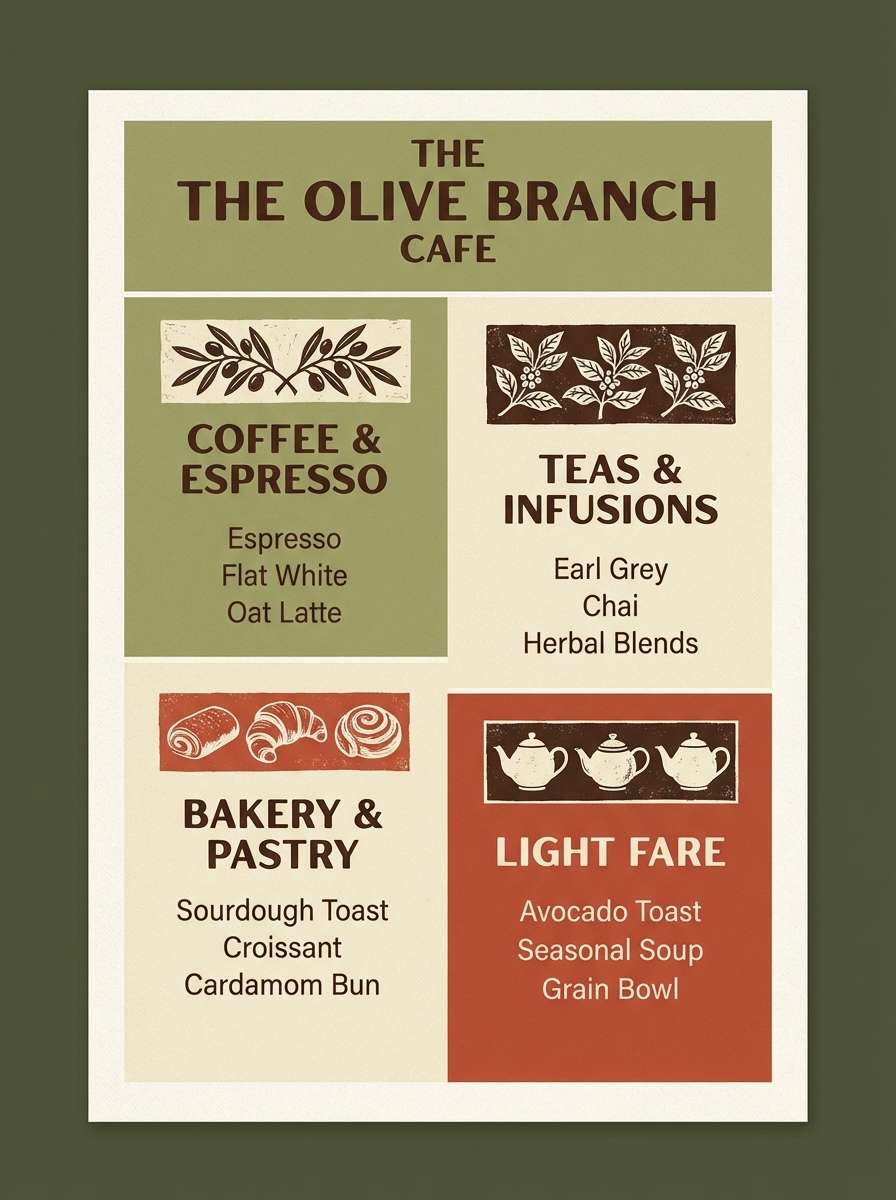
9) Vintage Picnic
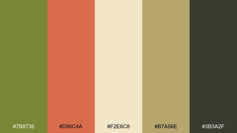
HEX: #7B8736 #D96C4A #F2E6C8 #B7A56E #3B3A2F
Mood: nostalgic and cheerful
Best for: cafe menu design
Nostalgic, cheerful hues recall retro table linens and sun-faded signage. These olive color combinations are great for cafe menus, chalkboard-style prints, and seasonal specials. Pair the warm cream base with dark type, then bring in tomato red for pricing or callouts. Tip: use olive as the dominant header color so the red feels like a tasty accent, not a warning.
Image example of vintage picnic generated using media.io
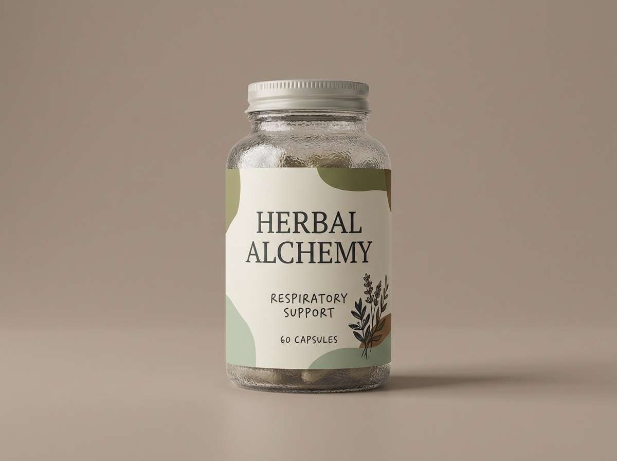
10) Herbal Apothecary
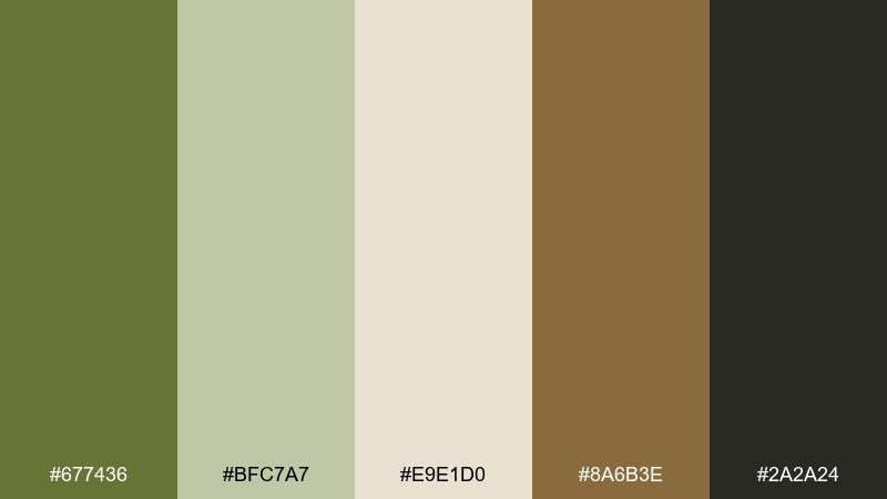
HEX: #677436 #BFC7A7 #E9E1D0 #8A6B3E #2A2A24
Mood: natural and trustworthy
Best for: supplement label
Natural, trustworthy tones bring up imagery of dried herbs, glass jars, and stamped labels. An olive color palette like this works well for supplements and wellness products that need credibility and calm. Keep the label background light, then use deep olive for ingredient hierarchy and icons. Tip: test small type on the warm cream to ensure it stays crisp under matte lamination.
Image example of herbal apothecary generated using media.io
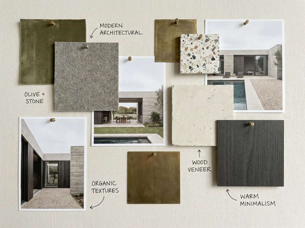
11) Olive Stone Neutrals
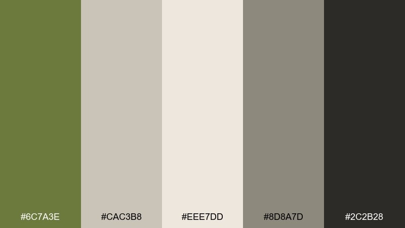
HEX: #6C7A3E #CAC3B8 #EEE7DD #8D8A7D #2C2B28
Mood: quiet and architectural
Best for: interior mood board
Quiet, architectural neutrals feel like limestone walls, shaded courtyards, and clean lines. Use these olive tones for interior mood boards, renovation decks, or minimalist furniture branding. The olive reads best as an accent on textiles, plants, or cabinetry details against the soft stone base. Tip: keep the darkest charcoal for thin linework and measurements so the layout stays airy.
Image example of olive stone neutrals generated using media.io
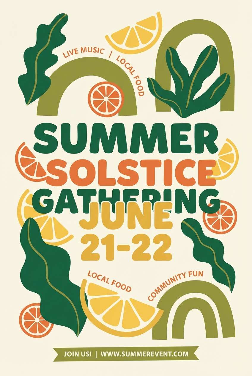
12) Citrus Grove Pop
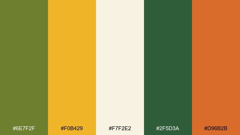
HEX: #6E7F2F #F0B429 #F7F2E2 #2F5D3A #D96B2B
Mood: fresh and energetic
Best for: summer event flyer
Fresh, energetic tones suggest citrus leaves, bright peel, and outdoor music in warm air. Use this olive color scheme for summer event flyers when you want nature-forward color with a punchy highlight. Let olive and deep green handle the background blocks, then use yellow for the headline and orange for small stickers or dates. Tip: keep the cream generous so the warm accents do not overpower the layout.
Image example of citrus grove pop generated using media.io
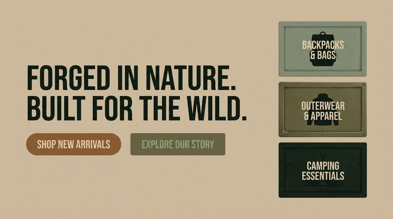
13) Military Modern
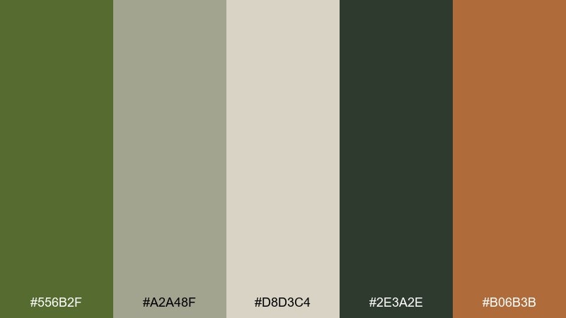
HEX: #556B2F #A2A48F #D8D3C4 #2E3A2E #B06B3B
Mood: strong and utilitarian
Best for: outdoor gear landing page
Strong, utilitarian colors recall field jackets, canvas straps, and rugged trails. They fit outdoor gear landing pages where durability and function should lead the story. Use the deep green-black for buttons and the muted sage for secondary UI states. Tip: introduce the warm brown only for badges like waterproof or limited edition to keep it purposeful.
Image example of military modern generated using media.io
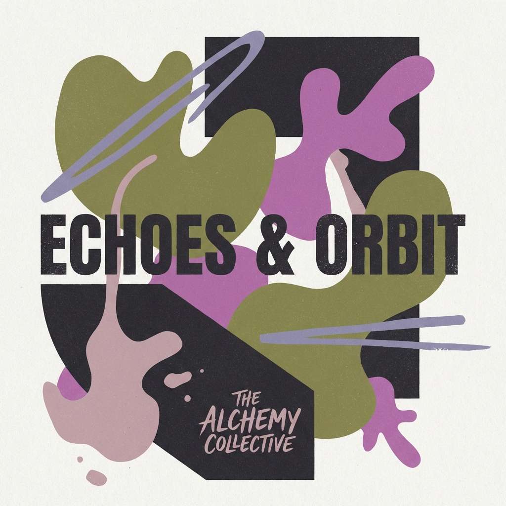
14) Olive Orchid Dusk
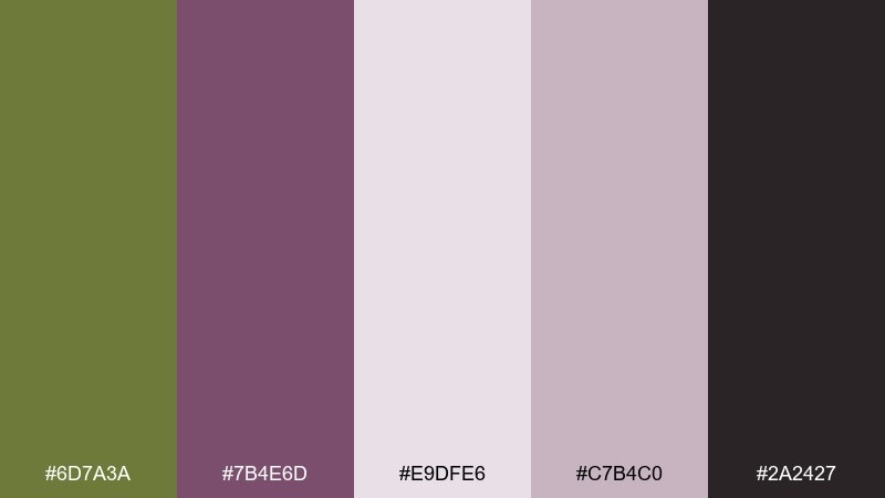
HEX: #6D7A3A #7B4E6D #E9DFE6 #C7B4C0 #2A2427
Mood: artsy and dramatic
Best for: album cover
Artsy, dramatic dusk tones feel like velvet curtains and twilight florals. These olive color combinations work well for album covers that need a moody twist without going fully neon. Keep olive as the grounding block color and let orchid purple add intrigue in titles or gradients. Tip: use the pale mauve as a soft halo behind text so small type stays readable.
Image example of olive orchid dusk generated using media.io
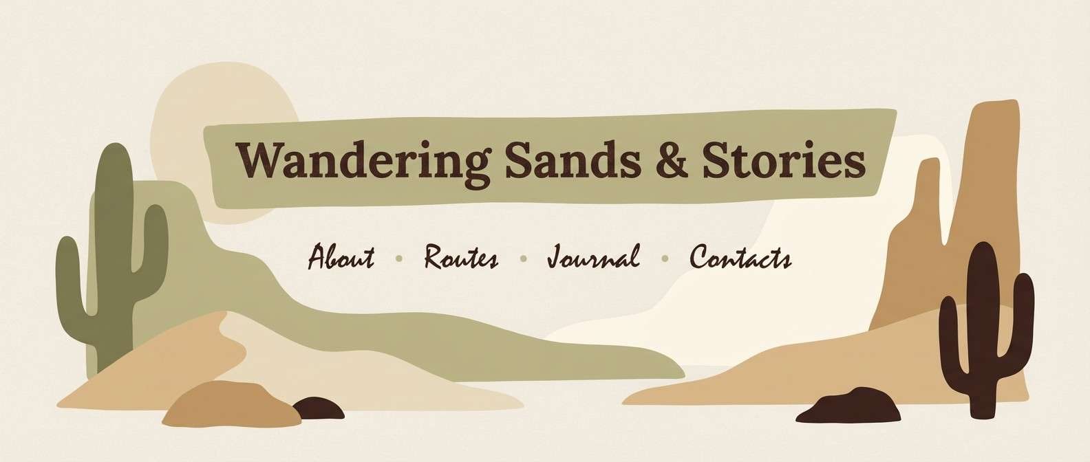
15) Desert Olive Sand
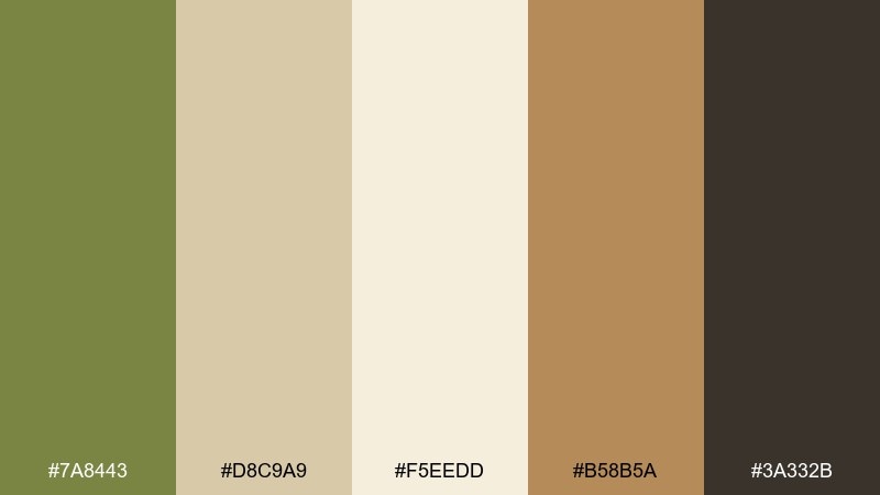
HEX: #7A8443 #D8C9A9 #F5EEDD #B58B5A #3A332B
Mood: sunbaked and relaxed
Best for: travel blog header
Sunbaked, relaxed tones bring to mind dunes, dry grasses, and slow mornings. Use it for travel blog headers and section dividers where an earthy story matters more than bright color. Olive pairs naturally with sand and cream backgrounds, while the warm tan adds a subtle sunlit accent. Tip: add generous line spacing and keep headers in the darkest brown for clean contrast.
Image example of desert olive sand generated using media.io
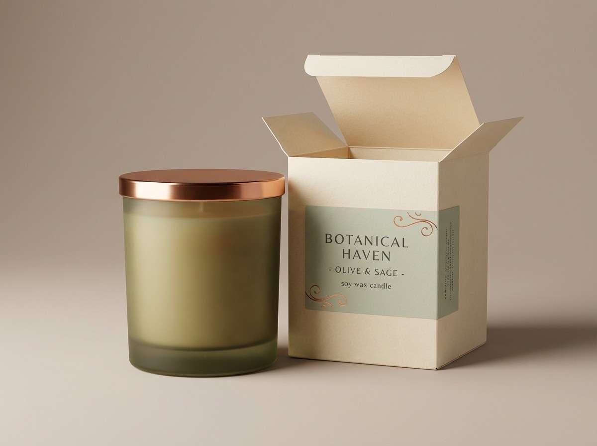
16) Olive Copper Luxe
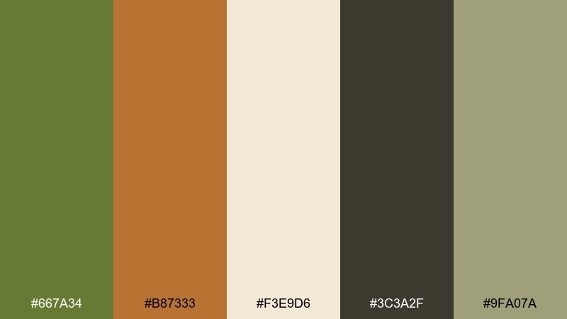
HEX: #667A34 #B87333 #F3E9D6 #3C3A2F #9FA07A
Mood: premium and cozy
Best for: candle label and box
Premium, cozy colors evoke glowing metal, warm wax, and a quiet evening at home. These olive color combinations are a strong fit for candle labels and gift boxes that want understated luxury. Use cream for the base, then copper for seals, foiling areas, or small decorative lines. Tip: keep the darkest charcoal for ingredient blocks so the design reads high-end, not rustic.
Image example of olive copper luxe generated using media.io
17) Botanical Sketchbook
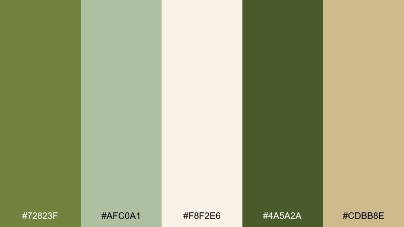
HEX: #72823F #AFC0A1 #F8F2E6 #4A5A2A #CDBB8E
Mood: fresh and artistic
Best for: botanical illustration print
Fresh, artistic greens feel like a sketchbook page filled with pressed leaves. Use this olive palette for botanical prints, garden posters, or educational charts where detail and calm matter. Let the light cream act as paper, then build depth with two olive values for stems and shading. Tip: reserve the warm buff tone for labels and small callouts so the illustration stays airy.
Image example of botanical sketchbook generated using media.io
18) Charcoal Olive Tech
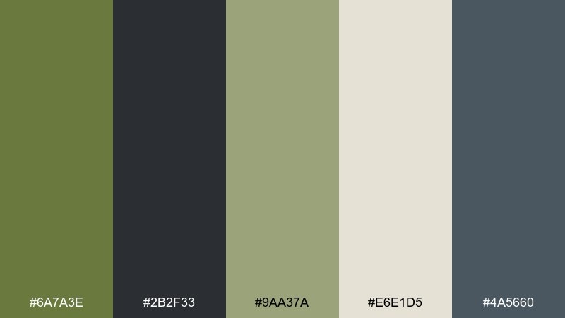
HEX: #6A7A3E #2B2F33 #9AA37A #E6E1D5 #4A5660
Mood: sleek and modern
Best for: saas marketing page
Sleek modern tones suggest brushed metal, quiet confidence, and crisp UI. They suit SaaS marketing pages where you want a tech feel without the usual bright blues. Use charcoal for sections and navigation, then bring olive in for highlights, checkmarks, and feature chips. Tip: keep the off-white for copy blocks so long text remains comfortable to read.
Image example of charcoal olive tech generated using media.io
19) Olive Plum Heritage
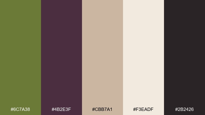
HEX: #6C7A38 #4B2E3F #CBB7A1 #F3EADF #2B2426
Mood: heritage and elegant
Best for: wine label
Heritage elegance comes through like an old cellar, dark fruit notes, and aged parchment. An olive color palette with plum creates a timeless label look that feels boutique and collected. Use cream for the main label field, then set the brand name in deep plum with olive as a border or crest color. Tip: keep ornaments minimal and let the contrast do the storytelling.
Image example of olive plum heritage generated using media.io
20) Rainy Olive Gray
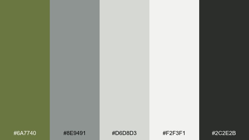
HEX: #6A7740 #8E9491 #D6D8D3 #F2F3F1 #2C2E2B
Mood: cool and understated
Best for: presentation deck
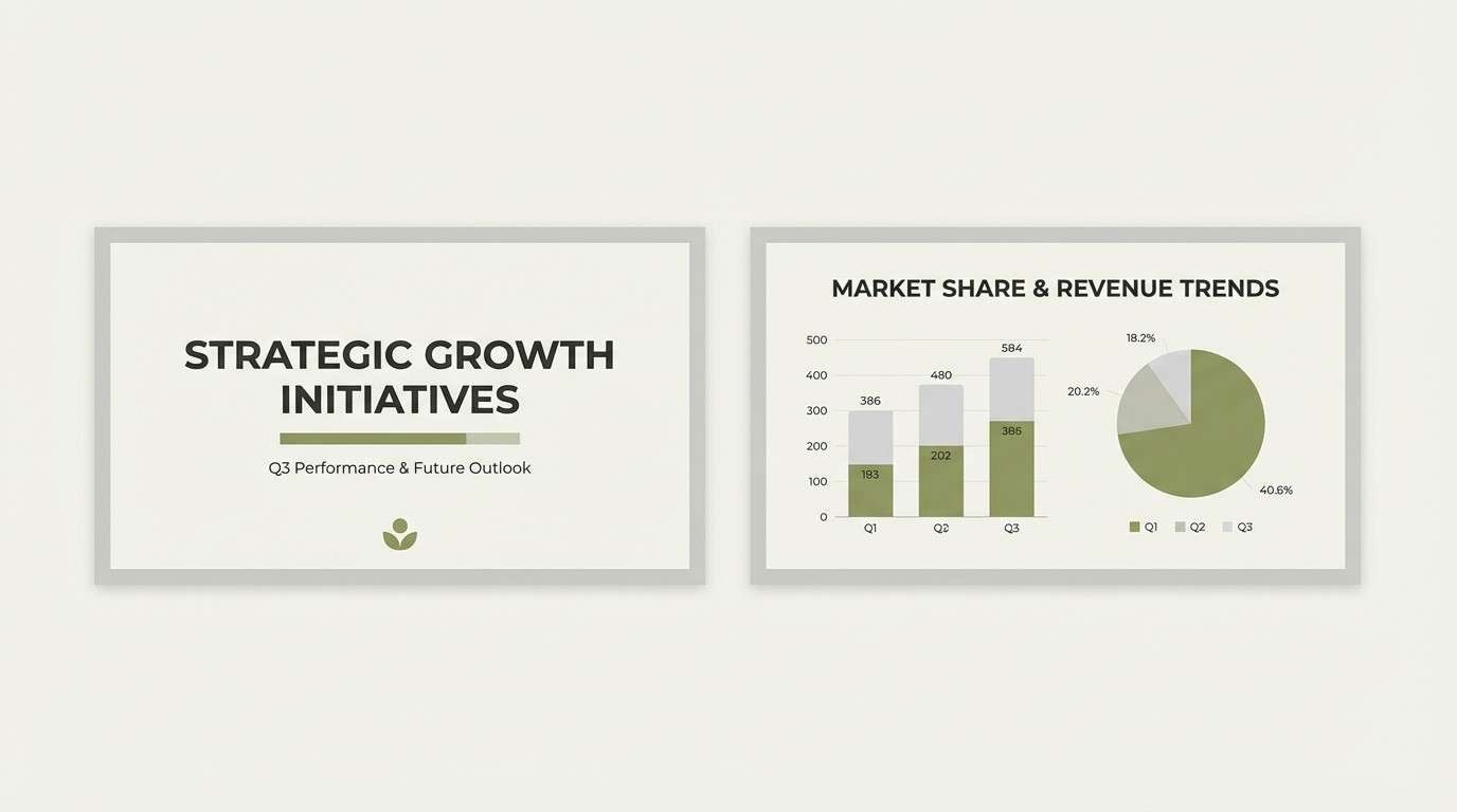
Cool understated neutrals feel like a rainy city park and overcast light. Use it for professional presentations when you want something softer than pure black and white. Olive works best as a quiet accent for charts, icons, or section dividers against the pale gray base. Tip: keep one dark tone for titles only, and let the mid grays handle body text.
Image example of rainy olive gray generated using media.io
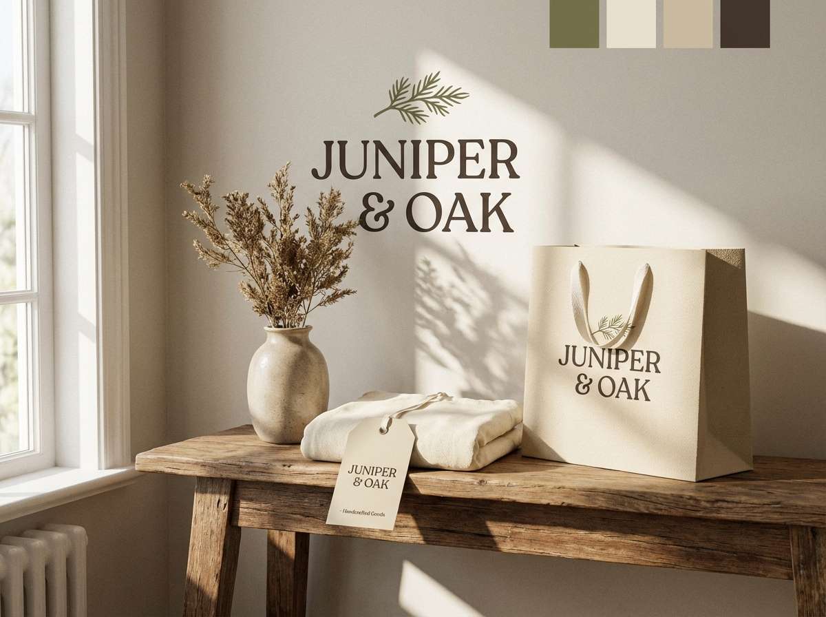
21) Olive Cream Cottage
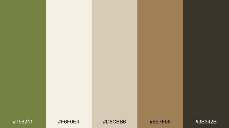
HEX: #758241 #F6F0E4 #D8CBB6 #9E7F56 #3B342B
Mood: cozy and welcoming
Best for: home decor shop logo
Cozy welcoming tones evoke cottage kitchens, natural wood, and soft textiles. This mix is ideal for a home decor shop logo and small brand system that needs warmth and trust. Use cream as the primary background, then apply olive for the mark and deep brown for typography. Tip: keep the mid beige for packaging tissue, tags, or subtle patterns so the identity feels layered.
Image example of olive cream cottage generated using media.io
What Colors Go Well with Olive?
Olive pairs naturally with warm neutrals like cream, sand, greige, and stone because they share an earthy base. This keeps designs calm and premium while still feeling modern.
For contrast, try deep ink/charcoal for typography and structure, or introduce a cool counterpoint like muted denim blue. If you want more energy, small hits of gold, citrus yellow, terracotta, or copper make olive feel intentional and fresh.
When in doubt, keep olive as the anchor (navigation, borders, headers) and let one accent color do the talking in CTAs, badges, or highlights.
How to Use a Olive Color Palette in Real Designs
In UI design, use off-white or pale gray as the main canvas, then assign olive to key interactive elements (active states, tabs, toggles). Reserve the darkest tone for headings and primary text to maintain readability.
In branding and packaging, olive works best as a “trust” color: logos, borders, seals, and label frameworks. Pair it with cream for an elevated base, then add one warm accent (copper, terracotta, gold) for hierarchy.
For interiors and mood boards, treat olive like a material color—cabinetry, textiles, plants, or accent walls—balanced by stone neutrals and warm wood. Keeping a consistent warm-neutral background prevents olive from skewing too yellow or too gray.
Create Olive Palette Visuals with AI
If you want to preview how an olive green palette will look on a poster, label, UI screen, or mood board, generating quick mockups can save hours of iteration. A single prompt plus your HEX direction is often enough to test tone and contrast.
Use the prompts above as templates: swap “album cover” for “landing page,” adjust the aspect ratio, and specify where olive should dominate (background blocks, typography, accents). Then refine with small changes like “more negative space” or “matte paper texture.”
Olive Color Palette FAQs
-
What is the HEX code for olive in this guide?
The reference olive used here is HEX #708238, a muted olive green that sits between green and brown for an earthy, modern feel. -
Is olive green good for UI design?
Yes. Olive works well for navigation, chips, and active states because it’s calm and readable when paired with off-whites and dark charcoals. Avoid using mid-olive for long body text—use a darker neutral instead. -
What are the best neutral colors to pair with olive?
Warm cream, sand, greige, stone gray, and soft off-white pair especially well. They keep olive grounded and prevent the palette from feeling too saturated. -
What accent colors make olive feel more modern?
Try warm metallics (copper, muted gold), dusty blush, denim blue, or deep plum. Use accents sparingly so olive remains the anchor rather than competing for attention. -
How can I keep olive from looking muddy?
Increase separation with clear light and dark values: use a pale background (cream/off-white) and a deep text color (charcoal/ink). Add subtle texture or a small bright accent (gold/yellow) to lift the palette. -
Does olive print well on paper and packaging?
It usually prints beautifully, especially on uncoated or textured stocks. For small type, test proofs on the chosen paper—olive can shift warmer or duller depending on ink coverage and lamination. -
Can I use these olive palettes for branding?
Absolutely. Choose a palette based on brand personality (rustic, tech, heritage, wellness), then define roles: one base neutral, one dark text color, olive as the signature, and one accent for highlights.
Next: Harlequin Color Palette


