

Harlequin is a vivid green that instantly reads as fresh, energetic, and modern—especially when you balance it with grounded neutrals or bold complementary accents.
Below are 20 curated harlequin color palette ideas (with HEX codes) you can use for branding, UI, packaging, and print—plus AI image prompts you can copy into Media.io to visualize each look.
In this article
- Why Harlequin Palettes Work So Well
-
- electric jester greens
- citrus carnival
- botanical punch
- vintage harlequin poster
- neon lime and plum pop
- soft spring harlequin
- forest and lemon contrast
- clean ui lime accents
- retro sport stripe
- minimalist chartreuse neutrals
- jewel night parade
- pastel garden party
- tropical market
- editorial highlight
- kids sticker fun
- modern packaging zest
- urban street sign
- wedding greenery accent
- tech dashboard glow
- sunset lime twist
- What Colors Go Well with Harlequin?
- How to Use a Harlequin Color Palette in Real Designs
- Create Harlequin Palette Visuals with AI
Why Harlequin Palettes Work So Well
Harlequin sits in that sweet spot between green and yellow, so it feels both natural (growth, freshness) and high-energy (movement, visibility). That makes it a reliable “attention color” without defaulting to red.
Because it’s so bright, harlequin pairs especially well with anchoring tones—charcoal, navy, deep forest green, or warm stone neutrals. Those darker or softer bases keep designs readable and premium.
It also plays nicely with playful accents like hot pink, violet, or orange. When you keep harlequin as the hero and limit other brights to small callouts, the whole palette stays intentional instead of chaotic.
20+ Harlequin Color Palette Ideas (with HEX Codes)
1) Electric Jester Greens
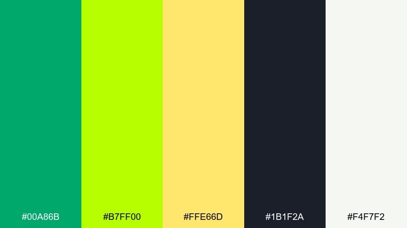
HEX: #00A86B #B7FF00 #FFE66D #1B1F2A #F4F7F2
Mood: electric, playful, high-contrast
Best for: sports branding and bold social banners
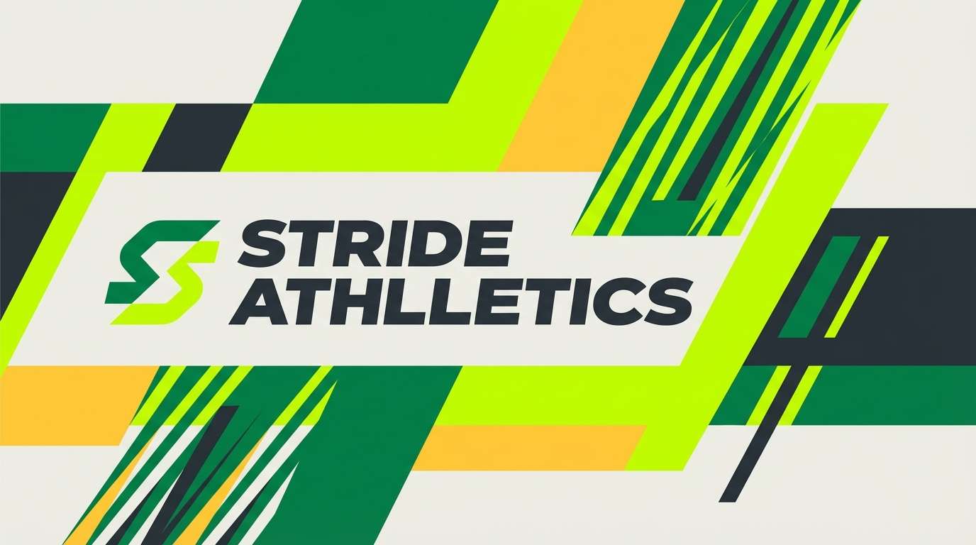
Electric and playful, these greens feel like stadium lights and fresh-cut turf. The deep ink tone anchors the brightness so the lime and jester green do not overwhelm. Use it for energetic branding, event graphics, or punchy social banners, and pair with clean sans-serif type. Tip: keep the neon green to buttons, headers, or a single hero shape for maximum impact.
Image example of electric jester greens generated using media.io
Media.io is an online AI studio for creating and editing video, image, and audio in your browser.

2) Citrus Carnival
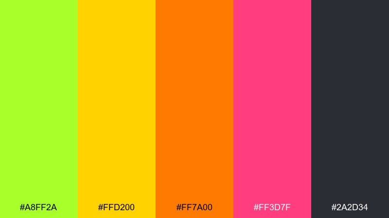
HEX: #A8FF2A #FFD200 #FF7A00 #FF3D7F #2A2D34
Mood: festive, loud, sunny
Best for: festival posters and pop-up event flyers
Festive and loud, it reads like citrus slices, confetti, and late-afternoon sun. The warm orange and punchy pink keep the lime from feeling too sporty, while charcoal adds legibility. It shines on posters, pop-up event flyers, and limited-edition merch where you want instant attention. Tip: set text in charcoal and reserve the hot pink for a single callout badge.
Image example of citrus carnival generated using media.io

3) Botanical Punch
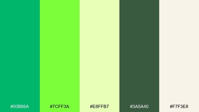
HEX: #00B66A #7CFF3A #E8FFB7 #3A5A40 #F7F3E8
Mood: fresh, leafy, optimistic
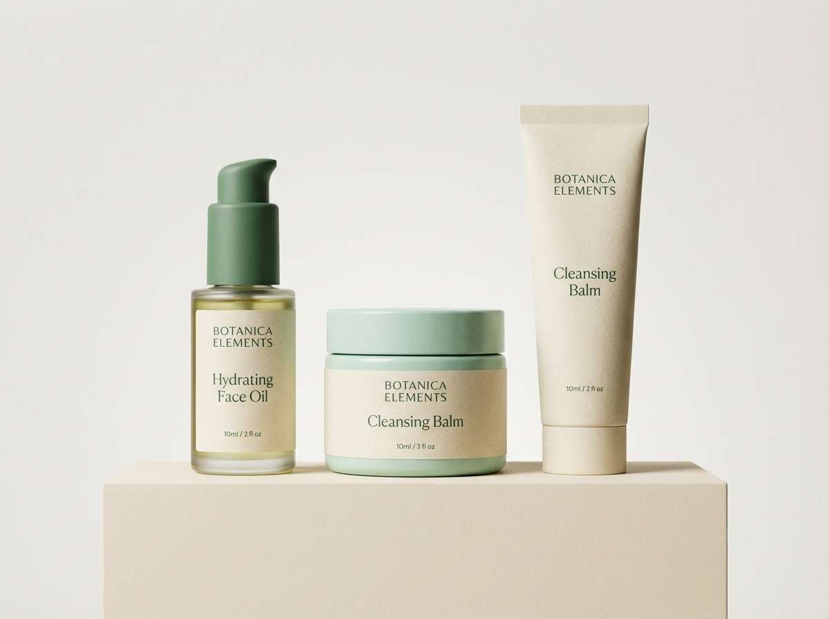
Best for: eco packaging and skincare labels
Fresh and leafy, it evokes greenhouse air and new growth after rain. The darker forest tone adds a natural backbone, while the pale minty tint keeps the look airy. This harlequin color palette works beautifully on eco packaging, skincare labels, and organic product tags paired with off-white paper textures. Tip: print the bright green as a spot accent and let the cream background do the heavy lifting.
Image example of botanical punch generated using media.io
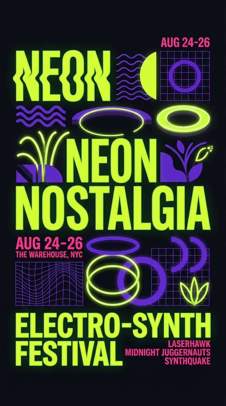
4) Vintage Harlequin Poster
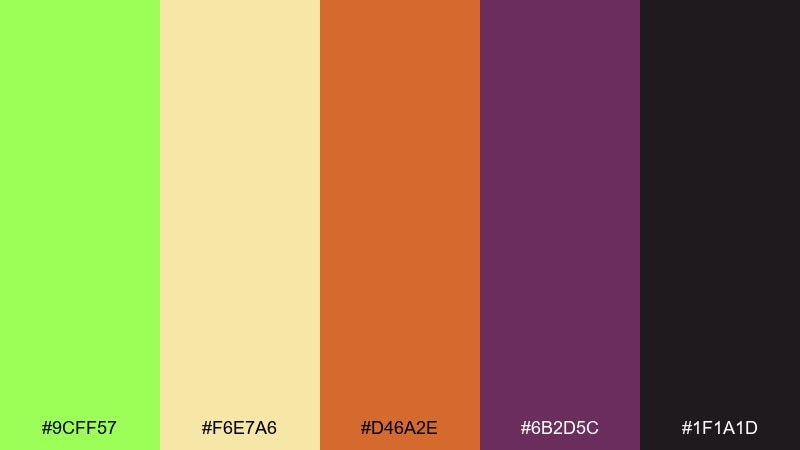
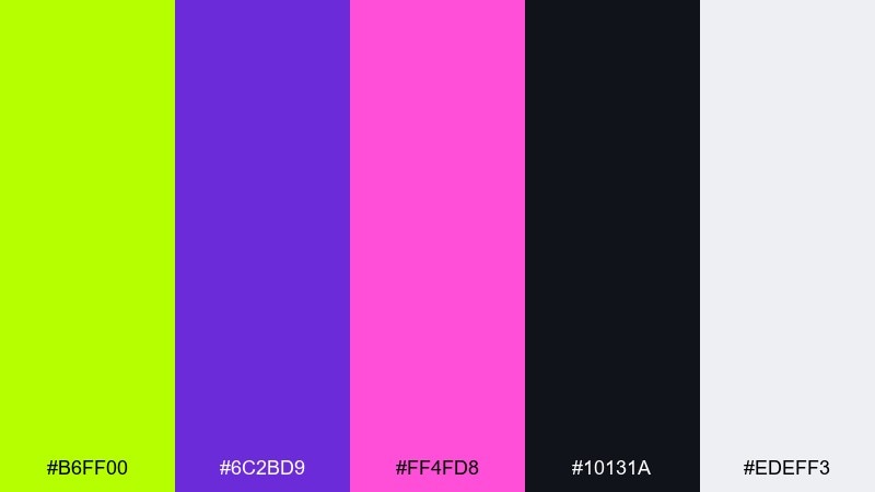
HEX: #9CFF57 #F6E7A6 #D46A2E #6B2D5C #1F1A1D
Mood: retro, theatrical, artsy
Best for: theatre posters and album artwork
Retro and theatrical, it feels like screen-printed playbills and velvet curtains. The burnt orange and plum bring warmth and nostalgia to the bright green, while near-black adds drama. Use it for theatre posters, album artwork, or editorial illustrations where you want a vintage edge. Tip: try a grainy texture overlay to make the colors feel intentionally aged.
Image example of vintage harlequin poster generated using media.io
5) Neon Lime and Plum Pop
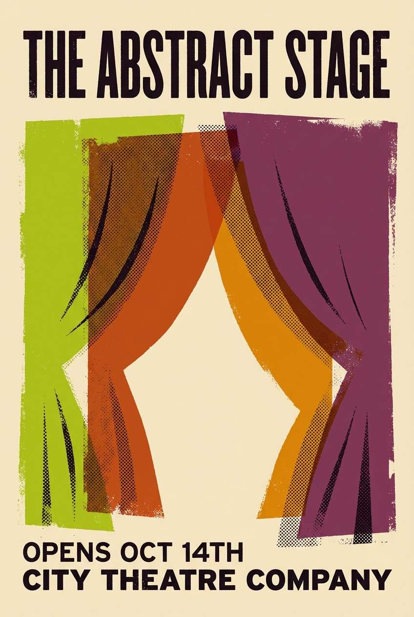
HEX: #B6FF00 #6C2BD9 #FF4FD8 #10131A #EDEFF3
Mood: nightlife, edgy, neon
Best for: music promo graphics and nightlife ads
Nightlife and edgy, it looks like neon signage against a dark club wall. Lime and violet create a striking harlequin color combination that still feels modern when balanced with soft gray. Use it for music promo graphics, nightclub ads, or streaming cover art, and keep layouts bold and simple. Tip: avoid small lime text on dark backgrounds and use it as a glow accent instead.
Image example of neon lime and plum pop generated using media.io
6) Soft Spring Harlequin
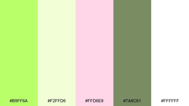
HEX: #B9FF6A #F2FFD6 #FFD6E8 #7A8C61 #FFFFFF
Mood: gentle, airy, springtime
Best for: wedding stationery and lifestyle blogs
Gentle and airy, it brings to mind spring blossoms and sunlit linen. The blush pink softens the bright green, while muted olive keeps the whole set grounded. It fits wedding stationery, lifestyle blog headers, and calm social templates with plenty of white space. Tip: use the lime as a thin border or small icon color so the palette stays delicate.
Image example of soft spring harlequin generated using media.io
7) Forest and Lemon Contrast
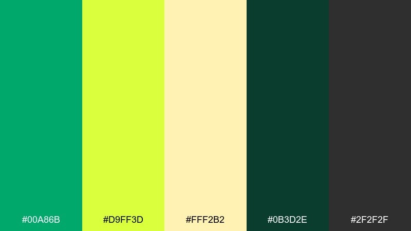
HEX: #00A86B #D9FF3D #FFF2B2 #0B3D2E #2F2F2F
Mood: confident, outdoorsy, crisp
Best for: outdoor gear branding and labels
Confident and outdoorsy, it feels like trail markers and sun filtering through trees. The deep evergreen and charcoal provide structure for the lemon-lime tones to stand out cleanly. Use it for outdoor gear branding, product labels, and signage where clarity matters. Tip: keep the pale yellow as background panels to boost readability for dark type.
Image example of forest and lemon contrast generated using media.io

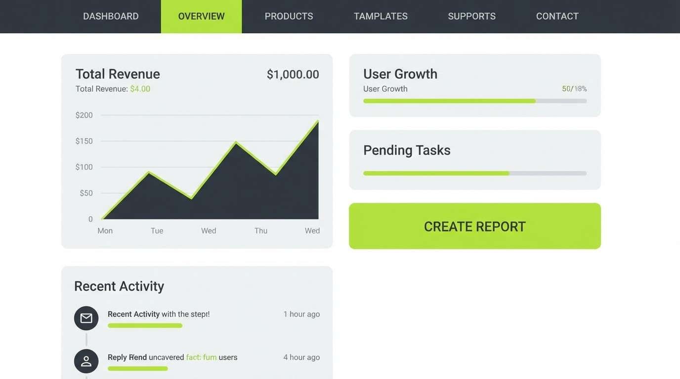
8) Clean UI Lime Accents
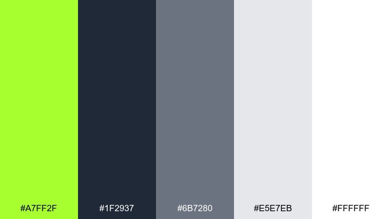
HEX: #A7FF2F #1F2937 #6B7280 #E5E7EB #FFFFFF
Mood: modern, clean, product-focused
Best for: saas UI dashboards and app onboarding
Modern and clean, it suggests a crisp interface with a lively click of color. Charcoal and grays handle the heavy UI work while lime highlights the moments that matter. This harlequin color palette is ideal for SaaS dashboards, onboarding screens, and data cards when you want one confident accent. Tip: apply the lime to primary buttons and active states only to keep the UI calm.
Image example of clean ui lime accents generated using media.io
9) Retro Sport Stripe
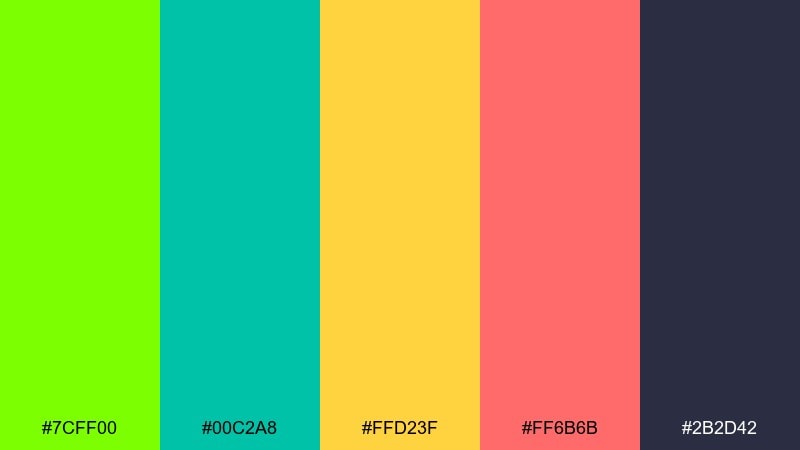
HEX: #7CFF00 #00C2A8 #FFD23F #FF6B6B #2B2D42
Mood: energetic, sporty, retro
Best for: team merch and streetwear graphics
Energetic and sporty, it feels like retro jerseys and racing stripes. Teal and coral add a playful twist to the bright green, keeping the vibe youthful rather than harsh. Use it on team merch, streetwear graphics, or YouTube thumbnails that need instant motion. Tip: build stripe patterns with two dominant colors and keep the others as small highlights.
Image example of retro sport stripe generated using media.io
10) Minimalist Chartreuse Neutrals
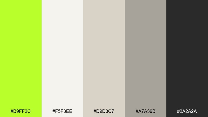
HEX: #B9FF2C #F5F3EE #D9D3C7 #A7A39B #2A2A2A
Mood: minimal, refined, gallery-like
Best for: interior mood boards and minimalist branding
Minimal and refined, it resembles a quiet gallery wall with a single bright highlight. The warm stone neutrals keep the chartreuse feeling sophisticated instead of loud. It works well for interior mood boards, minimalist branding, and premium packaging layouts. Tip: use the green as a tiny stamp, rule line, or icon to signal freshness without breaking the calm.
Image example of minimalist chartreuse neutrals generated using media.io
11) Jewel Night Parade
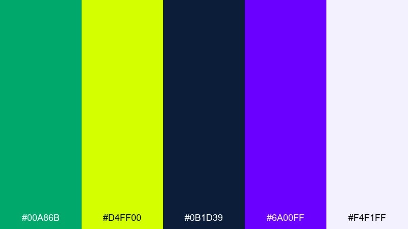
HEX: #00A86B #D4FF00 #0B1D39 #6A00FF #F4F1FF
Mood: bold, luminous, night-time
Best for: tech branding and hero sections
Bold and luminous, it brings to mind city lights and glossy signage after dark. The deep navy gives the greens a jewel-like glow, while violet adds a futuristic edge. As a harlequin color scheme, it is strong for tech branding, landing page hero sections, and product launches that need drama. Tip: pair with subtle gradients from navy to violet and keep green for the primary CTA.
Image example of jewel night parade generated using media.io

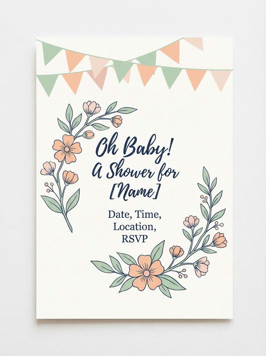
12) Pastel Garden Party
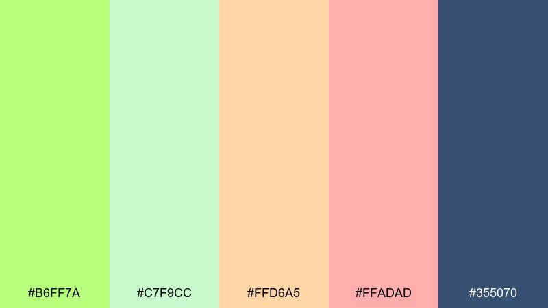
HEX: #B6FF7A #C7F9CC #FFD6A5 #FFADAD #355070
Mood: cheerful, friendly, pastel
Best for: baby shower invites and craft templates
Cheerful and friendly, it feels like pastel bunting in a backyard garden. The soft peach and rosy tones balance the minty greens so everything stays welcoming. Use it for baby shower invites, craft templates, or lighthearted community posts. Tip: keep the navy for small text and outlines to avoid turning the design too heavy.
Image example of pastel garden party generated using media.io
13) Tropical Market
HEX: #7DFF00 #00D084 #FFB000 #FF5A5F #2D1E2F
Mood: vibrant, juicy, summery
Best for: food packaging and cafe menus
Vibrant and juicy, it reads like tropical fruit crates and hand-painted price tags. The warm amber and coral add appetite appeal, while the dark plum keeps the composition bold. It is great for food packaging, cafe menus, and seasonal promos where color does the selling. Tip: use the green for freshness cues and let the amber lead on appetizing highlights.
Image example of tropical market generated using media.io
14) Editorial Highlight
HEX: #A6FF2A #111827 #F9FAFB #F59E0B #EF4444
Mood: punchy, newsy, attention-grabbing
Best for: magazine layouts and blog feature images
Punchy and newsy, it feels like highlighted pull quotes and sharp headlines. The lime works as a marker-style accent, while ink black and paper white keep the layout readable. Use it for magazine spreads, blog feature images, and announcement graphics with strong typographic hierarchy. Tip: limit orange and red to tiny badges so the lime stays the primary highlight.
Image example of editorial highlight generated using media.io
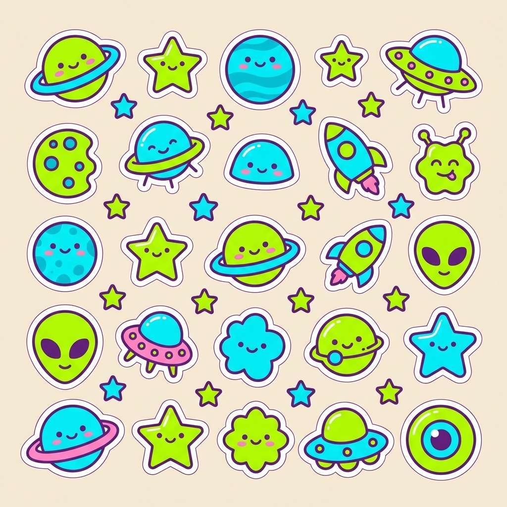
15) Kids Sticker Fun
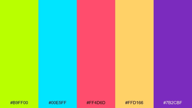
HEX: #B9FF00 #00E5FF #FF4D6D #FFD166 #7B2CBF
Mood: playful, bubbly, kid-friendly
Best for: kids app icons and sticker packs
Playful and bubbly, it looks like sticker sheets and toy packaging. The bright cyan and berry pink make the lime feel friendly, while purple adds a fun anchor. Use it for kids app icons, sticker packs, or classroom printables where shapes and characters carry the message. Tip: keep backgrounds light and use thick outlines so the colors stay clean and readable.
Image example of kids sticker fun generated using media.io
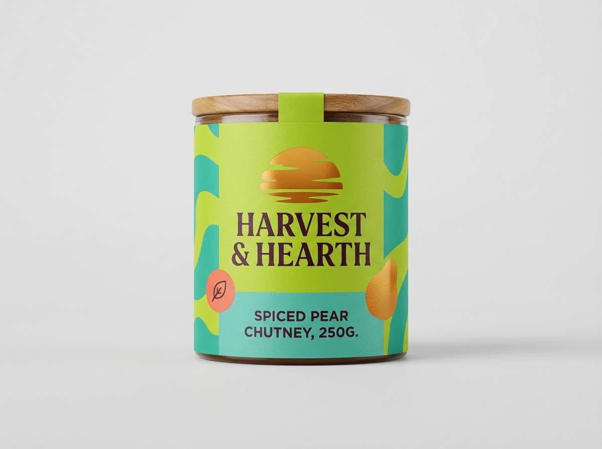
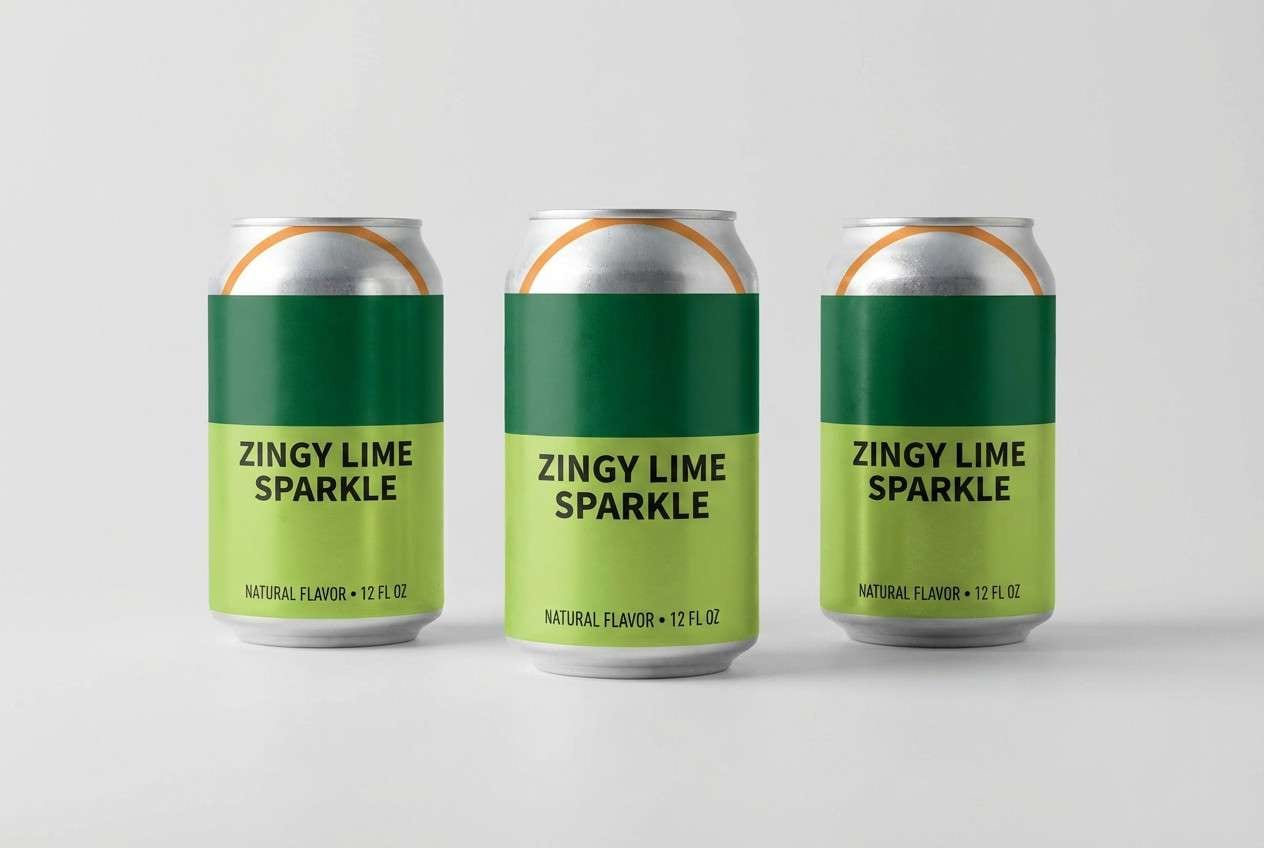
16) Modern Packaging Zest
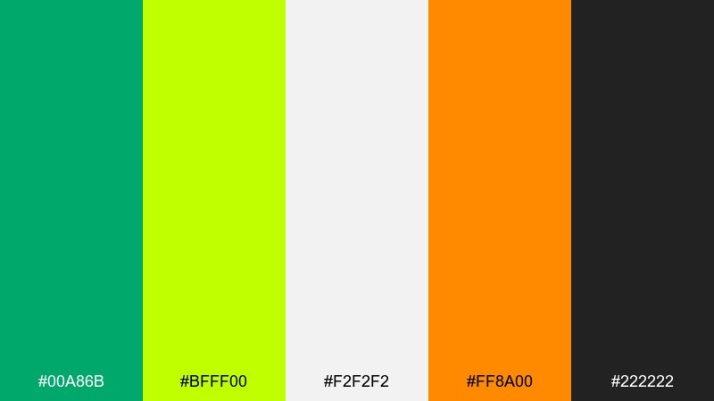
HEX: #00A86B #BFFF00 #F2F2F2 #FF8A00 #222222
Mood: fresh, premium, contemporary
Best for: beverage cans and supplement packaging
Fresh and premium, it feels like a crisp label with a zing of citrus. The cool grays elevate the greens, while orange adds a controlled burst of flavor. These harlequin color combinations suit beverage cans, supplements, and modern CPG packaging when you want clean shelves and strong contrast. Tip: use matte silver-gray as the base and place lime in a single bold band for instant recognition.
Image example of modern packaging zest generated using media.io
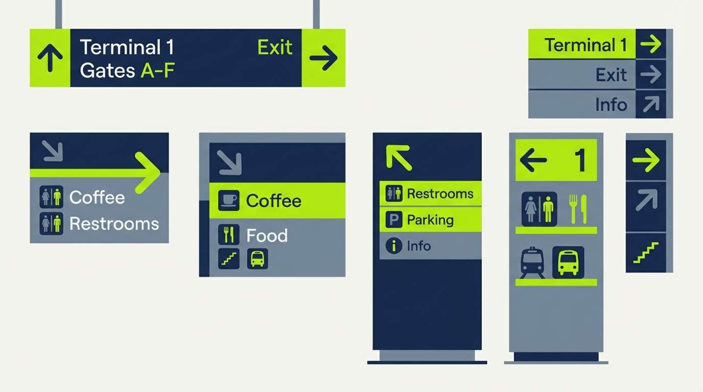
17) Urban Street Sign
HEX: #A8FF3A #0F172A #334155 #94A3B8 #F8FAFC
Mood: urban, utilitarian, clear
Best for: wayfinding systems and safety signage
Urban and utilitarian, it recalls street signage and clean directional systems. The slate range supports strong hierarchy, while the bright green calls attention fast. Use it for wayfinding, safety signage, or technical documentation graphics where clarity is non-negotiable. Tip: keep the green only for actionable elements like arrows, highlights, and status indicators.
Image example of urban street sign generated using media.io
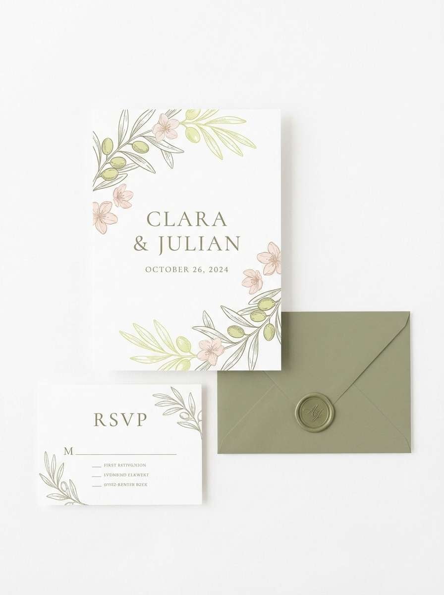
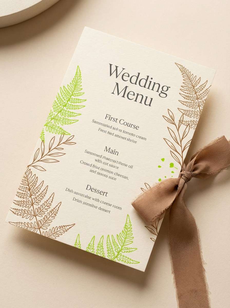
18) Wedding Greenery Accent
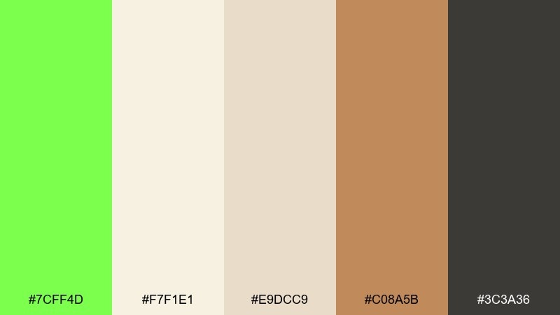
HEX: #7CFF4D #F7F1E1 #E9DCC9 #C08A5B #3C3A36
Mood: romantic, natural, warm
Best for: rustic wedding menus and place cards
Romantic and natural, it feels like greenery tucked into warm linen and wood. The creamy neutrals and terracotta-brown bring the bright green into a softer, more elegant space. Use it for rustic wedding menus, place cards, or venue signage paired with textured paper. Tip: choose the green for small botanical motifs and keep the rest in warm neutrals for a timeless look.
Image example of wedding greenery accent generated using media.io
19) Tech Dashboard Glow
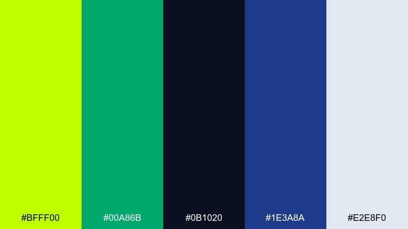
HEX: #BFFF00 #00A86B #0B1020 #1E3A8A #E2E8F0
Mood: futuristic, focused, high-contrast
Best for: analytics dashboards and dark mode UI
Futuristic and focused, it looks like glowing indicators on a dark control panel. The two greens provide clear status signals, while navy and near-black keep everything sleek. It is a strong fit for analytics dashboards, dark mode UI, and monitoring screens with lots of data. Tip: use the lime for alerts or active states and the deeper green for confirmations to build intuitive hierarchy.
Image example of tech dashboard glow generated using media.io
20) Sunset Lime Twist
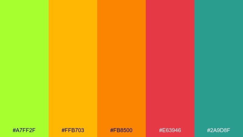
HEX: #A7FF2F #FFB703 #FB8500 #E63946 #2A9D8F
Mood: warm, adventurous, upbeat
Best for: travel promos and summer campaign ads
Warm and adventurous, it feels like a sunset ride with a bright green twist. Gold and orange bring heat, while teal cools the mix so it stays balanced. Use it for travel promos, summer campaign ads, and energetic landing sections with bold shapes. Tip: let orange lead the imagery and use lime as a sharp accent for buttons or price tags.
Image example of sunset lime twist generated using media.io
What Colors Go Well with Harlequin?
Harlequin pairs best with strong anchors: charcoal, near-black, deep navy, and forest green keep it readable and prevent the palette from feeling “neon-only.” These darker tones are especially important for typography and UI elements.
For a more premium look, combine harlequin with warm neutrals like cream, stone, beige, and greige. This turns the bright green into a refined accent rather than the entire visual personality.
If you want bold contrast, try violet, magenta, coral, or orange as controlled accents. The key is proportion: let harlequin lead, and keep the other brights for badges, highlights, or one secondary shape.
How to Use a Harlequin Color Palette in Real Designs
Start with role-based color assignments: use neutrals for backgrounds and body text, then use harlequin for primary actions (buttons, highlights, key icons). This keeps hierarchy clear while still delivering that fresh punch.
In print and packaging, treat harlequin like a spot accent—bands, seals, or small botanical marks—so it prints cleanly and doesn’t overpower product information. Pair it with warm paper whites for a natural feel or with cool grays for a modern shelf look.
For branding systems, define a “bright limit” rule: one hero green, one secondary accent, and the rest supportive neutrals. Consistency across social, web, and merch is what makes vivid palettes feel intentional.
Create Harlequin Palette Visuals with AI
If you can describe the vibe (sporty, minimalist, vintage, neon), you can generate on-brand harlequin visuals in minutes. Use the prompts above as templates, then swap subjects (poster, UI, packaging) to match your project.
In Media.io, you can quickly iterate: adjust the background, change typography style, or refine composition while keeping the same core HEX direction. This is especially useful when you need multiple campaign variations that still look consistent.
Once you have a direction you like, export your best results and apply the HEX set to your design system for repeatable colors across web and print.
Harlequin Color Palette FAQs
-
What is the HEX code for harlequin green?
Harlequin is often represented as a vivid green-yellow; in this article, the core harlequin family includes bright greens like #00A86B and high-energy limes like #BFFF00/#B7FF00 used as accents and highlights. -
Is harlequin closer to green or yellow?
Harlequin sits between green and yellow, so it can read “fresh green” in some contexts and “electric lime” in others. Surrounding colors (navy vs. cream, for example) strongly influence how it’s perceived. -
What neutral colors work best with harlequin?
Charcoal, near-black, cool grays, and warm off-whites work best. They give harlequin enough contrast to stay crisp while keeping layouts clean and easy to read. -
What are good complementary accent colors for harlequin?
Violet, plum, magenta, and coral are standout accents because they contrast harlequin without making it feel muddy. Use these in small doses (badges, icons, one callout) to avoid visual overload. -
How do I use harlequin in UI design without it looking too neon?
Use harlequin primarily for primary buttons, active states, and key indicators, and keep the rest of the interface in grays/white (or navy in dark mode). Avoid long passages of lime text; prioritize readability and contrast. -
Does harlequin print well on packaging?
Yes, but brightness can vary by paper stock and ink. For reliable results, use harlequin as a bold band or spot accent, and pair it with strong dark type (black/charcoal) on cream or light gray bases. -
How can I generate harlequin-themed mockups quickly?
Use a text-to-image tool with a clear subject (poster, dashboard, label) and specify dominant colors plus a single accent. The prompts in this article are ready to copy into Media.io for fast iterations.


