

A cozy color palette is all about warmth, softness, and a sense of lived-in comfort. Think creamy neutrals, muted browns, gentle oranges, and quiet greens that feel calm instead of loud.
Below are 20+ modern cozy palette combinations with HEX codes, plus practical ideas for using them in branding, UI, and interior-style visuals.
In this article
- Why Cozy Palettes Work So Well
-
- fireside latte
- wool blanket
- cinnamon oat
- amber cabin
- hearthstone
- maple orchard
- toasted clay
- cocoa dusk
- pumpkin cream
- honeyed linen
- mossy cottage
- spiced rose
- golden hour glow
- nutmeg neutral
- berry tea
- sandstone study
- autumn plaid
- cashmere taupe
- soft copper
- evening cardamom
- baked almond
- caramel library
- What Colors Go Well with Cozy?
- How to Use a Cozy Color Palette in Real Designs
- Create Cozy Palette Visuals with AI
Why Cozy Palettes Work So Well
Cozy palettes feel approachable because they sit close to natural materials we already associate with comfort: cream walls, wood grain, wool textiles, warm lighting, and earthy ceramics. That familiarity makes designs feel welcoming fast.
They also create calm structure. Warm neutrals provide a soft “base layer” that keeps layouts readable, while deeper browns and muted accents add hierarchy without harsh contrast.
Most importantly, cozy color schemes translate well across mediums—from brand packaging to UI components to room inspiration—because they’re easy on the eyes and forgiving across different screens and print finishes.
20+ Cozy Color Palette Ideas (with HEX Codes)
1) Fireside Latte
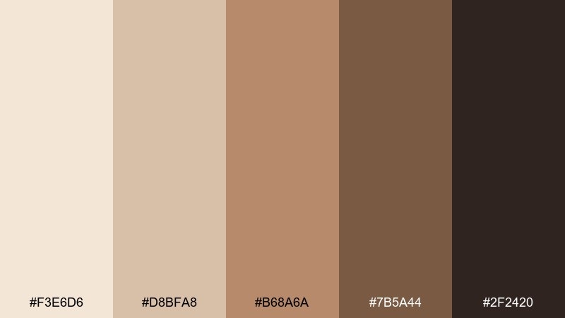
HEX: #f3e6d6 #d8bfa8 #b68a6a #7b5a44 #2f2420
Mood: warm, grounded, comforting
Best for: coffee shop branding and menu design
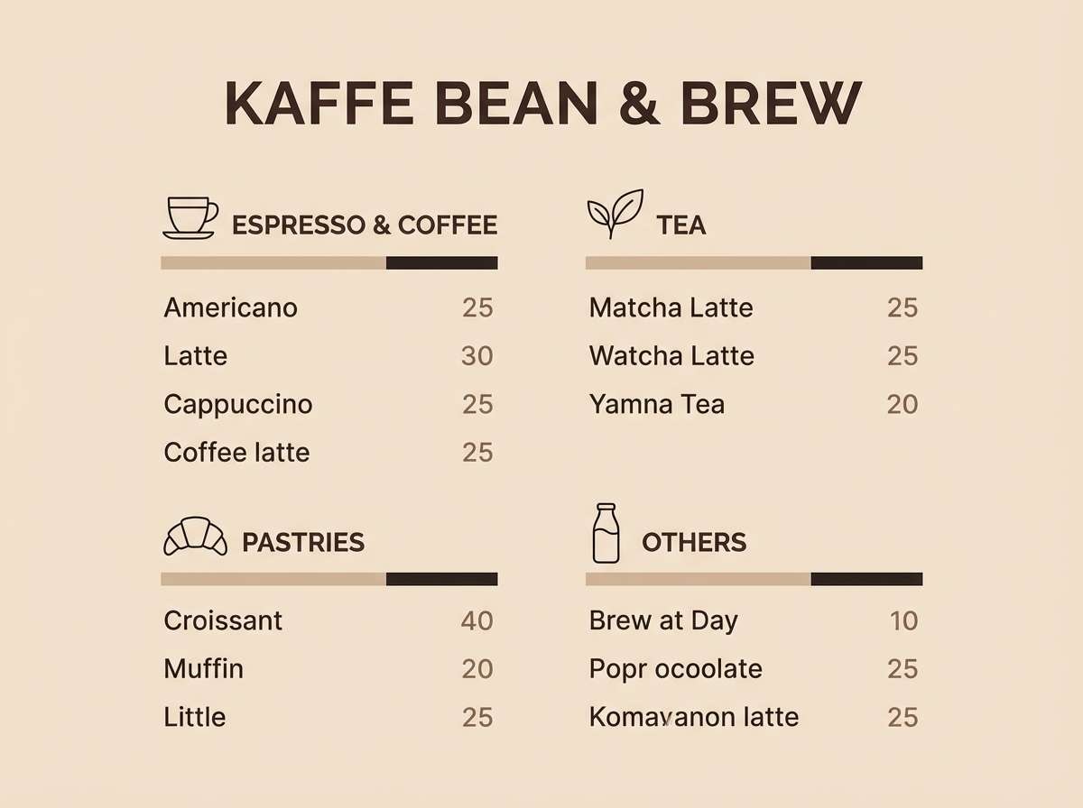
Warm and grounded like a late-night latte by the fireplace, these tones feel familiar and welcoming. Use the cream and oat shades for backgrounds, then lean on caramel and espresso for typography and dividers. It works beautifully on menus, loyalty cards, and packaging labels. Tip: keep the darkest brown for headings only so the layout stays airy.
Image example of fireside latte generated using media.io
Media.io is an online AI studio for creating and editing video, image, and audio in your browser.

2) Wool Blanket
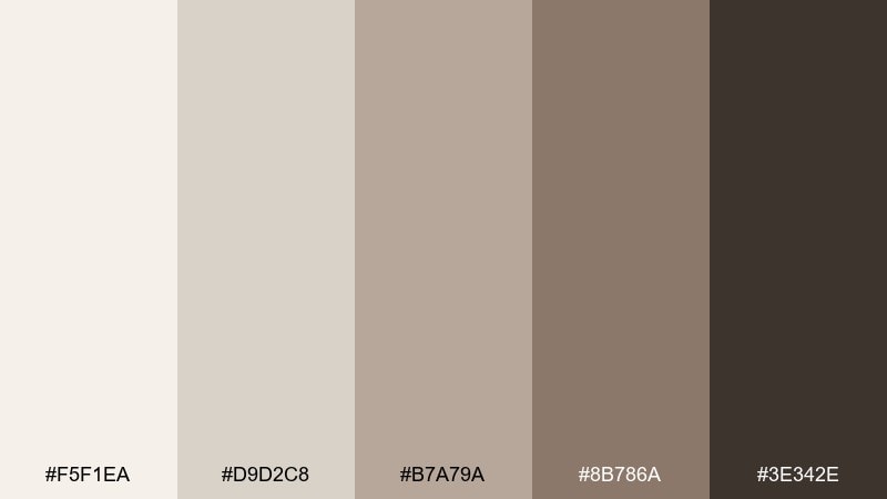
HEX: #f5f1ea #d9d2c8 #b7a79a #8b786a #3e342e
Mood: soft, calm, homey
Best for: living room interior styling
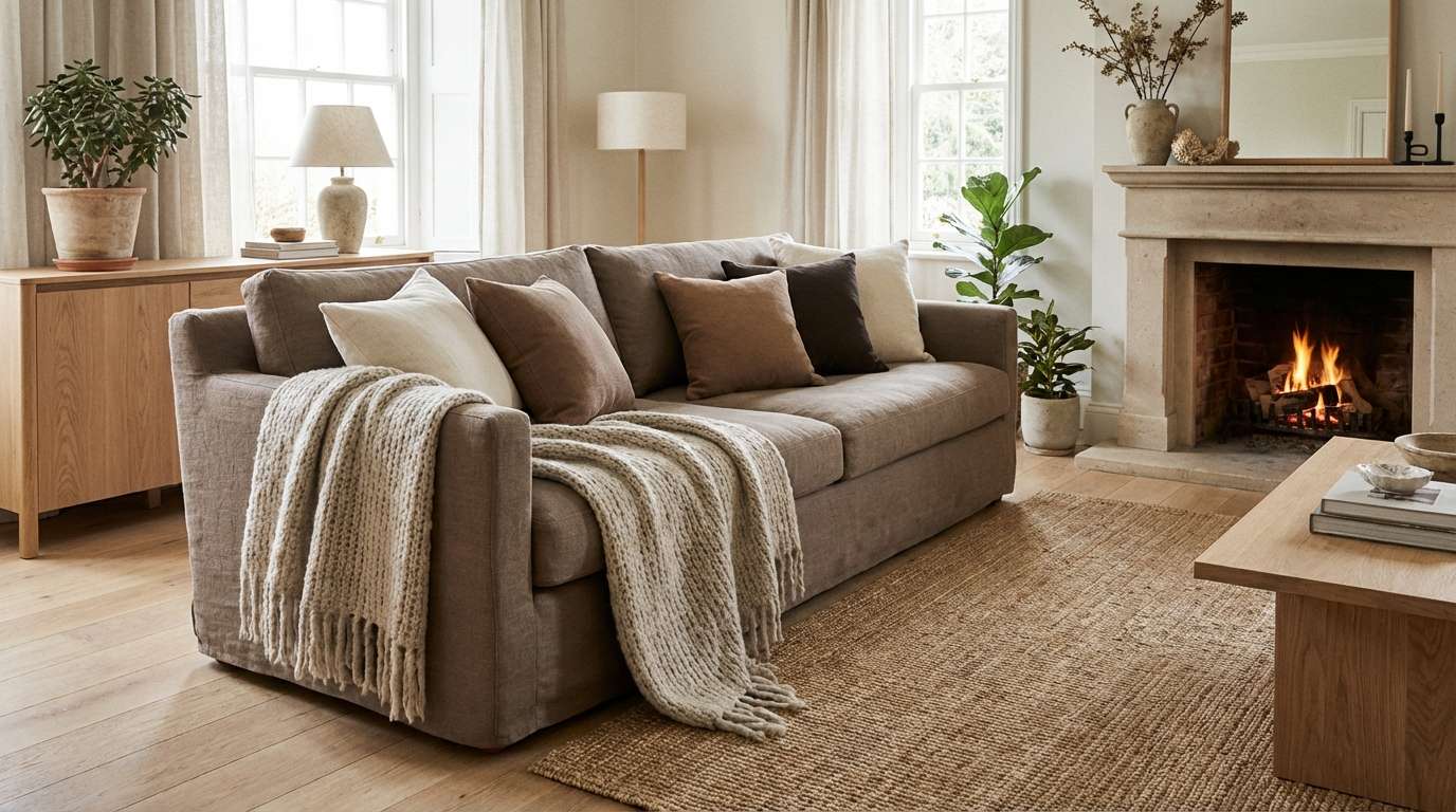
Soft and quiet like a folded wool throw, this mix reads as calm without feeling bland. Build the room around the warm off-white and stone, then bring depth with taupe wood tones and a near-espresso accent. It shines with textured fabrics, matte ceramics, and natural grain. Tip: repeat the darkest shade in small details like frames or hardware for cohesion.
Image example of wool blanket generated using media.io
3) Cinnamon Oat
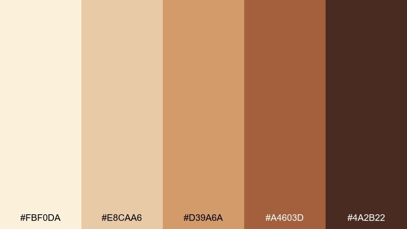
HEX: #fbf0da #e8caa6 #d39a6a #a4603d #4a2b22
Mood: spiced, sunny, inviting
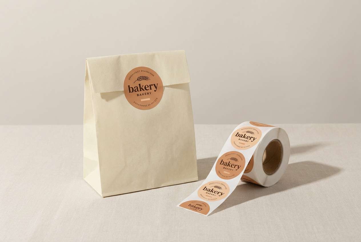
Best for: bakery packaging and stickers
Spiced and sunny like cinnamon on warm oatmeal, these hues feel instantly inviting. Use the creamy base for labels, then layer honey and cinnamon tones for icons and pattern work. For a friendly look, pair it with rounded type and simple line illustrations. Tip: print the darkest shade sparingly so the packaging stays light and giftable.
Image example of cinnamon oat generated using media.io
4) Amber Cabin
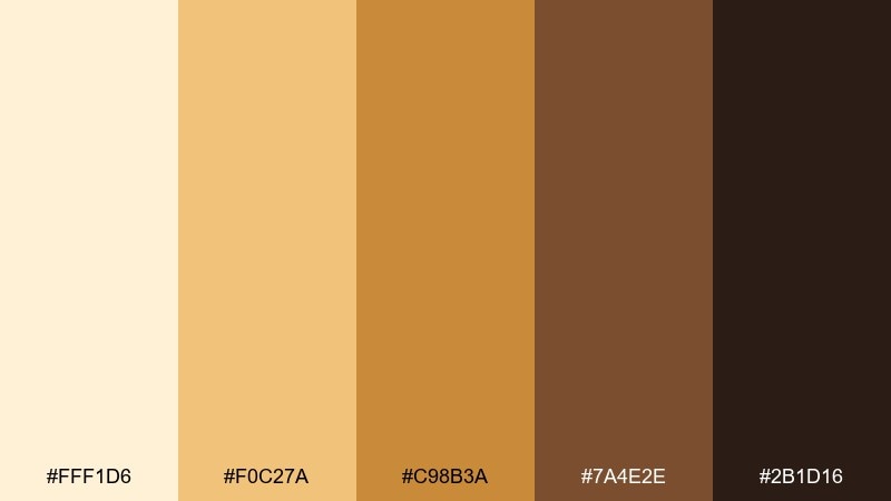
HEX: #fff1d6 #f0c27a #c98b3a #7a4e2e #2b1d16
Mood: rustic, golden, snug
Best for: outdoor lodge website hero section
Rustic and golden like lantern light in a cabin window, this set feels snug and adventurous. Let the pale cream carry large areas, then use amber and wood-brown for buttons and headlines. It pairs well with nature photography, leather textures, and simple map icons. Tip: keep contrast high by placing amber only on darker backgrounds for readability.
Image example of amber cabin generated using media.io

5) Hearthstone
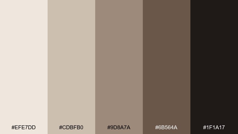
HEX: #efe7dd #cdbfb0 #9d8a7a #6b564a #1f1a17
Mood: minimal, steady, refined
Best for: premium editorial layout
Minimal and steady like smooth stones by a hearth, these neutrals look refined in print. Use the lightest tone for generous margins, then set body text in the deep charcoal for crisp legibility. The mid taupes work well for rules, captions, and subtle infographics. Tip: add texture through paper grain or soft shadows instead of extra colors.
Image example of hearthstone generated using media.io
6) Maple Orchard
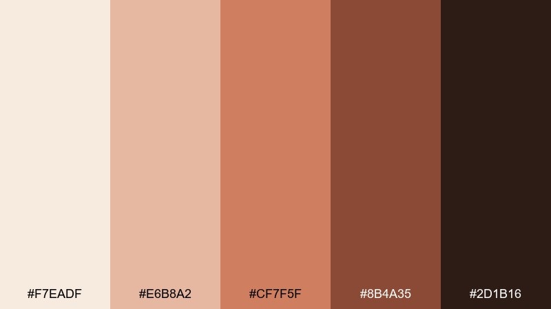
HEX: #f7eadf #e6b8a2 #cf7f5f #8b4a35 #2d1b16
Mood: autumnal, sweet, welcoming
Best for: fall event flyer design
Autumnal and sweet like maple treats at an orchard stand, these shades feel welcoming and festive. Start with the pale blush-cream as your base, then add warm coral and maple-brown for headlines and highlights. One of the most versatile cozy color combinations for seasonal promos, it also pairs nicely with kraft paper textures. Tip: keep icons in one solid tone to avoid visual clutter.
Image example of maple orchard generated using media.io

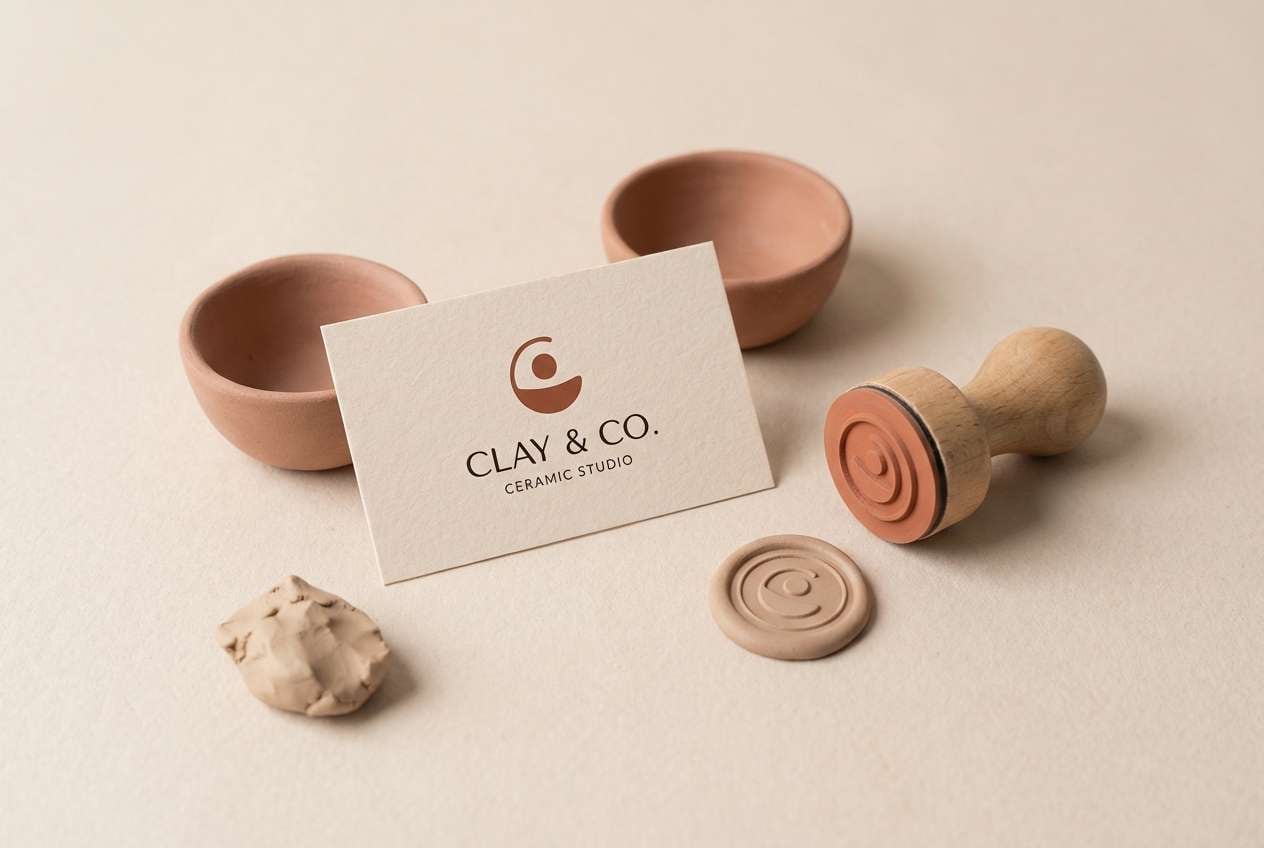
7) Toasted Clay
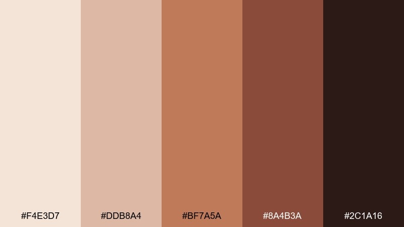
HEX: #f4e3d7 #ddb8a4 #bf7a5a #8a4b3a #2c1a16
Mood: earthy, artisanal, warm
Best for: ceramic studio brand identity
Earthy and artisanal like freshly fired clay, this palette feels handmade and honest. Use the soft peach-cream for backgrounds and packaging wraps, then bring in terracotta for logos and stamps. It pairs naturally with uncoated paper, pottery photography, and simple monoline marks. Tip: reserve the darkest shade for your logo lockup to keep everything looking crafted, not heavy.
Image example of toasted clay generated using media.io
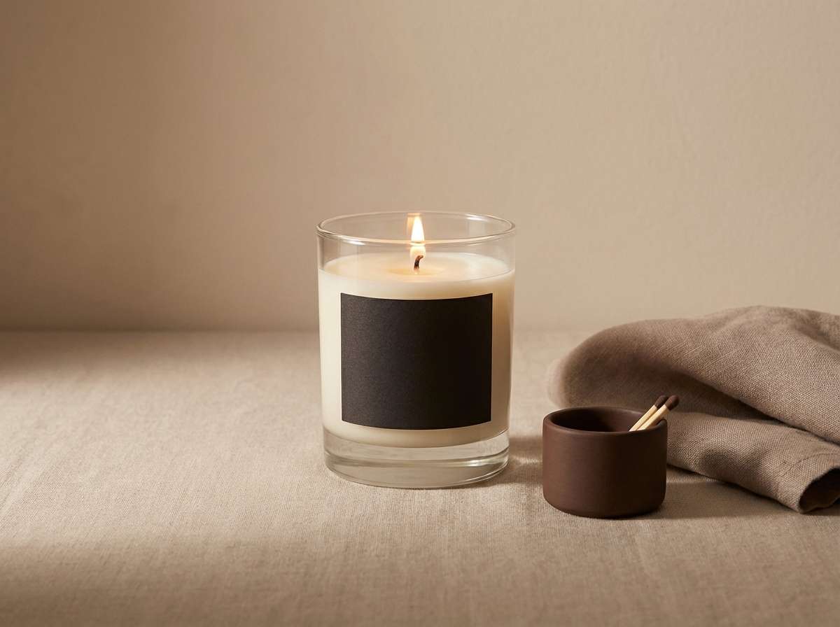
8) Cocoa Dusk
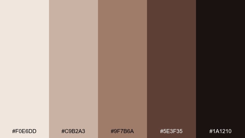
HEX: #f0e6dd #c9b2a3 #9f7b6a #5e3f35 #1a1210
Mood: moody, intimate, elegant
Best for: candle product ad
Moody and intimate like cocoa at dusk, these tones add elegance without feeling cold. Lean on the creamy top note for negative space, then build depth with cocoa and espresso shadows. It works especially well for candle ads, fragrance brands, and gift sets where warmth matters. Tip: use soft gradients between the mid browns to mimic candlelight glow.
Image example of cocoa dusk generated using media.io
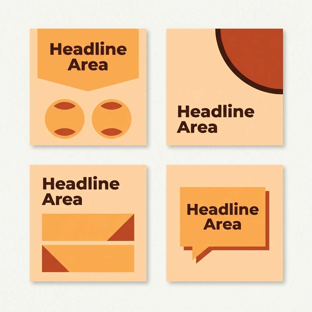
9) Pumpkin Cream
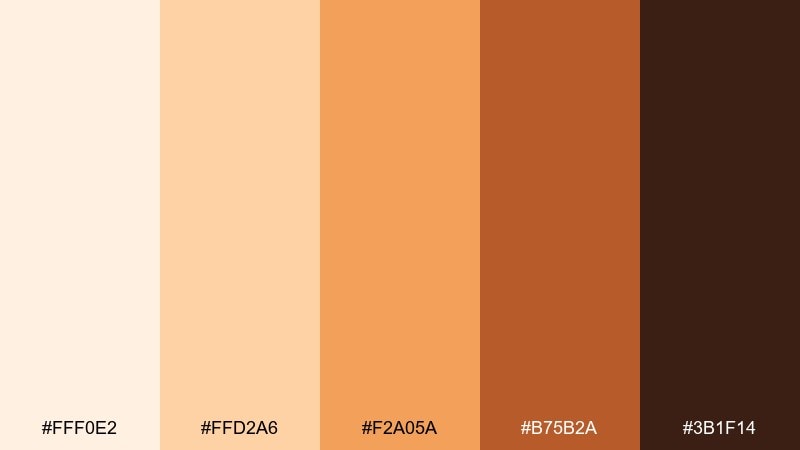
HEX: #fff0e2 #ffd2a6 #f2a05a #b75b2a #3b1f14
Mood: cheerful, toasty, playful
Best for: seasonal social media templates
Cheerful and toasty like pumpkin cream foam, this set brings instant seasonal energy. Use the soft cream as your canvas, then let bright pumpkin lead the accents for stickers, badges, and callouts. It pairs nicely with dark chocolate text for strong contrast and easy readability. Tip: keep the orange confined to 10 to 15 percent of the layout to avoid overpowering the feed.
Image example of pumpkin cream generated using media.io
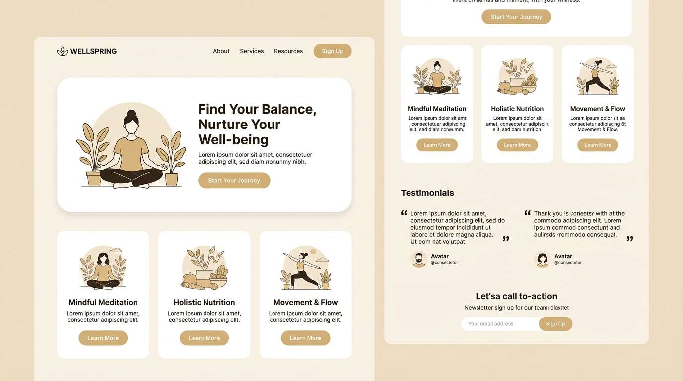
10) Honeyed Linen
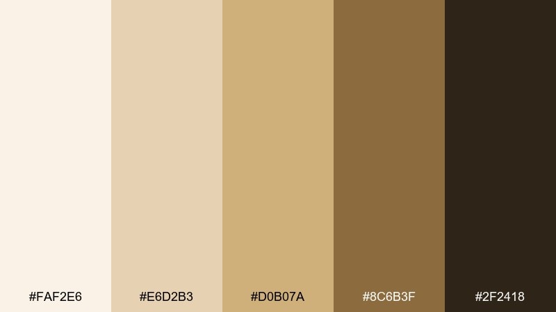
HEX: #faf2e6 #e6d2b3 #d0b07a #8c6b3f #2f2418
Mood: bright, wholesome, natural
Best for: wellness landing page UI
Bright and wholesome like sun on linen, these hues feel clean yet warm. Build a calm UI with the creamy base and subtle beige panels, then use honey-gold for primary buttons and progress states. For balance, pair it with plenty of white space and soft photography. Tip: use the deep olive-brown only for key labels so the interface stays light.
Image example of honeyed linen generated using media.io
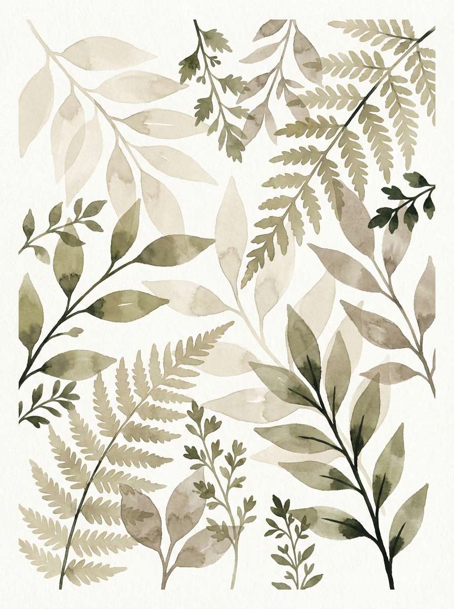
11) Mossy Cottage
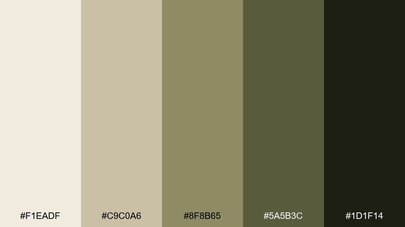
HEX: #f1eadf #c9c0a6 #8f8b65 #5a5b3c #1d1f14
Mood: earthy, quiet, restorative
Best for: botanical watercolor poster
Earthy and quiet like moss on a cottage wall, this mix feels restorative. Let the warm off-white keep the poster airy, then paint foliage with sage and deep moss for contrast. It pairs well with vintage botanical linework and deckled paper textures. Tip: limit the darkest green to stems and shadows so the illustration stays soft.
Image example of mossy cottage generated using media.io
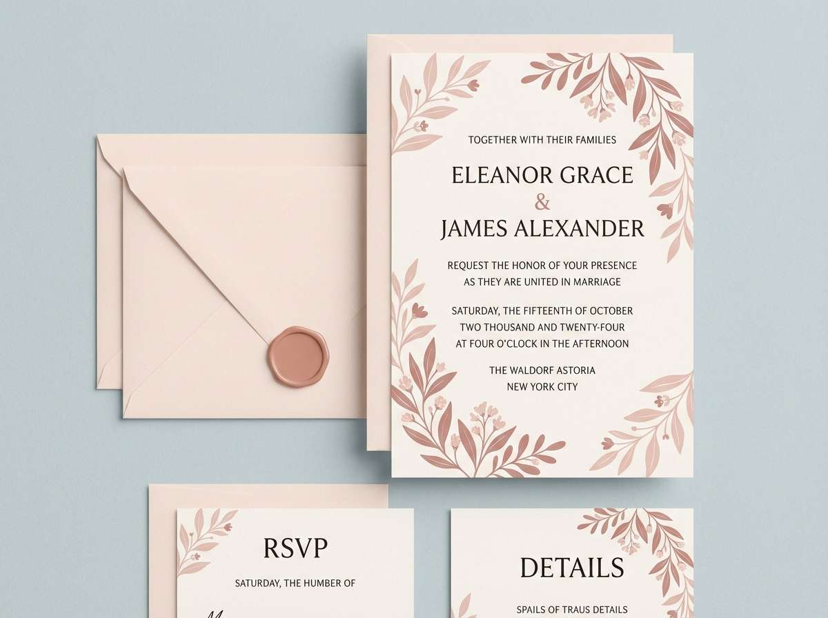
12) Spiced Rose
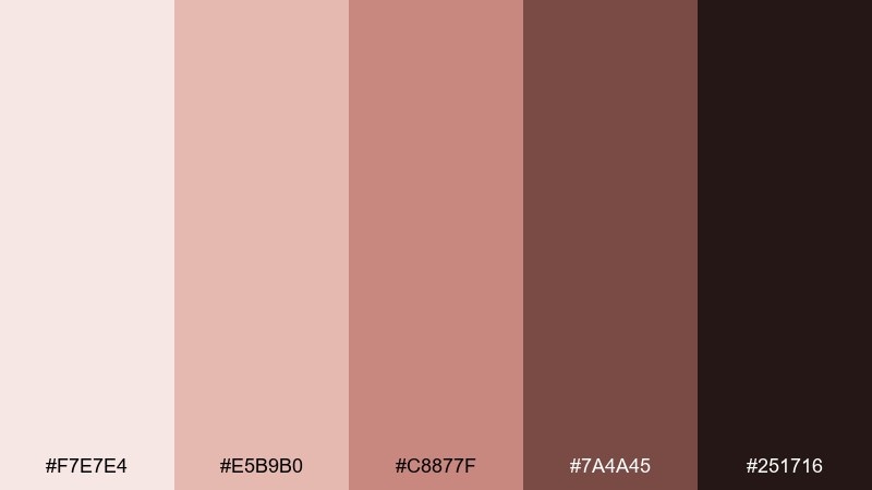
HEX: #f7e7e4 #e5b9b0 #c8877f #7a4a45 #251716
Mood: romantic, muted, cozy-chic
Best for: wedding invitation suite
Romantic and muted like dried roses and warm spice, these colors feel intimate and grown-up. Use the blush-cream for the invitation base, then bring in dusty rose for names and monograms. These cozy color combinations look great with letterpress textures, wax seals, and serif typography. Tip: keep the deepest shade for the RSVP details to maintain crisp readability.
Image example of spiced rose generated using media.io
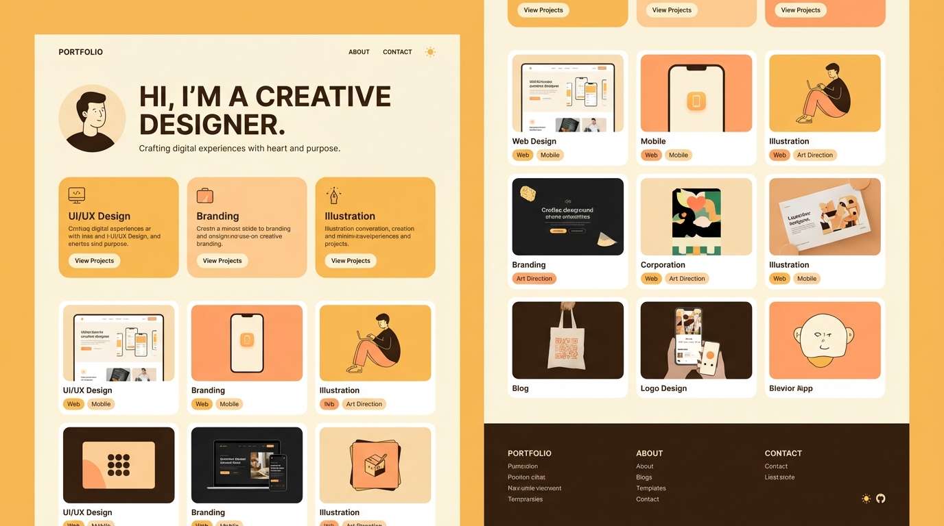
13) Golden Hour Glow
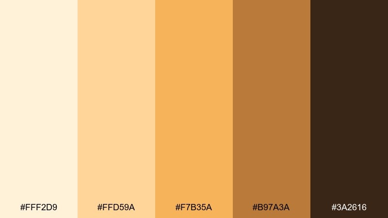
HEX: #fff2d9 #ffd59a #f7b35a #b97a3a #3a2616
Mood: radiant, uplifting, friendly
Best for: creative portfolio homepage
Radiant and uplifting like golden hour light on walls, this set feels friendly and energetic. Use the pale cream for large sections, then apply warm amber for highlights, hover states, and featured tags. It pairs nicely with dark brown type and rounded UI elements for a modern, approachable look. Tip: try a subtle amber-to-cream gradient behind the hero headline for glow without glare.
Image example of golden hour glow generated using media.io
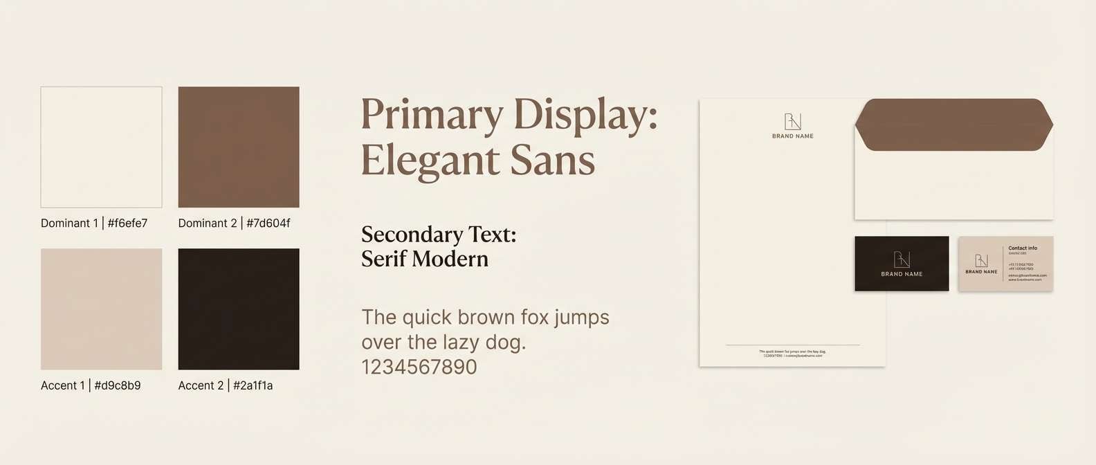
14) Nutmeg Neutral
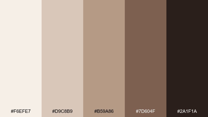
HEX: #f6efe7 #d9c8b9 #b59a86 #7d604f #2a1f1a
Mood: balanced, neutral, classic
Best for: brand guidelines and stationery
Balanced and classic like nutmeg dusted on cream, these neutrals are easy to live with. Use the light tones for generous white space, then anchor the system with the deeper brown for titles and rules. The mid taupes work well for secondary buttons, icons, and subtle background blocks. Tip: specify one accent shade only for calls to action to keep the guidelines consistent.
Image example of nutmeg neutral generated using media.io
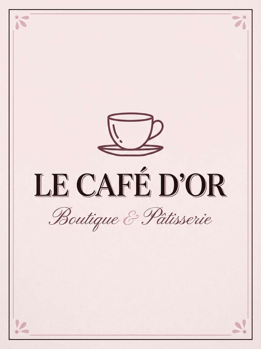
15) Berry Tea
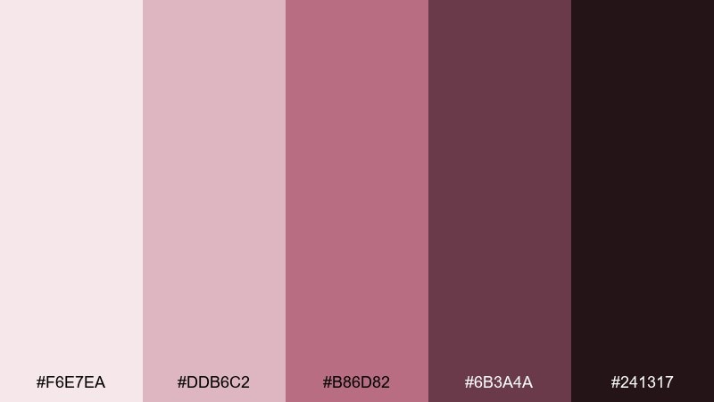
HEX: #f6e7ea #ddb6c2 #b86d82 #6b3a4a #241317
Mood: cozy, sophisticated, slightly moody
Best for: boutique cafe poster
Cozy and sophisticated like berry tea in a ceramic mug, these tones add warmth with a hint of drama. Use the pale rose as a poster base, then set headlines in the plum shade for strong contrast. It pairs beautifully with minimal photography and thin line icons. Tip: keep the darkest tone for small text only to avoid a heavy, overly formal feel.
Image example of berry tea generated using media.io
16) Sandstone Study
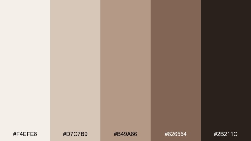
HEX: #f4efe8 #d7c7b9 #b49a86 #826554 #2b211c
Mood: focused, calm, academic
Best for: reading nook interior moodboard
Focused and calm like sunlit sandstone, these tones make a space feel settled and tidy. Use the light cream and sand for walls and textiles, then bring in the deeper browns through wood shelves and lamp bases. It pairs well with brass details, woven baskets, and matte black accents. Tip: repeat the mid taupe across at least three items so the room looks intentionally layered.
Image example of sandstone study generated using media.io
17) Autumn Plaid
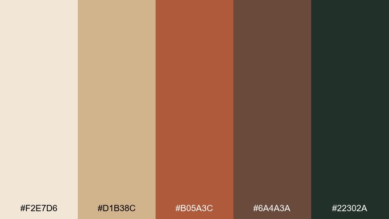
HEX: #f2e7d6 #d1b38c #b05a3c #6a4a3a #22302a
Mood: heritage, outdoorsy, textured
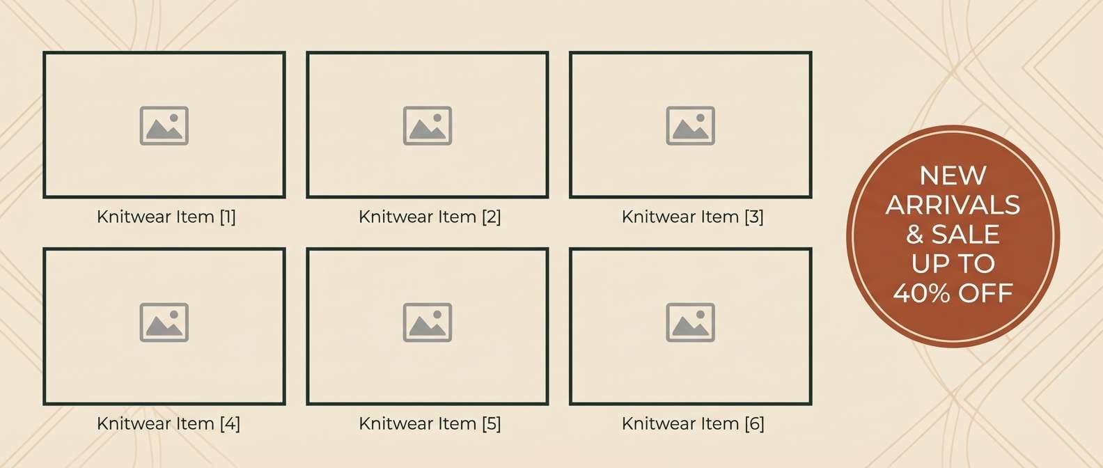
Best for: knitwear ecommerce banner
Heritage and outdoorsy like a favorite plaid scarf, this set feels textured and familiar. Use the warm cream as a base, then alternate camel and rust for product highlights and sale tags. The deep green-black adds a modern edge for headings and price text. Tip: keep patterns subtle so the clothing photos stay the star.
Image example of autumn plaid generated using media.io
18) Cashmere Taupe
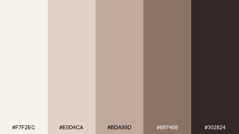
HEX: #f7f2ec #e0d4ca #bda99d #887468 #302824
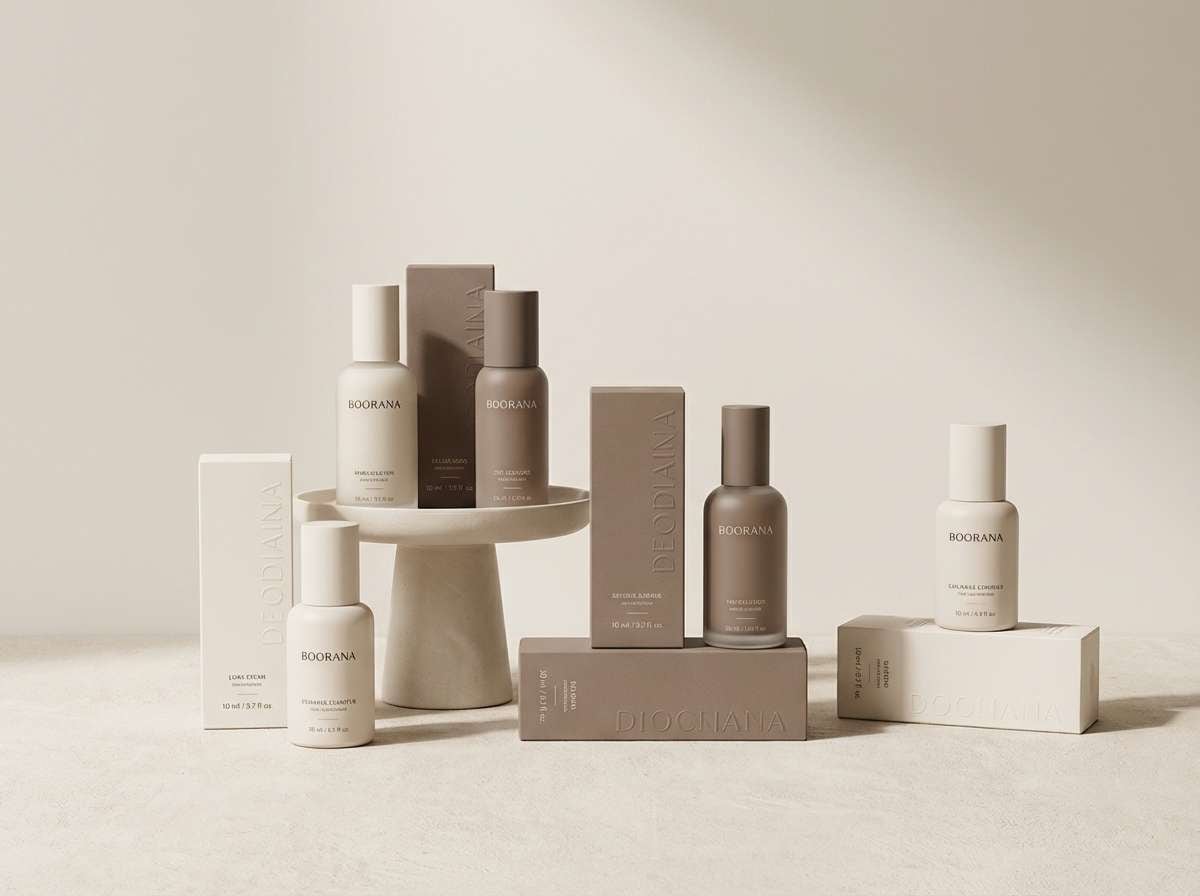
Mood: luxury, soft, understated
Best for: skincare packaging design
Luxury and soft like cashmere against skin, these taupes feel understated and premium. Use the pale ivory for the bottle base, then apply mid taupe for labels and subtle patterning. A cozy color palette like this looks best with minimal copy, generous spacing, and matte finishes. Tip: emboss the darkest shade as foil-free typography for a tactile, quiet effect.
Image example of cashmere taupe generated using media.io
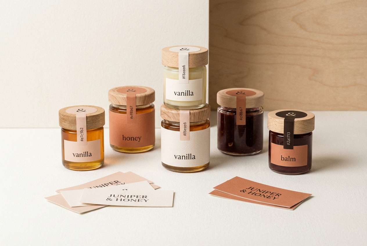
19) Soft Copper
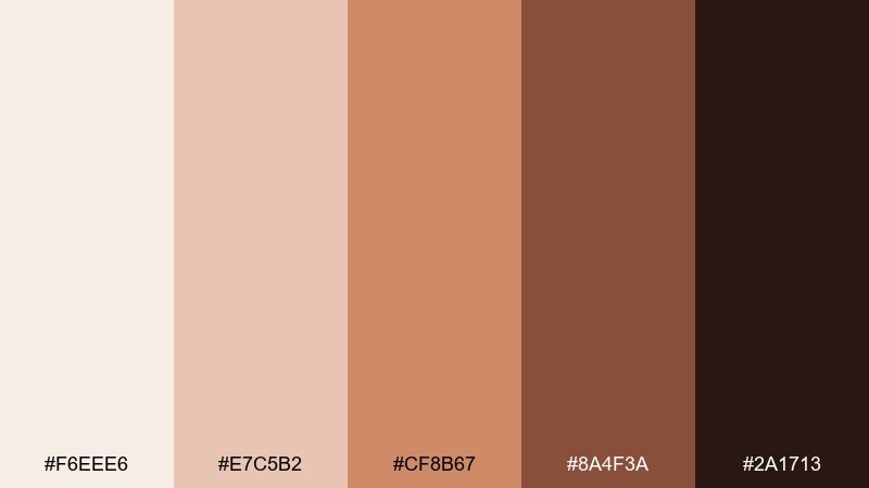
HEX: #f6eee6 #e7c5b2 #cf8b67 #8a4f3a #2a1713
Mood: warm, polished, artistic
Best for: artisan product label set
Warm and polished like soft copper cookware, these colors feel artistic and elevated. Use the pale base for label stock, then feature copper and clay tones for logos and badges. The deeper brown keeps text readable and gives the set a handcrafted finish. Tip: use one copper shade for metallic ink effects and keep the rest matte for contrast.
Image example of soft copper generated using media.io
20) Evening Cardamom
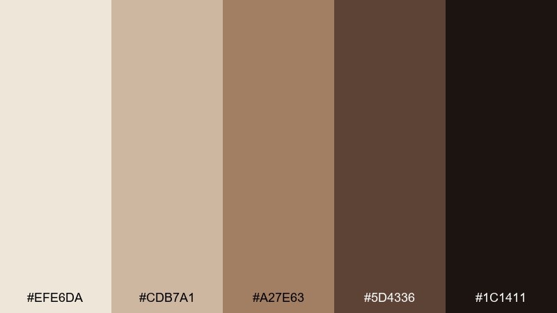
HEX: #efe6da #cdb7a1 #a27e63 #5d4336 #1c1411
Mood: quiet, intimate, timeless
Best for: book cover design
Quiet and intimate like cardamom tea at night, these tones feel timeless and literary. Let the light beige support the title area, then use the rich brown for author name and spine elements. It pairs well with paper textures, subtle grain, and a single illustrative motif. Tip: keep contrast strong by avoiding mid-tone text on mid-tone backgrounds.
Image example of evening cardamom generated using media.io

21) Baked Almond
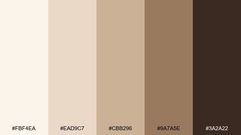
HEX: #fbf4ea #ead9c7 #cbb296 #9a7a5e #3a2a22
Mood: nutty, cozy, approachable
Best for: recipe blog UI kit
Nutty and approachable like baked almonds, this mix makes screens feel warm without looking dated. Use the light cream for backgrounds, then set cards and dividers in soft beige for structure. The deeper brown works for headings and navigation, while the mid almond shade can highlight ratings and tags. Tip: keep button fills light and rely on dark text so the UI stays readable.
Image example of baked almond generated using media.io
22) Caramel Library
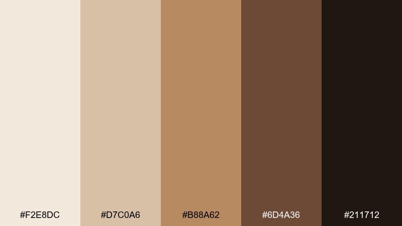
HEX: #f2e8dc #d7c0a6 #b88a62 #6d4a36 #211712
Mood: classic, studious, inviting
Best for: bookstore logo and signage
Classic and studious like caramel light across old pages, these hues feel inviting and trustworthy. Use the pale neutral for negative space and storefront backgrounds, then build the mark in caramel and deep brown for clarity. A cozy color palette like this pairs perfectly with vintage serif type and simple emblem shapes. Tip: test the logo in one color first, then add caramel as a secondary accent.
Image example of caramel library generated using media.io
What Colors Go Well with Cozy?
Cozy palettes pair best with warm neutrals first: cream, oatmeal, sand, taupe, and cocoa brown. These shades create a soft base that makes any accent color feel more “settled” and less sharp.
For accents, muted versions of seasonal hues work especially well—burnt orange, dusty rose, moss green, or honey gold. If you need contrast, use deep espresso or green-black for text and key UI elements instead of pure black.
To keep the vibe cozy, avoid highly saturated primaries and icy cool tones. When you do use cooler colors, choose softened versions (like sage instead of emerald, or warm gray instead of blue-gray).
How to Use a Cozy Color Palette in Real Designs
Start with a light neutral as your background (cream, off-white, blush-cream), then choose one mid-tone for surfaces (cards, panels, packaging blocks). Add one dark anchor color for type and dividers to keep contrast accessible.
Use the warm accent color strategically: buttons, badges, icons, or a single featured area like a hero strip. Cozy schemes look best when the accent is limited so the overall design still feels calm and breathable.
Texture does a lot of the work. Pair cozy colors with paper grain, soft shadows, matte finishes, natural materials, and gentle gradients to create depth without adding extra colors.
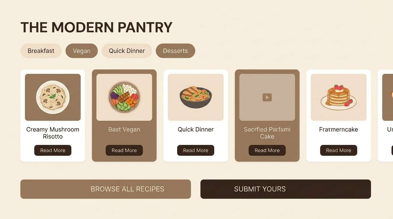
Create Cozy Palette Visuals with AI
If you already have HEX codes, you can quickly generate matching visuals—menu mockups, posters, UI sections, packaging scenes, and more—by describing your layout and specifying your palette colors in the prompt.
To get a cohesive result, name the style (editorial, minimal UI, studio product ad) and make two colors “dominant,” then list 2–3 as accents. Keep the background clean so the warm neutrals stay the focus.
Media.io makes it simple to turn cozy palette ideas into on-brand images you can use for presentations, moodboards, or marketing creatives.
Cozy Color Palette FAQs
-
What makes a color palette feel “cozy”?
Cozy palettes usually rely on warm neutrals (cream, beige, taupe) plus muted accents (terracotta, honey, dusty rose, moss). They avoid harsh contrast and overly saturated colors, creating a soft, settled look. -
Are cozy palettes good for UI design?
Yes—cozy palettes are great for wellness, lifestyle, food, and editorial UI. Use light neutrals for backgrounds, reserve deeper browns for text, and keep one accent color for buttons so readability stays high. -
What is the best text color for cozy backgrounds?
Deep espresso, charcoal-brown, or green-black typically reads better than pure black on warm creams. Test contrast for accessibility, especially on smaller body text. -
How many colors should a cozy brand palette include?
A practical cozy brand system often uses 5 colors: 1–2 light neutrals, 1 mid neutral, 1 warm accent, and 1 dark anchor for typography. This keeps the brand consistent across print and digital. -
Can cozy palettes still look modern?
Absolutely. Keep saturation low, use clean typography, add plenty of whitespace, and rely on one confident accent (like amber or terracotta). Modern cozy looks more minimal than rustic. -
What cozy colors work best for fall-themed designs?
Try maple, rust, pumpkin, honey gold, and cocoa brown paired with cream. These shades instantly signal warmth and seasonality without needing bright orange everywhere. -
How do I generate cozy palette images that match my HEX codes?
Use an AI image generator and include your HEX codes directly in the prompt, specifying which are dominant vs. accent colors. Describe the scene (poster, product ad, UI mockup) and request a clean background for better color accuracy.
Next: Platinum Color Palette


