

A modern color palette is all about clean contrast, breathable neutrals, and one confident accent that guides attention without clutter.
Below are 20+ modern color combinations with HEX codes, plus practical tips for UI, branding, and print so you can apply them fast.
In this article
- Why Modern Palettes Work So Well
-
- concrete sage
- graphite blush
- nordic sand
- cobalt charcoal
- clay and cream
- mint circuit
- sunset terracotta
- steel lavender
- ink and oat
- peach quartz
- forest minimal
- copper night
- seafoam slate
- lemon ash
- rosewood fog
- teal studio
- mocha mist
- berry concrete
- ivory olive
- neon accent neutral
- cloud blue gray
- apricot ink
- What Colors Go Well with Modern?
- How to Use a Modern Color Palette in Real Designs
- Create Modern Palette Visuals with AI
Why Modern Palettes Work So Well
Modern color combinations prioritize clarity: strong dark anchors, soft neutrals for space, and accents that create instant hierarchy. This makes layouts feel structured even with minimal elements.
They also scale well across screens and print. When your palette is built on stable neutrals, you can swap imagery, typography, or motion styles without fighting the colors.
Most importantly, modern palettes are easy to use consistently. A small set of tones reduces decision fatigue and helps your UI, brand system, or templates look cohesive everywhere.
20+ Modern Color Palette Ideas (with HEX Codes)
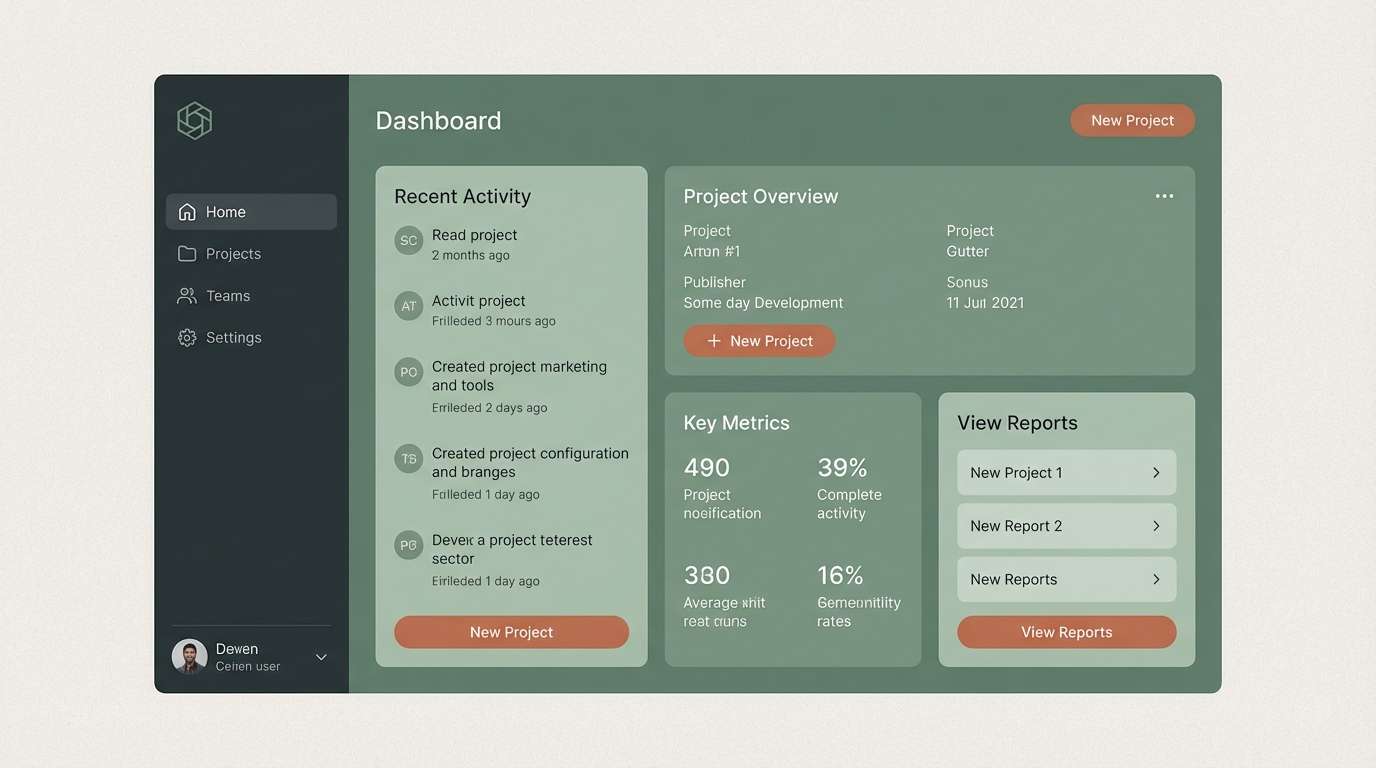
1) Concrete Sage
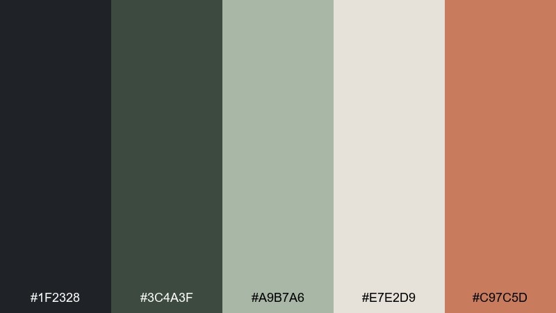
HEX: #1f2328 #3c4a3f #a9b7a6 #e7e2d9 #c97c5d
Mood: calm, architectural, grounded
Best for: minimal UI dashboard
Cool concrete and soft sage feel like a quiet studio with sunlight on raw materials. Use the deep graphite for navigation, sage for panels, and oat for breathing room. A warm clay accent lifts CTAs without turning loud. Tip: keep the accent under 10 percent to preserve the calm hierarchy.
Image example of concrete sage generated using media.io
Media.io is an online AI studio for creating and editing video, image, and audio in your browser.

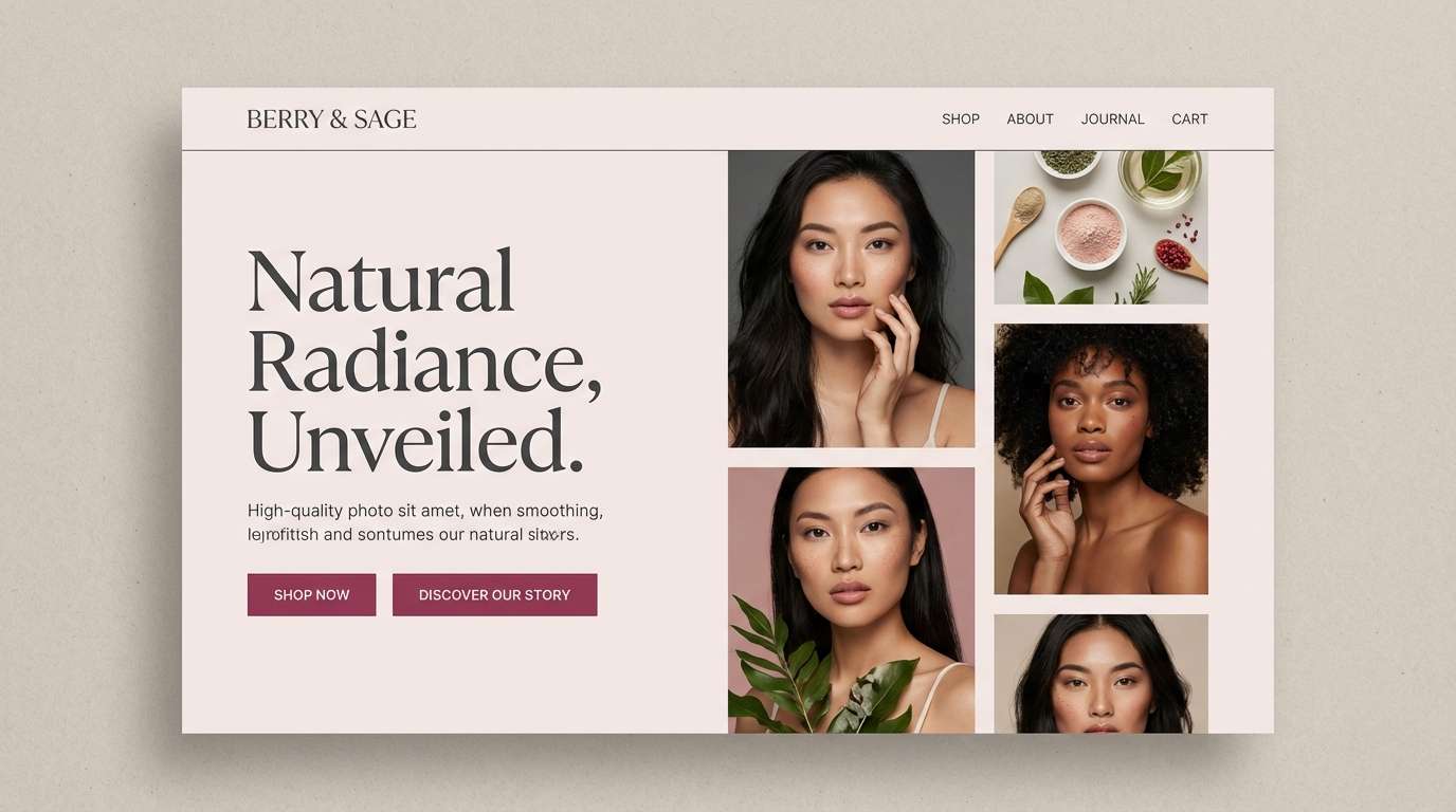
2) Graphite Blush
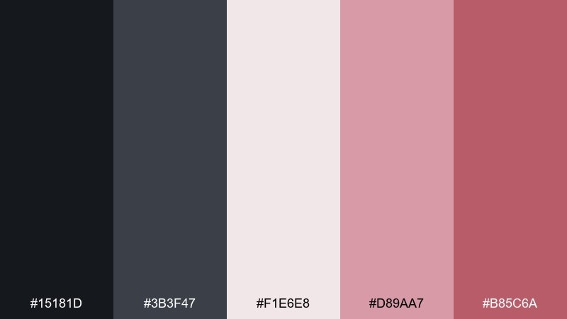
HEX: #15181d #3b3f47 #f1e6e8 #d89aa7 #b85c6a
Mood: sleek, romantic, confident
Best for: beauty brand landing page
Inky graphite with powdery blush evokes lipstick smudges on a minimalist vanity. Let charcoal carry headlines and structure, then soften sections with pale rose. The deeper berry works as a premium accent for buttons and badges. Tip: pair with lots of whitespace and crisp product photography for a polished modern color combination.
Image example of graphite blush generated using media.io
3) Nordic Sand
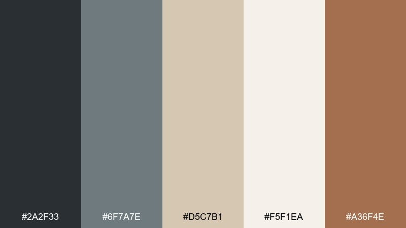
HEX: #2a2f33 #6f7a7e #d5c7b1 #f5f1ea #a36f4e
Mood: airy, cozy, understated
Best for: scandinavian interior mood board
Pale sand and milky cream feel like linen curtains and light wood floors. Use slate gray as your anchor, then layer beige and off-white for softness. A touch of warm tan adds warmth without breaking the minimal vibe. Tip: repeat the tan in small details like icons, rules, or stitching lines.
Image example of nordic sand generated using media.io
4) Cobalt Charcoal
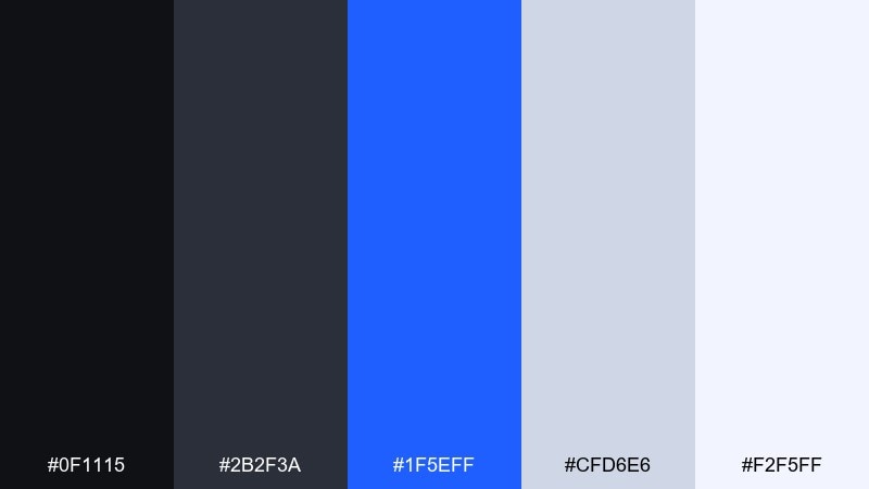
HEX: #0f1115 #2b2f3a #1f5eff #cfd6e6 #f2f5ff
Mood: sharp, tech-forward, focused
Best for: saas hero banner
Charcoal shadows and electric cobalt let this modern color scheme read like a night-mode workspace with a glowing cursor. Let cobalt handle highlights, links, and primary actions while soft periwinkle supports charts and backgrounds. The near-black keeps everything crisp and serious. Tip: use cobalt sparingly for emphasis so the interface stays readable and premium.
Image example of cobalt charcoal generated using media.io

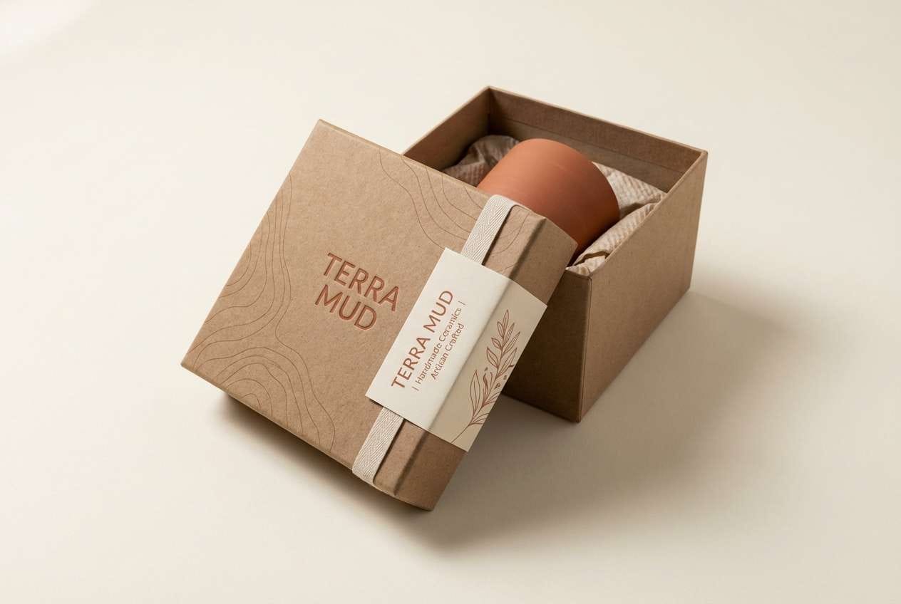
5) Clay and Cream
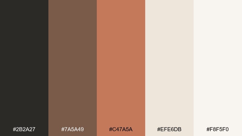
HEX: #2b2a27 #7a5a49 #c47a5a #efe6db #f8f5f0
Mood: warm, handmade, inviting
Best for: ceramics shop product packaging
Earthy clay tones and creamy neutrals feel like freshly thrown pottery on a kiln shelf. Use the dark espresso for logos and type, then build the label with cream and soft beige. The terracotta note adds a friendly pop for seals or pattern accents. Tip: choose uncoated paper stock so the colors look richer and tactile.
Image example of clay and cream generated using media.io
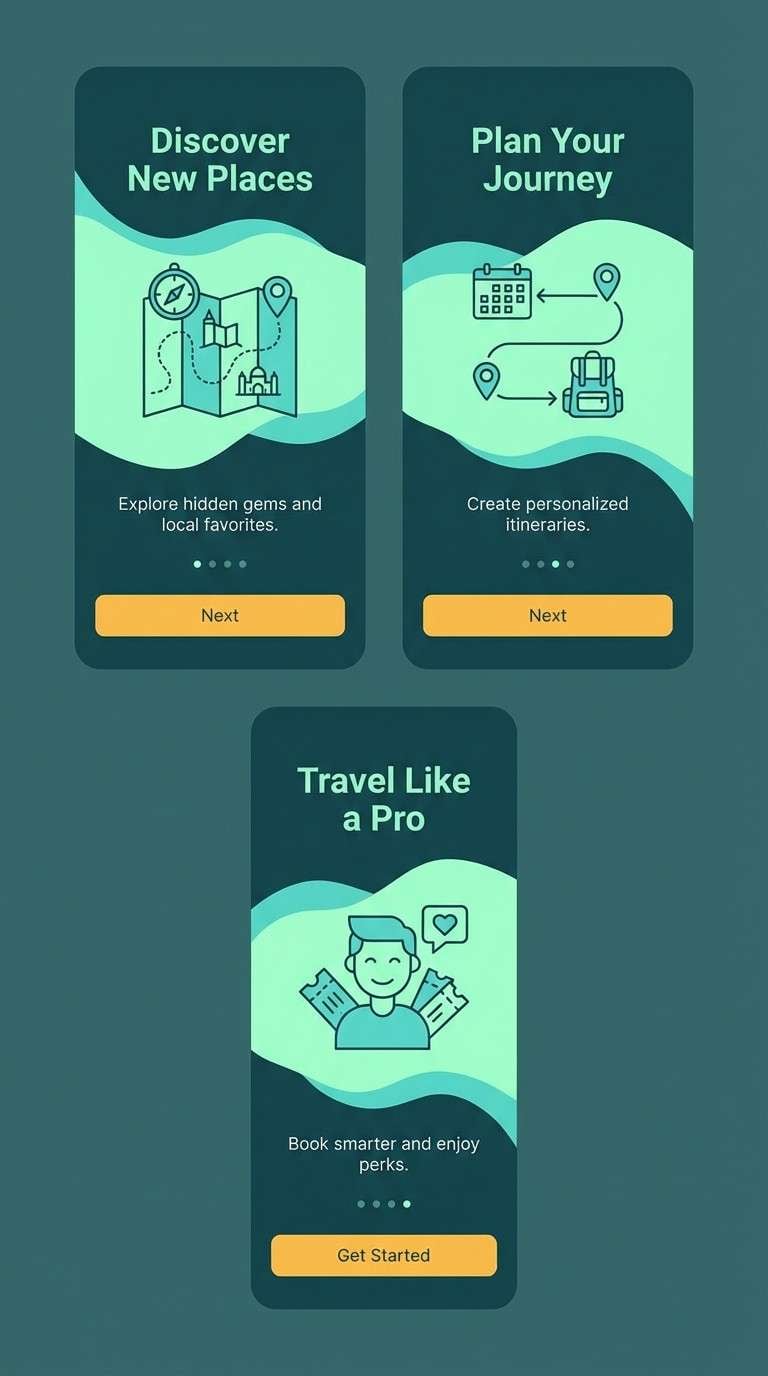
6) Mint Circuit
HEX: #0e1a16 #1e6f63 #6fe3cf #e6fbf6 #f3b33d
Mood: fresh, playful, digital
Best for: fintech app onboarding screens
Cool mint and deep teal feel like clean code lines on a dark workspace. Keep the background near-black for contrast, then use aqua for illustrations and progress states. A small hit of saffron makes key moments feel rewarding. Tip: apply the saffron only to one action per screen to keep the flow calm.
Image example of mint circuit generated using media.io
7) Sunset Terracotta
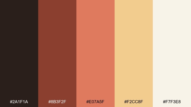
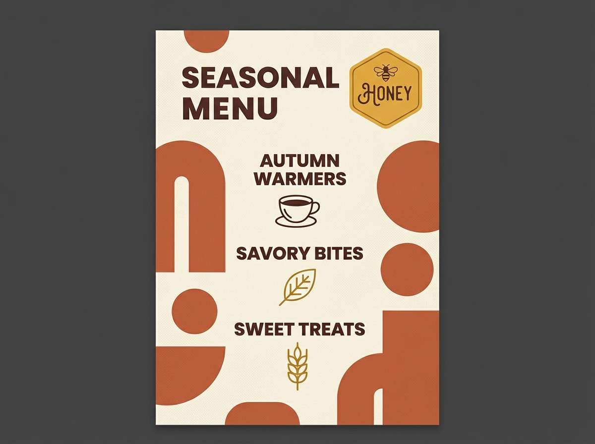
HEX: #2a1f1a #8b3f2f #e07a5f #f2cc8f #f7f3e8
Mood: sunlit, optimistic, artisanal
Best for: cafe seasonal poster
Terracotta and honeyed gold evoke late-afternoon light spilling across a café counter. Use the deep cocoa for type, terracotta for blocks and headings, and cream to keep this modern color palette airy. The golden tone shines for highlights like dates, prices, or a small badge. Tip: add subtle grain so the warm tones feel printed, not flat.
Image example of sunset terracotta generated using media.io
8) Steel Lavender
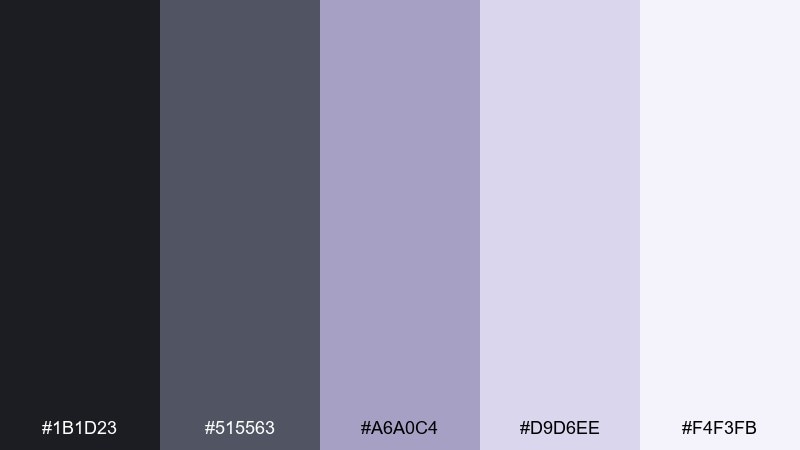
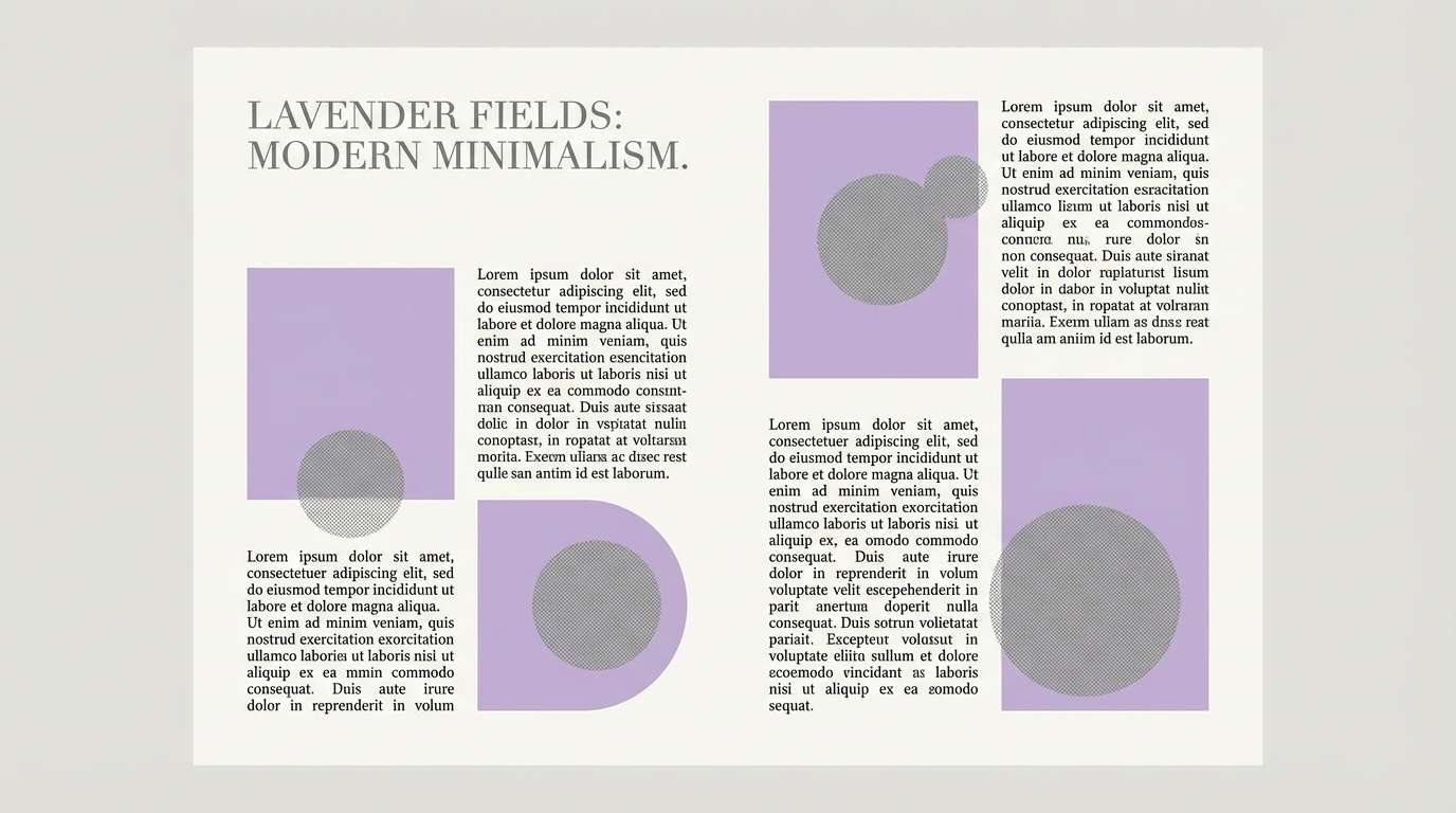
HEX: #1b1d23 #515563 #a6a0c4 #d9d6ee #f4f3fb
Mood: cool, soft, contemporary
Best for: editorial magazine spread
Steel gray with lavender haze feels like twilight over a glass skyline. Build the layout with dark type and gentle lilac panels for a refined rhythm. The palest tint works beautifully as negative space around images. Tip: keep photo treatments slightly desaturated so the tones stay cohesive.
Image example of steel lavender generated using media.io
9) Ink and Oat
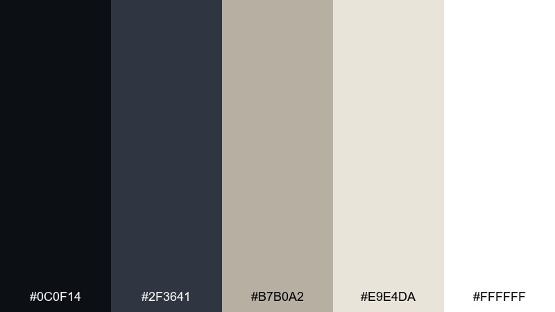
HEX: #0c0f14 #2f3641 #b7b0a2 #e9e4da #ffffff
Mood: clean, timeless, minimal
Best for: portfolio website theme
Deep ink and toasted oat feel like a gallery wall with matte frames. Let black and charcoal handle navigation and headings, then keep content areas warm with oat and cream. The near-white supports a quiet, high-end look without feeling sterile. Tip: use thin rules and subtle shadows instead of heavy borders.
Image example of ink and oat generated using media.io
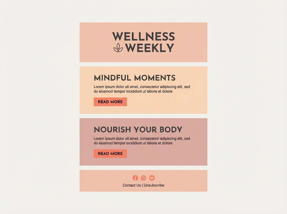
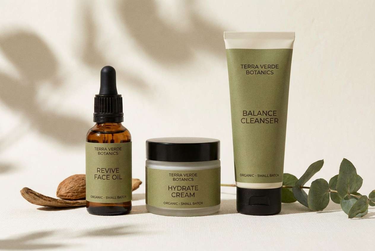
10) Peach Quartz
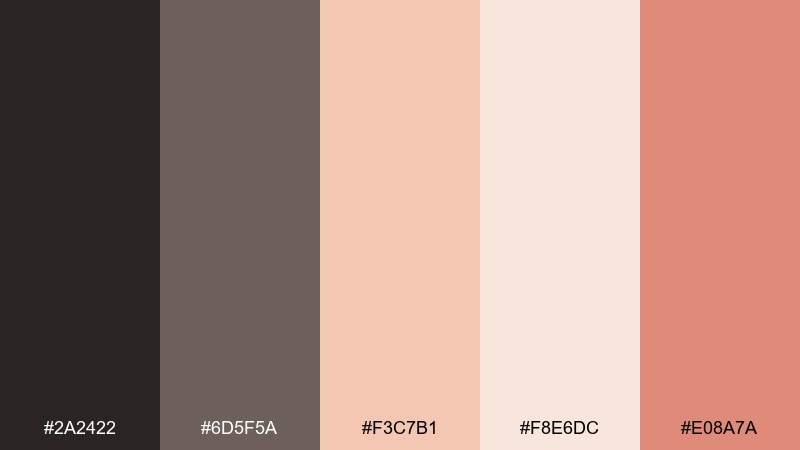
HEX: #2a2422 #6d5f5a #f3c7b1 #f8e6dc #e08a7a
Mood: soft, friendly, modern
Best for: wellness newsletter template
Peachy quartz and warm neutrals evoke a slow morning routine and clean skincare bottles. Use charcoal for body text, then bring in blush panels to separate sections. The coral note makes links and buttons feel welcoming without going candy-sweet. Tip: pair with rounded icons and generous line height for a calm read.
Image example of peach quartz generated using media.io
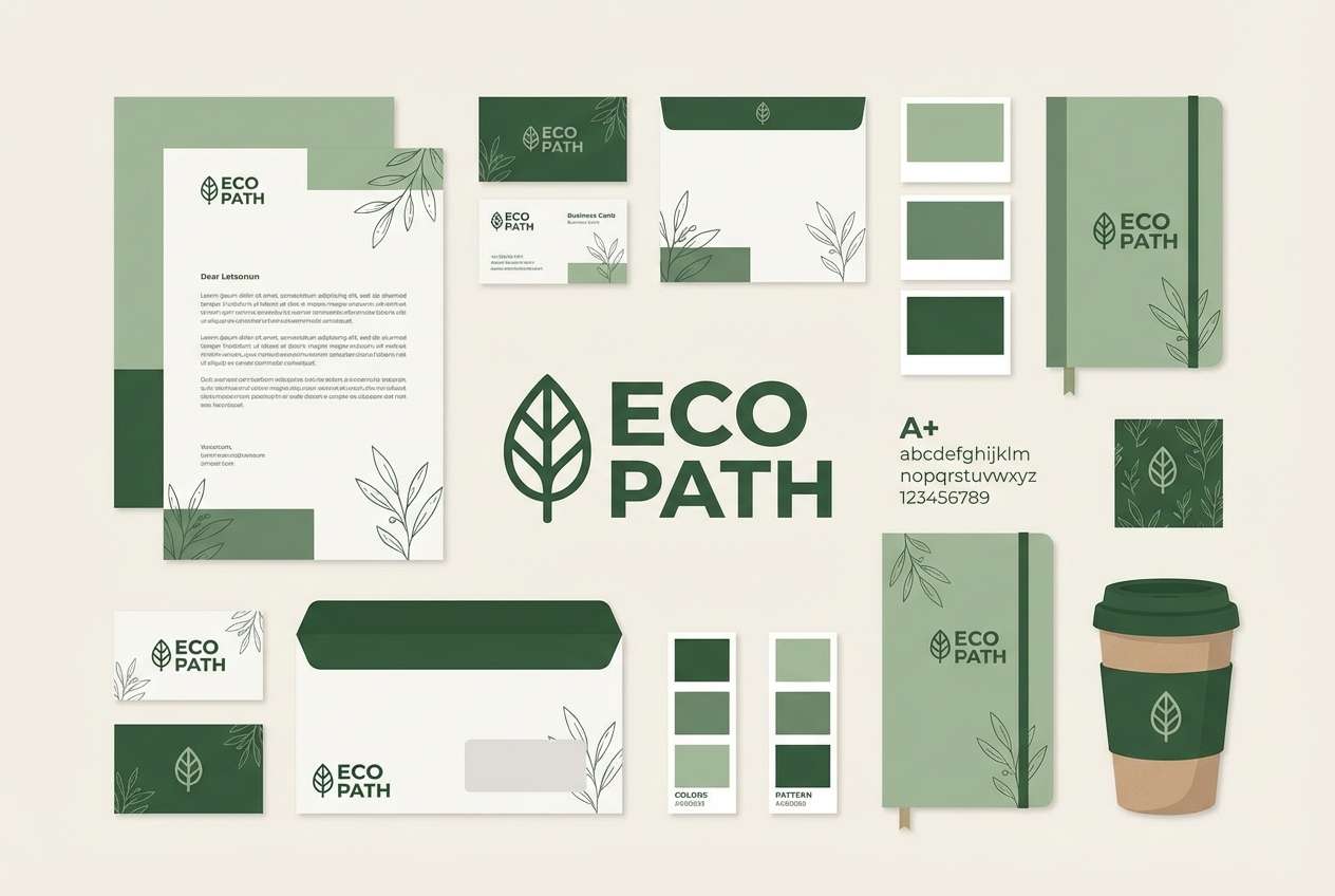
11) Forest Minimal
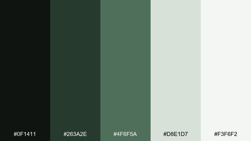
HEX: #0f1411 #263a2e #4f6f5a #d8e1d7 #f3f6f2
Mood: quiet, natural, balanced
Best for: eco brand identity kit
Muted forest greens feel like shaded trails and paper packaging. Use the darkest green for logos, the mid green for supporting shapes, and pale sage for backgrounds. The off-white keeps the identity breathable and contemporary. Tip: add a single botanical line illustration to reinforce the theme without clutter.
Image example of forest minimal generated using media.io
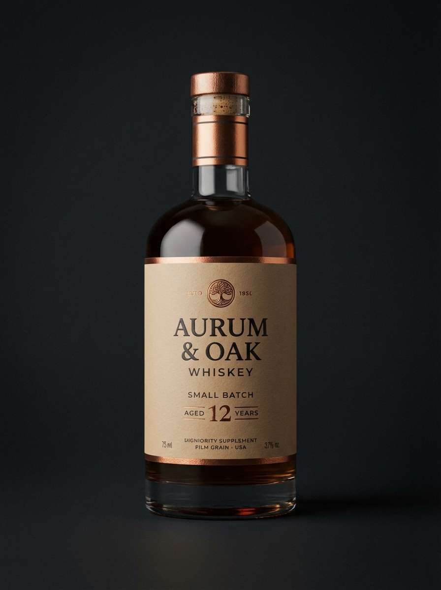
12) Copper Night
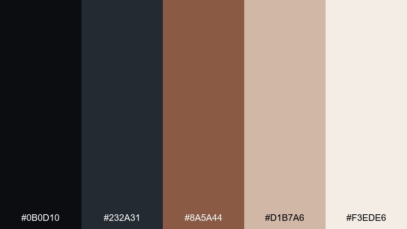
HEX: #0b0d10 #232a31 #8a5a44 #d1b7a6 #f3ede6
Mood: moody, luxe, cinematic
Best for: premium whiskey label
Dark night tones with copper warmth feel like a dim bar and polished metal. Set the label in near-black and slate, then lift key details with copper and warm beige. The pale cream works for small text blocks so everything stays legible. Tip: use copper as foil or spot color for a controlled, high-end finish.
Image example of copper night generated using media.io
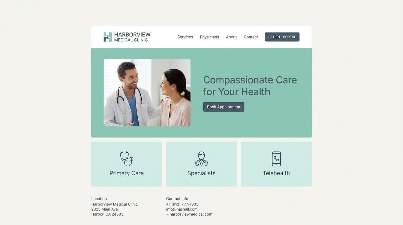
13) Seafoam Slate
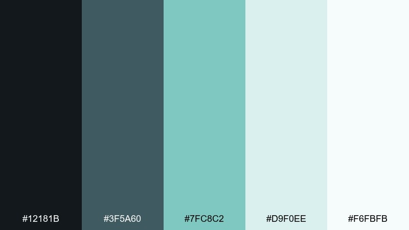
HEX: #12181b #3f5a60 #7fc8c2 #d9f0ee #f6fbfb
Mood: fresh, coastal, clean
Best for: medical clinic website
Seafoam and slate evoke clean air, calm water, and a reassuring waiting room. Use slate for headings and navigation, then seafoam for cards, icons, and highlights. The pale aqua makes large backgrounds feel bright but not stark. Tip: keep button colors one step darker than the surrounding panels for clear accessibility.
Image example of seafoam slate generated using media.io
14) Lemon Ash
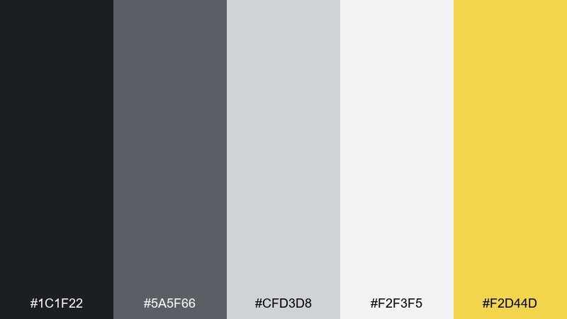
HEX: #1c1f22 #5a5f66 #cfd3d8 #f2f3f5 #f2d44d
Mood: bright, minimal, energetic
Best for: startup pitch deck
Soft ash grays with a lemon spark feel like a clean desk with a highlighter stripe. Use charcoal for titles, light gray for slides, and lemon for key metrics and callouts. This modern color palette stays professional while still feeling optimistic. Tip: reserve yellow for one data series per chart to avoid visual noise.
Image example of lemon ash generated using media.io
15) Rosewood Fog
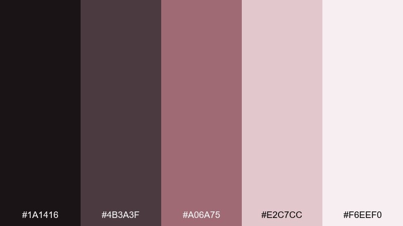
HEX: #1a1416 #4b3a3f #a06a75 #e2c7cc #f6eef0
Mood: soft, mature, elegant
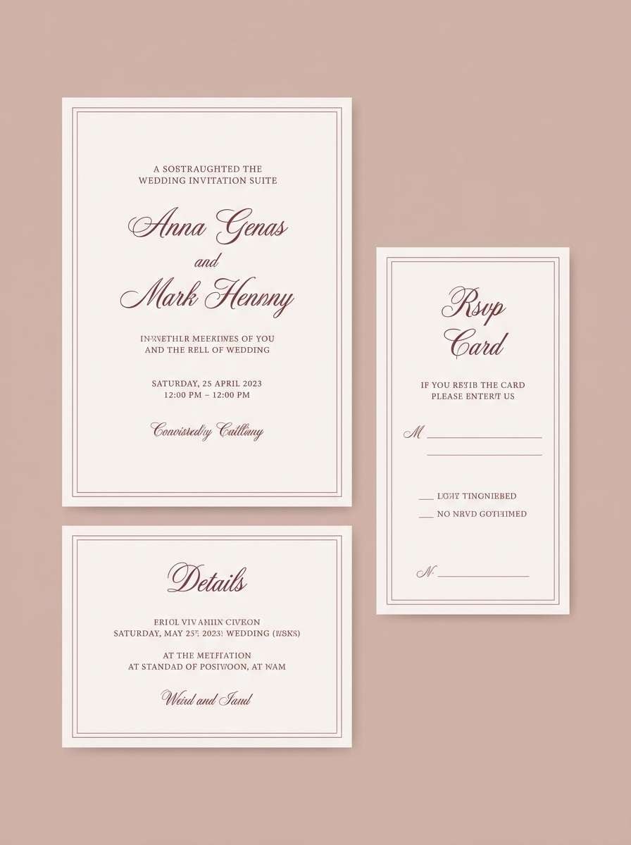
Best for: wedding invitation suite
Rosewood and misty blush feel like velvet ribbons and watercolor florals. Use the deep plum for names and headings, then soften the body copy with warm gray-brown. Blush and pale pink create a gentle backdrop that prints beautifully. Tip: choose textured paper and keep embellishments minimal so the type stays the hero.
Image example of rosewood fog generated using media.io
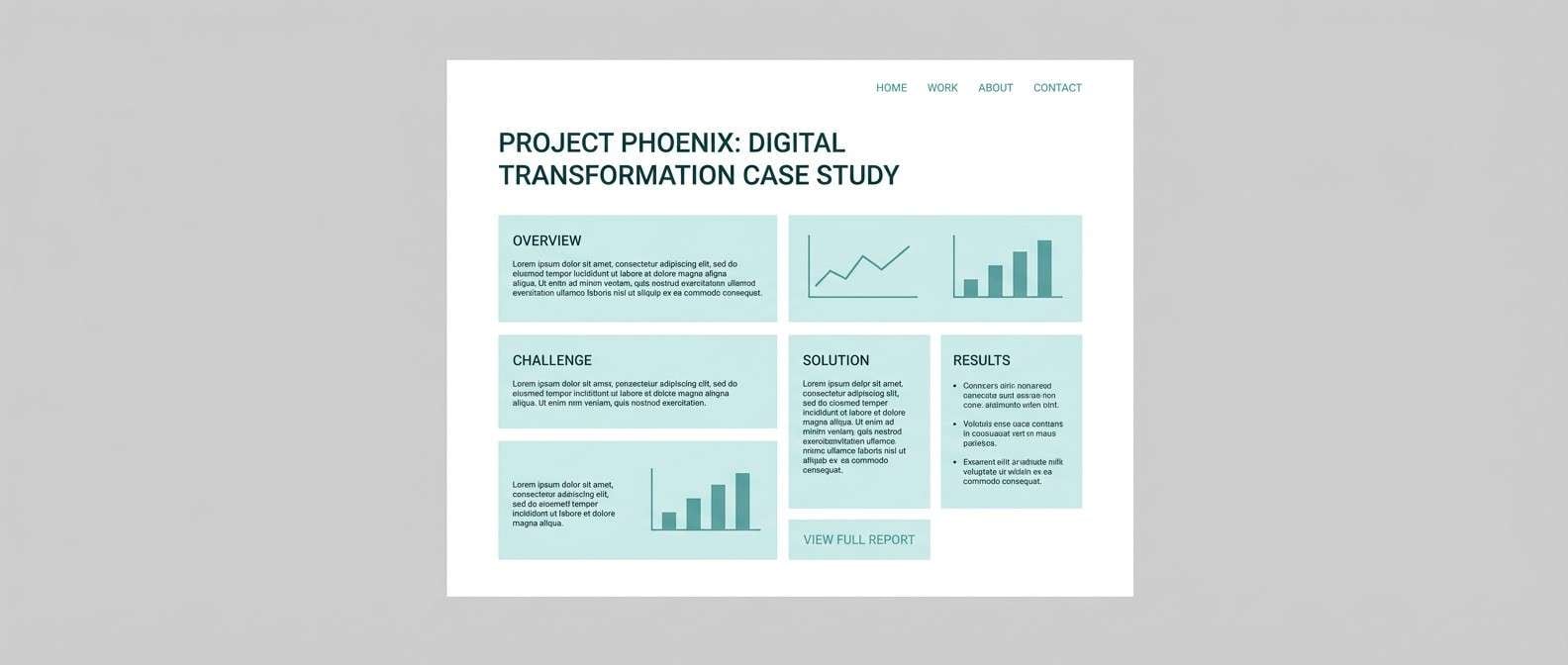
16) Teal Studio
HEX: #0d1416 #1b3b40 #2b7c85 #bfe7ea #f2fbfb
Mood: creative, crisp, modern
Best for: design agency case study page
Studio teal tones feel like fresh ink and a tidy workspace. Use the dark teal for headers, the mid teal for badges and links, and icy aqua for section backgrounds. This modern color scheme supports clean layouts and strong hierarchy, especially for long-form content. Tip: try subtle gradients between the two teals for a smooth, contemporary modern color combination.
Image example of teal studio generated using media.io
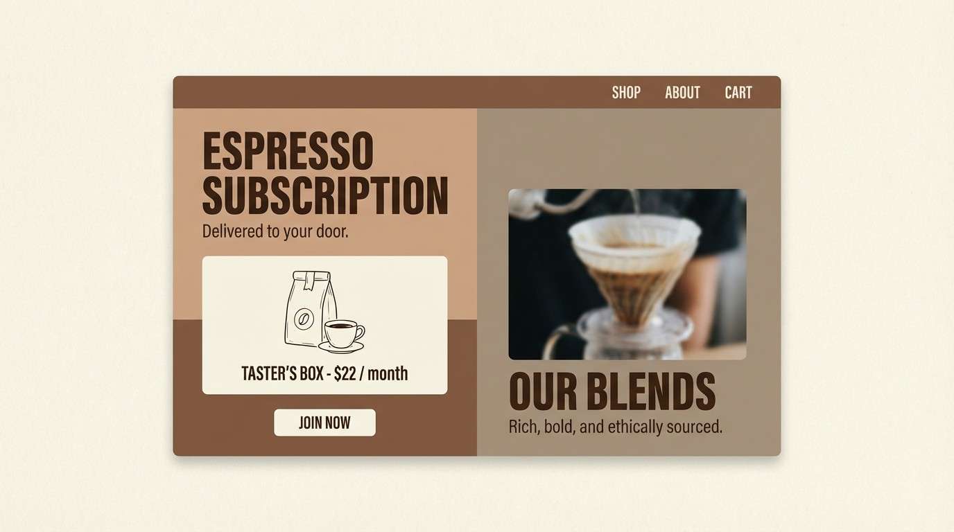
17) Mocha Mist
HEX: #171412 #4a3f3a #9b8c84 #ded6d1 #f7f3f0
Mood: soft, cozy, refined
Best for: coffee subscription landing page
Mocha browns and misty taupes evoke steamed milk, paper bags, and calm mornings. Use espresso for headings, taupe for section dividers, and creamy white to keep the page light. The mid neutral is great for secondary buttons and form fields. Tip: pair with warm, grainy photography so the tones feel consistent end to end.
Image example of mocha mist generated using media.io
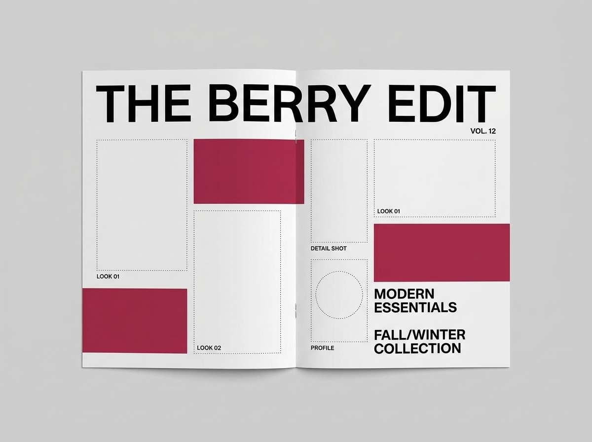
18) Berry Concrete
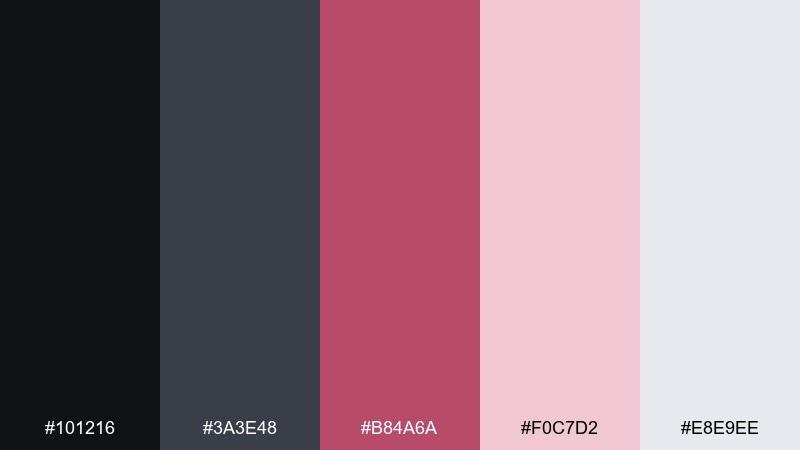
HEX: #101216 #3a3e48 #b84a6a #f0c7d2 #e8e9ee
Mood: urban, bold, stylish
Best for: streetwear lookbook
Concrete grays with berry punch feel like neon signage reflecting on wet pavement. Use charcoal and steel for the layout, then let berry lead calls to action and price tags. The pale blush can soften blocks behind typography without losing edge. Tip: keep type large and high contrast for that editorial, city-night energy.
Image example of berry concrete generated using media.io
19) Ivory Olive
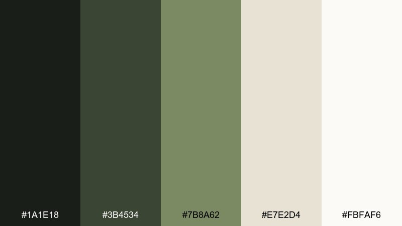
HEX: #1a1e18 #3b4534 #7b8a62 #e7e2d4 #fbfaf6
Mood: earthy, calm, elevated
Best for: organic skincare packaging
Olive greens and ivory feel like pressed leaves, ceramic jars, and clean apothecary labels. Use the darkest green for brand marks, olive for supporting graphics, and ivory as the main label field. The warm cream keeps it approachable and natural. Tip: a simple serif paired with thin line icons makes the set feel like a curated modern color palette.
Image example of ivory olive generated using media.io
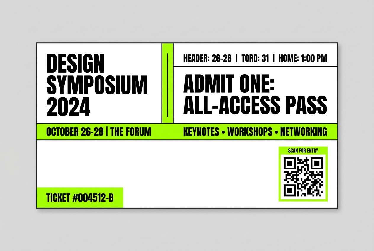
20) Neon Accent Neutral
HEX: #0f1012 #2b2d33 #b9bcc5 #f2f3f6 #b7ff3c
Mood: bold, sporty, high-contrast
Best for: event ticket design
Neutral grays with a neon green strike feel like a late-night concert poster under streetlights. Keep most of the layout monochrome, then use neon for the date, QR area, or one graphic bar. The result is punchy without becoming chaotic, and it supports modern color combinations that read instantly from a distance. Tip: avoid gradients on the neon and stick to flat shapes for maximum clarity.
Image example of neon accent neutral generated using media.io
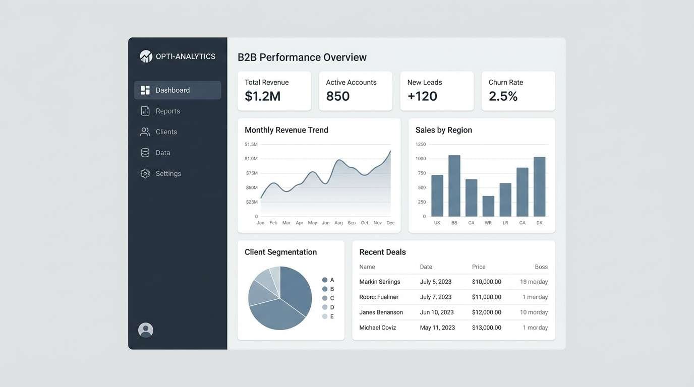
21) Cloud Blue Gray
HEX: #11161c #2f3b49 #6e7f90 #cfd8e3 #f6f8fb
Mood: clear, dependable, professional
Best for: b2b software dashboard
Blue-grays like cloudy skies over glass buildings create a steady, no-drama feel. Use navy-charcoal for structure, mid blue-gray for charts, and pale cloud for backgrounds. This modern color palette is especially strong for data-heavy screens where calm contrast matters. Tip: add one interactive state color by darkening the mid blue-gray rather than introducing a new hue.
Image example of cloud blue gray generated using media.io
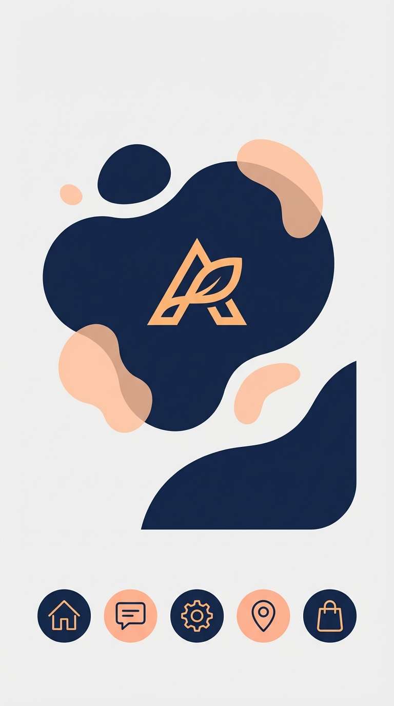
22) Apricot Ink
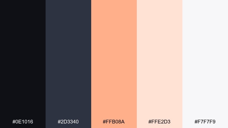
HEX: #0e1016 #2d3340 #ffb08a #ffe2d3 #f7f7f9
Mood: bright, modern, optimistic
Best for: app splash screen and icons
Apricot glow against inky blue feels like sunrise on a sleek glass phone screen. Use the dark tones for the base and icon outlines, then let apricot lead the brand mark and key highlights. The peach tint can fill soft shapes behind icons for depth. Tip: for a crisp modern color combination, keep gradients minimal and rely on strong silhouettes.
Image example of apricot ink generated using media.io
What Colors Go Well with Modern?
Modern palettes pair best with neutrals that create structure: charcoal, ink black, slate, warm gray, and clean off-whites. These colors keep typography readable and layouts calm.
For accents, choose one clear “signal” hue like cobalt, terracotta, saffron, berry, or neon green. The key is restraint: one accent used consistently feels modern; too many accents feel busy.
If you want a softer modern look, lean into muted tints (sage, blush, lavender, seafoam) and keep saturation controlled so the design still reads minimal and intentional.
How to Use a Modern Color Palette in Real Designs
Start with roles, not swatches: assign one dark for text/navigation, one light for backgrounds, one mid neutral for borders/panels, and one accent for primary actions. This makes the system reusable across pages and templates.
In UI, protect contrast for accessibility by keeping body text dark on light surfaces (or vice versa in dark mode). Save your brightest color for buttons, links, and key states so interactions are instantly recognizable.
In branding and print, use neutrals to carry most of the surface area, then repeat the accent in small, consistent touches (badges, seals, rules, icons) to keep the modern hierarchy crisp.
Create Modern Palette Visuals with AI
If you have HEX codes but need realistic mockups, AI can generate consistent visuals quickly—dashboards, landing pages, labels, posters, and brand kits—using the same palette rules.
To keep results modern, describe clean layouts, flat lighting, minimal props, and a clear grid. Then specify where the accent color should appear (buttons, badges, highlights) so the image stays focused.
With Media.io, you can turn a palette idea into on-brand visuals in minutes and iterate until the tone feels exactly right.
Modern Color Palette FAQs
-
What makes a color palette look modern?
Modern palettes usually rely on clean neutrals (charcoal, gray, off-white) plus one controlled accent color. The look comes from strong hierarchy, generous whitespace, and consistent usage across components. -
How many colors should a modern palette include?
Five is a practical sweet spot: one dark anchor, two neutrals (light + mid), one soft tint, and one accent. You can build a full UI system from this without adding extra hues. -
What’s the best accent color for modern UI?
Cobalt, teal, saffron/yellow, terracotta, and neon-lime can all work—choose based on brand tone. The best accent is the one you can use sparingly while still being visible and accessible. -
Are modern color palettes always neutral?
No. Many modern color combinations are neutral-led, but modern can also be bold (like neon accents) as long as the layout stays minimal and the palette remains tightly controlled. -
How do I keep a modern palette from feeling flat?
Use tonal steps (light/mid/dark), subtle shadows, and texture choices (grain, paper stock, soft gradients) instead of adding more colors. Depth comes from value contrast and spacing. -
How can I apply modern palettes to print design?
Let neutrals cover large areas and use the accent for focal details (titles, badges, seals). Consider paper and ink/foil finishes—modern palettes often look best with tactile materials and minimal decoration. -
Can AI generate design examples using my modern HEX codes?
Yes. Add your palette context to the prompt (where each color should appear, style references like “clean grid” and “minimal”), then generate multiple variations until the contrast and accent balance feel right.


