

A strong finance color palette helps your product or publication feel reliable at first glance. The right mix of blues, greens, neutrals, and premium accents can make complex information feel organized and easy to trust.
Below are 20+ finance color palette ideas with HEX codes you can use for fintech branding, dashboards, reports, pitch decks, and marketing assets.
In this article
- Why Finance Palettes Work So Well
-
- ledger navy
- vault green
- copper audit
- platinum statement
- sandstone budget
- midnight spreadsheet
- emerald equity
- graphite reserve
- champagne dividend
- teal treasury
- charcoal compliance
- bluechip slate
- olive bond
- rose gold forecast
- indigo ledgerlines
- silver interest
- cocoa capital
- cloudy cashflow
- burgundy benchmark
- sunrise yield
- harbor balance
- gilded portfolio
- What Colors Go Well with Finance?
- How to Use a Finance Color Palette in Real Designs
- Create Finance Palette Visuals with AI
Why Finance Palettes Work So Well
Finance brands depend on trust, clarity, and consistency, so color choices tend to favor structured hues like navy, slate, charcoal, and clean whites. These tones signal stability and help interfaces feel controlled, especially when users are making decisions with money.
Another reason finance palettes perform well is readability. Reports, dashboards, and forms are information-dense, so calmer backgrounds and high-contrast typography reduce fatigue and make charts easier to scan.
Finally, a good finance color scheme can still feel modern. By adding a single confident accent (teal, emerald, gold, or aqua), you can guide attention to CTAs and key metrics without breaking the “credible” look.
20+ Finance Color Palette Ideas (with HEX Codes)
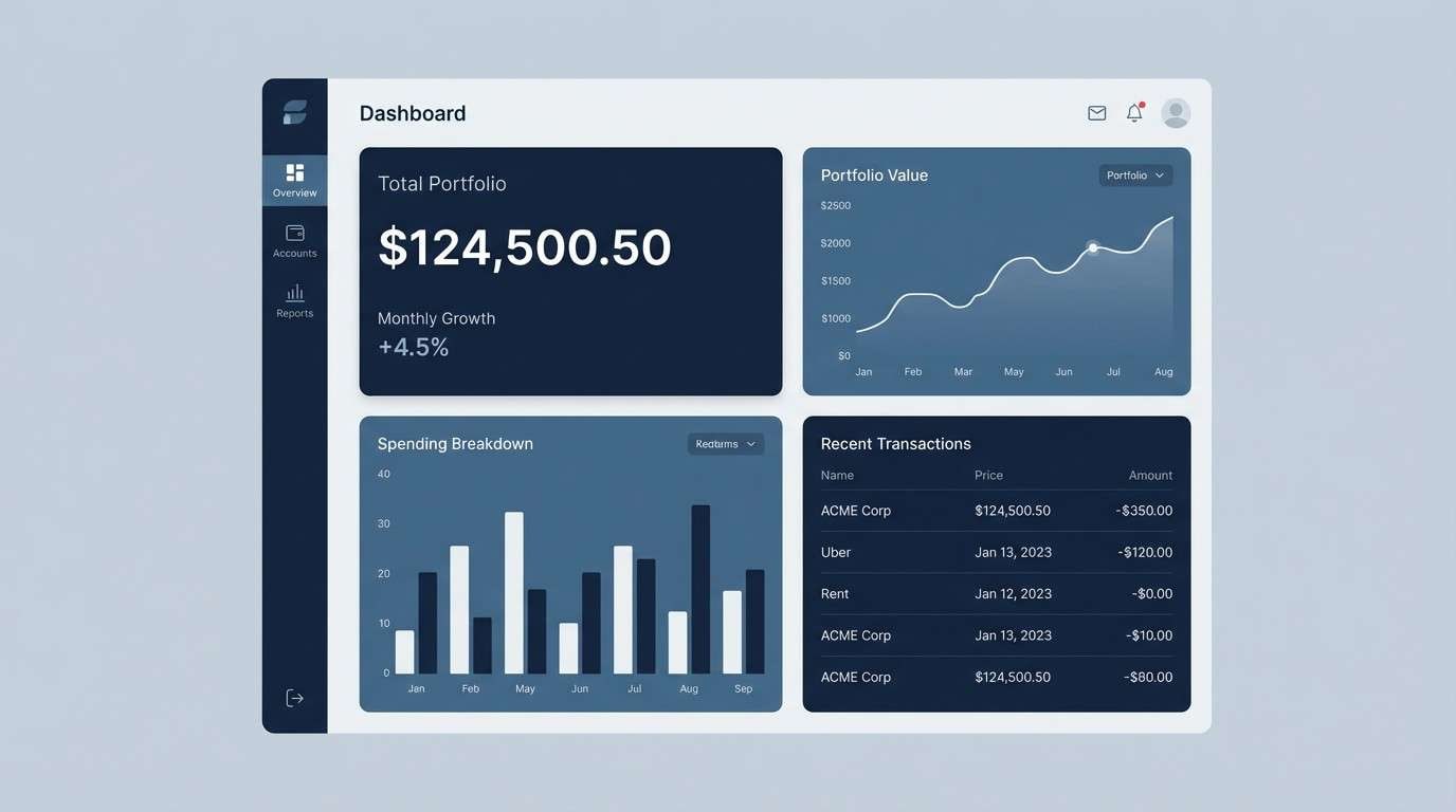
1) Ledger Navy
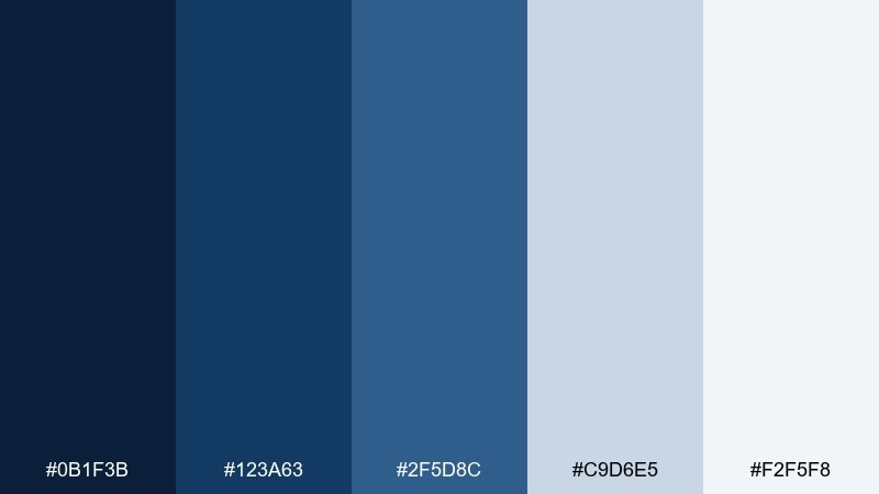
HEX: #0B1F3B #123A63 #2F5D8C #C9D6E5 #F2F5F8
Mood: trusted and structured
Best for: fintech dashboard UI
Trusted, ink-deep blues feel like crisp spreadsheets and polished boardrooms. Use the navy and steel blue for navigation and data panels, then keep the pale blue-gray for breathable spacing. Pair with white surfaces and thin dividers to make charts easy to scan. Tip: reserve the darkest navy for key totals so hierarchy stays obvious.
Image example of ledger navy generated using media.io
Create palette-perfect visuals with Media.io. Powered by Wan 2.7 Image, it helps you generate and edit images with precise color control, consistent tones, and ready-to-use styles in your browser.

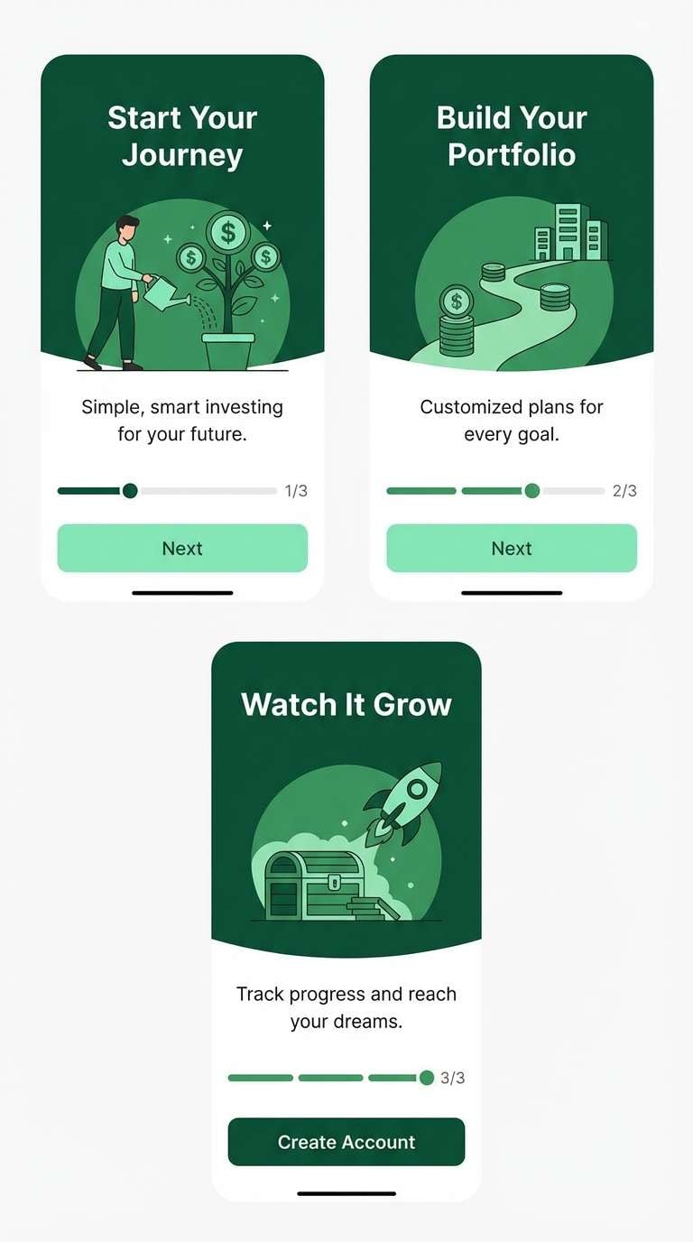
2) Vault Green
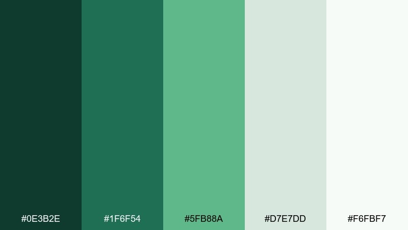
HEX: #0E3B2E #1F6F54 #5FB88A #D7E7DD #F6FBF7
Mood: secure and optimistic
Best for: investment app onboarding screens
Secure evergreen tones suggest stability, steady growth, and a calm user journey. This finance color palette works well when you want reassurance without feeling heavy, especially in onboarding flows. Let the deep green anchor headers and CTAs, while mint and soft sage keep forms friendly. Tip: use the lightest tint for success states so confirmation feels clean, not loud.
Image example of vault green generated using media.io
3) Copper Audit
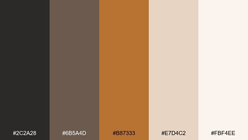
HEX: #2C2A28 #6B5A4D #B87333 #E7D4C2 #FBF4EE
Mood: grounded and premium
Best for: accounting firm brochure
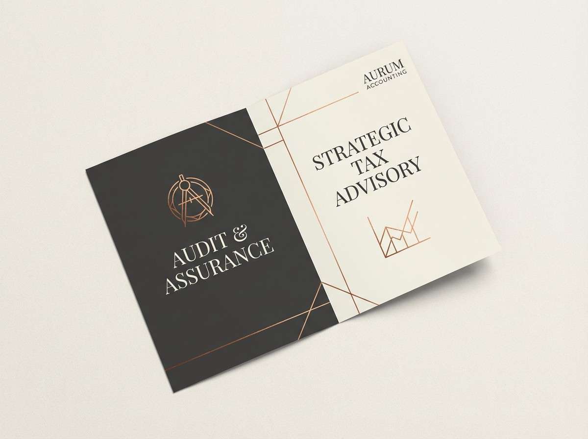
Warm copper and worn leather neutrals evoke ledgers, signatures, and heritage credibility. Use copper sparingly for headings, pull quotes, or section markers so it reads as premium rather than flashy. Pair with charcoal body text and creamy backgrounds for long-form readability. Tip: keep copper accents consistent across spreads to make the brochure feel intentional.
Image example of copper audit generated using media.io
4) Platinum Statement
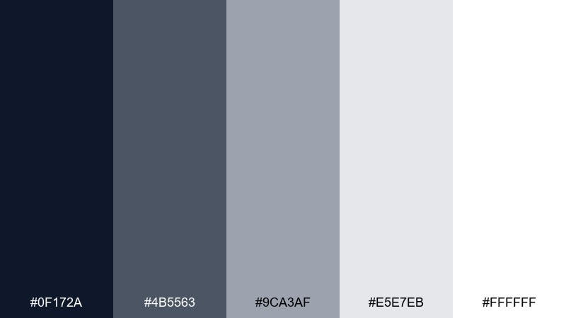
HEX: #0F172A #4B5563 #9CA3AF #E5E7EB #FFFFFF
Mood: clean and executive
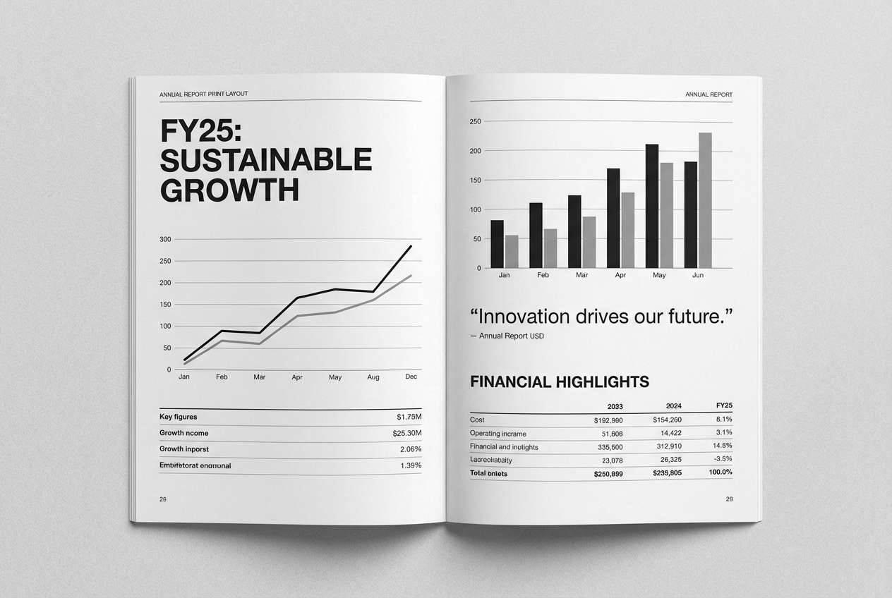
Best for: annual report layout
Crisp grays and near-black feel like polished statements and well-organized disclosures. These finance color combinations shine in dense documents where clarity matters most, from tables to footnotes. Use the deepest tone for headings and chart labels, then lean on light grays for grids and separators. Tip: keep plenty of white space so the layout stays calm even with heavy data.
Image example of platinum statement generated using media.io
5) Sandstone Budget
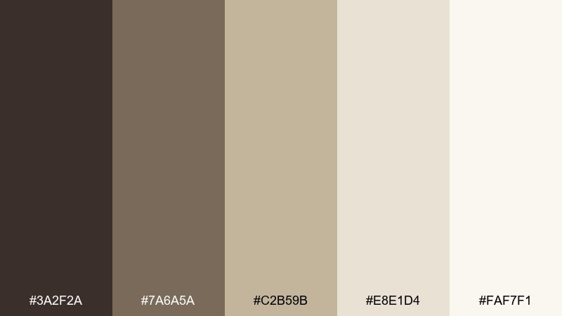
HEX: #3A2F2A #7A6A5A #C2B59B #E8E1D4 #FAF7F1
Mood: approachable and steady
Best for: personal finance blog graphics
Soft sand and clay browns evoke notebooks, budgeting planners, and a friendly, non-judgmental tone. Use the deeper brown for titles and icons, then layer the beige shades for cards and callouts. Pair with simple line charts so content feels practical, not intimidating. Tip: keep contrast high for accessibility by using the darkest brown for small text.
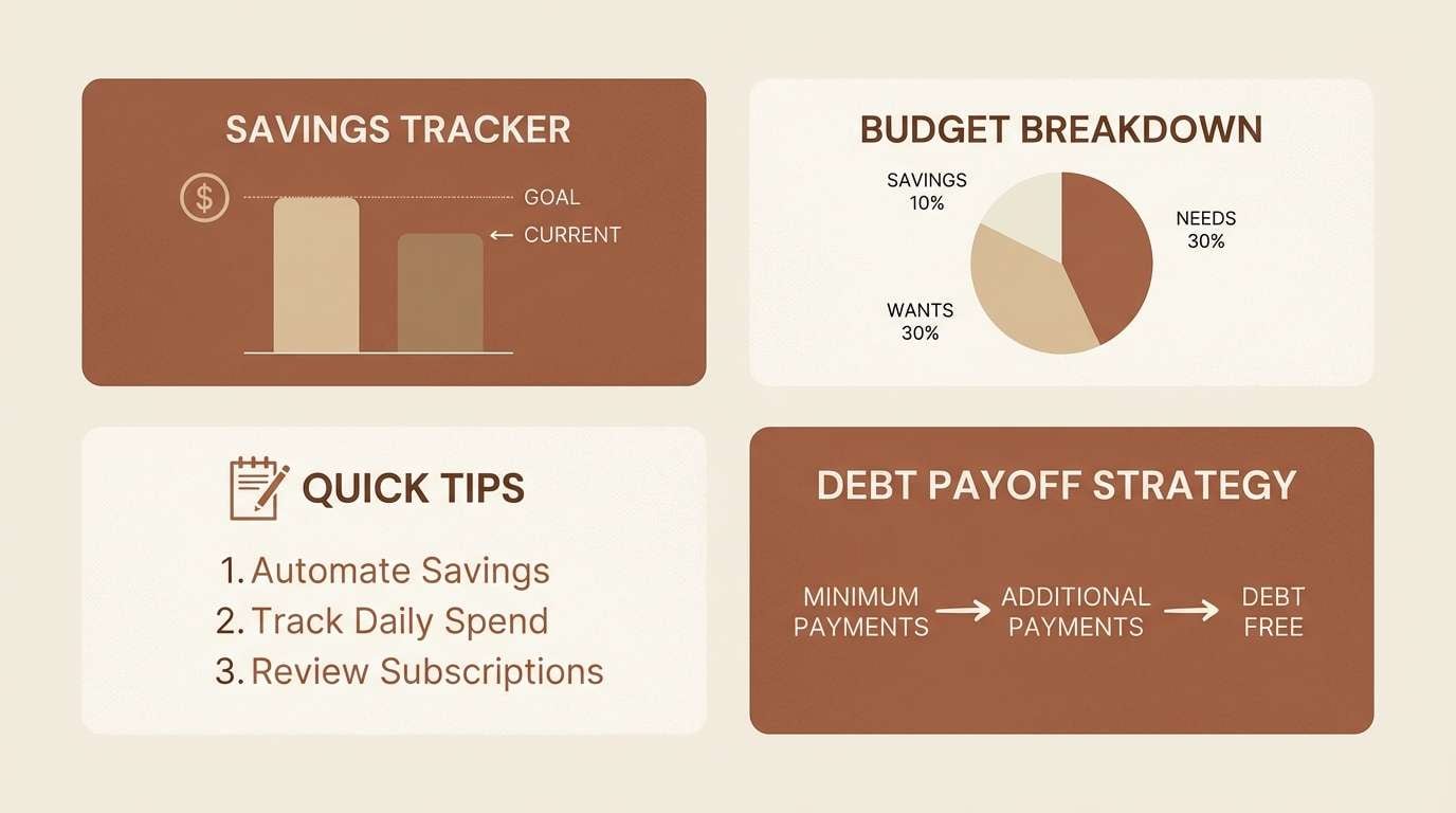
Image example of sandstone budget generated using media.io
6) Midnight Spreadsheet
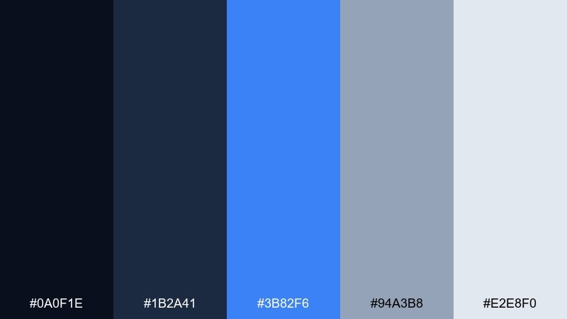
HEX: #0A0F1E #1B2A41 #3B82F6 #94A3B8 #E2E8F0
Mood: focused and high-tech
Best for: dark mode analytics dashboard
Midnight blues with electric accents feel like late-night analysis and confident decision-making. Use the near-black for backgrounds and panels, then let the bright blue highlight active states and key KPIs. Pair with cool gray for secondary labels so the interface stays readable. Tip: limit the bright accent to one action per screen to avoid visual noise.
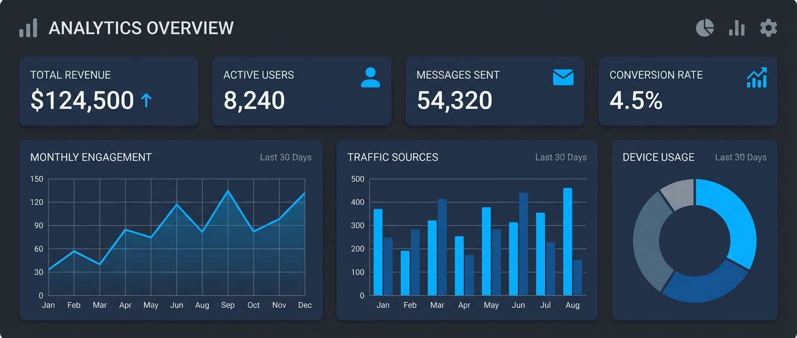
Image example of midnight spreadsheet generated using media.io
7) Emerald Equity
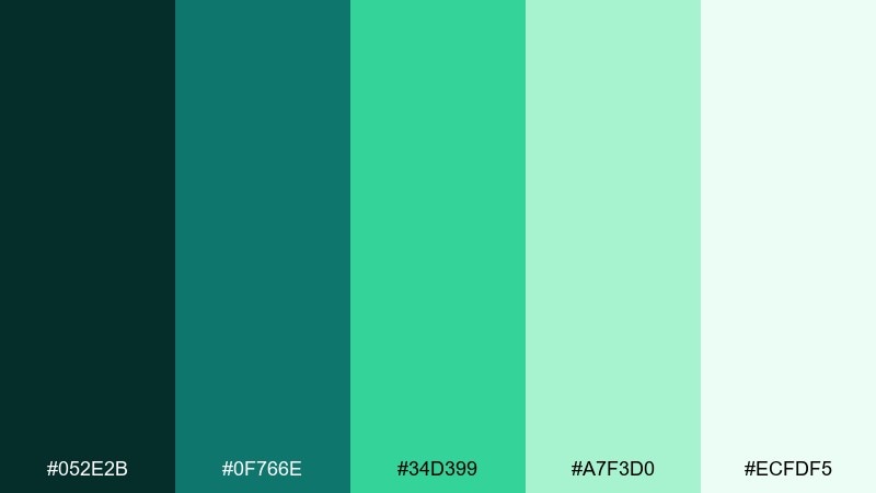
HEX: #052E2B #0F766E #34D399 #A7F3D0 #ECFDF5
Mood: fresh and growth-minded
Best for: startup pitch deck slides
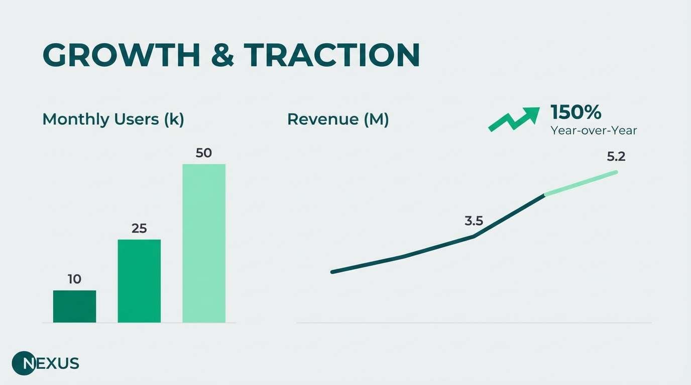
Bright emeralds suggest momentum, new capital, and a forward-looking story. Build slides with deep teal for section headers and use the vivid green for charts that show growth. Pair with lots of white and a single bold number per slide for punch. Tip: keep the light mint as a background block behind graphs to guide the eye.
Image example of emerald equity generated using media.io
8) Graphite Reserve
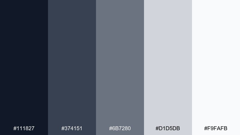
HEX: #111827 #374151 #6B7280 #D1D5DB #F9FAFB
Mood: serious and dependable
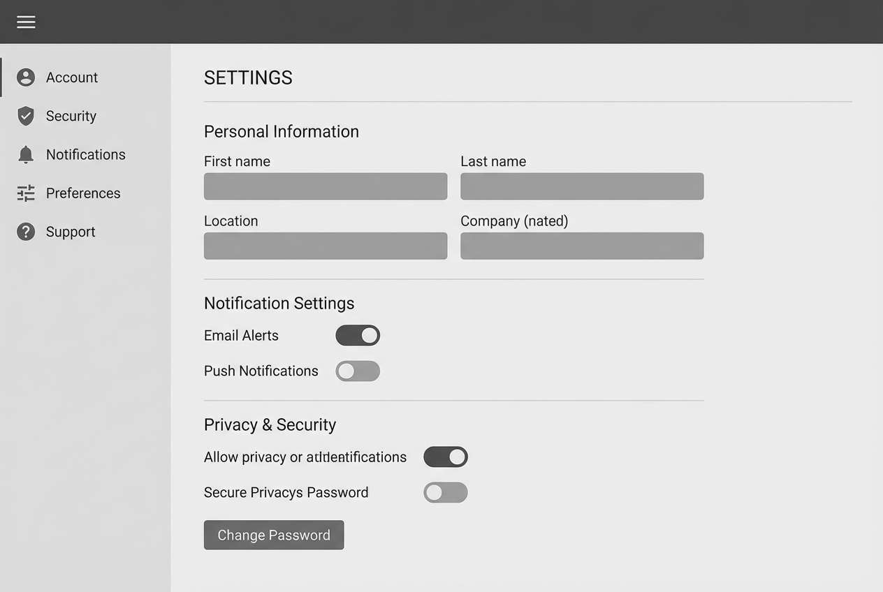
Best for: banking web app settings pages
Graphite neutrals feel secure, quiet, and built to last. Use the darkest tones for navigation and headings, then let mid-grays handle secondary text without competing. Pair with subtle shadows and fine borders to keep sections tidy. Tip: add one small accent color elsewhere in your brand system for alerts, but keep settings mostly monochrome.
Image example of graphite reserve generated using media.io
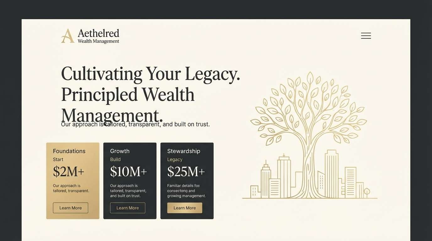
9) Champagne Dividend
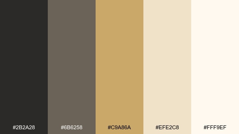
HEX: #2B2A28 #6B6258 #C9A86A #EFE2C8 #FFF9EF
Mood: upscale and celebratory
Best for: wealth management landing page
Champagne gold with soft creams signals reward, refinement, and long-term value. Use the gold for key CTAs and highlight numbers like returns or assets under management. Pair with charcoal typography to keep it grounded and readable. Tip: avoid large gold backgrounds; small accents feel more luxurious.
Image example of champagne dividend generated using media.io
10) Teal Treasury
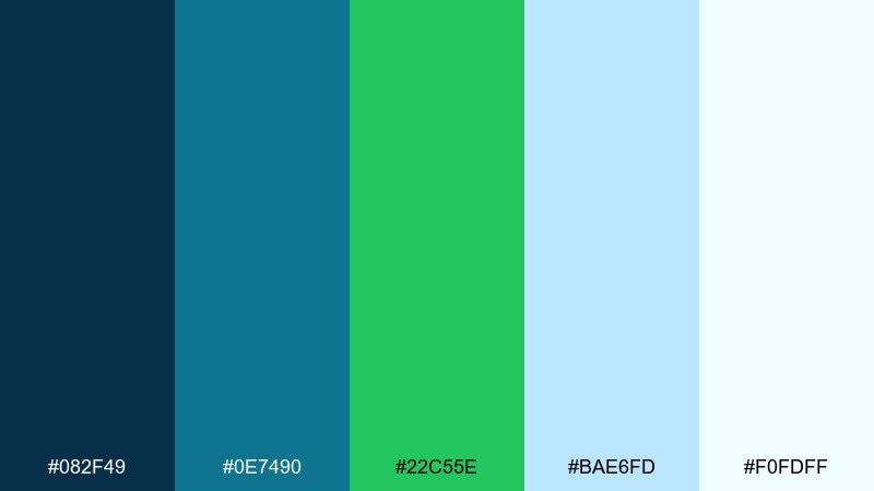
HEX: #082F49 #0E7490 #22C55E #BAE6FD #F0FDFF
Mood: modern and confident
Best for: payment app marketing banner
Crisp teal with a fresh green pop feels like fast transfers and clear confirmations. These finance color combinations work well for marketing banners where you want energy without losing trust. Use teal for the main headline area, then add the green as a single action cue like Pay now or Get started. Tip: keep supporting copy on pale sky tones to maintain contrast.
Image example of teal treasury generated using media.io

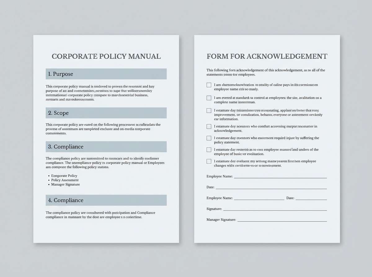
11) Charcoal Compliance
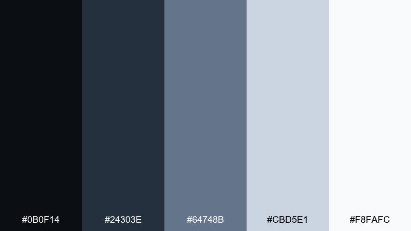
HEX: #0B0F14 #24303E #64748B #CBD5E1 #F8FAFC
Mood: authoritative and clear
Best for: policy document and forms
Cool charcoals feel precise, regulated, and unmistakably professional. As a finance color scheme, it supports long policies and complex forms by keeping the hierarchy strict and easy to follow. Use the dark tones for section headers and form labels, while pale blue-gray keeps pages from looking harsh. Tip: standardize one gray for links and help text to reduce cognitive load.
Image example of charcoal compliance generated using media.io
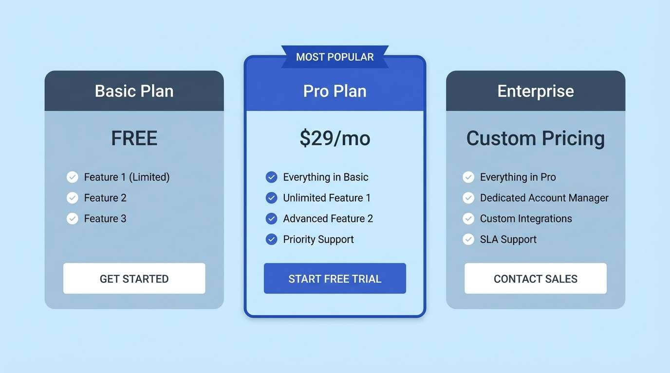
12) Bluechip Slate
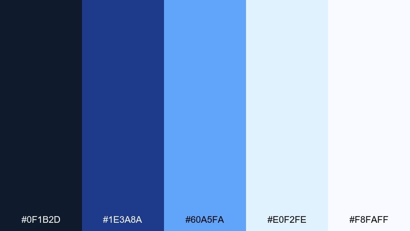
HEX: #0F1B2D #1E3A8A #60A5FA #E0F2FE #F8FAFF
Mood: stable and forward-looking
Best for: SaaS pricing page
Bluechip tones feel like steady leadership with a modern edge. Use the deep slate and royal blue to frame pricing tiers, then let the light sky shades carry feature lists and badges. Pair with simple icons and thin borders so the page stays scannable. Tip: highlight the recommended plan using the brightest blue, not a new color.
Image example of bluechip slate generated using media.io
13) Olive Bond
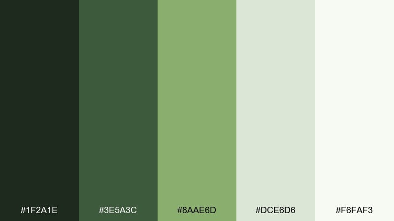
HEX: #1F2A1E #3E5A3C #8AAE6D #DCE6D6 #F6FAF3
Mood: heritage and calm
Best for: credit union branding kit
Muted olive greens evoke legacy institutions, community trust, and steady relationships. Use the darkest green for logos and headers, then let the sage tones soften stationery and social templates. Pair with warm off-white to avoid a cold, overly corporate look. Tip: keep gradients subtle, since flat olives feel more authentic.
Image example of olive bond generated using media.io

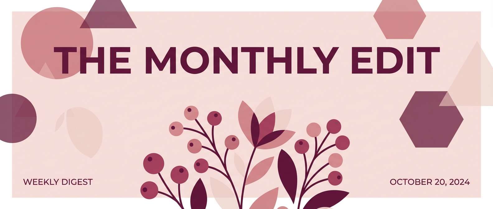
14) Rose Gold Forecast
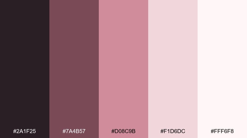
HEX: #2A1F25 #7A4B57 #D08C9B #F1D6DC #FFF6F8
Mood: premium and personable
Best for: newsletter header and hero graphics
Rose gold tones feel warm, confident, and slightly indulgent, like a well-timed market insight. Use the darker berry for headlines and dividers, then bring in blush for background blocks and callouts. Pair with clean sans-serif type to keep it contemporary. Tip: use the mid rose as the only accent for buttons so the email stays cohesive.
Image example of rose gold forecast generated using media.io
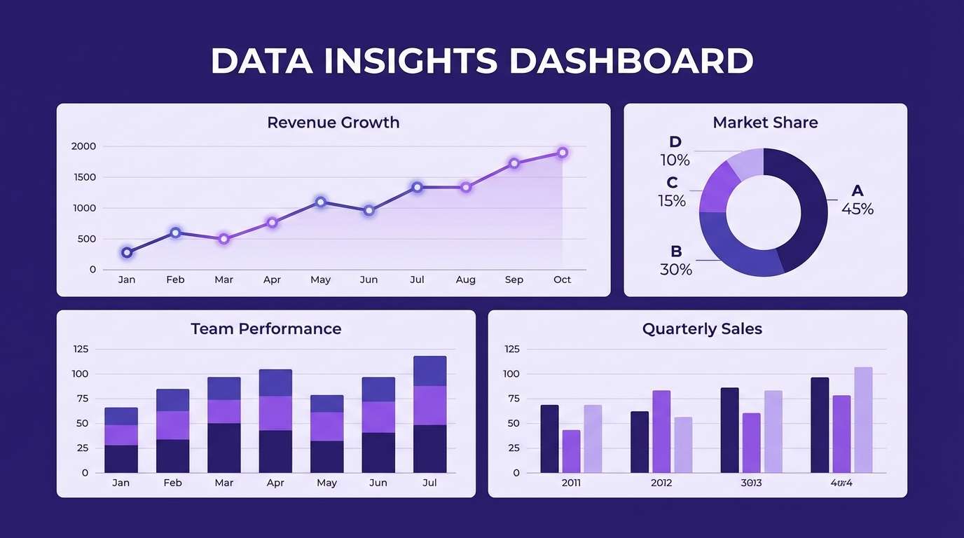
15) Indigo Ledgerlines
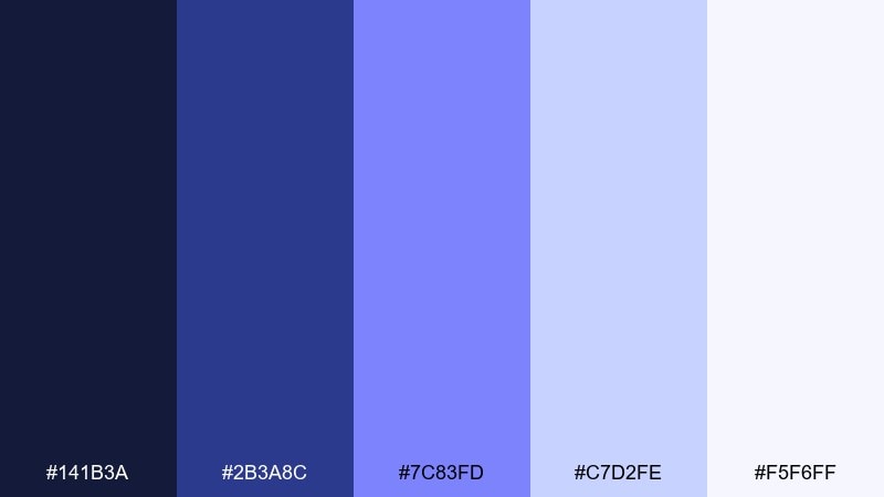
HEX: #141B3A #2B3A8C #7C83FD #C7D2FE #F5F6FF
Mood: smart and analytical
Best for: data visualization templates
Indigo with periwinkle highlights feels like sharp thinking and clean analysis. This finance color palette is especially strong for dashboards and reports that rely on multiple chart types. Use the darkest indigo for axes and labels, then apply periwinkle shades to separate series without clashing. Tip: keep one chart series consistently violet across pages to build recognition.
Image example of indigo ledgerlines generated using media.io
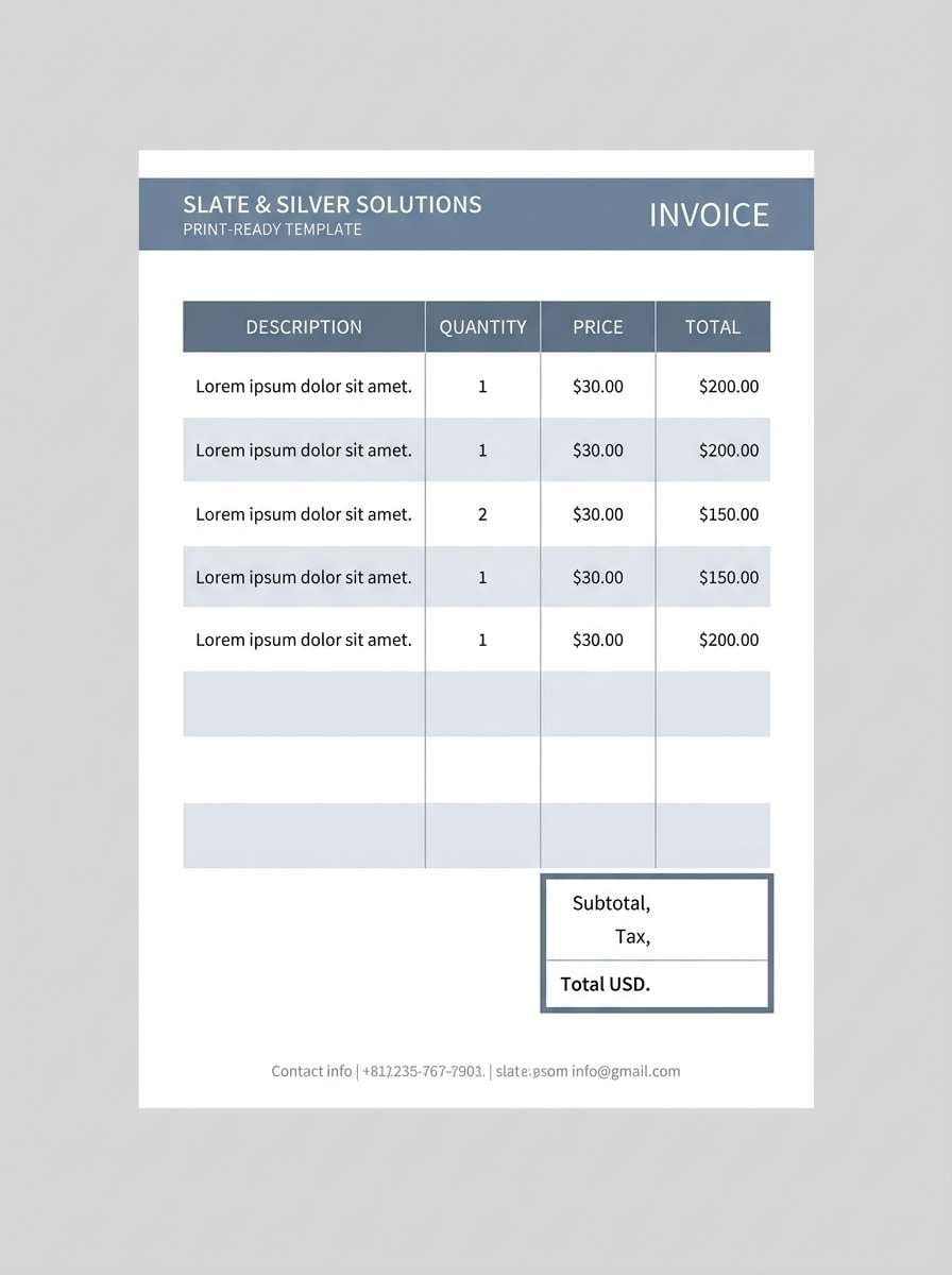
16) Silver Interest
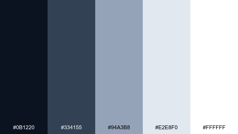
HEX: #0B1220 #334155 #94A3B8 #E2E8F0 #FFFFFF
Mood: precise and modern
Best for: invoice and billing template
Cool silvers and slate blues evoke accuracy, punctuality, and tidy paperwork. Use the darkest tone for totals and due dates, then rely on the light silver for tables and line items. Pair with generous margins so invoices print cleanly and read well on mobile. Tip: keep accent color to one place, like the paid stamp or balance highlight.
Image example of silver interest generated using media.io
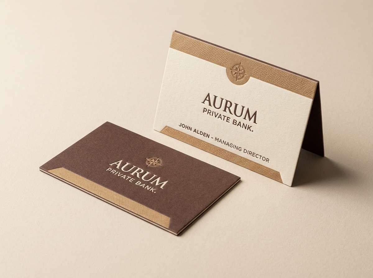
17) Cocoa Capital
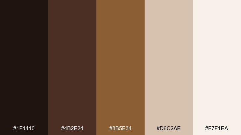
HEX: #1F1410 #4B2E24 #8B5E34 #D6C2AE #F7F1EA
Mood: warm and established
Best for: private banking business card
Rich cocoa browns feel established, discreet, and quietly premium. Use the darkest shade for type and monograms, then let the tan and cream handle background and texture. Pair with a subtle emboss effect for a tactile, high-end finish. Tip: keep the palette minimal on small formats so it reads upscale, not busy.
Image example of cocoa capital generated using media.io
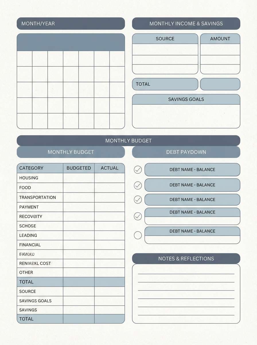
18) Cloudy Cashflow
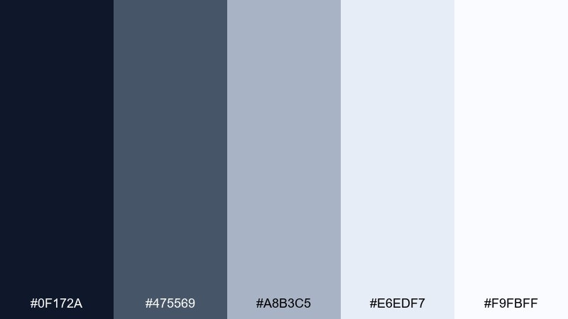
HEX: #0F172A #475569 #A8B3C5 #E6EDF7 #F9FBFF
Mood: calm and readable
Best for: financial planner worksheet PDF
Soft cloud blues feel calm, organized, and easy to work with for long sessions. Use the deep slate for section titles and instruction text, then apply the pale tints for fillable areas and grids. Pair with simple icons to guide steps without clutter. Tip: keep contrast consistent so the worksheet prints clearly in grayscale.
Image example of cloudy cashflow generated using media.io
19) Burgundy Benchmark
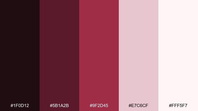
HEX: #1F0D12 #5B1A2B #9F2D45 #E7C6CF #FFF5F7
Mood: bold and decisive
Best for: conference poster for finance event
Deep burgundy feels decisive and high-stakes, like keynote moments and big benchmarks. Use the darkest tone for the title and speaker list, then let the rose tint support schedules and small print. Pair with clean grids and plenty of negative space so the poster stays legible at distance. Tip: keep red-burgundy accents limited to key highlights like date and venue.
Image example of burgundy benchmark generated using media.io

20) Sunrise Yield
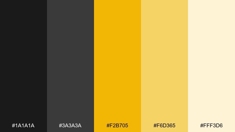
HEX: #1A1A1A #3A3A3A #F2B705 #F6D365 #FFF3D6
Mood: energizing and optimistic
Best for: social media carousel for savings tips
Warm sunrise yellows feel optimistic and motivating, like a fresh start for better habits. Use the charcoal tones for readable text and icons, then apply the gold shades for highlights, badges, and progress cues. Pair with simple illustrations and clear step-by-step panels. Tip: keep backgrounds light cream so the yellow stays bright without hurting contrast.
Image example of sunrise yield generated using media.io

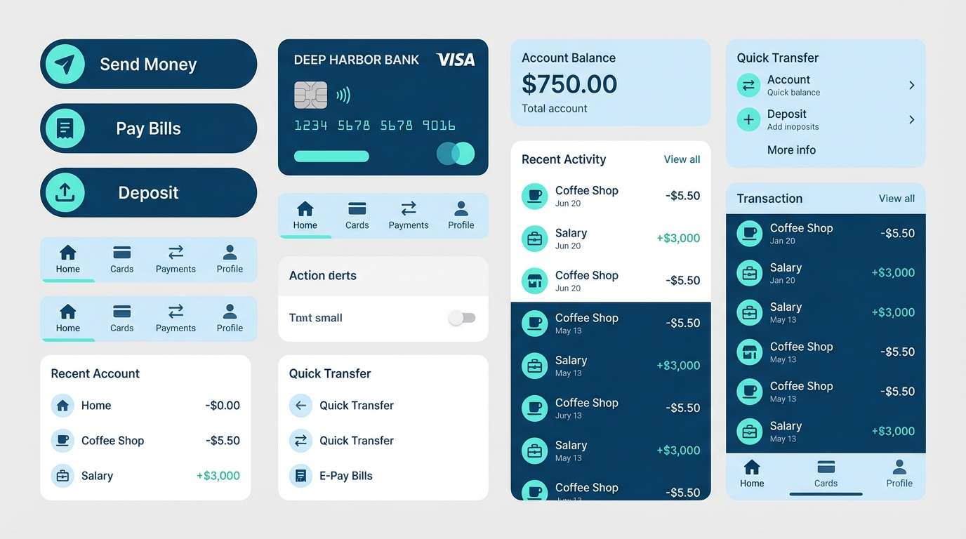
21) Harbor Balance
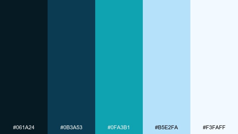
HEX: #061A24 #0B3A53 #0FA3B1 #B5E2FA #F3FAFF
Mood: calm and trustworthy
Best for: mobile banking app UI components
Harbor blues feel calm, steady, and reassuring, like checking balances without stress. Use the deep blue for nav and headers, then let the aqua tone guide interactive states such as active tabs and links. Pair with very light blue panels to separate modules without heavy borders. Tip: keep the aqua as a single accent so UI elements remain consistent.
Image example of harbor balance generated using media.io
22) Gilded Portfolio
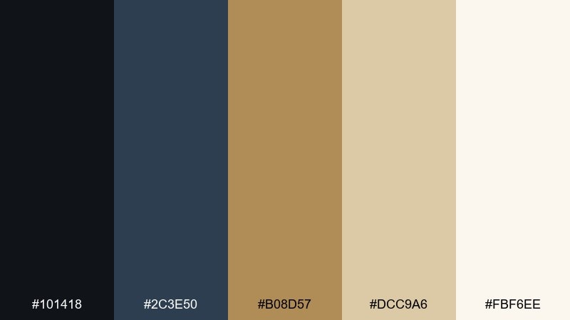
HEX: #101418 #2C3E50 #B08D57 #DCC9A6 #FBF6EE
Mood: luxury and composed
Best for: premium portfolio app splash screen
Gilded accents over deep slate feel like curated investments and high-touch service. Use the dark tones for a bold splash background, then let gold and sand highlight the logo and loading elements. Pair with minimal typography and a single icon style to keep it refined. Tip: choose one gold shade for all highlights to avoid a patchy look across screens.
Image example of gilded portfolio generated using media.io

What Colors Go Well with Finance?
Blues and blue-grays are the most common foundation for finance because they read as stable, logical, and dependable. They also pair naturally with white space for clean layouts and clear hierarchy.
Greens work well as “growth” accents, especially for confirmations, positive trends, and success states. For a more premium feel, add restrained metallic-like accents such as champagne gold or copper, but keep them minimal.
Neutral charcoals and soft grays are essential for typography, grids, and tables. They prevent your UI or report from becoming too colorful and help data visualizations stand out.
How to Use a Finance Color Palette in Real Designs
Start with a strict role system: one primary (navigation and headings), one surface/background family (cards and panels), and one accent (CTAs and active states). This keeps dashboards, pricing pages, and reports consistent across screens.
For charts, assign colors by meaning. Use one consistent “positive” color (often green), one “attention” color for warnings, and keep the rest in tints of your brand blues or purples so series don’t fight each other.
Always validate contrast for small text, numbers, and table lines. Finance layouts often include dense details, so legibility matters more than decoration.
Create Finance Palette Visuals with AI
If you’re building a deck, landing page, or dashboard concept, generating quick visuals can help you test a finance color scheme before committing to a full design system. AI mockups are especially useful for comparing light vs. dark UI and deciding where accents should appear.
With Media.io, you can turn a palette into practical examples like onboarding screens, pricing pages, posters, and report spreads—fast—so stakeholders can react to something tangible.
Use a short prompt, paste your HEX codes, and iterate until the layout feels credible, modern, and readable.
Finance Color Palette FAQs
-
What are the best colors for fintech branding?
Fintech branding often works best with deep blues or slates for trust, clean whites for clarity, and one modern accent (teal, emerald, or bright blue) for CTAs and highlights. -
Is green a good color for finance UI?
Yes. Green is strongly associated with growth and “success” states, so it’s great for confirmations, positive trends, and portfolio gains—just keep saturation controlled for a professional look. -
How many colors should a finance palette include?
A practical finance palette usually includes 1–2 strong brand tones, 2–3 neutrals for surfaces and typography, and 1 accent for actions or KPI emphasis. -
What’s a safe accent color for banking apps?
Teal, aqua, or a bright-but-limited blue accent tends to feel modern while staying trustworthy. Use it consistently for interactive states like active tabs, links, and primary buttons. -
Can I use gold accents in finance designs without looking flashy?
Yes—use gold like jewelry, not paint. Keep it to small highlights (badges, key numbers, CTA outlines) and pair it with charcoal text and light cream backgrounds. -
What finance colors work best for reports and dashboards?
Cool blues and grays are ideal because they maintain readability in data-heavy layouts. Use darker tones for headings and labels, and light grays for grids and separators. -
How do I keep finance charts readable with brand colors?
Use one consistent highlight color for the main metric, keep other series in tints/shades of the same hue family, and avoid using multiple equally saturated colors on one chart.
Next: Olive Color Palette


