

Fall color schemes feel instantly familiar: warm woods, baked spices, dried grasses, and deep evening shadows. They’re ideal when you want designs to read as welcoming, grounded, and premium.
Below are 20+ fall color palette ideas you can use for branding, UI, packaging, and seasonal campaigns—each with HEX codes and an AI prompt you can recreate in Media.io.
In this article
Why Fall Color Palettes Work So Well
Fall palettes balance comfort and contrast: warm oranges and browns feel human and approachable, while deep charcoals, olives, and near-blacks add modern structure. That mix makes designs look intentional rather than overly “seasonal.”
They also photograph and print beautifully. Earthy pigments tend to look rich on matte materials (paper, cardboard, fabric), and warm neutrals create natural whitespace that keeps layouts readable.
Most importantly, fall color schemes are versatile. You can push them rustic (tan + pine) or sleek (ember + near-black teal) while staying cohesive across UI, branding, and marketing assets.
20+ Fall Color Palette Ideas (with HEX Codes)
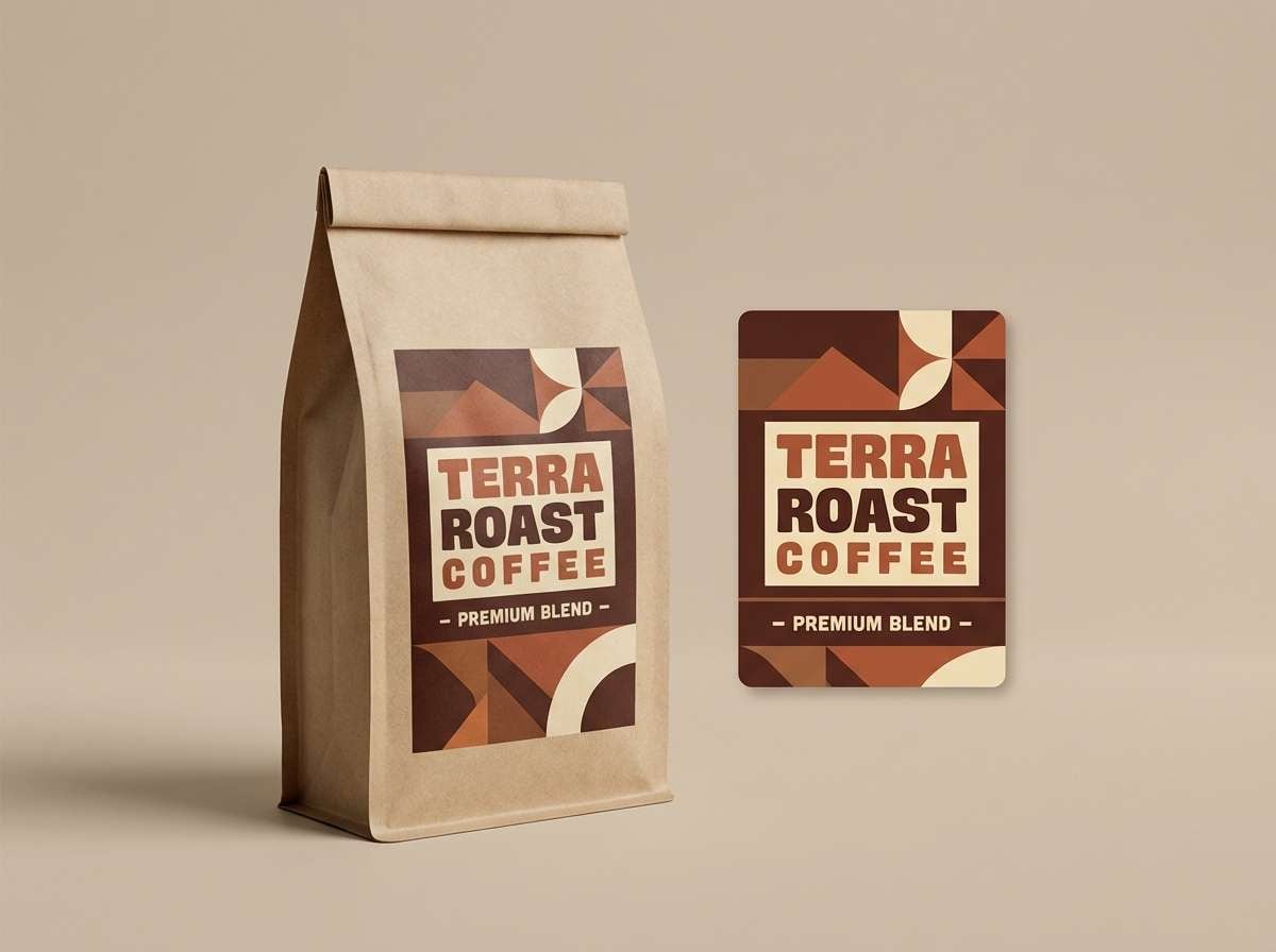
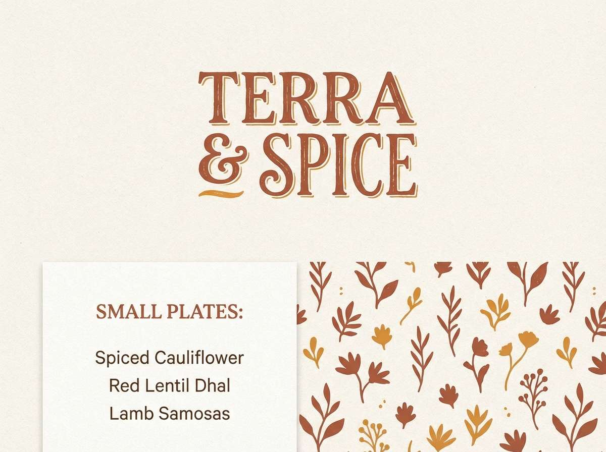
1) Harvest Hearth

HEX: #7A3E2A #B86B3F #E1B07A #2F2A24 #F3E7D6
Mood: toasty and welcoming
Best for: coffee packaging
Toasty and welcoming, like a mug warming your hands beside a crackling fire. The cocoa brown and spiced terracotta feel premium when paired with the creamy oat neutral for whitespace. Use the dark roast tone for typography and barcodes to keep legibility high. A subtle paper texture works beautifully with this mix without stealing attention.
Image example of harvest hearth generated using media.io
Media.io is an online AI studio for creating and editing video, image, and audio in your browser.

2) Cider Press
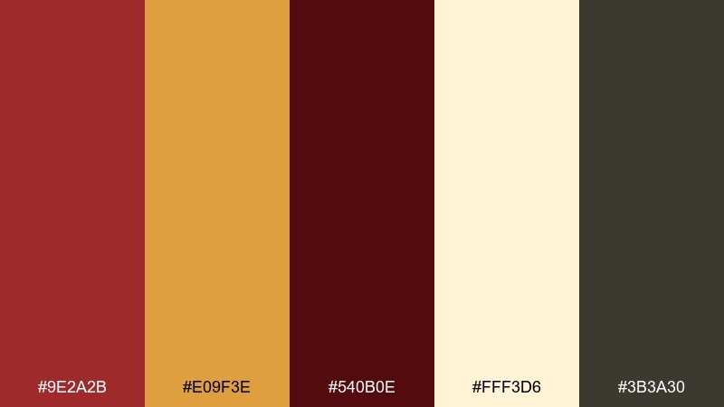
HEX: #9E2A2B #E09F3E #540B0E #FFF3D6 #3B3A30
Mood: bold and rustic
Best for: seasonal poster
Bold and rustic, this fall color palette brings to mind apple orchards, wooden crates, and hand-painted signage. The deep berry red carries headlines, while golden amber adds instant warmth for calls to action. Ground the look with charcoal olive for outlines and small print. Keep the cream as the main background so the poster stays readable from a distance.
Image example of cider press generated using media.io

3) Maple Dusk
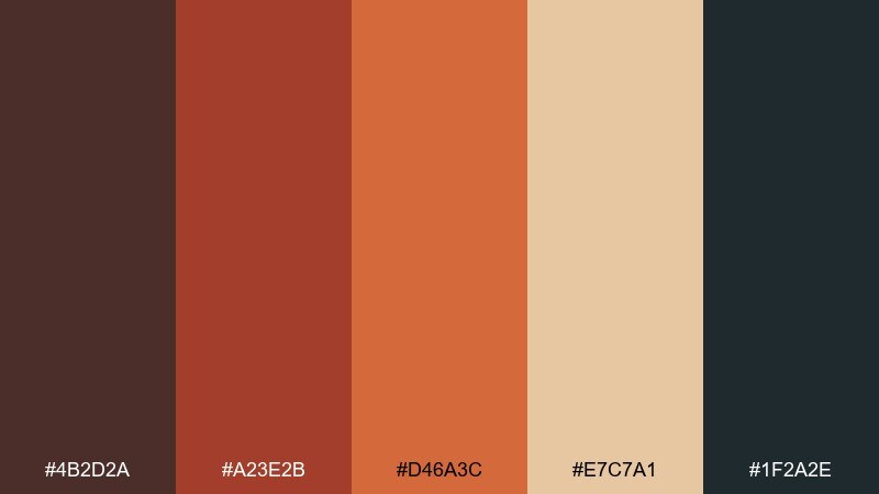
HEX: #4B2D2A #A23E2B #D46A3C #E7C7A1 #1F2A2E
Mood: moody and cinematic
Best for: brand hero banner
Moody and cinematic, it feels like late light hitting maple leaves just before sunset. The ember orange and brick red create a strong focal area, while the near-black teal gives modern contrast. For a sophisticated fall color palette effect, keep the light wheat tone for gradients and soft overlays. Tip: add a gentle grain layer to unify the darker shades without making them muddy.
Image example of maple dusk generated using media.io

4) Pumpkin Spice Latte

HEX: #C35A2C #F0B35A #6B3D2E #F7E6CF #2D2B2A
Mood: cozy and playful
Best for: bakery menu design
Cozy and playful, this fall color scheme suggests cinnamon swirls, toasted sugar, and a warm bakery counter. Use the pumpkin orange for section headers and the latte gold for highlights or icons. The espresso brown keeps text grounded and pairs nicely with thick serif type. A small tip: reserve the cream for menu blocks so prices and descriptions stay clean.
Image example of pumpkin spice latte generated using media.io

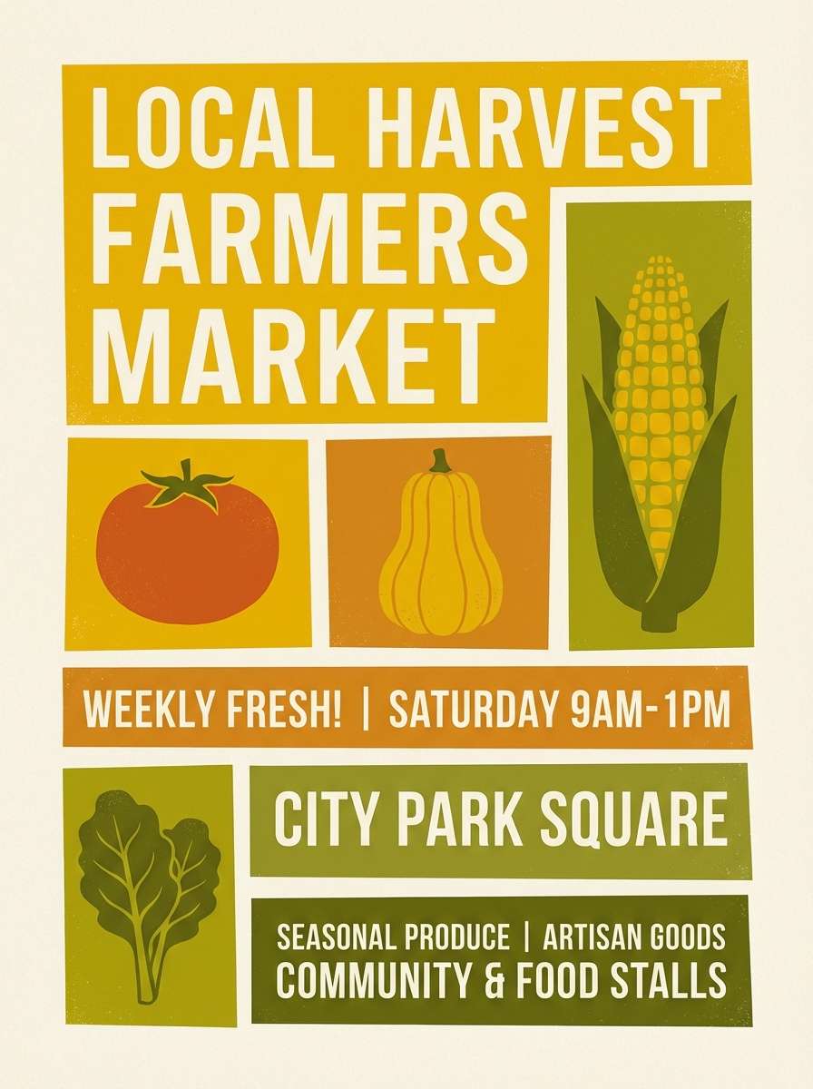
5) Golden Orchard

HEX: #D98C1E #F2C14E #7B5E2B #2E3A2C #FFF2D8
Mood: sunlit and earthy
Best for: farmers market flyer
Sunlit and earthy, it reads like ripe pears, hay bales, and leaf shadows on a bright afternoon. These tones make fall color combinations that feel friendly without getting too sweet. Let the golden hues carry the main shapes, then use forest olive for borders and navigation cues. Keep text mostly in the deep brown to maintain contrast on the pale cream base.
Image example of golden orchard generated using media.io
6) Cranberry Corduroy

HEX: #7B1E3A #B23A48 #D9A6A1 #3A2A2A #F6EFEA
Mood: vintage and tactile
Best for: fashion lookbook
Vintage and tactile, this fall color palette evokes corduroy jackets and berry-toned lipstick. The cranberry shades shine as large color fields, while the blush rose keeps the layout soft and editorial. Use the deep cocoa for body text and thin rules to give structure. Tip: try generous margins so the palette feels elevated rather than heavy.
Image example of cranberry corduroy generated using media.io
7) Forest Cabin
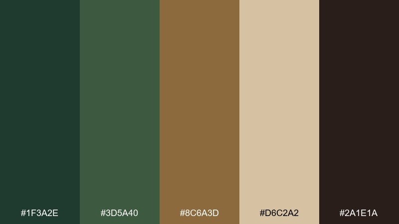
HEX: #1F3A2E #3D5A40 #8C6A3D #D6C2A2 #2A1E1A
Mood: grounded and outdoorsy
Best for: outdoor brand identity
Grounded and outdoorsy, this soft fall color palette feels like pine needles, weathered wood, and a trail map folded in your pocket. The layered greens provide a solid foundation, while the warm tan adds a human, handcrafted note. Use the dark bark tone for logos and small text to keep the identity sharp. A stitched or stamped texture complements these hues without making them look busy.
Image example of forest cabin generated using media.io
8) Amber Leather
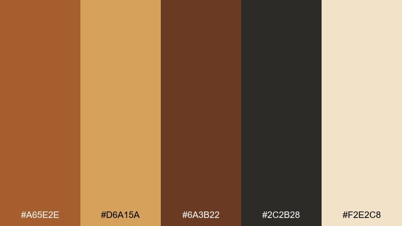
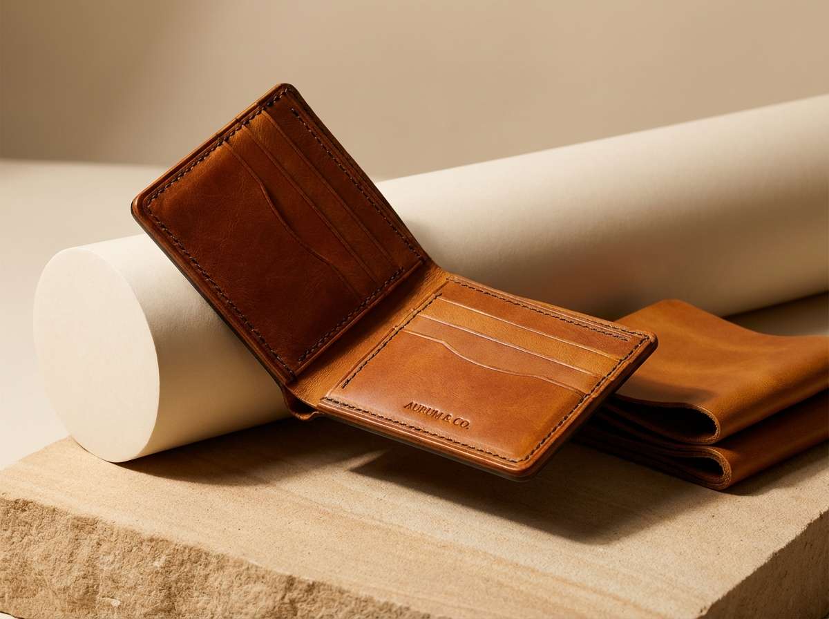
HEX: #A65E2E #D6A15A #6A3B22 #2C2B28 #F2E2C8
Mood: lux and warm
Best for: product ad for accessories
Lux and warm, it calls up polished leather, brass hardware, and soft spotlighting. The amber and caramel tones are ideal for hero objects, while the near-black makes the whole ad feel premium. Keep the cream as a subtle backdrop, not a competing highlight. Tip: use one metallic texture sparingly so the palette stays timeless.
Image example of amber leather generated using media.io
9) Smoky Chestnut

HEX: #5B3A29 #8A5A44 #B07D62 #D9C3B0 #2B2D2F
Mood: quiet and sophisticated
Best for: interior mood board
Quiet and sophisticated, this fall color palette resembles chestnut wood, soft smoke, and knit throws. The mid browns layer smoothly, making it easy to build depth without harsh contrast. Use the slate charcoal for labels and anchor elements to prevent the scene from drifting too warm. A matte finish works better than glossy here for a calm, modern look.
Image example of smoky chestnut generated using media.io

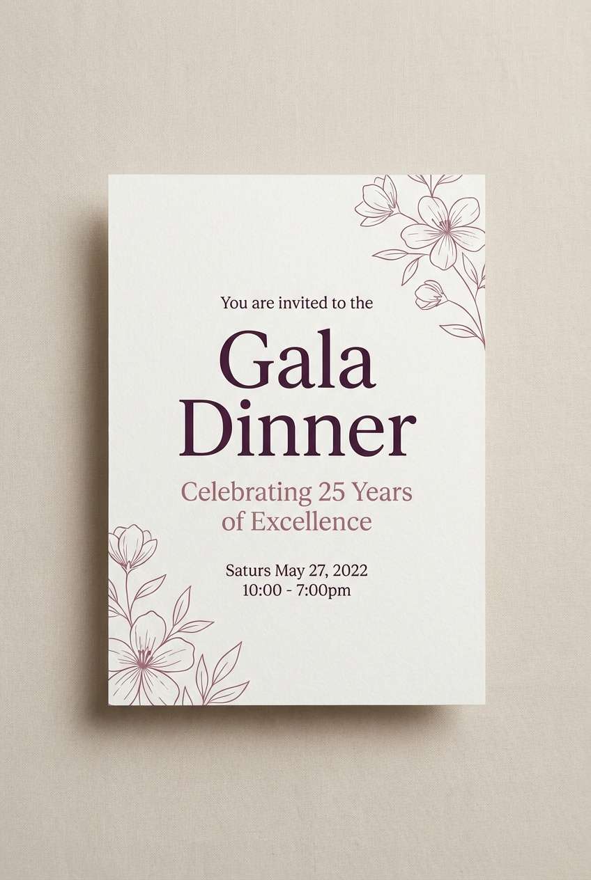
10) Spiced Plum
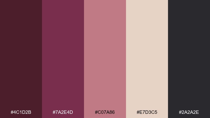
HEX: #4C1D2B #7A2E4D #C07A86 #E7D3C5 #2A2A2E
Mood: romantic and moody
Best for: event invitation
Romantic and moody, it feels like plum wine, velvet ribbons, and candlelight. The deep plum works beautifully for type and borders, while dusty rose softens the composition. Pair this fall color scheme with elegant serif headers and minimal line art for a refined finish. Tip: keep the light neutral dominant so the invitation prints clean and crisp.
Image example of spiced plum generated using media.io
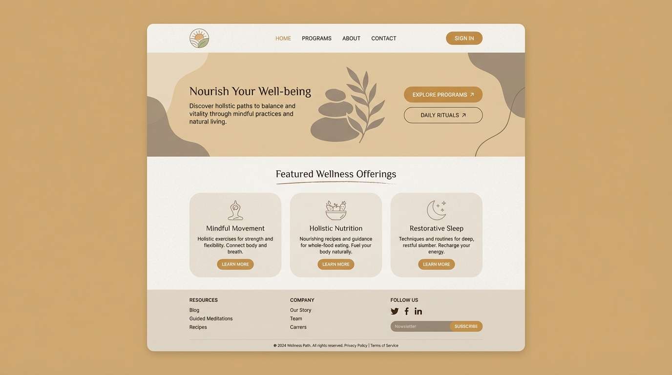
11) Wheat Field

HEX: #C9A66B #E6D3A4 #A47E3B #6A5A43 #F7F1E4
Mood: soft and natural
Best for: wellness landing page UI
Soft and natural, like dried grasses and sun-bleached linen. These gentle wheat tones are calming for wellness UI, especially when you keep contrast in the warm taupe for text and buttons. Use the deeper grain brown sparingly for active states and form outlines. A tip: add subtle shadows instead of harsh borders to keep the interface airy.
Image example of wheat field generated using media.io
12) Saffron Clay

HEX: #C86B2B #E6A43A #B14D2B #6D5B4B #F1E3D3
Mood: warm and energetic
Best for: restaurant brand kit
Warm and energetic, it brings to mind clay ovens, toasted spices, and glowing lanterns. The saffron yellow makes a standout accent for icons and stamps, while the clay red is perfect for logo fills. For a balanced fall color palette, keep the cream base dominant and let the darker taupe handle long-form text. Tip: test the saffron on white first so it stays vibrant in print.
Image example of saffron clay generated using media.io
13) Mossy Stone

HEX: #3F4A3C #6B7B5B #9A8F7A #CFC7B8 #2C2F2B
Mood: cool and grounded
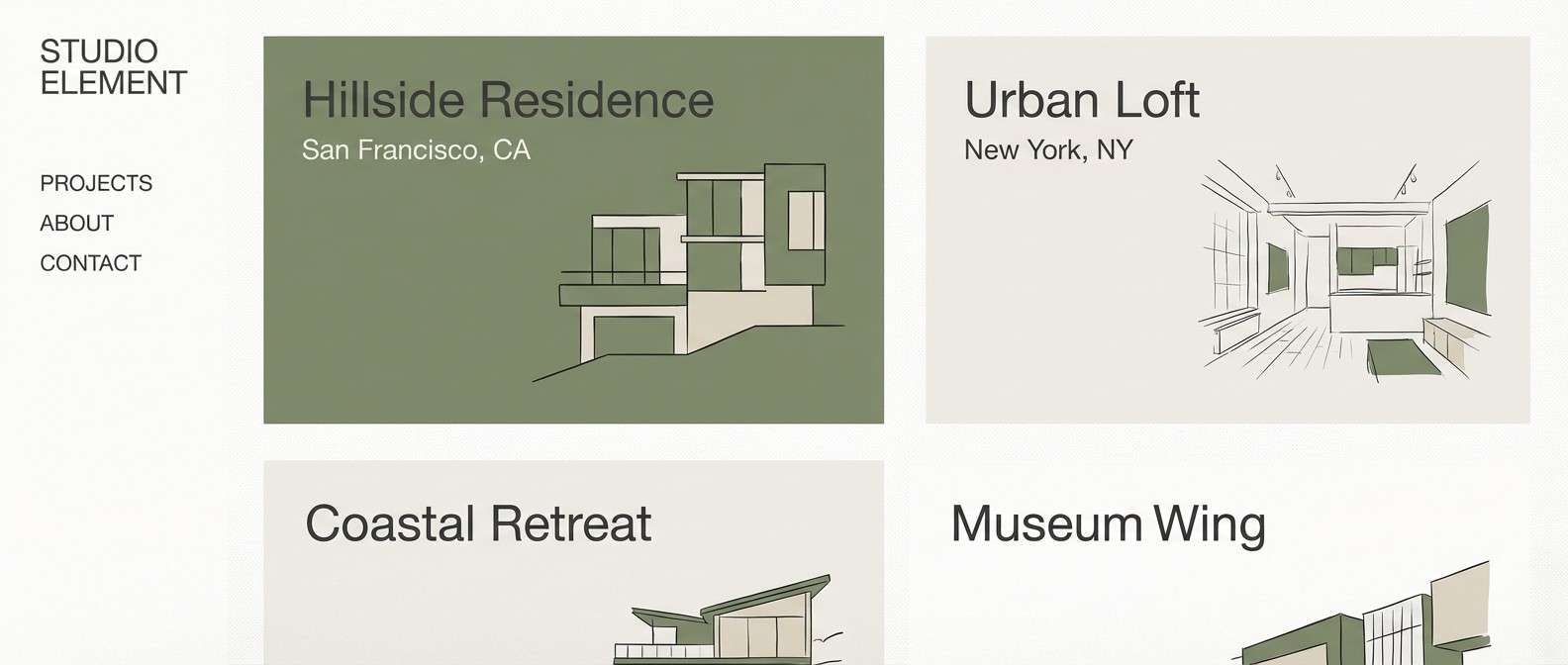
Best for: architectural portfolio
Cool and grounded, these fall color combinations recall moss on stone and overcast hikes. The muted greens and mineral neutrals feel modern, especially with clean sans-serif typography. Use the darkest charcoal for headings and navigation so the portfolio stays sharp. Tip: limit accent use to one green shade to keep the work looking curated.
Image example of mossy stone generated using media.io
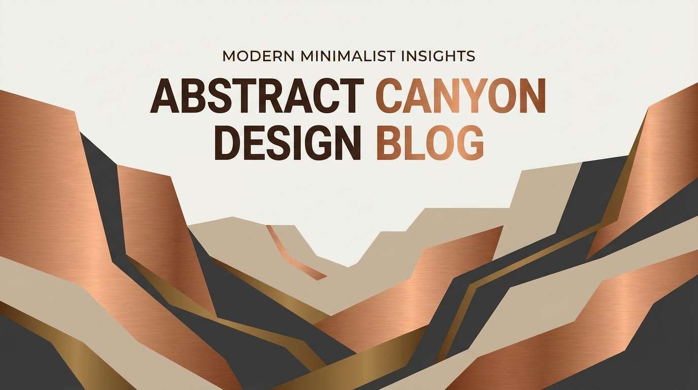
14) Copper Canyon
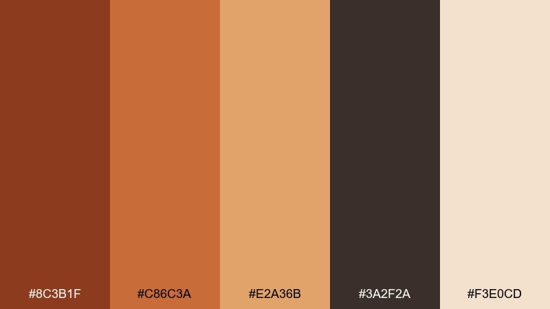
HEX: #8C3B1F #C86C3A #E2A36B #3A2F2A #F3E0CD
Mood: adventurous and sun-baked
Best for: travel blog header
Adventurous and sun-baked, it suggests canyon walls, copper dust, and warm evening air. Use the copper and sand tones for bold shapes and section dividers, then lean on the dark rock for legible type. The soft cream keeps the header from feeling too heavy on smaller screens. Tip: add a single high-contrast button in copper for clear navigation.
Image example of copper canyon generated using media.io
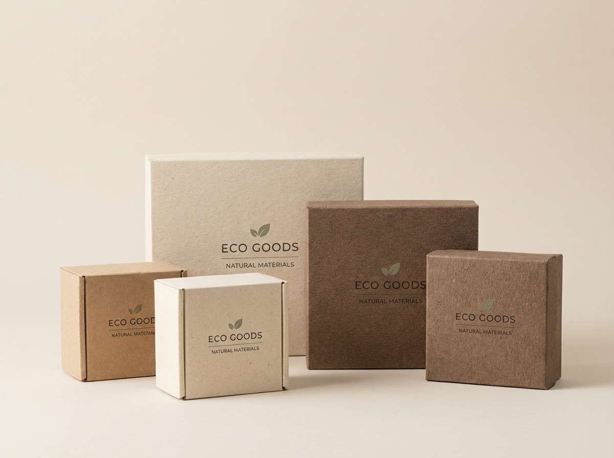
15) Birch and Bark

HEX: #EDE3D3 #BFA98A #7A664D #3B332B #6F7A5B
Mood: clean and woodsy
Best for: eco packaging
Clean and woodsy, like birch paper, twine, and a hint of green from the forest edge. The light neutral makes a strong base for sustainable packaging, while the bark browns provide natural contrast. Use the muted leaf green as a small seal or ingredient callout for freshness. Tip: choose uncoated stock so the palette looks authentic and tactile.
Image example of birch and bark generated using media.io
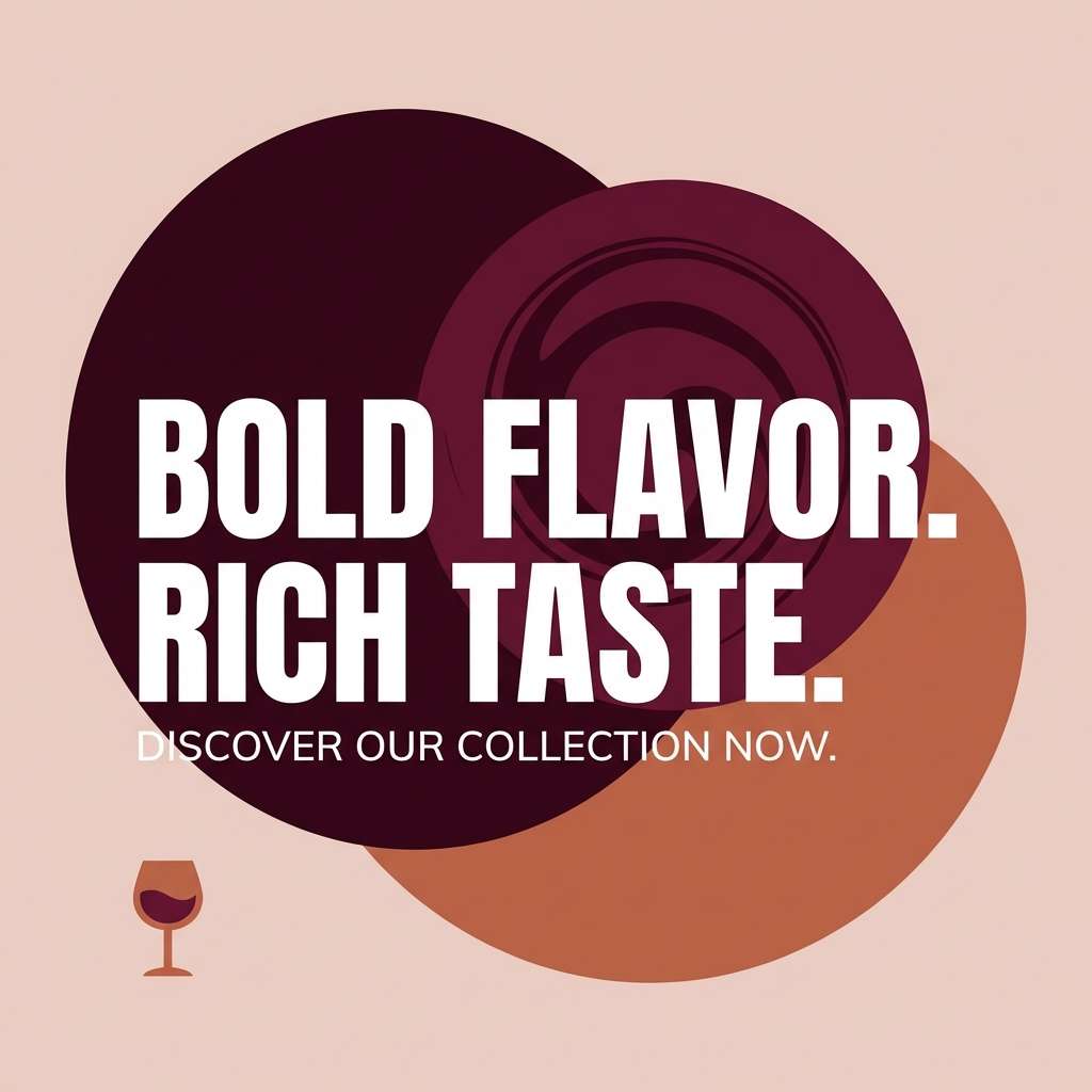
16) Mulled Wine
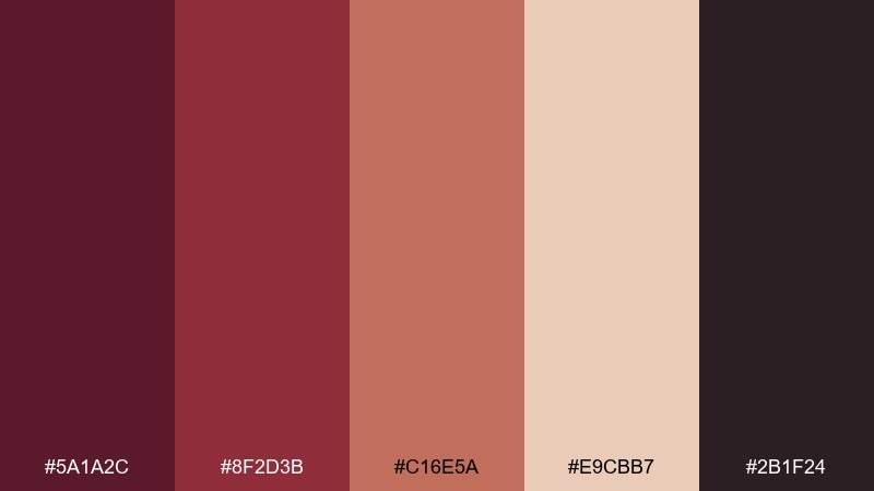
HEX: #5A1A2C #8F2D3B #C16E5A #E9CBB7 #2B1F24
Mood: festive and dramatic
Best for: holiday social ad
Festive and dramatic, this fall color palette feels like simmering wine, orange peel, and dark winter evenings. The burgundy tones create instant depth for social ads, while the warm clay adds a friendly glow. Keep the pale blush as a background panel for copy so the message stays readable. Tip: use bold, condensed headlines to match the richness of the colors.
Image example of mulled wine generated using media.io
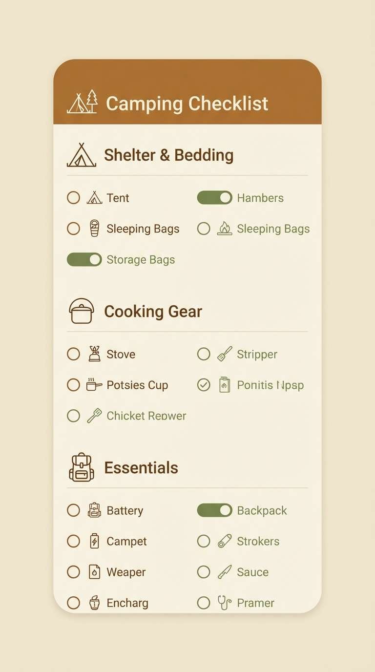
17) Acorn Trail

HEX: #5C4A3D #8A6B4E #BFA27B #DCCEB8 #3B4A3F
Mood: calm and outdoorsy
Best for: camping checklist UI
Calm and outdoorsy, it brings up acorns underfoot and canvas gear in earthy light. These muted browns and greens work well for utility screens where clarity matters more than flash. Use the deep green for primary buttons and the darkest brown for text. Tip: keep icons simple and flat so the palette stays the star.
Image example of acorn trail generated using media.io
18) Rust and Sage
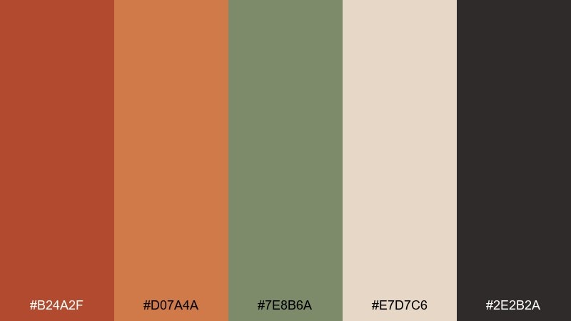
HEX: #B24A2F #D07A4A #7E8B6A #E7D7C6 #2E2B2A
Mood: balanced and modern rustic
Best for: home decor ecommerce banner
Balanced and modern rustic, it mixes sun-warmed rust with calming sage. These fall color combinations feel especially fresh for home decor when you keep the background light and the accents intentional. Use sage for secondary buttons and filters, then reserve rust for price tags or promos. Tip: avoid using both rust shades in small text to prevent blur on mobile.
Image example of rust and sage generated using media.io

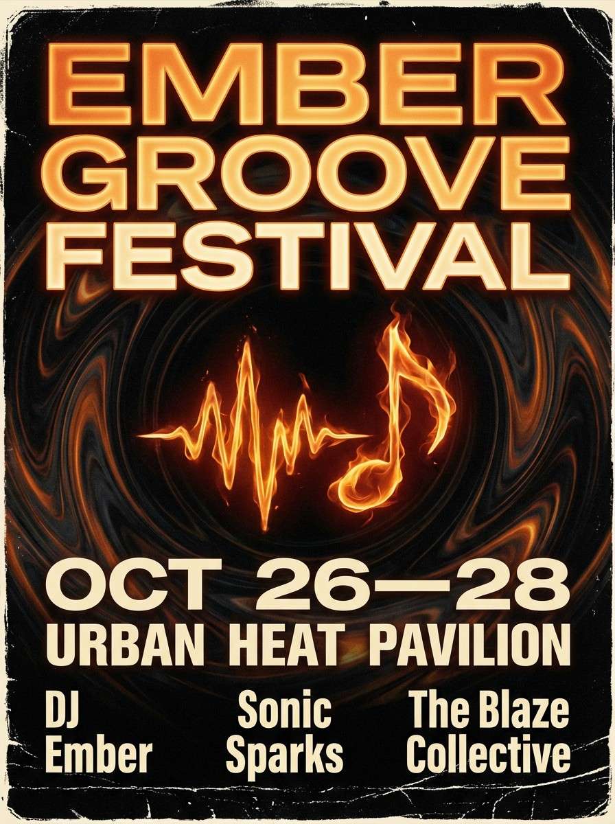
19) Bonfire Night
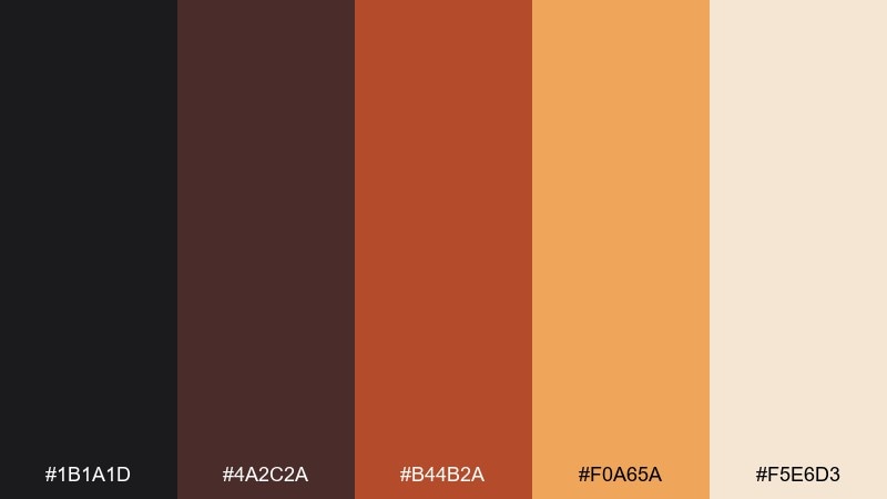
HEX: #1B1A1D #4A2C2A #B44B2A #F0A65A #F5E6D3
Mood: dramatic and high-contrast
Best for: music event flyer
Dramatic and high-contrast, it reads like night sky, sparks, and glowing embers. Use the near-black as the main background to make the flame tones pop with energy. The amber is ideal for dates and ticket buttons, while the cream keeps small details from getting lost. Tip: limit gradients to one area so the flyer stays punchy.
Image example of bonfire night generated using media.io
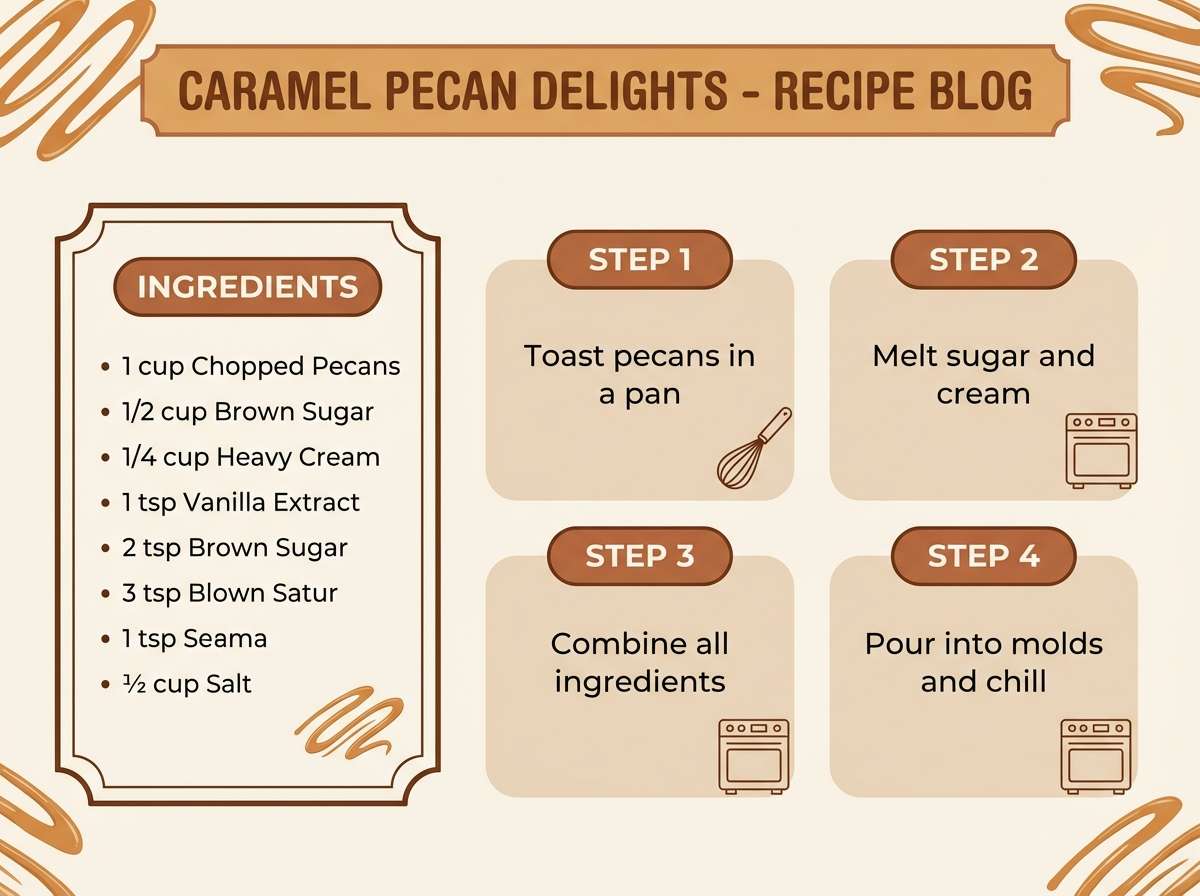
20) Pecan Pie

HEX: #6A3E2B #9A5B3D #C68B5B #E7CFAE #F7EFE3
Mood: sweet and comforting
Best for: recipe blog graphics
Sweet and comforting, these fall color combos feel like toasted pecans, brown sugar, and flaky crust. The mid caramel shades are perfect for title cards and step-by-step panels. Use the deepest brown for measurements and captions to keep everything readable. Tip: add plenty of light space so the warm tones do not overwhelm the layout.
Image example of pecan pie generated using media.io
21) Foggy Morning

HEX: #C9C1B8 #A59B90 #7A6F66 #4A4F52 #EFE9E2
Mood: minimal and serene
Best for: portfolio UI
Minimal and serene, it looks like fog over fields and soft knit neutrals. The grays and warm taupes create an understated backdrop that lets work samples shine. Use the darker slate for navigation and focus states so the UI still feels responsive. Tip: pair with one warm accent image per section to avoid a flat experience.
Image example of foggy morning generated using media.io
What Colors Go Well with Fall?
Fall tones pair well with warm neutrals (oat, cream, taupe) because they create breathing room and keep the palette usable for UI backgrounds and editorial layouts. If you’re aiming for a softer look, start with two neutrals and add one accent like rust or amber.
For contrast, add deep anchors such as charcoal, espresso brown, or near-black teal. These darker shades sharpen typography and help buttons, nav, and dividers stay readable without relying on pure black.
Muted greens (sage, moss, olive) are the easiest “fresh” companion to oranges and browns. They modernize the palette and prevent warm-heavy designs from feeling overly vintage.
How to Use a Fall Color Palette in Real Designs
Assign roles before you design: pick one background neutral, one primary brand color, one accent, and one dark text color. This keeps fall color combinations consistent across banners, packaging, and multi-page UI.
Watch saturation and scale. Warm hues like pumpkin and saffron look best as big blocks, icons, or highlights—not tiny body text—while charcoals and deep browns are more reliable for long reading.
If the design starts to feel heavy, increase whitespace and reduce texture. A subtle grain or paper look can unify earthy tones, but keeping it minimal preserves a modern finish.
Create Fall Palette Visuals with AI
Want to see how these HEX combinations look in real layouts? Use the prompts above to generate matching posters, brand boards, UI mockups, and packaging scenes in minutes.
In Media.io, you can iterate quickly: swap a single color word (like “amber” to “copper”), change the aspect ratio, or switch from “realistic studio shot” to “graphic design only” to fit your project style.
Once you have a strong result, reuse the same prompt structure for consistent seasonal campaign assets across sizes and platforms.
Fall Color Palette FAQs
-
What are the best colors for a modern fall color palette?
Modern fall palettes usually blend a warm accent (rust, amber, pumpkin) with a clean neutral (cream, oat, taupe) and a deep anchor (charcoal, espresso, near-black teal) for contrast and readability. -
How do I keep an autumn palette from looking too “traditional”?
Reduce saturation, lean on warm neutrals, and add one cool counterbalance like sage, moss, or slate. Using near-black instead of pure black also makes the palette feel more contemporary. -
What fall color combinations work well for branding?
Try terracotta + cream + charcoal for premium warmth, rust + sage + light neutral for modern rustic, or cranberry + blush + cocoa for editorial/lifestyle brands. -
Which fall colors are best for UI design?
Use light neutrals (linen, oat, cream) for backgrounds, dark taupes/charcoals for text, and reserve saturated oranges or ambers for buttons and key highlights so contrast stays accessible. -
Can I use fall palettes for non-seasonal projects?
Yes. Earthy tones read as timeless and trustworthy, especially for coffee, outdoor, wellness, interior, and eco brands. Keep the palette neutral-forward and use seasonal accents sparingly. -
What’s a good dark text color for warm fall backgrounds?
Deep espresso browns, charcoal olives, and near-black teal shades tend to look softer than pure black while still maintaining strong legibility on cream or wheat backgrounds. -
How can I generate fall palette visuals quickly?
Use Media.io text-to-image with a layout-focused prompt (e.g., “graphic design only, poster layout…”) and specify your dominant colors. Iterate by changing one keyword at a time to keep results consistent.
Next: Onyx Color Palette


