

Onyx is a deep charcoal-black neutral that instantly makes layouts feel modern, premium, and intentional. It’s a reliable anchor for interfaces, branding, and interiors because it controls contrast without overpowering supporting colors.
Below are 20 onyx color palette ideas with HEX codes, plus quick tips on what to pair with onyx and how to apply these schemes in real projects.
In this article
Why Onyx Palettes Work So Well
Onyx works because it behaves like a “smart neutral”: darker than charcoal, softer than pure black, and versatile across warm and cool pairings. It creates a strong visual foundation while leaving room for accent colors to stand out.
In UI design, onyx reduces glare compared to true black and makes hierarchy easy—navigation, cards, and data layers can be separated with subtle steps of gray. In branding and print, it communicates confidence and refinement without the harshness of stark black.
Onyx also pairs beautifully with metal tones, creams, and muted greens, making it a strong choice for modern, premium, and nature-inspired aesthetics alike.
20+ Onyx Color Palette Ideas (with HEX Codes)
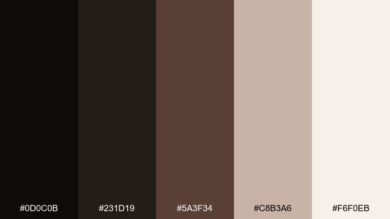
1) Midnight Onyx
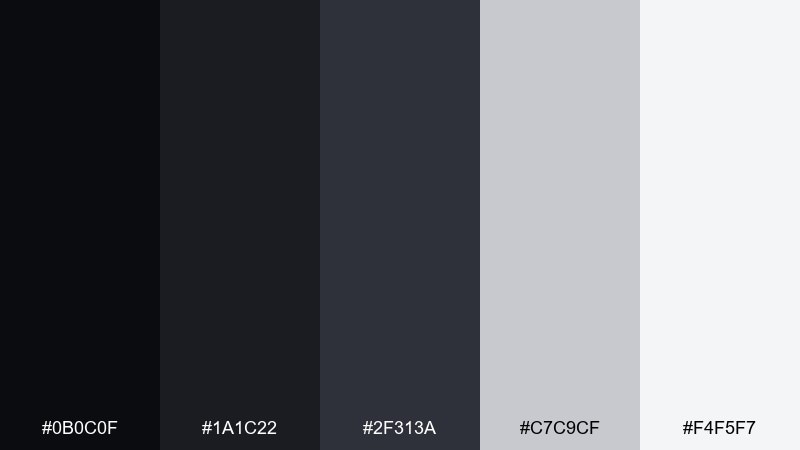
HEX: #0b0c0f #1a1c22 #2f313a #c7c9cf #f4f5f7
Mood: sleek, modern, high-contrast
Best for: dark UI dashboard
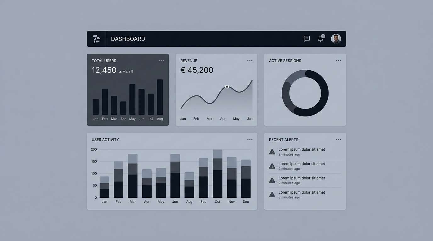
Sleek and nocturnal, like city lights reflected on black glass. Use it for dashboards and analytics screens where hierarchy matters and glare should stay low. Balance the deepest tones with soft grays for readability, and reserve near-white for key numbers and CTAs. Tip: keep body text in the light gray, not pure white, to reduce eye fatigue.
Image example of midnight onyx generated using media.io
Media.io is an online AI studio for creating and editing video, image, and audio in your browser.

2) Smoked Pearl
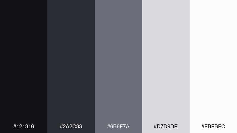
HEX: #121316 #2a2c33 #6b6f7a #d7d9de #fbfbfc
Mood: soft, airy, refined
Best for: editorial layout
Soft smoke and pearl highlights create a calm, upscale quiet. It shines in magazine-style layouts, long reads, and portfolios where white space is part of the story. Pair the dark anchor with mid-gray rules and captions to keep pages tidy. Tip: set headlines in the darkest tone and use the pale gray for section dividers instead of heavy lines.
Image example of smoked pearl generated using media.io
3) Bronze Noir
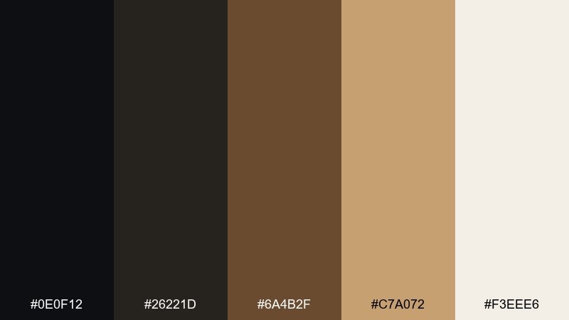
HEX: #0e0f12 #26221d #6a4b2f #c7a072 #f3eee6
Mood: luxury, warm, dramatic
Best for: premium brand identity
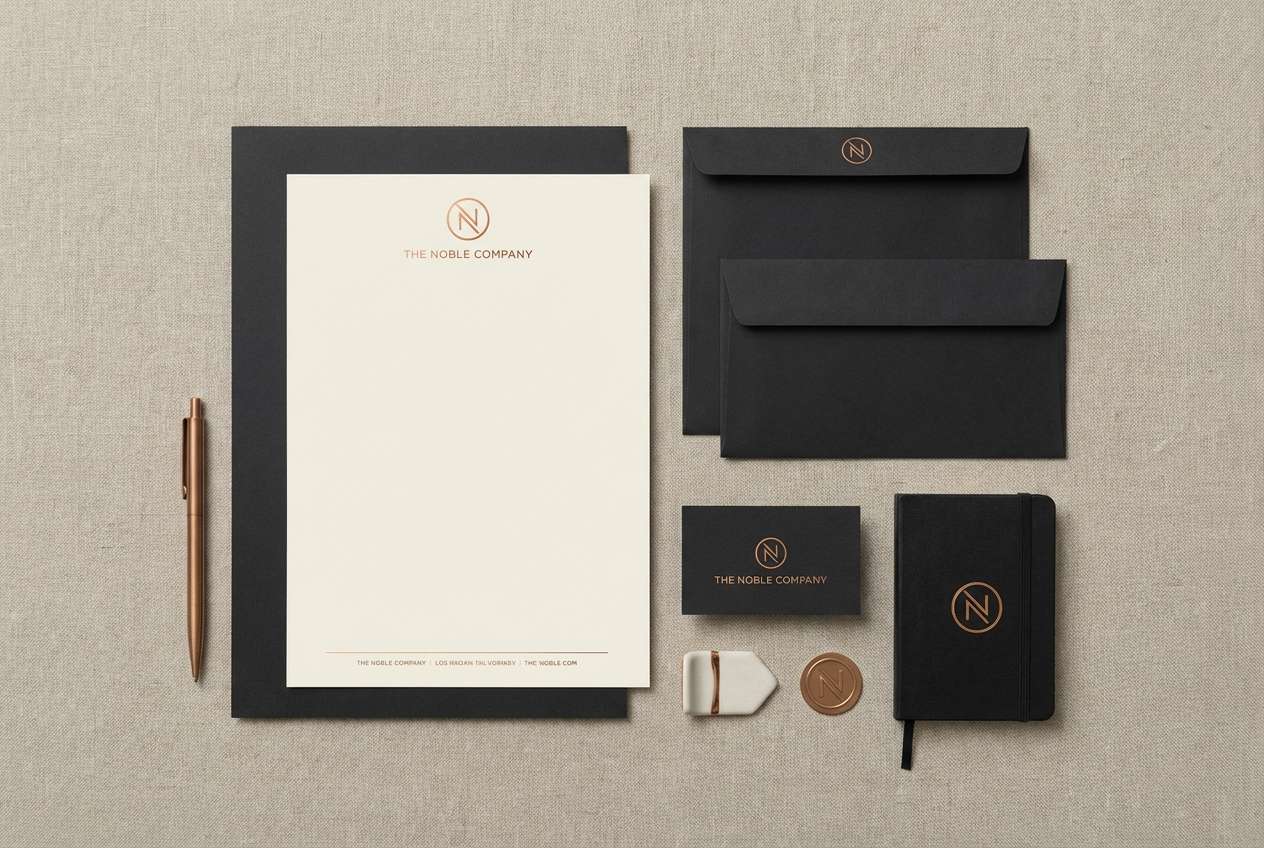
Luxurious and candlelit, with warm bronze glints against a dark base. This onyx color palette is ideal for premium logos, high-end services, and boutique hotel branding. Pair the bronze with cream for elegant contrast, and keep the deepest shade for backgrounds and stamps. Tip: use the bronze as a thin foil-like accent rather than large blocks to maintain a premium feel.
Image example of bronze noir generated using media.io
4) Forest Ash
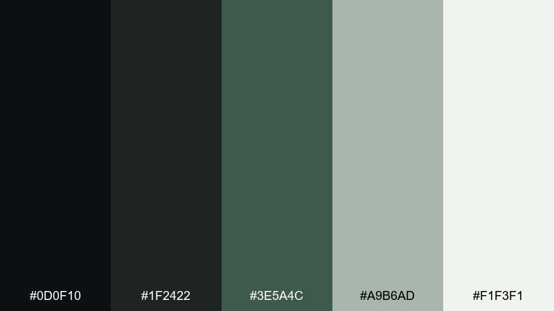
HEX: #0d0f10 #1f2422 #3e5a4c #a9b6ad #f1f3f1
Mood: grounded, natural, calm
Best for: eco product packaging
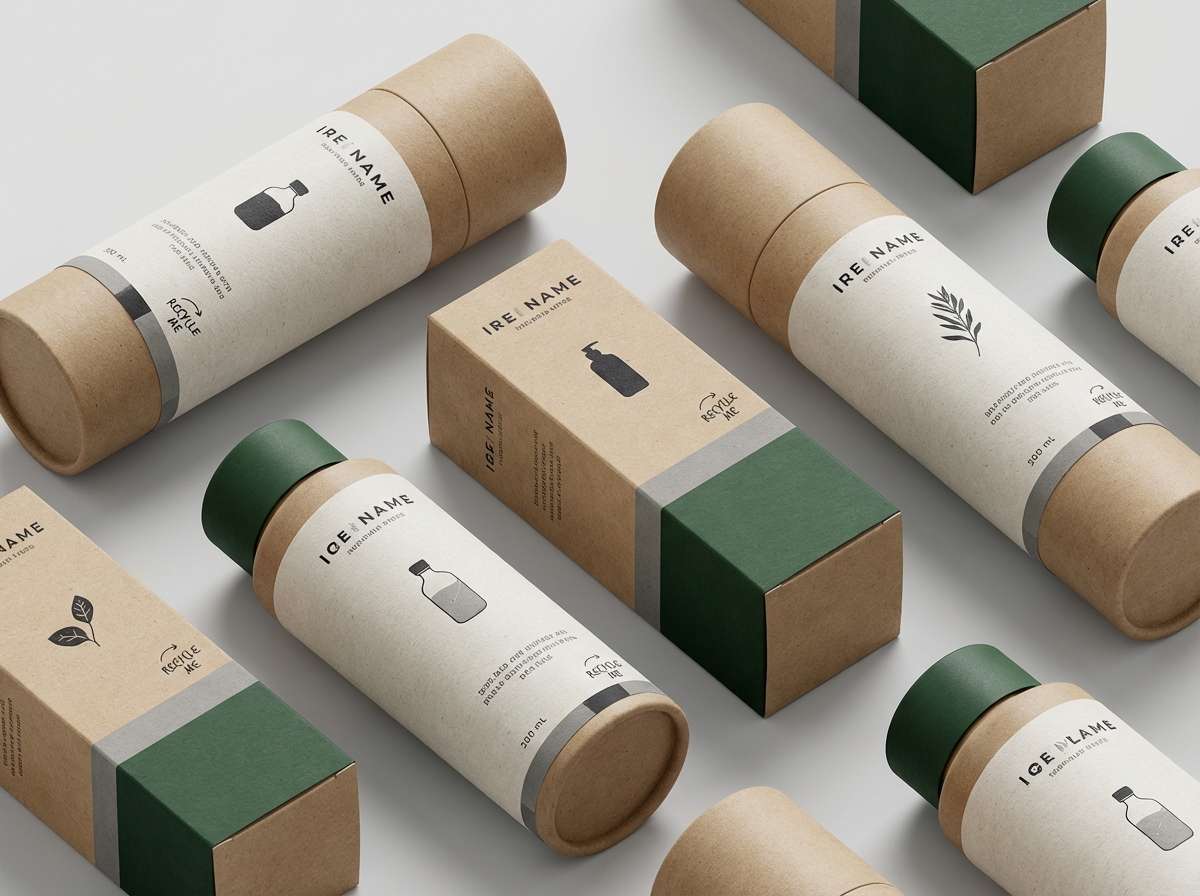
Grounded like a shaded trail with mossy greens and ash-gray bark. Use it for sustainable goods, skincare, or coffee packaging where natural cues matter. Pair the forest green with off-white labels for clarity, and reserve the near-black for typography and barcodes. Tip: keep green coverage moderate so the pack still reads clean on shelves.
Image example of forest ash generated using media.io
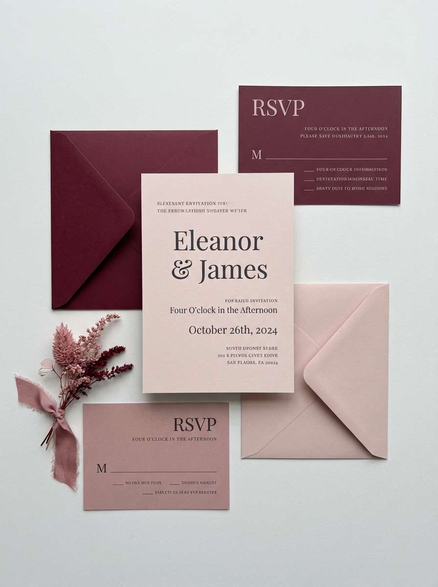
5) Rosewood Shadow
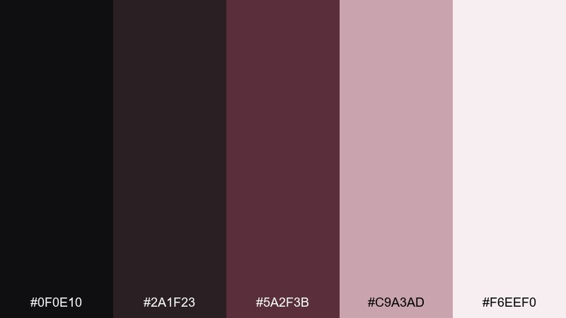
HEX: #0f0e10 #2a1f23 #5a2f3b #c9a3ad #f6eef0
Mood: romantic, moody, elegant
Best for: wedding invitation suite
Romantic and moody, like rose petals pressed into a dark diary. It works beautifully for wedding stationery, evening event invites, and luxe beauty campaigns. Pair the dusty blush with the deep wine tone for names and headings, and let the pale pink act as breathing room. Tip: keep the darkest shade for type to avoid muddy contrast on print.
Image example of rosewood shadow generated using media.io
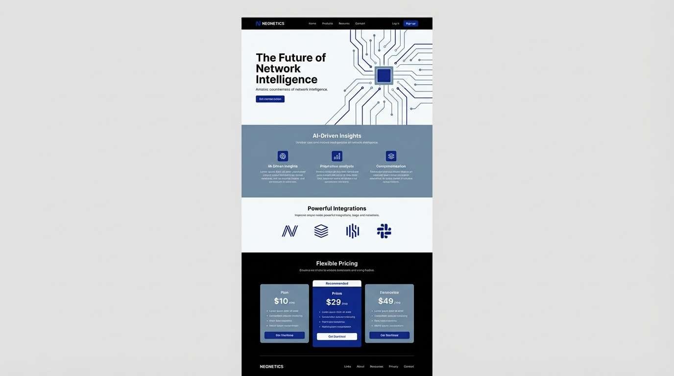
6) Arctic Ink
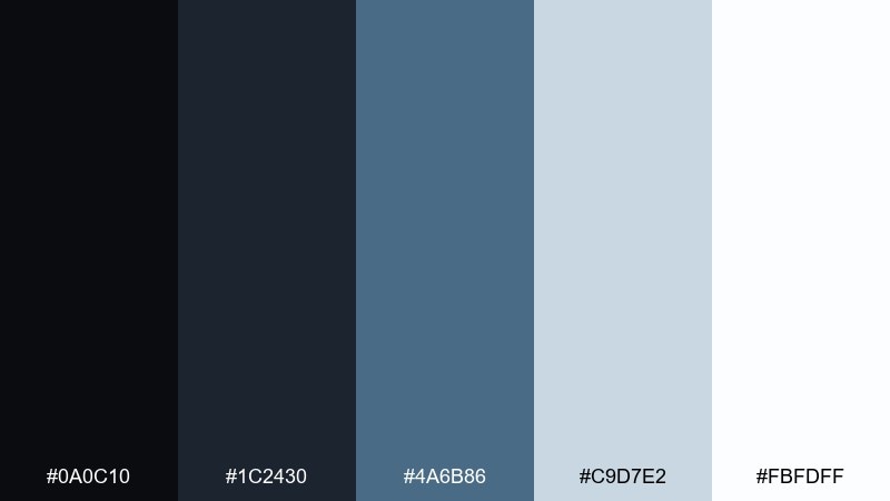
HEX: #0a0c10 #1c2430 #4a6b86 #c9d7e2 #fbfdff
Mood: crisp, cool, tech-forward
Best for: SaaS landing page
Crisp and cool, like ink on frosted glass. Use it for SaaS pages that need a confident, technical vibe without going neon. Pair the steel-blue with near-white sections and keep the darkest ink for navigation and footers. Tip: use the blue for one primary action and repeat it only in icons to keep the page focused.
Image example of arctic ink generated using media.io
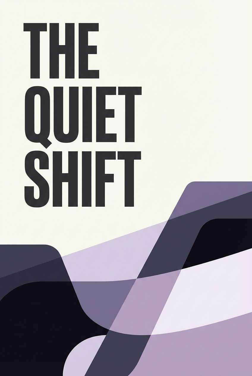
7) Lavender Slate
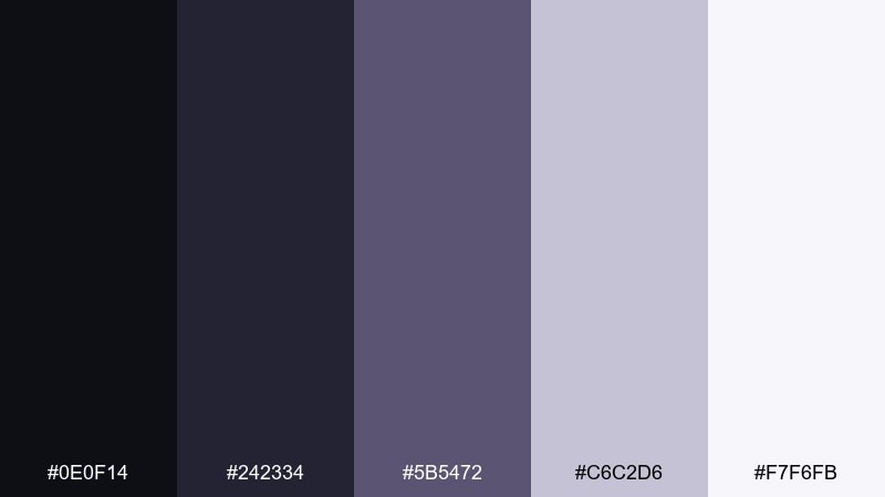
HEX: #0e0f14 #242334 #5b5472 #c6c2d6 #f7f6fb
Mood: dreamy, quiet, contemporary
Best for: book cover design
Dreamy and quiet, like twilight settling over slate rooftops. It fits contemporary fiction covers and poetry collections where mood matters more than noise. Pair the lavender midtone with the darkest shade for sharp type, then soften with the pale lilac for background space. Tip: add texture with subtle grain so the purples feel printed, not plastic.
Image example of lavender slate generated using media.io
8) Sandstone Carbon
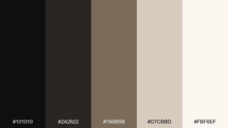
HEX: #101010 #2a2622 #7a6b5b #d7cbbd #fbf6ef
Mood: earthy, warm, timeless
Best for: interior styling moodboard
Earthy and timeless, like charcoal sketches on sandstone paper. Use it for interior moodboards, home goods branding, and artisan product pages. Pair the warm beige with carbon black for contrast, and let the taupe bridge the two in textiles and backgrounds. Tip: repeat the beige as negative space so the darker tones feel intentional, not heavy.
Image example of sandstone carbon generated using media.io
9) Emerald Soot
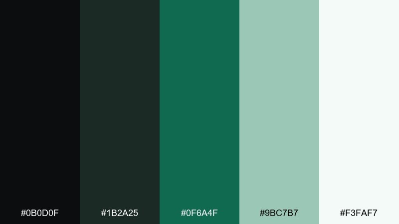
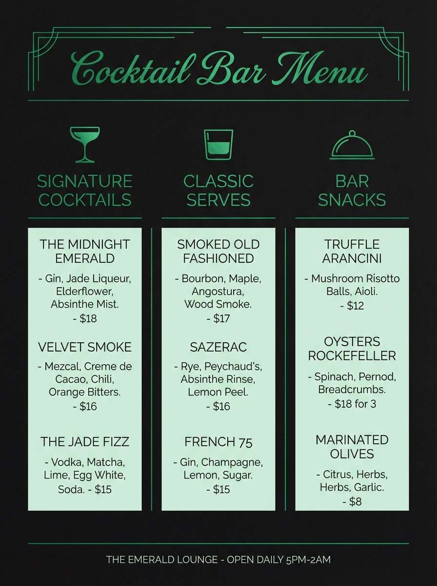
HEX: #0b0d0f #1b2a25 #0f6a4f #9bc7b7 #f3faf7
Mood: fresh, upscale, confident
Best for: cocktail bar menu
Fresh yet upscale, like emerald glassware in a dim lounge. The green pop adds character to menus, signage, and nightlife branding without losing legibility. For the best onyx color combinations here, keep backgrounds dark, set text in the pale mint, and use emerald only for section headers and icons. Tip: choose one display font for headings so the palette stays the hero.
Image example of emerald soot generated using media.io
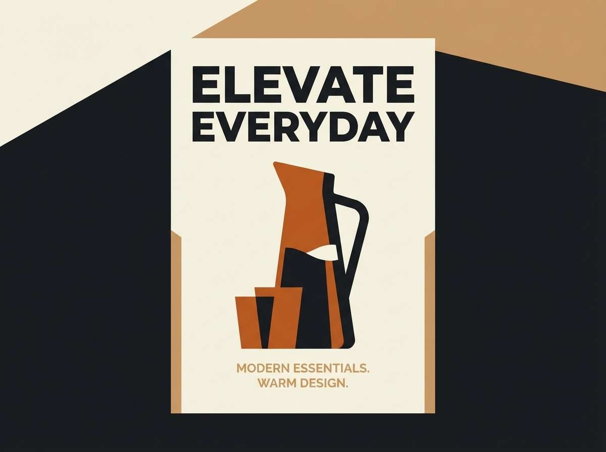
10) Copper Ember
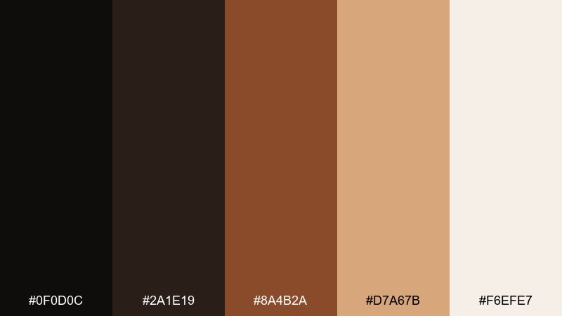
HEX: #0f0d0c #2a1e19 #8a4b2a #d7a67b #f6efe7
Mood: cozy, bold, artisanal
Best for: product ad poster
Cozy and bold, like embers glowing in a dark hearth. It works for artisanal food ads, coffee launches, and autumn promos where warmth sells. Pair copper with cream for readable headlines and use the darkest tone to frame imagery or borders. Tip: limit copper gradients and stick to flat blocks for a modern, premium look.
Image example of copper ember generated using media.io
11) Ocean Graphite
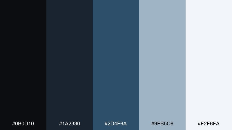
HEX: #0b0d10 #1a2330 #2d4f6a #9fb5c6 #f2f6fa
Mood: calm, professional, reliable
Best for: annual report
Calm and professional, like a deep ocean under overcast skies. Use it for annual reports, investor decks, and corporate comms that need authority without harshness. Pair graphite with the cool blue for charts, and keep the lightest shade for tables and margins. Tip: reserve the darkest tone for headings only so dense pages do not feel heavy.
Image example of ocean graphite generated using media.io

12) Olive Drab Noir
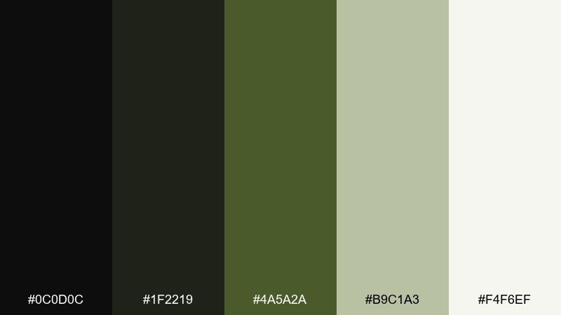
HEX: #0c0d0c #1f2219 #4a5a2a #b9c1a3 #f4f6ef
Mood: rugged, outdoorsy, understated
Best for: outdoor gear branding
Rugged and understated, like worn canvas and field jackets. It fits outdoor brands, adventure newsletters, and utilitarian labels where practicality leads. Pair the olive with the pale sage for patches and tags, and use the near-black for bold wordmarks. Tip: keep contrast high on small labels by placing text on the lightest background tone.
Image example of olive drab noir generated using media.io

13) Blush Granite
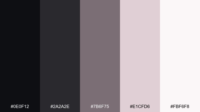
HEX: #0e0f12 #2a2a2e #7b6f75 #e1cfd6 #fbf6f8
Mood: soft, minimal, stylish
Best for: beauty e-commerce UI
Soft and stylish, like blush powder dusted over granite. Use it for beauty shops, skincare UI, and product listing pages that need gentle contrast. Pair granite grays with blush accents on badges and ratings, while keeping buttons in the darkest tone for clarity. Tip: choose one blush tint for all highlights so the interface stays consistent.
Image example of blush granite generated using media.io

14) Golden Charcoal

HEX: #0d0e10 #242424 #6a5a2a #d6c27a #fbf7e8
Mood: classic, upscale, celebratory
Best for: event flyer
Classic and celebratory, like warm spotlights on a dark stage. It works for gala flyers, award night graphics, and milestone announcements. Pair the gold with charcoal for sharp type, and let the pale cream act as the print-friendly base. Tip: use gold for rules, bullets, and small icons to avoid muddy large fills.
Image example of golden charcoal generated using media.io

15) Ink and Ivory
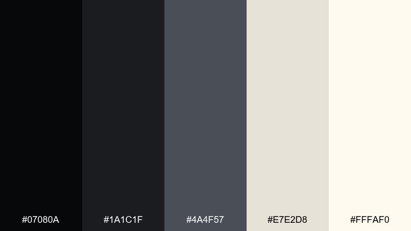
HEX: #07080a #1a1c1f #4a4f57 #e7e2d8 #fffaf0
Mood: clean, timeless, editorial
Best for: portfolio website
Clean and timeless, like ink drawings on ivory paper. As an onyx color scheme, it is perfect for portfolios that need work to stand out without loud color. Pair the ivory background with charcoal text and use the mid-gray for subtle UI states like disabled buttons. Tip: add one consistent accent treatment, such as underlines, instead of introducing extra colors.
Image example of ink and ivory generated using media.io
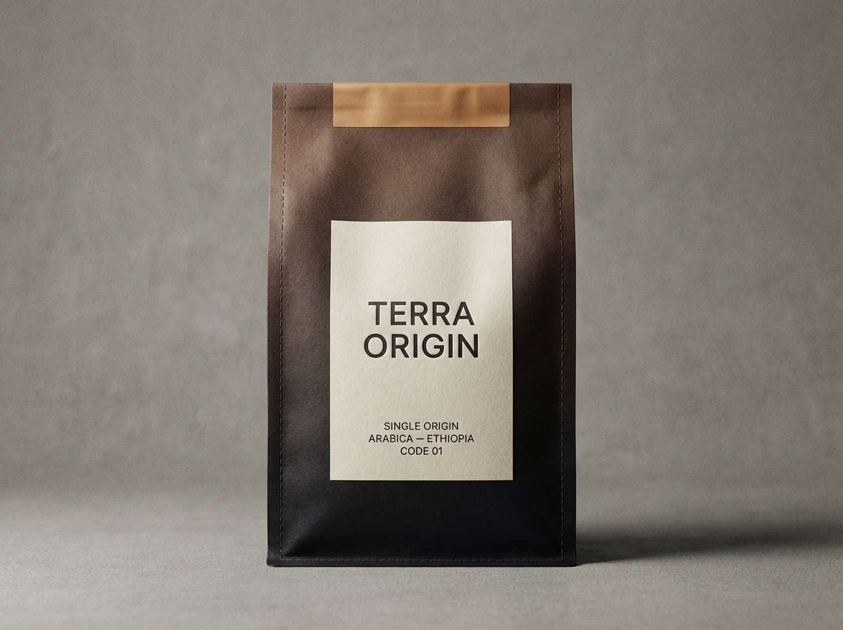
16) Mocha Obsidian
HEX: #0d0c0b #231d19 #5a3f34 #c8b3a6 #f6f0eb
Mood: warm, cozy, premium
Best for: coffee shop packaging
Warm and cozy, like espresso crema against dark obsidian. Use it for coffee bags, roastery labels, and cafe loyalty cards with a premium edge. Pair mocha browns with the pale cream for ingredient blocks, and keep the deepest shade for logos and roast levels. Tip: use the mid mocha tone for secondary text so the design feels layered, not flat.
Image example of mocha obsidian generated using media.io
17) Steel Night
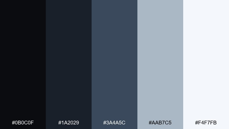
HEX: #0b0c0f #1a2029 #3a4a5c #aab7c5 #f4f7fb
Mood: industrial, focused, sharp
Best for: data visualization theme
Industrial and focused, like steel beams under a night sky. It is great for data visuals where lines, labels, and highlights must read fast. Pair the deep steel with the light gray-blue for grids, and keep the near-white for background cards. Tip: use one accent color for the highest-priority series and mute everything else to the mid steel tone.
Image example of steel night generated using media.io

18) Sage and Soot
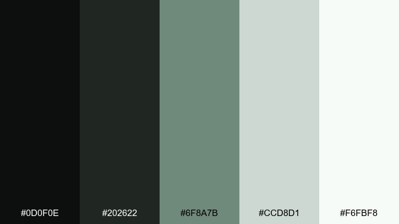
HEX: #0d0f0e #202622 #6f8a7b #ccd8d1 #f6fbf8
Mood: fresh, gentle, restorative
Best for: spa brochure
Fresh and restorative, like steam rising in a quiet herb garden. Use it for spa brochures, wellness landing pages, and calm product guides. Pair sage greens with soft off-white to keep layouts breathable, and use soot for headings and callouts. Tip: keep photos warm-neutral so the greens do not shift too blue on screen.
Image example of sage and soot generated using media.io

19) Plum Cinder
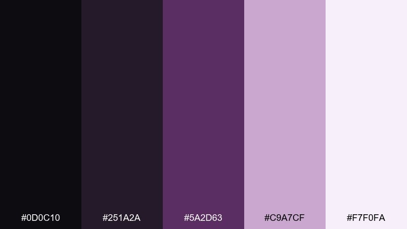
HEX: #0d0c10 #251a2a #5a2d63 #c9a7cf #f7f0fa
Mood: bold, artistic, mysterious
Best for: music poster
Bold and mysterious, like purple stage haze over dark amps. This onyx color palette brings drama to music posters, club nights, and album promo graphics. Pair plum with pale lilac for readable type, then ground the layout with near-black blocks and borders. Tip: let the plum do the work in one big shape and keep the rest minimal.
Image example of plum cinder generated using media.io

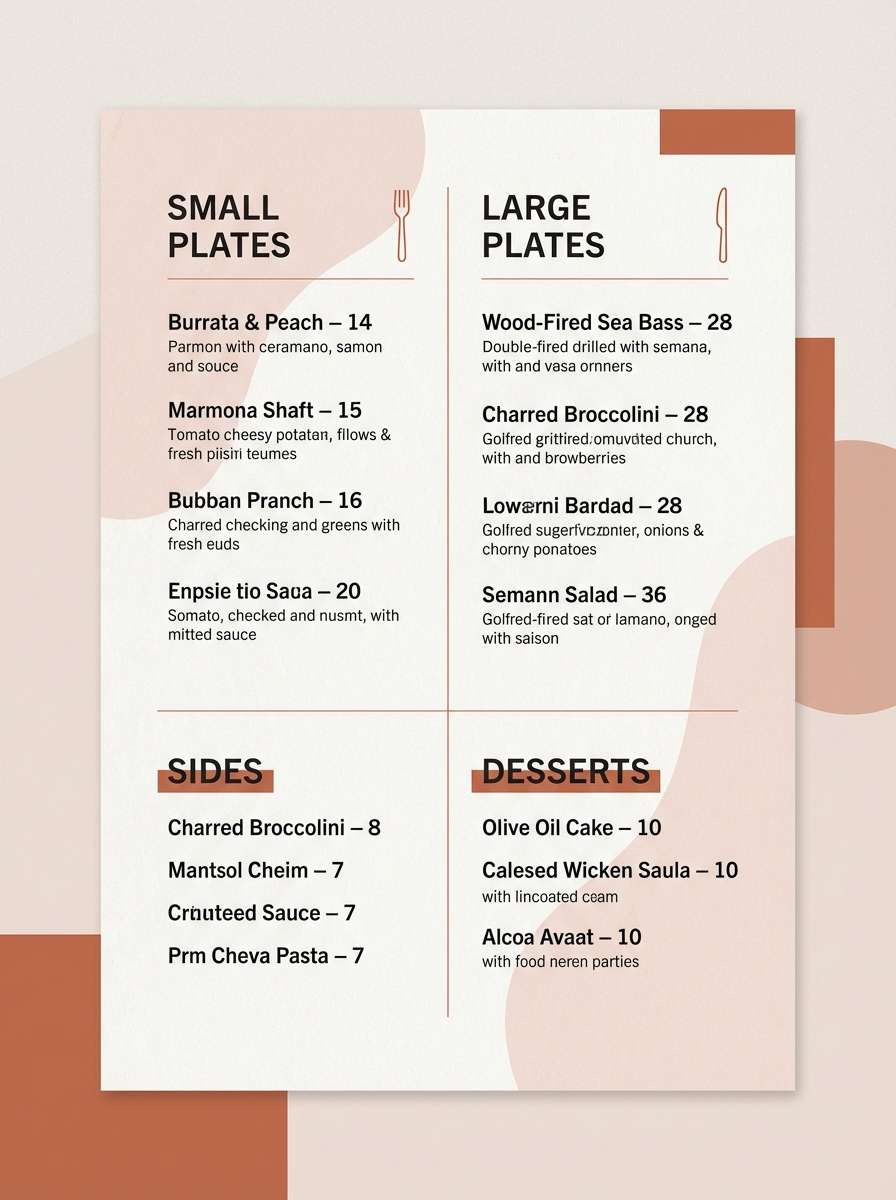
20) Terracotta Dusk
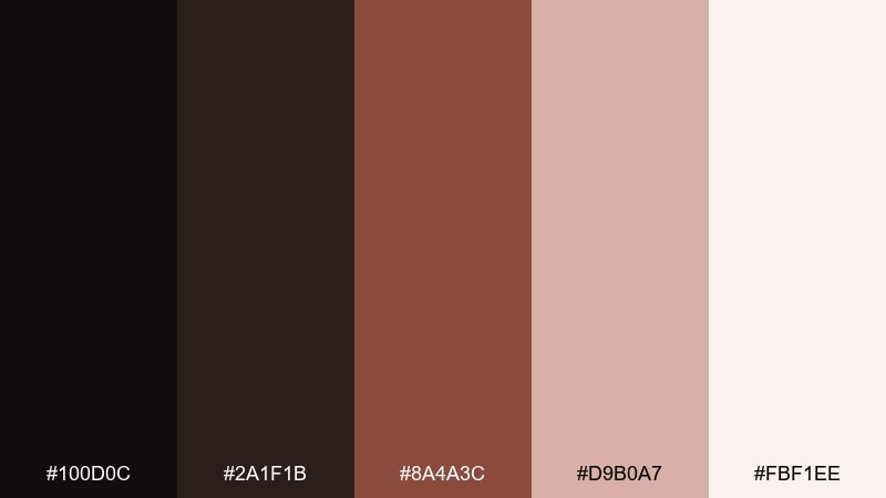
HEX: #100d0c #2a1f1b #8a4a3c #d9b0a7 #fbf1ee
Mood: warm, rustic, modern
Best for: restaurant menu
Warm and rustic, like terracotta tiles cooling at dusk. Use it for restaurant menus, bakery branding, and seasonal specials with a modern edge. Pair the terracotta with the pale blush for section backgrounds and keep the near-black for item names and prices. Tip: add subtle separators in the muted blush tone instead of heavy lines to keep the layout refined.
Image example of terracotta dusk generated using media.io
What Colors Go Well with Onyx?
Onyx pairs well with soft off-whites and cool grays for clean, high-readability contrast—perfect for editorial and UI layouts. If you want a warmer feel, swap in creams, sand, and taupe to make onyx feel less “tech” and more “home.”
For accents, muted greens (sage, olive, forest) read natural and modern against onyx, while desaturated blues (steel, ocean) feel professional and dependable. If you want a premium edge, metallic-inspired hues like bronze, copper, and gold add warmth and “luxury lighting” without needing loud saturation.
For bolder creative work, deep plum or dusty blush can soften onyx and add emotion—just keep the lightest tone in the palette for breathing room.
How to Use a Onyx Color Palette in Real Designs
Start by assigning roles: use onyx for primary backgrounds, navigation, or headline text; use a mid-tone (charcoal/steel) for secondary surfaces and UI states; and keep a near-white or cream for readable content blocks. This prevents designs from turning into a flat dark slab.
Limit accents to one main highlight color (like emerald, bronze, or steel blue) and repeat it consistently in buttons, icons, and key data points. When printing, avoid pure white on large onyx areas; slightly softened light tones often look smoother and reduce visual harshness.
In interiors, treat onyx like a grounding material—pair it with warm neutrals (sand, cream) for coziness, or cool pale grays for a modern gallery feel. Add texture (paper, grain, matte finishes) to keep dark palettes from feeling sterile.
Create Onyx Palette Visuals with AI
If you want to preview how an onyx palette looks in a real composition—like a dashboard, poster, menu, or packaging—generate quick mock visuals first. It’s an efficient way to test contrast, hierarchy, and accent balance before committing to production files.
With Media.io, you can turn a simple prompt into on-brand palette visuals and iterate fast: swap the accent color, adjust the mood (luxury vs. rugged), or change formats (flyer vs. landing page) in minutes.
Onyx Color Palette FAQs
-
What is an onyx color palette?
An onyx color palette is a set of colors built around deep charcoal-black (onyx) as the anchor, supported by lighter neutrals and one or two accents (like bronze, sage, steel blue, or blush) for contrast and personality. -
Is onyx the same as pure black?
No. Onyx is typically a near-black with subtle gray or warm/cool undertones, which makes it easier to pair and often more comfortable for screens than pure #000000. -
What colors go best with onyx for a premium brand?
Warm metallic-inspired accents (bronze, gold, copper) plus cream or ivory look especially premium with onyx. Keep accents thin and intentional to maintain a high-end feel. -
Which onyx palette works best for dark UI?
Choose an onyx scheme with multiple gray steps (near-black, charcoal, mid-gray, light gray, off-white) so you can build clear hierarchy for cards, dividers, and text—like “Midnight Onyx” or “Steel Night.” -
How do I keep onyx designs readable?
Avoid setting long body text in pure white on an onyx background; use a softened light gray instead. Also ensure there’s enough difference between background layers (e.g., cards vs. page background) and keep one consistent accent color for actions. -
Does onyx work with warm colors like terracotta or blush?
Yes. Onyx is a strong neutral that makes warm tones feel richer and more grounded. Pair with a pale blush/cream for spacing and use the warm accent for headers, badges, or key highlights. -
Can I generate onyx palette mockups with AI?
Yes—use Media.io’s text-to-image tool to create fast visual examples (menus, posters, UI layouts, packaging) using your onyx HEX colors as guidance in the prompt, then iterate until the contrast and mood look right.
Next: Snow Color Palette


