Eclipse palettes revolve around dark neutrals—ink, charcoal, and midnight tones—then add a controlled accent (lavender, teal, gold, or rose) to guide attention.
Below are 20 ready-to-use eclipse color schemes with HEX codes, mood notes, and AI prompt examples you can recreate for branding, UI, and social graphics.
In this article
Why Eclipse Color Schemes Work So Well
Eclipse palettes are built on low-light foundations (near-black, charcoal, slate, deep navy) that instantly feel modern, premium, and focused. Because the base is quiet, typography and layout hierarchy become clearer with fewer colors.
They also scale well across products: you can keep the same dark neutral system for UI components, then swap a single accent to match a campaign, feature, or brand line. That makes eclipse color schemes practical for design systems and content pipelines.
Most importantly, eclipse combinations make contrast easy to control. You can create depth with small steps between grays, then use one highlight color for CTAs, labels, or key moments without overwhelming the screen.
20+ Eclipse Color Palette Ideas (with HEX Codes)
1) Midnight Orbit
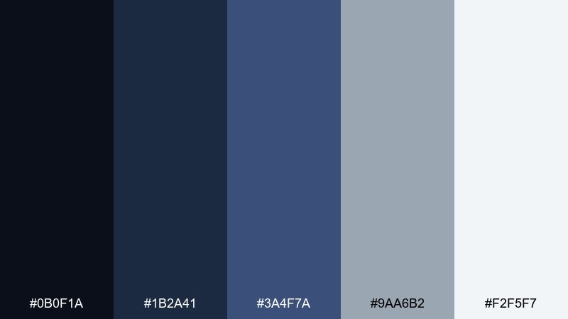
HEX: #0b0f1a #1b2a41 #3a4f7a #9aa6b2 #f2f5f7
Mood: cosmic, focused, modern
Best for: saas analytics dashboard ui
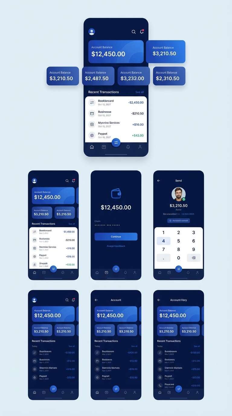
Cosmic and focused, these eclipse tones feel like a quiet control room under a night sky. Use the deep navy and ink as your base, then lift hierarchy with steel blue and cool gray. It shines in data-heavy UI, fintech screens, and admin panels where contrast matters. Tip: reserve the near-white for cards and key metrics to keep the layout breathable.
Image example of midnight orbit generated using media.io
Media.io is an online AI studio for creating and editing video, image, and audio in your browser.

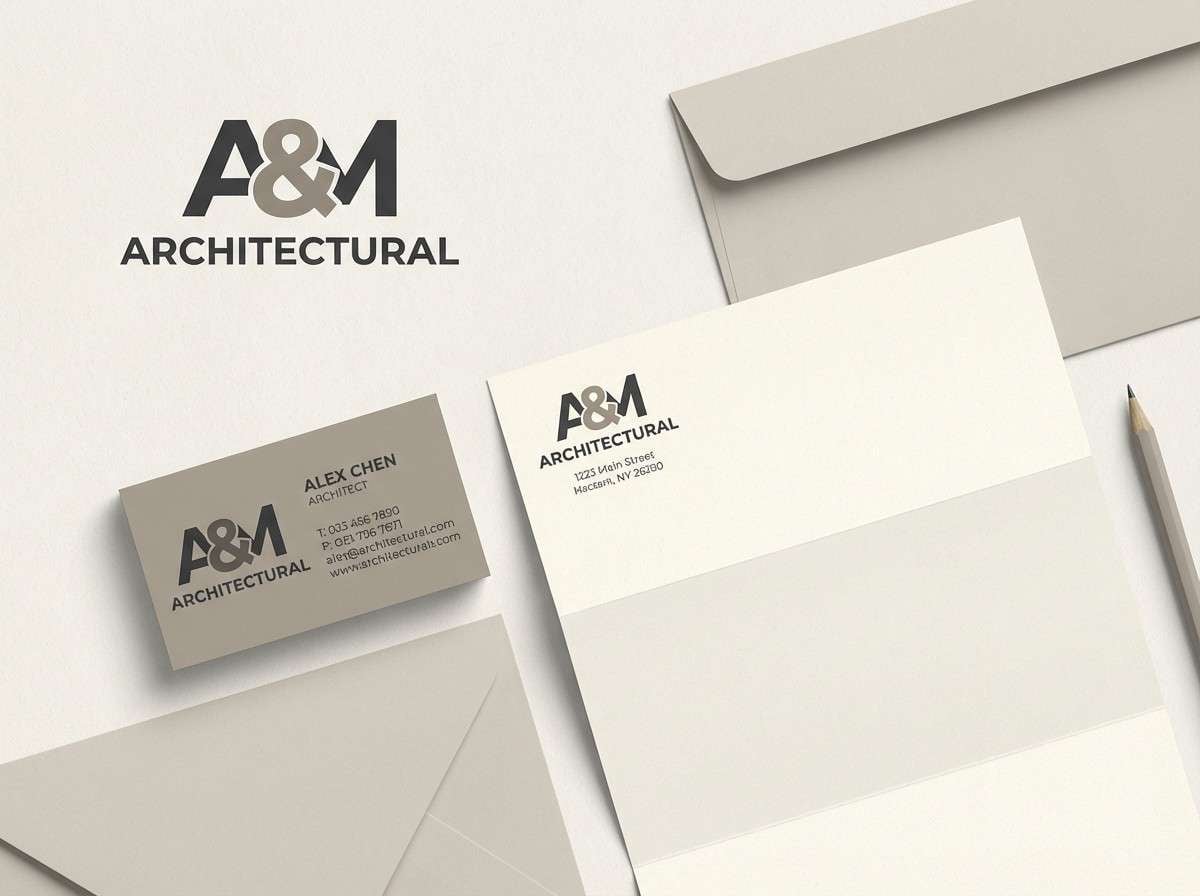
2) Ashen Halo
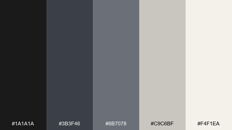
HEX: #1a1a1a #3b3f46 #6b7078 #c9c6bf #f4f1ea
Mood: quiet, refined, editorial
Best for: minimal brand identity system
Quiet and refined, this mix reads like soft ash, polished metal, and warm paper. These eclipse color schemes work best when you keep the darkest charcoal for logos and headings, then let the warm off-white carry negative space. It is ideal for premium identity systems, typography-led layouts, and monochrome packaging. Tip: add texture with subtle grain or recycled-paper finishes instead of extra colors.
Image example of ashen halo generated using media.io
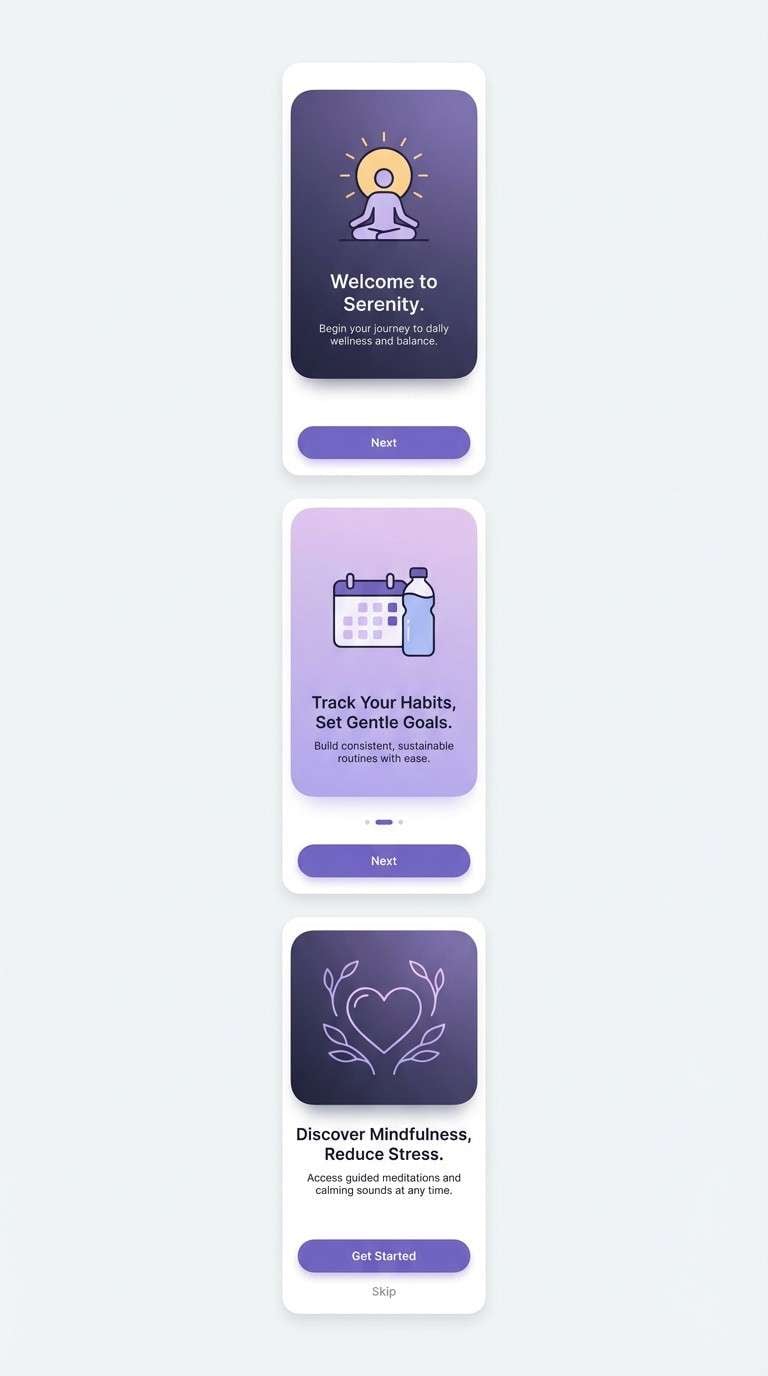
3) Lunar Lavender
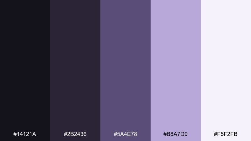
HEX: #14121a #2b2436 #5a4e78 #b8a7d9 #f5f2fb
Mood: dreamy, soft, nocturnal
Best for: wellness app onboarding screens
Dreamy and nocturnal, these purples feel like moonlight diffused through clouds. Anchor the screens with the near-black violet, then let lavender carry highlights and friendly micro-interactions. It works beautifully for wellness, sleep, and journaling experiences where you want calm without going fully pastel. Tip: use the pale lilac as a soft background panel to avoid harsh contrast.
Image example of lunar lavender generated using media.io
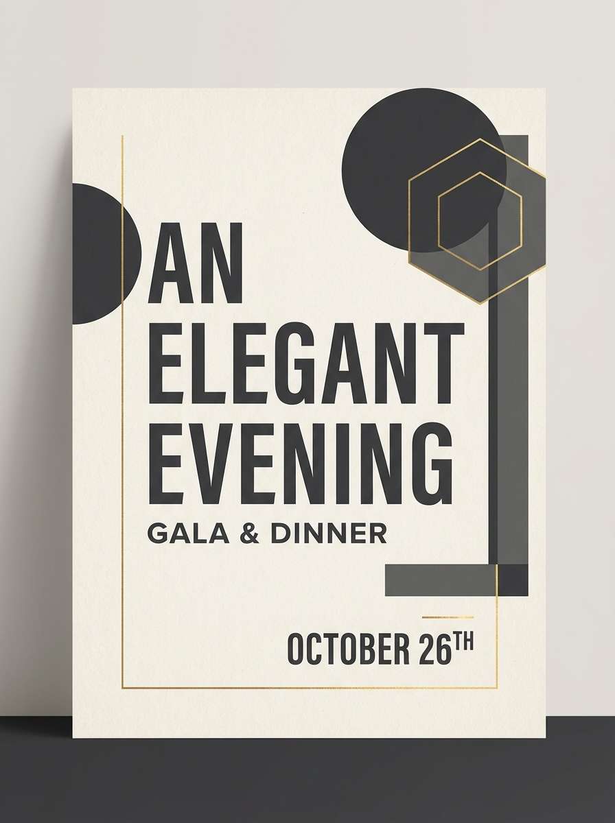
4) Solar Shadow
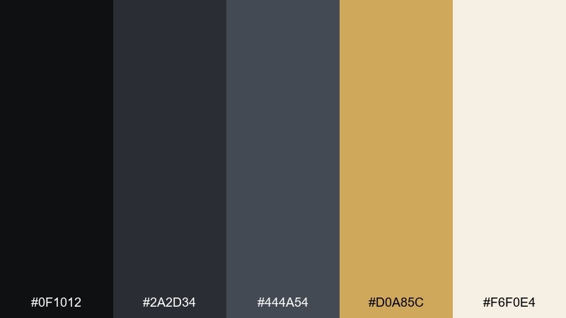
HEX: #0f1012 #2a2d34 #444a54 #d0a85c #f6f0e4
Mood: dramatic, premium, cinematic
Best for: luxury event poster design
Dramatic and cinematic, the dark grays set up a spotlight moment for warm gold. This eclipse color palette is strongest when you treat gold as a rare accent for dates, icons, or one hero line. Use it for luxury event posters, gallery openings, and music nights where you want instant premium energy. Tip: keep backgrounds matte and let the gold appear in foil-like elements for impact.
Image example of solar shadow generated using media.io
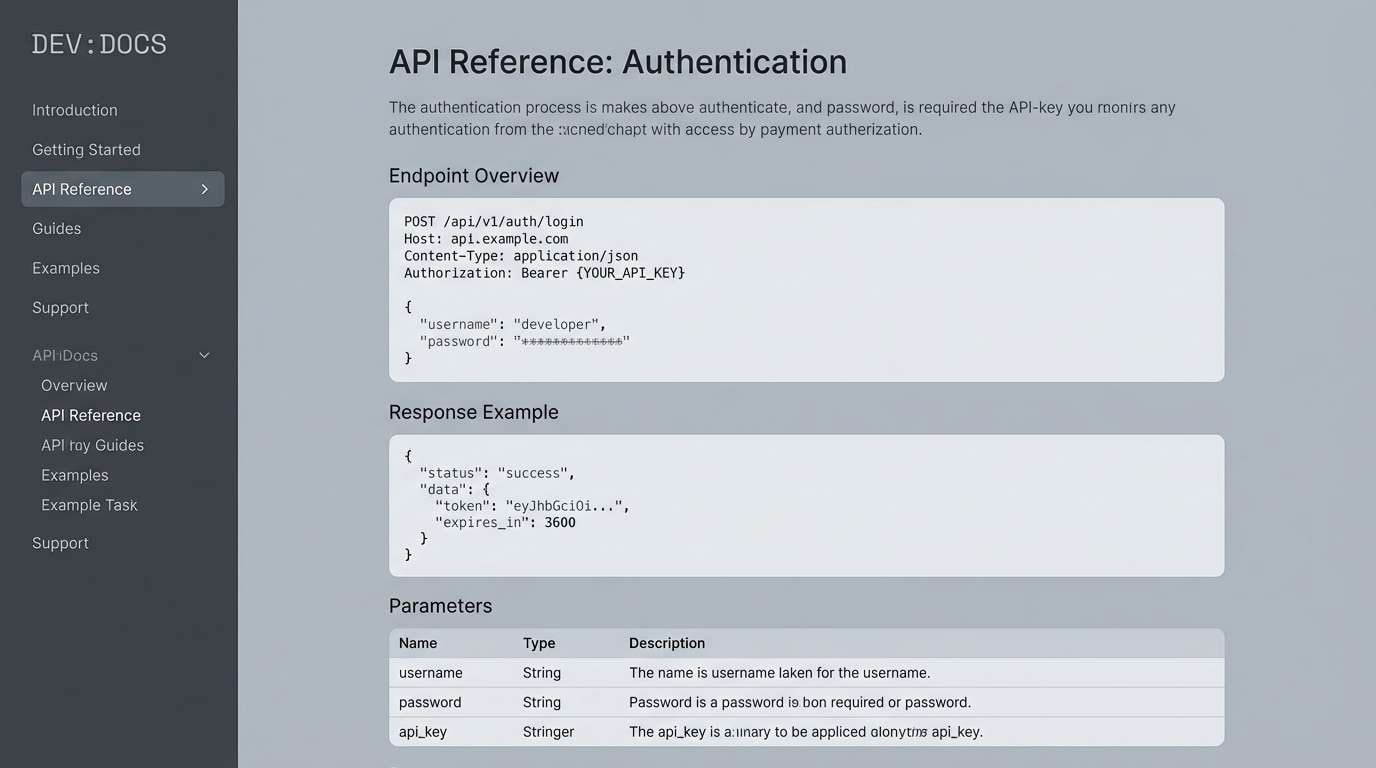
5) Graphite Nebula
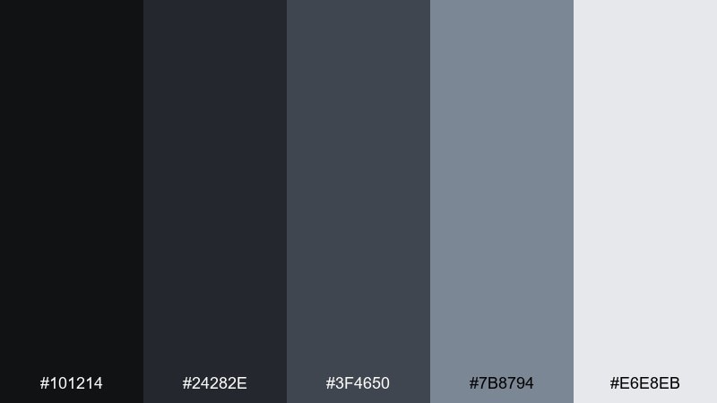
HEX: #101214 #24282e #3f4650 #7b8794 #e6e8eb
Mood: technical, crisp, understated
Best for: developer documentation website
Technical and crisp, these graphite tones feel like brushed metal and clean code blocks. Use the darkest shade for navigation and footers, then step up through mid-grays for sections and dividers. It fits documentation sites, knowledge bases, and product help centers where readability is the priority. Tip: pair it with a single bright status color for success and error states only.
Image example of graphite nebula generated using media.io
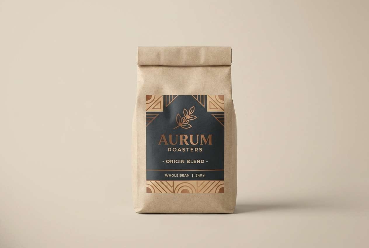
6) Twilight Copper
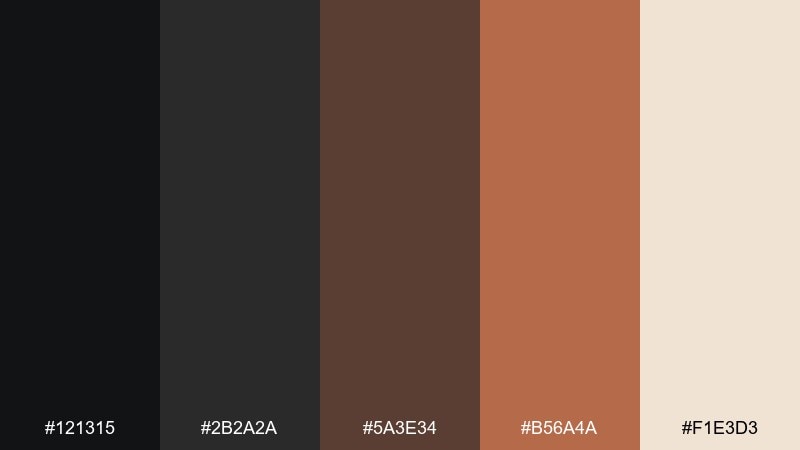
HEX: #121315 #2b2a2a #5a3e34 #b56a4a #f1e3d3
Mood: warm, moody, handcrafted
Best for: coffee bag packaging design
Warm and handcrafted, this eclipse set evokes roasted beans, copper light, and late-night cafes. Let the espresso blacks hold the brand mark, then use copper and tan for flavor notes and badges. It is a natural fit for coffee packaging, artisanal foods, and cozy lifestyle ads. Tip: add a simple line illustration in tan to keep the design premium rather than busy.
Image example of twilight copper generated using media.io
7) Stormglass
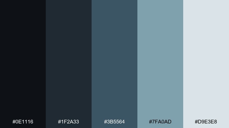
HEX: #0e1116 #1f2a33 #3b5564 #7fa0ad #d9e3e8
Mood: cool, trustworthy, sleek
Best for: b2b landing page hero section
Cool and trustworthy, these blues feel like rain on glass and calm momentum. As an eclipse color scheme, it balances deep structure with airy highlights that keep pages feeling modern. Use the darkest tones for headers and CTAs, then bring in the pale blue-gray for whitespace and subtle gradients. Tip: pair with sharp sans-serif type and simple line icons for a clean enterprise look.
Image example of stormglass generated using media.io

8) Velvet Dusk
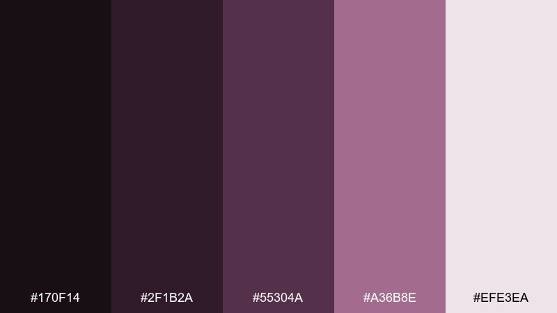
HEX: #170f14 #2f1b2a #55304a #a36b8e #efe3ea
Mood: romantic, artistic, intimate
Best for: album cover artwork
Romantic and intimate, these velvety purples read like stage curtains and fading neon. Use the darkest plum for the background, then let dusty rose handle titles and small highlights. It works well for album covers, poetry zines, and boutique nightlife promos. Tip: keep typography minimal and let one soft gradient do the heavy lifting.
Image example of velvet dusk generated using media.io
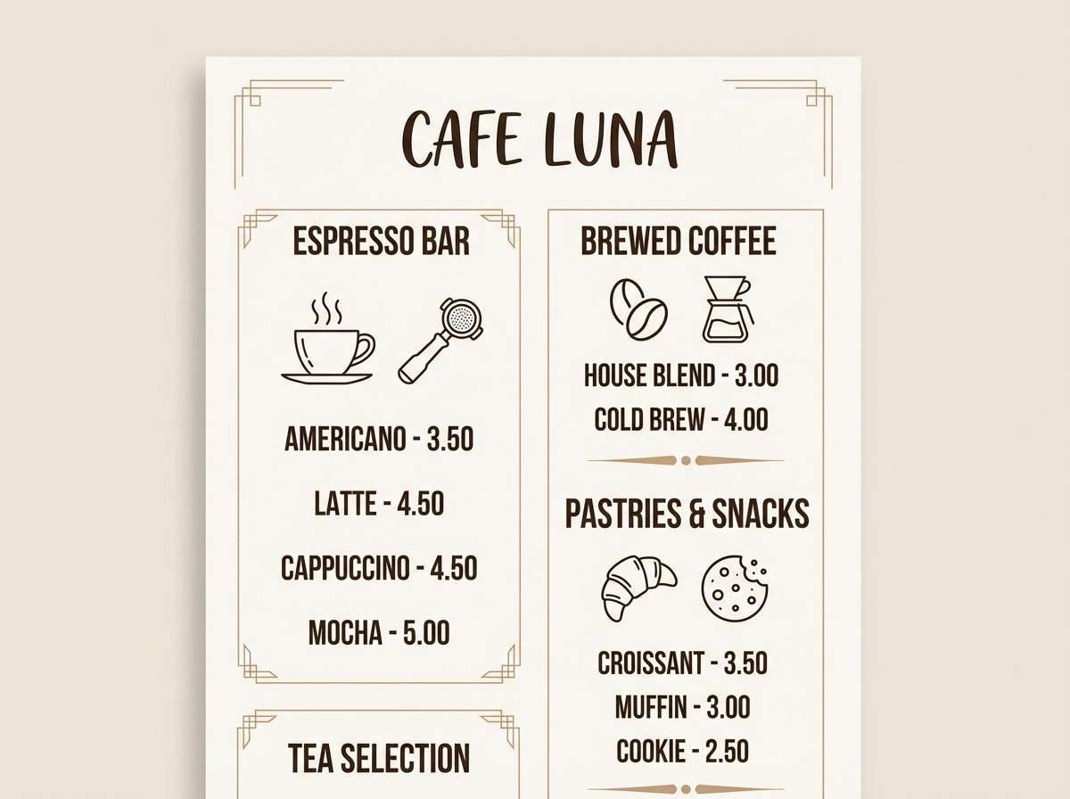
9) Eclipse Espresso
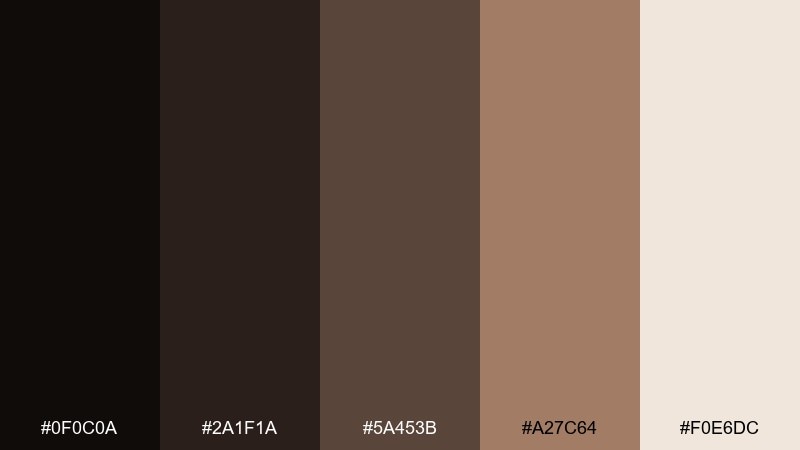
HEX: #0f0c0a #2a1f1a #5a453b #a27c64 #f0e6dc
Mood: cozy, grounded, rustic
Best for: cafe menu design
Cozy and grounded, this set feels like espresso crema, walnut wood, and warm candlelight. Use the darkest brown-black for headings and section dividers, then bring in tan for pricing and highlights. It suits cafe menus, bakery signage, and food photography overlays where warmth sells the story. Tip: pair with a serif headline font and plenty of spacing for an upscale look.
Image example of eclipse espresso generated using media.io
10) Smoky Sapphire
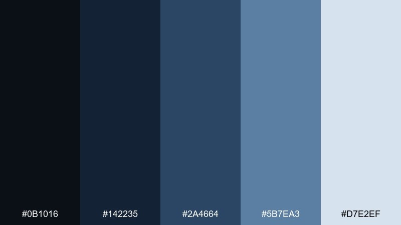
HEX: #0b1016 #142235 #2a4664 #5b7ea3 #d7e2ef
Mood: smart, calm, digital
Best for: fintech mobile app ui
Smart and calm, these blues suggest depth, security, and a polished digital feel. Keep the darkest navy for tab bars and primary buttons, and use the pale blue as the main canvas for cards. It is great for fintech apps, banking dashboards, and subscription flows where clarity builds trust. Tip: add a thin border in the mid-blue to separate cards without heavy shadows.
Image example of smoky sapphire generated using media.io
11) Concrete Violet
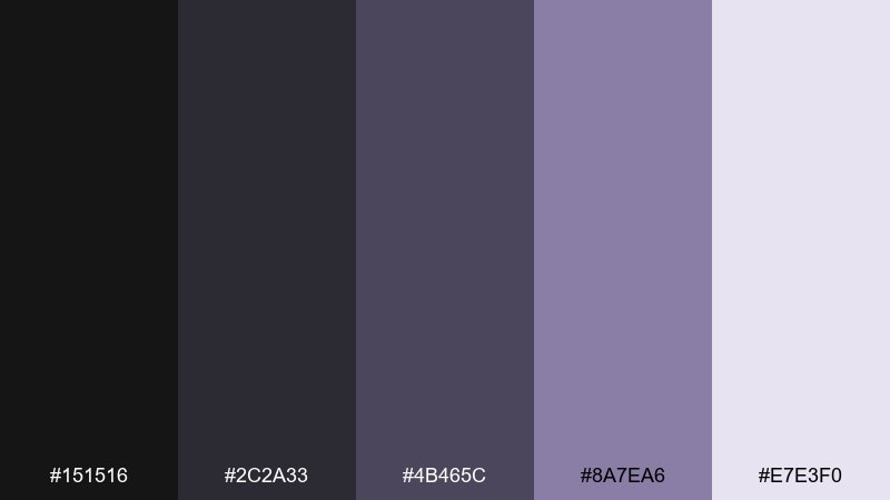
HEX: #151516 #2c2a33 #4b465c #8a7ea6 #e7e3f0
Mood: urban, minimal, creative
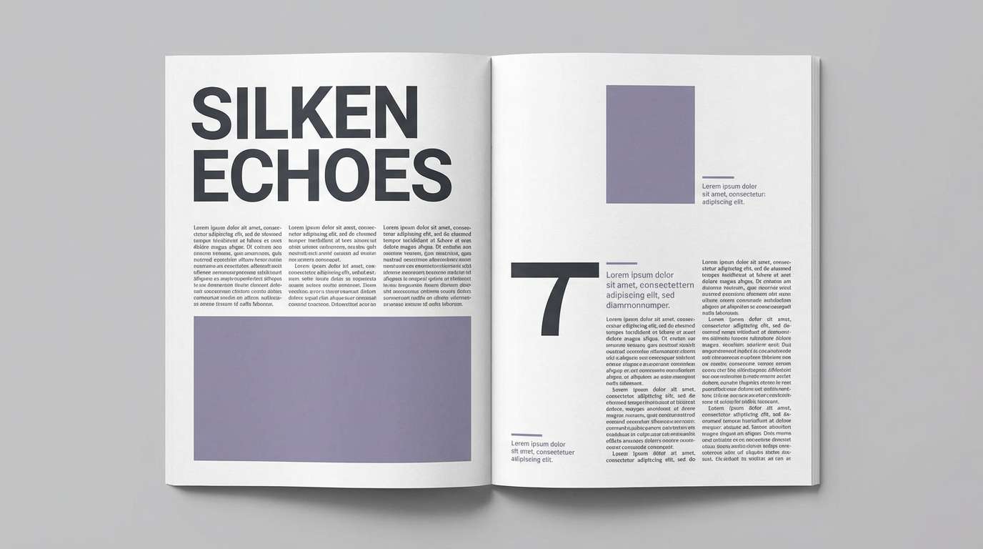
Best for: editorial magazine spread
Urban and minimal, this eclipse color palette feels like concrete walls with a violet dusk glow. Use the deep near-black for body text, then let muted violet add personality in pull quotes and section labels. It fits fashion editorials, architecture layouts, and culture magazines that need restraint with a twist. Tip: pair with high-contrast photography and keep colored blocks to small margins or captions.
Image example of concrete violet generated using media.io
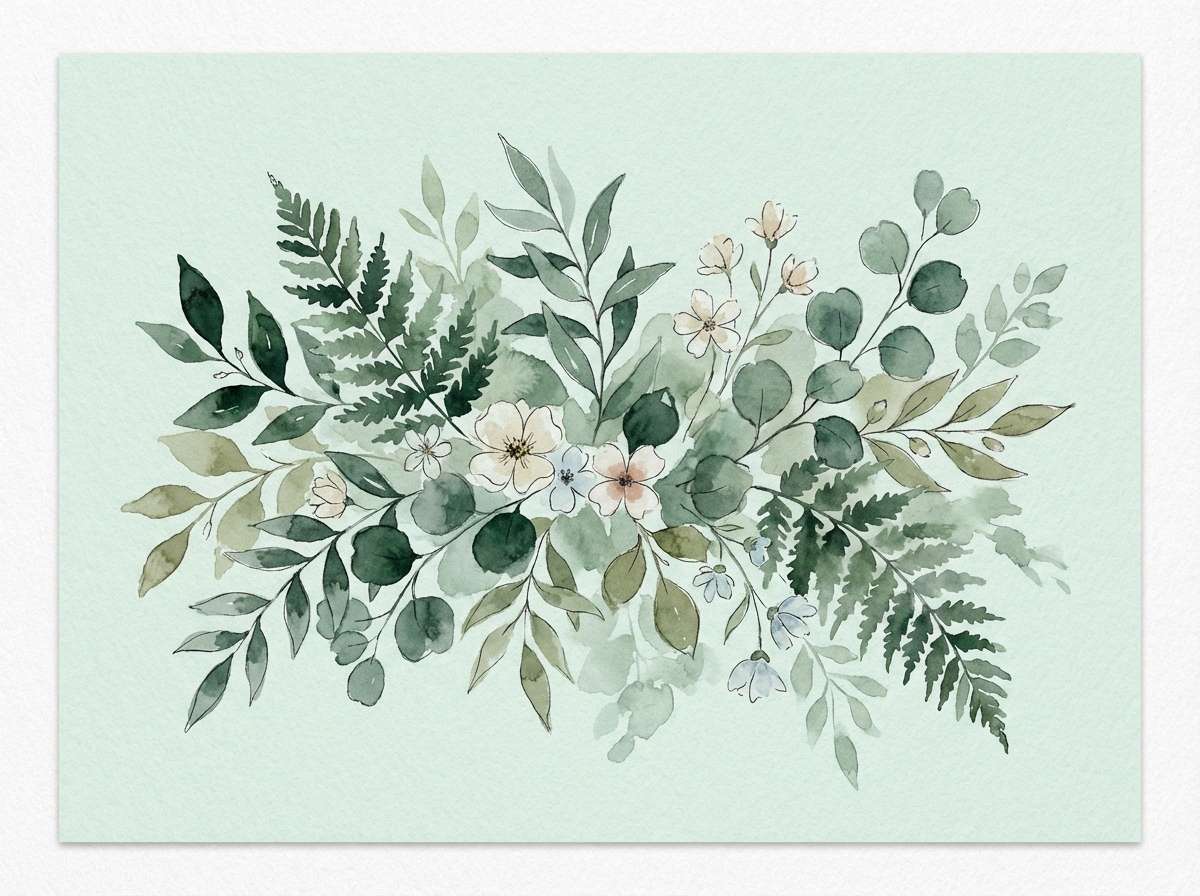
12) Night Garden
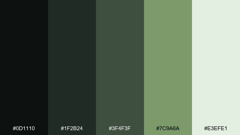
HEX: #0d1110 #1f2b24 #3f4f3f #7c9a6a #e3efe1
Mood: earthy, calm, botanical
Best for: watercolor botanical illustration
Earthy and calm, these greens look like leaves under moonlight and moss after rain. Use the deep forest tones for stems and shadows, then soften the scene with muted sage and pale mint washes. It is perfect for botanical prints, spring packaging, and wellness graphics that need a grounded feel. Tip: keep edges loose and let the light mint act as negative space.
Image example of night garden generated using media.io
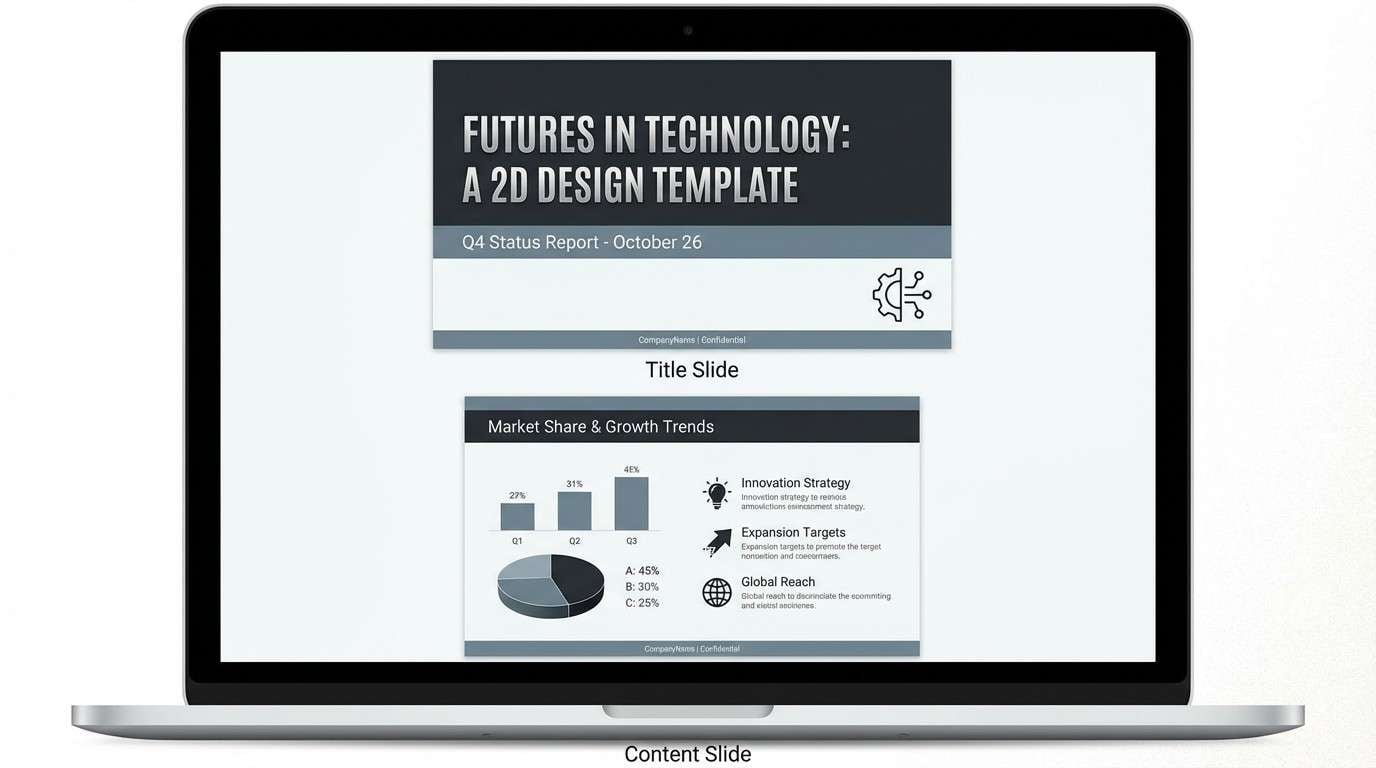
13) Space Station
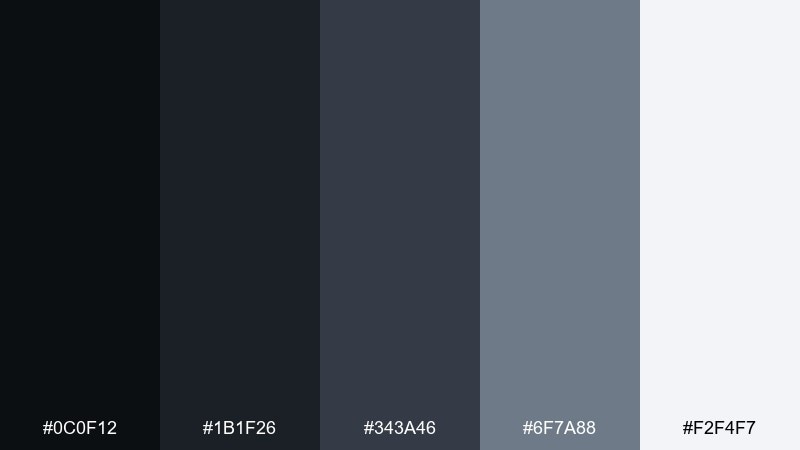
HEX: #0c0f12 #1b1f26 #343a46 #6f7a88 #f2f4f7
Mood: sleek, futuristic, organized
Best for: presentation slide deck template
Sleek and organized, these eclipse tones evoke a space station interior with crisp panels and soft lighting. Use the darkest shades for headers and navigation elements, then rely on the near-white for slide backgrounds and charts. It works well for pitch decks, technical reports, and product roadmaps where structure matters. Tip: limit chart colors to two tints of gray-blue to keep data clean.
Image example of space station generated using media.io
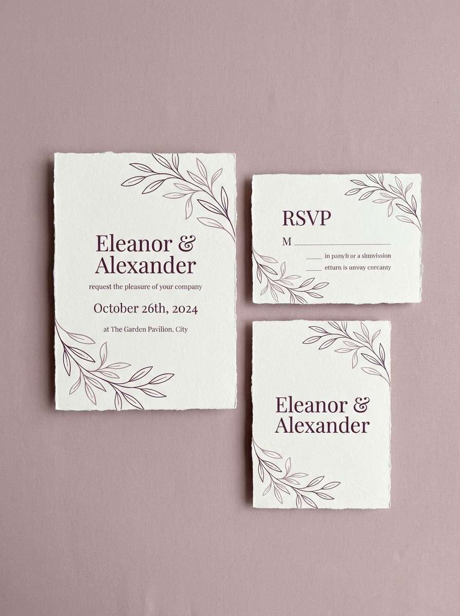
14) Clouded Plum
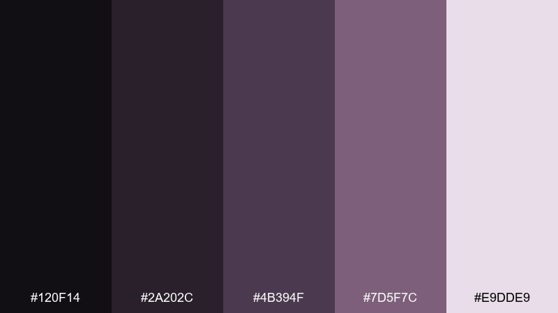
HEX: #120f14 #2a202c #4b394f #7d5f7c #e9dde9
Mood: soft, elegant, contemplative
Best for: wedding invitation suite
Soft and contemplative, these plums feel like twilight clouds and satin ribbons. Use the deep plum for names and headings, then let the pale mauve act as the paper tone. This eclipse color scheme suits wedding invitations, formal announcements, and romantic stationery where elegance matters more than brightness. Tip: add thin line borders in the mid-plum for a refined frame without clutter.
Image example of clouded plum generated using media.io
15) Charcoal Mint
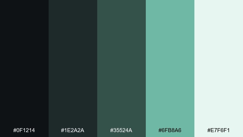
HEX: #0f1214 #1e2a2a #35524a #6fb8a6 #e7f6f1
Mood: fresh, balanced, modern
Best for: skincare product ad banner
Fresh and balanced, this mix feels like cool air against dark stone. An eclipse color palette like this works best when mint is the hero accent against charcoal typography and deep teal support. Use it for skincare ads, health brands, and clean product pages that need a calm pop of color. Tip: keep backgrounds nearly white and place mint on buttons or key benefit icons for clarity.
Image example of charcoal mint generated using media.io
16) Slate Rose
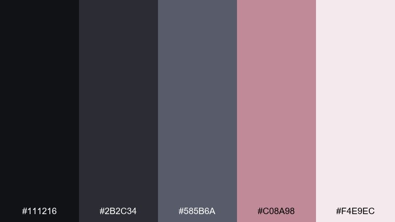
HEX: #111216 #2b2c34 #585b6a #c08a98 #f4e9ec
Mood: modern, romantic, poised
Best for: social media quote templates
Modern and poised, slate neutrals make the rose tone feel intentional rather than sugary. Use dark slate for text, blush for emphasis words, and the pale pink as the background for high legibility. It is great for quote templates, creator carousels, and lifestyle announcements. Tip: stick to one font family and let weight changes do the styling instead of extra graphics.
Image example of slate rose generated using media.io
17) Obsidian Sand
HEX: #0c0c0e #232326 #4a4a4f #b6a793 #f7f2ea
Mood: grounded, premium, natural
Best for: interior design mood board
Grounded and premium, this eclipse color scheme suggests obsidian stone, weathered concrete, and warm sand. Use the dark neutrals for key labels and swatches, then lean on sandy beige to keep the board inviting. It works well for interior mood boards, architectural concepts, and furniture brands that prefer understated luxury. Tip: pair with wood textures and matte black hardware for a cohesive finish.
Image example of obsidian sand generated using media.io
18) Northern Lights Dim
HEX: #0a1212 #12312c #1f5a52 #4aa68f #dff7f0
Mood: cool, energetic, clean
Best for: tech conference badge design
Cool and energetic, these teal tones feel like dim auroras over dark water. Use the near-black teal for the base badge, then highlight names and tracks with bright seafoam. It is ideal for tech events, workshop materials, and modern signage where quick scanning matters. Tip: keep iconography simple and use seafoam only for the top two information priorities.
Image example of northern lights dim generated using media.io
19) Monochrome Drift
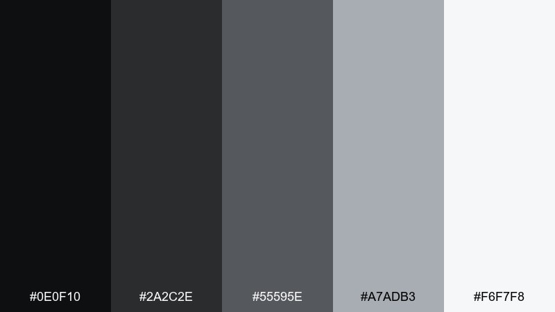
HEX: #0e0f10 #2a2c2e #55595e #a7adb3 #f6f7f8
Mood: minimal, timeless, confident
Best for: portfolio website layout
Minimal and timeless, this grayscale set feels like gallery walls and crisp print. Use the darkest shade for navigation and headings, mid-gray for secondary text, and near-white for page background. It is a strong choice for portfolios, agency sites, and case-study pages where work samples should lead. Tip: add one subtle hover state using the light gray to keep interactions visible but quiet.
Image example of monochrome drift generated using media.io
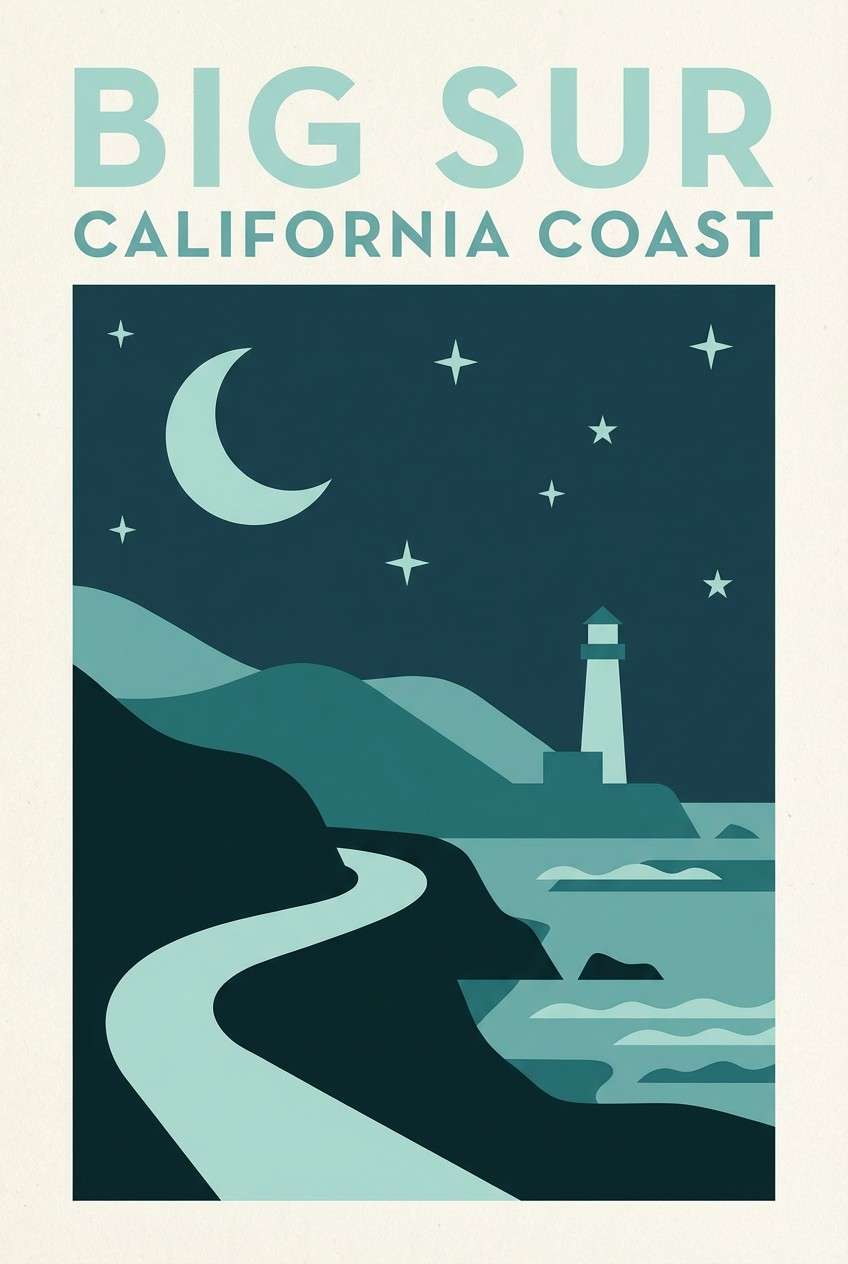
20) Deep Sea Eclipse
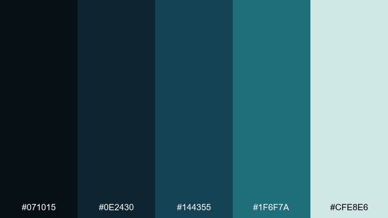
HEX: #071015 #0e2430 #144355 #1f6f7a #cfe8e6
Mood: mysterious, cool, sophisticated
Best for: travel poster for coastal night tour
Mysterious and sophisticated, these deep sea tones evoke moonlit waves and distant harbor lights. Use the darkest blue-green as a backdrop, then let teal carry focal shapes and headlines. This eclipse color scheme is perfect for travel posters, coastal experiences, and atmospheric campaigns that lean into mood. Tip: keep gradients subtle and add fine grain to avoid banding on large dark areas.
Image example of deep sea eclipse generated using media.io
What Colors Go Well with Eclipse?
Eclipse (dark neutral) palettes pair best with cool accents like slate blue, sapphire, teal, and muted lavender. These hues keep the overall look clean and contemporary while staying readable on deep backgrounds.
For warmer contrast, add controlled gold, copper, sand, blush, or tan. The key is restraint: treat warm tones as highlights for CTAs, dates, badges, or a single hero element.
If you want the most flexible option, use near-white, warm off-white, or pale gray as your “breathing room” color. It lifts contrast, supports cards and surfaces, and makes dark UI feel less heavy.
How to Use a Eclipse Color Scheme in Real Designs
Start with a 70/20/10 split: 70% dark neutral base, 20% mid-tone support for sections and borders, and 10% accent for interactive or high-priority elements. This keeps eclipse color combinations intentional instead of muddy.
In UI, use your darkest shade for navigation and primary buttons, then place content on a light surface (cards, tables, panels) to keep long sessions comfortable. In posters and social graphics, let the darkest color be the stage and the accent be the spotlight.
For branding, choose one signature accent and keep it consistent across templates. A single repeatable highlight color builds recognition faster than adding multiple brights to every asset.
Create Eclipse Palette Visuals with AI
If you have HEX codes but need mockups fast, generate on-brand visuals with an AI prompt that includes your subject (UI, poster, packaging) plus your eclipse colors as “dominant” and “accent” tones.
On Media.io, you can iterate quickly: try different aspect ratios for ads, thumbnails, and onboarding screens, then refine typography, layout density, and texture (matte, grain, foil) to match your mood.
Once you find a look you like, reuse the same prompt structure across campaigns—swap only the accent color and subject to keep a consistent eclipse design system.
Eclipse Color Scheme FAQs
-
What is an eclipse color scheme?
An eclipse color scheme is a set of dark neutrals (near-black, charcoal, deep navy) paired with a small number of supportive mid-tones and one restrained accent color to create contrast and focus. -
Is eclipse more like black, charcoal, or navy?
Eclipse typically sits in the near-black family, but it often leans slightly cool—toward charcoal or deep navy—so it feels modern and works well with blues, teals, and muted purples. -
What accent colors work best with eclipse?
Muted accents like slate blue, lavender, teal, dusty rose, gold, copper, and sand pair well with eclipse because they stay sophisticated while still standing out against dark backgrounds. -
How do I keep an eclipse palette from looking too dark?
Add a near-white or warm off-white for surfaces and negative space, and use stepped mid-grays for dividers and secondary text. This preserves the eclipse mood without sacrificing readability. -
Are eclipse color palettes good for UI and dashboards?
Yes—eclipse palettes are popular for SaaS UI because dark neutrals create clear hierarchy, reduce visual noise, and make a single accent color (like teal or blue) feel purposeful for CTAs and states. -
How many colors should an eclipse brand system use?
A practical setup is 3 neutrals (dark/base, mid, light surface) plus 1 accent and 1 soft highlight tint. This is enough for web, social templates, and print without bloating the system. -
Can I generate eclipse palette images from a text prompt?
Yes. Describe the design type (poster, UI, packaging), specify “dominant” dark neutrals, add one accent color, and include layout cues (minimal, clean grid, matte texture) to match eclipse styling.
Next: Safari Color Palette
