

A safari color palette is built on sun-warmed neutrals, earthy browns, and grounded greens—tones that feel natural, premium, and easy to live with across screens and print.
Below are 20 safari palette ideas (with HEX codes) plus practical pairing tips for branding, UI, packaging, and editorial layouts—starting from the signature khaki sand tone #C2B280.
In this article
Why Safari Palettes Work So Well
Safari colors sit in a warm, low-saturation range, which makes them feel timeless and “designed” without being loud. That’s why they’re popular for nature-led brands, travel, editorial layouts, and premium packaging.
They also give you reliable contrast options: a pale sand or cream for backgrounds, mid-tones for surfaces and cards, and deep browns/charcoals for readable type. This structure helps interfaces stay calm while still feeling high-end.
Finally, safari palettes pair naturally with texture—paper grain, canvas, leather, and matte finishes—so your visuals can feel rich even when the color count is simple.
20+ Safari Color Palette Ideas (with HEX Codes)
1) Savanna Dune
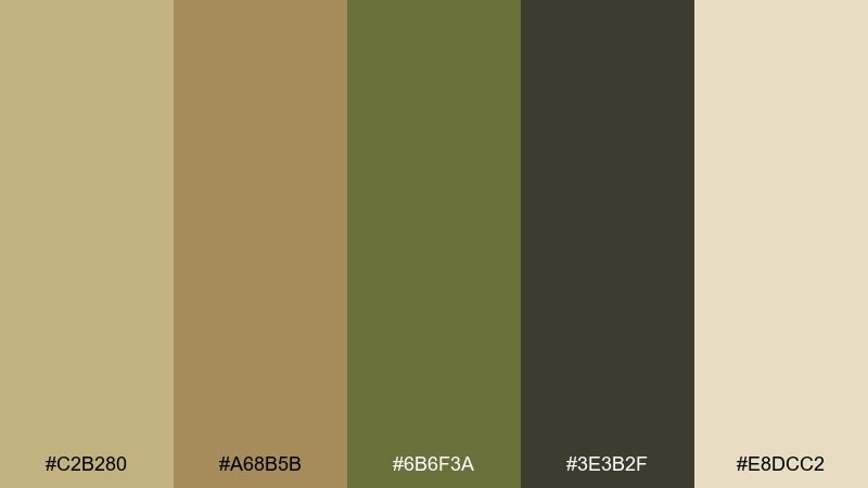
HEX: #C2B280 #A68B5B #6B6F3A #3E3B2F #E8DCC2
Mood: warm, grounded, sunlit
Best for: travel branding and hero sections
Warm and sunlit, it feels like wind-swept dunes and dry grass under a pale sky. Use it for travel branding, destination landing pages, or editorial headers that need an earthy first impression. Pair the sand and cream with deep charcoal for legible type, then bring olive in for buttons or icons. Tip: keep the darkest tone for text and UI outlines to avoid a muddy look.
Image example of savanna dune generated using media.io
Media.io is an online AI studio for creating and editing video, image, and audio in your browser.

2) Acacia Shade
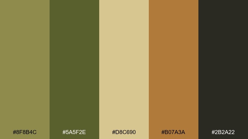
HEX: #8F8B4C #5A5F2E #D8C690 #B07A3A #2B2A22
Mood: shaded, rugged, natural
Best for: outdoor gear branding and labels
Shaded and rugged, it evokes acacia canopies, worn leather, and dusty trails. It works well for outdoor gear packaging, product labels, or a brand system that needs grit without looking harsh. Balance the deep olive with the pale sand for breathing room, then use the warm tan as a secondary highlight. Tip: reserve the near-black for small text and barcodes so the greens stay the visual focus.
Image example of acacia shade generated using media.io
3) Sunset Track
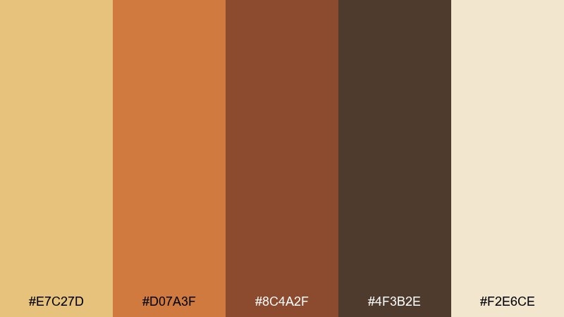
HEX: #E7C27D #D07A3F #8C4A2F #4F3B2E #F2E6CE
Mood: golden, bold, cinematic
Best for: event posters and campaign graphics
Golden and cinematic, it brings to mind sunset dust, long shadows, and the warmth of late-day light. These safari color combinations shine on posters, seasonal promos, and social graphics where you want instant energy. Pair the amber and rust with the pale cream for contrast, and keep the dark brown for headings and dividers. Tip: use large color blocks rather than gradients to keep the palette feeling modern.
Image example of sunset track generated using media.io

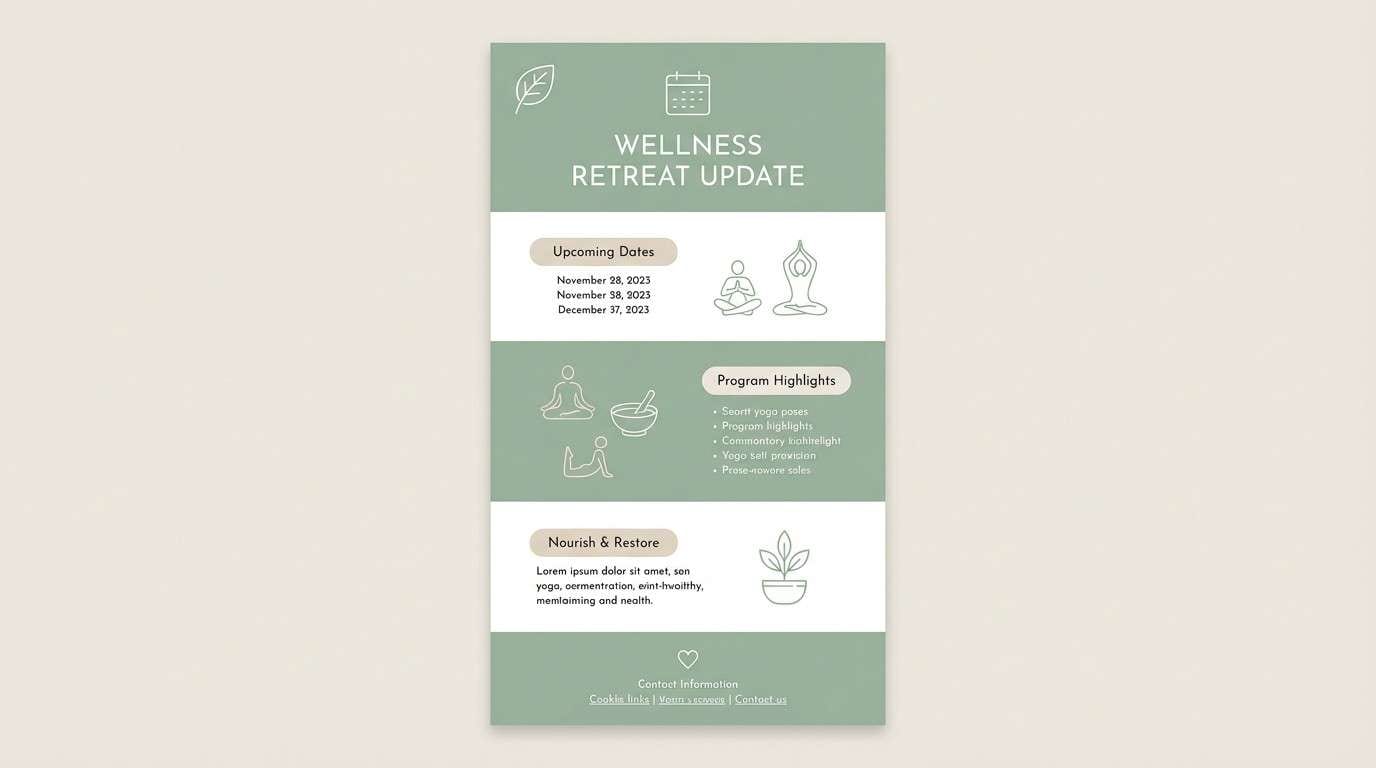
4) River Reed
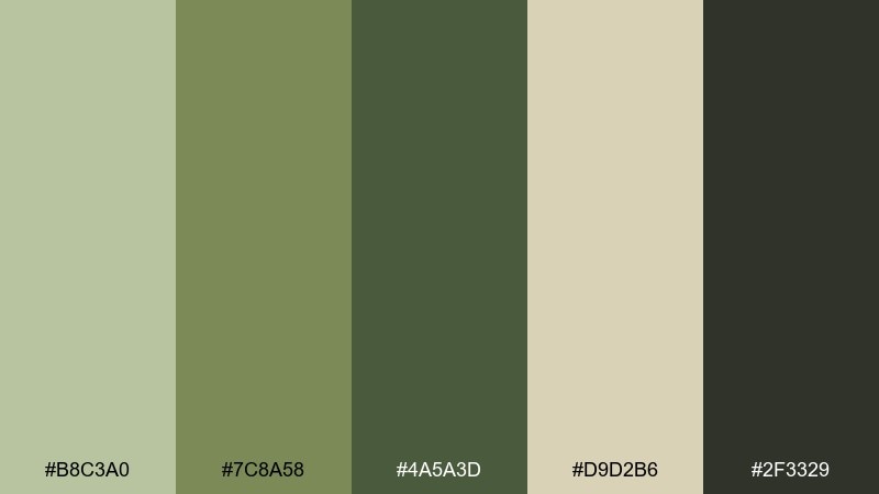
HEX: #B8C3A0 #7C8A58 #4A5A3D #D9D2B6 #2F3329
Mood: fresh, calm, botanical
Best for: wellness websites and newsletters
Fresh and calm, it feels like reeds along a slow river and cool shade near the waterline. Use it for wellness sites, newsletters, or packaging that needs a softer green story than typical forest tones. Pair the misty sage with warm beige so the greens do not turn clinical. Tip: keep CTAs in the mid-green for visibility without breaking the calm mood.
Image example of river reed generated using media.io
5) Rhino Hide
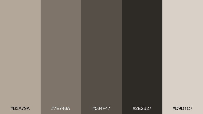
HEX: #B3A79A #7E746A #564F47 #2E2B27 #D9D1C7
Mood: neutral, sturdy, understated
Best for: minimal UI themes and dashboards
Neutral and sturdy, it reads like stone, hide, and well-worn canvas. It is a strong fit for minimalist dashboards, SaaS UI themes, or portfolios where content needs to lead. Pair the soft greige with the deep charcoal for high readability, and use the mid taupe for cards and dividers. Tip: add one warm accent from your brand (like a muted tan) if the interface starts feeling too flat.
Image example of rhino hide generated using media.io

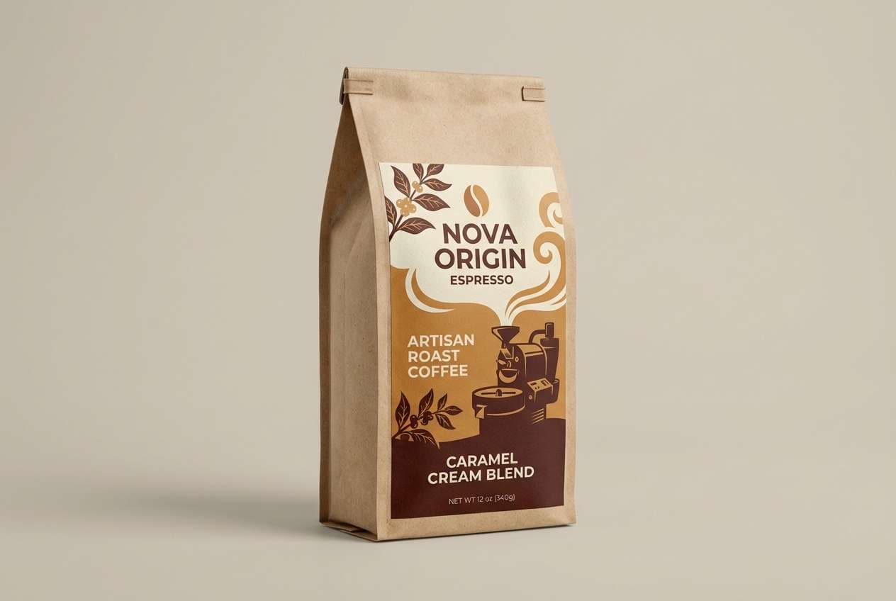
6) Baobab Bark
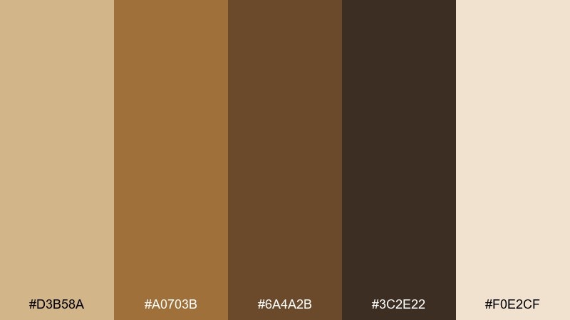
HEX: #D3B58A #A0703B #6A4A2B #3C2E22 #F0E2CF
Mood: earthy, rustic, handcrafted
Best for: coffee brands and artisan packaging
Earthy and handcrafted, it suggests baobab bark, roasted beans, and sunbaked wood. It works beautifully for coffee brands, artisan food labels, and textured packaging design. Pair the pale cream with the deep brown for clean hierarchy, then use the caramel tone as a signature accent. Tip: print with a slightly matte finish to keep the browns rich rather than glossy.
Image example of baobab bark generated using media.io
7) Leopard Spot
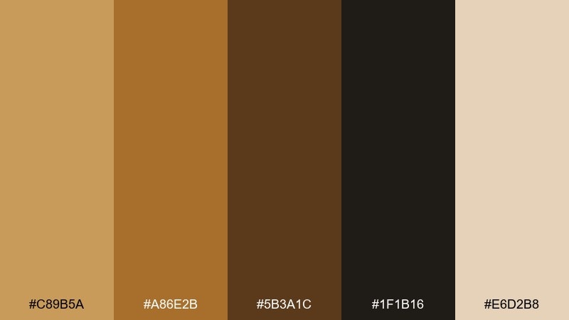
HEX: #C89B5A #A86E2B #5B3A1C #1F1B16 #E6D2B8
Mood: bold, confident, luxe
Best for: fashion lookbooks and promo banners
Bold and luxe, it channels leopard-gold warmth with a dark, editorial edge. Use it for fashion promos, lookbooks, or boutique branding where you want sophistication without bright colors. Pair the warm tan with the near-black for dramatic contrast, and keep the cream as negative space. Tip: use the darkest tone sparingly so the palette stays elegant instead of heavy.
Image example of leopard spot generated using media.io
8) Oasis Mint
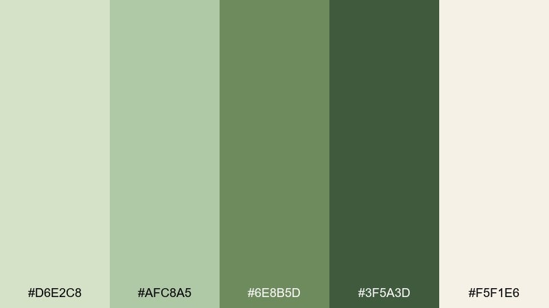
HEX: #D6E2C8 #AFC8A5 #6E8B5D #3F5A3D #F5F1E6
Mood: cool, airy, restorative
Best for: spa landing pages and product ads
Cool and restorative, it feels like an oasis breeze against warm sand. Try these safari color combinations for spa landing pages, skincare ads, or calm product storytelling that needs gentle greens. Pair the light mint and cream as the base, then use the deeper green for navigation and CTA contrast. Tip: keep imagery bright and low-contrast so the greens do not shift toward gray.
Image example of oasis mint generated using media.io
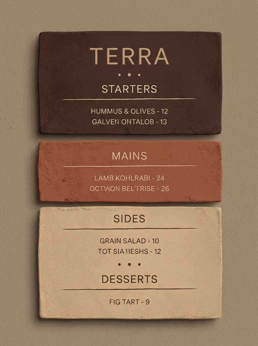
9) Clay Caravan
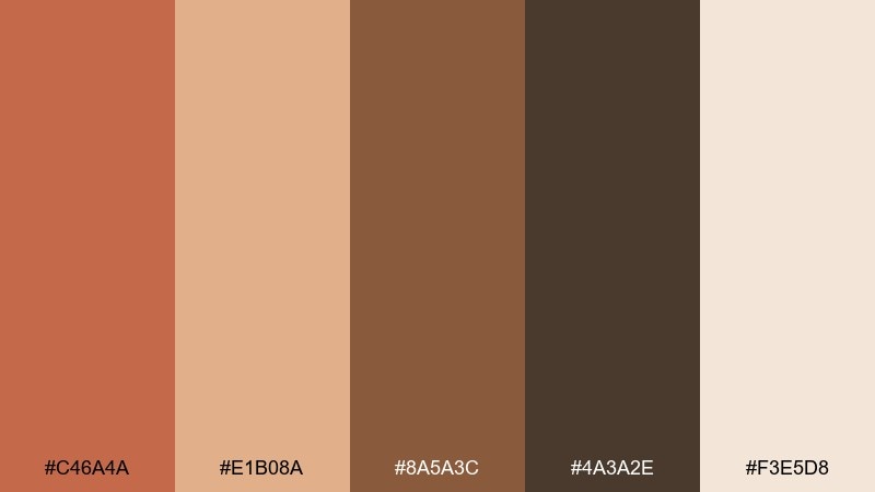
HEX: #C46A4A #E1B08A #8A5A3C #4A3A2E #F3E5D8
Mood: warm, inviting, story-driven
Best for: restaurant menus and identity sets
Warm and story-driven, it recalls clay pots, spiced tea, and evening light on adobe walls. It is ideal for restaurant menus, hospitality branding, and identity sets that want a friendly, grounded feel. Pair blushy sand with espresso brown for legible text, then bring clay red in for highlights like prices or section titles. Tip: use the clay tone on uncoated paper to get a richer, earthier finish.
Image example of clay caravan generated using media.io
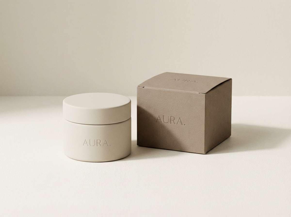
10) Giraffe Canvas
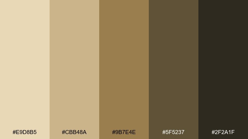
HEX: #E9D8B5 #CBB48A #9B7E4E #5F5237 #2F2A1F
Mood: soft, classic, versatile
Best for: brand guidelines and stationery
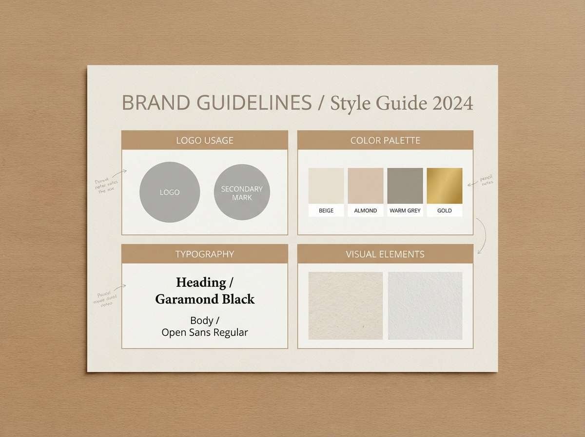
Soft and classic, it evokes sun-bleached canvas, dry grass, and warm stone. Use it for brand guideline decks, stationery, or web layouts that need a timeless neutral base. Pair the light beige with charcoal for type, and use the mid tan for section headers or subtle patterns. Tip: add texture like paper grain or linen to make the neutrals feel intentional, not empty.
Image example of giraffe canvas generated using media.io
11) Dusty Safari
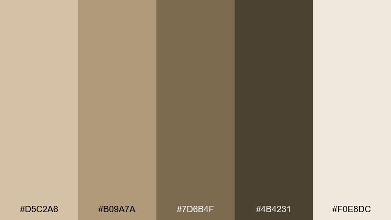
HEX: #D5C2A6 #B09A7A #7D6B4F #4B4231 #F0E8DC
Mood: muted, cozy, nostalgic
Best for: blog themes and long-form articles
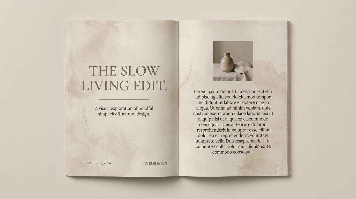
Muted and cozy, it feels like dusty roads, vintage maps, and quiet mornings at camp. It is a great fit for blog themes, reading-heavy pages, and long-form article layouts. Pair the light parchment background with the deep brown for body text, and use the mid taupe for callout boxes. Tip: keep contrast accessible by using the darkest tone for paragraphs, not the mid browns.
Image example of dusty safari generated using media.io
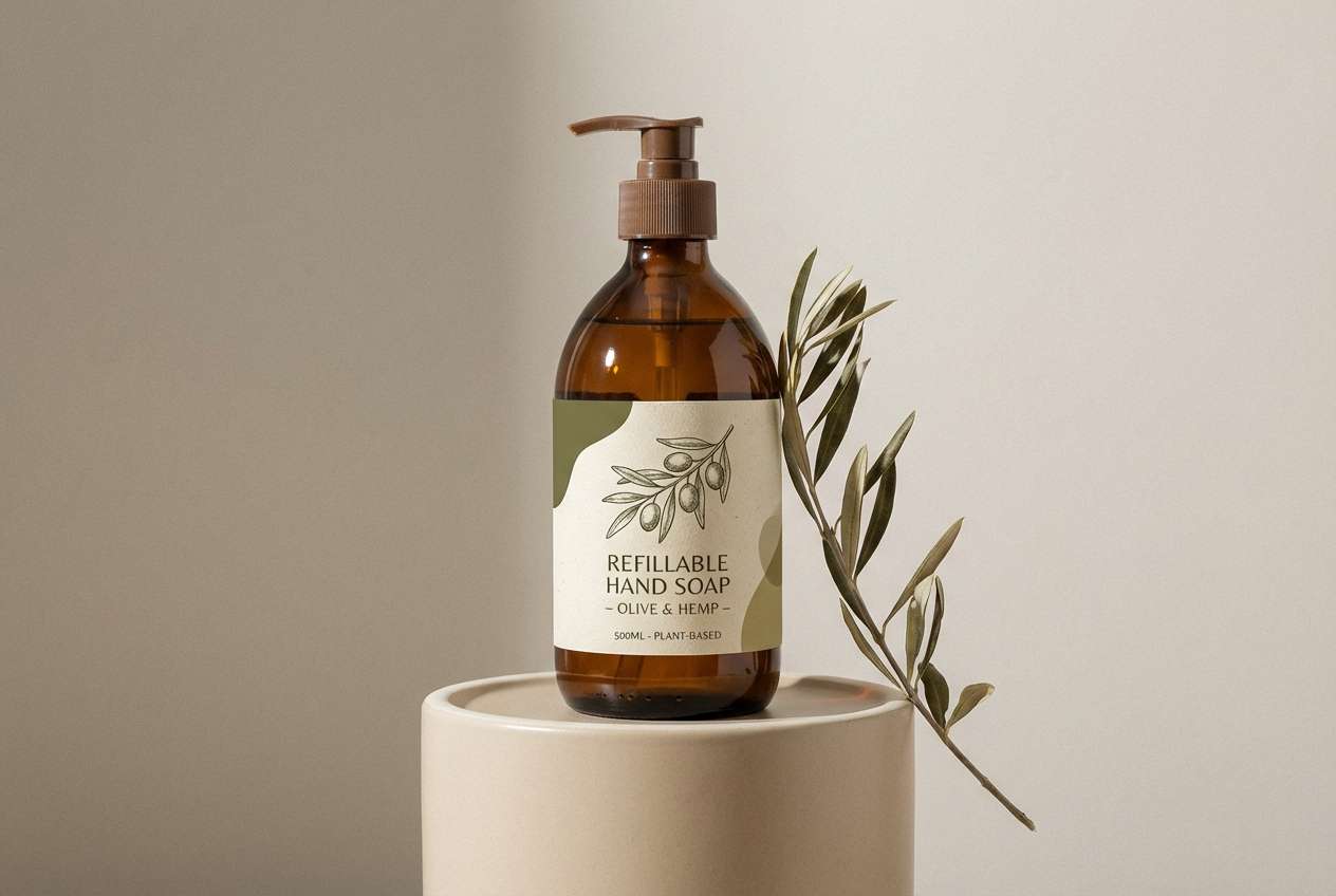
12) Wild Olive
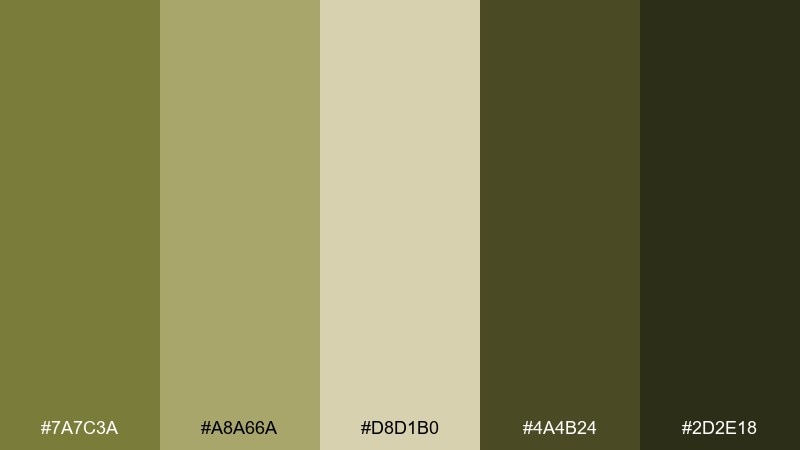
HEX: #7A7C3A #A8A66A #D8D1B0 #4A4B24 #2D2E18
Mood: earthy, modern, confident
Best for: eco brands and packaging systems
Earthy and modern, it brings to mind crushed olive leaves, seed pods, and sunlit fields. As a safari color palette, it is perfect for eco brands, refill packaging, and sustainability messaging that needs depth. Pair the pale khaki with the near-black for clean type, and use the mid olive for badges or eco claims. Tip: limit the darkest green to anchors and headings so the palette stays fresh.
Image example of wild olive generated using media.io
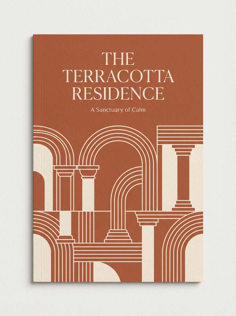
13) Terra Lodge
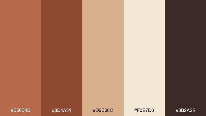
HEX: #B56B4B #8D4A31 #D9B08C #F3E7D6 #3B2A25
Mood: welcoming, rustic, premium
Best for: hotel brochures and booking pages
Welcoming and premium, it suggests terracotta walls, woven textiles, and a lodge at golden hour. Use it for hotel brochures, booking pages, or warm lifestyle brands that want a refined rustic tone. Pair the light cream with deep cocoa for layout structure, and keep terracotta for accents like icons or highlights. Tip: use generous margins so the darker brown feels intentional, not cramped.
Image example of terra lodge generated using media.io
14) Kalahari Light
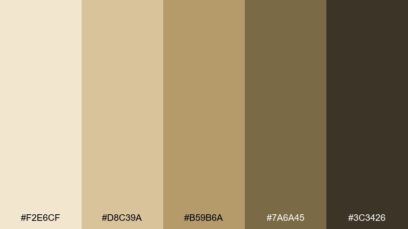
HEX: #F2E6CF #D8C39A #B59B6A #7A6A45 #3C3426
Mood: bright, airy, refined
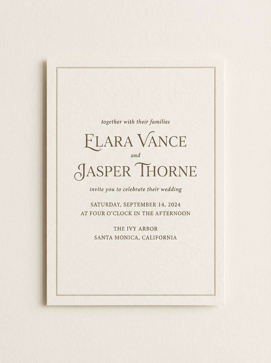
Best for: wedding invitations and stationery
Bright and refined, it feels like sunlit sand, dried wheat, and soft linen. This safari color scheme suits wedding invitations, minimal stationery, and brands that want warmth without strong saturation. Pair the pale cream with the deep brown for crisp typography, and use the golden tan for borders or monograms. Tip: foil or emboss works best when you keep the layout simple and let the neutrals shine.
Image example of kalahari light generated using media.io
15) Morning Mist Plains
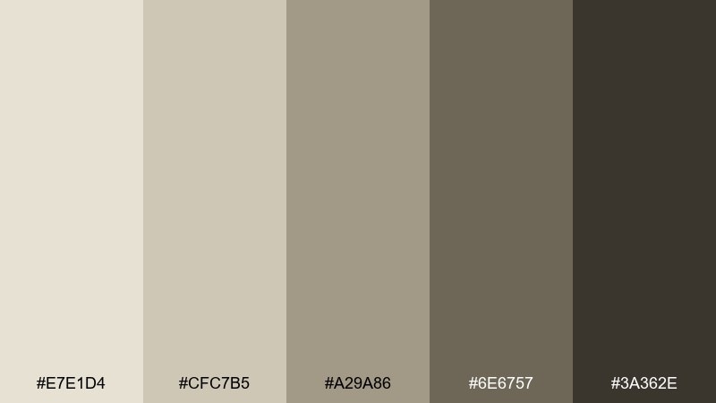
HEX: #E7E1D4 #CFC7B5 #A29A86 #6E6757 #3A362E
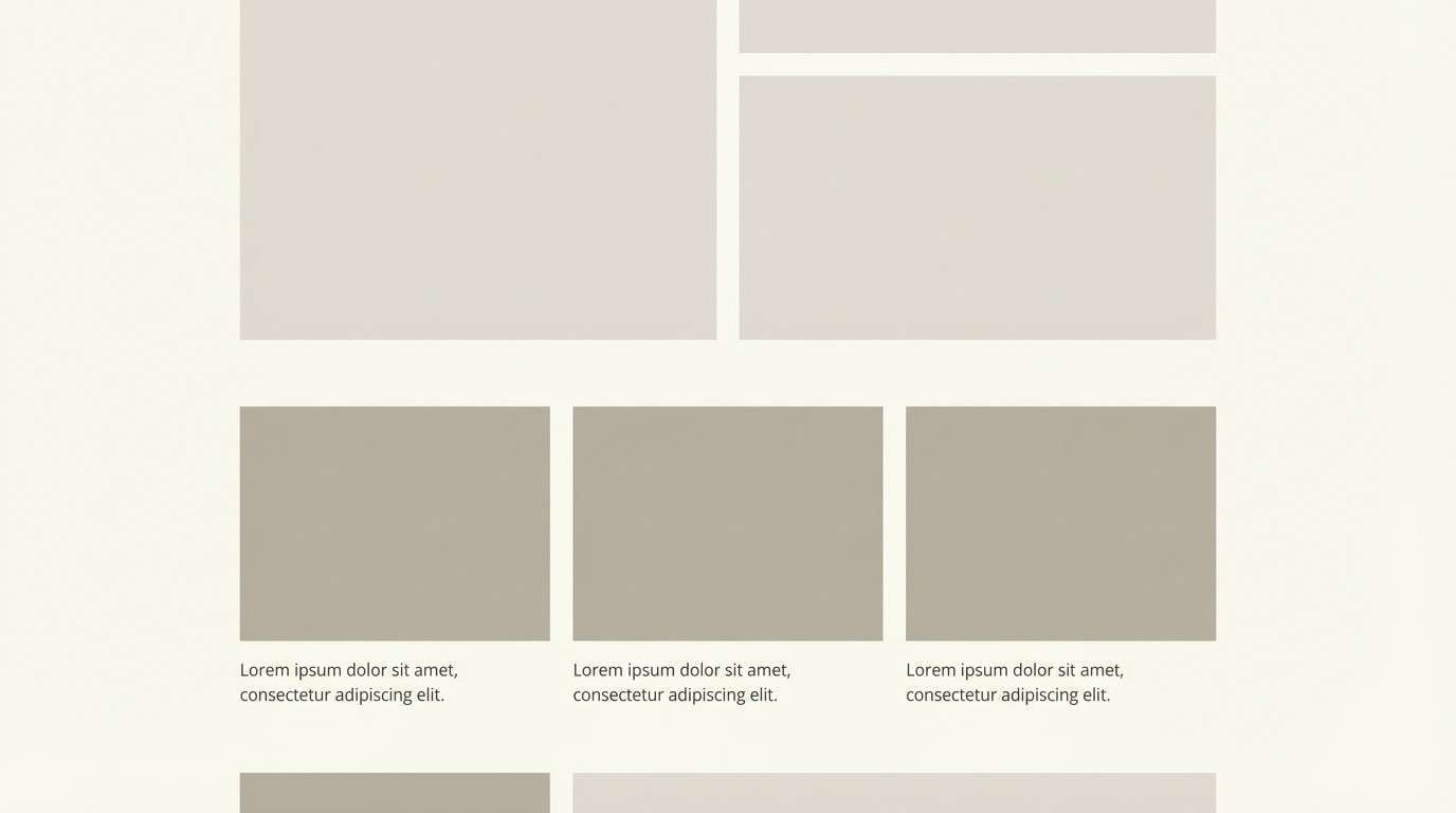
Mood: quiet, airy, minimalist
Best for: portfolio sites and case studies
Quiet and airy, it recalls morning mist over open plains and soft, desaturated light. It is ideal for portfolio sites, case studies, and minimal layouts where imagery needs room to breathe. Pair the pale base with the deepest tone for headings, and use the mid gray-beige for dividers and captions. Tip: keep photos slightly warm so the palette does not skew cold.
Image example of morning mist plains generated using media.io
16) Cheetah Sprint
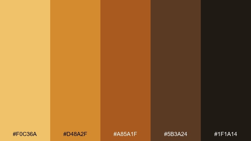
HEX: #F0C36A #D48A2F #A85A1F #5B3A24 #1F1A14
Mood: energetic, spicy, high-contrast
Best for: CTA-heavy landing pages and promos
Energetic and spicy, it looks like fast heat, sunlit fur, and rich amber highlights. Use it on CTA-heavy landing pages, promo banners, and notification systems where contrast matters. Pair the bright gold with deep brown for legible buttons, then support with the darker tones for nav and footers. Tip: avoid using the brightest gold for body text; keep it for highlights and UI emphasis.
Image example of cheetah sprint generated using media.io
17) Campfire Ember
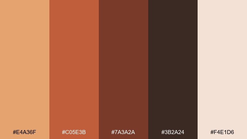
HEX: #E4A36F #C05E3B #7A3A2A #3B2A24 #F4E1D6
Mood: cozy, adventurous, intimate
Best for: podcast covers and storytelling posts
Cozy and adventurous, it feels like embers glowing after dark and warm stories shared close to the fire. As a safari color palette, it suits podcast cover art, storytelling posts, and community brands that want approachable warmth. Pair the ember coral with the pale blush for contrast, and use the deep brown for titles and outlines. Tip: keep gradients subtle so the reds do not turn overly modern or glossy.
Image example of campfire ember generated using media.io

18) Safari Linen
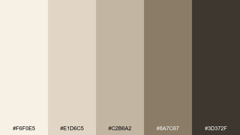
HEX: #F6F0E5 #E1D6C5 #C2B6A2 #8A7C67 #3D372F
Mood: clean, soft, premium-neutral
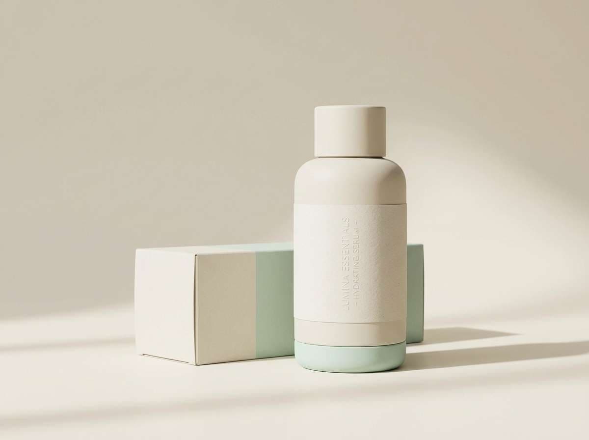
Best for: beauty brands and minimalist packaging
Clean and premium-neutral, it suggests fresh linen, soft light, and a calm, elevated shelf presence. It works for beauty packaging, minimalist ads, and product pages where you want warmth without obvious color. Pair the lightest tones for background and negative space, then use the deep brown for crisp copy. Tip: add a subtle texture or emboss detail to keep the palette from feeling too plain.
Image example of safari linen generated using media.io
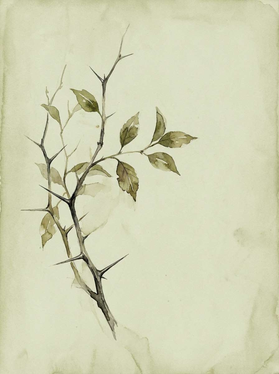
19) Thornbush Green
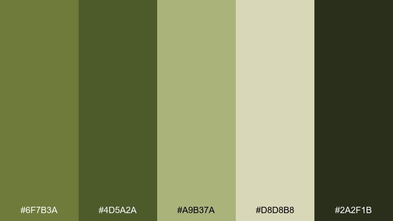
HEX: #6F7B3A #4D5A2A #A9B37A #D8D8B8 #2A2F1B
Mood: wild, herbal, grounded
Best for: garden brands and botanical illustrations
Wild and herbal, it brings to mind thorny shrubs, crushed leaves, and sunlit thickets. These safari color combinations are strong for garden brands, botanical print sets, and nature-led packaging. Pair the pale green-beige with deep olive for clear labels, then use the mid green for stems, icons, or pattern work. Tip: keep backgrounds light so the greens stay lively instead of heavy.
Image example of thornbush green generated using media.io
20) Starry Reserve
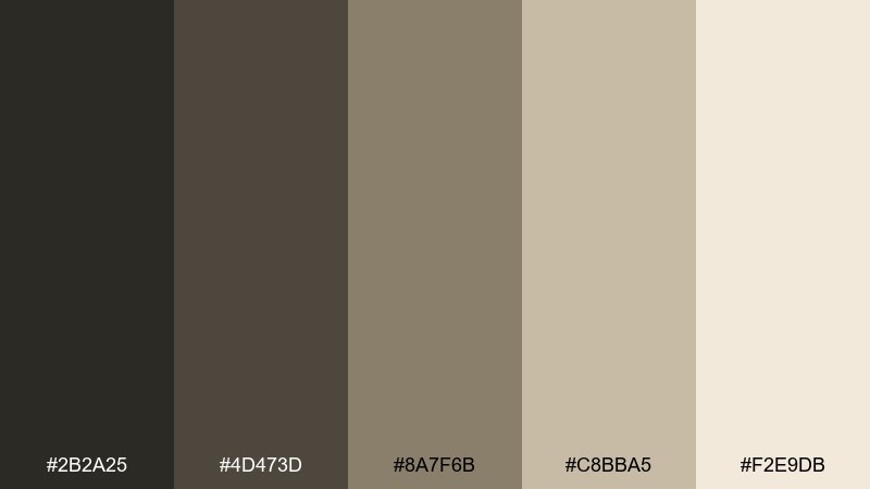
HEX: #2B2A25 #4D473D #8A7F6B #C8BBA5 #F2E9DB
Mood: moody, quiet, night-sky
Best for: luxury branding and premium editorials
Moody and quiet, it feels like a night reserve with warm starlight and deep shadows. As a safari color palette, it fits luxury branding, premium editorials, and high-end packaging where restraint sells. Pair the near-black with creamy off-white for sharp, upscale contrast, and keep the mid taupe for secondary type. Tip: use plenty of negative space so the dark tones read as elegant, not heavy.
Image example of starry reserve generated using media.io
What Colors Go Well with Safari?
Safari palettes pair best with other warm neutrals (cream, parchment, greige) because they keep the look cohesive and elevated. For contrast, deep cocoa, charcoal, or near-black help your typography and UI elements stay crisp.
Greens like olive, sage, and reed tones are natural companions, especially when balanced with sand or linen backgrounds so they don’t feel heavy. If you need a brighter accent, use amber or terracotta in small doses for highlights.
For a modern twist, introduce a restrained cool note (like a misty mint) while keeping the overall saturation low—this preserves the grounded “safari” mood.
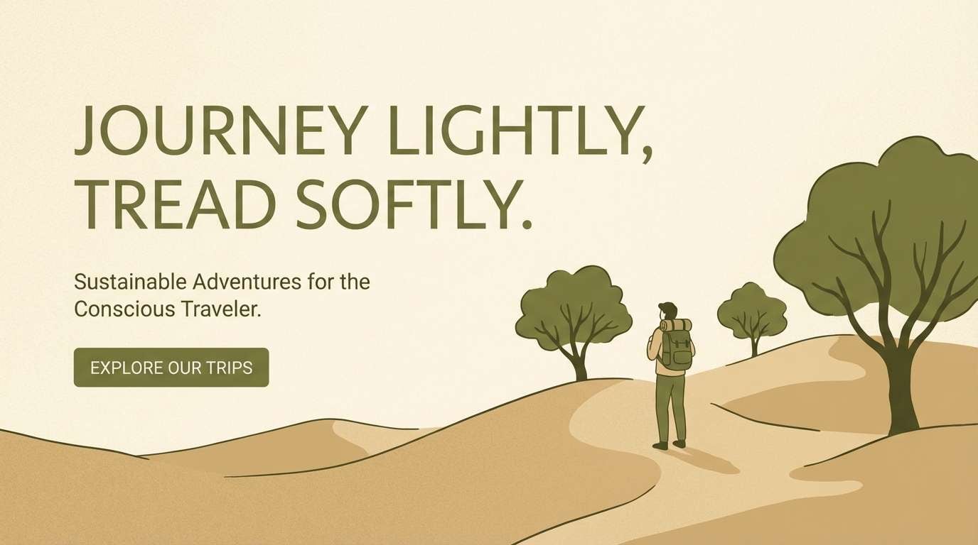
How to Use a Safari Color Palette in Real Designs
Start with a light sand/cream as your base, then assign one deep tone (charcoal or cocoa) to text and key dividers. This keeps long pages readable and prevents earthy colors from turning muddy.
Use mid-tones for surfaces: cards, form fields, navigation bars, and secondary sections. Then reserve one signature accent (amber, clay, or olive) for CTAs, badges, and icons so attention goes where it should.
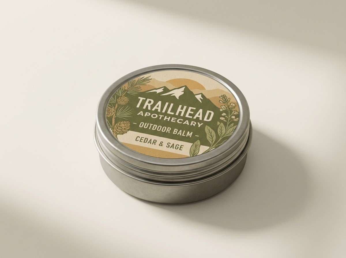
In print and packaging, safari colors look best with matte finishes and subtle texture. Consider paper grain, linen patterns, or soft shadow photography to enhance the palette without adding extra colors.
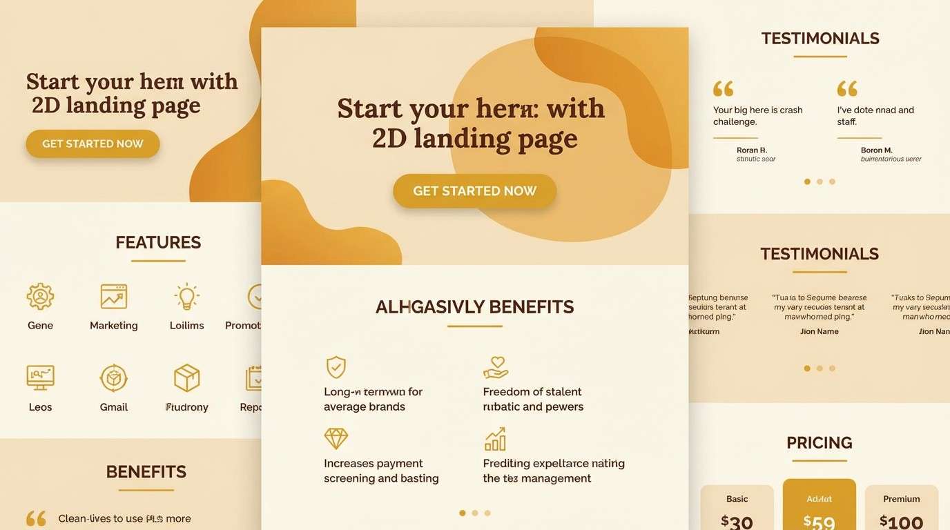
Create Safari Palette Visuals with AI
If you want to see your safari color scheme in action, generate quick mockups for hero sections, posters, packaging, or UI screens. This helps you validate contrast and mood before committing to a full design system.
With Media.io, you can turn a prompt into on-brand visuals fast—then iterate by swapping HEX-inspired color words (sand, khaki, olive, cocoa) and adjusting aspect ratios for different placements.
Safari Color Palette FAQs
-
What is a safari color palette?
A safari color palette is a set of warm, earthy tones inspired by dunes, dry grass, bark, and shaded foliage—typically including sand/khaki, olive greens, warm browns, and cream neutrals. -
What is the signature “safari” base color?
Khaki sand is the most recognizable base—often close to #C2B280. It works well as a background or supporting neutral for typography and UI surfaces. -
Do safari colors work for modern UI design?
Yes. Use a light neutral for backgrounds, a deep charcoal/brown for text, and one olive/amber accent for CTAs. The result feels modern, calm, and premium. -
How do I avoid a safari palette looking muddy?
Keep contrast intentional: use the darkest shade for text and key outlines, and keep mid-browns/olives for fills and accents. Also avoid stacking too many mid-tones together without a light neutral buffer. -
What accent colors go well with safari tones?
Amber, terracotta, rust, and muted gold add energy, while mint or soft sage can cool the palette down. Keep accents limited so the design stays grounded. -
Is a safari color scheme good for print?
Very. Safari palettes translate beautifully to uncoated or matte finishes, where browns and tans look rich and natural. Add subtle texture (paper grain/linen) to enhance depth. -
Can I generate safari-themed brand visuals with AI?
Yes—describe your layout (packaging, hero banner, poster) and specify color words like sand, khaki, olive, cocoa, and cream. Media.io can generate multiple variations quickly so you can pick the best direction.
Next: Office Color Palette


