

Forest color palettes blend calm greens with bark browns and misty neutrals, creating a grounded look that still feels modern on screens and in print.
Below are 26 ready-to-use forest palette ideas with HEX codes, plus quick tips for pairing and applying them to branding, UI, and packaging.
In this article
- Why Forest Palettes Work So Well
-
- mossy trail
- pine needle
- fern shadow
- cedar bark
- rainy canopy
- olive grove
- lichen stone
- evergreen ink
- woodland mist
- sage creek
- hollow log
- juniper berry
- meadow understory
- spruce tip
- forest floor
- antique moss
- deep glade
- herbal tonic
- dusk in the pines
- sunlit thicket
- birch hollow
- bramble path
- canopy contrast
- old growth reserve
- verdant balance
- shaded grove
- What Colors Go Well with Forest?
- How to Use a Forest Color Palette in Real Designs
Why Forest Palettes Work So Well
Forest color schemes feel instantly familiar because they mirror natural contrast: deep canopy greens, softer leaf tones, and grounded wood-like browns. That balance makes them easy to trust in branding and easy to read in interfaces.
They’re also flexible across moods. Shift toward cool gray-greens for modern UI, or add warm tans and bark browns for artisanal packaging and print-forward design.
Most importantly, forest tones pair well with negative space. When you give them breathing room, they look premium rather than heavy.
20+ Forest Color Palette Ideas (with HEX Codes)
1) Mossy Trail
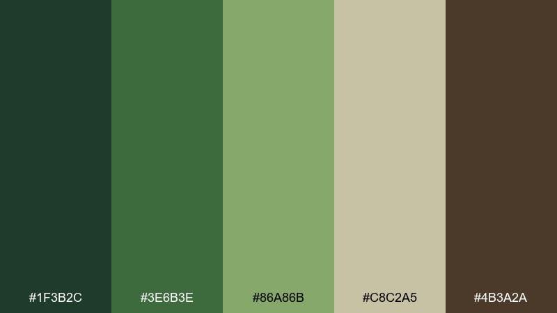
HEX: #1F3B2C #3E6B3E #86A86B #C8C2A5 #4B3A2A
Mood: grounded, fresh, outdoorsy
Best for: eco brand identity and label design
Grounded and fresh, it feels like moss underfoot and sun breaking through leaves. Use the dark green as your anchor, then let the mid greens carry headers and icons. The sandy neutral keeps layouts breathable, while the bark brown adds an earthy premium touch. Tip: reserve the light neutral for large backgrounds to avoid a heavy, overgrown look.
Image example of mossy trail generated using media.io
Media.io is an online AI studio for creating and editing video, image, and audio in your browser.

2) Pine Needle
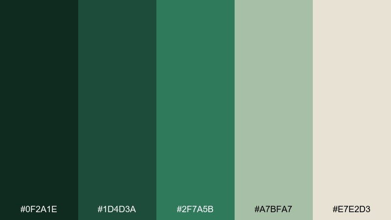
HEX: #0F2A1E #1D4D3A #2F7A5B #A7BFA7 #E7E2D3
Mood: cool, crisp, clean
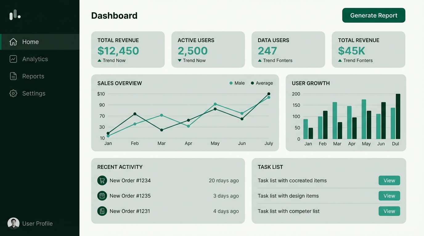
Best for: dashboard UI and analytics screens
Cool and crisp, it evokes pine needles after rain and a clean mountain breeze. Build contrast with the near-black green for navigation, then use the teal-green for active states and highlights. The gray-green works well for cards and dividers, with the off-white keeping charts readable. Tip: use the teal-green sparingly for alerts so it stays meaningful.
Image example of pine needle generated using media.io
3) Fern Shadow
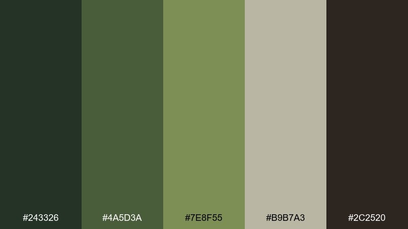
HEX: #243326 #4A5D3A #7E8F55 #B9B7A3 #2C2520
Mood: muted, vintage, calm
Best for: editorial layouts and book covers
Muted and vintage, it feels like fern fronds in shade with worn paper edges. Use the olive tones for headings and pull quotes, and keep the charcoal-brown for body text. The warm gray-beige reads like uncoated stock, making it ideal for print-forward design. Tip: add generous margins so the darker greens do not crowd the page.
Image example of fern shadow generated using media.io
4) Cedar Bark
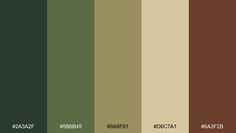
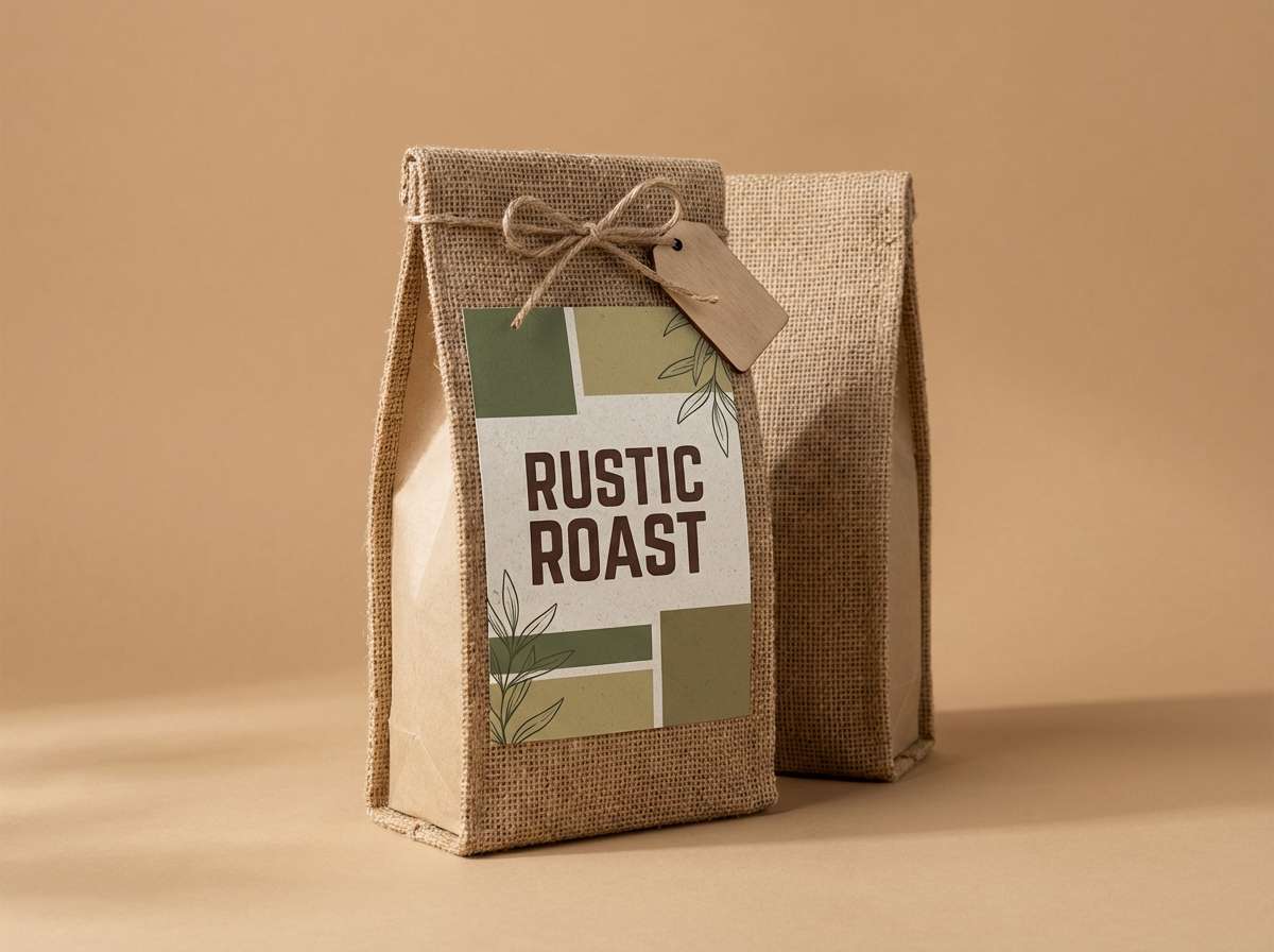
HEX: #2A3A2F #5B6B45 #9A8F61 #D6C7A1 #6A3F2B
Mood: warm, rustic, artisanal
Best for: coffee packaging and rustic product branding
Warm and rustic, it brings to mind cedar bark, dried herbs, and a cozy cabin shelf. The bark brown makes a strong base for logos, while olive and khaki support secondary typography. Use the pale tan as your background to keep the overall look welcoming. Tip: try a matte texture so the palette feels crafted, not glossy.
Image example of cedar bark generated using media.io
5) Rainy Canopy
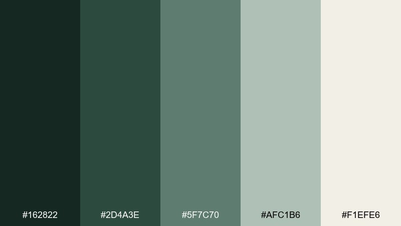
HEX: #162822 #2D4A3E #5F7C70 #AFC1B6 #F1EFE6
Mood: misty, quiet, modern
Best for: wellness app UI and calm landing pages
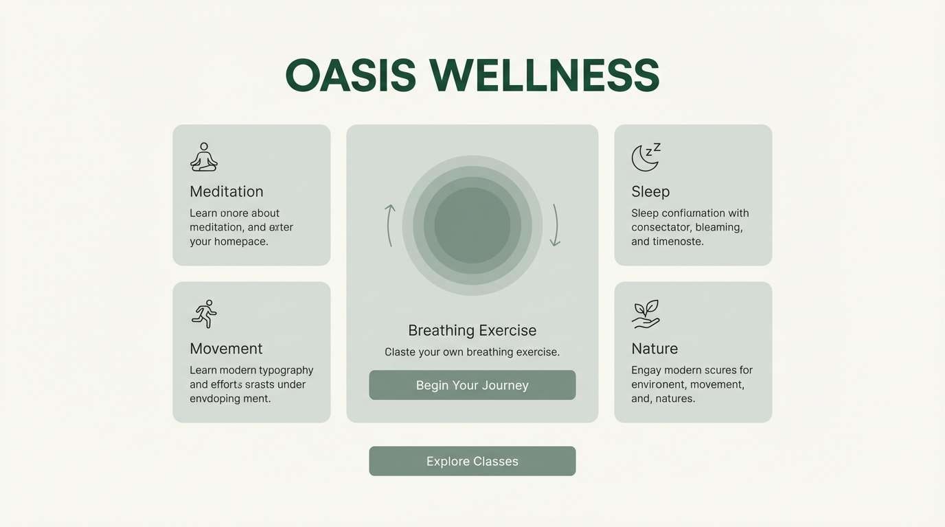
Misty and quiet, it feels like a rainy canopy with soft light filtering through. Pair the deep green with the foggy gray-green for sections and cards, then use the off-white for generous negative space. The mid-tone green-gray is great for subtle buttons and toggles without shouting. Tip: keep contrast checks on text over the mid tones to maintain accessibility.
Image example of rainy canopy generated using media.io
6) Olive Grove
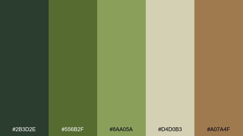
HEX: #2B3D2E #556B2F #8AA05A #D4D0B3 #A07A4F
Mood: earthy, sunlit, Mediterranean
Best for: food branding and menu design
Earthy and sunlit, it suggests olive leaves, dusty paths, and golden harvest light. The olive core works beautifully for headings, while the warm tan can highlight prices or callouts. Keep the pale neutral for paper-like backgrounds so the greens stay appetizing. Tip: add subtle line illustrations in the darkest green for a cohesive, handcrafted look.
Image example of olive grove generated using media.io

7) Lichen Stone
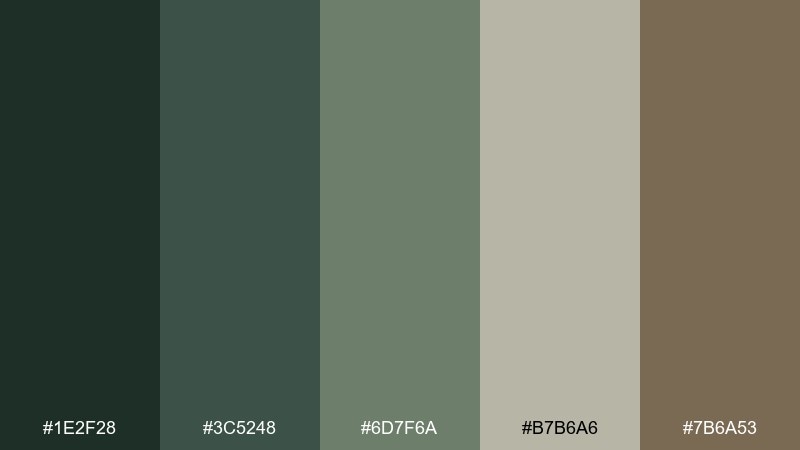
HEX: #1E2F28 #3C5248 #6D7F6A #B7B6A6 #7B6A53
Mood: natural, neutral, sophisticated
Best for: interior design mood boards
Natural and sophisticated, it recalls lichen on stone and weathered wood. Use the gray-greens as your main surfaces, then deepen the design with the inky green for contrast lines and titles. The taupe-brown makes an understated accent for materials and swatches. Tip: keep accents minimal and let texture do the heavy lifting.
Image example of lichen stone generated using media.io
8) Evergreen Ink
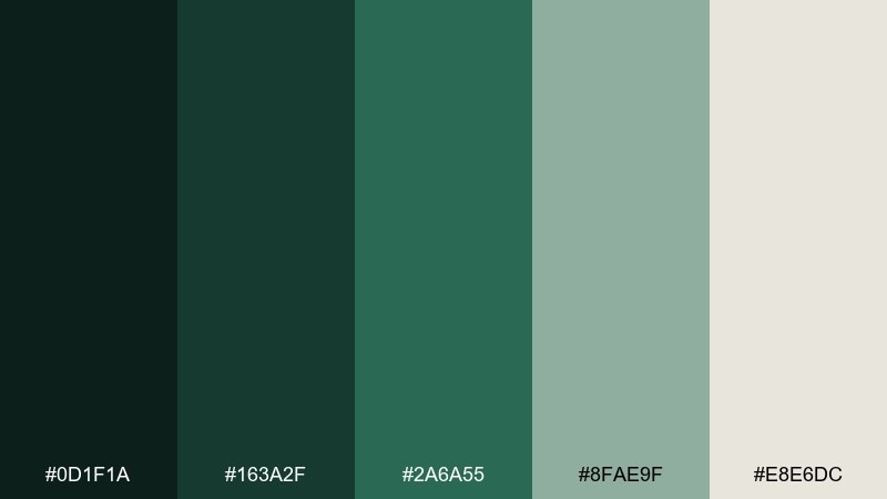
HEX: #0D1F1A #163A2F #2A6A55 #8FAE9F #E8E6DC
Mood: bold, polished, high-contrast
Best for: tech branding and SaaS hero sections
Bold and polished, it feels like evergreen ink on creamy stationery. Use the near-black green for headers and key sections, then bring energy with the rich teal for CTAs. The soft mint-gray keeps secondary content friendly without losing that premium edge. Tip: pair with a geometric sans serif to match the crisp contrast.
Image example of evergreen ink generated using media.io

9) Woodland Mist
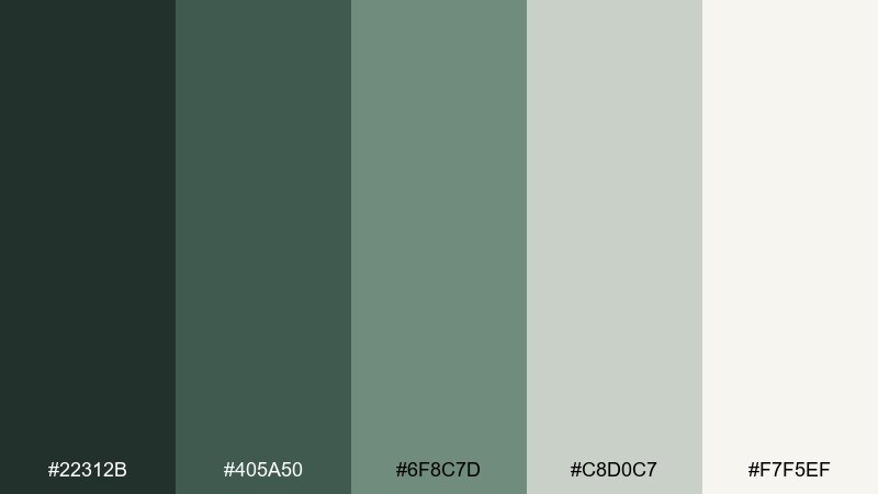
HEX: #22312B #405A50 #6F8C7D #C8D0C7 #F7F5EF
Mood: airy, soft, soothing
Best for: spa flyers and wellness posters
Airy and soothing, it looks like morning mist drifting between trunks. Let the pale tones do most of the work, then use the deeper greens for text and gentle dividers. The mid greens are ideal for icons, badges, or subtle gradients. Tip: keep imagery desaturated so the design stays calm and cohesive.
Image example of woodland mist generated using media.io
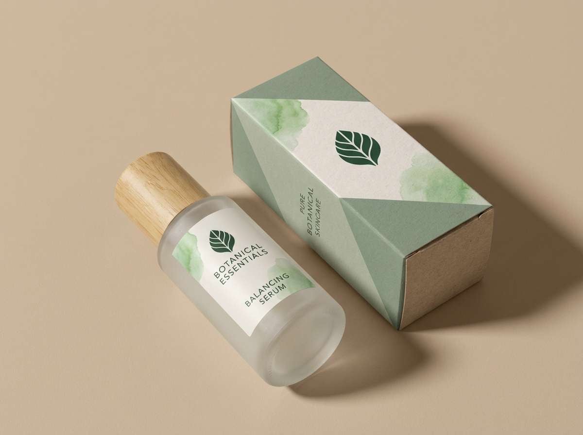
10) Sage Creek
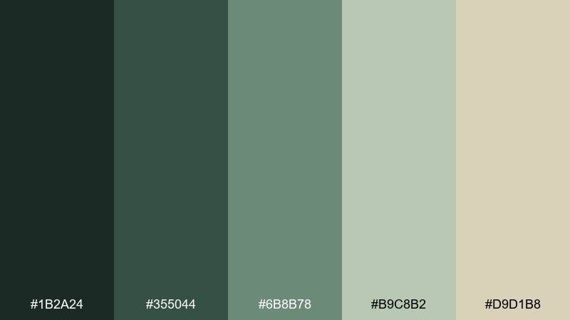
HEX: #1B2A24 #355044 #6B8B78 #B9C8B2 #D9D1B8
Mood: balanced, herbal, approachable
Best for: natural skincare packaging
Balanced and herbal, it brings to mind sage along a creek and smooth river stones. Use the deepest green for your brand mark, then lean on the sage tones for panels and ingredient callouts. The warm beige keeps the look gentle and skin-friendly. Tip: print the mid greens slightly lighter to avoid muddy results on recycled stock.
Image example of sage creek generated using media.io
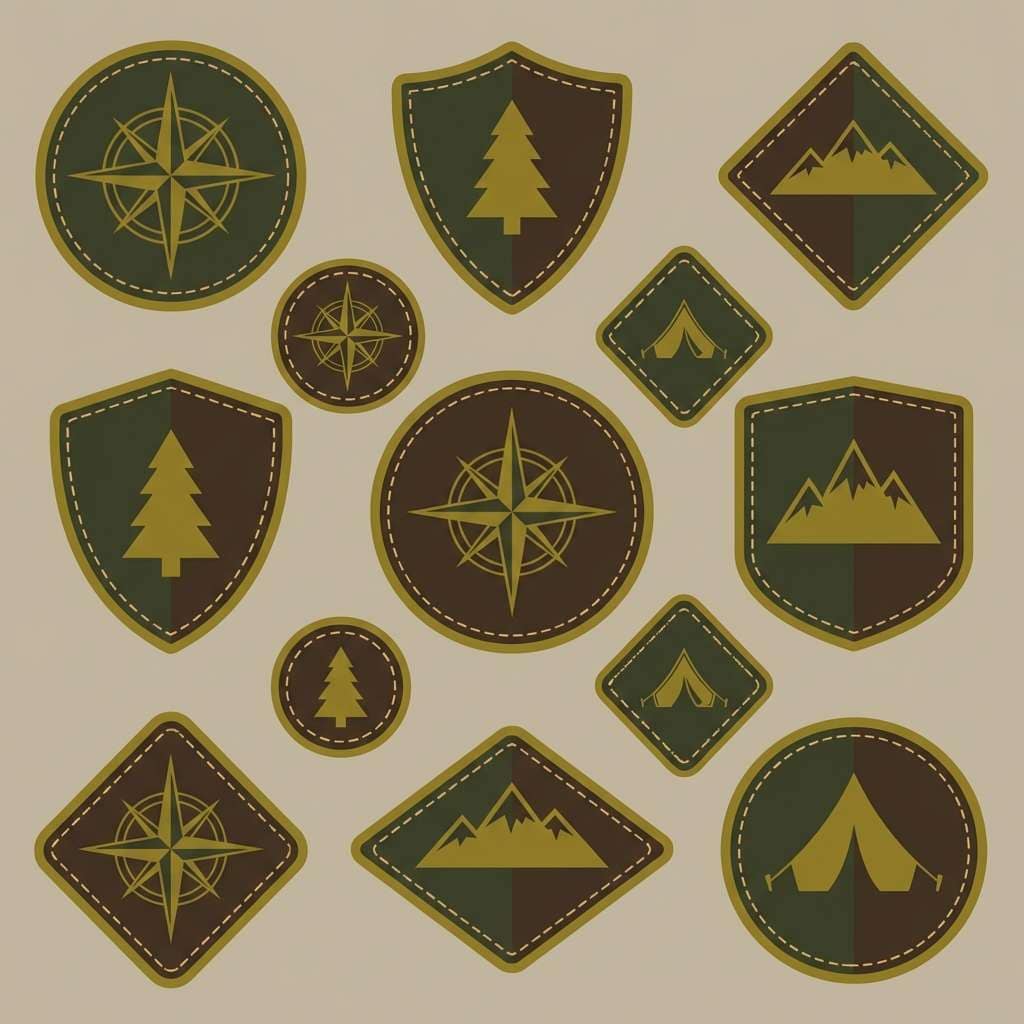
11) Hollow Log
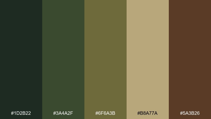
HEX: #1D2B22 #3A4A2F #6F6A3B #B8A77A #5A3B26
Mood: earthy, moody, traditional
Best for: outdoor gear branding and patch designs
Earthy and moody, it suggests hollow logs, damp soil, and old-growth shade. The dark green and brown create a sturdy base for badges and patches, while the olive-gold adds a rugged highlight. Use the tan sparingly for stitching details and small type. Tip: test the palette on fabric textures so contrast stays clear from a distance.
Image example of hollow log generated using media.io
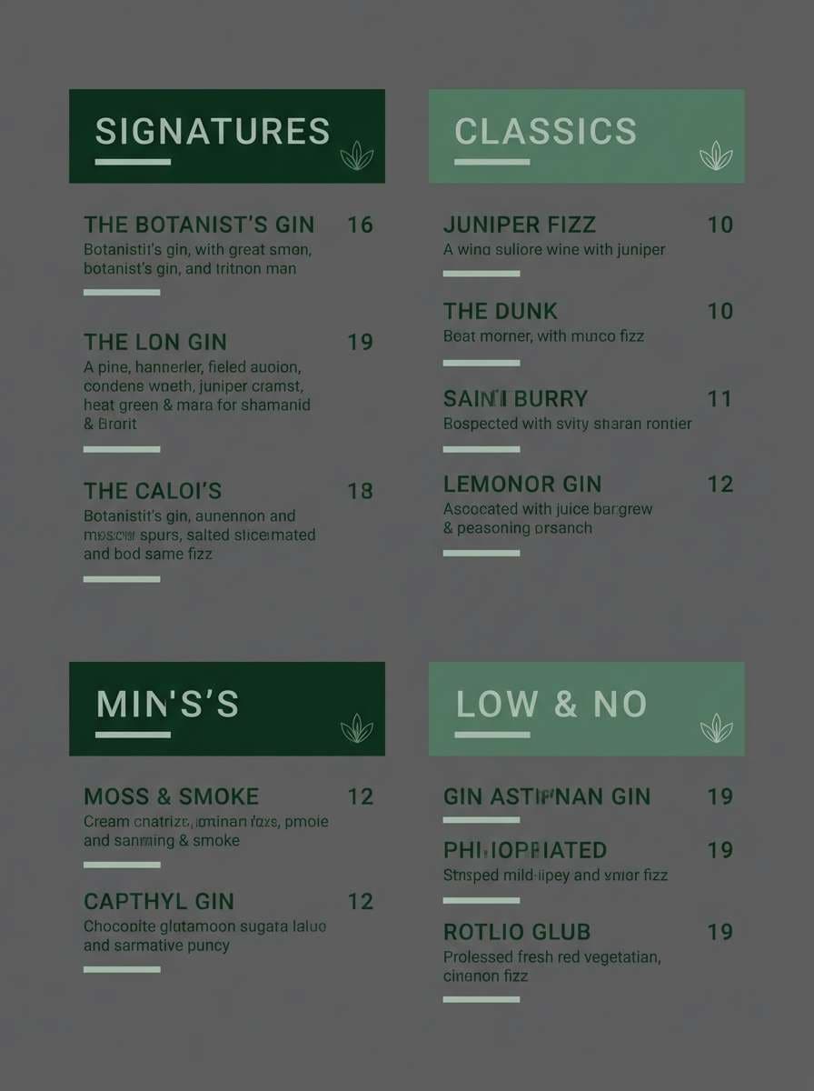
12) Juniper Berry
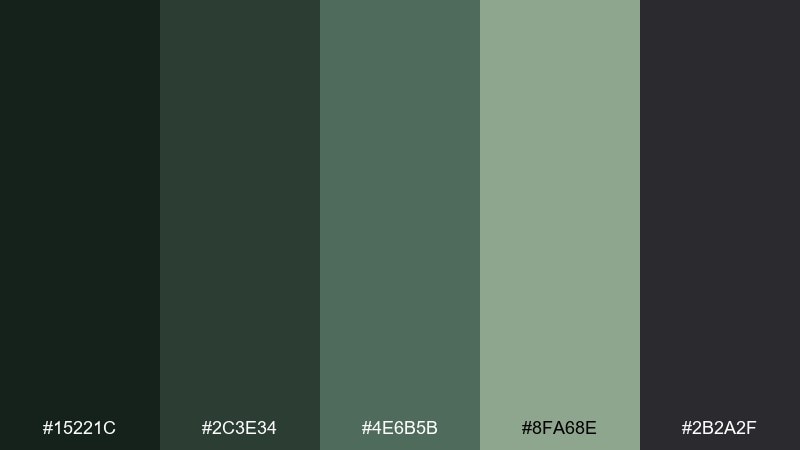
HEX: #15221C #2C3E34 #4E6B5B #8FA68E #2B2A2F
Mood: dark, botanical, modern
Best for: cocktail bar menus and nightlife branding
Dark and botanical, it feels like juniper in a shadowy bar with matte glassware. Use the charcoal as your canvas, then layer in the evergreen tones for typography and section blocks. The pale green-gray is perfect for subtle highlights without losing the night vibe. Tip: keep metallic effects minimal so the greens stay the star.
Image example of juniper berry generated using media.io
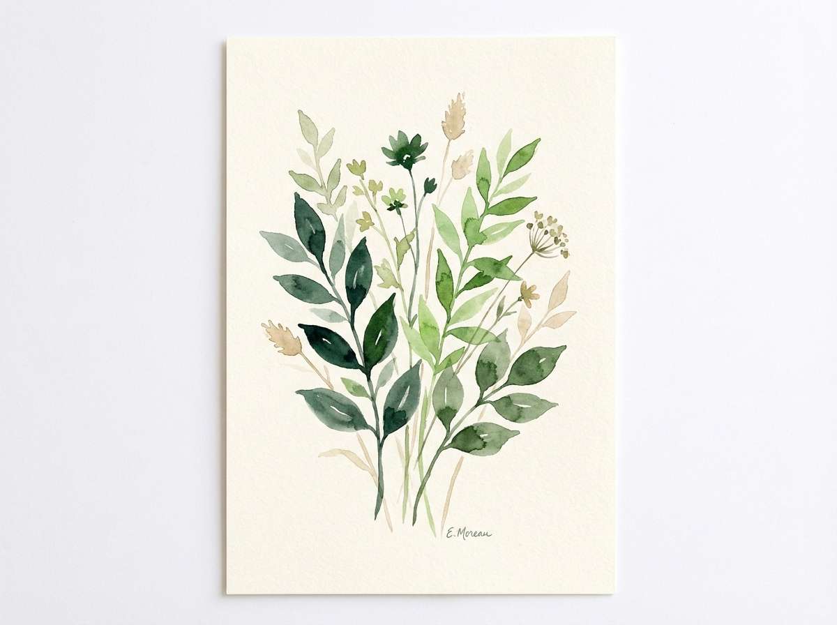
13) Meadow Understory
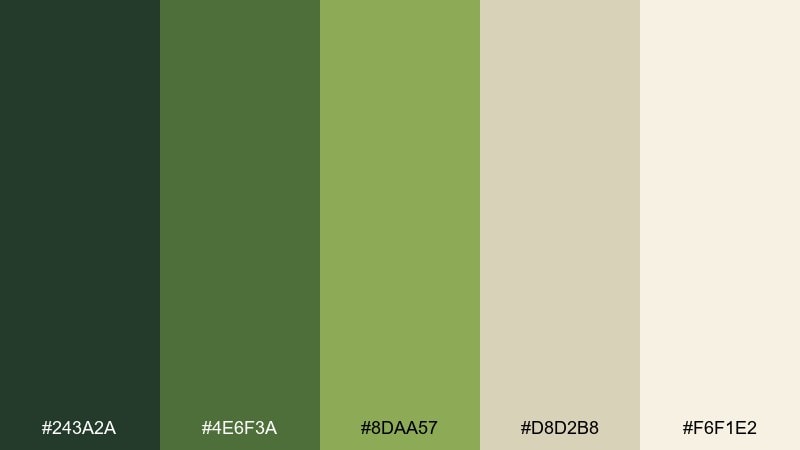
HEX: #243A2A #4E6F3A #8DAA57 #D8D2B8 #F6F1E2
Mood: cheerful, fresh, springlike
Best for: botanical illustrations and stationery
Cheerful and springlike, it brings up new growth, meadow edges, and soft sun on paper. These tones make a friendly pairing for illustrated leaves, florals, and lightweight patterns. Use the darkest green for outlines, the bright greens for fills, and the creams for negative space. Tip: keep gradients subtle to preserve a watercolor feel.
Image example of meadow understory generated using media.io
14) Spruce Tip
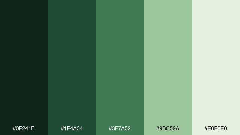
HEX: #0F241B #1F4A34 #3F7A52 #9BC59A #E6F0E0
Mood: bright, lively, optimistic
Best for: startup branding and social graphics
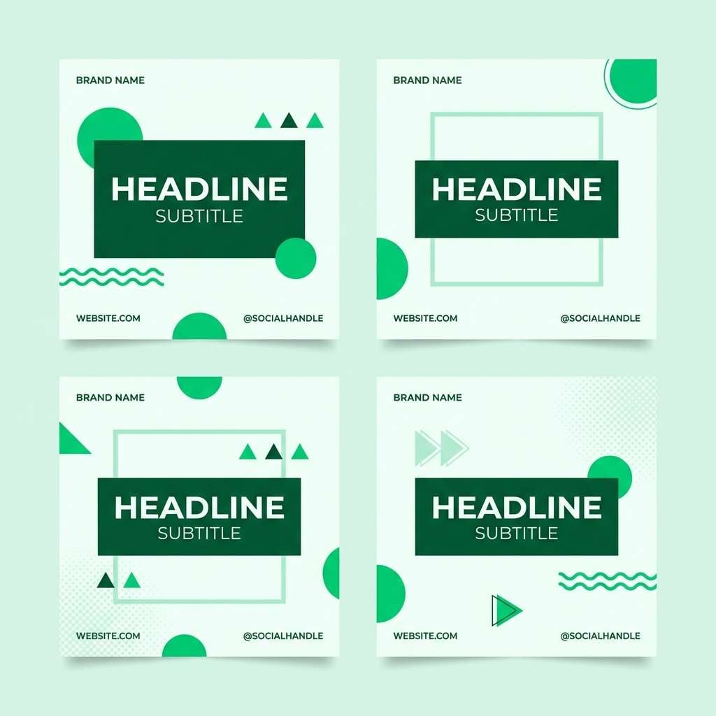
Bright and lively, it feels like spruce tips in early summer with crisp, herbal energy. Anchor headlines in the darkest green, then use the vibrant mid green for buttons and social accents. The minty tones are great for backgrounds and subtle patterns that still read fresh. Tip: keep accent usage consistent so your feeds look instantly recognizable.
Image example of spruce tip generated using media.io
15) Forest Floor
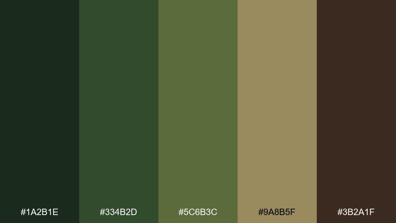
HEX: #1A2B1E #334B2D #5C6B3C #9A8B5F #3B2A1F
Mood: deep, earthy, cinematic
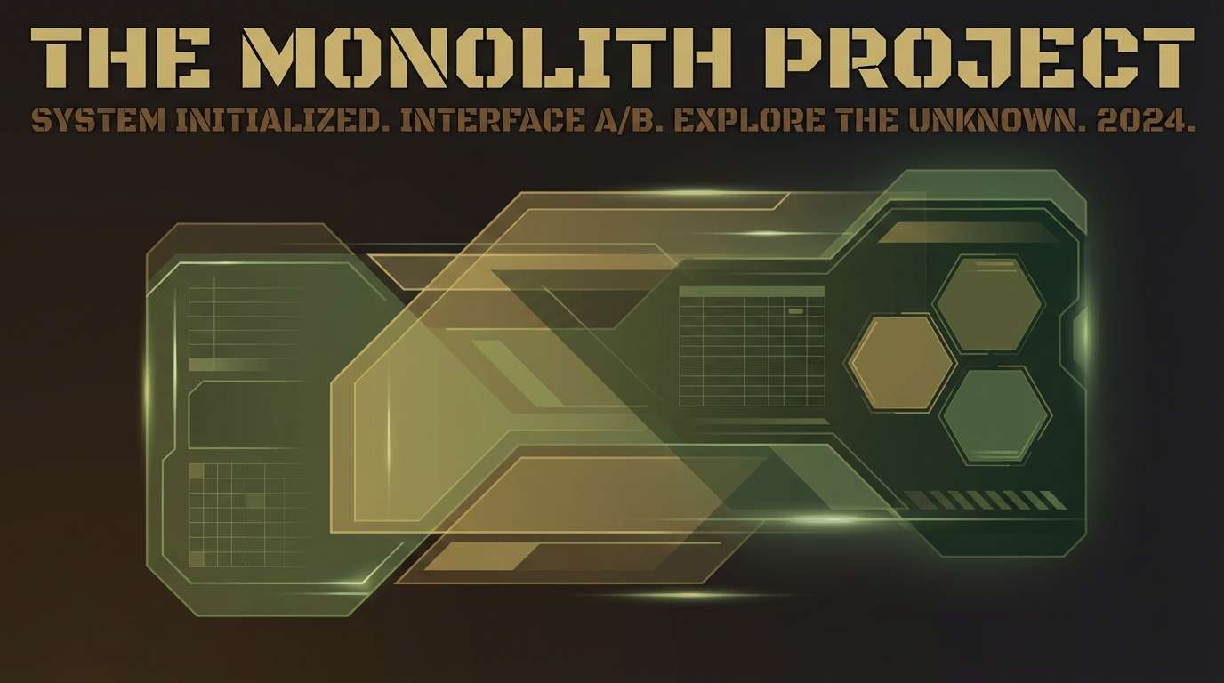
Best for: game UI and cinematic poster design
Deep and earthy, it evokes leaf litter, hidden paths, and a cinematic twilight mood. This forest color palette works best when you push contrast: use the near-black brown for type and frames, then layer olives for depth. The warm khaki makes a great highlight for icons, loot tiers, or small UI states. Tip: apply subtle grain to keep the darker tones from banding on screens.
Image example of forest floor generated using media.io
16) Antique Moss
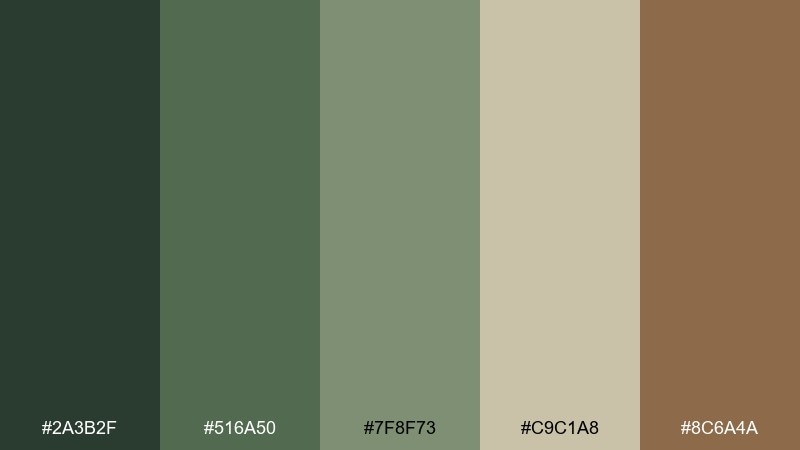
HEX: #2A3B2F #516A50 #7F8F73 #C9C1A8 #8C6A4A
Mood: heritage, soft, timeworn
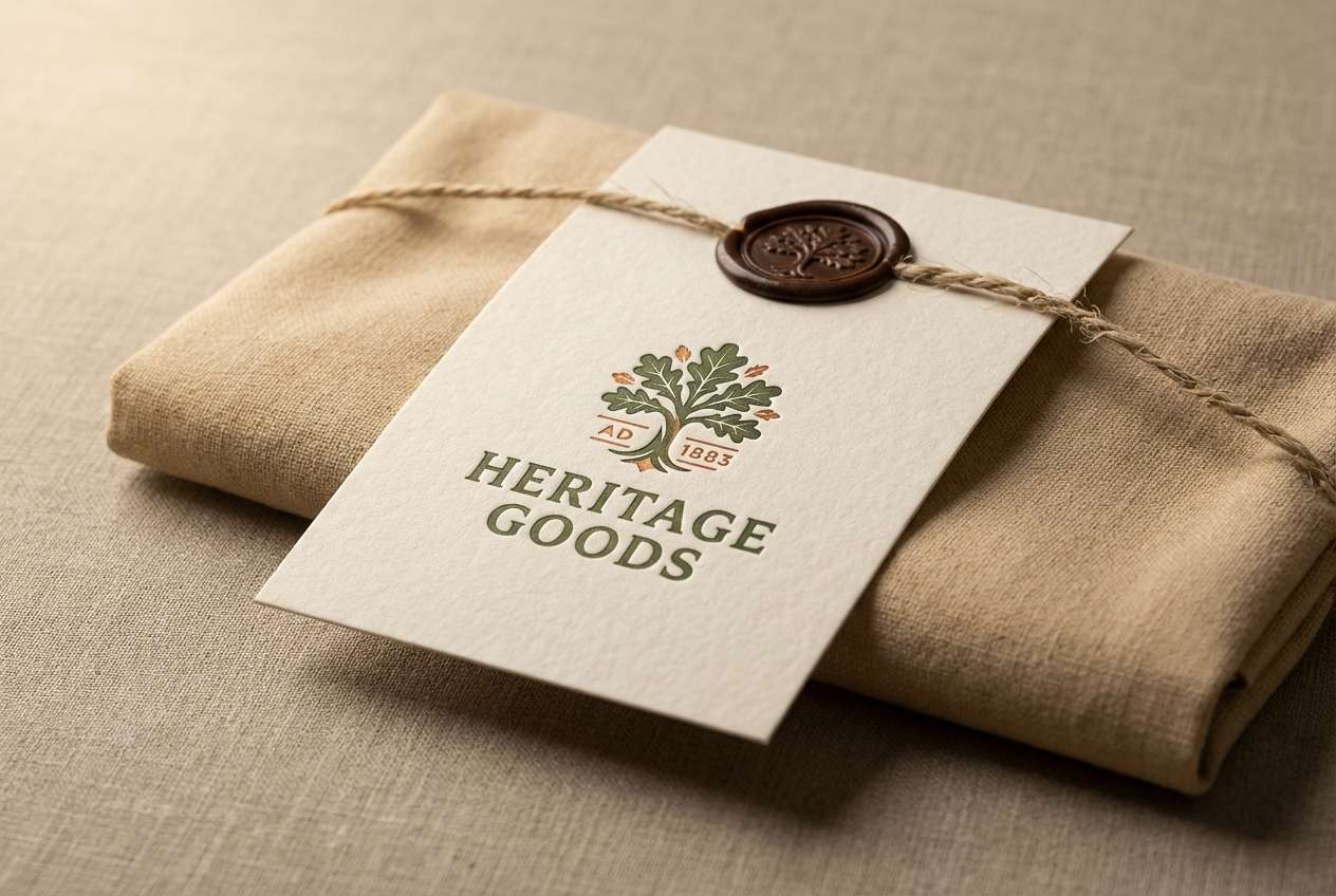
Best for: heritage logos and premium labels
Heritage and timeworn, it feels like antique moss on stone walls and aged parchment. Use the muted greens for a classic emblem, then bring in the warm brown for a stamped accent or seal. The sand neutral is ideal for label backgrounds and textured paper stocks. Tip: try letterpress or embossing to reinforce the vintage vibe.
Image example of antique moss generated using media.io
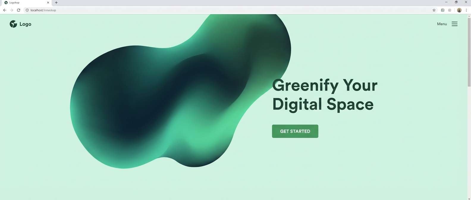
17) Deep Glade
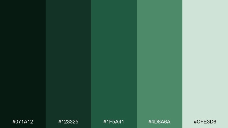
HEX: #071A12 #123325 #1F5A41 #4D8A6A #CFE3D6
Mood: mysterious, lush, modern
Best for: branding systems and web hero gradients
Mysterious and lush, it resembles a deep glade with light catching wet leaves. These forest color combinations shine in gradients, moving from inky green to airy mint. Use the mid greens for links and interactive states, then reserve the light mint for spacious sections. Tip: add a subtle radial glow behind CTAs to guide attention without breaking the mood.
Image example of deep glade generated using media.io
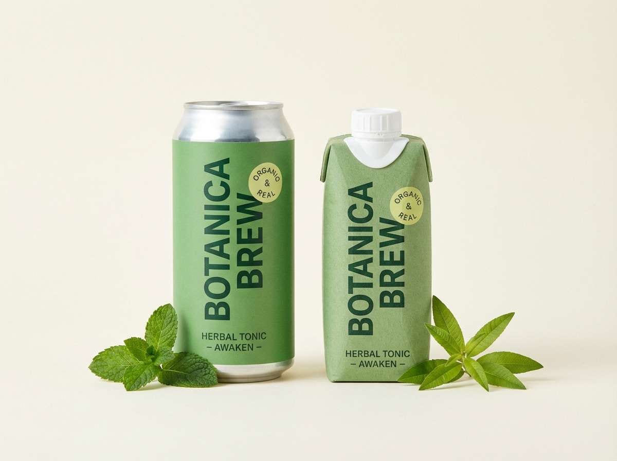
18) Herbal Tonic
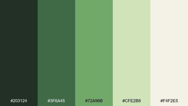
HEX: #203124 #3F6A45 #72A96B #CFE2B8 #F4F2E5
Mood: bright, healthy, uplifting
Best for: beverage packaging and product ads
Bright and healthy, it suggests fresh herbs, tonic fizz, and clean kitchen light. Use the medium green as the hero color, supported by the darker green for typography and structure. The pale yellow-green is perfect for flavor cues, badges, and callouts. Tip: keep the background creamy so the greens stay vibrant without turning neon.
Image example of herbal tonic generated using media.io
19) Dusk in the Pines
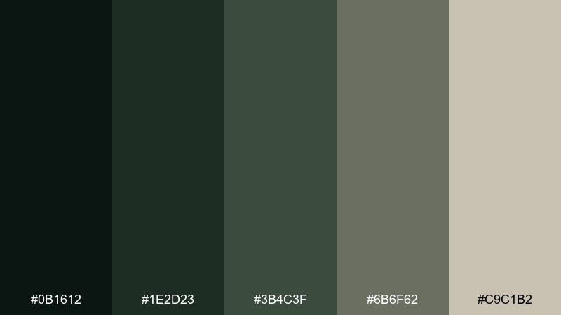
HEX: #0B1612 #1E2D23 #3B4C3F #6B6F62 #C9C1B2
Mood: quiet, moody, minimalist
Best for: portfolio websites and photography branding
Quiet and minimalist, it feels like dusk settling into pines with soft, gray-green air. Treat the near-black green as your main text and navigation color, then layer the mid grays for sections and captions. The warm beige adds a gentle, human touch that keeps the palette from feeling cold. Tip: use large type and simple grids to let the mood breathe.
Image example of dusk in the pines generated using media.io

20) Sunlit Thicket
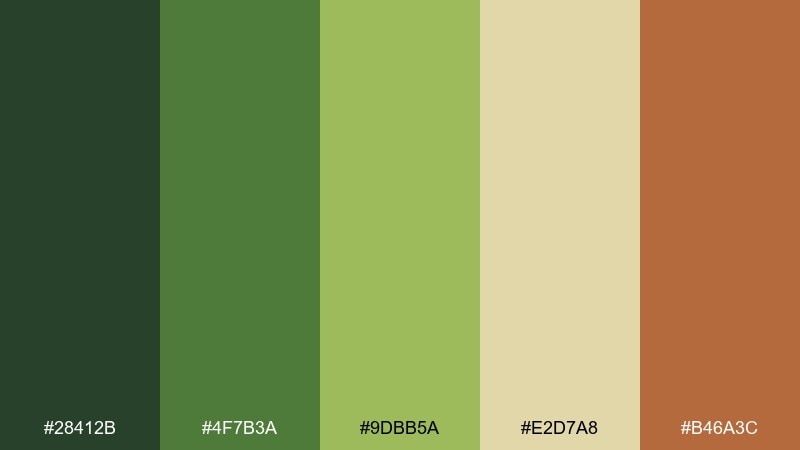
HEX: #28412B #4F7B3A #9DBB5A #E2D7A8 #B46A3C
Mood: warm, vibrant, inviting
Best for: event posters and seasonal campaigns
Warm and inviting, it looks like sunlit leaves with a hint of amber light. For a strong forest color combination, use the deep green for type, the lively greens for big shapes, and the sand tone for background. The orange-brown works as a punchy accent for dates, stickers, or limited-time tags. Tip: keep the accent to one or two elements per layout so it feels intentional.
Image example of sunlit thicket generated using media.io
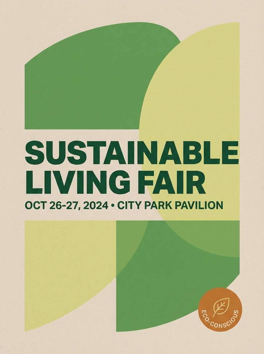
21) Birch Hollow
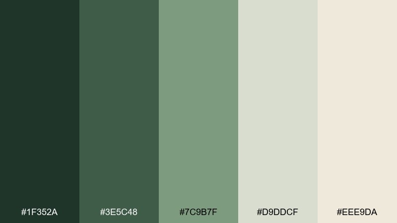
HEX: #1F352A #3E5C48 #7C9B7F #D9DDCF #EEE9DA
Mood: light, Scandinavian, calm
Best for: minimal UI kits and brand guidelines
Light and calm, it recalls birch bark, soft moss, and simple Nordic interiors. This mix supports tidy components, gentle borders, and airy layouts without losing depth. Use the darkest green for type and primary buttons, then let the pale neutrals handle most surfaces. Tip: keep shadows subtle and rely on spacing to define hierarchy.
Image example of birch hollow generated using media.io
22) Bramble Path
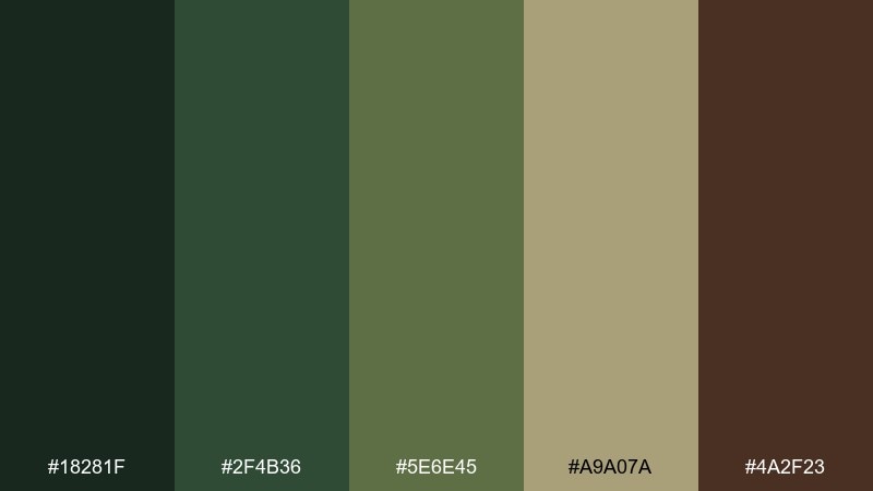
HEX: #18281F #2F4B36 #5E6E45 #A9A07A #4A2F23
Mood: rugged, earthy, adventurous
Best for: outdoor brochure and travel branding
Rugged and adventurous, it evokes a bramble path with dusty boots and late-afternoon shade. The darker greens provide strong structure for headings, while the khaki-gold adds warmth for highlights and route markers. Use the brown for small accents like separators, stamps, or icons. Tip: pair with a condensed headline font for a trail-sign feel.
Image example of bramble path generated using media.io
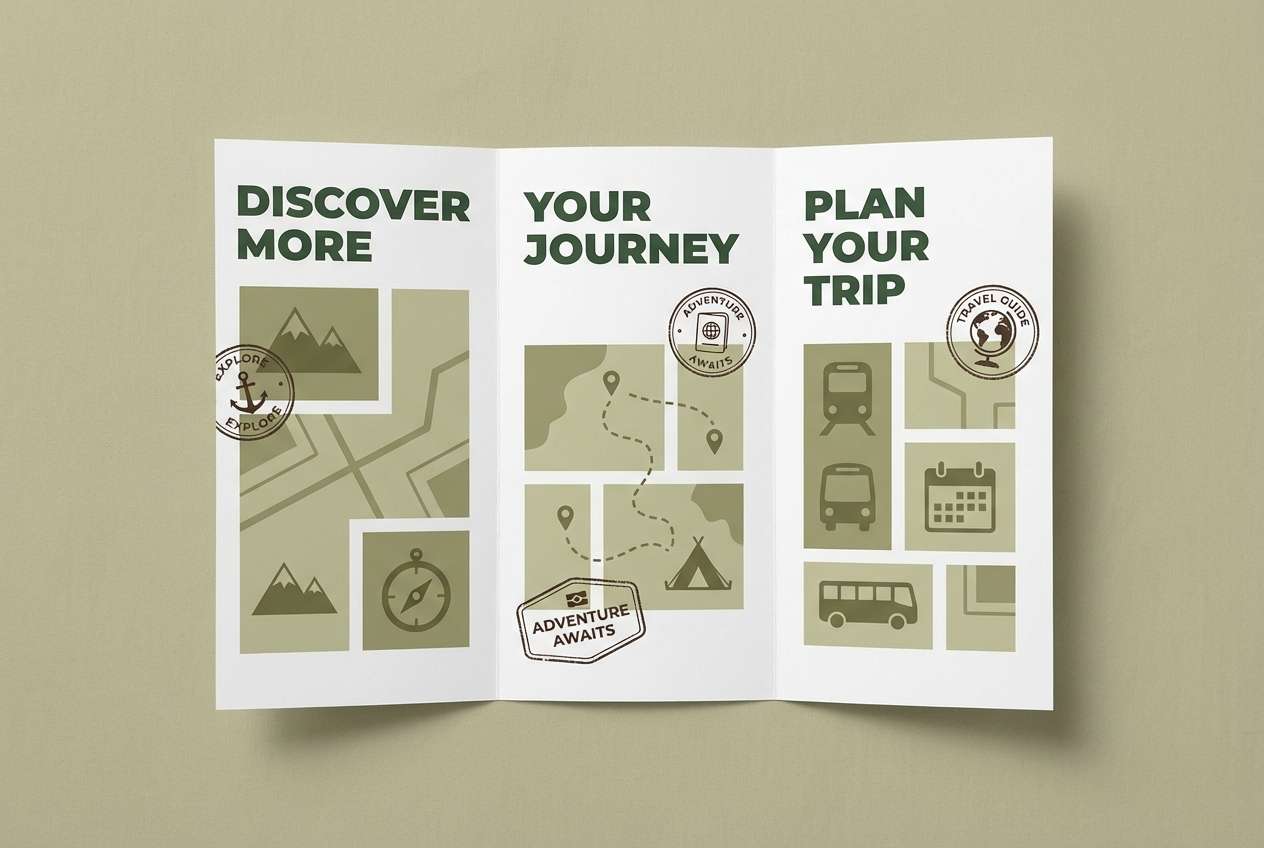
23) Canopy Contrast
HEX: #102018 #1E4A31 #3C7D57 #BFD8C2 #F2F0E7
Mood: fresh, confident, contemporary
Best for: brand refresh and marketing landing pages
Fresh and confident, it feels like sharp canopy shadows against bright sky. These forest color combinations are easy to modernize with clean typography and lots of white space. Use the dark green for navigation, the vivid green for CTAs, and the soft mint for section backgrounds. Tip: keep CTAs consistent in one green so your conversion path stays clear.
Image example of canopy contrast generated using media.io
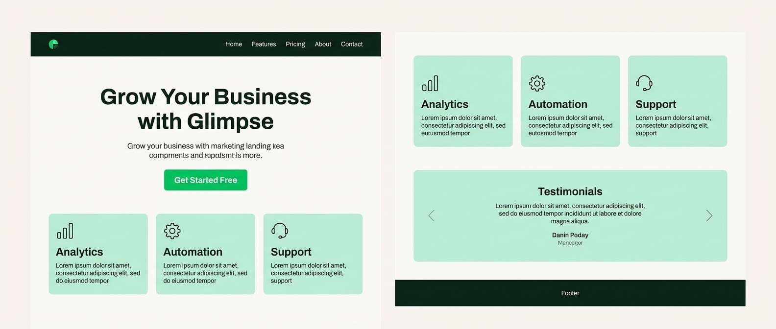
24) Old Growth Reserve
HEX: #0E1B14 #223A2A #3F5D3E #7A8F72 #D7D0BC
Mood: serious, timeless, trustworthy
Best for: nonprofit reports and institutional branding
Serious and timeless, it feels like old-growth shade and steady, trustworthy tradition. A strong forest color palette for reports, it supports clear hierarchy with deep greens for headings and softer greens for charts. The warm neutral keeps long pages readable and print-friendly. Tip: use the light neutral as the main page color and limit dark blocks to section openers.
Image example of old growth reserve generated using media.io
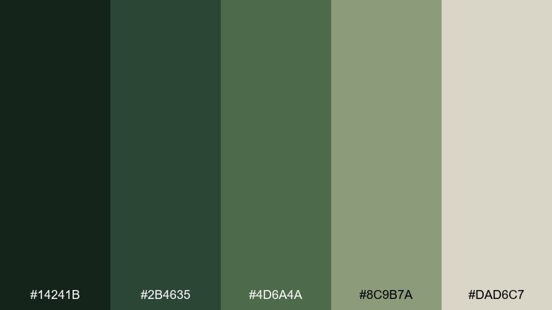
25) Verdant Balance
HEX: #1A3327 #2F5E44 #4F8A60 #9FC4A6 #E6E4D6
Mood: balanced, modern, reassuring
Best for: fintech UI and onboarding flows
Balanced and reassuring, it resembles healthy foliage with a clean, modern finish. Use the darker greens for navigation and key numbers, then bring in the mid green for progress states and success messages. The soft mint supports cards and onboarding steps without feeling clinical. Tip: if you need a warning color, lean on neutrals and icons rather than introducing a new hue.
Image example of verdant balance generated using media.io
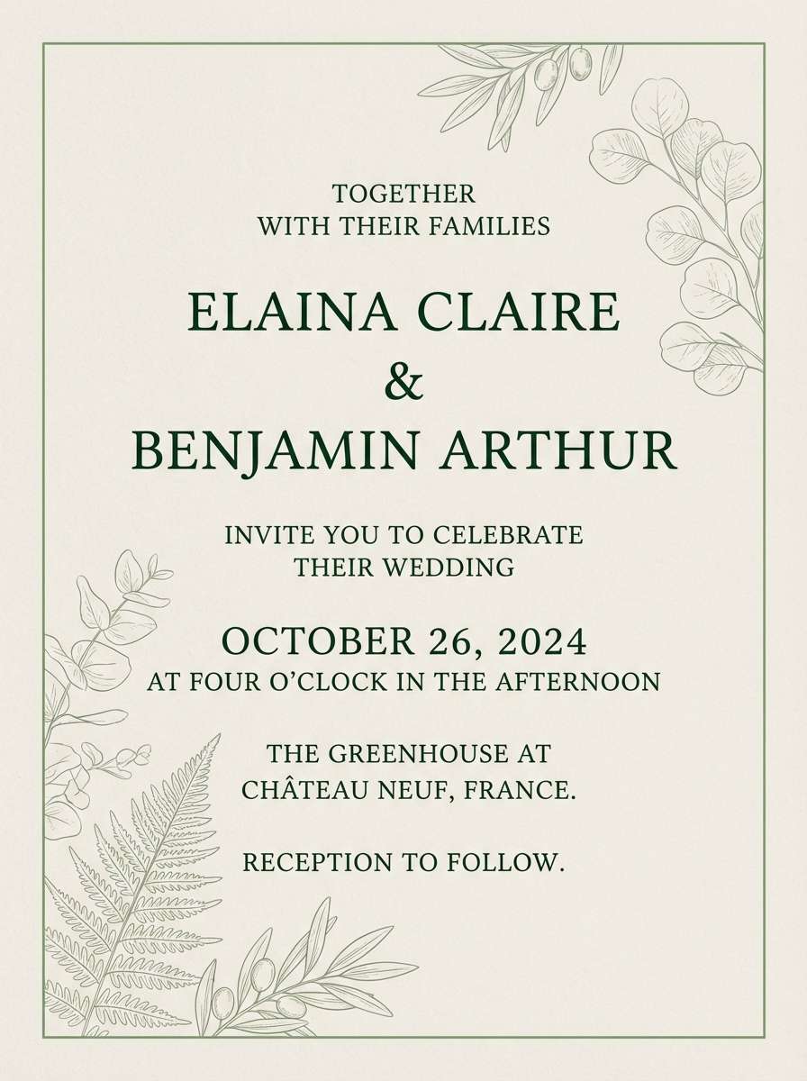
26) Shaded Grove
HEX: #14241B #2B4635 #4D6A4A #8C9B7A #DAD6C7
Mood: soft, mature, understated
Best for: wedding invitations and formal stationery
Soft and understated, it brings to mind a shaded grove and elegant paper goods. As a forest color scheme for stationery, the muted greens look refined with serif type and fine linework. Use the light neutral for the invitation base, and keep the darkest green for names and key details. Tip: add a thin border in the mid green to frame the layout without clutter.
Image example of shaded grove generated using media.io
What Colors Go Well with Forest?
Forest greens pair naturally with warm neutrals like sand, cream, tan, and bark brown—these keep layouts readable and make the greens feel premium rather than overpowering.
For a cooler, modern direction, mix forest with gray-greens, slate, and off-white. This works especially well for UI where you want calm surfaces and clear states.
If you need a bold accent, use it sparingly: muted gold, warm clay, or copper-like orange-browns can add energy without breaking the nature-first mood.
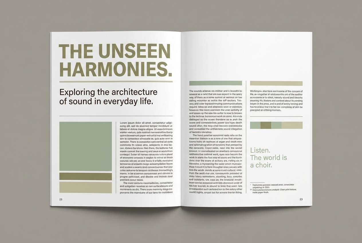
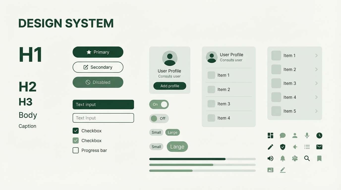
How to Use a Forest Color Palette in Real Designs
When using a Forest Color Palette in real-world design, the key is not to simply apply green everywhere, but to treat the palette as a layered natural system. Deep tones such as pine green or bark brown create stability and structure, mid-tone greens build the main visual body, and lighter warm accents act like sunlight filtering through trees—guiding attention with intention.
A successful forest-inspired design balances mood and functionality. By carefully assigning roles to each color and maintaining clarity in hierarchy and contrast, you can create visuals that feel organic, refined, and highly usable across branding, web design, packaging, and digital interfaces.
- 1) Define a Clear Primary–Secondary–Accent Structure: In practical design, assign clear roles to your colors. Use deep forest greens or earthy browns for large backgrounds and structural areas. Apply mid-tone greens for content sections, cards, or illustrations. Reserve warm accents like amber, golden sunlight, or muted berry for buttons, highlights, and calls to action. Accent colors should guide the eye—not dominate the layout.
- 2) Create Hierarchy Through Value (Lightness), Not Just Hue: Forest palettes often stay within a similar color family. Instead of relying on strong hue contrast, use differences in lightness to establish hierarchy. Darker tones can anchor headers and footers, medium shades define content areas, and lighter, misty greens help separate sections while keeping visual harmony.
- 3) Avoid Oversaturated Backgrounds: Highly saturated green backgrounds can feel artificial. Choose desaturated grey-greens, earthy neutrals, or subtle gradients that mimic natural light filtering through trees. A soft texture or gentle tonal shift can add depth and refinement.
- 4) Assign Clear Meaning to Interactive Elements: Map colors consistently in your design system. Use warm amber or gold for primary actions, muted moss green for secondary buttons, berry tones for warnings, and fresh leaf green for success states. Consistency improves usability and builds intuitive recognition.
- 5) Prioritize Readability Over Atmosphere: Forest palettes tend to lean dark, so ensure sufficient contrast. Avoid colorful body text—use deep neutral grays instead. Headlines can adopt a deep green tone for character, but readability should always come first.
- 6) Balance Organic Colors with Clean Layouts: Pair rich natural tones with structured layouts, generous spacing, and clean typography. This prevents the design from feeling heavy and keeps the overall look modern and polished.
Forest Color Palette FAQs
-
What is a forest color palette?
A forest color palette is a curated set of nature-inspired tones based on deep greens, earthy browns, muted neutrals, and warm sunlight accents. It is designed to evoke calmness, depth, and organic balance, often inspired by trees, moss, soil, and filtered natural light. -
Which forest colors work best for modern UI design?
For UI, use a deep forest green or charcoal-green as a base, soft off-white or warm beige for backgrounds, and a restrained accent like amber or muted gold for buttons and highlights. Keeping greens slightly desaturated helps maintain a clean and contemporary look. -
How do I keep a forest color scheme from feeling too dark?
Balance deep greens with lighter neutrals such as cream, misty sage, or warm gray. Introduce negative space and ensure strong text contrast. Gradients that shift from darker to lighter greens can also mimic natural light and prevent heaviness. -
Are forest palettes suitable for branding?
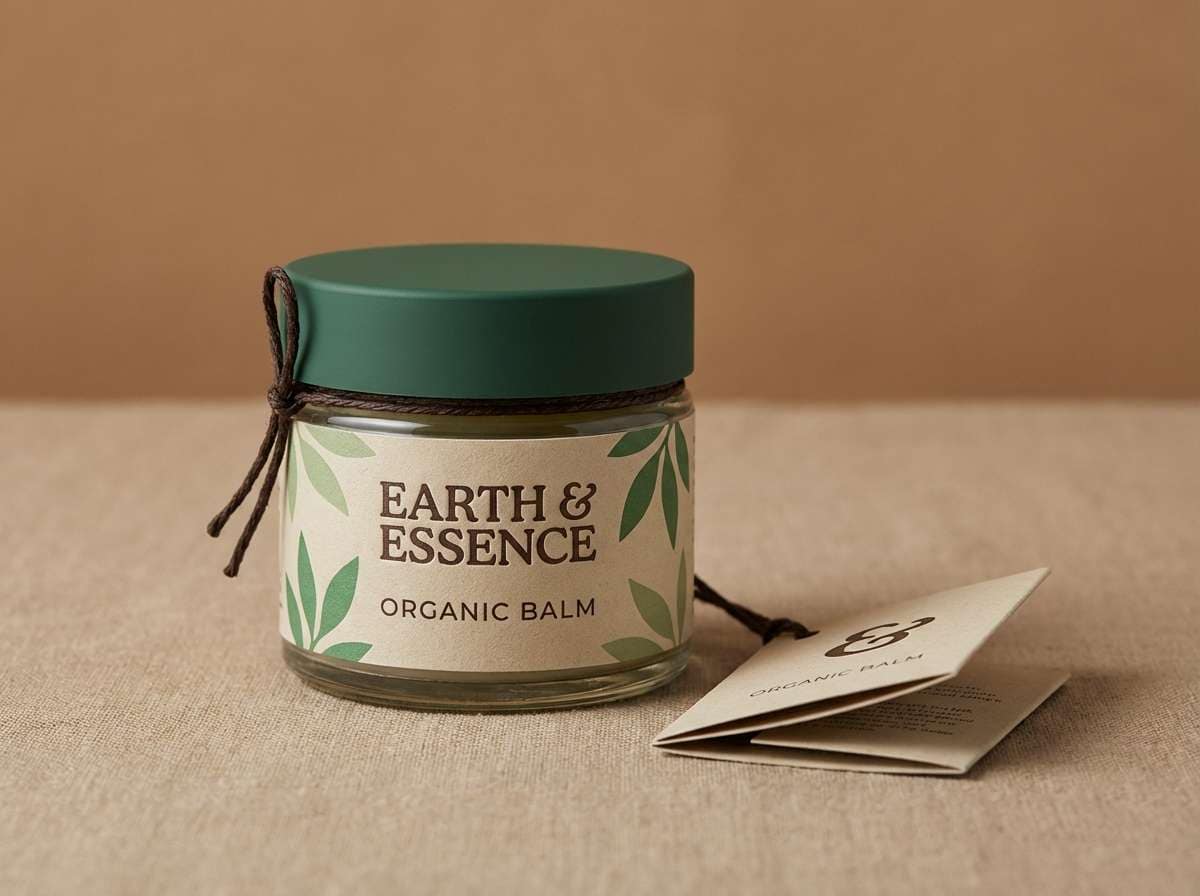
Yes. Forest palettes work especially well for eco-friendly brands, wellness companies, outdoor products, artisanal goods, and premium lifestyle branding. The key is pairing deep greens with refined neutrals or metallic accents to elevate the visual tone. -
What colors pair well with forest green?
Common combinations include forest green + beige (calm and premium), forest green + gold (luxurious and formal), forest green + white (clean and minimal), forest green + terracotta (earthy and warm), and forest green + navy (structured and professional). -
How many colors should a forest palette include?
A practical forest palette usually includes four to six colors: one dark anchor tone, one or two mid-tone greens, one light neutral for balance, and one or two accent colors for emphasis. This structure keeps designs cohesive and functional. -
Can I create forest-inspired visuals using AI prompts?
Yes. When writing prompts, specify elements like “deep pine green,” “moss texture,” “soft golden sunlight,” or “earthy neutral background.” Define the mood (calm, premium, rustic, modern) and adjust only one variable at a time—such as saturation or lighting—to refine the result.
Next: Warm Color Palette


