

Rose tones are one of the easiest ways to make a brand or layout feel human, premium, and approachable without relying on loud color.
From soft blush neutrals to deep rosewood and neon berry, these modern rose color palette ideas come with HEX codes and practical pairing tips for UI, print, and branding.
In this article
- Why Rose Palettes Work So Well
-
- blush satin
- dusty rose linen
- rosewood and cream
- rose gold minimal
- berry rose pop
- mauve twilight
- vintage tea rose
- rose and sage garden
- rosy clay earth
- neon rose nightlife
- soft rose ui
- rose and cocoa comfort
- rose quartz spa
- rose on charcoal
- coral rose sunrise
- rose and navy classic
- rose petal wedding
- rose and olive bistro
- muted rose editorial
- roseberry dessert
- antique rose and brass
- rose mist botanical
- What Colors Go Well with Rose?
- How to Use a Rose Color Palette in Real Designs
- Create Rose Palette Visuals with AI
Why Rose Palettes Work So Well
Rose sits in a sweet spot between red’s energy and neutral warmth, so it can feel emotional and modern at the same time. With the right saturation, it reads as polished rather than “pink.”
It also supports clear hierarchy: light blushes make calming backgrounds, mid-roses create friendly accents, and deep rosewood/charcoal shades anchor typography and contrast.
Because rose blends well with warm neutrals, cool grays, greens, and navies, it adapts easily across branding, UI, and print—especially when you control whitespace and text color.
20+ Rose Color Palette Ideas (with HEX Codes)
1) Blush Satin
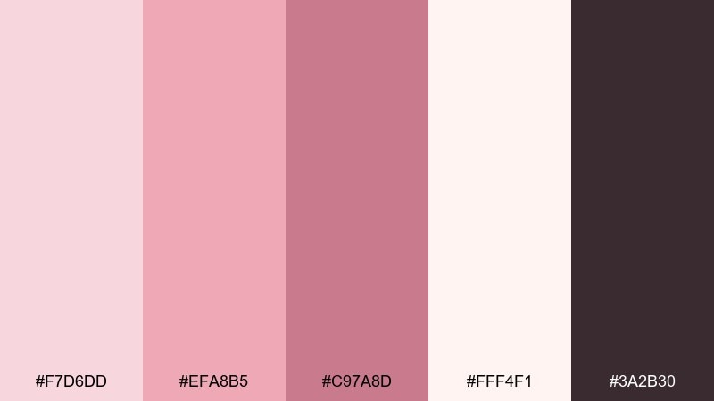
HEX: #F7D6DD #EFA8B5 #C97A8D #FFF4F1 #3A2B30
Mood: soft, romantic, polished
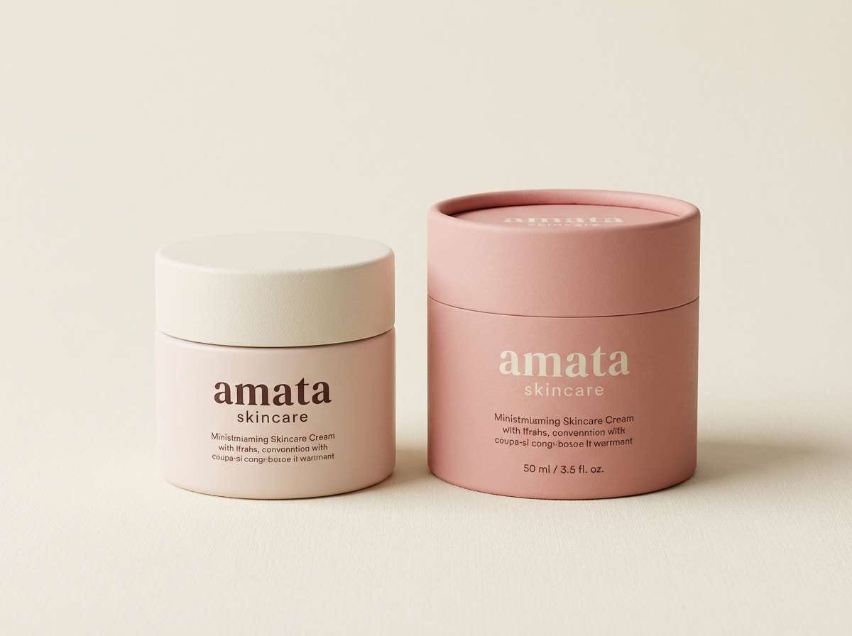
Best for: skincare product packaging
Soft and polished like satin ribbons and fresh petals, these tones feel gentle but intentional. They shine on skincare packaging, beauty labels, and premium gift sets. Pair with warm ivory and a deep cocoa accent to keep the pink from turning sugary. Tip: use the darkest shade for ingredient text to preserve readability on pale backgrounds.
Image example of blush satin generated using media.io
Media.io is an online AI studio for creating and editing video, image, and audio in your browser.

2) Dusty Rose Linen
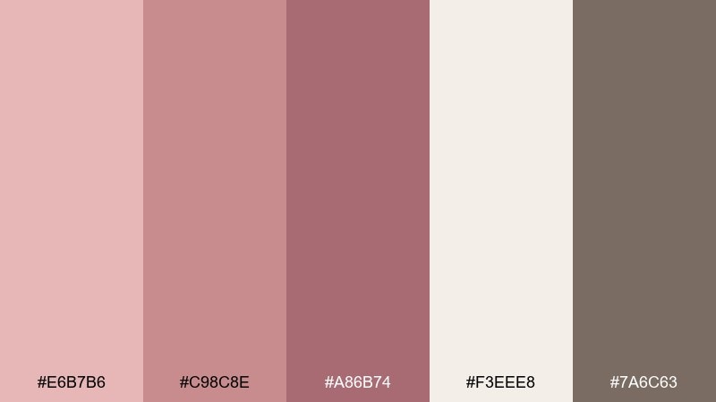
HEX: #E6B7B6 #C98C8E #A86B74 #F3EEE8 #7A6C63
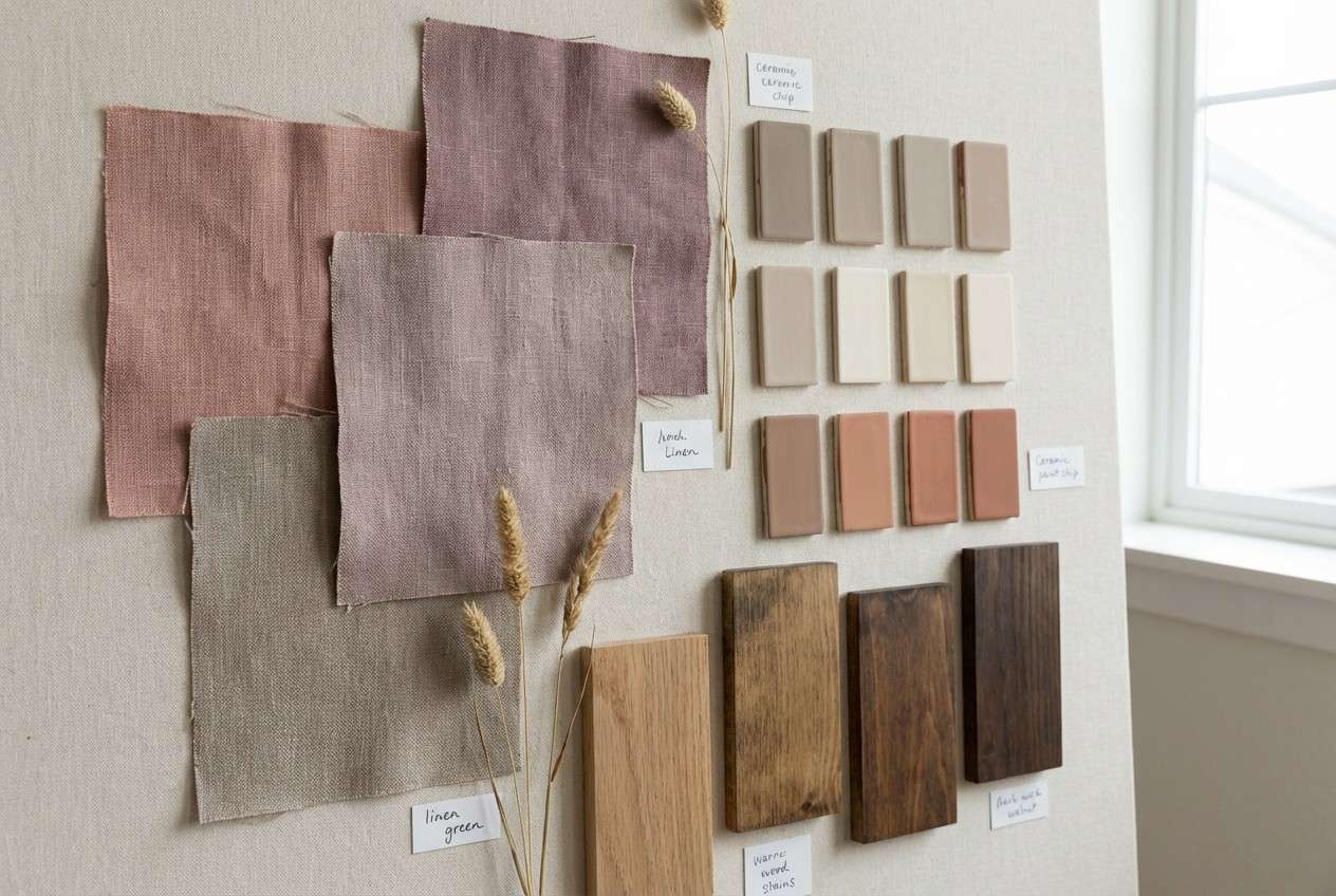
Mood: muted, cozy, organic
Best for: interior mood board
Muted and lived-in like washed linen and antique textiles, this mix brings quiet warmth. It works beautifully for interior mood boards, boutique hotel styling, and calm lifestyle photography edits. Ground it with greige and taupe so the rosy midtones read sophisticated. Tip: keep the lightest neutral as the dominant background and let the dusty shades appear in fabrics and accents.
Image example of dusty rose linen generated using media.io
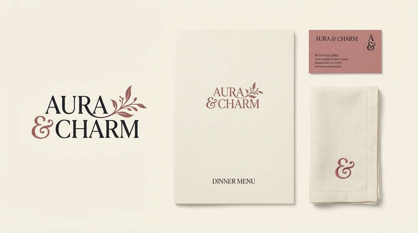
3) Rosewood and Cream
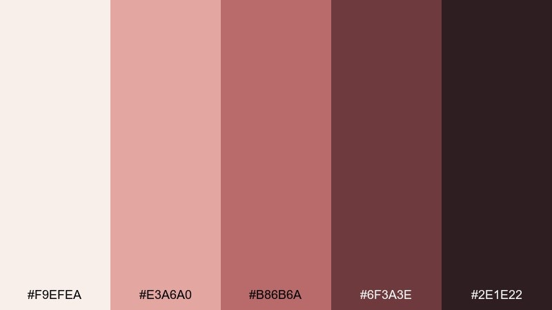
HEX: #F9EFEA #E3A6A0 #B86B6A #6F3A3E #2E1E22
Mood: rich, intimate, elegant
Best for: restaurant brand identity
Rich and intimate like candlelight on dark wood, these shades feel upscale without being loud. They fit restaurant identities, wine labels, and artisanal food branding where warmth matters. Balance the deeper rosewood tones with plenty of cream space and a muted midtone for menus and signage. Tip: reserve the near-black shade for small typographic details and logomarks to avoid a heavy look.
Image example of rosewood and cream generated using media.io
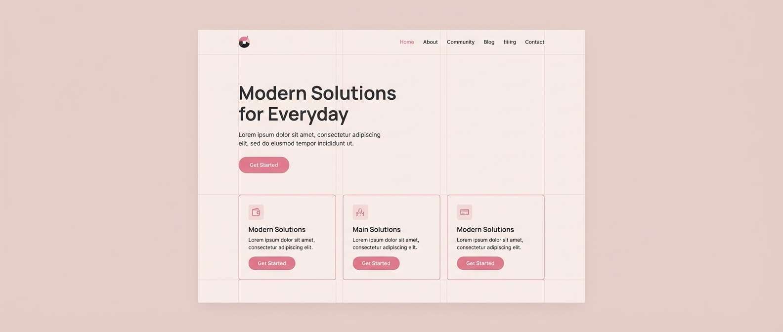
4) Rose Gold Minimal
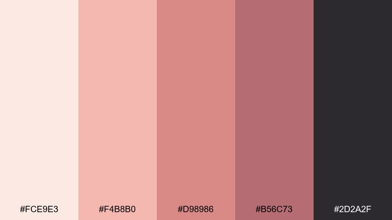
HEX: #FCE9E3 #F4B8B0 #D98986 #B56C73 #2D2A2F
Mood: modern, clean, luminous
Best for: startup landing page UI
Clean and luminous like rose gold light on glass, this set feels modern and confident. As a rose color palette for tech and lifestyle brands, it keeps things warm while still sharp. Pair it with charcoal typography and lots of whitespace to maintain a premium feel. Tip: use the mid pink as the primary CTA color, then soften secondary buttons with the pale blush.
Image example of rose gold minimal generated using media.io
5) Berry Rose Pop
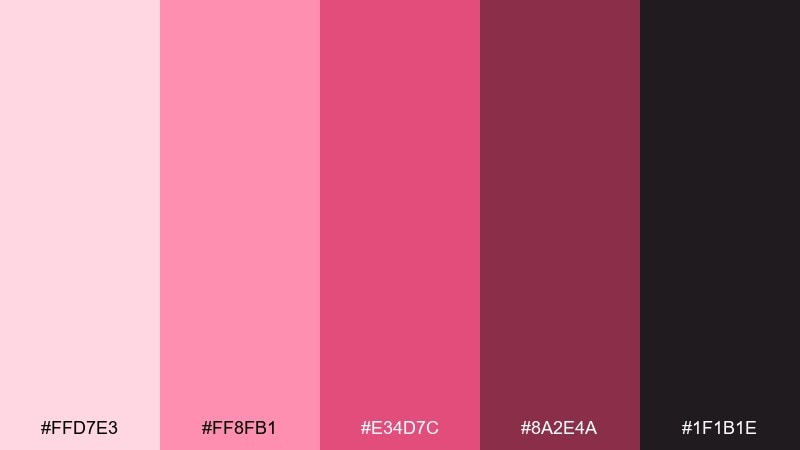
HEX: #FFD7E3 #FF8FB1 #E34D7C #8A2E4A #1F1B1E
Mood: bold, playful, energetic
Best for: social media promo poster
Bold and playful like berry sorbet and neon signage, this lineup is built for attention. Use it for social promos, event announcements, and product drops where you want a punchy vibe. Keep the brightest pink for headlines and highlights, then let the deep berry carry contrast. Tip: add breathing room with a pale blush backdrop so the saturated shades do not overwhelm the layout.
Image example of berry rose pop generated using media.io
6) Mauve Twilight
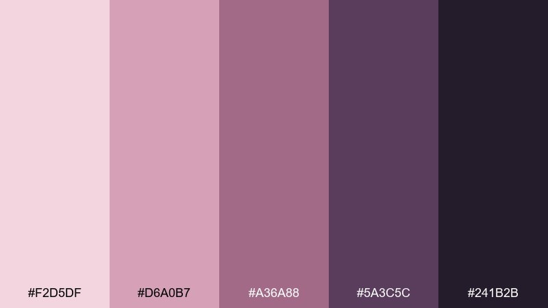
HEX: #F2D5DF #D6A0B7 #A36A88 #5A3C5C #241B2B
Mood: moody, dreamy, sophisticated
Best for: album cover artwork
Moody and dreamy like twilight haze, these mauves lean mysterious and artistic. They work well for album covers, book jackets, and creative portfolios that need depth. Pair the darkest violet with the soft blush to create dramatic hierarchy in type and imagery. Tip: apply a subtle grain texture so the gradients and shadows feel cinematic rather than flat.
Image example of mauve twilight generated using media.io
7) Vintage Tea Rose
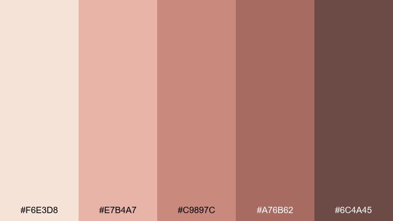
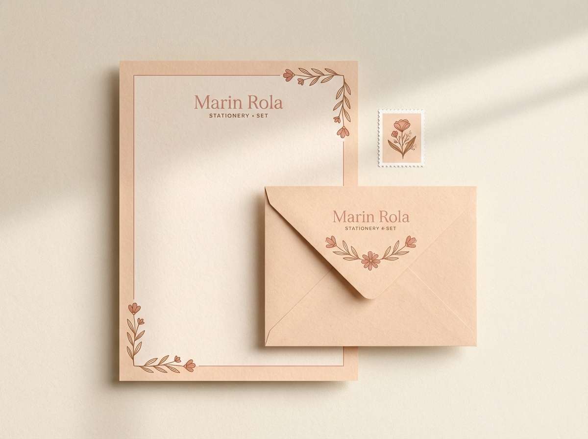
HEX: #F6E3D8 #E7B4A7 #C9897C #A76B62 #6C4A45
Mood: nostalgic, warm, charming
Best for: stationery set
Nostalgic and warm like pressed flowers in an old journal, these hues feel timeless. They suit stationery, thank you cards, and artisan packaging with a handmade touch. Combine with textured paper and warm brown ink to keep it grounded and readable. Tip: use the mid rose as a border or stamp color rather than flooding the entire page.
Image example of vintage tea rose generated using media.io
8) Rose and Sage Garden
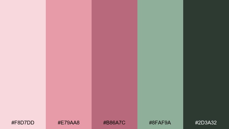
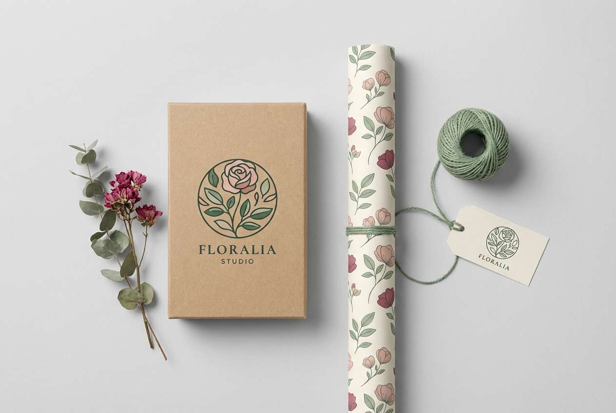
HEX: #F8D7DD #E79AA8 #B86A7C #8FAF9A #2D3A32
Mood: fresh, botanical, balanced
Best for: floral shop logo and wrap
Fresh and botanical like a morning garden, the pinks feel brighter when paired with calm sage. These rose color combinations are ideal for floral shops, wellness brands, and eco-friendly gifting. Let sage carry large surfaces like wrap or patterns, then use the deeper rose for the logo mark. Tip: keep black-green for fine linework so the design stays crisp on light paper.
Image example of rose and sage garden generated using media.io
9) Rosy Clay Earth
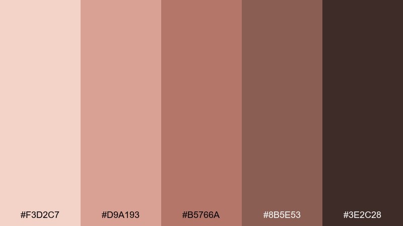
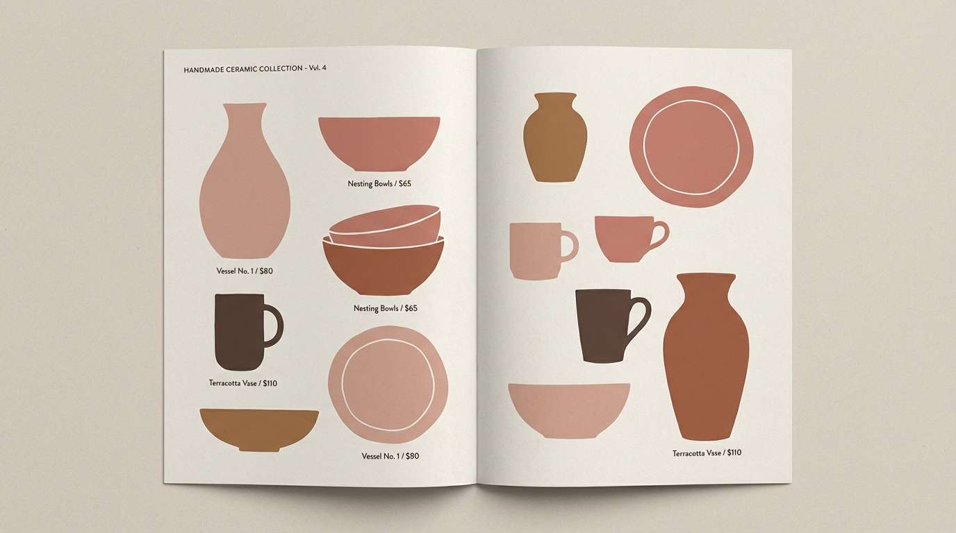
HEX: #F3D2C7 #D9A193 #B5766A #8B5E53 #3E2C28
Mood: earthy, grounded, artisanal
Best for: ceramic product catalog
Earthy and grounded like sun-baked clay, these tones feel handmade and tactile. They are great for ceramic catalogs, craft marketplaces, and rustic product photography. Pair with natural textures like stone, kraft paper, and matte finishes to amplify the artisanal vibe. Tip: use the dark brown sparingly for headings and pricing to keep pages airy.
Image example of rosy clay earth generated using media.io
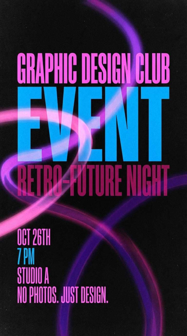
10) Neon Rose Nightlife
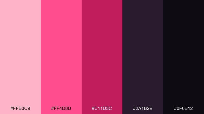
HEX: #FFB3C9 #FF4D8D #C11D5C #2A1B2E #0F0B12
Mood: electric, edgy, nightlife
Best for: club event flyer
Electric and edgy like city lights after midnight, this set thrives on contrast. It is perfect for club flyers, music events, and fashion drops that need instant impact. Use the near-black base for the background, then let the neon pinks glow in typography and shapes. Tip: add a subtle spotlight gradient behind key text to guide the eye without adding new colors.
Image example of neon rose nightlife generated using media.io
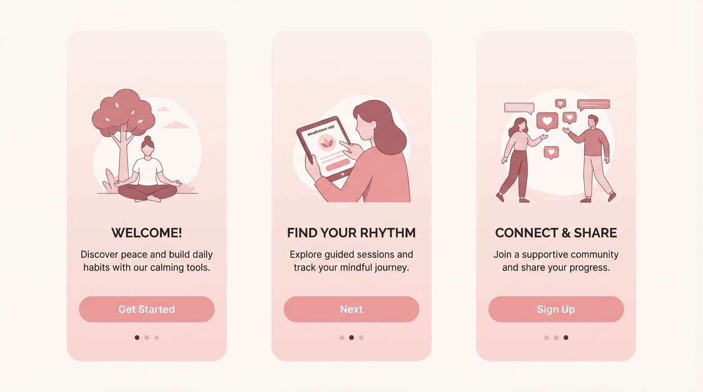
11) Soft Rose UI
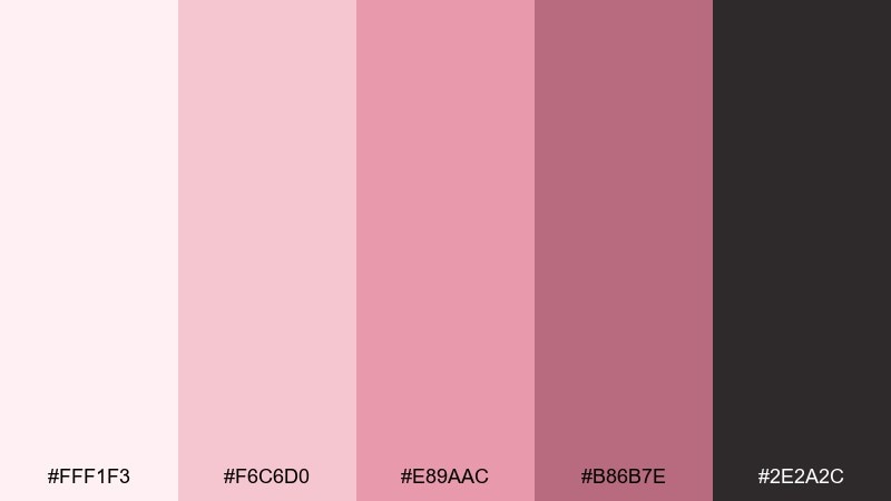
HEX: #FFF1F3 #F6C6D0 #E89AAC #B86B7E #2E2A2C
Mood: friendly, airy, approachable
Best for: mobile app onboarding screens
Friendly and airy like a soft glow on frosted glass, these shades feel welcoming. They fit onboarding screens, signup flows, and health apps where calm matters. Use the light blush as the canvas, then assign the mid pink to buttons and progress indicators. Tip: keep body text in the charcoal tone and meet contrast guidelines before final export.
Image example of soft rose ui generated using media.io
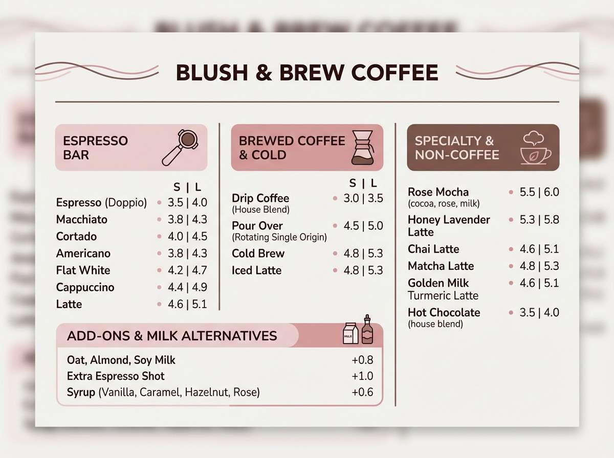
12) Rose and Cocoa Comfort
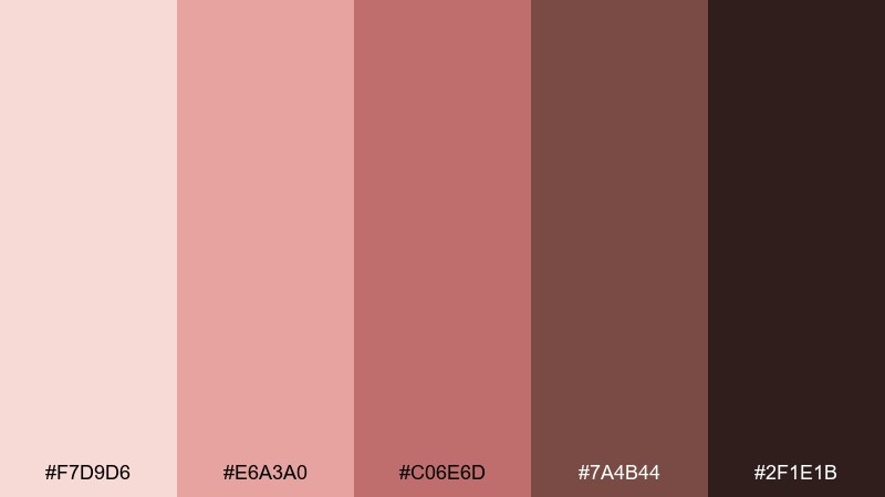
HEX: #F7D9D6 #E6A3A0 #C06E6D #7A4B44 #2F1E1B
Mood: cozy, warm, comforting
Best for: coffee shop menu design
Cozy and comforting like a warm latte with cinnamon, this mix feels inviting. It works for coffee shop menus, bakery signage, and seasonal promotions. Pair the rosy mids with cocoa browns for an appetizing contrast that still feels soft. Tip: keep backgrounds light and use the darkest espresso tone for prices and small details.
Image example of rose and cocoa comfort generated using media.io
13) Rose Quartz Spa
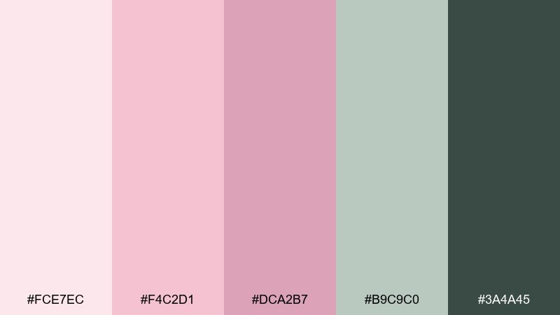
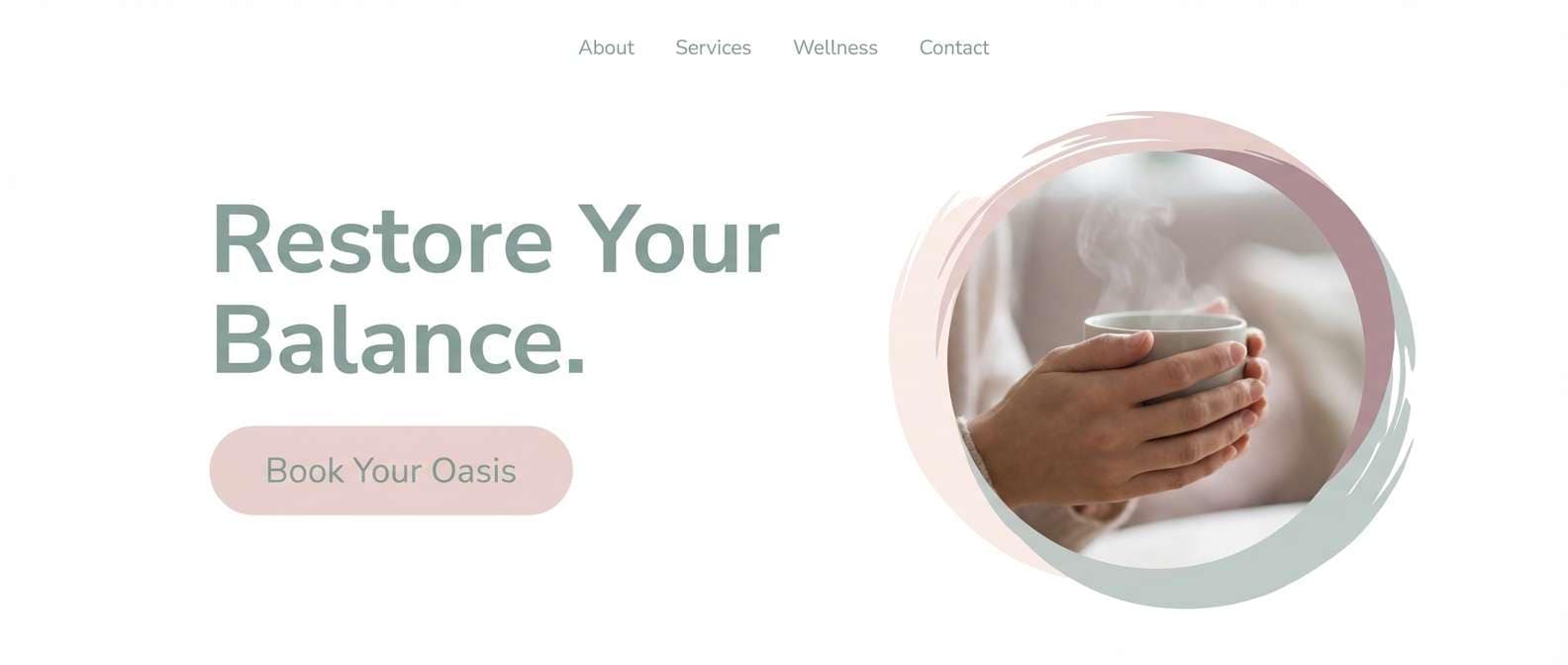
HEX: #FCE7EC #F4C2D1 #DCA2B7 #B9C9C0 #3A4A45
Mood: calm, clean, restorative
Best for: spa website hero section
Calm and restorative like steamed towels and mineral water, these tones feel clean and soothing. Use them for spa websites, wellness newsletters, and appointment booking pages. The cool green-gray keeps the pinks balanced, especially when paired with crisp white space. Tip: reserve the darkest teal-gray for navigation and small UI icons to maintain a tranquil look.
Image example of rose quartz spa generated using media.io
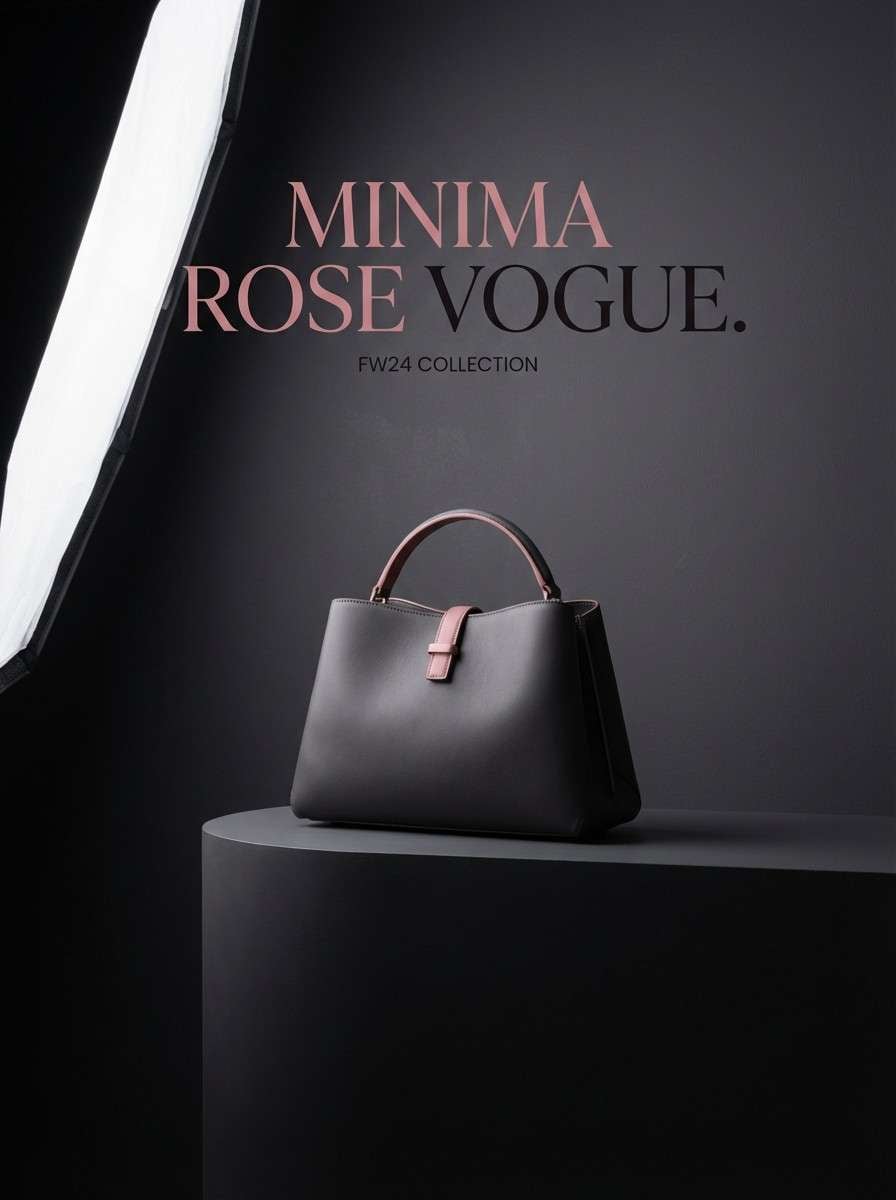
14) Rose on Charcoal
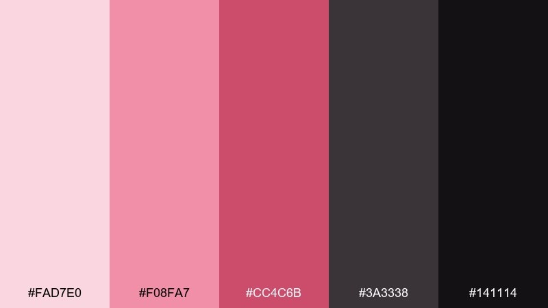
HEX: #FAD7E0 #F08FA7 #CC4C6B #3A3338 #141114
Mood: dramatic, modern, high-contrast
Best for: fashion product ad
Dramatic and modern like runway lighting, this high-contrast pairing feels sharp and editorial. It is built for fashion ads, bold lookbooks, and premium product launches. Keep charcoal as the base and use the brighter pink for badges, buttons, or key callouts. Tip: limit the mid reds to one or two focal spots to avoid a cluttered feel in the rose color combinations.
Image example of rose on charcoal generated using media.io
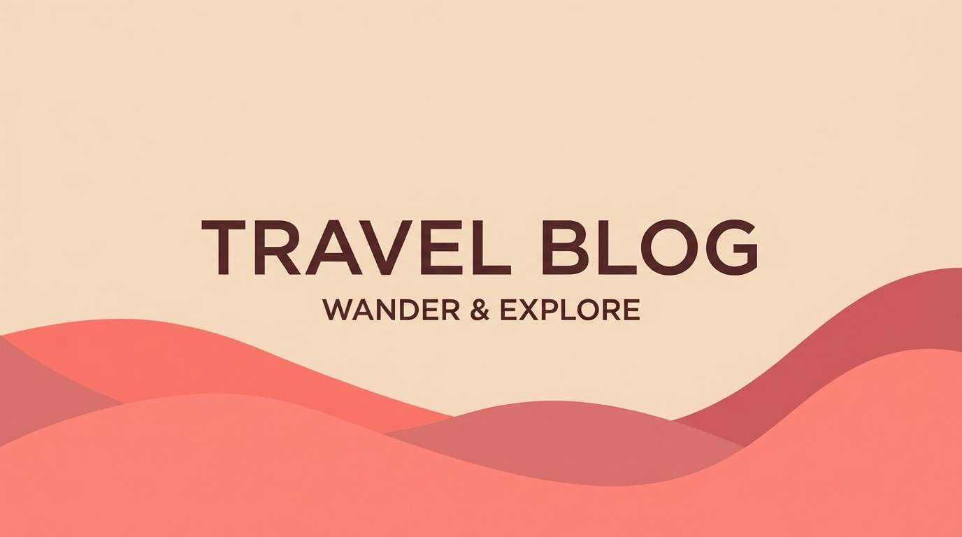
15) Coral Rose Sunrise
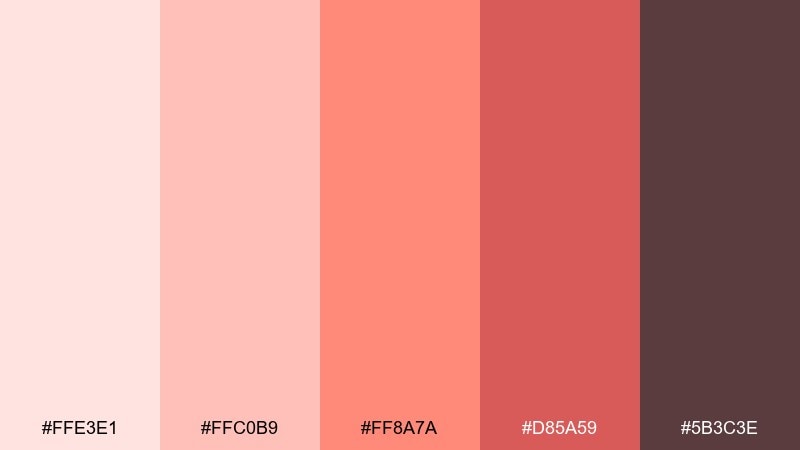
HEX: #FFE3E1 #FFC0B9 #FF8A7A #D85A59 #5B3C3E
Mood: optimistic, sunny, uplifting
Best for: travel blog header
Optimistic and sunny like a pastel sunrise, these coral-leaning pinks feel bright and friendly. They are great for travel blog headers, lifestyle banners, and creator thumbnails. Pair with warm neutrals and a deep cocoa for text so the warm hues stay legible. Tip: use a soft gradient from the lightest shade to coral for a natural sky-like backdrop.
Image example of coral rose sunrise generated using media.io
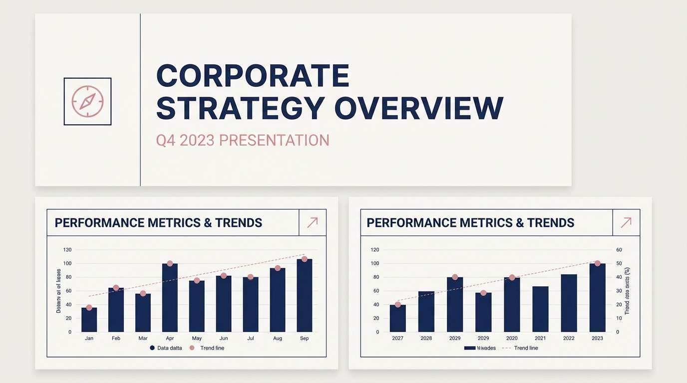
16) Rose and Navy Classic
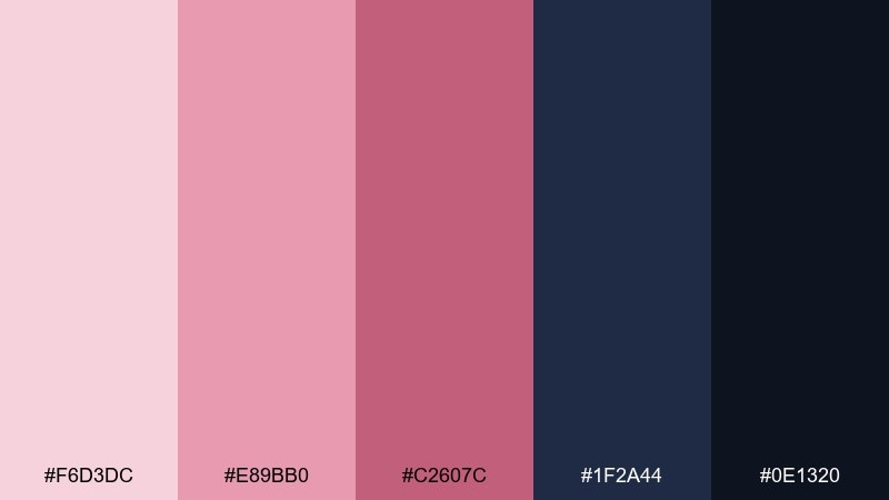
HEX: #F6D3DC #E89BB0 #C2607C #1F2A44 #0E1320
Mood: classic, confident, refined
Best for: corporate presentation deck
Classic and confident like tailored suiting with a soft pocket square, this mix feels refined. It works for corporate decks, consulting brands, and professional portfolios that still want warmth. Use navy for structure in charts and headers, then bring in pink as highlights and section dividers. Tip: keep slide backgrounds light so the accent colors do not fight for attention.
Image example of rose and navy classic generated using media.io
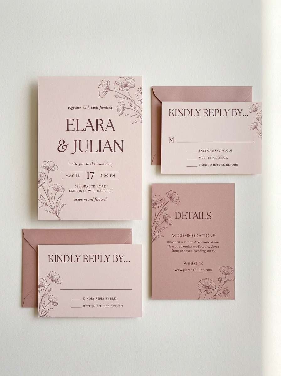
17) Rose Petal Wedding
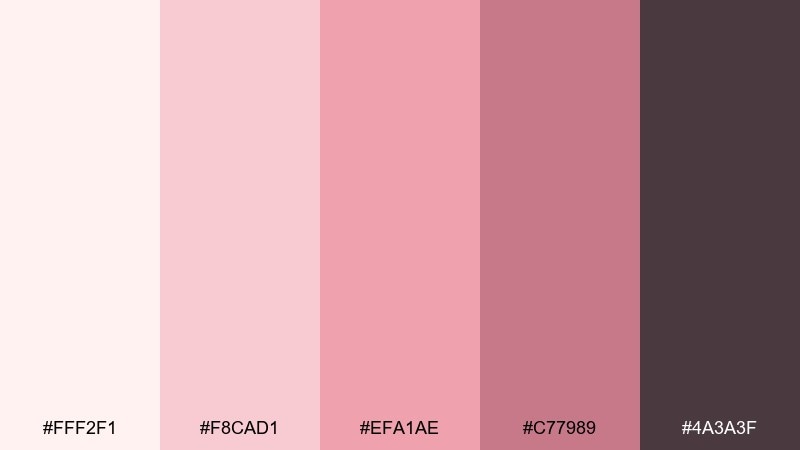
HEX: #FFF2F1 #F8CAD1 #EFA1AE #C77989 #4A3A3F
Mood: romantic, delicate, celebratory
Best for: wedding invitation suite
Romantic and delicate like scattered petals, these tones feel intimate and celebratory. As a rose color palette for weddings, it pairs beautifully with soft paper textures and elegant serif type. Balance the sweet pinks with a smoky plum-brown for names, dates, and RSVP details. Tip: add subtle line florals in the lightest shade so the layout stays airy and premium.
Image example of rose petal wedding generated using media.io
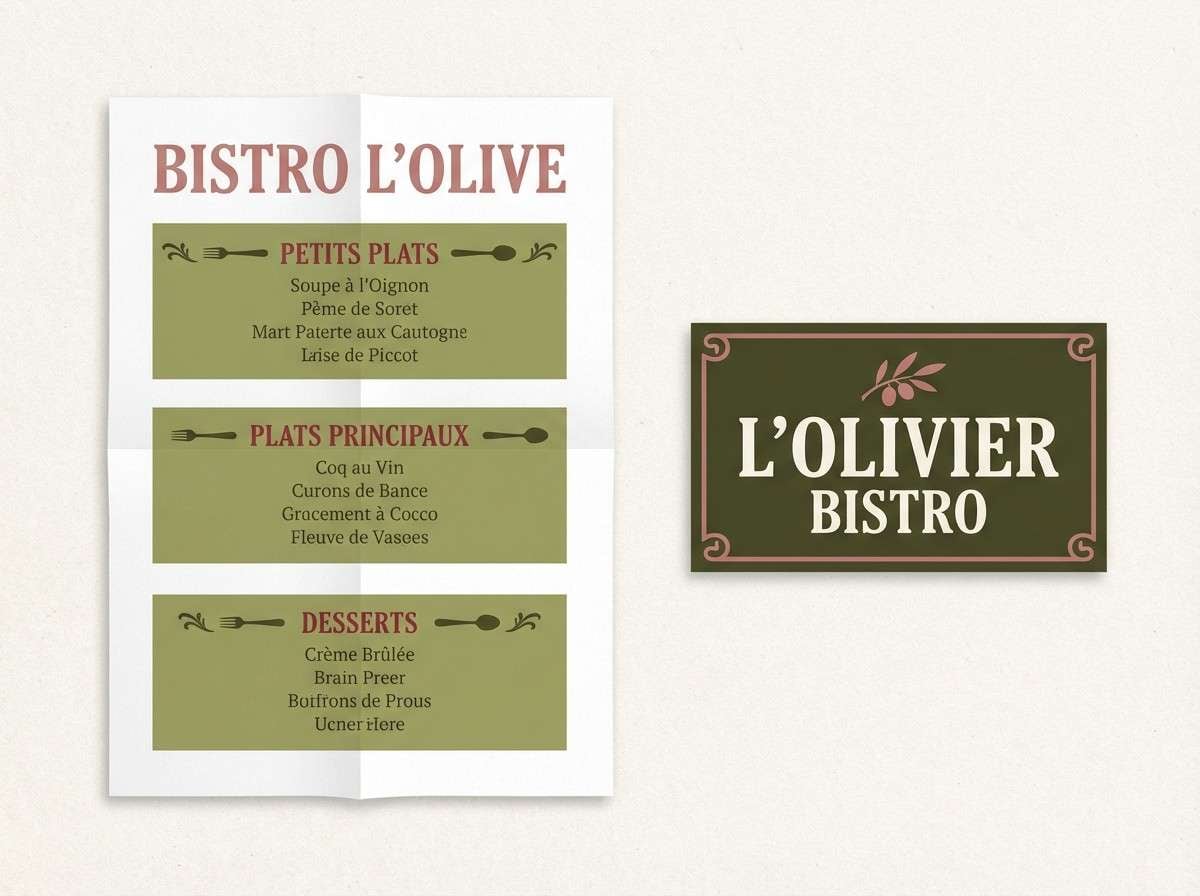
18) Rose and Olive Bistro
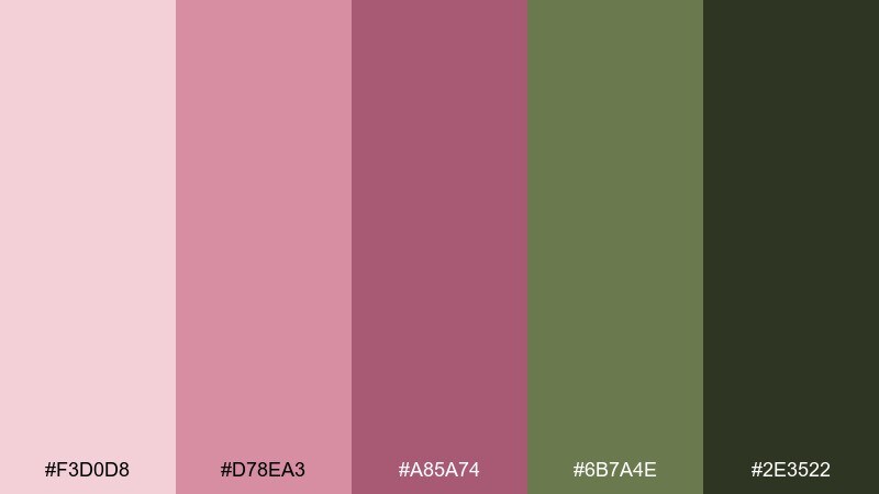
HEX: #F3D0D8 #D78EA3 #A85A74 #6B7A4E #2E3522
Mood: earthy, chic, European
Best for: bistro menu and signage
Earthy and chic like a small bistro with vintage tiles, this pairing feels stylish and grounded. The olive greens keep the pinks mature, making it great for menus, signage, and food packaging. Use olive as a background block and bring rose in for section headers or icons. Tip: test color on uncoated paper stock, since greens and pinks can shift in print.
Image example of rose and olive bistro generated using media.io
19) Muted Rose Editorial
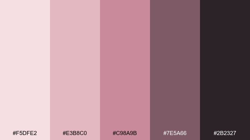
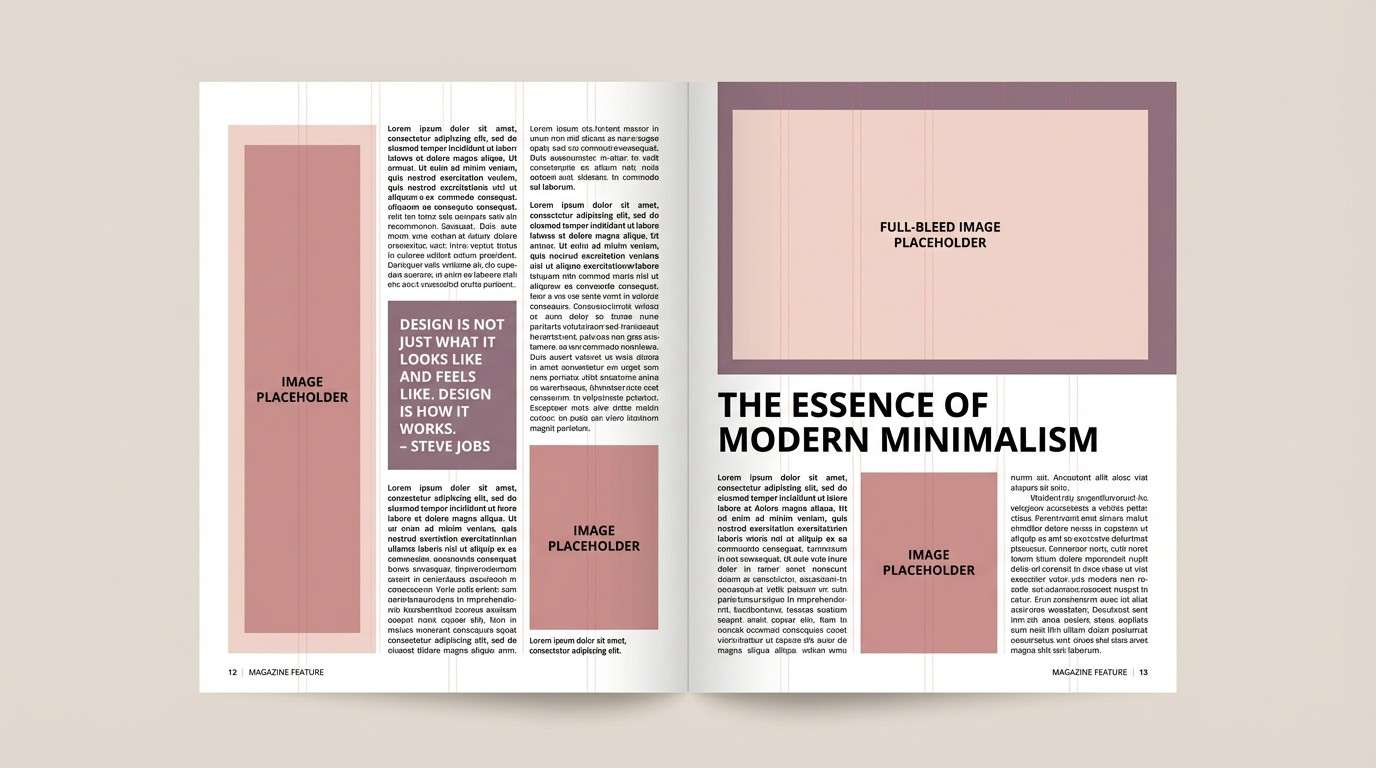
HEX: #F5DFE2 #E3B8C0 #C98A9B #7E5A66 #2B2327
Mood: editorial, mature, understated
Best for: magazine feature layout
Editorial and understated like a quiet fashion spread, these tones feel mature and balanced. This rose color scheme works especially well for magazine features, lookbooks, and long-form blog layouts. Pair it with lots of white space and fine rules in the muted mauve to keep the page breathable. Tip: use the darkest shade for body copy and captions for consistent readability.
Image example of muted rose editorial generated using media.io
20) Roseberry Dessert
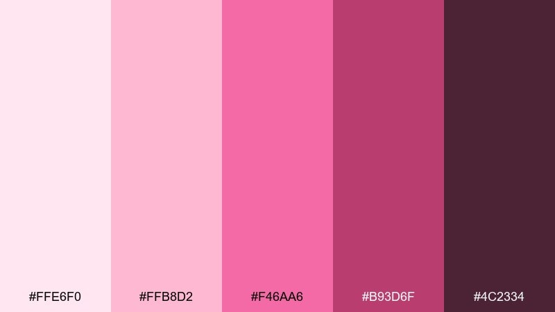
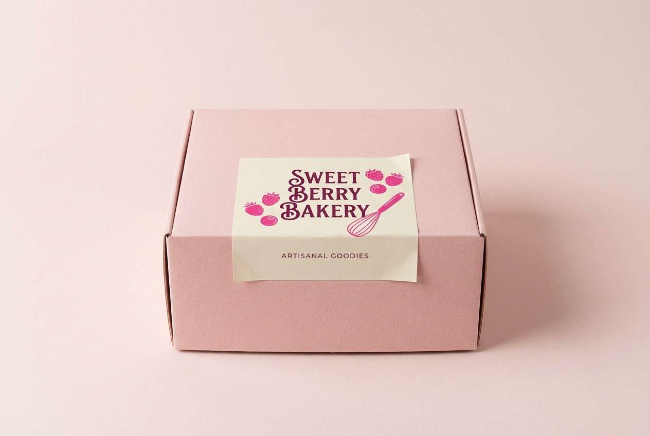
HEX: #FFE6F0 #FFB8D2 #F46AA6 #B93D6F #4C2334
Mood: sweet, fun, appetizing
Best for: bakery box packaging
Sweet and fun like berry frosting and sugared sprinkles, this mix feels instantly appetizing. It is a great fit for bakery boxes, dessert labels, and playful seasonal campaigns. Pair the bright pink with the deep berry for strong contrast, then soften with the pale blush on larger surfaces. Tip: use the darkest shade for small text so it stays legible on glossy packaging.
Image example of roseberry dessert generated using media.io
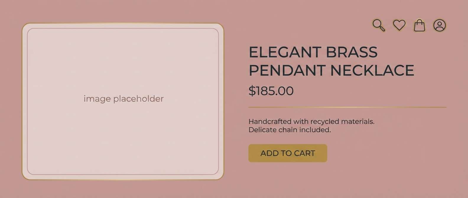
21) Antique Rose and Brass
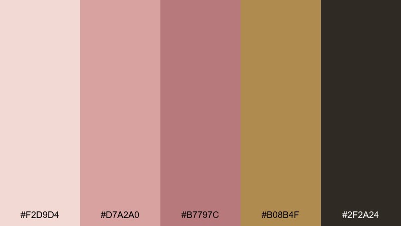
HEX: #F2D9D4 #D7A2A0 #B7797C #B08B4F #2F2A24
Mood: vintage, luxe, warm-metallic
Best for: jewelry product page
Vintage and luxe like antique brass on soft velvet, this set feels warm and heirloom-inspired. It works well for jewelry product pages, premium gift cards, and boutique branding. Pair the brass-gold tone with deep charcoal text to keep the warmth elegant rather than yellow. Tip: use the metallic shade as a thin accent line or icon color, not a full background fill.
Image example of antique rose and brass generated using media.io
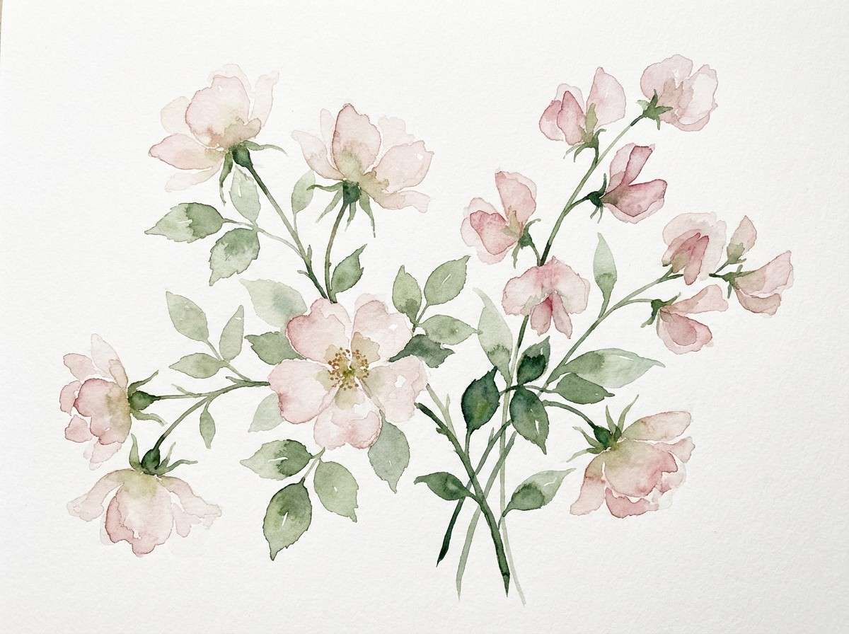
22) Rose Mist Botanical
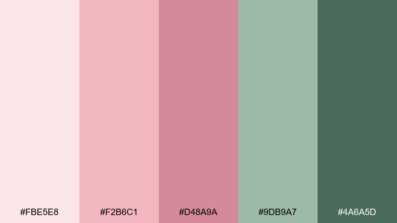
HEX: #FBE5E8 #F2B6C1 #D48A9A #9DB9A7 #4A6A5D
Mood: airy, botanical, springlike
Best for: watercolor floral illustration
Airy and springlike like morning mist over blooms, these shades feel light and alive. They are ideal for botanical illustrations, journaling pages, and gentle wall prints. Pair the soft pinks with muted greens to create a natural balance that never feels too sweet. Tip: keep edges loose and transparent in watercolor washes so the palette stays delicate.
Image example of rose mist botanical generated using media.io
What Colors Go Well with Rose?
Neutrals are the fastest way to modernize rose: warm ivory, cream, taupe, greige, and charcoal keep blush and dusty rose from feeling overly sweet. For typography, deep cocoa or near-black usually reads cleaner than pure black.
For contrast, pair rose with structured darks like navy or deep violet. These combinations look confident in branding, presentations, and editorial layouts where you need clear hierarchy.
For a natural, grown-up feel, add greens—especially sage, olive, and eucalyptus tones. Green balances rose instantly and works beautifully in packaging, wellness, and lifestyle design.
How to Use a Rose Color Palette in Real Designs
Start with role assignment: choose one light shade for backgrounds, one mid-rose for accents/CTAs, and one dark shade for text and icons. This prevents “pink overload” and makes your rose color scheme feel intentional.
In UI, test contrast early—rose tints can reduce readability if you place light text on mid pinks. In print, do a quick proof on your target paper stock since dusty roses and olives can shift warmer or duller.
Keep textures and finishes in mind: matte paper and subtle grain make rose feel editorial and premium, while glossy finishes make bright roses pop for promos and packaging.
Create Rose Palette Visuals with AI
If you want to preview how a rose palette looks on a real layout, generate quick mockups before you commit to a full design system. Seeing rose on UI cards, packaging, or posters helps you pick the right saturation and contrast.
With Media.io text-to-image, you can paste a prompt, specify the aspect ratio, and iterate until the palette feels balanced—then export visuals for mood boards, client reviews, or brand explorations.
Rose Color Palette FAQs
-
What is a rose color palette?
A rose color palette is a set of colors built around rose-toned pinks (from blush to dusty mauve to deep rosewood), usually paired with neutrals or contrasting darks for balance and readability. -
How do I keep a rose color scheme looking modern (not too sweet)?
Reduce saturation, add mature neutrals (cream, greige, charcoal), and reserve the brightest rose for small accents like buttons, badges, or highlights rather than full backgrounds. -
What colors pair best with dusty rose?
Dusty rose pairs especially well with warm ivory, taupe, cocoa brown, sage green, olive, and navy. These combinations feel grounded and sophisticated in both print and digital design. -
Is rose a good color for UI design?
Yes—rose works well for onboarding, wellness, beauty, and lifestyle apps when used with plenty of whitespace and dark neutral text. Always check contrast ratios before exporting final screens. -
What’s the best dark text color to use with blush backgrounds?
Charcoal, deep cocoa, or near-black (instead of pure black) often looks smoother with blush and cream backgrounds while maintaining strong legibility. -
Can rose palettes work for corporate branding?
They can. Pair rose accents with structured colors like navy and use rose sparingly in charts, dividers, and highlights to add warmth without losing a professional tone. -
How can I generate rose palette mockups quickly?
Use an AI generator like Media.io text-to-image: describe the layout (packaging, UI, poster), include your dominant palette colors, and iterate prompts until the look matches your brand mood.


