

Slate blue sits in that sweet spot between calm and confident, making it a reliable base for modern color schemes. It reads professional in UI, cozy in interiors, and elevated in branding.
Below are 20 slate blue color combinations with HEX codes, plus practical tips for pairing neutrals and accents so your designs feel balanced and intentional.
In this article
Why Slate Blue Color Combinations Work So Well
Slate blue is versatile because it combines blue’s trust and clarity with a muted, slightly violet undertone. That softness keeps it from feeling overly corporate, while still looking polished.
It also plays nicely with both warm and cool companions. You can push it toward calm minimalism with airy neutrals, or make it pop with energetic accents like coral, neon pink, or gold.
In digital design, slate blue tends to hold up well across light and dark UI, offering strong hierarchy without the harshness of pure primary blue. In print and interiors, it reads rich and grounded rather than bright.
20+ Slate Blue Color Palette Ideas (with HEX Codes)
1) Coastal Dusk
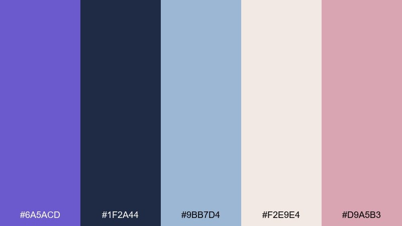
HEX: #6A5ACD #1F2A44 #9BB7D4 #F2E9E4 #D9A5B3
Mood: tranquil, coastal, twilight
Best for: travel brand landing page
Tranquil and slightly misty, this slate blue color palette feels like a boardwalk at blue hour with soft clouds rolling in. Use it on travel sites, boutique stays, or calm hero sections where readability matters. Pair the deep navy with warm blush accents to keep the page from feeling cold. Tip: reserve the blush for calls to action and small icons so the main blue stays soothing.
Image example of coastal dusk generated using media.io

Media.io is an online AI studio for creating and editing video, image, and audio in your browser.

2) Ink Lavender
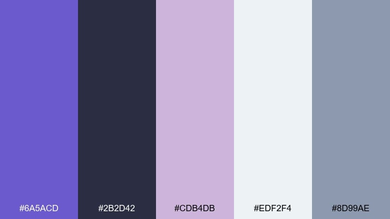
HEX: #6A5ACD #2B2D42 #CDB4DB #EDF2F4 #8D99AE
Mood: editorial, chic, polished
Best for: magazine cover layout
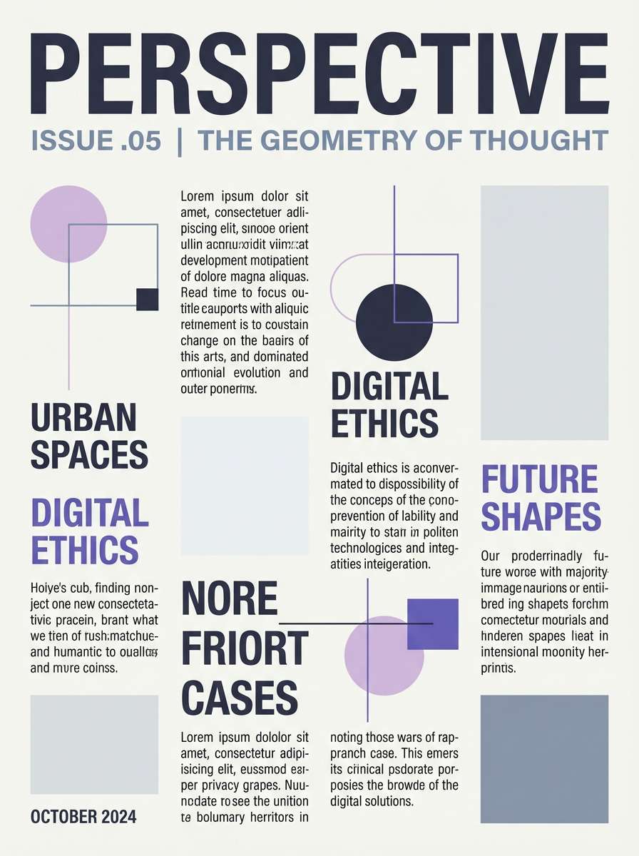
Polished and editorial, these slate blue tones read like ink on textured paper with a lavender highlight. They work beautifully for covers, feature spreads, and lookbooks that need contrast without harshness. Keep the darkest shade for headlines and use the pale gray as generous negative space. Tip: add a thin rule line in lavender to organize sections and elevate hierarchy.
Image example of ink lavender generated using media.io
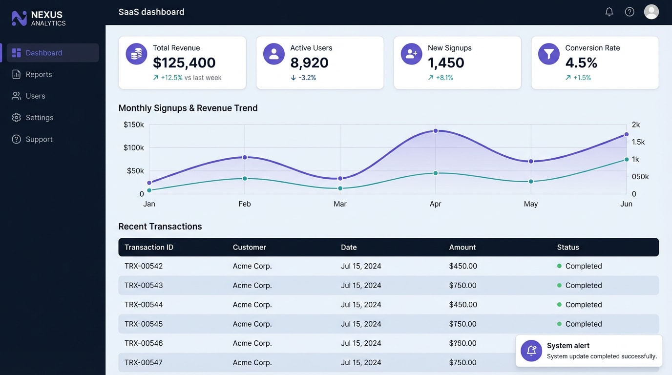
3) Tech Nebula
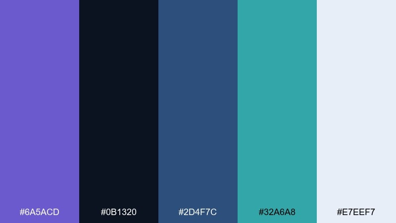
HEX: #6A5ACD #0B1320 #2D4F7C #32A6A8 #E7EEF7
Mood: futuristic, clean, focused
Best for: saas dashboard ui
Focused and futuristic, it evokes a night sky dashboard lit by quiet indicators. These slate blue color combinations shine in SaaS analytics, fintech, and developer tools where clarity is key. Use the near-black for navigation, slate blue for primary actions, and teal for status highlights. Tip: keep data visualizations to two accent colors to avoid noisy charts.
Image example of tech nebula generated using media.io
4) Vintage Stationery
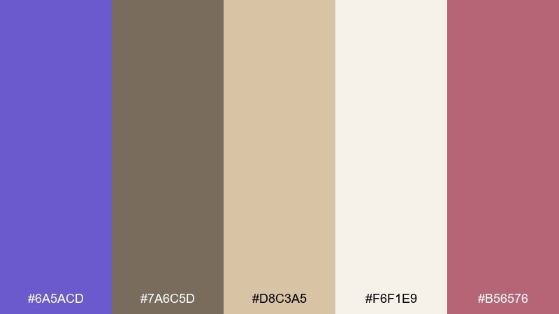
HEX: #6A5ACD #7A6C5D #D8C3A5 #F6F1E9 #B56576
Mood: nostalgic, warm, romantic
Best for: wedding invitation suite
Nostalgic and romantic, these shades feel like aged paper, wax seals, and a hint of twilight ink. They are ideal for invitations, menus, and save-the-dates that want a refined vintage touch. Pair the warm neutrals with the mauve accent for names and key details, then ground it with the taupe. Tip: choose a slightly textured background to make the soft cream look intentional rather than flat.
Image example of vintage stationery generated using media.io
5) Forest After Rain
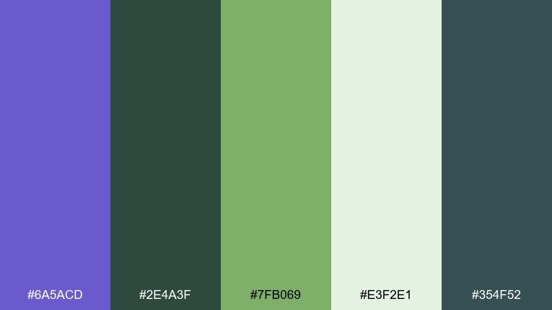
HEX: #6A5ACD #2E4A3F #7FB069 #E3F2E1 #354F52
Mood: fresh, earthy, restorative
Best for: eco packaging design
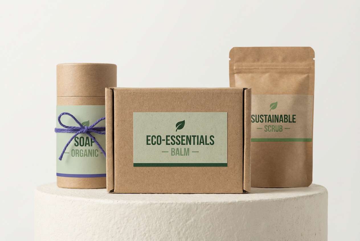
Fresh and restorative, this slate blue palette evokes wet leaves and cool air after a passing storm. It fits eco brands, refill packaging, and natural product labels that need a calm, trustworthy feel. Use slate blue for brand marks and the greens for ingredient cues and callouts. Tip: print tests matter here, so slightly thicken line art to keep the darker greens from filling in on recycled stock.
Image example of forest after rain generated using media.io
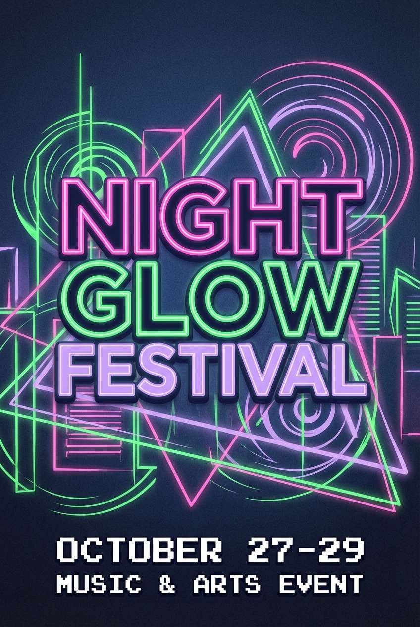
6) Nightfall Neon
HEX: #6A5ACD #111827 #FF2E88 #22C55E #F8FAFC
Mood: bold, nightlife, high-contrast
Best for: music festival poster
Bold and electric, it feels like neon signage cutting through a late-night street. The high contrast is great for posters, event promos, and announcements that must pop from a feed. Let slate blue and charcoal carry the background while pink and green become the energy points. Tip: keep the accent colors to short bursts in type and shapes so the design stays legible at a distance.
Image example of nightfall neon generated using media.io
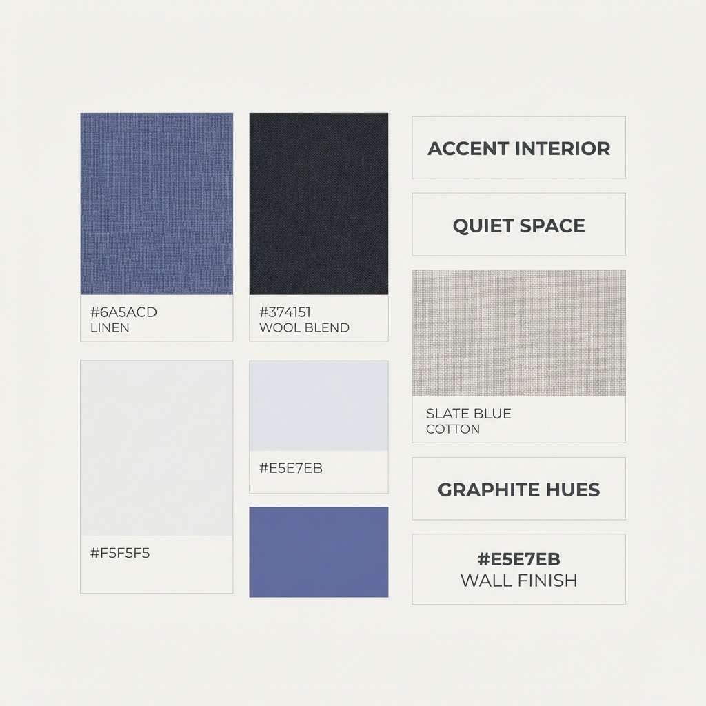
7) Minimal Loft
HEX: #6A5ACD #F5F5F5 #D1D5DB #374151 #E5E7EB
Mood: modern, airy, understated
Best for: interior moodboard
Airy and understated, these neutrals feel like sunlit concrete with a blue shadow cast across the room. It works for interior moodboards, minimalist brands, and clean portfolio layouts that need one confident accent. Use this slate blue color palette for small focal points like headings, throw pillows, or a single painted door. Tip: keep the blue to under 15 percent coverage so the overall look stays calm.
Image example of minimal loft generated using media.io
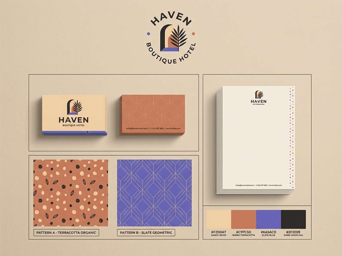
8) Desert Twilight
HEX: #6A5ACD #C97C5D #F2D0A7 #5B5F97 #2F2D2E
Mood: sunbaked, romantic, cinematic
Best for: boutique hotel branding
Sunbaked and cinematic, it brings to mind sandstone walls cooling down after sunset. These slate blue tones suit boutique hotel branding, destination guides, and packaging that wants warmth without losing sophistication. Pair the terracotta with slate blue for a balanced warm-cool contrast, then use the near-black for typography. Tip: on web, try a soft gradient from sand to lavender for section breaks instead of hard dividers.
Image example of desert twilight generated using media.io
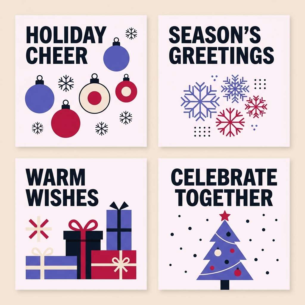
9) Winter Berry
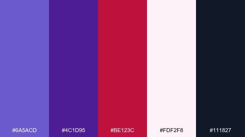
HEX: #6A5ACD #4C1D95 #BE123C #FDF2F8 #111827
Mood: cozy, festive, dramatic
Best for: holiday social graphics
Cozy and festive, these shades feel like berry syrup against fresh snow at dusk. They are perfect for holiday promos, seasonal email headers, and social tiles where you want drama without glitter. Use the pale pink as a soft background and bring in berry red for the message. Tip: set text in the near-black rather than pure black to keep the mood rich and wintery.
Image example of winter berry generated using media.io
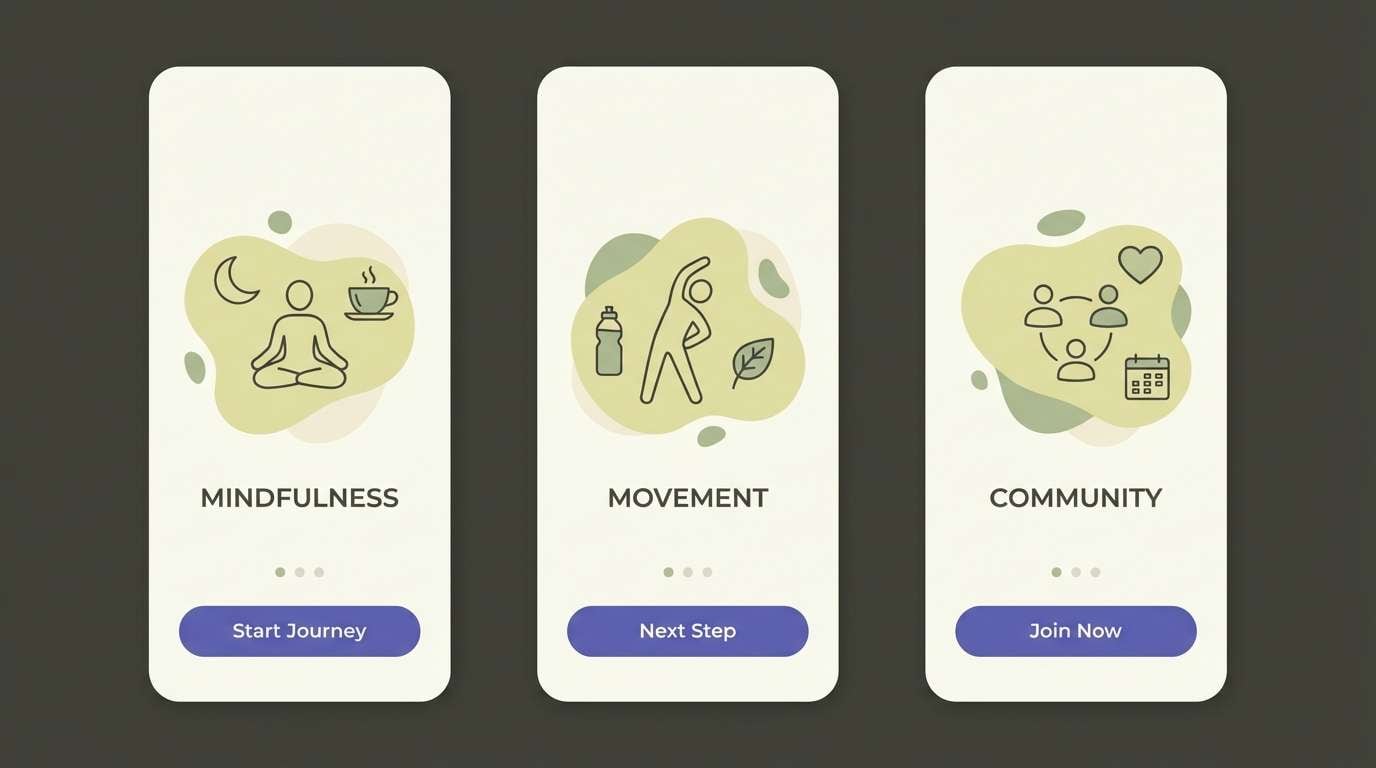
10) Ceramic Calm
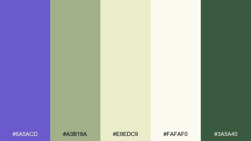
HEX: #6A5ACD #A3B18A #E9EDC9 #FAFAF0 #3A5A40
Mood: spa-like, gentle, balanced
Best for: wellness app onboarding
Gentle and spa-like, the slate blue color scheme evokes glazed ceramics and quiet herbal tea. The muted green and soft creams make onboarding screens feel welcoming and unhurried. Use slate blue for primary buttons and the deeper green for confirmations or progress states. Tip: increase line spacing and keep icons thin to match the light, breathable tone.
Image example of ceramic calm generated using media.io
11) Monochrome Slate
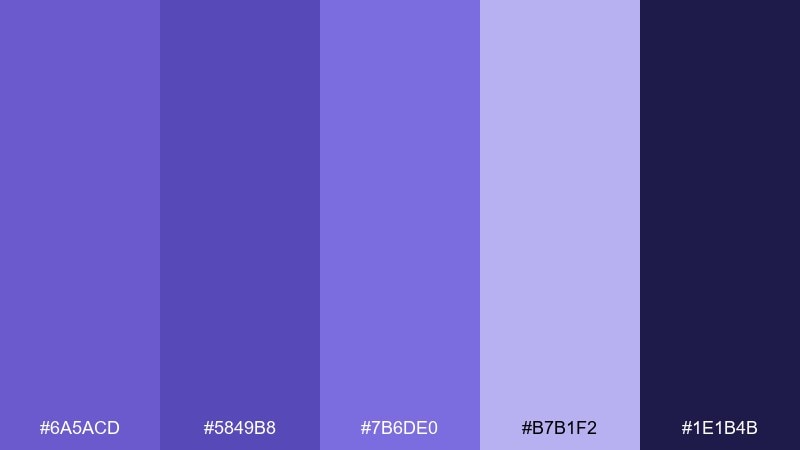
HEX: #6A5ACD #5849B8 #7B6DE0 #B7B1F2 #1E1B4B
Mood: tonal, refined, confident
Best for: presentation template
Tonal and refined, these slate blue hues feel like layered fabric in one hue family. When you want a deck that looks cohesive fast, slate blue color combinations like this keep every slide consistent. Use the darkest indigo for titles, mid tones for shapes, and the light lavender for spacious backgrounds. Tip: create one accent style for charts, then repeat it across the whole presentation for a premium look.
Image example of monochrome slate generated using media.io
12) Retro Arcade
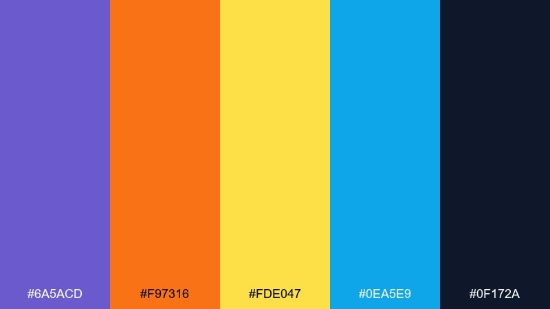
HEX: #6A5ACD #F97316 #FDE047 #0EA5E9 #0F172A
Mood: playful, energetic, retro
Best for: twitch stream overlay
Playful and energetic, this slate blue color palette channels arcade cabinets and glowing screen light. The orange and yellow bring instant excitement while slate blue keeps the look anchored. Use the dark navy for frames and panels, then push the warm accents into alerts and badges. Tip: limit gradients and lean on solid blocks of color for a crisp retro feel.
Image example of retro arcade generated using media.io
13) Garden Party
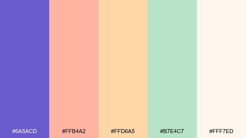
HEX: #6A5ACD #FFB4A2 #FFD6A5 #B7E4C7 #FFF7ED
Mood: cheerful, airy, springtime
Best for: spring flyer design
Cheerful and airy, this mix feels like fresh petals and lemonade on a sunny patio. It suits spring flyers, pop-up markets, and community events that want a friendly tone. Keep slate blue for the headline and use the pastels for large shapes and background blocks. Tip: add subtle grain to prevent the light colors from looking too digital.
Image example of garden party generated using media.io

14) Deep Sea Studio
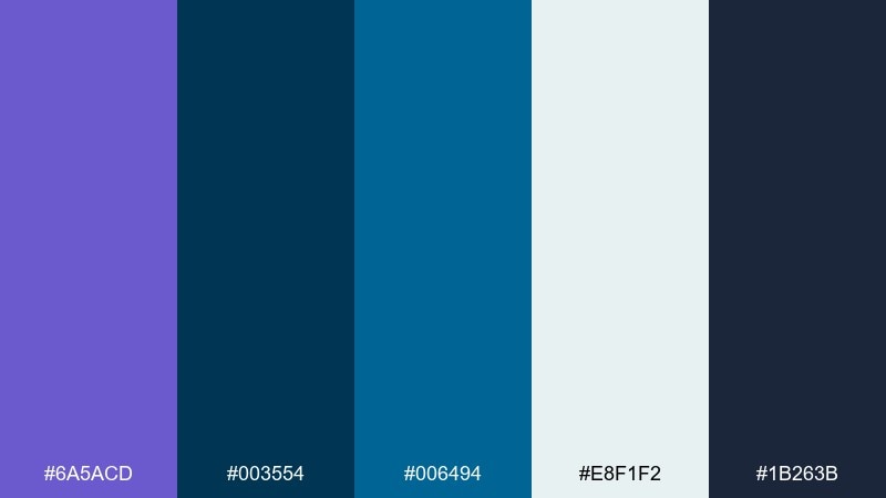
HEX: #6A5ACD #003554 #006494 #E8F1F2 #1B263B
Mood: crisp, marine, studio-clean
Best for: product ad for headphones
Crisp and marine, this slate blue color palette suggests deep water with bright reflections near the surface. These blues are strong for tech product ads where you want a premium, clean studio look. Use slate blue for the hero glow and the deeper navy for shadows and copy. Tip: keep the background nearly white-blue so the product silhouette stays sharp without harsh contrast.
Image example of deep sea studio generated using media.io

15) Artisan Coffee
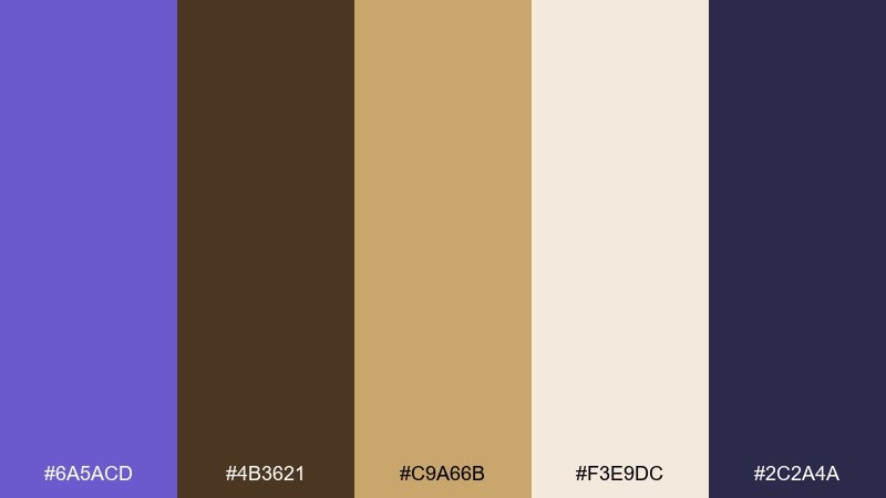
HEX: #6A5ACD #4B3621 #C9A66B #F3E9DC #2C2A4A
Mood: grounded, cozy, boutique
Best for: cafe menu design
Grounded and cozy, it brings together espresso browns with a cool twilight accent. It is ideal for cafe menus, loyalty cards, and small-batch packaging that needs warmth and structure. Pair the gold with slate blue for section headers and pricing highlights. Tip: use the cream as the main menu background to keep text readable and inviting.
Image example of artisan coffee generated using media.io
16) Orchid Smoke
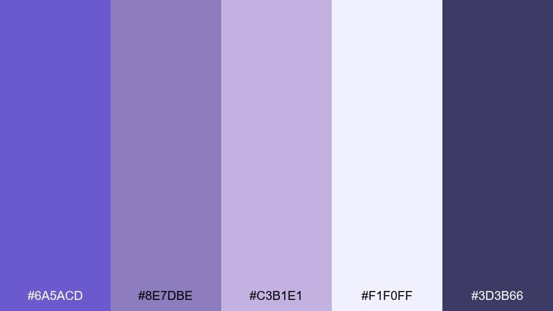
HEX: #6A5ACD #8E7DBE #C3B1E1 #F1F0FF #3D3B66
Mood: dreamy, soft, romantic
Best for: beauty brand packaging
Dreamy and soft, these purples feel like orchid petals in a light morning haze. They work well for skincare, fragrance, and beauty packaging that wants elegance without looking overly sweet. Use the pale lilac for the box base, then set details in the deep smoky violet for contrast. Tip: add subtle spot gloss on the slate blue elements to make the packaging feel premium.
Image example of orchid smoke generated using media.io
17) Graphite Gold
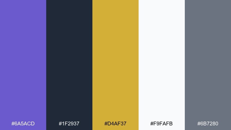
HEX: #6A5ACD #1F2937 #D4AF37 #F9FAFB #6B7280
Mood: premium, confident, modern
Best for: fintech logo and website
Premium and confident, this slate blue pairing feels like brushed metal against dark graphite. It fits fintech branding, investment tools, and corporate sites that need trust with a touch of luxury. Keep the gold as a small accent for key numbers and badges, while slate blue handles links and primary actions. Tip: test accessibility early, and bump contrast by using the near-white background for most content areas.
Image example of graphite gold generated using media.io

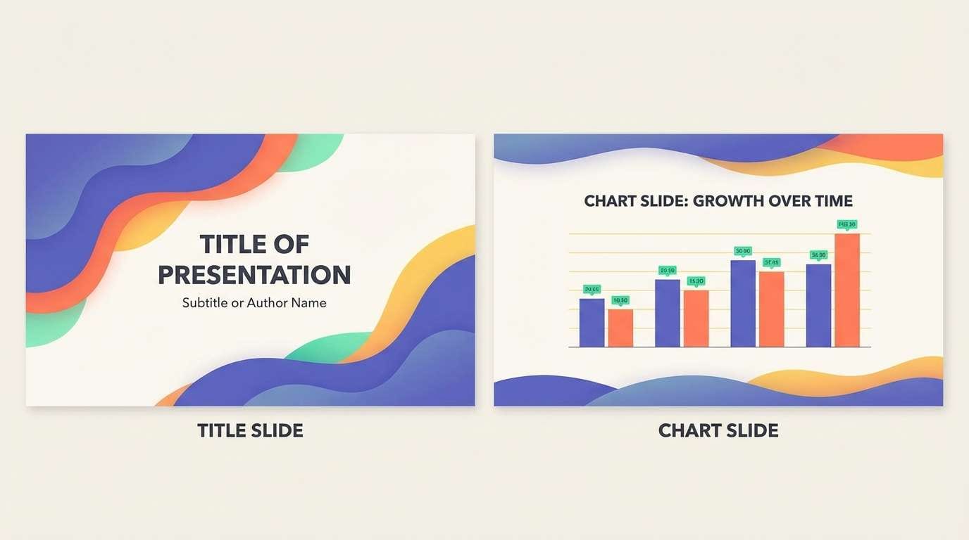
18) Sunrise Gradient
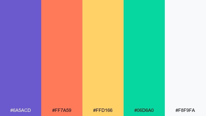
HEX: #6A5ACD #FF7A59 #FFD166 #06D6A0 #F8F9FA
Mood: optimistic, bright, contemporary
Best for: keynote slide deck
Optimistic and bright, it looks like sunrise spilling into a cool morning sky. These slate blue color combinations are great for keynote decks, workshops, and creative pitches that need energy without chaos. Use slate blue for headings, then rotate coral, yellow, and mint for section markers and charts. Tip: keep one warm accent per slide so the story stays easy to follow.
Image example of sunrise gradient generated using media.io
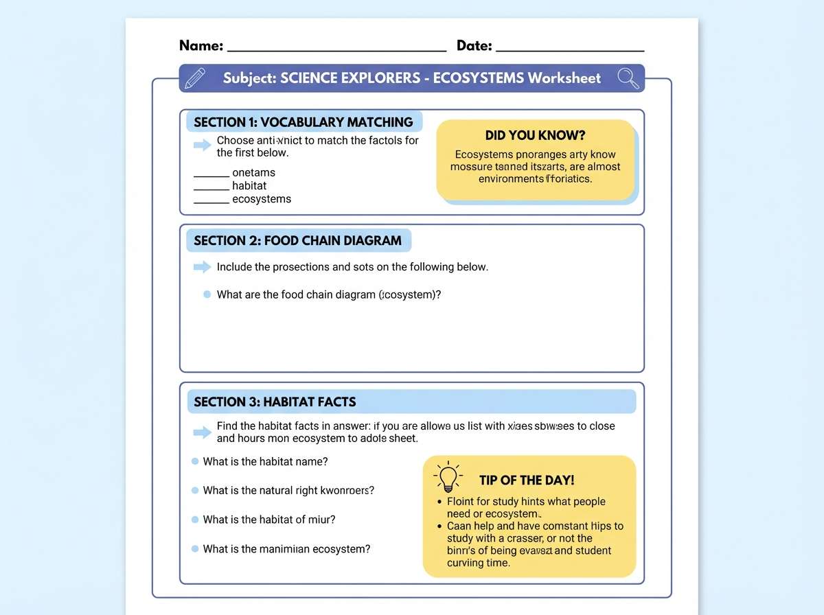
19) Classroom Calm
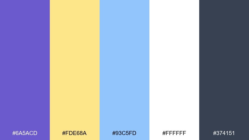
HEX: #6A5ACD #FDE68A #93C5FD #FFFFFF #374151
Mood: friendly, clear, organized
Best for: educational worksheet layout
Friendly and organized, these slate blue tones feel like a well-lit classroom with tidy notes. They are ideal for worksheets, learning posters, and course handouts that need clarity for all ages. Use slate blue for headings and section dividers, then keep yellow for highlights and callouts. Tip: stick to simple shapes and consistent spacing to make the page easy to scan.
Image example of classroom calm generated using media.io
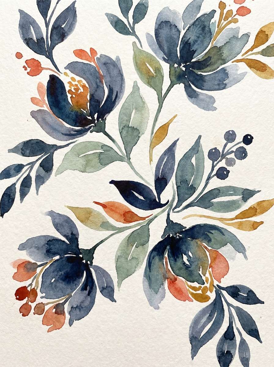
20) Cosmic Florals
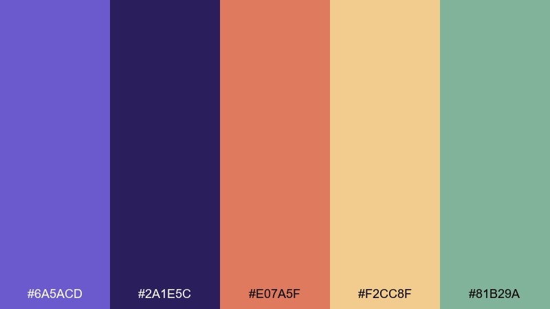
HEX: #6A5ACD #2A1E5C #E07A5F #F2CC8F #81B29A
Mood: artistic, whimsical, storybook
Best for: watercolor botanical illustration
Artistic and storybook-like, this mix feels like wildflowers painted under a deep night sky. It is a strong fit for botanical prints, journal covers, and seasonal collections with a handcrafted vibe. Use slate blue and indigo for shadows, then bring coral and sand into petals and highlights. Tip: keep edges soft and layered so the warm accents glow against the cooler base.
Image example of cosmic florals generated using media.io
What Colors Go Well with Slate Blue?
Slate blue pairs naturally with crisp neutrals like off-white, light gray, and charcoal, which help it feel modern and readable. These combinations are especially effective for websites, dashboards, and brand systems that need clean hierarchy.
For warmer contrast, try terracotta, blush, sand, or gold—these add friendliness and reduce the “cool” feel of blue-heavy layouts. If you want bolder energy, neon pink and bright green can work as short, controlled accents.
Analogous companions like lavender and indigo create a tonal, premium look. This is a safe route for presentations and product branding where consistency matters more than loud contrast.
How to Use a Slate Blue Color Palette in Real Designs
Start by choosing slate blue as either your primary (buttons, key headings) or your supporting color (background panels, illustration shadows). Then decide whether your design needs warmth (add clay, blush, or gold) or clarity (add white, gray, and near-black).
For UI, reserve the darkest shade for navigation and body text, and keep slate blue for interactive elements so users learn the system quickly. For branding, test the palette across light and dark applications (logo, social templates, and web hero) to ensure it stays consistent.
In interiors, slate blue works best when balanced with textured neutrals—think warm woods, linen whites, and soft grays—so the room feels calming rather than cold.
Create Slate Blue Palette Visuals with AI
If you want to see these slate blue color combinations in real layouts, generating quick mockups can help you decide faster. Try creating hero sections, posters, packaging, or onboarding screens using the prompts included with each palette.
With Media.io’s text-to-image, you can iterate on style (minimal, editorial, retro, cinematic) while keeping your HEX palette consistent. This makes it easy to compare options before committing to a full design build.
Slate Blue Color Palette FAQs
-
What is the HEX code for slate blue?
A commonly used slate blue HEX value is #6A5ACD. It’s a muted blue with a soft violet undertone, which helps it feel calm but still distinctive. -
Is slate blue warm or cool?
Slate blue is generally cool, but its purple undertone makes it feel less icy than many pure blues. Pairing it with warm neutrals (cream, sand) can make it feel more inviting. -
What colors complement slate blue best?
Great complements include terracotta, blush, gold, cream, and charcoal. For more playful contrast, small accents of neon pink or bright green can work well on dark backgrounds. -
Can I use slate blue for website UI and buttons?
Yes—slate blue works well for primary buttons and links because it’s saturated enough to stand out without being overly loud. For accessibility, check contrast against your background and consider using near-black for body text. -
How do I keep a slate blue palette from feeling too cold?
Add one warm accent (like blush, terracotta, or gold) and use creamy off-whites instead of stark white. Texture also helps—grain, paper, or soft shadows can make the palette feel warmer. -
What’s the easiest way to build a monochrome slate blue scheme?
Pick 1 dark anchor (for titles), 1 mid slate blue (for primary UI), and 1 light lavender (for backgrounds). Keep one repeated accent style for charts or highlights so the whole system stays cohesive. -
How can I preview slate blue color palettes before designing?
Generate quick visuals like landing pages, posters, or packaging mockups using AI prompts. This lets you test how slate blue behaves in real compositions before finalizing your brand or UI kit.


