

Orange yellow palettes are the shortcut to warmth: they feel sunny, friendly, and appetite-boosting—perfect for brands that want to look energetic without turning harsh.
Below are modern orange yellow color palette ideas with HEX codes, plus practical design notes and AI-ready prompts you can reuse for quick mockups.
In this article
Why Orange Yellow Palettes Work So Well
Orange and yellow sit close on the color wheel, so they blend naturally and feel “sun-made.” That harmony helps you build bright designs without the friction you can get from more contrasting pairs.
Psychologically, orange leans social and energetic, while yellow reads optimistic and attention-grabbing. Together they’re excellent for calls to action, promotions, food, events, and any UI that needs quick scanning.
The key is contrast control: warm tones can look luminous, so anchoring them with a dark neutral (charcoal, navy, deep green) keeps layouts readable across devices and print lighting.
20+ Orange Yellow Color Palette Ideas (with HEX Codes)
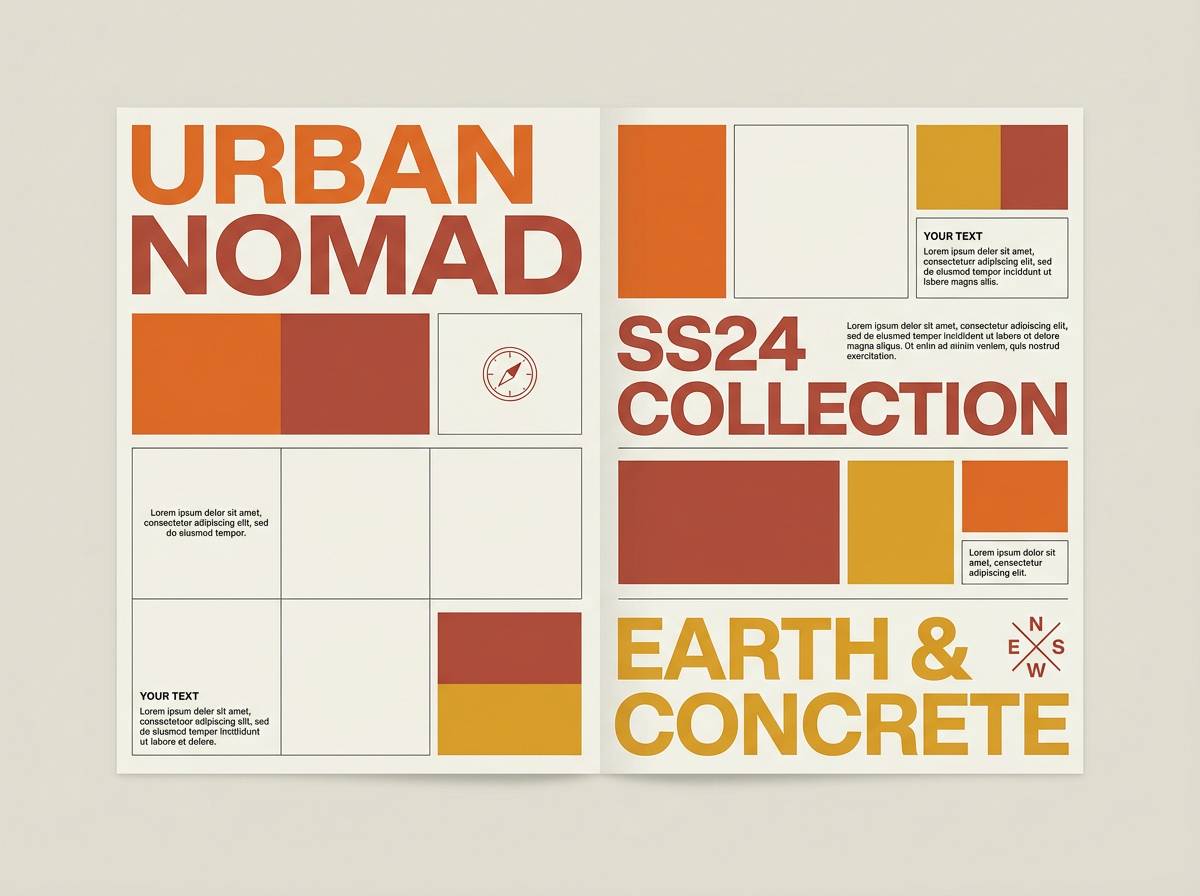
1) Citrus Sunrise
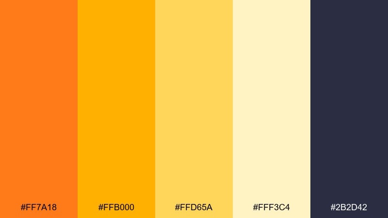
HEX: #ff7a18 #ffb000 #ffd65a #fff3c4 #2b2d42
Mood: bright, optimistic, punchy
Best for: breakfast cafe branding and menu design
Bright and optimistic like a fresh-squeezed morning with sunlit highlights and bold contrast. This orange yellow color palette works beautifully for menus, takeaway labels, and loyalty cards where appetite cues matter. Pair it with deep charcoal type for legibility and add creamy off-white for breathing room. Tip: keep the strongest orange for calls to action and let the yellows handle background warmth.
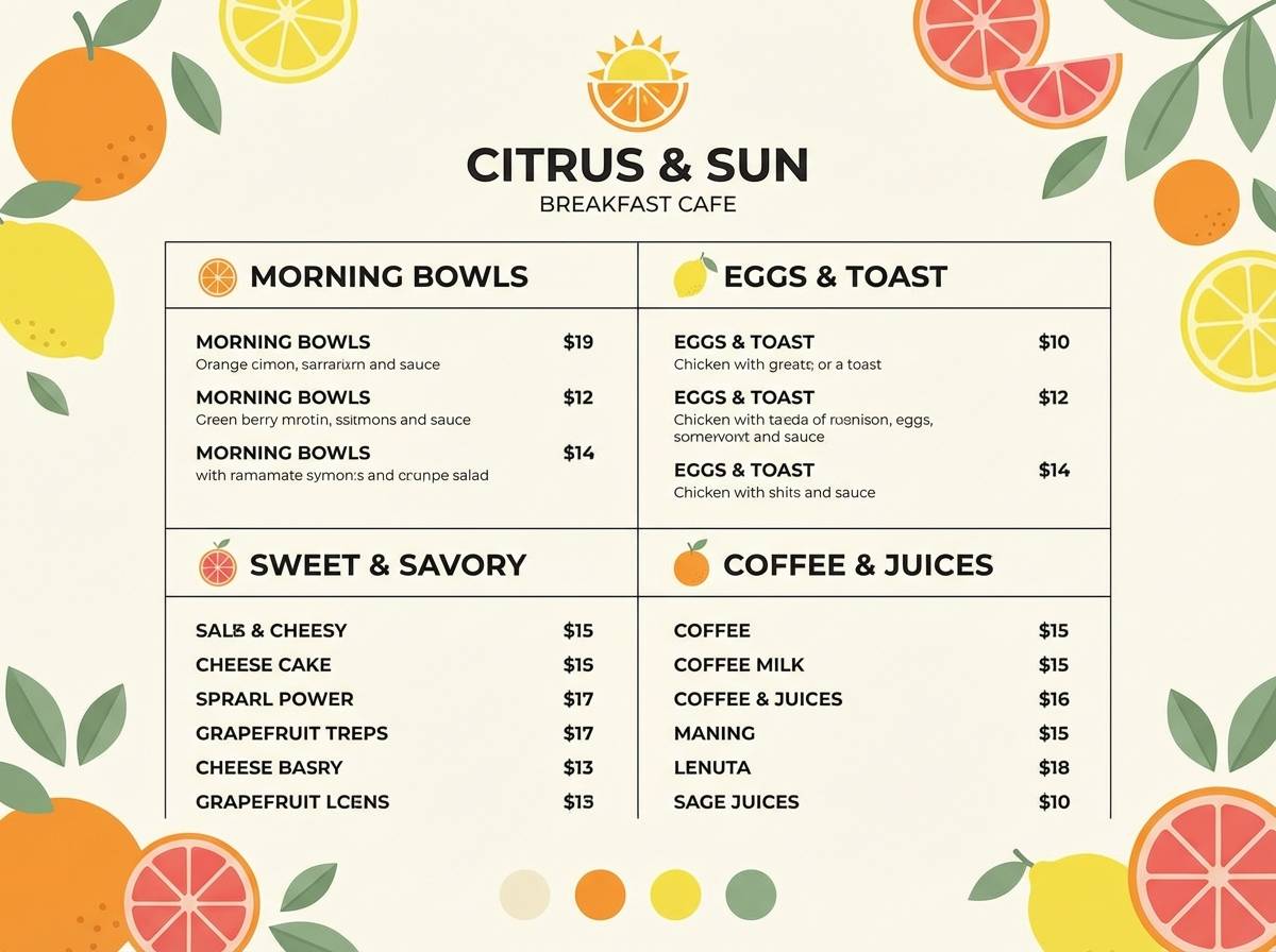
Image example of citrus sunrise generated using media.io
Media.io is an online AI studio for creating and editing video, image, and audio in your browser.

2) Marigold Market
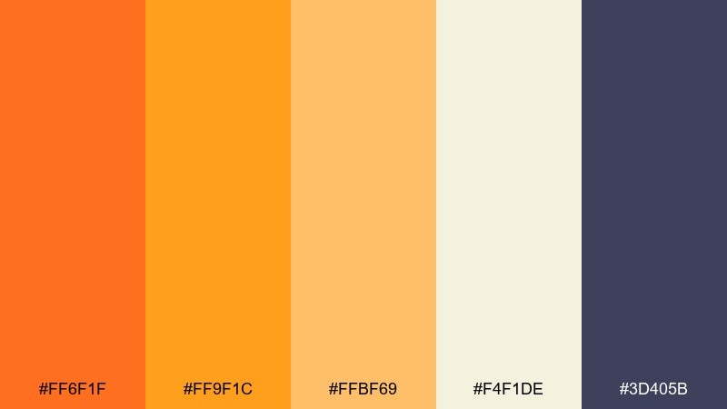
HEX: #ff6f1f #ff9f1c #ffbf69 #f4f1de #3d405b
Mood: friendly, bustling, handcrafted
Best for: farmers market poster and signage
Friendly and bustling, it feels like stalls of flowers, fruit, and handmade goods under a warm canopy. Use the saturated orange for headlines and directional signage, then let the softer golds fill large areas without glare. Deep indigo keeps pricing and details crisp, especially at a distance. Tip: stick to two font weights so the color energy does not turn chaotic.
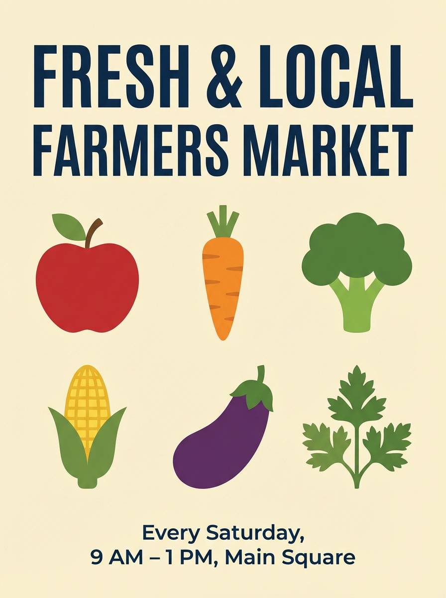
Image example of marigold market generated using media.io
3) Saffron Cream
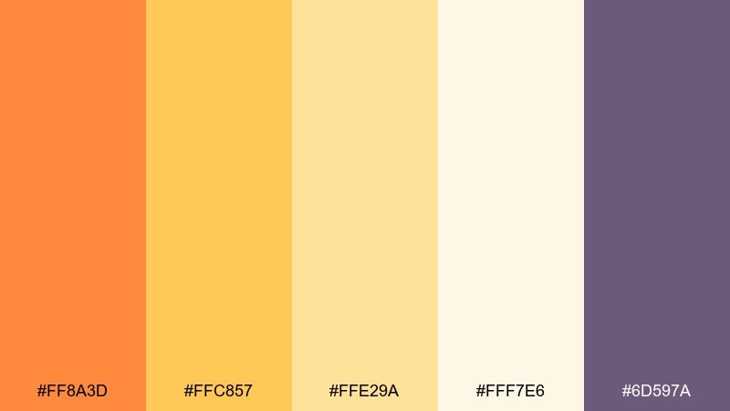
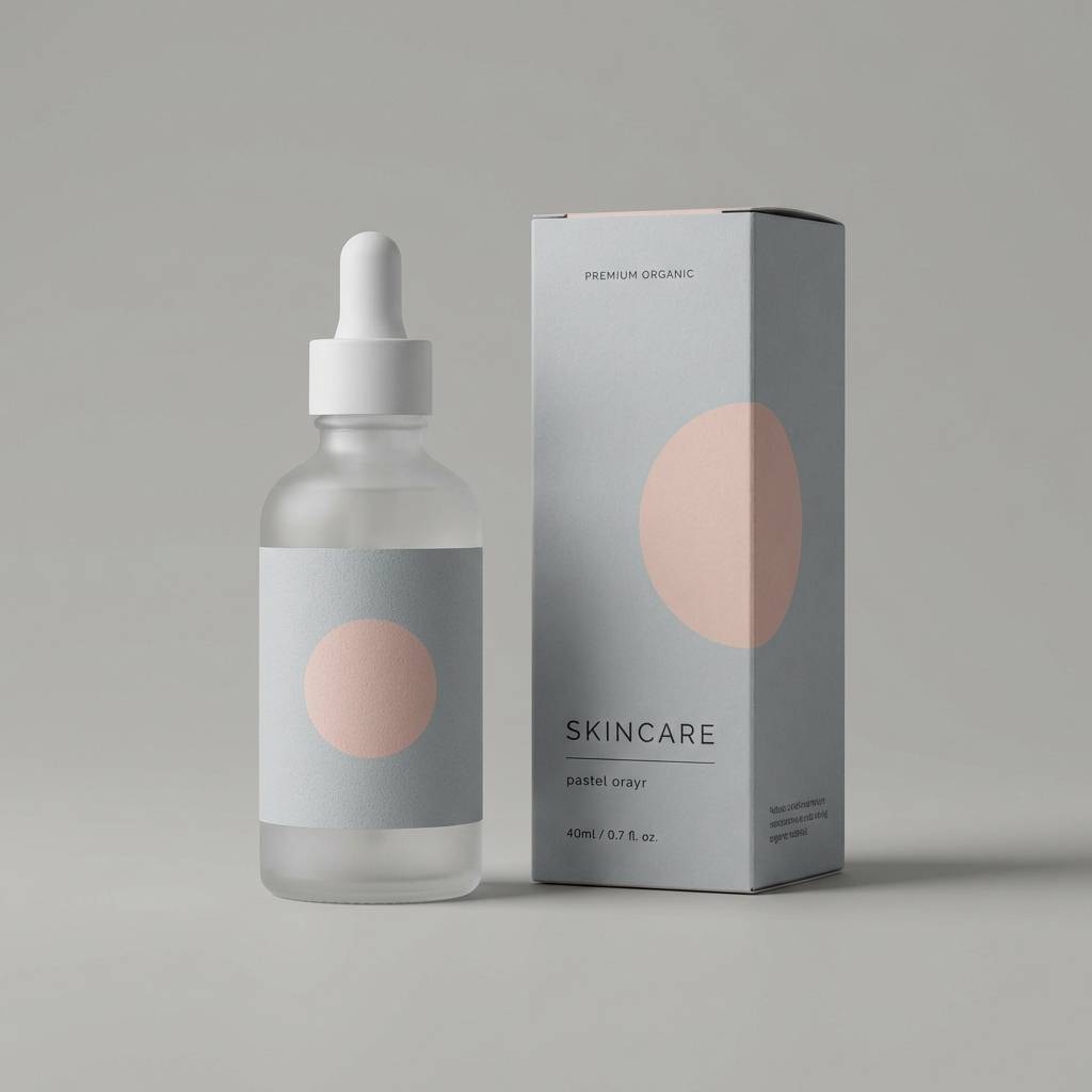
HEX: #ff8a3d #ffc857 #ffe29a #fff7e6 #6d597a
Mood: soft, cozy, elegant
Best for: skincare packaging and product labels
Soft and cozy, it suggests whipped creams, gentle spices, and a warm glow on minimal packaging. The creamy off-white gives a premium canvas while saffron accents add warmth without feeling loud. Pair with muted plum for ingredient lists and regulatory text so it stays refined. Tip: use matte finishes with a small spot-foil highlight to make the warm tones feel luxe.
Image example of saffron cream generated using media.io
4) Honey Ember
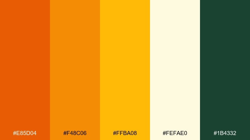
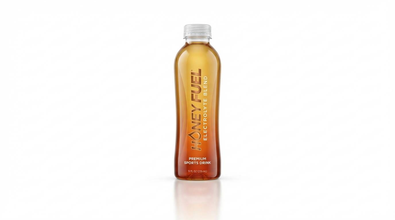
HEX: #e85d04 #f48c06 #ffba08 #fefae0 #1b4332
Mood: bold, toasty, energetic
Best for: sports drink product ad
Bold and toasty, it evokes ember-lit warmth with a clean shot of energy. The hot orange reads as speed and intensity, while the honey gold keeps the mood upbeat instead of aggressive. Ground it with a deep green accent for contrast on cans, banners, and ad headlines. Tip: reserve the darkest shade for outlines and small type so the bright tones stay the hero.
Image example of honey ember generated using media.io
5) Apricot Glow
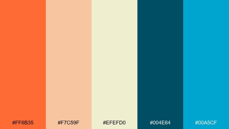
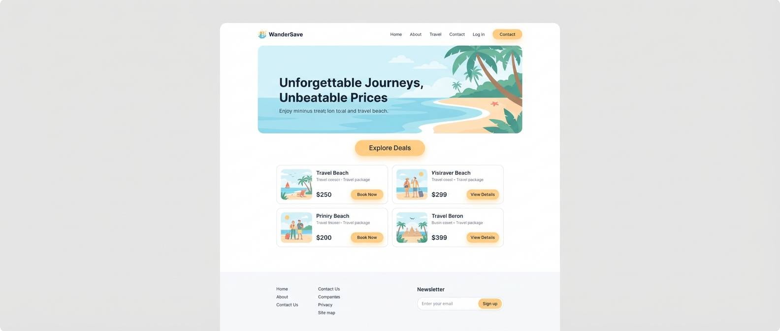
HEX: #ff6b35 #f7c59f #efefd0 #004e64 #00a5cf
Mood: playful, airy, modern
Best for: landing page UI for a travel deal site
Playful and airy, it feels like late-afternoon sun hitting pastel buildings by the sea. Use apricot as the primary CTA color, then lean on pale sand for generous whitespace. Teal and deep blue bring a modern, trustworthy counterpoint for navigation and link states. Tip: keep gradients subtle and prefer flat fills to preserve a clean, fast-loading UI look.
Image example of apricot glow generated using media.io
6) Tangerine Zest
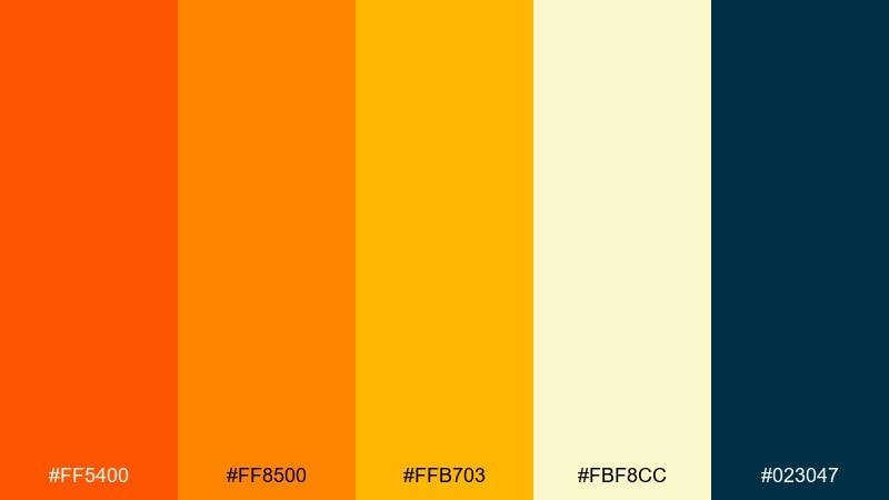
HEX: #ff5400 #ff8500 #ffb703 #fbf8cc #023047
Mood: loud, youthful, high-contrast
Best for: music festival flyer
Loud and youthful, it brings the punch of neon lights and summer speakers. High-contrast navy keeps the intense orange and gold from washing out on print and screens. Use the pale butter tone as negative space for schedules and lineup details. Tip: limit background patterns so the color intensity does not compete with the typography.
Image example of tangerine zest generated using media.io

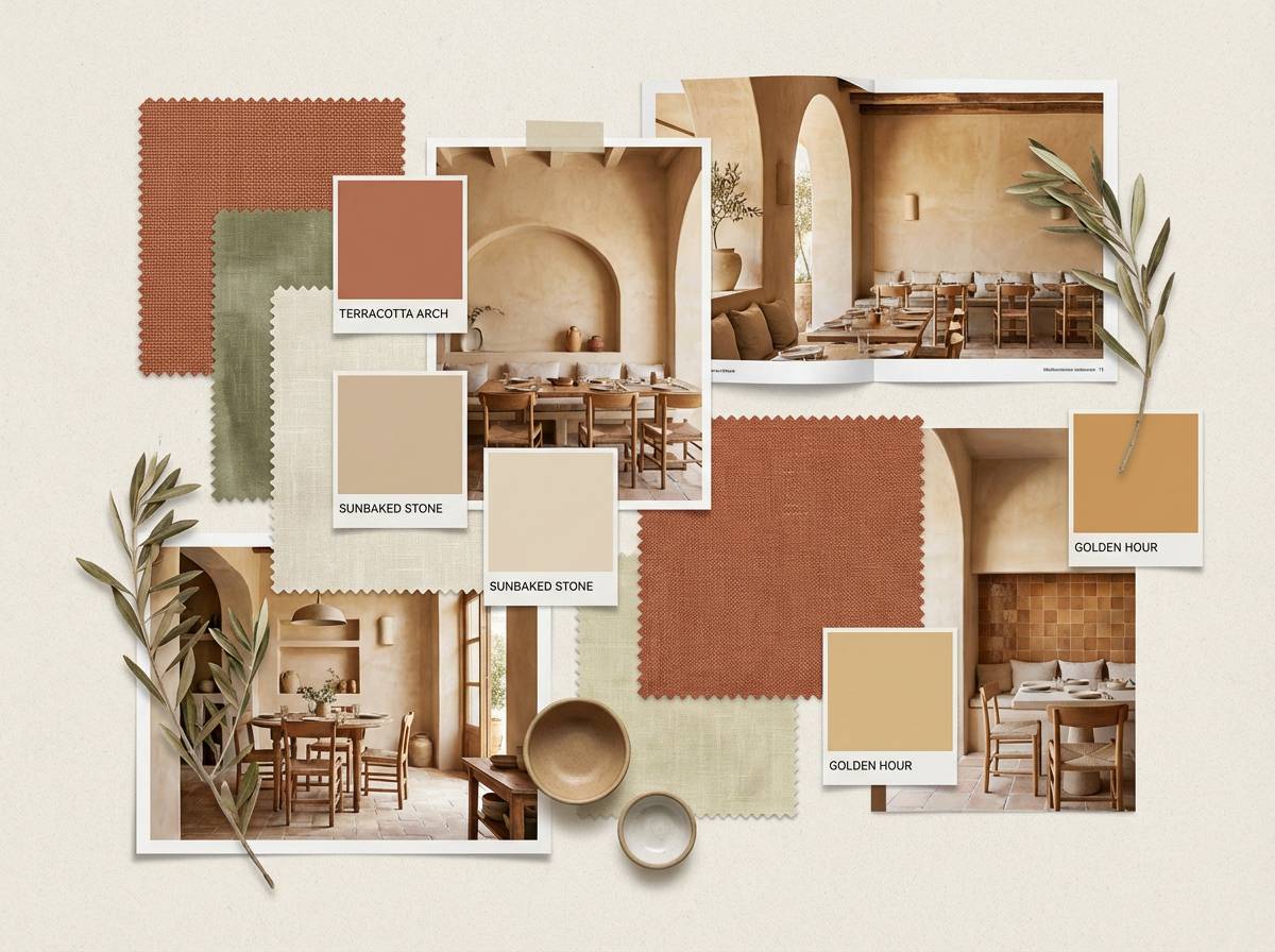
7) Sunlit Terracotta
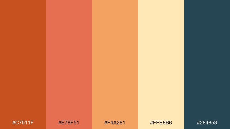
HEX: #c7511f #e76f51 #f4a261 #ffe8b6 #264653
Mood: earthy, sun-baked, calm
Best for: Mediterranean restaurant interior moodboard
Earthy and sun-baked, it recalls terracotta pots, tiled patios, and warm stone walls. Use the deeper clay tone for anchors like headers or section dividers, then layer the lighter peach and sand for calm expanses. Blue-green adds a coastal counterbalance that keeps the palette from feeling too dry. Tip: in interiors, repeat the accent color in small textiles rather than large painted areas.
Image example of sunlit terracotta generated using media.io
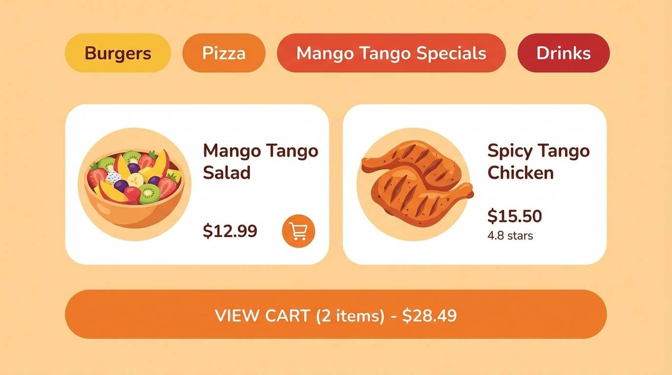
8) Mango Tango
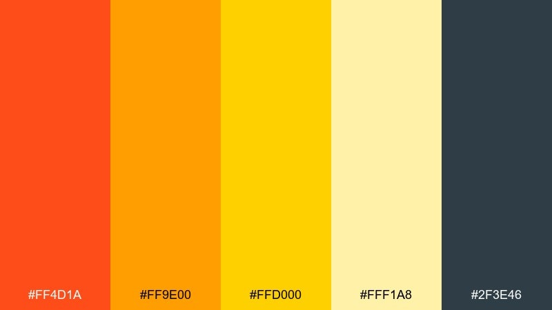
HEX: #ff4d1a #ff9e00 #ffd000 #fff1a8 #2f3e46
Mood: tropical, upbeat, confident
Best for: food delivery app UI
Tropical and upbeat, it reads like ripe mango slices with a confident, modern edge. For an orange yellow color combination that stays usable in UI, keep the brightest yellow for highlights and badges, not body backgrounds. Charcoal-gray is essential for text, icons, and form fields so the interface remains accessible. Tip: test hover states in dark mode too, since warm hues can shift dramatically against near-black.
Image example of mango tango generated using media.io
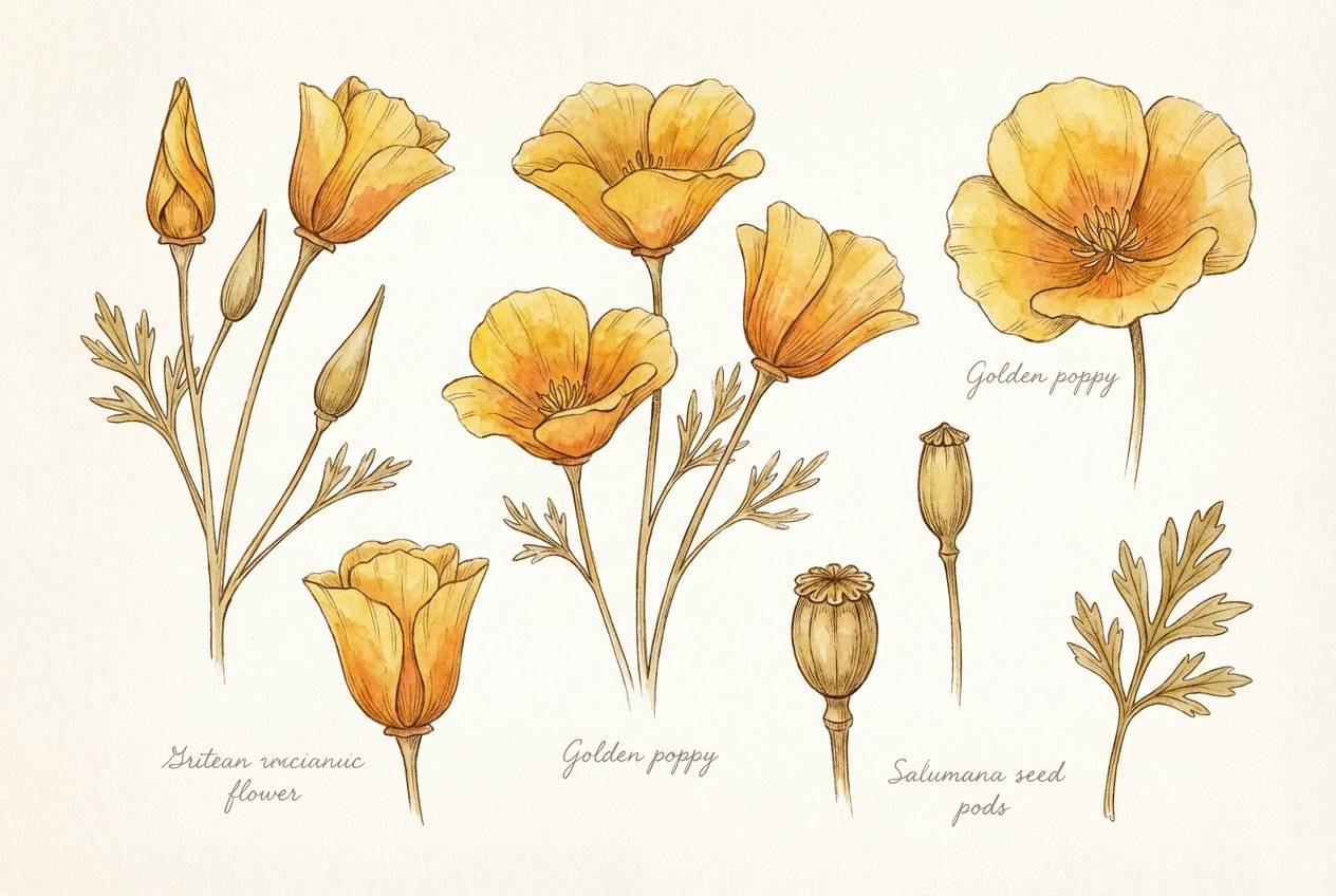
9) Golden Poppy
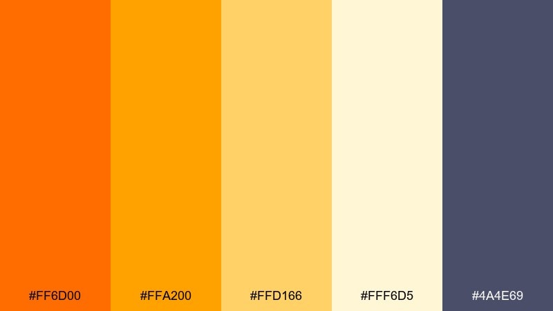
HEX: #ff6d00 #ffa200 #ffd166 #fff6d5 #4a4e69
Mood: cheerful, floral, light
Best for: spring botanical illustration set
Cheerful and floral, it feels like poppies in full bloom under bright spring light. Let the soft cream act as paper tone, then layer golden petals and orange centers for depth. A muted violet-gray gives outlines and shadows a gentle, artsy finish. Tip: in watercolor work, dilute the brightest orange for translucent washes and save saturation for focal petals.
Image example of golden poppy generated using media.io
10) Pumpkin Lemonade
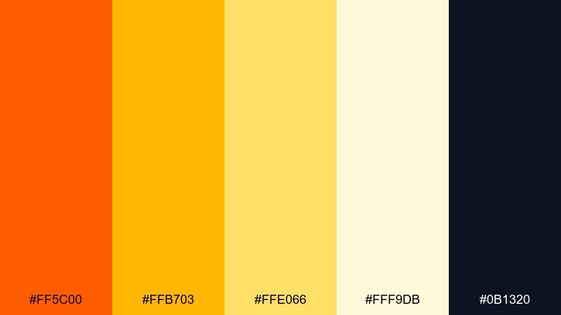
HEX: #ff5c00 #ffb703 #ffe066 #fff9db #0b1320
Mood: refreshing, punchy, summery
Best for: seasonal cafe drink promo poster
Refreshing and punchy, it looks like chilled lemonade with a pumpkin-orange twist for seasonal flair. Use the deep near-black for big, readable pricing and a clean ingredient list. The bright yellow should stay in accents like borders, stickers, and small icons so it does not overpower the layout. Tip: add a thin outline around orange text when placing it on yellow blocks to preserve contrast.
Image example of pumpkin lemonade generated using media.io
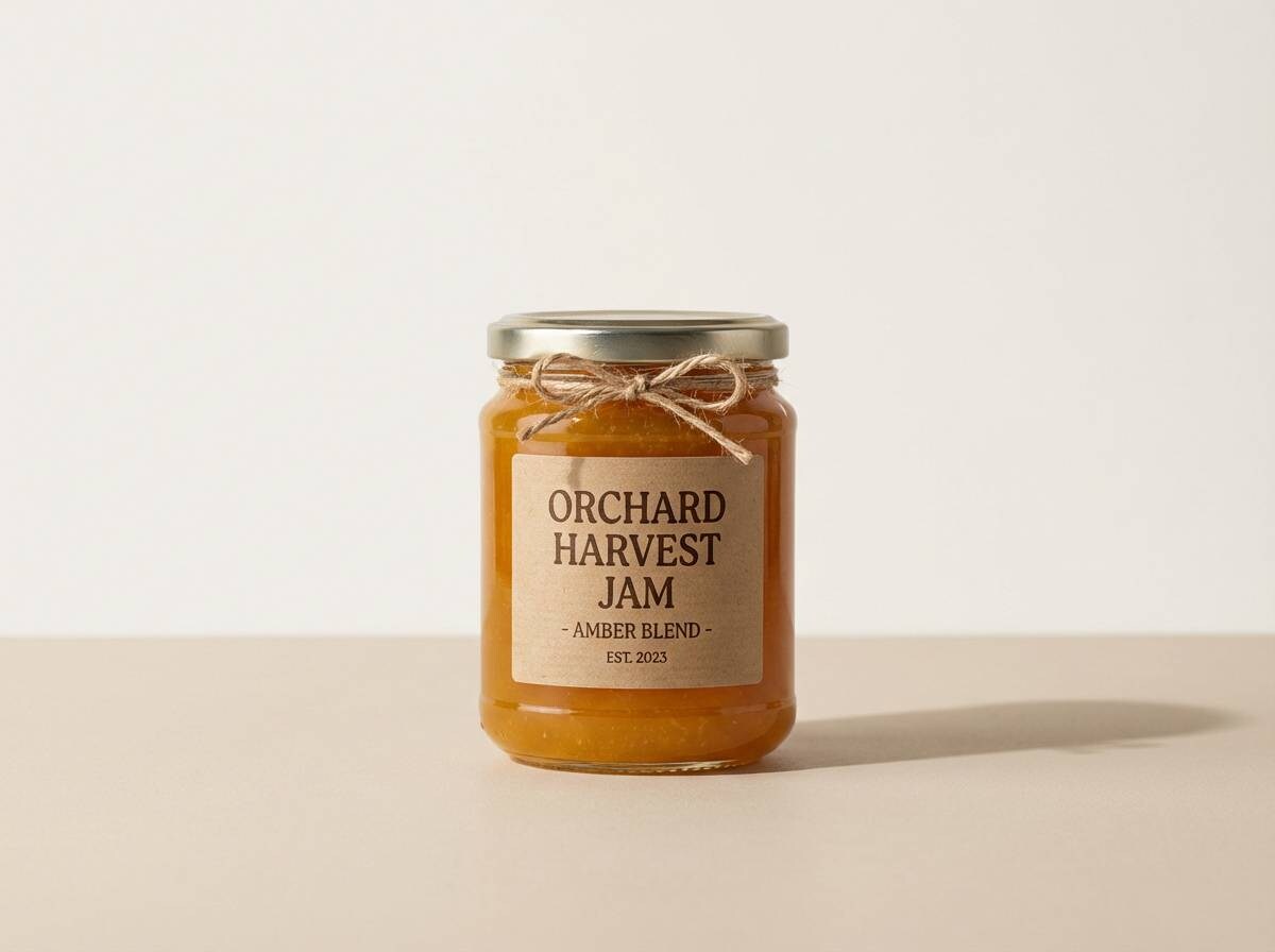
11) Amber Orchard
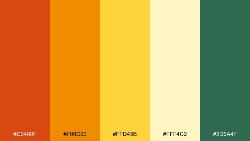
HEX: #d9480f #f08c00 #ffd43b #fff4c2 #2d6a4f
Mood: wholesome, rustic, inviting
Best for: jam label design and packaging
Wholesome and rustic, it brings to mind orchard rows, sticky preserves, and sun-warmed wood. Use amber and gold for the main label band, then add creamy yellow for the background to keep it friendly. A natural green makes a perfect accent for fruit variety markers and organic badges. Tip: keep type slightly condensed to fit more information without making the label feel busy.
Image example of amber orchard generated using media.io
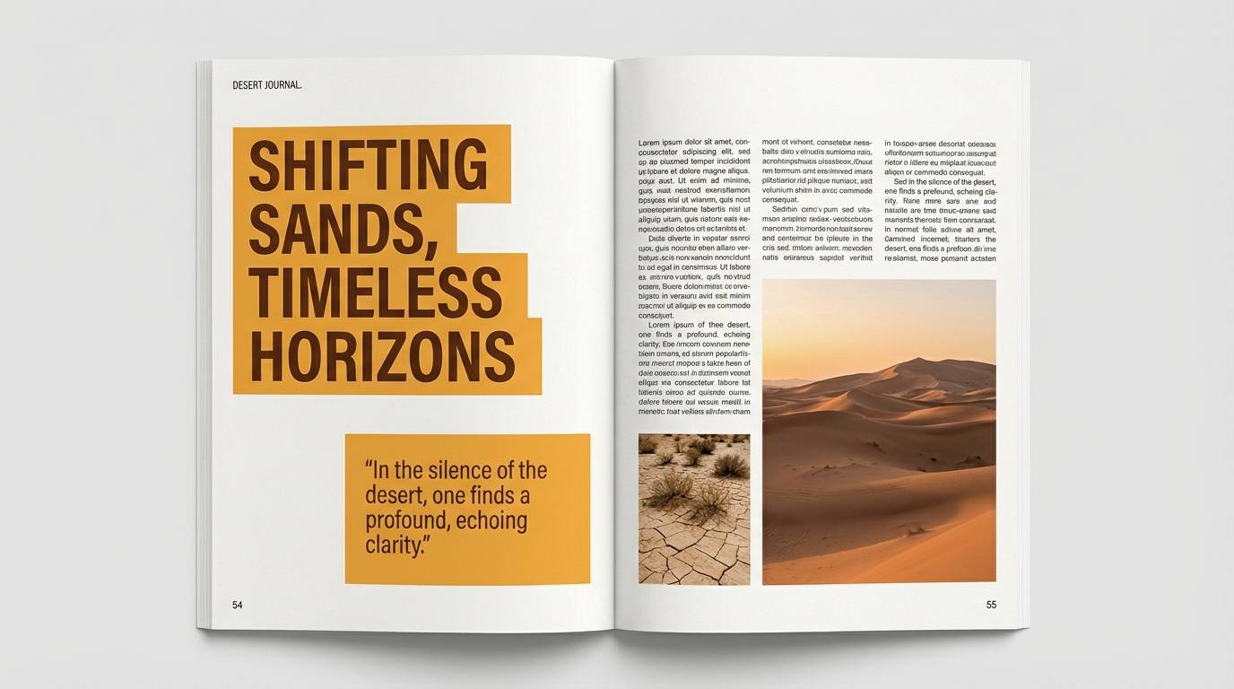
12) Desert Marigold
HEX: #cc5500 #ff8800 #ffcc33 #fff1b8 #1d3557
Mood: sun-drenched, adventurous, cinematic
Best for: travel magazine editorial spread
Sun-drenched and adventurous, it feels like desert trails and wildflowers against a deep twilight sky. Use the dark blue for text columns and photo captions to keep the spread readable. Warm oranges and marigold yellows work best as section headers, pull quotes, and small graphic rules. Tip: maintain generous margins so the palette stays sophisticated rather than loud.
Image example of desert marigold generated using media.io
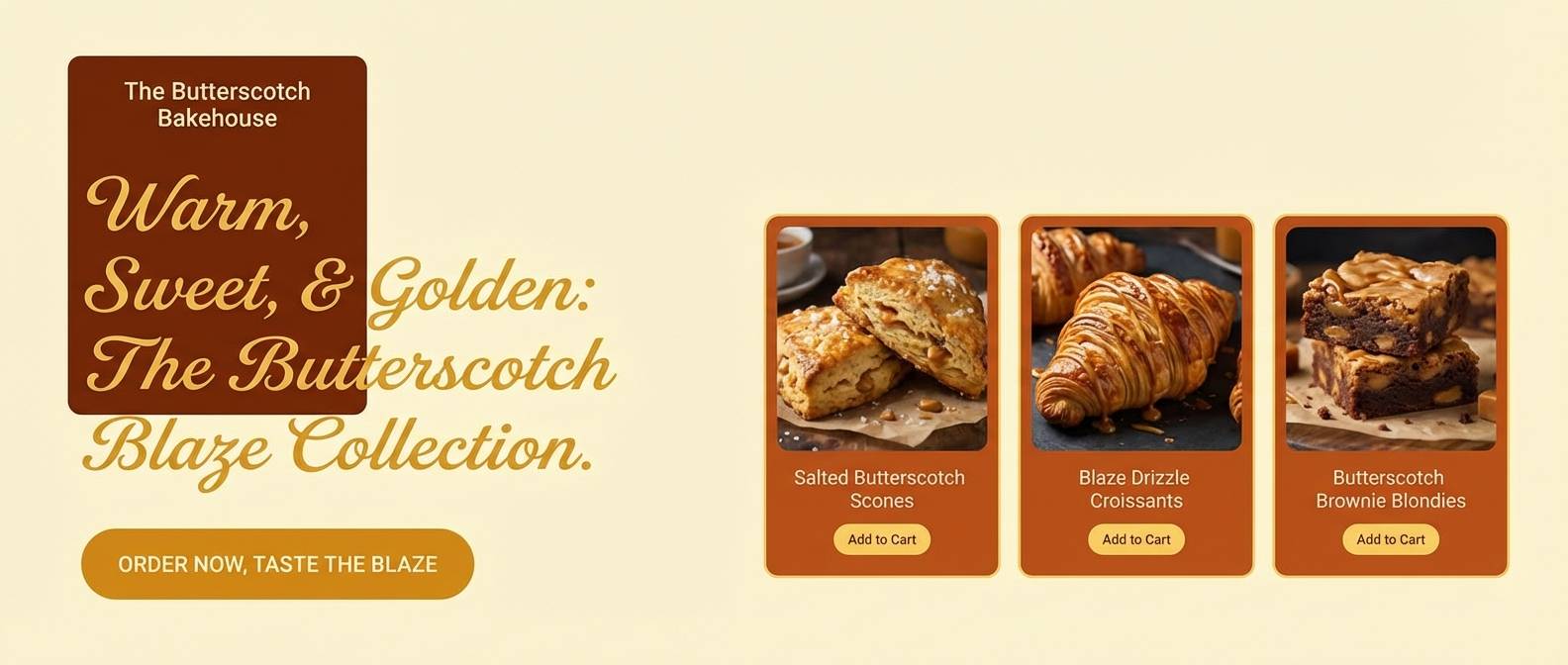
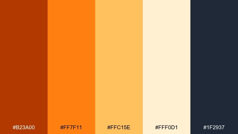
13) Butterscotch Blaze
HEX: #e8590c #ff922b #ffd8a8 #fff4e6 #343a40
Mood: cozy, modern, dessert-like
Best for: bakery website hero section
Cozy and dessert-like, it suggests butterscotch sauce and warm bakery lighting. This orange yellow color palette is ideal for hero sections where you want instant warmth without sacrificing clarity. Pair the soft creams with charcoal text and use the brighter orange sparingly for buttons and limited-time offers. Tip: add subtle grain or paper texture behind the light tones to avoid a flat, sterile look.
Image example of butterscotch blaze generated using media.io
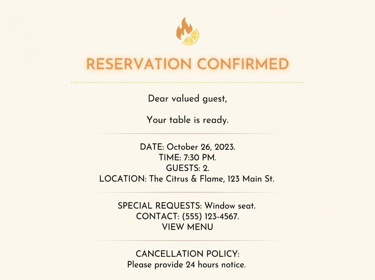
14) Candlelit Citrus
HEX: #b23a00 #ff7f11 #ffc15e #fff0d1 #1f2937
Mood: intimate, warm, upscale
Best for: restaurant reservation email template
Intimate and warm, it evokes candlelight reflecting off citrus peels and polished glassware. Use the deep orange as a refined accent for headers and dividers, then keep the background creamy for long-form readability. A cool charcoal balances the warmth and makes links and buttons feel intentional. Tip: avoid pure black; slightly softened dark tones look more premium with warm palettes.
Image example of candlelit citrus generated using media.io
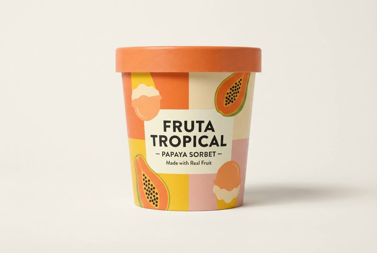
15) Papaya Sorbet
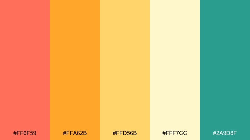
HEX: #ff6f59 #ffa62b #ffd56b #fff7cc #2a9d8f
Mood: lighthearted, creamy, beachy
Best for: ice cream packaging concept
Lighthearted and creamy, it feels like papaya sorbet melting in beach sun with a breezy teal splash. Keep the soft yellow as the main tub color, then use papaya orange for flavor ribbons and big typography. Teal works as a modern twist for seals, nutrition highlights, and side-panel patterns. Tip: try large color blocks instead of busy illustrations so the product reads fast in a freezer aisle.
Image example of papaya sorbet generated using media.io
16) Rusty Sunbeam
HEX: #a63c06 #e36414 #f4a261 #ffe6a7 #283618
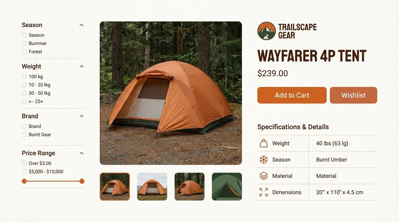
Mood: autumnal, grounded, outdoorsy
Best for: outdoor gear product page
Autumnal and grounded, it looks like a low sunbeam cutting through rust-colored leaves. Use the earthy green as a stability note for specs, filters, and trust badges, while the warm oranges energize headings. Lighter sand tones help product photos stand out without a stark white glare. Tip: keep your primary button color consistent across the site, and use the deeper rust only for urgency states.
Image example of rusty sunbeam generated using media.io
17) Citrus Brick
HEX: #c2410c #fb8500 #ffb703 #fff1c1 #334155
Mood: urban, bold, graphic
Best for: streetwear lookbook layout
Urban and bold, it has the punch of painted brick, safety signage, and crisp shadowed type. Use the slate blue-gray for body copy and grid lines so the warm colors can be big and graphic. For orange yellow color combinations in print, keep yellows slightly muted to avoid neon shifts under different lighting. Tip: add one consistent geometric motif and repeat it across pages to unify the lookbook.
Image example of citrus brick generated using media.io
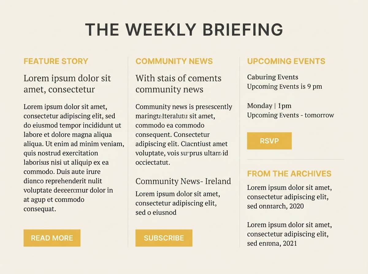
18) Warm Corn Silk
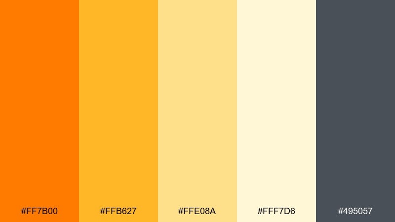
HEX: #ff7b00 #ffb627 #ffe08a #fff7d6 #495057
Mood: gentle, sunny, approachable
Best for: nonprofit newsletter design
Gentle and sunny, it feels like a welcoming note pinned to a community board. The soft yellow range makes long reading comfortable, while a single orange accent adds optimism to headlines and buttons. Use the cool gray for body text to maintain accessibility and avoid eye fatigue. Tip: keep link colors consistent and underline them, since warm palettes can reduce perceived contrast.
Image example of warm corn silk generated using media.io
19) Solar Spice
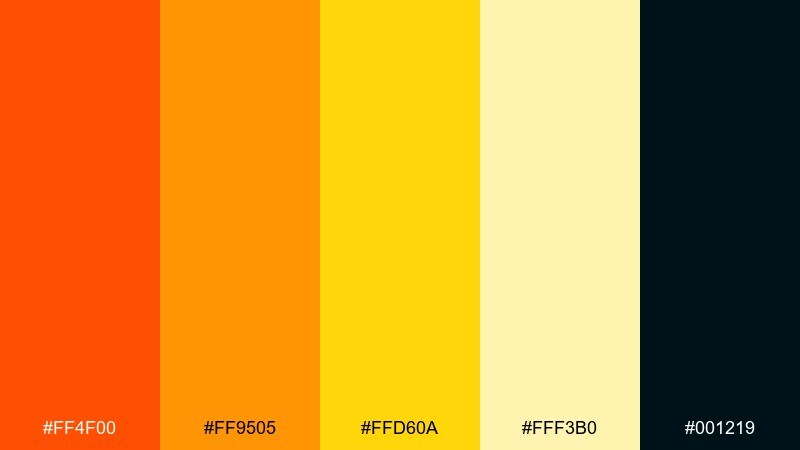
HEX: #ff4f00 #ff9505 #ffd60a #fff3b0 #001219
Mood: electric, spicy, high-impact
Best for: YouTube thumbnail template system
Electric and spicy, it brings instant heat with a clean, modern edge. Use the near-black for bold outlines and drop shadows so text stays readable at small sizes. Bright yellow works best as a punchy highlight behind a few key words, not full panels. Tip: build two consistent thumbnail variants and swap only the accent placement to keep your channel cohesive.
Image example of solar spice generated using media.io

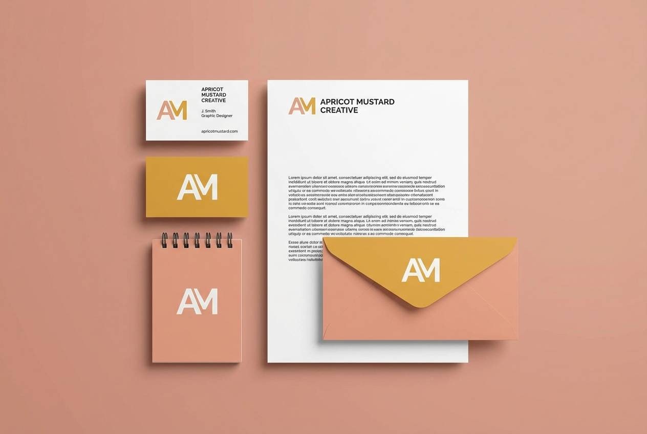
20) Apricot Mustard
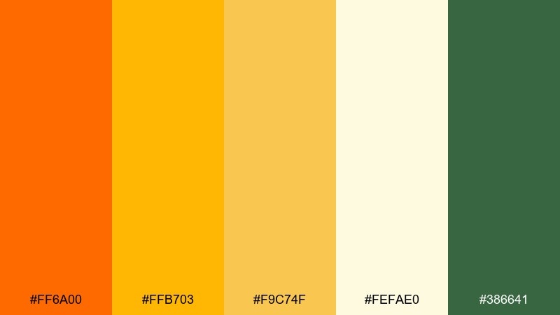
HEX: #ff6a00 #ffb703 #f9c74f #fefae0 #386641
Mood: retro, warm, nature-leaning
Best for: eco brand logo and stationery
Retro and warm, it feels like sun-faded paper, mustard seed tones, and a hint of botanical green. An orange yellow color scheme like this works well for eco branding when you keep the palette matte and slightly desaturated. Use green for stamps, secondary marks, and envelope liners to add credibility and calm. Tip: choose an uncoated paper stock so the yellows stay soft rather than glossy.
Image example of apricot mustard generated using media.io
What Colors Go Well with Orange Yellow?
Deep neutrals are the easiest match: charcoal, near-black, and slate keep orange yellow readable and modern, especially for UI text, pricing, and dense layouts.
Cool complements add sophistication—navy, teal, and blue-green counterbalance the heat and make warm accents feel intentional rather than overwhelming.
For softer work, try creamy off-whites, sand, and muted mauves/plums. They preserve the warm mood while dialing back glare on large backgrounds.
How to Use a Orange Yellow Color Palette in Real Designs
Assign roles to each color: pick one primary warm (CTA/buttons), one warm support (highlights/badges), one light background (cream), and one dark anchor (text/nav). This prevents “all-bright” layouts.
In print, test under different lighting because yellows can shift and look neon. Slightly muting the brightest yellow often improves consistency across stocks and finishes.
For accessibility, avoid orange text on yellow backgrounds. Use the darkest palette color for body copy, and reserve warm tones for blocks, icons, and emphasis.
Create Orange Yellow Palette Visuals with AI
If you have HEX codes but need real-looking mockups, AI is a fast way to generate posters, packaging concepts, UI screens, or thumbnail systems in your exact orange yellow tones.
Start with a clear format (poster, email template, landing page), specify “flat vector” or “realistic studio shot,” and keep the background simple so your palette reads cleanly.
Use the prompts above as templates, then swap the subject (menu, label, flyer) while keeping the style notes and aspect ratio consistent.
Orange Yellow Color Palette FAQs
-
What does an orange yellow color palette communicate in branding?
It usually signals warmth, friendliness, energy, and optimism. It’s common in food, events, family-focused products, and any brand that wants to feel approachable and upbeat. -
How do I keep orange and yellow from looking too loud?
Use a dark anchor color (charcoal/navy/deep green) for typography, keep bright yellows as accents, and give the layout enough cream/off-white space so the warm tones can “breathe.” -
What’s the best text color for orange yellow backgrounds?
Dark charcoal or near-black is usually safest for readability. Avoid orange-on-yellow; it often fails contrast, especially on mobile screens and in bright ambient light. -
Which complementary colors pair best with orange yellow?
Teal, deep cyan, and navy balance warm palettes well because they sit opposite warm hues and create clean, modern contrast without feeling harsh. -
Are orange yellow palettes good for UI design?
Yes, if you limit bright warm colors to buttons, highlights, and badges. For large UI surfaces, use creams/sands and keep the darkest color for text, icons, and form elements. -
How can I generate mockups using these palettes quickly?
Use an AI text-to-image tool, describe the design format (packaging, poster, landing page, email), call out a clean background, and include style constraints like “flat vector” or “realistic studio shot” plus an aspect ratio. -
Do orange yellow colors print differently than they look on screen?
They can. Bright yellows and oranges may shift under different lighting and paper stocks, so it’s smart to test print proofs and consider slightly desaturating the brightest yellow for consistency.
Next: Aesthetic Color Palette


