

Orange, green, and yellow is a high-energy trio that feels both natural and modern. It can read as citrus-fresh, garden-bright, or harvest-warm depending on how you balance saturation and contrast.
Below are 20+ orange green yellow color palette ideas with HEX codes, plus practical tips for using them in branding, UI, print, and social graphics.
In this article
- Why Orange Green Yellow Palettes Work So Well
-
- citrus grove
- sunlit meadow
- harvest walk
- retro tropic
- canyon citrus
- lime zest pop
- botanical marmalade
- festival lanterns
- modern orchard ui
- spice market
- citrus field notes
- eco cafe glow
- sunrise citrus splash
- garden market signage
- vintage orchard label
- sunny classroom
- citrus herb wedding
- urban market ui
- mango leaf editorial
- wildflower citrus
- citrus startup
- What Colors Go Well with Orange Green Yellow?
- How to Use a Orange Green Yellow Color Palette in Real Designs
- Create Orange Green Yellow Palette Visuals with AI
Why Orange Green Yellow Palettes Work So Well
Orange, green, and yellow naturally suggest sunlight, growth, and warmth—so they feel instantly familiar. That makes them powerful for designs that need fast emotional impact, from food packaging to event posters.
Visually, this trio offers built-in hierarchy: orange draws attention, yellow boosts brightness, and green stabilizes the composition. Add a deep neutral (charcoal, navy, or brown) and you get strong readability across print and screens.
Because these hues sit across warm-to-cool territory, you can steer the mood easily. Push greens darker for a grounded, eco feel, or keep greens lively for a youthful, energetic tone.
20+ Orange Green Yellow Color Palette Ideas (with HEX Codes)
1) Citrus Grove
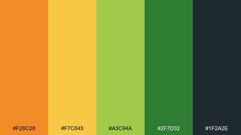
HEX: #F28C28 #F7C845 #A3C94A #2F7D32 #1F2A2E
Mood: fresh, sunny, energetic
Best for: juice brand packaging
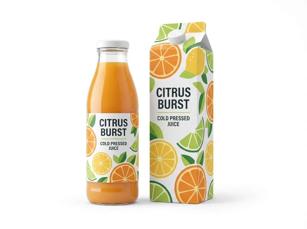
Fresh, sunny energy like sliced oranges under leafy shade. This orange green yellow color palette works beautifully on packaging where you need instant shelf pop and clear flavor cues. Pair it with clean white space and a deep charcoal for readable nutrition panels. Tip: keep the darkest tone for type and barcode areas so the bright hues stay crisp.
Image example of citrus grove generated using media.io
Media.io is an online AI studio for creating and editing video, image, and audio in your browser.

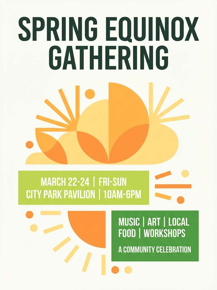
2) Sunlit Meadow
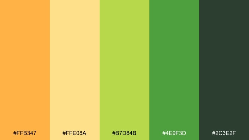
HEX: #FFB347 #FFE08A #B7D84B #4E9F3D #2C3E2F
Mood: bright, outdoorsy, optimistic
Best for: spring event poster
Bright meadow tones feel like warm light across new grass. Use these hues on posters for outdoor markets, garden talks, or community runs where upbeat readability matters. Pair with an off-white background and keep the deep green for headlines. Tip: set the yellow as a soft field and let orange do the call-to-action buttons or badges.
Image example of sunlit meadow generated using media.io
3) Harvest Walk
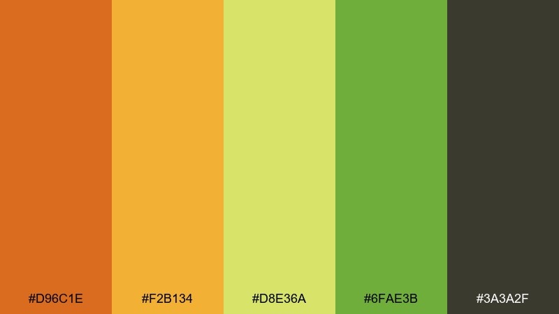
HEX: #D96C1E #F2B134 #D8E36A #6FAE3B #3A3A2F
Mood: earthy, nostalgic, grounded
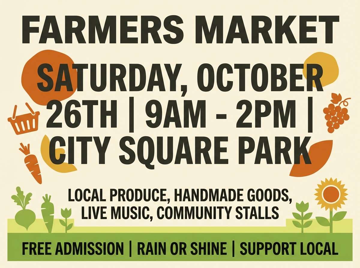
Best for: farmers market flyer
Earthy harvest warmth suggests baskets, burlap, and late-afternoon sun. It fits flyers and social tiles for seasonal produce, tasting events, and local food pop-ups. Pair with textured paper backgrounds and use the dark neutral for pricing and dates. Tip: limit the light yellow-green to highlights so the flyer does not feel washed out.
Image example of harvest walk generated using media.io
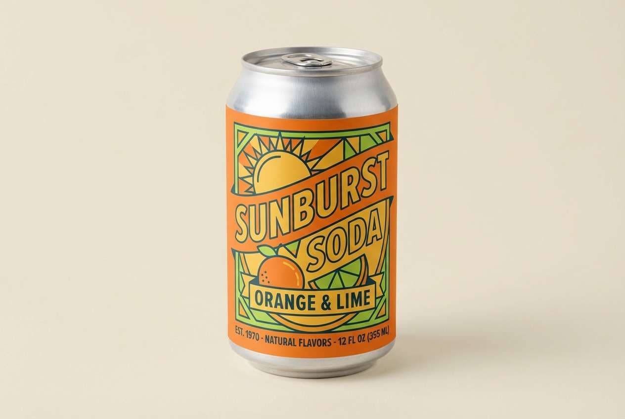
4) Retro Tropic
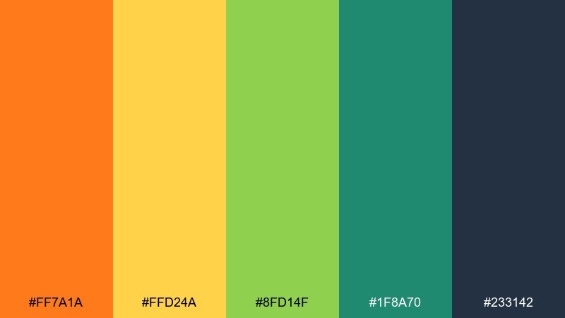
HEX: #FF7A1A #FFD24A #8FD14F #1F8A70 #233142
Mood: playful, retro, punchy
Best for: beverage ad creative
Playful retro punch brings to mind vintage cans and summer playlists. Use it for ad creatives where you need bold contrast and a fun, youthful tone. Pair with simple geometric shapes and a deep slate for copy. Tip: keep the teal-green as a secondary accent so the orange stays the hero.
Image example of retro tropic generated using media.io
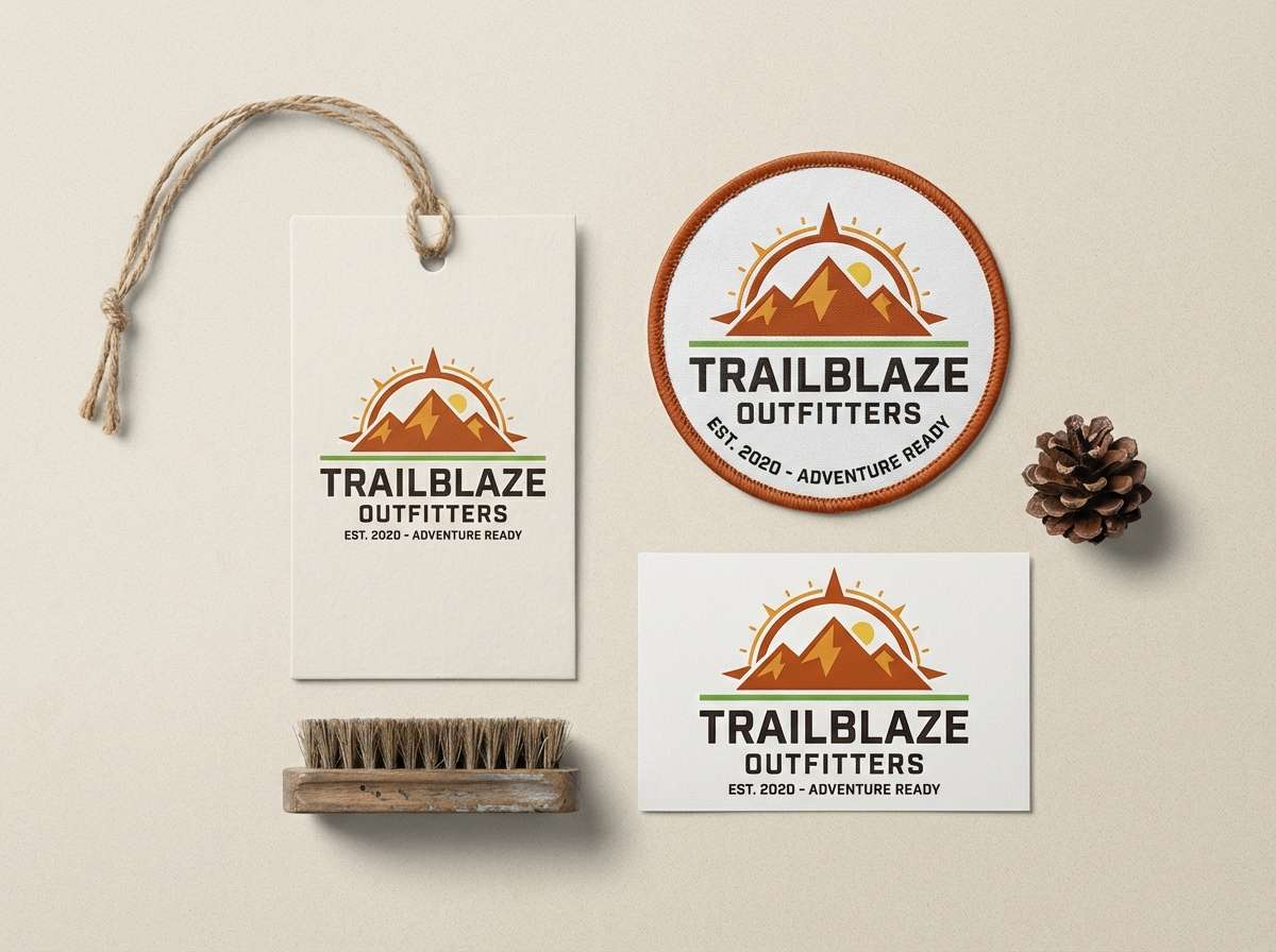
5) Canyon Citrus
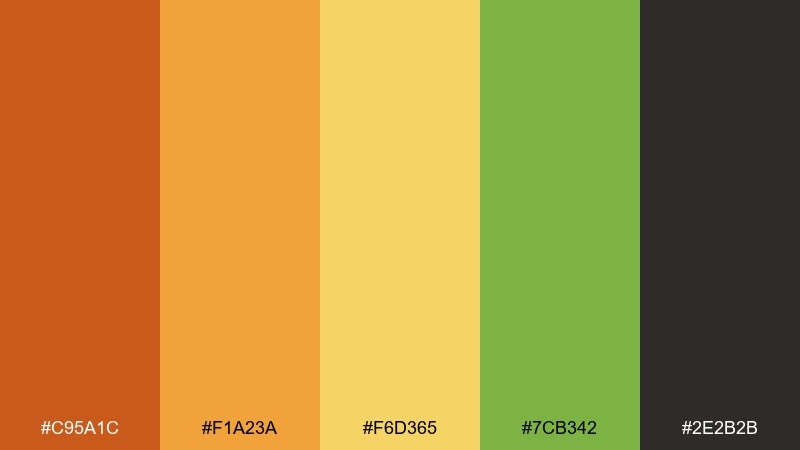
HEX: #C95A1C #F1A23A #F6D365 #7CB342 #2E2B2B
Mood: warm, rugged, adventurous
Best for: outdoor brand logo and kit
Warm canyon tones feel rugged and trail-ready, with a citrus lift that keeps it modern. This mix suits outdoor logos, hang tags, and gear kits that need both grit and friendliness. Pair with kraft textures and reserve the darkest shade for wordmarks. Tip: use the pale yellow as a highlight line or stitch detail rather than a large fill.
Image example of canyon citrus generated using media.io
6) Lime Zest Pop
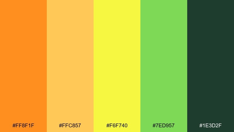
HEX: #FF8F1F #FFC857 #F6F740 #7ED957 #1E3D2F
Mood: zesty, bold, high-contrast
Best for: social media promo graphics
Zesty, bold color pops like a lime twist in a fizzy drink. These orange green yellow color combinations are ideal for punchy promo tiles, limited-time offers, and countdown posts. Pair with strong sans-serif type and keep backgrounds mostly light to avoid visual noise. Tip: set the neon-leaning yellow as a small accent so it reads intentional, not fluorescent.
Image example of lime zest pop generated using media.io

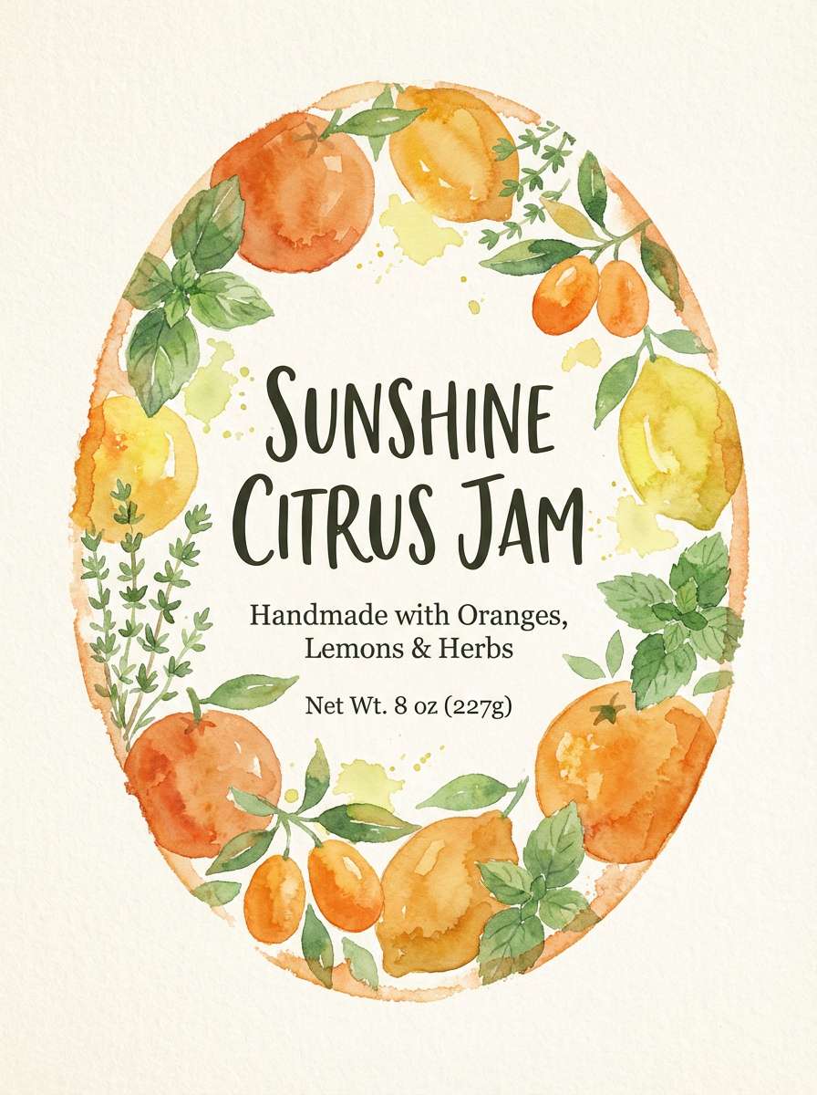
7) Botanical Marmalade
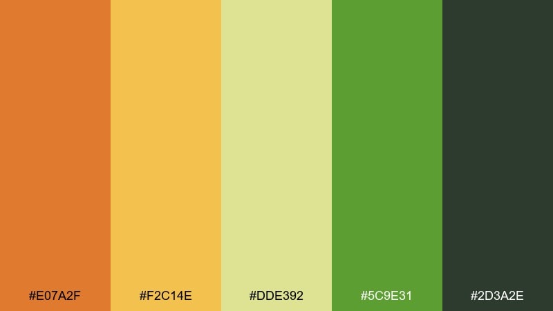
HEX: #E07A2F #F2C14E #DDE392 #5C9E31 #2D3A2E
Mood: cozy, botanical, artisanal
Best for: jam label illustration
Cozy botanical warmth evokes homemade preserves, paper labels, and garden herbs. It shines on artisanal food branding where you want natural cues without looking dull. Pair with hand-drawn linework and a cream background for an inviting, crafted feel. Tip: use the muted yellow-green for foliage washes and keep the orange for fruit focal points.
Image example of botanical marmalade generated using media.io
8) Festival Lanterns
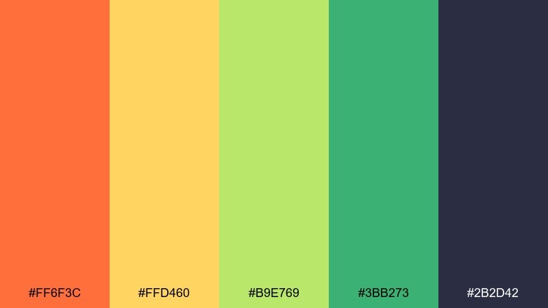
HEX: #FF6F3C #FFD460 #B9E769 #3BB273 #2B2D42
Mood: festive, vibrant, welcoming
Best for: summer festival tickets
Festive lantern brightness feels lively and welcoming, like warm lights over a crowd. Use it for ticket designs, wristbands, and event assets that need instant energy and legibility. Pair with generous margins and let the deep navy anchor the fine print. Tip: keep gradients subtle and use flat blocks for clean, printable results.
Image example of festival lanterns generated using media.io

9) Modern Orchard UI
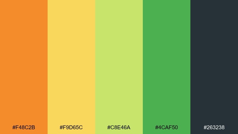
HEX: #F48C2B #F9D65C #C8E46A #4CAF50 #263238
Mood: clean, friendly, modern
Best for: 2D dashboard UI mockup
Clean orchard tones feel friendly and modern, with just enough warmth to stay human. It suits dashboards, onboarding screens, and SaaS cards where status colors must be clear. Pair with soft grays and use the deepest shade for primary text and icons. Tip: reserve the bright orange for one key action to keep the interface calm.
Image example of modern orchard ui generated using media.io
10) Spice Market
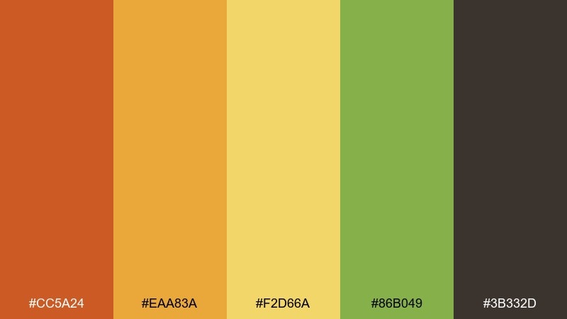
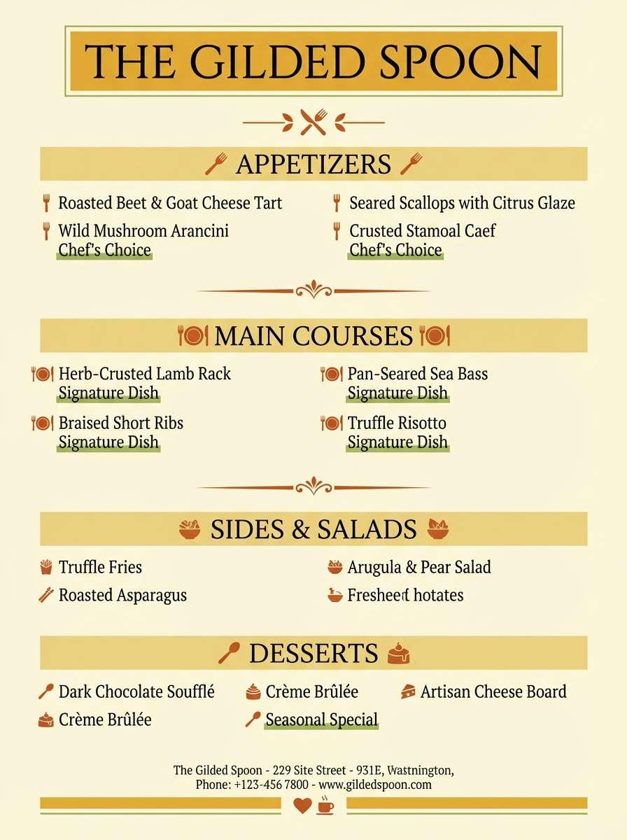
HEX: #CC5A24 #EAA83A #F2D66A #86B049 #3B332D
Mood: warm, aromatic, textured
Best for: restaurant menu design
Warm, aromatic tones recall toasted spices and bustling market stalls. They work well for restaurant menus, specials boards, and food photography overlays. Pair with a warm cream stock and use the deep brown for section headers. Tip: keep the strongest orange for icons or dish highlights so the menu stays readable.
Image example of spice market generated using media.io
11) Citrus Field Notes
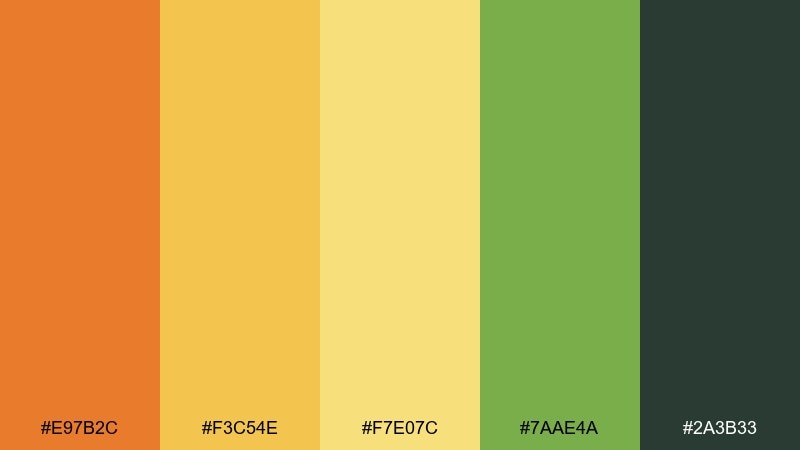
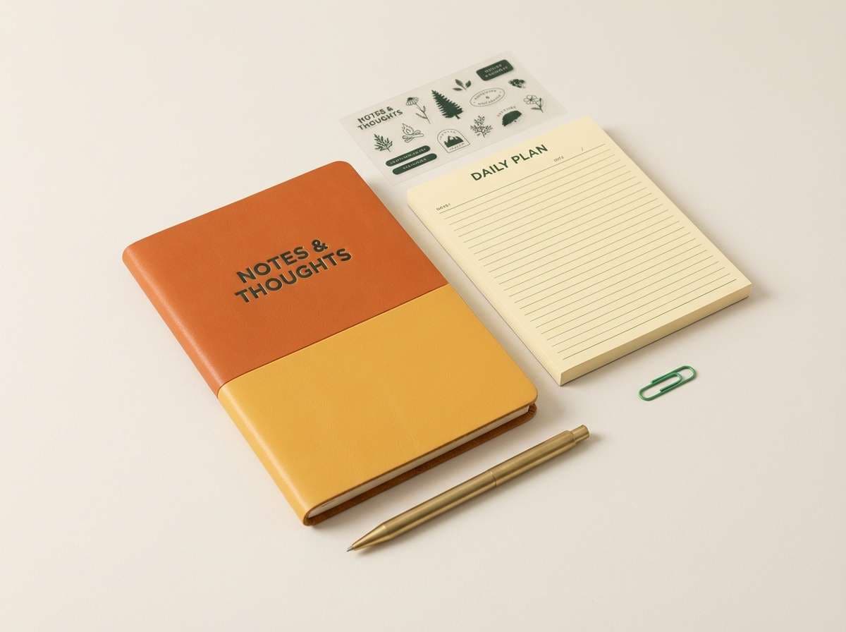
HEX: #E97B2C #F3C54E #F7E07C #7AAE4A #2A3B33
Mood: calm, natural, organized
Best for: stationery set branding
Calm natural notes feel like sketchbooks, pressed leaves, and tidy checklists. This orange green yellow color palette is a strong fit for stationery, notebook covers, and planner stickers that should feel upbeat but not loud. Pair with simple grid layouts and let the dark green handle small text. Tip: use the soft yellow as a paper tint to keep whites from feeling stark.
Image example of citrus field notes generated using media.io
12) Eco Cafe Glow
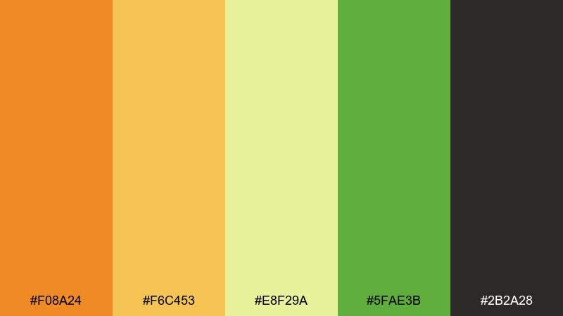
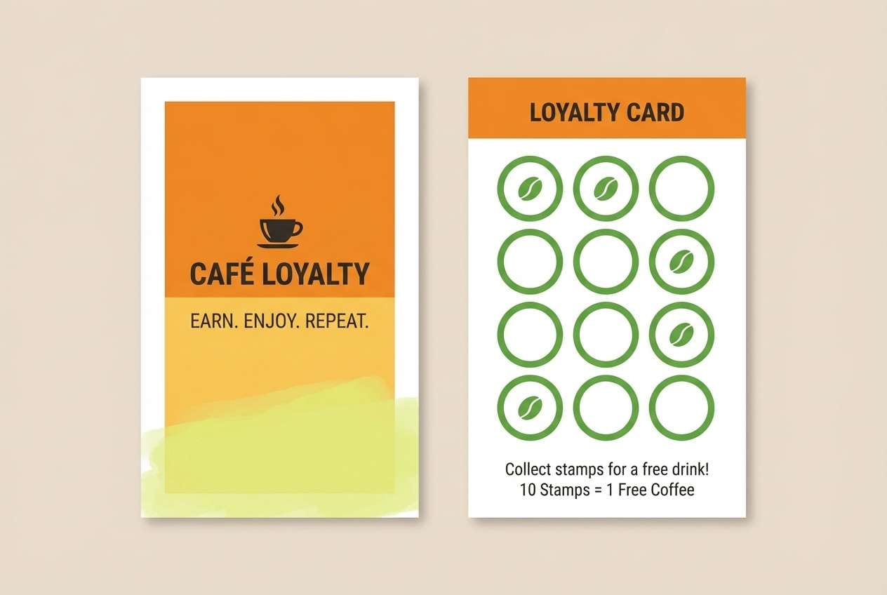
HEX: #F08A24 #F6C453 #E8F29A #5FAE3B #2B2A28
Mood: cozy, eco-minded, inviting
Best for: cafe loyalty card
Cozy cafe glow feels like warm pastries near a sunny window. Use it on loyalty cards, stamp cards, and small-format print where friendly contrast matters. Pair with uncoated paper and a simple icon set for an eco vibe. Tip: keep the pale yellow-green as a background wash and place text on the darker tones for clarity.
Image example of eco cafe glow generated using media.io
13) Sunrise Citrus Splash
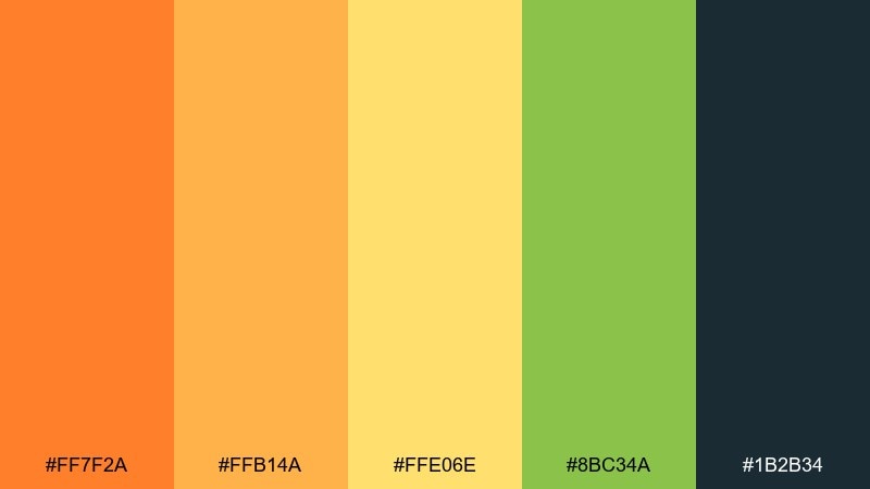
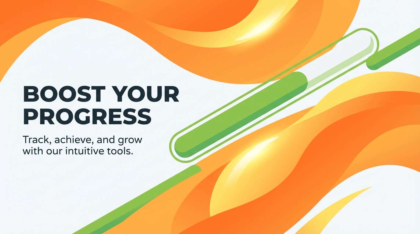
HEX: #FF7F2A #FFB14A #FFE06E #8BC34A #1B2B34
Mood: uplifting, bright, dynamic
Best for: fitness app hero banner
Uplifting sunrise tones feel dynamic, like early runs and fresh starts. They are great for a hero banner where you want movement without overwhelming the layout. Pair with bold typography and a dark navy for accessibility-friendly contrast. Tip: use orange for the primary button and keep greens for progress or success states.
Image example of sunrise citrus splash generated using media.io
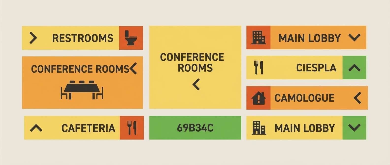
14) Garden Market Signage
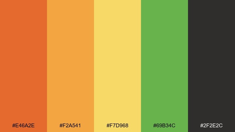
HEX: #E46A2E #F2A541 #F7D968 #69B34C #2F2E2C
Mood: friendly, clear, practical
Best for: wayfinding signage set
Friendly market signage tones feel clear, practical, and easy to follow. Use them for wayfinding systems, booth signs, and vendor labels that must read from a distance. Pair with simple pictograms and high-contrast type. Tip: dedicate one color per category so visitors learn the system quickly.
Image example of garden market signage generated using media.io
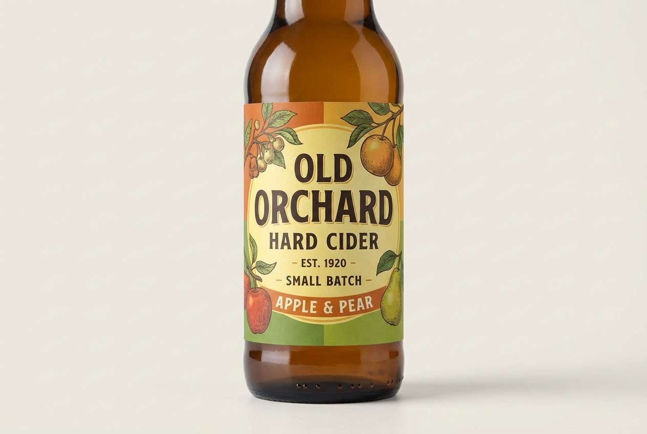
15) Vintage Orchard Label
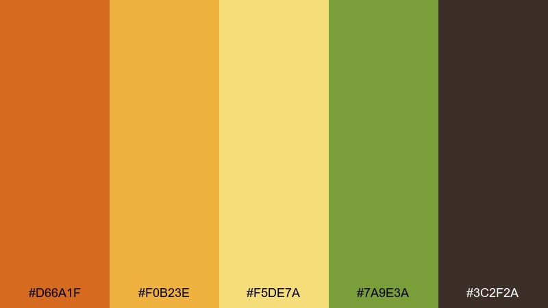
HEX: #D66A1F #F0B23E #F5DE7A #7A9E3A #3C2F2A
Mood: vintage, crafted, warm
Best for: cider bottle label
Vintage orchard warmth suggests woodcut textures and hand-pressed fruit. It fits bottle labels and badge logos where you want tradition with a bright lift. Pair with serif type, fine borders, and a cream stock to enhance the crafted feel. Tip: use the deepest brown for small legal text and keep orange for the brand mark.
Image example of vintage orchard label generated using media.io
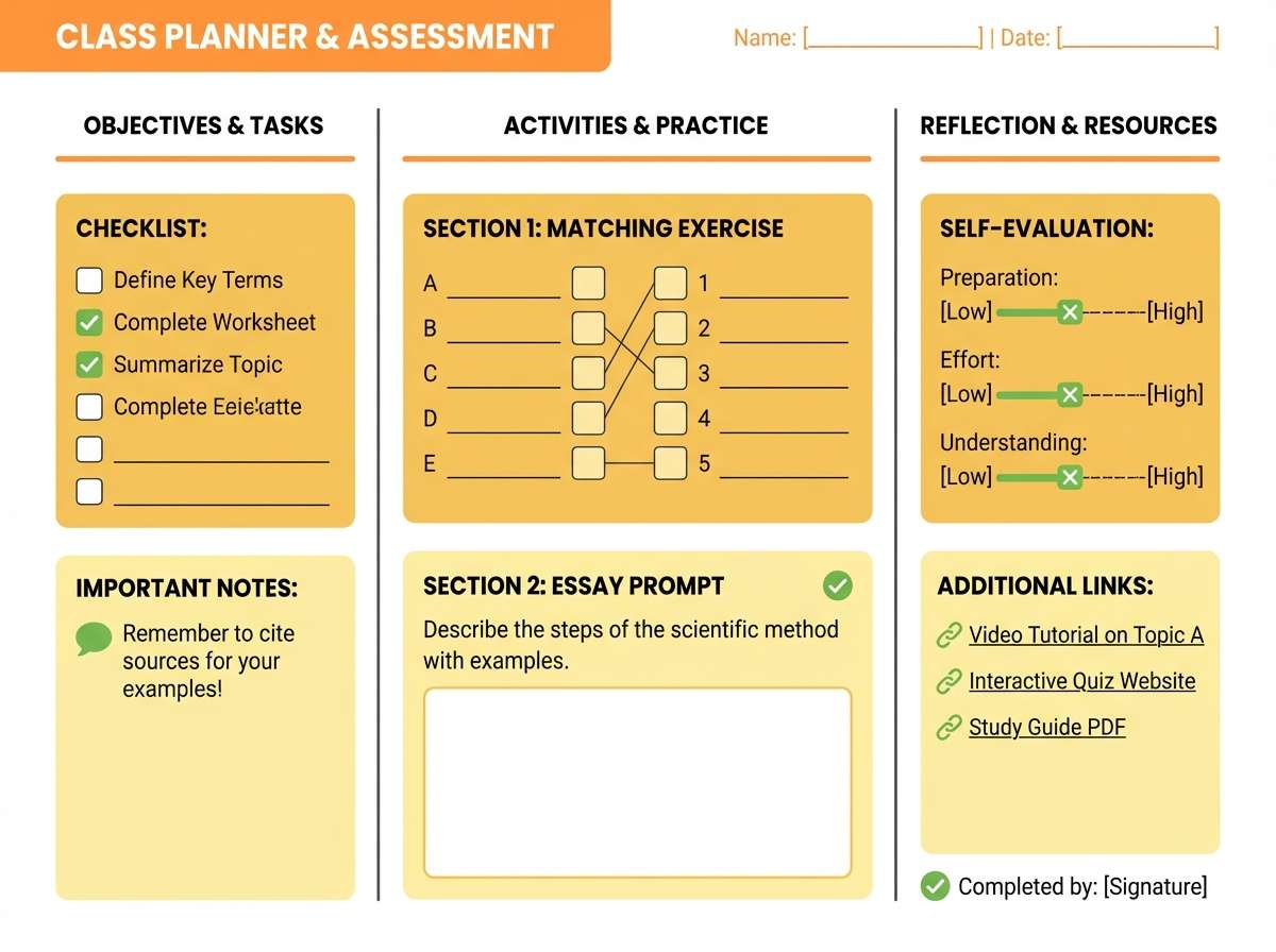
16) Sunny Classroom
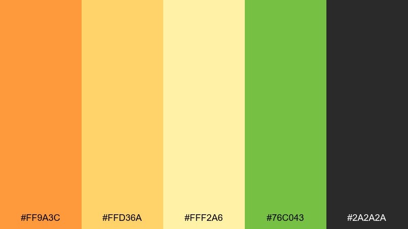
HEX: #FF9A3C #FFD36A #FFF2A6 #76C043 #2A2A2A
Mood: cheerful, approachable, kid-friendly
Best for: education worksheet templates
Cheerful classroom tones feel approachable and easy on the eyes. They work well for worksheets, slides, and printable templates where structure matters. Pair with plenty of white space and use the dark neutral for instructions. Tip: assign the green to correct answers and the orange to key reminders to reinforce meaning.
Image example of sunny classroom generated using media.io
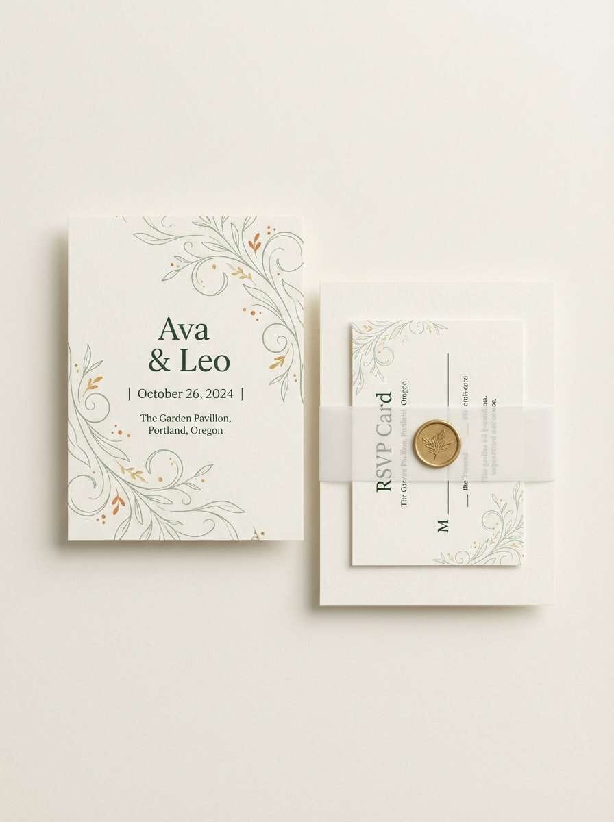
17) Citrus Herb Wedding
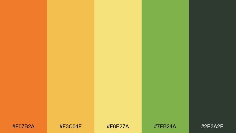
HEX: #F07B2A #F3C04F #F6E27A #7FB24A #2E3A2F
Mood: romantic, fresh, garden-inspired
Best for: wedding invitation suite
Romantic garden freshness brings to mind citrus branches, herbs, and golden-hour photos. These orange green yellow color combinations feel modern on invitations when you keep the layout airy and the typography refined. Pair with warm ivory paper and use green for botanical linework. Tip: print the orange in small accents like monograms or wax-seal details to avoid overpowering the suite.
Image example of citrus herb wedding generated using media.io
18) Urban Market UI
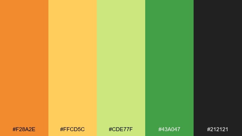
HEX: #F28A2E #FFCD5C #CDE77F #43A047 #212121
Mood: modern, confident, high-clarity
Best for: ecommerce category UI
Modern market tones feel confident and clean, with clarity that holds up in small components. Use them for ecommerce category chips, badges, and promo bars where hierarchy is everything. Pair with neutral grays and keep green for success and availability signals. Tip: test the yellow on accessibility contrast and move it to backgrounds rather than body text.
Image example of urban market ui generated using media.io
19) Mango Leaf Editorial
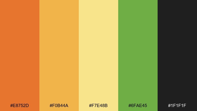
HEX: #E8752D #F0B44A #F7E48B #6FAE45 #1F1F1F
Mood: editorial, stylish, warm
Best for: magazine feature layout
Stylish warmth reads like an editorial spread with sunlit photography and crisp typography. It suits magazine features, lookbooks, and long-form landing pages that need a lively but mature feel. Pair with generous margins and let the near-black carry body copy. Tip: use the green sparingly as a pull-quote marker or section label for a refined finish.
Image example of mango leaf editorial generated using media.io
20) Wildflower Citrus
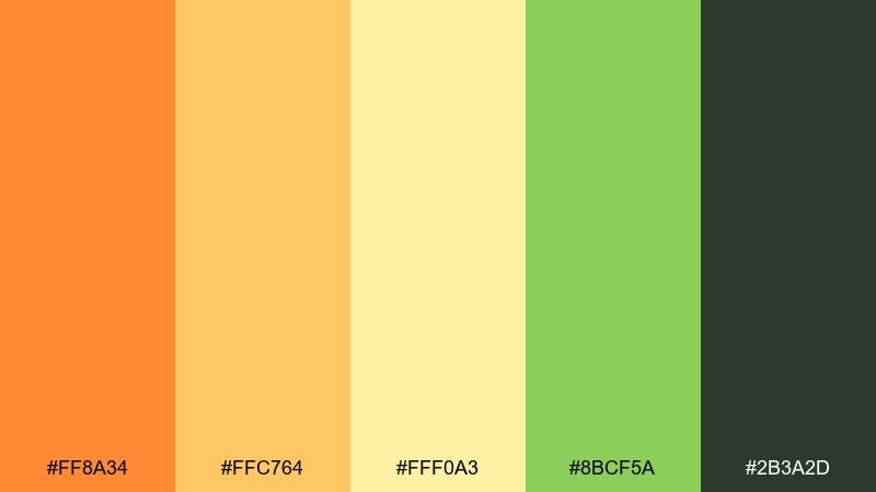
HEX: #FF8A34 #FFC764 #FFF0A3 #8BCF5A #2B3A2D
Mood: airy, soft, nature-forward
Best for: botanical print illustration
Airy wildflower softness feels like a sunlit field sketch with gentle color washes. Use it for botanical prints, greeting cards, and light seasonal merch. Pair with fine ink lines and warm white paper so the pastels stay delicate. Tip: keep the darkest green only for stems and small labels to preserve the airy mood.
Image example of wildflower citrus generated using media.io
21) Citrus Startup
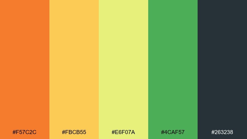
HEX: #F57C2C #FBCB55 #E6F07A #4CAF57 #263238
Mood: startup-friendly, optimistic, trustworthy
Best for: brand landing page header
Optimistic startup energy feels bright, trustworthy, and action-oriented. It works well for hero headers, feature icon sets, and signup sections where you want warmth without losing clarity. Pair with cool light grays and use the dark slate for navigation and body text. Tip: keep the yellow-green as a soft background gradient so buttons remain the focus.
Image example of citrus startup generated using media.io
What Colors Go Well with Orange Green Yellow?
Neutrals are the easiest win: warm ivory, off-white, kraft beige, charcoal, and near-black help the bright hues feel intentional and readable. If your palette leans sunny, a deep slate or navy can provide a clean counterbalance.
For a more natural look, add earthy browns and muted olive tones to reduce “neon” energy while keeping the outdoorsy vibe. If you want something sharper and more modern, pair with cool light grays and use green primarily for “success” or “available” messaging.
Accent-wise, teal and deep blue-green can bridge orange and green nicely. Just keep the accent limited so the orange/yellow remain the attention drivers.
How to Use a Orange Green Yellow Color Palette in Real Designs
Start with roles: let orange handle calls-to-action, highlights, and “buy now” moments; use yellow for background warmth or subtle emphasis; and use green for balance, confirmation states, or botanical cues. Then anchor everything with a dark neutral for text and UI icons.
Control saturation to avoid visual noise—especially with bright yellow. A good rule is to use yellow as a tint or panel color, not for paragraphs or thin type, and reserve the most vivid hue for one primary element per layout.
Finally, test contrast early. Orange and yellow can look gorgeous but fail accessibility when used for text on light backgrounds; shifting text to charcoal or deep green usually solves it.
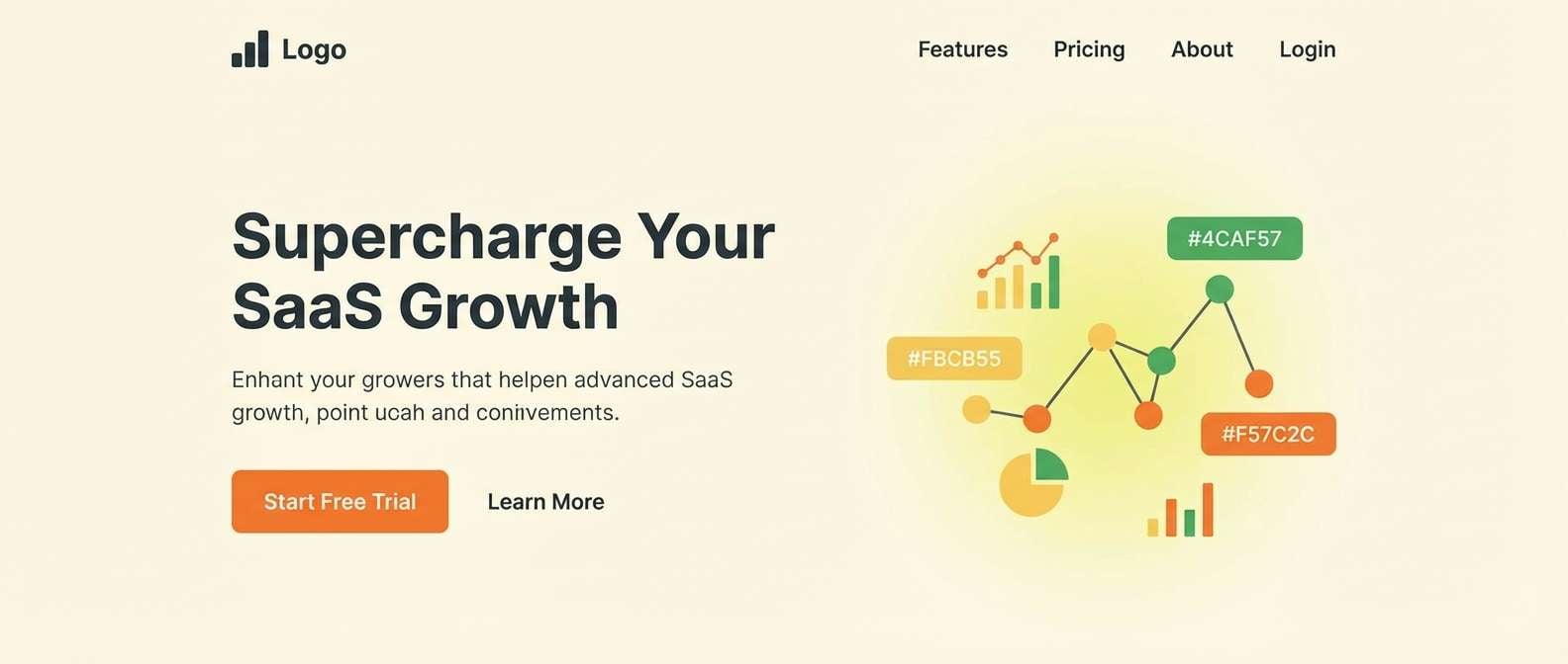
Create Orange Green Yellow Palette Visuals with AI
If you already have HEX codes, you can turn them into mockups quickly by prompting an AI image generator with your palette and layout intent. This helps you preview how the colors behave on packaging, posters, invitations, or UI components before you commit to production.
To keep results consistent, mention where each color should appear (background, headline, accents, typography) and specify a style (flat 2D, realistic studio shot, watercolor illustration). Re-run the prompt with small tweaks to saturation or proportions until the palette feels balanced.
Orange Green Yellow Color Palette FAQs
-
What does an orange green yellow palette communicate?
It typically signals warmth, energy, freshness, and growth. Orange grabs attention, yellow adds brightness and optimism, and green brings a natural, healthy balance. -
How do I keep orange, green, and yellow from looking too loud?
Reduce saturation on one or two colors (often yellow/green), use plenty of white/cream space, and anchor the design with a dark neutral like charcoal, deep navy, or brown. -
What’s the best text color for orange green yellow designs?
Deep charcoal, near-black, or very dark green usually provides the most reliable readability. Avoid yellow text on light backgrounds, and test contrast for accessibility. -
Can I use this palette for professional UI design?
Yes—assign clear roles: orange for primary CTA, green for success/progress, yellow for highlights or background tints, and keep body text/icons in a dark neutral. -
What industries work best with orange green yellow palettes?
Food and beverage, wellness, outdoor brands, eco-friendly products, education, and events. The palette is especially effective when you want “fresh” or “seasonal” cues. -
How many colors should I use at once from a 5-color palette?
In most layouts, 2–3 colors plus a neutral is enough. Use one hero color, one support color, and one accent—then keep the remaining shades for states, highlights, or small details. -
How can I generate matching visuals with these HEX codes?
Use an AI text-to-image tool and include the HEX codes in the prompt along with where each color should be applied (e.g., “typography in #263238, accents in #F57C2C”). Generate a few variations and pick the most consistent result.


