

A rustic wedding color palette is all about cozy earth tones, natural greens, and warm neutrals that feel organic in photos and real-life décor. Whether you’re planning a barn venue, mountain lodge, or garden-to-farm celebration, rustic colors keep the vibe relaxed but still elevated.
Below are 20 rustic wedding color scheme ideas with HEX codes you can use for invitations, florals, signage, rentals, and even your wedding website—plus AI image prompts to visualize each look fast.
In this article
Why Rustic Wedding Color Schemes Work So Well
Rustic wedding colors look “right” in almost any venue because they mirror materials you already see: wood, linen, stone, foliage, dried florals, and warm lighting. That natural familiarity makes the whole event feel cohesive without trying too hard.
These palettes also photograph beautifully. Earth tones and softened neutrals keep skin tones flattering, while greens and warm metals add depth so details like invitations, menus, and tablescapes don’t feel flat.
Most importantly, rustic schemes are flexible. You can lean airy and light (cream + sage), warm and harvest-like (terracotta + amber), or moody and woodsy (fir + plum) while still staying within the rustic aesthetic.
20+ Rustic Wedding Color Palette Ideas (with HEX Codes)
1) Barnwood Sage
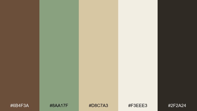
HEX: #6B4F3A #8AA17F #D8C7A3 #F3EEE3 #2F2A24
Mood: grounded, natural, handcrafted
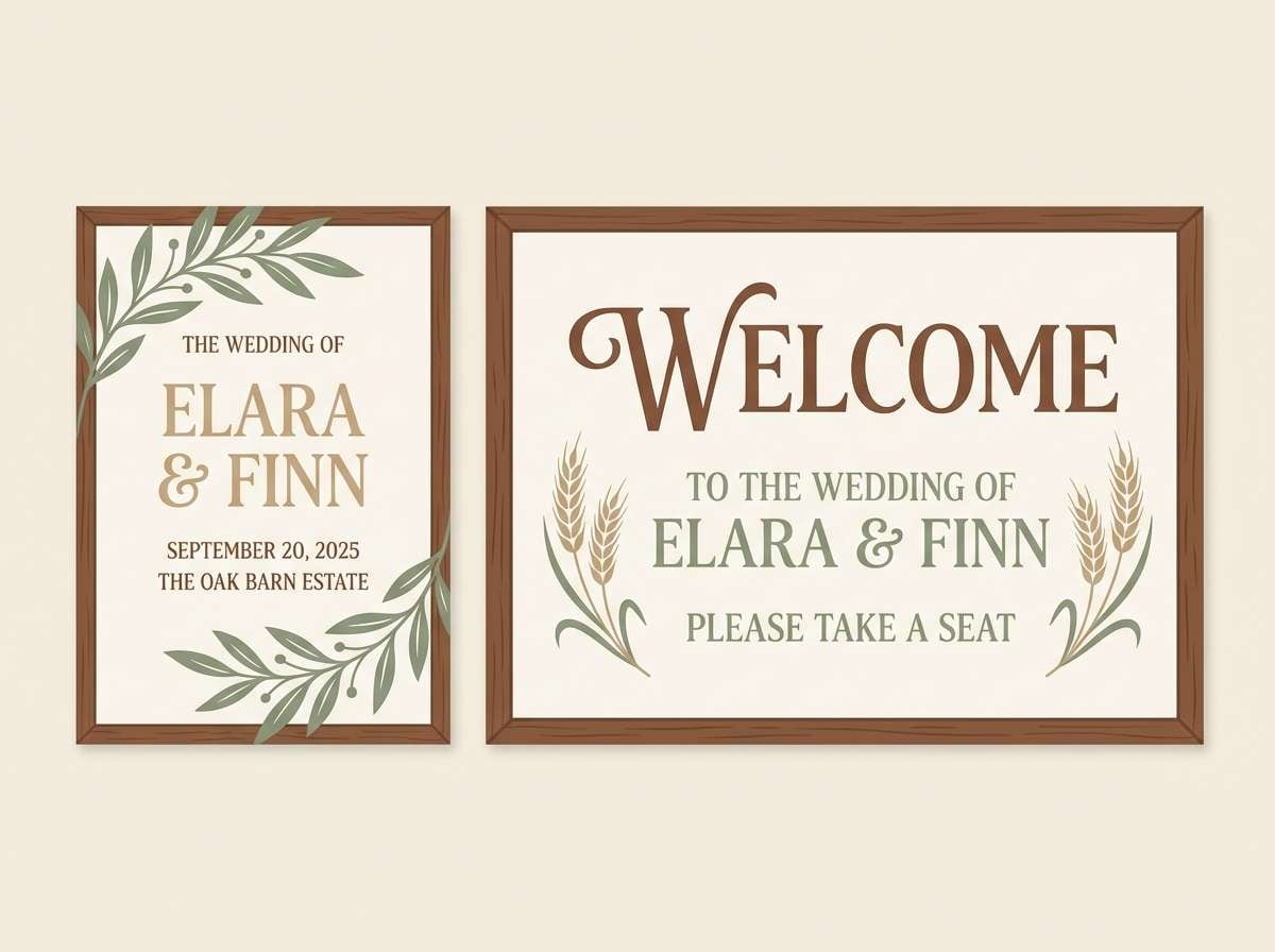
Best for: barn invitations, welcome signs, and table numbers
Grounded and outdoorsy, these rustic wedding tones feel like weathered timber, fresh herbs, and sunlit linen. Use the deep brown for headlines, sage for greenery accents, and the creams to keep layouts airy. It suits barn venues, wood tables, and kraft paper details without looking too heavy. Tip: add a thin charcoal border to make light stationery feel crisp in photos.
Image example of barnwood sage generated using media.io
Media.io is an online AI studio for creating and editing video, image, and audio in your browser.

2) Terracotta Linen
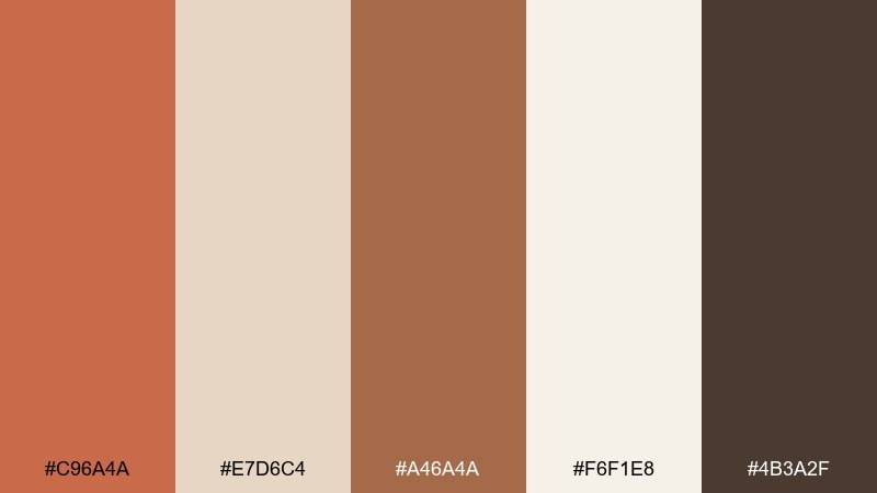
HEX: #C96A4A #E7D6C4 #A46A4A #F6F1E8 #4B3A2F
Mood: warm, sunbaked, inviting
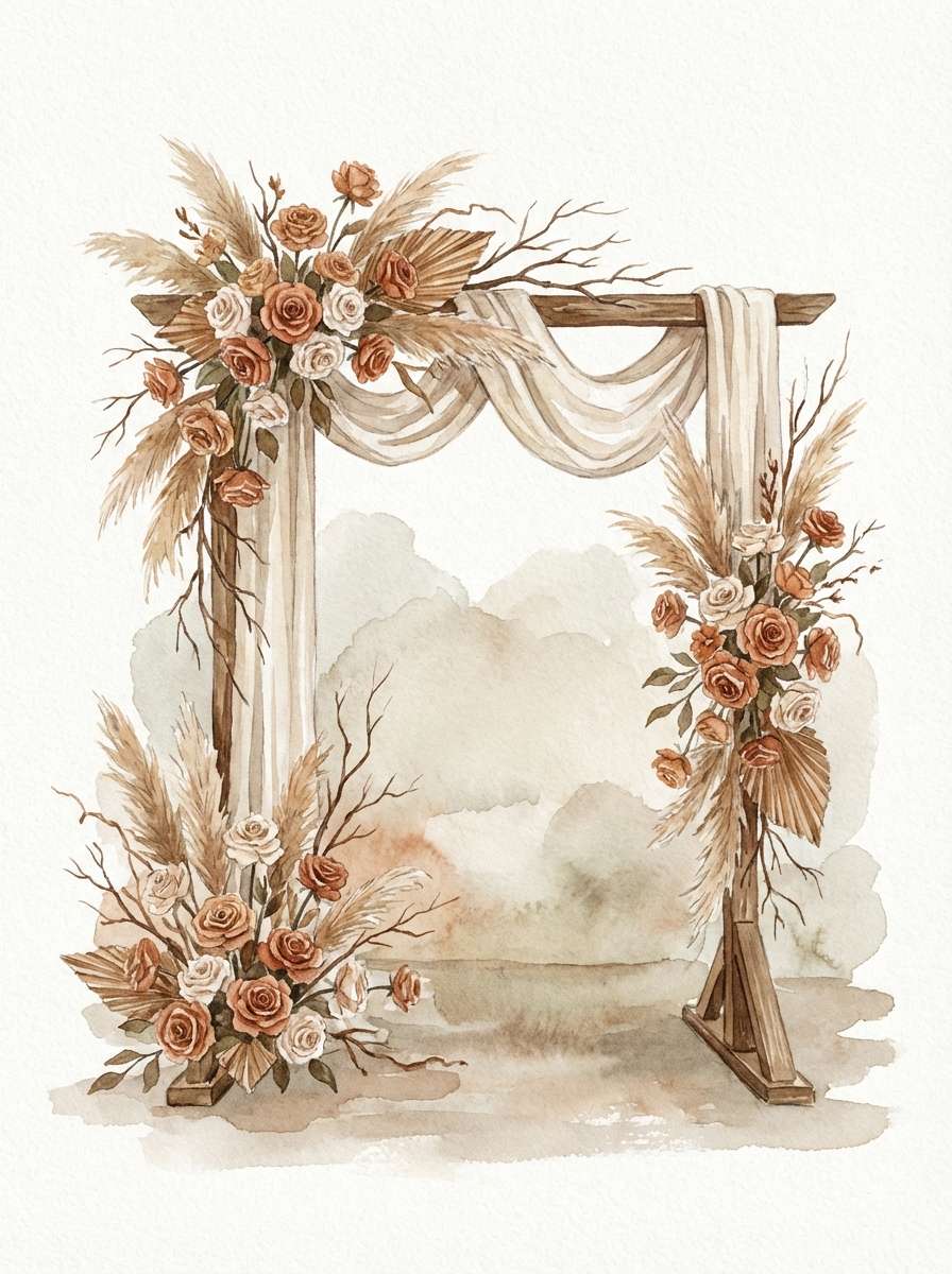
Best for: ceremony arch florals and aisle décor
Warm and sunbaked, this mix evokes clay pots, dried grasses, and soft linen drape. Let terracotta lead in florals and ribbons, then balance with creamy neutrals for table settings and signage. It shines in late-summer and early-fall ceremonies, especially with pampas, roses, and olive branches. Tip: keep the darkest espresso tone for small details like wax seals or chair tags.
Image example of terracotta linen generated using media.io
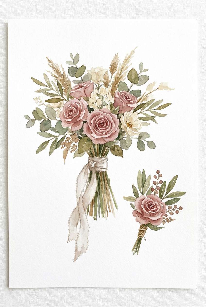
3) Dusty Rose Burlap
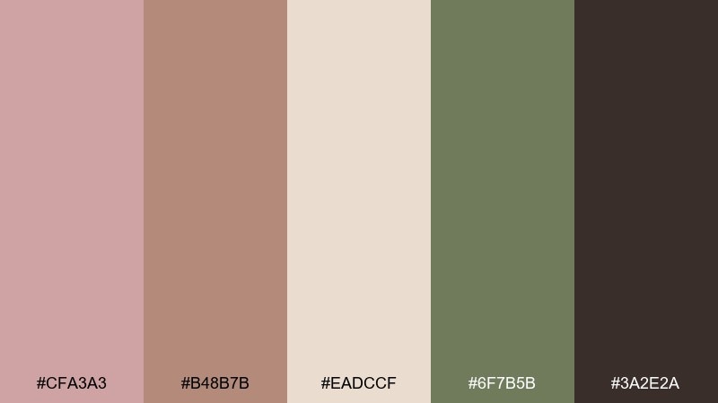
HEX: #CFA3A3 #B48B7B #EADCCF #6F7B5B #3A2E2A
Mood: romantic, homespun, softly vintage
Best for: bridesmaid palettes, bouquets, and boutonnieres
Romantic and homespun, this rustic wedding color scheme suggests dried roses, burlap ribbon, and soft greenery. Pair dusty rose with muted olive to keep pink feeling grown-up rather than sugary. It works beautifully for garden-to-barn transitions, mixing fresh blooms with dried textures. Tip: repeat the olive tone in napkins or menus to connect florals with the tablescape.
Image example of dusty rose burlap generated using media.io
4) Pine Copper
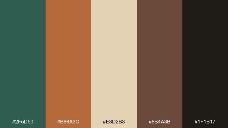
HEX: #2F5D50 #B66A3C #E3D2B3 #6B4A3B #1F1B17
Mood: moody, woodsy, refined
Best for: evening receptions, candles, and metallic accents
Moody and woodsy, these rustic wedding hues feel like evergreen needles beside hammered copper and candlelight. Use pine green for a strong base in linens or bridesmaid looks, then sprinkle copper tones through vases, cutlery, or foil details. It flatters low-light venues and late-fall dates where you want richness without going gothic. Tip: keep beige as the buffer color so the dark shades do not swallow your photos.
Image example of pine copper generated using media.io
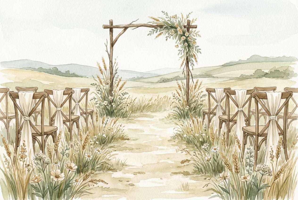
5) Wheat Meadow
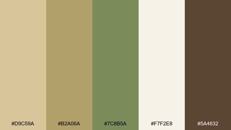
HEX: #D9C59A #B2A06A #7C8B5A #F7F2E8 #5A4632
Mood: breezy, pastoral, sunlit
Best for: outdoor lawn ceremonies and picnic-style receptions
Breezy and pastoral, this rustic wedding color palette brings to mind wheat fields, meadow greens, and vintage cream crockery. Keep the wheat and cream tones dominant for a light, airy look, then use the olive-green as a grounding accent. It is ideal for daytime celebrations, casual farm venues, and airy canvas tents. Tip: choose matte finishes over glossy to preserve the soft, natural feel.
Image example of wheat meadow generated using media.io
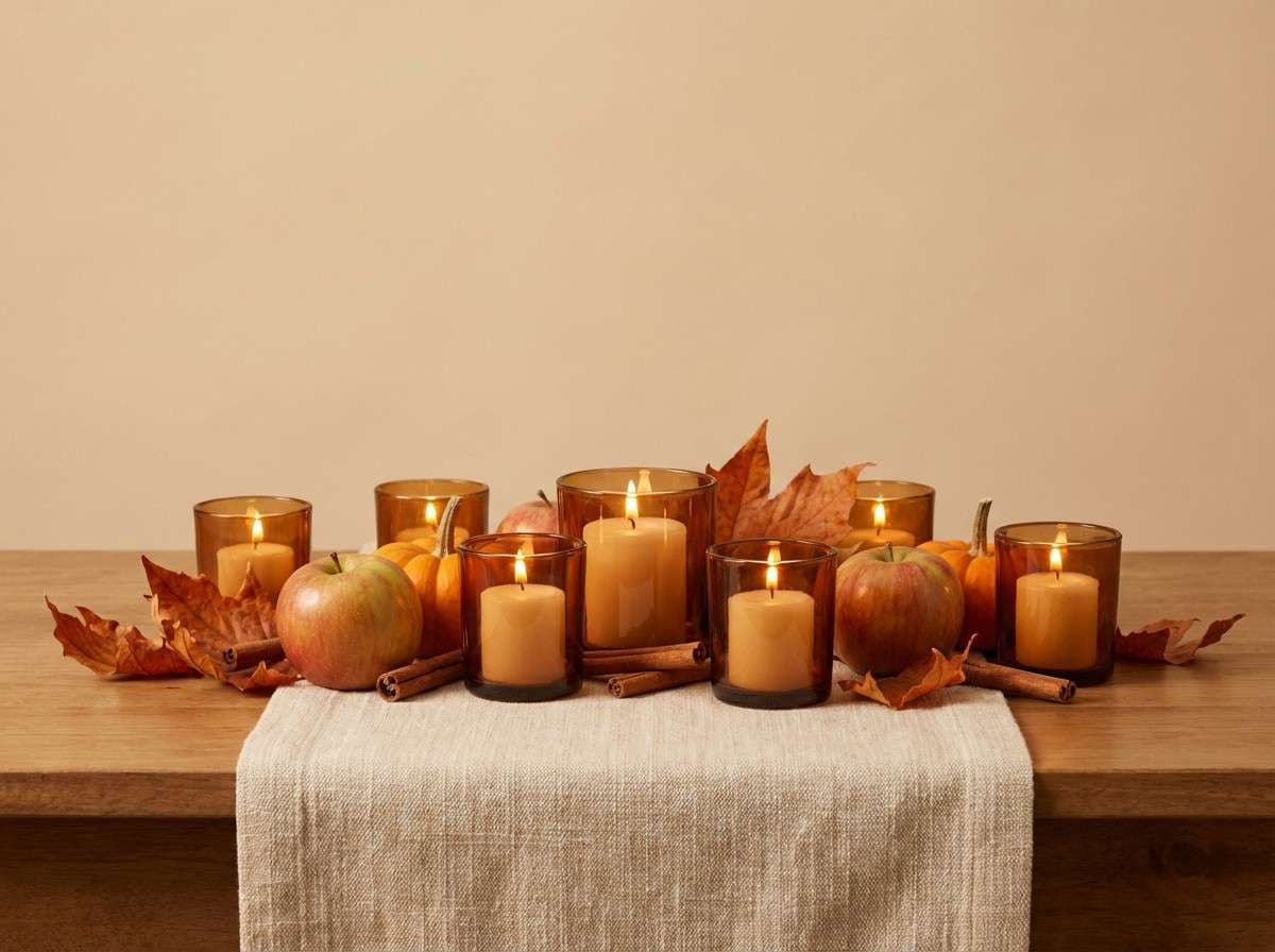
6) Autumn Orchard
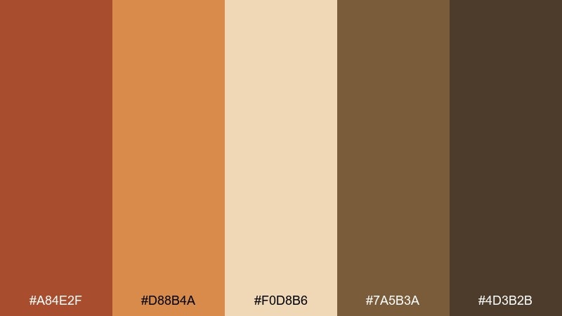
HEX: #A84E2F #D88B4A #F0D8B6 #7A5B3A #4D3B2B
Mood: cozy, seasonal, harvest-inspired
Best for: fall centerpieces, fruit accents, and menu styling
Cozy and harvest-inspired, these shades evoke cider, baked spices, and orchard wood crates. Let the warm orange and amber tones show up in florals, fruit styling, and candles, while the light cream keeps menus and place cards readable. It is a strong choice for October weddings and rustic lodges where warmth is the main vibe. Tip: mix two warm tones in your centerpiece, then repeat only one on stationery for a calmer overall look.
Image example of autumn orchard generated using media.io
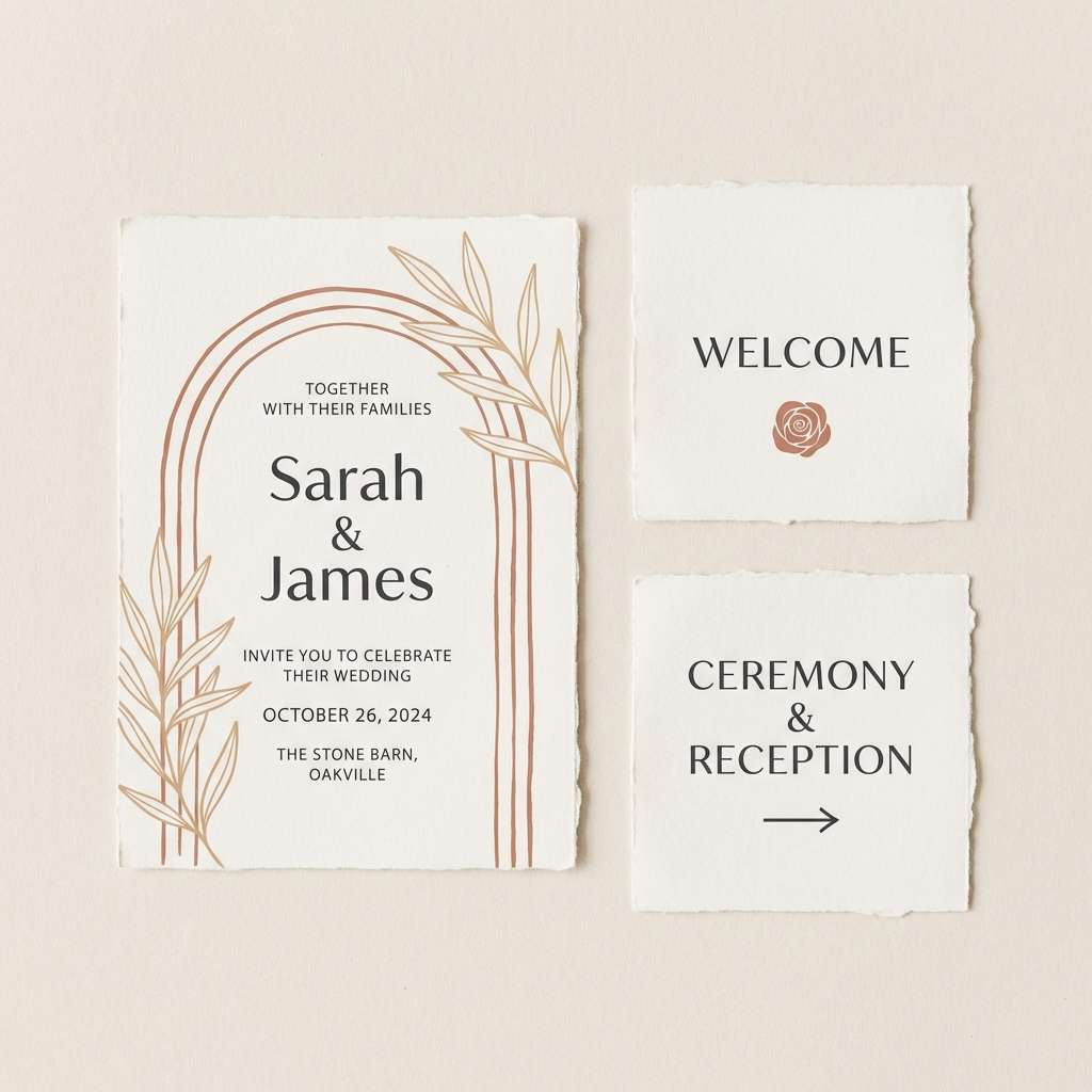
7) Clay and Cream
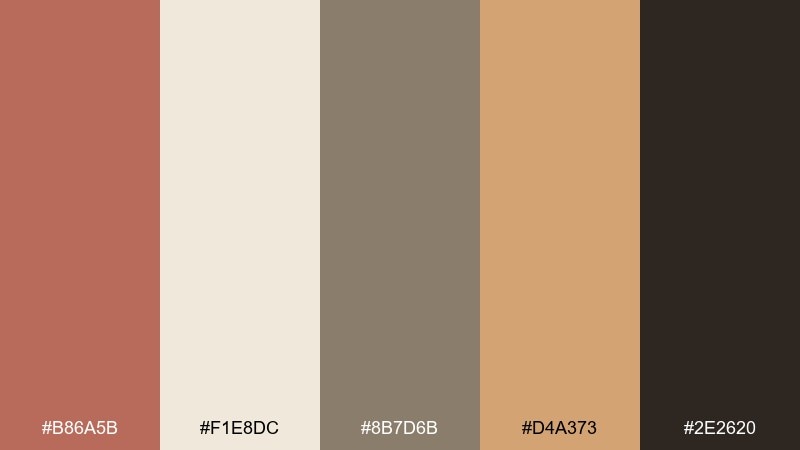
HEX: #B86A5B #F1E8DC #8B7D6B #D4A373 #2E2620
Mood: minimal, earthy, quietly elegant
Best for: modern rustic invitations and minimalist signage
Minimal and quietly elegant, these neutrals feel like handmade pottery against soft cream paper. Use clay as your hero color for headings and monograms, with taupe and sand to build depth without visual noise. This is one of those rustic wedding color combinations that works across seasons, from spring barns to winter cabins. Tip: choose a textured paper stock so the subtle shades still feel intentional.
Image example of clay and cream generated using media.io
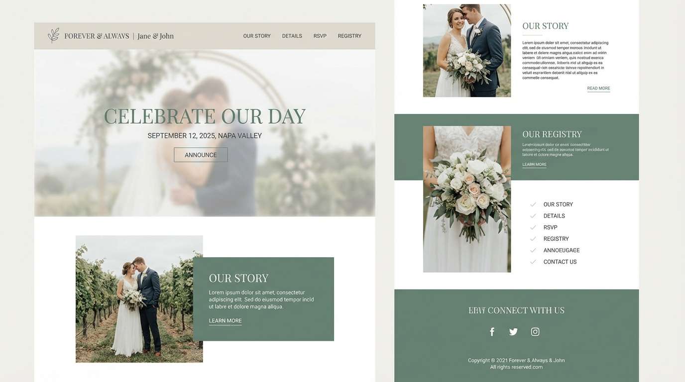
8) Eucalyptus Stone
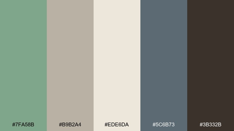
HEX: #7FA58B #B9B2A4 #EDE6DA #5C6B73 #3B332B
Mood: cool, calm, airy
Best for: website hero banners, RSVP pages, and digital invites
Cool and calm, this rustic wedding palette suggests eucalyptus leaves, river stones, and misty mornings. Build layouts with the pale stone and cream, then use eucalyptus green for buttons and highlights that still feel soft. It is a clean rustic wedding color combination for couples who want nature vibes without heavy browns. Tip: keep contrast high for accessibility by pairing slate text with the lightest background shade.
Image example of eucalyptus stone generated using media.io
9) Amber Whiskey
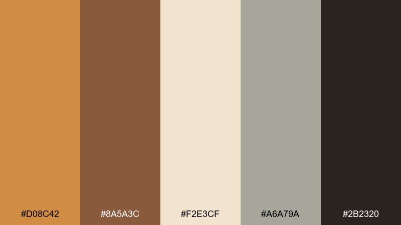
HEX: #D08C42 #8A5A3C #F2E3CF #A6A79A #2B2320
Mood: luxe rustic, warm, celebratory
Best for: bar menus, signature cocktail cards, and lounges
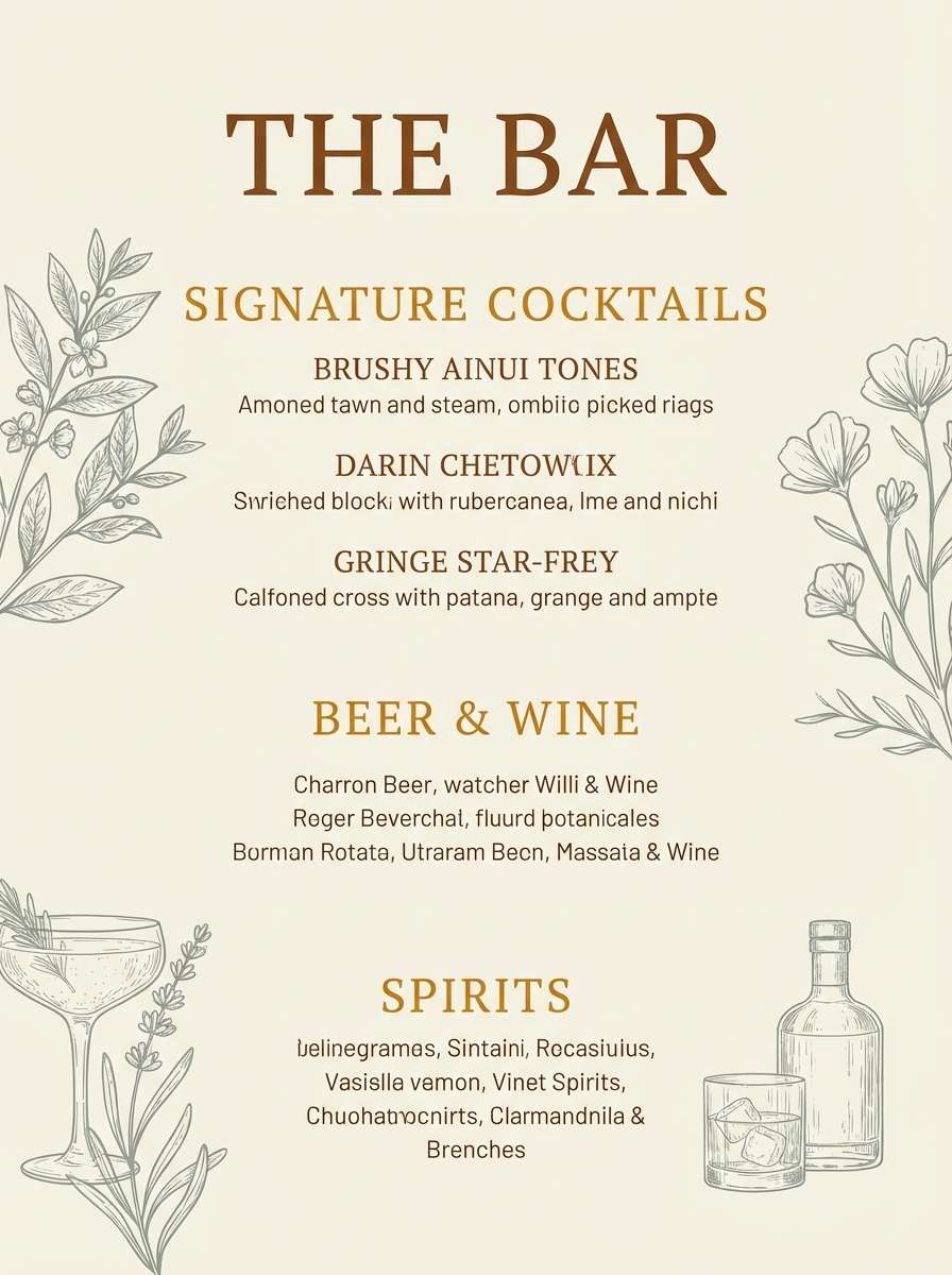
Luxe rustic and warmly celebratory, these color palette for rustic wedding feels like whiskey pours, leather, and soft candle glow. Use amber for callouts on bar menus, then rely on cream to keep type clean and legible. The muted gray-green adds a modern edge that prevents the browns from feeling dated. Tip: add a small amber icon set for cocktail names to make the design feel curated.
Image example of amber whiskey generated using media.io
10) Mocha Olive
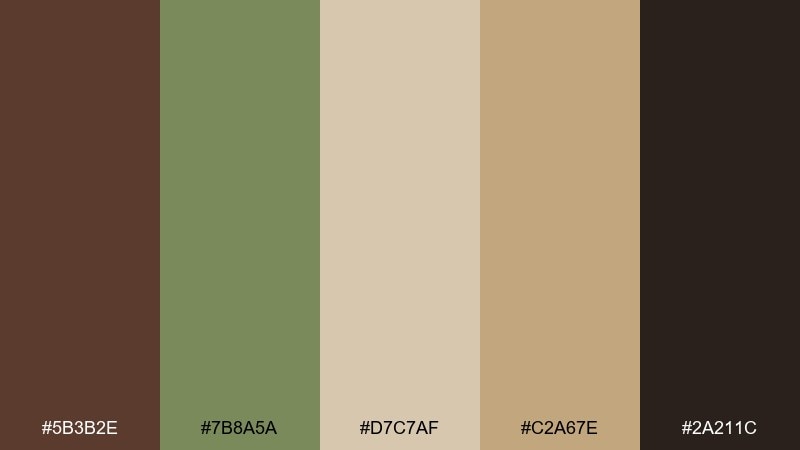
HEX: #5B3B2E #7B8A5A #D7C7AF #C2A67E #2A211C
Mood: earthy, classic, grounded
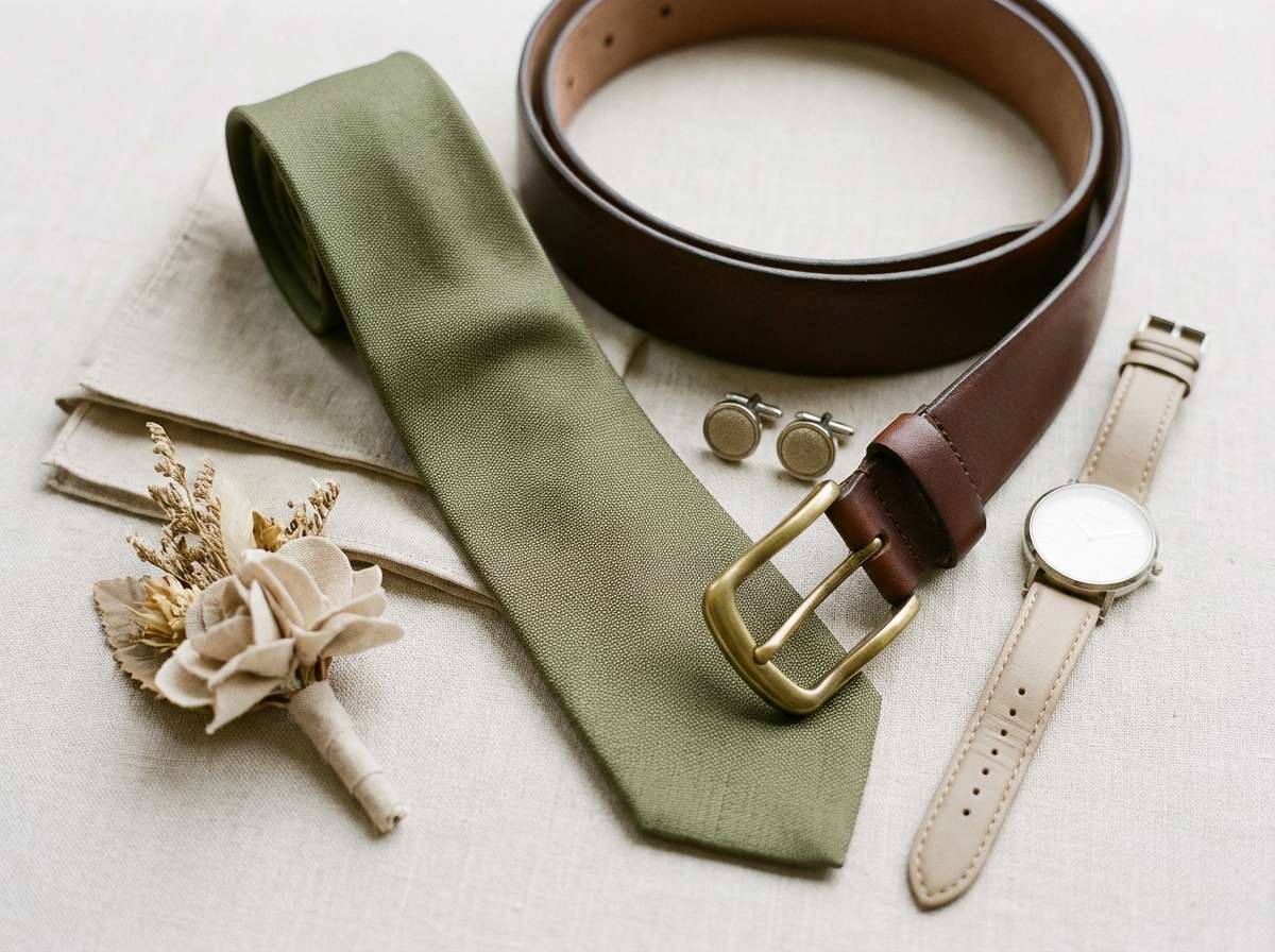
Best for: groomsmen attire, leather details, and wood tables
Earthy and classic, these shades read like espresso, olive branches, and worn leather. Olive is a flattering accent in ties, boutonnieres, and greenery-heavy centerpieces, while mocha anchors wood elements and candles. The sandy neutrals keep everything cohesive when you mix different wood tones in the venue. Tip: repeat the sand tone in napkins or place cards to brighten the overall scene.
Image example of mocha olive generated using media.io
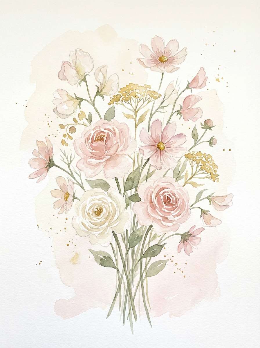
11) Wildflower Blush
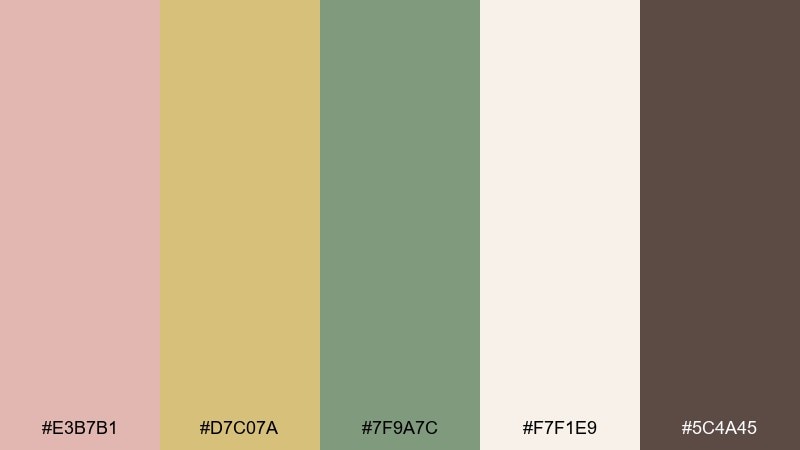
HEX: #E3B7B1 #D7C07A #7F9A7C #F7F1E9 #5C4A45
Mood: playful, garden-fresh, soft
Best for: spring florals, bridal showers, and brunch weddings
Playful and garden-fresh, this mix feels like wildflower petals, honeyed sunlight, and soft greenery. Let blush and cream carry the look for linens and stationery, then bring in gold and green through stems, candles, and ribbon. It is especially pretty for spring brunch celebrations and outdoor receptions with lots of natural light. Tip: choose one floral print and keep everything else solid to avoid visual clutter.
Image example of wildflower blush generated using media.io
12) River Rock Taupe
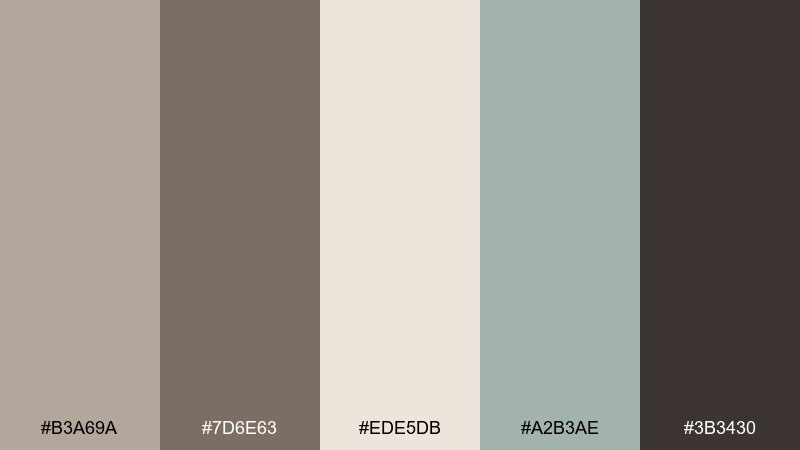
HEX: #B3A69A #7D6E63 #EDE5DB #A2B3AE #3B3430
Mood: neutral, modern, quietly rustic
Best for: photo backdrops, seating charts, and rentals
Neutral and quietly rustic, this rustic wedding color scheme echos smooth stones, weathered taupe linen, and soft fog. Use the pale beige as your base so signage photographs cleanly, then layer taupe and charcoal for structure. The cool gray-green is perfect for tying in eucalyptus or olive without going too saturated. Tip: choose matte acrylic or cotton paper so the neutrals look rich instead of flat.
Image example of river rock taupe generated using media.io
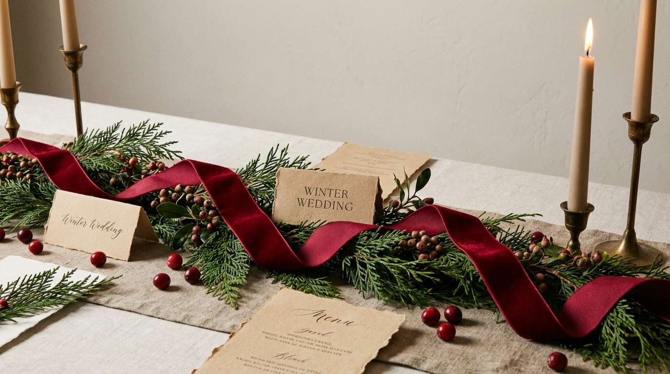
13) Cranberry Cedar
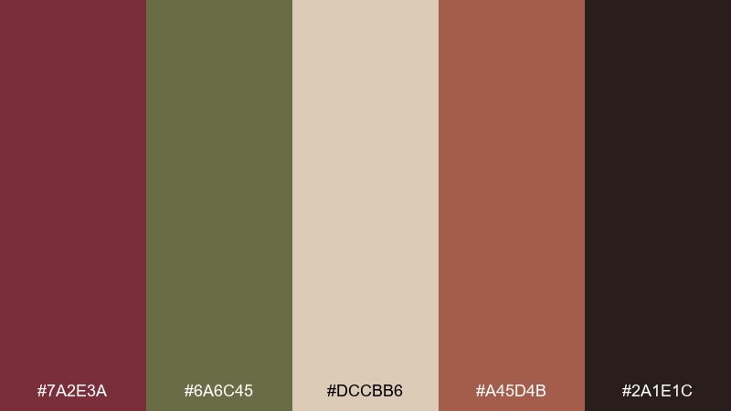
HEX: #7A2E3A #6A6C45 #DCCBB6 #A45D4B #2A1E1C
Mood: festive, moody, woodland
Best for: winter weddings, velvet accents, and greenery garlands
Festive and woodland-rich, this set brings cranberry depth to cedar greens and warm neutrals. It is ideal for winter receptions with velvet ribbons, evergreen garlands, and darker candlelit rooms. Keep cranberry as the statement color in florals or bridesmaid dresses, then balance with beige for paper goods. Tip: use the darkest shade sparingly on typography to avoid harsh contrast against cream.
Image example of cranberry cedar generated using media.io
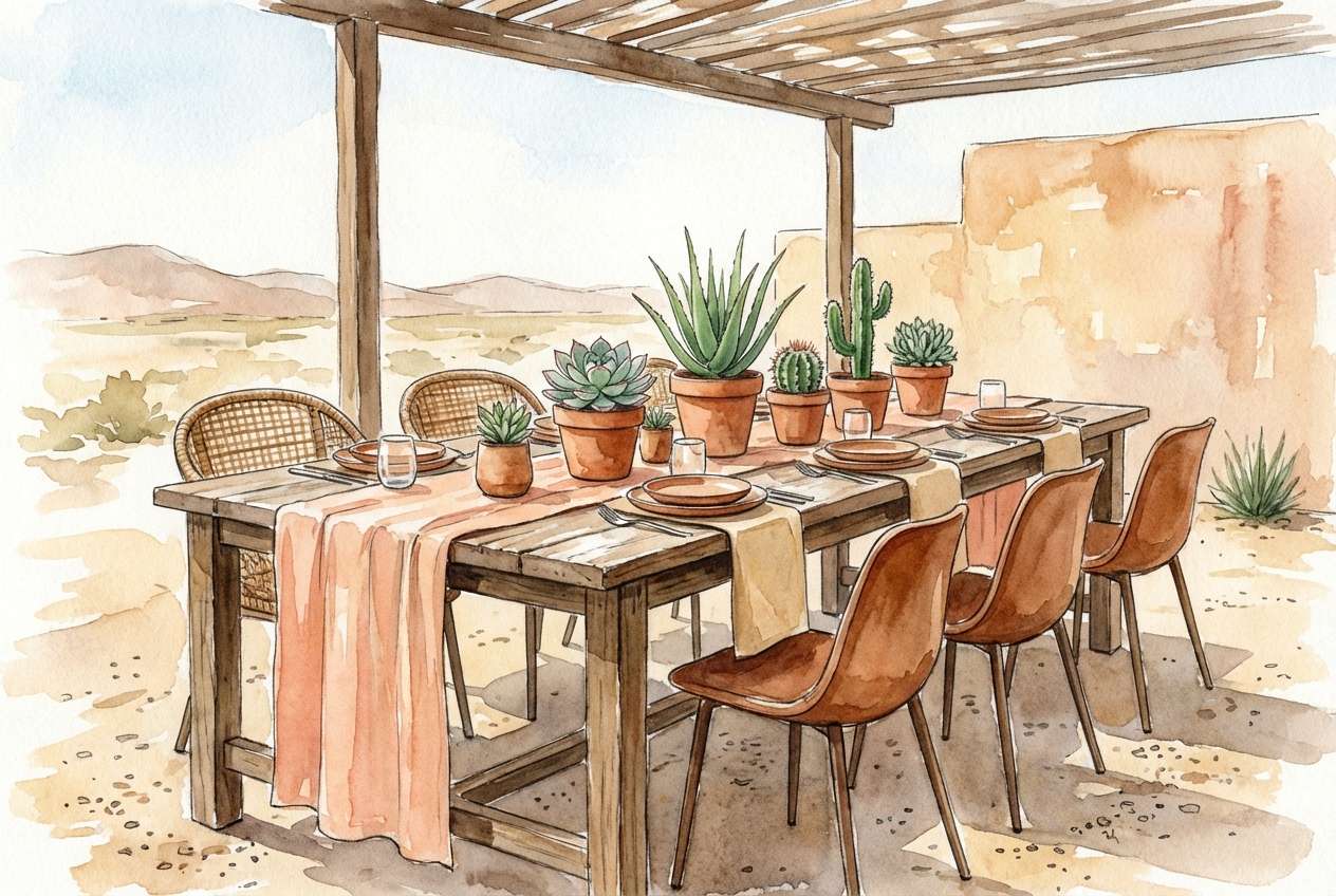
14) Sunbaked Adobe
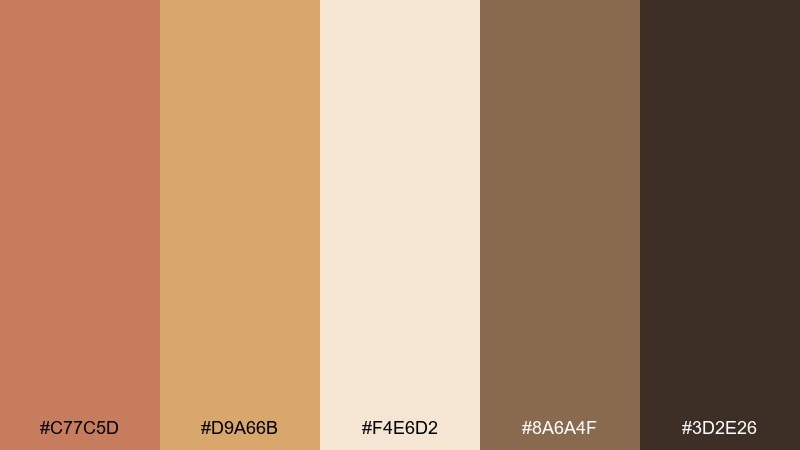
HEX: #C77C5D #D9A66B #F4E6D2 #8A6A4F #3D2E26
Mood: desert rustic, bright, welcoming
Best for: southwest-inspired décor, terracotta pots, and outdoor dinners
Bright and desert-rustic, these rustic wedding hues feel like adobe walls at golden hour. Use the warm peach and sand tones for linens and signage, then add darker brown in wood chairs or lanterns. It pairs beautifully with dried palms, succulents, and brass accents for a modern southwest look. Tip: keep one large neutral surface, like a cream runner, to stop the warm tones from competing.
Image example of sunbaked adobe generated using media.io
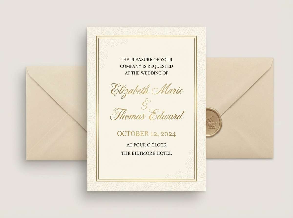
15) Vintage Lace Gold
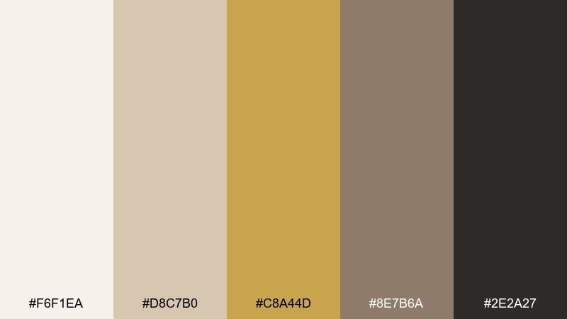
HEX: #F6F1EA #D8C7B0 #C8A44D #8E7B6A #2E2A27
Mood: romantic, antique, softly glamorous
Best for: foil-stamped invitations and heirloom-style stationery
Romantic and antique, this mix recalls lace, champagne, and softly aged gold. Keep the creamy tones dominant, then use gold as a highlight for monograms, borders, or wax seal emblems. It works especially well for a refined rustic wedding color palette where you want barn warmth with ballroom polish. Tip: use gold only on key moments, like names and date, so it feels premium rather than flashy.
Image example of vintage lace gold generated using media.io
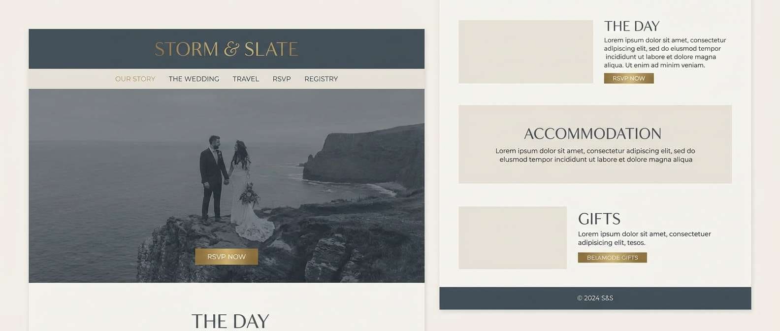
16) Stormy Slate
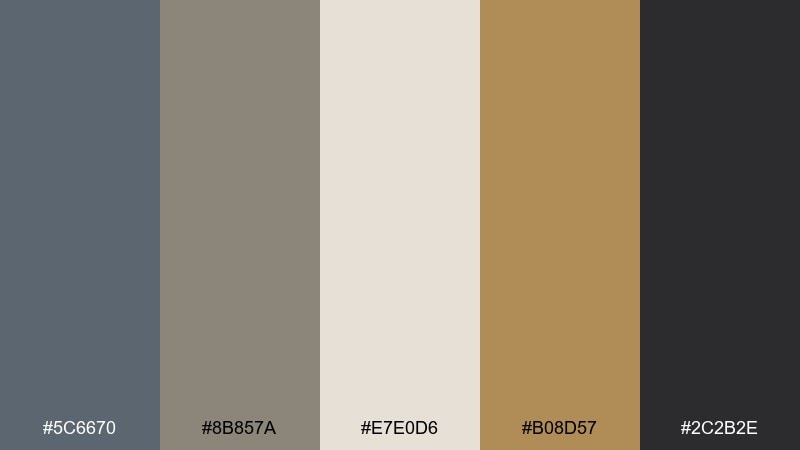
HEX: #5C6670 #8B857A #E7E0D6 #B08D57 #2C2B2E
Mood: modern, dramatic, polished rustic
Best for: wedding websites, registry pages, and minimalist branding
Modern and a little dramatic, these rustic wedding tones feel like storm clouds over stone with a warm brass glow. Use the light beige as your background, slate for large blocks and UI sections, and brass as a controlled accent for buttons or icons. It is a strong choice when you want rustic textures without leaning too country. Tip: limit brass to one or two UI elements per screen to keep the look premium.
Image example of stormy slate generated using media.io
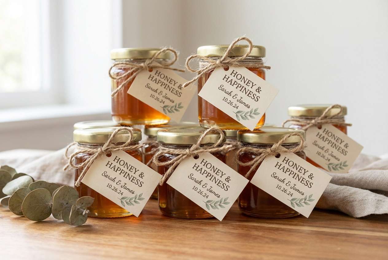
17) Honeycomb Harvest
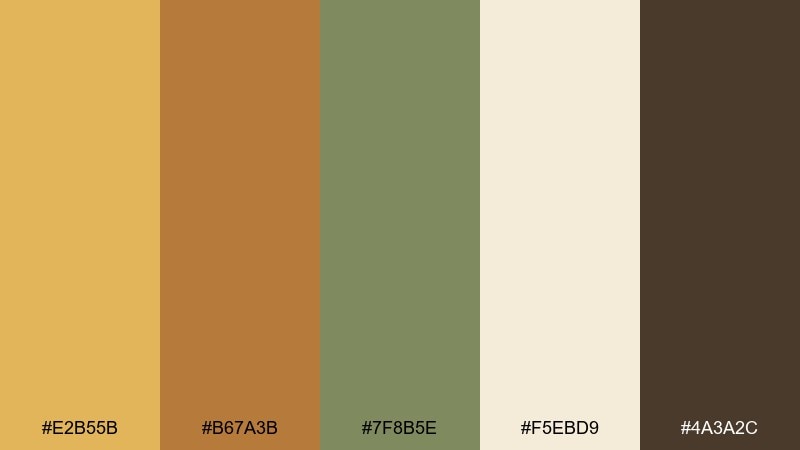
HEX: #E2B55B #B67A3B #7F8B5E #F5EBD9 #4A3A2C
Mood: cheerful, cozy, artisan
Best for: favors, honey jars, and thank-you tags
Cheerful and artisan, these rustic wedding colors bring honeycomb warmth with a hint of herb green. The gold tones look beautiful on favor labels and thank-you tags, while cream keeps packaging clean and giftable. It is one of the easiest rustic wedding color combinations for farm-to-table themes, especially when you add kraft paper and twine. Tip: print labels on uncoated stock so the yellows stay rich instead of glossy.
Image example of honeycomb harvest generated using media.io
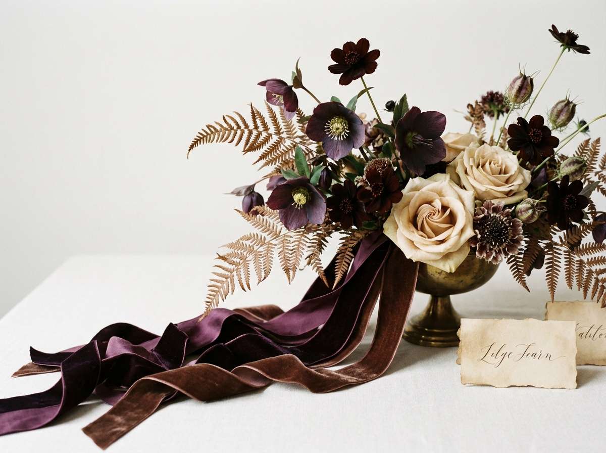
18) Cocoa Plum
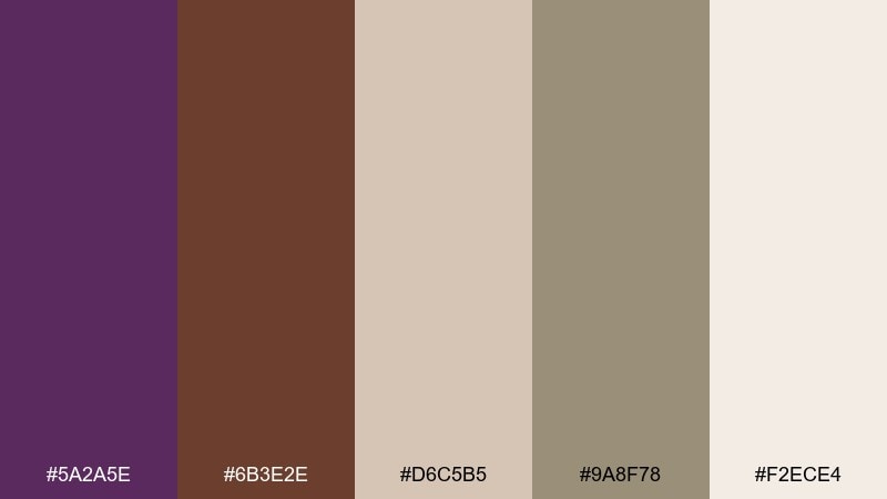
HEX: #5A2A5E #6B3E2E #D6C5B5 #9A8F78 #F2ECE4
Mood: rich, romantic, unexpected
Best for: late-night receptions, velvet ribbons, and statement florals
Rich and romantic, this pairing feels like plum velvet against cocoa wood and creamy parchment. Use plum as the statement shade in ribbons, bouquets, or a signature cocktail, then keep the rest of the décor in warm neutrals. It photographs beautifully under string lights and adds depth without turning the room too dark. Tip: repeat plum in one small detail per table, like a taper candle, to create continuity.
Image example of cocoa plum generated using media.io
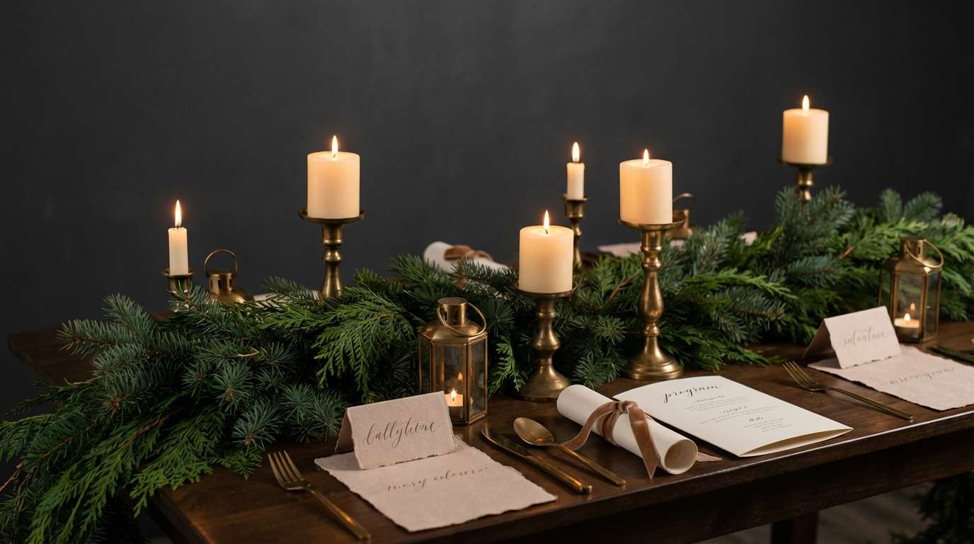
19) Midnight Fir
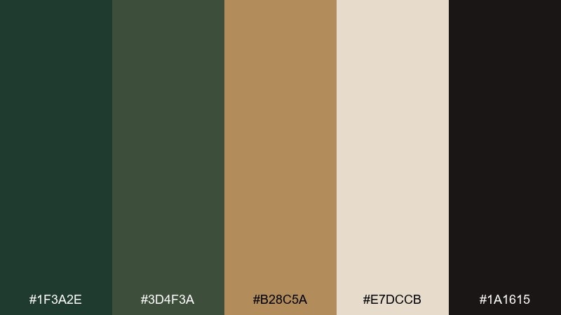
HEX: #1F3A2E #3D4F3A #B28C5A #E7DCCB #1A1615
Mood: deep, forested, intimate
Best for: mountain venues, evergreen décor, and candlelit ceremonies
Deep and intimate, these tones feel like fir trees at dusk with warm brass flickers. Layer the two greens across garlands and napkins, then add brass through candlesticks or embossed details. The soft beige keeps the whole look from going too dark in photos, especially indoors. Tip: choose warm lighting temperatures so the greens stay lush rather than muddy.
Image example of midnight fir generated using media.io
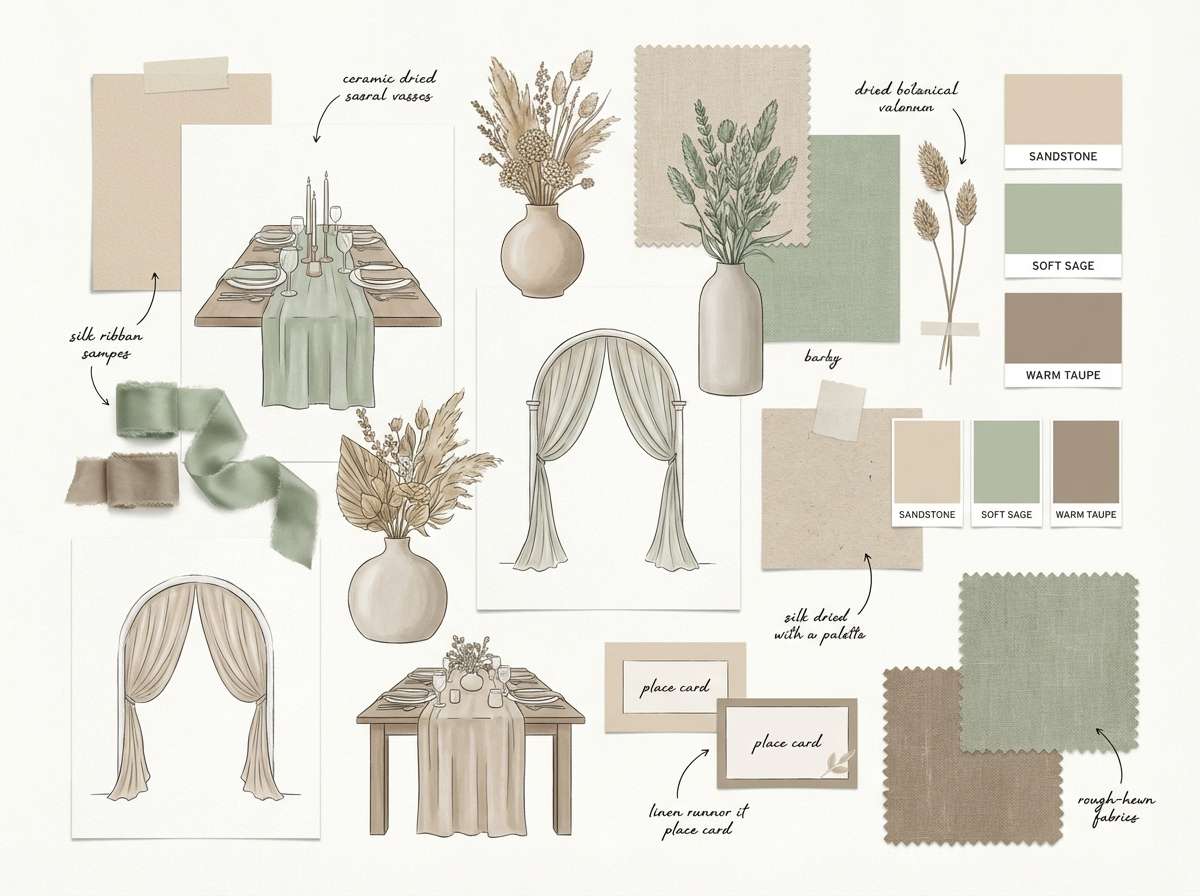
20) Soft Sandstone
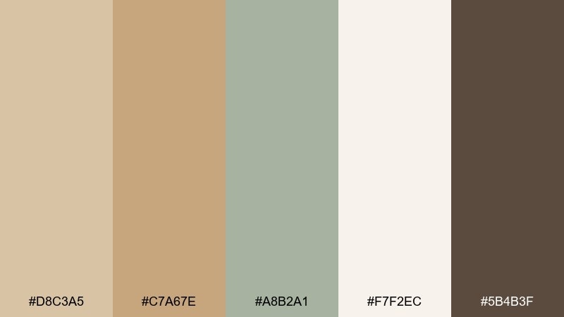
HEX: #D8C3A5 #C7A67E #A8B2A1 #F7F2EC #5B4B3F
Mood: soft, neutral, effortlessly rustic
Best for: cohesive décor planning across venues and seasons
Soft and effortless, this rustic color scheme reads like sandstone, driftwood, and gentle sage. The neutrals make it easy to mix rental items, different woods, and varying flower tones without clashing. As a rustic wedding color palette foundation, it gives you room to add any accent, from blush to burgundy, while staying cohesive. Tip: pick one accent color for the day-of florals and keep the rest in these calm neutrals.
Image example of soft sandstone generated using media.io
What Colors Go Well with Rustic Wedding?
Rustic wedding colors pair best with grounded neutrals (ivory, cream, sand, taupe) and nature-inspired greens (sage, eucalyptus, olive, fir). These shades act like “connectors” that help wood textures, greenery, and florals feel intentional rather than random.
To add personality, bring in one richer accent such as terracotta, amber, cranberry, or plum. Warm metals—gold, brass, copper—also work beautifully in rustic themes because they echo candlelight and vintage details without feeling overly formal.
If you want a cleaner modern-rustic look, use cooler stones and slates with controlled warm accents. This keeps the palette rustic in texture, but more contemporary in tone.
How to Use a Rustic Wedding Color Palette in Real Designs
Start by choosing a base (usually a light neutral) for invitations, signage, and table linens so typography stays readable and photos stay bright. Then pick one mid-tone (sage, taupe, wheat) to repeat across multiple touchpoints for consistency.
Save your darkest shade for small “anchor” details: borders, monograms, menu headings, or wax seals. This creates contrast without making stationery feel heavy or the tablescape feel too dark.
Finally, match finishes to the rustic mood: matte paper, textured stocks, uncoated labels, and brushed metals. Those material choices do as much work as the colors themselves.
Create Rustic Wedding Palette Visuals with AI
If you’re planning décor or designing invites, it helps to see your rustic wedding color combinations before committing to rentals or printing. With AI visuals, you can test different balances (more cream vs. more wood tones) and quickly find what photographs best.
Use the prompts above as-is, or swap in your venue details (barn, vineyard, cabin, tent) and key items (arch, bar menu, seating chart) to generate on-theme mockups in minutes.
Once you have a direction, you can keep outputs consistent by reusing the same prompt structure and only changing the HEX-inspired color words (sage, terracotta, slate, brass) across designs.
Rustic Wedding Color Palette FAQs
-
What are the most popular rustic wedding colors?
Popular rustic wedding colors include sage and eucalyptus greens, cream/ivory, taupe, warm browns, and accents like terracotta, amber, and gold/brass. -
How do I keep rustic colors from looking too dark?
Use a light neutral (cream, ivory, stone) as the dominant base, then reserve deep browns/charcoals for small accents like borders, headings, or wax seals. -
Do rustic wedding palettes work for spring and summer?
Yes. Choose airy versions such as Wheat Meadow or Eucalyptus Stone, and keep finishes matte with lots of cream so the look stays fresh in bright daylight. -
What rustic colors look best in fall weddings?
Terracotta, spiced orange, amber, and warm browns (like Autumn Orchard or Amber Whiskey) look especially cohesive with seasonal florals, candles, and wood textures. -
Can I use blush or pink in a rustic wedding scheme?
Absolutely—muted blush like Dusty Rose Burlap or Wildflower Blush works best when balanced with olive/greenery and warm neutrals so it feels grown-up and rustic. -
What metallics match rustic wedding décor?
Brass, antique gold, and copper are the easiest matches because they echo candlelight and vintage details while still pairing naturally with wood, linen, and greenery. -
How can I preview rustic wedding colors before printing invitations?
Generate quick mockups with AI using your palette words (sage, terracotta, slate) and your design type (invite, menu, seating chart) to test readability and overall mood.
Next: Eggplant Color Palette


