

Eggplant is a deep, moody purple that reads instantly premium—without feeling cold like pure black. It’s a versatile anchor for branding, UI, interiors, and event design, especially when paired with warm neutrals, metallics, or muted greens.
Below are curated eggplant color palette ideas with HEX codes, plus quick tips to keep contrast, mood, and usability on point.
In this article
- Why Eggplant Palettes Work So Well
-
- velvet nightfall
- botanical aubergine
- modern merlot office ui
- plum and brass
- smoky lavender minimal
- eggplant and clay
- midnight sage contrast
- berry sorbet pop
- dusty rose romance
- espresso velvet
- gilded orchid
- arctic plum
- autumn aubergine
- neon berry night
- coastal plum and sand
- vintage wine cellar
- soft lilac workspace
- forest plum cabin
- monochrome aubergine
- cream and concord
- What Colors Go Well with Eggplant?
- How to Use a Eggplant Color Palette in Real Designs
- Create Eggplant Palette Visuals with AI
Why Eggplant Palettes Work So Well
Eggplant sits in the “luxury neutral” zone: it’s colorful enough to feel distinctive, but dark enough to behave like black in layouts. That makes it a strong foundation for logos, navigation, packaging, and typography.
Because it has both warm (red) and cool (blue) undertones, eggplant pairs beautifully with a wide range of accents—from brass and blush to sage and icy blue-grays. You can push it romantic, vintage, modern, or edgy depending on the supporting colors.
In practice, eggplant also helps create depth. A single palette can deliver hierarchy (near-black for structure, mid plum for actions, pale tints for surfaces) without introducing distracting hue shifts.
20+ Eggplant Color Palette Ideas (with HEX Codes)
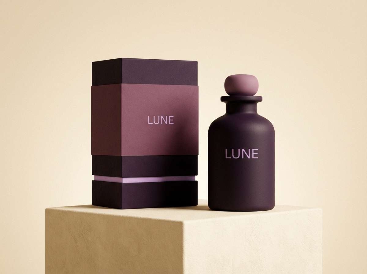
1) Velvet Nightfall
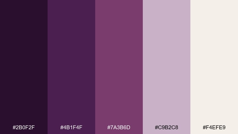
HEX: #2B0F2F #4B1F4F #7A3B6D #C9B2C8 #F4EFE9
Mood: dramatic, plush, evening
Best for: luxury fragrance branding and packaging
Dramatic and velvety, these tones feel like candlelight in a boutique hotel lounge. The dark plum base looks premium on matte finishes, while the pale lilac and soft ivory keep layouts readable. For elegant eggplant color combinations, pair the deepest shade with warm off-white and use the orchid tone for headings or foil accents. Tip: reserve the near-black purple for logos and borders so product text stays crisp.
Image example of velvet nightfall generated using media.io
Media.io is an online AI studio for creating and editing video, image, and audio in your browser.

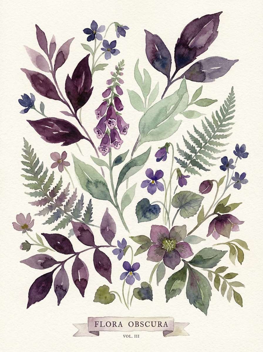
2) Botanical Aubergine
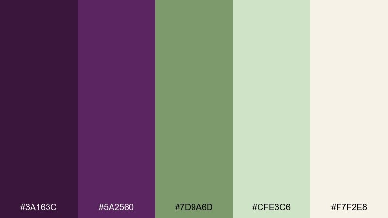
HEX: #3A163C #5A2560 #7D9A6D #CFE3C6 #F7F2E8
Mood: earthy, calm, garden-fresh
Best for: watercolor botanical prints and stationery
Earthy purples with soft greens evoke shaded garden paths and fresh herbs. The muted sage brings balance to the richer plum, making the whole mix feel natural rather than heavy. Use the cream tone as paper color, then layer stems and leaves in the greens with aubergine for flowers or type. Tip: keep the darkest purple for small details so the illustration stays airy.
Image example of botanical aubergine generated using media.io
3) Modern Merlot Office UI
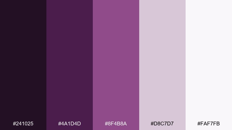
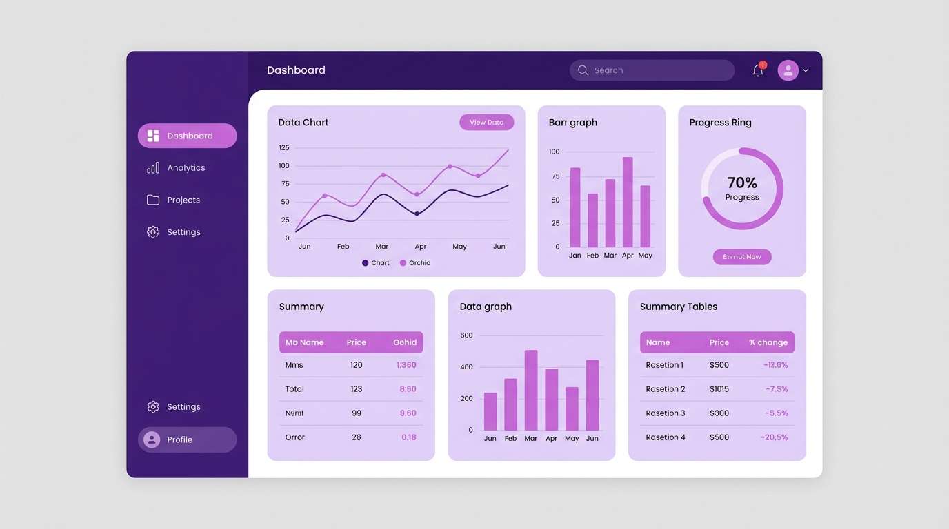
HEX: #241025 #4A1D4D #8F4B8A #D8C7D7 #FAF7FB
Mood: clean, modern, confident
Best for: dashboard UI and SaaS product design
Polished and modern, these purples feel like a focused workspace with a hint of personality. The near-black tone anchors navigation, while soft lavender tints create gentle surfaces for cards and panels. Pair the mid purple with plenty of off-white to keep contrast accessible, and use the brighter orchid for active states. Tip: make charts use the orchid plus one neutral tint to avoid visual noise.
Image example of modern merlot office ui generated using media.io
4) Plum and Brass
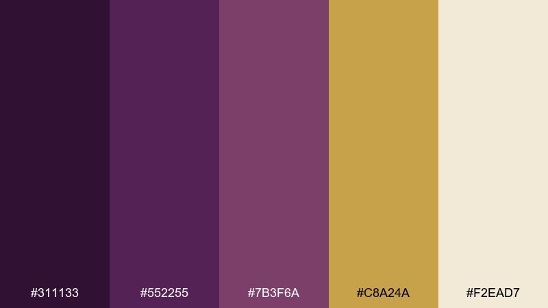
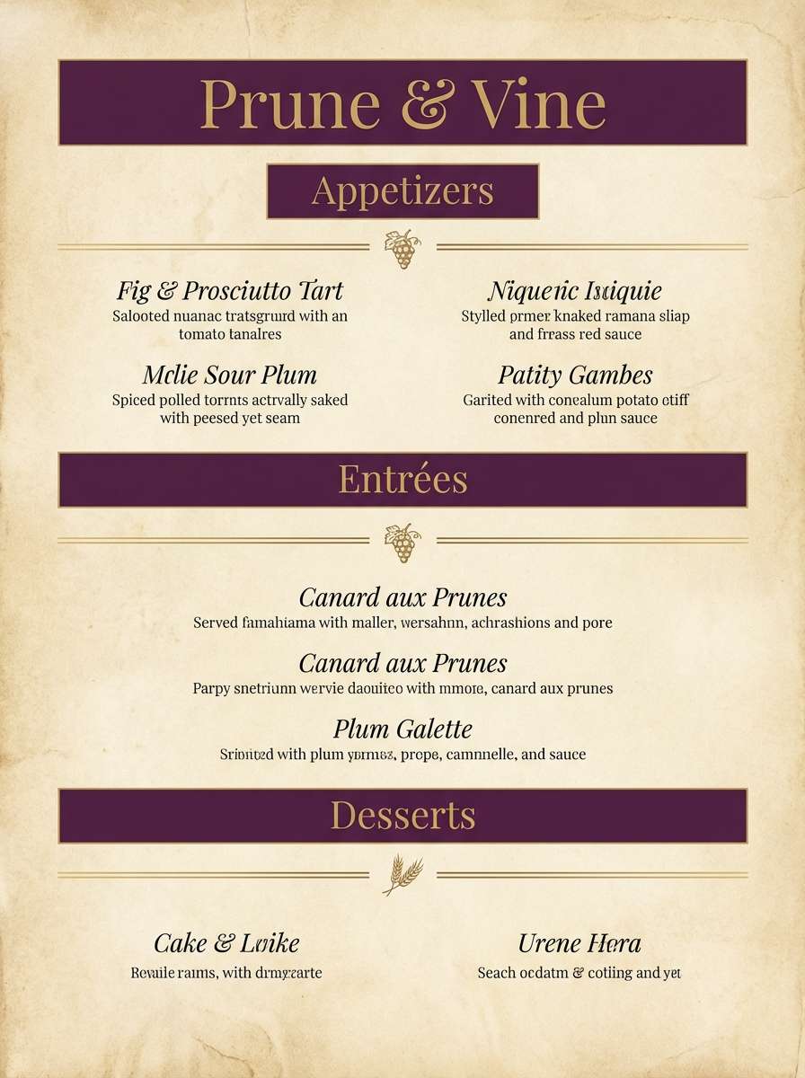
HEX: #311133 #552255 #7B3F6A #C8A24A #F2EAD7
Mood: upscale, warm, classic
Best for: restaurant menus and boutique hospitality
Warm and upscale, this mix suggests brass fixtures, velvet booths, and late-night dining. Gold brings a confident glow against the plum shades, while the soft parchment tone keeps long text comfortable. Use brass as a thin accent for rules, icons, or pricing, and keep headings in the darkest purple for authority. Tip: print on uncoated stock to make the gold feel more tactile and refined.
Image example of plum and brass generated using media.io
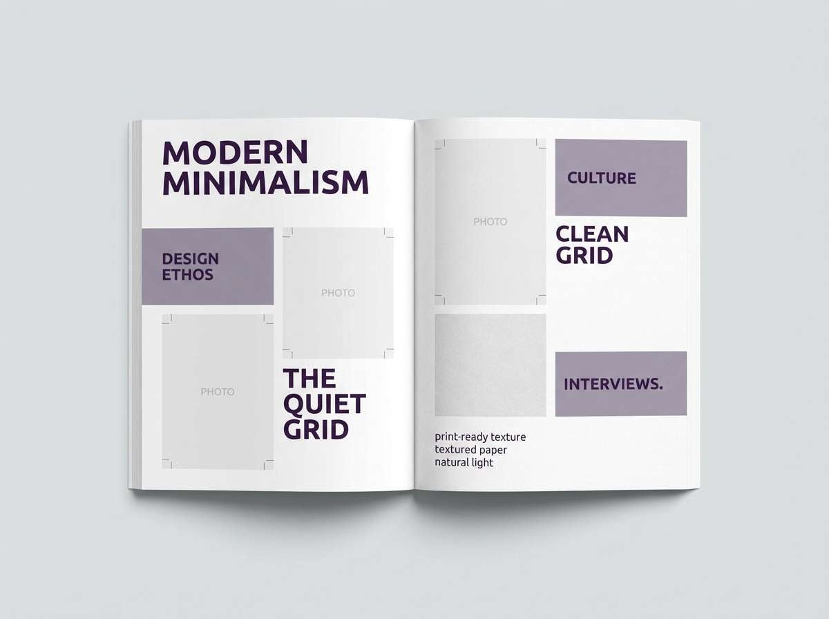
5) Smoky Lavender Minimal
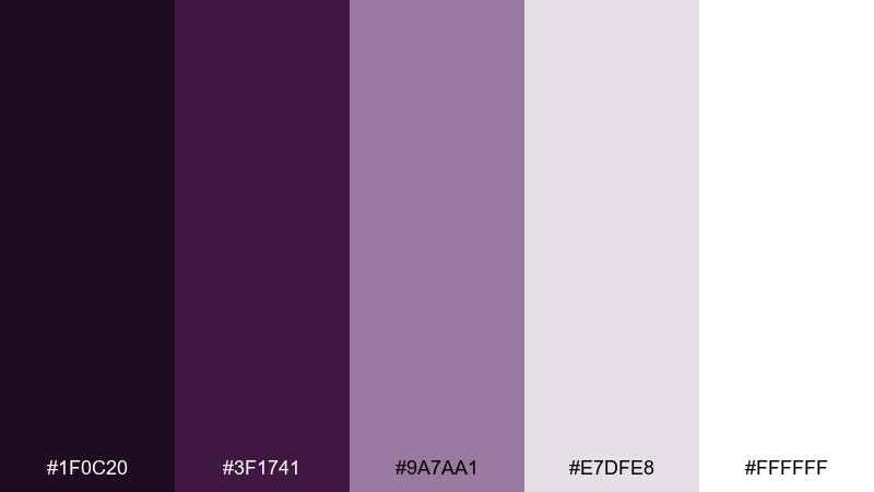
HEX: #1F0C20 #3F1741 #9A7AA1 #E7DFE8 #FFFFFF
Mood: quiet, minimal, editorial
Best for: magazine layouts and minimalist brand systems
Quiet and smoky, these tones feel like soft shadows on white linen. The deep purple behaves like a sophisticated ink, while dusty lavender adds a gentle, modern tint for sections and pull quotes. As an eggplant color palette, it shines when you lean into whitespace and use the darkest shade for typography and key UI elements. Tip: keep tints around 10 to 20 percent for backgrounds to avoid a washed-out look in print.
Image example of smoky lavender minimal generated using media.io
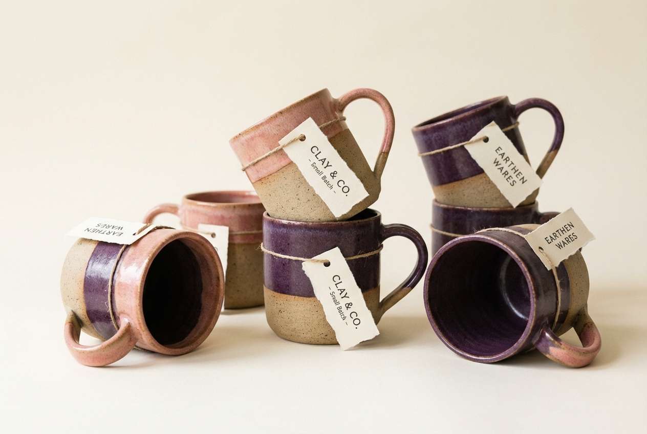
6) Eggplant and Clay
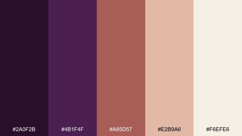
HEX: #2A0F2B #4B1F4F #A85D57 #E2B9A6 #F6EFE6
Mood: warm, artisanal, grounded
Best for: handmade goods ads and ceramic branding
Warm and grounded, this pairing feels like pottery studios and sunlit shelves. The clay and blush tones soften the purple, making it friendly for lifestyle brands without losing depth. Use eggplant for logos and labels, then let clay take over as the hero color in product photos and backgrounds. Tip: add texture, like paper grain or ceramic glaze, to make the colors feel handcrafted rather than flat.
Image example of eggplant and clay generated using media.io
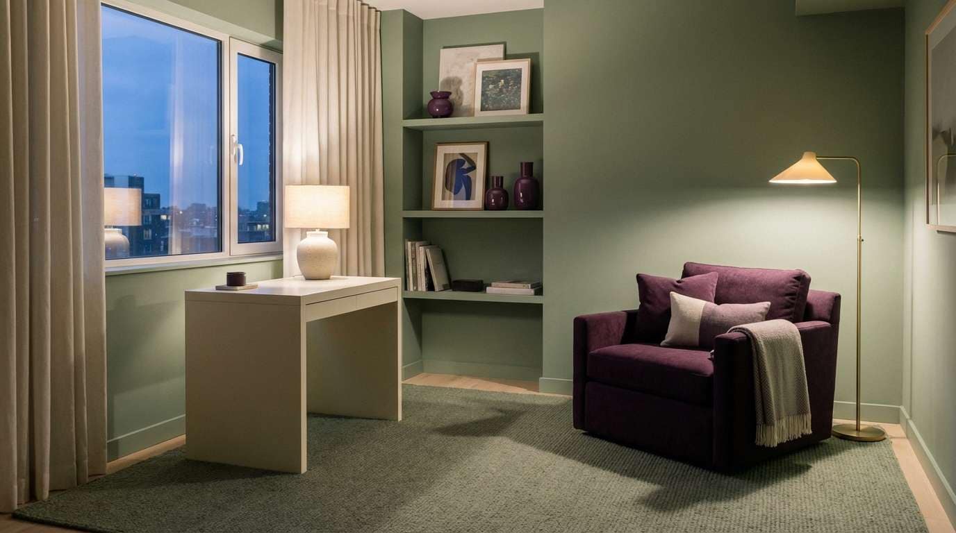
7) Midnight Sage Contrast
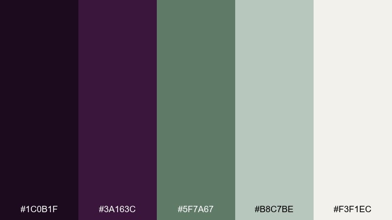
HEX: #1C0B1F #3A163C #5F7A67 #B8C7BE #F3F1EC
Mood: moody, calm, nature-inspired
Best for: interior styling and home office concepts
Moody purple with sage feels like a quiet cabin evening with greenery by the window. The cool gray-green tones create breathing room, so the dark base reads cozy rather than harsh. Use sage for walls or large UI panels, then bring in the deepest purple on trim, buttons, or focal furniture. Tip: add warm lighting in visuals to keep the palette from skewing too cold.
Image example of midnight sage contrast generated using media.io
8) Berry Sorbet Pop
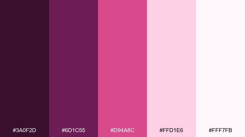
HEX: #3A0F2D #6D1C55 #D94A8C #FFD1E6 #FFF7FB
Mood: playful, bold, sweet
Best for: social media promos and beauty launches
Bright and playful, these berries feel like glossy lip tint and strawberry sorbet. The hot pink accent makes the darker purples look energetic, not heavy. Use the pale blush for backgrounds, then hit key CTAs with the vivid pink and keep body text in the deepest shade. Tip: limit the hottest accent to one element per frame to keep the design premium.
Image example of berry sorbet pop generated using media.io

9) Dusty Rose Romance
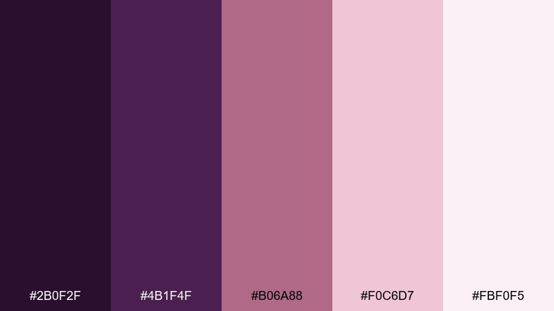
HEX: #2B0F2F #4B1F4F #B06A88 #F0C6D7 #FBF0F5
Mood: romantic, soft, elegant
Best for: wedding invitations and event stationery
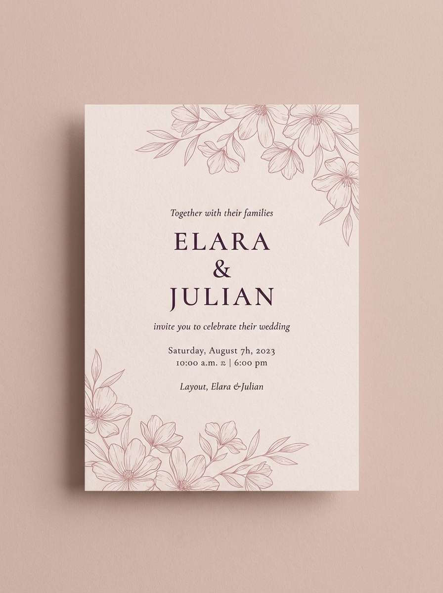
Soft and romantic, this mix feels like pressed flowers and satin ribbons. Dusty rose keeps the purple refined, while pale blush and petal pink create gentle space for typography. Use the darkest tone for names and headings, then add rose for monograms and small flourishes. Tip: emboss or letterpress the deep purple for a subtle luxury upgrade.
Image example of dusty rose romance generated using media.io
10) Espresso Velvet
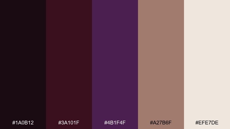
HEX: #1A0B12 #3A101F #4B1F4F #A27B6F #EFE7DE
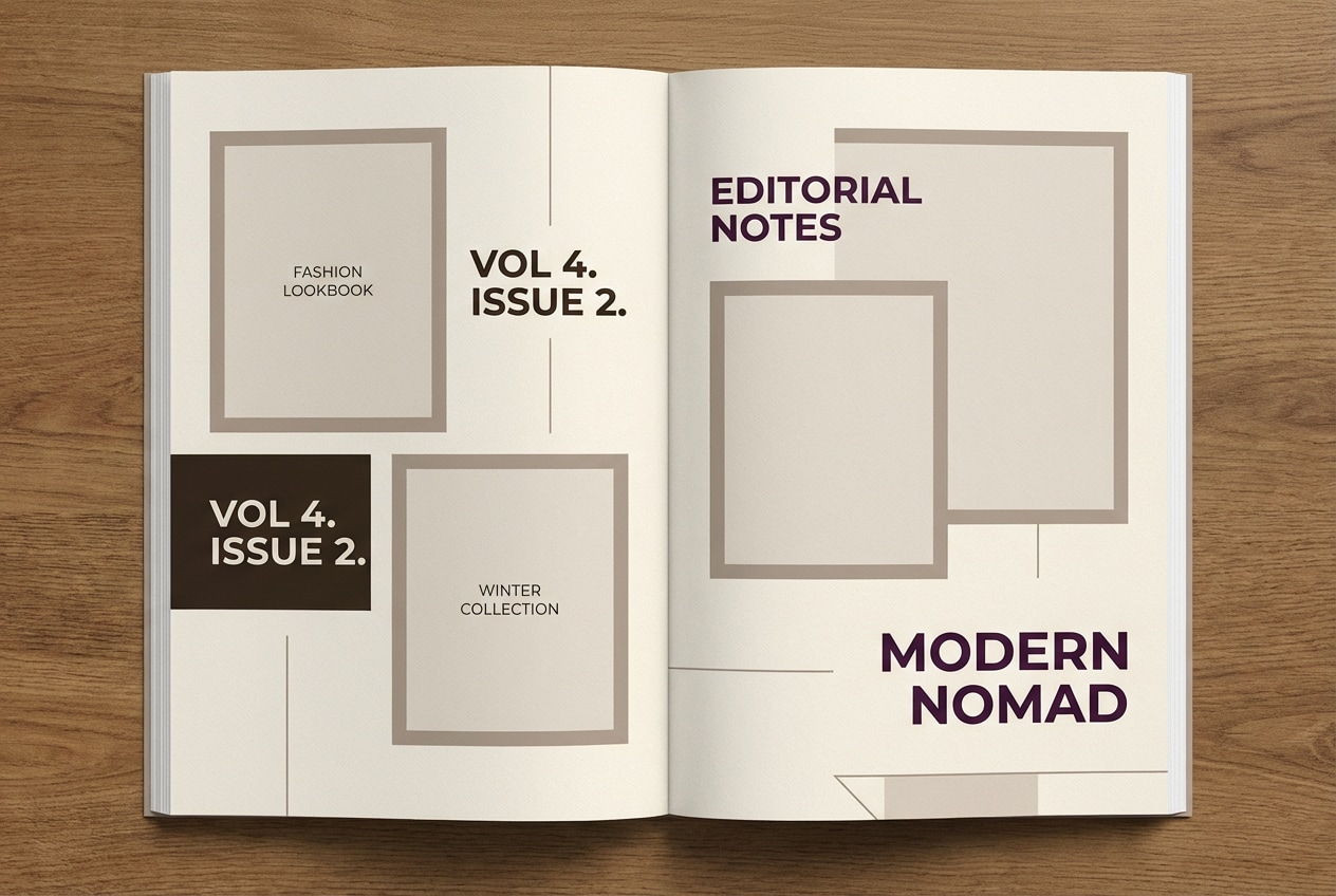
Mood: rich, moody, fashion-forward
Best for: fashion lookbooks and premium photography grades
Rich and moody, these shades evoke espresso bars, velvet coats, and soft studio shadows. The warm taupe and cream lift the deep tones, keeping spreads readable and skin tones flattering. Use the plum as an accent for headings, stitching details, or background panels, and let taupe dominate for a softer editorial feel. Tip: add subtle grain and low contrast to amplify the luxe mood.
Image example of espresso velvet generated using media.io
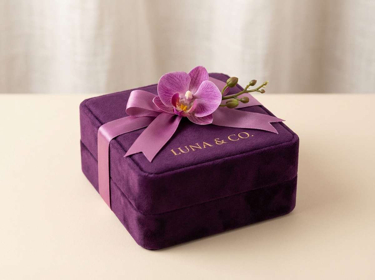
11) Gilded Orchid
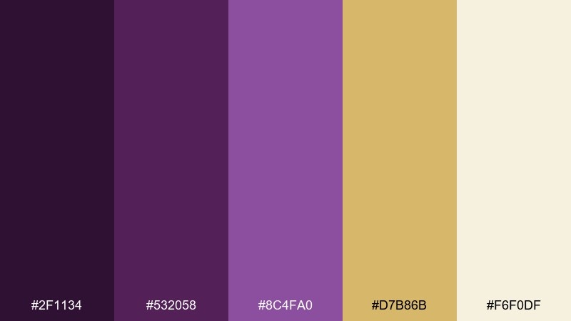
HEX: #2F1134 #532058 #8C4FA0 #D7B86B #F6F0DF
Mood: opulent, luminous, refined
Best for: jewelry packaging and premium gift boxes
Opulent and luminous, this palette feels like gemstones under gallery lights. The gold accent makes the purples sparkle, while the creamy neutral keeps packaging from looking too dark. Use the orchid mid-tone for secondary panels and patterns, then reserve gold for tiny highlights like seals, icons, or edges. Tip: in print, simulate gold with spot color or foil for the most convincing finish.
Image example of gilded orchid generated using media.io
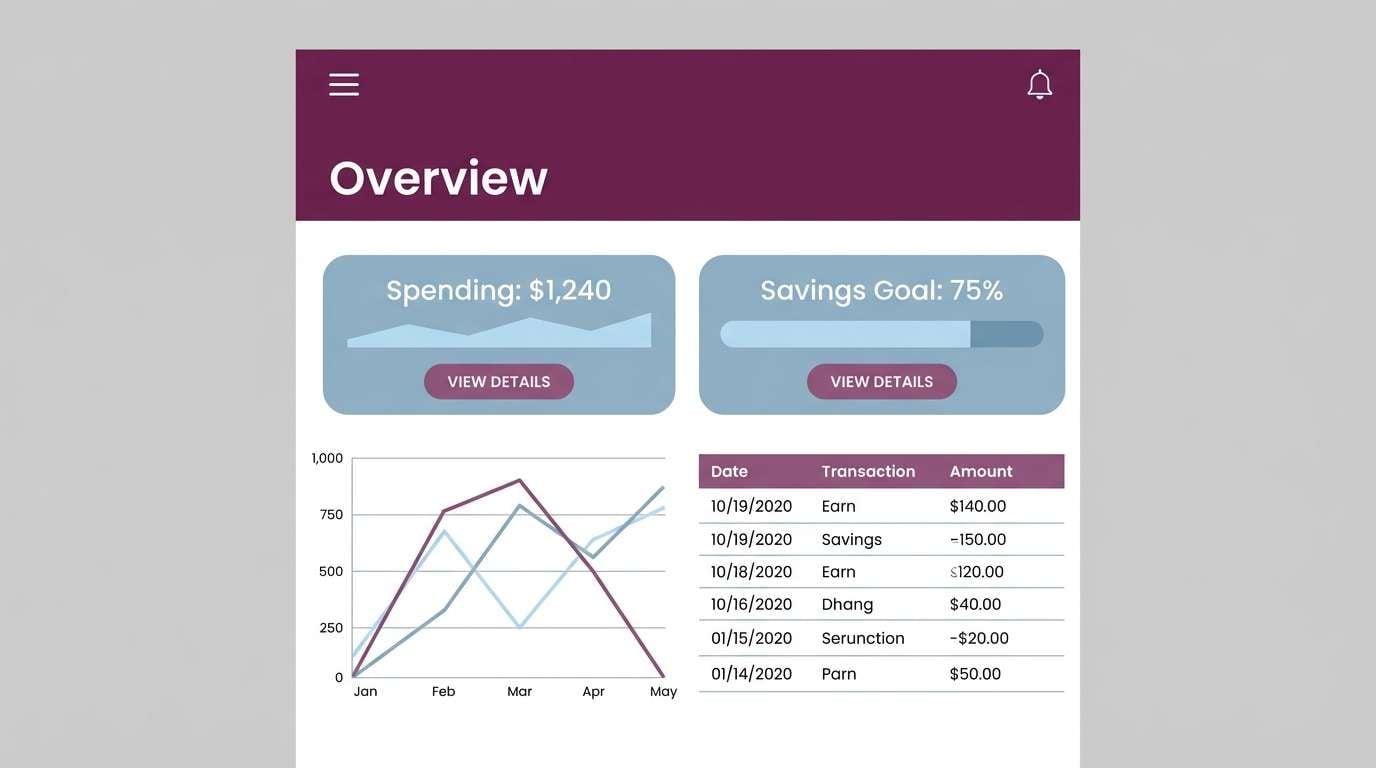
12) Arctic Plum
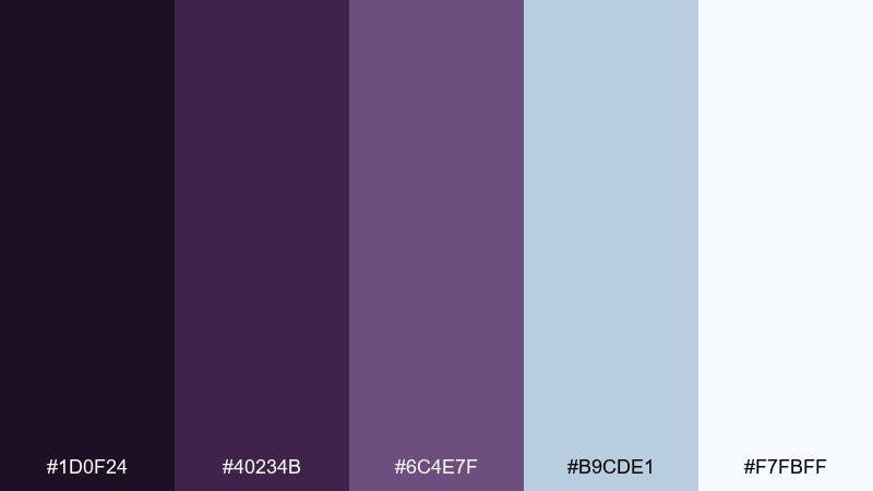
HEX: #1D0F24 #40234B #6C4E7F #B9CDE1 #F7FBFF
Mood: cool, technical, trustworthy
Best for: fintech UI and data-heavy products
Cool and technical, these hues suggest crisp air, glass surfaces, and calm confidence. The icy blue-gray tint lightens the purples, creating a trustworthy interface tone for charts and tables. For an eggplant color scheme that still feels modern, use the darkest shade for navigation and the pale blue as a canvas for data cards. Tip: keep buttons in the mid plum for strong contrast without the harshness of pure black.
Image example of arctic plum generated using media.io
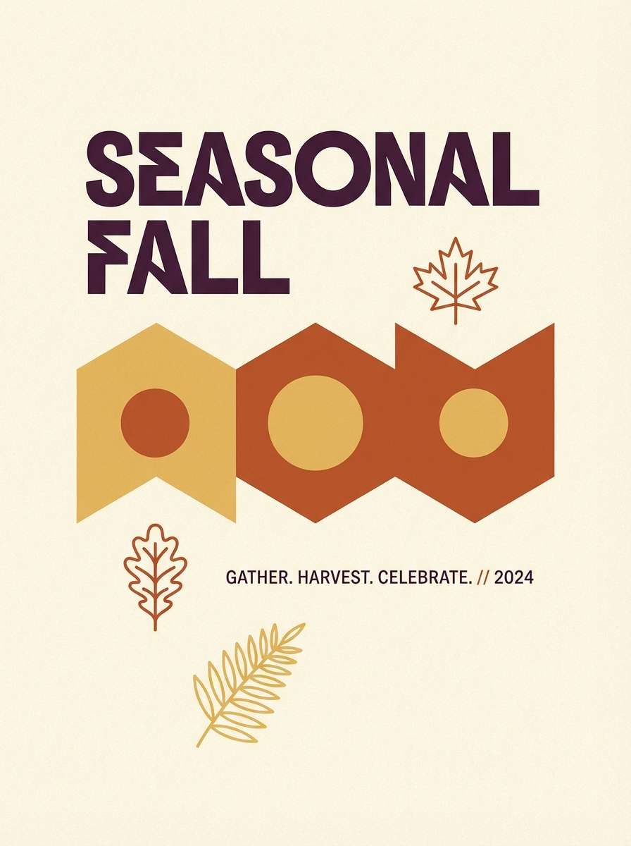
13) Autumn Aubergine
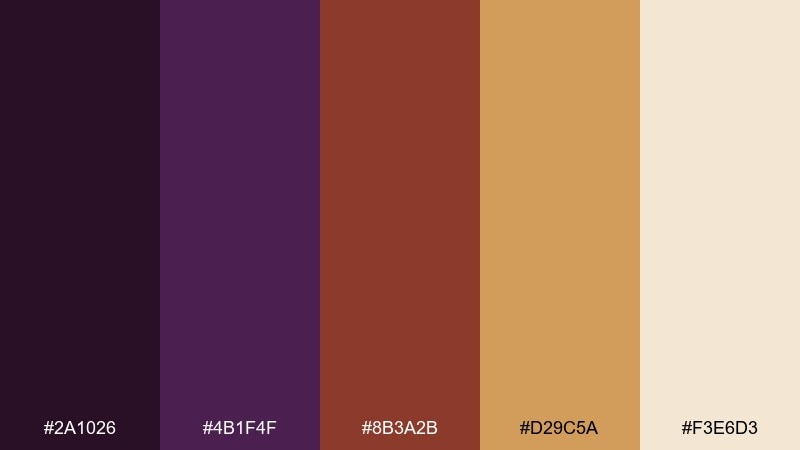
HEX: #2A1026 #4B1F4F #8B3A2B #D29C5A #F3E6D3
Mood: seasonal, cozy, rustic
Best for: fall campaign posters and craft labels
Cozy and seasonal, this set feels like leaf piles, spiced cider, and dusk skies. Rust and honey tones warm up the purple, making it perfect for autumn promotions and handmade goods. These eggplant color combinations work best when you let the golden shade lead, with deep purple as a grounding counterpoint for type and borders. Tip: add simple leaf motifs in honey to create instant seasonality without clutter.
Image example of autumn aubergine generated using media.io
14) Neon Berry Night
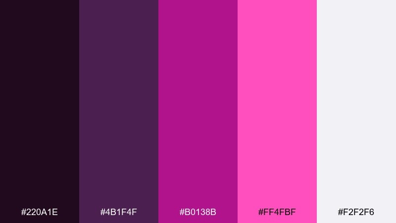
HEX: #220A1E #4B1F4F #B0138B #FF4FBF #F2F2F6
Mood: electric, nightlife, high-contrast
Best for: music event flyers and club posters
Electric and high-contrast, these colors feel like neon signs against a midnight sky. The hot pinks bring instant energy, while the soft near-white gives you space for dates and details. Use the darkest shade as the background, then layer neon text and shapes in two intensities to create depth. Tip: keep gradients subtle and within the pink range so the design stays cohesive.
Image example of neon berry night generated using media.io

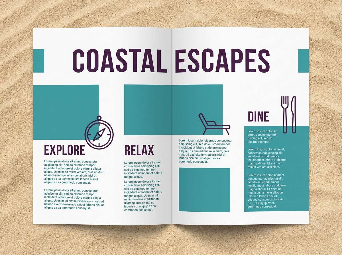
15) Coastal Plum and Sand
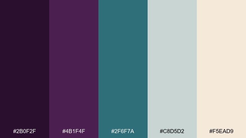
HEX: #2B0F2F #4B1F4F #2F6F7A #C8D5D2 #F5EAD9
Mood: fresh, balanced, seaside modern
Best for: travel brochures and boutique hotel branding
Fresh and balanced, this mix suggests coastal air with a sophisticated purple twist. Muted teal cools the plum, while sand and pale gray keep everything light and inviting. Use teal for secondary headings and icons, then keep plum for brand marks and key calls to action. Tip: if you use photography, pick images with neutral skies and warm stone to match the sand tone.
Image example of coastal plum and sand generated using media.io
16) Vintage Wine Cellar
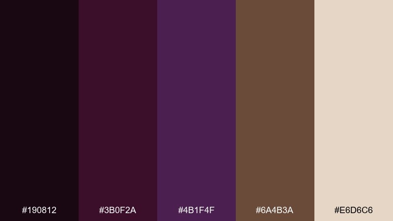
HEX: #190812 #3B0F2A #4B1F4F #6A4B3A #E6D6C6
Mood: vintage, cozy, heritage
Best for: wine labels and artisanal food packaging
Vintage and cozy, these shades feel like oak barrels and aged labels. The brown notes add heritage warmth to the purple, while the light beige works like textured paper. Use the deep tones for crests and typography, and bring in beige for negative space and premium readability. Tip: add a single accent line in the mid purple to modernize the label without losing tradition.
Image example of vintage wine cellar generated using media.io
17) Soft Lilac Workspace
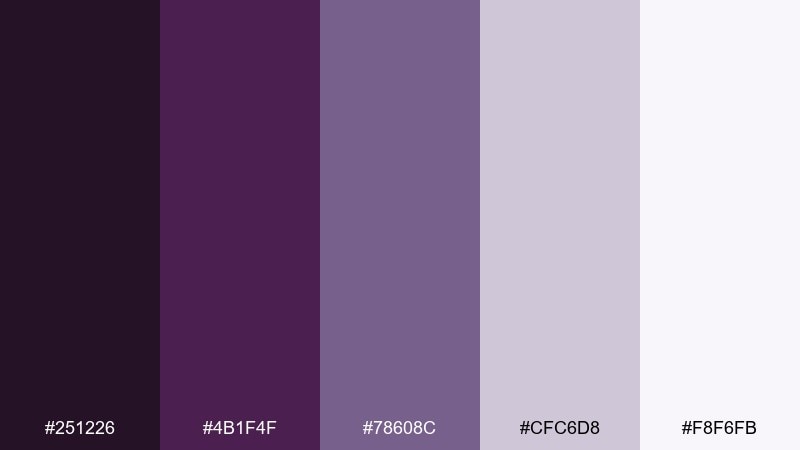
HEX: #251226 #4B1F4F #78608C #CFC6D8 #F8F6FB
Mood: friendly, modern, calm
Best for: presentation templates and productivity tools
Friendly and calm, these lilac tones feel like a tidy desk and a clear plan. The softer tints keep slides and templates approachable, while the darker purple adds structure for titles and emphasis. Use the mid lilac for section dividers and charts, then keep backgrounds bright for legibility. Tip: choose one accent color per slide and repeat it to make decks feel cohesive.
Image example of soft lilac workspace generated using media.io
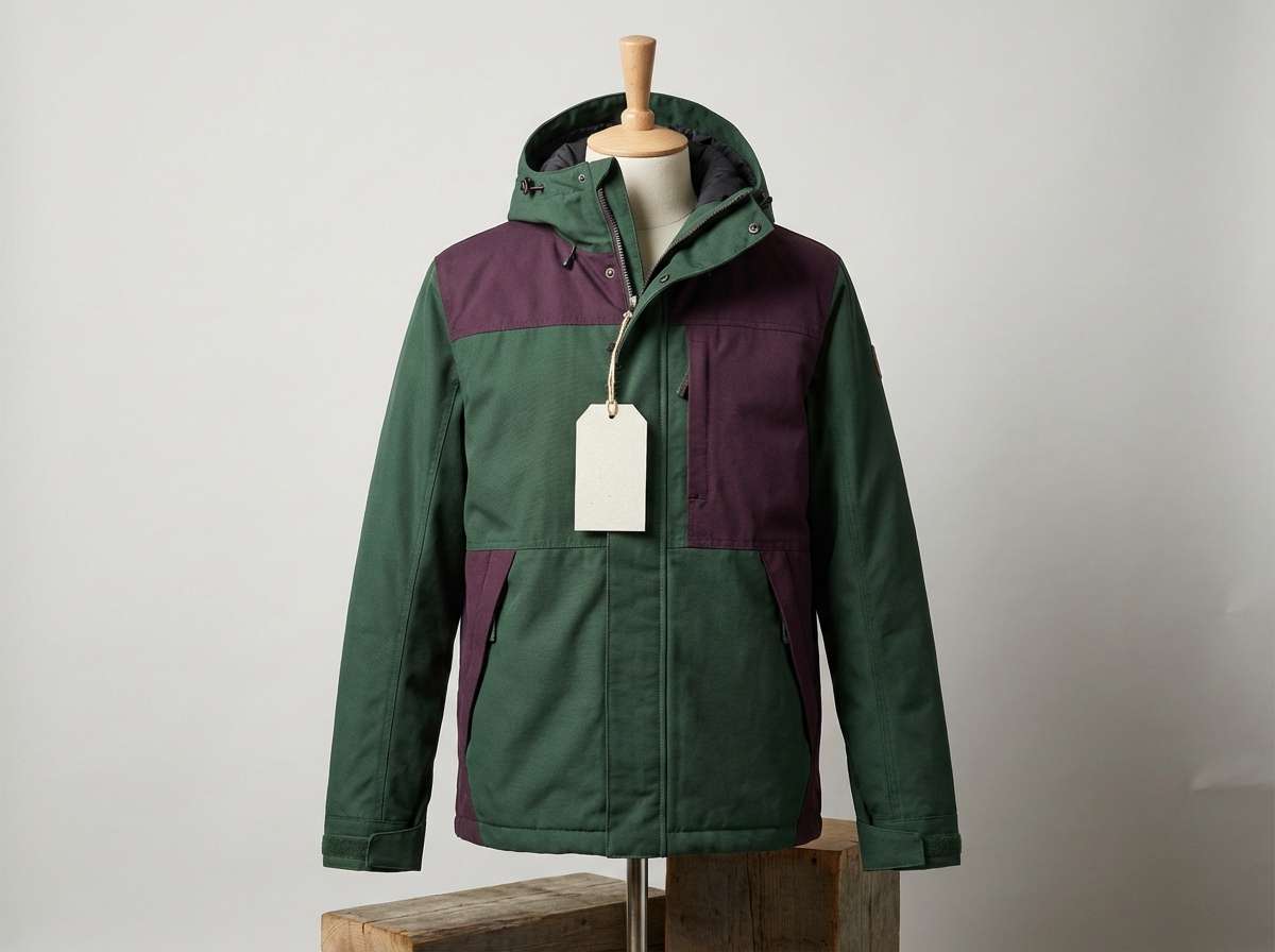
18) Forest Plum Cabin
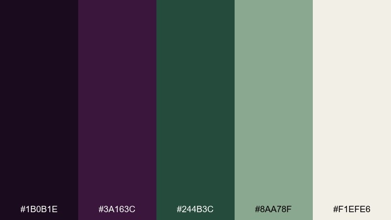
HEX: #1B0B1E #3A163C #244B3C #8AA78F #F1EFE6
Mood: outdoorsy, rugged, cozy
Best for: outdoor apparel ads and camp-inspired branding
Outdoorsy and rugged, this set looks like pine forest shadows with a plum dusk overlay. Deep green and eggplant create a sturdy base for badges, patches, and heritage-style marks. Use the lighter green for supporting panels and keep the off-white for product details and sizing charts. Tip: add subtle fabric texture and stitched lines to reinforce the cabin-ready vibe.
Image example of forest plum cabin generated using media.io
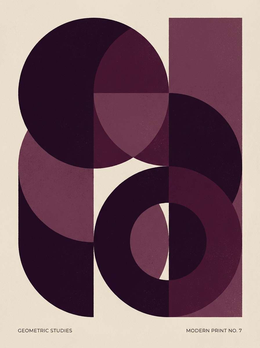
19) Monochrome Aubergine
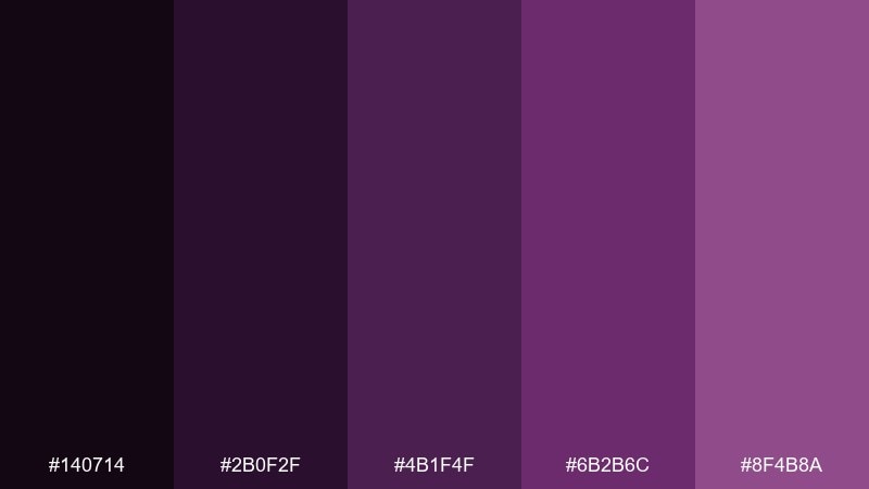
HEX: #140714 #2B0F2F #4B1F4F #6B2B6C #8F4B8A
Mood: bold, artistic, graphic
Best for: abstract posters and geometric identities
Bold and artistic, this monochrome set feels like ink layers and gallery posters. Staying within one hue family creates instant harmony, even when you push contrast with the deepest shade. Use lighter purples for large shapes, then add the darkest tone for outlines, typography, and focal points. Tip: include one subtle texture overlay to prevent flat areas from looking overly digital.
Image example of monochrome aubergine generated using media.io
20) Cream and Concord
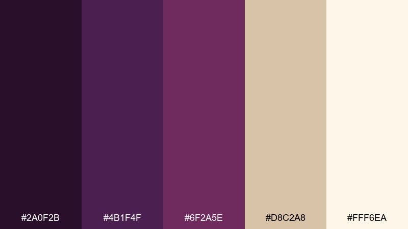
HEX: #2A0F2B #4B1F4F #6F2A5E #D8C2A8 #FFF6EA
Mood: welcoming, boutique, softly modern
Best for: cafe branding and small business identity kits
Welcoming and boutique, these tones feel like a cozy cafe with warm cream walls and a rich plum accent. The beige and cream keep it friendly, while concord purple adds memorable brand presence. As an eggplant color palette, it works best when cream carries the background and purple is used for logos, stamps, and key signage. Tip: use the mid purple for secondary patterns so the darkest shade stays special.
Image example of cream and concord generated using media.io
What Colors Go Well with Eggplant?
Warm neutrals are the easiest wins with eggplant: ivory, cream, parchment, and taupe keep the palette readable and make the purple look richer. If you want a more romantic direction, try blush, dusty rose, and soft lilac tints.
For contrast, eggplant pairs especially well with muted greens (sage, eucalyptus, forest) and blue-grays (icy, arctic tones). These cooler companions modernize eggplant and help it feel calm in UI or interior concepts.
If you want a luxe accent, metallic-inspired hues like brass and gold deliver a high-end finish—best used sparingly on lines, icons, or small highlights.
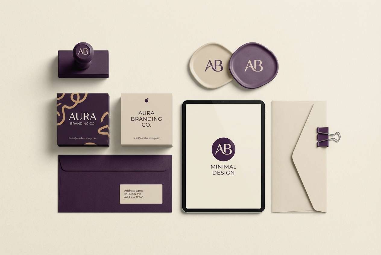
How to Use a Eggplant Color Palette in Real Designs
Start by assigning roles: use the darkest eggplant as your “ink” (headings, nav, outlines), then choose one mid-tone for emphasis (buttons, badges), and a light neutral for backgrounds. This keeps hierarchy consistent across pages and assets.
In print and packaging, eggplant looks premium on matte stocks and textured surfaces. Pair it with warm off-whites to avoid a heavy look, and reserve bright accents (hot pink or gold) for a single focal element.
In UI, watch contrast: eggplant-on-eggplant often fails accessibility. Use off-white surfaces and keep interactive elements in a mid plum or contrasting accent (teal, orchid) for clear states.
Create Eggplant Palette Visuals with AI
If you want to preview how an eggplant color scheme feels in packaging, UI mockups, posters, or interiors, generating quick concept visuals can save hours. The key is to describe the subject, lighting, texture, and where the eggplant tones should dominate.
Use prompts like “matte packaging, deep eggplant base, warm ivory background” or “dashboard UI, eggplant nav, lavender cards” to control mood and readability. Then iterate by swapping one accent (sage, brass, blush) to explore different directions.
Eggplant Color Palette FAQs
-
What is the HEX code for eggplant?
Eggplant isn’t one single fixed HEX value, but it’s typically a very dark purple in the #2B0F2F to #4B1F4F range. In this article, several palettes use #2B0F2F and #4B1F4F as reliable eggplant anchors. -
Is eggplant a warm or cool color?
Eggplant can read warm or cool depending on its undertone. More red-leaning eggplants feel warmer (plum/merlot), while more blue-leaning versions feel cooler (arctic plum). Pairing it with brass or cream warms it up; pairing it with sage or icy blue cools it down. -
What’s the best neutral to pair with eggplant?
Warm off-whites like ivory, cream, and parchment are the most flattering neutrals with eggplant because they keep the palette soft and premium. Crisp white can work too, but it often feels more modern and higher-contrast. -
Does eggplant work for modern UI design?
Yes—eggplant works especially well as a navigation or header color, with light lavender/neutral surfaces for cards. For accessibility, avoid low-contrast purple-on-purple text and use off-white backgrounds with mid-tone plums for buttons. -
What accent colors make eggplant feel luxurious?
Gold/brass accents, soft ivories, and orchid mid-tones make eggplant look opulent and refined. Use metallic-inspired hues sparingly (lines, icons, seals) to keep the result elegant rather than flashy. -
What colors should I avoid with eggplant?
Highly saturated primaries (especially intense reds and pure blues) can clash unless you’re intentionally going for a neon/nightlife look. Also avoid stacking multiple dark shades without a light neutral—designs can quickly become heavy and hard to read. -
How do I generate eggplant palette images that match my brand?
In your prompt, specify the context (packaging, UI, interior), the dominant eggplant shade, the supporting neutral, and one accent color. Add finish details like “matte paper,” “foil logo,” “soft diffused light,” or “clean grid UI” to make the output consistent.


