

Rustic color palettes capture the warmth of wood, clay, and worn metal—perfect for designs that should feel grounded, handmade, and inviting.
Below are 20 rustic color combinations with HEX codes, plus practical tips for using them in branding, interiors, packaging, and UI.
In this article
- Why Rustic Color Combinations Work So Well
-
- barnwood harvest
- clay pottery
- sagebrush meadow
- copper kettle
- old leather book
- autumn orchard
- desert cabin
- stone hearth
- weathered denim
- pine and parchment
- smoked walnut
- sunbaked adobe
- mossy trail
- wheatfield dawn
- rustic rosewood
- river rock neutral
- charred cedar
- forest cabin lights
- antique market finds
- cozy flannel night
- What Colors Go Well with Rustic?
- How to Use a Rustic Color Palette in Real Designs
- Create Rustic Palette Visuals with AI
Why Rustic Color Combinations Work So Well
Rustic tones feel familiar because they mirror natural materials we touch every day—timber, stone, linen, leather, and clay. That material-first association makes designs feel trustworthy and lived-in, even when they’re brand new.
They also balance warmth and neutrality. Creams, tans, and browns create calm backgrounds, while terracotta, copper, olive, or charcoal provide contrast for hierarchy and calls to action.
Most rustic color schemes are slightly muted, which helps photography, textures, and typography feel cohesive across print and digital layouts without fighting for attention.
20+ Rustic Color Palette Ideas (with HEX Codes)
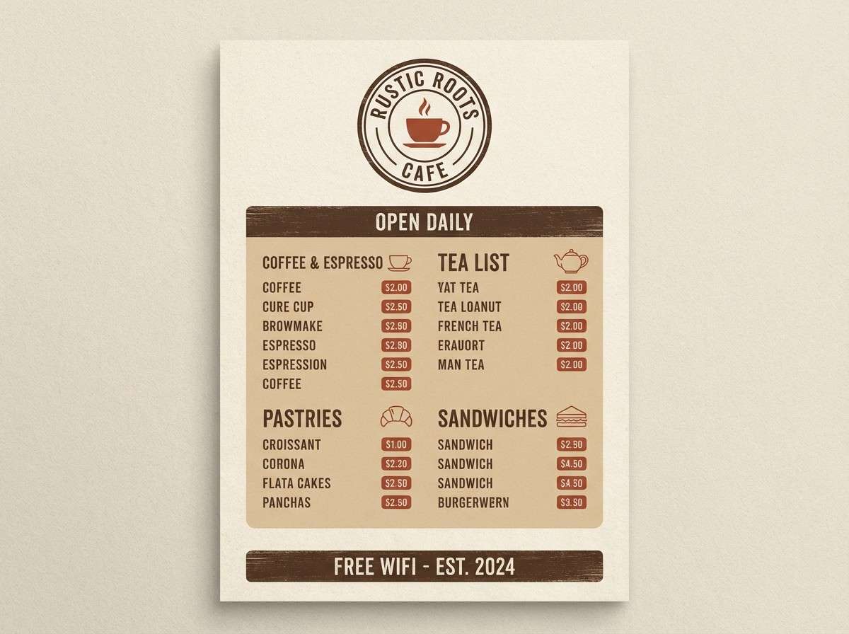
1) Barnwood Harvest
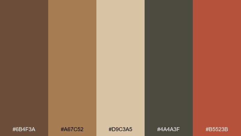
HEX: #6B4F3A #A67C52 #D9C3A5 #4A4A3F #B5523B
Mood: homey, sturdy, sun-warmed
Best for: rustic cafe logo and menu design
Homey barnwood browns and toasted tan feel like weathered beams and fresh-baked bread. Use the cream and tan for readable backgrounds, then drop in the clay red for callouts and stamps. Pair with slab serif type or hand-drawn icons for a crafted look. Tip: keep the dark charcoal only for headlines so the page stays airy.
Image example of barnwood harvest generated using media.io
Media.io is an online AI studio for creating and editing video, image, and audio in your browser.

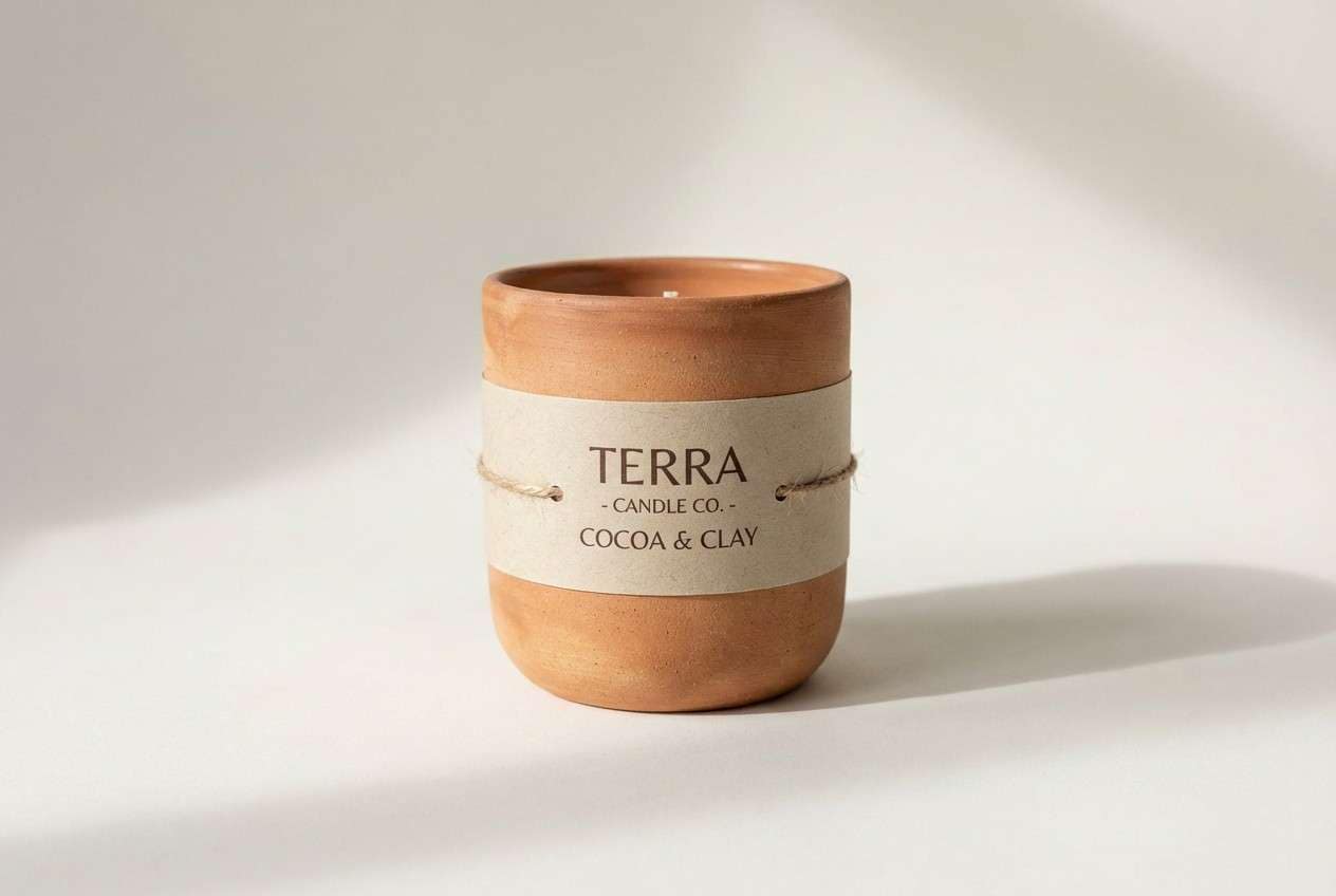
2) Clay Pottery
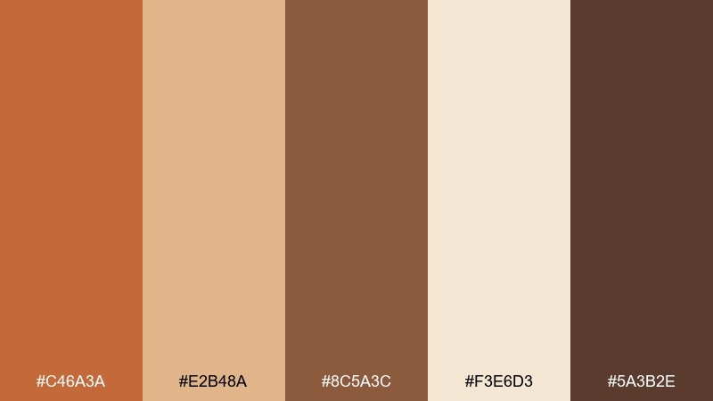
HEX: #C46A3A #E2B48A #8C5A3C #F3E6D3 #5A3B2E
Mood: handmade, earthy, welcoming
Best for: handmade pottery product packaging
Sun-baked clay and kiln-fired browns evoke studio shelves and artisan glazes. Let the soft cream act as negative space, then layer terracotta and cocoa for typography and borders. Works beautifully with recycled paper textures and minimal illustrations. Tip: choose one bold clay tone for the main label so the rest reads premium, not busy.
Image example of clay pottery generated using media.io
3) Sagebrush Meadow
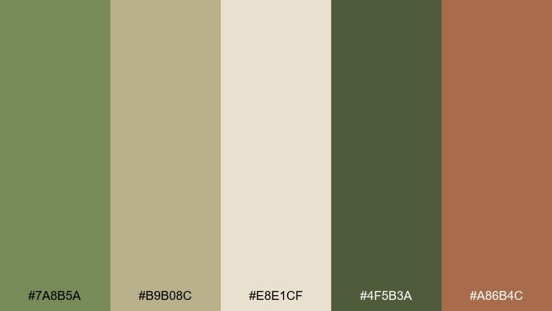
HEX: #7A8B5A #B9B08C #E8E1CF #4F5B3A #A86B4C
Mood: calm, natural, outdoorsy
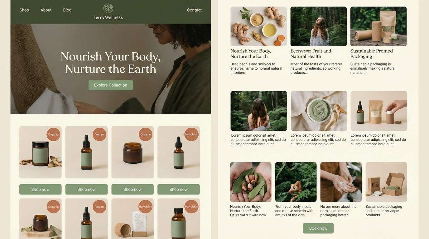
Best for: eco wellness website UI
Dusty sage and meadow neutrals feel like morning air over dry grasses. Use the pale cream for screens, then keep sage as the primary UI color for buttons and tabs. The warm clay accent helps highlight key actions without turning the layout loud. Tip: reserve the deep olive for nav and footers to anchor the page.
Image example of sagebrush meadow generated using media.io
4) Copper Kettle
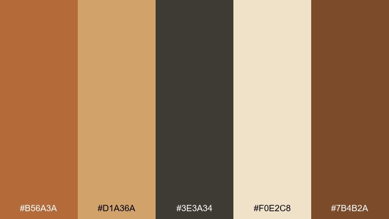
HEX: #B56A3A #D1A36A #3E3A34 #F0E2C8 #7B4B2A
Mood: toasty, vintage, polished
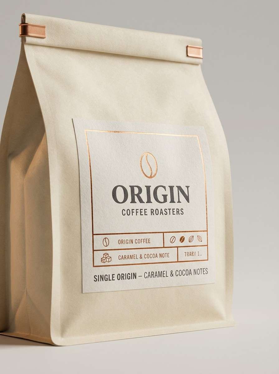
Best for: coffee bag packaging and product ads
Burnished copper and caramel tones bring to mind a kettle on a wood stove and softly worn metal. These rustic color combinations look best when the cream stays dominant and the dark charcoal is used for crisp type. Pair with kraft paper textures, foil accents, or simple stamp graphics for an old-world finish. Tip: keep highlights in the light gold so the design still feels modern.
Image example of copper kettle generated using media.io
5) Old Leather Book
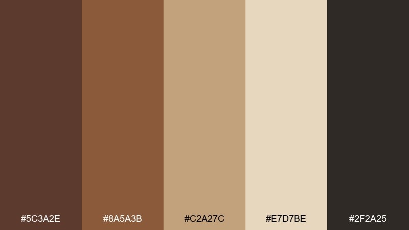
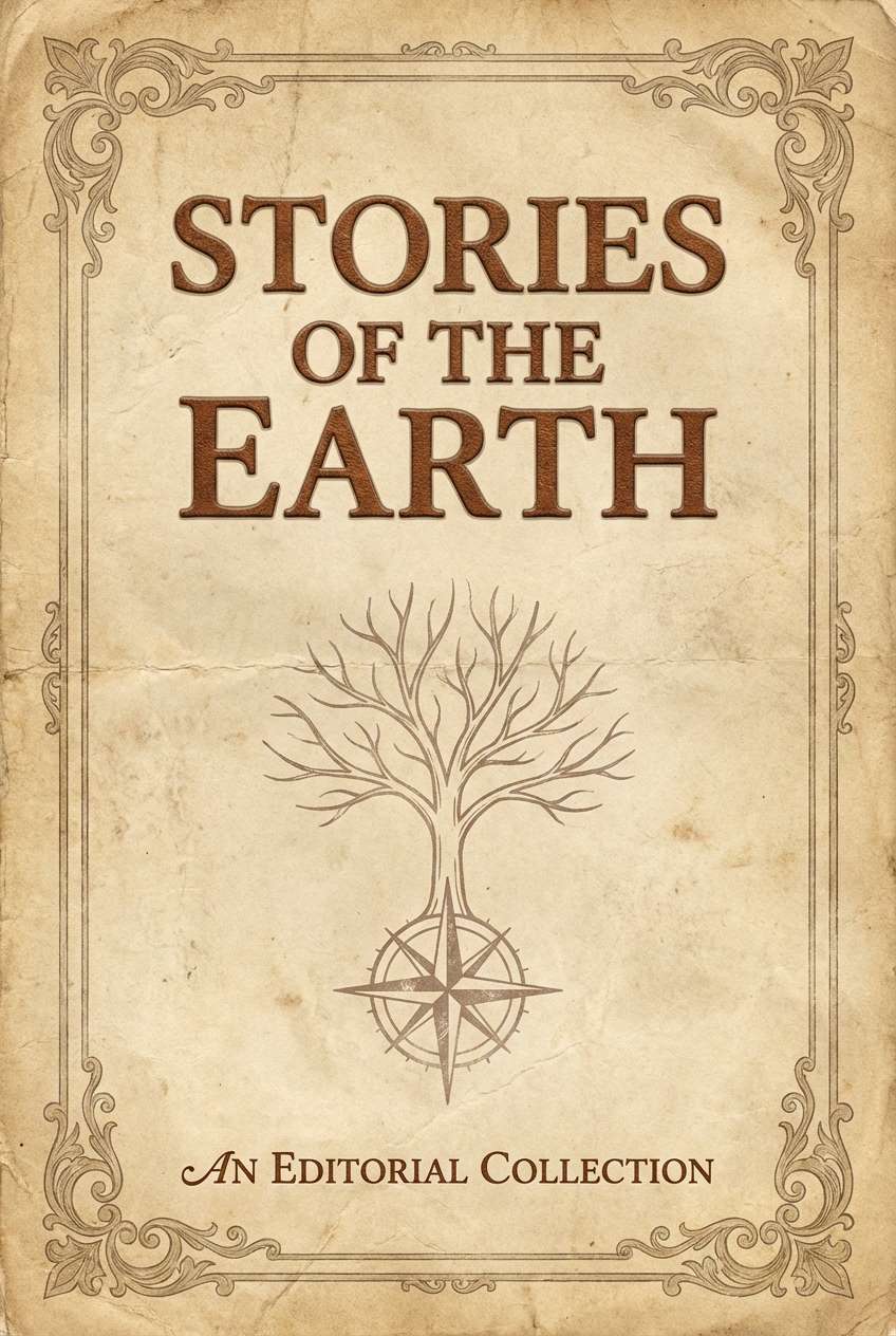
HEX: #5C3A2E #8A5A3B #C2A27C #E7D7BE #2F2A25
Mood: classic, scholarly, cozy
Best for: editorial book cover and chapter openers
Deep leather browns and parchment beige evoke library stacks and worn spines. Use the parchment tones as the page base, then build hierarchy with the dark ink-like brown for headings. The mid tan works well for frames, dividers, and subtle patterns. Tip: add generous margins so the palette feels refined rather than heavy.
Image example of old leather book generated using media.io
6) Autumn Orchard
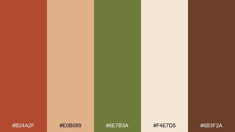
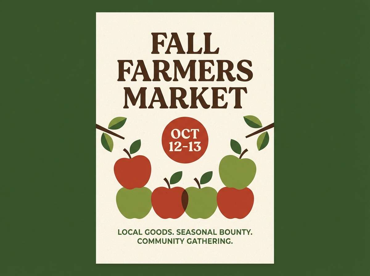
HEX: #B24A2F #E0B089 #6E7B3A #F4E7D5 #6B3F2A
Mood: seasonal, hearty, inviting
Best for: fall farmers market poster and banners
Spiced red, baked tan, and orchard green feel like apples, leaves, and wooden crates. A rustic color palette like this reads best when the light cream carries most of the space and the green is used as a grounding secondary. Pair with chunky serif headlines and simple produce illustrations. Tip: use the spice red sparingly for dates and prices to maximize contrast.
Image example of autumn orchard generated using media.io
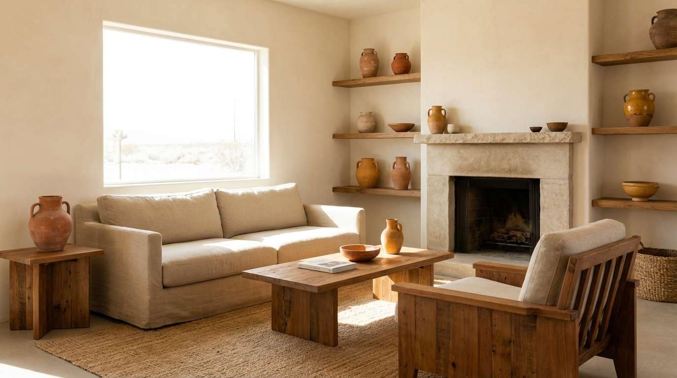
7) Desert Cabin
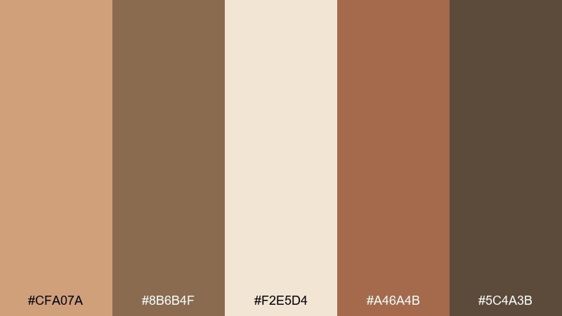
HEX: #CFA07A #8B6B4F #F2E5D4 #A46A4B #5C4A3B
Mood: sun-faded, relaxed, grounded
Best for: airbnb cabin listing hero image
Sun-faded sand and dusty wood tones suggest a quiet cabin with linen throws and clay decor. Use the pale cream as the main background and layer the medium browns for text and UI overlays. Works well with natural materials like rattan, oak, and brushed brass. Tip: add contrast with the darkest brown only in small areas such as buttons or key labels.
Image example of desert cabin generated using media.io
8) Stone Hearth
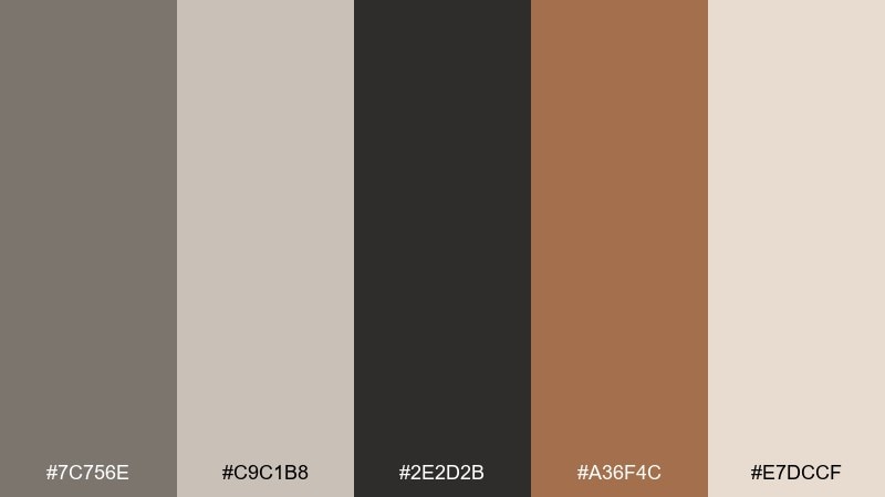
HEX: #7C756E #C9C1B8 #2E2D2B #A36F4C #E7DCCF
Mood: grounded, minimal, fireside
Best for: interior moodboards and decor styling
Cool stone grays balanced with warm terracotta feel like a hearth beside aged plaster. Keep the light neutrals for large surfaces, then add the charcoal for structure in text and outlines. The terracotta note brings warmth without overpowering a calm room palette. Tip: repeat the stone gray in two materials, like tile and linen, for a cohesive look.
Image example of stone hearth generated using media.io
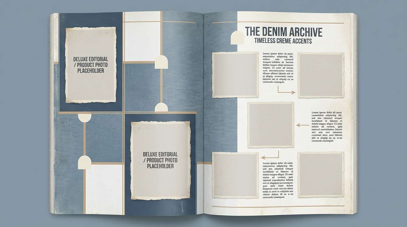
9) Weathered Denim
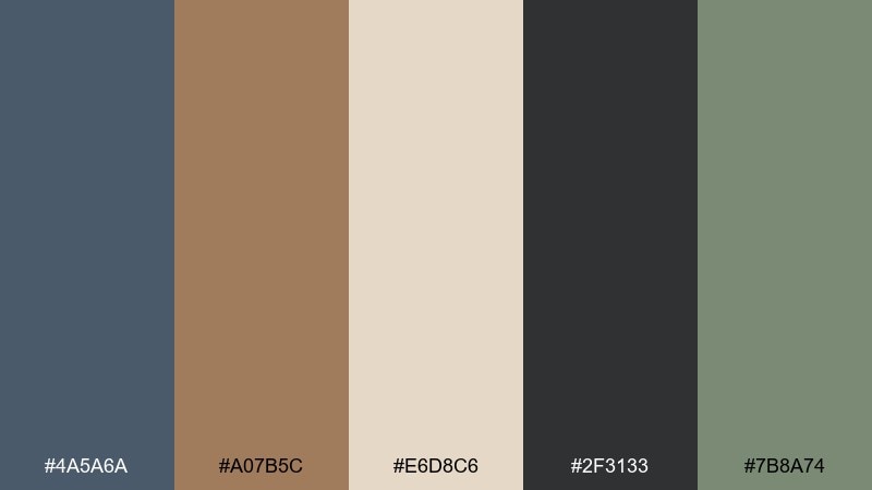
HEX: #4A5A6A #A07B5C #E6D8C6 #2F3133 #7B8A74
Mood: workwear, muted, dependable
Best for: denim workwear brand lookbook
Faded denim blue and worn tan evoke canvas aprons, tool belts, and washed fabric. Use the cream as page space, then lean on denim blue for headers and section blocks. The charcoal gives strong contrast for captions and SKU details. Tip: keep imagery slightly desaturated so the palette stays cohesive across spreads.
Image example of weathered denim generated using media.io
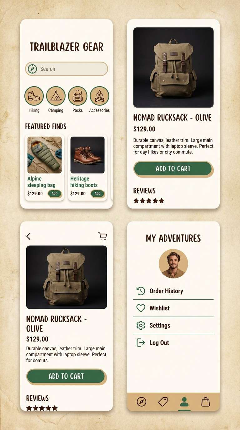
10) Pine and Parchment
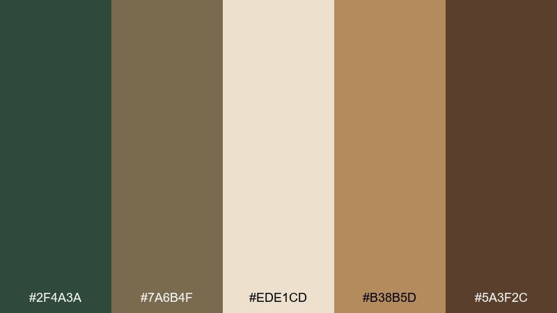
HEX: #2F4A3A #7A6B4F #EDE1CD #B38B5D #5A3F2C
Mood: woodsy, balanced, classic
Best for: outdoor gear app UI and onboarding
Deep pine green against parchment beige feels like trail maps tucked into a leather pack. A rustic color scheme like this is easiest to scale when parchment remains the base and pine becomes the primary action color. Use the warm gold-tan for highlights like badges, toggles, and progress states. Tip: keep the darkest brown for icons and dividers to avoid heavy screens.
Image example of pine and parchment generated using media.io
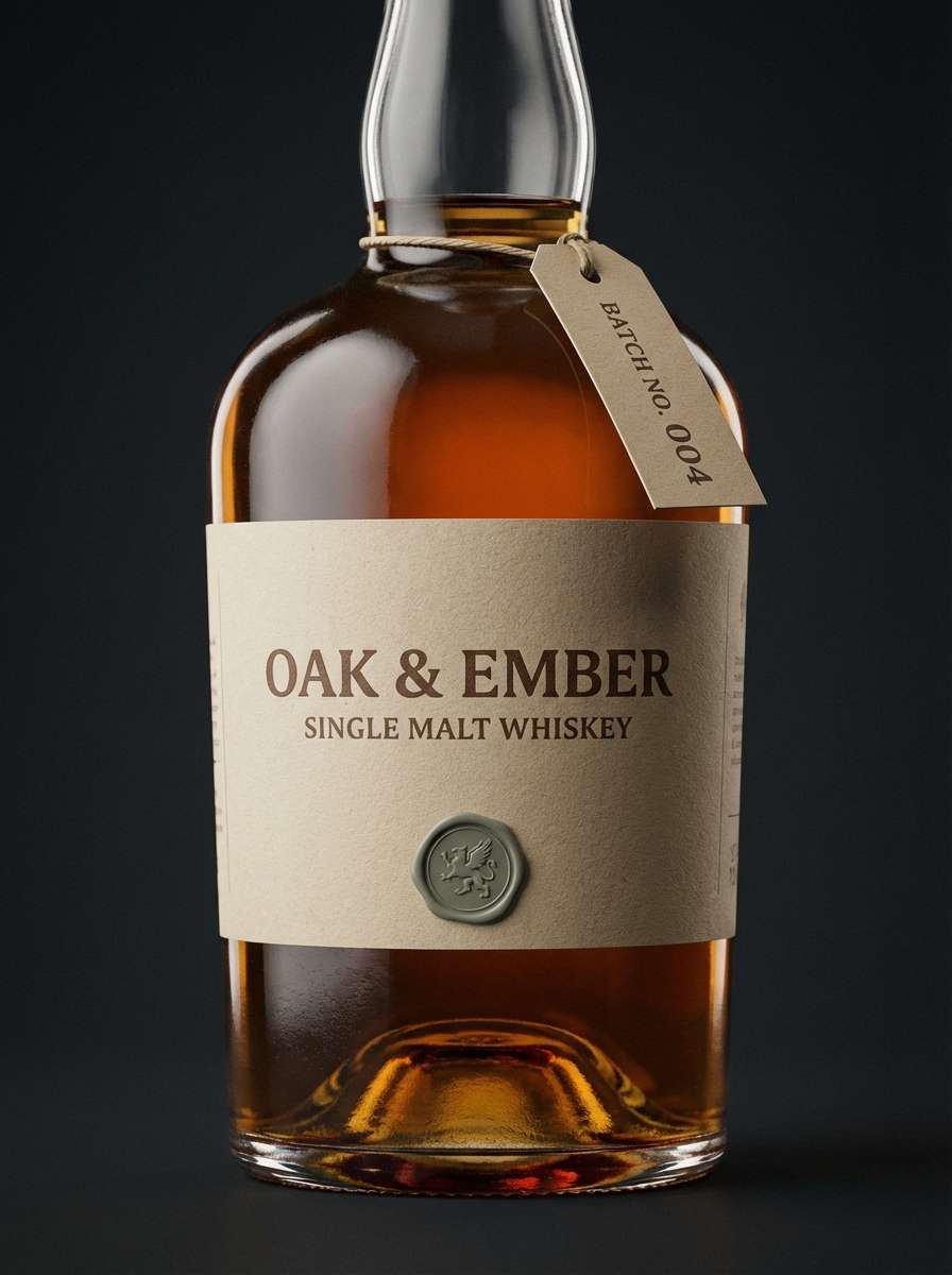
11) Smoked Walnut
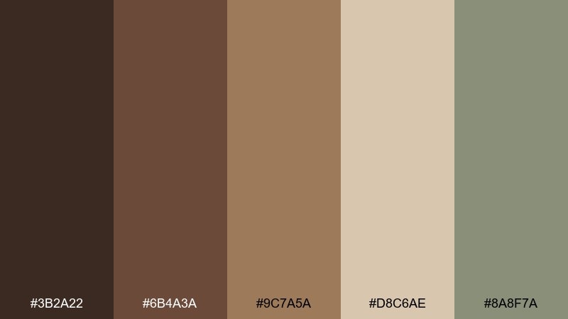
HEX: #3B2A22 #6B4A3A #9C7A5A #D8C6AE #8A8F7A
Mood: moody, refined, mature
Best for: whiskey label and bottle neck tag
Smoked walnut browns and dusty taupe create a slow, refined mood like a barrel room. Put the light beige on the main label for legibility, then use the darkest brown for type and crests. The muted gray-green works well as a subtle foil or security mark accent. Tip: add a thin border line to keep the layout sharp against dark glass.
Image example of smoked walnut generated using media.io
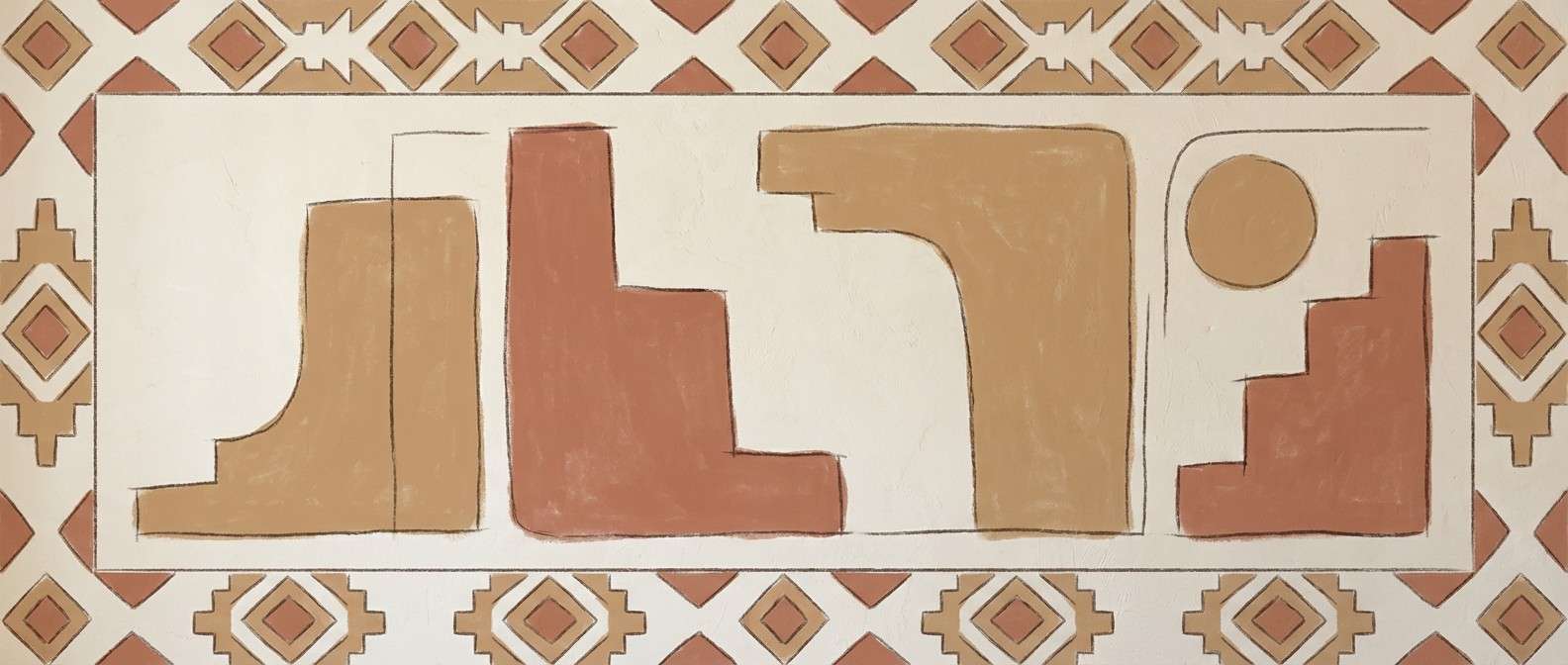
12) Sunbaked Adobe
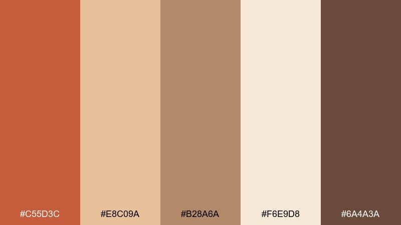
HEX: #C55D3C #E8C09A #B28A6A #F6E9D8 #6A4A3A
Mood: warm, artisanal, sunlit
Best for: restaurant wall mural illustration
Adobe red and creamy sand tones feel like a sunlit courtyard and hand-troweled plaster. Use the pale cream as the wall base, then build shapes with terracotta and warm tan. Works especially well with line-drawn botanicals and geometric borders. Tip: keep the darkest brown only in small outlines so the mural stays bright.
Image example of sunbaked adobe generated using media.io
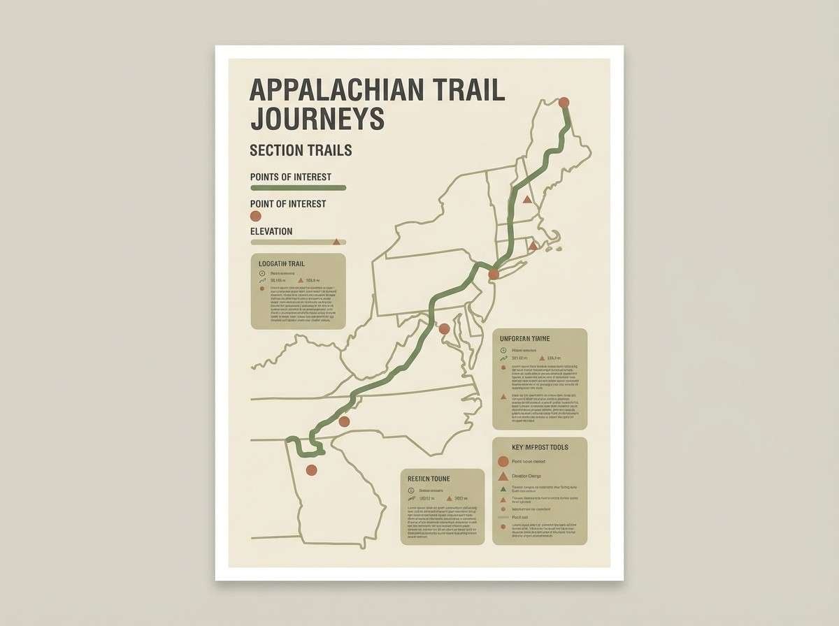
13) Mossy Trail
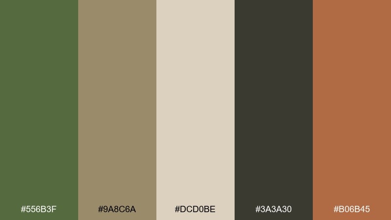
HEX: #556B3F #9A8C6A #DCD0BE #3A3A30 #B06B45
Mood: earthy, adventurous, grounded
Best for: hiking trail map poster
Moss green and dusty khaki evoke damp trails, bark, and well-used canvas. Let the light neutral act as the map base, then use green for routes and markers. The warm clay accent helps highlight trailheads and warning symbols. Tip: keep typography in the charcoal tone to preserve clarity at a distance.
Image example of mossy trail generated using media.io
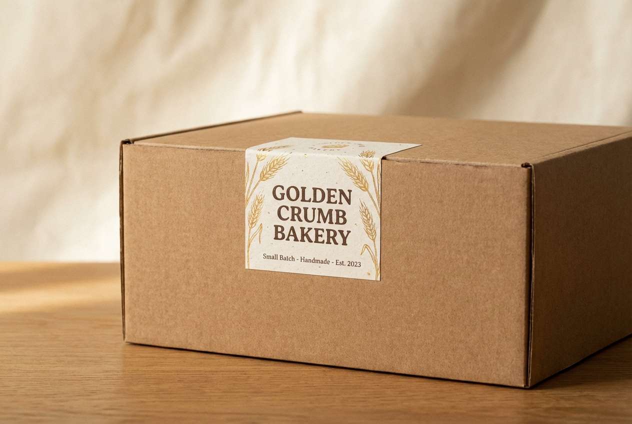
14) Wheatfield Dawn
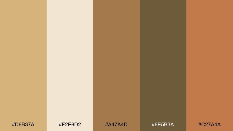
HEX: #D6B37A #F2E6D2 #A47A4D #6E5B3A #C27A4A
Mood: soft, optimistic, natural
Best for: bakery brand identity and box packaging
Golden wheat and creamy oat tones feel like early light across fields and fresh loaves cooling on racks. These rustic color combinations shine on kraft stock, where the cream becomes the label base and the darker browns carry type. Add the warm caramel as a highlight for seals, ribbons, or icon fills. Tip: use large, simple typography so the gentle contrast stays readable.
Image example of wheatfield dawn generated using media.io
15) Rustic Rosewood
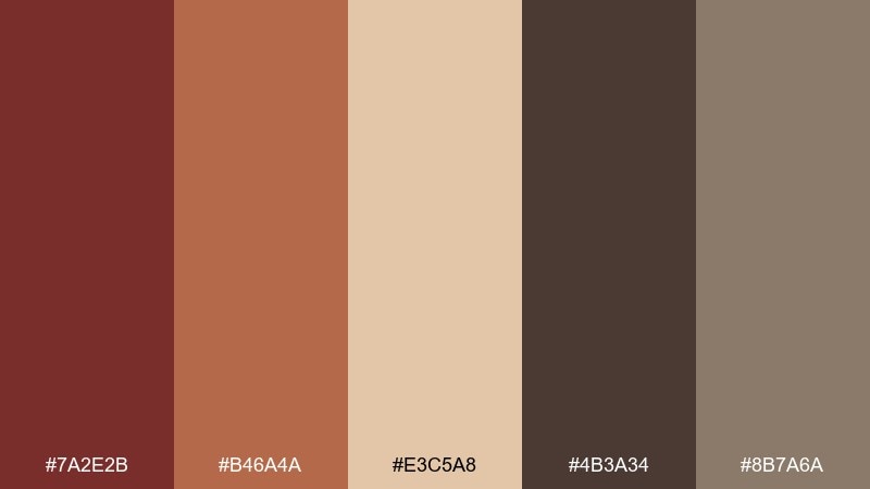
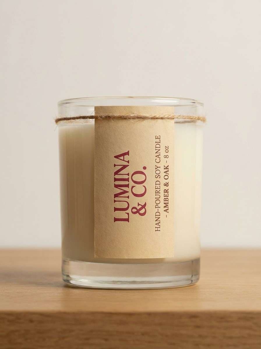
HEX: #7A2E2B #B46A4A #E3C5A8 #4B3A34 #8B7A6A
Mood: romantic, vintage, cozy
Best for: boutique candle branding
Rosewood red and warm blush-beige bring a vintage, romantic cabin mood without feeling sugary. Use the light beige for labels and web backgrounds, then let the rosewood tone carry logos and key headlines. The cocoa brown works well for fine details like ingredients and small icons. Tip: add a subtle paper texture to enhance the handcrafted vibe.
Image example of rustic rosewood generated using media.io
16) River Rock Neutral
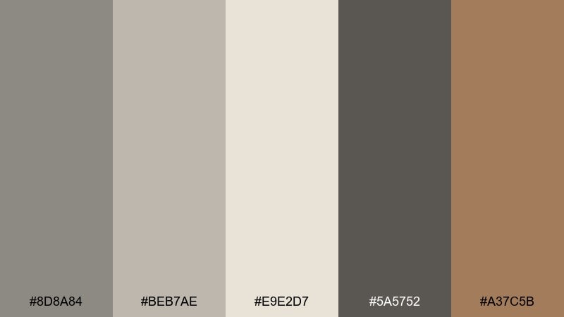
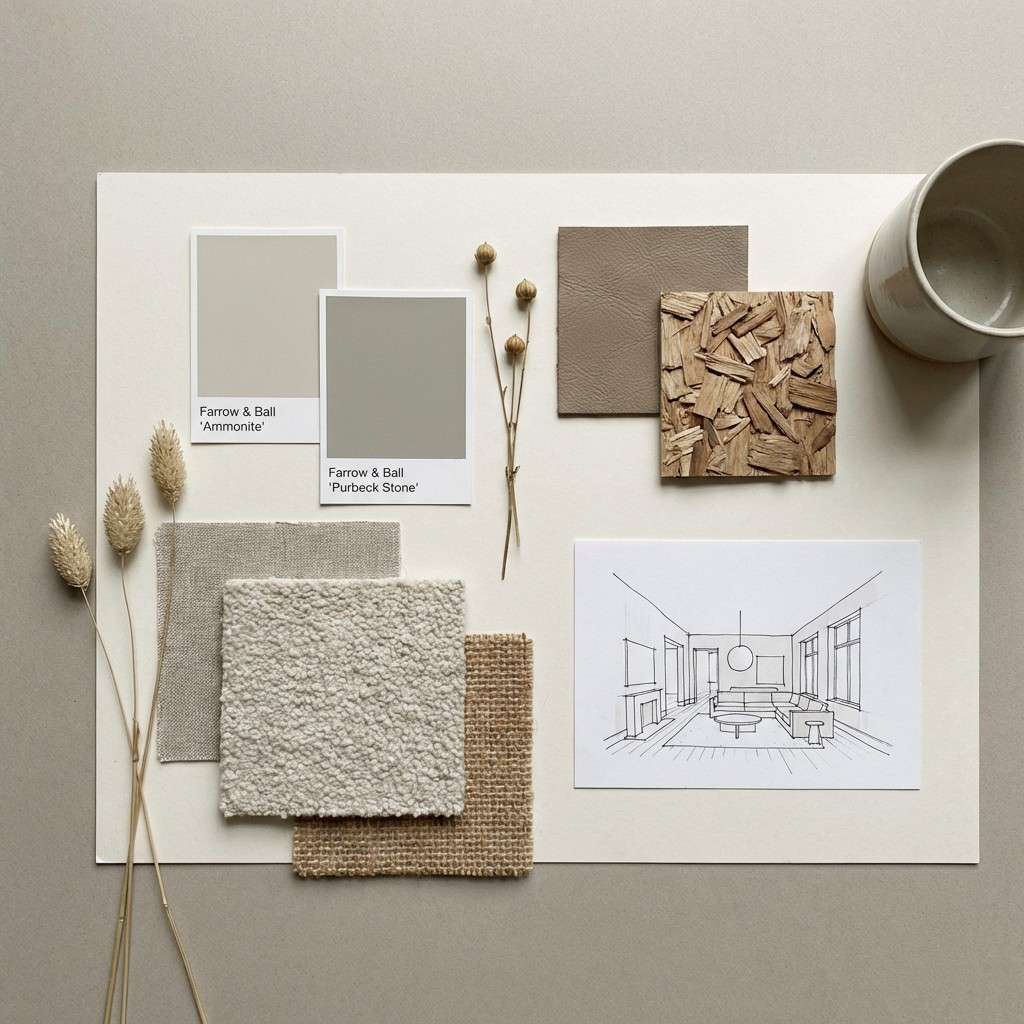
HEX: #8D8A84 #BEB7AE #E9E2D7 #5A5752 #A37C5B
Mood: quiet, modern, grounded
Best for: minimalist interior paint swatches and moodboard
River stone grays and soft greige feel clean, grounded, and effortlessly modern. Use the palest tone for broad surfaces, then build depth with mid grays for tiles, textiles, and UI panels. The warm taupe accent adds just enough life for decor accessories or highlight states. Tip: introduce contrast through texture rather than color to keep the look serene.
Image example of river rock neutral generated using media.io
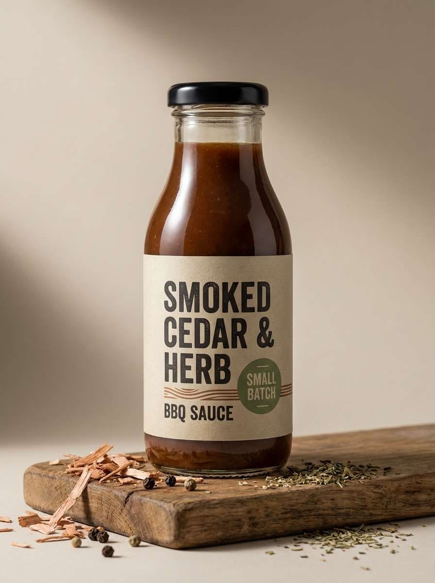
17) Charred Cedar
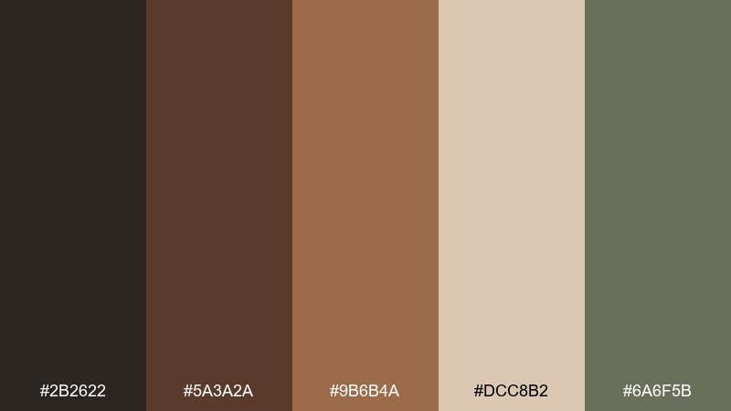
HEX: #2B2622 #5A3A2A #9B6B4A #DCC8B2 #6A6F5B
Mood: bold, smoky, rugged
Best for: bbq sauce bottle product ad
Charred black-brown and cedar tones evoke smoke, firewood, and cast-iron grills. A rustic color palette like this looks strongest when the light beige is used for the label field and the near-black becomes the hero contrast. The muted herb tone can signal flavor notes or heat level without introducing loud colors. Tip: keep the background simple so the bottle silhouette feels premium.
Image example of charred cedar generated using media.io
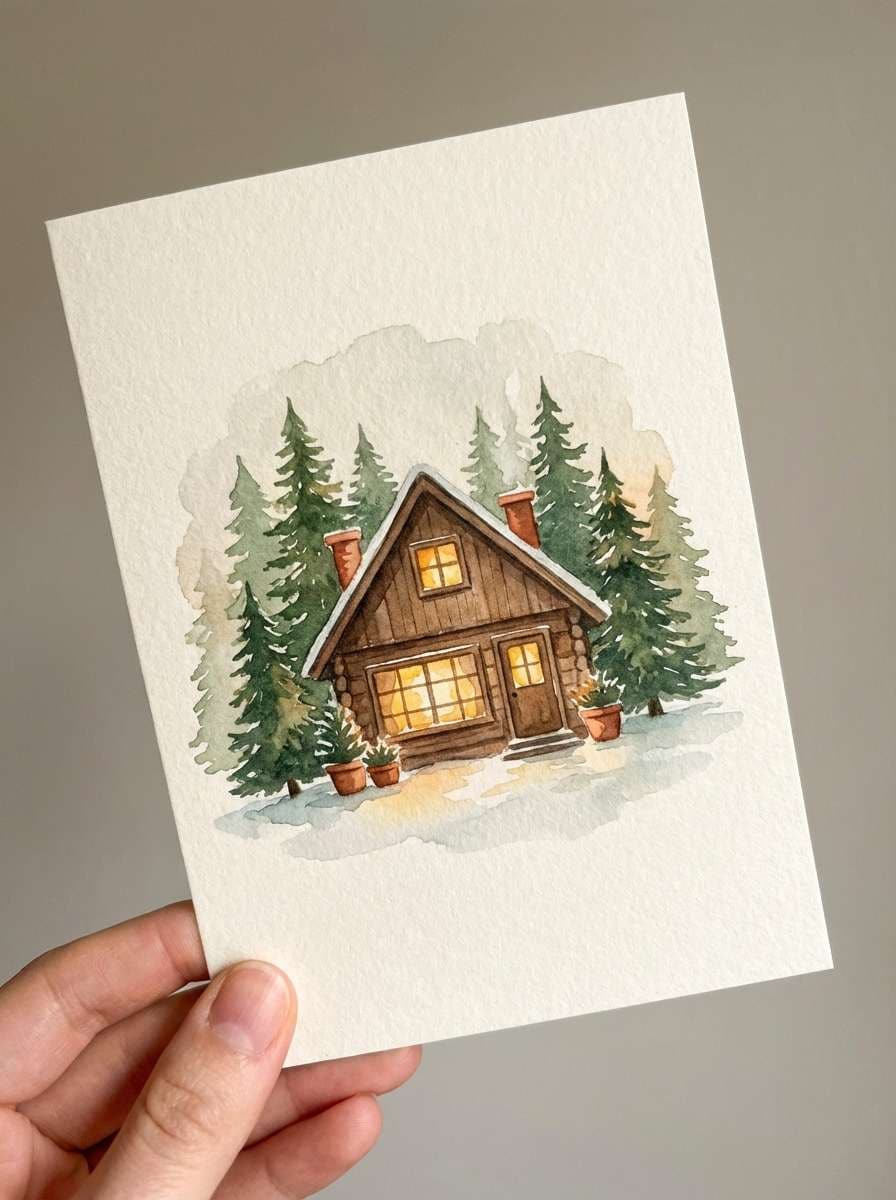
18) Forest Cabin Lights
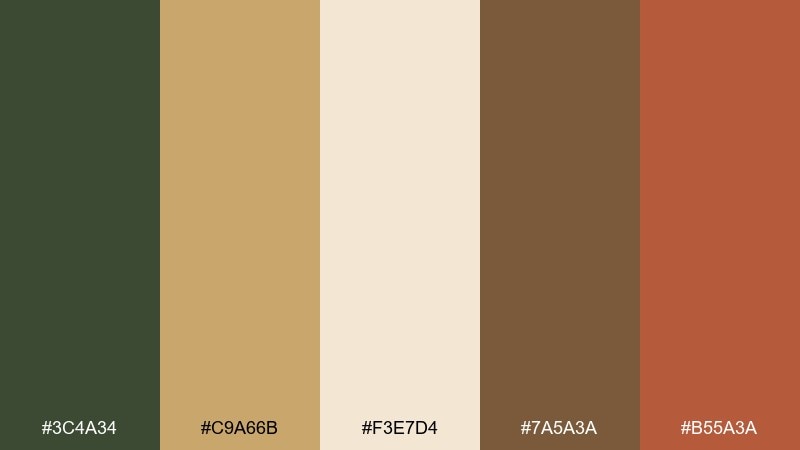
HEX: #3C4A34 #C9A66B #F3E7D4 #7A5A3A #B55A3A
Mood: cozy, festive, woodsy
Best for: holiday cabin greeting card illustration
Pine green and candlelit gold feel like a cabin window glowing at dusk. Use the cream tone as the paper base, then layer green and warm brown for illustrated shapes and text. The terracotta accent adds a friendly pop for ornaments or small icons. Tip: keep gradients subtle so the artwork stays print-friendly.
Image example of forest cabin lights generated using media.io
19) Antique Market Finds
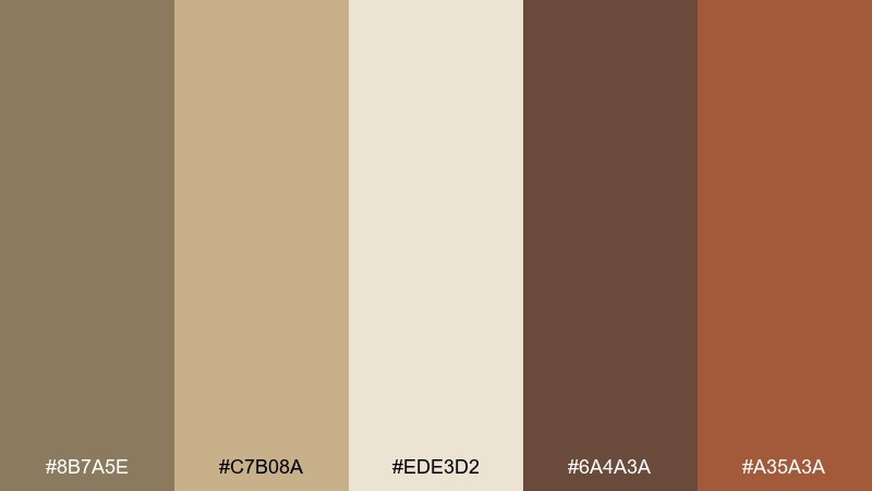
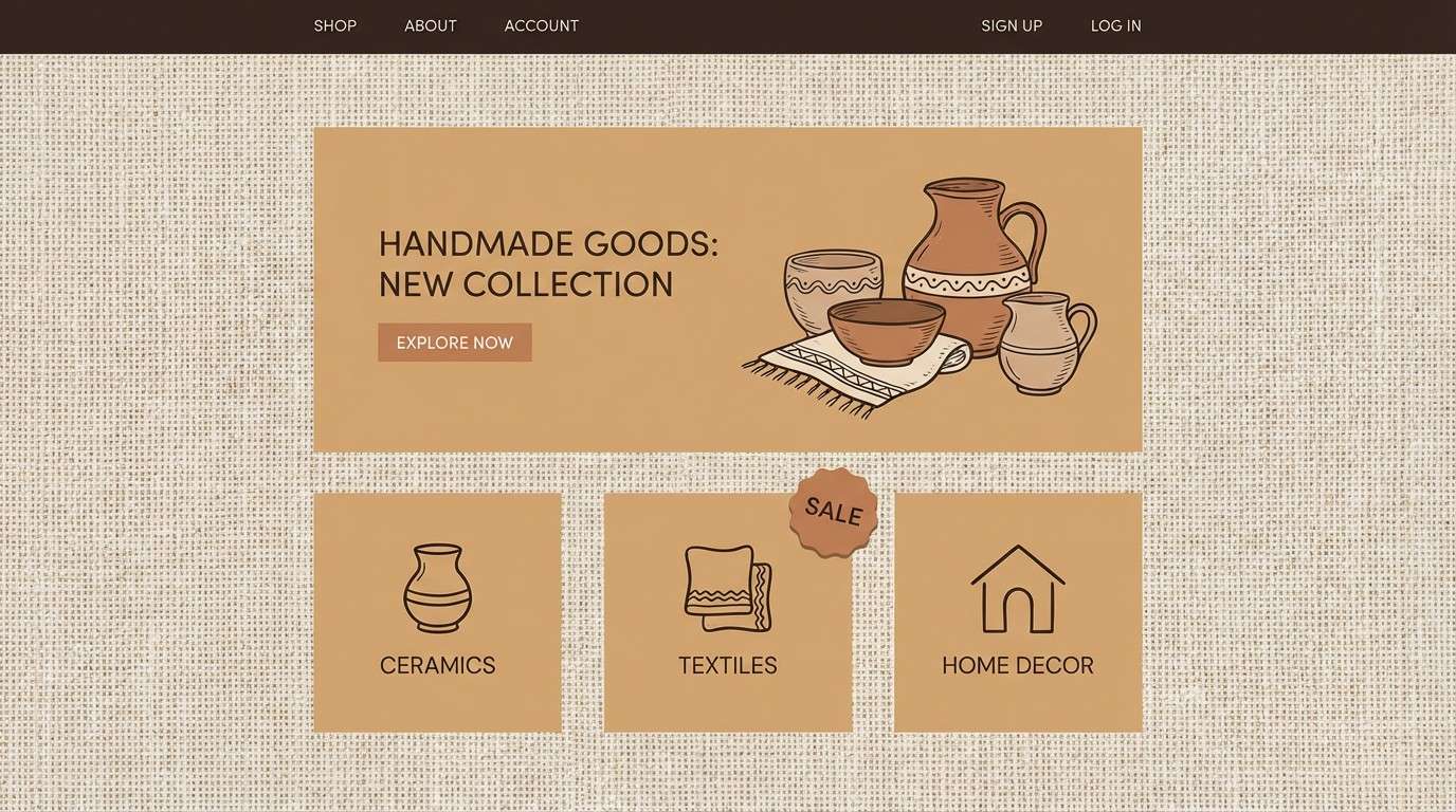
HEX: #8B7A5E #C7B08A #EDE3D2 #6A4A3A #A35A3A
Mood: nostalgic, curated, warm
Best for: antique shop ecommerce banner and category tiles
Soft brass, linen, and aged wood tones suggest curated shelves and treasure-hunt afternoons. A rustic color combination like this works best with lots of breathing room and simple product frames. Use the darker brown for navigation and prices, while the warm clay tone highlights sale tags. Tip: keep photography warm and slightly matte to match the vintage feel.
Image example of antique market finds generated using media.io
20) Cozy Flannel Night
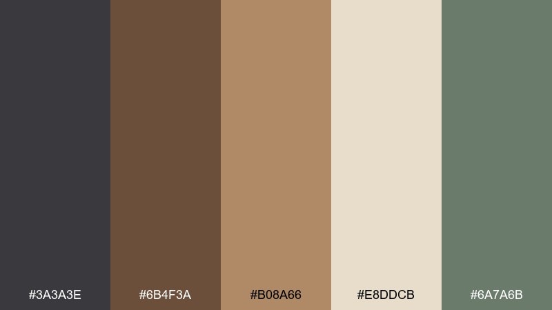
HEX: #3A3A3E #6B4F3A #B08A66 #E8DDCB #6A7A6B
Mood: cozy, subdued, evening
Best for: lodge event ticket poster
Smoky charcoal and warm brown feel like flannel by a campfire on a cool night. Use the light cream for the main ticket field, then anchor headings in charcoal for crisp contrast. The muted green works well for small stamps, icons, or section dividers. Tip: add a simple check pattern in the background at low opacity for texture without clutter.
Image example of cozy flannel night generated using media.io

What Colors Go Well with Rustic?
Rustic palettes pair best with warm neutrals (cream, oat, sand, tan, and greige) because they mimic natural backdrops like paper, plaster, and linen. These tones keep layouts readable and help textures look intentional.
For contrast, add deep anchors like charcoal, espresso brown, pine green, or deep olive—especially for headlines, navigation, and small UI elements. They create structure without breaking the rustic mood.
If you need a pop, choose muted accents such as terracotta, copper, brick red, or warm amber. They feel “crafted” rather than neon, making them ideal for stamps, badges, and callouts.
How to Use a Rustic Color Palette in Real Designs
Start with a light neutral as your base (cream or parchment), then pick one primary “material color” (wood brown, sage, or stone gray) for consistent UI and brand surfaces. This makes the palette scalable across pages and packaging.
Use your darkest tone sparingly for typography and key dividers—rustic designs can feel heavy if dark browns or charcoals take over. Keeping contrast concentrated in text improves legibility and keeps the look airy.
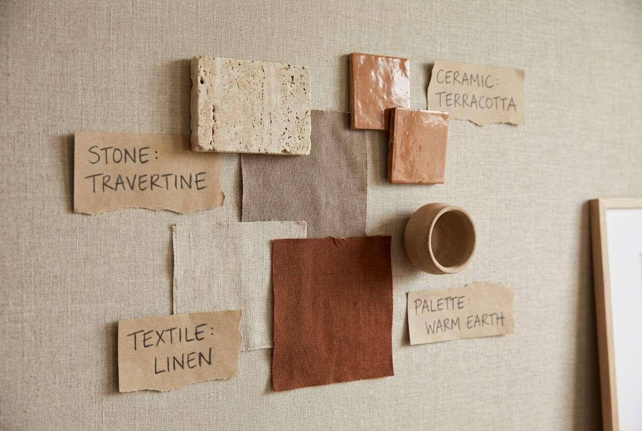
Finally, reinforce the rustic feeling through texture and finishes: recycled paper, matte labels, subtle grain, stamp icons, and desaturated photography. Often, texture delivers “rustic” more effectively than adding extra colors.
Create Rustic Palette Visuals with AI
If you already have HEX codes, you can generate quick mockups that match your rustic scheme—menus, labels, posters, moodboards, and UI screens. This is especially helpful when you want to test multiple accents (terracotta vs. copper vs. olive) without rebuilding layouts from scratch.
Describe your layout (poster, packaging, website hero), specify your rustic tones, and keep details like lighting, paper texture, and typography style consistent. You’ll get on-theme visuals you can refine into final designs.
Rustic Color Palette FAQs
-
What makes a color palette “rustic”?
Rustic palettes are built around natural, slightly muted hues—warm woods, clay reds, parchment creams, stone grays, and deep greens—often inspired by real materials like leather, linen, and aged metal. -
What is the best background color for rustic designs?
Soft off-whites and beiges (parchment, oat, cream) are ideal. They keep text readable and let wood, terracotta, and olive accents feel intentional instead of overpowering. -
Which accent colors work well with rustic neutrals?
Terracotta, copper, brick red, muted amber, and sage/olive are reliable rustic accents. Use them for badges, icons, buttons, and highlights while keeping the base mostly neutral. -
Can rustic color combinations work for modern brands and UI?
Yes—keep the palette minimal (one base neutral, one primary, one dark for type, one accent). Pair with clean typography and generous spacing to make the look feel modern and premium. -
What typography styles match a rustic color scheme?
Slab serifs, classic serifs, and clean sans-serifs with slightly rounded shapes work well. For handcrafted vibes, use a restrained display font for headlines and keep body text simple for readability. -
How do I keep rustic colors from looking dull?
Add contrast with a deep anchor (charcoal, espresso, pine) and bring in texture (paper grain, stamped marks, matte photography). Subtle warmth and material cues can add richness without brighter colors. -
Are rustic palettes good for packaging?
They’re excellent for packaging because they imply authenticity and craft. Combine a cream label base with dark type and one warm accent, and consider finishes like kraft stock, embossing, or foil for depth.
Next: Beige Tan Color Palette


