

Blue is one of the most flexible colors in design, spanning everything from deep navy authority to airy sky-blue calm.
Below you’ll find 20 curated blue color palette ideas with HEX codes, plus practical pairing tips for UI, branding, and print.
In this article
Why Blue Palettes Work So Well
Blue is strongly associated with trust, clarity, and stability, which is why it shows up so often in finance, tech, healthcare, and corporate branding. It communicates professionalism without feeling harsh.
From a usability perspective, blue also performs well in UI systems because it can create clear hierarchy across states (links, selected tabs, primary buttons) while staying readable on light or dark backgrounds.
Just as important, blue has a huge tonal range. You can push it warm (denim, sapphire), cool (arctic, glacier), muted (slate), or electric (neon) and still keep a cohesive look.
20+ Blue Color Palette Ideas (with HEX Codes)
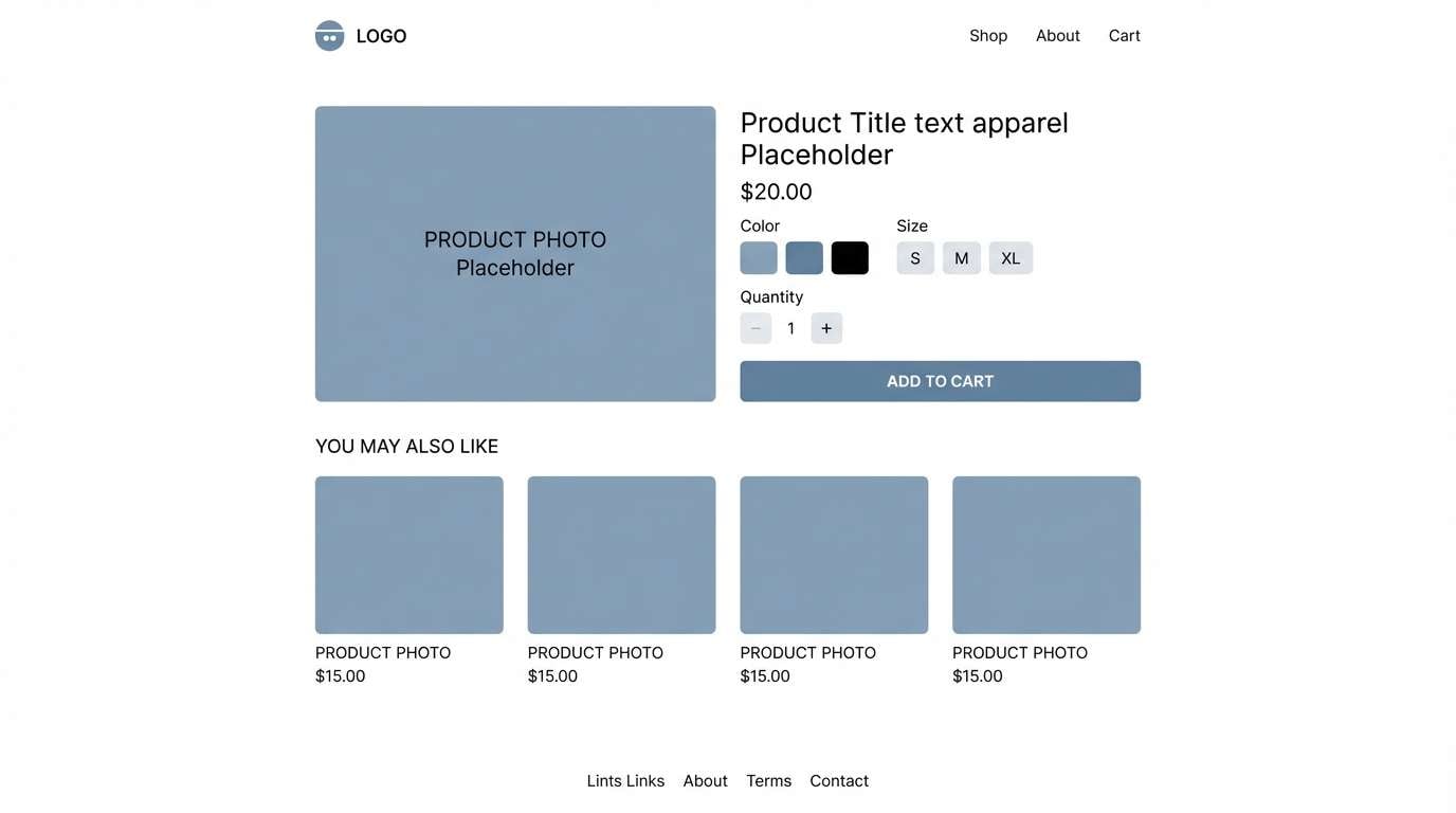
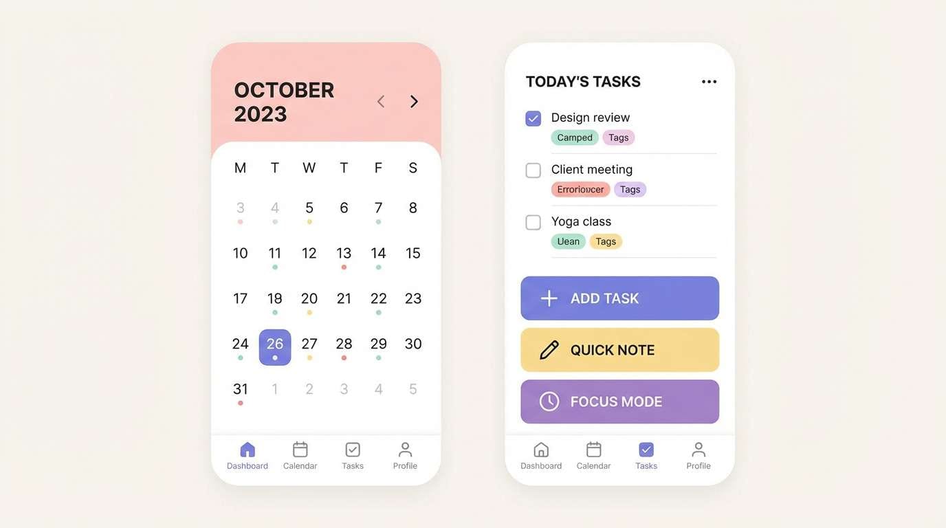
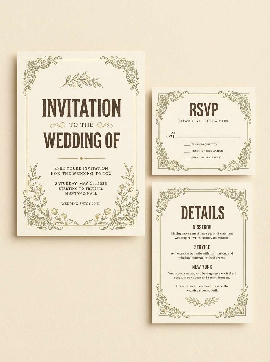
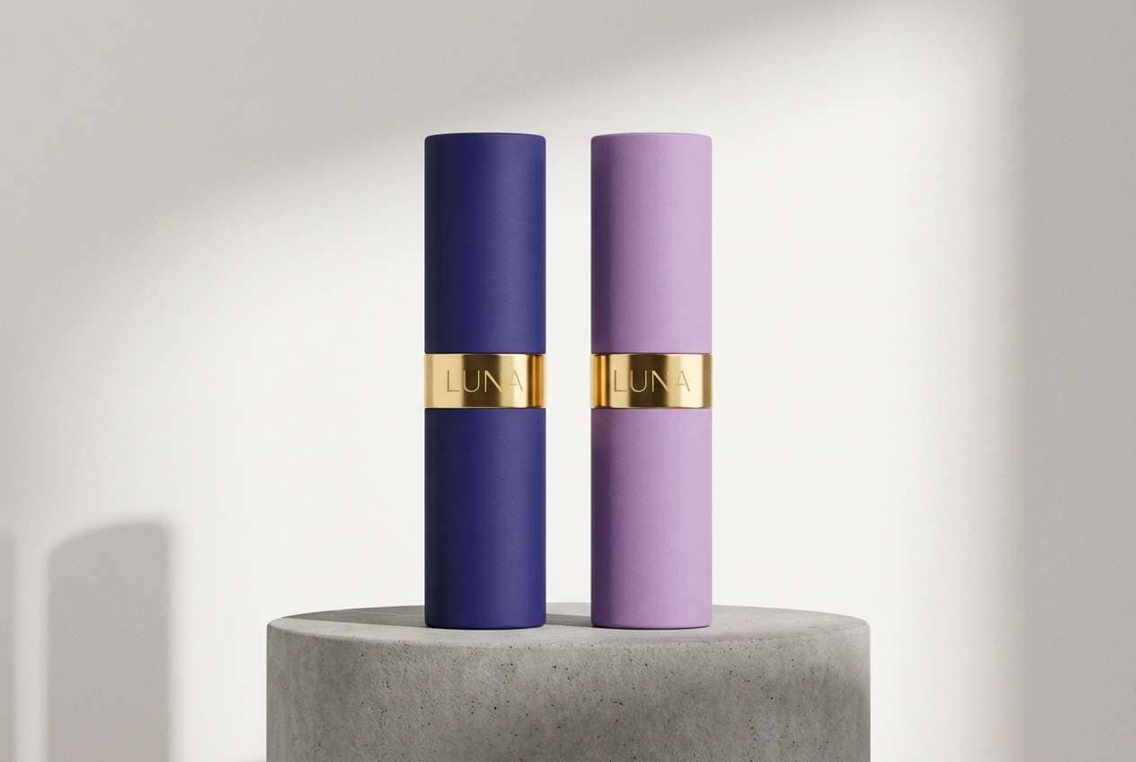
1) Midnight Harbor
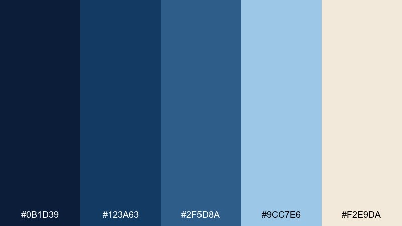
HEX: #0B1D39 #123A63 #2F5D8A #9CC7E6 #F2E9DA
Mood: moody, nautical, confident
Best for: finance branding and premium web headers
Moody harbor blues feel like deep water under city lights, steady and trustworthy. Use the navy as your anchor and let the pale sky tone handle backgrounds and spacious layouts. Warm sand adds a subtle human touch for CTAs, badges, or pricing highlights. Keep contrast high for accessibility and reserve the lightest blue for charts and key states.
Image example of midnight harbor generated using media.io

Media.io is an online AI studio for creating and editing video, image, and audio in your browser.

2) Coastal Breeze
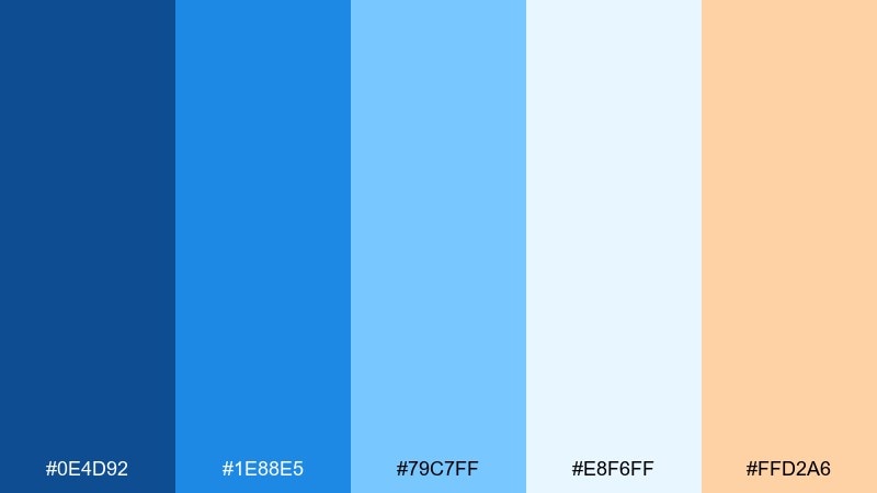
HEX: #0E4D92 #1E88E5 #79C7FF #E8F6FF #FFD2A6
Mood: fresh, airy, optimistic
Best for: travel ads and summer social graphics
Fresh coastal tones evoke clear skies, salt air, and sunlit water. Pair the bright azure with the soft ice tint to keep text readable while still feeling upbeat. The peach accent works best as a small highlight for buttons or discount tags. For a polished look, use the mid blue for headlines and the lightest shade for generous negative space.
Image example of coastal breeze generated using media.io
3) Denim Workshop
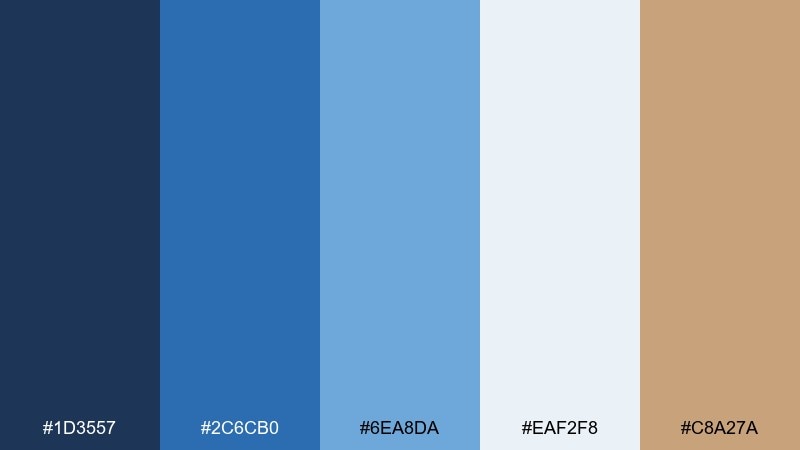
HEX: #1D3557 #2C6CB0 #6EA8DA #EAF2F8 #C8A27A
Mood: casual, handcrafted, dependable
Best for: ecommerce product pages and lifestyle brands
Casual denim blues feel worn-in and reliable, like a well-loved jacket. Use the darkest shade for navigation and the powder tint for backgrounds to keep pages light. The tan accent adds a craft vibe for price highlights or small icons. Balance photos with plenty of off-white space so the blues do not overwhelm the product imagery.
Image example of denim workshop generated using media.io
4) Glacier Calm
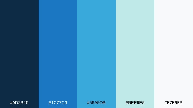
HEX: #0D2B45 #1C77C3 #39A9DB #BEE9E8 #F7F9FB
Mood: clean, crisp, calming
Best for: wellness apps and spa branding
Crisp glacier tones suggest cold air, clear water, and a quiet mind. Let the near-white sit behind content blocks, then layer the brighter blues as accents for progress, tabs, and key metrics. When you need a soothing blue color palette that still reads modern, keep gradients subtle and lean on the teal-tinted light for softness. Pair with light gray line icons and generous spacing to maintain the calm.
Image example of glacier calm generated using media.io
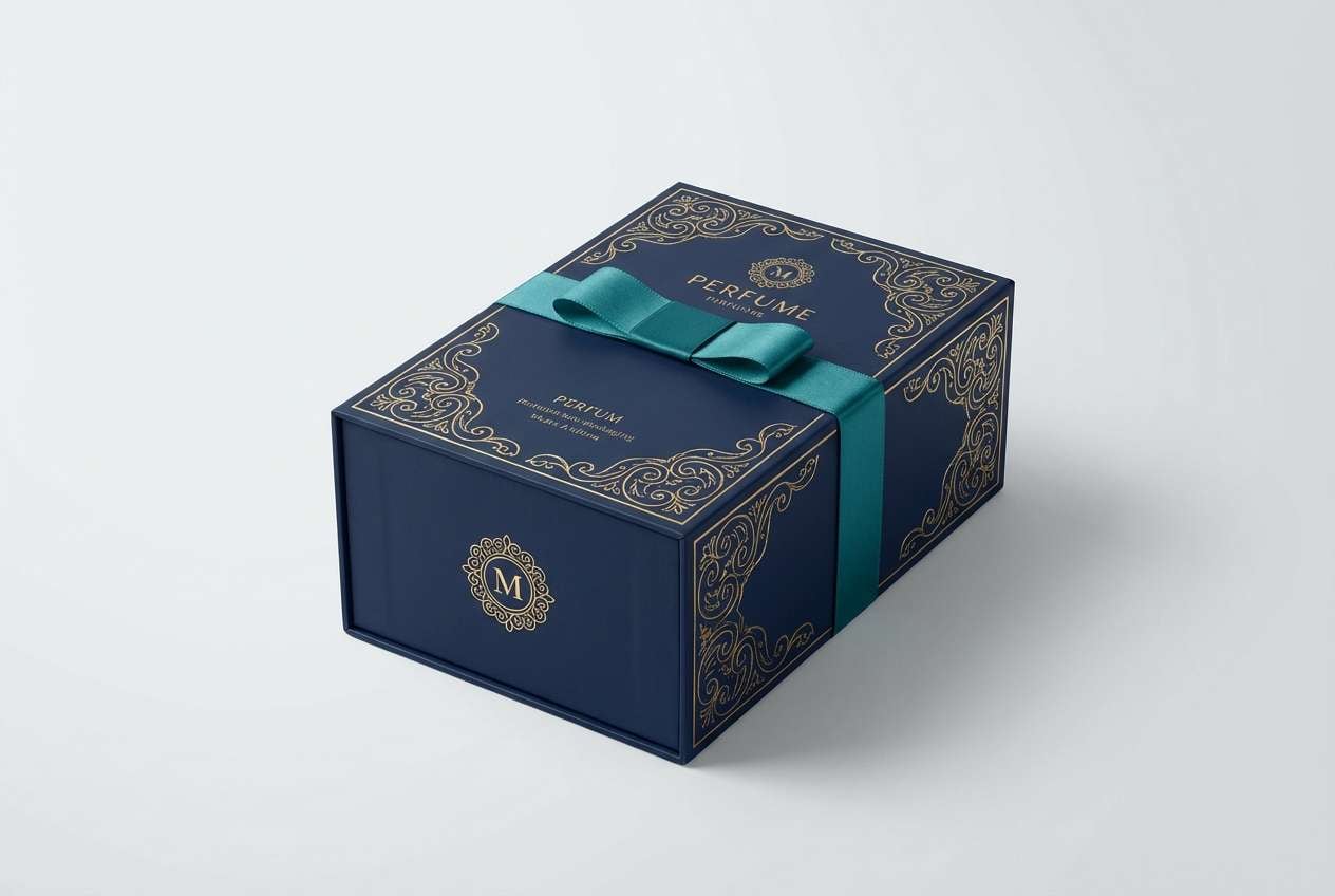
5) Royal Ink
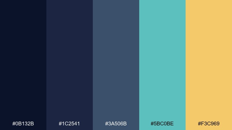
HEX: #0B132B #1C2541 #3A506B #5BC0BE #F3C969
Mood: regal, dramatic, polished
Best for: event branding and premium packaging
Regal ink tones feel like velvet curtains and spotlighted stage signage. Use the darkest navy for backgrounds and let teal lift key elements such as labels and stamps. The warm gold works best in small doses for foil-style highlights or premium pricing tiers. For packaging, keep typography bold and avoid overly thin lines against the deep base.
Image example of royal ink generated using media.io
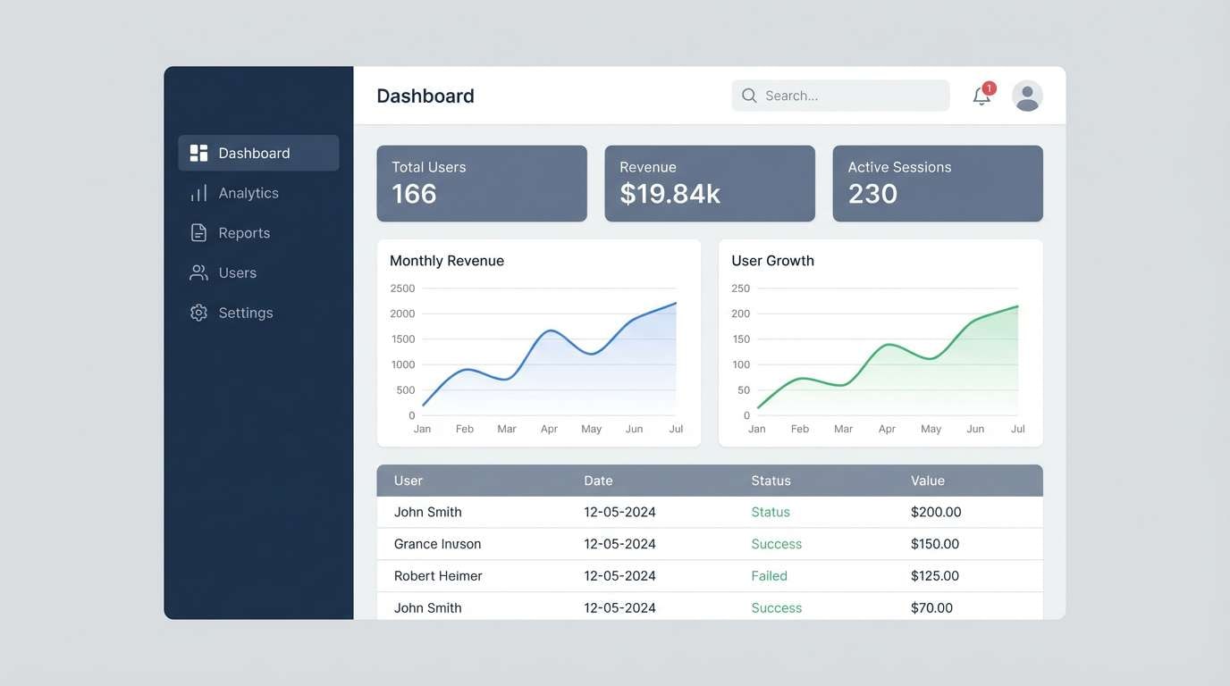
6) Stormy Skyline
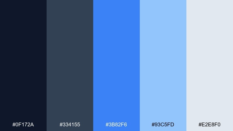
HEX: #0F172A #334155 #3B82F6 #93C5FD #E2E8F0
Mood: modern, urban, focused
Best for: saas dashboards and data reports
Urban storm tones look like glass towers under a passing cloud, sharp and efficient. Use slate and navy for structure, then bring in the vivid blue for primary actions and selected states. The pale blue and cool gray keep tables and charts from feeling heavy. If your dashboard is dense, limit the bright blue to one or two key components to preserve hierarchy.
Image example of stormy skyline generated using media.io
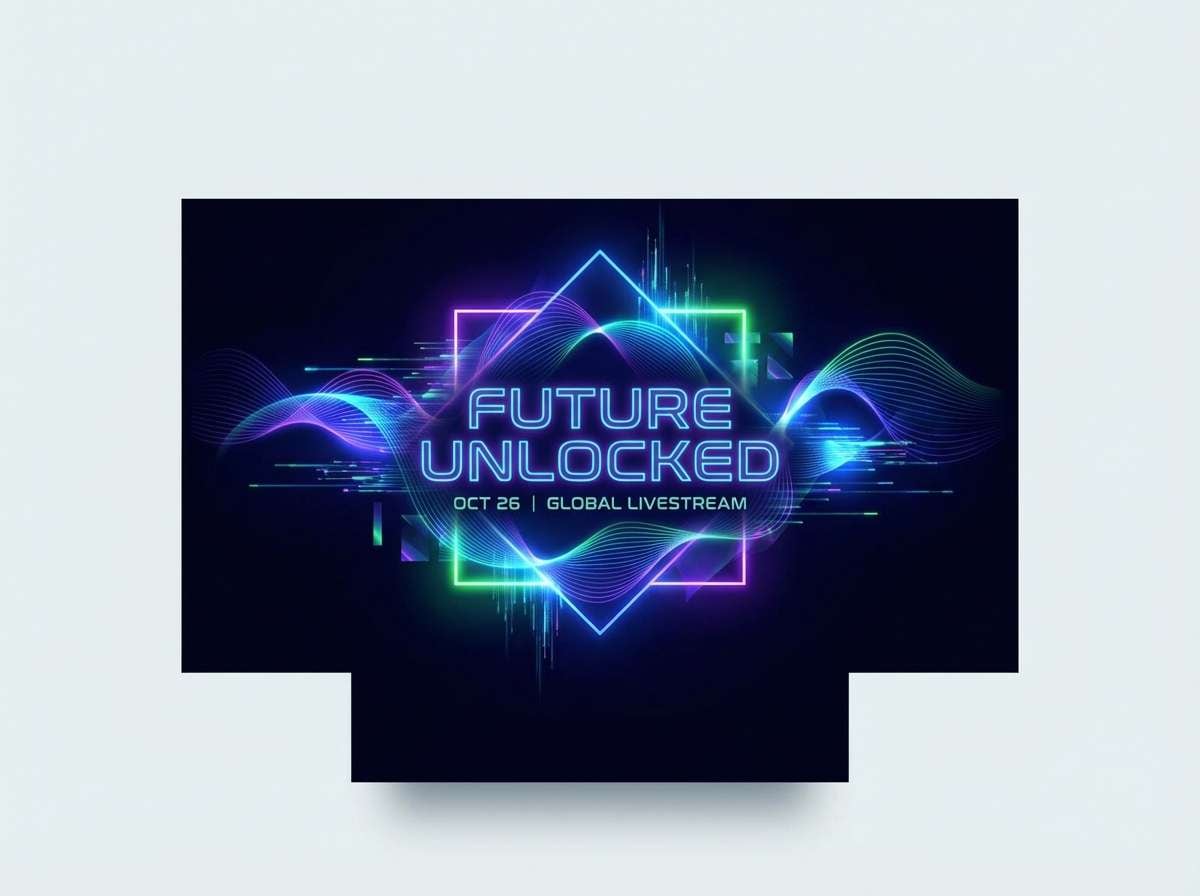
7) Neon Tide
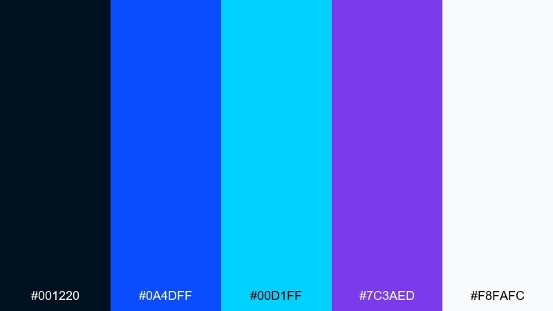
HEX: #001220 #0A4DFF #00D1FF #7C3AED #F8FAFC
Mood: electric, futuristic, playful
Best for: gaming overlays and tech launch posters
Electric tide colors feel like neon reflections on wet pavement at night. These blue color combinations shine in dark mode, especially when you reserve white for typography and UI chrome. Purple adds depth for secondary actions, while cyan can highlight live states or hover effects. Keep gradients tight and avoid using all brights at once to prevent visual noise.
Image example of neon tide generated using media.io
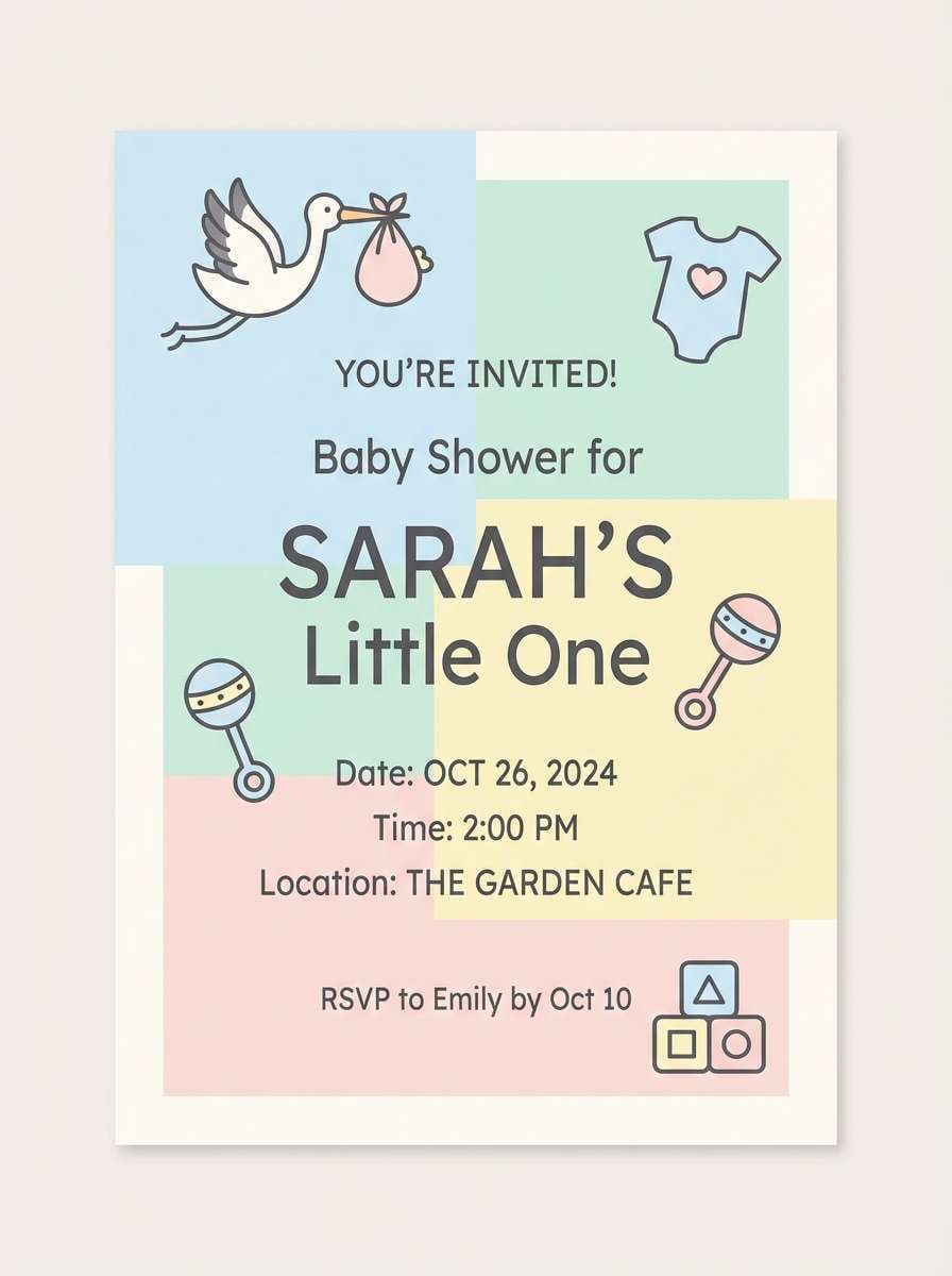
8) Powder Nursery
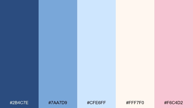
HEX: #2B4C7E #7AA7D9 #CFE6FF #FFF7F0 #F6C4D2
Mood: soft, gentle, comforting
Best for: baby shower invites and family blogs
Soft powder tones evoke knit blankets, morning light, and quiet lullabies. Use the deeper blue for headings so the pastel base stays airy and readable. Cream and blush make a sweet pairing for borders, icons, or small illustrations. For invites, keep the layout minimal and let the light blue carry most of the background.
Image example of powder nursery generated using media.io
9) Arctic UI
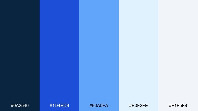
HEX: #0A2540 #1D4ED8 #60A5FA #E0F2FE #F1F5F9
Mood: sleek, precise, high-tech
Best for: productivity apps and fintech ui
Sleek arctic shades feel like clean glass and crisp typography. Use navy for navigation, then rely on the brighter blues for interaction states and alerts. The pale tints create breathable panels that work well with dense content. A good rule is to keep primary buttons consistent in the royal blue and use the lightest blue only for subtle emphasis.
Image example of arctic ui generated using media.io
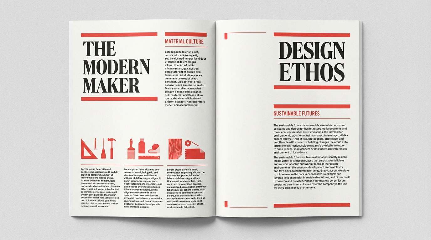
10) Sapphire Serif
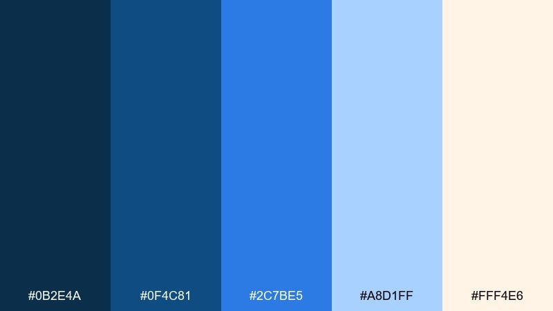
HEX: #0B2E4A #0F4C81 #2C7BE5 #A8D1FF #FFF4E6
Mood: editorial, confident, refined
Best for: magazine layouts and thought-leadership sites
Refined sapphire tones feel like ink on textured paper with a modern edge. Use the darkest shade for mastheads and pull quotes, then the bright blue for links and callouts. The soft cream warms the layout without dulling the cool vibe. For long reads, keep body text near-black and use the pale blue for section dividers and sidebars.
Image example of sapphire serif generated using media.io
11) Lakehouse Morning
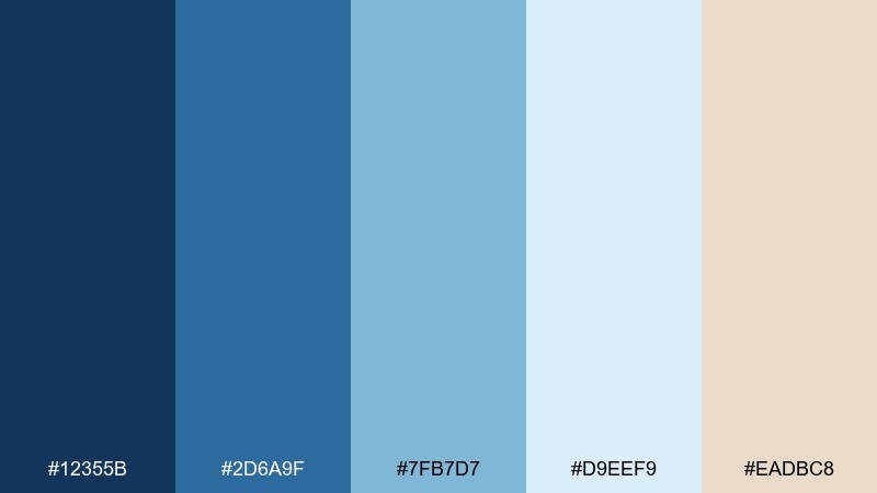
HEX: #12355B #2D6A9F #7FB7D7 #D9EEF9 #EADBC8
Mood: relaxed, friendly, natural
Best for: hospitality websites and cabin rentals
Relaxed lakehouse colors look like still water, weathered wood, and soft fog. Use the medium blue for buttons and the pale tint for large background sections. The warm beige pairs nicely with lifestyle photography and adds comfort to the layout. For headers, try a subtle overlay using the darkest blue at low opacity to keep text readable over images.
Image example of lakehouse morning generated using media.io
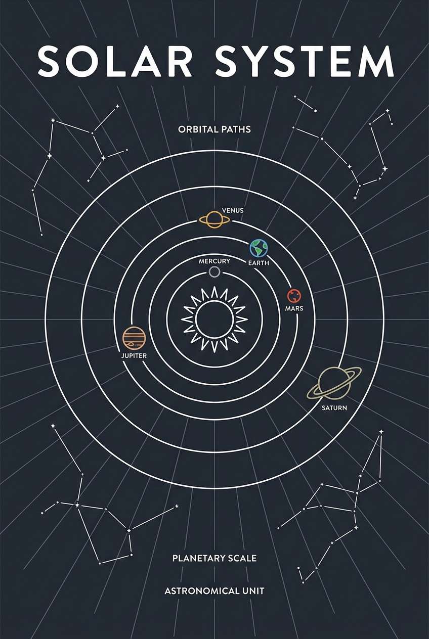
12) Space Cadet
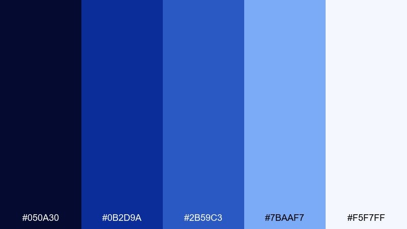
HEX: #050A30 #0B2D9A #2B59C3 #7BAAF7 #F5F7FF
Mood: bold, cosmic, adventurous
Best for: science posters and edu content
Cosmic blues bring to mind star maps, rocket panels, and bright telemetry lights. Use the darkest tone as a night-sky base, then layer mid blues for shapes, diagrams, and data points. The light periwinkle is great for subtle grids or constellation lines. Add plenty of whitespace so the palette stays sharp rather than heavy.
Image example of space cadet generated using media.io
13) Ocean Glass
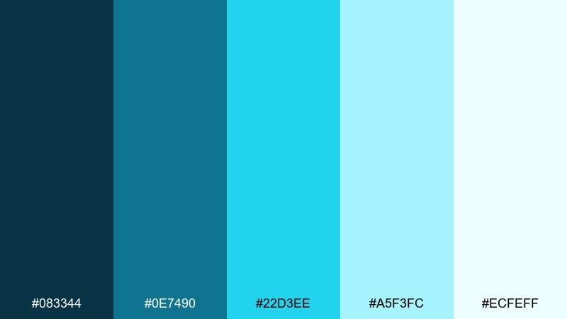
HEX: #083344 #0E7490 #22D3EE #A5F3FC #ECFEFF
Mood: bright, aquatic, clean
Best for: water brands and skincare labels
Aquatic glass tones feel like sunlight through clear water, sparkling and clean. Use the deep teal-blue for strong type and let the icy tints do the heavy lifting on backgrounds. The vivid cyan is perfect for freshness cues, such as icons, seals, or ingredient highlights. On labels, keep contrast crisp and leave margins generous to maintain a premium look.
Image example of ocean glass generated using media.io
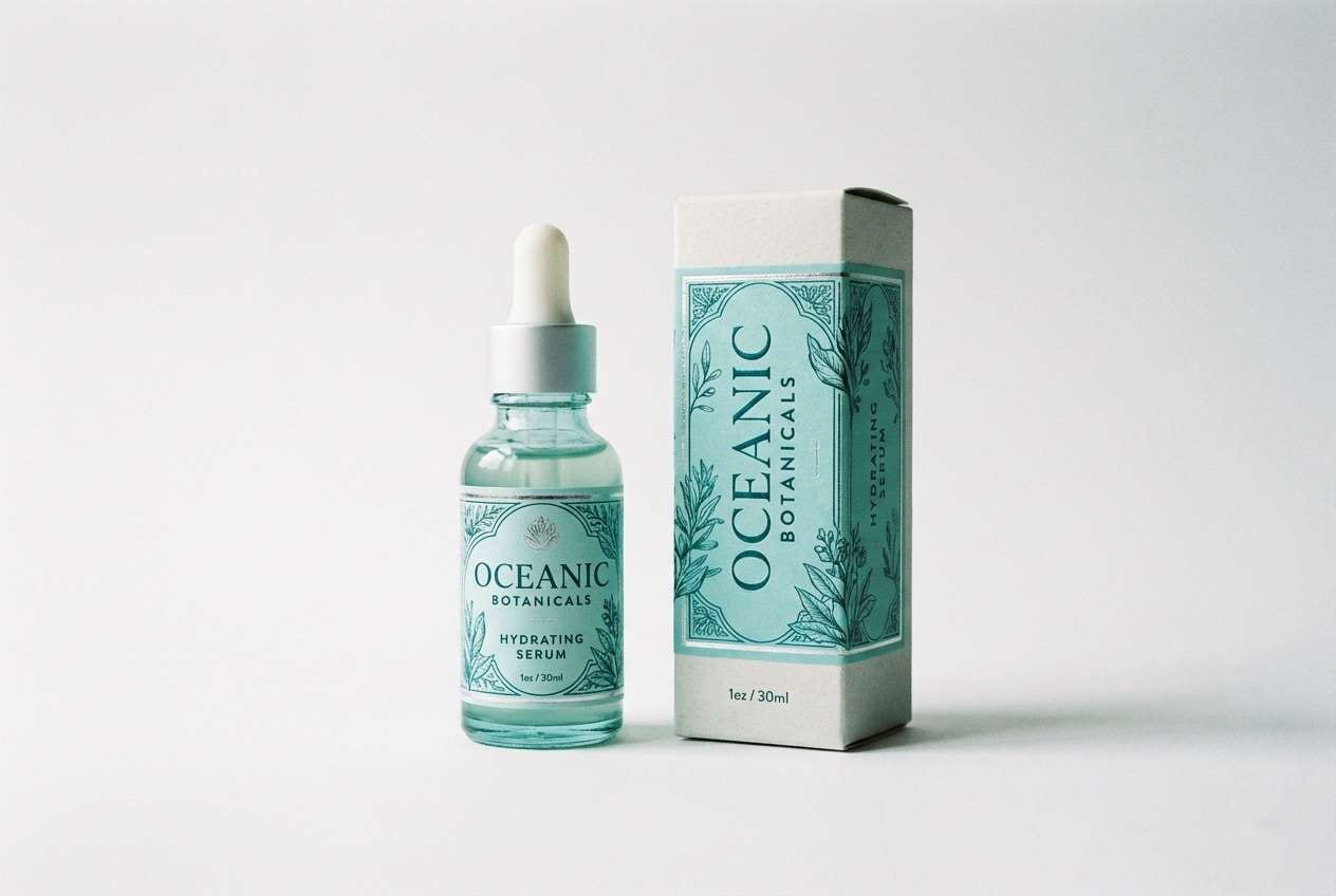
14) Blue Spruce
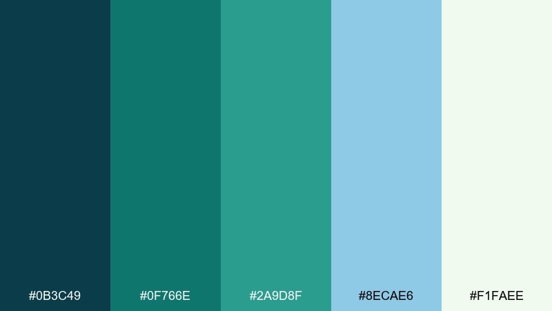
HEX: #0B3C49 #0F766E #2A9D8F #8ECAE6 #F1FAEE
Mood: outdoorsy, grounded, refreshing
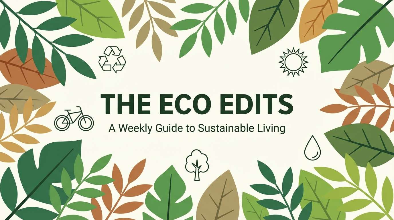
Best for: eco brands and nature newsletters
Grounded spruce tones evoke mountain air, evergreen shade, and clear streams. The teal-leaning blues pair beautifully with natural textures like recycled paper and matte finishes. Use the lighter sky tone for backgrounds and keep the greens as secondary accents to avoid turning too tropical. A small pop of the bright aqua can guide the eye to signup buttons or key stats.
Image example of blue spruce generated using media.io
15) Vintage Postcard
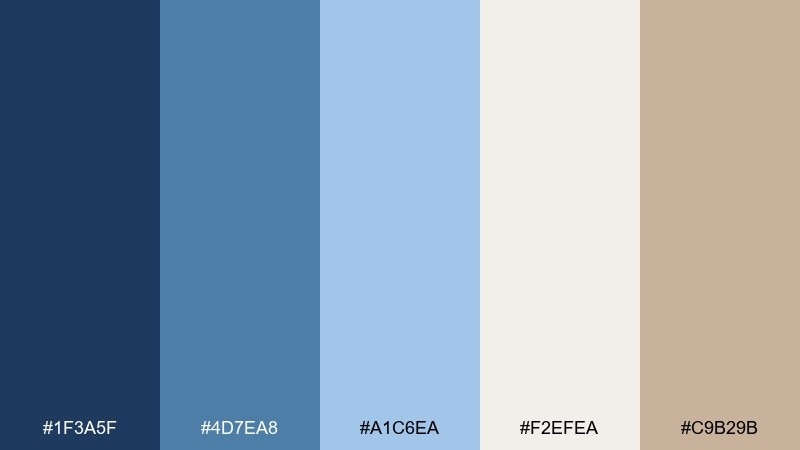
HEX: #1F3A5F #4D7EA8 #A1C6EA #F2EFEA #C9B29B
Mood: nostalgic, warm, travel-inspired
Best for: wedding stationery and boutique blogs
Nostalgic postcard blues feel sun-faded and charming, like a seaside note found in a drawer. Use the dusty mid blue for borders and headings to keep the vintage character. Cream and warm taupe add softness that works well with serif typography and film-style photos. For stationery, try a subtle paper texture and keep accent elements minimal.
Image example of vintage postcard generated using media.io
16) Blueprint Studio
HEX: #071A52 #0B4F9E #1E96FC #B3D9FF #F8FAFC
Mood: technical, smart, energetic
Best for: architecture portfolios and product docs
Technical blueprint tones suggest crisp lines, measured grids, and confident planning. This blue color combination works best with thin strokes, clear spacing, and a disciplined hierarchy. Use the brightest blue for links and key annotations, while the pale tint supports diagrams and code blocks. Keep body text dark and let the blues do the signaling, not the reading.
Image example of blueprint studio generated using media.io
17) Indigo Velvet
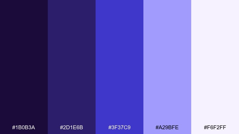
HEX: #1B0B3A #2D1E6B #3F37C9 #A29BFE #F6F2FF
Mood: luxurious, creative, dramatic
Best for: beauty branding and album art
Velvety indigos feel like theater lighting and rich fabric, bold without being loud. Use the darkest purple-navy for backgrounds and let the bright indigo carry primary buttons or title type. The lavender tint softens large areas so the design stays elegant. For beauty packaging, combine with metallic details and keep photography high contrast.
Image example of indigo velvet generated using media.io
18) Rainy Day Minimal
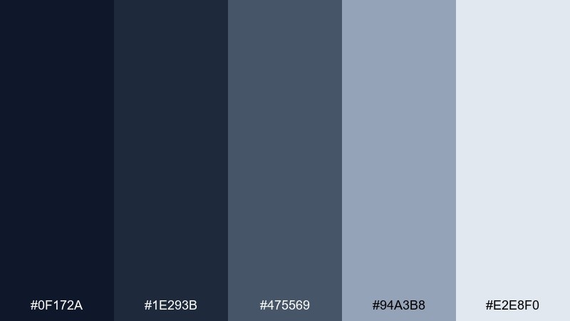
HEX: #0F172A #1E293B #475569 #94A3B8 #E2E8F0
Mood: minimal, quiet, professional
Best for: resume sites and corporate templates
Quiet rainy-day tones feel like overcast light and clean concrete, calm and practical. Use the darkest shade for headers and key titles, with mid grays for secondary text and dividers. The light gray-blue background keeps sections separated without heavy boxes. For a modern look, pair with one bright accent color only when you need a clear focal point.
Image example of rainy day minimal generated using media.io
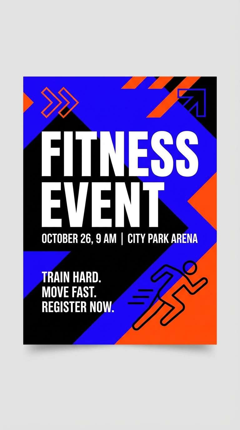
19) Cerulean Sport
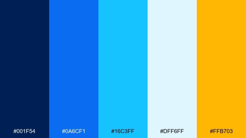
HEX: #001F54 #0A6CF1 #16C3FF #DFF6FF #FFB703
Mood: energetic, sporty, high-contrast
Best for: fitness ads and event flyers
Energetic cerulean tones bring stadium lights and fast motion to mind. Use the bright blue and cyan for bold typography, banners, and dynamic shapes. The yellow-orange accent is perfect for countdowns, prices, or key calls to action. If you are building bold blue color combinations, keep the base navy large and let the warm accent appear in short, punchy bursts.
Image example of cerulean sport generated using media.io
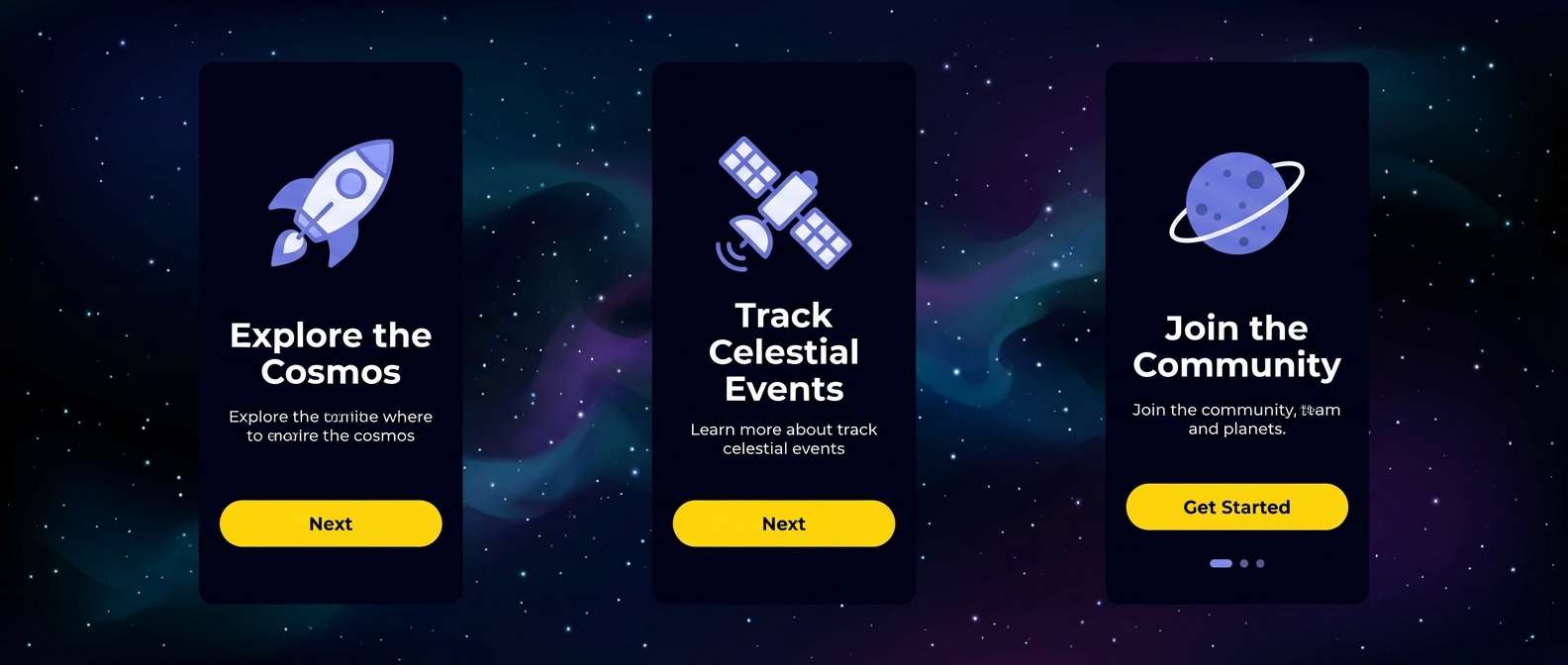
20) Dusk to Dawn
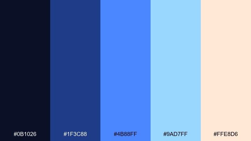
HEX: #0B1026 #1F3C88 #4B88FF #9AD7FF #FFE8D6
Mood: dreamy, cinematic, uplifting
Best for: app onboarding screens and hero sections
Cinematic dusk-to-dawn hues feel like a horizon shifting from night to first light. Use the deep base for immersive hero areas, then let the brighter blues guide the eye through steps and highlights. The soft peach warms the palette and pairs well with friendly illustrations. For onboarding, keep copy short and use the lightest blue for spacious panels and gentle progress cues.
Image example of dusk to dawn generated using media.io
What Colors Go Well with Blue?
Blue pairs cleanly with neutrals like white, charcoal, and cool grays for modern UI and editorial layouts. These combinations keep contrast predictable and help blue feel intentional instead of overpowering.
For warmth, add sand, cream, beige, or soft peach to balance cool blue tones. This is a common approach in branding because it keeps the palette friendly while still trustworthy.
If you want energy, try high-contrast accents such as yellow, gold, or orange in small doses. In dark-mode designs, cyan and purple can also add a futuristic edge without breaking harmony.
How to Use a Blue Color Palette in Real Designs
Start by assigning roles: a dark blue for structure (navigation, headers), a mid blue for primary actions, and a light tint for surfaces and sections. This keeps your system consistent across pages and components.
In print, watch ink density and legibility—deep navies can swallow fine type if you go too thin. Use off-whites or warm papers to reduce harsh contrast while keeping the design premium.
For accessibility, check contrast for text and interactive states, especially when using pale blues on white. Reserve the brightest blue for the most important actions so hierarchy stays clear.
Create Blue Palette Visuals with AI
If you already have HEX codes, you can quickly generate mockups, posters, packaging, and UI scenes that match your palette. This helps you validate mood and contrast before committing to a full design build.
Try describing the layout (hero section, flyer, dashboard), then specify your style (flat vector, studio shot, minimalist) and reuse the same prompt structure to keep outputs consistent.
With Media.io, you can iterate fast—swap accents, test dark mode, or explore different blue tones while keeping your brand direction intact.
Blue Color Palette FAQs
-
What does a blue color palette communicate in branding?
Blue commonly signals trust, stability, and clarity. Lighter blues can feel friendly and approachable, while deeper navies often read as premium, professional, or authoritative. -
Which blue shades work best for UI design?
Use a dark blue for structure (navigation and headers), a mid/bright blue for primary actions, and very light tints for surfaces. This creates a predictable hierarchy and makes interaction states easy to recognize. -
What accent colors pair best with blue?
Warm accents like sand, peach, gold, and orange balance cool blues nicely. For a modern tech feel, cyan and purple accents work well—especially on dark backgrounds. -
How do I keep blue from feeling too cold?
Add a warm neutral (cream, beige, soft tan) or a subtle warm accent for highlights. You can also choose slightly warmer blues (denim, sapphire) rather than icy, gray-leaning tones. -
Are blue palettes good for dark mode?
Yes—blue is strong in dark mode because it maintains clarity and contrast. Keep backgrounds very dark, reserve bright blues/cyans for key states, and use off-white text to reduce glare. -
How can I test if my blue palette is accessible?
Check contrast ratios for text and UI states (normal, hover, selected, disabled). Pay extra attention to light blue text on white or pale-blue backgrounds, which often fails contrast without a darker tone. -
Can I generate blue palette mockups quickly without design software?
Yes—use an AI image generator to create posters, UI mockups, packaging, or social graphics based on your palette and a consistent prompt. It’s a fast way to preview real-world usage before final production.


