

Amaranth is a saturated berry-red that instantly signals confidence, romance, and modern energy. Because it sits between red and deep pink, it can feel bold in headlines yet refined in small accents.
Below are ready-to-use amaranth color palette ideas with HEX codes—built for branding, UI, posters, packaging, and interiors—plus AI prompts you can copy into Media.io to generate matching visuals.
In this article
- Why Amaranth Palettes Work So Well
-
- velvet rose and ink
- blush clay minimal
- pomegranate citrus pop
- dusty mauve neutrals
- berry mint refresh
- sunset terracotta glow
- plum champagne luxe
- coral sand studio
- cranberry sage kitchen
- ruby noir editorial
- rose quartz tech ui
- festival fuchsia lights
- vintage lipstick poster
- warm garnet wood
- orchid smoke branding
- berry cream bakery
- floral garden wash
- neon berry nightlife
- soft rose wedding suite
- cocoa rose comfort
- graphite rose startup
- amaranth meets straw
- What Colors Go Well with Amaranth?
- How to Use a Amaranth Color Palette in Real Designs
- Create Amaranth Palette Visuals with AI
Why Amaranth Palettes Work So Well
Amaranth has the attention-grabbing power of red, but with a berry undertone that reads more contemporary than pure primary red. That makes it perfect for modern branding and digital UI where you want warmth without looking dated.
It also pairs easily across temperatures: cool neutrals (charcoal, slate, indigo) make it feel editorial and premium, while warm creams and clay tones soften it for lifestyle, food, and beauty.
Most importantly, amaranth is highly effective as an accent. Use it to guide the eye—CTAs, highlights, rules, badges—while letting calmer companions carry backgrounds and long-form readability.
20+ Amaranth Color Palette Ideas (with HEX Codes)
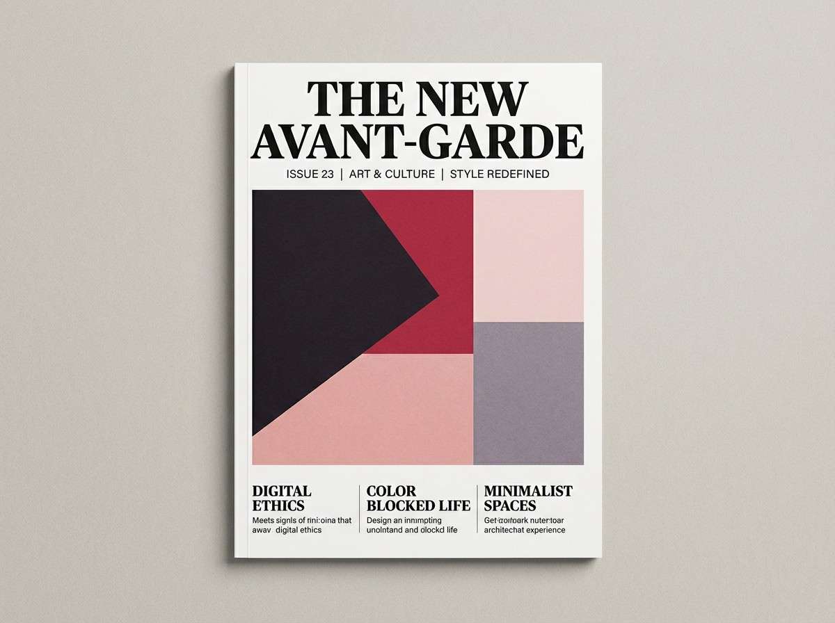
1) Velvet Rose and Ink
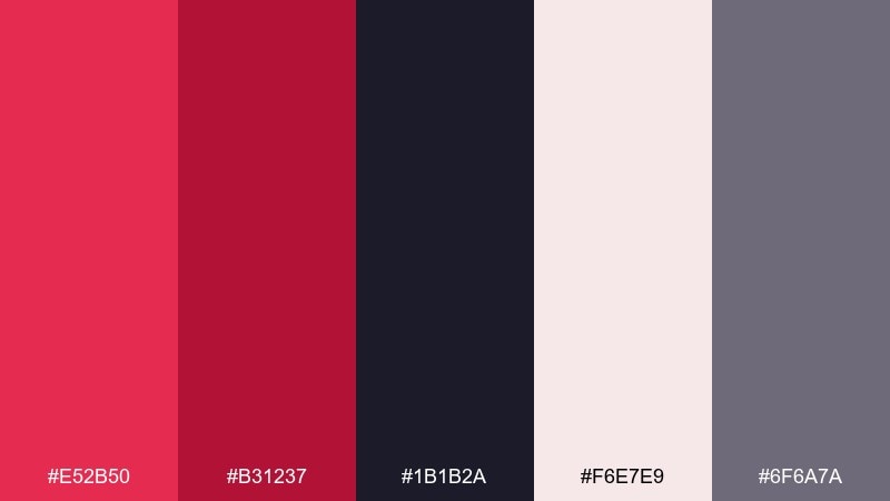
HEX: #e52b50 #b31237 #1b1b2a #f6e7e9 #6f6a7a
Mood: dramatic, modern, romantic
Best for: editorial magazine cover layout
Dramatic and velvety, it feels like rose petals against midnight ink. Use the deep near-black to anchor type, then let the saturated red take the spotlight in headlines and pull quotes. Pair with soft blush for breathing room and a muted gray-violet for supporting elements. Tip: keep the blush as generous negative space to avoid an overly heavy cover.
Image example of velvet rose and ink generated using media.io
Media.io is an online AI studio for creating and editing video, image, and audio in your browser.

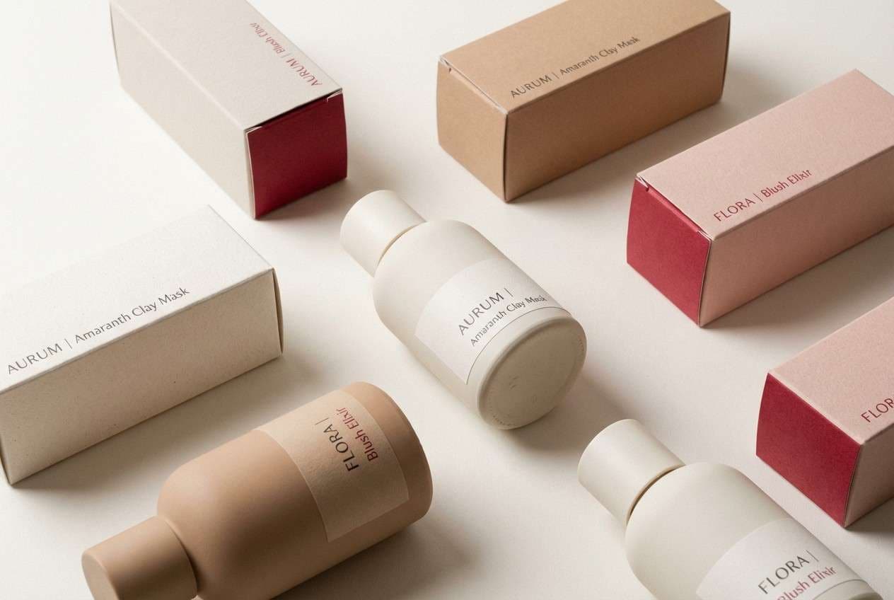
2) Blush Clay Minimal
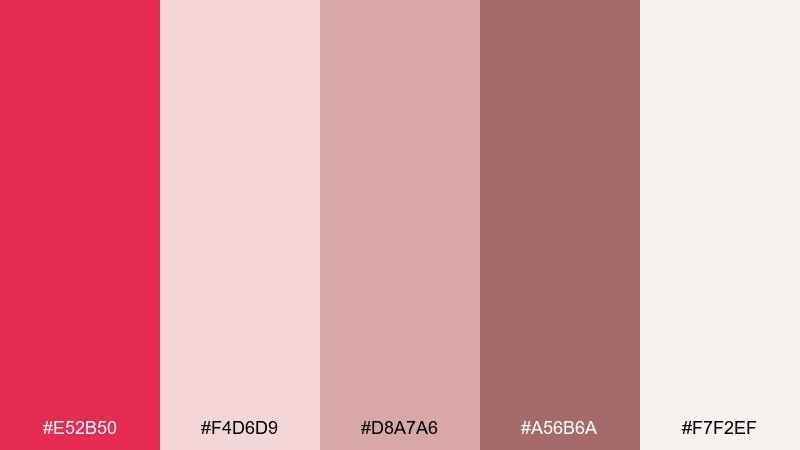
HEX: #e52b50 #f4d6d9 #d8a7a6 #a56b6a #f7f2ef
Mood: soft, clean, approachable
Best for: skincare product packaging
Soft and powdery, it reads like blush pigment blended into warm clay. The gentle neutrals keep the red from feeling too loud, which is ideal for premium, calm packaging. Pair with minimalist typography and plenty of off-white to signal clarity and trust. Tip: reserve the strongest red for a single brand mark or seal to keep the pack feeling airy.
Image example of blush clay minimal generated using media.io
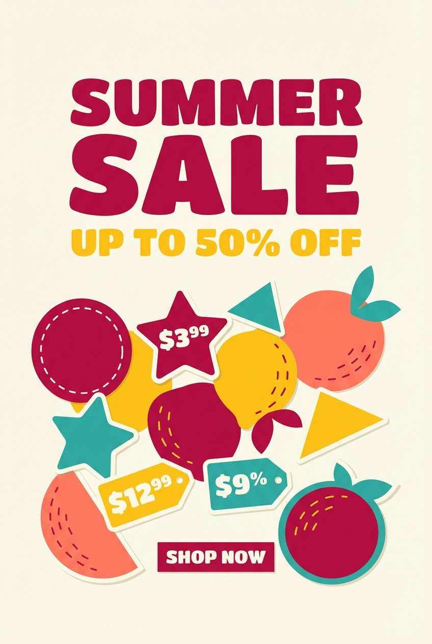
3) Pomegranate Citrus Pop
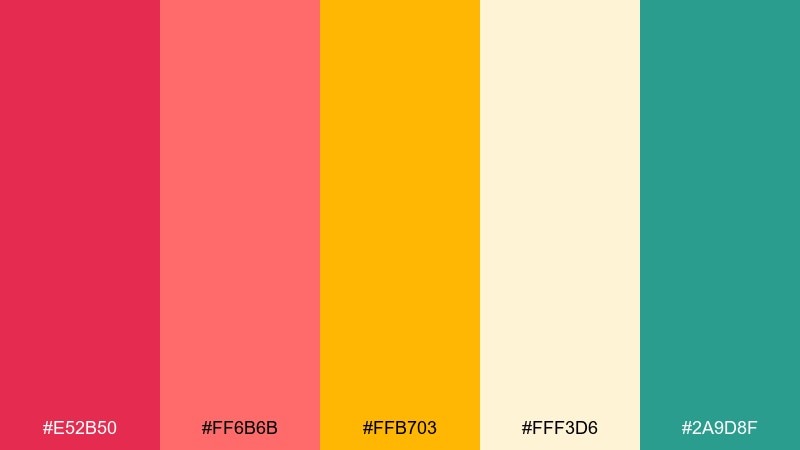
HEX: #e52b50 #ff6b6b #ffb703 #fff3d6 #2a9d8f
Mood: playful, juicy, energetic
Best for: summer sale poster design
Playful and juicy, it evokes pomegranate arils with a squeeze of citrus. These amaranth color combinations work best when you pick one hero hue for the headline and let the others support with shapes and stickers. Teal adds a crisp contrast that keeps warm tones from blending together. Tip: use cream as the poster base so the bright accents stay readable from a distance.
Image example of pomegranate citrus pop generated using media.io
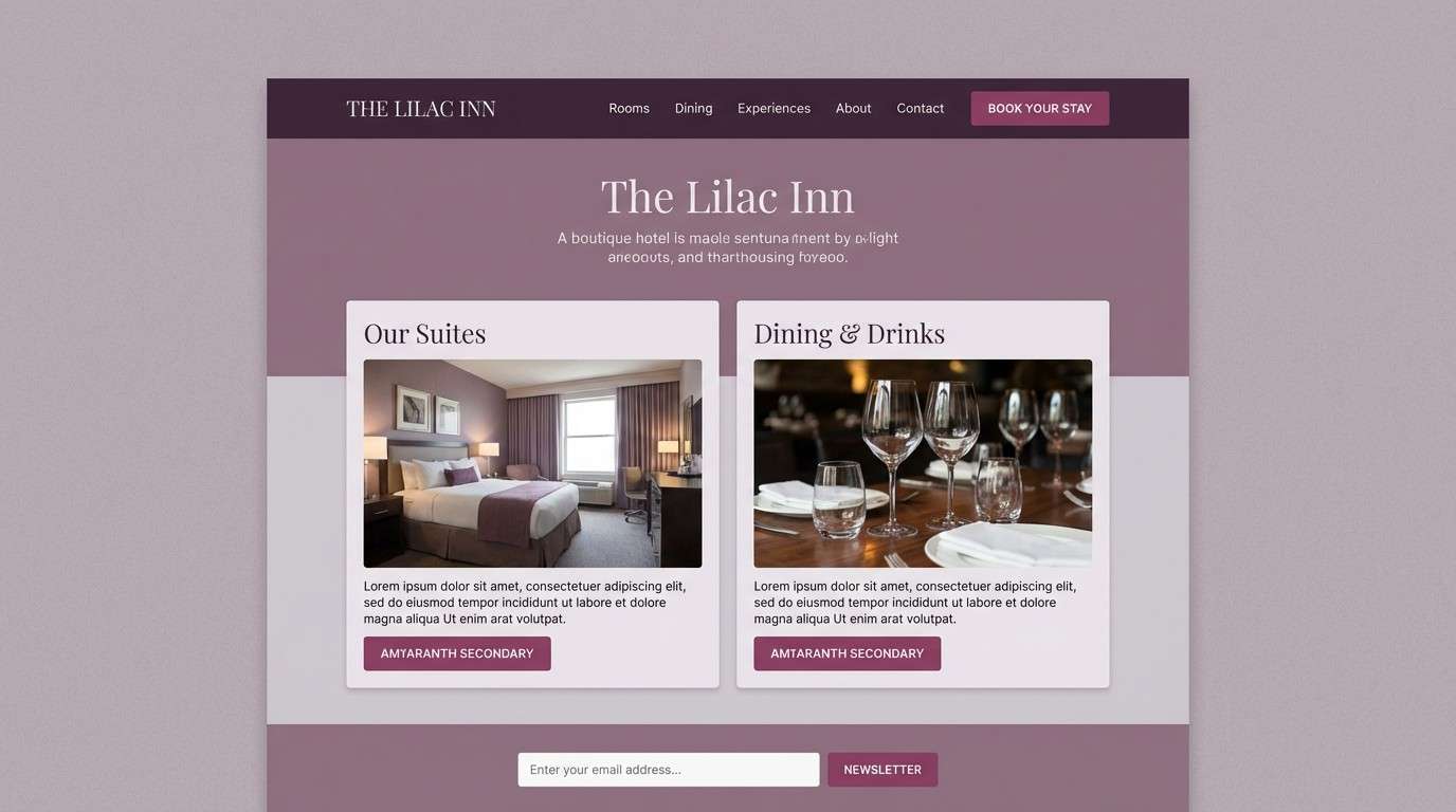
4) Dusty Mauve Neutrals
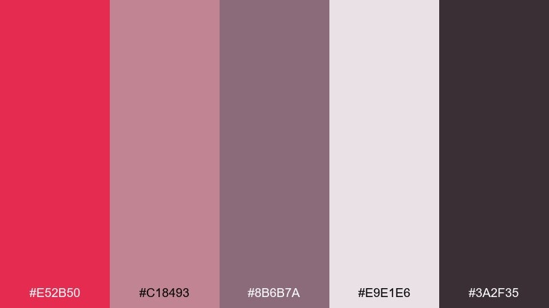
HEX: #e52b50 #c18493 #8b6b7a #e9e1e6 #3a2f35
Mood: moody, refined, understated
Best for: boutique hotel website UI
Moody and refined, it looks like mauve fabric in low evening light. Keep the deepest plum-brown for nav bars and footers, then use dusty rose for cards and sections. A pale lilac-gray makes content feel spacious without turning stark white. Tip: use the vivid red only for primary CTAs so it reads as intentional luxury, not noise.
Image example of dusty mauve neutrals generated using media.io
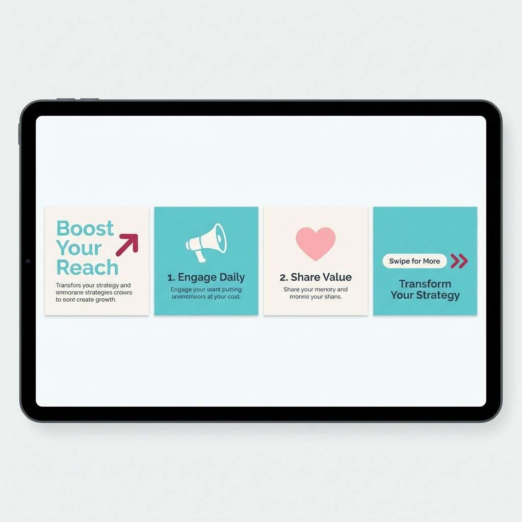
5) Berry Mint Refresh
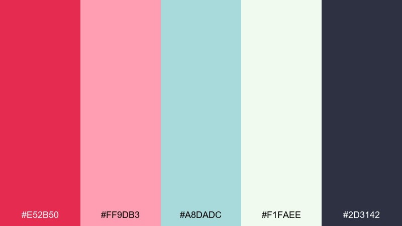
HEX: #e52b50 #ff9db3 #a8dadc #f1faee #2d3142
Mood: fresh, bright, youthful
Best for: social media carousel graphics
Fresh and youthful, it feels like berry sorbet with a minty chill. Let the cool aqua carry backgrounds while the red and pink drive emphasis for badges and key phrases. The dark slate is perfect for readable text over light slides. Tip: keep each carousel slide to two dominant colors so the series stays cohesive.
Image example of berry mint refresh generated using media.io
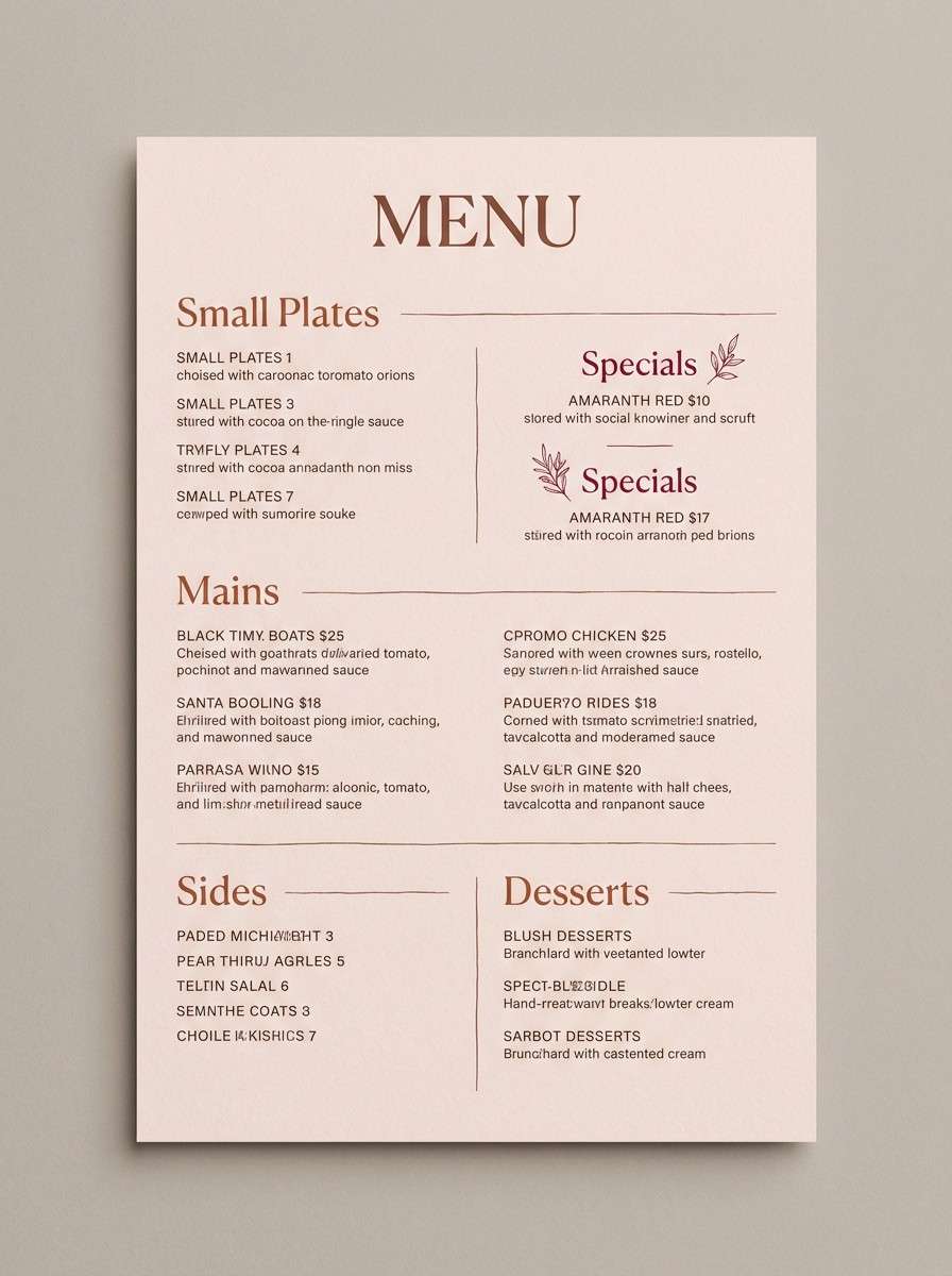
6) Sunset Terracotta Glow
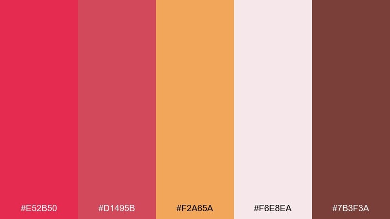
HEX: #e52b50 #d1495b #f2a65a #f6e8ea #7b3f3a
Mood: warm, inviting, artisanal
Best for: restaurant menu design
Warm and inviting, it brings to mind sunset light on terracotta pottery. Use the clay and cocoa tones for section headers and dividers, then add the brighter red for chef specials or icons. The pale blush keeps the layout light while still feeling cozy. Tip: print on uncoated stock to enhance the handcrafted vibe these colors suggest.
Image example of sunset terracotta glow generated using media.io
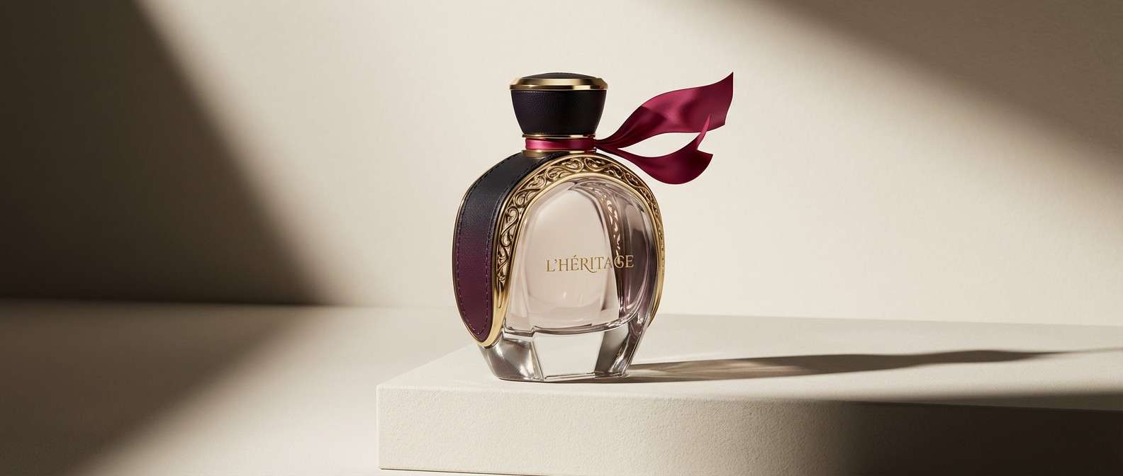
7) Plum Champagne Luxe
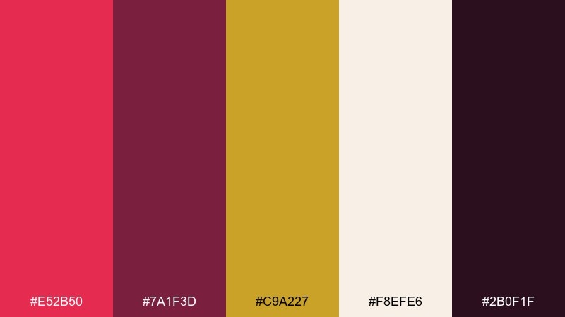
HEX: #e52b50 #7a1f3d #c9a227 #f8efe6 #2b0f1f
Mood: luxurious, bold, celebratory
Best for: premium perfume product ad
Luxurious and celebratory, it feels like champagne sparkle over dark plum velvet. The near-black and deep wine shades build a premium base, while gold adds instant status cues. In an amaranth color palette like this, keep highlights restrained so the gold looks metallic, not yellow. Tip: use glossy finishing on the red accent to make the hero bottle feel more dimensional.
Image example of plum champagne luxe generated using media.io
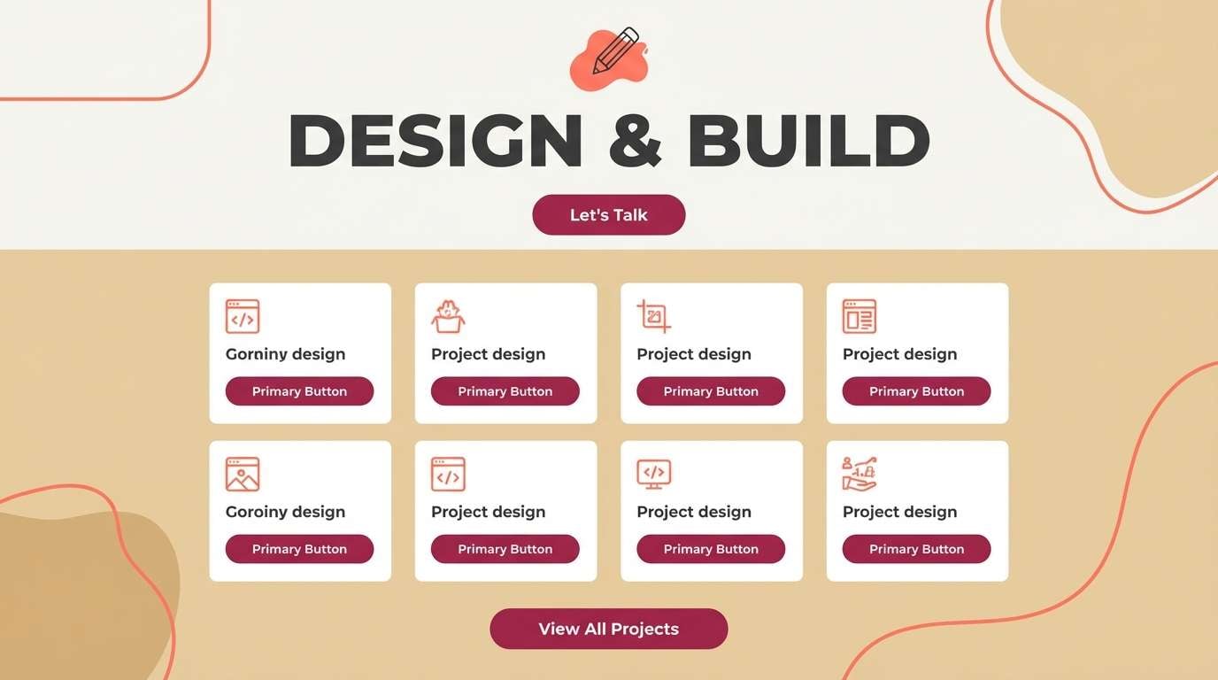
8) Coral Sand Studio
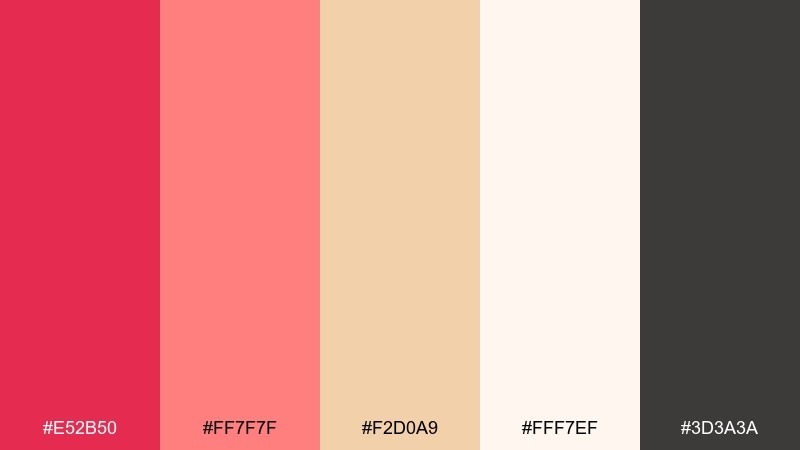
HEX: #e52b50 #ff7f7f #f2d0a9 #fff7ef #3d3a3a
Mood: friendly, modern, sunlit
Best for: creator portfolio landing page
Friendly and sunlit, it looks like coral paint swatches laid on warm sand. Use the off-white as the main canvas, then bring in coral for section highlights and hover states. The dark charcoal keeps text crisp without feeling harsh. Tip: keep the strongest red for a single recurring element like the primary button so the page stays calm.
Image example of coral sand studio generated using media.io
9) Cranberry Sage Kitchen
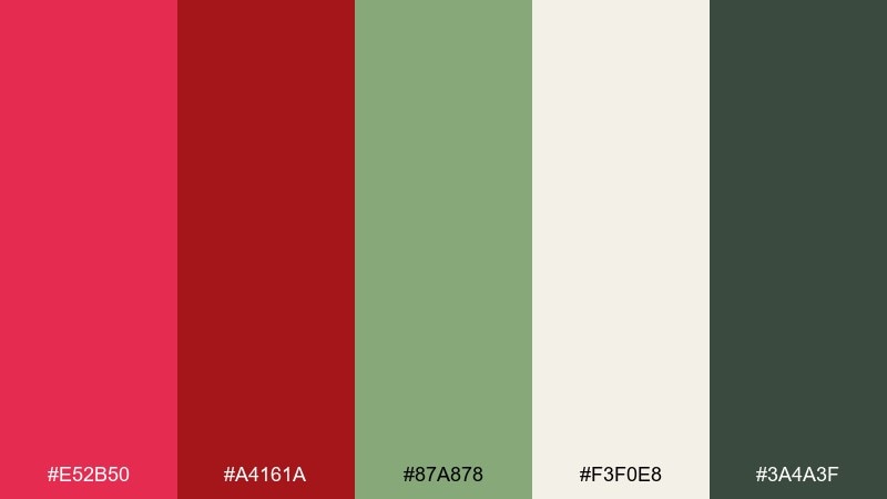
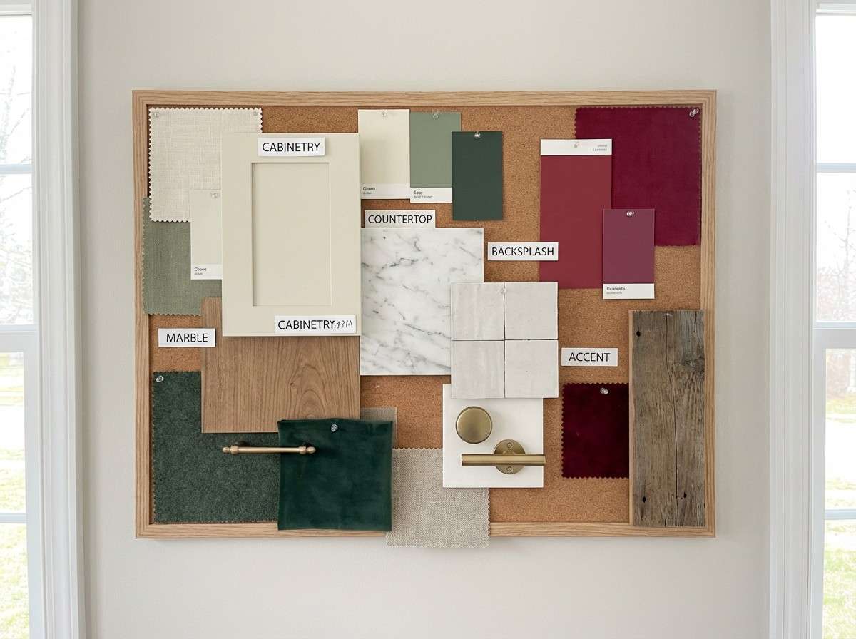
HEX: #e52b50 #a4161a #87a878 #f3f0e8 #3a4a3f
Mood: earthy, cozy, seasonal
Best for: kitchen decor moodboard
Earthy and cozy, it evokes cranberry sauce beside fresh sage leaves. The greens keep the red grounded, making it a strong choice for seasonal home accents and food brands. Use cream for walls or backgrounds, then place red as small punches in textiles, signage, or labels. Tip: balance the darkest green with lighter cream so the space does not turn too heavy.
Image example of cranberry sage kitchen generated using media.io
10) Ruby Noir Editorial
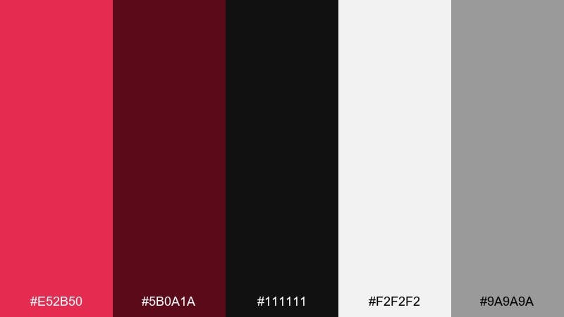
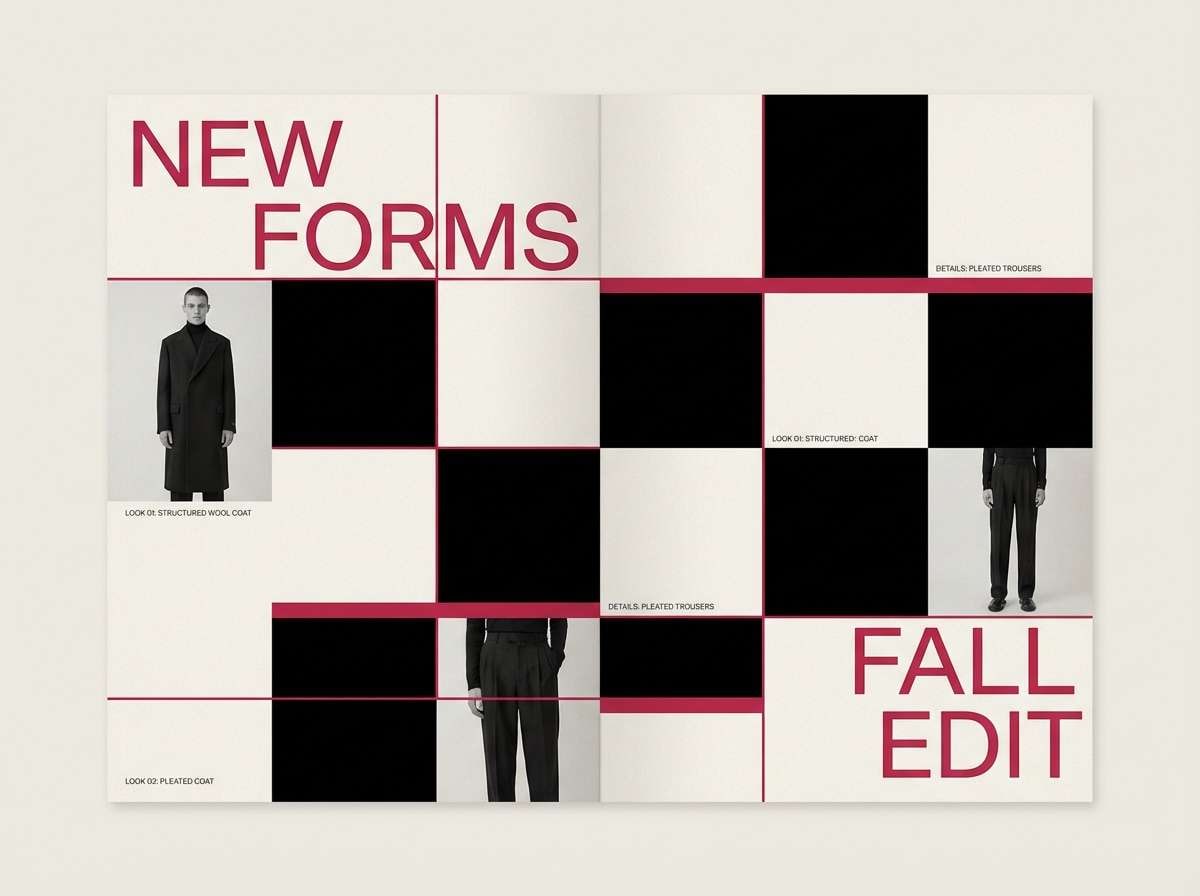
HEX: #e52b50 #5b0a1a #111111 #f2f2f2 #9a9a9a
Mood: sharp, high-contrast, confident
Best for: fashion lookbook spread
Sharp and confident, it feels like a ruby highlight on a noir film poster. Use black and off-white to structure the spread with strong grids, then drop in the red as a signature rule line or callout. Mid-gray helps soften transitions between blocks of contrast. Tip: keep photos mostly neutral so the red accents stay unmistakably editorial.
Image example of ruby noir editorial generated using media.io
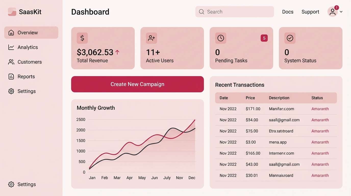
11) Rose Quartz Tech UI
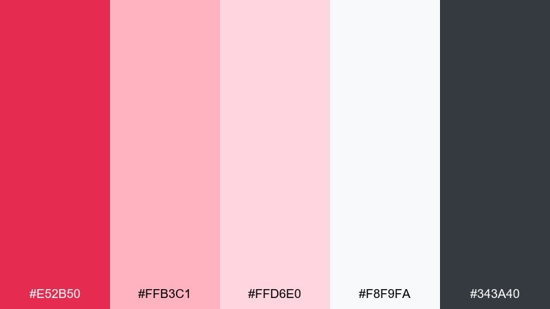
HEX: #e52b50 #ffb3c1 #ffd6e0 #f8f9fa #343a40
Mood: polished, gentle, modern
Best for: SaaS dashboard UI kit
Polished and gentle, it reads like rose quartz glass under soft studio lights. As an amaranth color scheme for dashboards, use the blush range for surfaces and states, then reserve the saturated red for alerts and primary actions. Charcoal keeps text accessible on the light background. Tip: test the red on small icons and badges to ensure it stays legible at tiny sizes.
Image example of rose quartz tech ui generated using media.io
12) Festival Fuchsia Lights
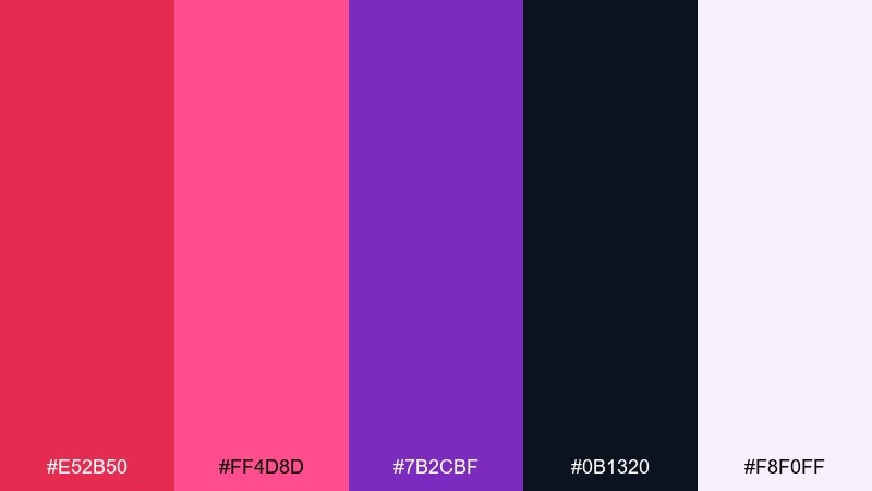
HEX: #e52b50 #ff4d8d #7b2cbf #0b1320 #f8f0ff
Mood: electric, bold, nightlife
Best for: music event flyer
Electric and bold, it feels like fuchsia stage lights cutting through a dark venue. Use the deep navy-black for the base, then layer magenta and purple gradients for energy. A pale lavender-white keeps key details readable without breaking the vibe. Tip: limit body text and prioritize big type so the neon tones can do the heavy lifting.
Image example of festival fuchsia lights generated using media.io

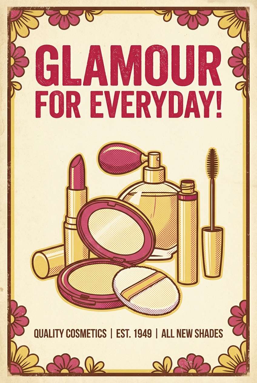
13) Vintage Lipstick Poster
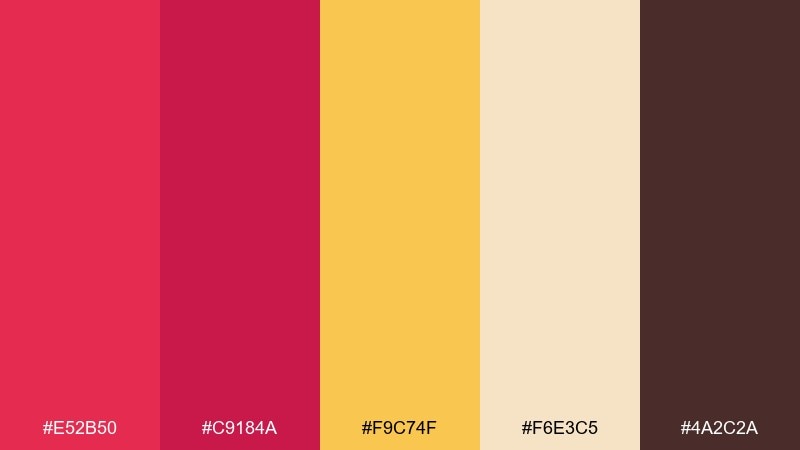
HEX: #e52b50 #c9184a #f9c74f #f6e3c5 #4a2c2a
Mood: retro, charming, bold
Best for: retro cosmetics poster
Retro and charming, it evokes a classic lipstick tube and golden signage. Use the warm cream and butter yellow for the poster base, then punch in the reds for illustration and product callouts. The cocoa brown adds that vintage print feel for outlines and shadows. Tip: try halftone texture on the yellow areas to reinforce the throwback look.
Image example of vintage lipstick poster generated using media.io
14) Warm Garnet Wood
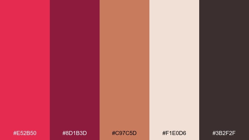
HEX: #e52b50 #8d1b3d #c97c5d #f1e0d6 #3b2f2f
Mood: grounded, warm, rustic
Best for: handmade product branding
Grounded and warm, it looks like garnet varnish over natural wood grain. Use the tan and blush-beige as your primary surfaces, then layer deep red for logos, wax seals, or tags. Dark brown-black is ideal for typography that still feels organic. Tip: pair with kraft paper textures and simple iconography for an authentic handmade finish.
Image example of warm garnet wood generated using media.io
15) Orchid Smoke Branding
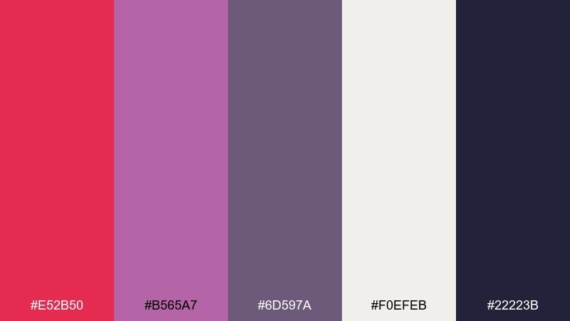
HEX: #e52b50 #b565a7 #6d597a #f0efeb #22223b
Mood: creative, stylish, slightly mysterious
Best for: creative agency brand kit
Stylish and slightly mysterious, it feels like orchid petals drifting through soft smoke. Purple-grays broaden the palette so the red can feel sophisticated instead of purely sweet. Use the off-white for stationery and the deep indigo for wordmarks and headings. Tip: apply the brighter red as a micro-accent on links, bullets, and social icons for a consistent signature.
Image example of orchid smoke branding generated using media.io
16) Berry Cream Bakery
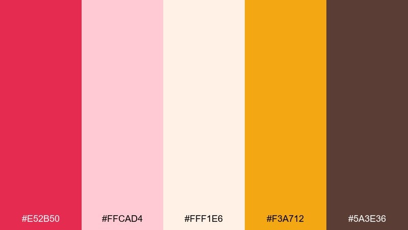
HEX: #e52b50 #ffcad4 #fff1e6 #f3a712 #5a3e36
Mood: sweet, cozy, appetizing
Best for: bakery Instagram post
Sweet and cozy, it brings to mind berry jam swirled into whipped cream. Use the creamy off-white as the main field, then accent with red for product names and small labels. The honey-gold adds warmth that reads as fresh-from-the-oven. Tip: keep the brown for text only so the overall post stays light and appetizing.
Image example of berry cream bakery generated using media.io

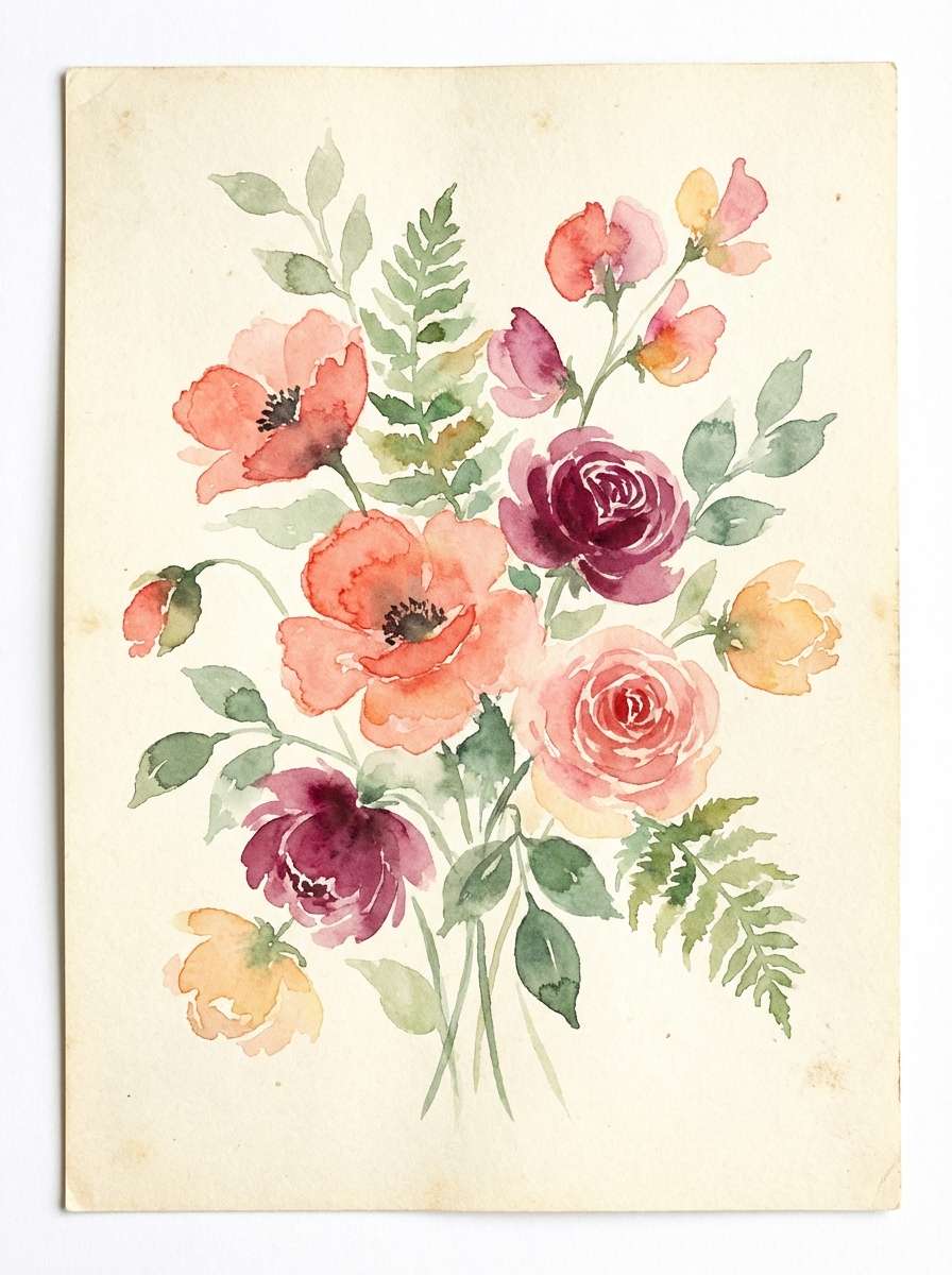
17) Floral Garden Wash
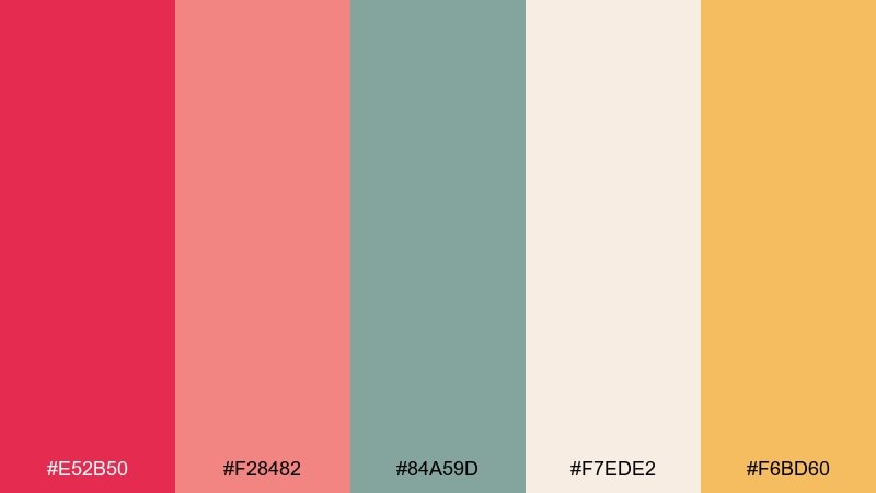
HEX: #e52b50 #f28482 #84a59d #f7ede2 #f6bd60
Mood: airy, botanical, cheerful
Best for: watercolor spring illustration
Airy and botanical, it feels like fresh blooms painted with a light watercolor hand. Use the warm cream for paper, then layer coral and red for petals while sage-green handles stems and leaves. A sunny apricot-yellow makes the composition feel optimistic without overpowering. Tip: keep edges soft and let colors bleed slightly to maintain the watercolor charm.
Image example of floral garden wash generated using media.io
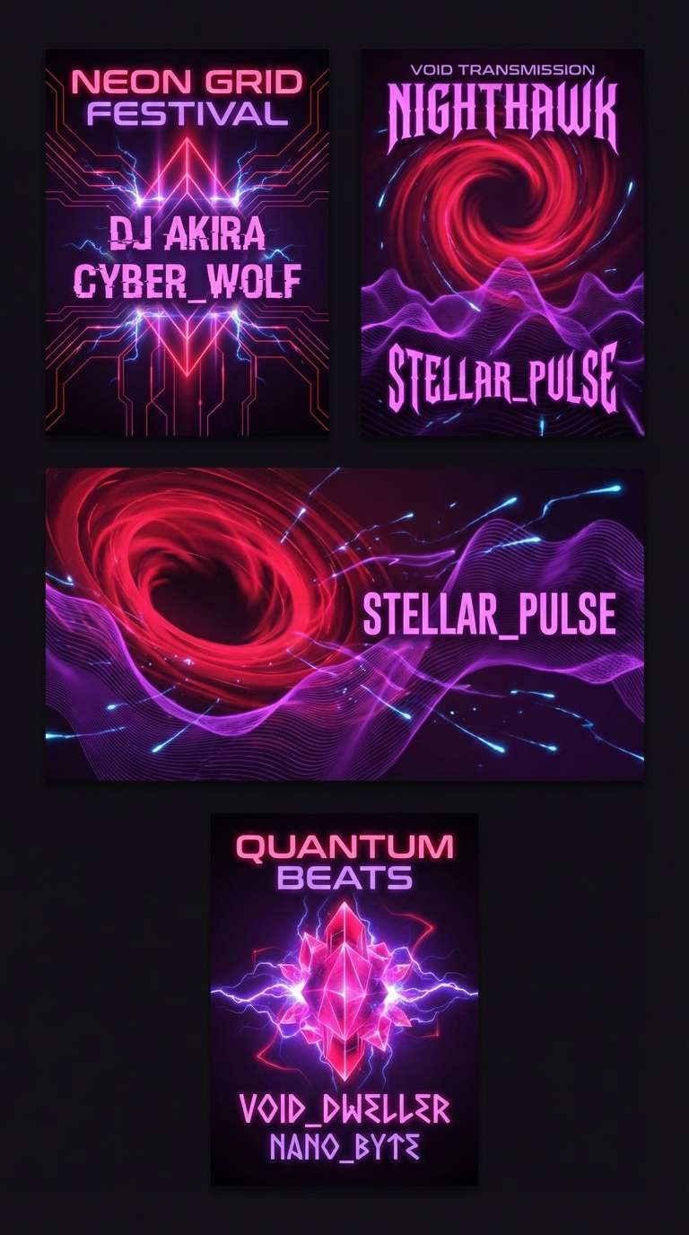
18) Neon Berry Nightlife
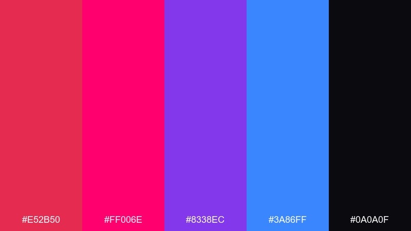
HEX: #e52b50 #ff006e #8338ec #3a86ff #0a0a0f
Mood: loud, futuristic, high-energy
Best for: DJ poster series
Loud and futuristic, it looks like neon berry signage reflected on wet asphalt. Keep the background nearly black so the hot hues stay punchy and readable. Use blue sparingly as a rim-light accent to add depth to the magenta and purple. Tip: repeat one simple shape motif across the series to keep multiple posters feeling like a set.
Image example of neon berry nightlife generated using media.io
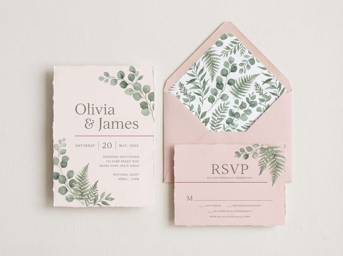
19) Soft Rose Wedding Suite
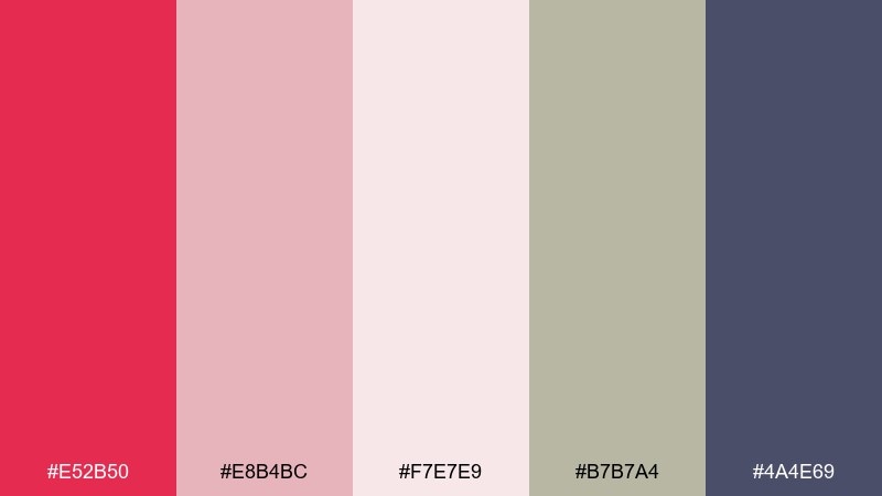
HEX: #e52b50 #e8b4bc #f7e7e9 #b7b7a4 #4a4e69
Mood: romantic, calm, elegant
Best for: wedding invitation suite
Romantic and calm, it suggests soft roses, sage hints, and evening stationery. These amaranth color combinations shine when the red is used like a lip tint: small, deliberate, and memorable. Pair the blush tones with warm gray for type, then add muted green for foliage details. Tip: emboss the monogram in gray and use the red only for the RSVP highlight line.
Image example of soft rose wedding suite generated using media.io
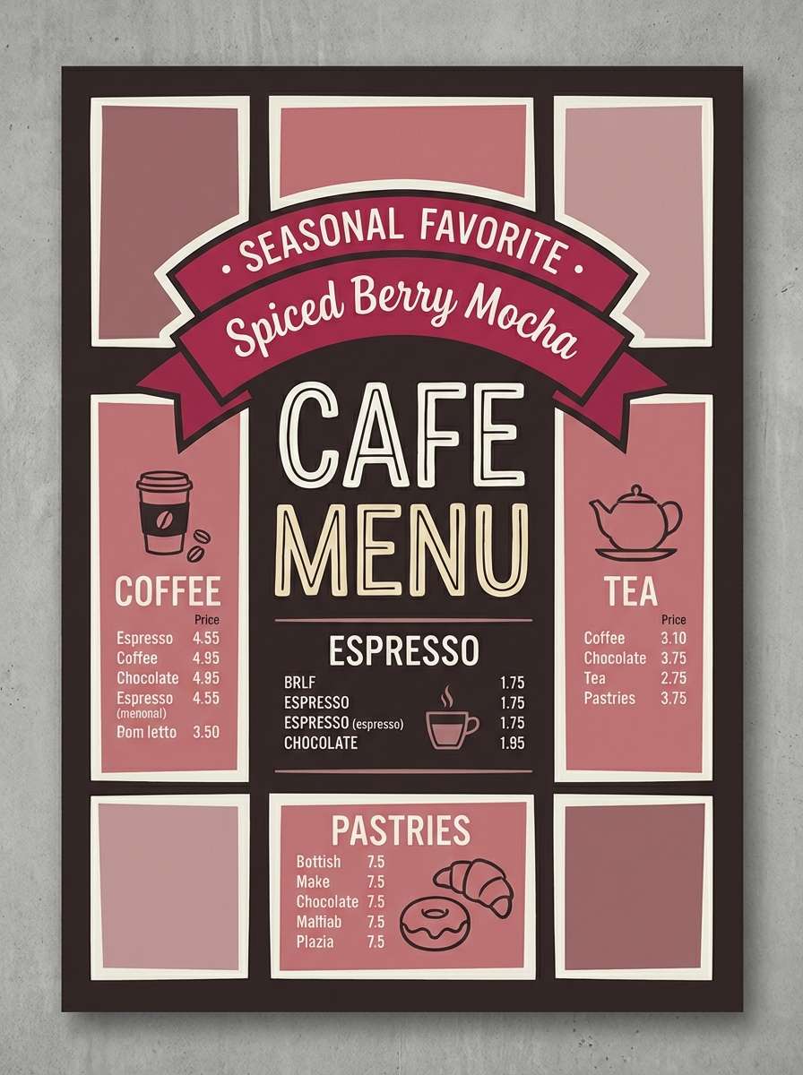
20) Cocoa Rose Comfort
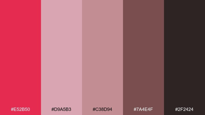
HEX: #e52b50 #d9a5b3 #c38d94 #7a4e4f #2f2424
Mood: cozy, intimate, comforting
Best for: cafe brand menu board
Cozy and intimate, it feels like cocoa foam with a rose syrup swirl. Use the darkest brown for the board background and the muted pinks for section blocks and price tags. The brighter red works best for one standout item like a seasonal drink. Tip: stick to chunky sans-serif type so the warm tones read clearly from across the counter.
Image example of cocoa rose comfort generated using media.io
21) Graphite Rose Startup
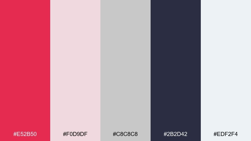
HEX: #e52b50 #f0d9df #c8c8c8 #2b2d42 #edf2f4
Mood: smart, clean, trustworthy
Best for: startup pitch deck template
Smart and clean, it looks like graphite sketches warmed up with a rose accent. Use light grays and off-white for slide backgrounds, then let the deep navy handle headings and charts. The red is perfect for one data highlight per slide so attention goes exactly where you want it. Tip: keep charts mostly monochrome and apply the accent only to the key metric.
Image example of graphite rose startup generated using media.io

22) Amaranth Meets Straw
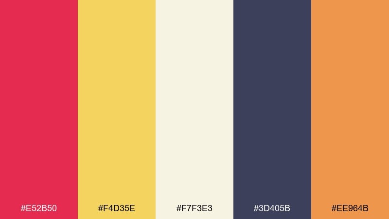
HEX: #e52b50 #f4d35e #f7f3e3 #3d405b #ee964b
Mood: sunny, optimistic, modern
Best for: brand launch hero banner
Sunny and optimistic, it feels like bold red ink against warm straw paper. The yellow and cream create instant brightness, while the deep blue keeps typography stable and modern. An amaranth color palette like this works best when you make the banner mostly light, then add strong accents for the logo and CTA. Tip: keep the orange as a secondary accent only, so the red remains the clear focal point.
Image example of amaranth meets straw generated using media.io

What Colors Go Well with Amaranth?
Neutrals are the easiest win: cream, blush, warm gray, and off-white make amaranth feel polished instead of overpowering. For typography and structure, charcoal, near-black, and deep navy keep contrast sharp and accessible.
For more personality, pair amaranth with greens (sage, mint, deep forest) to create a grounded, seasonal feel. If you want a louder look, add bright companions like citrus yellow, hot pink, electric blue, or purple—just keep one “hero” and let the rest support.
Metallic cues also work well: gold-like yellows and champagne tones instantly push amaranth toward luxury, especially when you limit the metallic color to trims, icons, or small highlights.
How to Use a Amaranth Color Palette in Real Designs
Start by deciding the role of amaranth: primary brand color (bold), secondary accent (balanced), or micro-accent for links and badges (subtle). Most teams get the cleanest results when amaranth is used sparingly against light surfaces.
In UI, reserve saturated amaranth for primary actions, alerts, or key metrics, and keep backgrounds in blush/gray to reduce eye fatigue. In print (posters, menus, invitations), use cream or off-white as the base so amaranth stays readable from a distance.
For brand systems, build a scale: one vivid amaranth, one deeper wine shade, one soft blush, one neutral background, and one dark text color. This gives you hierarchy without needing extra colors.
Create Amaranth Palette Visuals with AI
If you already have HEX codes, you can turn them into consistent visuals by generating mockups, posters, UI screens, or moodboards with a color-directed prompt. This is an easy way to test how amaranth behaves in different lighting, textures, and layouts.
Copy any prompt above, tweak the subject (e.g., “landing page,” “packaging,” “flyer”), and keep the palette consistent across variations. You’ll quickly find which companion color should be the background and which should be saved for accents.
Media.io helps you iterate fast: generate multiple compositions, choose the best, then refine typography, spacing, and contrast for production-ready design.
Amaranth Color Palette FAQs
-
What is the HEX code for amaranth?
A commonly used digital amaranth is #e52b50. It’s a berry-leaning red that works well as an accent or a bold brand primary. -
Is amaranth closer to red or pink?
Amaranth sits between red and deep pink. It keeps the intensity of red but adds a rosy/berry undertone that can feel more modern and romantic. -
What neutral colors pair best with amaranth?
Cream, off-white, blush, warm gray, charcoal, and deep navy are the most reliable. They stabilize the saturation and keep layouts readable. -
Can I use amaranth in UI design without it feeling too loud?
Yes—use amaranth for CTAs, badges, alerts, or one highlight per screen, and keep large surfaces in light blush/gray. This preserves hierarchy and reduces visual fatigue. -
What colors make amaranth look more luxurious?
Deep plum/near-black bases plus champagne or gold accents make amaranth feel premium. Keep “gold” limited to small details so it reads metallic rather than flat yellow. -
What’s a good complementary contrast to amaranth?
Teal and blue-green tones create crisp contrast against amaranth’s warm berry hue. They’re especially useful in posters and bold brand systems. -
How do I generate palette-based images with Media.io?
Pick a palette above, copy its prompt, and adjust the subject (poster, packaging, UI). Keep the same key color words and generate a few variations to compare composition and contrast.
Next: Straw Color Palette


