

Spring design is easiest when you start with clear color roles and reliable contrast. This guide collects spring color palettes, spring color combinations, and spring color sets you can apply to UI, branding, print, and seasonal campaigns. You will get 20 curated palettes with HEX codes, practical usage notes, and AI image prompts you can run in Media.io to generate matching visuals for your layouts.
In this article
Why Spring Palettes Work So Well
A spring color palette usually combines fresh greens, soft pastels, and a few brighter accents. Those spring tones feel light and positive, but they can still be structured enough for modern interfaces and brand systems.
- Natural harmony: many spring colors sit close on the color wheel (greens, yellows, pinks), so they blend smoothly.
- Easy hierarchy: you can use pale tints as backgrounds and keep one deeper shade for titles and UI states.
- Seasonal recognition: florals and fresh greens signal spring fast, useful for campaigns and packaging.
- Flexible contrast: adding a navy, slate, or saturated accent prevents a pastel color palette from looking washed out.
20+ Spring Color Palette Ideas (with HEX Codes)
Below are 20 spring palette ideas with HEX codes you can copy into Figma, Canva, or CSS. Each spring color scheme includes a quick layout plan (background, primary, text, buttons, highlights) plus an AI prompt for generating matching visuals in Media.io. If you need a spring palette for UI, branding, posters, or packaging, start with the “Best for” line and adapt the roles.
1) morning bloom
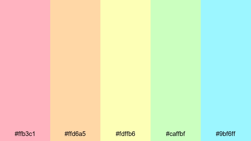
HEX: #ffb3c1 #ffd6a5 #fdffb6 #caffbf #9bf6ff
Mood: bright, friendly, optimistic
Best for: social media post templates
For this spring color scheme, keep mint or soft yellow as the main background to create airy spacing, then use warm pink for headlines and callouts. Peach works well for secondary badges or section headers. Use aqua consistently for buttons, links, and icon highlights, and keep text in a dark neutral to avoid low contrast against the light spring tones.
Image example of morning bloom generated using media.io
Media.io is an online AI studio for creating and editing video, image, and audio in your browser.

2) tulip market
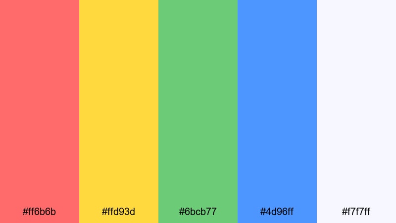
HEX: #ff6b6b #ffd93d #6bcB77 #4d96ff #f7f7ff
Mood: playful, energetic, bold
Best for: event poster
Use off-white as the poster base, then set the main headline in deep blue for strong readability. Coral is ideal for the event theme or key hook lines, while yellow works for high-visibility badges and date stickers. Keep green for supporting shapes, dividers, or location blocks so this spring palette for posters stays bold but organized.
Image example of tulip market generated using media.io

3) fresh meadow
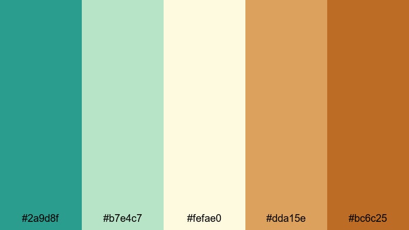
HEX: #2a9d8f #b7e4c7 #fefae0 #dda15e #bc6c25
Mood: natural, grounded, outdoorsy
Best for: brand identity for eco products
Build the identity on cream as the background and use teal as the primary brand color for logos, navigation, and key marks. Use the light green for large areas like packaging panels or website sections to keep it fresh. Save the warm browns for secondary labels, patterns, and highlight stamps to add depth without making the spring tones feel too rustic.
Image example of fresh meadow generated using media.io
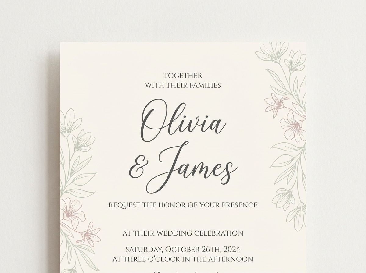
4) cherry petal
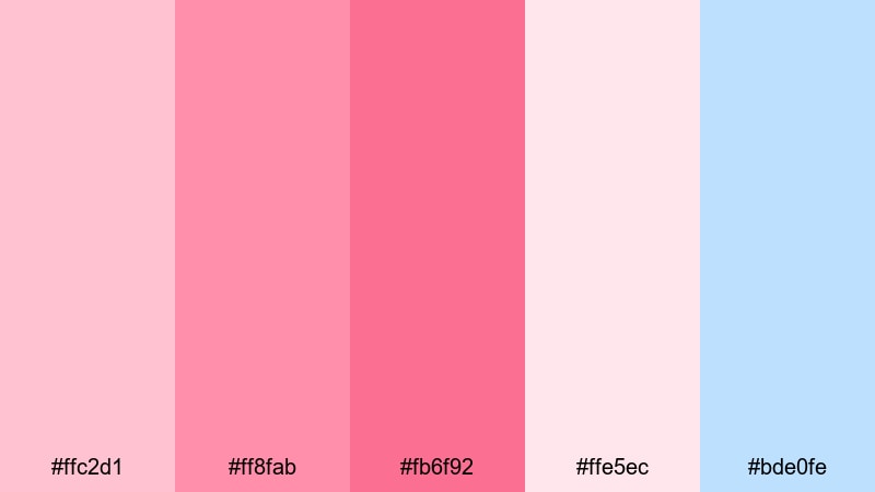
HEX: #ffc2d1 #ff8fab #fb6f92 #ffe5ec #bde0fe
Mood: romantic, soft, airy
Best for: spring wedding invitation
Use the palest pink as the invitation background and keep the deeper rose for names, dates, and key details. Put the mid pink on small flourishes (rules, icons, RSVP labels) so it supports the hierarchy instead of competing with text. Add powder blue sparingly for borders or monograms to cool down the warm spring tones and improve balance.
Image example of cherry petal generated using media.io
5) rainy garden
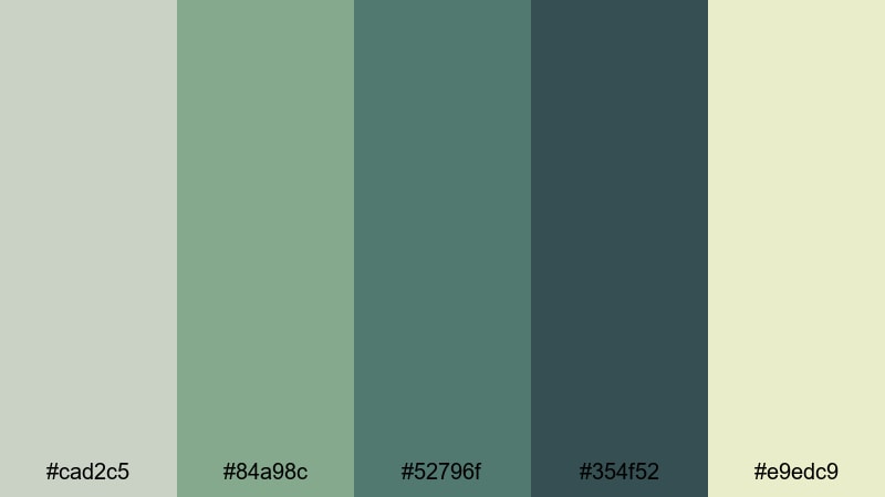
HEX: #cad2c5 #84a98c #52796f #354f52 #e9edc9
Mood: calm, refined, moody
Best for: editorial magazine layout
Use pale cream for article pages and keep the light sage for sidebars, captions, and subtle content blocks. Apply the deep slate greens to headlines, pull quotes, and section markers for strong structure. This spring palette works best when highlights are minimal: use medium green for rules and small UI-like elements rather than big fills.
Image example of rainy garden generated using media.io
6) citrus spritz
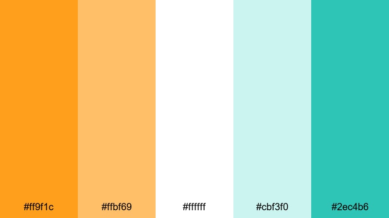
HEX: #ff9f1c #ffbf69 #ffffff #cbf3f0 #2ec4b6
Mood: fresh, sunny, modern
Best for: product packaging for beverages
White should lead as the main surface to keep the packaging clean, then use bright orange for the flavor name or a top band so it is visible from a distance. Use the pale teal for background patterns or ingredient panels, and keep the deeper teal for icons and key UI-style elements like nutrition highlights. This spring color palette with HEX codes is great when you want crisp contrast without going dark.
Image example of citrus spritz generated using media.io
7) lilac haze
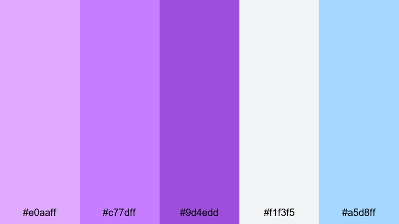
HEX: #e0aaff #c77dff #9d4edd #f1f3f5 #a5d8ff
Mood: dreamy, creative, gentle
Best for: app onboarding screens
Set the onboarding background to the light gray to keep the UI clean, then use lilac tints for illustration areas and section headers. Use the deepest purple as the primary button and active progress state so the next action is always clear. Add light blue for secondary buttons, info callouts, or links. This spring palette for UI stays soft while still supporting clear interaction cues.
Image example of lilac haze generated using media.io
8) buttercup field
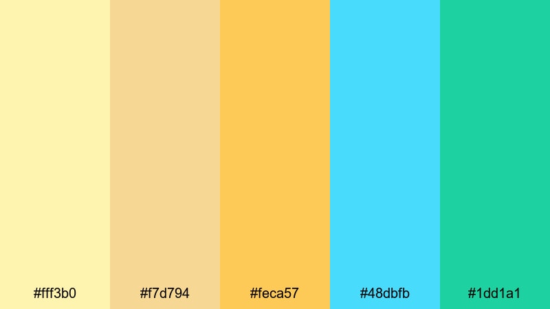
HEX: #fff3b0 #f7d794 #feca57 #48dbfb #1dd1a1
Mood: cheerful, youthful, upbeat
Best for: kids spring flyer
Use the soft yellow as the main flyer background, and place the strongest golden yellow on big headings and sticker-like shapes to guide attention. Put aqua on key sections like times, activities, or sign-up info, and keep mint for icons, arrows, and playful highlights. For text, choose a dark neutral so the lighter spring tones stay readable for parents at a glance.
Image example of buttercup field generated using media.io

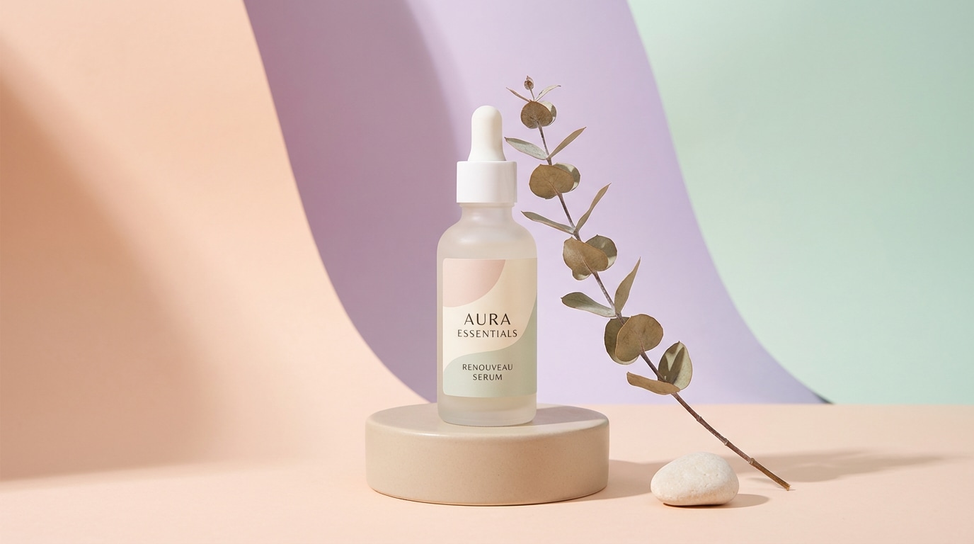
9) peach orchard
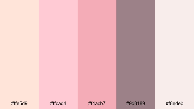
HEX: #ffe5d9 #ffcad4 #f4acb7 #9d8189 #f8edeb
Mood: warm, elegant, approachable
Best for: skincare product ad
Use the light cream and blush tones as the ad background to create a soft, clean skincare look. Set product names and benefits in dusty rose to keep emphasis without harsh contrast. Use muted mauve for small text, shadows, and dividers so the layout holds together. This spring color scheme works best with minimal graphic elements and plenty of spacing around the product.
Image example of peach orchard generated using media.io
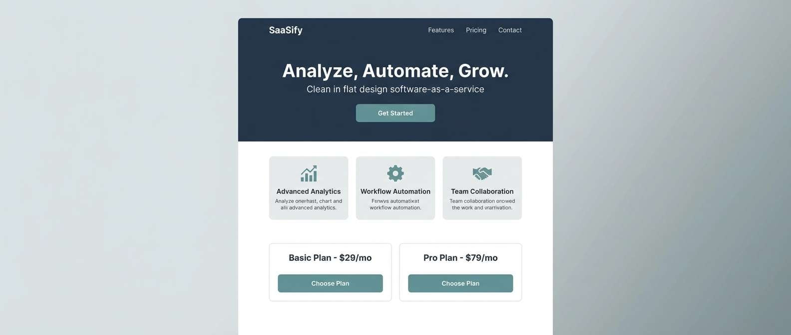
10) mint ribbon
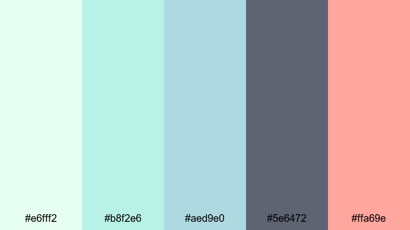
HEX: #e6fff2 #b8f2e6 #aed9e0 #5e6472 #ffa69e
Mood: clean, modern, friendly
Best for: saas landing page ui
Let the pale mint carry the page background and reserve slate gray for long-form body text to maintain contrast. Use coral for the primary CTA button and important conversion moments (pricing toggle, free trial). Apply the blue-green tones to cards, feature icons, and section separators. This spring palette for branding and web UI feels fresh while still looking professional.
Image example of mint ribbon generated using media.io
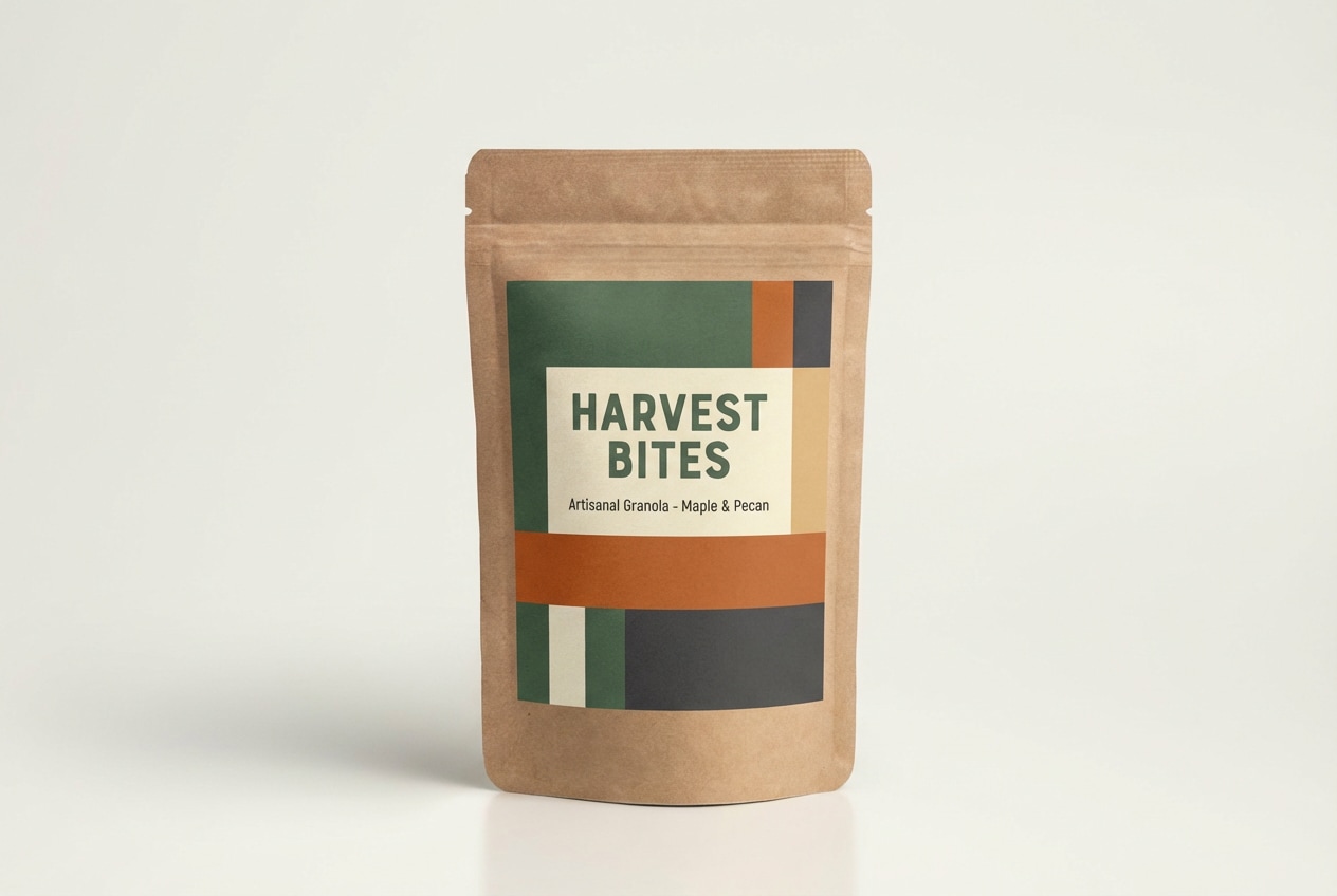
11) daisy milk
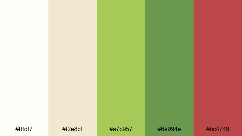
HEX: #fffdf7 #f2e8cf #a7c957 #6a994e #bc4749
Mood: wholesome, fresh, farm-to-table
Best for: food brand packaging
Use warm white as the main label base for a clean, farm-to-table feel. Place the two greens on seals, ingredient callouts, and brand blocks so the packaging reads as fresh and natural. Keep the muted red as a controlled accent for flavor tags, limited-edition stamps, or price flashes. These spring tones work especially well for simple typography and illustrated icons.
Image example of daisy milk generated using media.io
12) sky hyacinth
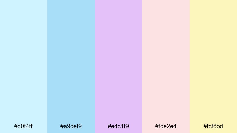
HEX: #d0f4ff #a9def9 #e4c1f9 #fde2e4 #fcf6bd
Mood: light, whimsical, delicate
Best for: botanical illustration set
Use the pale blues and lilac for petals and shadows to keep illustrations soft and airy. Apply the blush pink as a gentle midtone for layered blooms, and use the butter yellow as background wash or highlight so the pieces feel sunlit. Keep text or labels minimal and dark gray, because these spring tones are light and can lose contrast easily.
Image example of sky hyacinth generated using media.io
13) pollen pop
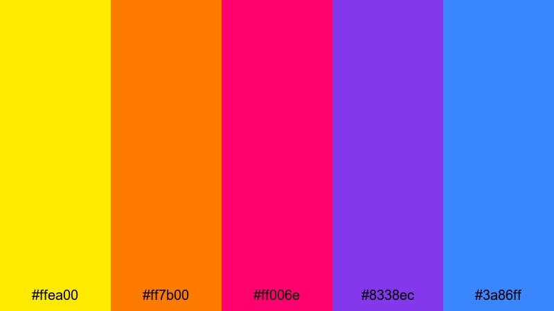
HEX: #ffea00 #ff7b00 #ff006e #8338ec #3a86ff
Mood: vibrant, punchy, youthful
Best for: music festival banner
Use electric yellow for the top-level message so it reads from far away, then pair it with blue for supporting copy and schedules. Keep purple and magenta for artist highlights, graphic shapes, and section dividers to build a clear visual rhythm. Use orange as a secondary accent rather than a full background fill, or the spring color scheme can become too intense.
Image example of pollen pop generated using media.io
14) garden party
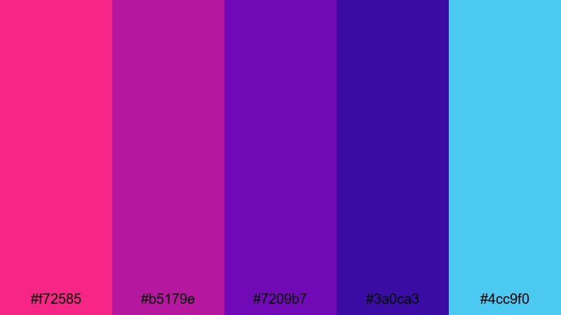
HEX: #f72585 #b5179e #7209b7 #3a0ca3 #4cc9f0
Mood: festive, stylish, glamorous
Best for: party invitation flyer
Put bright pink on the event name and key CTA text, then keep the cooler blue for dates, venue, and RSVP details so the layout stays readable. Use layered purples as gradient backgrounds or large shapes to add depth without needing photos. This spring palette is strong, so keep typography clean and use plenty of negative space around the main title.
Image example of garden party generated using media.io

15) sprout and stone
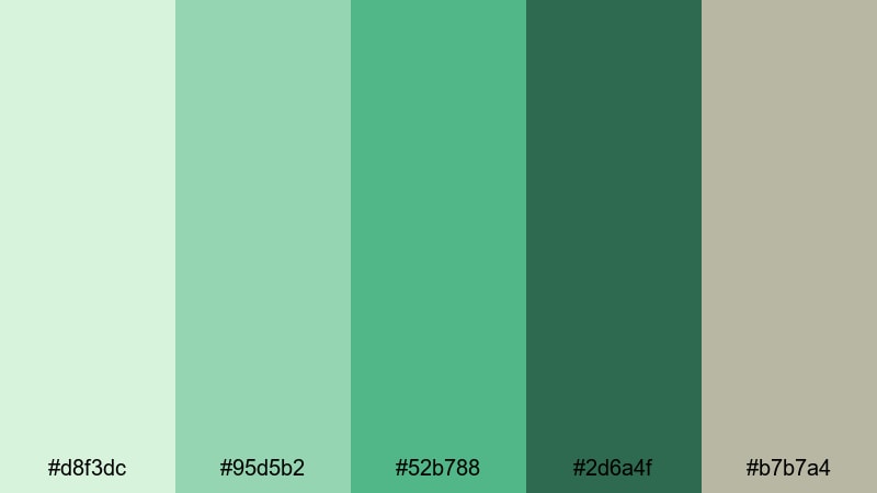
HEX: #d8f3dc #95d5b2 #52b788 #2d6a4f #b7b7a4
Mood: minimal, fresh, trustworthy
Best for: presentation slides
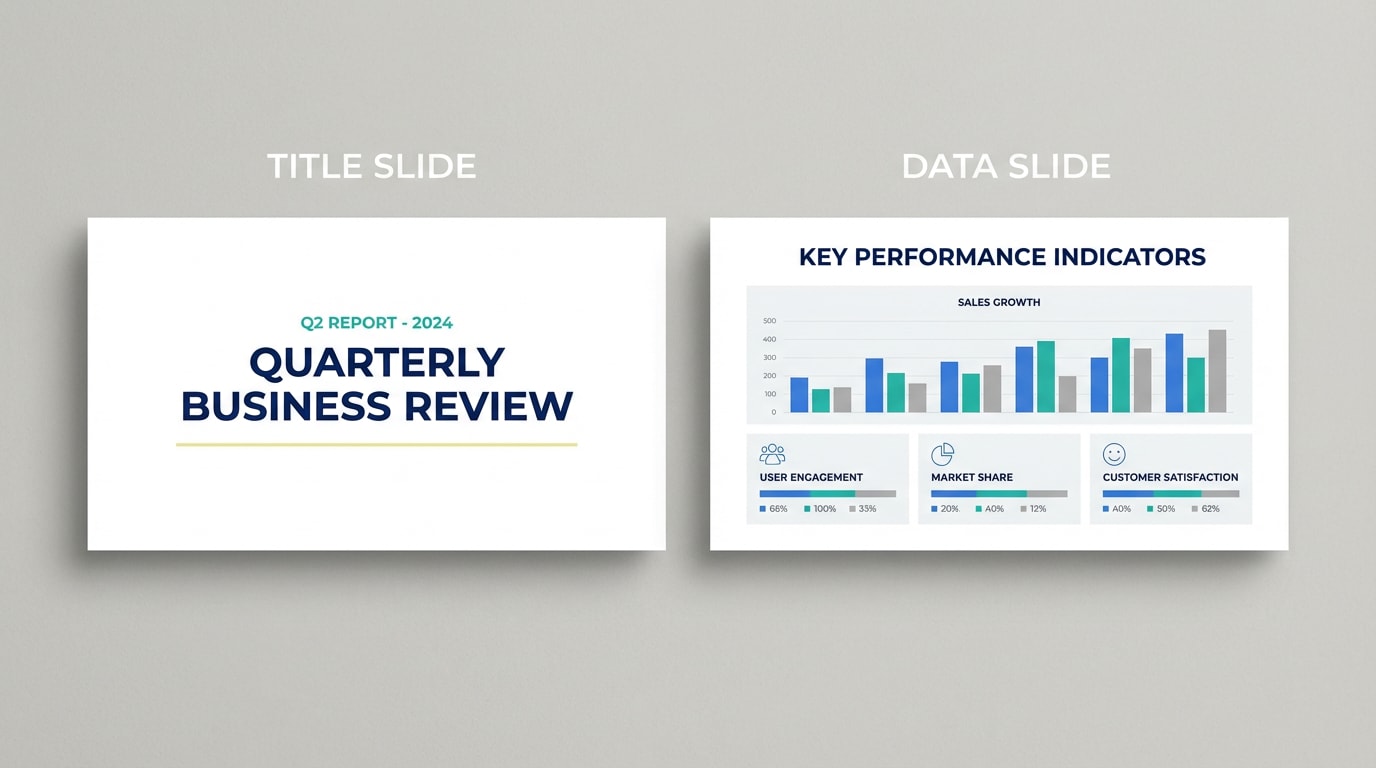
Use the light mint or warm gray as the slide background to reduce glare and keep content calm. Set titles and key numbers in the deep green for strong contrast. Use the mid greens for charts, icons, and callout boxes to keep data consistent across slides. This spring color palette for presentations works well when you limit fills and rely on clear spacing and alignment.
Image example of sprout and stone generated using media.io
16) april drizzle
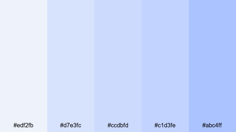
HEX: #edf2fb #d7e3fc #ccdbfd #c1d3fe #abc4ff
Mood: soft, calm, professional
Best for: dashboard ui
Start with the lightest blue as the dashboard canvas and use deeper blues for selected states, tabs, and key chart lines. Keep cards mostly white or very pale blue so content stays readable. Use borders, subtle shadows, and spacing to define sections instead of heavy color blocks. This spring palette for UI is ideal when you want a calm data product look.
Image example of april drizzle generated using media.io

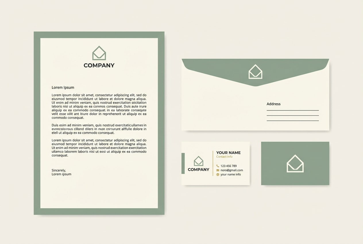
17) sunlit lavender
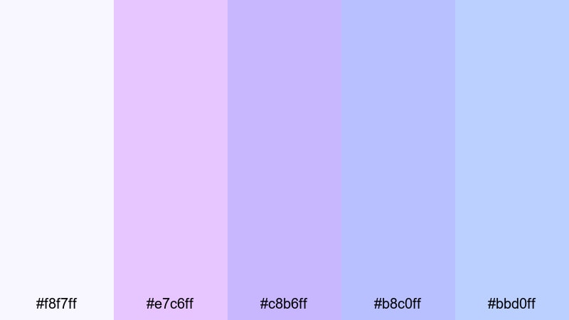
HEX: #f8f7ff #e7c6ff #c8b6ff #b8c0ff #bbd0ff
Mood: serene, airy, modern
Best for: stationery set
Keep the near-white tone as the paper base, then apply lavender for borders, monograms, and light background patterns. Use the deeper lavender-purple for names and headings so they stay crisp in print. The periwinkle and light blue work well for envelopes or secondary elements like return address blocks. This spring color scheme is best when contrast is handled through typography weight, not heavy fills.
Image example of sunlit lavender generated using media.io
18) rosewater mint
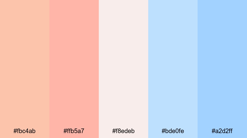
HEX: #fbc4ab #ffb5a7 #f8edeb #bde0fe #a2d2ff
Mood: soft, welcoming, polished
Best for: seasonal email newsletter
Use light blush as the email background and keep content blocks on off-white so text remains clear across devices. Apply sky blues to buttons and links for a calm CTA color that still stands out. Use peach for promotional badges, discounts, or product highlights to guide the eye. This spring palette for branding emails works best with simple icons and generous padding.
Image example of rosewater mint generated using media.io
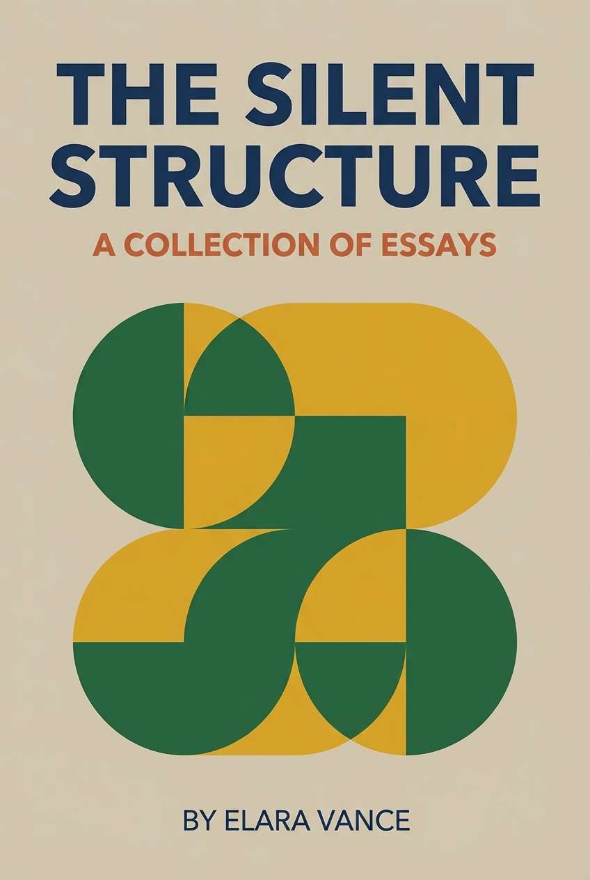
19) peony prose
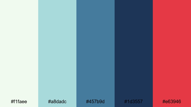
HEX: #f1faee #a8dadc #457b9d #1d3557 #e63946
Mood: classic, confident, editorial
Best for: book cover design
Use the soft off-white for the cover background and set the title in navy so it stays readable at thumbnail size. Use teal for subtitles, series labels, or small graphic rules. Keep the red as a single focal accent, such as an emblem, underline, or author mark, so it adds energy without overpowering the spring tones. This spring color palette with HEX codes is ideal when you need an editorial look with a seasonal twist.
Image example of peony prose generated using media.io
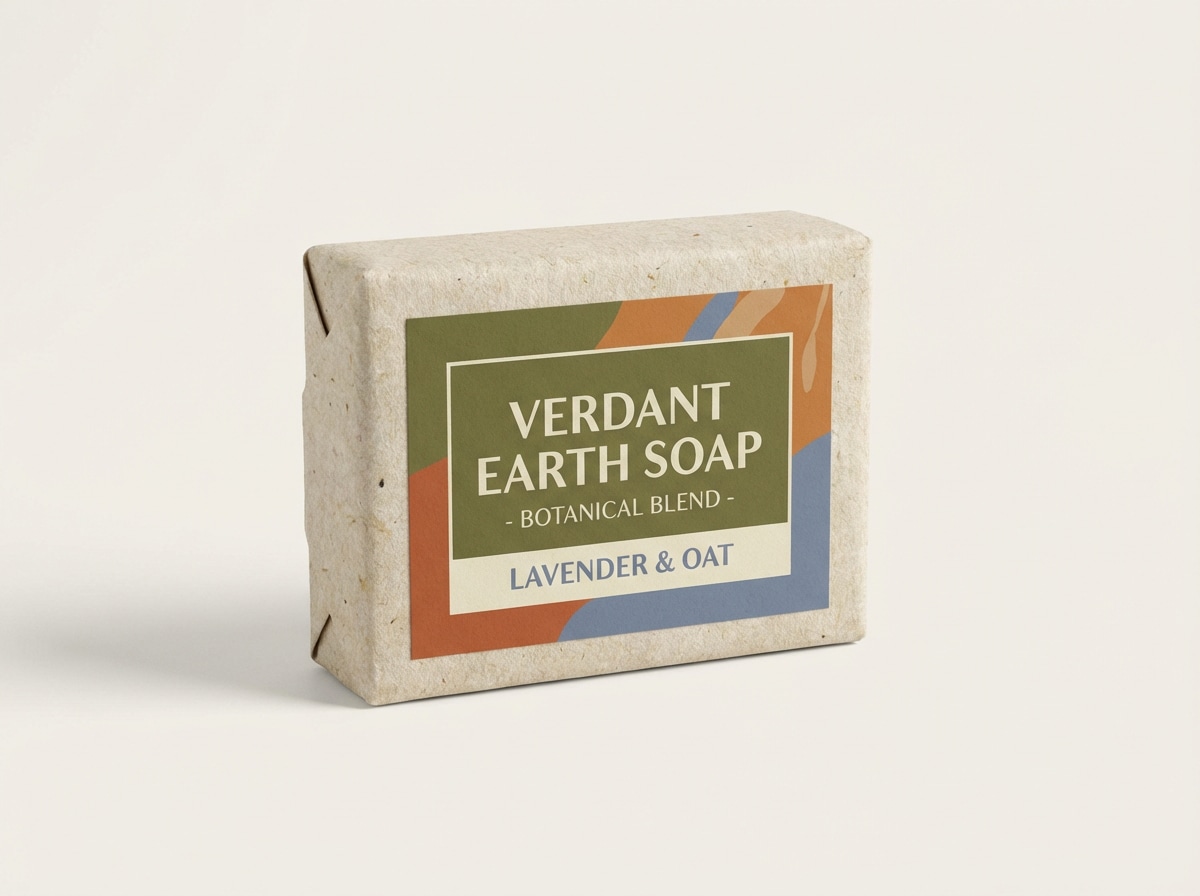
20) spring market kraft
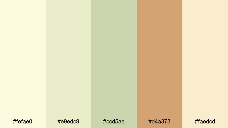
HEX: #fefae0 #e9edc9 #ccd5ae #d4a373 #faedcd
Mood: warm, artisanal, organic
Best for: natural soap packaging
Use the creamy neutrals as the main label base to mimic kraft warmth while staying clean. Apply olive for ingredient callouts, icons, and small borders to add structure. Use caramel brown for the brand name and scent variant to maintain readability and an artisanal feel. This spring palette is strongest when you keep layouts simple and let material texture (paper, wrap) do some of the work.
Image example of spring market kraft generated using media.io
What Colors Go Well with Spring?
- Pairing: blush pink + sage green creates a gentle, botanical feel for invitations, wellness brands, and packaging.
- Pairing: butter yellow + sky blue reads bright and optimistic for UI empty states, kids materials, and seasonal promos.
- Pairing: mint + coral gives clear CTA contrast for landing pages, app banners, and email modules.
- Pairing: lilac + soft gray feels modern and calm for onboarding screens, portfolios, and editorial templates.
- Pairing: cream + teal looks grounded and eco-friendly for sustainable branding, product labels, and presentation decks.
- Pairing: off-white + navy with a single red accent keeps spring tones readable for book covers, posters, and premium packaging.
How to Use a Spring Color Palette in Real Designs
- Protect contrast when using pastels: for body text, use a dark neutral (charcoal, deep navy, slate green) rather than a tinted pastel. Reserve the light spring tones for backgrounds, cards, and large shapes.
- Assign one “hero accent” per layout: pick a single saturated color (coral, teal, deep purple, or red) for buttons and key highlights. Keep the other spring colors as supporting tints to avoid a scattered look.
- Use warm vs cool zones: split pages into warm sections (peach, blush, butter yellow) and cool sections (mint, aqua, sky blue). This creates structure without adding heavy dividers.
- Repeat spring tones in small UI elements: apply the same accent to links, toggles, icons, and chart highlights so your spring color scheme feels consistent across screens and breakpoints.
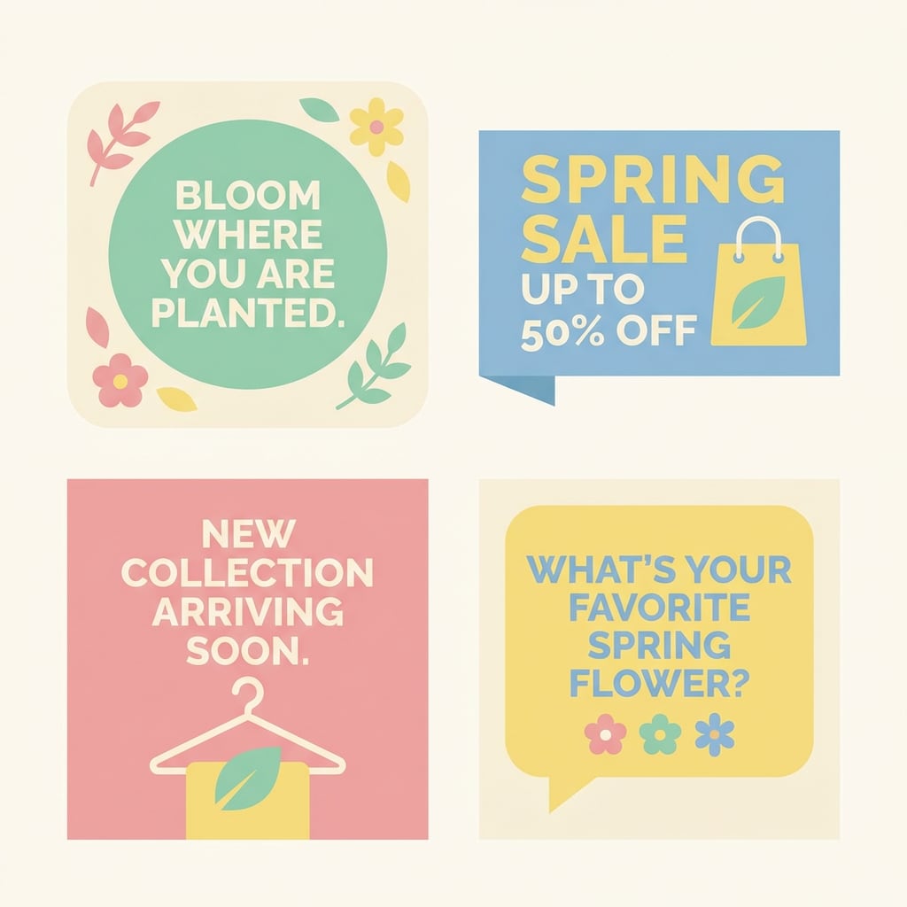
Create Spring Palette Visuals with AI
If you want consistent seasonal graphics, generate a few “style anchors” first: one background pattern, one product mockup, and one simple UI screen using the exact spring tones from your chosen palette. Then reuse the same prompt structure and only swap the layout type (poster, landing page, invitation) to keep output cohesive. Media.io makes it easy to test variations quickly and export visuals for web and print.
Spring Color Palette FAQs
-
What are typical spring colors?
Common spring colors include soft pinks, mint and fresh greens, butter yellows, sky blues, and lilacs. Many spring color palettes mix light tints with one stronger accent for contrast. -
How do I keep a pastel spring palette readable?
Use a dark neutral for text (charcoal or navy), keep pastels as backgrounds and cards, and pick one deeper accent for buttons and selected states. Check contrast for accessibility before finalizing. -
Which spring palette works best for UI design?
Look for a spring palette with a light background, a clear mid tone for borders/cards, and one deep or saturated accent for CTAs. Palettes like lilac haze, mint ribbon, and april drizzle are built for UI hierarchy. -
How many colors should a spring color scheme use?
Five colors is a practical set: 1 background, 1 surface/card, 1 text/heading color, 1 primary accent (CTA), and 1 secondary accent. You can expand later with tints of the same hues. -
Can I use spring tones for branding year-round?
Yes. Keep the palette anchored with a stable neutral and a consistent accent, then treat the lighter spring tones as supporting colors. This makes the brand feel fresh without looking seasonal only. -
What is the fastest way to preview these spring color combinations?
Generate a poster, landing page, or packaging mockup using the palette prompt and the exact HEX set. With Media.io, you can iterate quickly and see how the spring tones behave in real compositions.


