

Bright lavender sits in a sweet spot between playful pastel and confident purple, which makes it surprisingly flexible for modern design.
Below are ready-to-use bright lavender color palette ideas with HEX codes, plus practical ways to apply them across branding, UI, print, and social.
In this article
- Why Bright Lavender Palettes Work So Well
-
- lilac sunrise
- orchid neon pop
- cotton candy haze
- amethyst chrome
- lavender latte
- violet spritz
- spring wisteria garden
- studio pastel tech
- berry milkshake
- iris minimal ui
- festival glow poster
- cloudy mauve neutrals
- rose quartz twist
- midnight lilac luxe
- zen lavender spa
- periwinkle punch
- glam powder makeup
- garden party invite
- soft gradient onboarding
- retro lavender soda
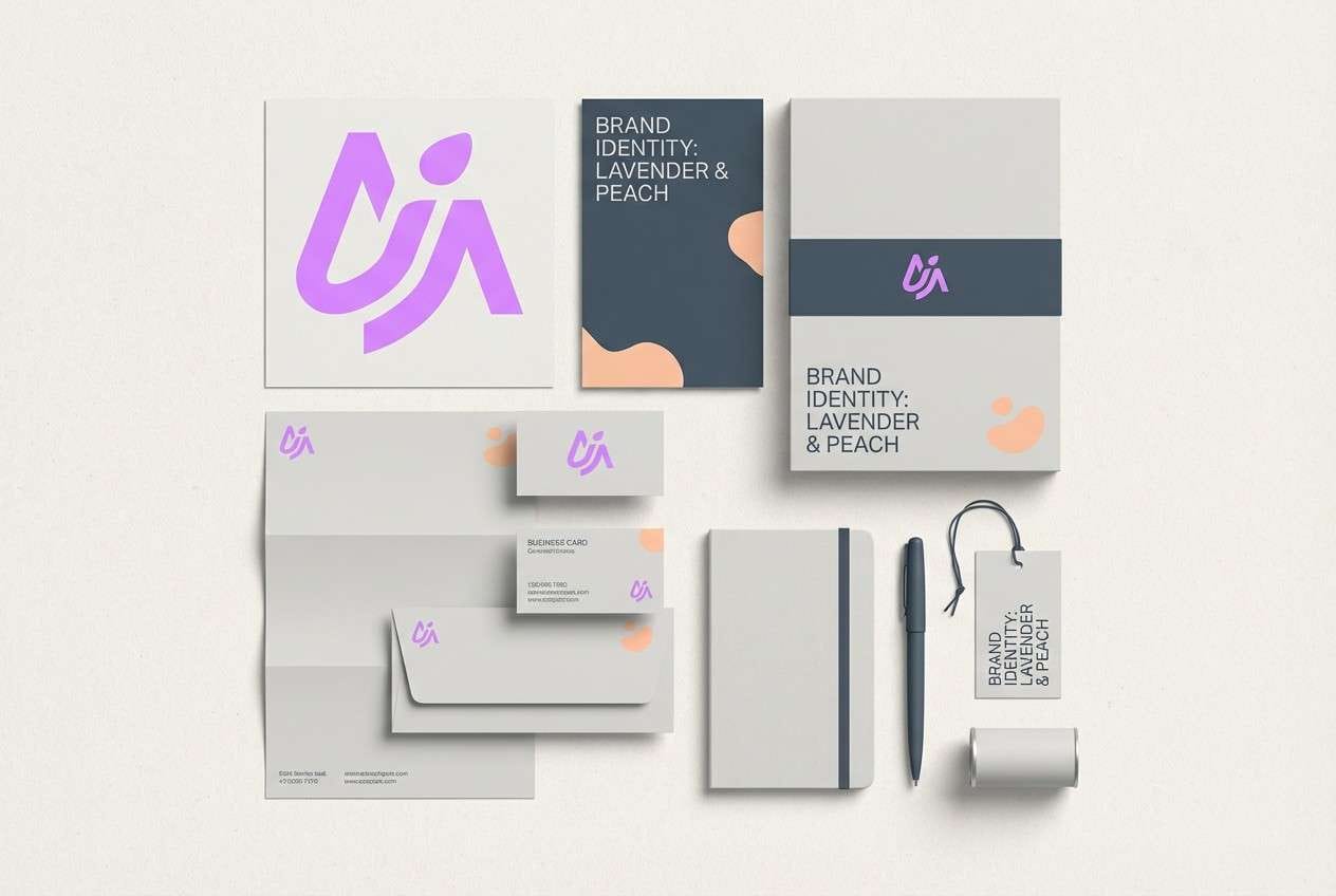
- minimal iris brandmark
- plum neon balance
- lavender pearl wedding
- What Colors Go Well with Bright Lavender?
- How to Use a Bright Lavender Color Palette in Real Designs
- Create Bright Lavender Palette Visuals with AI
Why Bright Lavender Palettes Work So Well
Bright lavender feels modern because it has the friendliness of a pastel, but still carries the “premium” association people often give to purple. That mix helps designs look upbeat without losing polish.
It also pairs easily with both warm and cool hues: creams and golds make it softer, while charcoal, teal, and neon pink push it into high-contrast, contemporary territory.
In UI and branding, bright lavender is especially effective as an accent because it’s colorful enough to guide attention, yet gentle enough to sit on light backgrounds without feeling harsh.
20+ Bright Lavender Color Palette Ideas (with HEX Codes)
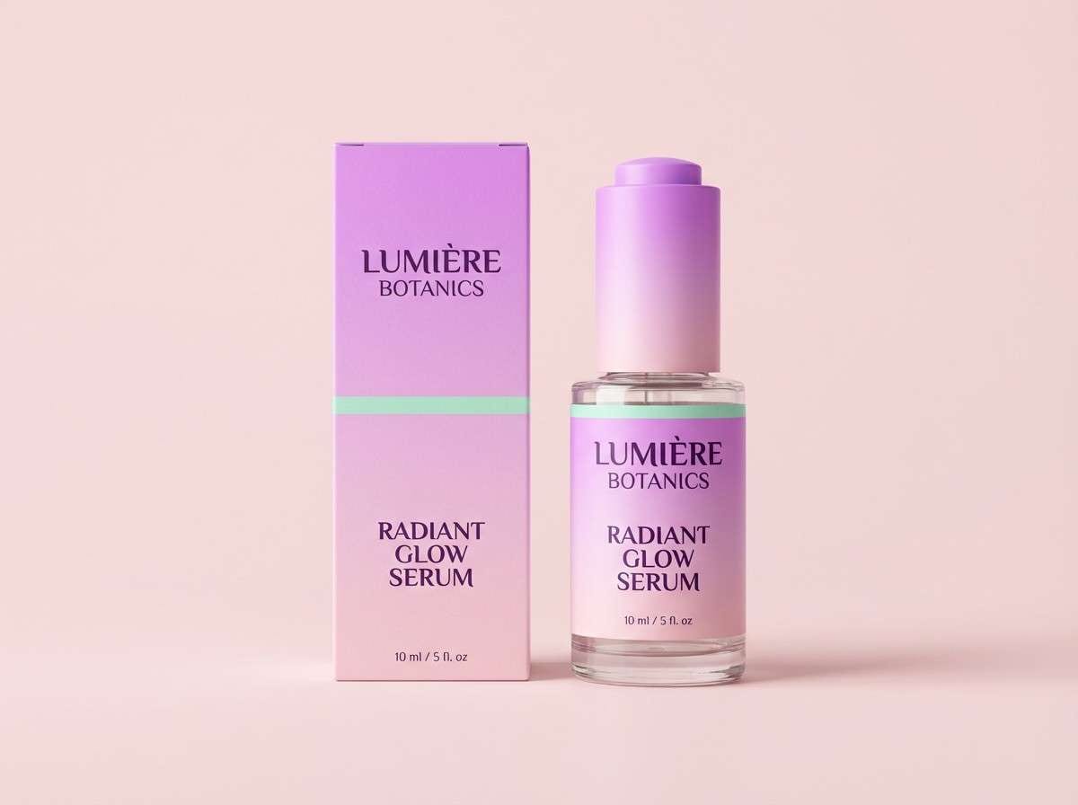
1) Lilac Sunrise
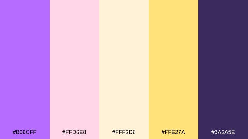
HEX: #B66CFF #FFD6E8 #FFF2D6 #FFE27A #3A2A5E
Mood: warm, cheerful, dreamy
Best for: morning cafe menu design
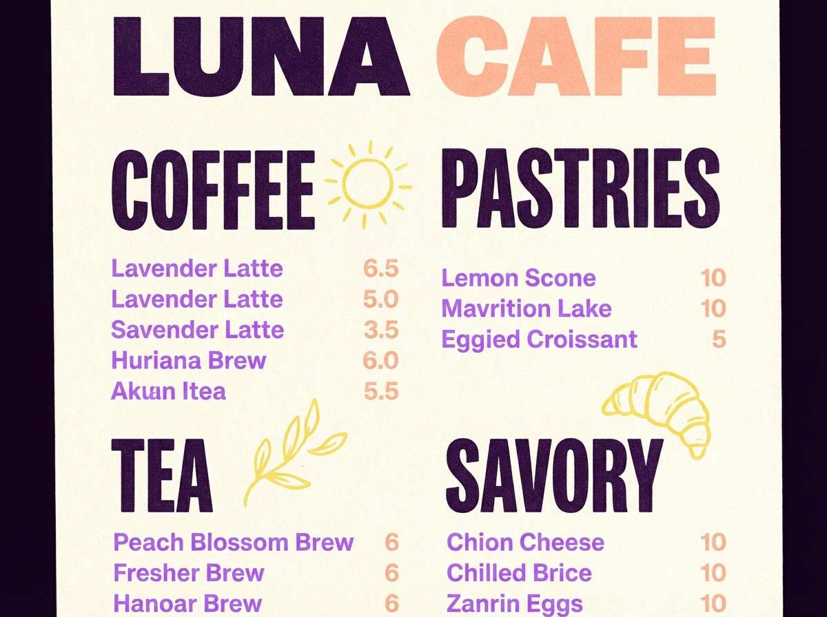
Warm and cheerful like early sun hitting soft lilac clouds, this mix feels sweet without becoming sugary. Use the lavender as the main header color, then let buttery yellow and peach handle highlights and icons. The deep eggplant works well for body text and improves readability on creamy backgrounds. Tip: keep yellow to small bursts so the design stays elegant, not loud.
Image example of lilac sunrise generated using media.io
Media.io is an online AI studio for creating and editing video, image, and audio in your browser.

2) Orchid Neon Pop
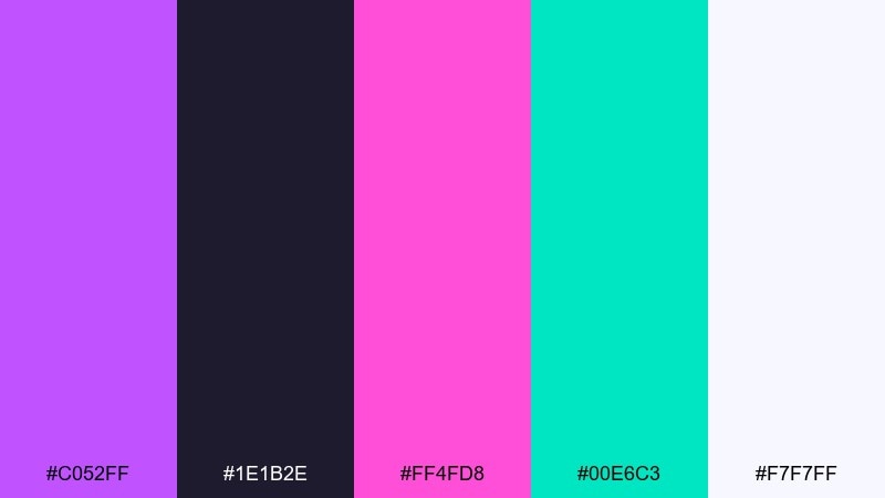
HEX: #C052FF #1E1B2E #FF4FD8 #00E6C3 #F7F7FF
Mood: bold, electric, youthful
Best for: music event poster
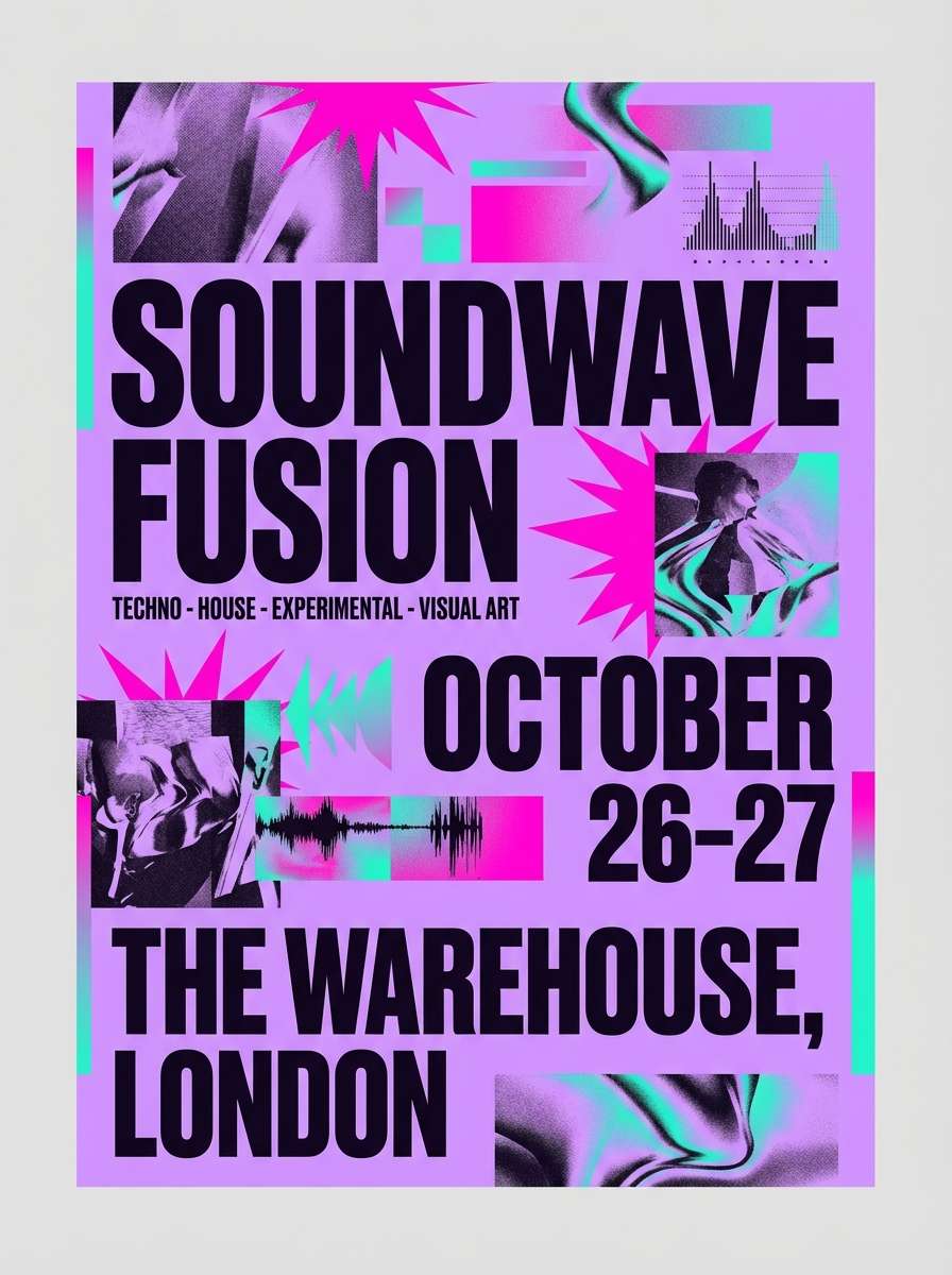
Bold and electric like club lights bouncing off satin, these tones bring instant energy. For bright lavender color combinations that still feel readable, anchor the layout with near-black and reserve neon pink for key calls to action. Mint-teal adds a cool counterpoint for icons or secondary lines. Tip: use the off-white for negative space so the neon accents do not overwhelm the poster.
Image example of orchid neon pop generated using media.io
3) Cotton Candy Haze
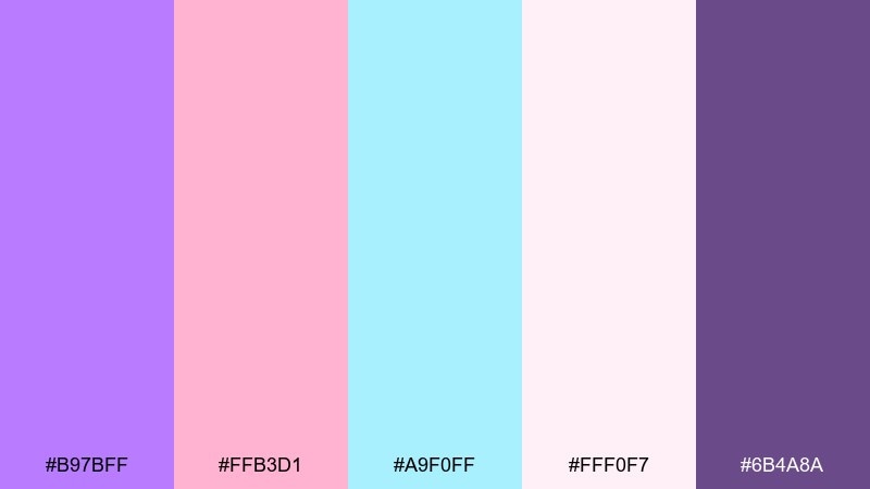
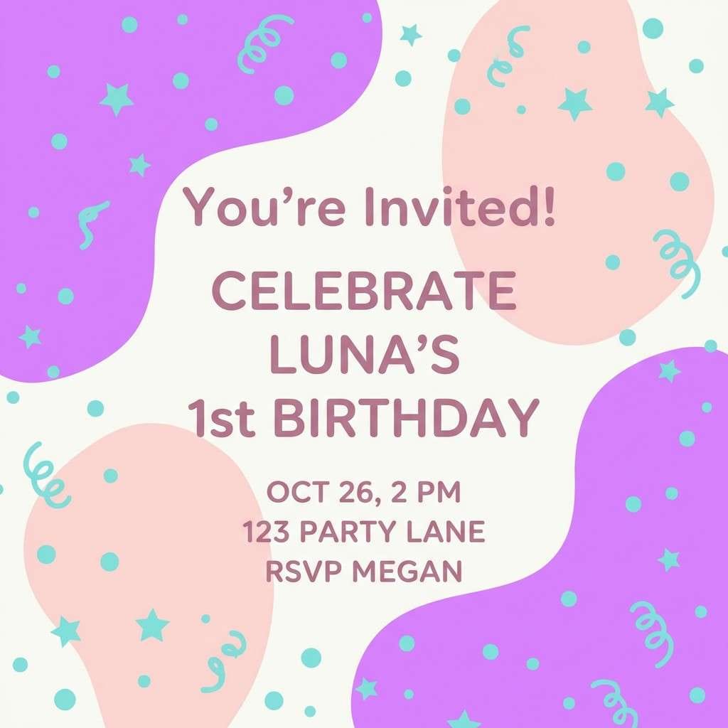
HEX: #B97BFF #FFB3D1 #A9F0FF #FFF0F7 #6B4A8A
Mood: playful, airy, soft
Best for: kids birthday invitation
Playful and airy like carnival cotton candy, this palette keeps everything light and friendly. Use lavender and blush for big shapes, then bring in sky-aqua for small confetti details or borders. The mauve-purple provides a calmer anchor for names and dates. Tip: print on a slightly warm white stock to keep the pastels from feeling icy.
Image example of cotton candy haze generated using media.io
4) Amethyst Chrome
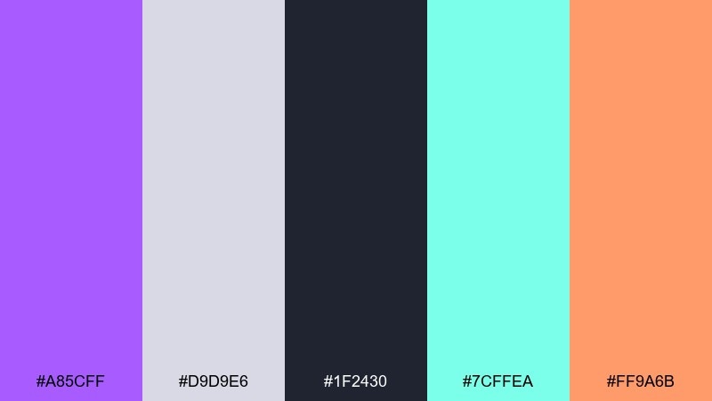
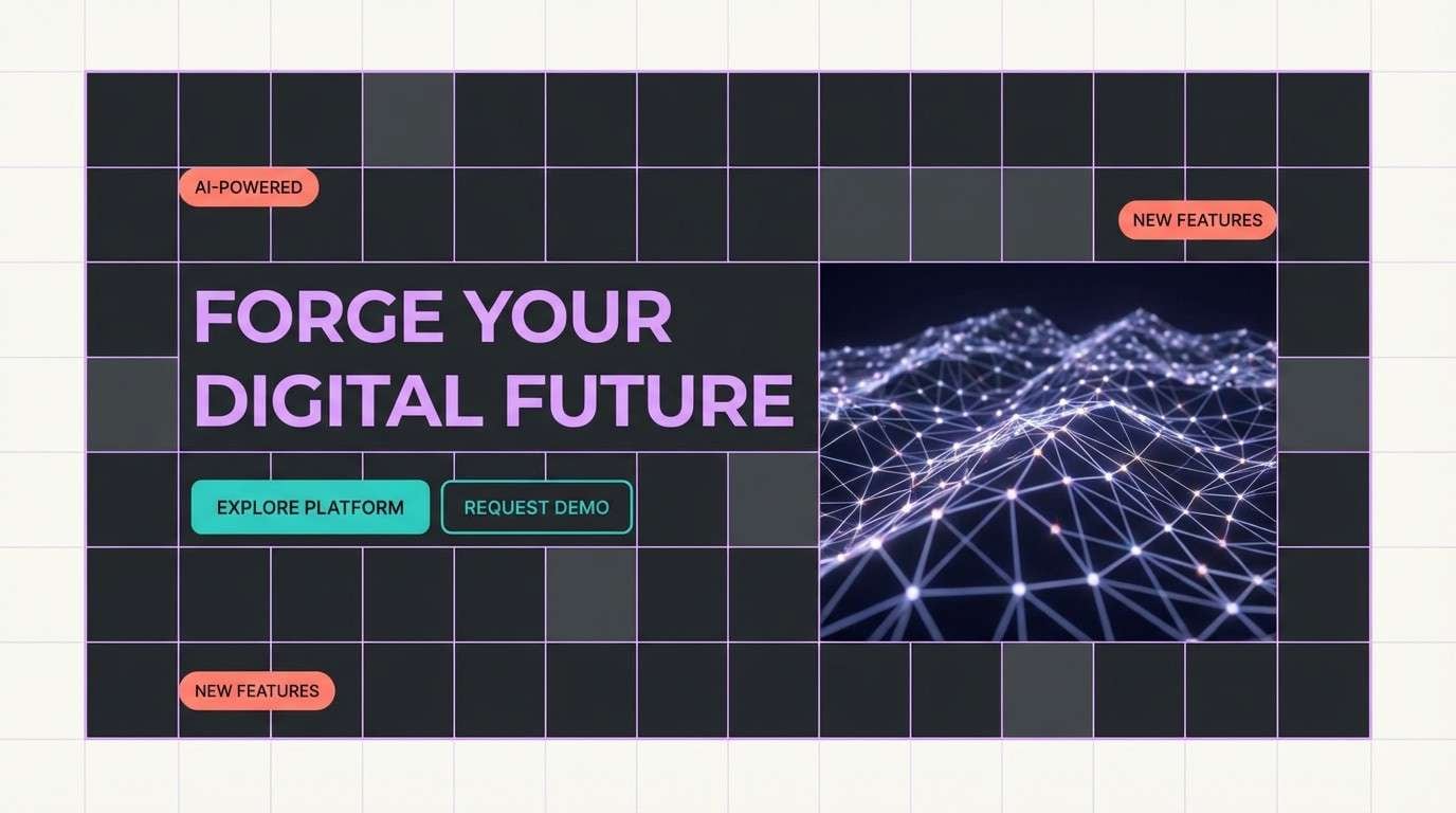
HEX: #A85CFF #D9D9E6 #1F2430 #7CFFEA #FF9A6B
Mood: futuristic, clean, high-contrast
Best for: tech product landing page hero
Futuristic and clean like polished metal under violet LEDs, this set is built for contrast. Lavender and charcoal create a sharp hero section, while icy gray supports cards and dividers. Use teal as the primary accent for buttons and coral for secondary highlights or badges. Tip: keep gradients subtle so the chrome feel stays premium rather than noisy.
Image example of amethyst chrome generated using media.io
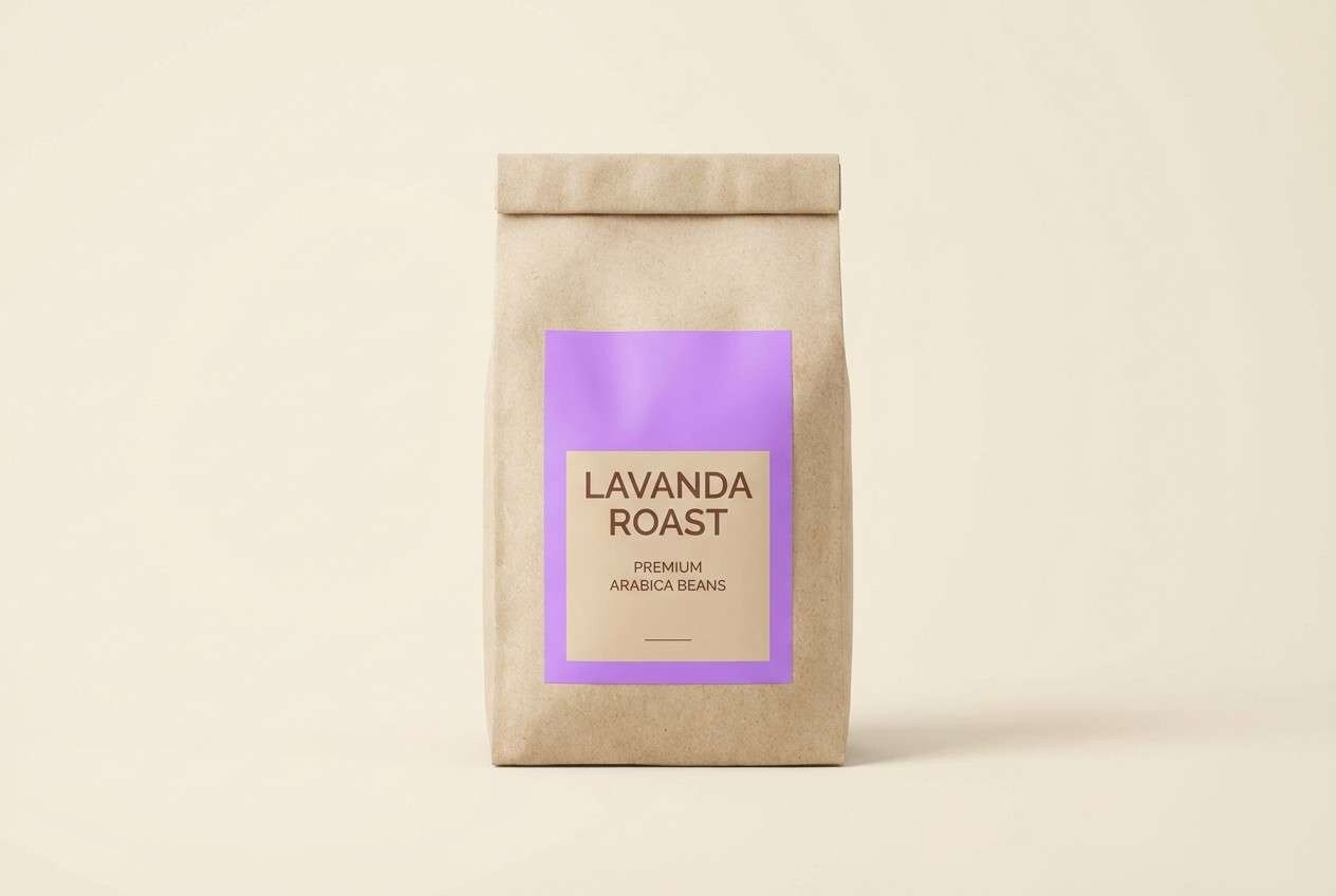
5) Lavender Latte
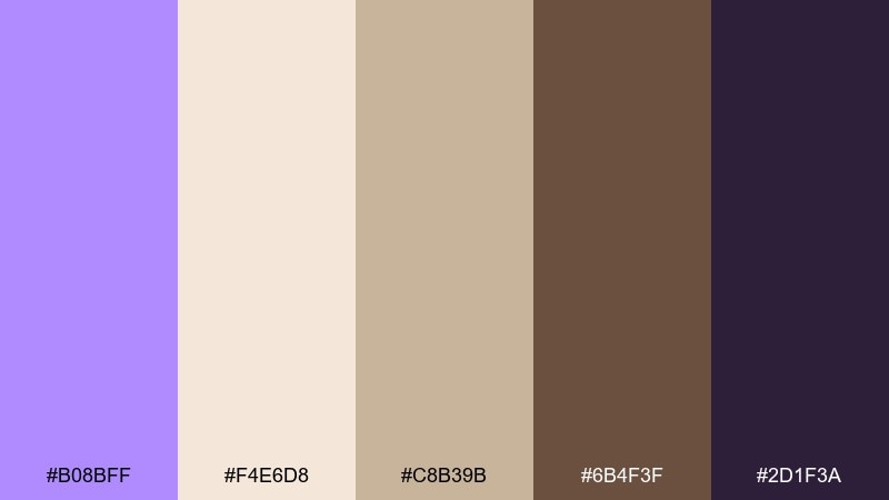
HEX: #B08BFF #F4E6D8 #C8B39B #6B4F3F #2D1F3A
Mood: cozy, grounded, boutique
Best for: coffee brand packaging
Cozy and grounded like steamed milk with a lavender drizzle, this mix feels boutique and comforting. Pair the lavender with creamy beige for the main label, then use cocoa brown for typography and ingredient details. The muted tan works well for secondary panels or patterns. Tip: add a matte finish and keep lavender to one large block for a modern premium look.
Image example of lavender latte generated using media.io
6) Violet Spritz
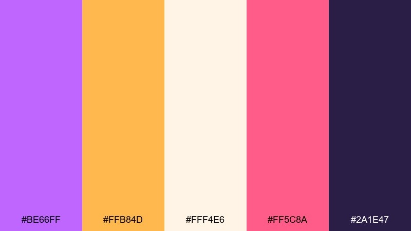
HEX: #BE66FF #FFB84D #FFF4E6 #FF5C8A #2A1E47
Mood: fun, sunny, celebratory
Best for: summer sale social ad
Fun and sunny like a sparkling drink at golden hour, these colors feel instantly celebratory. Let lavender and cream set the base, then use orange and pink for price tags, stickers, and punchy CTAs. The deep violet keeps text crisp and adds sophistication. Tip: limit the hot pink to one focal element per frame to avoid visual clutter.
Image example of violet spritz generated using media.io

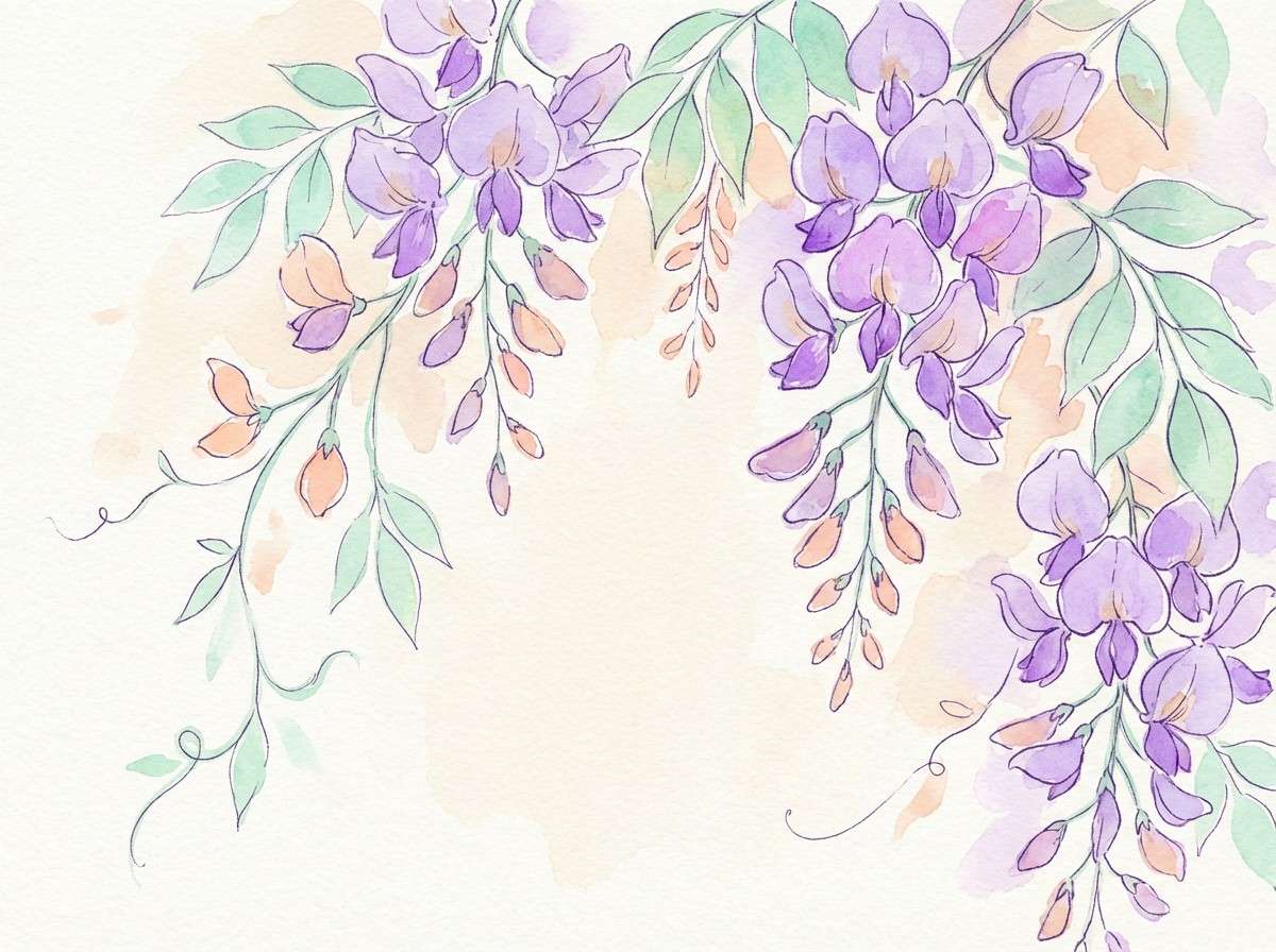
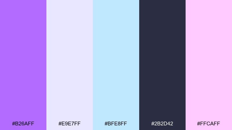
7) Spring Wisteria Garden
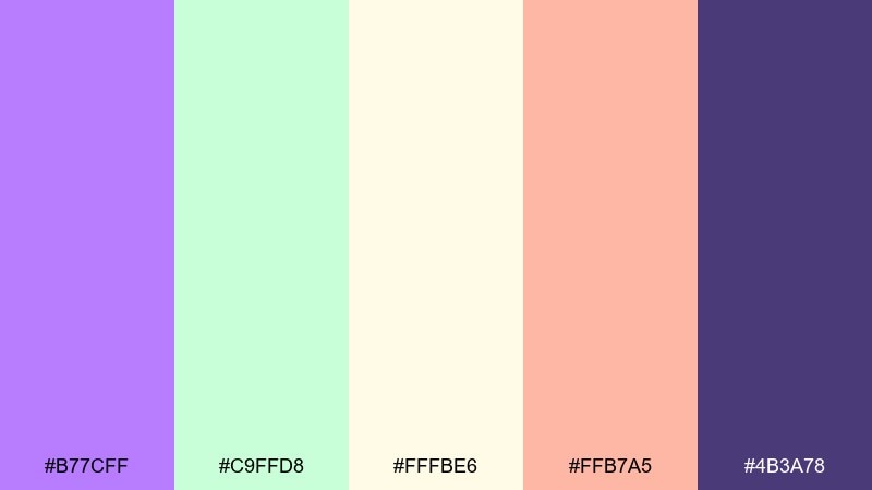
HEX: #B77CFF #C9FFD8 #FFFBE6 #FFB7A5 #4B3A78
Mood: fresh, floral, uplifting
Best for: botanical illustration set
Fresh and floral like wisteria blooms over a sunlit path, this palette leans bright yet gentle. Use lavender for petals and focal blossoms, with mint-green for leaves and soft cream for paper texture. Peach works as a natural accent for buds or butterflies, while the deep purple is perfect for fine ink lines. Tip: keep washes translucent so the illustration stays airy.
Image example of spring wisteria garden generated using media.io
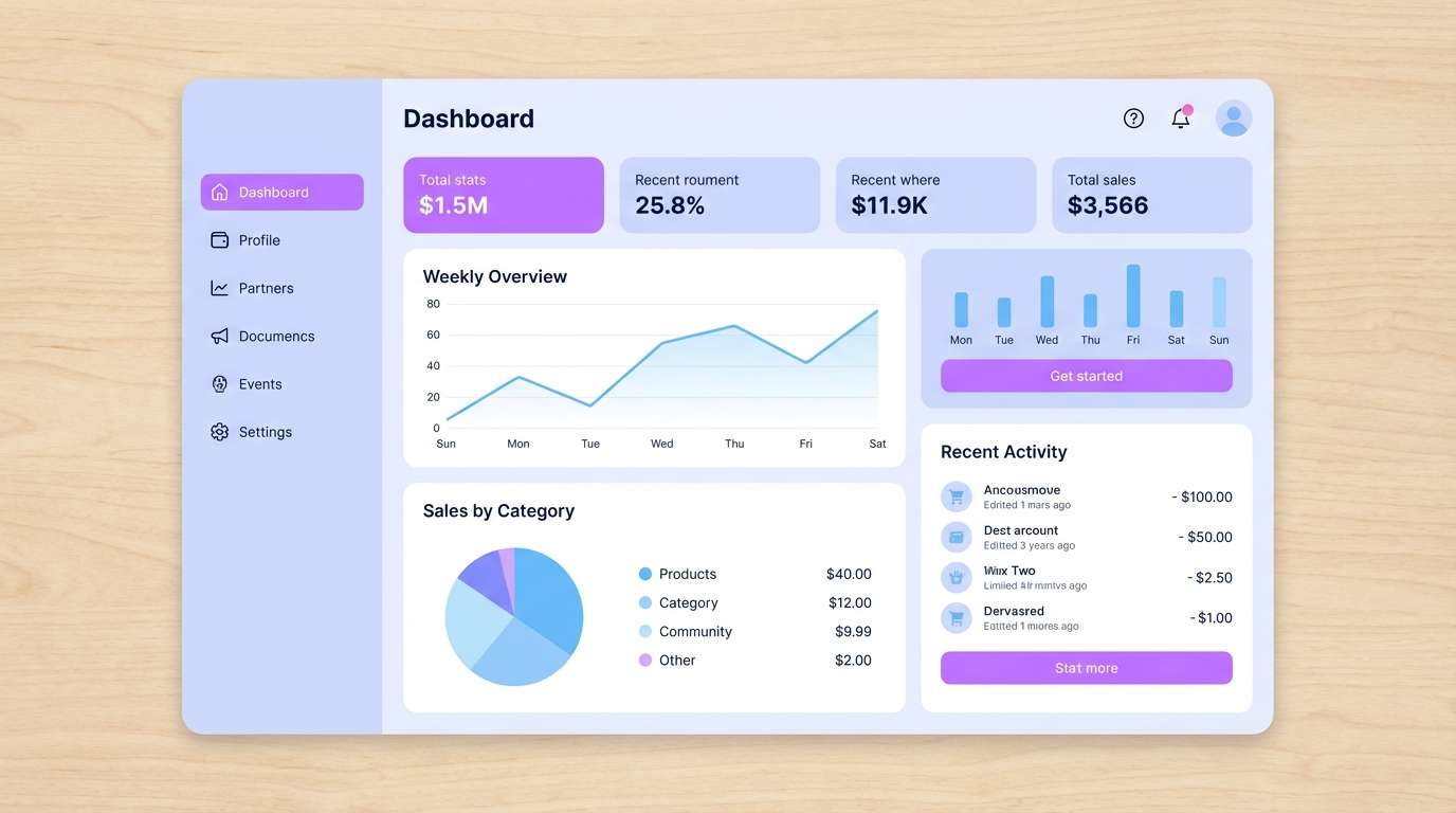
8) Studio Pastel Tech
HEX: #B26AFF #E9E7FF #BFE8FF #2B2D42 #FFCAFF
Mood: modern, tidy, approachable
Best for: app dashboard UI
Modern and tidy like a well-lit studio desk, these pastels feel approachable for digital products. Use lavender for active states and key metrics, with periwinkle and sky-blue for secondary charts. The inky navy keeps navigation and text sharp against soft surfaces. Tip: apply lavender sparingly on interactive elements so users can scan quickly.
Image example of studio pastel tech generated using media.io
9) Berry Milkshake
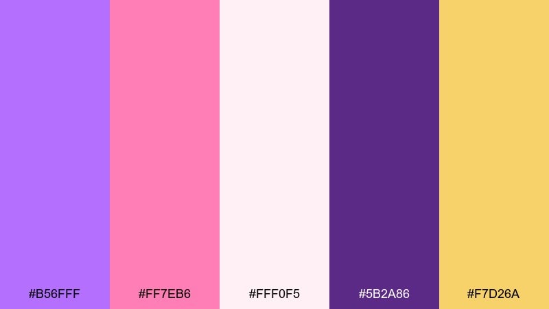
HEX: #B56FFF #FF7EB6 #FFF0F5 #5B2A86 #F7D26A
Mood: sweet, trendy, energetic
Best for: dessert shop branding kit
Sweet and trendy like a berry shake topped with whipped cream, this palette feels energetic and friendly. Lavender and blush can lead the brand mark, while soft pink-white supports packaging backgrounds. Add golden yellow as a playful highlight for stickers, loyalty cards, or menu dots. Tip: use the deep purple for outlines so the light colors never look washed out.
Image example of berry milkshake generated using media.io
10) Iris Minimal UI
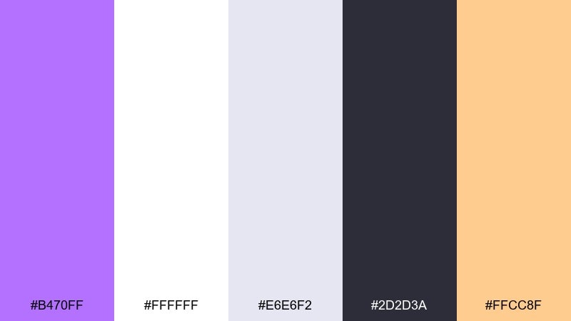
HEX: #B470FF #FFFFFF #E6E6F2 #2D2D3A #FFCC8F
Mood: clean, minimal, confident
Best for: SaaS onboarding screens
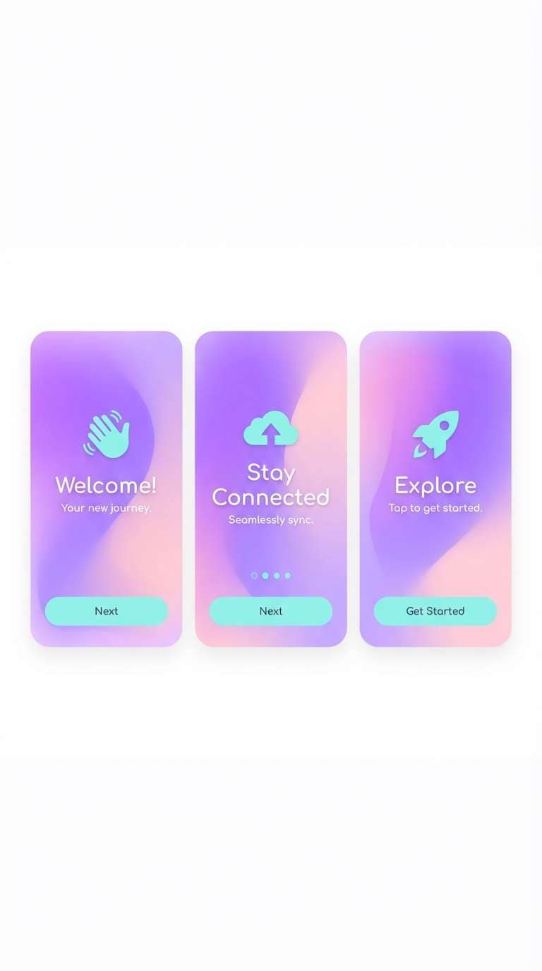
Clean and confident like an art gallery wall with a single iris bloom, this set stays minimal while still feeling warm. A bright lavender color palette works best here as the hero accent on buttons and progress states, with soft grays handling surfaces and dividers. Peach adds a friendly spark for illustrations or success messages. Tip: keep text in near-black and reserve lavender for interactive focus.
Image example of iris minimal ui generated using media.io
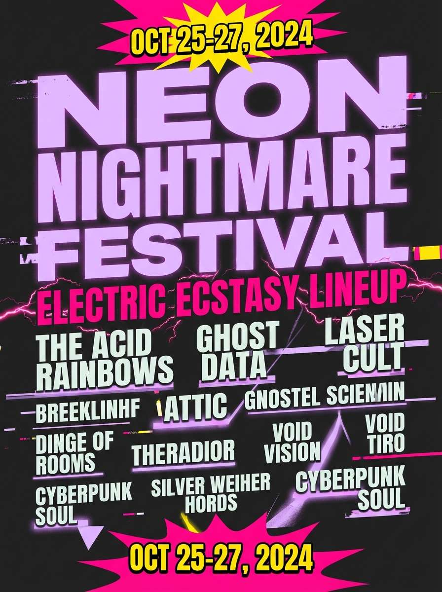
11) Festival Glow Poster
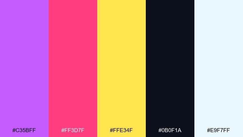
HEX: #C35BFF #FF3D7F #FFE34F #0B0F1A #E9F7FF
Mood: dramatic, loud, nightlife
Best for: night festival lineup poster
Dramatic and loud like neon signage against a midnight sky, this set is made to grab attention fast. Use black as the main canvas, then let lavender and hot pink carry titles and artist names. Yellow works best as a spotlight accent for dates, QR codes, or ticket info. Tip: add generous spacing so the high-saturation elements feel intentional, not chaotic.
Image example of festival glow poster generated using media.io
12) Cloudy Mauve Neutrals
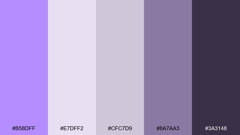
HEX: #B58DFF #E7DFF2 #CFC7D9 #8A7AA3 #3A3148
Mood: calm, muted, editorial
Best for: wellness blog editorial layout
Calm and muted like a lavender-tinted overcast day, these neutrals feel soothing and editorial. Use the pale mauve-grays for backgrounds and sections, with lavender as a gentle highlight for pull quotes. Deep charcoal-purple keeps long-form text readable and refined. Tip: add texture through subtle grain or paper overlays instead of extra colors.
Image example of cloudy mauve neutrals generated using media.io
13) Rose Quartz Twist
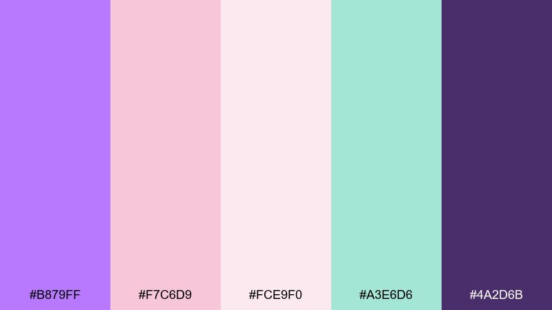
HEX: #B879FF #F7C6D9 #FCE9F0 #A3E6D6 #4A2D6B
Mood: romantic, polished, gentle
Best for: skincare product ad
Romantic and polished like rose quartz catching soft studio light, this mix feels gentle and high-end. Lavender pairs beautifully with blush for the hero product, while mint adds a clean, fresh cue for ingredients. Use the deep purple for brand type and legal text so everything stays legible. Tip: keep shadows soft and avoid harsh blacks to maintain the pampering vibe.
Image example of rose quartz twist generated using media.io
14) Midnight Lilac Luxe
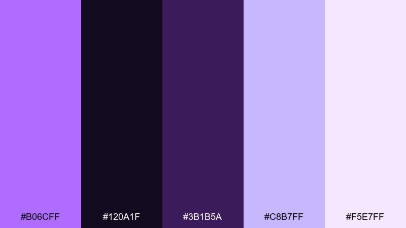
HEX: #B06CFF #120A1F #3B1B5A #C8B7FF #F5E7FF
Mood: luxury, moody, elegant
Best for: premium fragrance packaging
Luxury and moody like velvet drapes in a dim lounge, this palette makes lavender feel expensive. Use near-black for the box and let lavender appear as foil-like accents or a single label panel. Pale lilac and soft orchid-white can support inner packaging and inserts. Tip: pair with minimal typography and plenty of negative space for a high-end finish.
Image example of midnight lilac luxe generated using media.io
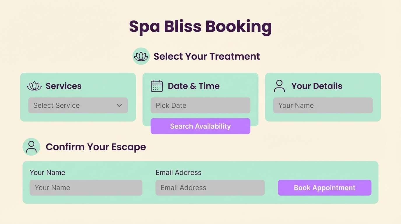
15) Zen Lavender Spa
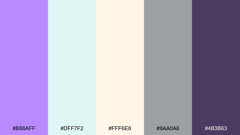
HEX: #B88AFF #DFF7F2 #FFF6E8 #9AA0A6 #4B3B63
Mood: serene, airy, restorative
Best for: spa booking website UI
Serene and airy like a quiet spa room with lavender steam, these tones calm the page immediately. Use cream as the main background, then layer mint and lavender for sections and subtle highlights. Gray supports form fields, while the deep purple works for headings and link states. Tip: keep contrast high on buttons to preserve accessibility on soft backgrounds.
Image example of zen lavender spa generated using media.io
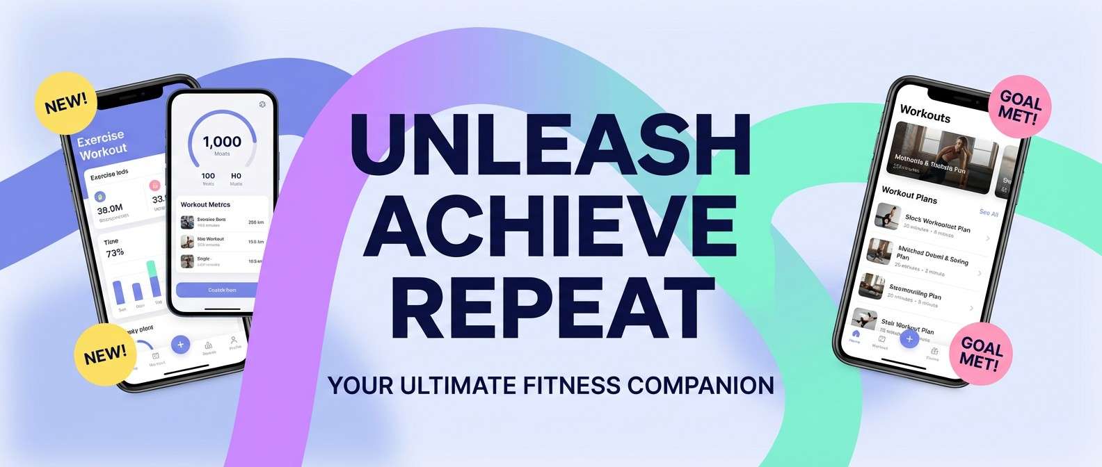
16) Periwinkle Punch
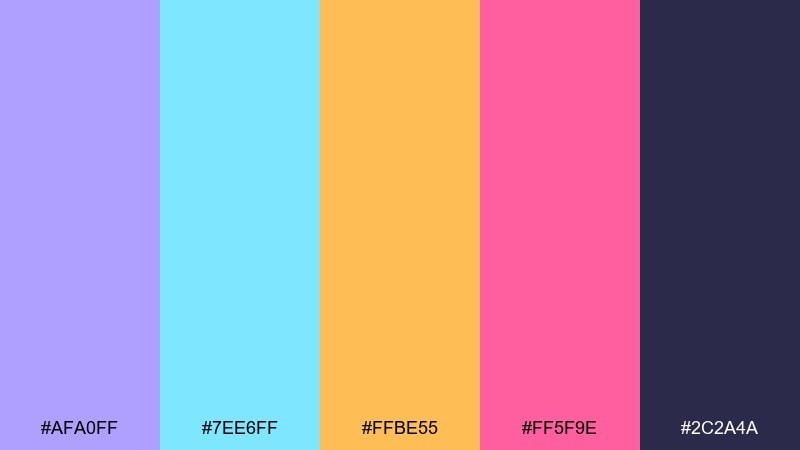
HEX: #AFA0FF #7EE6FF #FFBE55 #FF5F9E #2C2A4A
Mood: fresh, sporty, upbeat
Best for: fitness app promo banner
Fresh and upbeat like a pop playlist on a sunny run, this set balances cool and warm accents. Periwinkle-lavender can lead the background gradients, while aqua supports motion graphics and icons. Use yellow and pink as punchy attention cues for offers and feature callouts. Tip: keep the dark navy for text blocks so everything reads clearly at a glance.
Image example of periwinkle punch generated using media.io
17) Glam Powder Makeup
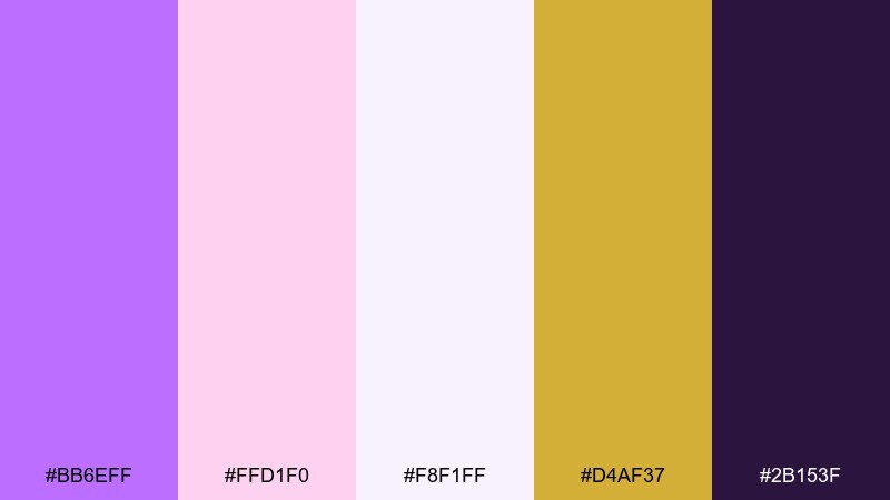
HEX: #BB6EFF #FFD1F0 #F8F1FF #D4AF37 #2B153F
Mood: glam, feminine, premium
Best for: makeup palette packaging
Glam and feminine like pressed powder with a soft shimmer, these tones feel premium and giftable. Let lavender and off-white dominate the package, then use blush for inner details and swatch labels. A touch of gold makes the design feel luxe, while deep plum anchors the logo. Tip: use gold sparingly as foil accents so it reads as intentional jewelry, not noise.
Image example of glam powder makeup generated using media.io
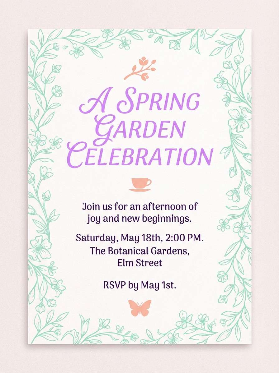
18) Garden Party Invite
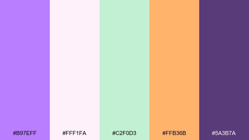
HEX: #B97EFF #FFF1FA #C2F0D3 #FFB36B #5A3B7A
Mood: festive, charming, springtime
Best for: garden party invitation card
Festive and charming like a spring gathering under flowering trees, this mix feels welcoming. Use blush-white as the base, then bring in lavender for the title and mint for delicate borders. Peach-orange works as a fun RSVP highlight or icon color, while deep purple keeps names and addresses crisp. Tip: add a subtle floral line illustration to tie the colors together without clutter.
Image example of garden party invite generated using media.io
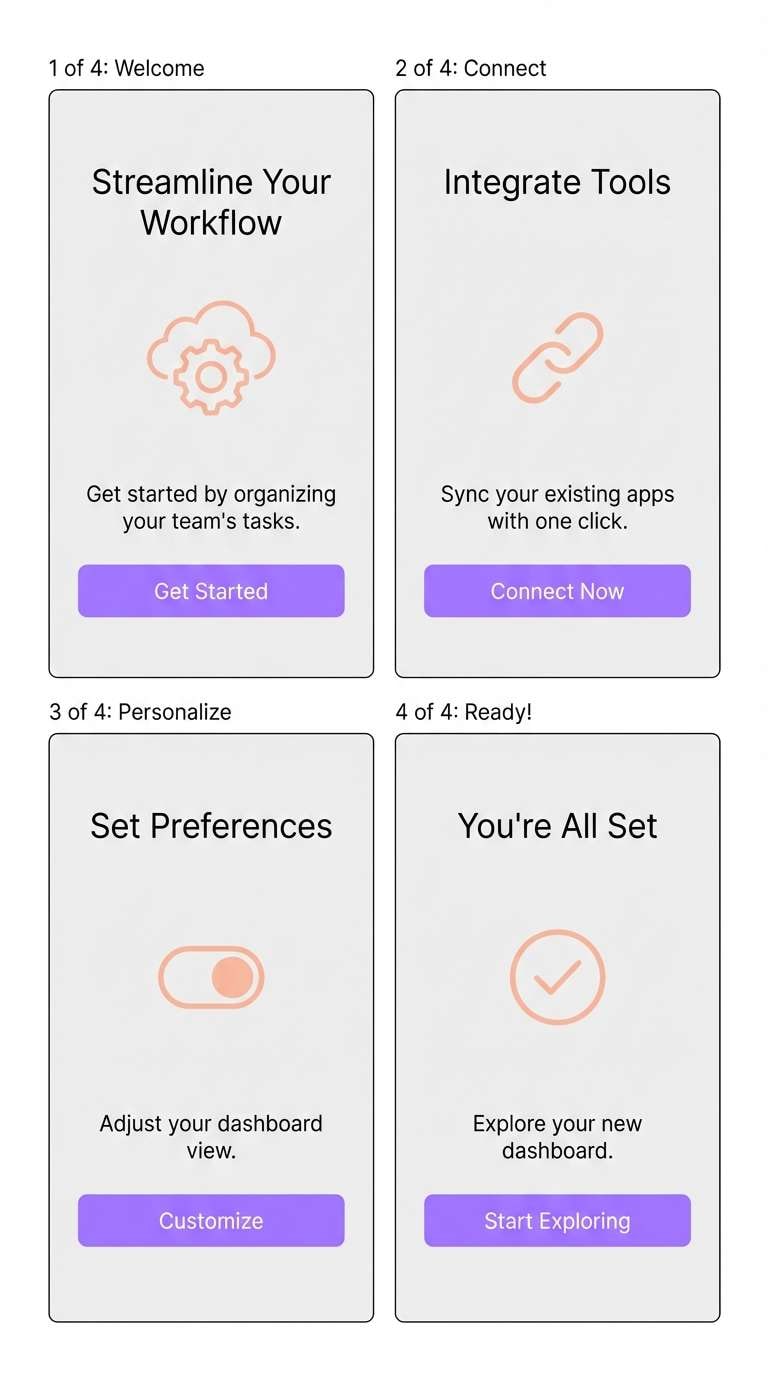
19) Soft Gradient Onboarding
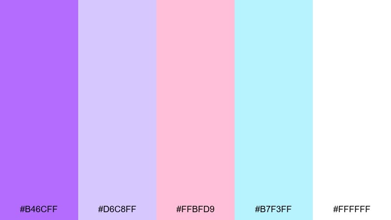
HEX: #B46CFF #D6C8FF #FFBFD9 #B7F3FF #FFFFFF
Mood: friendly, modern, light
Best for: mobile app onboarding UI
Friendly and modern like a soft gradient sky, these hues make onboarding feel effortless. Use lavender as the primary brand tone, then blend into lilac and blush for background panels. Aqua supports icons and small illustrations, while white keeps the layout clean. Tip: keep gradients large and slow so screens feel calm instead of busy.
Image example of soft gradient onboarding generated using media.io
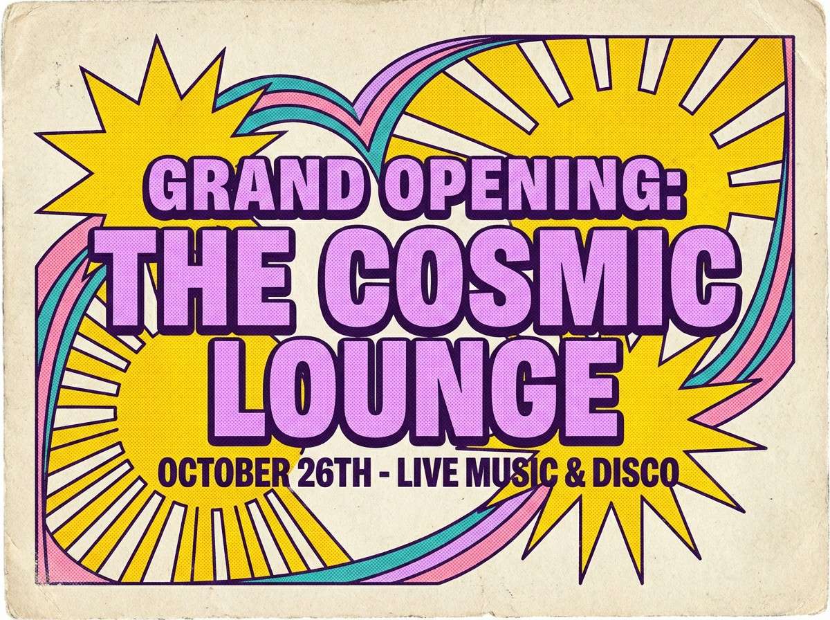
20) Retro Lavender Soda
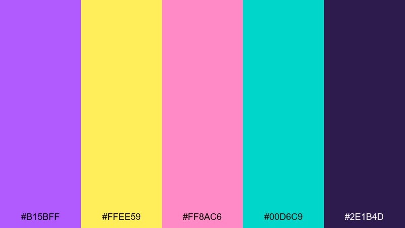
HEX: #B15BFF #FFEE59 #FF8AC6 #00D6C9 #2E1B4D
Mood: retro, pop, playful
Best for: vintage-style flyer
Retro and playful like a fizzy soda label from the 80s, this palette pops with personality. Lean on lavender and deep purple for the main type stack, then use yellow for bursts and stickers. Pink and teal give that classic pop-art contrast for shapes and borders. Tip: add halftone dots and chunky outlines to sell the vintage vibe.
Image example of retro lavender soda generated using media.io
21) Minimal Iris Brandmark
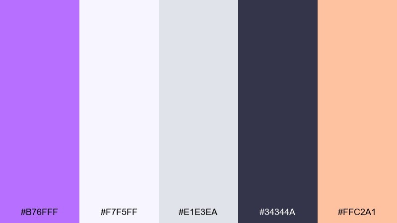
HEX: #B76FFF #F7F5FF #E1E3EA #34344A #FFC2A1
Mood: smart, calm, contemporary
Best for: startup brand identity
Smart and calm like a minimalist gallery poster, the tones feel contemporary and trustworthy. Use lavender for the brandmark and key UI accents, with cool off-whites and light grays for stationery and templates. Peach can highlight feature tags or illustrations without stealing attention. Tip: keep the dark slate only for typography to maintain a clean, premium identity system.
Image example of minimal iris brandmark generated using media.io
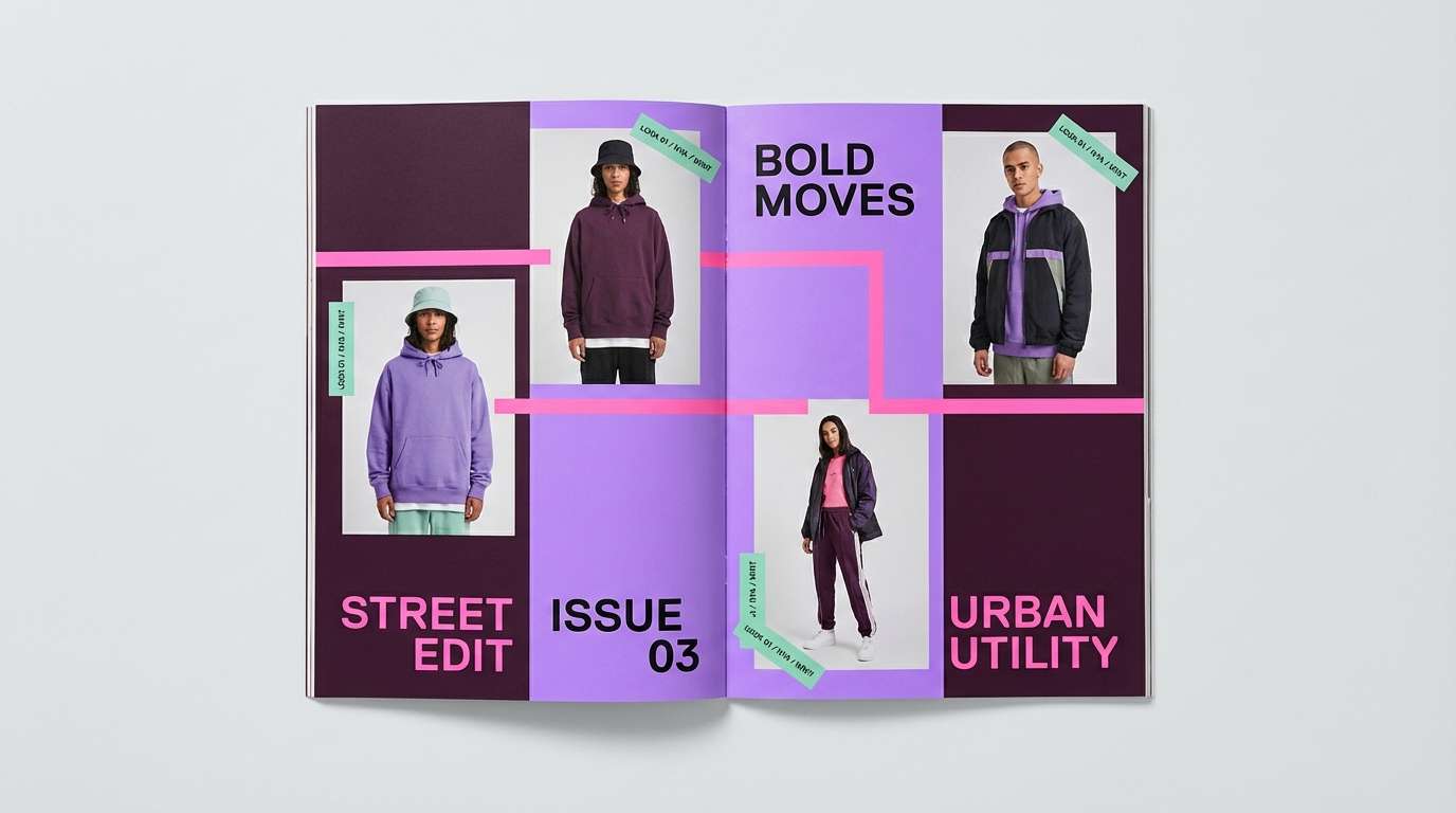
22) Plum Neon Balance
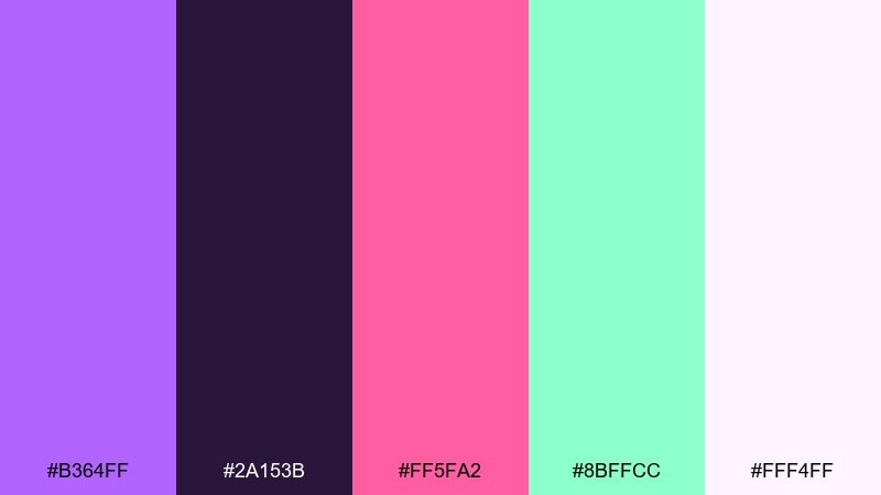
HEX: #B364FF #2A153B #FF5FA2 #8BFFCC #FFF4FF
Mood: edgy, balanced, contemporary
Best for: streetwear lookbook layout
Edgy yet balanced like neon signage over dark plum velvet, this set feels contemporary and confident. The dark base lets lavender and pink glow for headlines, while mint adds a crisp counter-accent for labels and sizing. Use the pale tint for margins and negative space to avoid heaviness. Tip: keep photos desaturated so the color blocks do the talking.
Image example of plum neon balance generated using media.io
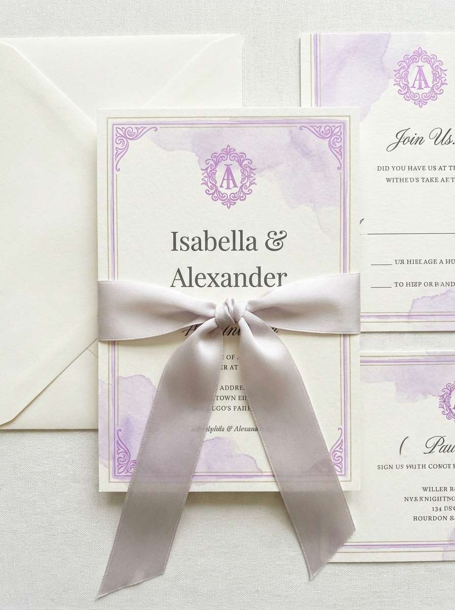
23) Lavender Pearl Wedding
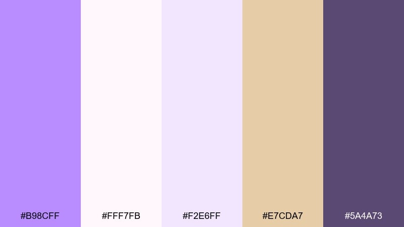
HEX: #B98CFF #FFF7FB #F2E6FF #E7CDA7 #5A4A73
Mood: romantic, classic, refined
Best for: wedding invitation suite
Romantic and refined like pearls against a lilac veil, this suite-ready palette feels timeless. A bright lavender color palette shines here when used for monograms and borders, while soft blush-whites keep the paper look airy. Warm gold-beige adds a subtle luxury cue for wax seals or foil details. Tip: print lavender slightly lighter than screen so it stays soft on textured stock.
Image example of lavender pearl wedding generated using media.io
What Colors Go Well with Bright Lavender?
Bright lavender looks instantly clean with soft neutrals like white, cream, and pale gray, which helps it work for UI and editorial layouts. These backgrounds also keep lavender from feeling too “candy” on screen.
For warmer, more romantic combinations, pair it with blush pink, peach, beige, or subtle gold tones. This direction is popular for beauty, weddings, and boutique packaging.
If you want contrast and energy, combine bright lavender with charcoal/near-black, teal/mint, or neon pink and yellow. The dark anchor improves readability while the brights bring a modern pop.
How to Use a Bright Lavender Color Palette in Real Designs
In branding, use bright lavender as the signature accent (logo mark, label panel, or key graphic), then build the system with calm neutrals for flexibility. This keeps the identity recognizable without over-saturating every touchpoint.
In UI, reserve lavender for interactive states—primary buttons, active tabs, toggles, and highlights—while using dark text for accessibility. Pair it with soft surfaces so the hierarchy is obvious at a glance.
For print and social, let lavender handle big shapes and headlines, then use one high-energy accent (gold, coral, hot pink, or teal) for CTAs and stickers. Keeping accents limited prevents visual clutter.
Create Bright Lavender Palette Visuals with AI
If you want to preview a bright lavender palette in context (poster, packaging, onboarding screens, or invitations), generating a few mockups can help you validate contrast and vibe before production.
With Media.io Text to Image, you can paste a prompt, describe your layout, and iterate quickly—then fine-tune details like typography space, background texture, or accent intensity.
Try using your five HEX colors as guidance in the prompt and specify the format (square ad, 16:9 hero, 3:4 poster) so outputs match your real deliverables.
Bright Lavender Color Palette FAQs
-
What is the HEX code for bright lavender?
“Bright lavender” can vary by palette, but common bright lavender picks in this article include #B66CFF, #B470FF, and #B46CFF. -
Is bright lavender a pastel color?
Yes—bright lavender is typically a high-chroma pastel purple. It stays soft compared to deep purple, but it still pops more than muted lilac or dusty mauve. -
What neutral colors match bright lavender best?
Cream, warm white, light gray, and soft off-white pair especially well because they keep the palette airy and help lavender feel modern and clean. -
What accent colors make bright lavender look modern?
Teal/mint, coral, neon pink, and sunny yellow add a contemporary punch. Pairing lavender with charcoal or near-black also boosts contrast for a sleek, modern look. -
How do I keep bright lavender designs readable?
Use dark text (charcoal, deep purple, or near-black) on light backgrounds, and reserve bright lavender for buttons, headings, and highlights rather than long body text. -
Does bright lavender work for luxury branding?
It can—when paired with near-black, deep plum, and subtle metallics (gold-beige). Use lavender as a controlled accent (foil-like details or a single panel) to keep it premium. -
What’s the easiest way to preview a bright lavender color palette in a real layout?
Generate quick mockups (poster, packaging, UI screens) with an AI image tool and iterate. It’s a fast way to check contrast, balance, and how lavender behaves next to neutrals and accents.
Next: Seashell Color Palette


