

Seashell is a warm, airy off-white (think: creamy blush-tinted neutral) that instantly makes layouts feel clean, calm, and inviting. It’s a go-to base color for coastal branding, soft minimal UI, and bright interiors that still feel warm.
Below are seashell color palette ideas with HEX codes, plus practical pairing tips and AI prompts you can use to generate matching visuals for web, print, and product mockups.
In this article
- Why Seashell Palettes Work So Well
-
- coastal linen
- blush sandbar
- pearly minimal ui
- dune roast
- tidepool pastels
- coral shell pop
- driftwood editorial
- sunset boardwalk
- oyster gray workspace
- sea glass nursery
- warm terra resort
- misty harbor app
- vintage nautical paper
- creamy dessert menu
- rosewater spa
- soft clay kitchen
- moonlit beach web
- apricot picnic
- modern gallery invite
- shell pink retail
- stone and pearl balance
- winter shore calm
- What Colors Go Well with Seashell?
- How to Use a Seashell Color Palette in Real Designs
- Create Seashell Palette Visuals with AI
Why Seashell Palettes Work So Well
Seashell (#fff5ee) is brighter than beige but softer than pure white, so it keeps designs light without feeling sterile. That subtle warmth flatters skin tones in lifestyle imagery and makes typography feel more approachable.
Because it sits close to neutral, seashell adapts to many directions—coastal, modern minimal, editorial, rustic, or romantic—depending on your accent colors. It also creates “breathing room” in layouts, helping key elements (headlines, CTAs, product shots) stand out.
In print and interiors, seashell is forgiving: it pairs nicely with natural materials like wood, linen, stone, and matte ceramics. That versatility is why it’s a common backbone for brand systems that need to scale across web, packaging, and physical spaces.
20+ Seashell Color Palette Ideas (with HEX Codes)
1) Coastal Linen
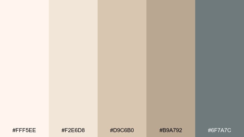
HEX: #fff5ee #f2e6d8 #d9c6b0 #b9a792 #6f7a7c
Mood: clean, breezy, grounded
Best for: living room interior styling
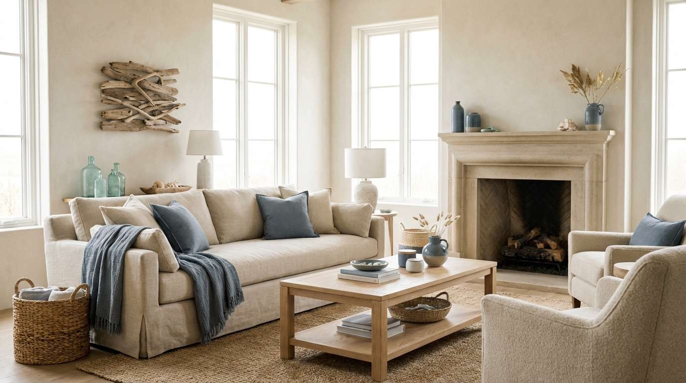
Clean, breezy neutrals with a hint of weathered stone evoke sunlit linen curtains and calm shoreline mornings. It works beautifully for living spaces, airy cafes, and calming brand backdrops. Pair the warm creams with the muted slate as a grounding accent for trim, text, or hardware. Usage tip: keep the darkest tone to small details so the space stays bright.
Image example of coastal linen generated using media.io
Media.io is an online AI studio for creating and editing video, image, and audio in your browser.

2) Blush Sandbar
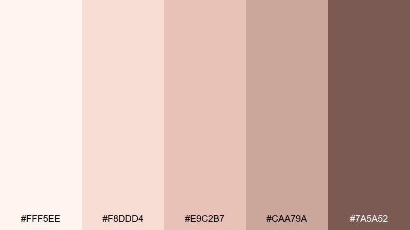
HEX: #fff5ee #f8ddd4 #e9c2b7 #caa79a #7a5a52
Mood: romantic, soft, sun-warmed
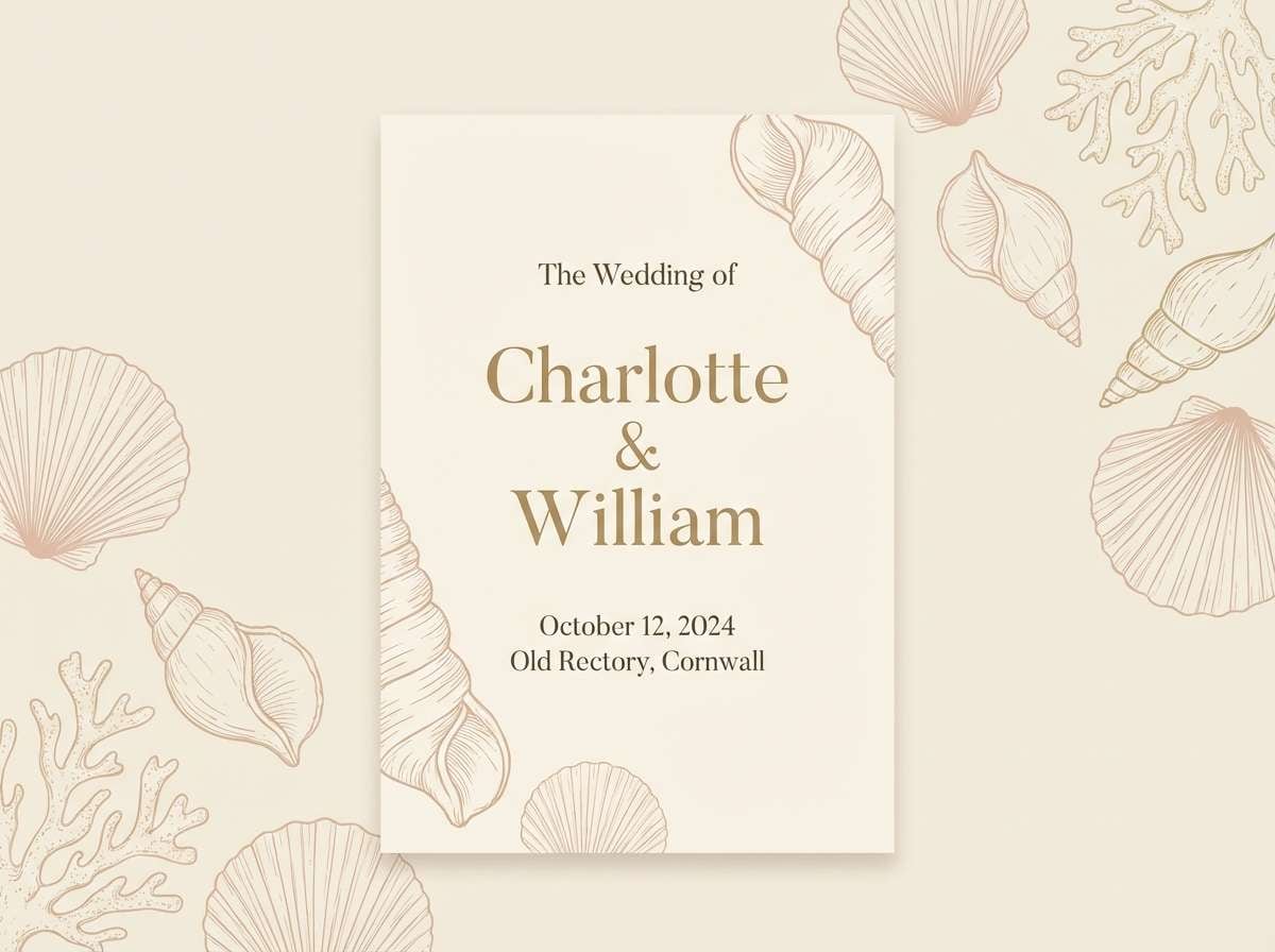
Best for: wedding invitation design
Romantic blush and creamy neutrals feel like seashells scattered on warm sand at golden hour. It shines on wedding stationery, save-the-dates, and elegant event branding. Pair the cocoa-brown with blush for typography contrast while keeping backgrounds mostly cream. Usage tip: use the mid blush as the main block color and reserve the darkest tone for names and dates.
Image example of blush sandbar generated using media.io
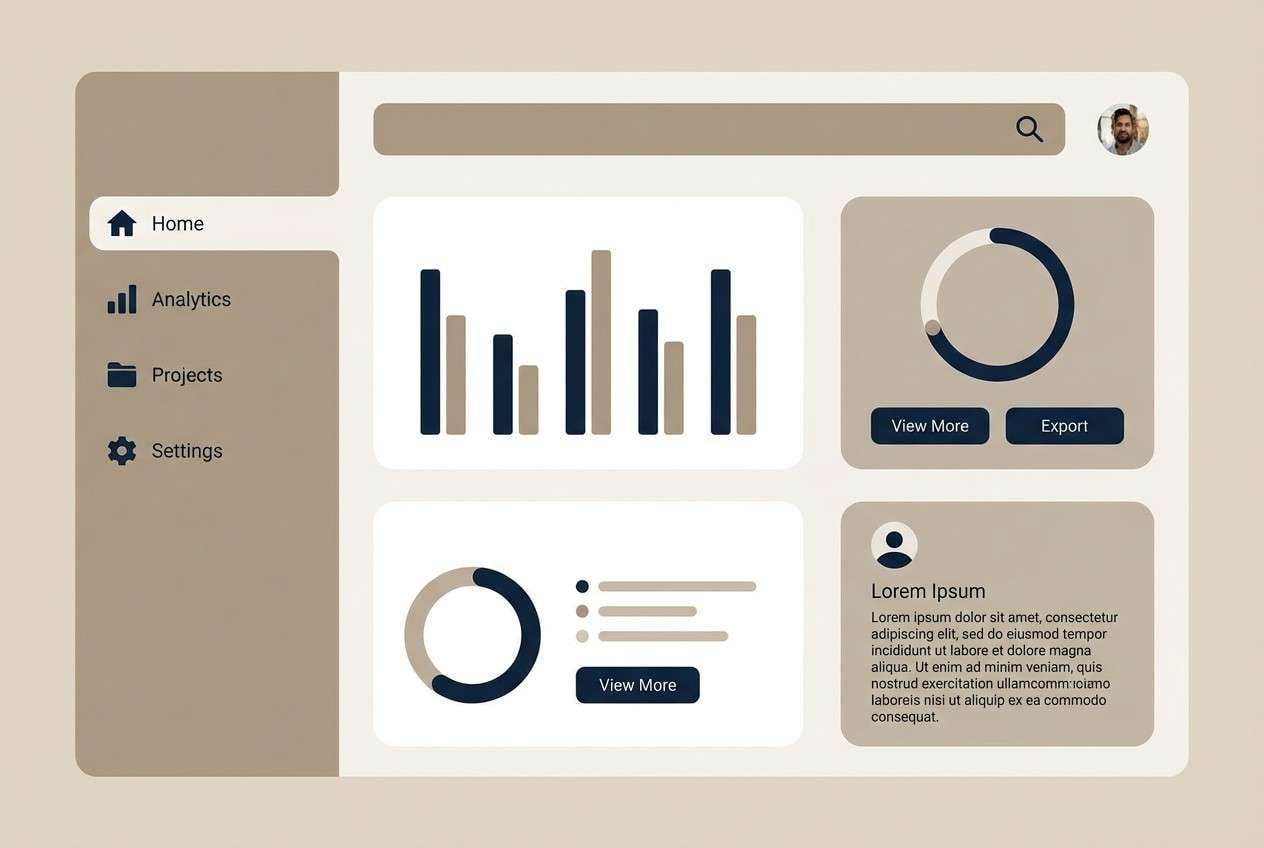
3) Pearly Minimal UI
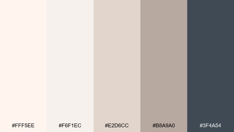
HEX: #fff5ee #f6f1ec #e2d6cc #b8a9a0 #3f4a54
Mood: minimal, polished, modern
Best for: 2D app UI mockup
Minimal pearly neutrals with a deep ink accent suggest smooth ceramics and clean morning light. These tones are ideal for wellness apps, ecommerce, and dashboards that need calm clarity. Pair the charcoal-blue with soft pearl for buttons, icons, and key states without looking harsh. Usage tip: keep contrast accessible by using the darkest color for primary text and the mid taupe for borders.
Image example of pearly minimal ui generated using media.io
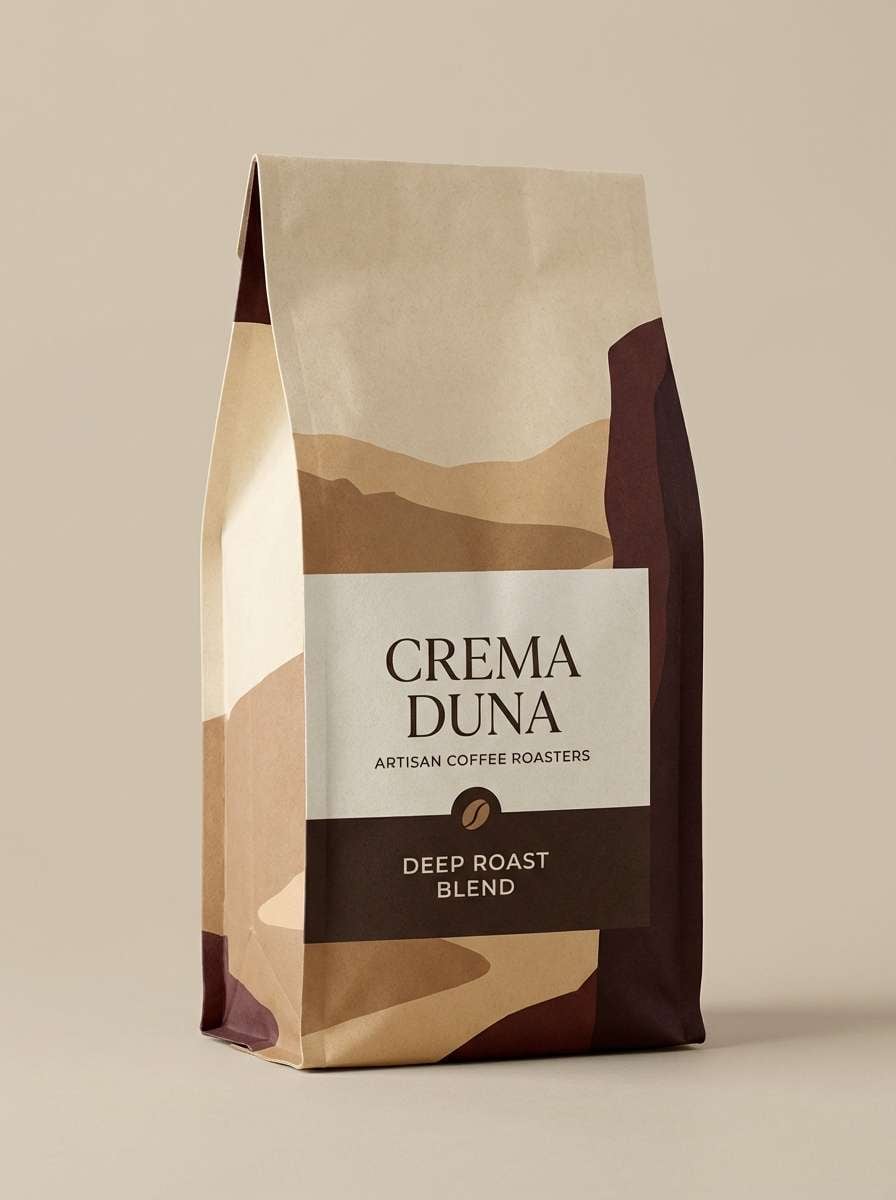
4) Dune Roast
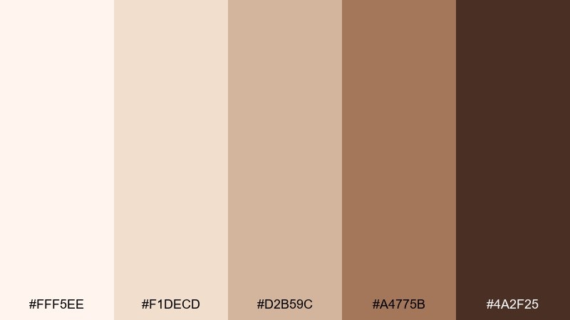
HEX: #fff5ee #f1decd #d2b59c #a4775b #4a2f25
Mood: cozy, rustic, appetizing
Best for: coffee bag packaging design
Cozy dune browns and toasted creams bring to mind beach bonfires, driftwood, and a fresh espresso crema. This seashell color palette fits coffee, bakery, and craft food packaging where warmth sells the story. Pair the darkest roast tone with cream for bold labels, then use the sandy midtones for patterns or flavor bands. Usage tip: add plenty of negative space so the package still reads premium.
Image example of dune roast generated using media.io
5) Tidepool Pastels
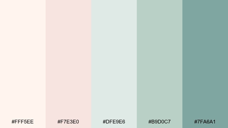
HEX: #fff5ee #f7e3e0 #dfe9e6 #b9d0c7 #7fa6a1
Mood: fresh, gentle, springlike
Best for: watercolor botanical illustration
Fresh, gentle pastels feel like seafoam pooling around pale shells and soft petals. It is a natural match for botanical prints, spring packaging, and soothing social graphics. Pair the minty green with blush as your main duo, then let cream act as breathing room. Usage tip: keep edges soft and gradients subtle to maintain the watercolor mood.
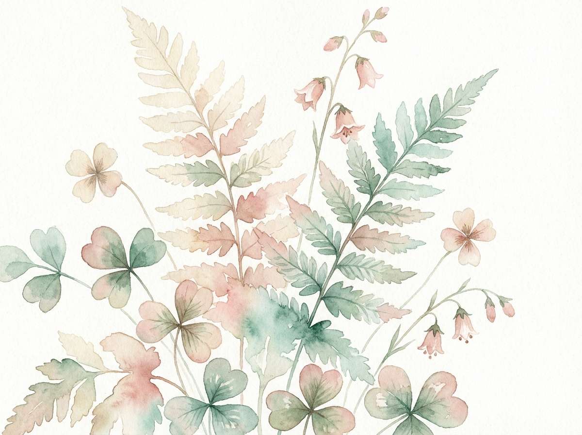
Image example of tidepool pastels generated using media.io
6) Coral Shell Pop
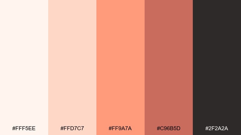
HEX: #fff5ee #ffd7c7 #ff9a7a #c96b5d #2f2a2a
Mood: playful, punchy, confident
Best for: social media promo graphic
Playful coral against creamy neutrals evokes a bright shell market and sun-warmed cheeks. It performs well on social promos, beauty launches, and lifestyle banners where you want instant energy. Pair the vivid coral with near-black for headlines, then use cream to keep the layout from feeling loud. Usage tip: limit the brightest tone to call-to-action elements so the message stays clear.
Image example of coral shell pop generated using media.io

7) Driftwood Editorial
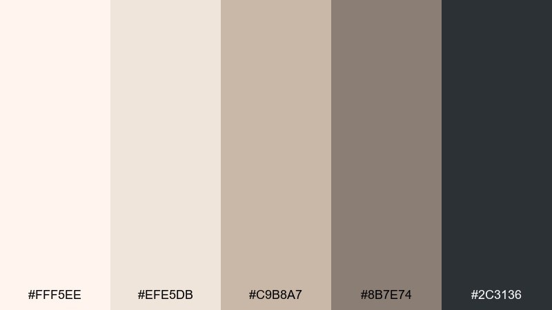
HEX: #fff5ee #efe5db #c9b8a7 #8b7e74 #2c3136
Mood: editorial, refined, moody
Best for: magazine layout design
Refined driftwood neutrals with an inky anchor tone suggest matte paper, soft shadows, and quiet luxury. These seashell color combinations are strong for editorial spreads, portfolio PDFs, and premium product stories. Pair the deep blue-black with cream for crisp type, and use the taupes for column rules and captions. Usage tip: choose one accent per spread to keep the layout feeling intentional.
Image example of driftwood editorial generated using media.io
8) Sunset Boardwalk
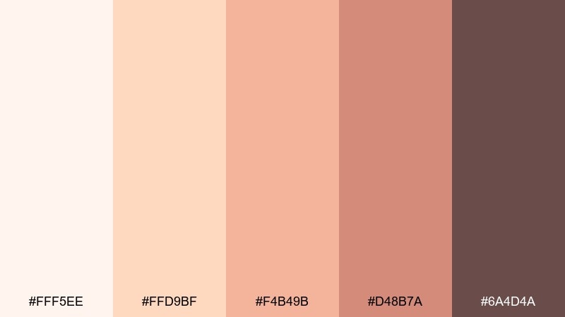
HEX: #fff5ee #ffd9bf #f4b49b #d48b7a #6a4d4a
Mood: nostalgic, warm, inviting
Best for: event poster design
Nostalgic peach and terracotta tones bring back boardwalk sunsets and salt-air warmth. It is great for event posters, local markets, and community flyers that need friendly energy. Pair the deeper cocoa tone with peach for readable titles and use the mid terracotta for shapes or section bars. Usage tip: print tests help here, since warm midtones can darken on uncoated paper.
Image example of sunset boardwalk generated using media.io

9) Oyster Gray Workspace
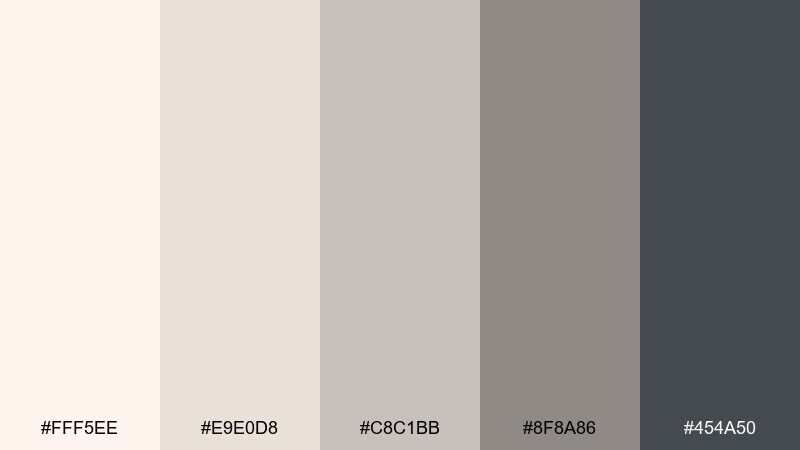
HEX: #fff5ee #e9e0d8 #c8c1bb #8f8a86 #454a50
Mood: calm, professional, balanced
Best for: office presentation template
Calm oyster grays with a soft cream base feel focused, tidy, and quietly confident. They fit pitch decks, reports, and B2B branding that needs neutrality without looking cold. Pair the darkest slate with cream for headings, and let the mid gray handle charts and dividers. Usage tip: add one subtle highlight color only when you need emphasis, otherwise keep it monochrome.
Image example of oyster gray workspace generated using media.io
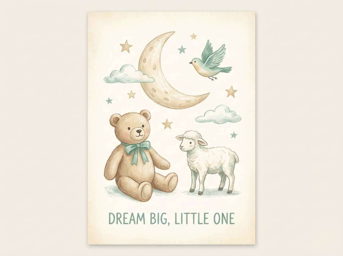
10) Sea Glass Nursery
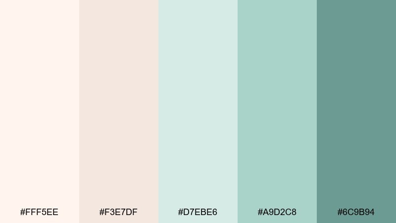
HEX: #fff5ee #f3e7df #d7ebe6 #a9d2c8 #6c9b94
Mood: sweet, soothing, airy
Best for: nursery wall art print
Sweet sea-glass greens and milky neutrals create a soothing, nap-friendly atmosphere. This mix works for nursery prints, baby shower decor, and gentle kids brands. Pair the soft teal with cream for the main shapes, then use the deeper green for outlines or small icons. Usage tip: keep contrast moderate so the artwork stays soft rather than graphic.
Image example of sea glass nursery generated using media.io
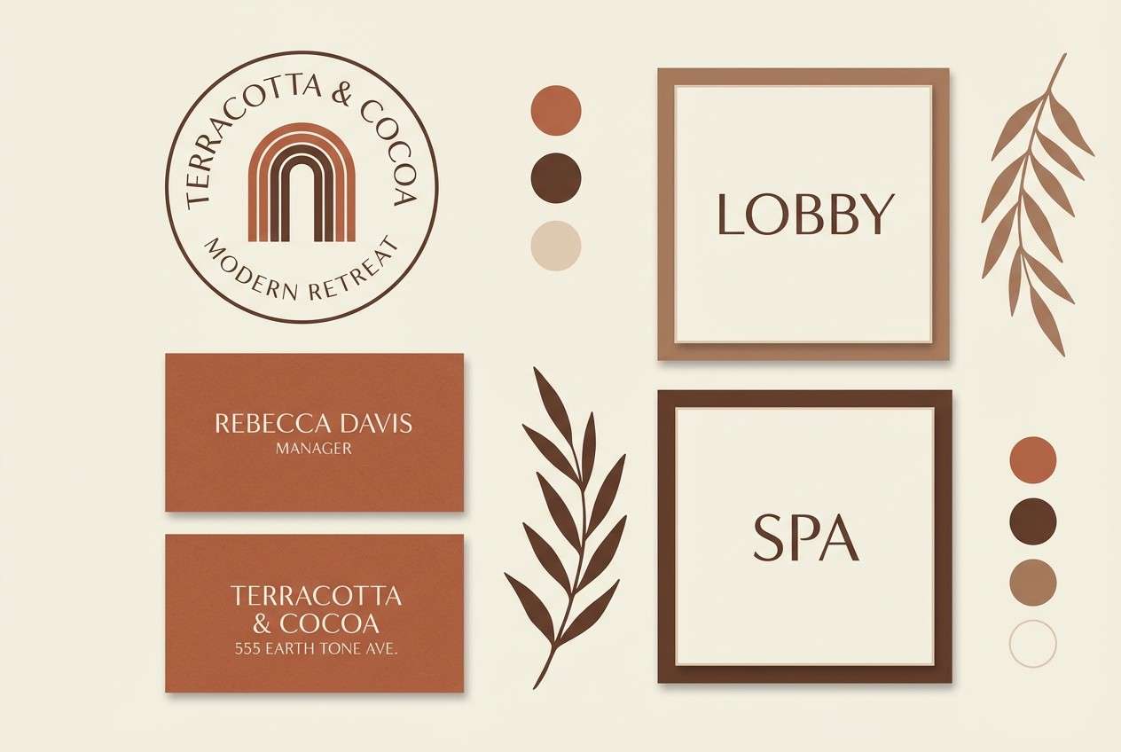
11) Warm Terra Resort
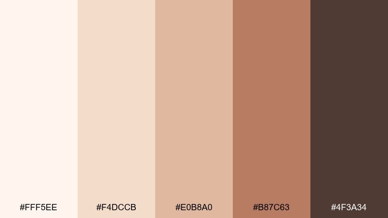
HEX: #fff5ee #f4dccb #e0b8a0 #b87c63 #4f3a34
Mood: sunbaked, upscale, welcoming
Best for: hotel branding concept
Sunbaked terracotta and creamy sand evoke boutique resorts, clay walls, and late-afternoon light. It is a strong fit for hospitality branding, menus, and signage where warmth should feel elevated. Pair the deep cocoa with the light cream for logos and wayfinding, then use the terra tones for secondary marks. Usage tip: choose matte finishes to keep the palette looking natural and premium.
Image example of warm terra resort generated using media.io
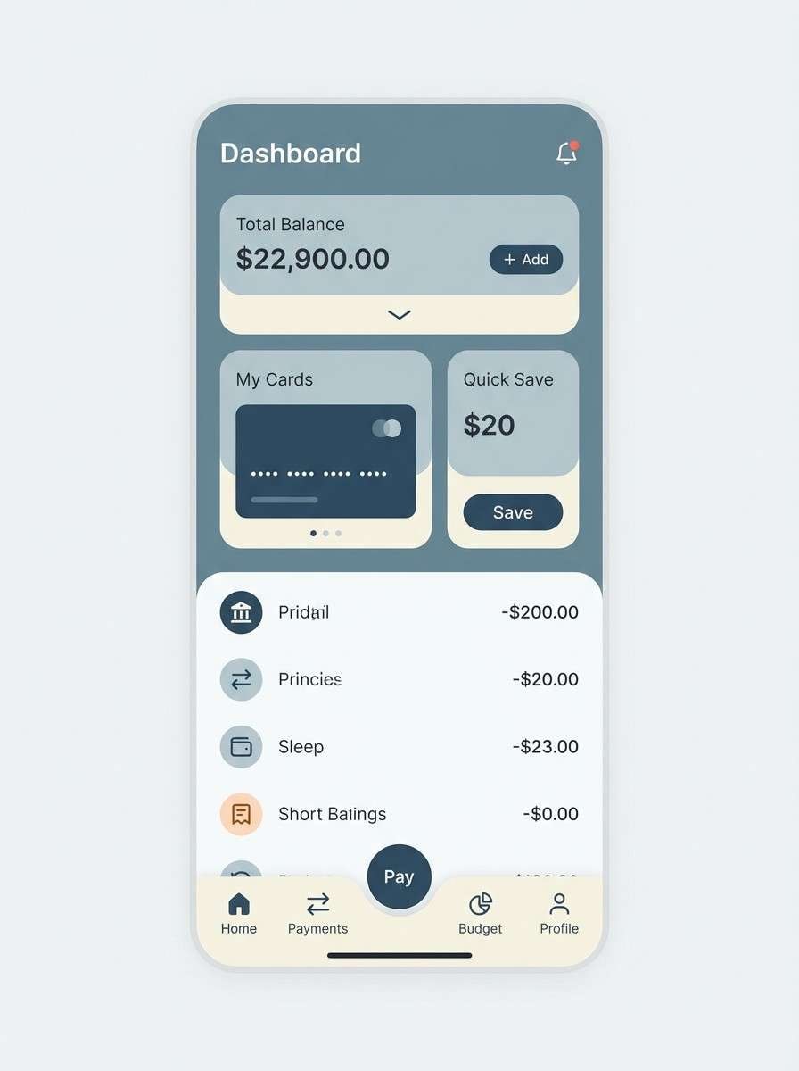
12) Misty Harbor App
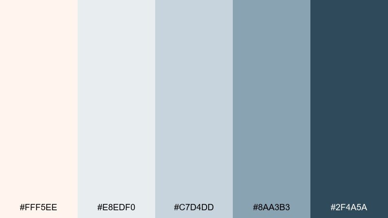
HEX: #fff5ee #e8edf0 #c7d4dd #8aa3b3 #2f4a5a
Mood: cool, clear, trustworthy
Best for: 2D fintech UI mockup
Cool misty blues layered over creamy white recall harbor fog rolling in over quiet water. These seashell color combinations suit fintech, travel planning, and productivity tools that need trust and calm. Pair the deep steel blue with the pale base for primary buttons and active states, and keep the mid blue-gray for panels. Usage tip: use one accent shade consistently for all interactive elements to reduce cognitive load.
Image example of misty harbor app generated using media.io
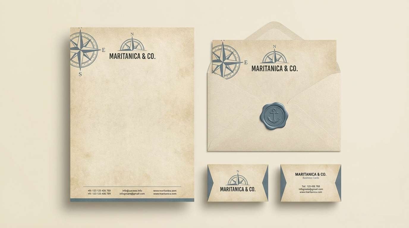
13) Vintage Nautical Paper
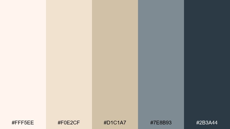
HEX: #fff5ee #f0e2cf #d1c1a7 #7e8b93 #2b3a44
Mood: heritage, crisp, coastal
Best for: brand stationery set
Heritage paper tones with nautical blue-grays feel like old charts, letterpress texture, and salt-stained maps. It is ideal for stationery, craft brands, and boutique retail identity systems. Pair the deep slate with parchment for letterheads and stamps, then use the muted blue-gray for secondary details. Usage tip: add subtle grain or embossing to amplify the vintage feel without making it busy.
Image example of vintage nautical paper generated using media.io
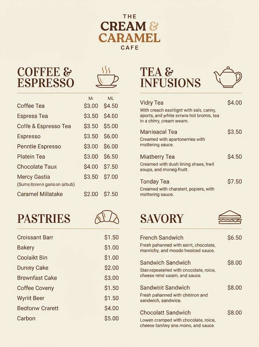
14) Creamy Dessert Menu
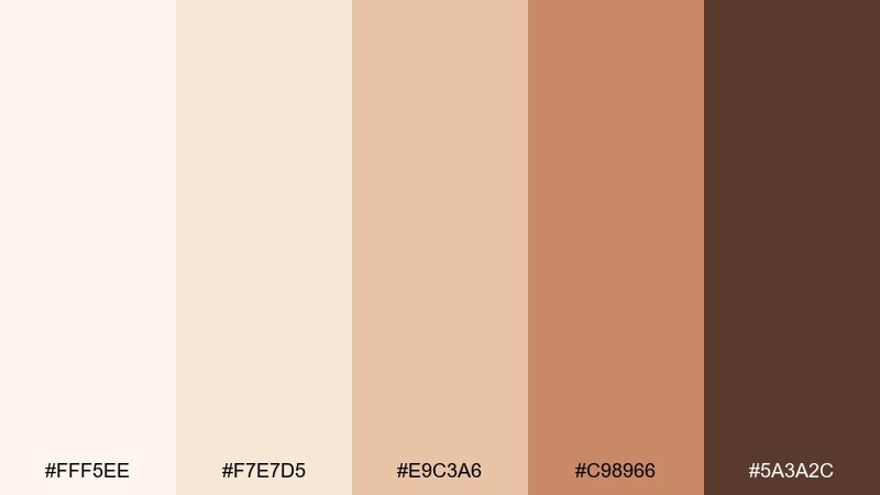
HEX: #fff5ee #f7e7d5 #e9c3a6 #c98966 #5a3a2c
Mood: delicious, warm, charming
Best for: cafe menu design
Delicious cream and caramel tones evoke whipped frosting, baked crusts, and cozy cafe counters. This set works for menus, bakery branding, and product labels that should feel handmade but polished. Pair the chocolate brown with creamy backgrounds for readability, and use caramel as a highlight for prices or section headers. Usage tip: keep type weight slightly heavier than usual to avoid low-contrast print issues.
Image example of creamy dessert menu generated using media.io
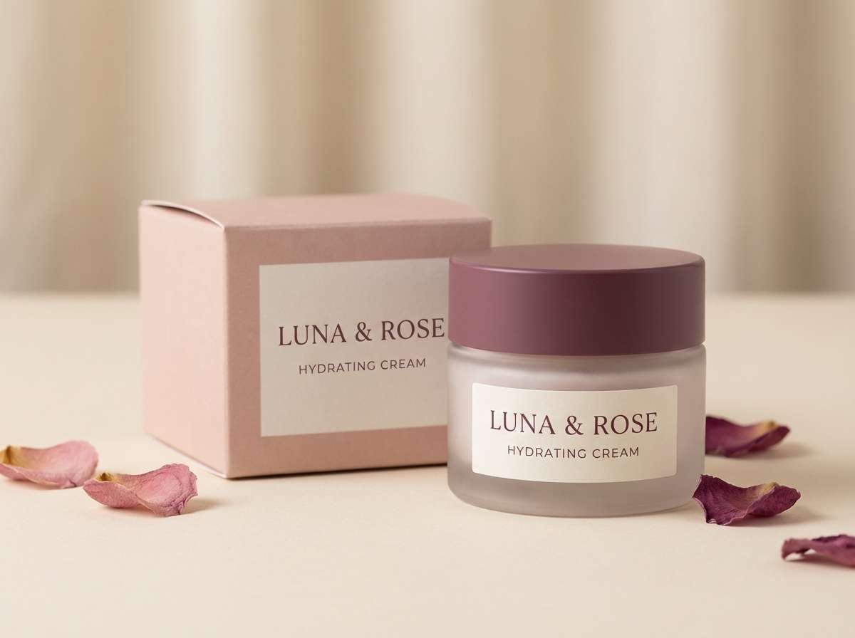
15) Rosewater Spa
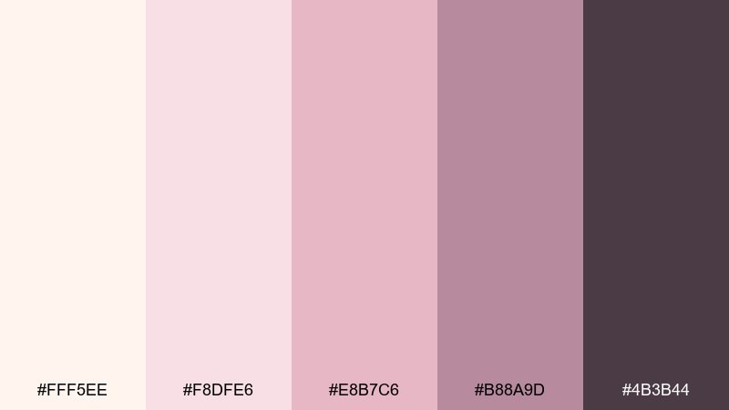
HEX: #fff5ee #f8dfe6 #e8b7c6 #b88a9d #4b3b44
Mood: serene, elegant, pampering
Best for: skincare jar product ad
Serene rosewater pinks and soft neutrals feel like steamed towels, gentle fragrance, and quiet self-care. It is perfect for spa branding, skincare packaging, and beauty ads that need softness with structure. Pair the deep mauve with pale blush for logo marks and ingredient lists, and keep the cream tone for clean margins. Usage tip: use satin lighting in visuals so the pinks look refined rather than sugary.
Image example of rosewater spa generated using media.io
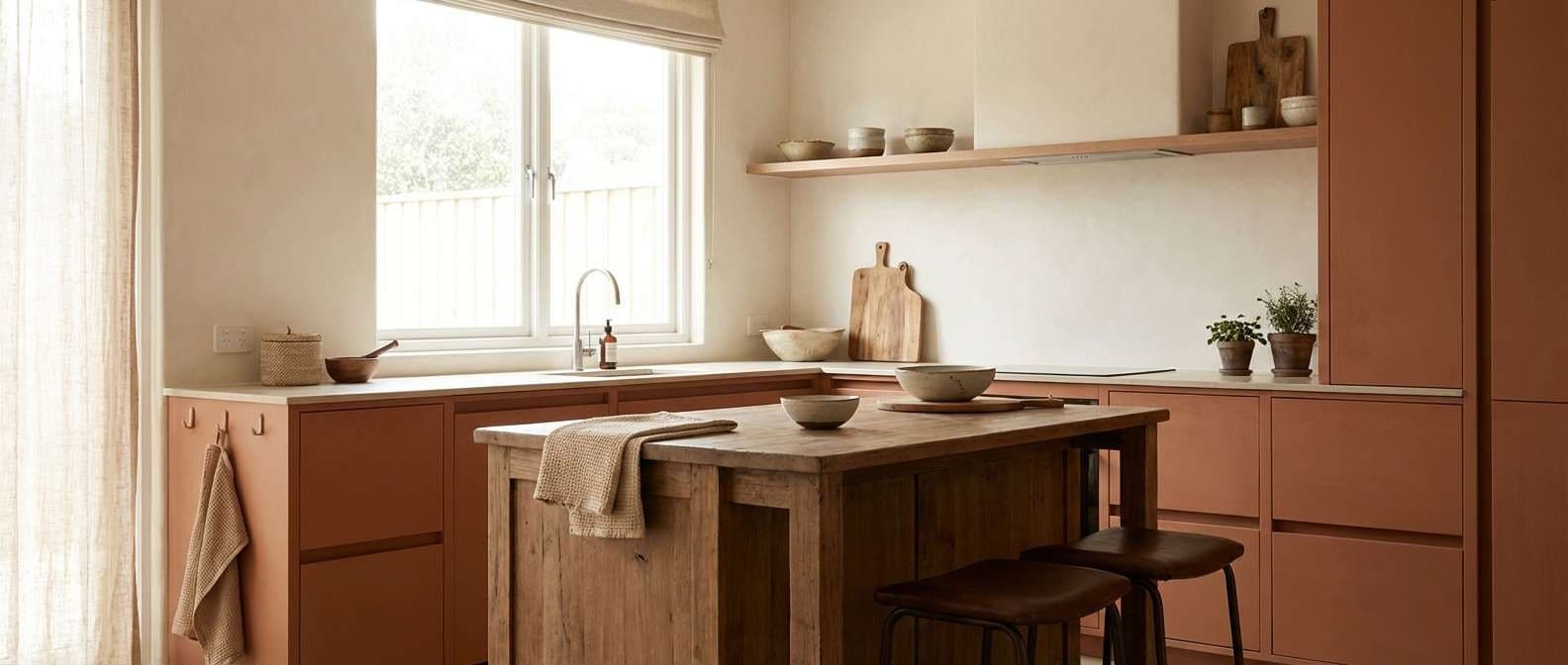
16) Soft Clay Kitchen
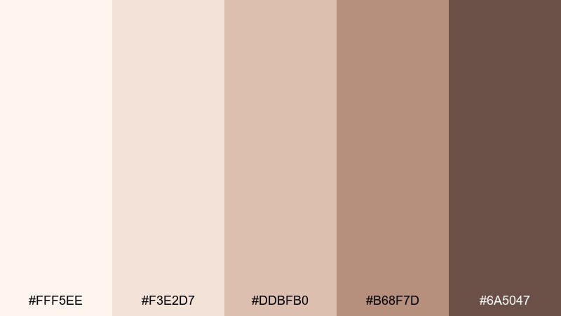
HEX: #fff5ee #f3e2d7 #ddbfb0 #b68f7d #6a5047
Mood: homey, earthy, relaxed
Best for: kitchen interior styling
Homey clay and creamy tones evoke handmade pottery, warm tile, and a slow Sunday breakfast. It suits kitchens, dining spaces, and lifestyle photography styling where you want warmth without heavy saturation. Pair the clay midtone with the light base for cabinetry and walls, then use the deeper brown for fixtures or shelving. Usage tip: repeat one earthy accent across the room to keep the look cohesive.
Image example of soft clay kitchen generated using media.io
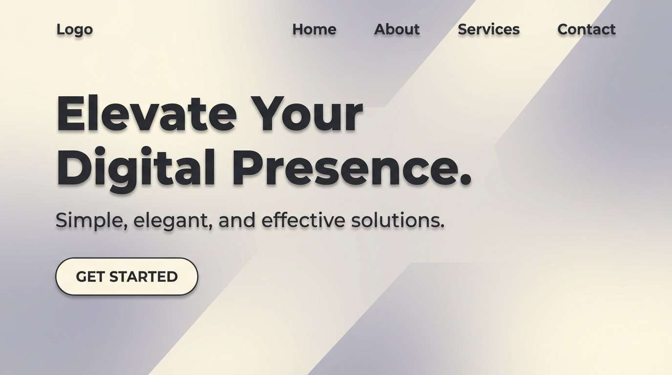
17) Moonlit Beach Web
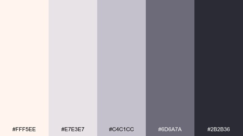
HEX: #fff5ee #e7e3e7 #c4c1cc #6d6a7a #2b2b36
Mood: quiet, cinematic, modern
Best for: website hero section design
Quiet, moonlit neutrals with a deep shadow tone feel cinematic, like pale sand under night sky. This range is great for modern websites, portfolios, and landing pages that lean minimalist. Pair the darkest shade with the pale base for strong hero headlines, and use the soft lavender-gray for subtle overlays. Usage tip: add a gentle gradient in the background to create depth without adding new colors.
Image example of moonlit beach web generated using media.io
18) Apricot Picnic
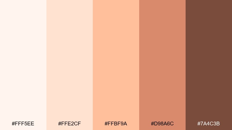
HEX: #fff5ee #ffe2cf #ffbf9a #d98a6c #7a4c3b
Mood: cheerful, summery, friendly
Best for: illustrated food poster
Cheerful apricot and peach tones feel like fruit slices, sun hats, and a breezy picnic on the dunes. It is well-suited for illustrated posters, seasonal campaigns, and playful packaging. Pair the bright peach with cream for large shapes, then use the warm brown for outlines and text. Usage tip: keep shadows soft and warm so the artwork stays sunny rather than dramatic.
Image example of apricot picnic generated using media.io

19) Modern Gallery Invite
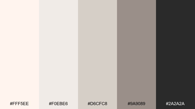
HEX: #fff5ee #f0ebe6 #d6cfc8 #9a9089 #2a2a2a
Mood: gallery-clean, understated, chic
Best for: exhibition invitation flyer
Gallery-clean neutrals with a crisp near-black feel like polished concrete and framed prints. It is ideal for exhibition invites, design talks, and minimalist event collateral. Pair the black with the light cream for typography and QR codes, and use the mid gray for subtle blocks behind details. Usage tip: keep margins generous to make the layout feel curated.
Image example of modern gallery invite generated using media.io

20) Shell Pink Retail
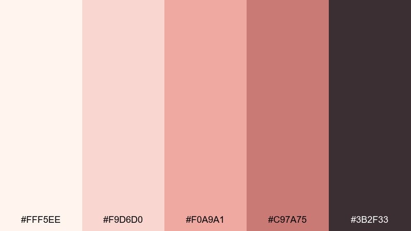
HEX: #fff5ee #f9d6d0 #f0a9a1 #c97a75 #3b2f33
Mood: trendy, warm, approachable
Best for: boutique product banner ad
Trendy shell pinks with a grounded plum-brown feel playful yet grown-up, like blush ceramics on a dark wood shelf. This pairing is strong for boutique retail, drops, and limited-edition announcements. Pair the mid pink with cream for the main banner field, and use the deep tone for price and CTA. Usage tip: add simple rounded shapes to echo the softness of the colors.
Image example of shell pink retail generated using media.io
21) Stone and Pearl Balance
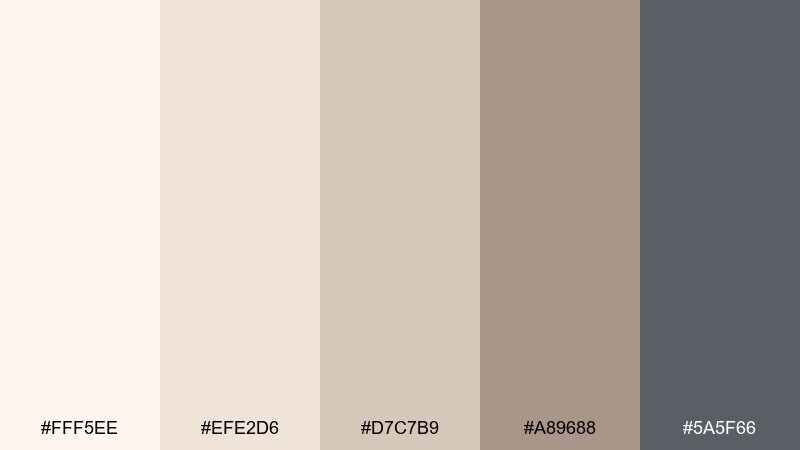
HEX: #fff5ee #efe2d6 #d7c7b9 #a89688 #5a5f66
Mood: balanced, natural, timeless
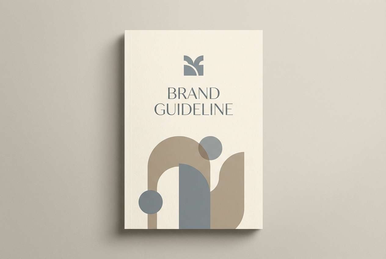
Best for: brand guideline cover
Balanced stone and pearl tones evoke smooth pebbles, matte ceramics, and quiet confidence. It is a dependable seashell color palette for identity systems, brand books, and long-form content where colors must stay calm. Pair the cool gray-blue with warm cream to keep neutrals from looking flat, and use the mid taupe for secondary headings. Usage tip: define clear tint steps so your palette scales cleanly across print and web.
Image example of stone and pearl balance generated using media.io
22) Winter Shore Calm
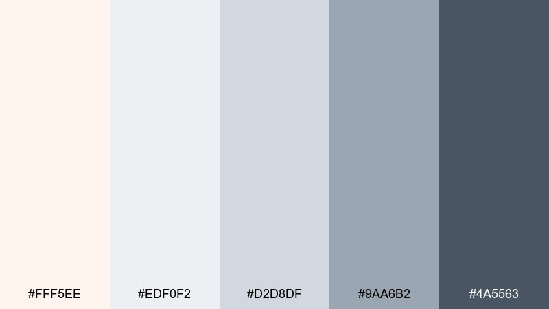
HEX: #fff5ee #edf0f2 #d2d8df #9aa6b2 #4a5563
Mood: crisp, calm, refreshing
Best for: holiday greeting card design
Crisp wintery neutrals feel like a quiet shoreline in cold air, bright but never stark. It works for holiday cards, seasonal email headers, and minimalist winter campaigns. Pair the slate blue with the pale base for typography and borders, and keep the mid blue-gray for subtle patterns. Usage tip: introduce metallic foil only as a finish, not a new color, to maintain the cool calm.
Image example of winter shore calm generated using media.io

What Colors Go Well with Seashell?
Seashell plays best with other warm neutrals like sand, oatmeal, taupe, and caramel—these keep the look cohesive while adding depth. For sharper contrast, pair it with ink/charcoal tones (blue-black, slate, espresso) for headlines, icons, and borders.
To push a coastal direction, add muted blue-grays and sea-glass greens. For romantic or beauty-forward branding, introduce blush, rose, or soft coral—seashell keeps those accents looking polished instead of overly sweet.
If you want a modern twist, bring in a cool gray-lavender or steel blue. That temperature contrast makes seashell feel brighter and more premium in UI and editorial layouts.
How to Use a Seashell Color Palette in Real Designs
Use seashell as your dominant background (60–80%) so content feels open and breathable, then assign one darker anchor color for text and UI states. This typically improves readability and keeps your system consistent across components.
In branding and packaging, choose one midtone (like blush, caramel, or misty blue-gray) for blocks, labels, or secondary surfaces. Then reserve the most saturated accent (coral/terracotta) for CTAs, promo bursts, or small details to avoid overwhelming the softness.
For print, test warm midtones on the actual paper stock—uncoated stocks can darken peach and taupe. A slightly heavier font weight and generous margins help seashell-based designs stay crisp and premium.
Create Seashell Palette Visuals with AI
If you already have HEX codes, you can generate matching images by describing the scene (interior, UI, packaging, poster) and specifying that seashell/cream tones should dominate. Adding materials (linen, matte paper, ceramic) helps the AI preserve the palette’s soft, tactile feel.
To keep outputs consistent, reuse one prompt “template” and only swap the subject (e.g., “wedding invite” vs “fintech UI”), while keeping lighting and style cues the same. This is especially useful when you need a cohesive set of visuals for a campaign or brand guide.
Create a few variations, then pick the one with the best contrast and the cleanest negative space—seashell palettes look strongest when the composition stays uncluttered.
Seashell Color Palette FAQs
-
What HEX code is Seashell?
Seashell is commonly represented as #fff5ee. It’s a warm off-white with a subtle blush/peach undertone. -
Is seashell a warm or cool color?
Seashell is a warm neutral. It reads softer than pure white and pairs naturally with warm woods, sand tones, blush, and terracotta. -
What’s the best text color on a seashell background?
For readability, use deep neutrals like charcoal, blue-black, or espresso (for example, #2a2a2a, #2c3136, or #4a2f25). They create clear contrast without the harshness of pure black. -
Does seashell work for minimalist UI design?
Yes. Seashell is excellent for minimalist UI because it provides gentle warmth while still behaving like a neutral. Pair it with a single dark “ink” accent and a mid-tone for dividers/borders to keep hierarchy clear. -
How do I keep a seashell palette from looking too pale?
Add one grounding shade (slate/charcoal/cocoa) for contrast and one midtone (taupe, blush, or misty blue-gray) for structure. Keep the darkest tone for small areas like headings, icons, and key UI states. -
What accent colors make seashell feel more “coastal”?
Muted sea-glass greens, misty blue-grays, and weathered slate accents create a coastal look. Keep saturation low so the overall mood stays airy and calm. -
Can I use seashell palettes for print (invites, menus, packaging)?
Absolutely. Seashell prints beautifully on textured or uncoated stocks, but test warm midtones (peach/taupe) since they can shift darker in print. Using slightly heavier type weights helps maintain legibility.


