

Lavender sits in a sweet spot between calming neutrals and expressive purples, which makes it easy to use across modern UI, branding, and print.
Below are 20+ lavender color palette ideas with HEX codes, plus practical tips to help you apply them to real projects.
In this article
- Why Lavender Palettes Work So Well
-
- misty lilac
- cottage bloom
- silver violet
- midnight lavender
- lavender latte
- orchid glow
- soft minimal
- retro pop lilac
- coastal lavender
- forest haze
- sunset mauve
- bridal whisper
- tech lilac grid
- art deco violet
- storybook lavender
- luxury amethyst
- scandinavian calm
- cyber lavender neon
- botanical watercolor
- editorial lavender ink
- autumn lavender spice
- pastel prism pairing
- herbal soap wrap
- What Colors Go Well with Lavender?
- How to Use a Lavender Color Palette in Real Designs
- Create Lavender Palette Visuals with AI
Why Lavender Palettes Work So Well
Lavender is versatile because it can read as a soft pastel, a cool neutral, or a saturated violet depending on what you pair it with. That makes it effective for everything from calm wellness branding to high-contrast, energetic graphics.
It also balances warmth and coolness: lilac tints can feel airy and friendly, while deeper lavender-violets bring structure and authority. This range helps you build clear hierarchy in UI and strong contrast in print.
Finally, lavender plays nicely with modern design trends—minimal layouts, gentle gradients, and muted neutrals—while still offering a distinctive “signature” color that feels fresh.
20+ Lavender Color Palette Ideas (with HEX Codes)
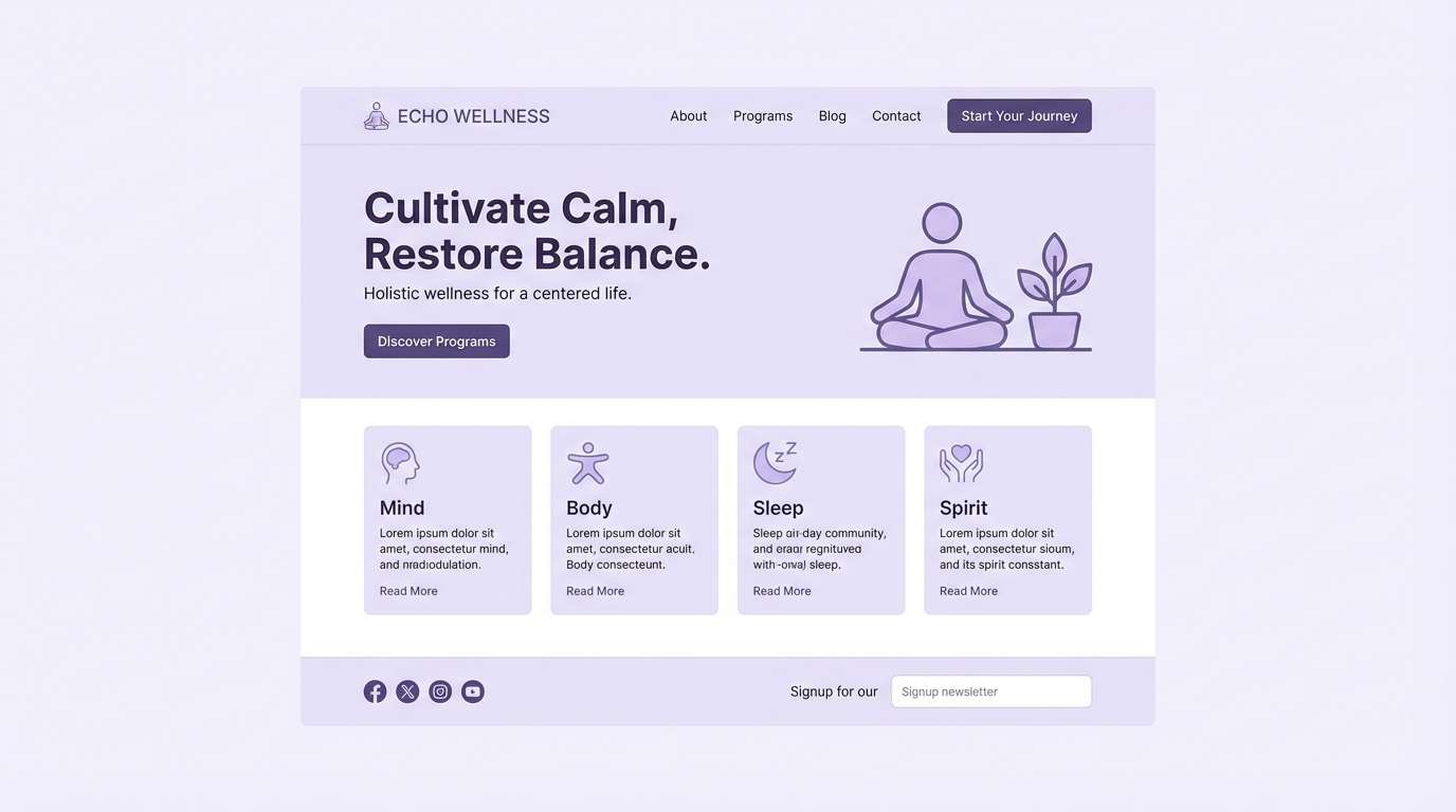
1) Misty Lilac
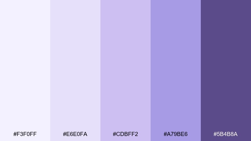
HEX: #F3F0FF #E6E0FA #CDBFF2 #A79BE6 #5B4B8A
Mood: airy, calm, dreamy
Best for: wellness landing page UI
Airy and cloudlike, these lilac tints feel like morning fog over a quiet garden. They work beautifully for wellness and skincare sites where calm is the message. Pair with soft gray typography and plenty of white space to keep it breathable. Usage tip: reserve the deepest violet for primary buttons so the interface stays gentle but still clear.
Image example of misty lilac generated using media.io
Media.io is an online AI studio for creating and editing video, image, and audio in your browser.

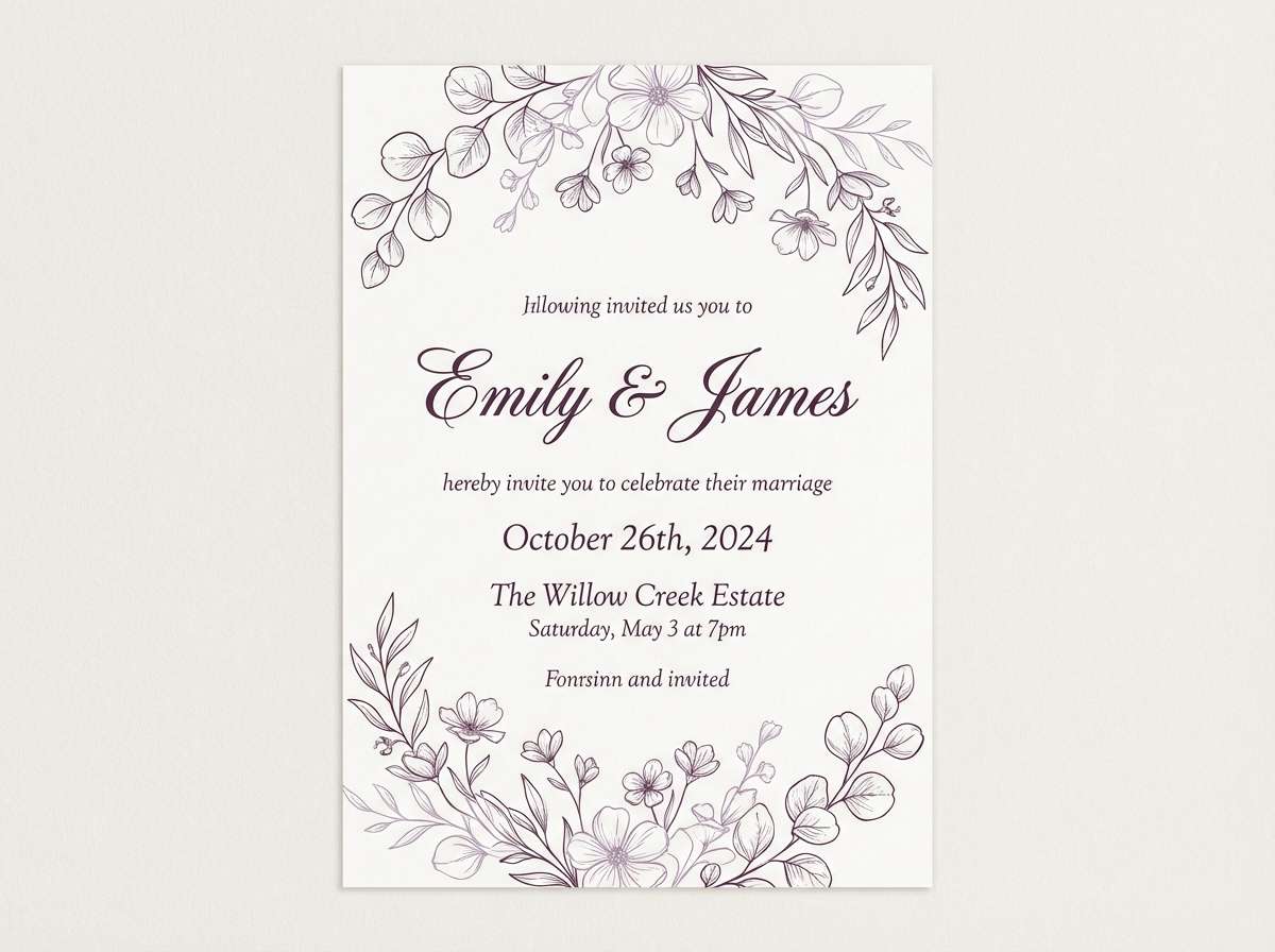
2) Cottage Bloom
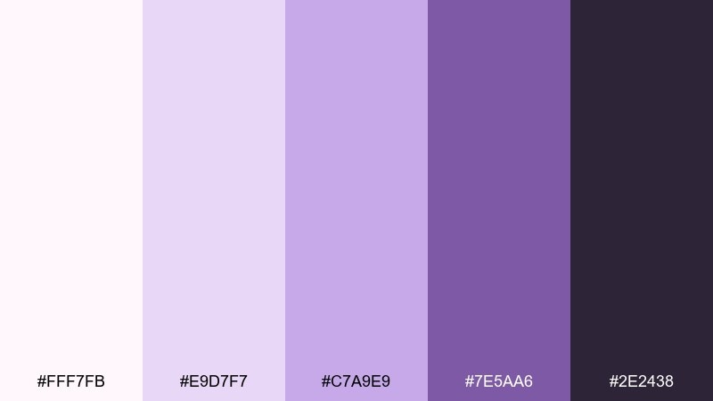
HEX: #FFF7FB #E9D7F7 #C7A9E9 #7E5AA6 #2E2438
Mood: romantic, floral, cozy
Best for: spring wedding invitation
Romantic and hand-tied like a cottage bouquet, these tones feel soft without turning sugary. They shine on wedding stationery, save-the-dates, and RSVP cards, especially with delicate serif type. Add a warm off-white paper texture and a charcoal ink for readability. Usage tip: keep the darkest tone for names and dates, and let the mid lavender carry borders and motifs.
Image example of cottage bloom generated using media.io
3) Silver Violet
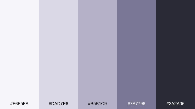
HEX: #F6F5FA #DAD7E6 #B5B1C9 #7A7796 #2A2A36
Mood: minimal, polished, modern
Best for: professional brand identity
Cool and refined like brushed metal, this mix reads modern and quietly premium. It fits consulting, productivity tools, and corporate decks that want softness without losing authority. Combine with crisp black type and subtle gradients for depth. Usage tip: use the lightest tones for backgrounds and let the mid grays anchor charts and dividers.
Image example of silver violet generated using media.io
4) Midnight Lavender
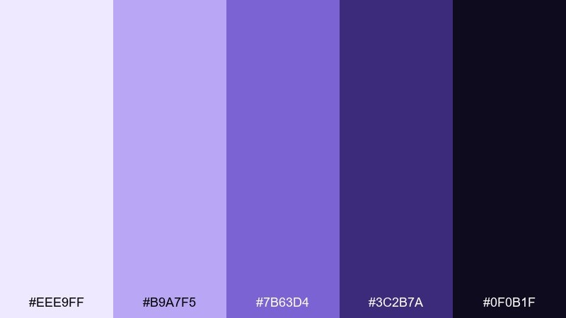
HEX: #EEE9FF #B9A7F5 #7B63D4 #3C2B7A #0F0B1F
Mood: moody, bold, cosmic
Best for: music festival poster
Moody and electric, these tones feel like neon haze over a midnight stage. They are made for posters, album art, and event graphics where contrast needs to hit fast. Pair with a bright white headline and a touch of grain for energy. Usage tip: keep the darkest color as the base so the violet highlights glow instead of flattening out.
Image example of midnight lavender generated using media.io

5) Lavender Latte
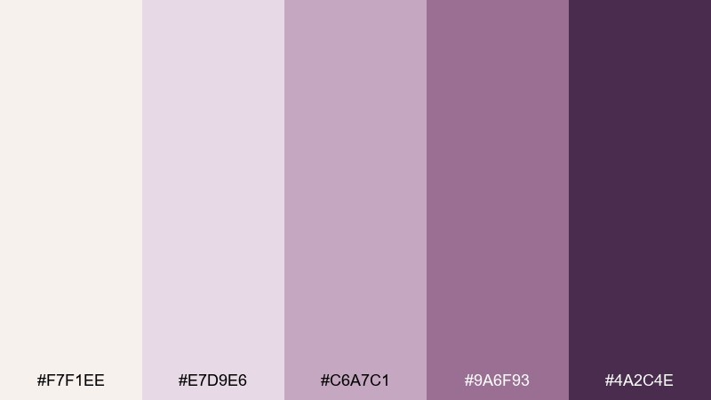
HEX: #F7F1EE #E7D9E6 #C6A7C1 #9A6F93 #4A2C4E
Mood: warm, comforting, boutique
Best for: cafe menu design
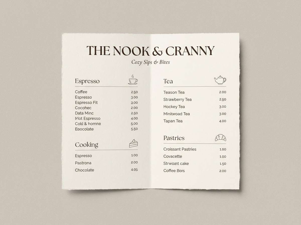
Warm and creamy like a foamy latte, this palette adds comfort to purple-leaning tones. It works well for menus, cafe branding, and artisan packaging that wants a cozy vibe. Pair with kraft textures, soft blush accents, and elegant script headlines. Usage tip: keep the light cream as your base so the mauve and plum feel inviting rather than heavy.
Image example of lavender latte generated using media.io
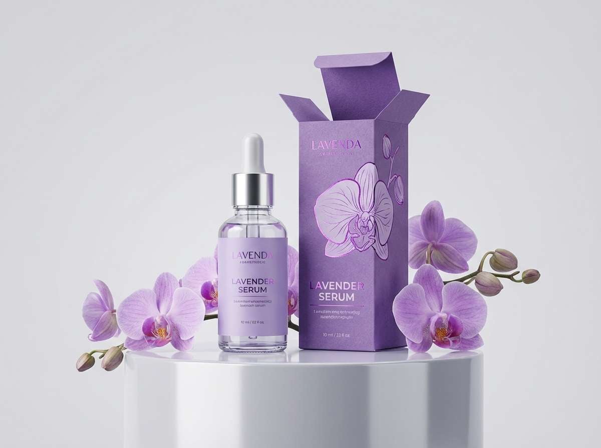
6) Orchid Glow
HEX: #FFF1FF #F2C8F5 #D58AE3 #8F3FB3 #2D0F3A
Mood: vibrant, playful, expressive
Best for: beauty product ad
Vibrant and glossy, these orchid-forward tones feel like studio lights hitting shimmering makeup. They are ideal for bold beauty ads, social promos, and limited-edition drops. Pair with clean sans-serif type and plenty of negative space to avoid visual overload. Usage tip: use the dark plum for text and the bright magenta as a sparing accent for price tags or badges.
Image example of orchid glow generated using media.io
7) Soft Minimal
HEX: #FBFAFF #EDEBFF #D6D2F5 #A9A4D9 #5E5A7C
Mood: clean, gentle, organized
Best for: saas dashboard UI
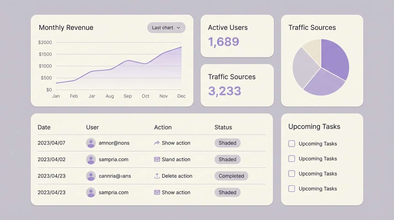
Clean and whisper-soft, these shades feel like a tidy desk and a quiet to-do list. They suit dashboards and analytics screens where hierarchy matters more than decoration. Add slate typography and subtle shadows to separate cards without harsh borders. Usage tip: keep charts to two accent colors and let the pale tints handle the rest of the UI.
Image example of soft minimal generated using media.io
8) Retro Pop Lilac
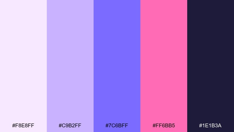
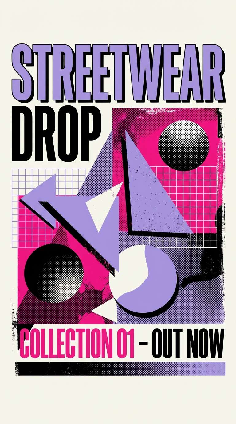
HEX: #F8E8FF #C9B2FF #7C6BFF #FF6BB5 #1E1B3A
Mood: fun, retro, energetic
Best for: streetwear drop poster
Punchy and nostalgic, this mix channels retro stickers and arcade glow. It is great for streetwear, playful merch, and social tiles that need instant pop. Balance the hot pink with deep indigo so the composition stays readable. Usage tip: make the bright violet your hero block color and keep text on the darkest background for sharp contrast.
Image example of retro pop lilac generated using media.io
9) Coastal Lavender
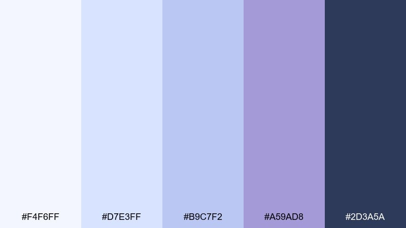
HEX: #F4F6FF #D7E3FF #B9C7F2 #A59AD8 #2D3A5A
Mood: fresh, breezy, serene
Best for: travel blog header
Breezy and bright, these tones feel like salt air and a pastel sky at dusk. They fit travel and lifestyle layouts that want softness with a crisp, coastal edge. Pair with airy photography, thin dividers, and navy text for clarity. Usage tip: use the blue-lavender midtones for tags and navigation states to guide scanning.
Image example of coastal lavender generated using media.io
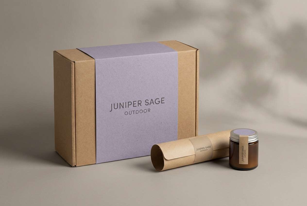
10) Forest Haze
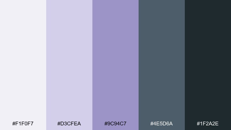
HEX: #F1F0F7 #D3CFEA #9C94C7 #4E5D6A #1F2A2E
Mood: earthy, muted, contemplative
Best for: outdoor brand packaging
Muted and slightly smoky, these hues feel like twilight settling over evergreens. They work for outdoor goods and lifestyle packaging where you want calm strength rather than loud color. Pair with recycled paper textures and simple line icons to keep it grounded. Usage tip: use the deep green-gray for labels and let the soft violet act as a subtle brand signature.
Image example of forest haze generated using media.io
11) Sunset Mauve
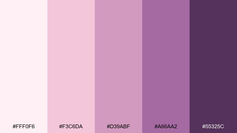
HEX: #FFF0F6 #F3C6DA #D39ABF #A66AA2 #55325C
Mood: soft, romantic, glowing
Best for: boutique hotel branding
Soft and glowing, these colors resemble a mauve sunset fading into velvet night. They suit boutique hospitality, spa experiences, and elegant loyalty cards. Pair with warm neutrals, brass details, and editorial photography for a refined look. Usage tip: keep backgrounds pale and use the deepest berry tone for logos and key headings.
Image example of sunset mauve generated using media.io
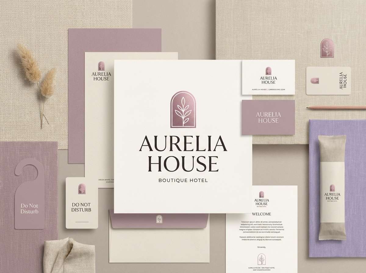
12) Bridal Whisper
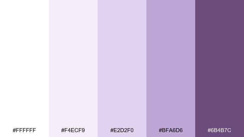
HEX: #FFFFFF #F4ECF9 #E2D2F0 #BFA6D6 #6B4B7C
Mood: delicate, elegant, timeless
Best for: bridal shower invitation
Delicate and powdery, these shades evoke lace, tulle, and fresh petals. They are perfect for bridal showers and refined invitations where softness is the priority. Pair with gold foil accents and a warm gray for body copy. Usage tip: keep the darkest violet only for dates and RSVP details so the page feels airy.
Image example of bridal whisper generated using media.io
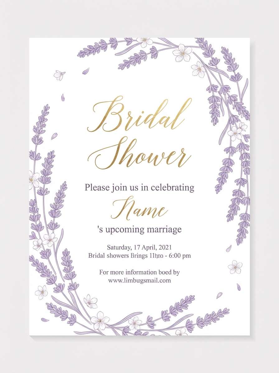
13) Tech Lilac Grid
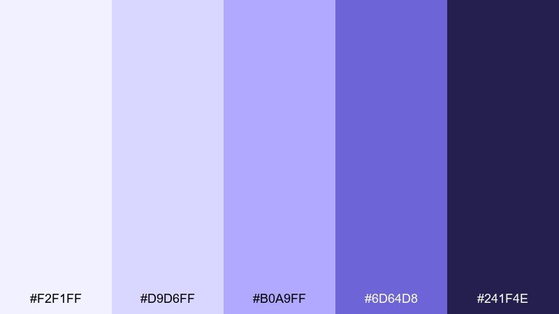
HEX: #F2F1FF #D9D6FF #B0A9FF #6D64D8 #241F4E
Mood: sleek, futuristic, structured
Best for: app onboarding UI screens
Sleek and structured, these tones feel like soft neon running through a tidy grid. They work well for onboarding flows, fintech apps, and product tours where clarity matters. Pair with high-contrast typography and simple iconography to keep screens scannable. Usage tip: use the mid lilac for progress indicators and the deep indigo for active states and links.
Image example of tech lilac grid generated using media.io
14) Art Deco Violet

HEX: #F7F2FF #D9C5F0 #B08BD5 #6A3D8F #1B1026
Mood: glamorous, dramatic, classic
Best for: cocktail bar menu
Glamorous and shadowy, these violets bring Art Deco drama without feeling dated. They fit cocktail menus, lounge posters, and premium packaging with geometric patterns. Pair with black, fine linework, and metallic gold accents for a luxe finish. Usage tip: use the lightest tint sparingly as highlight space so the dark base stays rich.
Image example of art deco violet generated using media.io
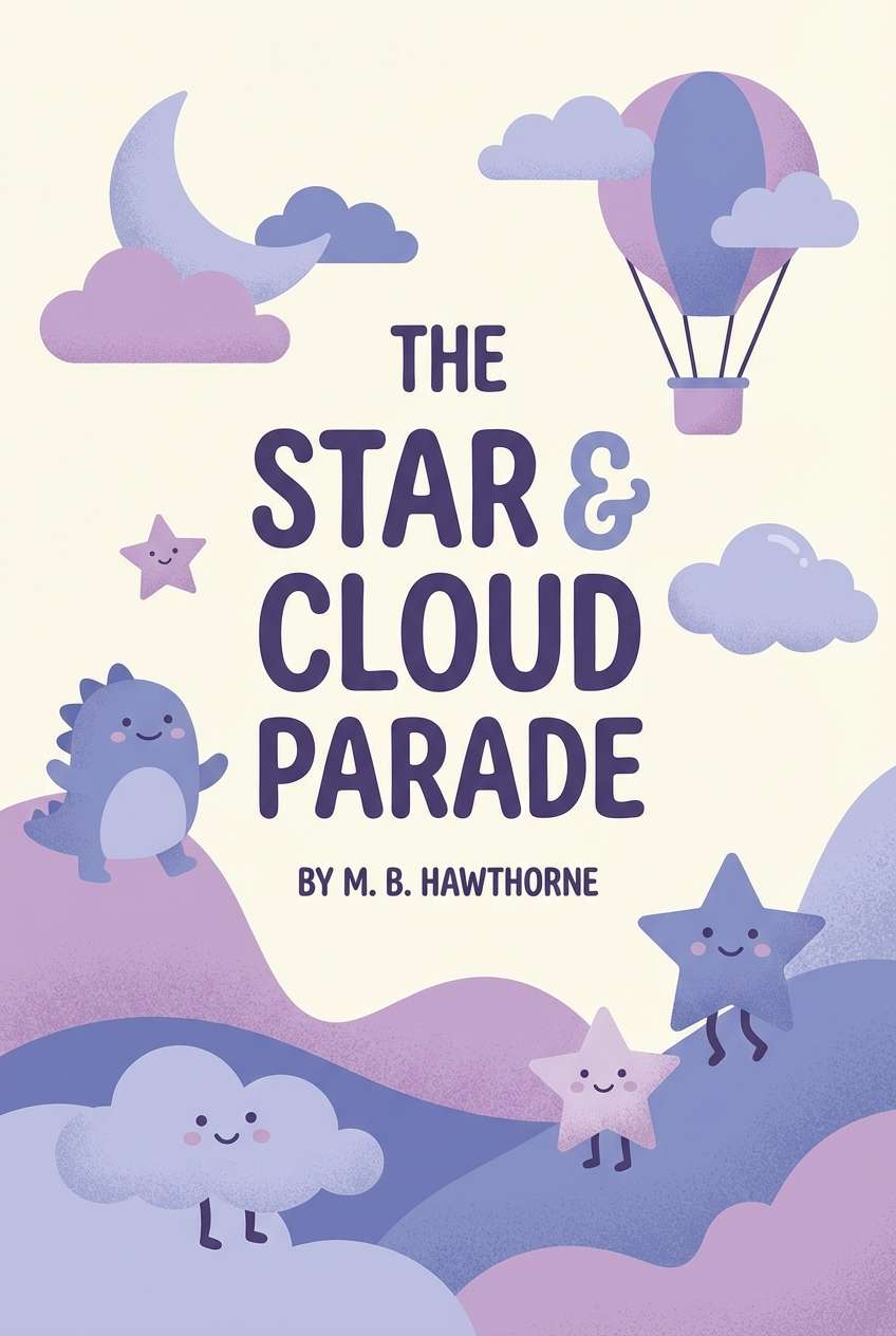
15) Storybook Lavender
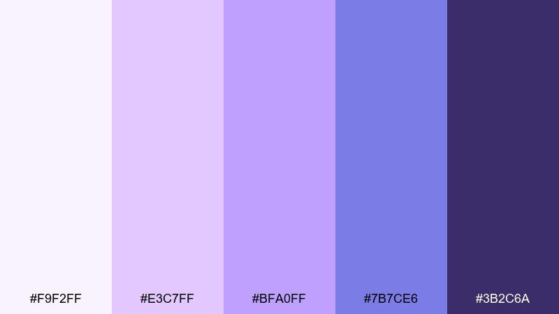
HEX: #F9F2FF #E3C7FF #BFA0FF #7B7CE6 #3B2C6A
Mood: whimsical, sweet, imaginative
Best for: kids book cover illustration
Whimsical and gentle, these hues feel like a storybook sky filled with friendly magic. They are great for kids covers, learning apps, and playful classroom materials. Pair with rounded type, simple stars, and soft gradients to keep it approachable. Usage tip: keep outlines in the darker purple so illustrations stay crisp at small sizes.
Image example of storybook lavender generated using media.io
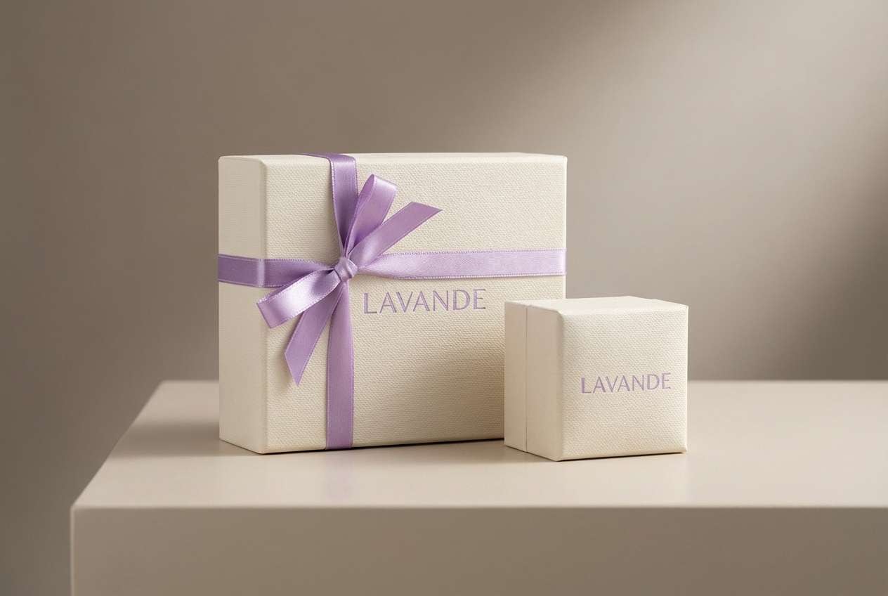
16) Luxury Amethyst
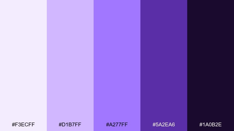
HEX: #F3ECFF #D1B7FF #A277FF #5A2EA6 #1A0B2E
Mood: luxury, confident, jewel-toned
Best for: jewelry brand packaging
Deep and jewel-like, these amethyst tones feel expensive and confident. They suit jewelry boxes, fragrance labels, and premium gift sets where contrast is part of the charm. Pair with matte black, embossed details, and minimal copy for maximum impact. Usage tip: keep the brightest violet for small highlights like seals, ribbons, or icon marks.
Image example of luxury amethyst generated using media.io
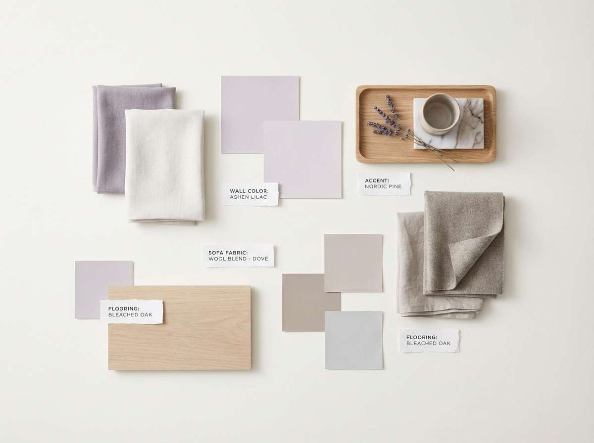
17) Scandinavian Calm
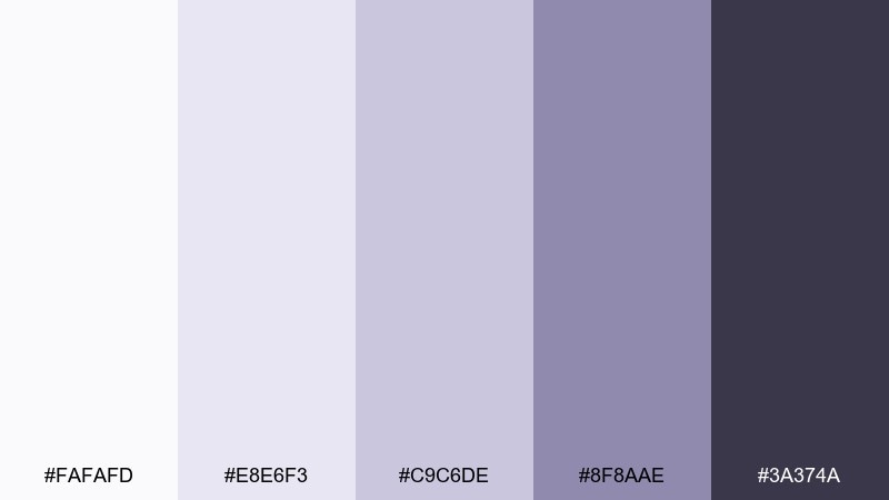
HEX: #FAFAFD #E8E6F3 #C9C6DE #8F8AAE #3A374A
Mood: calm, neutral, understated
Best for: interior design mood board
Understated and calm, these neutrals hint at lavender without leaning overly purple. They work well for interior mood boards, minimalist blogs, and calm lifestyle branding. Pair with warm woods, linen textures, and soft daylight photography. Usage tip: treat the mid gray-lilac as your anchor and keep accents subtle for a cohesive, airy look.
Image example of scandinavian calm generated using media.io
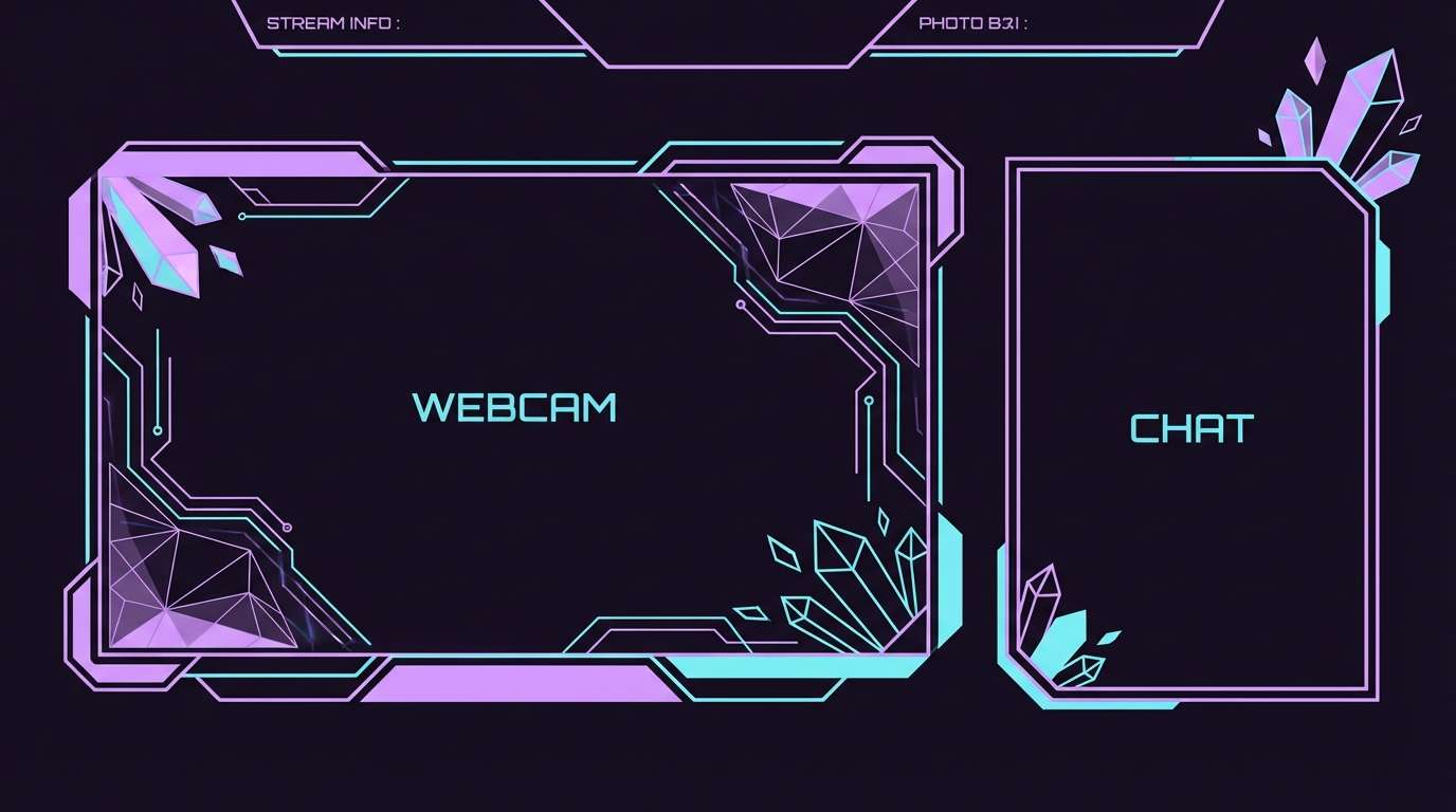
18) Cyber Lavender Neon
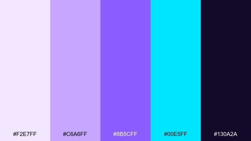
HEX: #F2E7FF #C6A6FF #8B5CFF #00E5FF #130A2A
Mood: neon, edgy, futuristic
Best for: gaming stream overlay
Edgy and futuristic, these high-contrast tones feel like neon signage in a rainy city. They are a strong fit for gaming overlays, esports branding, and bold thumbnails. Pair with tight typography, angular shapes, and a dark base to keep the cyan accent sharp. Usage tip: use the cyan only for alerts and live states so it stays special and readable.
Image example of cyber lavender neon generated using media.io
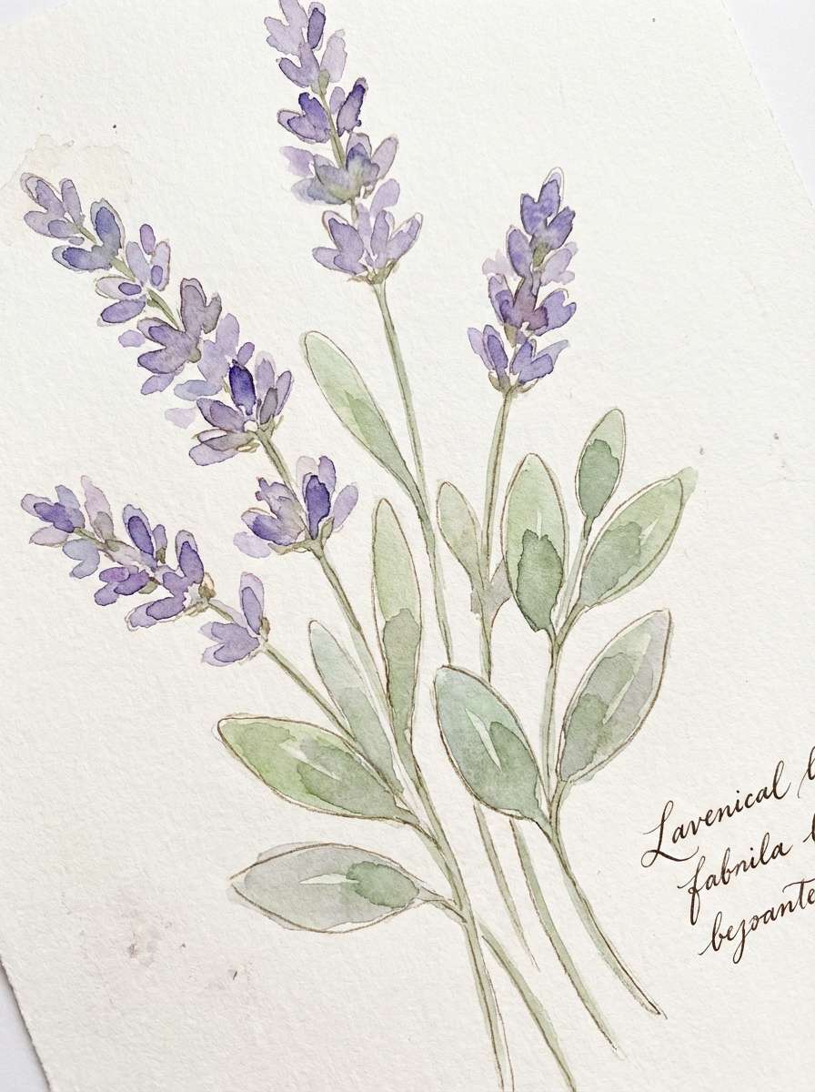
19) Botanical Watercolor
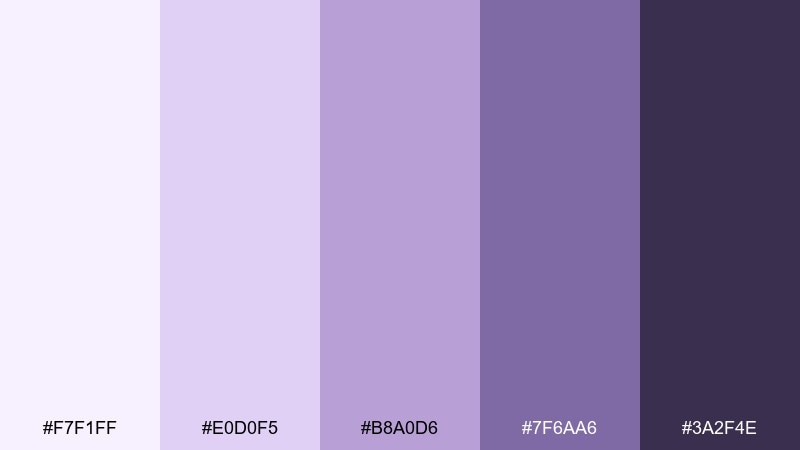
HEX: #F7F1FF #E0D0F5 #B8A0D6 #7F6AA6 #3A2F4E
Mood: natural, soft, handcrafted
Best for: spring botanical illustration
Natural and handcrafted, these tones look like watercolor washes on cold-pressed paper. They are ideal for botanical prints, greeting cards, and seasonal social posts. Pair with sage green accents and a warm ivory background to keep it organic. Usage tip: let the light tints do most of the work and add the darkest tone only for stems, shadows, and small lettering.
Image example of botanical watercolor generated using media.io
20) Editorial Lavender Ink
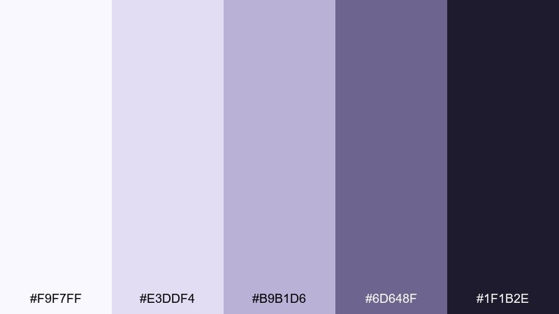
HEX: #F9F7FF #E3DDF4 #B9B1D6 #6D648F #1F1B2E
Mood: editorial, thoughtful, refined
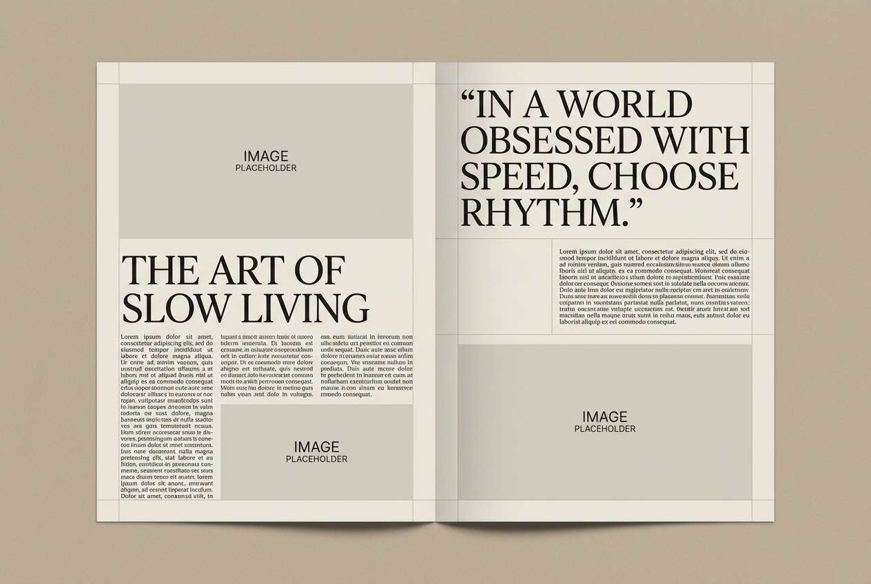
Best for: magazine layout design
Refined and slightly inky, these shades feel like printed pages with a soft violet cast. They work for long-form editorials, lookbooks, and portfolio case studies where readability comes first. Pair with generous margins, monochrome photography, and a single accent rule. Usage tip: keep body text near-black and use the mid lavender for pull quotes and section headers.
Image example of editorial lavender ink generated using media.io
21) Autumn Lavender Spice
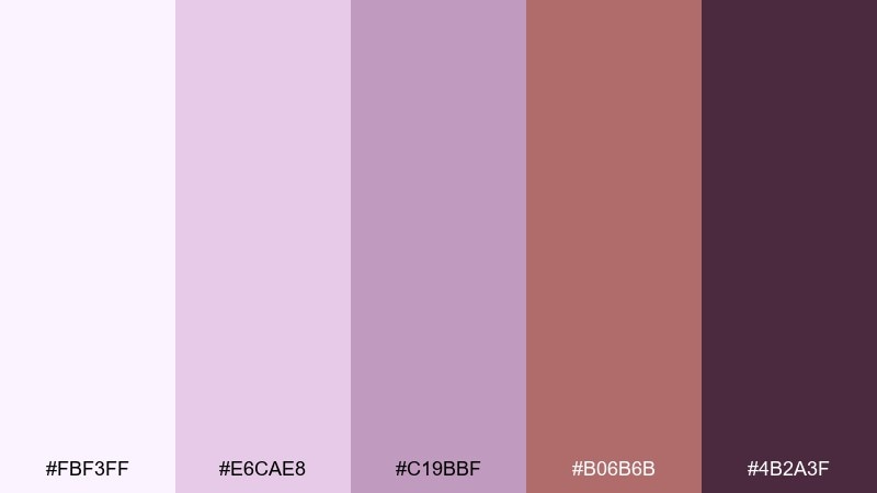
HEX: #FBF3FF #E6CAE8 #C19BBF #B06B6B #4B2A3F
Mood: cozy, seasonal, sophisticated
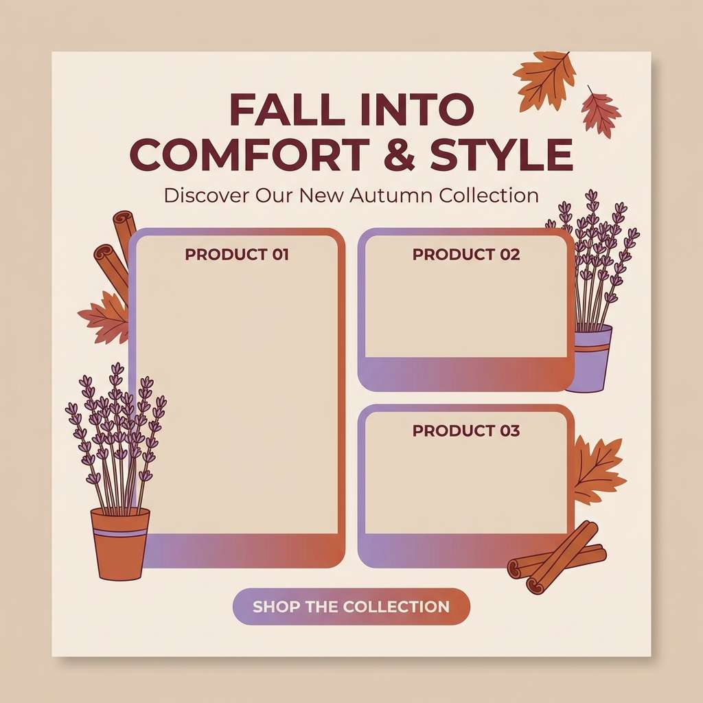
Best for: fall campaign social ads
Cozy and seasonal, these tones mix soft purple with a hint of spiced rose. They are great for fall campaigns, home goods promos, and lifestyle ads that want warmth without going full orange. Pair with creamy neutrals and natural fabric textures for a grounded feel. Usage tip: treat the muted red-brown as a secondary accent for CTAs and price points, not a full background.
Image example of autumn lavender spice generated using media.io
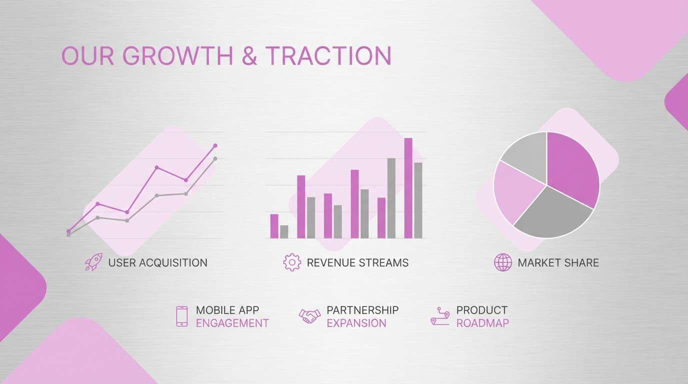
22) Pastel Prism Pairing
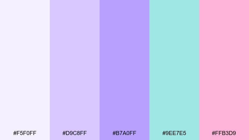
HEX: #F5F0FF #D9C8FF #B7A0FF #9EE7E5 #FFB3D9
Mood: cheerful, youthful, bright
Best for: startup pitch deck
Cheerful and youthful, this mix feels like a pastel prism catching light. It is a friendly option for startups, creator brands, and upbeat presentations that need personality. If you are exploring lavender color combinations, this one stays playful while still looking polished. Usage tip: keep slides mostly pale lavender, then use teal and pink for callouts, icons, and key metrics.
Image example of pastel prism pairing generated using media.io
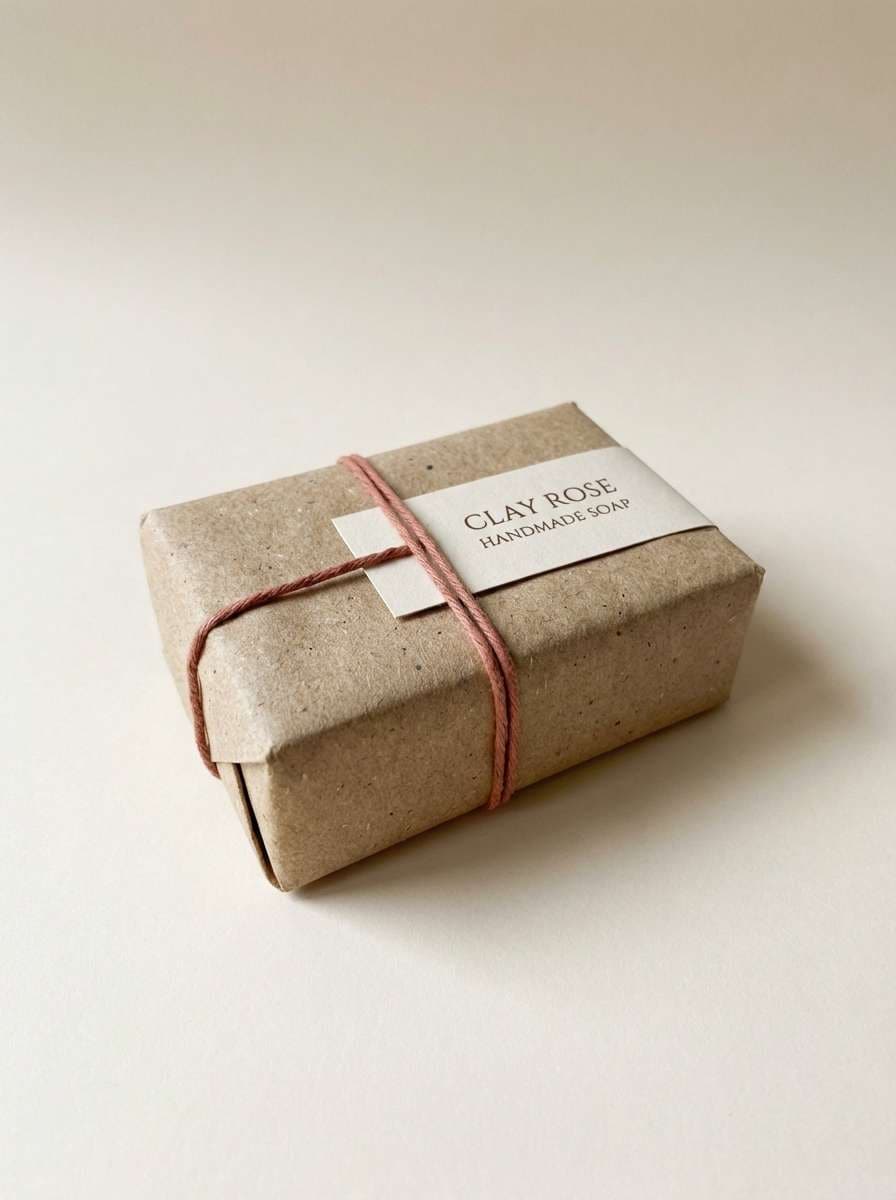
23) Herbal Soap Wrap
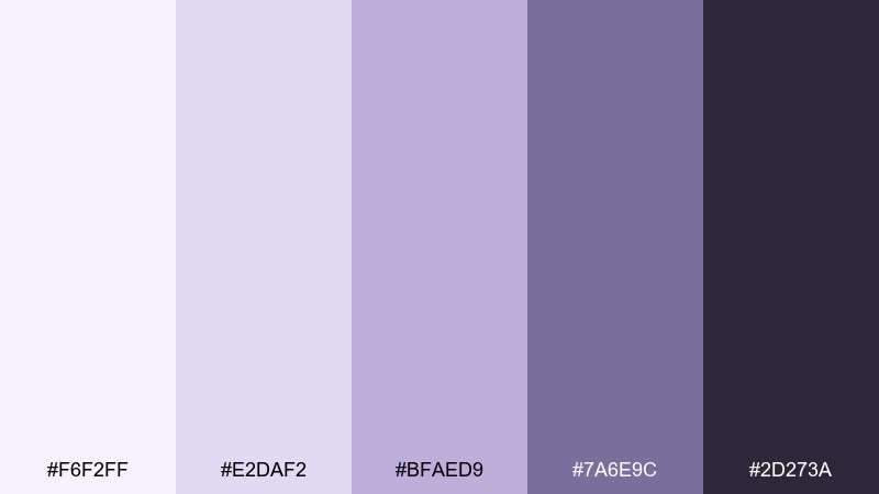
HEX: #F6F2FF #E2DAF2 #BFAED9 #7A6E9C #2D273A
Mood: clean, botanical, artisan
Best for: handmade soap packaging
Clean and botanical, these tones evoke dried herbs wrapped in soft paper. They are a natural fit for handmade soap wraps, candles, and small-batch apothecary labels. The overall lavender color palette feels calming when paired with simple line drawings and uncoated stock. Usage tip: print the darkest tone for ingredient lists and keep the mid shade for borders and brand marks.
Image example of herbal soap wrap generated using media.io
What Colors Go Well with Lavender?
Lavender pairs cleanly with whites and cool grays for a modern, minimal look—especially in UI where you want softness without losing structure. Deep navy or near-black makes lavender accents pop while keeping typography highly readable.
For warmer palettes, try lavender with cream, blush, mauve, and cocoa-browns to create a boutique or lifestyle feel. These combinations feel inviting on packaging, menus, and editorial layouts.
If you want contrast and energy, lavender works well with teal/cyan accents or a sparing hot pink. Use the bright accent as a “signal color” (badges, active states, highlights) rather than a full background.
How to Use a Lavender Color Palette in Real Designs
Start with role assignment: pick one light tint for backgrounds, one mid lavender for surfaces (cards, sections), and one deep violet for actions and emphasis. This keeps the palette consistent and prevents everything from blending together.
For accessibility, keep body text near-black or deep indigo and test contrast before finalizing buttons and links. Lavender is often light, so you’ll get better readability by treating it as a background/accent family rather than the main text color.
In print, lavender can shift depending on paper and ink. If you’re designing packaging or invitations, do a quick proof on the intended stock and consider adding a darker anchor color for type and key details.
Create Lavender Palette Visuals with AI
If you already have HEX codes, you can turn them into mockups fast by generating UI screens, posters, packaging shots, or mood boards that match your lavender tones. This helps you validate the vibe before you commit to a full design system.
In Media.io, you can also iterate quickly: swap prompts, change aspect ratios, or test different “anchor” colors (deep indigo vs. plum) while keeping lavender as the signature accent.
Use the palettes above as a starting point, then generate a few variations to find the best balance of softness, contrast, and brand personality.
Lavender Color Palette FAQs
-
What is a lavender color palette?
A lavender color palette is a curated set of tints, tones, and shades built around lavender (a light purple). It typically includes pale lavender backgrounds, mid lavenders for UI surfaces or decorative elements, and deeper violets to provide contrast for text or CTAs. -
Is lavender considered warm or cool?
Lavender usually reads as cool because it leans toward blue-purple, but it can feel warmer when mixed with mauve, blush, cream, or brown undertones. The “temperature” depends on the surrounding colors and the specific lavender hex codes you choose. -
What colors complement lavender best?
For clean, modern pairings, use lavender with white, cool gray, navy, or near-black. For softer, romantic combinations, pair it with blush, cream, and mauve. For high-energy contrast, add teal/cyan accents or a small amount of hot pink. -
How do I keep lavender designs from looking too sweet?
Add an anchor neutral (charcoal, deep indigo, or slate) for typography and structure, and limit the lightest tints to backgrounds. You can also introduce muted grays (like “Silver Violet”) to make the overall palette feel more professional. -
Which lavender palette is best for UI design?
Try softer, low-contrast sets like Misty Lilac or Soft Minimal for backgrounds and cards, then use one deeper violet for primary buttons. For onboarding or fintech, a structured set like Tech Lilac Grid helps keep states and progress indicators clear. -
Can I use lavender for branding?
Yes—lavender works especially well for wellness, beauty, lifestyle, and premium brands because it signals calm and refinement. To make it distinctive, define clear brand roles (background, accent, CTA, text) and include one dark signature color for consistent contrast. -
Do lavender hex colors print accurately?
Lavender can shift in print due to paper warmth and ink profiles, sometimes appearing more gray or more pink. For packaging or invitations, it helps to proof on the final paper stock and keep a darker text color to protect readability.
Next: Hippie Color Palette


