
Hot pink is unapologetically bold: it grabs attention fast, reads as modern, and instantly adds energy to any layout. The key is pairing it with smart neutrals or complementary accents so it feels intentional, not overwhelming.
Below are hot pink color palette ideas with HEX codes plus practical tips for branding, UI, posters, packaging, and more—so you can pick a vibe and apply it with confidence.
In this article
Why Hot Pink Palettes Work So Well
Hot pink sits in a sweet spot between playful and powerful. It’s vivid enough to act as a brand signature color, but flexible enough to shift moods depending on what you pair it with—black for edge, white for clarity, or warm tones for friendliness.
Because it’s naturally high-contrast, hot pink can create hierarchy quickly: CTAs, badges, and key highlights pop without needing heavy illustration or complex layout. That makes it especially effective in UI, posters, and social ads where attention is limited.
The secret is balance. When hot pink dominates every surface, it can feel loud; when it’s used as an accent inside a well-structured palette, it feels premium, modern, and designed.
20+ Hot Pink Color Palette Ideas (with HEX Codes)
1) Neon Rose Pop
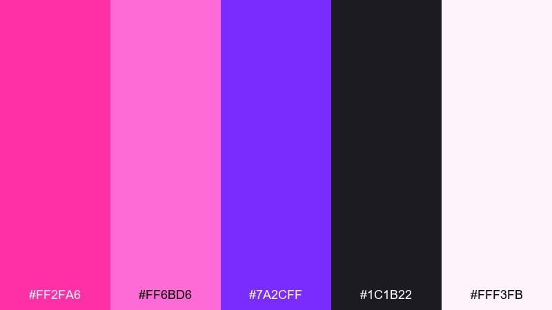
HEX: #ff2fa6 #ff6bd6 #7a2cff #1c1b22 #fff3fb
Mood: bold, nightlife, high-energy
Best for: club event poster design
Bold and electric, it feels like neon signage glowing at midnight. Use the deep near-black to ground the brightness and keep the page readable. Pair the violet as a secondary accent for headlines and line art. Tip: reserve the light blush for negative space so the pink stays punchy instead of overwhelming.
Image example of neon rose pop generated using media.io

Media.io is an online AI studio for creating and editing video, image, and audio in your browser.

2) Blush and Charcoal
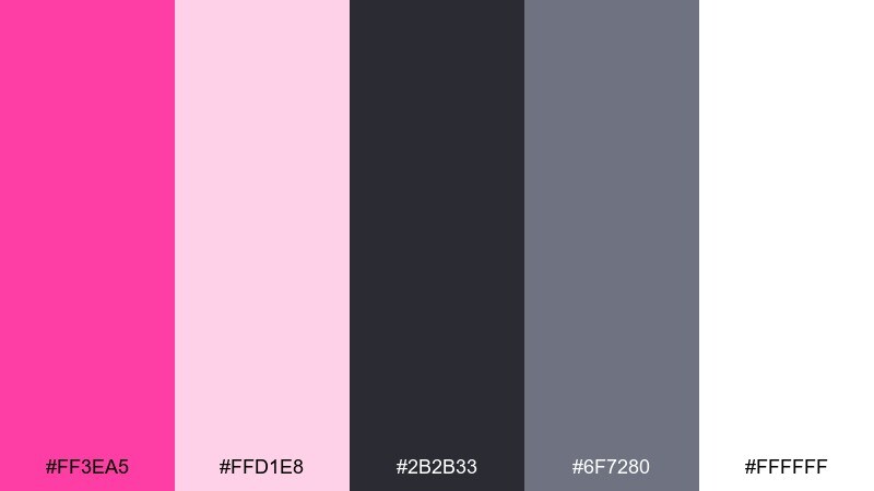
HEX: #ff3ea5 #ffd1e8 #2b2b33 #6f7280 #ffffff
Mood: modern, balanced, editorial
Best for: beauty brand identity
Chic and polished, it evokes glossy magazine covers and clean studio lighting. Charcoal and cool gray give structure while the pink reads as confident, not sugary. Keep the blush tones for backgrounds and packaging panels to soften the contrast. Tip: use pure white sparingly so the darker neutrals keep the identity premium.
Image example of blush and charcoal generated using media.io
3) Sunset Fuchsia
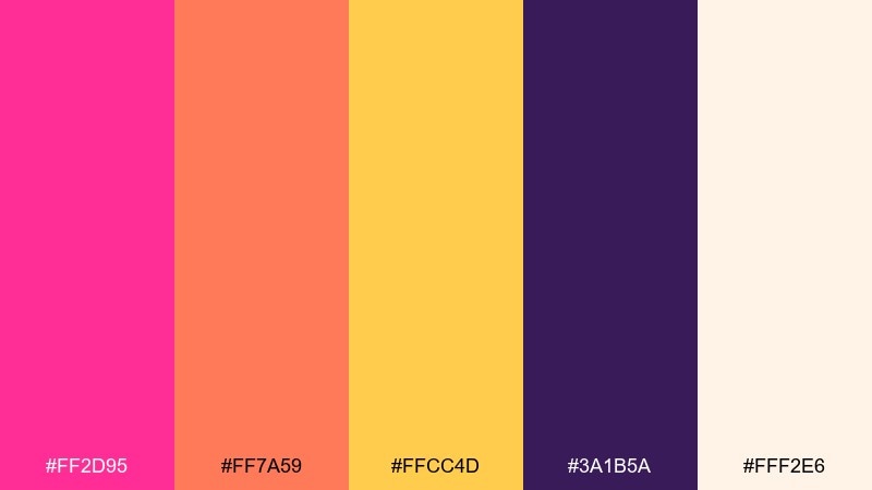
HEX: #ff2d95 #ff7a59 #ffcc4d #3a1b5a #fff2e6
Mood: warm, playful, optimistic
Best for: summer sale banner
Warm and juicy, it brings to mind sunset skies and citrus sorbet. Let the golden yellow act as a highlight color for discounts and buttons. The deep purple keeps type crisp when the warmer tones get busy. Tip: limit gradients to one focal area so the banner stays readable at a glance.
Image example of sunset fuchsia generated using media.io
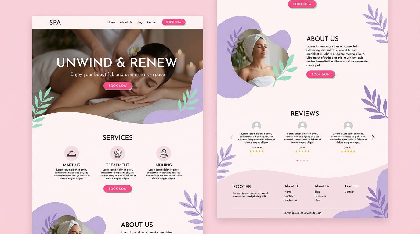
4) Orchid Sorbet
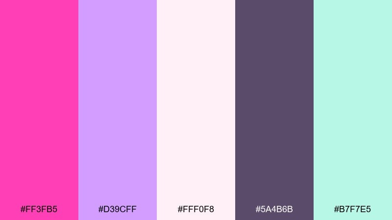
HEX: #ff3fb5 #d39cff #fff0f8 #5a4b6b #b7f7e5
Mood: soft, dreamy, airy
Best for: spa website landing page
Soft and floaty, it feels like orchid petals and whipped sorbet. Use the pale pink as your main canvas and bring in mint for calm, refreshing accents. The muted plum works well for body text and icons without turning harsh. Tip: keep button colors consistent by choosing either hot pink or mint as the single primary action color.
Image example of orchid sorbet generated using media.io
5) Raspberry Cream
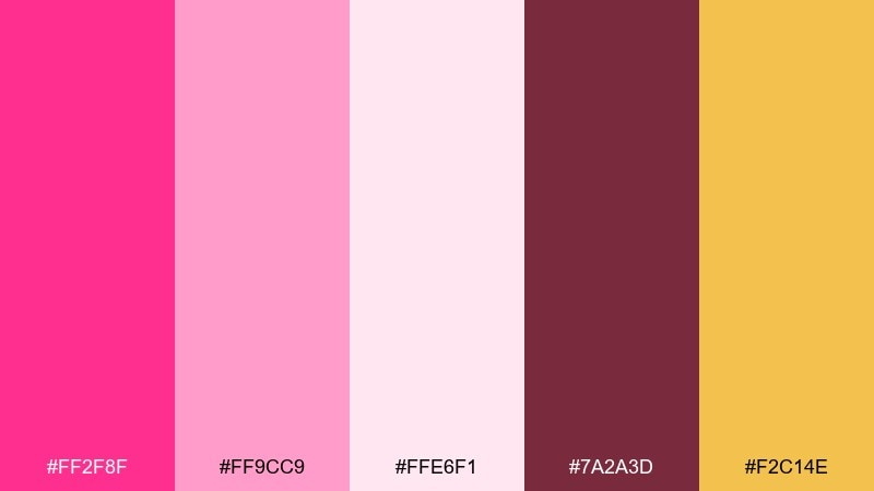
HEX: #ff2f8f #ff9cc9 #ffe6f1 #7a2a3d #f2c14e
Mood: sweet, cozy, appetizing
Best for: bakery menu design
Sweet and cozy, it suggests raspberry filling, buttercream, and warm pastry tones. The chocolatey maroon is ideal for headings and pricing so the menu stays legible. Use the golden accent for special items or seasonal callouts. Tip: keep photos warm-toned so they blend naturally with the cream background.
Image example of raspberry cream generated using media.io
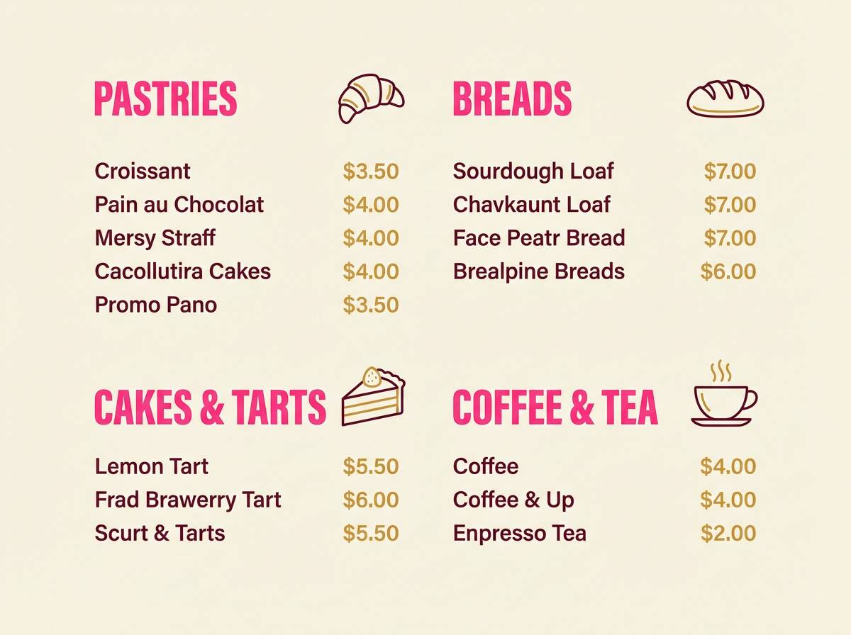
6) Flamingo Mint
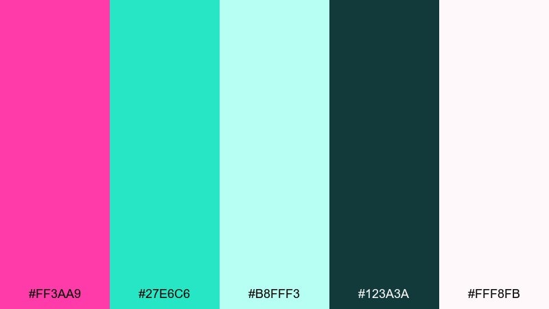
HEX: #ff3aa9 #27e6c6 #b8fff3 #123a3a #fff8fb
Mood: fresh, punchy, youthful
Best for: fitness app onboarding screens
Fresh and punchy, it feels like a tropical smoothie with a cool breeze. These hot pink color combinations work best when mint leads the backgrounds and pink marks key actions. Deep teal anchors navigation and keeps text readable on bright surfaces. Tip: use pink only for the primary CTA so onboarding steps look structured and calm.
Image example of flamingo mint generated using media.io
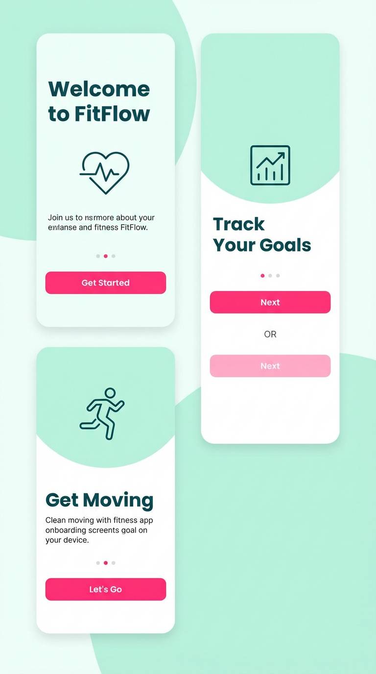
7) Magenta Mocha
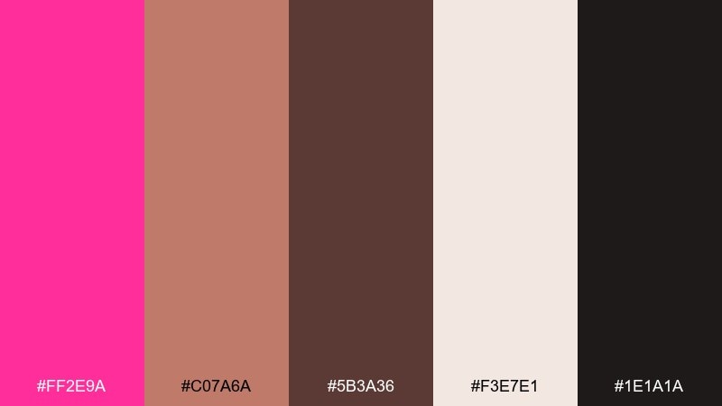
HEX: #ff2e9a #c07a6a #5b3a36 #f3e7e1 #1e1a1a
Mood: rich, cozy, luxe
Best for: coffee shop packaging
Rich and cozy, it brings together magenta flair with roasted mocha depth. Use the cream as the base for labels and let the browns carry typography and details. The near-black is perfect for barcodes, ingredient lists, and fine print. Tip: emboss the pink on kraft or cream stock to make the accent feel premium.
Image example of magenta mocha generated using media.io
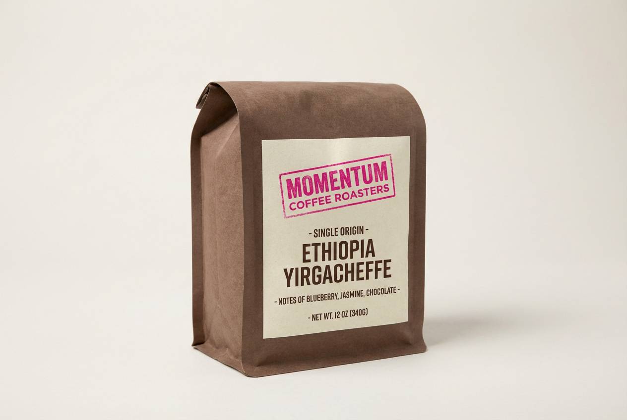
8) Candy Citrus
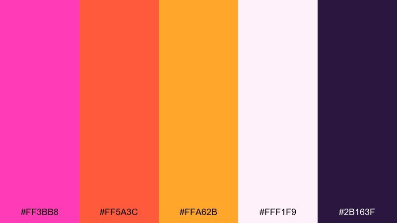
HEX: #ff3bb8 #ff5a3c #ffa62b #fff1f9 #2b163f
Mood: playful, loud, energetic
Best for: kids birthday invitation
Playful and loud, it feels like candy wrappers and citrus pops. Use the pale pink as the invitation base so the orange and pink can shout without clashing. The deep purple keeps names and details crisp for printing. Tip: limit confetti shapes to two colors so the layout stays fun but not chaotic.
Image example of candy citrus generated using media.io

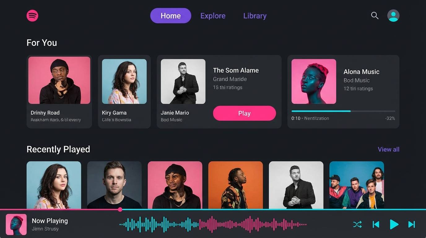
9) Electric Night
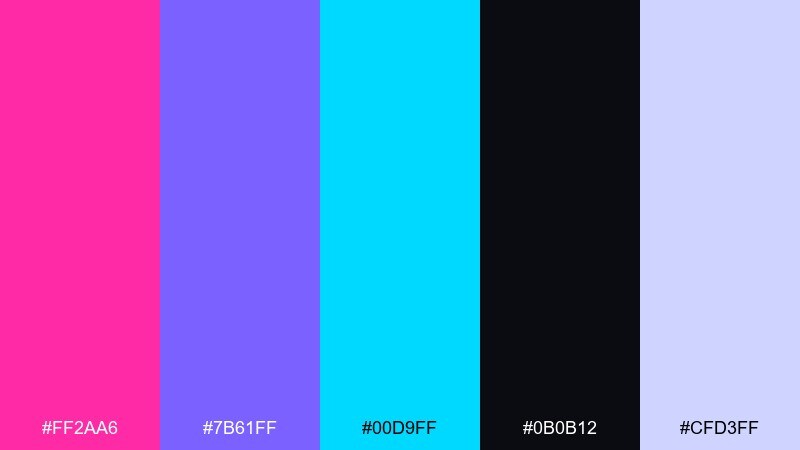
HEX: #ff2aa6 #7b61ff #00d9ff #0b0b12 #cfd3ff
Mood: cyber, vibrant, futuristic
Best for: music streaming app UI
Futuristic and glossy, it evokes LED light trails on a dark highway. Use the near-black as a true app background so the neon accents feel intentional. Cyan works well for secondary actions, while violet can mark selected states. Tip: keep gradients subtle and confined to artwork cards to avoid eye fatigue.
Image example of electric night generated using media.io
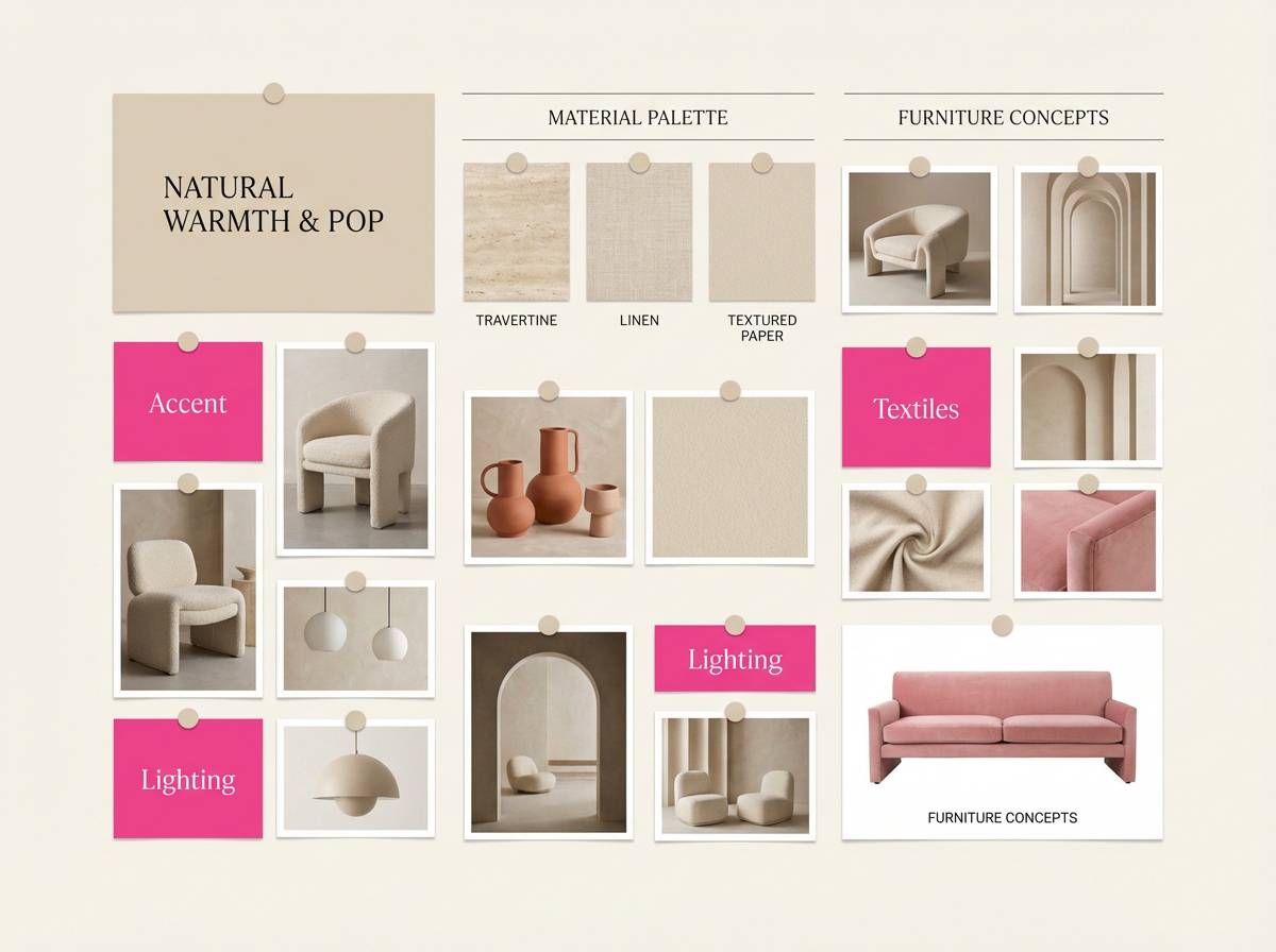
10) Pink Sandstone
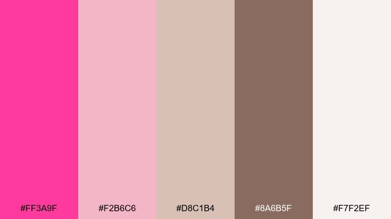
HEX: #ff3a9f #f2b6c6 #d8c1b4 #8a6b5f #f7f2ef
Mood: warm, earthy, approachable
Best for: interior design mood board
Warm and earthy, it reads like sunlit plaster, rosy stone, and soft textiles. Let the off-white carry most of the surface area and use the browns for structure and captions. The brighter pink works best as a small accent in decor pins or title blocks. Tip: add texture overlays in beige tones to keep the mood board tactile and grounded.
Image example of pink sandstone generated using media.io
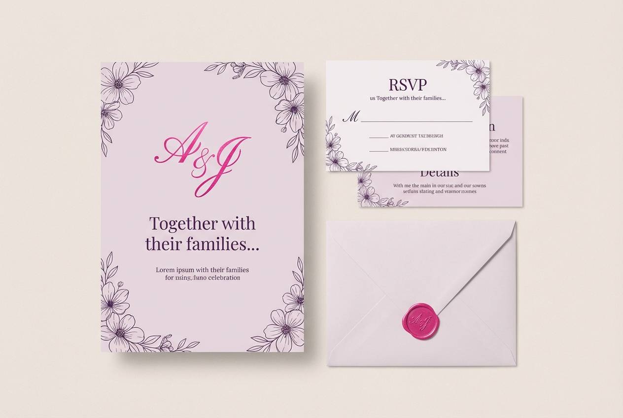
11) Petal Lavender
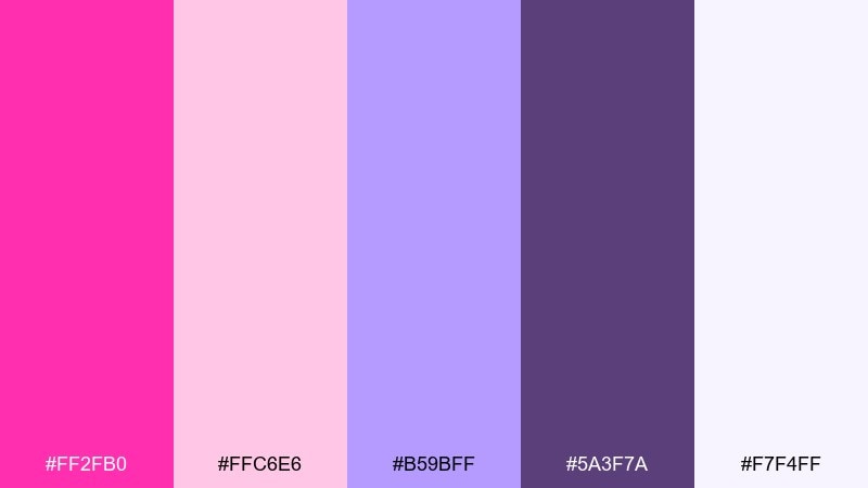
HEX: #ff2fb0 #ffc6e6 #b59bff #5a3f7a #f7f4ff
Mood: romantic, gentle, elegant
Best for: wedding stationery suite
Romantic and gentle, it feels like pressed petals tucked into a lavender envelope. This hot pink color palette shines when the light lavender becomes the main tint and the bright pink is reserved for monograms or wax-seal motifs. Use the deep purple for names and dates to keep readability strong in print. Tip: choose one ornate font for headings and keep body text simple to avoid a busy look.
Image example of petal lavender generated using media.io
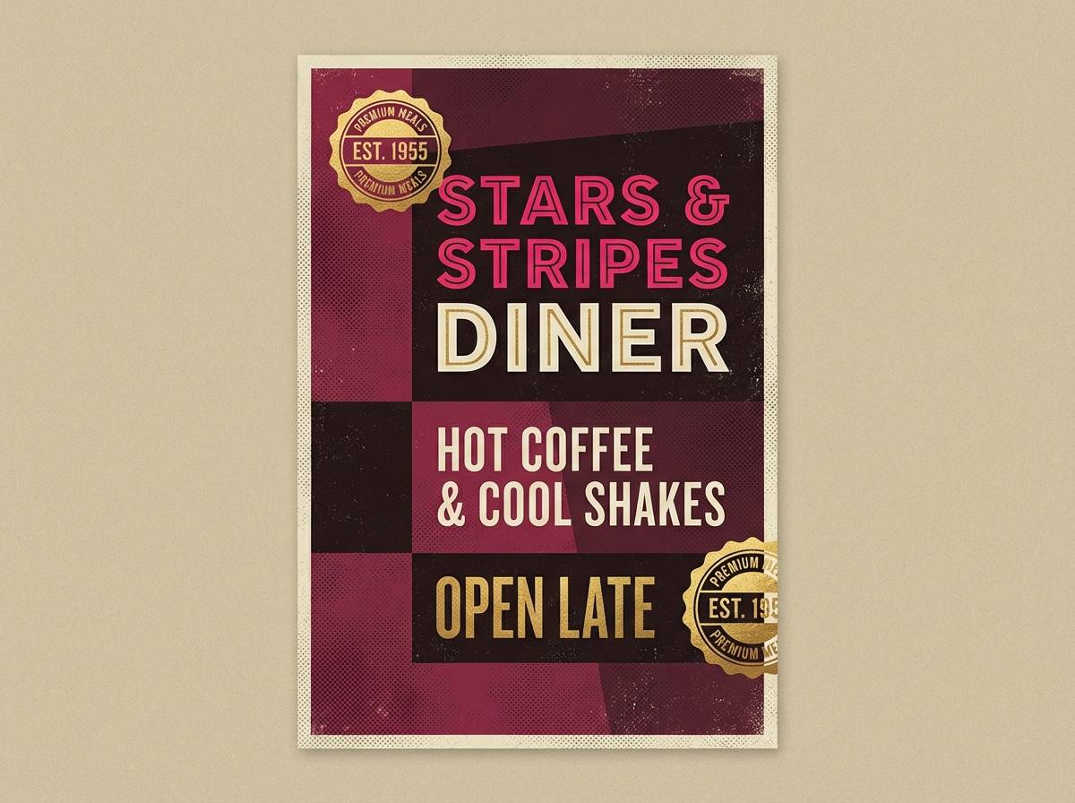
12) Cherry Cola
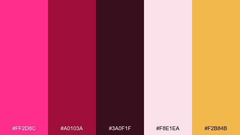
HEX: #ff2d8c #a0103a #3a0f1f #f8e1ea #f2b84b
Mood: moody, retro, indulgent
Best for: retro diner poster
Moody and retro, it recalls cherry soda, vinyl booths, and glowing signage. Use the deep burgundy and cola tones for big shapes and outlines, then let pink pop in the highlights. The warm gold is perfect for prices, stars, and badges. Tip: add halftone dots in the blush tone for a true vintage print feel.
Image example of cherry cola generated using media.io
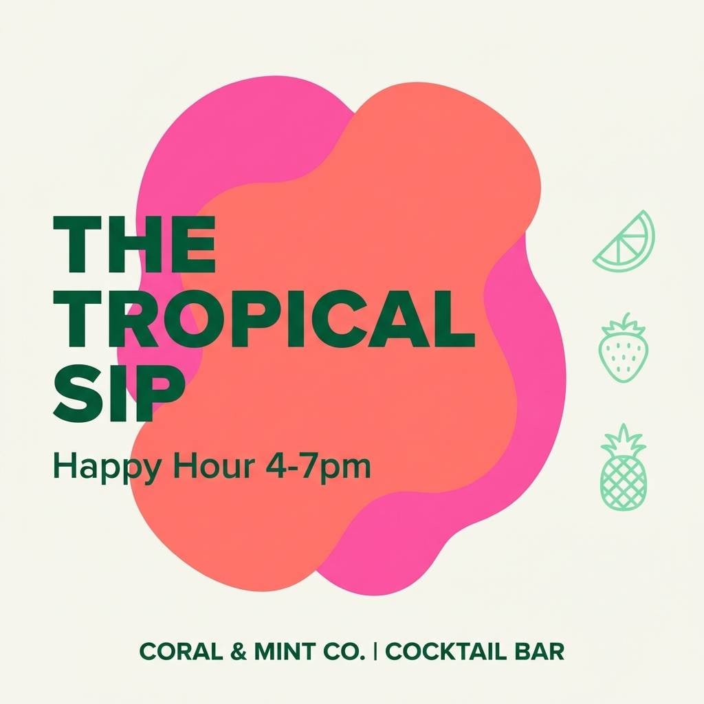
13) Tropical Punch
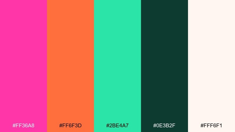
HEX: #ff36a8 #ff6f3d #2be4a7 #0e3b2f #fff6f1
Mood: bright, vacation, lively
Best for: cocktail bar social media ad
Bright and vacation-ready, it feels like a fruit punch served under palm leaves. Use the off-white to keep text readable and let pink and coral drive the energy. Deep green provides a sophisticated counterweight and works nicely for logos or borders. Tip: keep gradients out of the background and instead apply them to one hero shape or sticker.
Image example of tropical punch generated using media.io
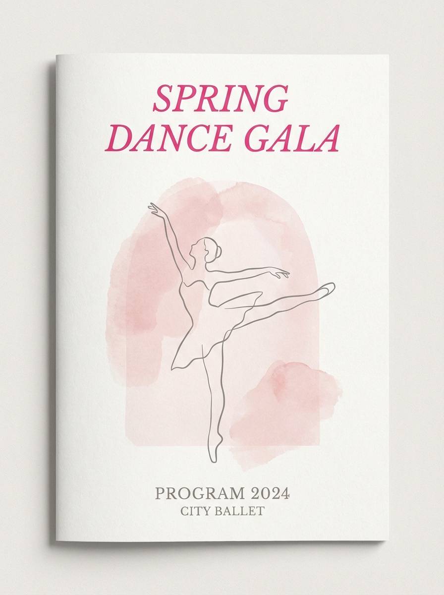
14) Ballet Studio
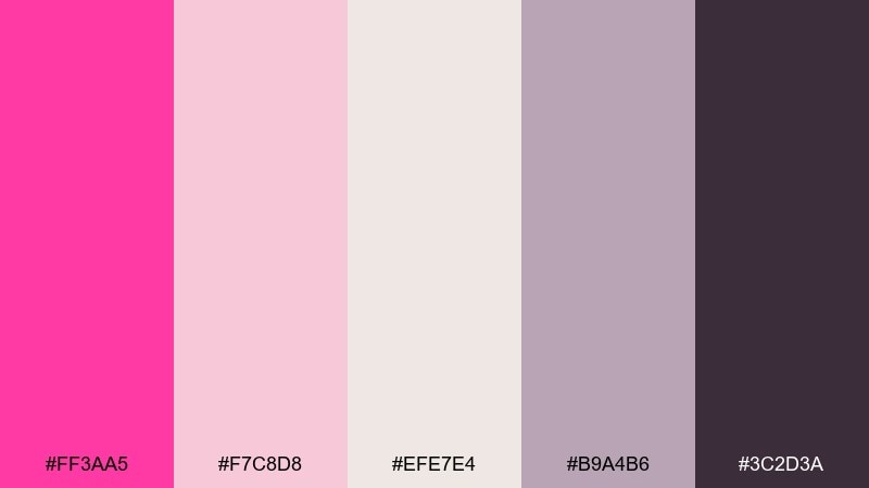
HEX: #ff3aa5 #f7c8d8 #efe7e4 #b9a4b6 #3c2d3a
Mood: soft, graceful, refined
Best for: dance recital program
Soft and graceful, it mirrors satin ribbons and powdery studio light. Use the warm neutrals for pages and margins, then bring the pink in for section titles and dividers. The charcoal-plum gives elegant contrast for long-form text. Tip: keep imagery in black-and-white or gentle sepia so the typography colors stay cohesive.
Image example of ballet studio generated using media.io
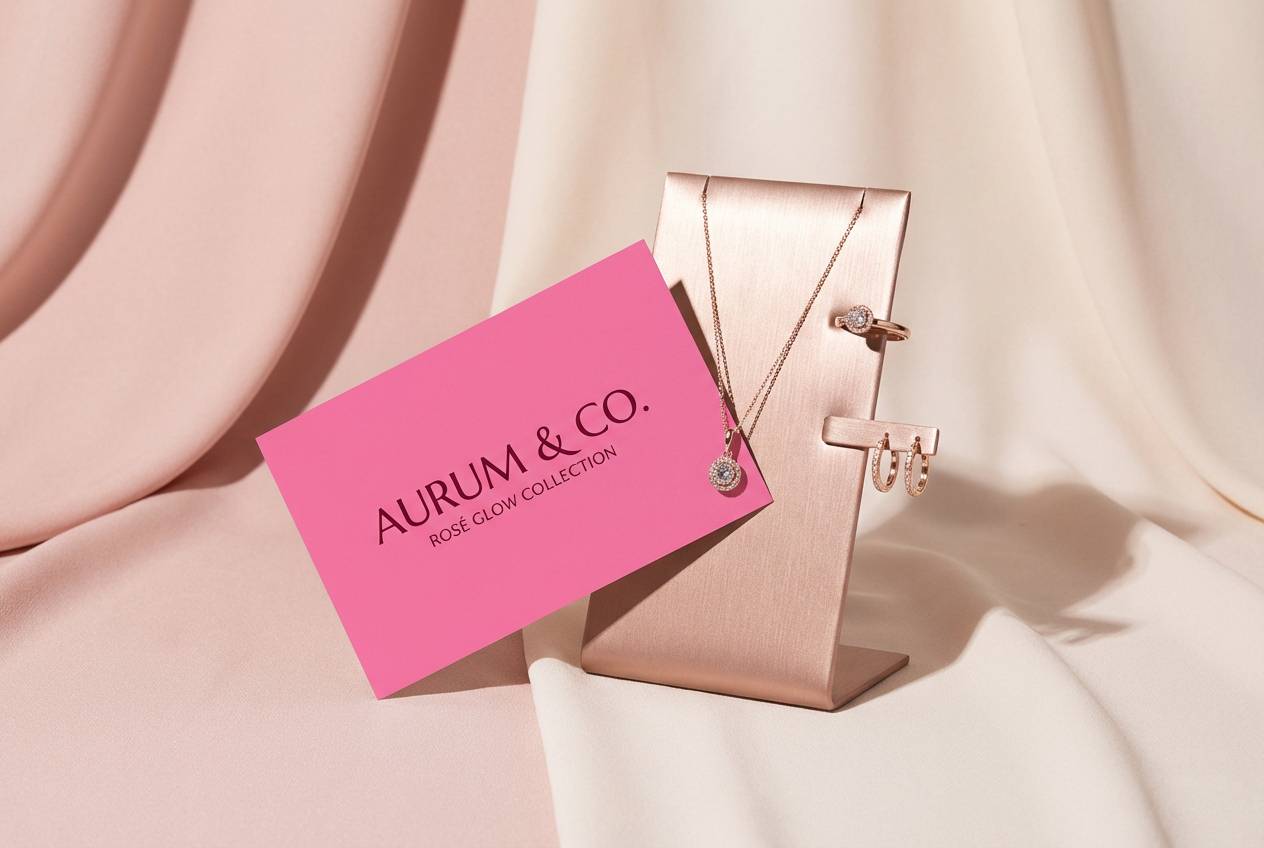
15) Rose Gold Luxe
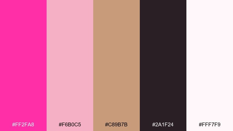
HEX: #ff2fa8 #f6b0c5 #c89b7b #2a1f24 #fff7f9
Mood: luxury, glamorous, warm
Best for: jewelry product ad
Luxurious and warm, it suggests rose-gold shine against a soft blush glow. Let the creamy off-white act as the studio backdrop and use the deep plum-brown for clean typography. The metallic tan tone can be used as a foil-like accent in borders or badge shapes. Tip: keep the pink in small, high-impact areas so the ad looks premium rather than loud.
Image example of rose gold luxe generated using media.io
16) Pixel Pink UI
HEX: #ff3db8 #ff7ad9 #6b5bff #101018 #e9e6ff
Mood: digital, playful, modern
Best for: SaaS dashboard UI
Digital and playful, it feels like crisp pixels and glowing status lights. The dark background makes the pinks read like high-priority actions, while violet supports charts and tabs. Keep the pale lilac for cards so you can still show hierarchy without losing contrast. Tip: test accessibility by using the lightest tint behind text-heavy components, not the saturated pink.
Image example of pixel pink ui generated using media.io

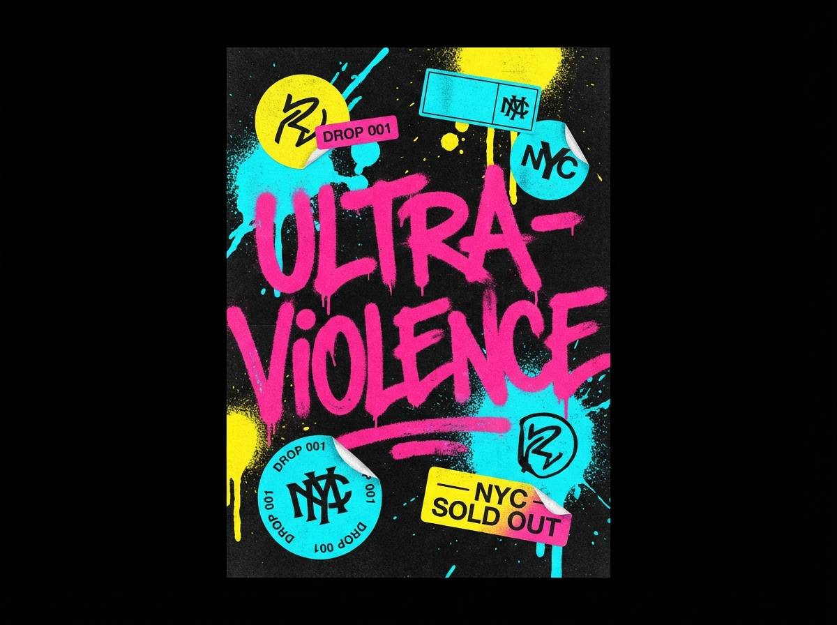
17) Graffiti Glow
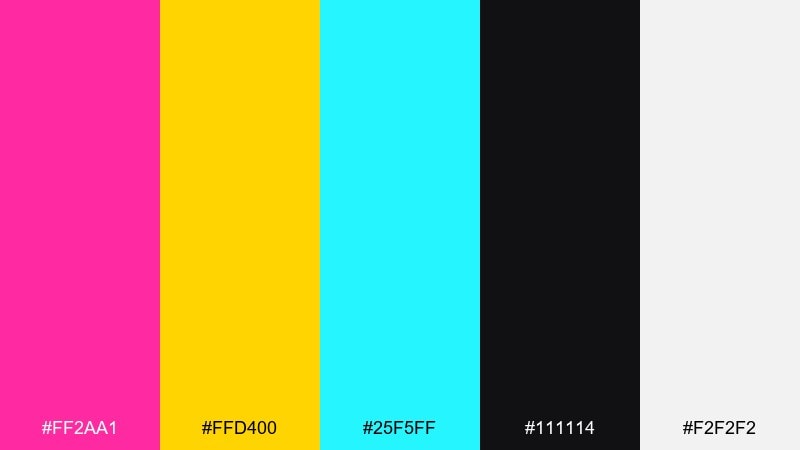
HEX: #ff2aa1 #ffd400 #25f5ff #111114 #f2f2f2
Mood: street, loud, rebellious
Best for: streetwear drop poster
Street-loud and rebellious, it looks like fresh spray paint under a streetlamp. Hot pink color combinations hit hardest here when you keep black dominant and use yellow and cyan as quick bursts. The light gray is useful for texture layers and sticker-like elements without adding more colors. Tip: use rough brush lettering for the headline but keep the date and URL in a clean sans-serif.
Image example of graffiti glow generated using media.io
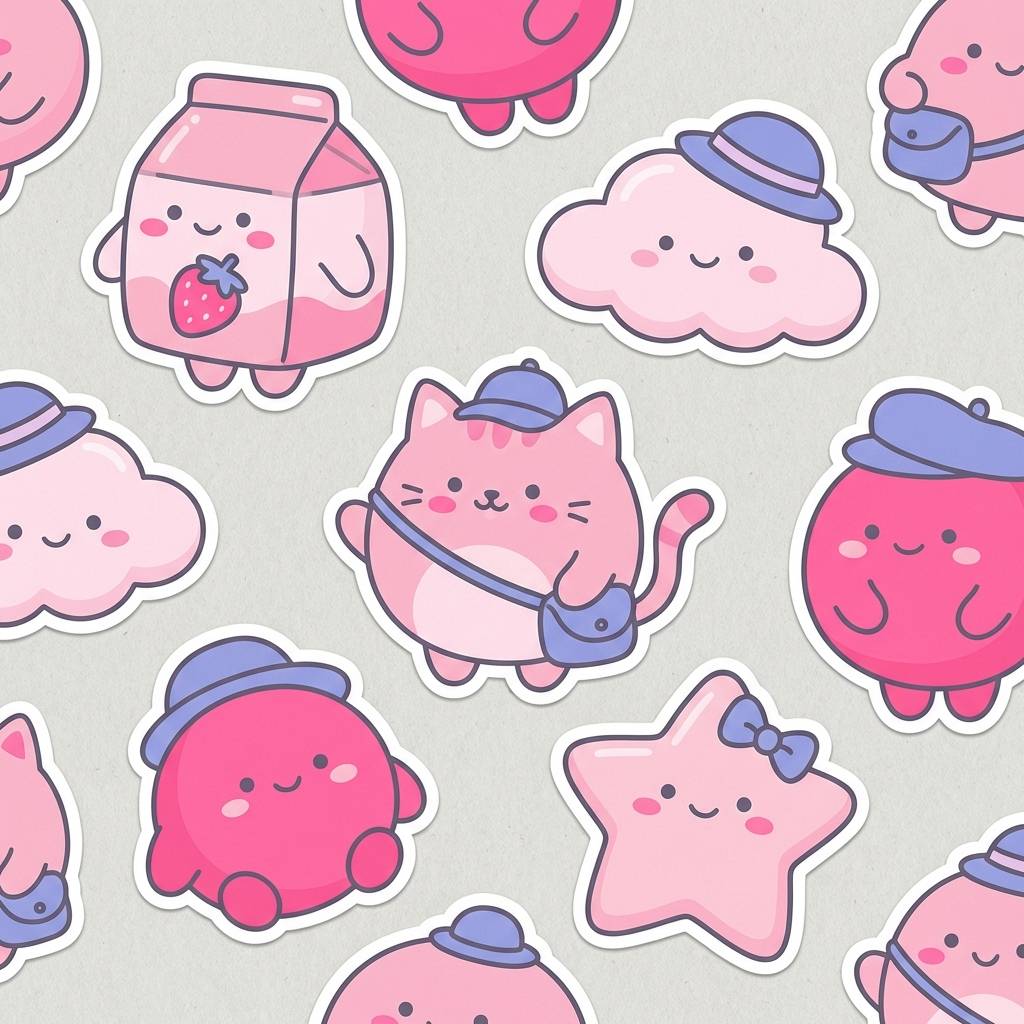
18) Strawberry Milk
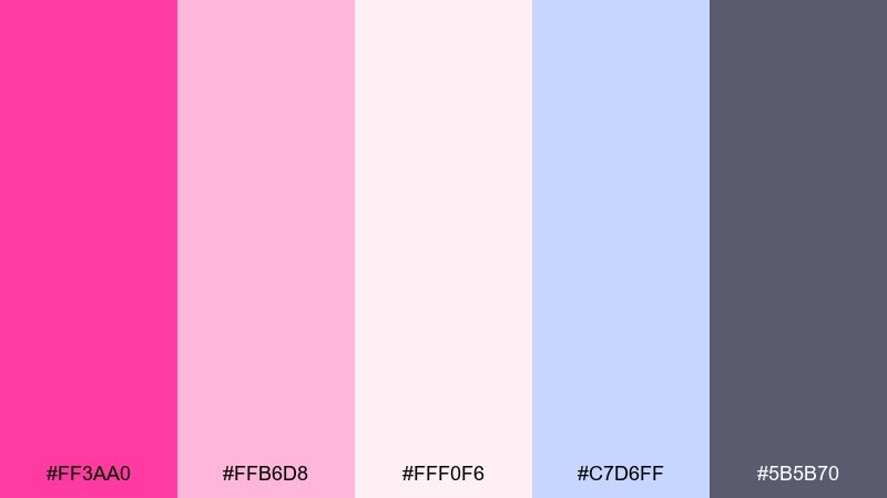
HEX: #ff3aa0 #ffb6d8 #fff0f6 #c7d6ff #5b5b70
Mood: cute, soft, comforting
Best for: kawaii sticker pack design
Cute and comforting, it brings to mind strawberry milk with a cool pastel finish. Use the soft blush as the main fill for characters and keep hot pink for tiny details like cheeks and hearts. The periwinkle adds variety without breaking the gentle mood, while gray keeps outlines clean. Tip: keep stroke weights consistent so the stickers look cohesive across different shapes.
Image example of strawberry milk generated using media.io
19) Desert Bloom

HEX: #ff319f #ff7fbf #f6d9c6 #7c8f6b #2f3b2c
Mood: natural, sunbaked, artistic
Best for: botanical watercolor print
Natural and sunbaked, it feels like desert flowers blooming after rain. Use the sandy beige as paper tone and bring in greens for stems and shadows. The brighter pink is best as a blossom highlight rather than a full wash. Tip: keep edges soft and layered so the palette stays organic instead of graphic.
Image example of desert bloom generated using media.io
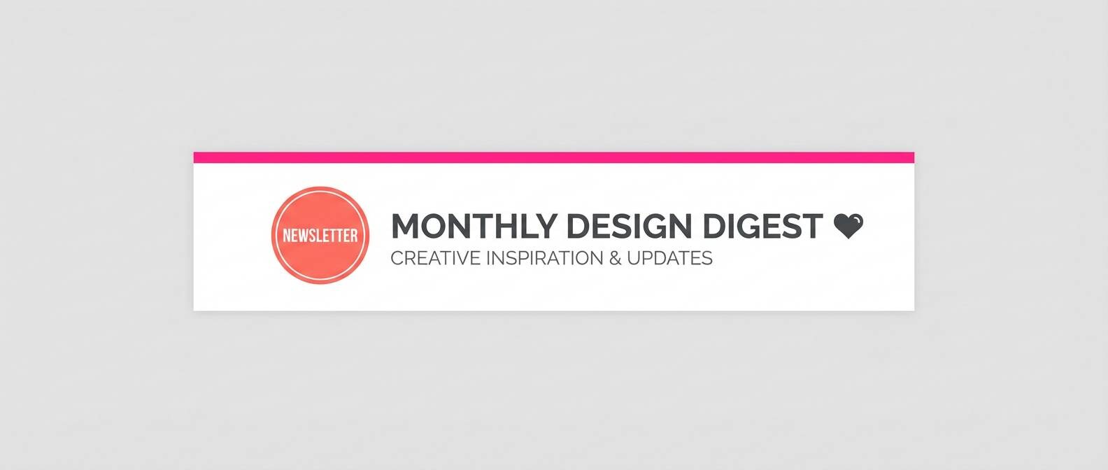
20) Modern Valentine
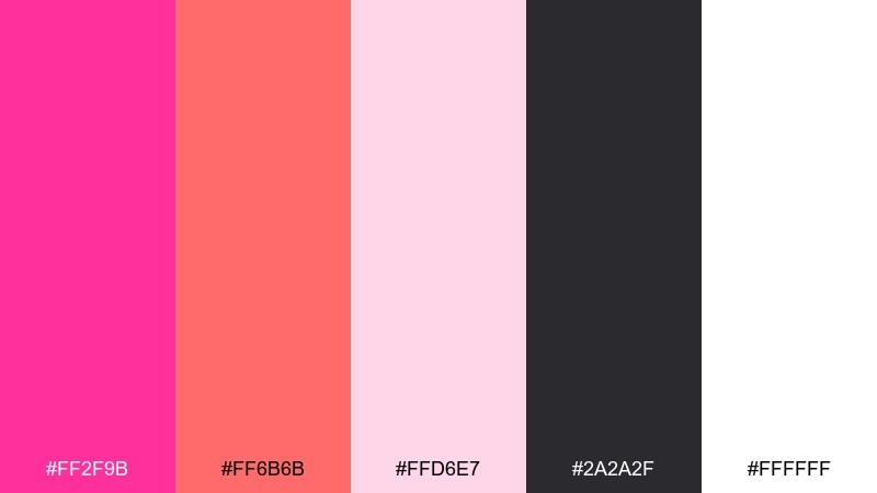
HEX: #ff2f9b #ff6b6b #ffd6e7 #2a2a2f #ffffff
Mood: romantic, clean, contemporary
Best for: email newsletter header
Romantic but modern, it reads like crisp paper with a punch of candy-red warmth. This hot pink color palette works well in email when white space stays generous and the dark gray handles all body copy. Use coral-red for secondary buttons or badges so the primary action can remain pink. Tip: avoid full-width pink backgrounds, and instead use pink as a stripe or corner accent to keep deliverability-friendly contrast.
Image example of modern valentine generated using media.io
What Colors Go Well with Hot Pink?
Hot pink pairs best with strong anchors and clean breathing room. Deep neutrals like black, charcoal, and near-black give it a sharp, premium edge and keep typography readable, especially in UI and posters.
For a softer feel, use pale blush, off-white, and creamy neutrals to let hot pink act as a high-impact accent. This approach works well in beauty branding, packaging, and editorial layouts.
If you want high-energy contrast, add complementary or near-complementary accents like mint/teal, cyan, and lime-leaning greens. For a richer, more artistic palette, try violets, plums, burgundy, or warm gold.
How to Use a Hot Pink Color Palette in Real Designs
Use hot pink like a spotlight: reserve it for CTAs, price badges, key icons, or one hero shape. Then let neutrals (white, cream, charcoal, or near-black) carry most of the surface area so the design stays clean and legible.
For branding systems, define roles: one primary hot pink, one dark text color, one light background, and one secondary accent (violet, mint, gold, or coral). This keeps applications consistent across ads, packaging, and social posts.
In digital design, test contrast early. Saturated pink behind body text often fails accessibility; instead, place text on pale tints or dark neutrals, and use hot pink for buttons, selected states, or highlights.
Create Hot Pink Palette Visuals with AI
If you want to preview how a hot pink palette looks in a real poster, product mockup, or UI screen, generating concept visuals with AI can save hours. You can quickly test whether the pink should lead, or whether it works better as a controlled accent.
Start with a clear subject (banner, packaging, onboarding screens), then specify your palette colors and usage (e.g., “near-black background, hot pink CTA, cyan secondary”). Iterate with small prompt changes until the contrast and mood feel right.
With Media.io’s text-to-image tool, you can turn the prompts above into instant examples and refine them into design directions for your next project.
Hot Pink Color Palette FAQs
-
What is the HEX code for hot pink?
Hot pink is often represented as #FF69B4, but “hot pink” palettes commonly use nearby, more saturated shades like #FF2FA6 or #FF2D95What colors go with hot pink for a modern look?
For modern design, pair hot pink with charcoal/near-black, clean white, and one cool accent like violet or cyan. This keeps the palette crisp and prevents the pink from feeling overly sweet.Does hot pink work well with black?
Yes—hot pink and black is a classic high-contrast combination for posters, nightlife branding, and bold UI. Keep black dominant for readability, and use hot pink for highlights (CTAs, headlines, badges).What’s a good complementary color for hot pink?
Green-leaning tones (like mint, teal, and aqua-cyan) often create strong contrast with hot pink. Use them as secondary accents or background tints to avoid visual overload.How do I keep a hot pink palette from looking overwhelming?
Limit hot pink to 10–20% of the layout, use light neutrals for large surfaces, and rely on dark neutrals for typography. If you use gradients, keep them in one focal area instead of everywhere.Which hot pink palette is best for UI design?
Dark-mode palettes like Electric Night or Pixel Pink UI work well because the near-black background supports contrast. Use hot pink for primary actions and selected states, and lighter tints for cards and text-heavy areas.Can I use hot pink in packaging and still look premium?
Yes—combine hot pink with cream/off-white and deep plum-browns, then keep pink in small, high-impact areas (logo stamp, seal, border). Finishes like embossing or foil-style accents can make it feel more luxurious.Next: Light Yellow Color Palette
 Julian Moore Mar 12, 26


