

Cream is a warm neutral that feels bright without the starkness of pure white. It’s easy to read on screens, flattering in print, and flexible enough to pair with both earthy and bold accents.
Below are cream color combinations with HEX codes, plus practical notes for branding, UI, weddings, and interiors.
In this article
- Why Cream Color Combinations Work So Well
-
- vanilla linen
- buttercream sage
- oatmilk terracotta
- pearl gray minimal
- champagne blush
- sandstone coastal
- antique paper ink
- honeyed walnut
- citrus cream pop
- desert dusk
- nordic cozy
- floral porcelain
- art deco glow
- coffeehouse neutrals
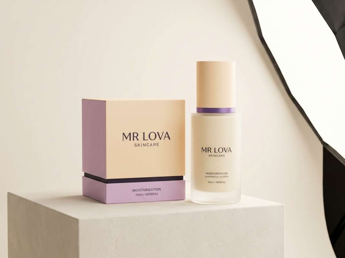
- lavender meringue
- olive grove
- retro diner
- calm spa stone
- winter sun
- storybook parchment
- What Colors Go Well with Cream?
- How to Use a Cream Color Combination in Real Designs
- Create Cream Palette Visuals with AI
Why Cream Color Combinations Work So Well
Cream sits between white and beige, so it keeps layouts light while adding warmth and approachability. That subtle warmth makes it especially useful for brands that want to feel human, premium, or comforting.
Because cream has gentle contrast, it pairs naturally with deep browns, charcoals, and dark greens for readable typography. It also softens saturated accents (like terracotta or amber) so designs feel balanced instead of loud.
In interiors and print, cream reflects light well and reduces harsh edges, which helps spaces and compositions feel calmer. It’s a reliable base for layered neutrals, textures, and understated gradients.
20+ Cream Color Palette Ideas (with HEX Codes)
1) Vanilla Linen
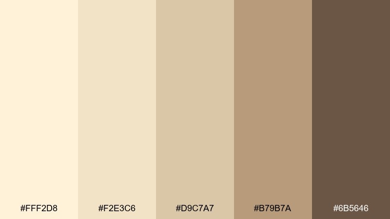
HEX: #FFF2D8 #F2E3C6 #D9C7A7 #B79B7A #6B5646
Mood: airy, clean, comforting
Best for: minimal brand identity and stationery
Airy and comforting like sunlit linen and fresh paper. Use these cream tones for a calm foundation on logos, labels, and letterheads, then bring contrast with the deep cocoa brown for headlines. It pairs especially well with subtle texture, like uncoated paper or light grain. Tip: keep the darkest shade to 10 to 15 percent of the layout so the look stays soft.
Image example of vanilla linen generated using media.io
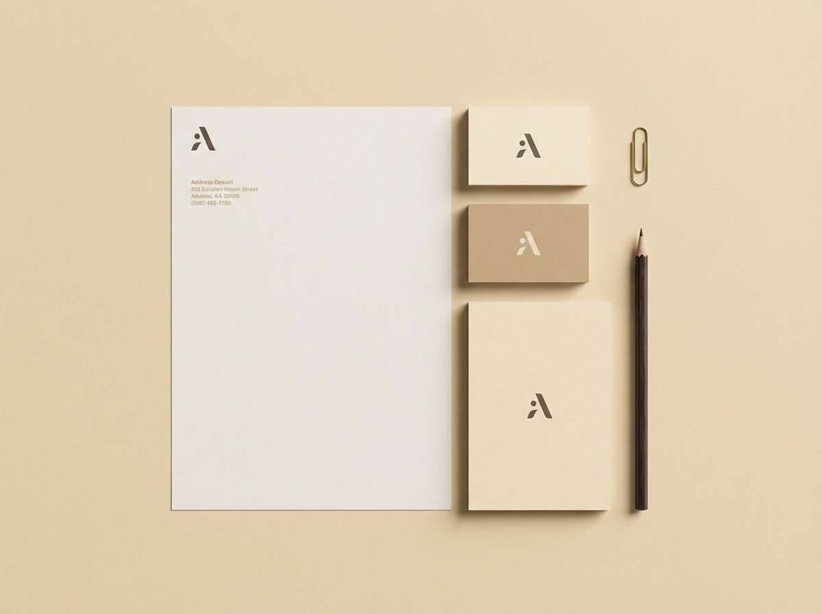
Media.io is an online AI studio for creating and editing video, image, and audio in your browser.

2) Buttercream Sage
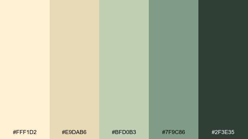
HEX: #FFF1D2 #E9DAB6 #BFD0B3 #7F9C86 #2F3E35
Mood: fresh, balanced, organic
Best for: wellness UI and dashboard themes
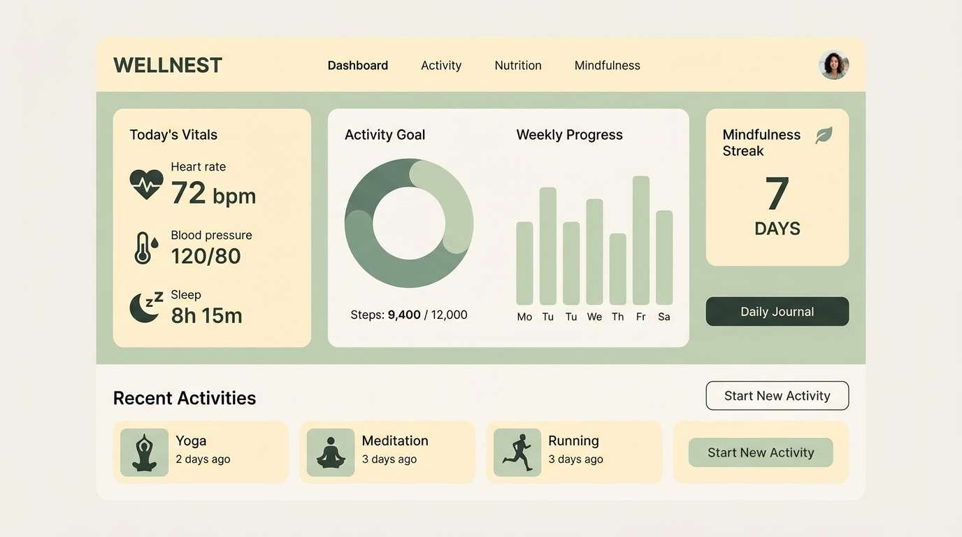
Fresh and balanced, like herbal steam drifting through a bright kitchen. These cream hues make a readable interface where the sage greens calm the eye and the near-black adds crisp structure. For a modern cream color combination, use the light butter tone for surfaces and reserve the darkest green for navigation and key text. Tip: pair the mid sage with subtle outlines so cards and inputs feel defined without looking heavy.
Image example of buttercream sage generated using media.io
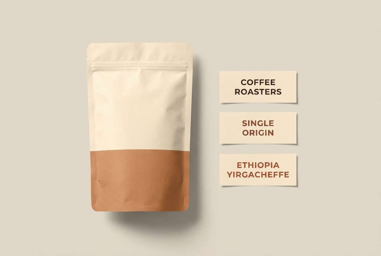
3) Oatmilk Terracotta
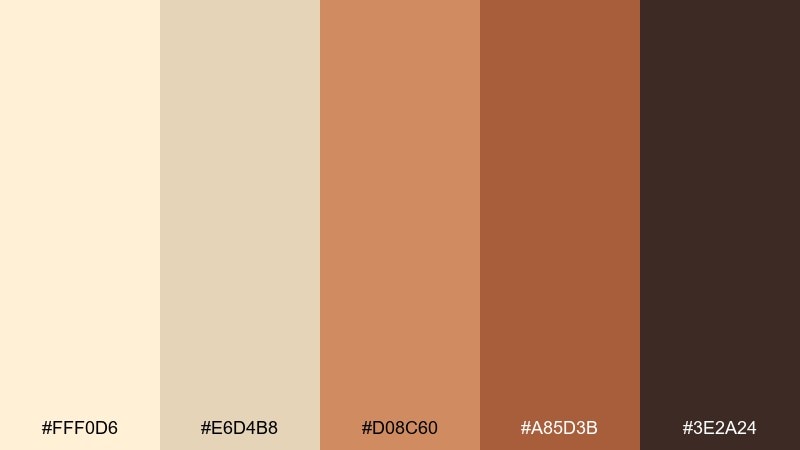
HEX: #FFF0D6 #E6D4B8 #D08C60 #A85D3B #3E2A24
Mood: warm, rustic, inviting
Best for: cafe menus and food packaging
Warm and rustic, like oatmilk foam beside a clay mug. The terracotta range brings appetite appeal while the dark roast brown anchors type and nutrition info. These cream color combinations work best with matte paper, kraft textures, and simple line icons. Tip: use the medium terracotta for callouts and pricing so it pops without shouting.
Image example of oatmilk terracotta generated using media.io
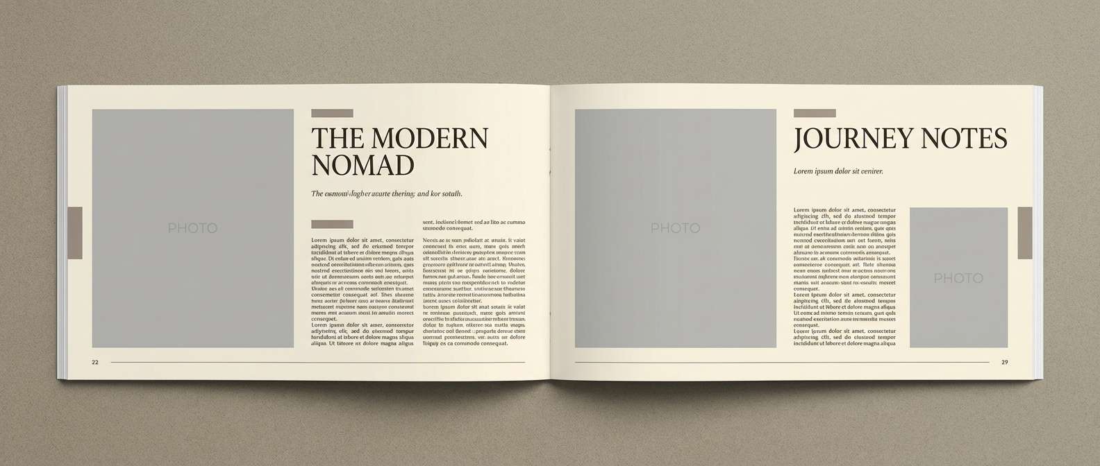
4) Pearl Gray Minimal
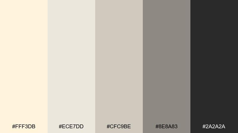
HEX: #FFF3DB #ECE7DD #CFC9BE #8E8A83 #2A2A2A
Mood: quiet, modern, gallery-like
Best for: editorial layouts and portfolios
Quiet and modern, like a gallery wall lit by soft daylight. The gray steps give you hierarchy for captions, pull quotes, and grids, while the charcoal keeps body text sharp. Use the lightest tone as generous negative space and let one mid gray carry rules and dividers. Tip: add a single bold photo and keep the rest of the page monochrome for a premium feel.
Image example of pearl gray minimal generated using media.io
5) Champagne Blush
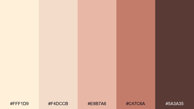
HEX: #FFF1D9 #F4DCCB #E8B7A6 #C47C6A #5A3A35
Mood: romantic, soft, celebratory
Best for: wedding invitations and save-the-dates
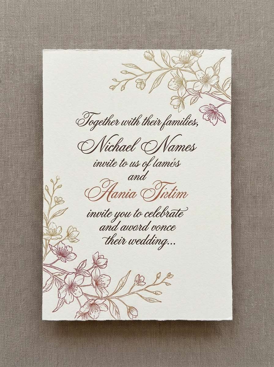
Romantic and celebratory, like champagne bubbles over blush silk. The gentle pinks keep things flattering in print, while the cocoa brown makes names and dates readable. For a refined cream color palette, set the background in the lightest shade and use the dusty blush for borders and small motifs. Tip: choose one script font for names and keep the rest in a clean serif to avoid clutter.
Image example of champagne blush generated using media.io
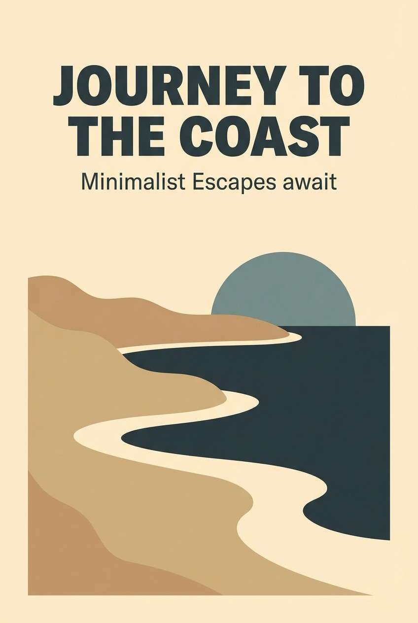
6) Sandstone Coastal
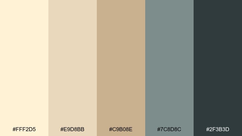
HEX: #FFF2D5 #E9D8BB #C9B08E #7C8D8C #2F3B3D
Mood: coastal, relaxed, breezy
Best for: travel posters and lifestyle banners
Coastal and relaxed, like pale sand under a hazy sky. The slate teal adds a cool breeze to the warm base, making it great for travel graphics and seasonal promos. Keep the sandy neutrals dominant and use the teal tones for icons, headings, and buttons. Tip: add plenty of whitespace so the palette feels like open air.
Image example of sandstone coastal generated using media.io
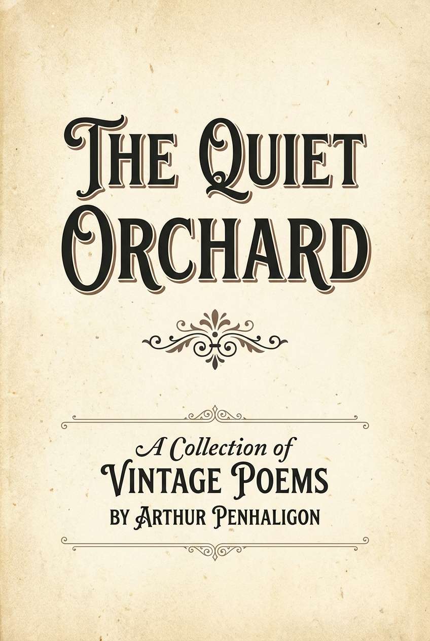
7) Antique Paper Ink
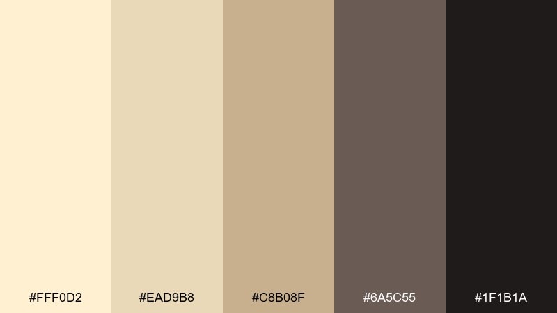
HEX: #FFF0D2 #EAD9B8 #C8B08F #6A5C55 #1F1B1A
Mood: vintage, literary, thoughtful
Best for: book covers and blog headers
Vintage and literary, like worn pages and fountain pen ink. The deep near-black gives strong readability, while the warm mids create that archival feel without looking yellow. Use this cream color palette for covers, long-form blog headers, and quote cards with classic serif type. Tip: add a subtle paper grain and keep accent elements thin, like rules and ornaments.
Image example of antique paper ink generated using media.io
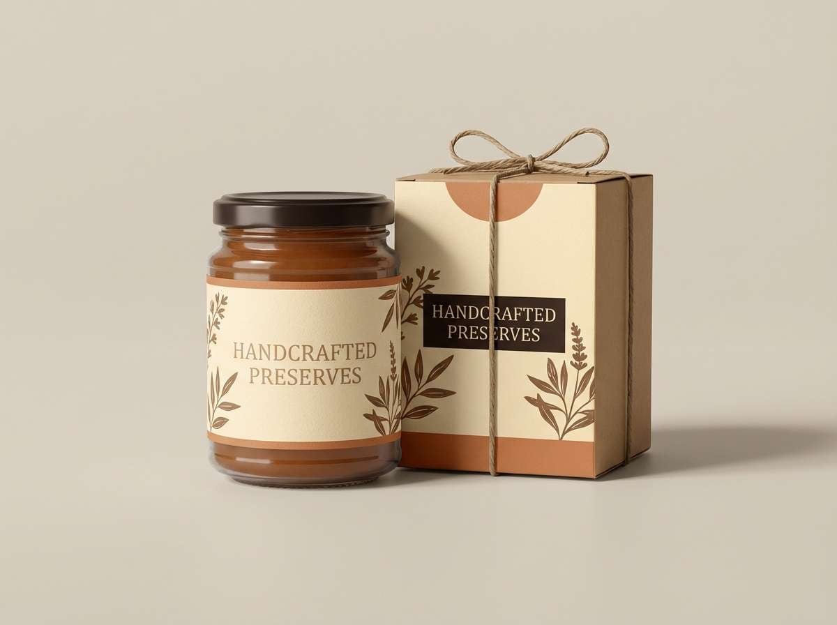
8) Honeyed Walnut
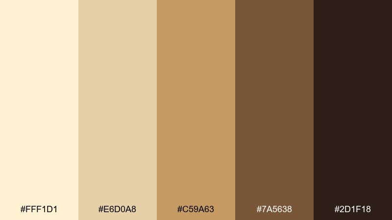
HEX: #FFF1D1 #E6D0A8 #C59A63 #7A5638 #2D1F18
Mood: rich, cozy, handcrafted
Best for: artisan product labels and packaging
Rich and cozy, like honey drizzled over toasted walnuts. The golden midtones make labels feel handcrafted, while the espresso brown adds weight for logos and ingredient lists. These cream color combinations shine on glass jars, paper wraps, and embossed seals. Tip: use the warm gold as a spot-color band to instantly signal premium quality.
Image example of honeyed walnut generated using media.io
9) Citrus Cream Pop
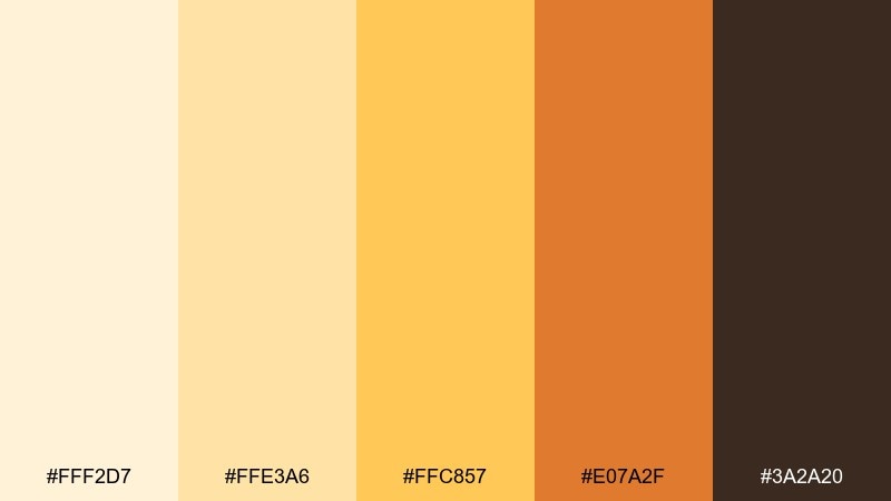
HEX: #FFF2D7 #FFE3A6 #FFC857 #E07A2F #3A2A20
Mood: bright, upbeat, sunny
Best for: social ads and launch graphics
Bright and upbeat, like citrus zest against a buttery pastry. The yellow and amber tones create instant energy for promos, while the deep brown keeps text legible on mobile. For high-contrast creams and warm accents, use the light base for most space and push the orange into CTAs and badges. Tip: keep gradients subtle so the palette stays punchy rather than neon.
Image example of citrus cream pop generated using media.io

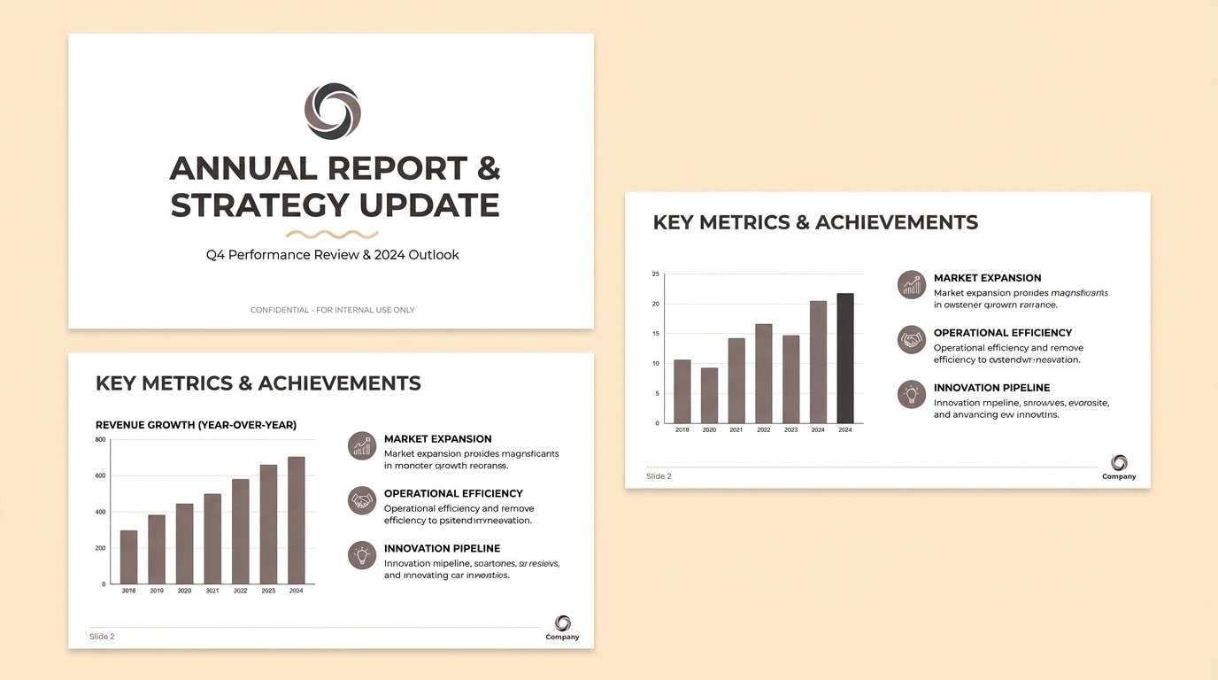
10) Desert Dusk
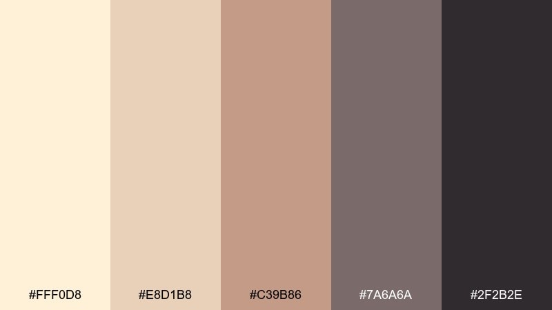
HEX: #FFF0D8 #E8D1B8 #C39B86 #7A6A6A #2F2B2E
Mood: muted, cinematic, calm
Best for: presentation templates and pitch decks
Muted and cinematic, like desert hills at dusk. The mauve-browns feel mature and modern, ideal for decks where you want warmth without looking playful. Use the light cream as slide background, the taupe for sections, and the charcoal for charts and titles. Tip: keep charts to two data colors and let the neutrals do most of the work.
Image example of desert dusk generated using media.io
11) Nordic Cozy
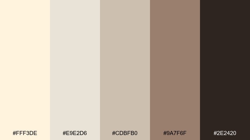
HEX: #FFF3DE #E9E2D6 #CDBFB0 #9A7F6F #2E2420
Mood: cozy, simple, hygge
Best for: home decor branding and lookbooks
Cozy and simple, like a knit throw on a bright winter morning. The warm browns add structure without making the scheme feel heavy, which is great for lookbooks and home brands. Pair these cream colors with natural materials like wood, wool, and ceramic whites for an effortless finish. Tip: use the mid taupe for product names and let the darkest shade stay for small details.
Image example of nordic cozy generated using media.io
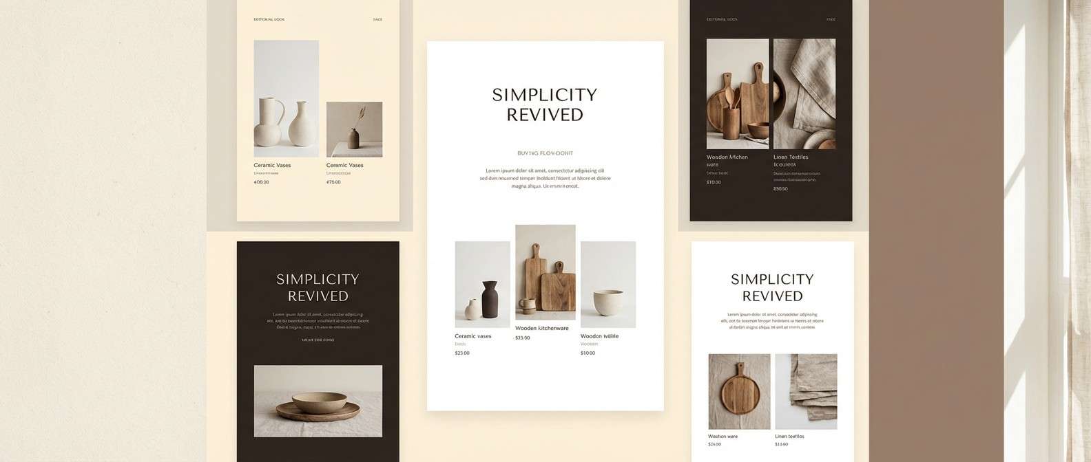
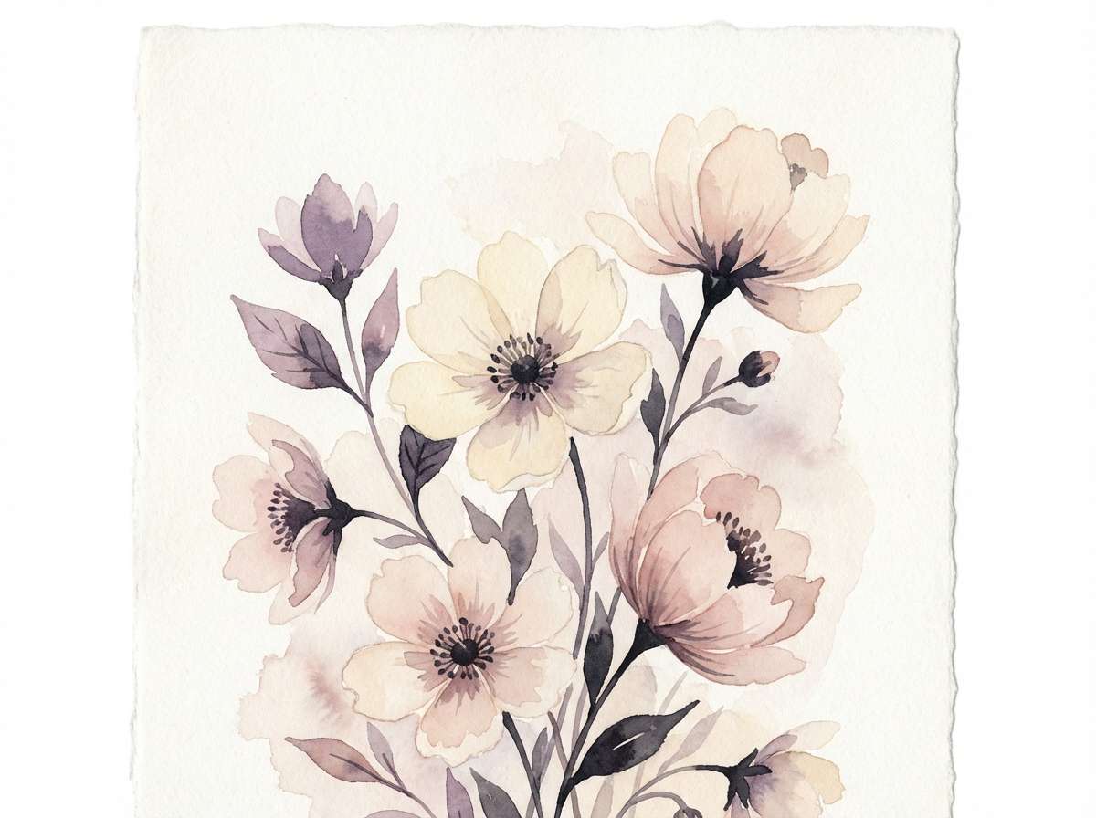
12) Floral Porcelain
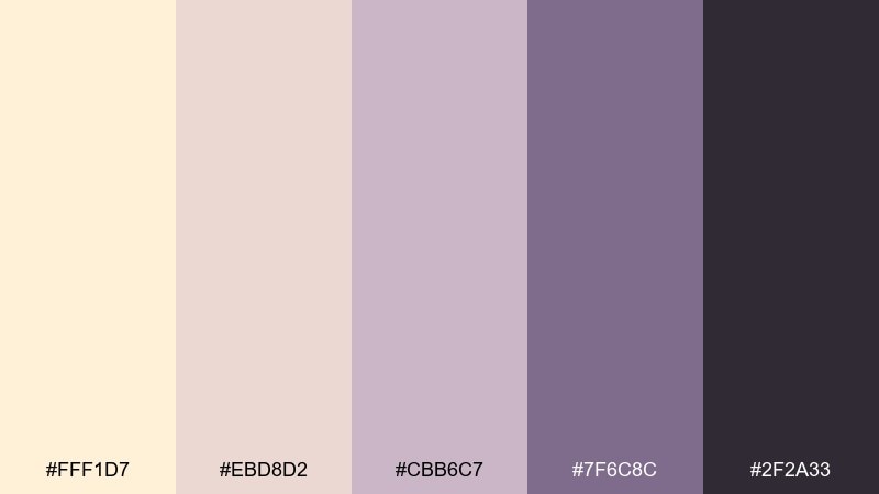
HEX: #FFF1D7 #EBD8D2 #CBB6C7 #7F6C8C #2F2A33
Mood: delicate, artistic, serene
Best for: botanical illustrations and spring campaigns
Delicate and serene, like porcelain petals painted by hand. The lavender-plum tones bring elegance to florals without becoming overly sweet. Use these cream color combinations for spring campaign art, greeting cards, and gentle hero illustrations with lots of negative space. Tip: keep outlines in the dark charcoal so the pastels stay crisp.
Image example of floral porcelain generated using media.io
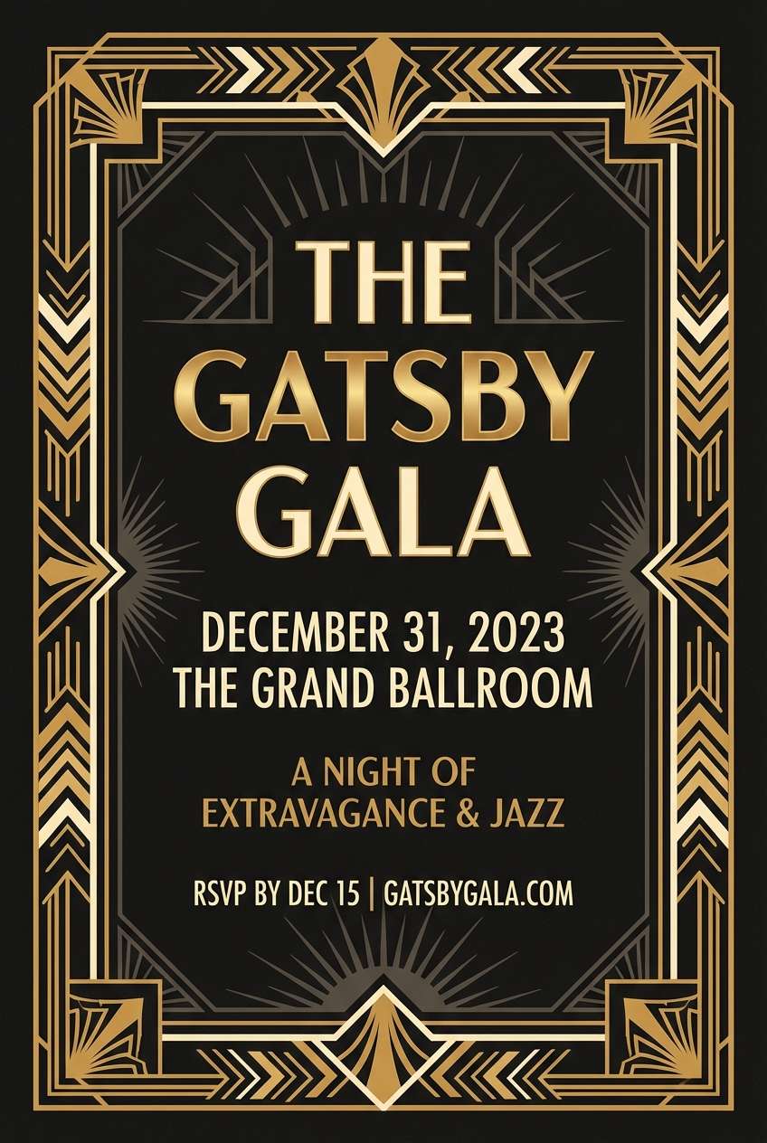
13) Art Deco Glow
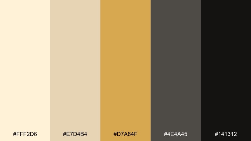
HEX: #FFF2D6 #E7D4B4 #D7A84F #4E4A45 #141312
Mood: glam, bold, upscale
Best for: event posters and luxury promos
Glam and bold, like brass catching light in a dark lounge. The gold tone feels premium against the smoky grays, making it ideal for nightlife promos and high-end events. As a cream color palette with dramatic contrast, it works best with geometric patterns and strong typographic hierarchy. Tip: use the gold sparingly on borders and key numbers to keep it looking expensive.
Image example of art deco glow generated using media.io
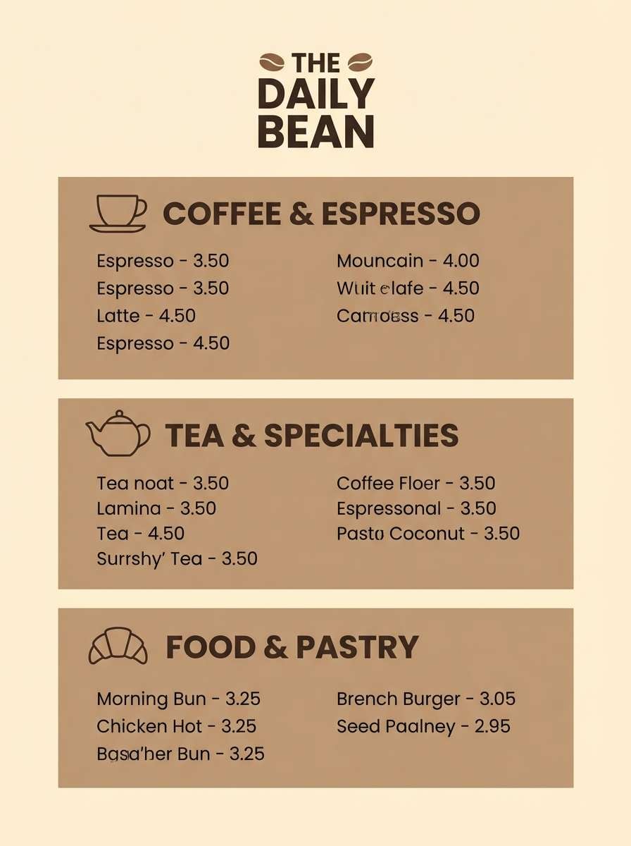
14) Coffeehouse Neutrals
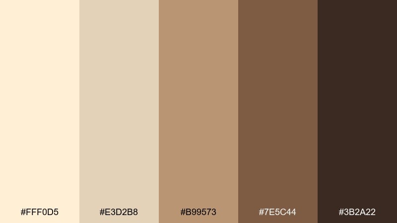
HEX: #FFF0D5 #E3D2B8 #B99573 #7E5C44 #3B2A22
Mood: grounded, friendly, familiar
Best for: menu boards and loyalty cards
Grounded and friendly, like a corner coffeehouse with warm wood and quiet chatter. The caramel and mocha tones make type feel approachable, while the light base keeps the design from getting too dark. Use the mid brown for icons and dividers, and lean on the cream background for legibility. Tip: add a single accent stamp or seal in the deepest shade for brand recognition.
Image example of coffeehouse neutrals generated using media.io
15) Lavender Meringue
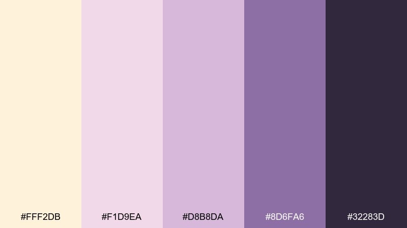
HEX: #FFF2DB #F1D9EA #D8B8DA #8D6FA6 #32283D
Mood: dreamy, sweet, calming
Best for: beauty branding and product ads
Dreamy and calming, like lavender whipped into a light dessert. The mauve-to-violet range feels premium for beauty, especially when paired with soft gradients and minimal copy. For balanced cream color combinations, keep the lightest shade as the canvas and use the deep plum for product names and claims. Tip: add subtle glow highlights rather than harsh shadows to keep the softness.
Image example of lavender meringue generated using media.io
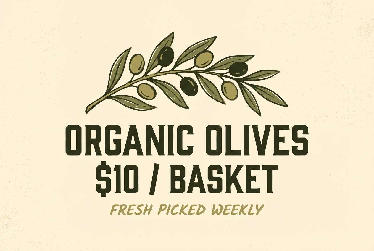
16) Olive Grove
HEX: #FFF1D4 #E7D7B7 #B5A86B #6F7442 #2F331D
Mood: earthy, sunbaked, natural
Best for: organic food labels and farmers market signs
Earthy and sunbaked, like an olive grove at midday. The olive greens feel authentic for organic goods, while the warm cream keeps the look bright and friendly. Use the deep green for certification marks and the yellow-green for highlights on pricing and flavor notes. Tip: pair with simple botanical line art to reinforce the natural story.
Image example of olive grove generated using media.io
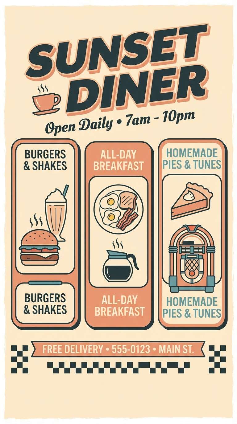
17) Retro Diner
HEX: #FFF0D7 #F7C7A8 #E08D6A #6BA0A6 #2B3A3D
Mood: playful, nostalgic, punchy
Best for: flyers for pop-ups and themed events
Playful and nostalgic, like a retro diner booth and a warm milkshake. The teal brings a fun twist to the peachy warmth, making it great for pop-up flyers and event graphics. Balance the palette by keeping the cream background large and using teal for frames, icons, or a single headline line. Tip: add bold block type and simple checker accents for instant throwback energy.
Image example of retro diner generated using media.io
18) Calm Spa Stone
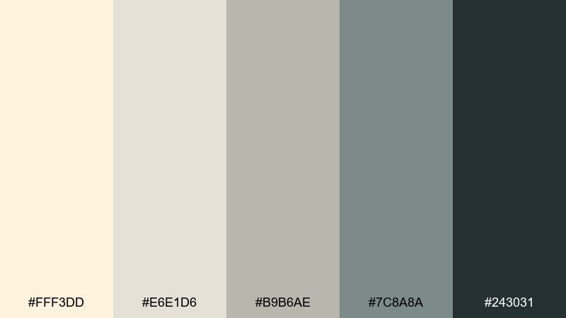
HEX: #FFF3DD #E6E1D6 #B9B6AE #7C8A8A #243031
Mood: calm, clean, restorative
Best for: spa websites and service menus
Calm and restorative, like smooth stones warmed by steam. The cool gray-greens keep pages feeling fresh while the warm cream prevents it from turning sterile. Use the light tones for sections and the deep slate for navigation, pricing, and form labels. Tip: keep button fills muted and rely on contrast plus spacing for a serene UX.
Image example of calm spa stone generated using media.io
19) Winter Sun
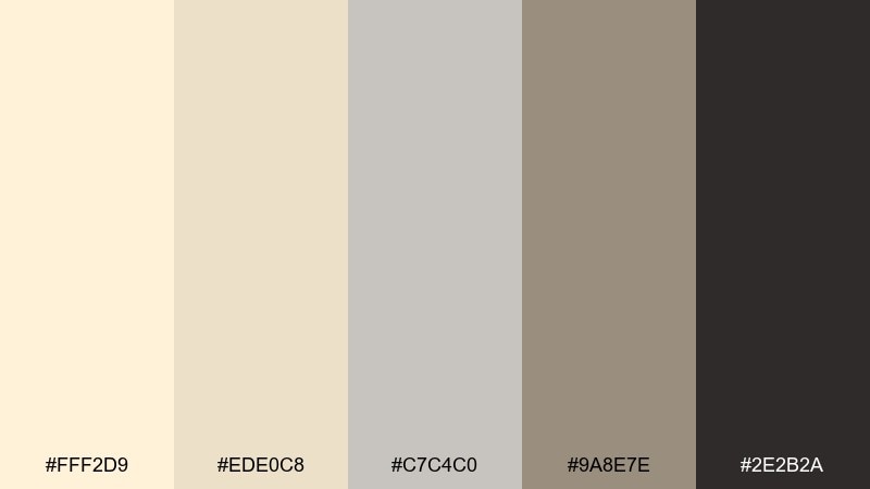
HEX: #FFF2D9 #EDE0C8 #C7C4C0 #9A8E7E #2E2B2A
Mood: soft, neutral, quietly bright
Best for: corporate branding and reports
Soft and quietly bright, like pale sunlight through winter clouds. These cream color combinations feel professional without going cold, making them reliable for reports, corporate sites, and documentation. Use the warm taupe for section headers and the charcoal for charts and footnotes. Tip: introduce contrast through typography weight rather than adding extra colors.
Image example of winter sun generated using media.io
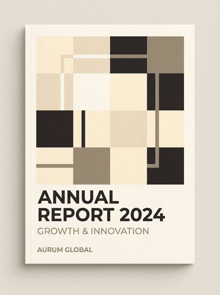
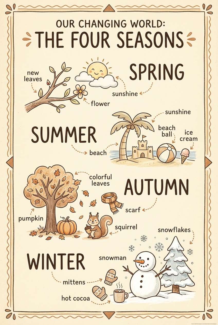
20) Storybook Parchment
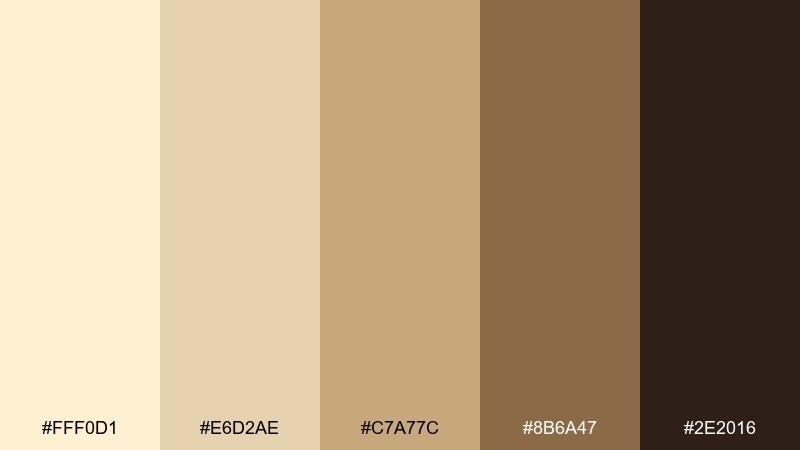
HEX: #FFF0D1 #E6D2AE #C7A77C #8B6A47 #2E2016
Mood: whimsical, warm, nostalgic
Best for: kids book covers and educational posters
Whimsical and warm, like parchment pages in a well-loved storybook. The honey browns create a friendly tone for educational posters and children-focused covers, while the deep brown keeps titles readable. As a cream color scheme, it pairs nicely with hand-drawn illustrations and soft shading. Tip: keep backgrounds light and let the darker shades frame characters and key text.
Image example of storybook parchment generated using media.io
What Colors Go Well with Cream?
Cream pairs beautifully with grounded darks like espresso brown, charcoal, and deep forest green because they provide clean contrast for text and UI components. It also works with warm metals (gold, brass) for a premium look.
For softer combinations, try muted accents such as blush pink, sage, dusty lavender, or warm taupe. These keep the palette calm while still giving you hierarchy for headings, icons, and highlights.
If you want more energy, add citrus yellow, amber, or terracotta in small doses. Cream keeps these accents from feeling neon, especially when you maintain a darker neutral for typography.
How to Use a Cream Color Combination in Real Designs
In branding, cream is an ideal “paper” color: use it for backgrounds, packaging bases, and social templates, then choose one deep anchor (charcoal or dark brown) for the logo and body text. Add one accent color for CTAs, seals, or badges.
In UI design, treat cream as your primary surface and use slightly darker creams/taupes for cards, borders, and input states. Reserve the darkest shade for navigation and text to maintain accessibility and clarity.
For weddings and interiors, combine cream with texture: linen, matte paper, ceramics, light wood, and brushed metals. This keeps the look rich even when the color contrast is intentionally soft.
Create Cream Palette Visuals with AI
If you want to preview how cream tones look on a poster, product label, UI screen, or invitation, generate quick mockups before committing to final design. This is especially helpful when you’re deciding between warm browns, sage greens, or gold accents.
Start with one palette, paste the prompt, and tweak keywords like “studio lighting,” “paper grain,” “minimal typography,” or “vector style” to match your project. Keep the HEX colors consistent so your visuals stay on-brand.
When you find a look you like, you can iterate fast by swapping only the subject (menu, packaging, dashboard) while keeping the same cream color scheme.
Cream Color Palette FAQs
-
What is the best text color to use on a cream background?
Charcoal or deep brown usually reads best on cream because it keeps contrast high while matching the warm tone. For long-form content, avoid light grays that can look washed out against cream. -
Is cream a warm or cool color?
Most creams are warm because they include yellow or beige undertones. If a cream leans slightly gray, it can feel more neutral and modern, but it’s still typically warmer than pure white. -
What colors go well with cream for a modern brand?
Try cream with charcoal, slate, sage, or muted taupe for a clean modern feel. Add one controlled accent (gold, terracotta, or amber) to create a recognizable brand highlight. -
How do I keep a cream palette from looking “too beige”?
Introduce a cooler counterbalance like slate teal, gray-green, or a violet-plum accent, and use a strong dark for typography. Texture (grain, matte finishes) can also make creams look intentional and premium. -
Can I use cream in UI design without losing accessibility?
Yes—use cream for surfaces, but keep text and key UI elements in dark tones (charcoal, deep green, or espresso). Check contrast ratios for buttons and links, and rely on weight/spacing as well as color. -
What’s the difference between cream, ivory, and beige?
Cream is a soft off-white with noticeable warmth, ivory is often slightly lighter and less brown, and beige is darker with more brown/gray influence. In palettes, cream is commonly used as the “light base” color. -
What’s a good accent color for cream in marketing graphics?
For high-energy promos, amber or orange works well; for calm campaigns, sage or dusty lavender is a great fit. Keep the accent to small areas (badges, CTAs, borders) so cream stays dominant.


