

Charcoal is the modern “dark neutral” that makes layouts feel sleek, grounded, and instantly more premium than pure black. It’s deep enough for contrast, but softer on the eyes across UI, print, and interiors.
Below are 20 ready-to-use charcoal color palette combinations with HEX codes, plus practical pairing ideas and tips for applying charcoal tones in real designs.
In this article
- Why Charcoal Palettes Work So Well
-
- smoke and linen
- city night neon
- sage studio charcoal
- espresso and cream brown
- slate rose minimal
- harbor fog blues
- vintage newspaper gray
- graphite citrus pop
- mountain cabin warmth
- museum marble white
- cyber monochrome
- autumn ember glow
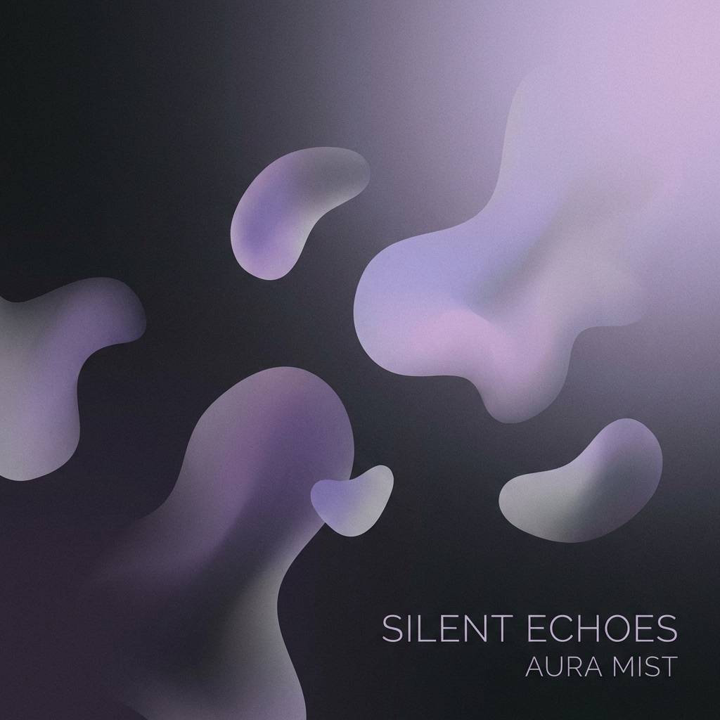
- lavender haze night
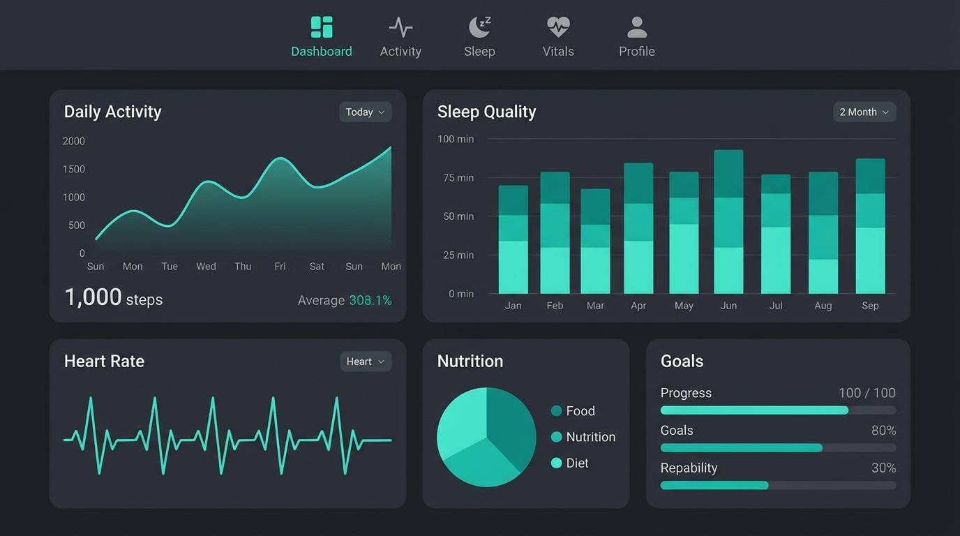
- teal depths modern
- sandstone shadow neutral
- winter pine calm
- soft clay portrait
- boutique gold accent
- ink and coral punch
- quiet rain mist
- What Colors Go Well with Charcoal?
- How to Use a Charcoal Color Palette in Real Designs
- Create Charcoal Palette Visuals with AI
Why Charcoal Palettes Work So Well
Charcoal sits in the sweet spot between black and gray: it delivers strong contrast and structure while feeling less harsh than pure black. That makes it ideal for modern branding, readable long-form layouts, and calm dark-mode interfaces.
Because charcoal is neutral, it plays well with almost any accent color—from muted earth tones to high-saturation neon. You can keep a design minimal with creams and soft grays, or push energy with bold pops like coral, citrus, and cyan.
Charcoal also hides imperfections better than flat black in real-world applications. In interiors, product photography, and packaging, it looks more natural under varied lighting and materials, especially when paired with texture or warm highlights.
20+ Charcoal Color Palette Ideas (with HEX Codes)
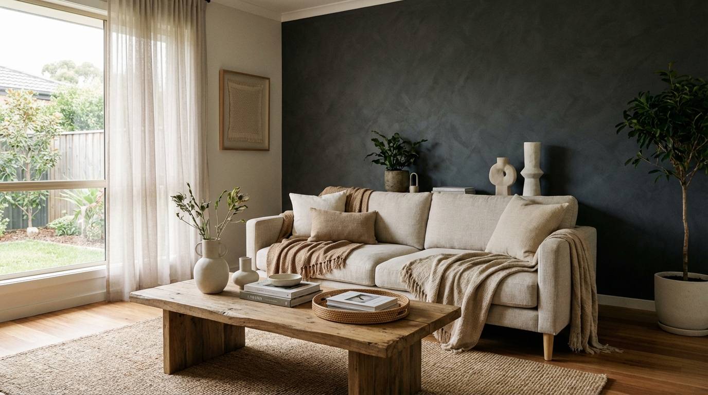
1) Smoke and Linen
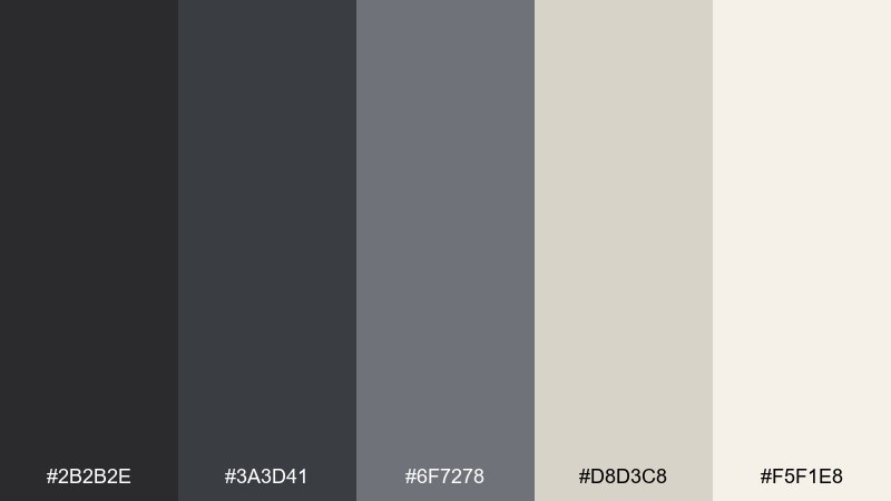
HEX: #2b2b2e #3a3d41 #6f7278 #d8d3c8 #f5f1e8
Mood: calm, airy, understated
Best for: scandinavian interiors, wellness branding, minimal websites
Calm and airy like morning haze over soft fabric, these tones feel clean without turning sterile. The charcoal color palette anchors layouts with depth, while linen neutrals keep pages and rooms bright. Pair it with matte black hardware, warm wood, or subtle grain textures for extra realism. Usage tip: reserve the lightest cream for whitespace and highlights so the darker grays stay crisp.
Image example of smoke and linen generated using media.io
Media.io is an online AI studio for creating and editing video, image, and audio in your browser.

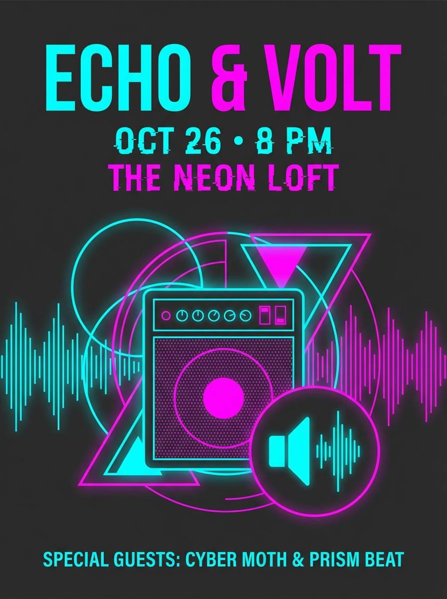
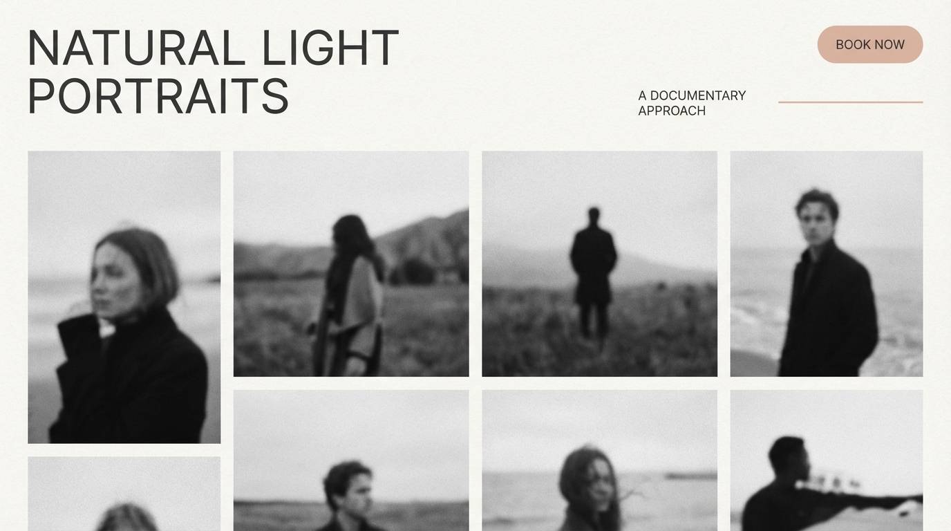
2) City Night Neon
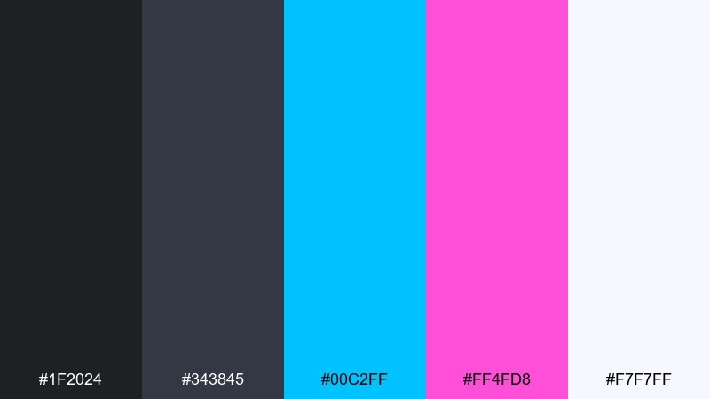
HEX: #1f2024 #343845 #00c2ff #ff4fd8 #f7f7ff
Mood: electric, nightlife, high-contrast
Best for: music event posters, esports branding, app splash screens
Electric and punchy like city lights after midnight, this mix thrives on contrast. These charcoal color combinations let neon accents pop while keeping the base sophisticated. Pair with bold sans typography and simple geometric shapes to avoid visual noise. Usage tip: limit neon to buttons and key headers so the interface stays readable.
Image example of city night neon generated using media.io
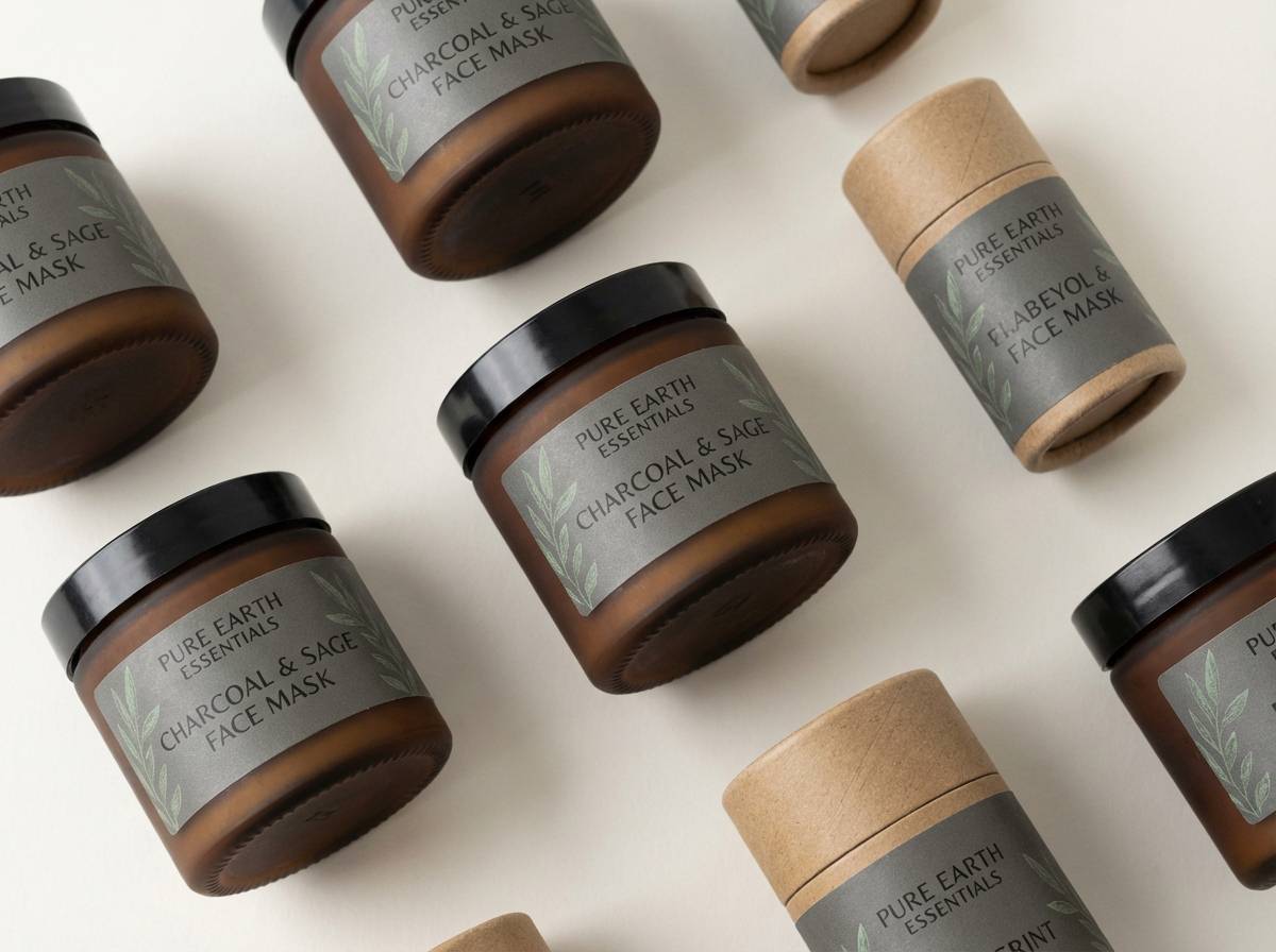
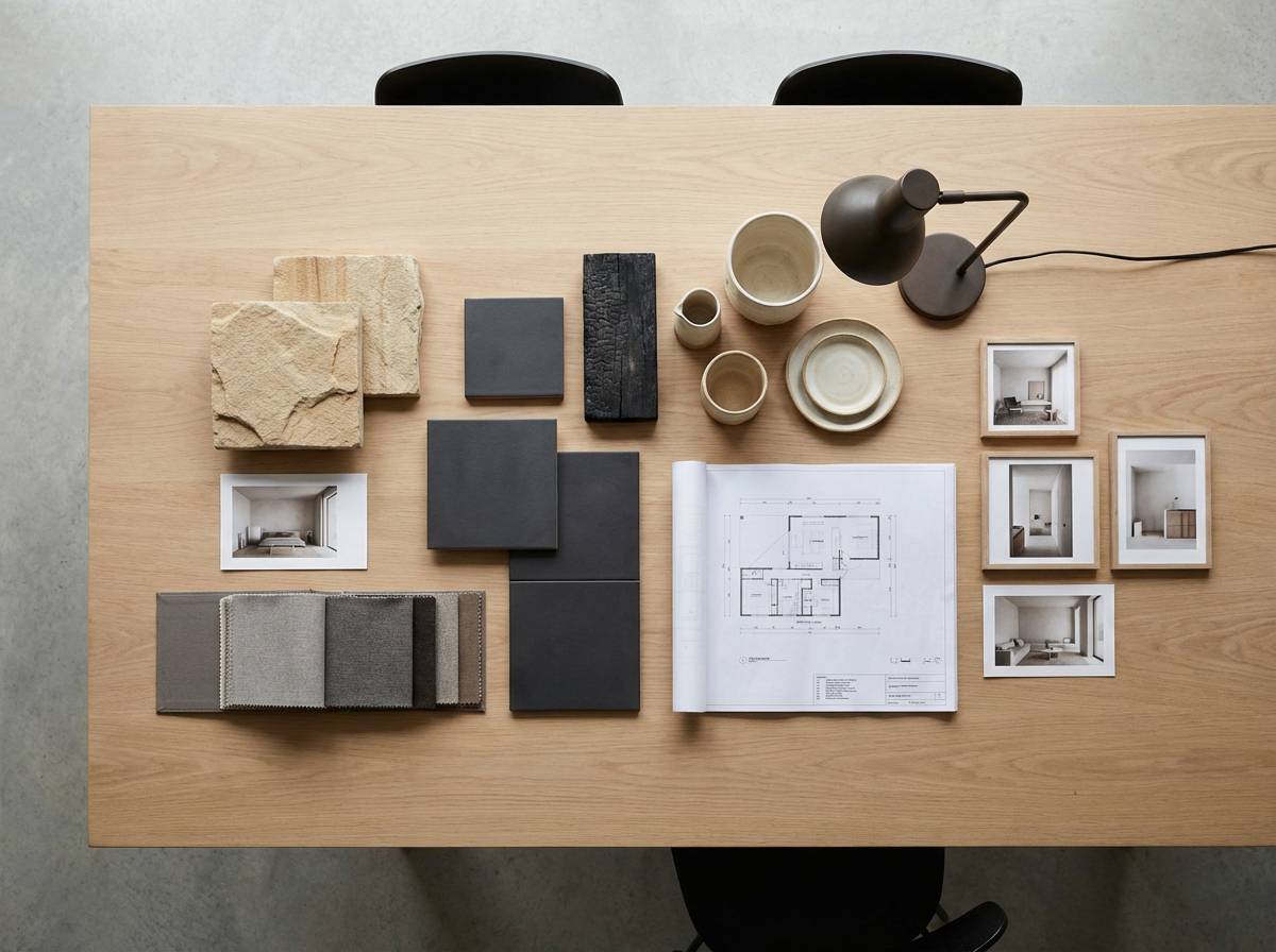
3) Sage Studio Charcoal
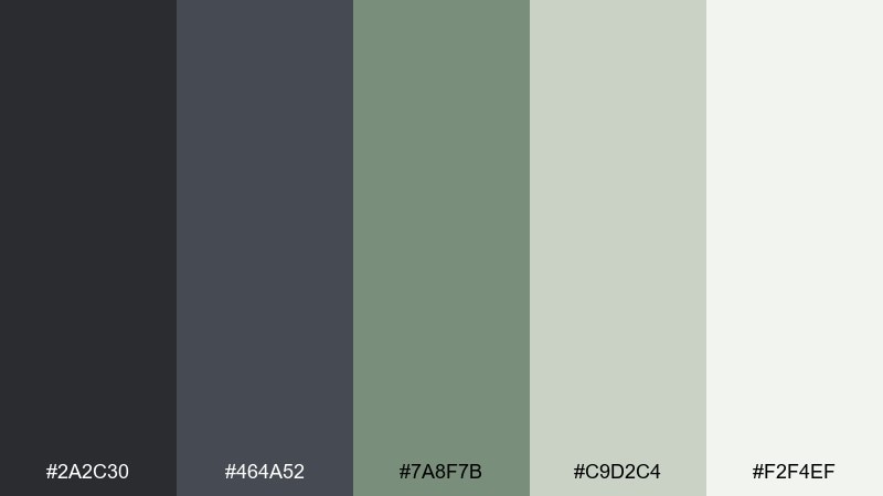
HEX: #2a2c30 #464a52 #7a8f7b #c9d2c4 #f2f4ef
Mood: grounded, fresh, creative
Best for: studio brands, sustainable packaging, calm dashboards
Grounded and fresh, it feels like a sunlit studio with plants and concrete floors. The muted sage softens the deep grays, making the whole set feel approachable for modern design. Pair it with recycled paper textures, off-white backgrounds, and subtle line icons for a clean eco look. Usage tip: use the sage midtone for secondary buttons and tags to keep hierarchy clear.
Image example of sage studio charcoal generated using media.io
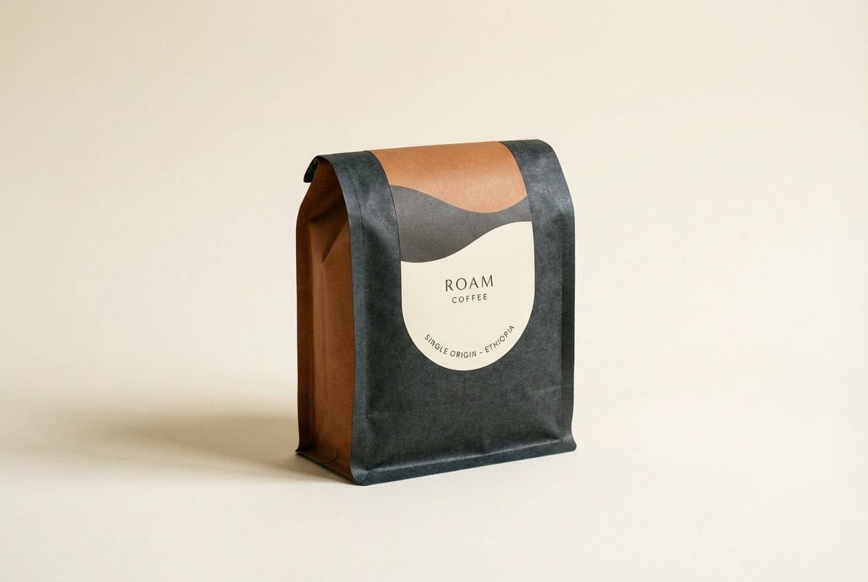
4) Espresso and Cream Brown
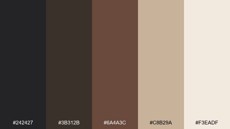
HEX: #242427 #3b312b #6a4a3c #c8b29a #f3eadf
Mood: cozy, artisanal, warm
Best for: coffee brands, bakery menus, rustic interiors
Cozy and artisanal, it evokes espresso crema, worn leather, and warm café lighting. The brown undertones make the dark base feel less industrial and more inviting. Pair with kraft paper textures, serif headlines, and soft lighting photography for a handcrafted vibe. Usage tip: keep the cream brown for backgrounds so product shots and type stay legible.
Image example of espresso and cream brown generated using media.io
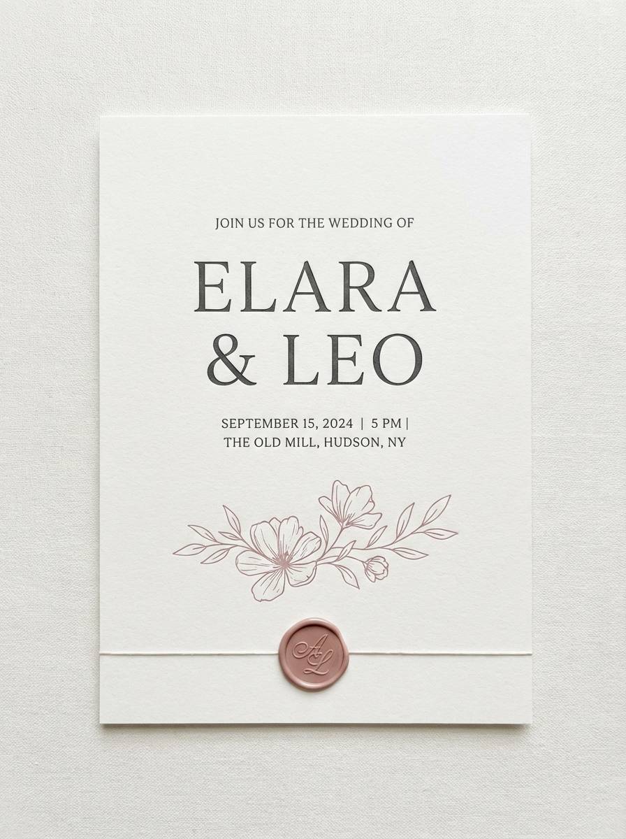
5) Slate Rose Minimal
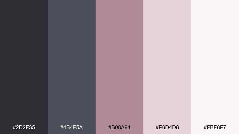
HEX: #2d2f35 #4b4f5a #b08a94 #e6d4d8 #fbf6f7
Mood: soft, modern, romantic
Best for: beauty branding, wedding stationery, social templates
Soft and modern with a romantic edge, it feels like rose petals on polished stone. The dusty pink brings warmth without turning sugary, especially against the slate grays. Pair with thin lines, generous margins, and elegant serif accents for a premium feel. Usage tip: use the rose midtone sparingly as a focal color for calls to action or seals.
Image example of slate rose minimal generated using media.io
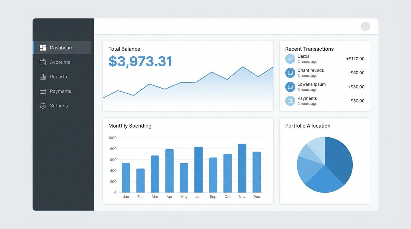
6) Harbor Fog Blues
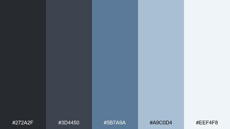
HEX: #272a2f #3d4450 #5b7a9a #a9c0d4 #eef4f8
Mood: cool, coastal, composed
Best for: finance apps, B2B SaaS, nautical branding
Cool and composed like a foggy harbor, these blues read trustworthy and calm. The steely base keeps layouts professional, while the lighter blue tints add breathing room. Pair with simple charts, rounded UI components, and subtle gradients for a modern SaaS look. Usage tip: keep the darkest tone for navigation and use the pale blue for surfaces and cards.
Image example of harbor fog blues generated using media.io
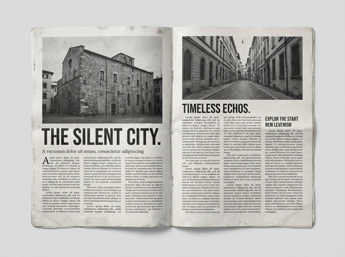
7) Vintage Newspaper Gray
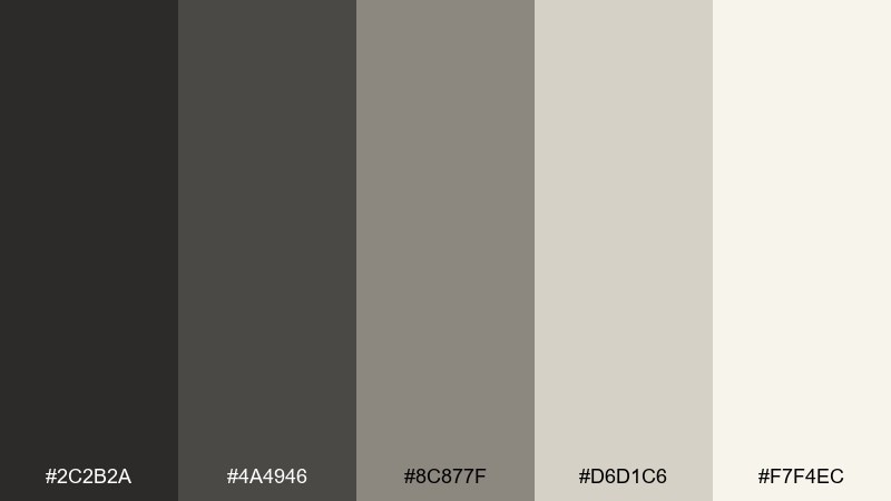
HEX: #2c2b2a #4a4946 #8c877f #d6d1c6 #f7f4ec
Mood: classic, editorial, textured
Best for: magazines, book covers, heritage branding
Classic and editorial, it brings to mind newsprint, ink, and soft paper grain. A charcoal color scheme like this works beautifully for long-form reading because contrast stays comfortable. Pair with serif fonts, subtle rules, and monochrome photography for an authentic print feel. Usage tip: add a tiny bit of texture to the light backgrounds to avoid a flat digital look.
Image example of vintage newspaper gray generated using media.io
8) Graphite Citrus Pop
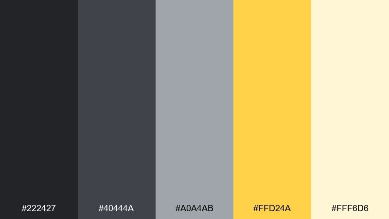
HEX: #222427 #40444a #a0a4ab #ffd24a #fff6d6
Mood: playful, energetic, crisp
Best for: startup landing pages, sports promos, icon sets
Playful and energetic, it feels like sunlight cutting through a cloudy skyline. The yellow accent adds instant optimism while the graphite tones keep the design sharp. Pair with bold icons, clean outlines, and white space so the bright note stays intentional. Usage tip: use the citrus only for key interactions like hover states and primary buttons.
Image example of graphite citrus pop generated using media.io

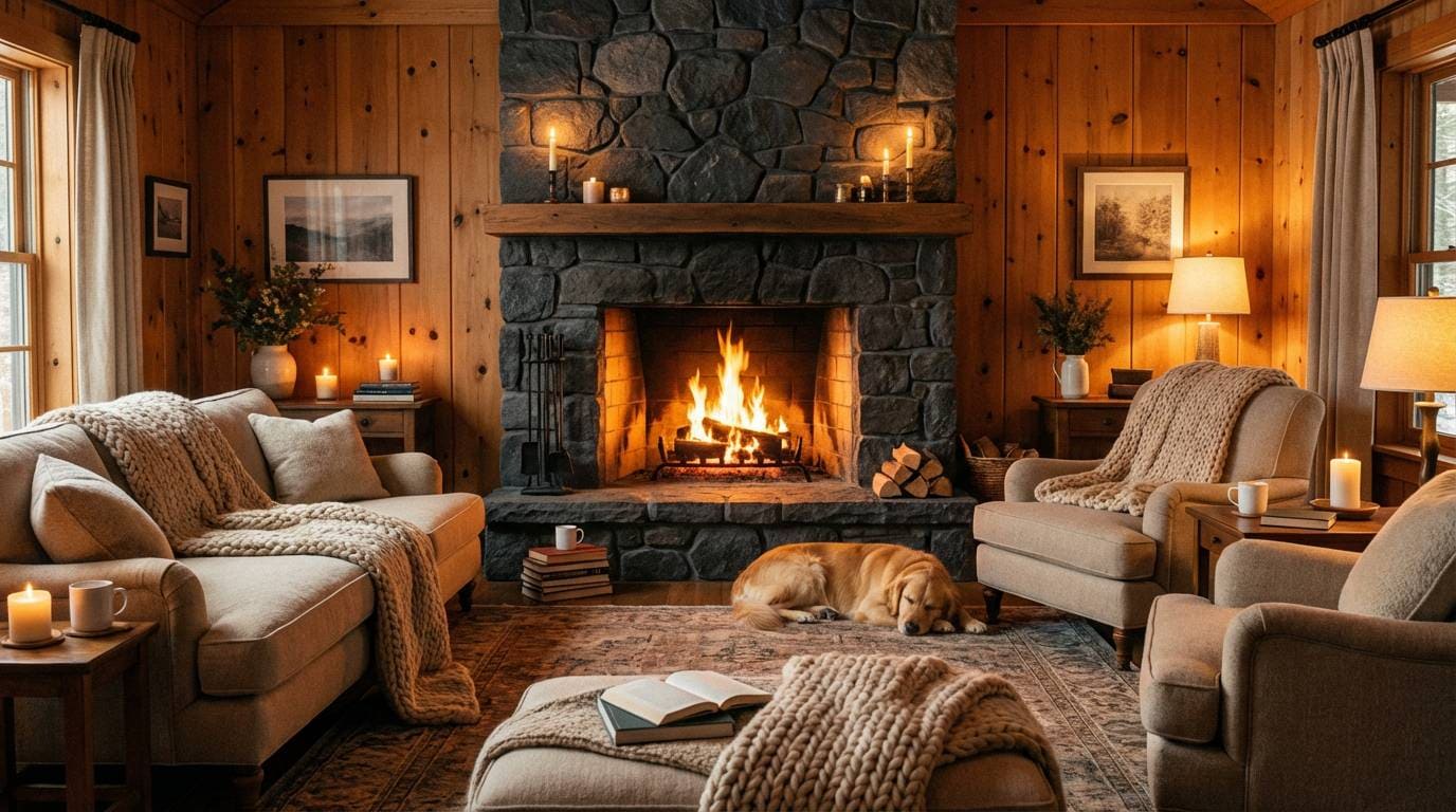
9) Mountain Cabin Warmth
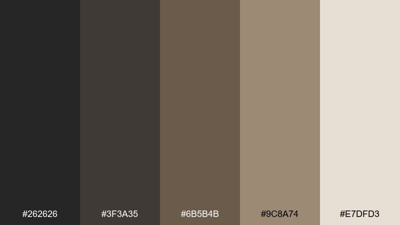
HEX: #262626 #3f3a35 #6b5b4b #9c8a74 #e7dfd3
Mood: rustic, grounded, cozy
Best for: outdoor brands, cabin rentals, lifestyle photography
Rustic and grounded, it evokes pine smoke, wool blankets, and weathered timber. The warm browns keep the dark tones inviting rather than stark. Pair with natural materials, handwritten accents, and warm lighting to lean into the cabin feel. Usage tip: use the pale beige for text blocks and captions to maintain readability over darker photos.
Image example of mountain cabin warmth generated using media.io
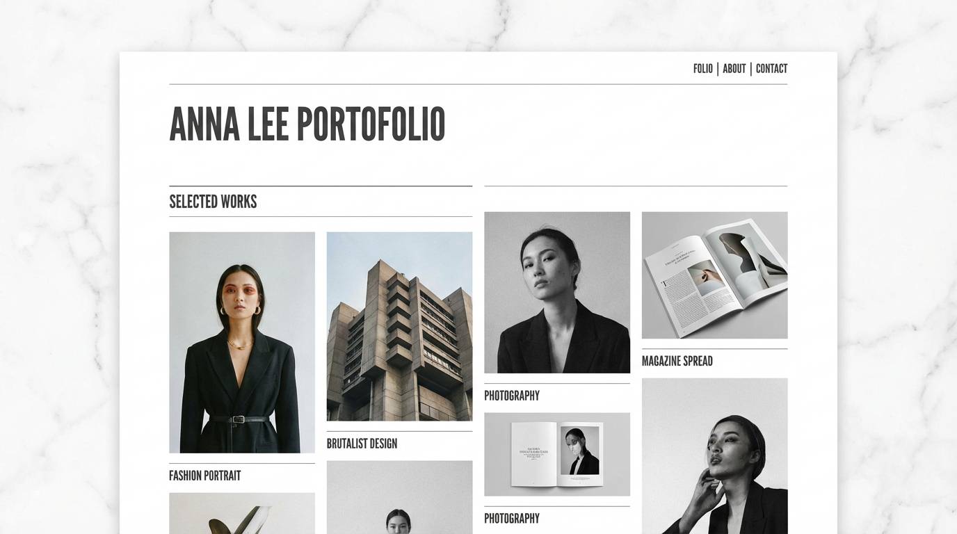
10) Museum Marble White
HEX: #1f2125 #3b3f45 #8b9097 #d9dadc #ffffff
Mood: gallery-clean, premium, balanced
Best for: portfolio sites, architecture studios, luxury product pages
Gallery-clean and premium, it feels like a quiet museum hall with polished stone and soft spotlights. This charcoal color palette is a strong choice for showcasing photography, typography, and white space without glare. Pair with thin grid lines, restrained animations, and high-resolution imagery for a modern portfolio look. Usage tip: keep pure white for margins and hero sections, and use mid-gray for dividers instead of black.
Image example of museum marble white generated using media.io
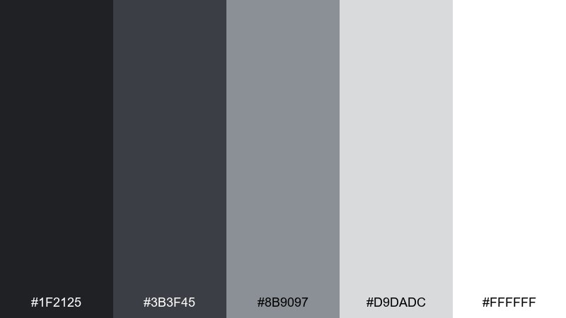
11) Cyber Monochrome
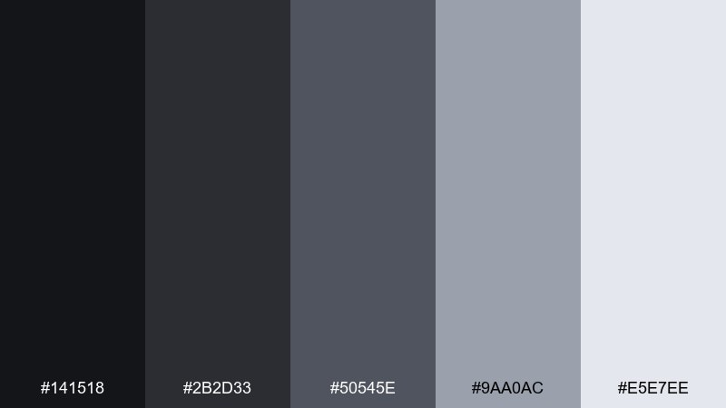
HEX: #141518 #2b2d33 #50545e #9aa0ac #e5e7ee
Mood: sleek, technical, futuristic
Best for: developer tools, dark mode UI, dashboards
Sleek and technical, it evokes terminal windows, brushed metal, and late-night focus. The tight grayscale range makes it ideal for interfaces that rely on hierarchy and spacing. Pair with a single accent color outside this set when you need alerts or success states. Usage tip: bump contrast for small text by placing light gray on the darkest background, not mid-gray on mid-gray.
Image example of cyber monochrome generated using media.io
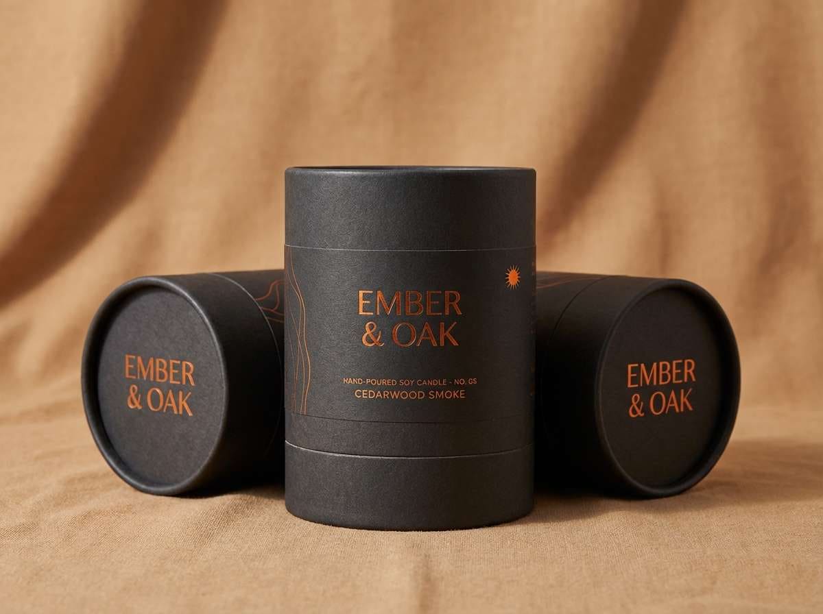
12) Autumn Ember Glow
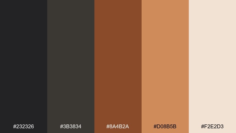
HEX: #232326 #3b3834 #8a4b2a #d08b5b #f2e2d3
Mood: warm, seasonal, inviting
Best for: fall campaigns, food photography, cozy packaging
Warm and seasonal, it brings to mind ember light, cinnamon, and worn clay. The orange-brown notes add comfort while the dark base keeps everything grounded. Pair with kraft textures, moody food shots, and soft shadows for a rich autumn look. Usage tip: use the lighter tan for backgrounds so the ember shades can be used as accents without overpowering.
Image example of autumn ember glow generated using media.io
13) Lavender Haze Night
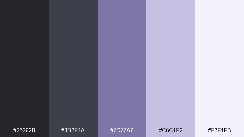
HEX: #25262b #3d3f4a #7d77a7 #c6c1e2 #f3f1fb
Mood: dreamy, moody, soft
Best for: music covers, beauty brands, dreamy UI themes
Dreamy and moody, it feels like lavender mist drifting through a dark room. The purple undertone adds personality while the neutrals keep the palette wearable for brands. Pair with soft gradients, blurred shapes, and thin sans type for a modern atmospheric look. Usage tip: keep the lavender for accent cards and highlights, and let the dark grays do the heavy lifting for contrast.
Image example of lavender haze night generated using media.io
14) Teal Depths Modern
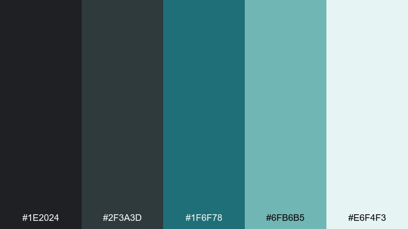
HEX: #1e2024 #2f3a3d #1f6f78 #6fb6b5 #e6f4f3
Mood: fresh, modern, aquatic
Best for: health tech, spa brands, data visualizations
Fresh and modern, it evokes deep water, glass, and clean air. Teal brings clarity to the darker base and reads especially well in charts and infographics. Pair with lots of negative space and rounded corners for a friendly, contemporary UI. Usage tip: use the pale aqua for cards and surfaces, and reserve the deep teal for interactive elements.
Image example of teal depths modern generated using media.io
15) Sandstone Shadow Neutral
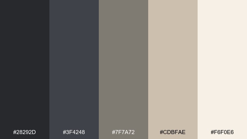
HEX: #28292d #3f4248 #7f7a72 #cdbfae #f6f0e6
Mood: organic, timeless, balanced
Best for: interior mood boards, architecture, lifestyle blogs
Organic and timeless, it feels like sandstone walls in soft shade. The warm neutrals balance the darkness, making it a reliable choice for long-lived branding. Pair with natural light photography, beige ceramics, and subtle shadows for depth. Usage tip: choose the greige midtone for body text when pure black feels too harsh.
Image example of sandstone shadow neutral generated using media.io
16) Winter Pine Calm
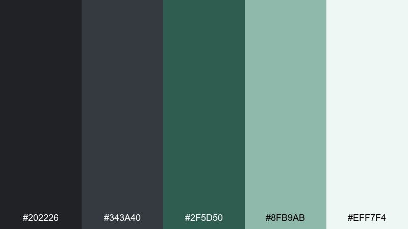
HEX: #202226 #343a40 #2f5d50 #8fb9ab #eff7f4
Mood: cool, calming, outdoorsy
Best for: outdoor apparel, winter campaigns, nature blogs
Cool and calming, it suggests evergreen forests, cold air, and quiet trails. The green reads natural against charcoal, giving the set a confident outdoor character. Pair with textured photography, simple badges, and clean sans type for a modern adventure brand. Usage tip: keep the minty light tone for backgrounds so product photos remain the focal point.
Image example of winter pine calm generated using media.io
17) Soft Clay Portrait
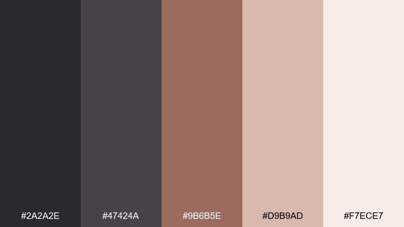
HEX: #2a2a2e #47424a #9b6b5e #d9b9ad #f7ece7
Mood: soft, human, flattering
Best for: portrait retouch presets, personal brands, lifestyle sites
Soft and human, it feels like clay, blush, and gentle studio lighting. The warm skin-like tones prevent the dark grays from feeling cold, which works well for portraits and personal stories. Pair with rounded UI elements, warm photography, and minimal iconography. Usage tip: use the clay midtone as a consistent accent for links and small labels.
Image example of soft clay portrait generated using media.io
18) Boutique Gold Accent
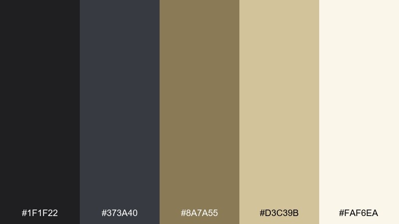
HEX: #1f1f22 #373a40 #8a7a55 #d3c39b #faf6ea
Mood: luxury, refined, warm-metallic
Best for: jewelry branding, premium packaging, hotel identity
Luxury and refined, it evokes brushed gold on dark stone and soft candlelight. These charcoal color combinations feel instantly premium when paired with minimal layouts and high-end photography. Pair with foil-stamp effects, elegant serif headlines, and generous spacing for a boutique look. Usage tip: use the gold-beige for small highlights only, like icons or rules, to keep it tasteful.
Image example of boutique gold accent generated using media.io
19) Ink and Coral Punch
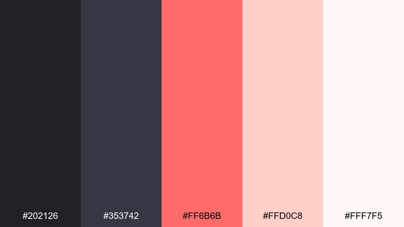
HEX: #202126 #353742 #ff6b6b #ffd0c8 #fff7f5
Mood: bold, friendly, contemporary
Best for: CTA-driven landing pages, food brands, social ads
Bold and friendly, it feels like fresh coral paint against dark ink. The coral brings instant warmth and urgency, making it great for conversion-focused design. Pair with clean photography, strong buttons, and short headlines so the accent color stays impactful. Usage tip: keep coral for primary actions and use the blush tint for hover states and subtle highlights.
Image example of ink and coral punch generated using media.io
20) Quiet Rain Mist
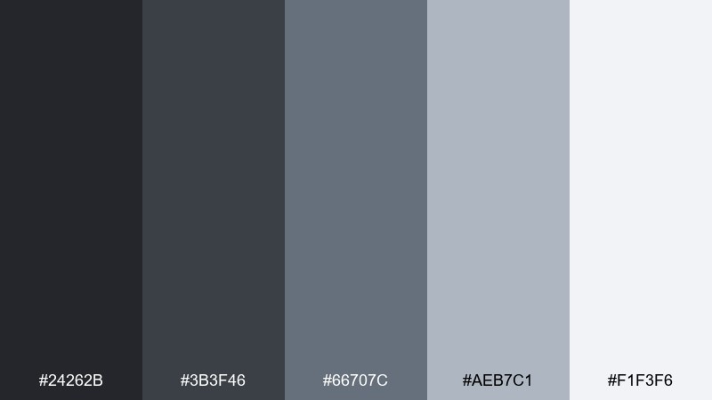
HEX: #24262b #3b3f46 #66707c #aeb7c1 #f1f3f6
Mood: quiet, thoughtful, professional
Best for: reports, corporate decks, productivity apps
Quiet and thoughtful, it resembles rain clouds and clean concrete after a shower. The blue-gray steps create smooth hierarchy for text-heavy layouts and presentations. Pair with simple icons, thin dividers, and consistent spacing for a polished corporate look. Usage tip: use the lightest gray for slide backgrounds and keep the darkest tone for headings and key numbers.
Image example of quiet rain mist generated using media.io
What Colors Go Well with Charcoal?
Charcoal pairs effortlessly with light neutrals like ivory, linen, and warm white for a clean, premium look. This is the safest route for brands that want sophistication without feeling heavy.
For color accents, charcoal supports both cool and warm directions: teal and slate blue read calm and trustworthy, while clay, caramel, and gold-beige feel cozy and upscale. If you need punch, use small amounts of coral, citrus yellow, cyan, or magenta to create crisp focal points.
When in doubt, keep charcoal as the structural base (navigation, headings, frames) and let accents appear only where you want attention (buttons, badges, key data points).
How to Use a Charcoal Color Palette in Real Designs
In UI design, use charcoal for navigation and primary surfaces, then step upward through mid-grays for borders and secondary panels. Reserve near-white or pale tints for cards and text-heavy sections to maintain readability and reduce eye strain.
In branding and packaging, charcoal works best when you add texture: soft grain, matte paper, brushed metal, or subtle gradients. This keeps dark neutrals from looking flat and helps photography feel more dimensional.
For typography, avoid pure-black text on charcoal backgrounds; choose off-white or light gray for body copy, and test contrast for small text. Charcoal excels when hierarchy is clear: spacing, weight, and a restrained accent color do most of the work.
Create Charcoal Palette Visuals with AI
If you already have HEX codes, the next step is seeing them in context—posters, packaging mockups, landing pages, and room scenes. That’s where AI visuals help you validate mood, contrast, and accent balance fast.
With Media.io Text-to-Image, you can paste a prompt like the examples above and generate multiple on-brand concepts in minutes. Iterate by changing lighting (soft, studio, neon), materials (paper, metal, fabric), and layout (minimal, editorial, high-contrast).
Charcoal Color Palette FAQs
-
What is the HEX code for charcoal?
There isn’t one single universal charcoal HEX, but common charcoal shades include values around #1F2125, #202126, and #2B2B2E. Pick the exact charcoal based on whether you want a cooler (blue-gray) or warmer (brown-gray) undertone. -
Is charcoal better than black for UI design?
Often, yes. Charcoal usually feels less harsh than pure black, improves comfort in dark mode, and gives you more flexibility for hierarchy because you can still use near-black as a deeper step if needed. -
What accent colors pop against charcoal?
High-contrast accents like citrus yellow, coral, cyan, and magenta pop strongly. For a calmer look, use muted accents like sage, teal, dusty rose, or slate blue. -
Can I use charcoal for backgrounds without making a design feel too dark?
Yes—balance it with generous whitespace (warm white or pale tints), lighter cards/surfaces, and restrained accents. Avoid filling every area with dark tones; let charcoal act as structure, not wall-to-wall fill. -
What text color works best on a charcoal background?
Use off-white or light gray rather than pure white for body text to reduce glare, then reserve brighter whites for key headings. Always check contrast, especially for small type and thin fonts. -
Does charcoal work with warm palettes like cream and brown?
Yes. Warm neutrals (cream, beige, caramel, tan) make charcoal feel inviting and artisanal—great for cafés, interiors, premium packaging, and lifestyle brands. -
How do I keep a charcoal palette from looking flat?
Add subtle texture (grain, paper, stone), include at least one warm or cool midtone, and use multiple value steps (dark, mid, light). Small highlights—like gold-beige rules or soft gradients—also add depth.


