

Gold is one of the easiest ways to add “premium” to a design—without changing layout, typography, or imagery. A well-built gold color palette can read classic, modern, playful, or corporate depending on what you pair it with.
Below you’ll find 20 ready-to-use gold palette ideas with HEX codes, practical pairing notes, and AI prompt examples you can recreate for branding, UI, packaging, and print.
In this article
- Why Gold Palettes Work So Well
-
- gilded ivory
- antique brass
- sunlit marigold
- champagne glow
- midnight gold
- royal brocade
- desert dune gold
- minimal gold and white
- olive and gold accent
- blush gold romance
- teal and gold modern
- coastal gold and blue
- coffee gold warmth
- slate gold corporate
- lavender gold dream
- emerald gold luxe
- rust gold autumn
- neon gold nightlife
- monochrome gold metals
- ink gold editorial
- What Colors Go Well with Gold?
- How to Use a Gold Color Palette in Real Designs
- Create Gold Palette Visuals with AI
Why Gold Palettes Work So Well
Gold works because it’s both a color and a signal. Even in flat digital HEX form (not foil), gold implies value, celebration, and craftsmanship—so small accents can lift an entire layout.
It also pairs beautifully with a wide range of neutrals. Creams, charcoals, deep browns, and cool slates help gold look intentional instead of “yellow,” while keeping typography readable.
Finally, gold is flexible across styles. With black it becomes dramatic; with blush it turns romantic; with teal or slate it feels modern and product-ready for UI and branding systems.
20+ Gold Color Palette Ideas (with HEX Codes)
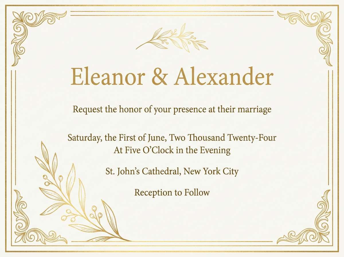
1) Gilded Ivory
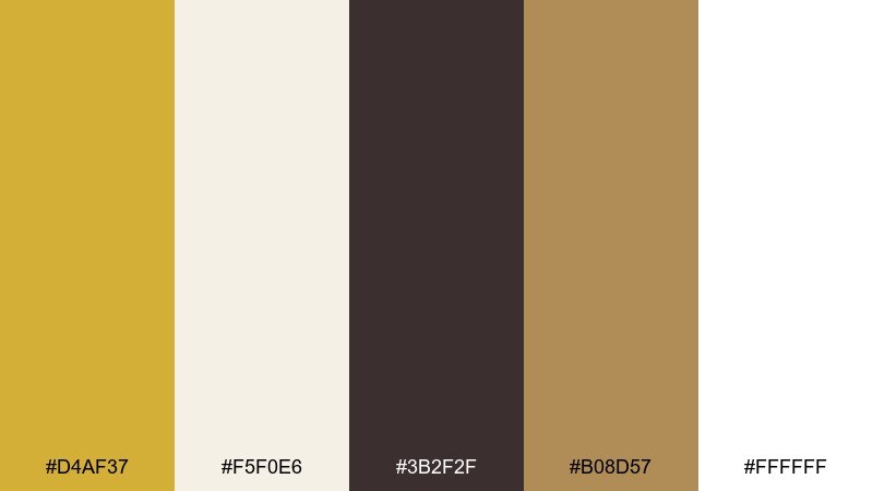
HEX: #D4AF37 #F5F0E6 #3B2F2F #B08D57 #FFFFFF
Mood: polished, timeless, celebratory
Best for: wedding stationery, luxury logos, premium packaging
Polished and celebratory, this mix feels like candlelight on ivory paper with a soft metallic gleam. It is a gold color palette that stays elegant by leaning on creamy whites and a deep espresso anchor. Pair it with minimal black typography, embossed textures, or subtle marble details to keep it upscale. Usage tip: reserve the brightest gold for borders and small accents so the layout never feels heavy.
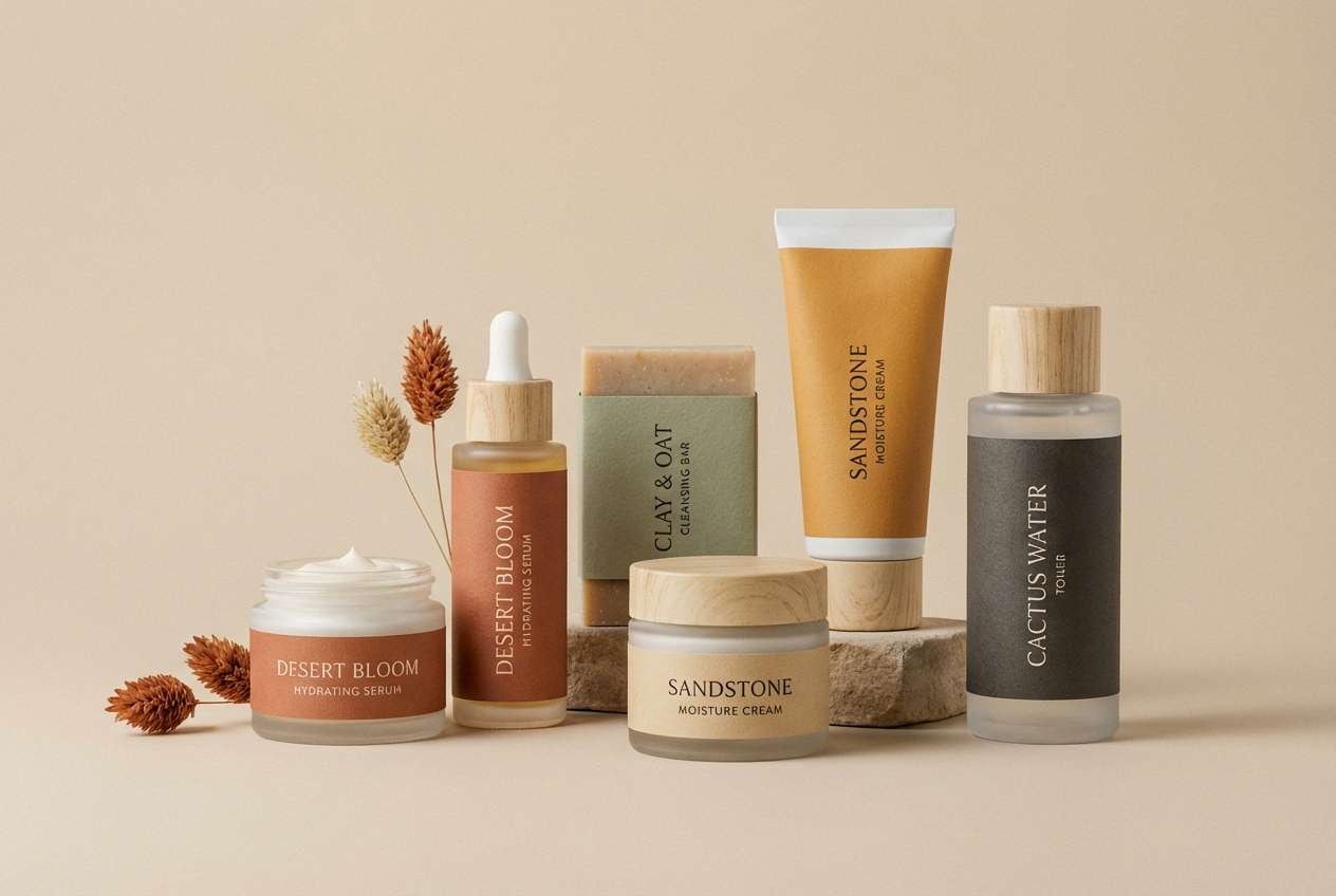
Image example of gilded ivory generated using media.io
Media.io is an online AI studio for creating and editing video, image, and audio in your browser.

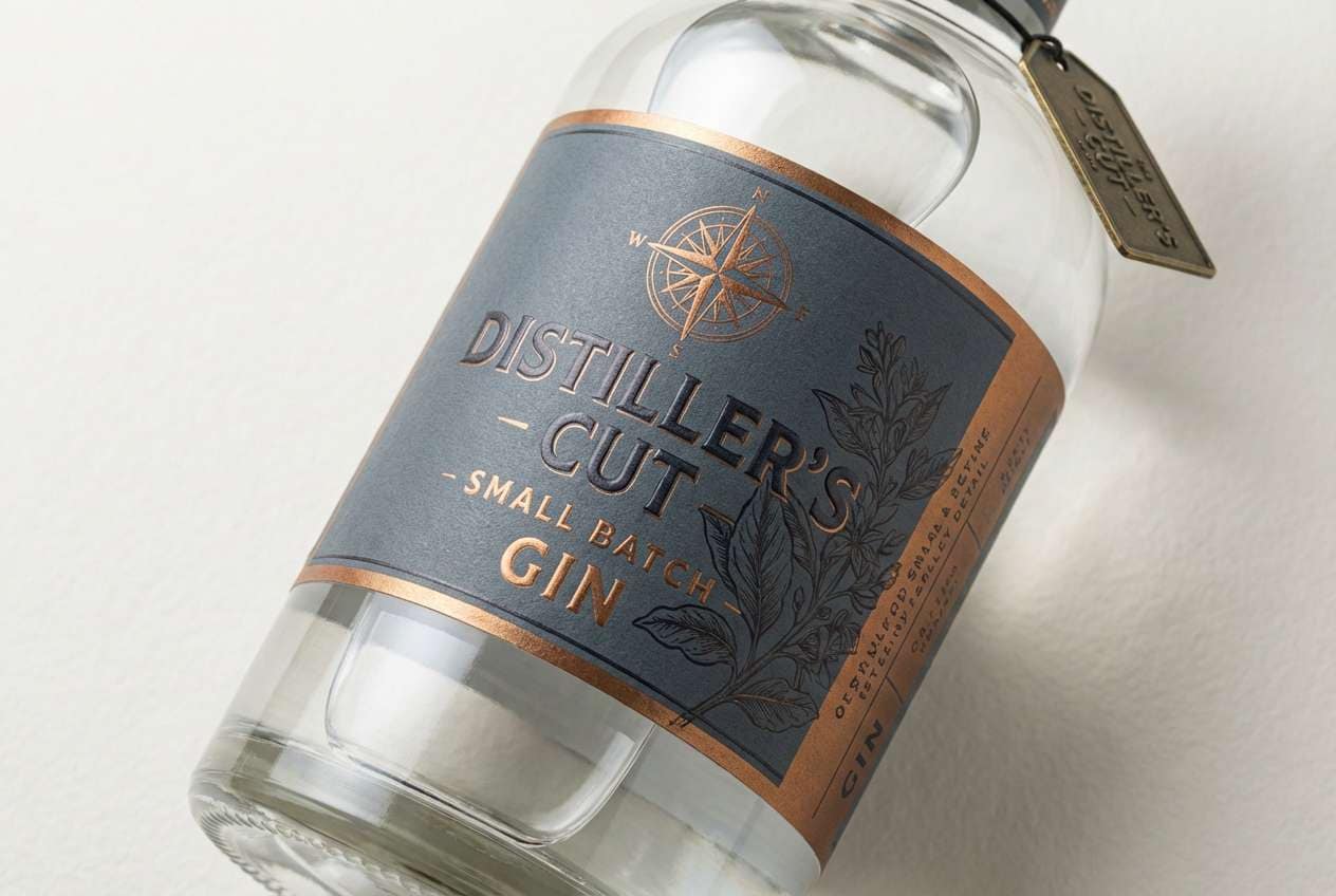
2) Antique Brass
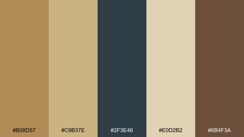
HEX: #B08D57 #C9B37E #2F3E46 #E0D2B2 #6B4F3A
Mood: heritage, grounded, artisanal
Best for: craft spirits labels, heritage brands, boutique interiors
Heritage and grounded, these tones evoke aged brass hardware, woodgrain, and old library shelves. The muted metal notes sit comfortably next to deep brown, making it ideal for tactile, story-rich branding. Pair with off-white paper stocks and a touch of slate for a modern update. Usage tip: use the darkest shade for type and keep the brass tones for stamps, seals, and small icons.
Image example of antique brass generated using media.io
3) Sunlit Marigold
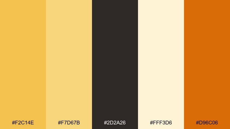
HEX: #F2C14E #F7D67B #2D2A26 #FFF3D6 #D96C06
Mood: bright, optimistic, energetic
Best for: seasonal campaigns, food branding, social graphics
Bright and optimistic, these shades feel like late-afternoon sun on citrus and saffron. The warm orange accent adds a punch that works well for calls to action and promotional headers. Pair with charcoal text and generous cream space to keep readability high. Usage tip: limit the vivid orange to one key element per design so the marigold stays the hero.
Image example of sunlit marigold generated using media.io

4) Champagne Glow
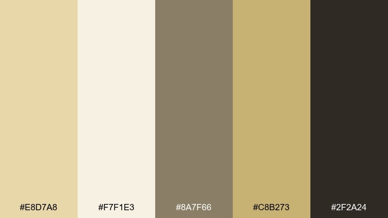
HEX: #E8D7A8 #F7F1E3 #8A7F66 #C8B273 #2F2A24
Mood: soft, airy, refined
Best for: beauty brands, minimalist websites, event signage
Soft and refined, this set reads like champagne bubbles and warm silk. The gentle neutrals make it easy to build calm layouts without losing a premium feel. Pair with matte black accents and thin line icons for a modern, editorial finish. Usage tip: keep contrast by using the deep brown for body text and the pale tones for large backgrounds.
Image example of champagne glow generated using media.io
5) Midnight Gold
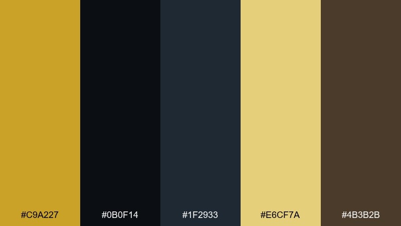
HEX: #C9A227 #0B0F14 #1F2933 #E6CF7A #4B3B2B
Mood: dramatic, sleek, high-contrast
Best for: tech branding, luxury ads, cinematic posters
Dramatic and sleek, this mix brings to mind city lights against a midnight sky. The bright metallic notes pop sharply on near-black, making it perfect for bold headlines and premium hero sections. Pair with subtle gradients or grain textures to add depth without clutter. Usage tip: use the pale gold sparingly as a highlight for icons, dividers, and key numbers.
Image example of midnight gold generated using media.io
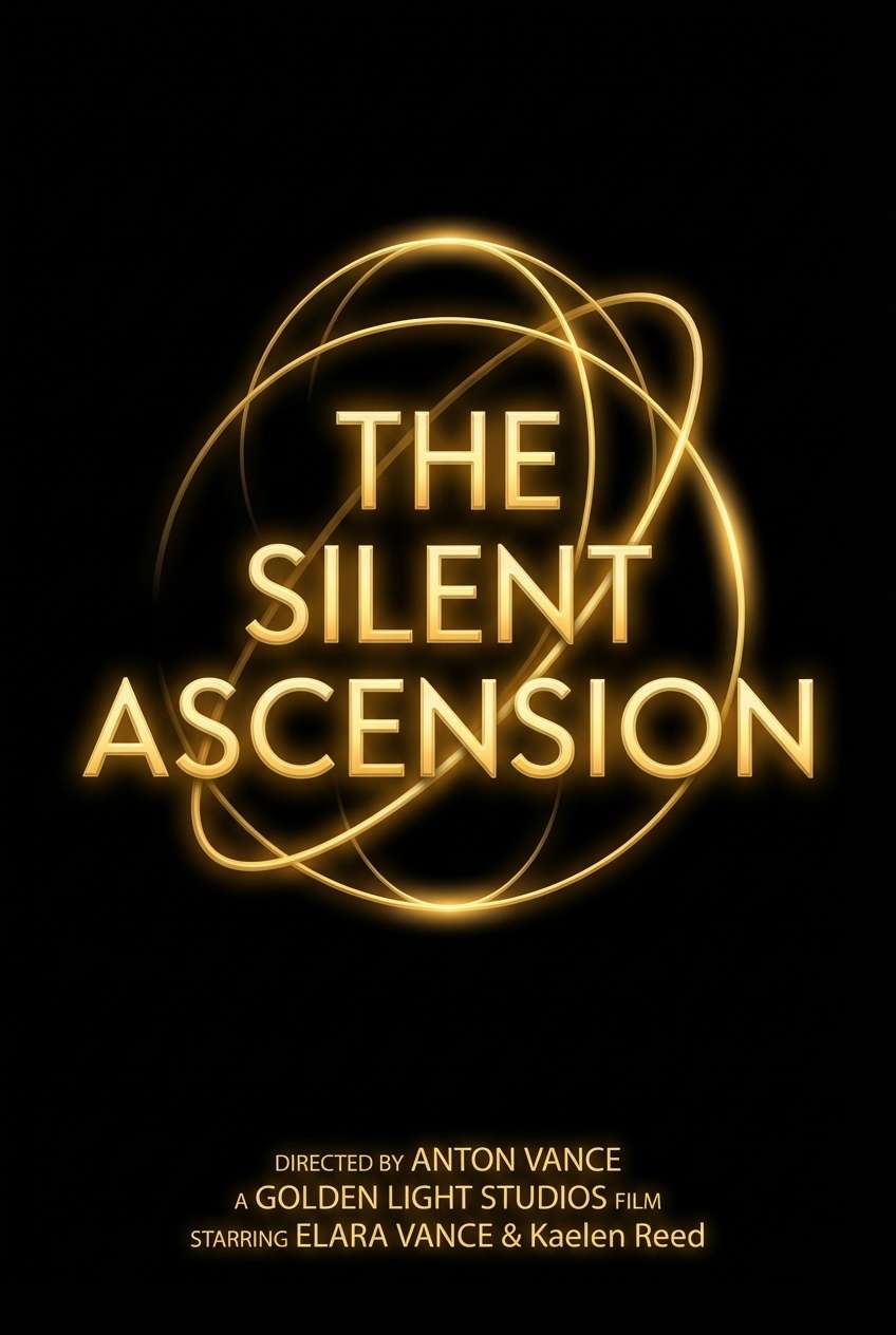
6) Royal Brocade
HEX: #D1A954 #3F1D5A #1B1B1D #F3E2B9 #7A4E2D
Mood: opulent, bold, regal
Best for: luxury fashion, premium invitations, brand campaigns
Opulent and bold, the deep violet feels like velvet drapery beside luminous metal thread. These gold color combinations work best when the purple takes the lead and the warm highlight plays the role of jewelry. Pair with creamy parchment tones to soften transitions and keep shadows rich. Usage tip: treat gold like a finishing touch for borders, monograms, and small ornaments rather than full blocks.
Image example of royal brocade generated using media.io
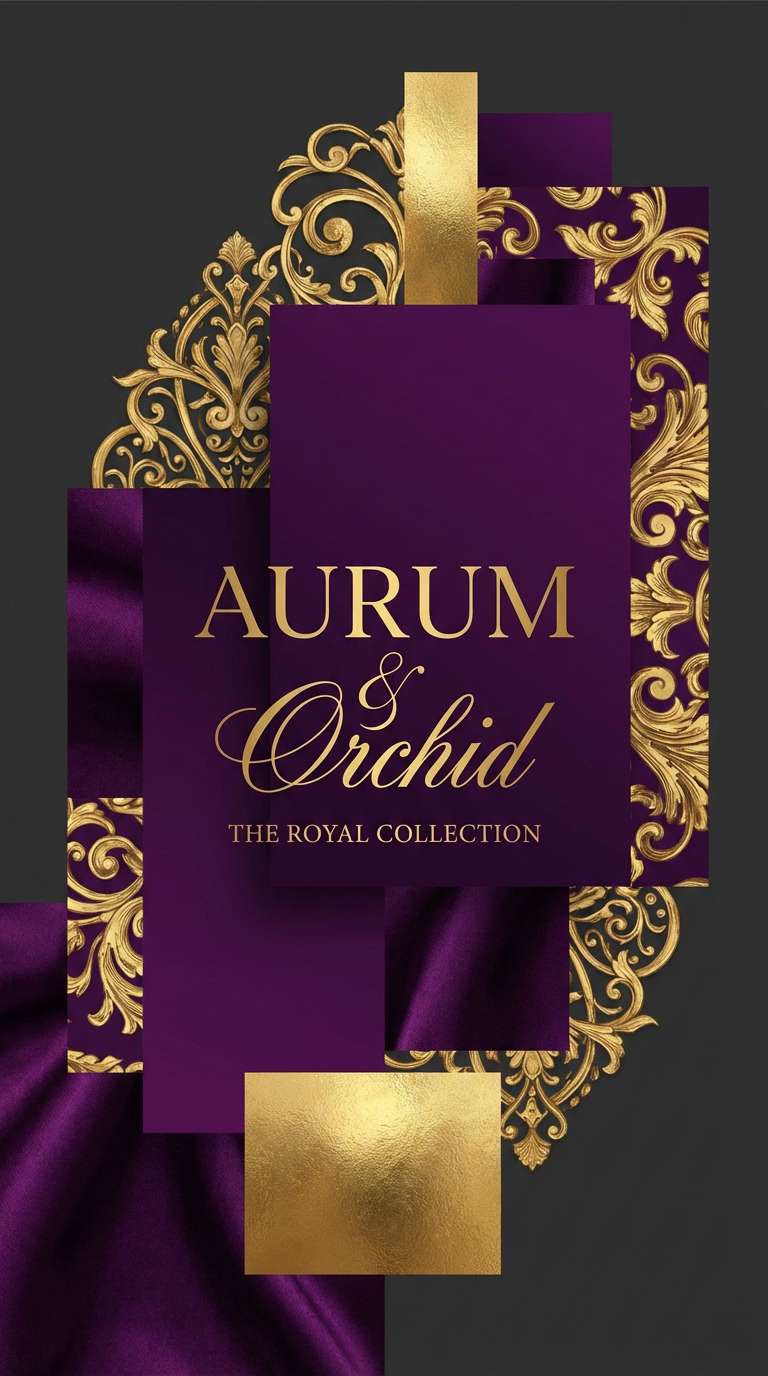
7) Desert Dune Gold
HEX: #CAA24A #E7D3A8 #A67C52 #4A3F35 #F4EFE3
Mood: earthy, sunbaked, calm
Best for: travel brands, natural skincare, lifestyle blogs
Earthy and calm, this set evokes sunbaked dunes, woven textiles, and warm stone. The sandy midtones create an easy base for backgrounds, while the deeper brown adds structure for navigation and headings. Pair with natural photography, clay textures, and simple sans-serif type. Usage tip: use the lightest shade for breathing room and let the gold-brown carry buttons and highlights.
Image example of desert dune gold generated using media.io
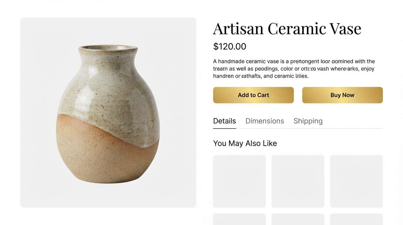
8) Minimal Gold and White
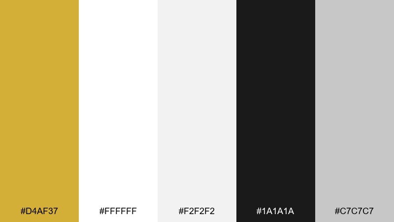
HEX: #D4AF37 #FFFFFF #F2F2F2 #1A1A1A #C7C7C7
Mood: clean, modern, understated
Best for: ui systems, ecommerce, product landing pages
Clean and understated, the look is like a crisp gallery wall with a single metallic detail. The neutral grays keep everything professional, while the warm accent adds a premium cue without shouting. Pair with bold black typography and plenty of whitespace for a sharp, modern finish. Usage tip: apply the gold only to primary buttons, key badges, and active states for consistent hierarchy.
Image example of minimal gold and white generated using media.io
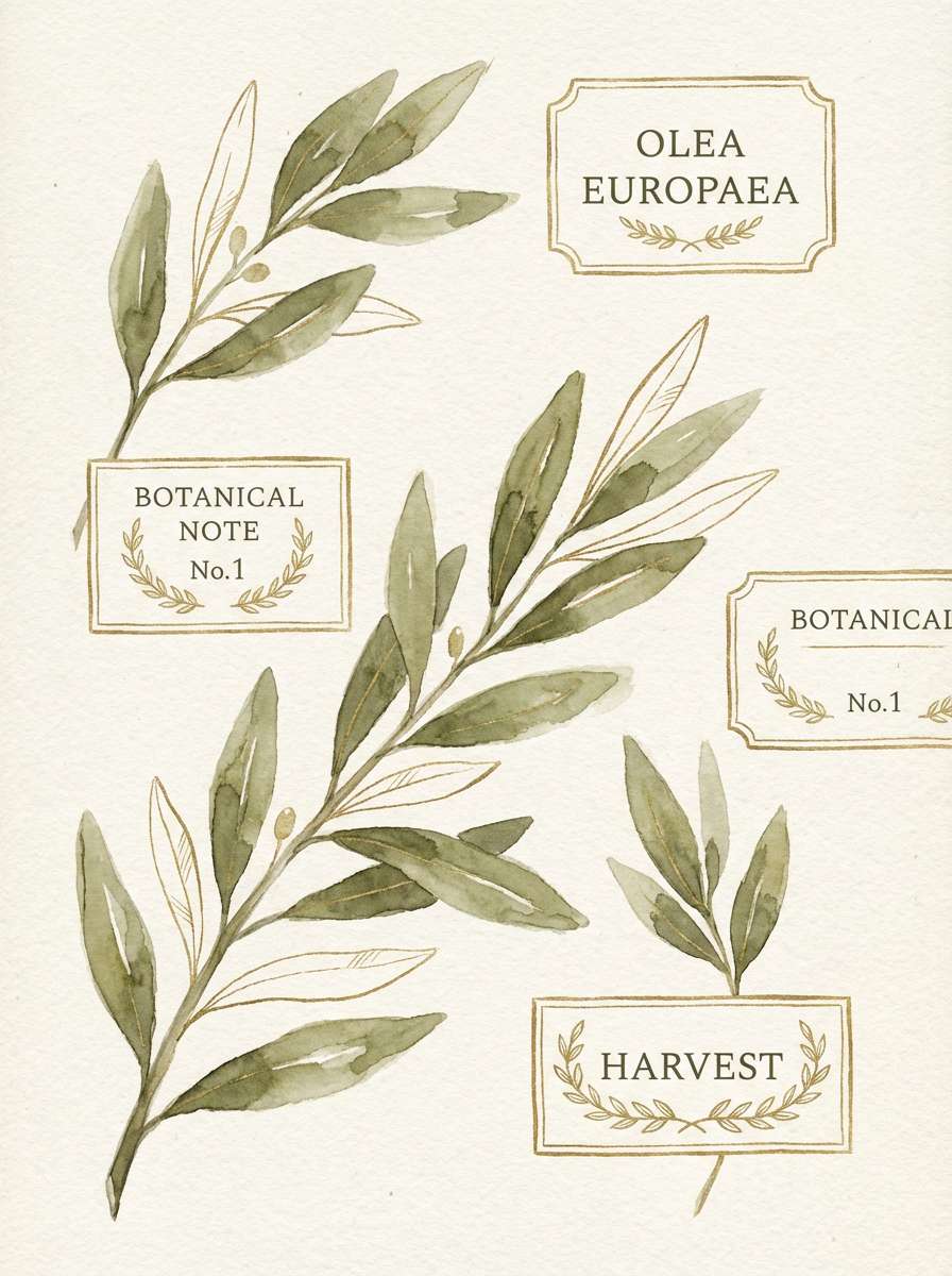
9) Olive and Gold Accent
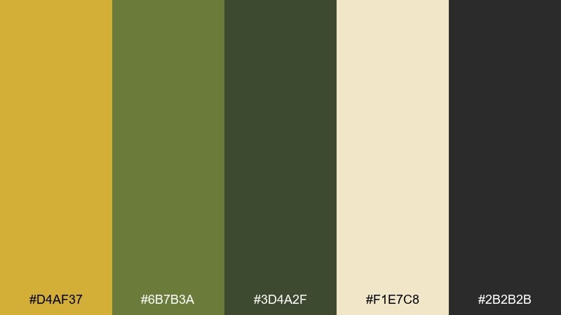
HEX: #D4AF37 #6B7B3A #3D4A2F #F1E7C8 #2B2B2B
Mood: botanical, balanced, earthy-luxe
Best for: eco branding, botanical labels, wellness packaging
Botanical and balanced, these tones feel like olive leaves against a warm, sunlit kitchen wall. The muted greens bring calm credibility, while the metallic accent adds a touch of sophistication. Pair with textured paper, line-art illustrations, and soft cream backgrounds for an organic look. Usage tip: keep gold as a small seal or foil-stamped detail to preserve the natural vibe.
Image example of olive and gold accent generated using media.io
10) Blush Gold Romance
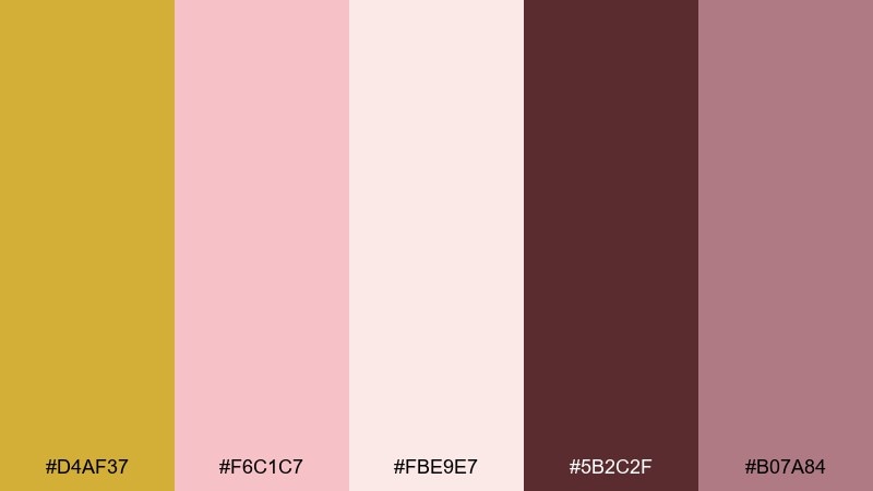
HEX: #D4AF37 #F6C1C7 #FBE9E7 #5B2C2F #B07A84
Mood: romantic, gentle, playful
Best for: beauty launches, bridal events, social templates
Romantic and gentle, this mix feels like rose petals, satin ribbons, and warm candle glow. The blush tones soften the metallic accent, making it ideal for friendly, personal brands. Pair with deep wine text for contrast and a touch of dusty mauve for depth. Usage tip: use blush as your main background and keep gold for thin lines, icons, and highlights.
Image example of blush gold romance generated using media.io
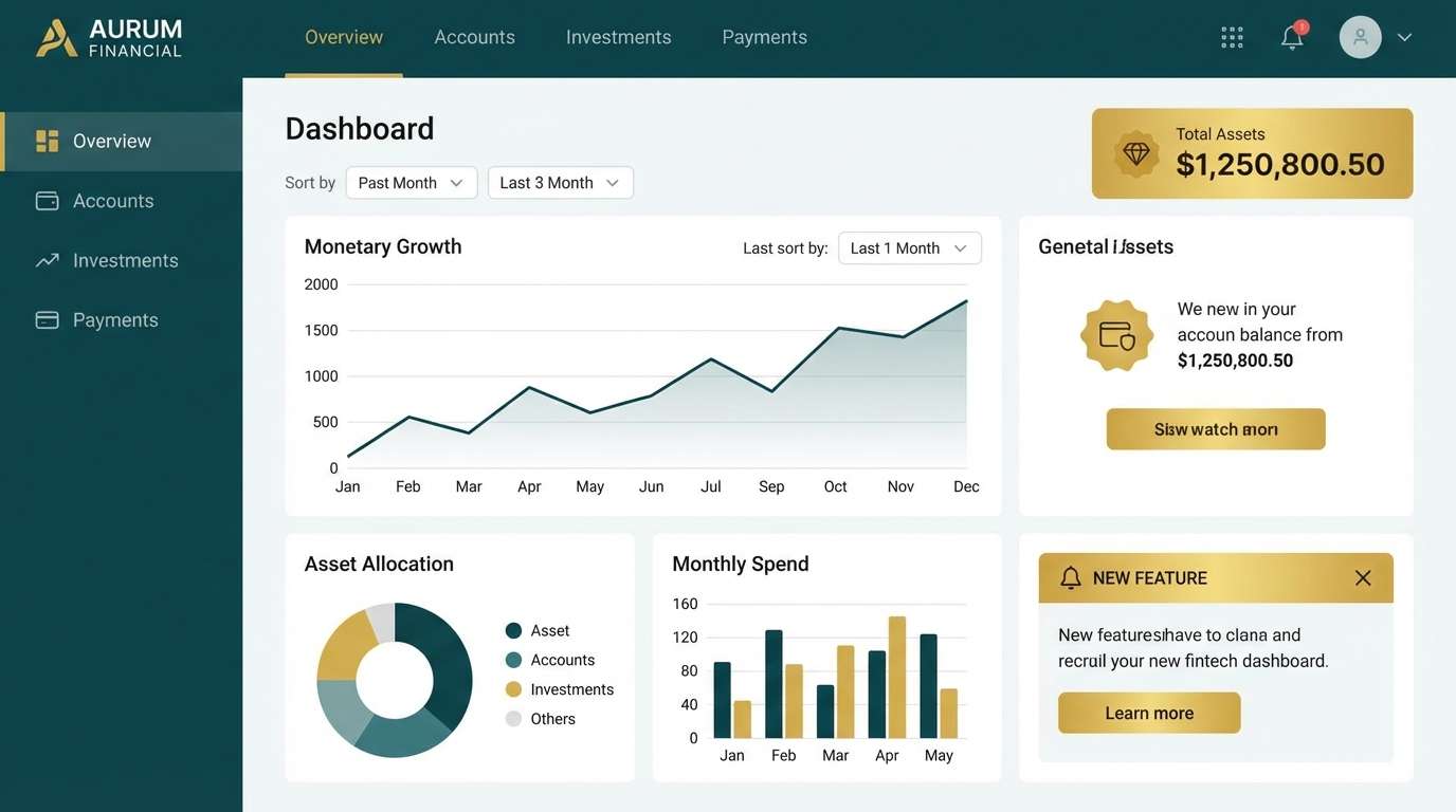
11) Teal and Gold Modern
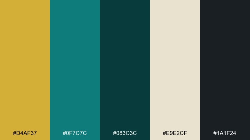
HEX: #D4AF37 #0F7C7C #083C3C #E9E2CF #1A1F24
Mood: confident, contemporary, crisp
Best for: saas dashboards, fintech branding, pitch decks
Confident and contemporary, the teal reads like deep water with a clean metallic highlight. The dark base gives strong contrast for data and UI components, while the warm neutral keeps the palette from feeling icy. Pair with thin charts, rounded cards, and subtle shadows for a polished product look. Usage tip: make teal the primary brand color and use gold only for success states or priority badges.
Image example of teal and gold modern generated using media.io
12) Coastal Gold and Blue
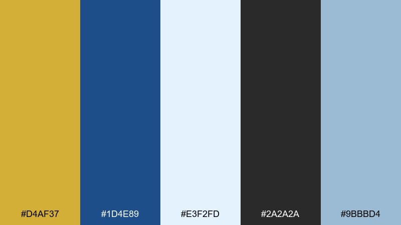
HEX: #D4AF37 #1D4E89 #E3F2FD #2A2A2A #9BBBD4
Mood: fresh, breezy, optimistic
Best for: travel campaigns, hospitality, event branding
Fresh and breezy, these colors evoke sunshine over ocean blue and airy coastal mornings. The light sky tint keeps layouts open, while the deep blue anchors headings and logos. Pair with clean photography, white space, and simple geometric patterns. Usage tip: use gold as a highlight for rates, dates, or booking buttons to guide the eye.
Image example of coastal gold and blue generated using media.io

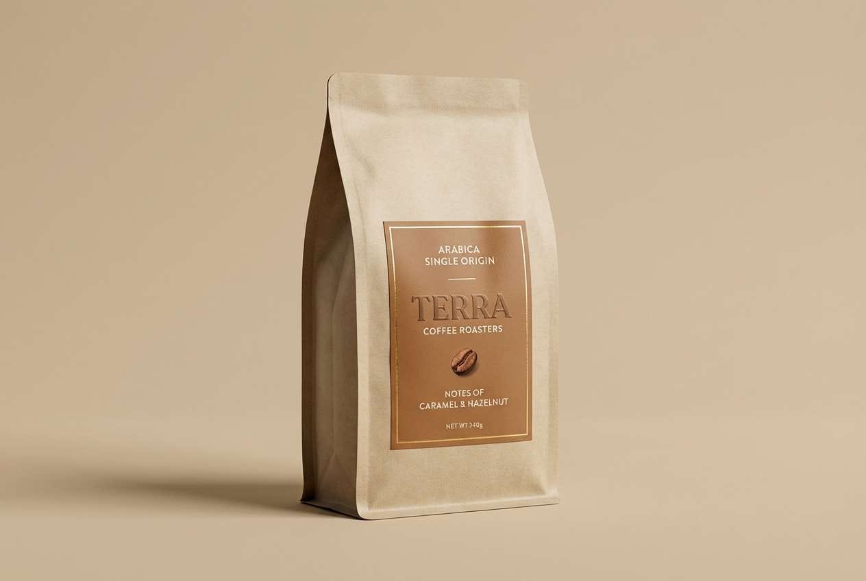
13) Coffee Gold Warmth
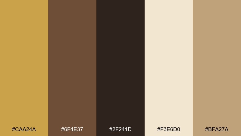
HEX: #CAA24A #6F4E37 #2F241D #F3E6D0 #BFA27A
Mood: cozy, rich, welcoming
Best for: cafe branding, food packaging, menu design
Cozy and rich, this palette feels like roasted beans, caramel crema, and warm café lighting. The creamy tan keeps the browns from getting too heavy, making it great for menus and packaging. Pair with kraft textures, hand-drawn icons, and a clean serif for a premium craft feel. Usage tip: put the darkest brown on text and reserve gold-brown for stamps and small highlights.
Image example of coffee gold warmth generated using media.io
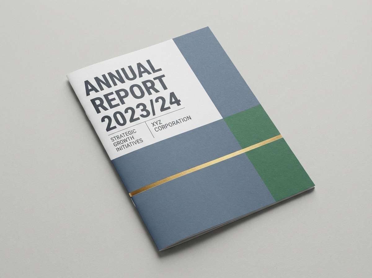
14) Slate Gold Corporate
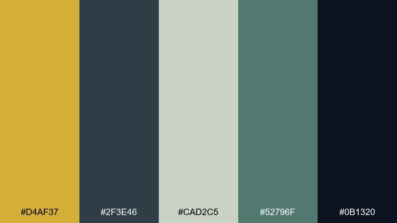
HEX: #D4AF37 #2F3E46 #CAD2C5 #52796F #0B1320
Mood: professional, steady, modern
Best for: corporate branding, annual reports, b2b websites
Professional and steady, these tones feel like brushed metal, slate stone, and crisp stationery. As a gold color scheme, it works best when the cool slates do the heavy lifting and the warm accent signals quality. Pair with structured grids, ample margins, and muted photography for a trustworthy presence. Usage tip: keep gold to section dividers and key metrics so the report stays readable and calm.
Image example of slate gold corporate generated using media.io
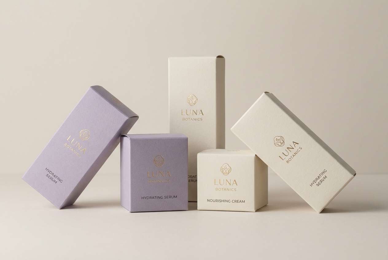
15) Lavender Gold Dream
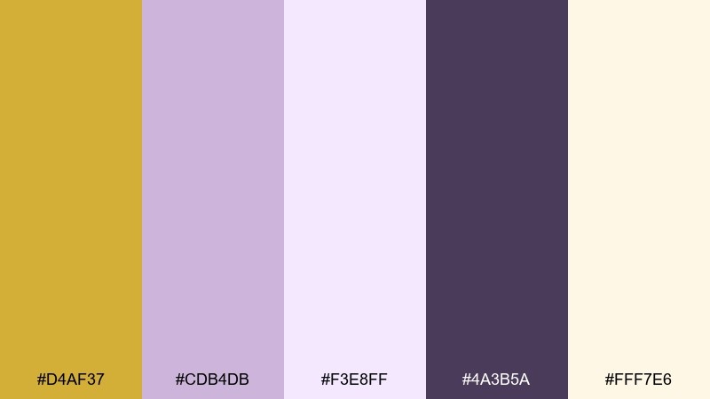
HEX: #D4AF37 #CDB4DB #F3E8FF #4A3B5A #FFF7E6
Mood: dreamy, soft, creative
Best for: creative studios, boutique skincare, lifestyle content
Dreamy and soft, this set suggests lavender haze with a gentle golden shimmer. The pale violet tones are friendly for backgrounds, while the deep plum keeps type legible and refined. Pair with delicate illustrations, rounded shapes, and light gradients for a modern romantic feel. Usage tip: use the cream as your main canvas and bring in lavender for panels and cards.
Image example of lavender gold dream generated using media.io
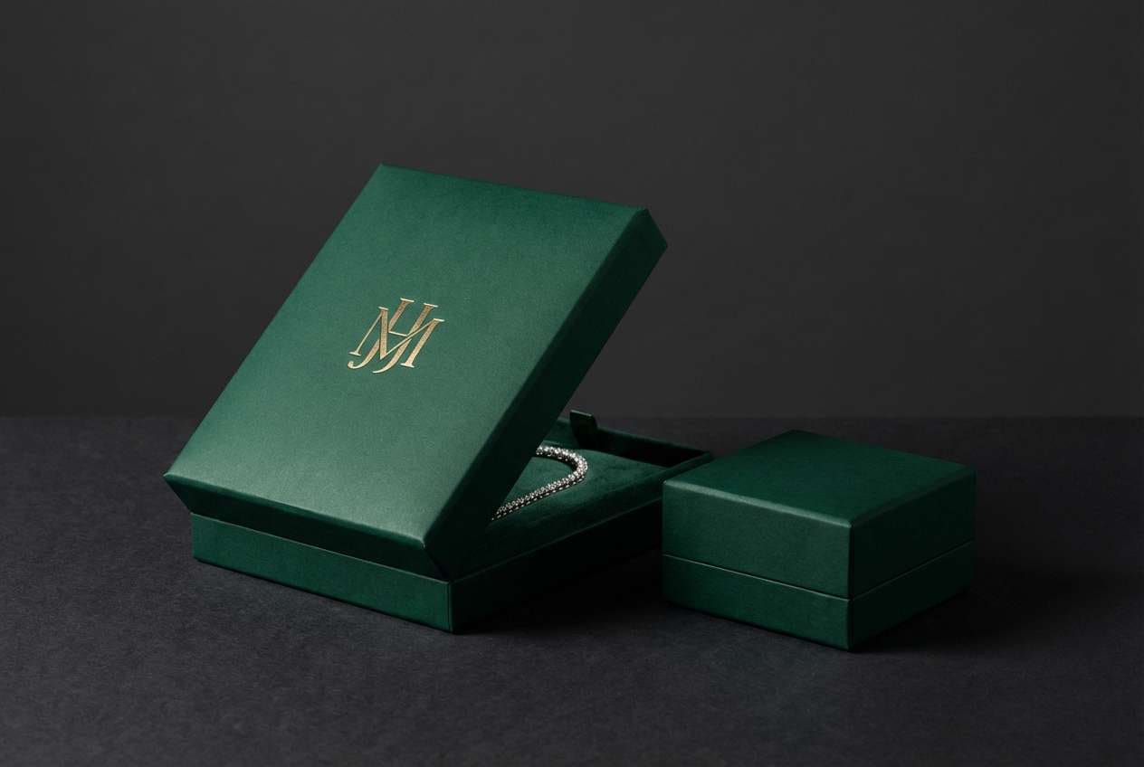
16) Emerald Gold Luxe
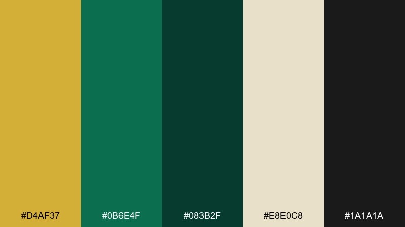
HEX: #D4AF37 #0B6E4F #083B2F #E8E0C8 #1A1A1A
Mood: luxe, bold, cinematic
Best for: jewelry brands, upscale restaurants, gift packaging
Luxe and cinematic, the emerald tones feel like deep gemstone facets under spotlight. The creamy neutral keeps the dark greens approachable, while the metallic accent reads instantly premium. Pair with black typography, fine-line patterns, and high-contrast product photography. Usage tip: let emerald dominate large areas and use gold as a trim for logos, seals, and small ornaments.
Image example of emerald gold luxe generated using media.io
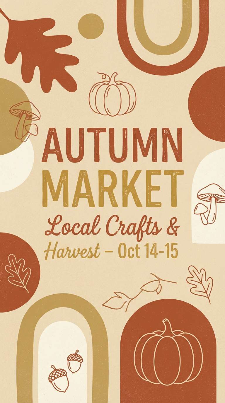
17) Rust Gold Autumn
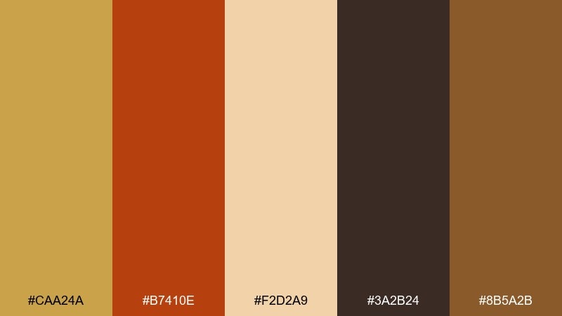
HEX: #CAA24A #B7410E #F2D2A9 #3A2B24 #8B5A2B
Mood: autumnal, rustic, hearty
Best for: fall promotions, handmade goods, seasonal packaging
Autumnal and hearty, these colors bring to mind fallen leaves, copper cookware, and warm spice markets. The rust accent energizes the mix and plays nicely with earthy browns for a handcrafted feel. Pair with textured backgrounds, serif headlines, and simple line illustrations. Usage tip: use the light peach tone for breathing room so the rust does not overwhelm the composition.
Image example of rust gold autumn generated using media.io
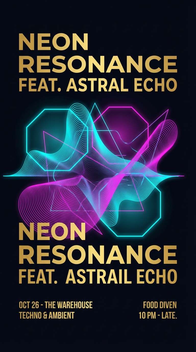
18) Neon Gold Nightlife
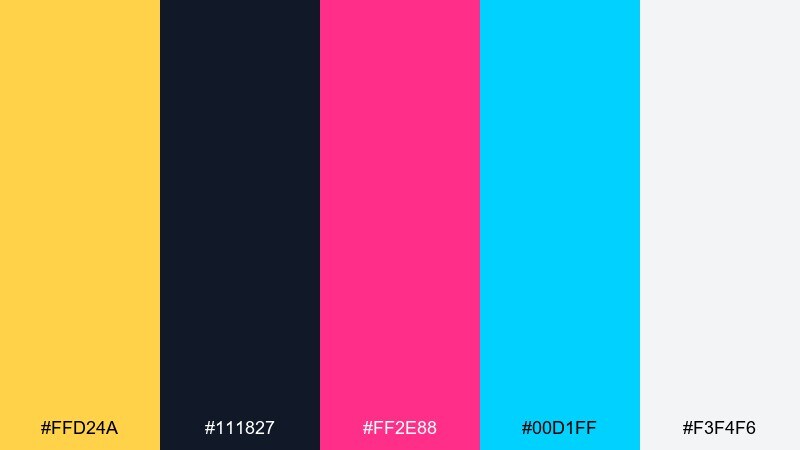
HEX: #FFD24A #111827 #FF2E88 #00D1FF #F3F4F6
Mood: electric, playful, high-energy
Best for: event posters, club flyers, youth brand campaigns
Electric and high-energy, this set feels like neon signs bouncing off wet pavement. The hot pink and cyan create instant motion, while the bright metal note adds a punchy highlight. These gold color combinations work best on dark backgrounds with bold, condensed type and simple shapes. Usage tip: keep text mostly in off-white and use the neon hues only for emphasis and graphic accents.
Image example of neon gold nightlife generated using media.io
19) Monochrome Gold Metals
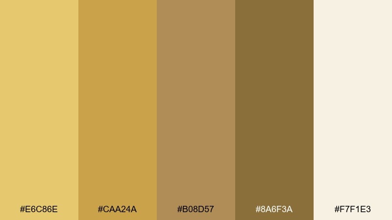
HEX: #E6C86E #CAA24A #B08D57 #8A6F3A #F7F1E3
Mood: harmonious, warm, tonal
Best for: pattern design, packaging systems, brand style guides
Harmonious and tonal, the shades read like a gradient of brushed metals from pale champagne to antique bronze. Because the contrast is gentle, it is ideal for patterns, borders, and background textures. Pair with a single dark neutral for typography when you need stronger readability. Usage tip: use two adjacent tones for most elements and save the lightest cream for negative space.
Image example of monochrome gold metals generated using media.io
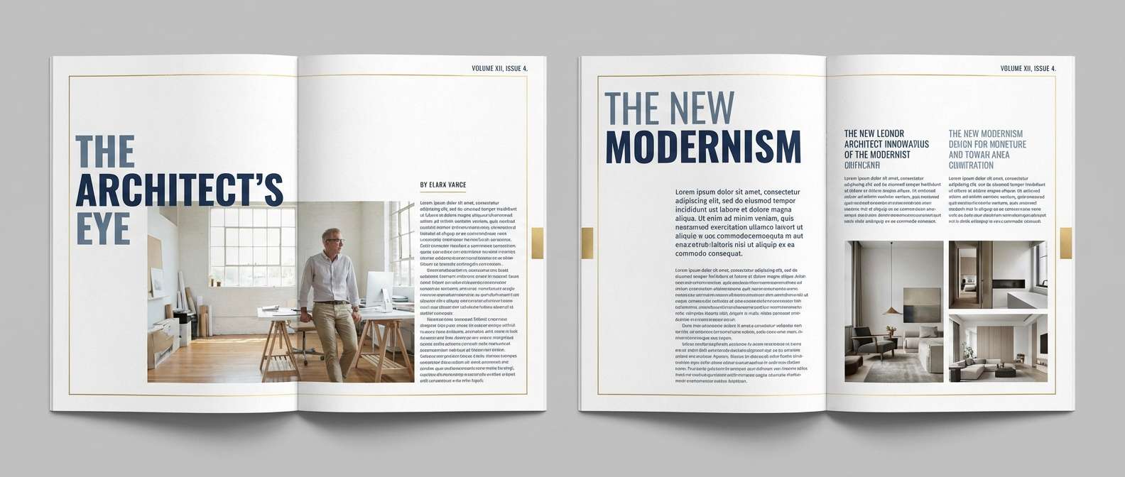
20) Ink Gold Editorial
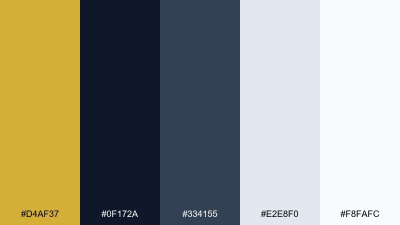
HEX: #D4AF37 #0F172A #334155 #E2E8F0 #F8FAFC
Mood: editorial, crisp, premium
Best for: magazine layouts, blog themes, portfolio sites
Editorial and crisp, this mix feels like fresh ink on bright paper with a subtle metallic rule. The cool slates keep things modern and readable, while the warm accent adds a premium signature. Pair with strong typographic hierarchy, plenty of margins, and monochrome photography. Usage tip: use gold for thin dividers, pull-quote marks, and small navigation highlights to maintain an upscale finish.
Image example of ink gold editorial generated using media.io
What Colors Go Well with Gold?
Gold pairs best with strong neutrals that prevent it from drifting toward “yellow.” Try black, charcoal, deep espresso, and cool slate for a clean, premium contrast that works in both print and UI.
For softer looks, use warm whites, champagne, blush, and parchment tones. These combinations keep gold romantic and light—ideal for invitations, beauty branding, and editorial layouts.
If you want bolder contrast, combine gold with jewel tones like emerald, deep teal, navy, or violet. Let the jewel tone lead (large areas), and use gold as trim, rules, badges, or small icon highlights.
How to Use a Gold Color Palette in Real Designs
Use gold like a hierarchy tool. In web and app design, it’s most effective on primary buttons, key badges, active states, and small dividers—places where you want the eye to land first.
Keep readability in mind: gold on white often lacks contrast, so pair gold accents with dark text colors and leave plenty of negative space. For dark themes, a pale gold highlight can guide attention without adding extra colors.
In print and packaging, consider texture: matte papers + gold ink can look muted, while foil stamping or spot UV makes gold feel truly metallic. If you can’t use foil, mimic it with gradients sparingly and keep surrounding colors simple.
Create Gold Palette Visuals with AI
If you’re building a brand moodboard or testing packaging directions, generating quick mock visuals helps you decide faster than tweaking swatches in isolation. A single prompt can produce poster layouts, label mockups, or UI screens that show how gold behaves in context.
Start with one palette above, then describe the design format (invitation, website hero, label), background material (paper, fabric, dark matte), and typography mood (serif, modern sans). Keep the composition “clean” so the gold accent stays believable.
When you find a look you like, iterate by adjusting only one variable at a time (background shade, accent intensity, or layout ratio). That way your gold color scheme stays consistent across variations.
Gold Color Palette FAQs
-
What is the best HEX code for “classic” gold?
A widely used classic gold HEX is #D4AF37. It reads warm and metallic-like in digital designs, especially when paired with deep neutrals such as charcoal or espresso. -
Why does gold sometimes look yellow on screens?
Without surrounding contrast and texture, flat gold can appear like yellow. Add dark anchors (black, navy, deep brown) and supportive warm neutrals (cream/champagne) to make it feel more “gold.” -
What background color makes gold stand out most?
Near-black and deep navy create the strongest visual pop for gold accents. For a softer premium look, use warm whites or champagne tones and keep gold to thin details. -
Is gold good for UI buttons and links?
Yes—when used sparingly for primary actions, badges, or active states. Avoid gold text on white backgrounds due to contrast issues; instead use dark text and keep gold as a fill, border, or icon highlight. -
What colors go well with gold for luxury branding?
Black, deep emerald, rich violet, and slate/charcoal are common luxury pairings. Add a warm neutral (ivory, parchment, cream) to keep layouts breathable and premium. -
How can I make a gold palette feel modern instead of traditional?
Use cool partners like slate, ink navy, or teal; keep layouts minimal; and apply gold only as an accent (rules, small icons, micro-interactions). Modern gold works best with lots of whitespace and crisp typography. -
Can I simulate metallic gold in digital designs?
You can suggest a metallic feel using subtle gradients, soft highlights, and gentle shadows—then keep the rest of the palette simple. For print, foil stamping or spot UV will look most authentically metallic.
Next: Gray Green Color Palette


