

Boysenberry is a deep berry-purple that feels equal parts luxurious and modern, making it a reliable anchor for branding, UI, and print.
Whether you pair it with warm metals, earthy greens, or soft blush tints, boysenberry color combinations can shift from moody and cinematic to airy and editorial—without losing that rich signature tone.
In this article
Why Boysenberry Color Combinations Work So Well
Boysenberry sits in the plum-to-magenta range, so it carries emotional warmth while still reading as sophisticated and “designed.” It can feel romantic, premium, or bold depending on what you place beside it.
It also plays nicely with both high-contrast neutrals (near-black, white, cool grays) and softened tints (blush, lilac, powder). That flexibility makes it great for systems like UI, brand guidelines, and multi-page print layouts.
Because it’s naturally rich, boysenberry works best as an anchor or accent—giving designs depth without needing heavy textures or complex gradients.
20+ Boysenberry Color Combinations (with HEX Codes)
1) Velvet Jam
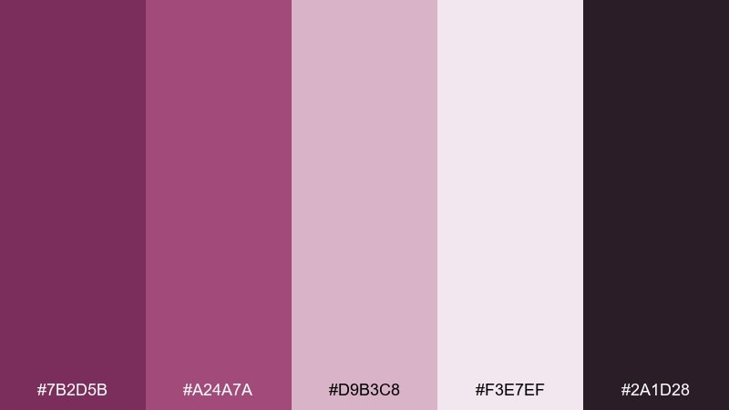
HEX: #7b2d5b #a24a7a #d9b3c8 #f3e7ef #2a1d28
Mood: luxurious, romantic, moody
Best for: premium branding and hero sections
Luxurious and velvety, like berry jam spread on dark toast under soft candlelight. Use the deep boysenberry as your anchor, then let blush and powder tints carry the spacious areas. This boysenberry color palette shines on premium branding, landing pages, and product hero banners paired with warm lighting and minimal textures. Tip: keep body text on the pale tint and reserve the near-black plum for headings to avoid heavy contrast fatigue.
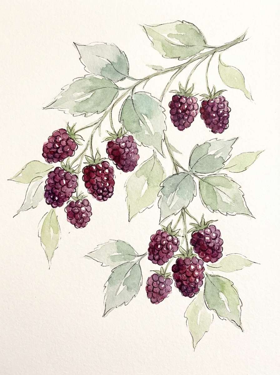
Image example of velvet jam generated using media.io
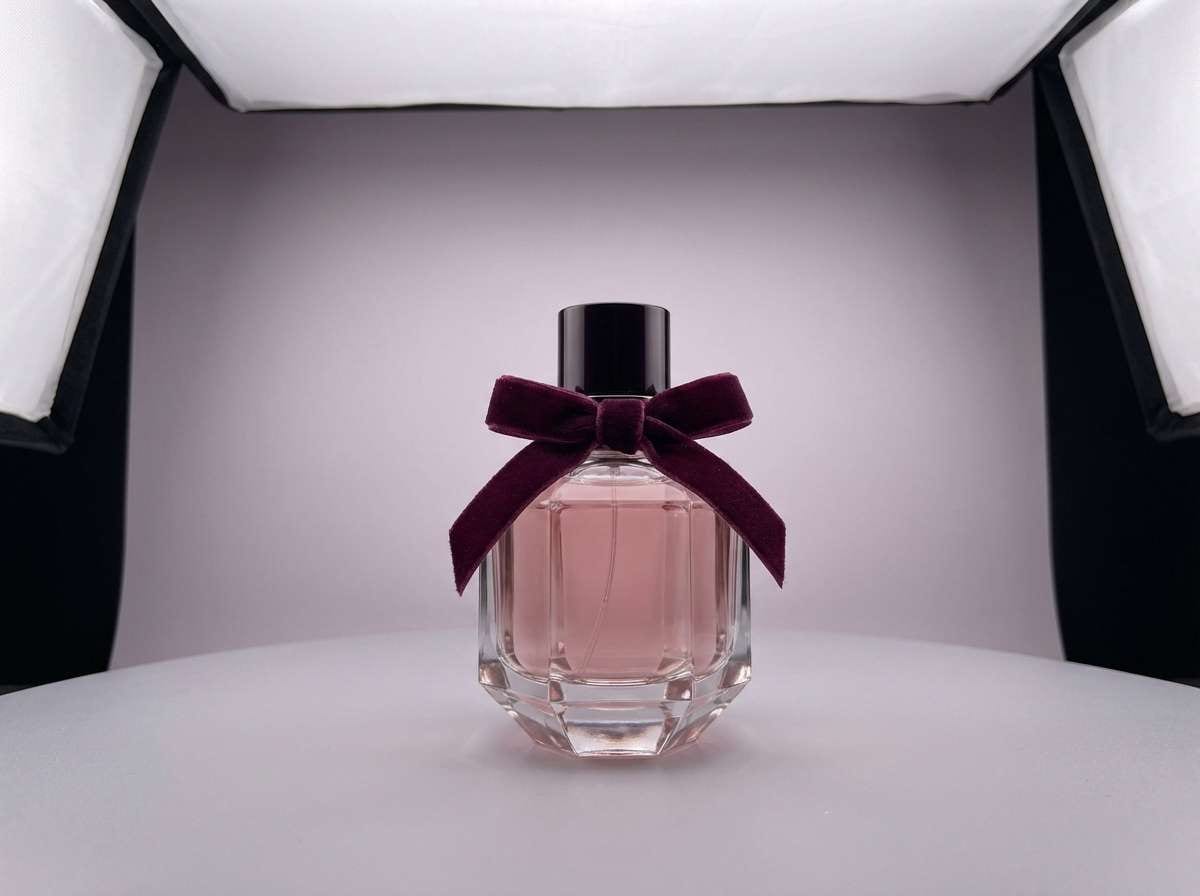
Media.io is an online AI studio for creating and editing video, image, and audio in your browser.

2) Autumn Orchard
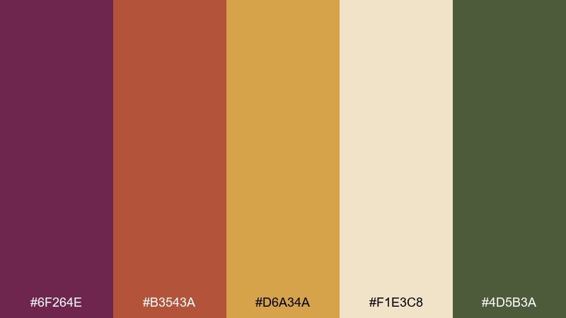
HEX: #6f264e #b3543a #d6a34a #f1e3c8 #4d5b3a
Mood: warm, rustic, seasonal
Best for: fall campaigns and food packaging
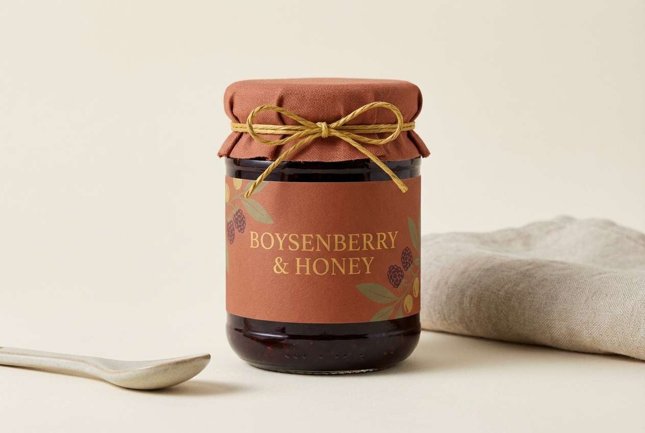
Warm and harvest-like, evoking mulled fruit, cider spice, and sunlit leaves. The berry base feels grounded next to coppery orange and golden accents, while cream keeps everything readable. It works beautifully for seasonal packaging, café promos, and editorial food styling. Tip: use the olive tone for small labels or icons so the palette stays earthy instead of overly sweet.
Image example of autumn orchard generated using media.io
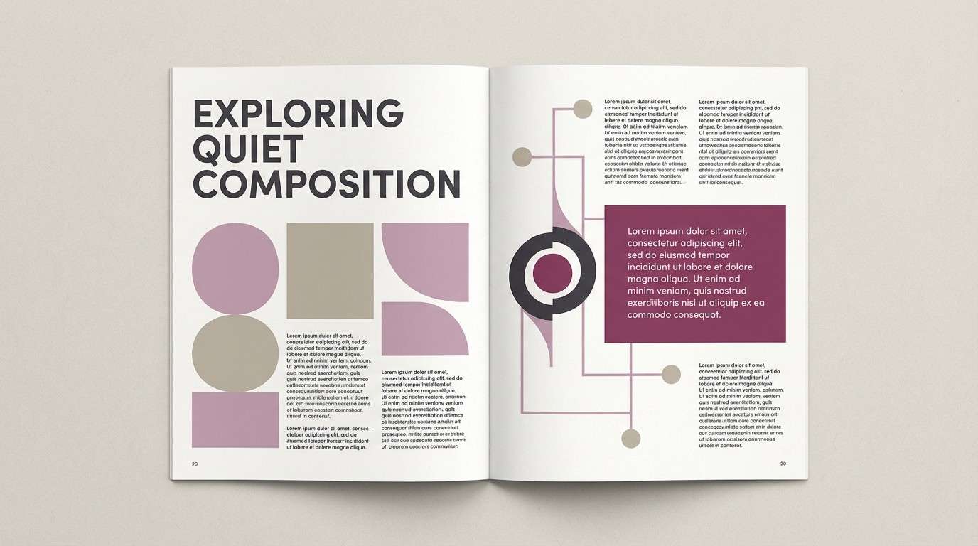
3) Rosewood Minimal
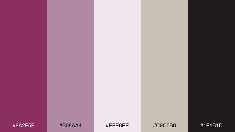
HEX: #8a2f5f #b08aa4 #efe6ee #c9c0b6 #1f1b1d
Mood: calm, modern, understated
Best for: minimal UI and editorial layouts
Quiet and refined, like rosewood furniture in a bright studio. This boysenberry color palette balances a confident berry note with soft mauve and warm greige neutrals for an elevated, minimal look. It fits UI systems, magazine layouts, and brand guidelines where restraint matters. Tip: keep the dark charcoal for type and dividers, and use the berry sparingly as a button or link color.
Image example of rosewood minimal generated using media.io
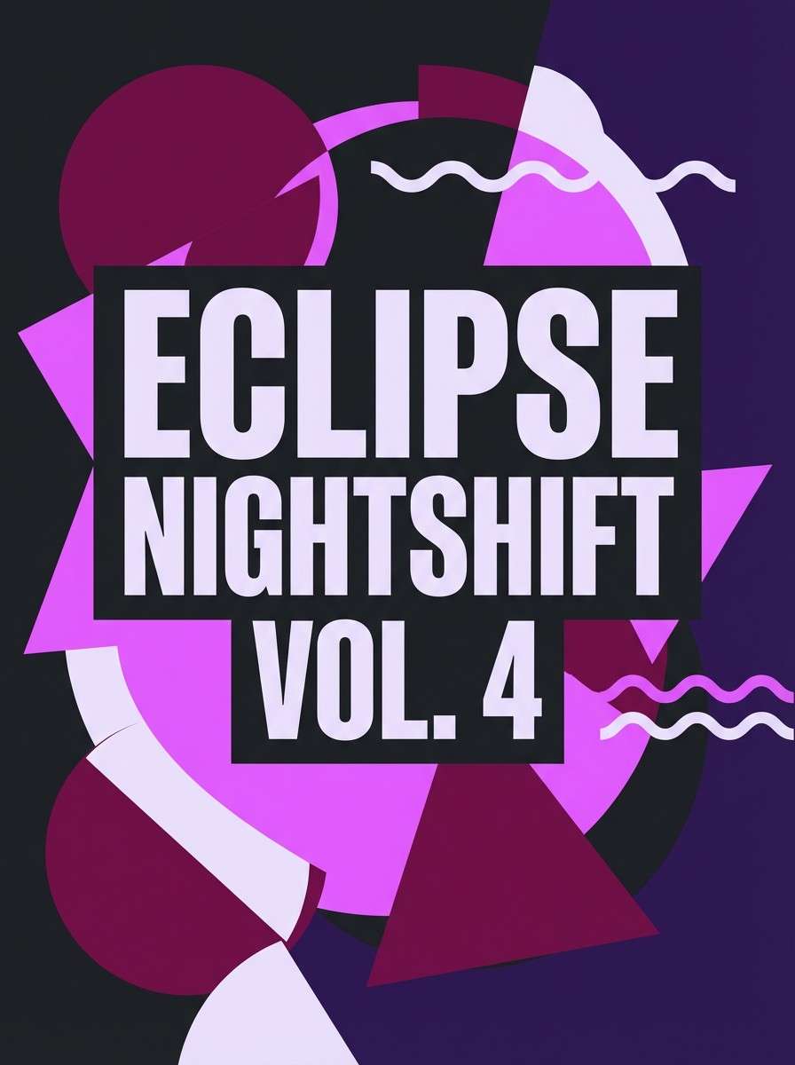
4) Midnight Berry
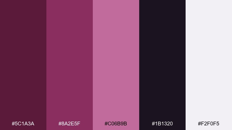
HEX: #5c1a3a #8a2e5f #c06b9b #1b1320 #f2f0f5
Mood: dramatic, cinematic, high contrast
Best for: nightlife posters and bold campaigns
Dramatic and cinematic, like city lights reflecting on a velvet jacket at midnight. The near-black purple deepens the berry tones, while the pale lavender-white keeps the contrast crisp. Use this boysenberry color combination for nightlife posters, album art, or bold campaign visuals where you want instant impact. Tip: add glow effects using the pink-lilac accent, but keep large backgrounds dark for that theater-like mood.
Image example of midnight berry generated using media.io
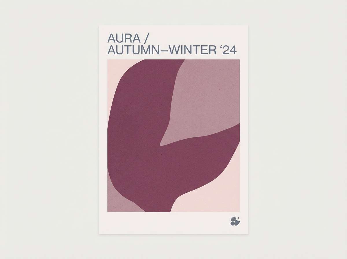
5) Dusty Mauve Studio
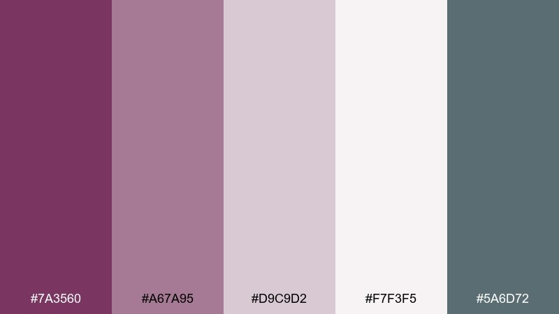
HEX: #7a3560 #a67a95 #d9c9d2 #f7f3f5 #5a6d72
Mood: soft, airy, contemporary
Best for: lifestyle branding and lookbooks
Soft and airy, like mauve paint swatches laid out on a sunlit worktable. Dusty midtones make the berry feel approachable, and the cool slate adds a modern edge without overpowering. these boysenberry colors suit lifestyle brands, lookbooks, and social templates that need a gentle but grown-up palette. Tip: use slate for captions and secondary UI states to keep the pinks from feeling too precious.
Image example of dusty mauve studio generated using media.io
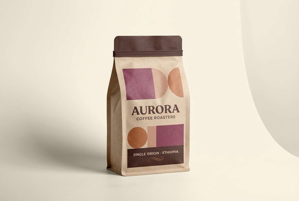
6) Copper and Cream
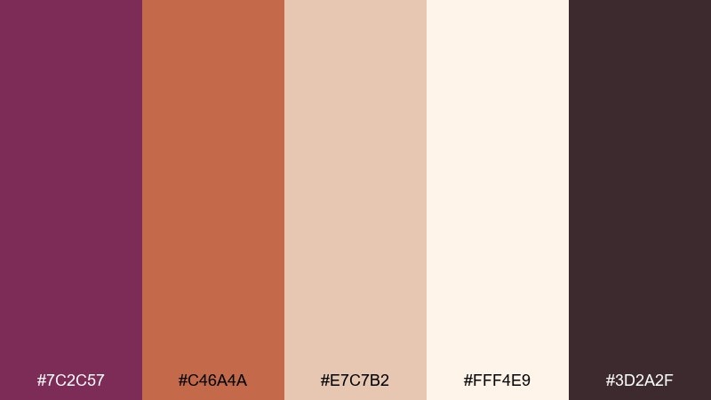
HEX: #7c2c57 #c46a4a #e7c7b2 #fff4e9 #3d2a2f
Mood: welcoming, artisanal, warm
Best for: coffee brands and handmade goods
Welcoming and handcrafted, like copper cookware and fresh pastries. The berry tone feels richer next to terracotta and creamy neutrals, making it ideal for artisanal storytelling. Try it on café menus, handmade soap labels, or warm e-commerce product pages. Tip: keep the darkest brown-plum for logos and headings, and let cream do most of the background work.
Image example of copper and cream generated using media.io
7) Sage Contrast
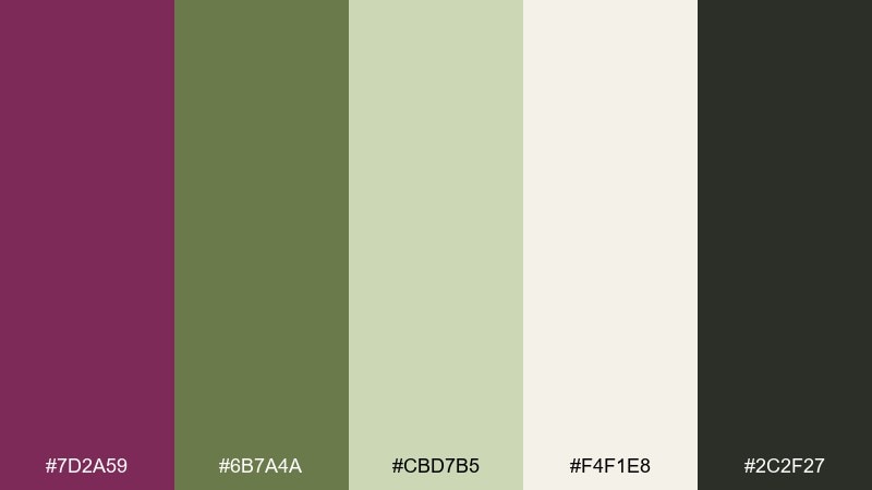
HEX: #7d2a59 #6b7a4a #cbd7b5 #f4f1e8 #2c2f27
Mood: fresh, balanced, nature-meets-luxe
Best for: wellness brands and eco packaging
Fresh and grounded, like wild berries growing beside soft sage leaves. This boysenberry color palette stands out because green takes the edge off the purple and instantly feels more natural. Use it for wellness branding, eco packaging, or calm dashboards where you want a confident accent without loudness. Tip: make sage the primary surface color and reserve the berry for CTAs and small highlights.
Image example of sage contrast generated using media.io
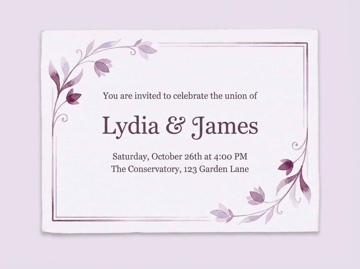
8) Lavender Haze
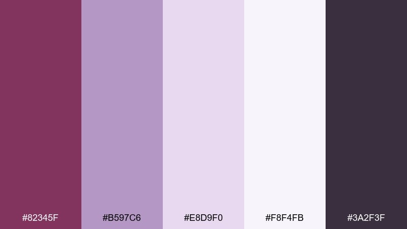
HEX: #82345f #b597c6 #e8d9f0 #f8f4fb #3a2f3f
Mood: dreamy, gentle, ethereal
Best for: beauty editorials and soft UI
Dreamy and misty, like lavender fog drifting over berry fields at dawn. The lilac tints soften the depth of the main hue, creating an elegant gradient for backgrounds and overlays. Use this boysenberry color combination for beauty editorials, meditation apps, or invitation suites that need calm romance. Tip: layer the two palest tones for subtle depth, and keep the darkest purple only for key text.
Image example of lavender haze generated using media.io
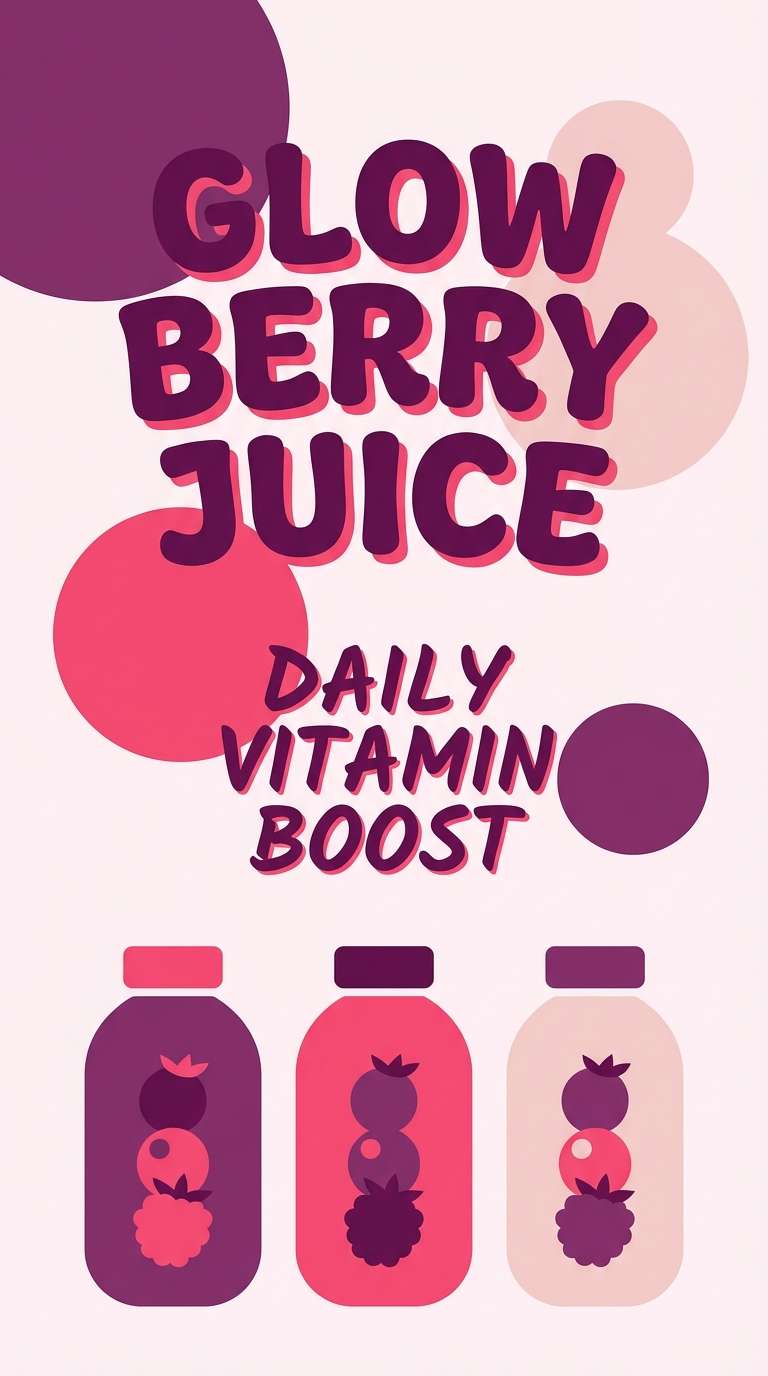
9) Berry Sorbet
HEX: #8d2c5e #ff9bb7 #ffd1dc #fff0f4 #3c1f2f
Mood: playful, sweet, upbeat
Best for: social posts and youth branding
Playful and sweet, like scoops of sorbet in a glass dish. Bright pinks lift the berry base into something bubbly, while the deep plum keeps it from turning candy-like. These boysenberry tones work for social graphics, youth branding, and fun product drops where you want energy without neon. Tip: use the darkest tone for outlines and type so the pale pinks stay legible.
Image example of berry sorbet generated using media.io
10) Botanical Luxe

HEX: #7a2556 #3f6b4f #a8c9a1 #f2e6d8 #c7a26b
Mood: botanical, premium, earthy
Best for: skincare branding and boutique packaging
Botanical and premium, like a spa shelf lined with herbs and golden caps. These boysenberry color combinations pair berry depth with forest green and a soft oat neutral, finished with warm metallic energy. Use them for skincare branding, boutique packaging, and refined product ads that need nature cues without going fully rustic. Tip: treat the gold-brown as a foil accent for stamps, borders, or tiny icons rather than a full background.
Image example of botanical luxe generated using media.io
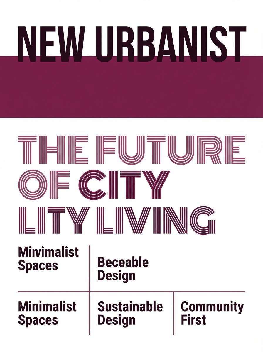
11) Modern Editorial

HEX: #6d244d #9c5c7b #d8d2d8 #ffffff #22202a
Mood: clean, sophisticated, print-ready
Best for: magazines and portfolio sites
Clean and sophisticated, like a fashion spread with crisp margins and confident headlines. Mid-berry tones bring personality, while grayscale neutrals keep the layout professional and flexible. It is perfect for magazines, portfolio sites, and case studies where content needs to feel curated. Tip: set most body text in the near-black and reserve the berry for pull quotes or section markers.
Image example of modern editorial generated using media.io
12) Neon Accent Pop

HEX: #7a1f4f #ff5aa5 #ffd400 #1a1a1a #f7f7f7
Mood: energetic, bold, trendy
Best for: event promos and nightlife ads
Energetic and bold, like club flyers under bright signage. Hot pink and electric yellow turn the berry into a statement, while black and off-white keep the design sharp. Use this boysenberry color palette for event promos, nightlife ads, or standout announcement banners. Tip: limit yellow to small highlights and icons so it reads as an accent rather than overwhelming the layout.
Image example of neon accent pop generated using media.io

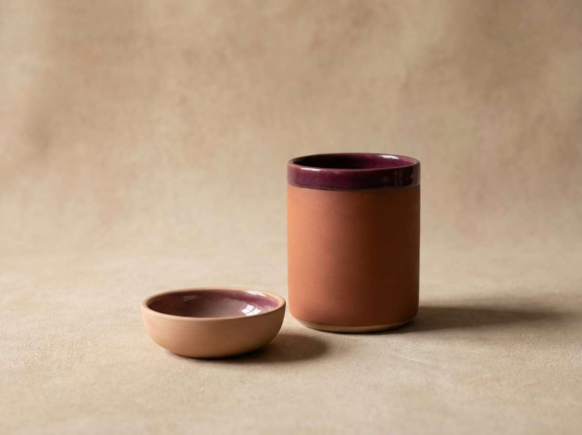
13) Clay and Wine
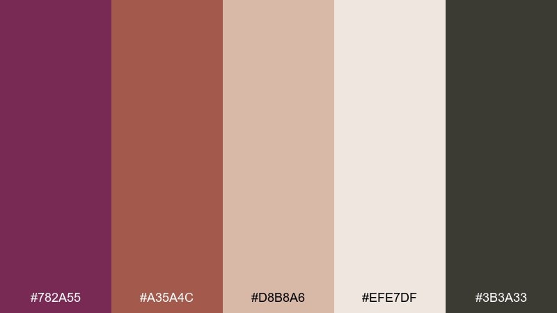
HEX: #782a55 #a35a4c #d8b8a6 #efe7df #3b3a33
Mood: earthy, grounded, artisanal
Best for: ceramics brands and home decor
Earthy and grounded, like clay pottery glazed with a hint of berry wine. Warm terracotta and nude tones soften the purple, creating a palette that feels handmade and tactile. It fits ceramics brands, home decor catalogs, and cozy interior moodboards. Tip: use the cream-beige as the main canvas and add berry as a thin border or stamp for a crafted feel.
Image example of clay and wine generated using media.io
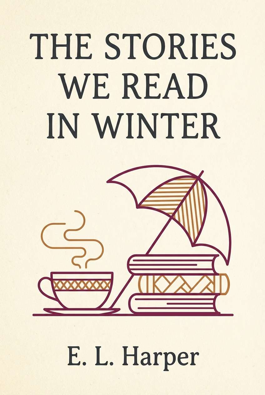
14) Cozy Cabin
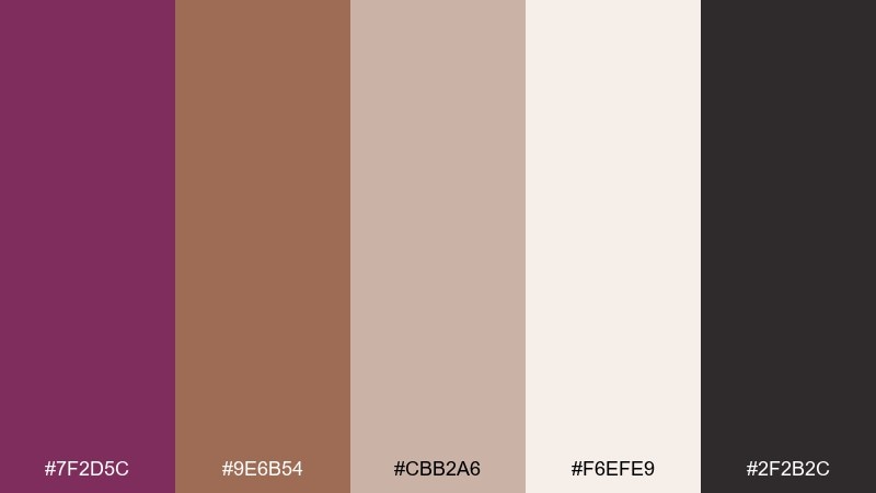
HEX: #7f2d5c #9e6b54 #cbb2a6 #f6efe9 #2f2b2c
Mood: cozy, intimate, nostalgic
Best for: seasonal promos and book covers
Cozy and intimate, like a knit blanket and berry tea beside a cabin window. This boysenberry color palette pairs beautifully with caramel browns and creamy paper tones for a nostalgic look. It works for seasonal promos, book covers, and warm long-form landing pages. Tip: add subtle grain on the light background to make the browns and berry feel more tactile and inviting.
Image example of cozy cabin generated using media.io
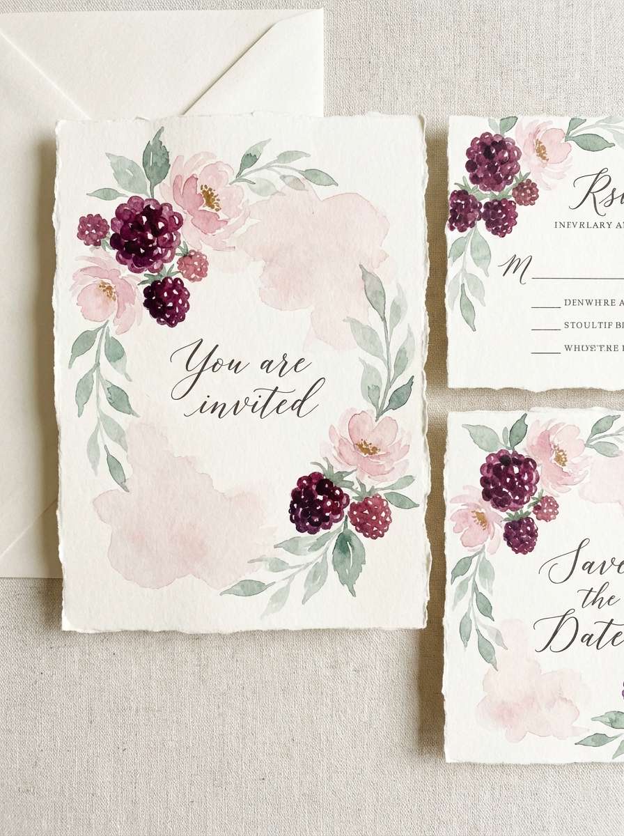
15) Wedding Florals
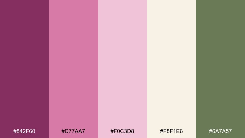
HEX: #842f60 #d77aa7 #f0c3d8 #f8f1e6 #6a7a57
Mood: romantic, elegant, garden-inspired
Best for: wedding invites and floral brands
Romantic and garden-inspired, like peonies and berries arranged on linen. Soft pinks and cream give the berry a bridal polish, while muted green keeps it fresh and botanical. Use it for wedding invitations, florist branding, and delicate stationery sets. Tip: keep typography in berry or sage, and let the light cream handle the negative space for a premium finish.
Image example of wedding florals generated using media.io
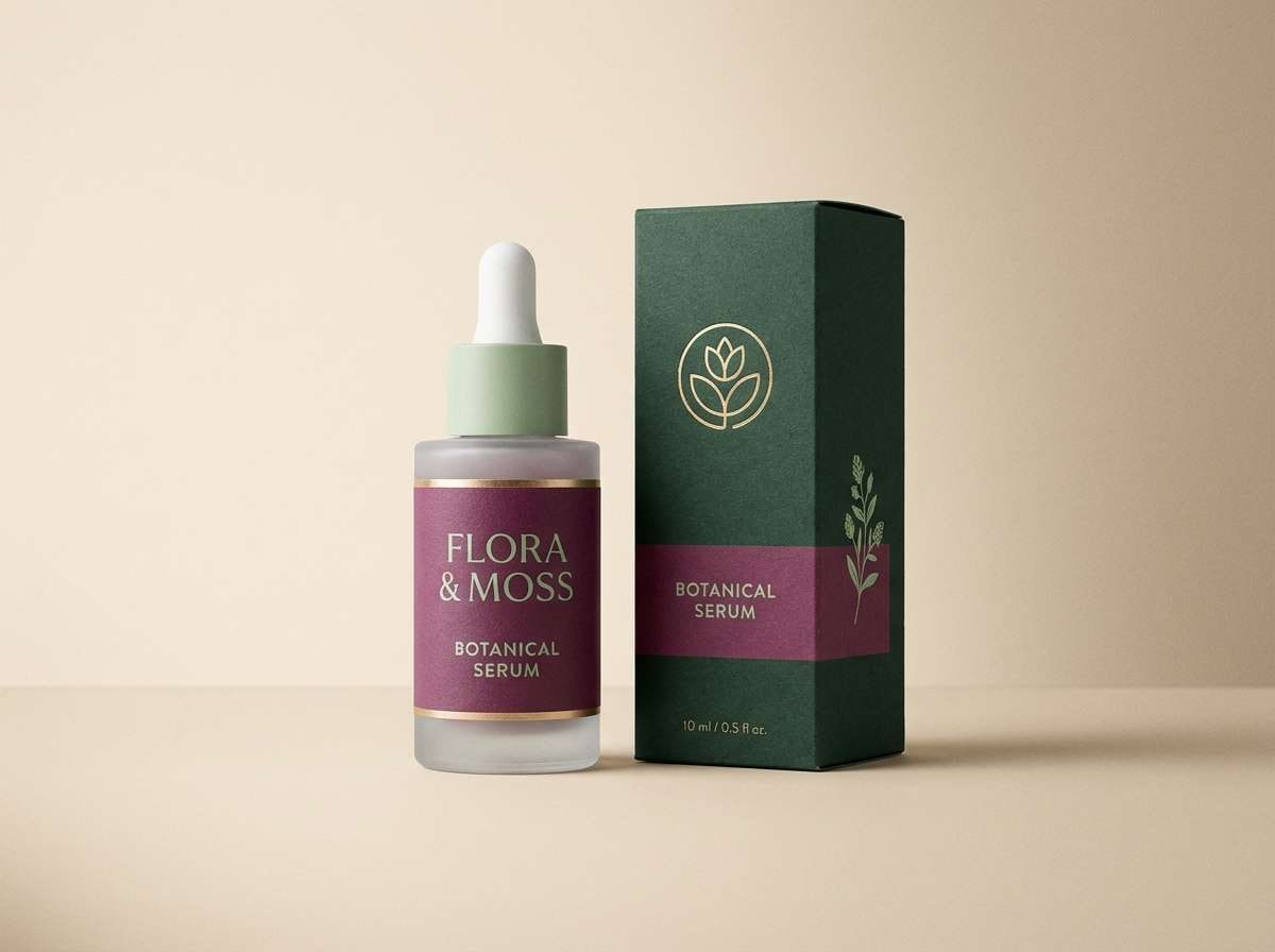
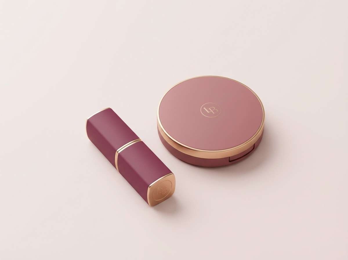
16) Beauty Packaging
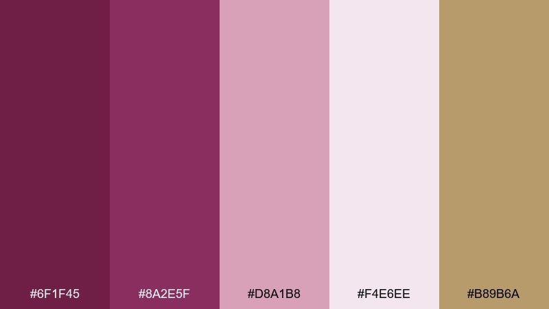
HEX: #6f1f45 #8a2e5f #d8a1b8 #f4e6ee #b89b6a
Mood: glam, polished, feminine
Best for: cosmetics ads and packaging
Glam and polished, like a lipstick bullet catching warm studio light. The gold-beige accent instantly elevates the berry tones and makes the pale blush feel intentional rather than pastel. This boysenberry color combination suits cosmetics packaging, beauty ads, and premium loyalty cards. Tip: use the gold only for small foil details and keep backgrounds on the light blush for clean readability.
Image example of beauty packaging generated using media.io
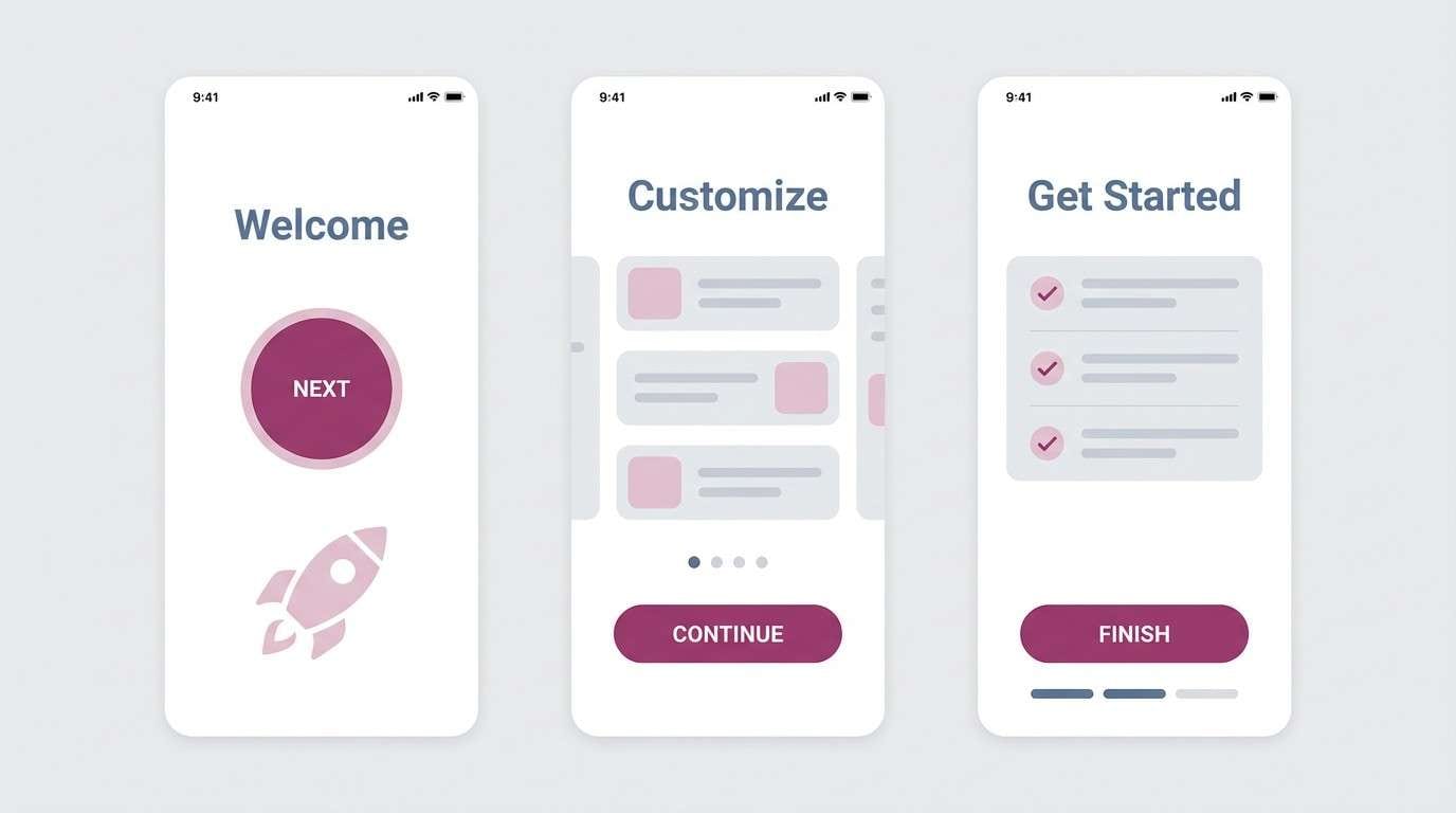
17) App Onboarding

HEX: #7a2b58 #2f3a4a #a8b3c2 #f3f4f6 #e6c0d2
Mood: professional, friendly, tech-forward
Best for: SaaS onboarding screens
Professional but friendly, like a calm dashboard with a berry-toned welcome message. Cool slate blues make the palette feel tech-forward, and the pink tint keeps it human. Use it for SaaS onboarding, account pages, and data-heavy UI where you want warmth without sacrificing clarity. Tip: keep interactive states in berry and reserve slate for navigation and secondary buttons.
Image example of app onboarding generated using media.io
18) Café Menu
HEX: #7b2957 #f0e7df #c9a489 #2b1d20 #a74934
Mood: cozy, appetizing, vintage
Best for: menus and small restaurant branding
Cozy and appetizing, like a handwritten special on textured paper. A strong berry base teams up with cream and caramel to create a welcoming, slightly vintage vibe. For a memorable boysenberry color combination, keep headings in the deep plum and use the brick tone for callouts like seasonal items. Tip: choose a paper-like off-white background so the darker inks feel richer and more tactile.
Image example of café menu generated using media.io
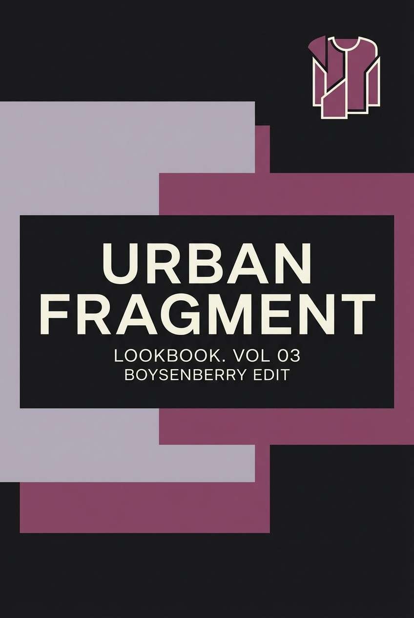
19) Streetwear Drop

HEX: #6c1f46 #8a2e5f #d0c7cf #111015 #e8d6e1
Mood: urban, edgy, minimal
Best for: lookbook covers and merch promos
Urban and edgy, like matte black fabric with a berry-toned embroidered mark. The grayscale tints keep it minimal while the purple-magenta punches through as a signature accent. Use it for streetwear lookbooks, merch promos, and bold web banners with lots of negative space. Tip: keep the background near-black and use the pale lavender-gray to soften typography blocks.
Image example of streetwear drop generated using media.io
20) Storybook Pop
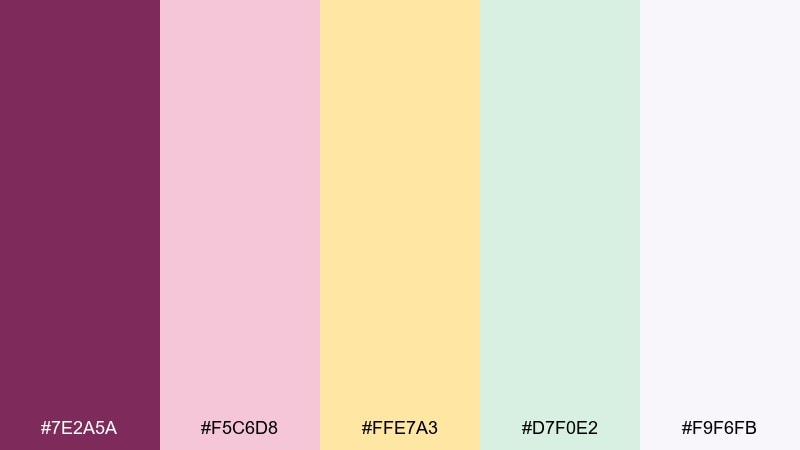
HEX: #7e2a5a #f5c6d8 #ffe7a3 #d7f0e2 #f9f6fb
Mood: cheerful, soft, imaginative
Best for: kids illustrations and playful branding
Cheerful and imaginative, like a storybook page filled with cotton-candy clouds and berry candies. Pastel companions make the main hue feel friendly and bright, perfect for playful layouts. Use it for kids illustrations, classroom printables, or upbeat brand graphics that need gentle contrast. Tip: let the pale background stay dominant and use berry for characters, titles, or key shapes so the design stays readable.
Image example of storybook pop generated using media.io

What Colors Go Well with Boysenberry?
Boysenberry pairs beautifully with warm neutrals like cream, oat, and greige because they soften the purple and keep layouts readable. If you want a premium feel, add warm metallic cues through gold-beige, copper, or terracotta tones.
For contrast, near-black plum, charcoal, and crisp white make boysenberry feel sharper and more modern—ideal for typography-heavy designs. If you want it to feel natural, muted greens (sage, olive, forest) are the easiest way to balance the berry depth.
To brighten the mood, use blush and lilac tints as large surfaces, and keep saturated accents (hot pink or yellow) small so the palette stays cohesive.
How to Use Boysenberry Color Combinations in Real Designs
Use boysenberry as an “anchor” color: logos, headlines, primary buttons, or key shapes. Let lighter tints (blush, lavender-white) handle backgrounds and cards so the design feels airy instead of heavy.
In UI, boysenberry works well for interactive states (primary CTA, selected tabs, focus rings) while slate/charcoal handle navigation and body text. In print, it shines as a spot color for section dividers, pull quotes, and premium packaging labels.
If your design starts to look too sweet, introduce a grounding neutral (near-black plum, cocoa brown, or cool slate) and reduce the amount of pink-tint surface area.
Create Boysenberry Palette Visuals with AI
If you already have HEX codes but need matching visuals (ads, posters, packaging mockups, or UI screens), AI generation is a fast way to explore multiple directions without rebuilding layouts from scratch.
With Media.io Text-to-Image, you can paste a prompt, describe the style (editorial, watercolor, minimal UI), and iterate until the lighting, mood, and color balance match your boysenberry palette.
Start with one of the prompts above, then swap subjects (perfume → skincare, poster → social story) while keeping the palette’s hero color consistent.
Boysenberry Color Palette FAQs
-
What is a boysenberry color (in design terms)?
Boysenberry is a deep berry-purple that sits between plum and magenta. It reads rich and modern, and it can feel romantic or bold depending on the supporting neutrals and accents. -
Is boysenberry closer to purple or pink?
It’s typically closer to purple (plum) but with a noticeable magenta undertone. Pair it with charcoal/white to emphasize purple, or with blush tones to pull it toward pink. -
What neutral backgrounds work best with boysenberry?
Cream, oat, warm greige, and soft lavender-white are the most forgiving backgrounds. For a dramatic look, near-black plum or charcoal backgrounds make boysenberry accents pop. -
What accent colors make boysenberry look more “premium”?
Warm metallic-inspired accents like gold-beige, copper, and terracotta elevate boysenberry quickly. Use them sparingly (borders, icons, foil-like details) for the most luxe result. -
Can I use boysenberry in UI without hurting readability?
Yes—use boysenberry for CTAs, highlights, and selected states, and keep body text in charcoal/near-black. Reserve pale tints (blush/lavender-white) for surfaces so contrast stays accessible. -
What colors go well with boysenberry for eco or wellness branding?
Muted greens like sage and olive pair especially well, balancing the berry tone and adding a natural cue. Combine with warm off-whites for calm, grounded wellness aesthetics. -
How do I generate boysenberry palette images that stay on-color?
In your prompt, call out “dominant colors” and list the key tones (boysenberry, cream, sage, etc.), then keep lighting and background simple. Generate a few variations and pick the one that best matches your HEX targets.
Next: Pistachio Color Palette


