

Lilac is one of those rare hues that can read soft and romantic, or modern and techy, depending on what you pair it with. It sits between lavender and purple, so it naturally carries calm while still feeling expressive.
Below are 20+ lilac color palette ideas with HEX codes, mood notes, and practical tips for branding, UI, weddings, packaging, and home decor—plus example prompts you can use to generate matching visuals.
In this article
- Why Lilac Palettes Work So Well
-
- whispered wisteria
- french lilac linen
- berry milkshake
- moonlit orchid
- dusty mauve studio
- lilac and sage garden
- modern periwinkle pop
- amethyst fog
- vanilla violet latte
- plum velvet night
- blush lilac bridal
- retro lilac soda
- coastal lilac mist
- graphite lilac tech
- terracotta lilac warmth
- silver lilac minimal
- neon lilac accent
- lilac citrus twist
- woodland lilac dusk
- frosted lilac glow
- iris paperback
- cloudy lilac neutral
- lilac cocoa balance
- prism lilac highlights
- What Colors Go Well with Lilac?
- How to Use a Lilac Color Palette in Real Designs
- Create Lilac Palette Visuals with AI
Why Lilac Palettes Work So Well
Lilac feels light and approachable, which makes it a reliable base for calm, modern design. Because it’s a tinted purple, it brings personality without the intensity that deeper violets can add.
It also pairs easily across temperatures: warm neutrals (cream, sand, cocoa) make lilac feel cozy, while cool accents (periwinkle, teal, mint) make it feel crisp and contemporary.
Most importantly, lilac supports strong hierarchy. Use pale lilacs as background tints, mid lilacs for UI elements, and deep plums/charcoals for contrast so typography stays readable.
20+ Lilac Color Palette Ideas (with HEX Codes)
1) Whispered Wisteria
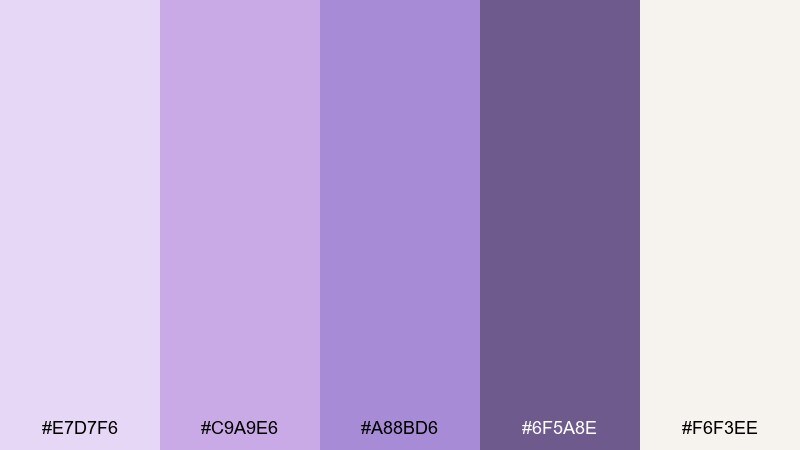
HEX: #E7D7F6 #C9A9E6 #A88BD6 #6F5A8E #F6F3EE
Mood: airy, romantic, calm
Best for: brand identity board for a wellness studio
Airy and romantic like wisteria drifting over a sunlit patio, these tones feel gentle without turning bland. Use the pale tint for backgrounds, then let the mid lilac carry buttons, labels, or headlines. Pair it with warm off-white for softness and a muted purple-brown for readable contrast. Tip: keep accents under 10 percent so the design stays serene.
Image example of whispered wisteria generated using media.io
Media.io is an online AI studio for creating and editing video, image, and audio in your browser.

2) French Lilac Linen
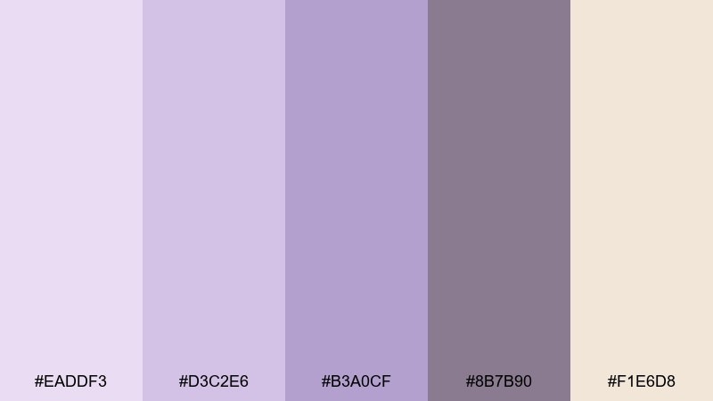
HEX: #EADDF3 #D3C2E6 #B3A0CF #8B7B90 #F1E6D8
Mood: soft, classic, editorial
Best for: magazine-style product feature spread
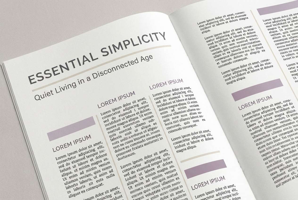
Soft and classic like pressed linen and dried petals, the palette reads upscale and composed. It works beautifully in editorial layouts where you need a calm backdrop and clear hierarchy. Pair the lilac tints with the warm sand neutral for page margins, then use the gray-mauve for body text. Tip: reserve the deeper tone for pull quotes to keep the spread refined.
Image example of french lilac linen generated using media.io
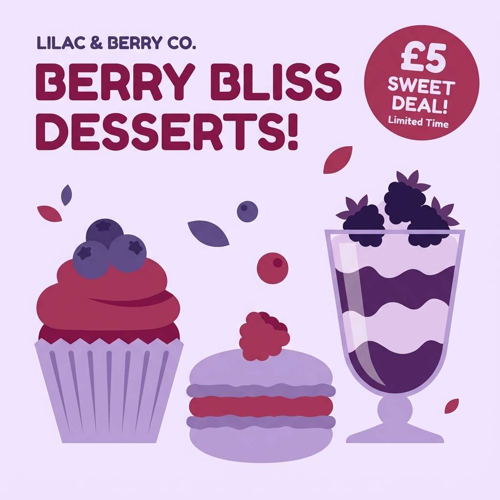
3) Berry Milkshake
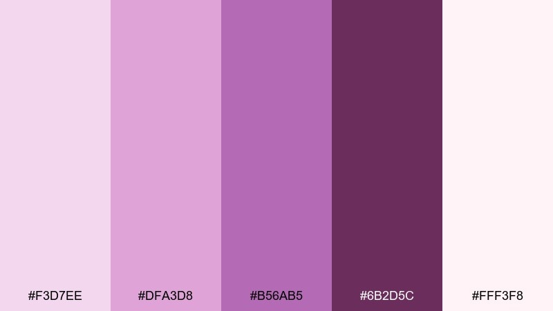
HEX: #F3D7EE #DFA3D8 #B56AB5 #6B2D5C #FFF3F8
Mood: playful, sweet, bold
Best for: social media promo graphics for a dessert shop
Playful and sweet like berry cream with a glossy swirl, these colors pop while still feeling cute. Use the deep berry as your anchoring text and logo color so the lighter tones stay readable. The pink-lilac midtones make great sticker-style badges and price bursts. Tip: add plenty of white space to keep the promo from looking overly sugary.
Image example of berry milkshake generated using media.io
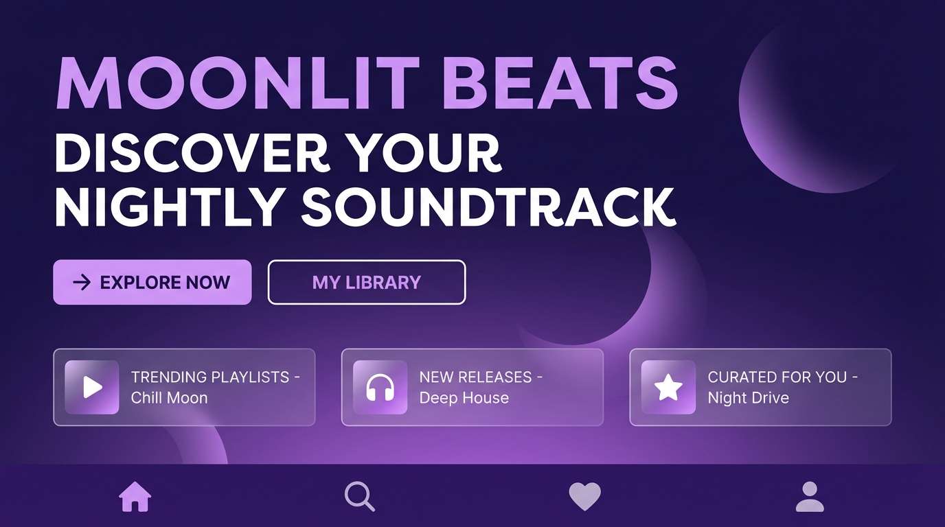
4) Moonlit Orchid
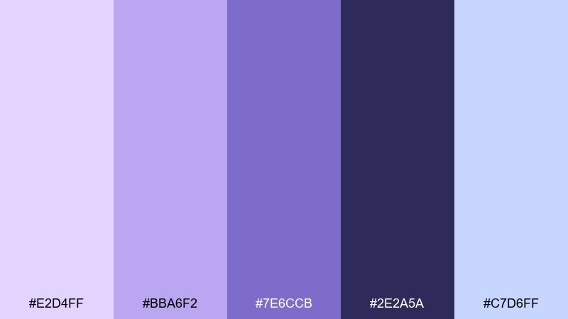
HEX: #E2D4FF #BBA6F2 #7E6CCB #2E2A5A #C7D6FF
Mood: mysterious, dreamy, modern
Best for: landing page hero for a music app
Mysterious and dreamy like orchids under moonlight, this mix balances glow with depth. The navy-purple is perfect for hero sections, while the bright periwinkle tint lifts cards and highlights. Pair it with a cool blue-lilac accent for links and micro-interactions. Tip: test contrast on the mid purple for accessibility before finalizing.
Image example of moonlit orchid generated using media.io
5) Dusty Mauve Studio
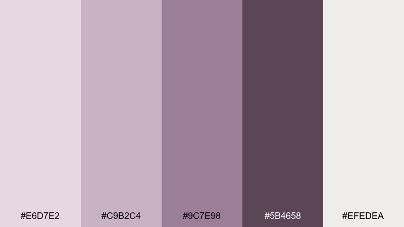
HEX: #E6D7E2 #C9B2C4 #9C7E98 #5B4658 #EFEDEA
Mood: muted, artsy, grounded
Best for: portfolio website theme for a photographer
Muted and artsy like a studio wall after a long shoot, the tones feel grounded and mature. Use the pale mauve as a site background and the charcoal-plum for navigation and captions. The mid mauves are ideal for hover states and subtle dividers. Tip: keep image frames neutral so the photography stays the hero.
Image example of dusty mauve studio generated using media.io
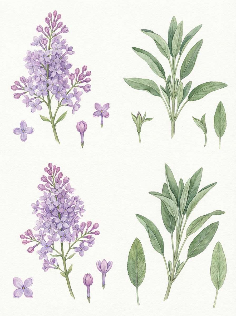
6) Lilac and Sage Garden
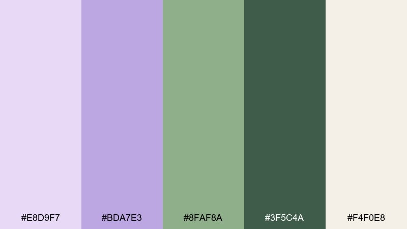
HEX: #E8D9F7 #BDA7E3 #8FAF8A #3F5C4A #F4F0E8
Mood: fresh, botanical, soothing
Best for: watercolor botanical illustration set
Fresh and botanical like new leaves beside soft petals, this pairing feels restorative. The sage greens keep the purples from drifting too sugary, making it ideal for nature-forward packaging or stationery. Use the darker green for stems, borders, or typography, and let the light lilac wash the background. Tip: add paper texture to amplify the garden mood.
Image example of lilac and sage garden generated using media.io
7) Modern Periwinkle Pop
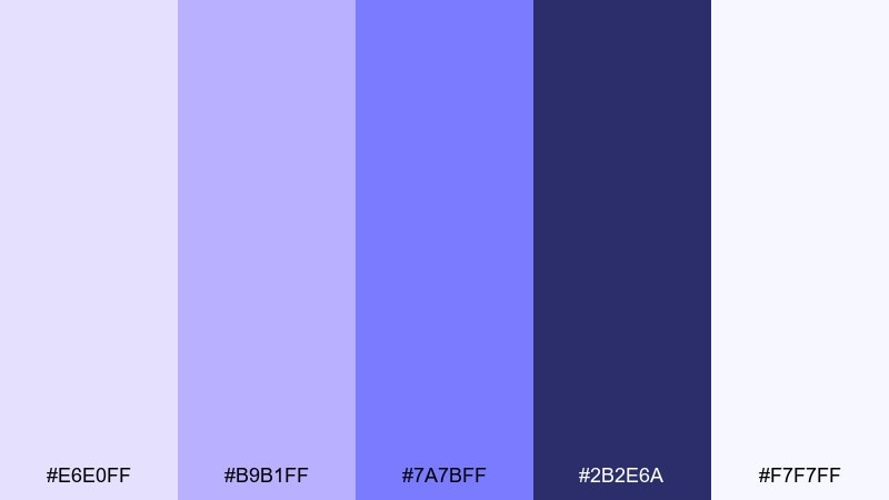
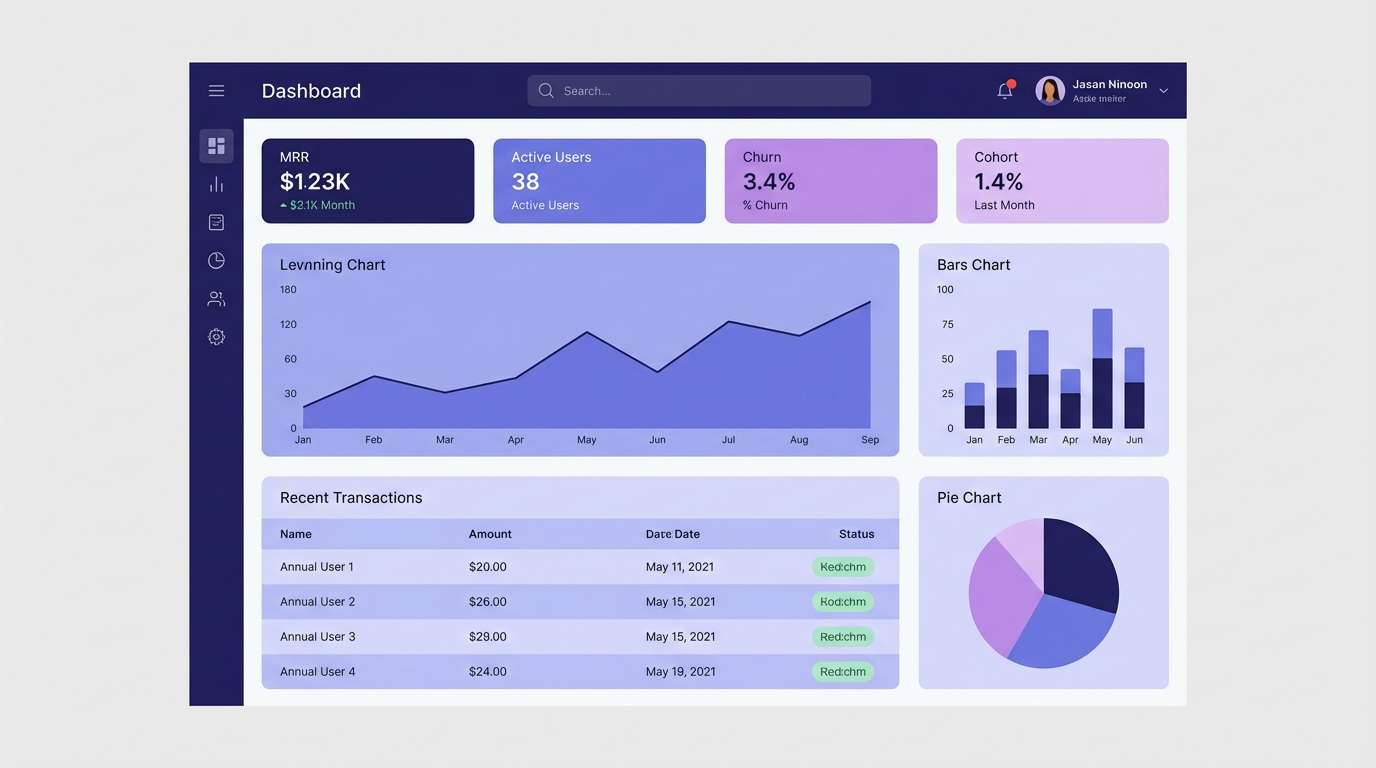
HEX: #E6E0FF #B9B1FF #7A7BFF #2B2E6A #F7F7FF
Mood: energetic, clean, techy
Best for: SaaS dashboard UI theme
Energetic and clean like neon light softened by fog, the palette feels modern and fast. Use the periwinkle pop for primary buttons and chart highlights, then anchor everything with the deep indigo for headers. The near-white keeps data tables airy and readable. Tip: reserve the brightest swatch for just one action per screen to avoid visual noise.
Image example of modern periwinkle pop generated using media.io
8) Amethyst Fog
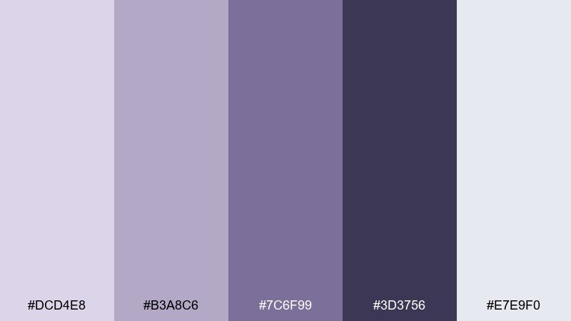
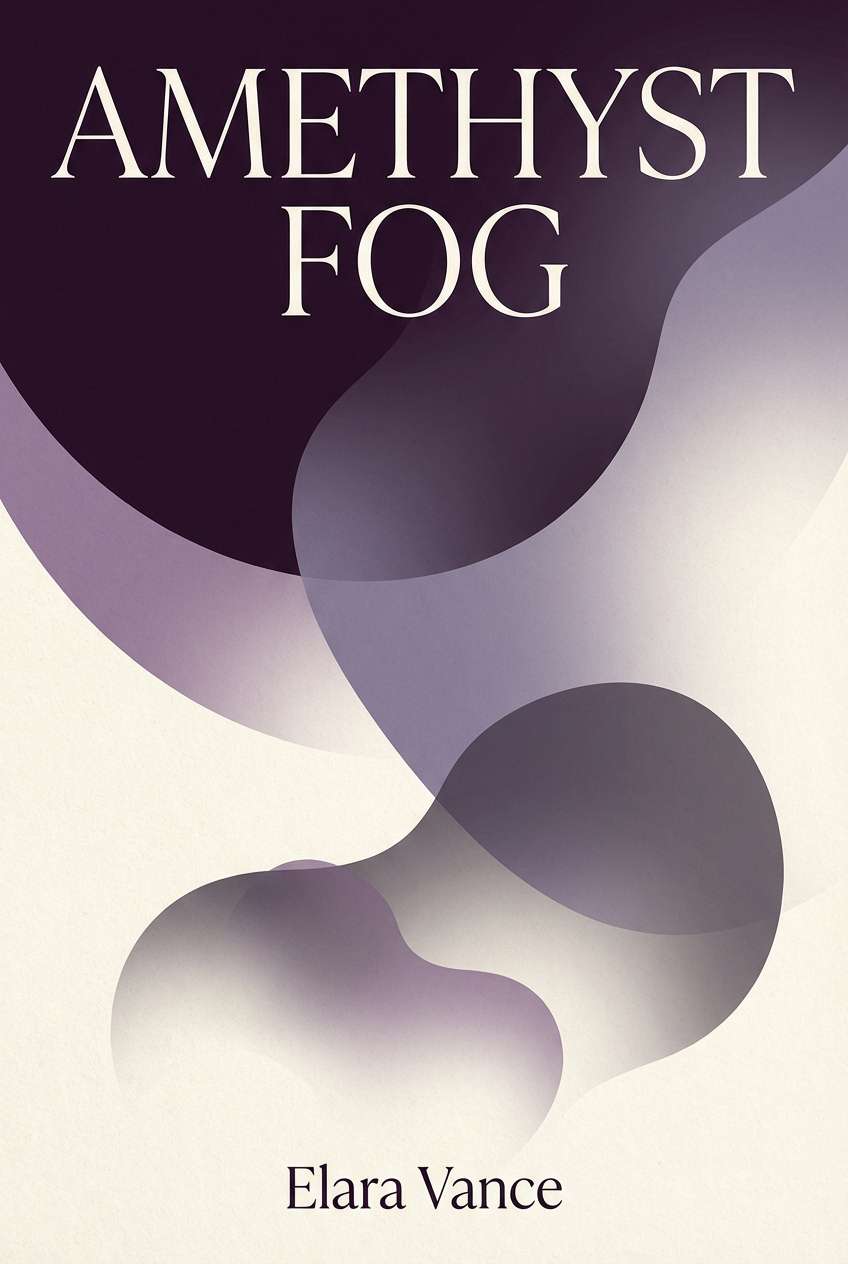
HEX: #DCD4E8 #B3A8C6 #7C6F99 #3D3756 #E7E9F0
Mood: moody, minimal, sophisticated
Best for: book cover design for literary fiction
Moody and minimal like fog rolling over amethyst stone, these tones feel sophisticated and quiet. They suit book covers and poster designs where you want atmosphere without chaos. Pair the soft gray-lilac background with the deep violet for title typography, then use the mid tone for author name and details. Tip: add subtle grain to make the cover feel tactile.
Image example of amethyst fog generated using media.io
9) Vanilla Violet Latte
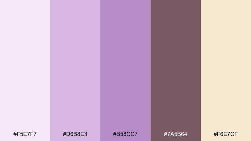
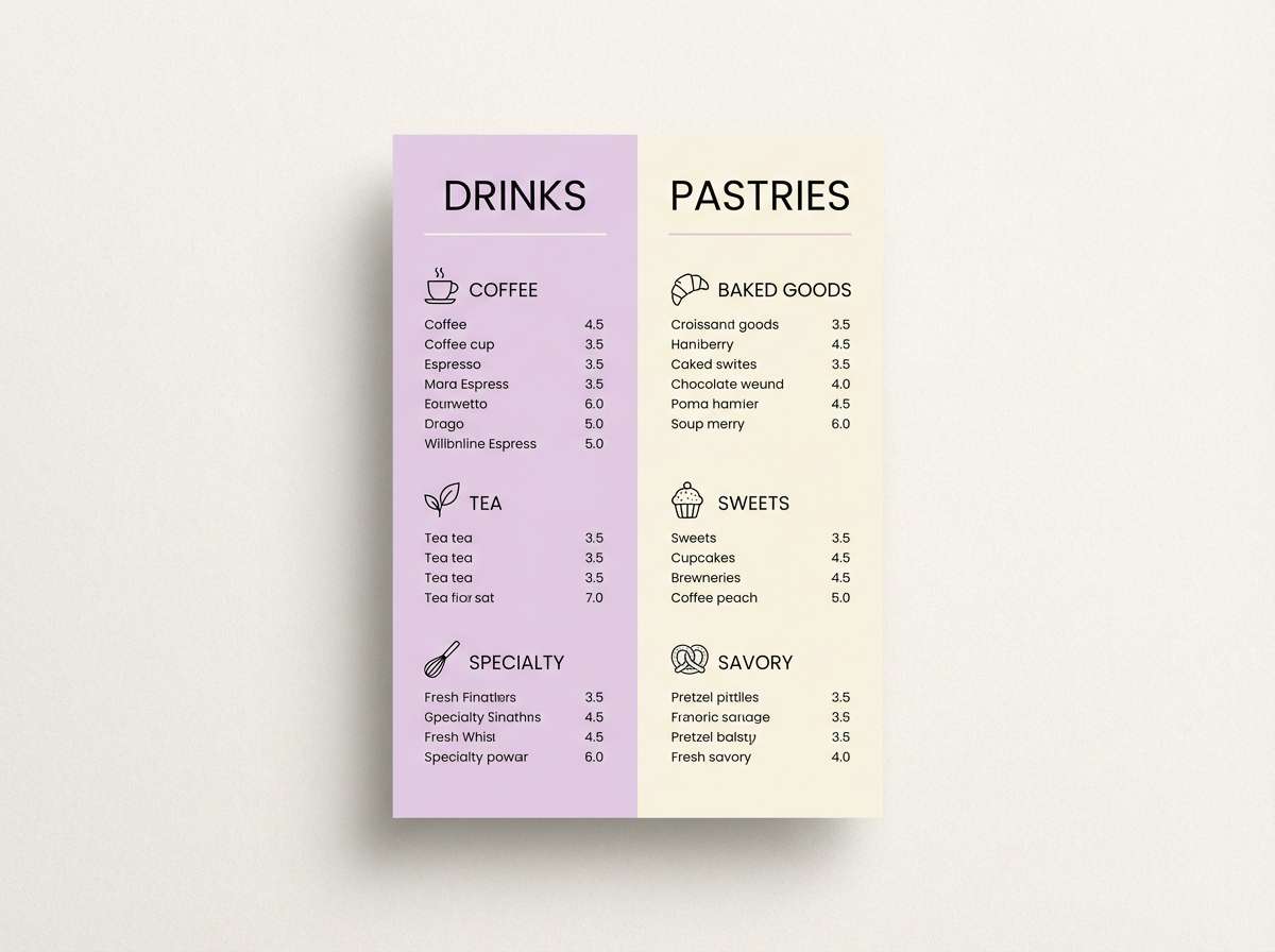
HEX: #F5E7F7 #D6B8E3 #B58CC7 #7A5B64 #F6E7CF
Mood: cozy, warm, inviting
Best for: cafe menu flyer design
Cozy and warm like a vanilla latte with a violet sprinkle, the palette feels inviting and friendly. It works well for menus, promos, and small business signage where you want a soft welcome. Pair the creamy beige with lilac headings, then use the cocoa-mauve for prices and body copy. Tip: keep icons line-based so the design stays light.
Image example of vanilla violet latte generated using media.io
10) Plum Velvet Night
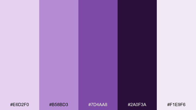
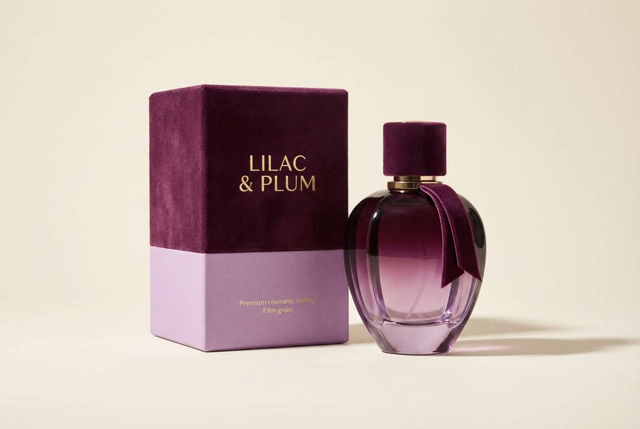
HEX: #E6D2F0 #B58BD3 #7D4AA8 #2A0F3A #F1E9F6
Mood: luxurious, dramatic, evening
Best for: perfume product ad and box packaging
Luxurious and dramatic like velvet curtains at midnight, these shades create instant premium energy. Use the near-black plum as the base for packaging, then bring in the brighter lilac for foil-style accents and badges. The pale tint is great for secondary panels and ingredient text blocks. Tip: choose one metallic finish and let the contrast do the heavy lifting.
Image example of plum velvet night generated using media.io
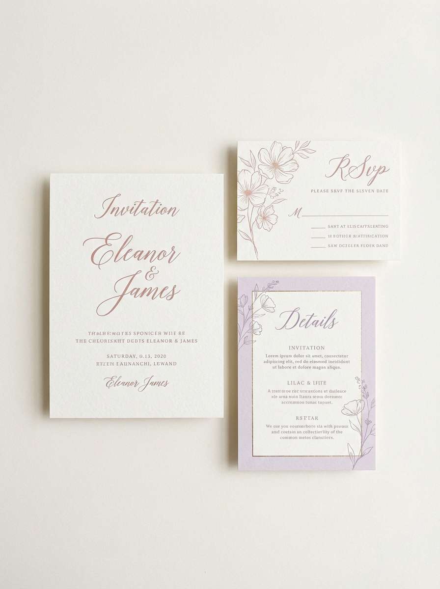
11) Blush Lilac Bridal
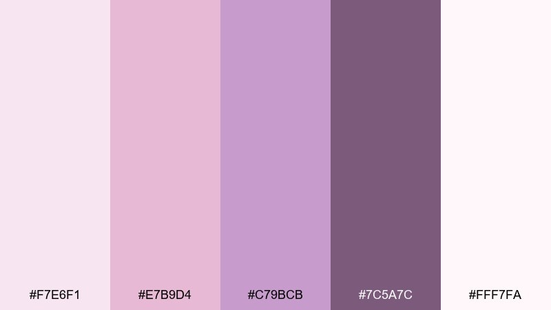
HEX: #F7E6F1 #E7B9D4 #C79BCB #7C5A7C #FFF7FA
Mood: romantic, airy, elegant
Best for: wedding invitation suite
Romantic and airy like blush tulle and lilac petals, the mix is soft but still polished. These are classic lilac color combinations for invitations, menus, and place cards, especially with delicate serif type. Use the lightest tones for the card base, then bring in the deeper mauve for names and key details. Tip: add a thin border line in the mid tone to frame the layout cleanly.
Image example of blush lilac bridal generated using media.io
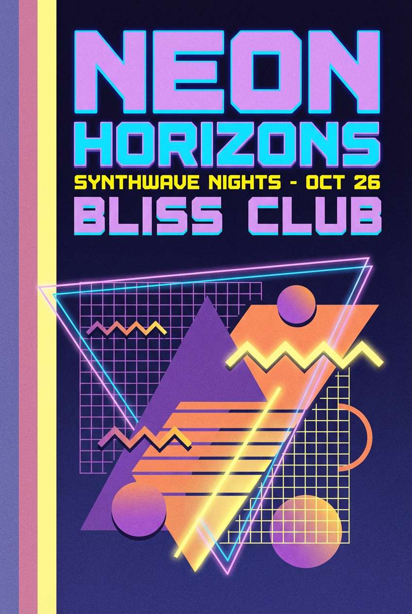
12) Retro Lilac Soda
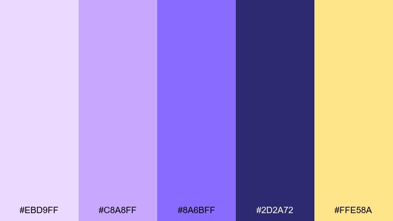
HEX: #EBD9FF #C8A8FF #8A6BFF #2D2A72 #FFE58A
Mood: retro, fun, high-contrast
Best for: event poster for a synthwave night
Retro and fizzy like soda foam under neon signs, this set is bold and nostalgic. The yellow accent brings instant punch against the purples, perfect for poster headlines and callouts. Use the dark indigo for text and silhouettes to keep readability strong. Tip: try a gradient only in the background and keep typography solid for clarity.
Image example of retro lilac soda generated using media.io
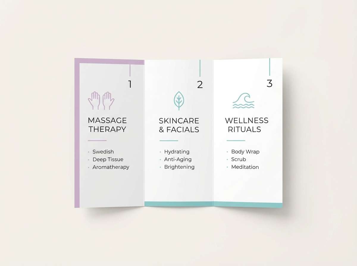
13) Coastal Lilac Mist
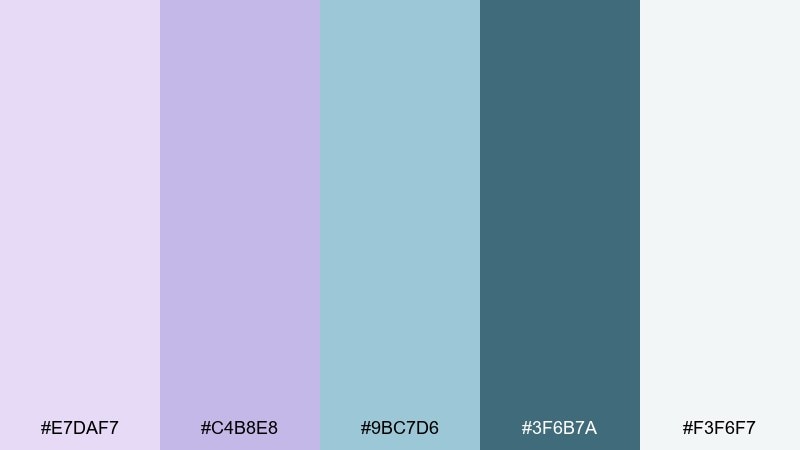
HEX: #E7DAF7 #C4B8E8 #9BC7D6 #3F6B7A #F3F6F7
Mood: breezy, calm, coastal
Best for: spa brochure and service list
Breezy and calm like morning mist over a quiet shoreline, these tones feel clean and restorative. The sea-glass blue lifts the lilac and keeps the overall look fresh. Use the pale gray-white as the main background, then set headings in the deeper teal for crisp structure. Tip: keep imagery cool-toned so the palette stays cohesive.
Image example of coastal lilac mist generated using media.io
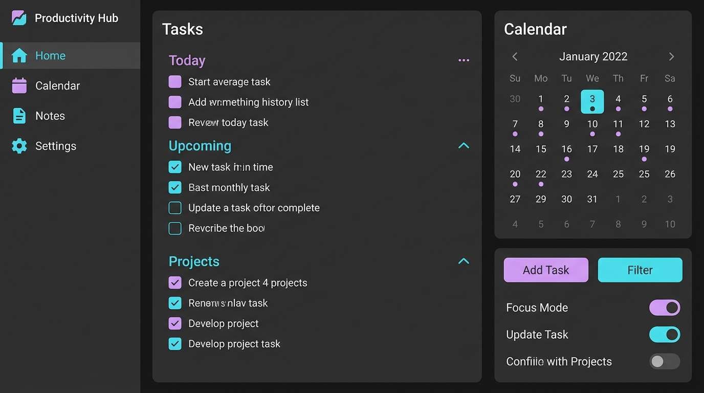
14) Graphite Lilac Tech
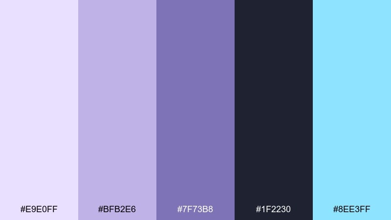
HEX: #E9E0FF #BFB2E6 #7F73B8 #1F2230 #8EE3FF
Mood: sleek, futuristic, confident
Best for: dark-mode app UI for productivity
Sleek and futuristic like graphite with a soft glow, this mix is built for dark mode. Use the near-black graphite for the canvas, then layer lilac tints for cards, toggles, and focus states. The cyan accent is perfect for active links and success states without feeling harsh. Tip: keep shadows subtle and rely on color contrast for depth.
Image example of graphite lilac tech generated using media.io
15) Terracotta Lilac Warmth
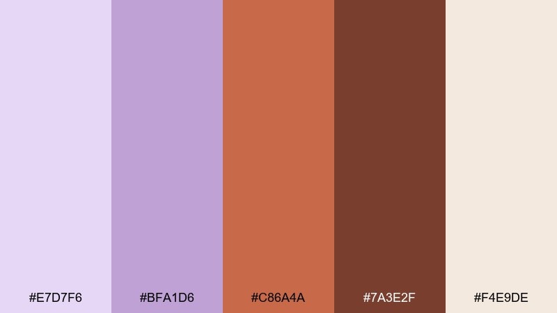
HEX: #E7D7F6 #BFA1D6 #C86A4A #7A3E2F #F4E9DE
Mood: earthy, warm, creative
Best for: home decor moodboard for a living room
Earthy and warm like clay pottery beside soft florals, the pairing feels creative and lived-in. The terracotta adds a grounded counterpoint, making the purples look more mature. Use the cream as wall color or background, then layer lilac textiles with terracotta accents in art and ceramics. Tip: repeat the terracotta in small doses to avoid overpowering the softness.
Image example of terracotta lilac warmth generated using media.io
16) Silver Lilac Minimal
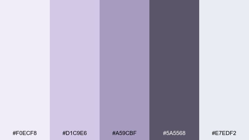
HEX: #F0ECF8 #D1C9E6 #A59CBF #5A5568 #E7EDF2
Mood: minimal, cool, professional
Best for: corporate pitch deck template
Minimal and cool like brushed silver with a hint of violet, these tones feel professional and controlled. They suit pitch decks and business docs where clarity matters more than decoration. Use the lightest swatches for slides and charts, then set headings in the dark gray for crisp readability. Tip: keep accent color consistent across all graphs to reduce cognitive load.
Image example of silver lilac minimal generated using media.io
17) Neon Lilac Accent
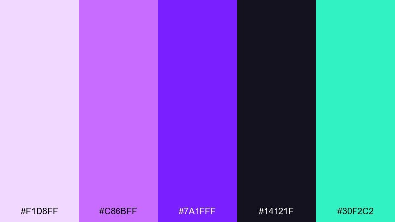
HEX: #F1D8FF #C86BFF #7A1FFF #14121F #30F2C2
Mood: edgy, vibrant, nightlife
Best for: streetwear drop announcement poster
Edgy and vibrant like club lights cutting through darkness, this set is made for high impact. The electric green adds a sharp counter-accent that keeps the purples from blending together. Use the near-black for the base, then hit key text with neon purple and reserve green for one standout detail. Tip: increase tracking on headlines to make the poster feel more premium.
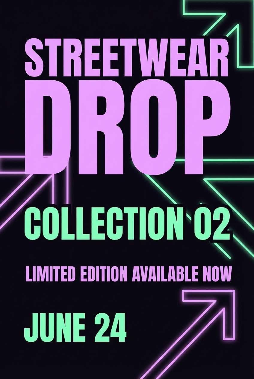
Image example of neon lilac accent generated using media.io
18) Lilac Citrus Twist
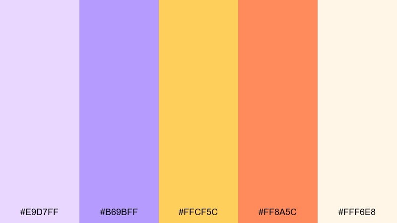
HEX: #E9D7FF #B69BFF #FFCF5C #FF8A5C #FFF6E8
Mood: bright, cheerful, optimistic
Best for: beverage label and can packaging
Bright and cheerful like citrus slices on a pastel table, the contrast feels upbeat and modern. It is a friendly lilac color combination for drinks, snacks, and seasonal promos where you want instant energy. Use the creamy background to keep labels readable, then alternate lemon and coral for flavor cues. Tip: keep the lilac as a consistent brand thread across all variants.
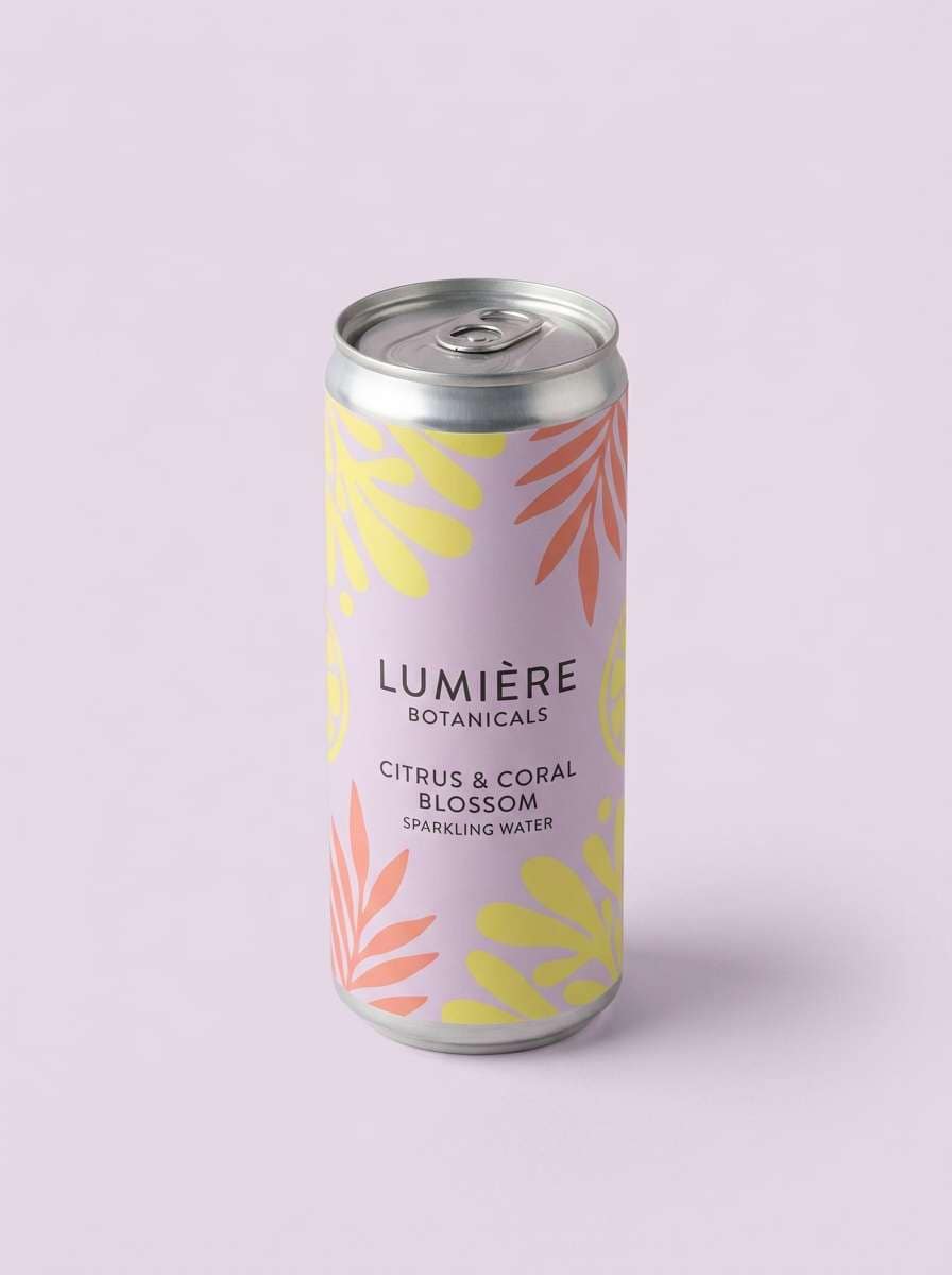
Image example of lilac citrus twist generated using media.io
19) Woodland Lilac Dusk
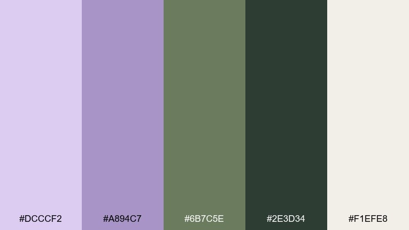
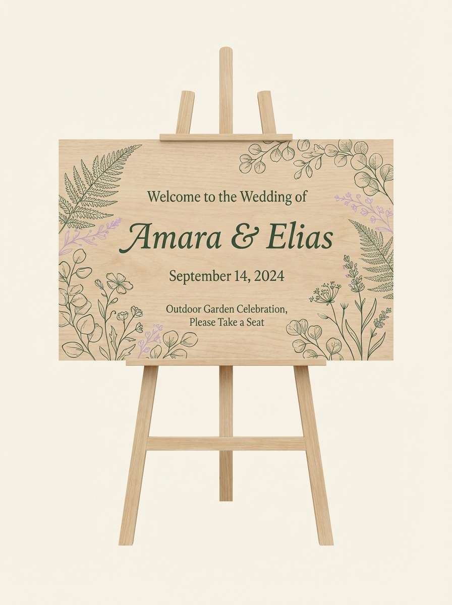
HEX: #DCCCF2 #A894C7 #6B7C5E #2E3D34 #F1EFE8
Mood: natural, dusky, rustic
Best for: outdoor wedding sign and stationery
Natural and dusky like wildflowers at the edge of the woods, the tones feel rustic but elevated. The greens give structure, while the soft purple keeps everything romantic. Use the cream for sign backgrounds, then set type in the deep forest for high contrast outdoors. Tip: choose matte paper stock so the colors stay true in sunlight.
Image example of woodland lilac dusk generated using media.io
20) Frosted Lilac Glow
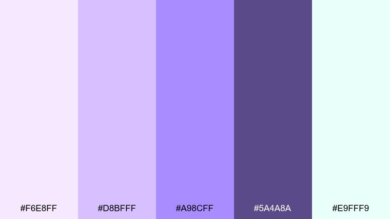
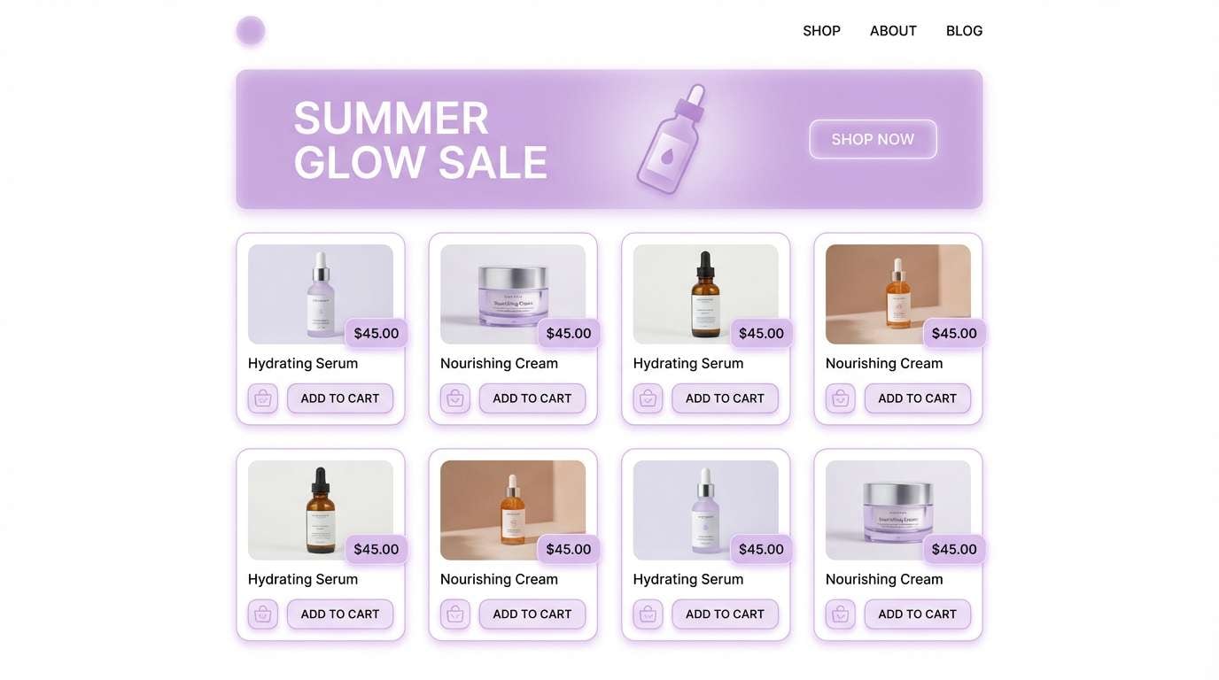
HEX: #F6E8FF #D8BFFF #A98CFF #5A4A8A #E9FFF9
Mood: fresh, luminous, clean
Best for: skincare ecommerce homepage UI
Fresh and luminous like frosted glass catching early light, this set feels clean and modern. It makes a strong lilac color palette for beauty brands that want softness without losing clarity. Use the pale lilac for large sections, add the mint-white for breathing room, and rely on the deeper violet for buttons and prices. Tip: keep product photos bright and neutral so the glow effect stays consistent.
Image example of frosted lilac glow generated using media.io
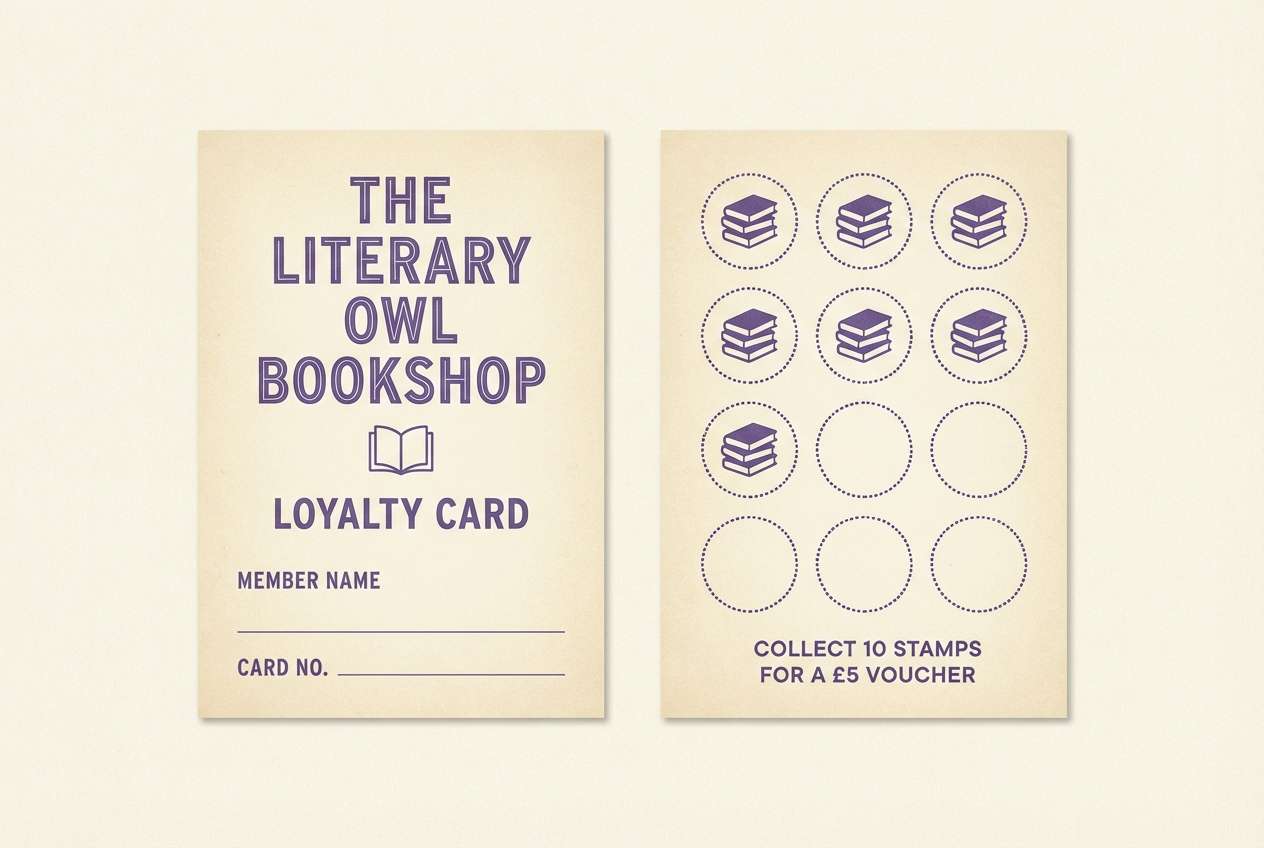
21) Iris Paperback
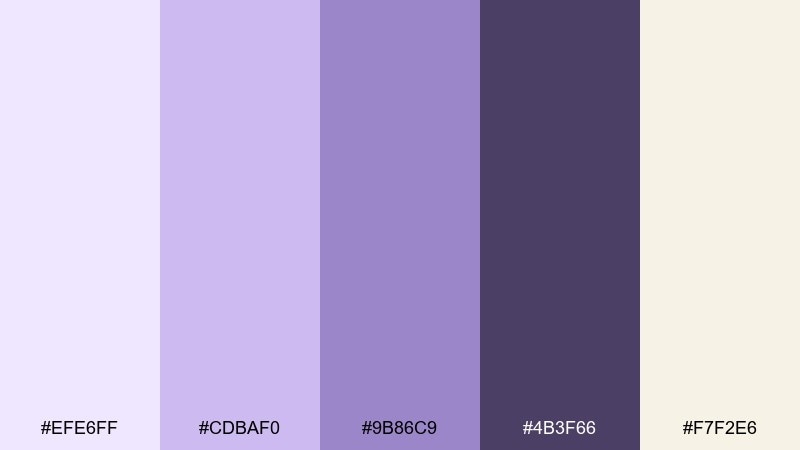
HEX: #EFE6FF #CDBAF0 #9B86C9 #4B3F66 #F7F2E6
Mood: literary, soft, nostalgic
Best for: bookstore loyalty card and stamp design
Literary and nostalgic like a well-loved paperback with an iris pressed inside, the colors feel gentle and thoughtful. They work nicely on small-format print pieces where subtlety reads premium. Use the cream for the base, the mid purple for borders and stamps, and the deep tone for the logo mark. Tip: try letterpress-style textures to make the card feel collectible.
Image example of iris paperback generated using media.io
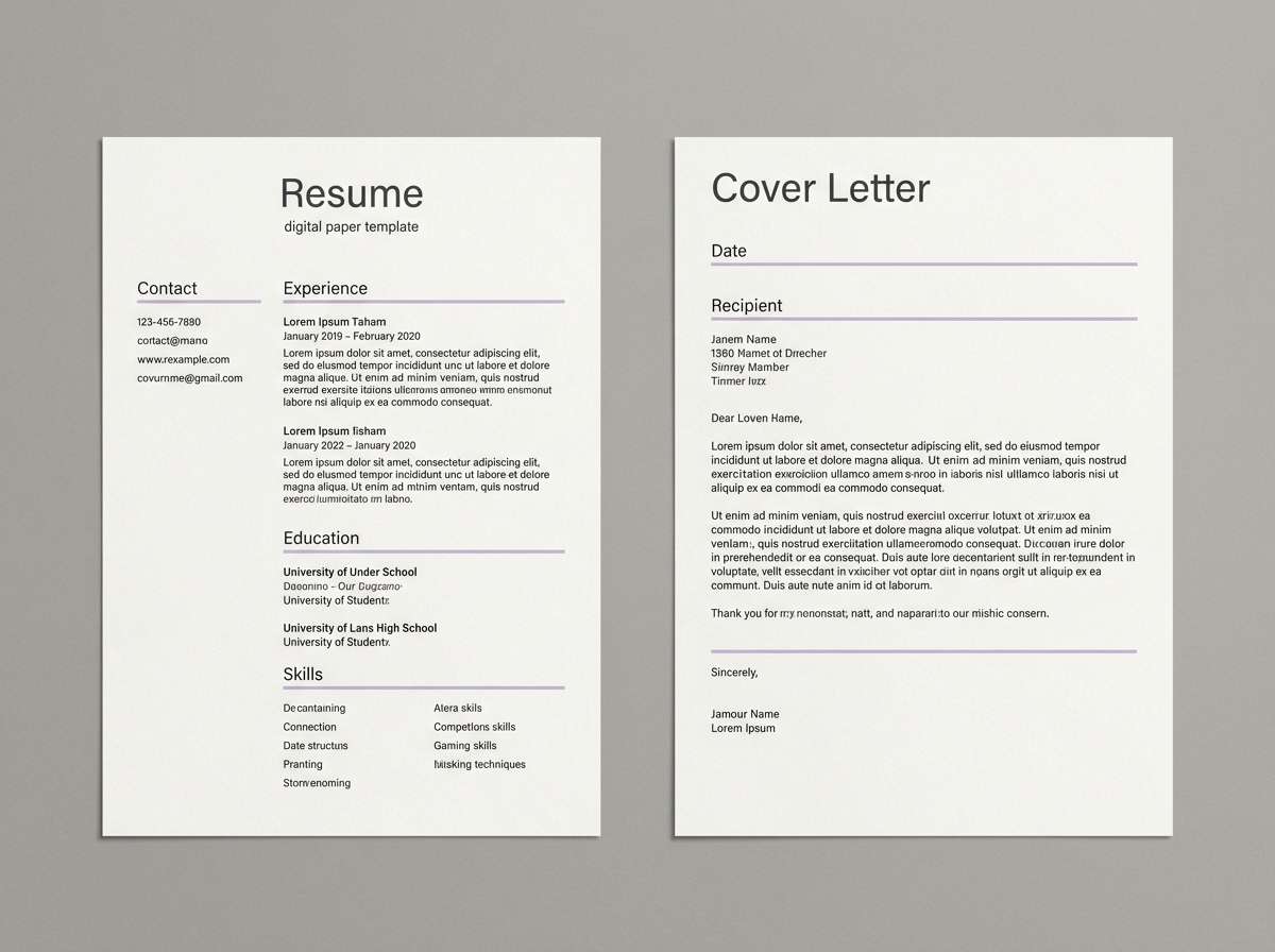
22) Cloudy Lilac Neutral
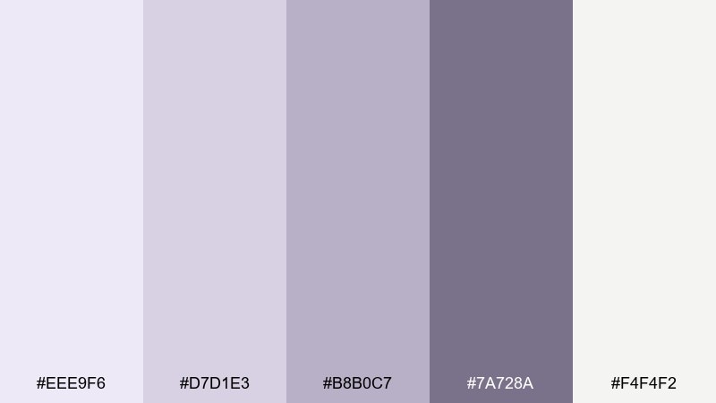
HEX: #EEE9F6 #D7D1E3 #B8B0C7 #7A728A #F4F4F2
Mood: quiet, neutral, versatile
Best for: resume and cover letter template
Quiet and neutral like clouds tinted at dusk, the palette is understated and versatile. It suits resumes and professional templates where you want a hint of personality without distracting. Use the light gray-lilac for section bands and the darker gray for headings and rules. Tip: keep the accent to one shade so the page reads crisp when printed.
Image example of cloudy lilac neutral generated using media.io
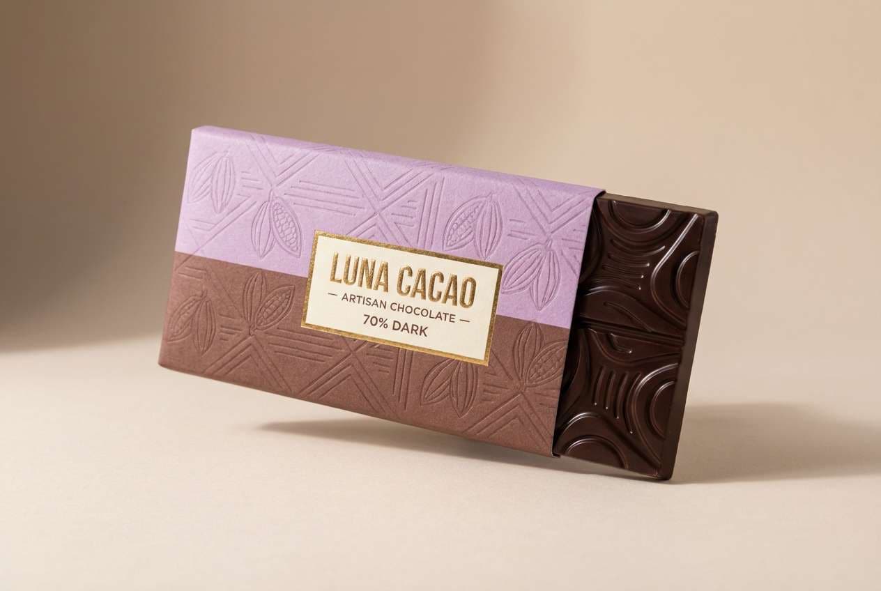
23) Lilac Cocoa Balance
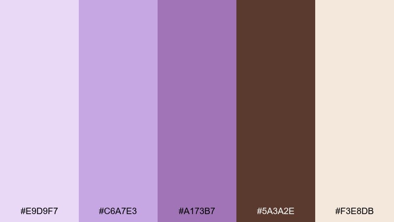
HEX: #E9D9F7 #C6A7E3 #A173B7 #5A3A2E #F3E8DB
Mood: cozy, crafted, boutique
Best for: artisan chocolate wrapper design
Cozy and crafted like cocoa dust on handmade truffles, this pairing feels boutique and indulgent. The warm brown makes the purples look richer, ideal for food packaging with an artisanal vibe. Use the cream for negative space, then let the mid purple carry patterns while cocoa handles type and nutrition details. Tip: keep pattern scale large so it stays legible on a wrapper fold.
Image example of lilac cocoa balance generated using media.io
24) Prism Lilac Highlights
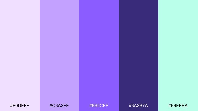
HEX: #F0DFFF #C3A2FF #8B5CFF #3A2B7A #B9FFEA
Mood: creative, glossy, experimental
Best for: creative conference ticket and badge design
Creative and glossy like light splitting through a prism, the colors feel experimental but controlled. Use the deepest purple for QR code zones and text blocks, then let the brighter swatches carry gradients and highlight bands. These lilac color combinations also work well for wayfinding when you need quick visual cues. Tip: define one solid fallback color for print to avoid unpredictable gradient shifts.
Image example of prism lilac highlights generated using media.io
What Colors Go Well with Lilac?
Neutrals are the easiest match: warm creams and beiges make lilac feel soft and welcoming, while cool grays and silvers make it look clean and professional. For readable type, deep plum, charcoal, or near-black graphite usually performs best.
For contrast, try complementary energy with muted yellows and golds, or add freshness using sage, teal, or sea-glass blue. If you want a modern UI vibe, periwinkle and indigo create a sharp, tech-forward lilac color scheme.
When in doubt, keep one anchor dark (for text), one main light (for backgrounds), and use lilac as the brand thread that ties accents and components together.
How to Use a Lilac Color Palette in Real Designs
In branding, lilac is great for wellness, beauty, lifestyle, and boutique retail—especially when paired with warm neutrals and a single deep tone for logos and headlines. Keep secondary accents minimal so the identity stays calm and premium.
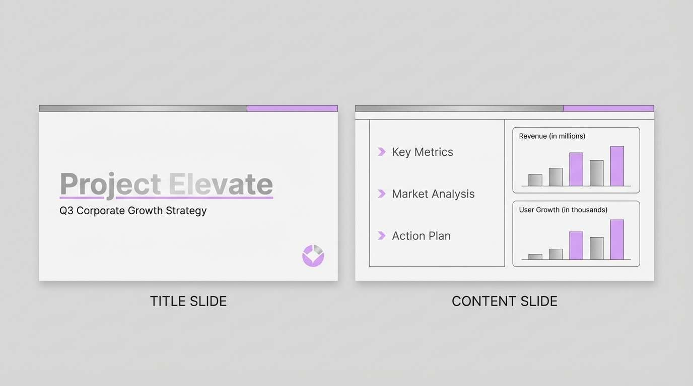
In UI, use pale lilac for surfaces and cards, mid lilac for interactive states, and a dark indigo/plum for navigation and text. Always check contrast (especially on mid purples) to meet accessibility requirements.
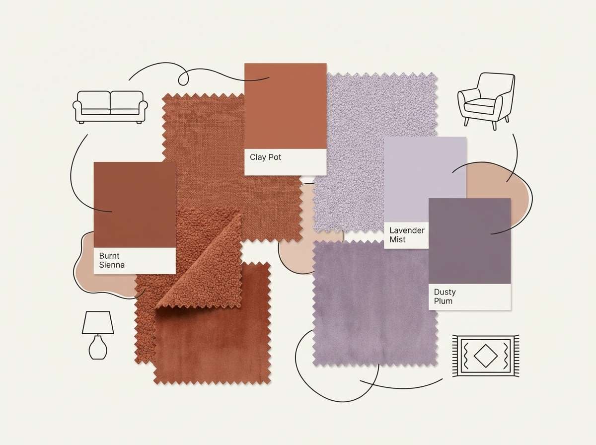
For weddings and home decor, lilac shines when balanced with greens (sage, forest) or earthy warms (terracotta, cocoa). Repeating one accent color in small doses helps the overall look feel intentional, not overly pastel.
Create Lilac Palette Visuals with AI
If you already have HEX codes, you can generate on-brand mockups (posters, UI screens, packaging, invitations) by describing the layout and calling out lilac tones and complementary accents. Consistent prompts make it easier to produce a cohesive set of visuals.
Start with one palette from the list above, reuse its mood words (like “airy,” “editorial,” or “dark-mode tech”), and keep your composition simple—clean grids, clear typography blocks, and a single hero accent.
Media.io makes it easy to turn your lilac color palette into ready-to-share images for moodboards, presentations, and marketing drafts.
Lilac Color Palette FAQs
-
What HEX code is “lilac” usually closest to?
There isn’t one universal HEX for lilac, but it’s commonly represented by light, pink-tinted purples such as #C8A2C8 or softer tints like #E7D7F6. The best “lilac” depends on whether you want it warmer (more pink) or cooler (more periwinkle). -
Is lilac the same as lavender?
They’re related but not identical. Lavender usually leans cooler and slightly bluer, while lilac often has a pinker, more floral tint. In palettes, lavender pairs naturally with cool grays and blues; lilac often loves warm creams and blush tones. -
What colors complement lilac?
Soft complements include sage green, muted teal, warm cream, and gentle gray. For higher contrast, pair lilac with deep plum/indigo for text, or add a small pop of yellow/gold for energetic accents. -
How do I make a lilac color scheme look modern (not too “cute”)?
Anchor it with a dark neutral (charcoal, graphite, deep indigo), use more white space, and limit bright accents. Cool pairings like periwinkle + indigo or lilac + silver-gray also push it toward a clean, techy feel. -
Can lilac work for business or corporate design?
Yes—choose a restrained, gray-lilac palette and use lilac as an accent rather than the main background. Combine it with slate/dark gray for headings and keep charts and highlights consistent to maintain a professional look. -
What’s the best text color on a lilac background?
For accessibility, use a deep plum, indigo, or near-black rather than mid purple. If your lilac is very pale, dark gray can also work well; always verify contrast using a WCAG contrast checker.
Next: Summer Color Palette


