

Pistachio is a soft, friendly green that sits between fresh spring color and modern neutral. It brings an optimistic feel to branding and interfaces without the harshness of neon greens.
Below are pistachio pairing ideas you can use for logos, UI, packaging, and seasonal visuals—each palette includes HEX codes plus an AI prompt you can recreate in Media.io.
In this article
- Why Pistachio Palettes Work So Well
-
- pistachio cream
- citrus grove
- minted clay
- vintage gelato
- botanical breeze
- calm workspace ui
- artisan bakery
- soft wedding greens
- mediterranean tiles
- eco skincare
- modern editorial
- playful kidsroom
- desert herb
- night garden
- minimal packaging
- retro diner
- spa sanctuary
- outdoor market
- tech startup fresh
- pastel sunset
- tea house calm
- gallery minimal
- pistachio stone
- What Colors Go Well with Pistachio?
- How to Use a Pistachio Color Palette in Real Designs
- Create Pistachio Palette Visuals with AI
Why Pistachio Palettes Work So Well
Pistachio green feels naturally “clean” because it has enough yellow to read as sunlit and fresh, while staying muted enough to work as a background or brand base color. It’s a great bridge between pastel green palettes and more grounded green-neutral schemes.
In branding, pistachio is approachable and modern—ideal for wellness, food, lifestyle, and eco-forward products. It can feel premium with creamy off-white, or playful with blush and citrus accents.
In UI, pistachio works well as a success/active-state color because it signals “positive” without the intensity of bright neon green. Pair it with charcoal text and soft grays to keep accessibility and clarity strong.
20+ Pistachio Color Palette Ideas (with HEX Codes)
1) Pistachio Cream
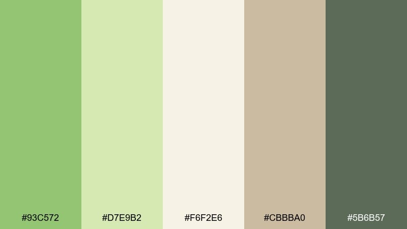
HEX: #93C572 #D7E9B2 #F6F2E6 #CBBBA0 #5B6B57
Mood: airy, gentle, clean
Best for: minimal packaging design
Airy and gentle like gelato in a sunlit café, these tones feel calm and reassuring. They work beautifully on minimal packaging, skincare labels, and stationery where whitespace matters. Pair the greens with the warm beige for a grounded, premium look. Usage tip: keep the darkest green for small type and icons to preserve the soft, clean mood.
Image example of pistachio cream generated using media.io
Media.io is an online AI studio for creating and editing video, image, and audio in your browser.

2) Citrus Grove
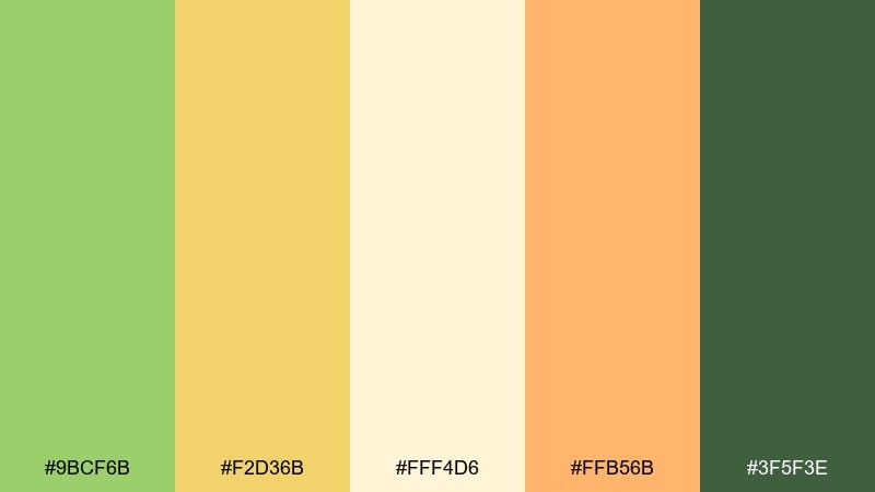
HEX: #9BCF6B #F2D36B #FFF4D6 #FFB56B #3F5F3E
Mood: fresh, upbeat, sunny
Best for: social media promo post
Fresh and upbeat like a morning farmers market, this mix adds instant energy without feeling loud. It shines in social promos, food brands, and seasonal launches where a bright accent helps calls to action pop. Balance the warm citrus tones against the creamy background to keep everything readable. Usage tip: use the orange as a small highlight on buttons or price tags, not the main fill.
Image example of citrus grove generated using media.io
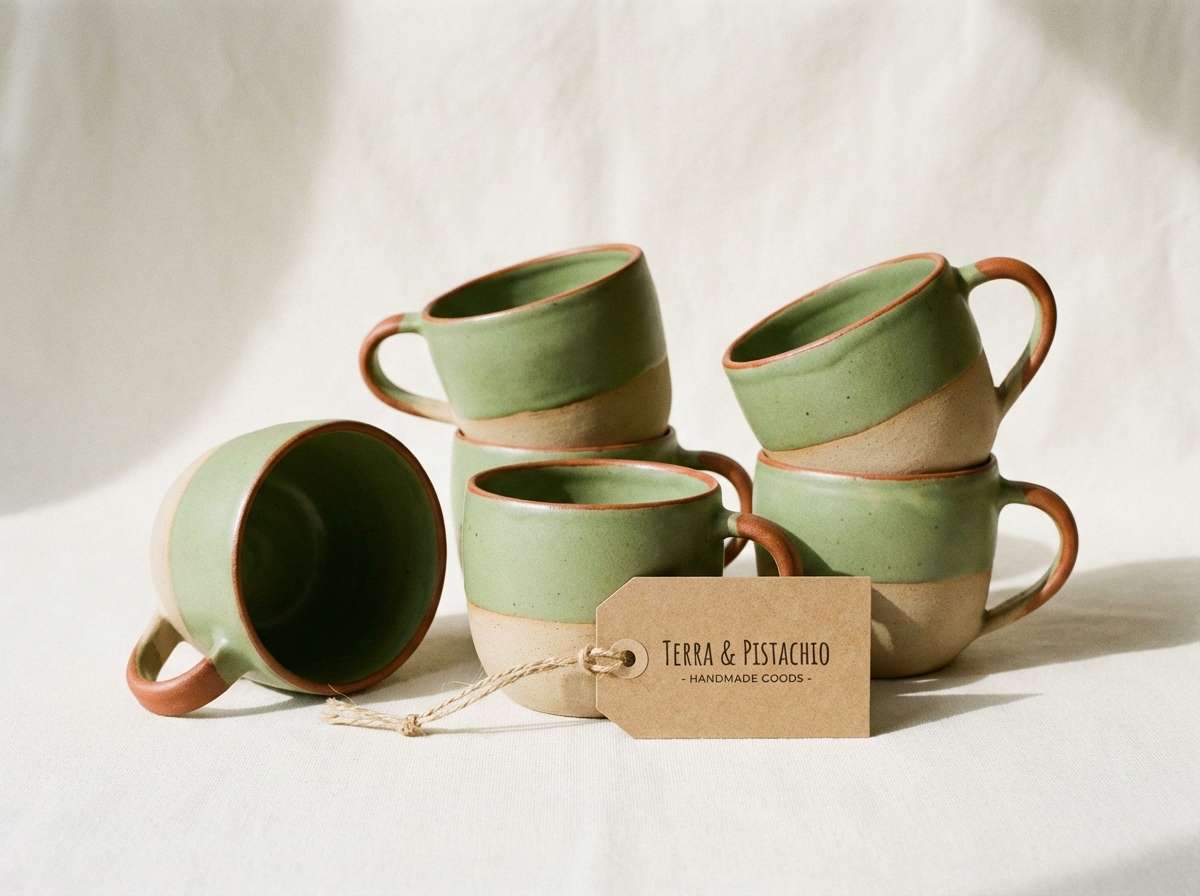
3) Minted Clay
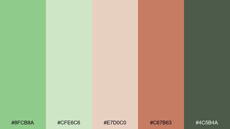
HEX: #8FCB8A #CFE6C6 #E7D0C0 #C67B63 #4C5B4A
Mood: cozy, artisanal, modern rustic
Best for: ceramics brand identity
Cozy and tactile like hand-thrown pottery, these colors feel warm, human, and slightly earthy. The pistachio color combinations here pair especially well with clay and terracotta tones for artisanal branding. Use the pale mint as your background and bring in the terracotta for stamps, seals, or social highlights. Usage tip: keep contrast high by reserving the deep gray-green for logos and primary text.
Image example of minted clay generated using media.io
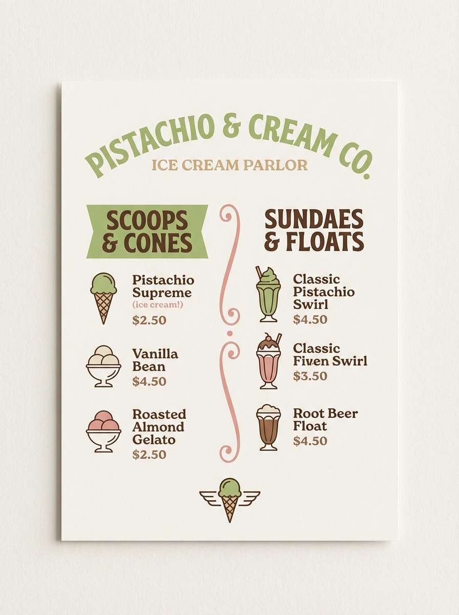
4) Vintage Gelato
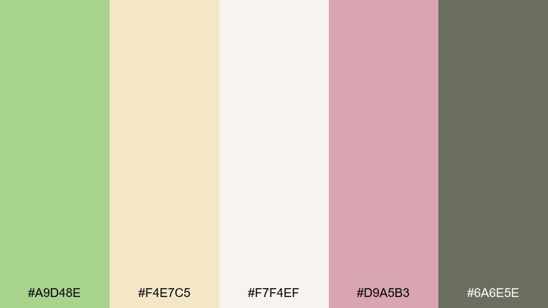
HEX: #A9D48E #F4E7C5 #F7F4EF #D9A5B3 #6A6E5E
Mood: nostalgic, sweet, soft
Best for: ice cream shop menu
Nostalgic and sweet like a retro scoop shop, this palette leans creamy with a playful blush twist. It works well for menus, loyalty cards, and pastel-forward food photography overlays. Pair the pistachio and blush sparingly so the design stays airy rather than sugary. Usage tip: use the gray-green for pricing and section headers to keep the menu easy to scan.
Image example of vintage gelato generated using media.io
5) Botanical Breeze
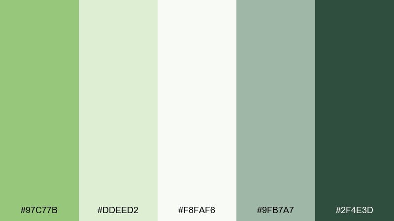
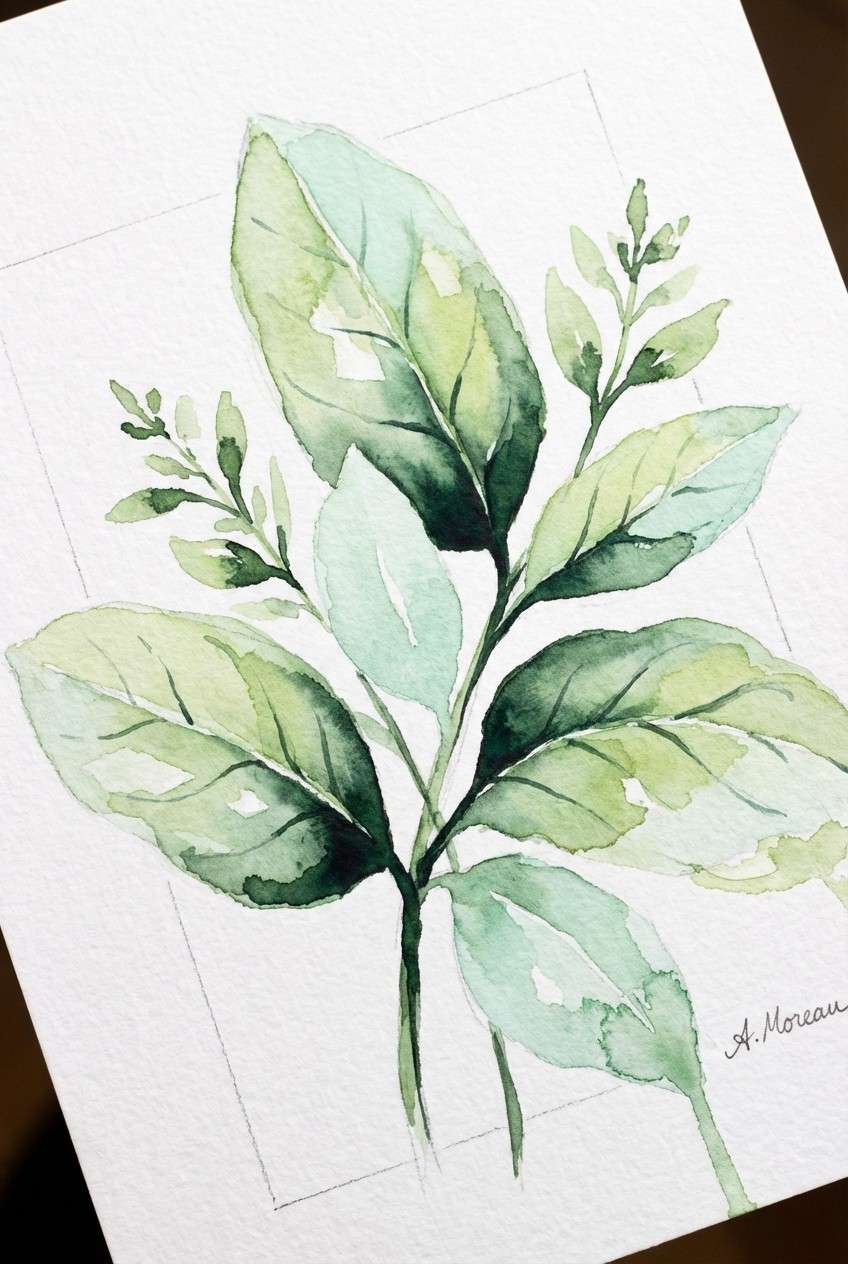
HEX: #97C77B #DDEED2 #F8FAF6 #9FB7A7 #2F4E3D
Mood: springtime, breezy, botanical
Best for: watercolor botanical illustration
Springtime and breezy like leaves after rain, these greens feel clean and naturally optimistic. They suit botanical illustrations, eco messaging, and calm wellness visuals that need a light touch. Keep the deep forest tone for outlines and shadows so the lighter greens can glow. Usage tip: add negative space around leaf clusters to avoid a busy, heavy look.
Image example of botanical breeze generated using media.io
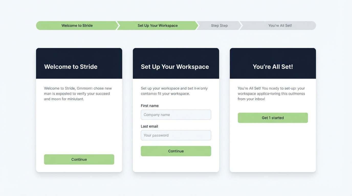
6) Calm Workspace UI
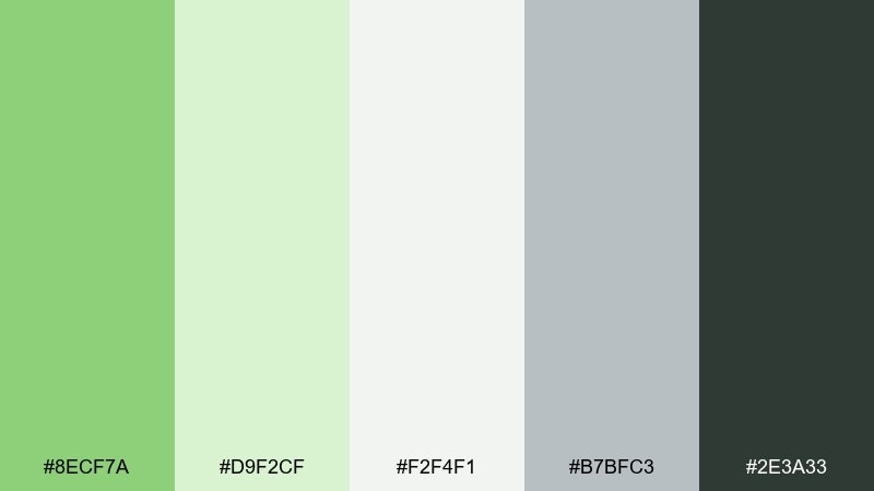
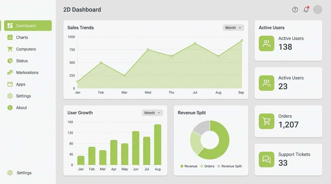
HEX: #8ECF7A #D9F2CF #F2F4F1 #B7BFC3 #2E3A33
Mood: focused, calm, professional
Best for: 2D dashboard UI mockup
Focused and calm like a quiet morning inbox, this set feels modern without going cold. It fits productivity dashboards, fintech tools, and admin panels where clarity is everything. Pair the pistachio with the soft grays for structure, then use the dark charcoal for contrast and accessibility. Usage tip: reserve the green for active states and success messages to keep it meaningful.
Image example of calm workspace ui generated using media.io
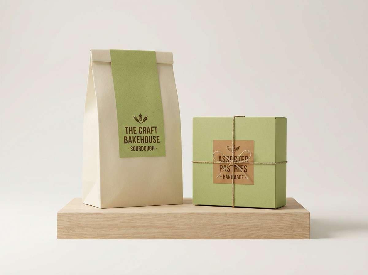
7) Artisan Bakery
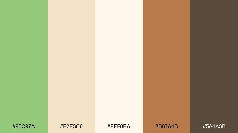
HEX: #95C97A #F2E3C6 #FFF8EA #B87A4B #5A4A3B
Mood: warm, inviting, handmade
Best for: bakery product packaging
Warm and inviting like fresh bread on a wooden counter, these hues feel handmade and comforting. The pistachio color palette works especially well for bakery packaging, coffee sleeves, and ingredient-forward labels. Pair the greens with toasty browns for a rustic premium vibe that still feels fresh. Usage tip: print the deep brown for barcode and body text to avoid muddiness on kraft-like backgrounds.
Image example of artisan bakery generated using media.io
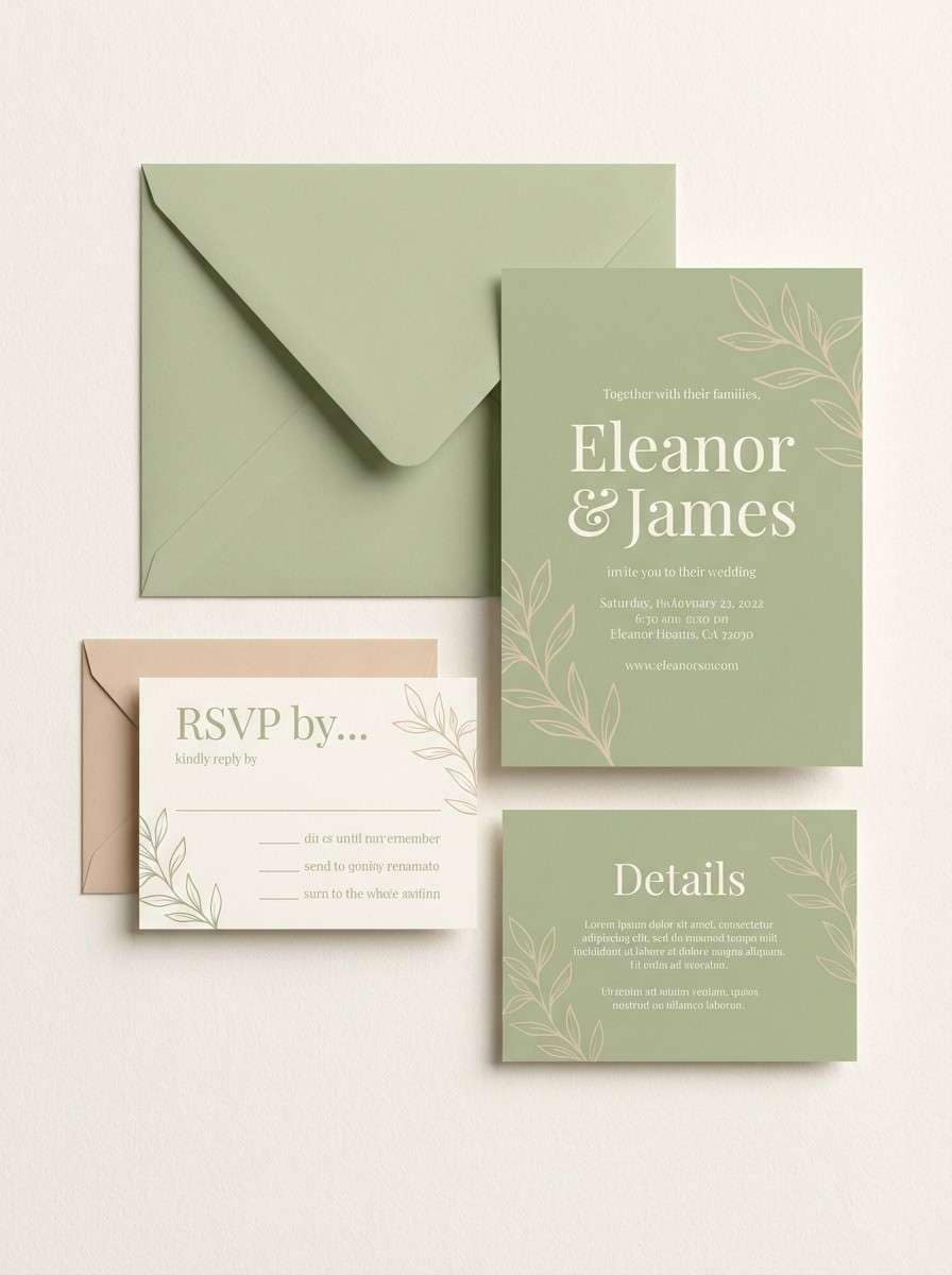
8) Soft Wedding Greens
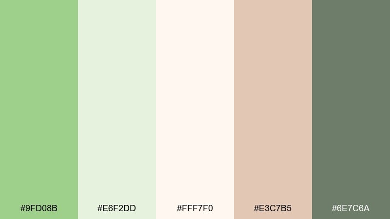
HEX: #9FD08B #E6F2DD #FFF7F0 #E3C7B5 #6E7C6A
Mood: romantic, light, elegant
Best for: wedding invitation suite
Romantic and light like garden vows at dusk, these shades feel elegant without being overly formal. They are ideal for invitations, place cards, and wedding websites that lean modern-classic. Pair the pistachio with blush-beige for warmth, then anchor typography in the muted gray-green. Usage tip: use the palest cream as the paper base and keep green to borders, monograms, and floral line art.
Image example of soft wedding greens generated using media.io
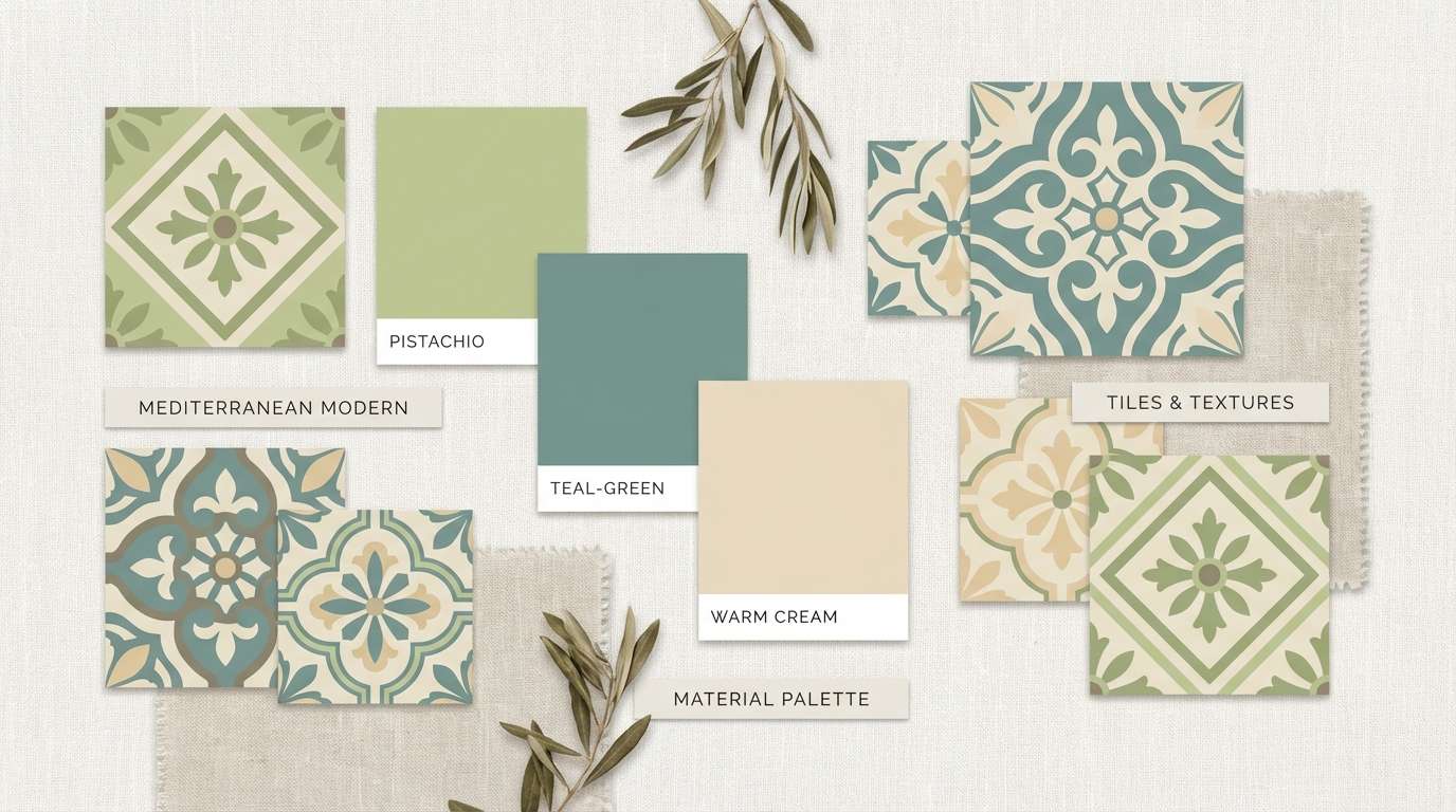
9) Mediterranean Tiles
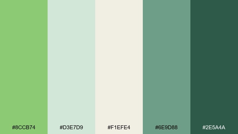
HEX: #8CCB74 #D3E7D9 #F1EFE4 #6E9D88 #2E5A4A
Mood: refreshing, coastal, artisanal
Best for: kitchen interior moodboard
Refreshing and coastal like sun-warmed tiles near the sea, this mix feels crisp yet grounded. It suits kitchen and bath moodboards, boutique hospitality branding, and lifestyle editorials. Pair the pale mint with the deeper teal-green for a tiled pattern or border details. Usage tip: keep large surfaces in the lightest neutrals and let the darker greens define shapes and trim.
Image example of mediterranean tiles generated using media.io
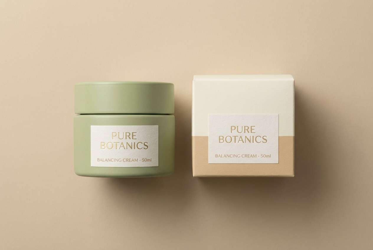
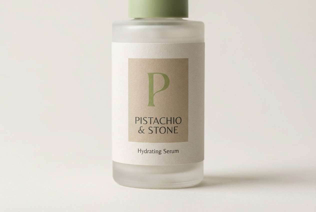
10) Eco Skincare
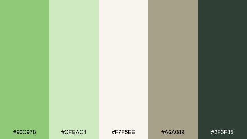
HEX: #90C978 #CFEAC1 #F7F5EE #A6A089 #2F3F35
Mood: natural, trustworthy, premium
Best for: skincare product ad
Natural and trustworthy like a clean ingredients list, these greens feel premium without trying too hard. They are great for skincare ads, sustainable packaging, and brand guidelines that need a calm, modern tone. Pair the pistachio with the warm stone neutral for a grounded, eco-forward look. Usage tip: use the charcoal for ingredient callouts so the soft background stays airy and readable.
Image example of eco skincare generated using media.io
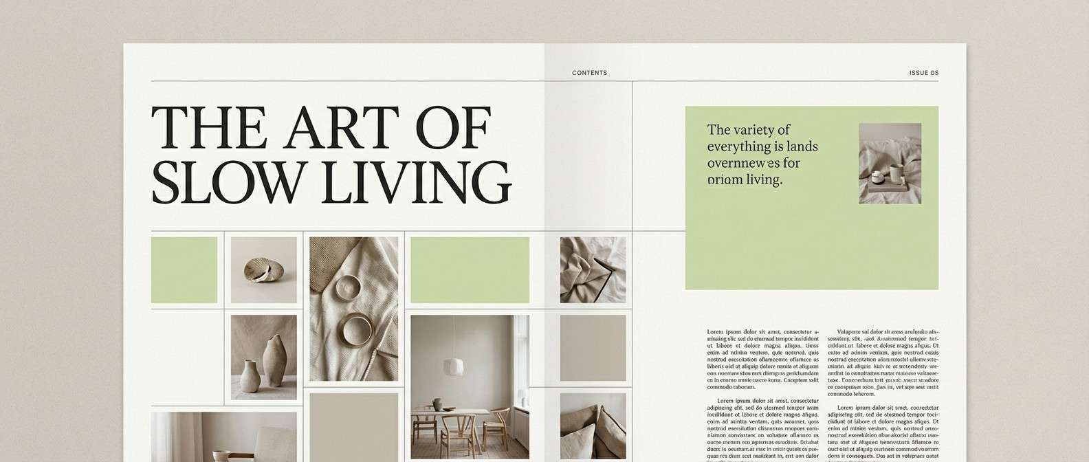
11) Modern Editorial
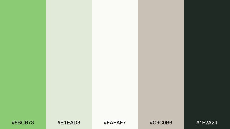
HEX: #8BCB73 #E1EAD8 #FAFAF7 #C9C0B6 #1F2A24
Mood: minimal, refined, editorial
Best for: magazine layout design
Minimal and refined like a high-end lifestyle spread, these tones feel modern and composed. They work well for magazine layouts, lookbooks, and reports where subtle color blocks support strong typography. Pair pistachio with warm gray-beige for pull quotes and section dividers. Usage tip: keep body text in near-black and use green only for headings and small graphic accents.
Image example of modern editorial generated using media.io
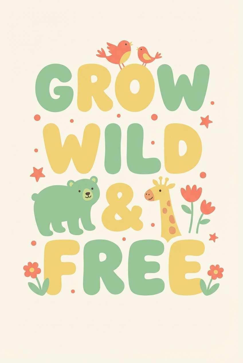
12) Playful Kidsroom
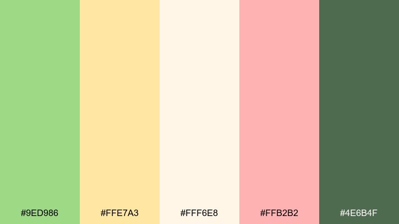
HEX: #9ED986 #FFE7A3 #FFF6E8 #FFB2B2 #4E6B4F
Mood: cheerful, soft, playful
Best for: nursery wall art poster
Cheerful and soft like a storybook afternoon, this mix feels playful without turning neon. It fits nursery posters, kids brand graphics, and classroom materials that need friendly warmth. Pair pistachio with butter yellow for big shapes, then use coral-pink as a tiny highlight. Usage tip: keep the background creamy so the colors stay gentle and easy on the eyes.
Image example of playful kidsroom generated using media.io
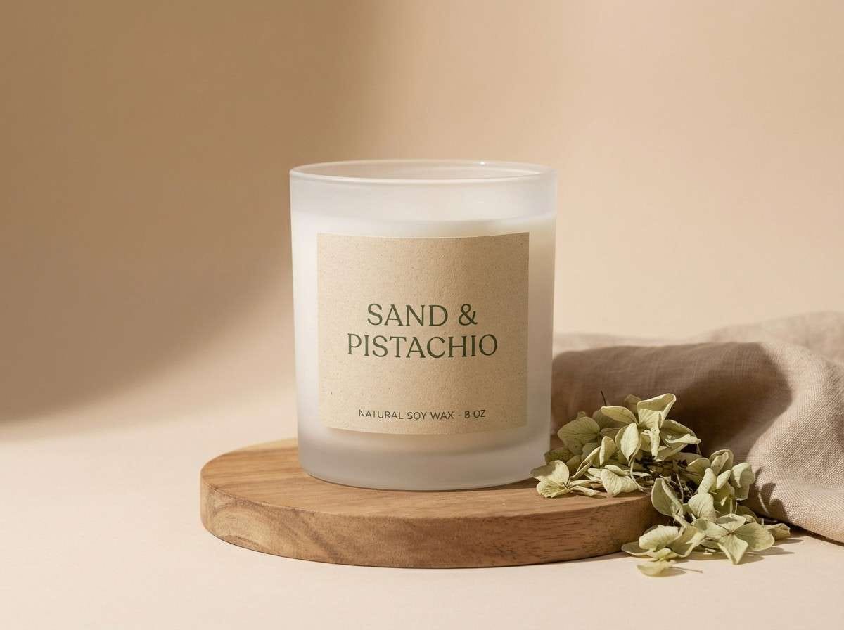
13) Desert Herb
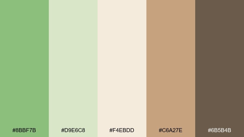
HEX: #8BBF7B #D9E6C8 #F4EBDD #C6A27E #6B5B4B
Mood: earthy, sunbaked, calming
Best for: natural candle label
Earthy and sunbaked like herbs drying in a desert breeze, these tones feel calm and grounded. This pistachio color scheme pairs beautifully with sand and clay neutrals for candles, apothecary goods, and slow-living brands. Use the tan as a label base and bring pistachio in through borders, icons, or scent notes. Usage tip: limit the darkest brown to small text so the overall look stays airy and modern.
Image example of desert herb generated using media.io
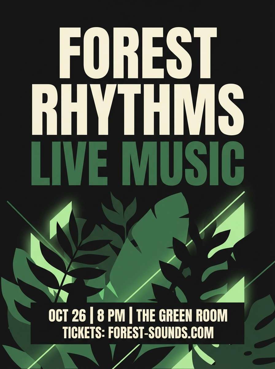
14) Night Garden
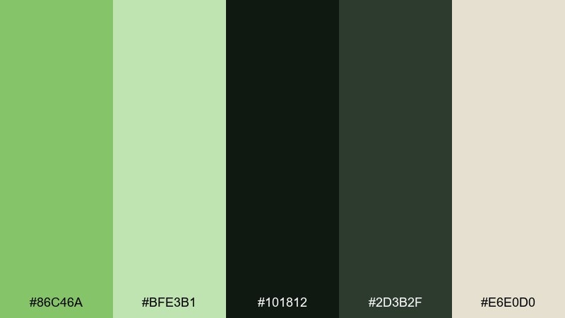
HEX: #86C46A #BFE3B1 #101812 #2D3B2F #E6E0D0
Mood: moody, cinematic, lush
Best for: music event poster
Moody and cinematic like a garden lit by lanterns, this palette brings drama while keeping a natural edge. It works well for music posters, evening event branding, and covers where dark contrast is part of the vibe. Pair the pistachio glow against near-black for a striking focal point. Usage tip: keep most of the layout dark and use the light cream for only key details like date and venue.
Image example of night garden generated using media.io
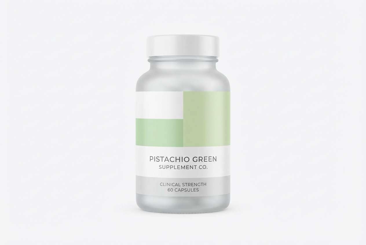
15) Minimal Packaging
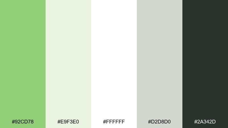
HEX: #92CD78 #E9F3E0 #FFFFFF #D2D8D0 #2A342D
Mood: clean, modern, scalable
Best for: supplement bottle packaging
Clean and modern like a well-organized shelf, these tones are built for clarity. They fit supplement packaging, tech-forward wellness, and brands that need a scalable system across SKUs. Pair pistachio with crisp white and use the gray for secondary panels and fine print. Usage tip: keep green to one or two areas per label so the range still looks cohesive.
Image example of minimal packaging generated using media.io
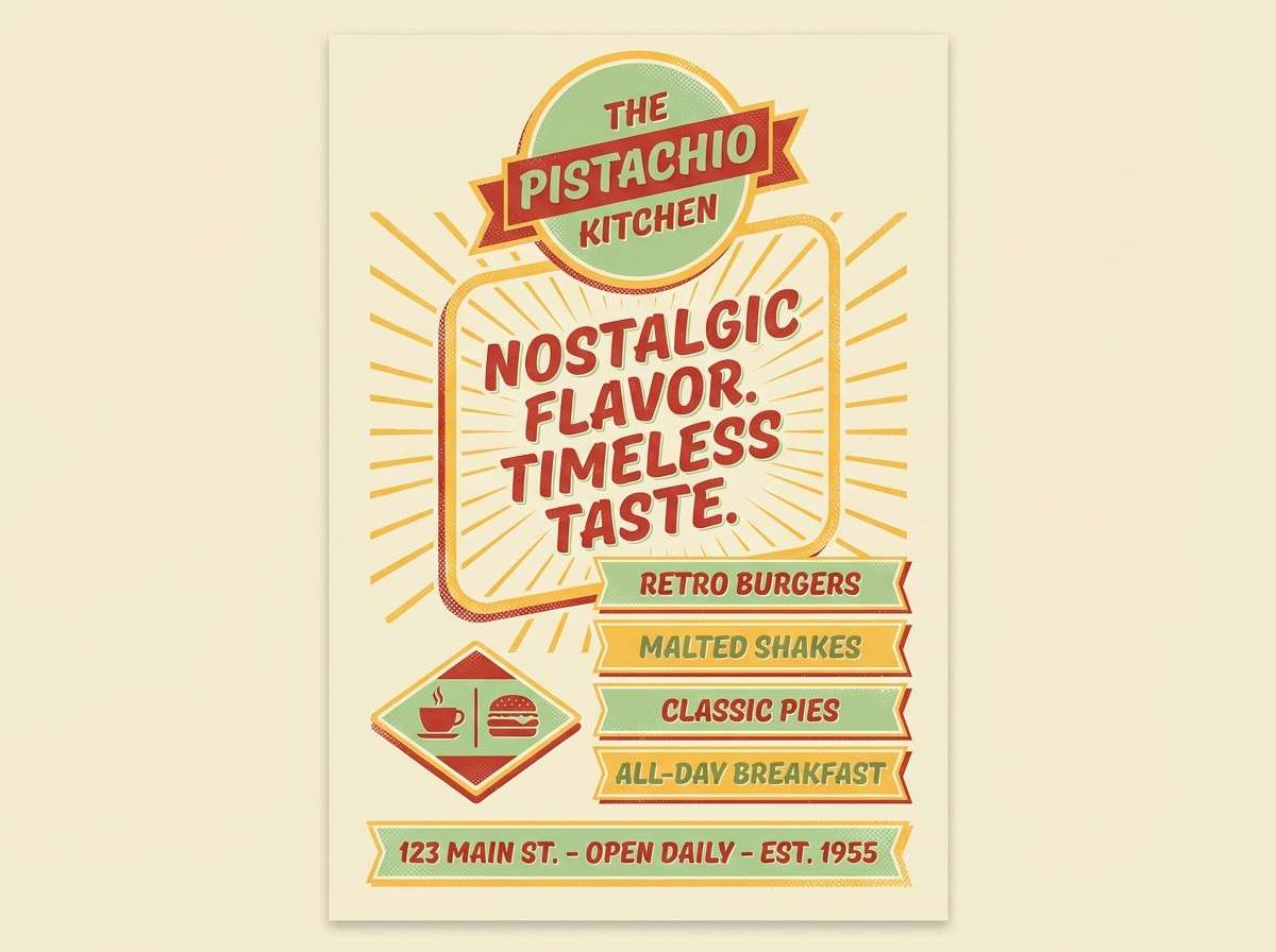
16) Retro Diner
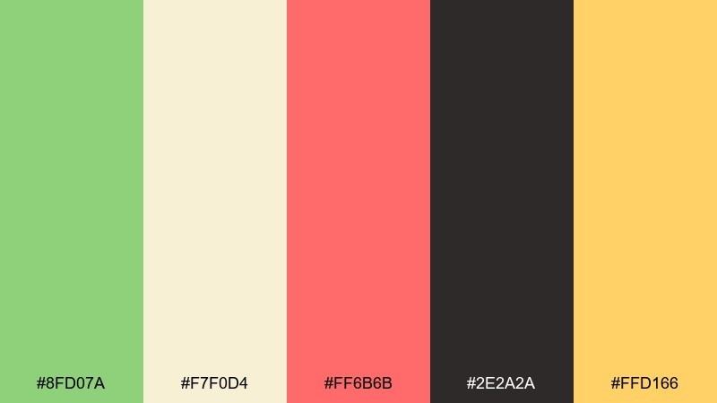
HEX: #8FD07A #F7F0D4 #FF6B6B #2E2A2A #FFD166
Mood: retro, bold, fun
Best for: restaurant flyer design
Retro and bold like a diner sign at golden hour, this set mixes freshness with a punchy accent. It suits restaurant flyers, combo-deal posters, and playful brand moments that need energy. Pair pistachio with cream for the base, then use the red accent for prices and limited-time labels. Usage tip: keep black for headlines so the bright colors do not fight for attention.
Image example of retro diner generated using media.io
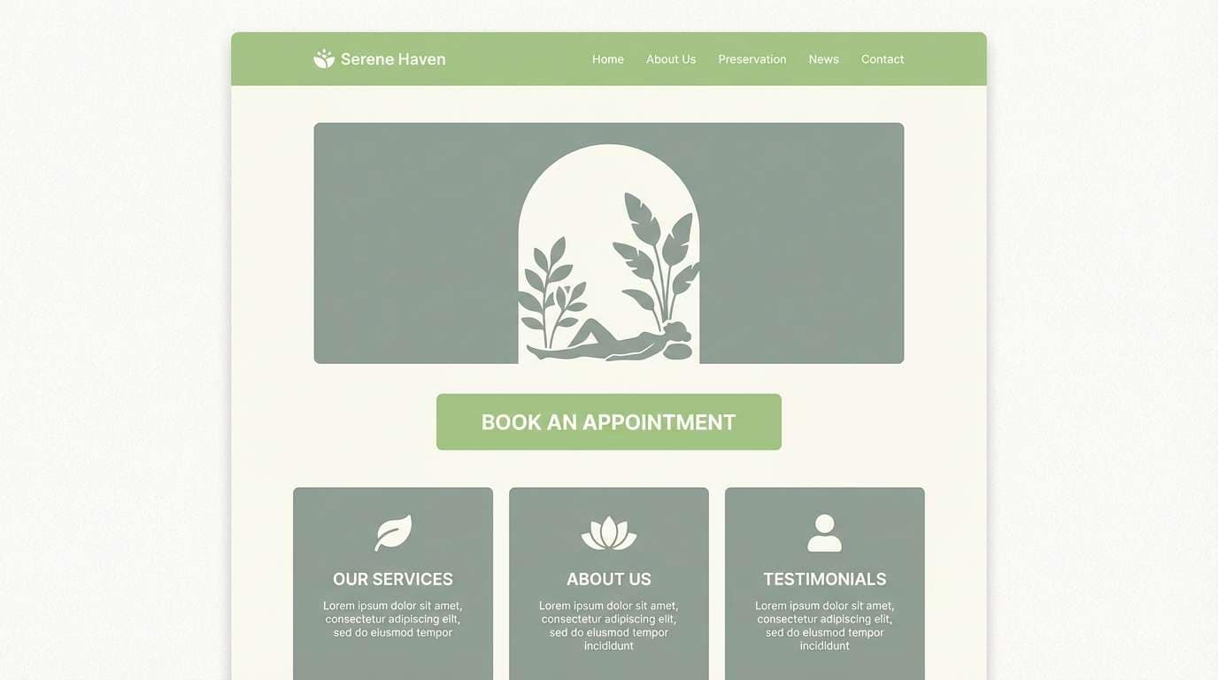
17) Spa Sanctuary
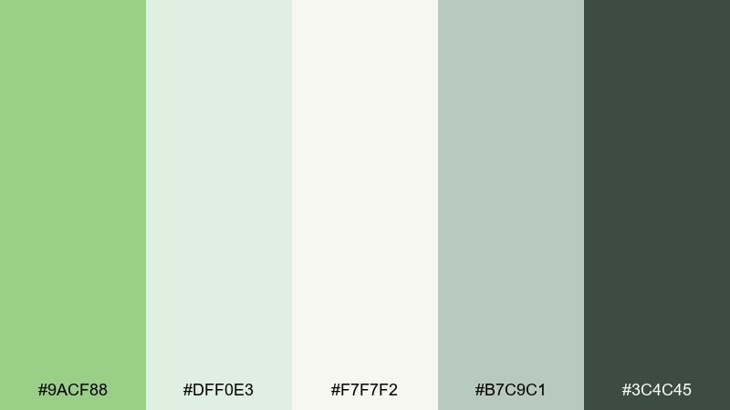
HEX: #9ACF88 #DFF0E3 #F7F7F2 #B7C9C1 #3C4C45
Mood: soothing, airy, restorative
Best for: wellness landing page UI
Soothing and airy like a quiet spa lounge, these greens feel restorative and light. They are great for wellness landing pages, booking flows, and services that benefit from a calm, trustworthy tone. Pair pistachio with the misty sage-gray for sections and cards, then use the deep green for navigation and labels. Usage tip: keep gradients subtle and rely on spacing to convey luxury.
Image example of spa sanctuary generated using media.io
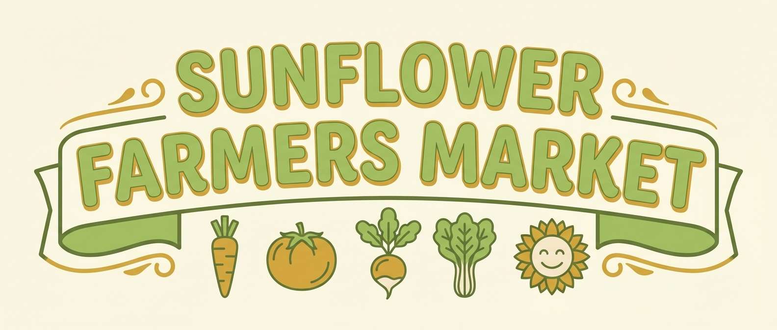
18) Outdoor Market
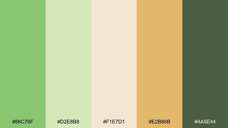
HEX: #88C76F #D2E8B8 #F1E7D1 #E2B86B #4A5E44
Mood: organic, friendly, community
Best for: farmers market banner
Organic and friendly like a weekend market stroll, these colors feel welcoming and community-first. They work for banners, vendor signage, and local food branding where warmth matters as much as freshness. Pair pistachio with golden tones for headings and directional arrows. Usage tip: use the deepest green for legibility on outdoor prints under bright sunlight.
Image example of outdoor market generated using media.io
19) Tech Startup Fresh
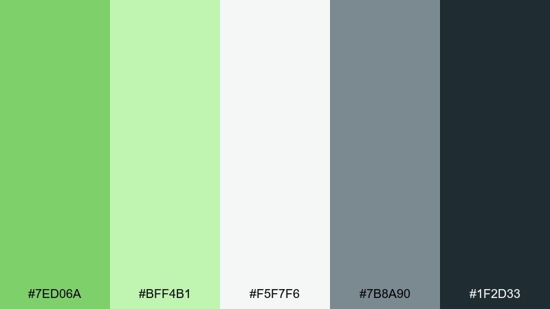
HEX: #7ED06A #BFF4B1 #F5F7F6 #7B8A90 #1F2D33
Mood: fresh, confident, modern
Best for: SaaS onboarding screens
Fresh and confident like a crisp product launch, these tones feel modern and fast-moving. The pistachio color combinations are ideal for SaaS onboarding, feature highlights, and success states that need a friendly signal. Pair the bright green with cool grays to keep the interface professional. Usage tip: apply pistachio primarily to progress, toggles, and confirmation messages so it reads as a positive cue.
Image example of tech startup fresh generated using media.io
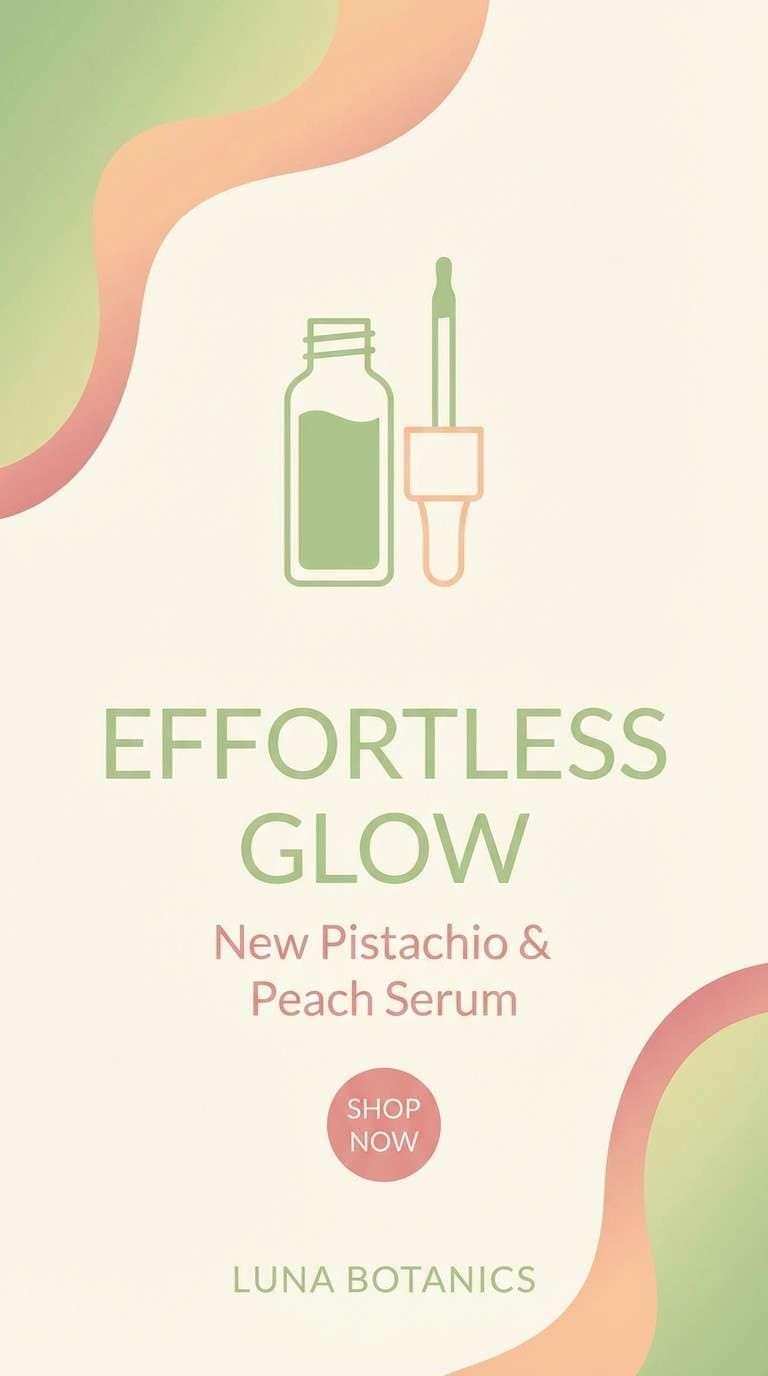
20) Pastel Sunset
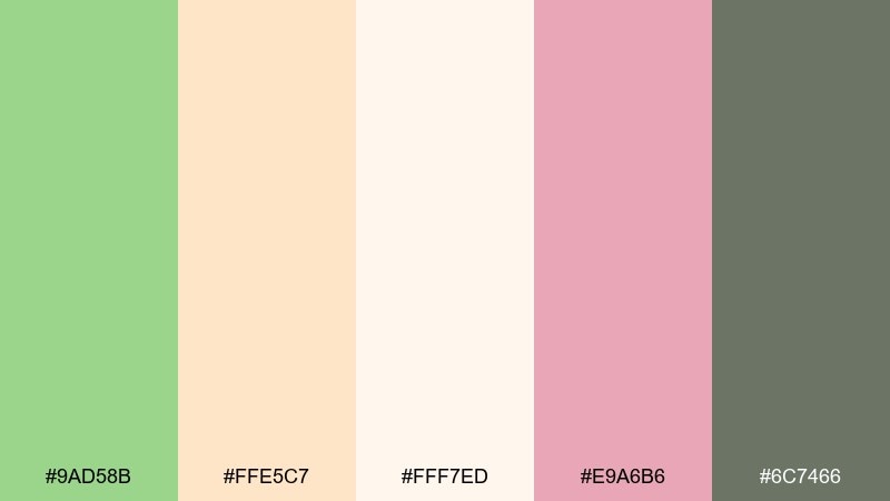
HEX: #9AD58B #FFE5C7 #FFF7ED #E9A6B6 #6C7466
Mood: soft, dreamy, optimistic
Best for: beauty brand Instagram story
Soft and dreamy like a pastel sunset, this mix feels optimistic and flattering. It fits beauty stories, creator templates, and gentle announcements where color should feel light, not loud. Pair pistachio with peach for big gradients, then use the muted gray-green for text and UI stickers. Usage tip: keep the cream as a buffer so blush accents do not overpower the green.
Image example of pastel sunset generated using media.io
21) Tea House Calm
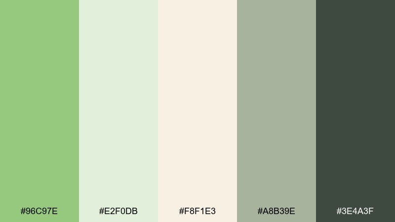
HEX: #96C97E #E2F0DB #F8F1E3 #A8B39E #3E4A3F
Mood: quiet, cozy, mindful
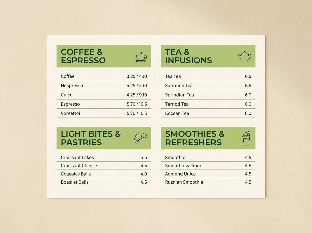
Best for: cafe menu board design
Quiet and cozy like steam rising from a cup of green tea, these tones feel mindful and unhurried. They suit café menus, loyalty cards, and small-batch product notes where simplicity sells. Pair the creamy paper tone with pistachio for section headers and subtle dividers. Usage tip: keep the darker green for item names and use the gray-green for descriptions to create a clear hierarchy.
Image example of tea house calm generated using media.io
22) Gallery Minimal
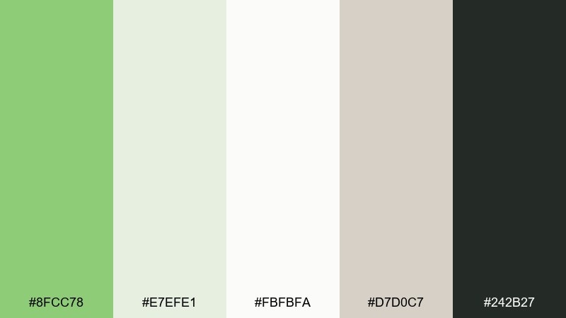
HEX: #8FCC78 #E7EFE1 #FBFBFA #D7D0C7 #242B27
Mood: quiet, modern, curated
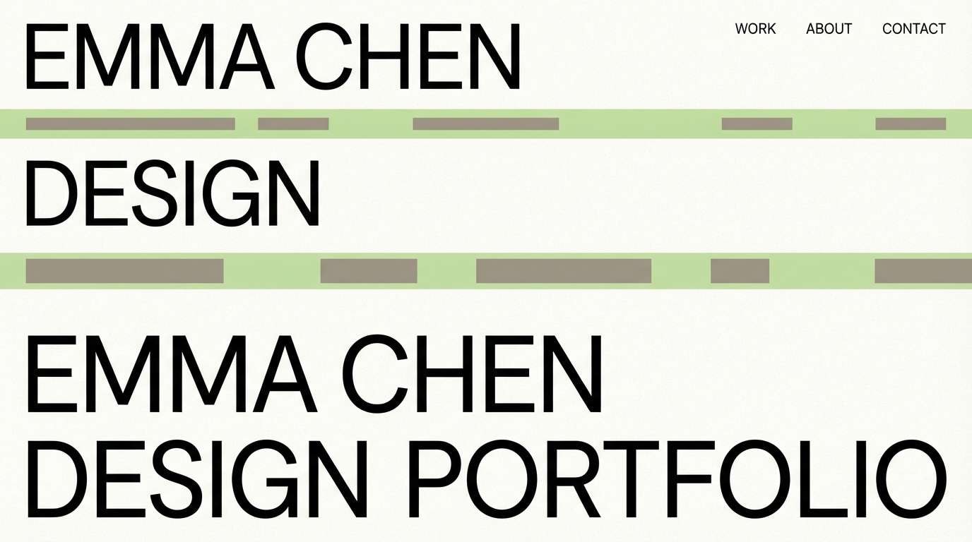
Best for: portfolio website header
Quiet and curated like a contemporary gallery, this set keeps attention on the work. It fits portfolio headers, case study pages, and typography-led branding where color should support rather than shout. Pair pistachio with warm gray for subtle blocks behind titles and captions. Usage tip: use the near-black for links and CTAs to maintain strong contrast on pale sections.
Image example of gallery minimal generated using media.io
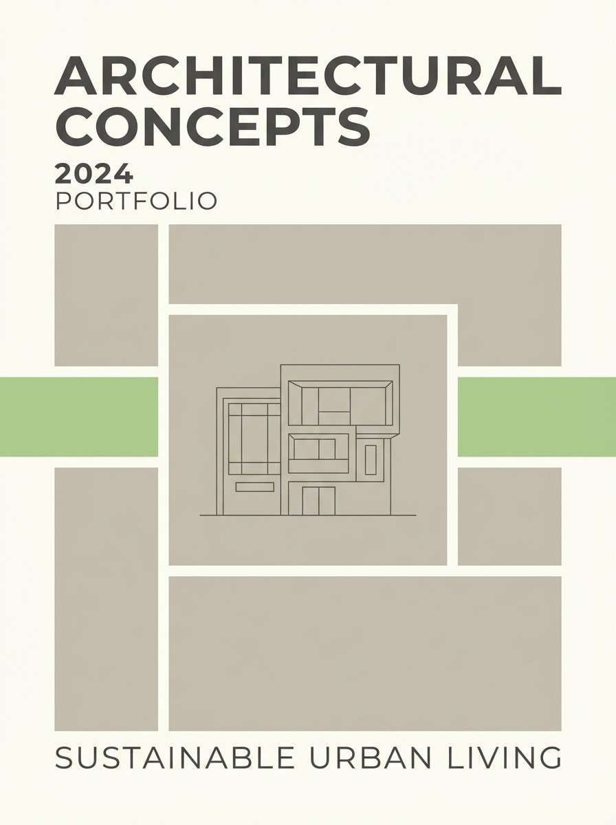
23) Pistachio Stone
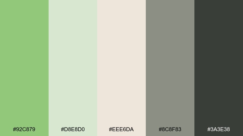
HEX: #92C879 #D8E8D0 #EEE6DA #8C8F83 #3A3E38
Mood: neutral, grounded, timeless
Best for: architectural brochure
Neutral and grounded like stonewashed walls with a hint of green, these tones feel timeless. The pistachio color palette is a smart choice for architectural brochures, real estate decks, and calm corporate materials. Pair pistachio with the warm gray-beige for large panels, then use deeper grays for plans and captions. Usage tip: keep photo overlays light so the green reads as a subtle brand cue, not a tint.
Image example of pistachio stone generated using media.io
What Colors Go Well with Pistachio?
Pistachio pairs naturally with creamy off-white, warm beige, and stone neutrals, creating a clean, friendly base that feels premium and calm. These are reliable matches for packaging, minimalist branding, and modern editorial layouts.
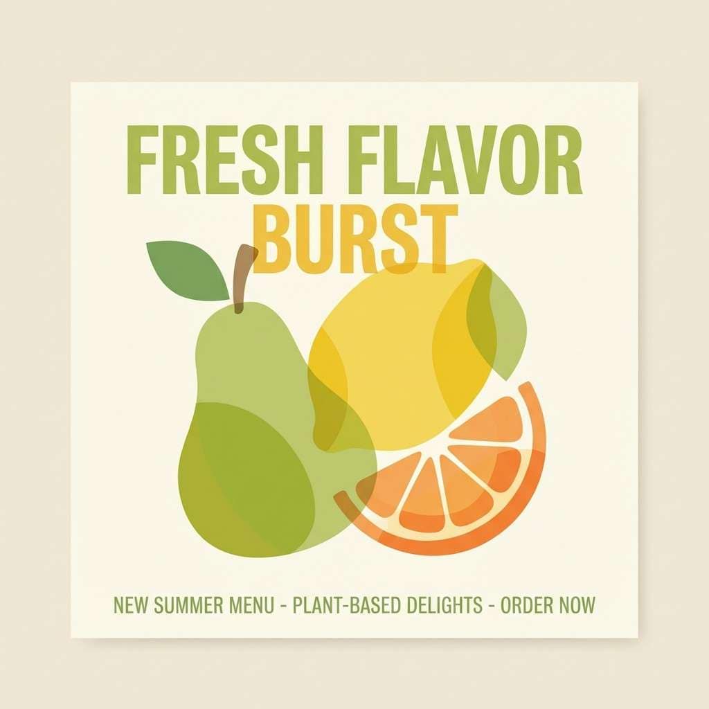
For a brighter, more seasonal look, combine pistachio with citrus yellow, peach, or soft orange—then keep a light background so the accents stay readable. This approach is great for promos, food visuals, and spring campaigns.
If you want more contrast, anchor pistachio with deep charcoal, forest green, or near-black for typography and UI components. Dark neutrals make pistachio feel crisp and intentional instead of washed out.
How to Use a Pistachio Color Palette in Real Designs
Start with pistachio as a supporting brand color rather than a full-bleed main fill. Use it for headers, badges, icon highlights, borders, or secondary panels, and let off-white or cream carry most of the negative space.
For UI, reserve pistachio for “meaningful states” like success messages, active tabs, progress, and confirmations. Pair it with cool grays and a strong charcoal to maintain hierarchy and accessibility.
For print and packaging, test pistachio on your real substrate (white, kraft, matte coated) because it can shift warmer or duller depending on paper and ink. Keep your darkest tone for small text and barcodes to preserve clarity.
Create Pistachio Palette Visuals with AI
If you already have a pistachio color scheme, you can generate matching mockups and concept visuals by reusing the prompts above and swapping subjects (labels, UI screens, posters, moodboards). This is a fast way to validate mood before committing to photography or production.
To keep results consistent, repeat key descriptors like “clean background,” “soft diffused lighting,” and “minimal layout,” then specify pistachio + your neutrals as the dominant colors. Small wording changes can shift the output from airy to rustic or from playful to premium.
When you find an image style you like, iterate by only changing one element at a time (product type, aspect ratio, or accent color). That makes it easier to build a cohesive set for a brand or campaign.
Pistachio Color Palette FAQs
-
What HEX code is “pistachio green”?
A commonly used pistachio green HEX is #93C572. Depending on the design style, you can shift lighter for backgrounds or darker for text and icons. -
Is pistachio considered a pastel green?
Yes—pistachio often reads as a pastel or soft green because it’s light and slightly warm. It stays more modern when paired with off-white, stone, and charcoal neutrals. -
What neutral colors go best with pistachio?
Creamy off-white, warm beige, sand, and soft gray-beige pair especially well with pistachio. These neutrals keep the palette calm and help pistachio feel premium rather than loud. -
What accent colors make pistachio pop?
Citrus yellow, peach/orange, terracotta, and blush pink are strong accents for pistachio. Use them in small amounts (buttons, price tags, stamps) so pistachio remains the main cue. -
Does pistachio work for UI and app design?
It works well in UI when used for active states, success messaging, and light brand accents. Pair it with high-contrast charcoal text and grays to maintain readability and accessibility. -
How do I keep pistachio from looking washed out?
Add contrast with a deep green or near-black for typography, and keep large areas in off-white/cream. If needed, slightly deepen the pistachio tone for key elements like headings or buttons. -
What brands or industries fit a pistachio color scheme?
Pistachio is popular for wellness, skincare, cafes/food, eco brands, modern lifestyle, and calm SaaS products. It communicates friendly freshness without feeling overly trendy.
Next: Red Orange Color Palette


