

White sand tones sit in that sweet spot between warm beige and soft ivory, making them a go-to base for modern design that still feels welcoming.
Below are 20+ white sand color palette combinations with HEX codes, plus practical ways to apply them to branding, interiors, and UI without losing brightness.
In this article
- Why White Sand Palettes Work So Well
-
- dune morning
- coastal linen
- sahara blush
- seashell sage
- driftwood navy
- terracotta tide
- pearl olive
- ivory pebble
- candlelight cream
- saltflat mint
- desert lavender
- oatmilk stone
- palm shadow
- sunbaked coral
- gallery greige
- sandstone teal
- warm quarry
- barefoot beige
- opal breeze
- clay and cotton
- eucalyptus mist
- amber drift
- What Colors Go Well with White Sand?
- How to Use a White Sand Color Palette in Real Designs
- Create White Sand Palette Visuals with AI
Why White Sand Palettes Work So Well
White sand is a “quiet luxury” neutral: it’s lighter than beige, warmer than cool gray, and reads clean without feeling stark. That makes it ideal for backgrounds where you want content, product, or photography to stay in the spotlight.
Because it’s naturally soft, white sand pairs well with both warm accents (terracotta, cocoa, amber) and cool accents (sage, teal, opal blue). You can shift the mood from coastal to premium tech just by swapping the accent color.
In UI and print, these tones reduce visual fatigue compared to pure white, especially on large surfaces. Used with a deep anchor color for typography, white sand palettes stay readable and polished.
20+ White Sand Color Palette Ideas (with HEX Codes)
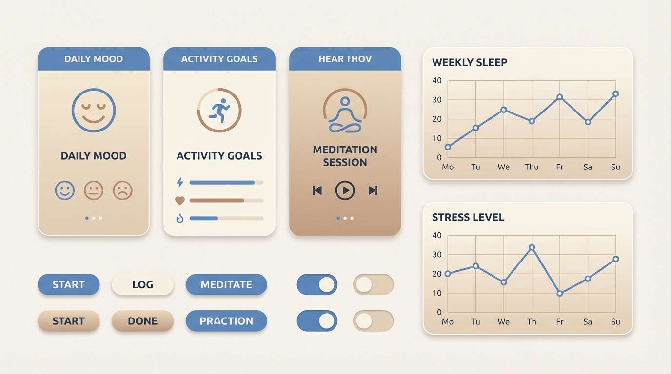
1) Dune Morning

HEX: #F4EBDD #E7D7C1 #CBBBA0 #9AA79A #2F3A3F
Mood: airy, calm, grounded
Best for: minimal UI dashboard
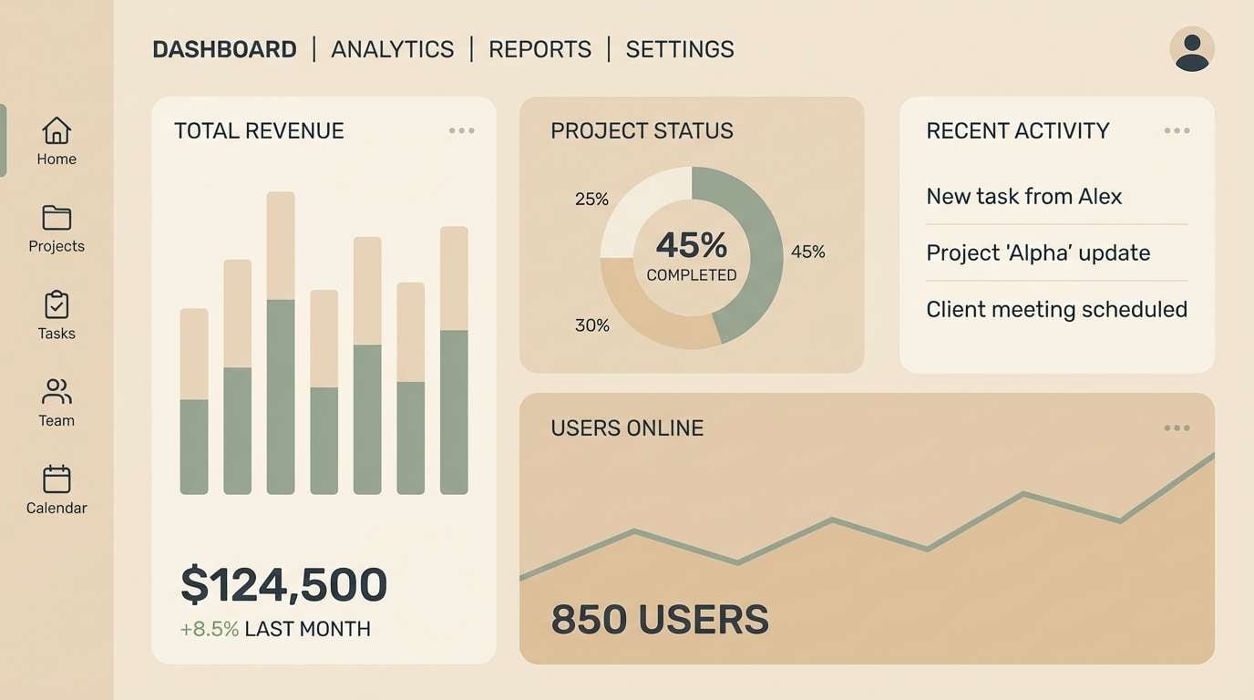
Airy dune light with a cool breeze, balanced by a deep slate anchor. It works beautifully for dashboards that need soft surfaces and strong hierarchy without harsh contrast. Pair the sand tones with muted sage for secondary states and reserve slate for text and key actions. Usage tip: keep the main background at #F4EBDD and use #2F3A3F for body text to maintain readability.
Image example of dune morning generated using media.io
Media.io is an online AI studio for creating and editing video, image, and audio in your browser.

2) Coastal Linen
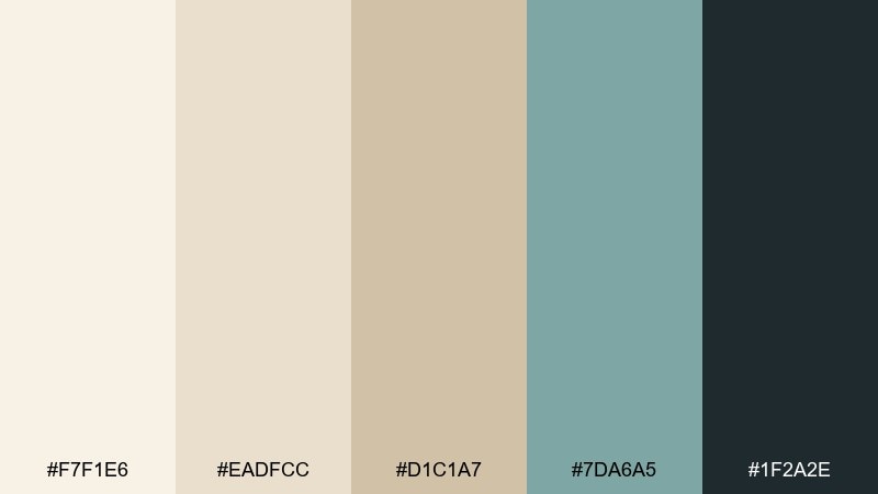
HEX: #F7F1E6 #EADFCC #D1C1A7 #7DA6A5 #1F2A2E
Mood: fresh, coastal, refined
Best for: brand identity for a boutique hotel
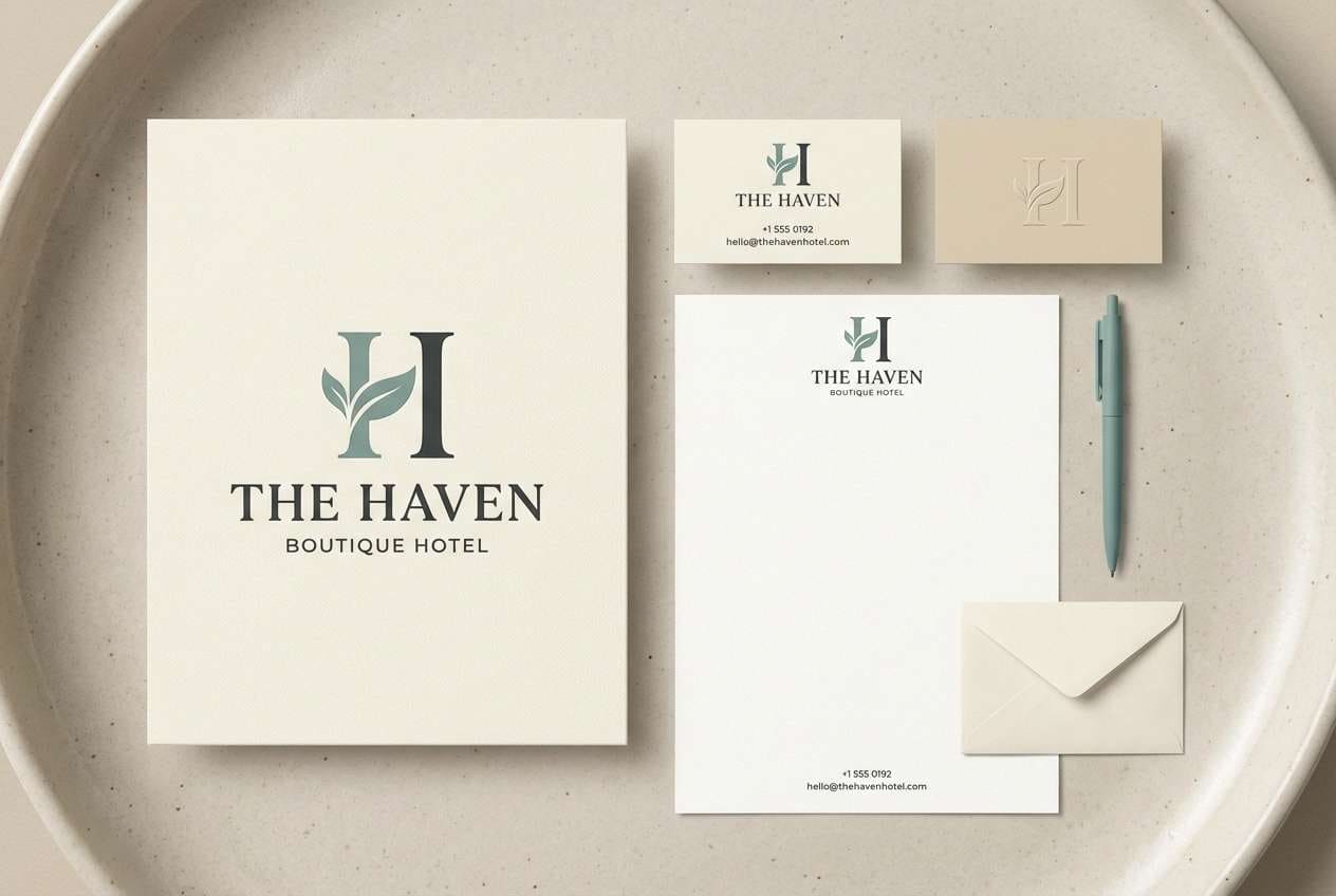
Fresh linen and sea-glass hints create a boutique, coastal feel that still reads upscale. Use the light neutrals for stationery and signage, then bring in the muted teal for wayfinding and highlights. The inky charcoal keeps logos and typography crisp on light paper stocks. Usage tip: try #7DA6A5 as a subtle foil stamp or small icon accent rather than a full background.
Image example of coastal linen generated using media.io
3) Sahara Blush
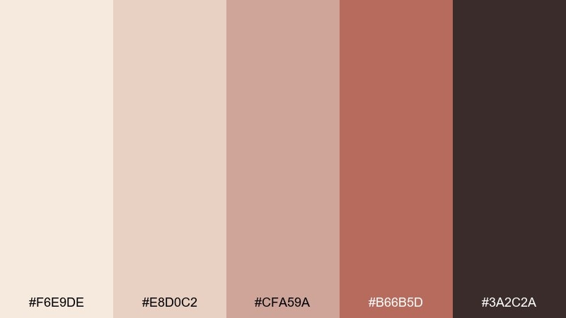
HEX: #F6E9DE #E8D0C2 #CFA59A #B66B5D #3A2C2A
Mood: romantic, warm, sunlit
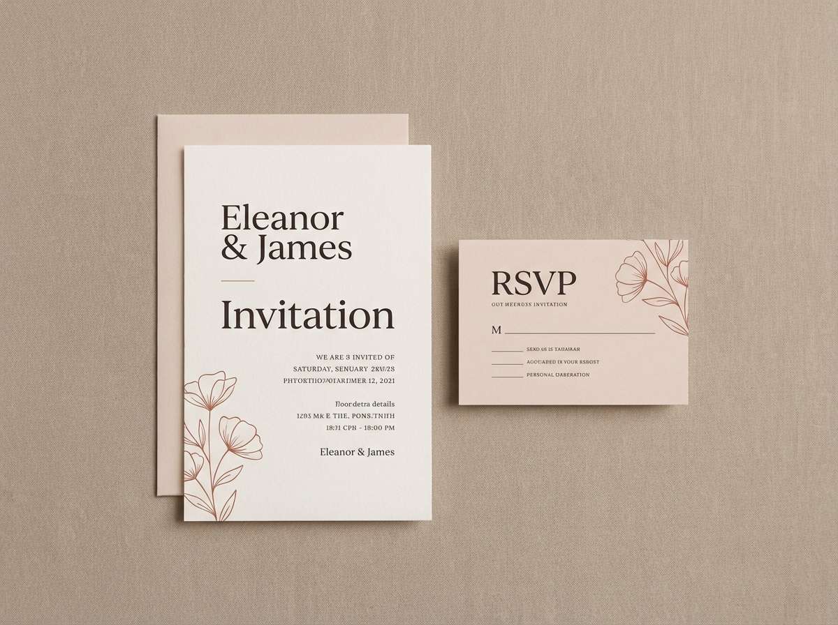
Best for: wedding invitation suite
Romantic desert light meets soft blush clay, finished with a deep cocoa for contrast. This white sand color palette suits invitations that feel modern but sentimental, especially with serif type and generous whitespace. Pair #B66B5D for headings and small motifs, while #3A2C2A grounds names and details. Usage tip: print the lightest tones uncoated for a tactile, matte look.
Image example of sahara blush generated using media.io
4) Seashell Sage
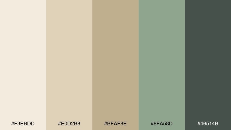
HEX: #F3EBDD #E0D2B8 #BFAF8E #8FA58D #46514B
Mood: organic, soft, balanced
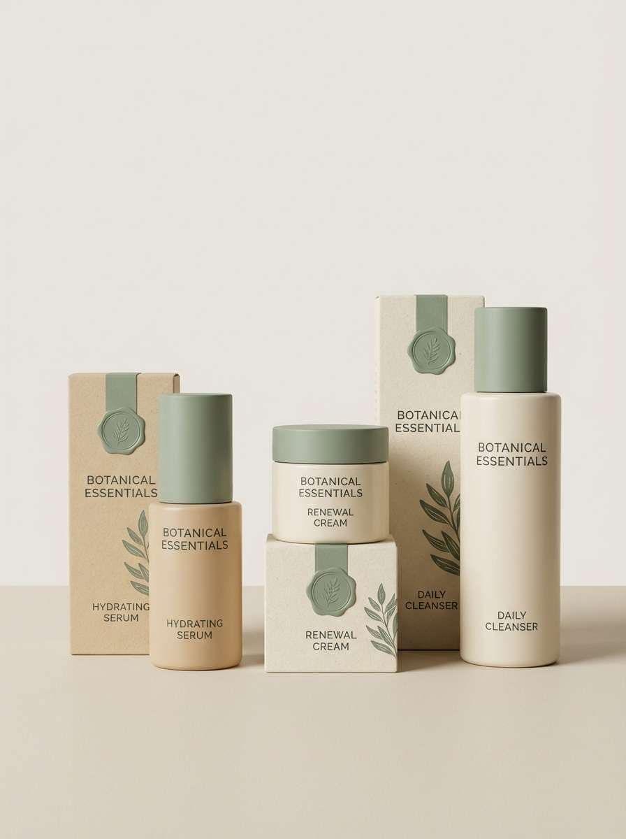
Best for: skincare packaging
Organic and clean like seashells and coastal herbs, with gentle contrast that feels trustworthy. It fits skincare labels, boxes, and bottle designs where calmness matters more than loud color. Let the sand neutrals carry the packaging, then use sage for ingredient callouts and subtle badges. Usage tip: keep #46514B for small text to avoid the washed-out look that lighter inks can create.
Image example of seashell sage generated using media.io
5) Driftwood Navy
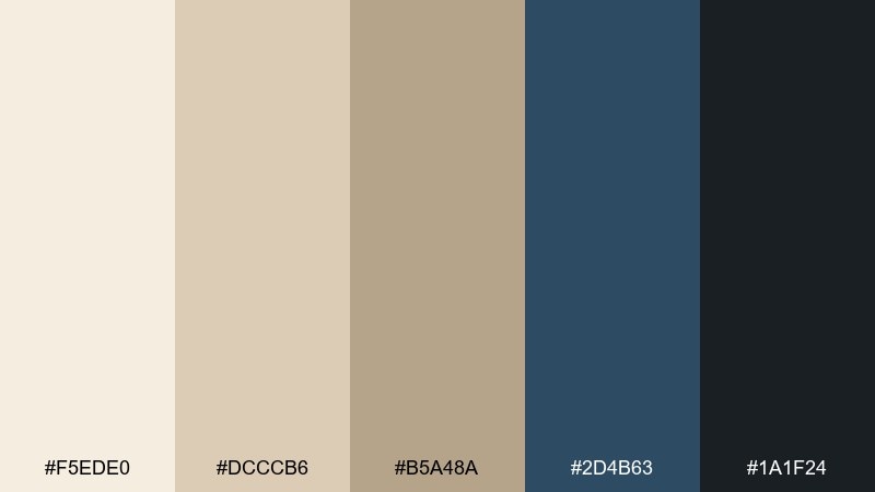
HEX: #F5EDE0 #DCCCB6 #B5A48A #2D4B63 #1A1F24
Mood: nautical, steady, premium
Best for: finance app onboarding screens
Driftwood neutrals with a navy current give a steady, premium tone without feeling cold. Great for onboarding flows where you want trust, clarity, and a hint of sophistication. Use #2D4B63 for primary buttons and progress states, while #1A1F24 keeps headings sharp. Usage tip: add generous padding and let the light background do most of the work.
Image example of driftwood navy generated using media.io
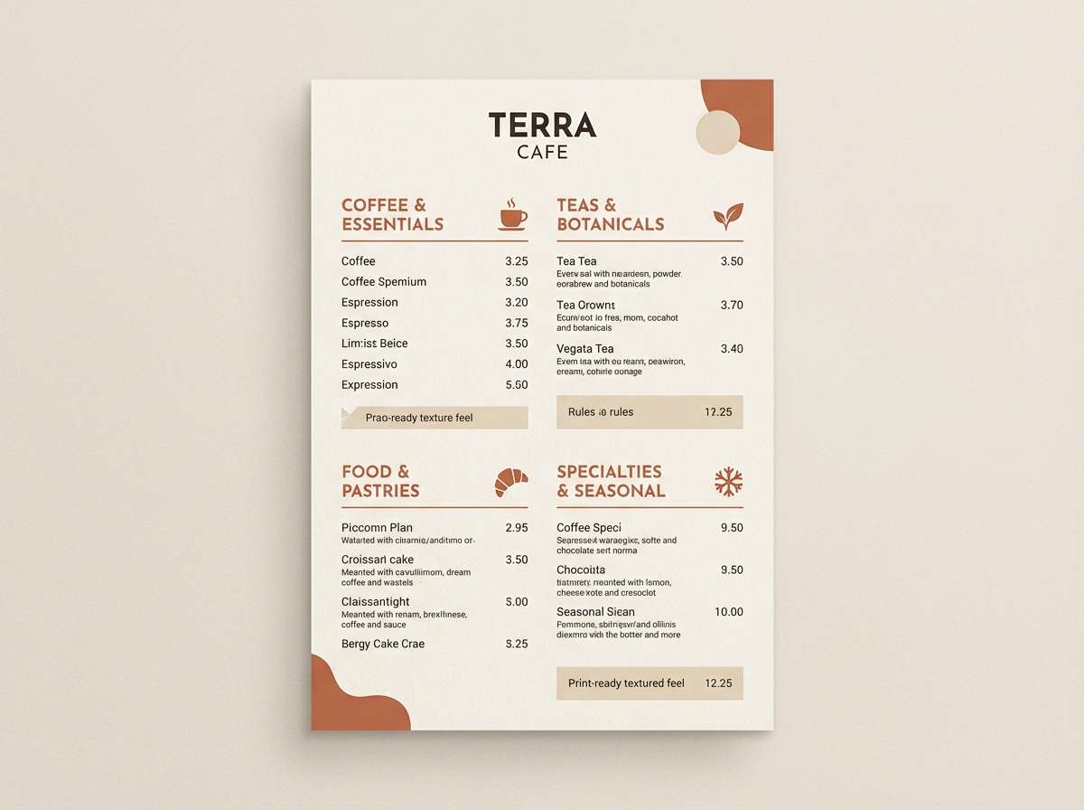
6) Terracotta Tide
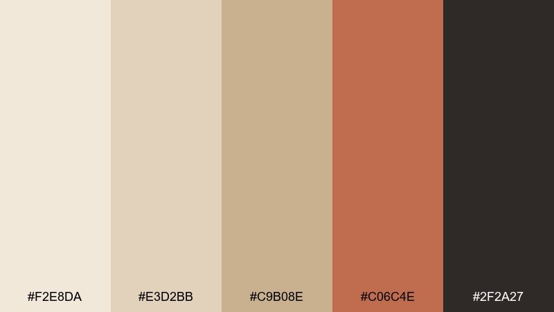
HEX: #F2E8DA #E3D2BB #C9B08E #C06C4E #2F2A27
Mood: earthy, inviting, artisanal
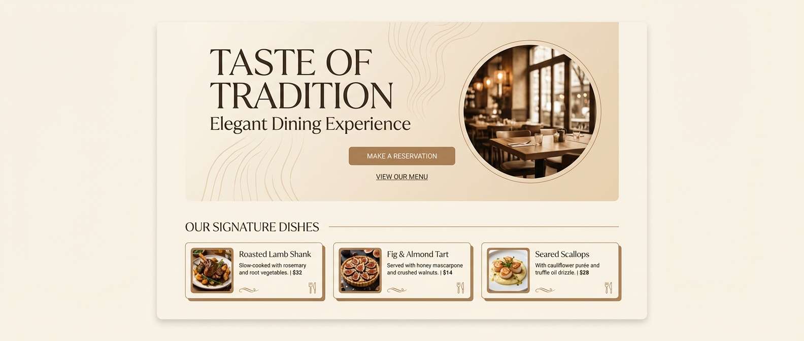
Best for: cafe menu design
Earthy and inviting like clay cups on a sun-warmed patio, with a terracotta pop that feels handmade. These white sand color combinations are ideal for cafe menus that need warmth, readability, and a little personality. Pair #C06C4E for section headers and icons, while #2F2A27 keeps prices and body copy crisp. Usage tip: use #E3D2BB as a subtle menu background to reduce glare compared to pure white.
Image example of terracotta tide generated using media.io
7) Pearl Olive
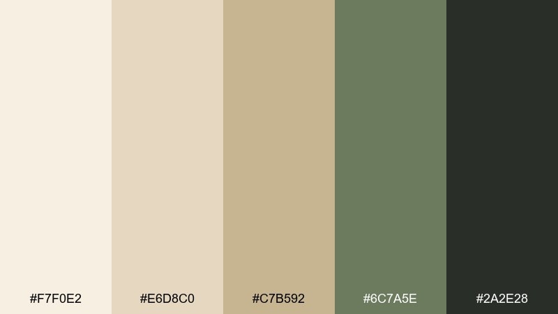
HEX: #F7F0E2 #E6D8C0 #C7B592 #6C7A5E #2A2E28
Mood: natural, classic, grounded
Best for: organic food label design
Natural and grounded like pearl grains and olive leaves, with a classic, earthy finish. It shines on food labels where you want a wholesome vibe without looking rustic or dated. Use olive for brand marks and claims, and keep the light sand as the main field to make typography breathe. Usage tip: test #6C7A5E at small sizes so it stays legible on textured paper.
Image example of pearl olive generated using media.io
8) Ivory Pebble
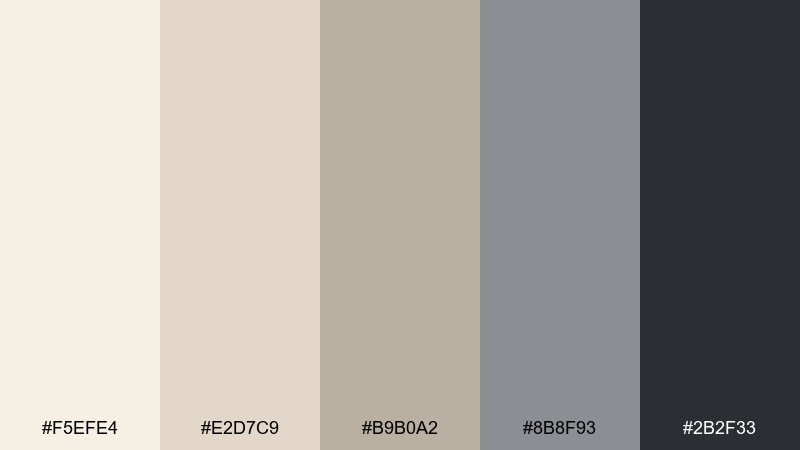
HEX: #F5EFE4 #E2D7C9 #B9B0A2 #8B8F93 #2B2F33
Mood: quiet, modern, balanced
Best for: editorial magazine layout
Quiet and modern like polished pebbles on an ivory shore, with cool gray structure. It works well for editorial spreads where images need breathing room and typography must feel intentional. Pair the mid gray for rules, captions, and small UI-like details, and keep charcoal for headings. Usage tip: restrict gray blocks to 10 to 15 percent coverage so the page stays light.
Image example of ivory pebble generated using media.io
9) Candlelight Cream
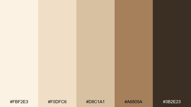
HEX: #FBF2E3 #F0DFC6 #D8C1A1 #A6805A #3B2E23
Mood: cozy, warm, intimate
Best for: restaurant landing page
Cozy candlelight warmth with caramel accents makes the page feel intimate and welcoming. This white sand color palette is perfect for restaurant hero sections, reservation blocks, and menu highlights. Pair the gold-brown for buttons and separators, and use the deep brown for headlines to keep contrast strong. Usage tip: add subtle gradients between #FBF2E3 and #F0DFC6 to mimic soft lighting.
Image example of candlelight cream generated using media.io
10) Saltflat Mint
HEX: #F2EBDD #DED2BF #BFB1A0 #A9C9C1 #253033
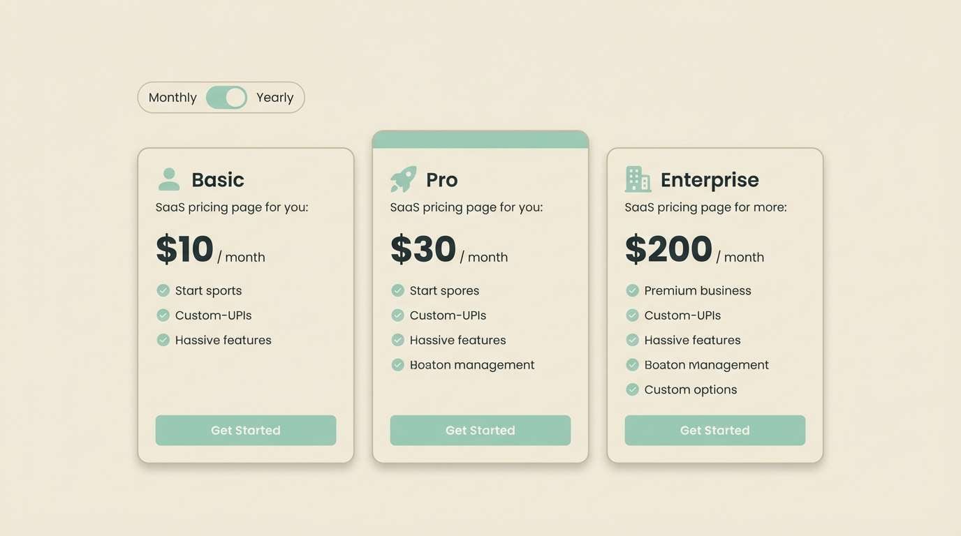
Mood: clean, breezy, modern
Best for: SaaS pricing page UI
Clean and breezy like salt flats under a pale sky, with a minty lift for modern polish. It fits SaaS pricing pages where you need calm sections, clear tiers, and gentle emphasis. Use mint for highlighted plans and subtle badges, while the charcoal handles pricing figures and fine print. Usage tip: keep borders in #BFB1A0 at low opacity to avoid a busy grid.
Image example of saltflat mint generated using media.io
11) Desert Lavender
HEX: #F4EBDD #E6D7C3 #C8B69F #B7A6C9 #332A3C
Mood: dreamy, soft, artistic
Best for: social media quote template
Dreamy and soft, like lavender haze drifting over pale dunes at dusk. It works well for quote templates where readability matters but you still want a gentle, creative edge. Use lavender for shapes or headline highlights, and keep deep plum for the main text. Usage tip: set type in #332A3C and limit lavender to one or two elements per post.
Image example of desert lavender generated using media.io

12) Oatmilk Stone

HEX: #F6EFE3 #E3D7C8 #C5B8A8 #A39B92 #2D2A27
Mood: minimal, honest, dependable
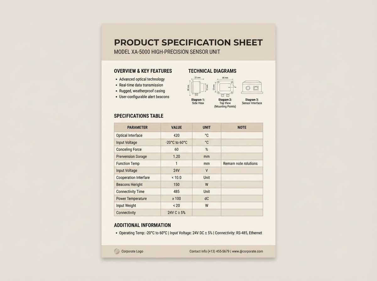
Best for: product spec sheet PDF
Minimal and dependable like oatmilk foam against smooth stone. It is a strong fit for spec sheets where tables, charts, and annotations should feel calm and professional. Pair the mid stone tone for table headers and callouts, then keep the darkest shade for numbers and labels. Usage tip: use #A39B92 for thin rules so the grid stays quiet.
Image example of oatmilk stone generated using media.io
13) Palm Shadow
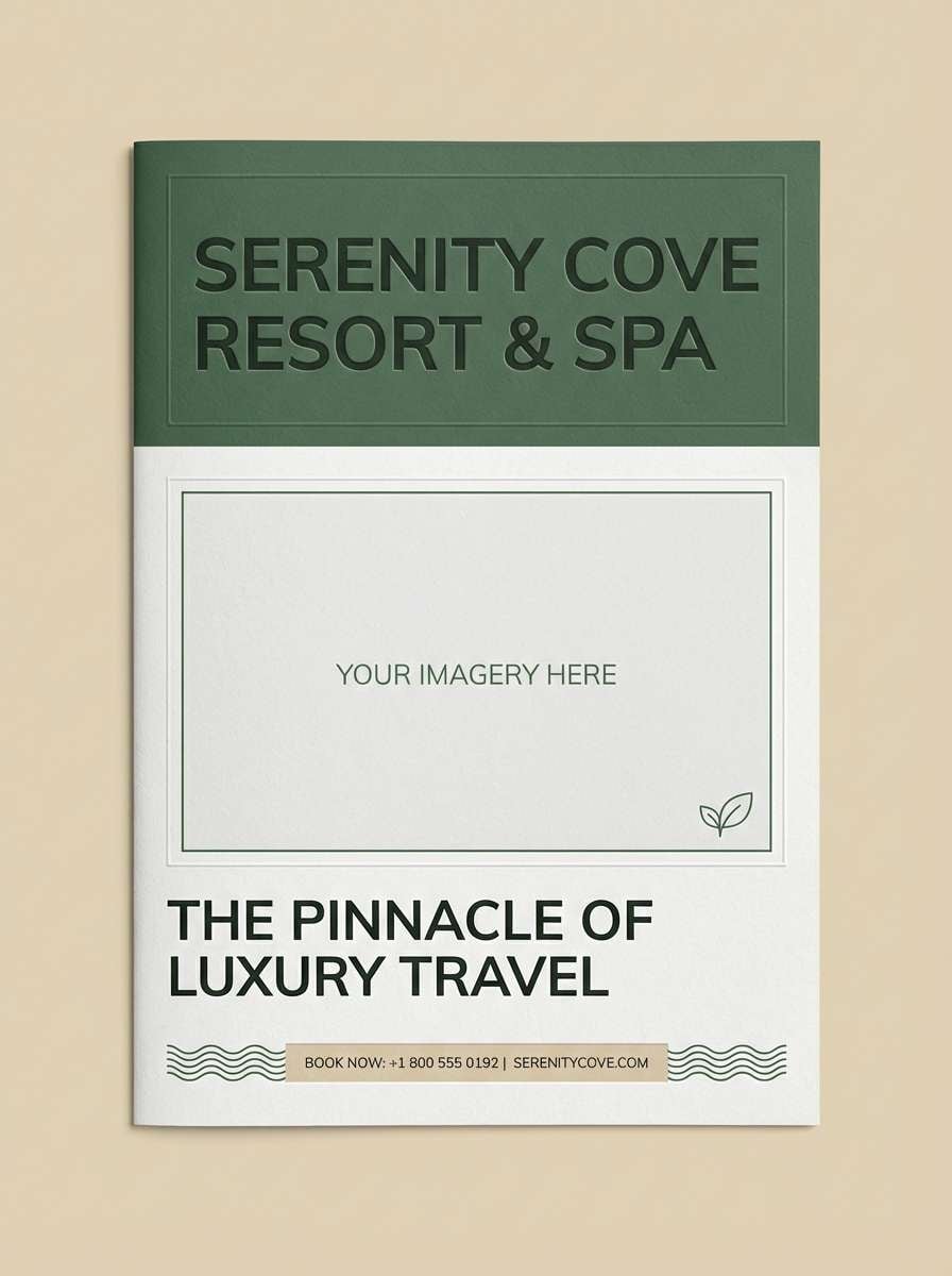
HEX: #F2E9D9 #DFD0B6 #BFAE8E #4E6B5A #1E2A24
Mood: tropical, shaded, sophisticated
Best for: resort brochure cover
Shaded palm greens over sun-bleached sand create a tropical mood that still feels sophisticated. Ideal for brochure covers where you want relaxed luxury and strong contrast for titles. Use the dark green for headline blocks and the soft neutrals for photography margins and negative space. Usage tip: keep #4E6B5A as a supporting accent so the cover stays light.
Image example of palm shadow generated using media.io
14) Sunbaked Coral
HEX: #F7EDE0 #EAD5C1 #D2B49A #F08A6B #3A2A25
Mood: cheerful, warm, energetic
Best for: summer sale poster
Cheerful and sunbaked, with coral energy that feels like late afternoon heat on stone. These white sand color combinations are great for seasonal posters when you want warmth without neon. Pair coral for the discount headline and keep the deep brown for details like dates and terms. Usage tip: add a soft sand background and let #F08A6B do the heavy lifting for attention.
Image example of sunbaked coral generated using media.io

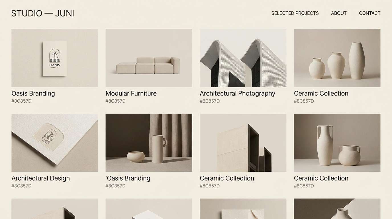
15) Gallery Greige
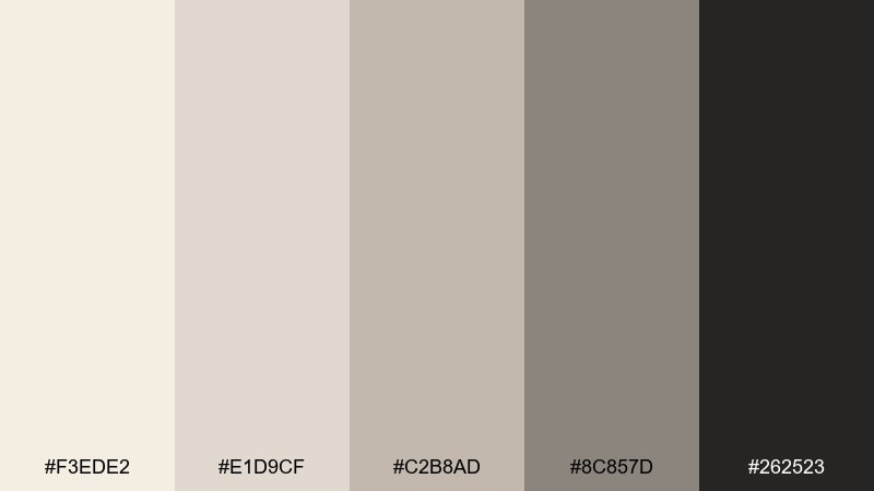
HEX: #F3EDE2 #E1D9CF #C2B8AD #8C857D #262523
Mood: curated, quiet, contemporary
Best for: portfolio website theme
Curated and quiet, like a contemporary gallery wall in soft greige. It is ideal for portfolios where work should lead and the interface should stay understated. Pair the darker greige for navigation and captions, and keep the lightest tones for page backgrounds. Usage tip: use #262523 sparingly for the highest-contrast elements like active links.
Image example of gallery greige generated using media.io
16) Sandstone Teal
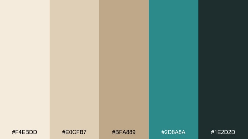
HEX: #F4EBDD #E0CFB7 #BFA889 #2D8A8A #1E2D2D
Mood: confident, fresh, modern
Best for: tech brand landing hero
Confident sandstone neutrals with a crisp teal accent feel modern and forward-leaning. Use it when you want a warm base but still need a clear, tech-ready highlight color for CTAs. The deep green-black keeps headers and nav elements sharp without pure black harshness. Usage tip: try teal only for buttons and links so the page stays premium, not playful.
Image example of sandstone teal generated using media.io

17) Warm Quarry
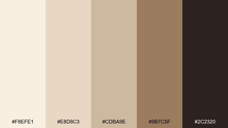
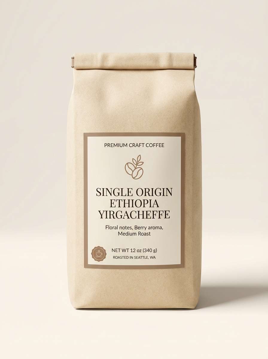
HEX: #F8EFE1 #E8D8C3 #CDBA9E #9B7C5F #2C2320
Mood: heritage, warm, sturdy
Best for: craft coffee packaging
Warm quarry stone and toasted brown accents feel heritage-inspired and sturdy. It suits craft coffee packaging where you want to signal roast depth and small-batch care. Use the mid brown for badges like origin and tasting notes, and keep the darkest shade for barcodes and legal text. Usage tip: choose a slightly textured paper so the light sand tones do not look flat.
Image example of warm quarry generated using media.io
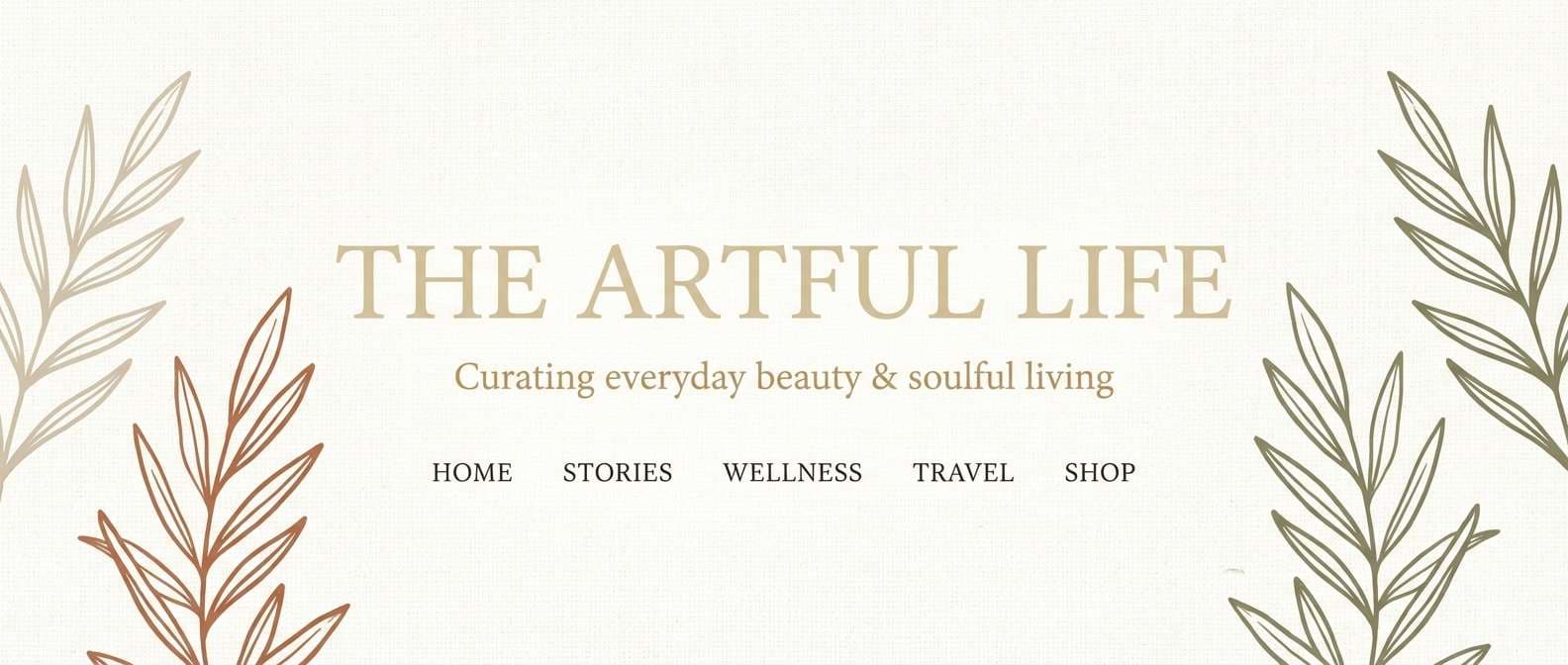
18) Barefoot Beige
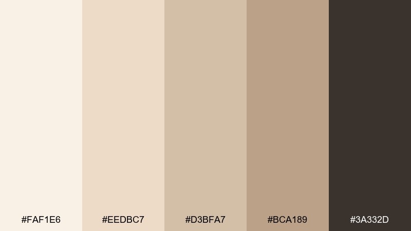
HEX: #FAF1E6 #EEDBC7 #D3BFA7 #BCA189 #3A332D
Mood: soft, relaxed, approachable
Best for: lifestyle blog header
Soft and relaxed, like barefoot steps across smooth beige sand. It works for lifestyle blog headers that need an approachable, airy look while keeping text readable. Pair the mid beige for navigation highlights and let the darkest brown handle logo and menu items. Usage tip: keep imagery warm-toned so it harmonizes with #EEDBC7 and #D3BFA7.
Image example of barefoot beige generated using media.io
19) Opal Breeze
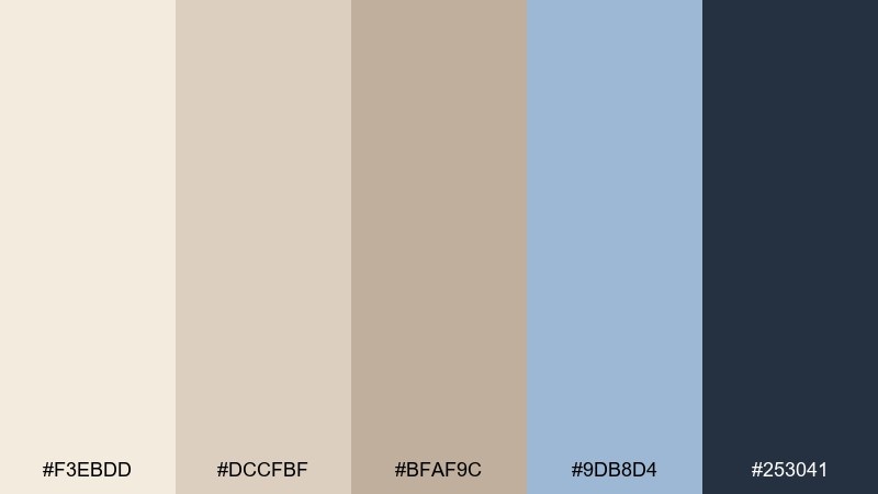
HEX: #F3EBDD #DCCFBF #BFAF9C #9DB8D4 #253041
Mood: serene, airy, polished
Best for: wellness app UI kit
Serene and airy, like an opal sky over pale shoreline. The cool blue accent adds clarity for wellness UI components while the sand base keeps everything gentle. Use the blue for active states and progress, and rely on deep navy for typography and icons. Usage tip: keep backgrounds at #F3EBDD and reserve blue for interaction so the kit stays soothing.
Image example of opal breeze generated using media.io
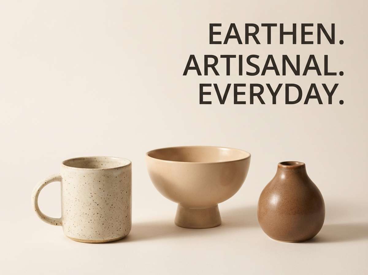
20) Clay and Cotton
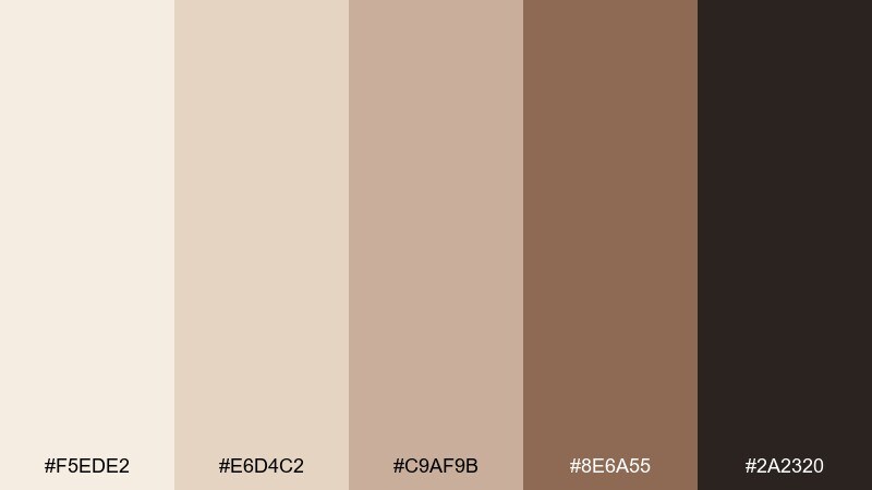
HEX: #F5EDE2 #E6D4C2 #C9AF9B #8E6A55 #2A2320
Mood: handcrafted, cozy, rustic-modern
Best for: ceramics product ad
Handcrafted and cozy like clay vessels on folded cotton, with a rustic-modern balance. It is a great fit for product ads where texture and warmth should feel premium, not busy. Use the clay brown for headlines and price tags, and let cotton neutrals frame the product. Usage tip: keep shadows soft so the palette stays warm and inviting.
Image example of clay and cotton generated using media.io
21) Eucalyptus Mist
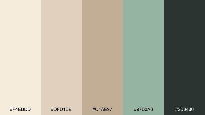
HEX: #F4EBDD #DFD1BE #C1AE97 #97B3A3 #2B3430
Mood: fresh, calming, spa-like
Best for: spa flyer design
Fresh eucalyptus mist over warm sand feels instantly spa-like and restorative. This white sand color scheme works for flyers that need to look calming while still guiding the eye to services and booking info. Pair the misty green for section blocks and icons, then keep the darkest shade for contact details. Usage tip: leave wide margins and use light line icons to match the airy tone.
Image example of eucalyptus mist generated using media.io
22) Amber Drift
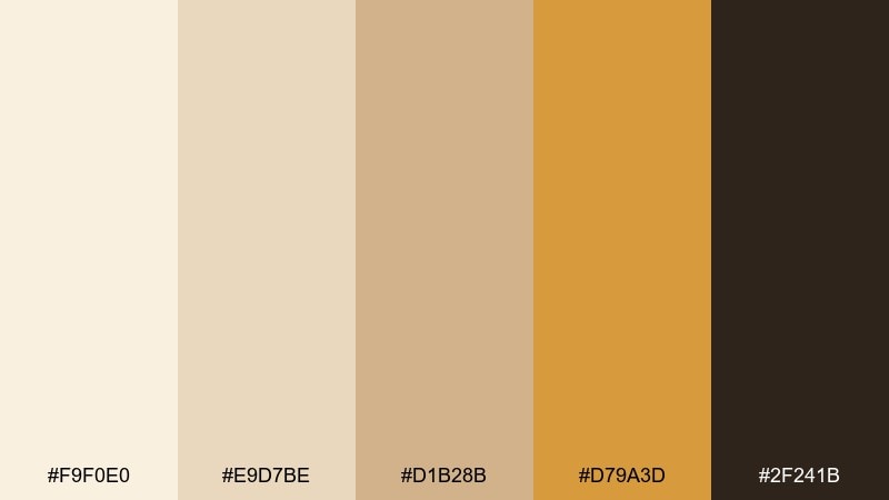
HEX: #F9F0E0 #E9D7BE #D1B28B #D79A3D #2F241B
Mood: sunny, optimistic, premium
Best for: ecommerce product banner
Sunny amber highlights on a creamy base feel optimistic and premium. These white sand color combinations help ecommerce banners pop without turning loud, especially for home goods and accessories. Use amber for the main CTA and small promo tags, and keep deep brown for the product name and pricing. Usage tip: avoid large amber backgrounds and instead use it as a focused accent.
Image example of amber drift generated using media.io
What Colors Go Well with White Sand?
White sand works best with grounded dark anchors (charcoal, deep brown, deep navy) because they protect readability and keep the palette from feeling washed out. If you’re building a UI palette, pick one dark shade for text and one accent for interaction states.
For a calm, organic look, pair white sand with sage, eucalyptus, olive, and muted teals. For warmth and energy, bring in terracotta, coral, amber, or caramel—ideally as small accents against larger sand surfaces.
If you want a more editorial or contemporary feel, cool grays and greige tones add structure. A subtle blue accent can also make white sand feel “cleaner” without turning clinical.
How to Use a White Sand Color Palette in Real Designs
Start by assigning roles: use the lightest sand tone for backgrounds, a mid sand for surfaces (cards, sections, panels), and a darker neutral for borders or dividers. Then choose one accent color for CTAs, highlights, or key illustrations.
For branding, white sand shines on packaging, stationery, and web layouts where whitespace is part of the luxury cue. Keep your logo and typography in a deep anchor (charcoal, cocoa, or green-black) for crisp reproduction across screens and print.
For interiors, white sand can act as a wall or textile base while wood, stone, and green accents provide depth. The easiest way to avoid a “flat” room is to mix finishes (matte paint, linen, ceramic) rather than adding more colors.
Create White Sand Palette Visuals with AI
If you want to see these palettes in action before committing, generate quick mockups for landing pages, posters, packaging, or social templates. A single prompt with your HEX colors can help you test vibe, contrast, and layout direction.
With Media.io Text to Image, you can iterate fast: adjust the accent color, change the aspect ratio, or swap the design scenario (UI, print, product shot) while keeping the same white sand base.
White Sand Color Palette FAQs
-
What is a “white sand” color in design?
White sand is a warm, off-white neutral that leans beige/ivory rather than pure white. It’s often used as a soft background tone because it feels bright but less stark than #FFFFFF. -
Is white sand closer to beige or cream?
It usually sits between beige and cream: beige brings more brown/earth, while cream brings more yellow warmth. White sand tends to be lighter and more muted, making it versatile for modern minimal styles. -
What’s the best text color on a white sand background?
Use deep charcoal, espresso brown, or deep navy for body text to maintain contrast and avoid a faded look. In the palettes above, shades like #2F3A3F, #2B3430, or #1A1F24 are strong choices. -
What accent colors pair well with white sand?
Sage/olive greens, muted teals, dusty blues, terracotta, coral, and amber all pair well. Choose one accent family to keep the look cohesive (cool coastal vs. warm earthy). -
How do I keep a white sand palette from looking flat?
Add depth with one dark anchor color, and use at least one mid-tone for surfaces and dividers. Texture also helps: subtle grain, soft shadows, or material cues (linen, paper, ceramic) make neutrals feel intentional. -
Can white sand work for modern UI design?
Yes—white sand backgrounds reduce glare and can feel more premium than pure white. The key is clear hierarchy: strong text contrast, restrained accents for states/CTAs, and consistent neutrals for cards and separators. -
How can I preview a white sand palette on real mockups quickly?
Use an AI generator to create fast visuals like landing heroes, packaging, posters, or UI components by including your HEX codes in the prompt. This helps you validate contrast and mood before building final assets.


