

Green light blue sits right between minty greens and airy blues, making it one of the easiest color families to design with. It can feel coastal and relaxed, clean and clinical, or bold and techy depending on contrast and accents.
Below are 20+ green light blue color combinations with HEX codes, plus practical ways to apply them across UI, branding, and print.
In this article
- Why Green Light Blue Palettes Work So Well
-
- coastal mint breeze
- seafoam studio
- glass lagoon
- mint and sky pairing
- aqua pebble neutral
- arctic pool
- lagoon citrus pop
- herbal watercolor mist
- modern clinic calm
- rainy harbor
- pool tile contrast
- ice mint minimal
- marine clay balance
- aurora swim
- gentle glacier
- teal cotton candy
- bayside concrete
- tidepool neon hint
- soft aquarium
- riverstone and lime
- calm meridian
- What Colors Go Well with Green Light Blue?
- How to Use a Green Light Blue Color Palette in Real Designs
- Create Green Light Blue Palette Visuals with AI
Why Green Light Blue Palettes Work So Well
Green light blue palettes naturally communicate calm, clarity, and cleanliness. Because they borrow trust from blue and freshness from green, they fit everything from wellness branding to modern software interfaces.
They also scale well across different surfaces: soft tints can carry large backgrounds without feeling heavy, while deeper teal/navy anchors typography and CTAs with reliable contrast.
Most importantly, green light blue is flexible with accents. You can keep it monochromatic for a minimal look, or add warm notes (sand, coral, citrus) to create instant energy without losing the soothing base.
20+ Green Light Blue Color Palette Ideas (with HEX Codes)
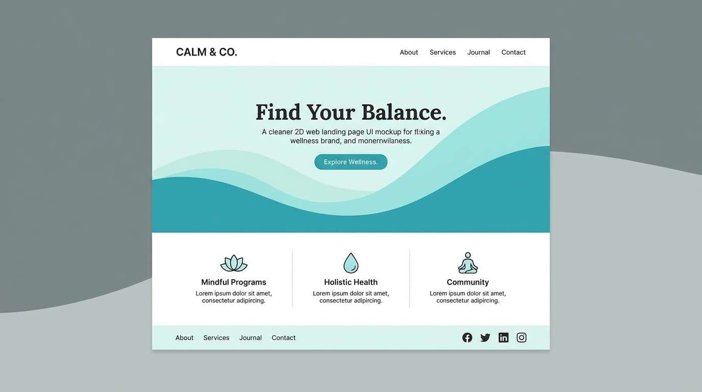
1) Coastal Mint Breeze
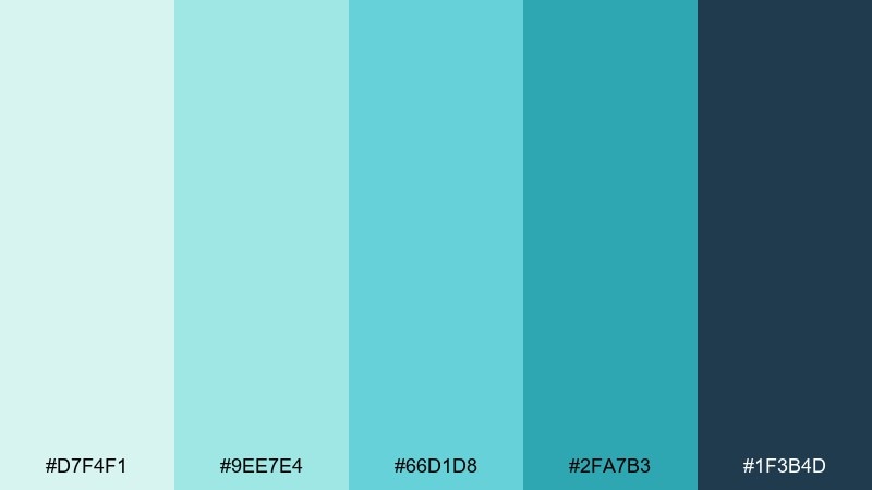
HEX: #D7F4F1 #9EE7E4 #66D1D8 #2FA7B3 #1F3B4D
Mood: airy, fresh, coastal
Best for: wellness landing page UI
Airy and coastal, these tones feel like sea mist over pale sand with a crisp, clean finish. Use this green light blue color palette for wellness brands, skincare, and calming onboarding screens. Pair it with white space and a deep slate for typography to keep contrast accessible. Tip: reserve the darkest tone for buttons and key CTAs, and keep gradients subtle.
Image example of coastal mint breeze generated using media.io
Media.io is an online AI studio for creating and editing video, image, and audio in your browser.

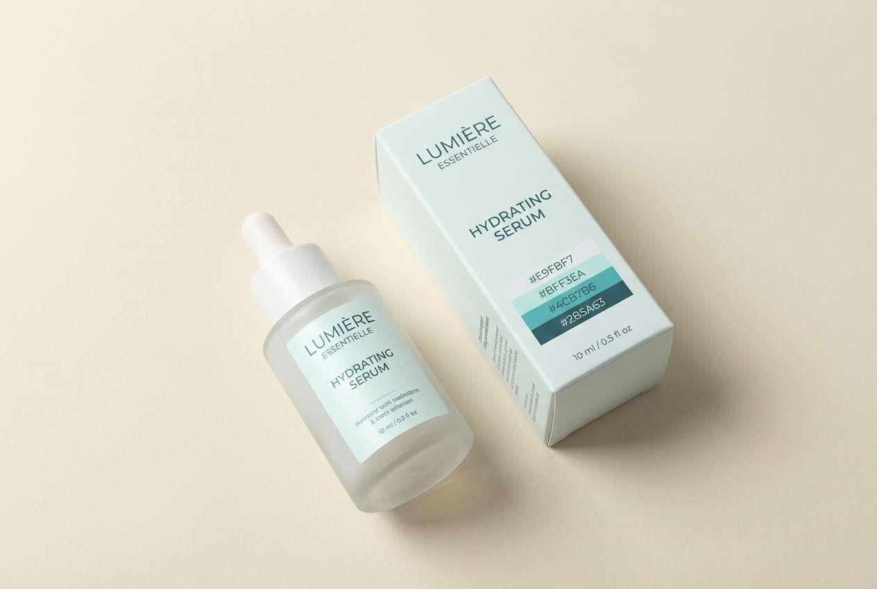
2) Seafoam Studio
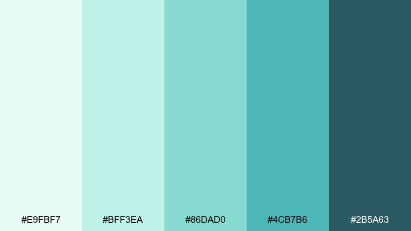
HEX: #E9FBF7 #BFF3EA #86DAD0 #4CB7B6 #2B5A63
Mood: clean, modern, spa-like
Best for: skincare product packaging
Clean and spa-like, the mix reads as fresh seafoam and polished stone. It works beautifully on minimalist labels, ingredient lists, and premium boxes where clarity matters. Add matte cream as background support and let the teal midtone carry the brand mark. Tip: use the darkest shade for small legal text to avoid washed-out printing.
Image example of seafoam studio generated using media.io
3) Glass Lagoon
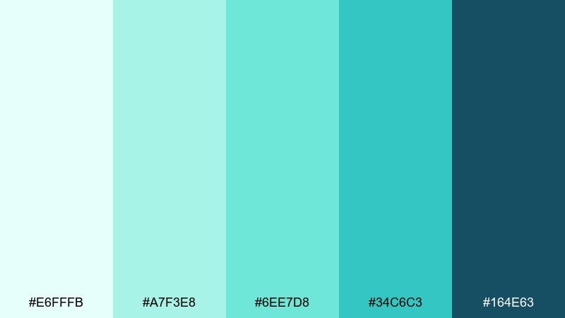
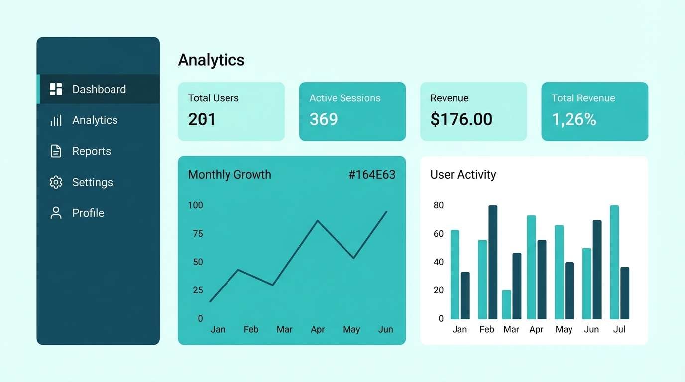
HEX: #E6FFFB #A7F3E8 #6EE7D8 #34C6C3 #164E63
Mood: bright, tropical, polished
Best for: app dashboard UI
Bright and polished, it evokes clear lagoon water with a confident, techy edge. The light tints keep dashboards readable while the deeper blue-green anchors navigation. Pair with neutral grays for tables and let the aqua highlight active states. Tip: keep charts limited to two accents so data stays easy to scan.
Image example of glass lagoon generated using media.io
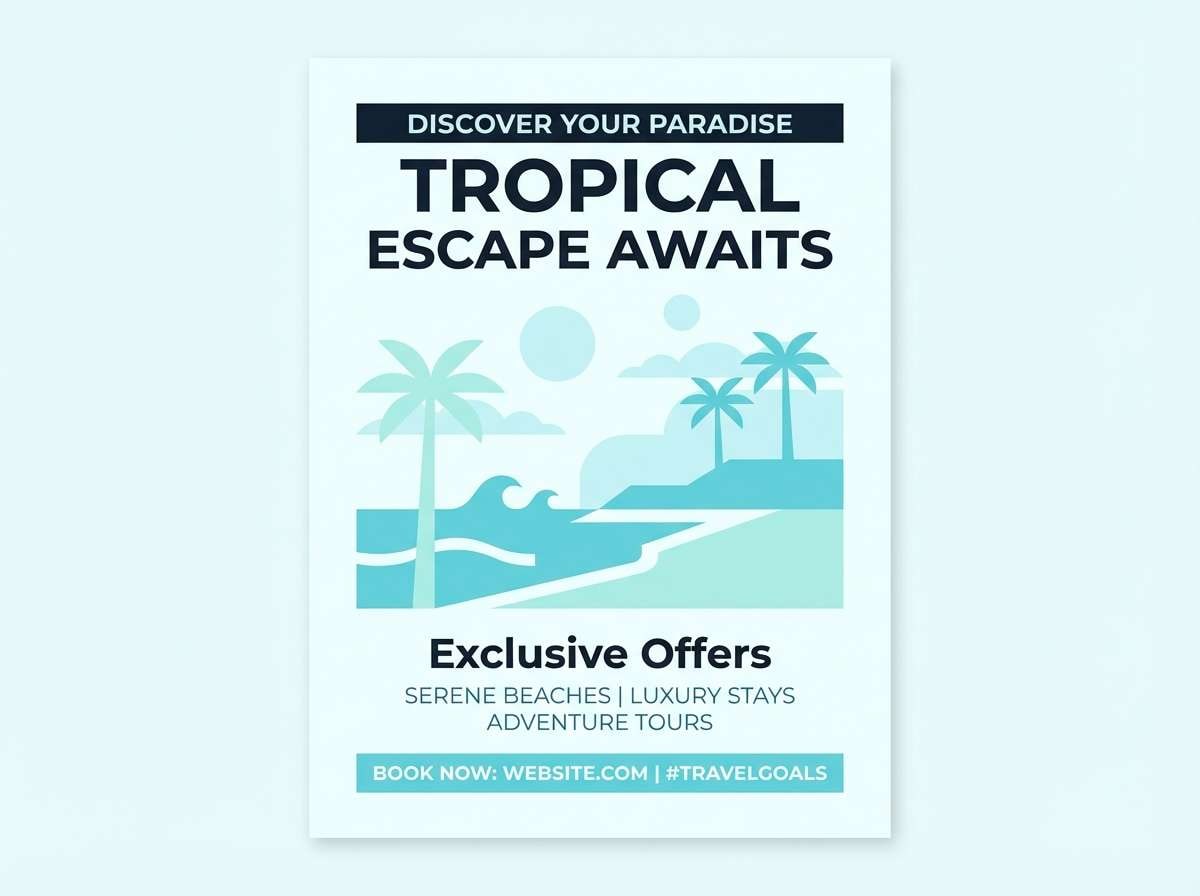
4) Mint And Sky Pairing
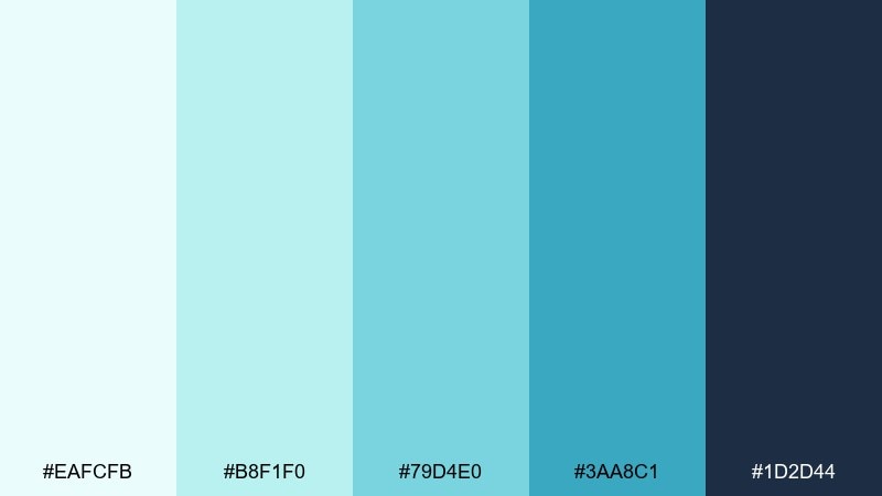
HEX: #EAFCFB #B8F1F0 #79D4E0 #3AA8C1 #1D2D44
Mood: uplifting, breezy, optimistic
Best for: travel flyer design
Uplifting and breezy, it feels like open water under a high, clear sky. These green light blue color combinations shine on travel flyers, summer promos, and event headers that need instant freshness. Pair with bold sans-serif type and keep imagery lightly toned so the palette stays in charge. Tip: set the navy as the headline color to keep contrast crisp in print.
Image example of mint and sky pairing generated using media.io
5) Aqua Pebble Neutral
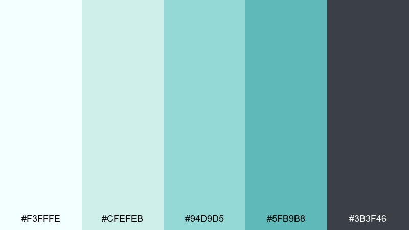
HEX: #F3FFFE #CFEFEB #94D9D5 #5FB9B8 #3B3F46
Mood: balanced, calm, professional
Best for: corporate pitch deck
Balanced and calm, it suggests aqua glass next to smooth pebble gray. The neutral base keeps slides professional while the teal tones add trust and clarity. Pair with light gray dividers and simple icons for a clean, consistent system. Tip: use the midtone for section headers and the darker gray for body text.
Image example of aqua pebble neutral generated using media.io
6) Arctic Pool

HEX: #F0FAFF #CDEFFF #8DD6F3 #3FB1D6 #0F3D4C
Mood: cool, crisp, refreshing
Best for: tech blog header graphics
Cool and crisp, it feels like sunlight bouncing off an arctic pool. The pale blues keep headers light while the deeper teal gives you strong typographic contrast. Pair with monochrome line icons and a single accent button for a modern editorial look. Tip: avoid over-saturating backgrounds; let white do the heavy lifting.
Image example of arctic pool generated using media.io

7) Lagoon Citrus Pop
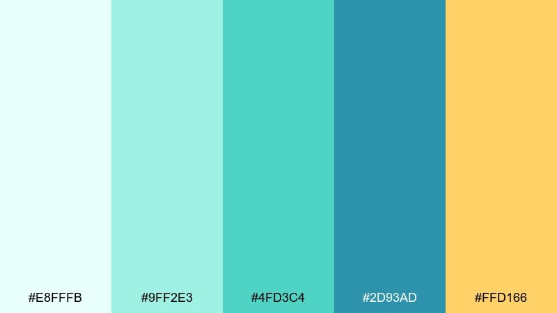
HEX: #E8FFFB #9FF2E3 #4FD3C4 #2D93AD #FFD166
Mood: playful, energetic, summery
Best for: social media ad creative
Playful and summery, it looks like lagoon water with a juicy citrus twist. The warm accent keeps the cool tones from feeling too clinical, perfect for scroll-stopping promos. Pair with bold shapes and short copy so the color does the persuasion. Tip: keep the yellow to small highlights like badges and price tags.
Image example of lagoon citrus pop generated using media.io
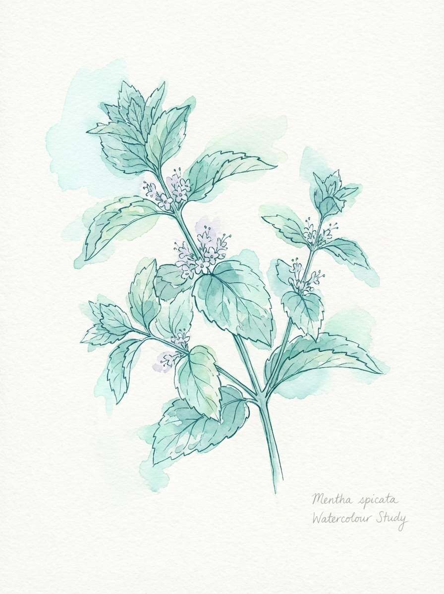
8) Herbal Watercolor Mist
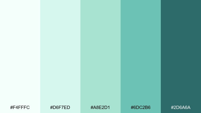
HEX: #F4FFFC #D6F7ED #A8E2D1 #6DC2B6 #2D6A6A
Mood: gentle, botanical, soothing
Best for: spring botanical illustration
Gentle and botanical, it evokes fresh herbs washed in morning dew. The soft tints are ideal for spring illustrations, packaging accents, and lifestyle blog art. Pair with paper textures and delicate linework to keep it organic. Tip: let the darkest green-blue appear only in stems and small shadows for depth.
Image example of herbal watercolor mist generated using media.io
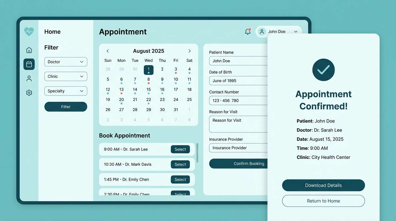
9) Modern Clinic Calm
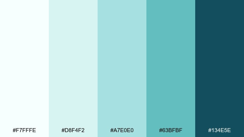
HEX: #F7FFFE #D8F4F2 #A7E0E0 #63BFBF #134E5E
Mood: reassuring, hygienic, calm
Best for: healthcare appointment UI
Reassuring and hygienic, it feels like a spotless clinic with a friendly tone. This green light blue color scheme supports forms, calendars, and status states without visual stress. Pair with rounded UI elements and a neutral gray for secondary text. Tip: use the darkest shade for error messages and key actions to maintain clarity.
Image example of modern clinic calm generated using media.io
10) Rainy Harbor
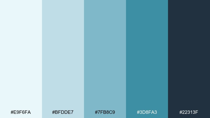
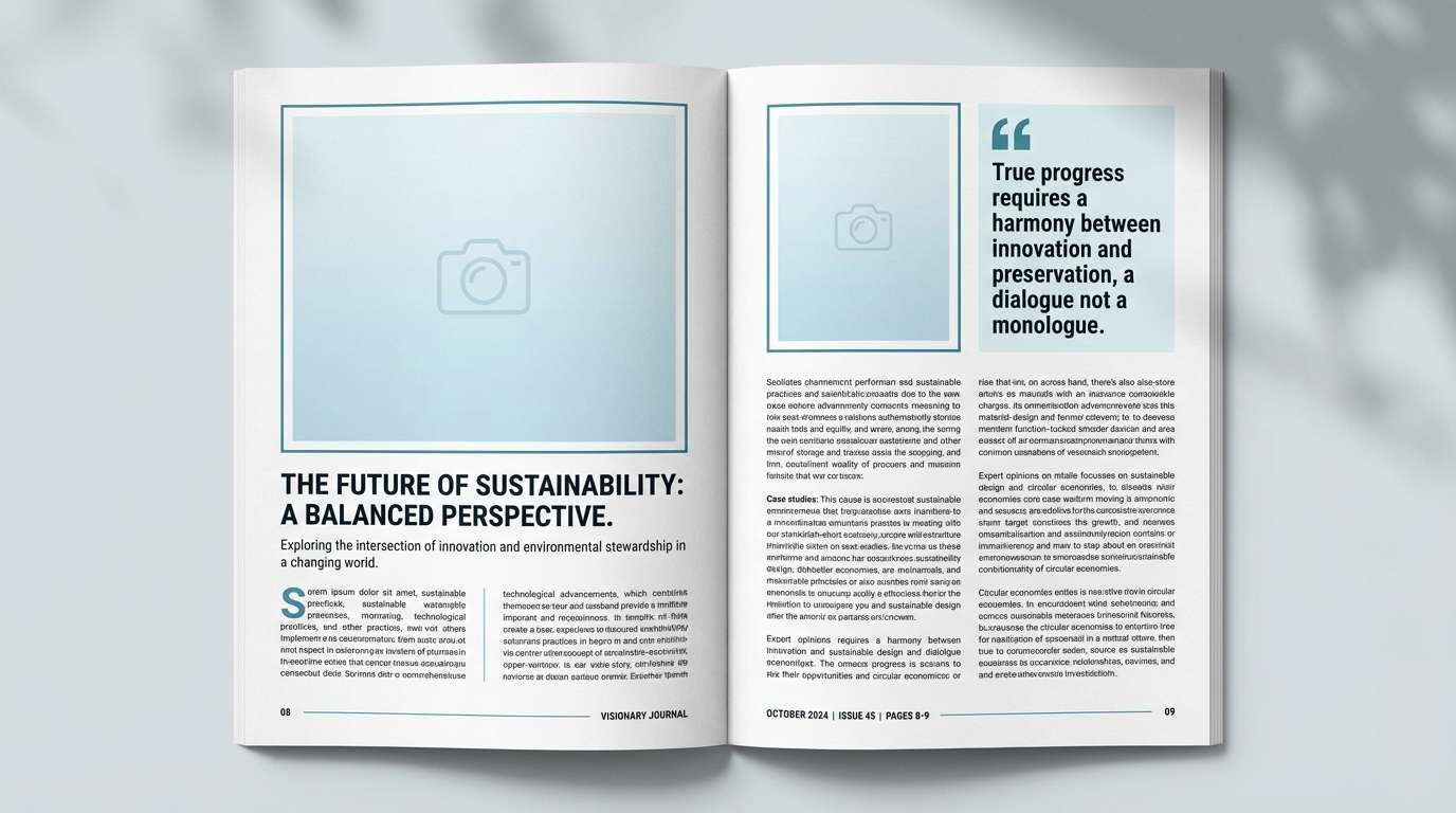
HEX: #E9F6FA #BFDDE7 #7FB8C9 #3D8FA3 #22313F
Mood: moody, refined, nautical
Best for: editorial magazine spread
Moody and refined, it suggests a rainy harbor with steel-blue water and dark hulls. The muted steps are great for editorial layouts where images and type must coexist. Pair with off-white paper tones and a single accent rule line for structure. Tip: keep body text in the charcoal shade to avoid a washed-out page.
Image example of rainy harbor generated using media.io
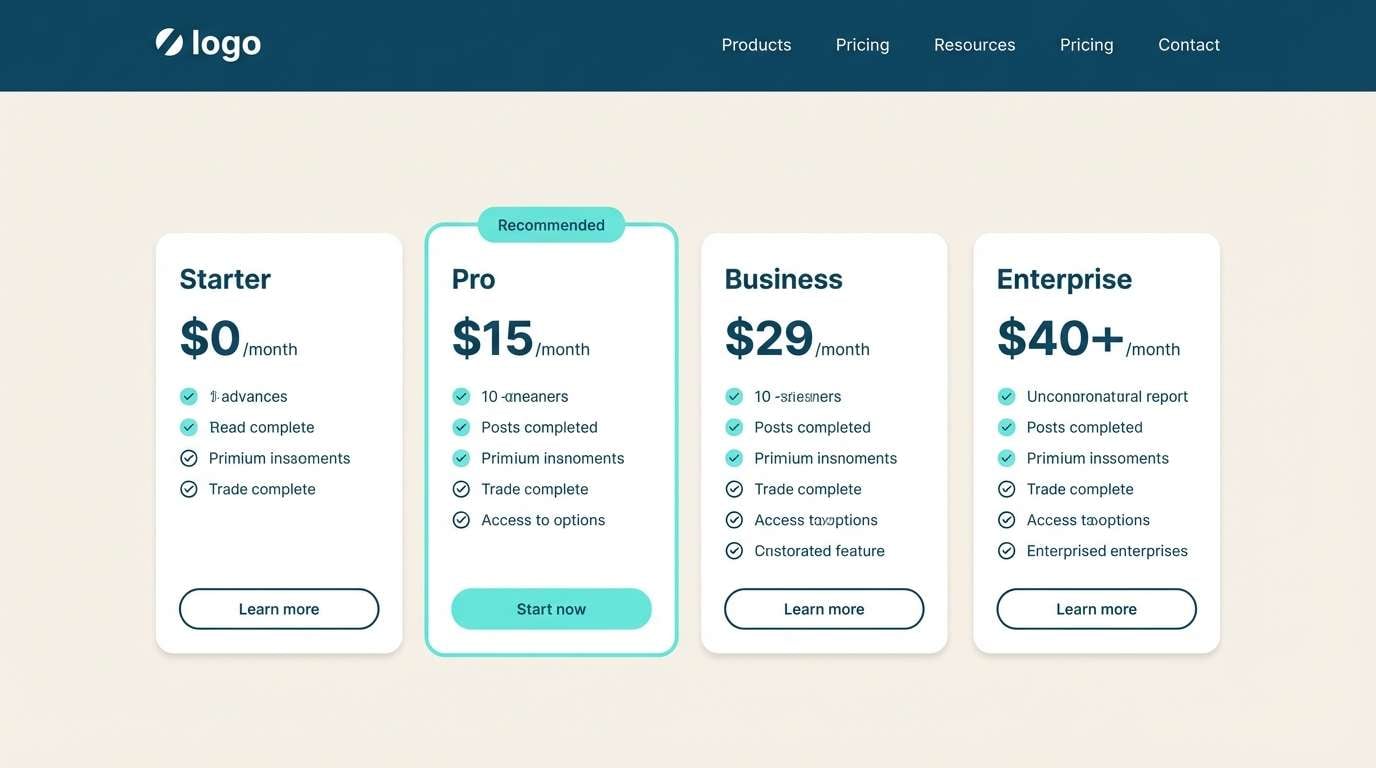
11) Pool Tile Contrast
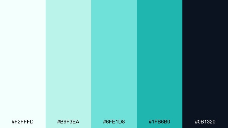
HEX: #F2FFFD #B9F3EA #6FE1D8 #1FB6B0 #0B1320
Mood: bold, clean, high-contrast
Best for: SaaS pricing page UI
Bold and clean, it feels like glossy pool tiles against midnight shadows. The contrast makes pricing tiers and feature highlights instantly scannable. Pair with simple iconography and plenty of spacing to keep it premium, not loud. Tip: use the near-black only for headings and buttons so the page stays airy.
Image example of pool tile contrast generated using media.io
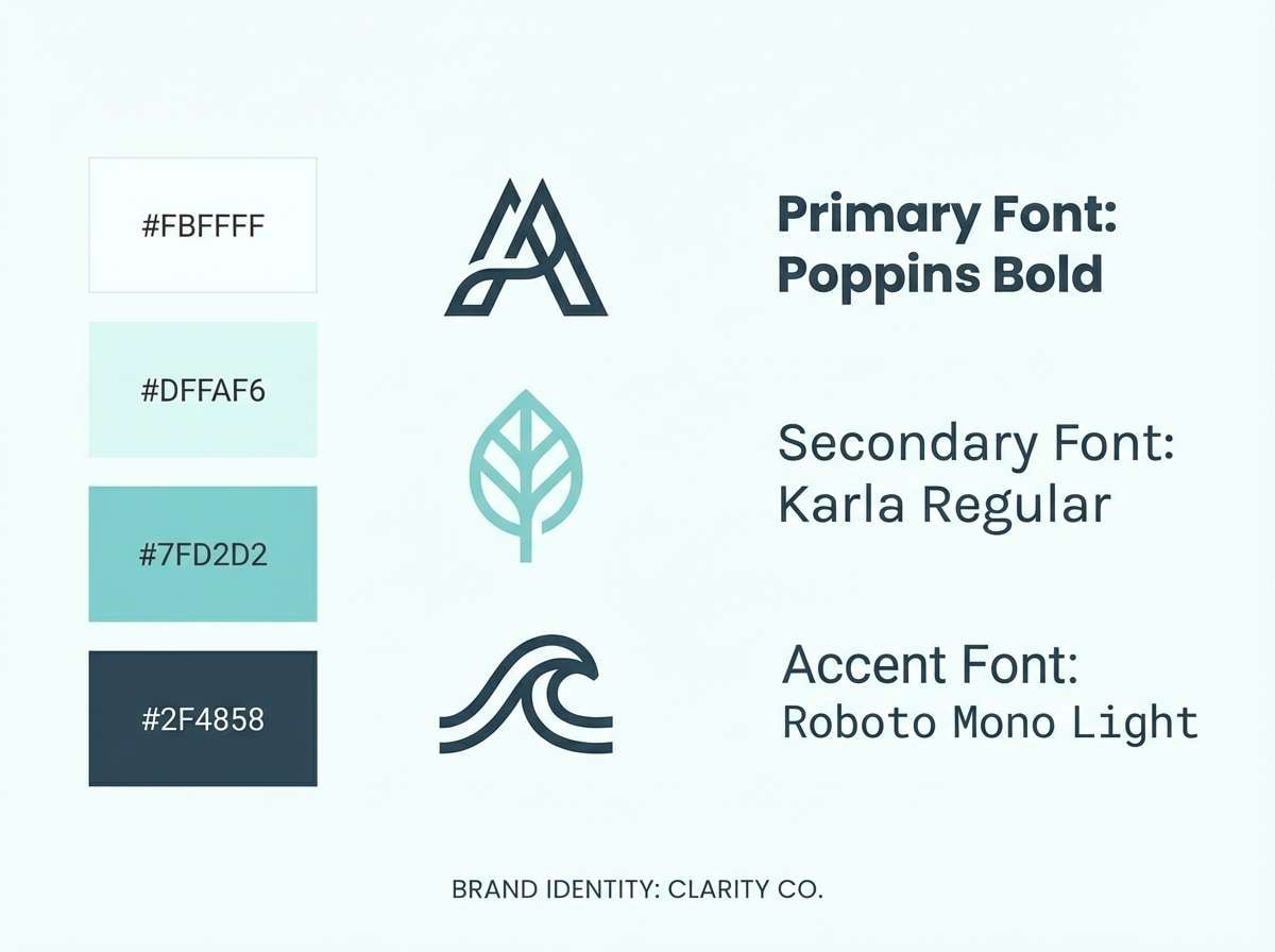
12) Ice Mint Minimal
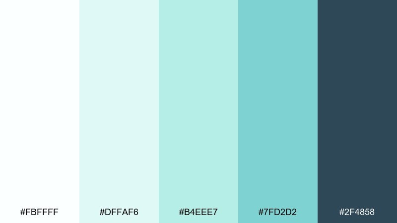
HEX: #FBFFFF #DFFAF6 #B4EEE7 #7FD2D2 #2F4858
Mood: minimal, airy, contemporary
Best for: brand identity moodboard
Minimal and airy, it reads like frosted glass with a quiet mint tint. Use this green light blue color palette on identity boards, stationery mockups, and simple logo explorations. Pair with warm white paper and restrained type choices to keep it elegant. Tip: keep gradients off the logo and use flat fills for consistency.
Image example of ice mint minimal generated using media.io
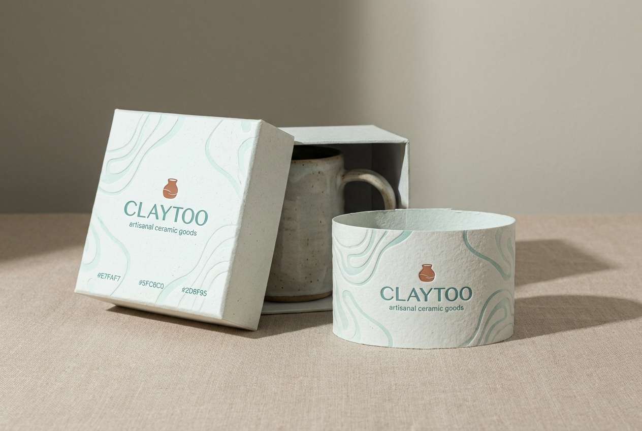
13) Marine Clay Balance
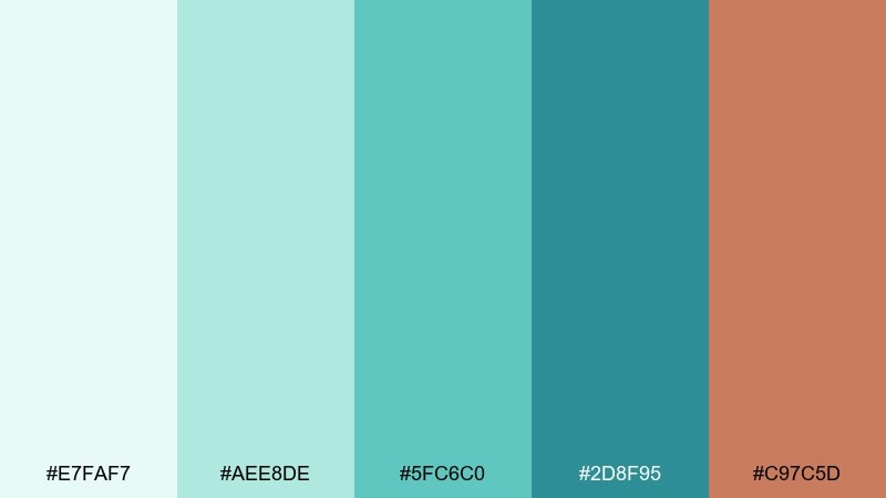
HEX: #E7FAF7 #AEE8DE #5FC6C0 #2D8F95 #C97C5D
Mood: grounded, artisanal, modern
Best for: ceramic brand packaging
Grounded and artisanal, it mixes marine freshness with a clay-warm accent. The cool tones keep the look modern, while the terracotta note adds handmade character. Pair with uncoated paper and simple stamped graphics for authenticity. Tip: use the warm shade sparingly on seals or small patterns so it stays special.
Image example of marine clay balance generated using media.io
14) Aurora Swim
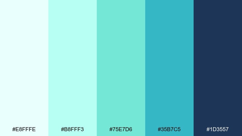
HEX: #E8FFFE #B8FFF3 #75E7D6 #35B7C5 #1D3557
Mood: fresh, luminous, sporty
Best for: fitness app onboarding screens
Fresh and luminous, it feels like an early swim under an aurora glow. These tones are great for onboarding flows where you want energy without harsh saturation. Pair with simple illustrations and strong navy headlines for readability. Tip: keep progress indicators in the brighter teal to make motion feel rewarding.
Image example of aurora swim generated using media.io

15) Gentle Glacier
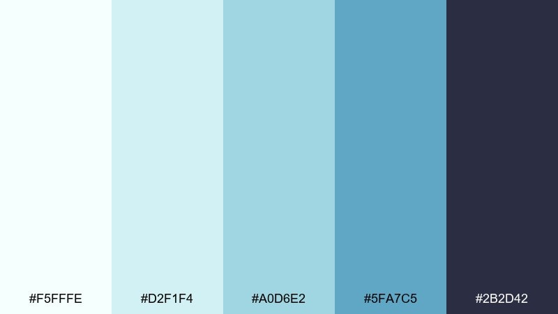
HEX: #F5FFFE #D2F1F4 #A0D6E2 #5FA7C5 #2B2D42
Mood: serene, cool, understated
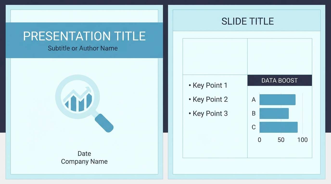
Best for: presentation template theme
Serene and cool, it brings to mind glacier light filtered through thin clouds. It suits slide themes that need calm authority for charts, agendas, and speaker notes. Pair with thin dividers and monochrome icons for a tidy system. Tip: apply the mid blue to section bars to guide the audience through the story.
Image example of gentle glacier generated using media.io
16) Teal Cotton Candy
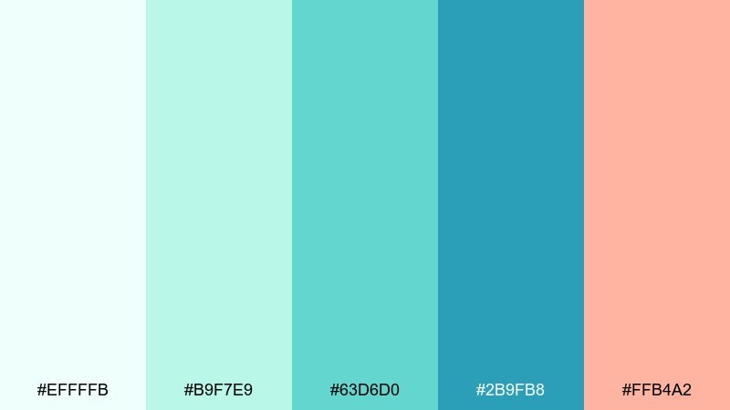
HEX: #EFFFFB #B9F7E9 #63D6D0 #2B9FB8 #FFB4A2
Mood: cheerful, youthful, friendly
Best for: cafe menu poster
Cheerful and friendly, it feels like iced matcha next to a soft candy accent. The playful contrast works well for cafe menus, seasonal specials, and lighthearted posters. Pair with rounded type and simple illustrations to keep it approachable. Tip: place the warm accent only on prices or callouts so it does not overpower the cool base.
Image example of teal cotton candy generated using media.io
17) Bayside Concrete
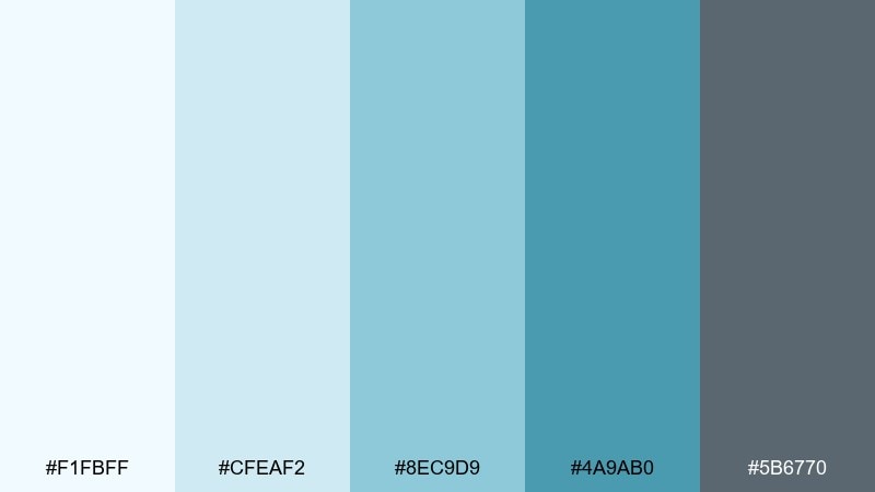
HEX: #F1FBFF #CFEAF2 #8EC9D9 #4A9AB0 #5B6770
Mood: urban, relaxed, contemporary
Best for: real estate brochure
Urban and relaxed, it evokes bayside air against smooth concrete. The palette keeps property brochures looking modern while staying easy on the eyes. Pair with plenty of white margins and crisp photography for a premium feel. Tip: use the gray as a consistent caption color to unify multiple listings.
Image example of bayside concrete generated using media.io
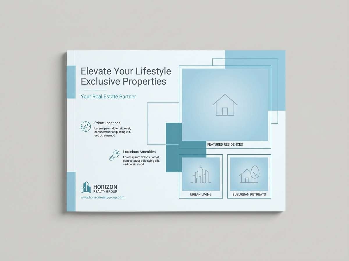
18) Tidepool Neon Hint
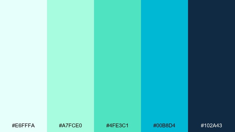
HEX: #E6FFFA #A7FCE0 #4FE3C1 #00B8D4 #102A43
Mood: vibrant, techy, confident
Best for: startup product hero section
Vibrant and techy, it recalls tidepools lit by sharp midday sun. It works well for product hero sections where you want clean energy and strong contrast. Pair with dark mode blocks and a single bright highlight for interactive elements. Tip: keep gradients limited to backgrounds so UI components stay crisp.
Image example of tidepool neon hint generated using media.io

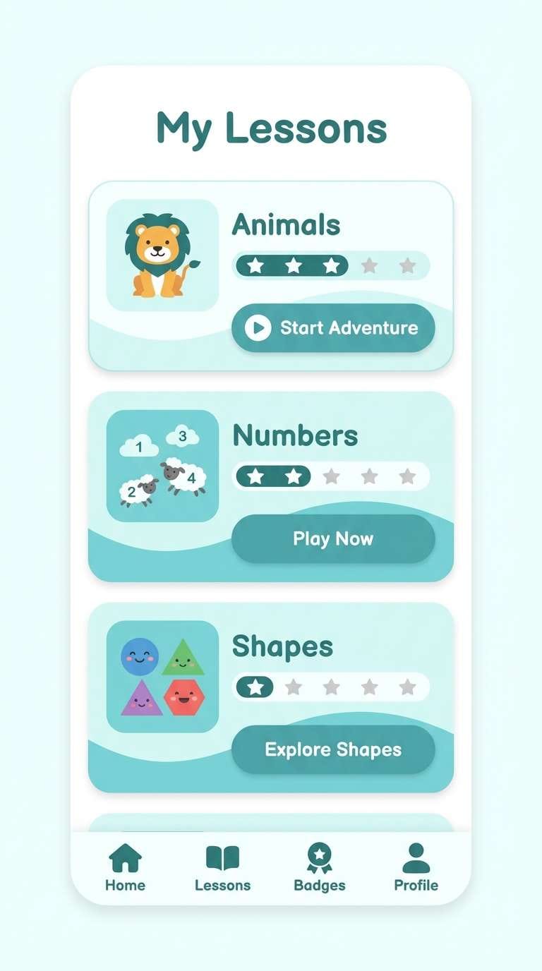
19) Soft Aquarium
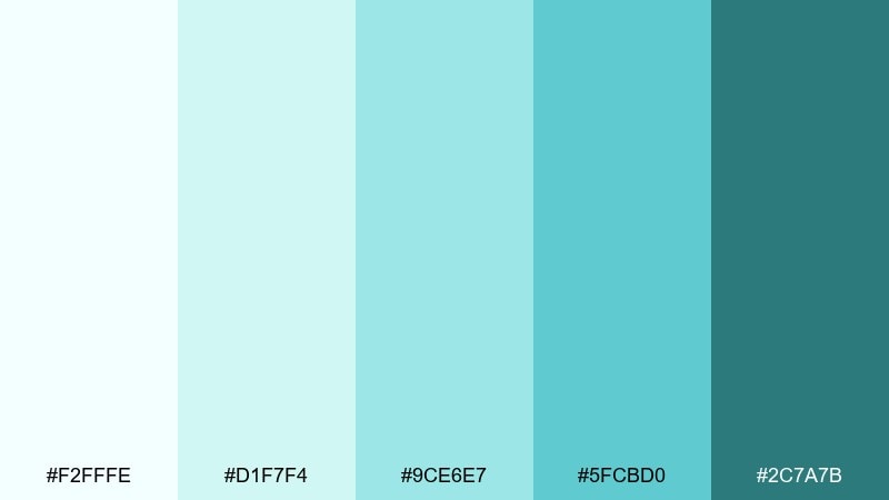
HEX: #F2FFFE #D1F7F4 #9CE6E7 #5FCBD0 #2C7A7B
Mood: soft, friendly, educational
Best for: kids learning app UI
Soft and friendly, it feels like an aquarium visit with gentle light and calm water. The pastel range keeps screens approachable for kids while still looking modern. Pair with simple character illustrations and rounded cards for a welcoming rhythm. Tip: use the darkest teal only for navigation labels and key feedback states.
Image example of soft aquarium generated using media.io
20) Riverstone And Lime
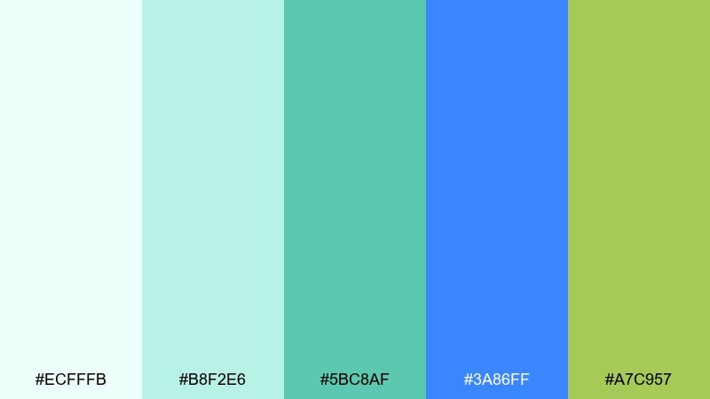
HEX: #ECFFFB #B8F2E6 #5BC8AF #3A86FF #A7C957
Mood: adventurous, outdoorsy, bright
Best for: outdoor event poster
Adventurous and outdoorsy, it suggests riverstone water with a lively lime edge. These green light blue color combinations fit trail events, clean energy campaigns, and bold poster typography. Pair with chunky type and simple topographic patterns to reinforce the theme. Tip: keep the bright blue as a secondary accent so the greens stay dominant.
Image example of riverstone and lime generated using media.io

21) Calm Meridian
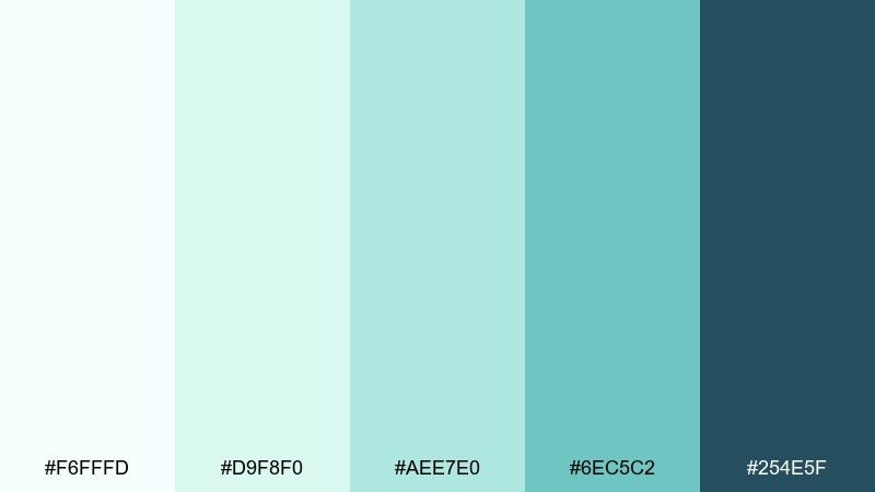
HEX: #F6FFFD #D9F8F0 #AEE7E0 #6EC5C2 #254E5F
Mood: composed, trustworthy, refined
Best for: finance app UI
Composed and trustworthy, it feels like a steady compass line over calm water. Use this green light blue color palette for finance UIs that need reassurance without looking cold. Pair with subtle shadows and restrained icon fills for a premium finish. Tip: set success states in the mid teal and keep alerts neutral to avoid visual anxiety.
Image example of calm meridian generated using media.io
What Colors Go Well with Green Light Blue?
Green light blue pairs effortlessly with crisp neutrals like white, warm ivory, and soft grays to keep layouts airy and readable. For text and structure, deep navy, slate, or charcoal gives reliable contrast without feeling harsh.
If you want a coastal vibe, add sand, beige, or driftwood browns. For more energy, use warm accents like coral, peach, or citrus yellow in small doses to create focal points.
For a modern tech look, combine green light blue with near-black and one bright highlight (electric cyan or neon mint). This keeps the palette clean while still feeling dynamic.
How to Use a Green Light Blue Color Palette in Real Designs
Start by assigning roles: use the lightest tint for backgrounds, a mid teal for surfaces (cards, sections, UI fills), and a dark blue-green for headlines, navigation, and primary buttons. This keeps hierarchy consistent across screens or pages.
In print, keep large areas light to avoid muddy results, and rely on the darker shade for body text. If you introduce a warm accent, reserve it for key callouts (prices, badges, “New” tags) so the design stays calm.
For branding systems, create a small set of tokens: background, surface, border, primary, and accent. That makes green light blue color combinations easier to scale across web, social, packaging, and templates.
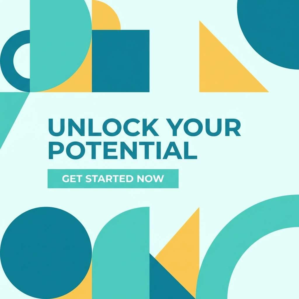
Create Green Light Blue Palette Visuals with AI
If you want to preview how a green light blue color scheme looks in real layouts, generate quick mockups with AI. It’s a fast way to test mood, contrast, and where accents should appear before you commit to production design.
Try making multiple variations by keeping the same palette but changing the scene (UI, packaging, poster) and the lighting/style (flat vector vs. realistic studio). You’ll quickly see which tones should lead and which should support.
Green Light Blue Color Palette FAQs
-
What is considered “green light blue”?
Green light blue is a pale blue with noticeable green/teal undertones, often close to mint, aqua, seafoam, or light turquoise. It reads cool, fresh, and clean compared to a pure sky blue. -
Is green light blue good for UI design?
Yes. Light aqua and mint tints make comfortable backgrounds and surfaces, while darker teal/navy shades provide strong contrast for navigation, headings, and CTAs. It’s especially popular for wellness, fintech, and SaaS. -
What accent colors work best with green light blue?
Warm accents like coral, peach, terracotta, and citrus yellow add energy and focus. For a calmer look, use neutrals like ivory, cool gray, and charcoal instead of strong warm accents. -
How do I keep contrast accessible with light teal backgrounds?
Use a dark anchor color (navy, slate, charcoal) for body text and key UI elements, and avoid placing white text on light teal fills. Reserve the darkest palette shade for buttons, links, and important labels. -
Does green light blue print well?
It can, but very light tints may look washed out depending on paper and ink. Use uncoated paper for a softer feel, test proofs, and rely on darker teal/charcoal for typography and fine details. -
What vibe does a green light blue color scheme create?
Most green light blue palettes feel calm, hygienic, coastal, and modern. With higher contrast they can feel techy and confident; with warm accents they become playful and friendly. -
How many colors should I use from a 5-color palette?
In most designs, 3 core roles are enough (background, primary, dark text/CTA). Add the remaining colors as optional accents or data highlights to avoid a noisy interface.


