

White green blue palettes feel instantly clean, modern, and breathable. They’re a go-to for brands and interfaces that want to communicate clarity, wellness, and trust without looking sterile.
Below are 20 fresh white green blue color combinations with HEX codes, plus usage notes and AI prompts you can reuse to generate matching visuals fast.
In this article
Why White Green Blue Palettes Work So Well
White sets a clean foundation, while green adds a natural, restorative cue and blue delivers stability and professionalism. Together, they create a “fresh but reliable” message that reads well across digital and print.
These cool tones also support strong hierarchy: pale tints make airy backgrounds, mid tones add UI structure, and deep blues handle readable text and key CTAs. That balance helps designs feel organized without heavy contrast.
Because the palette is widely associated with water, sky, and health, it’s especially effective for wellness, SaaS, finance, and eco brands—anywhere you want calm confidence and modern simplicity.
20+ White Green Blue Color Palette Ideas (with HEX Codes)
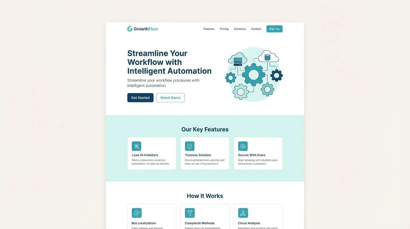
1) Seafoam Studio
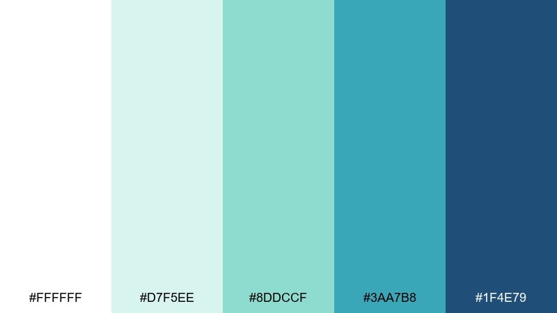
HEX: #ffffff #d7f5ee #8ddccf #3aa7b8 #1f4e79
Mood: airy, coastal, optimistic
Best for: saas landing page UI
Sea-glass freshness meets deep ocean blue, creating a bright and confident vibe. It works beautifully for clean product pages, navigation bars, and feature sections where clarity matters. Pair it with thin-line icons and plenty of whitespace to keep the mint and teal feeling light. Usage tip: reserve the navy tone for headlines and primary CTAs so the layout stays readable.
Image example of seafoam studio generated using media.io
Media.io is an online AI studio for creating and editing video, image, and audio in your browser.

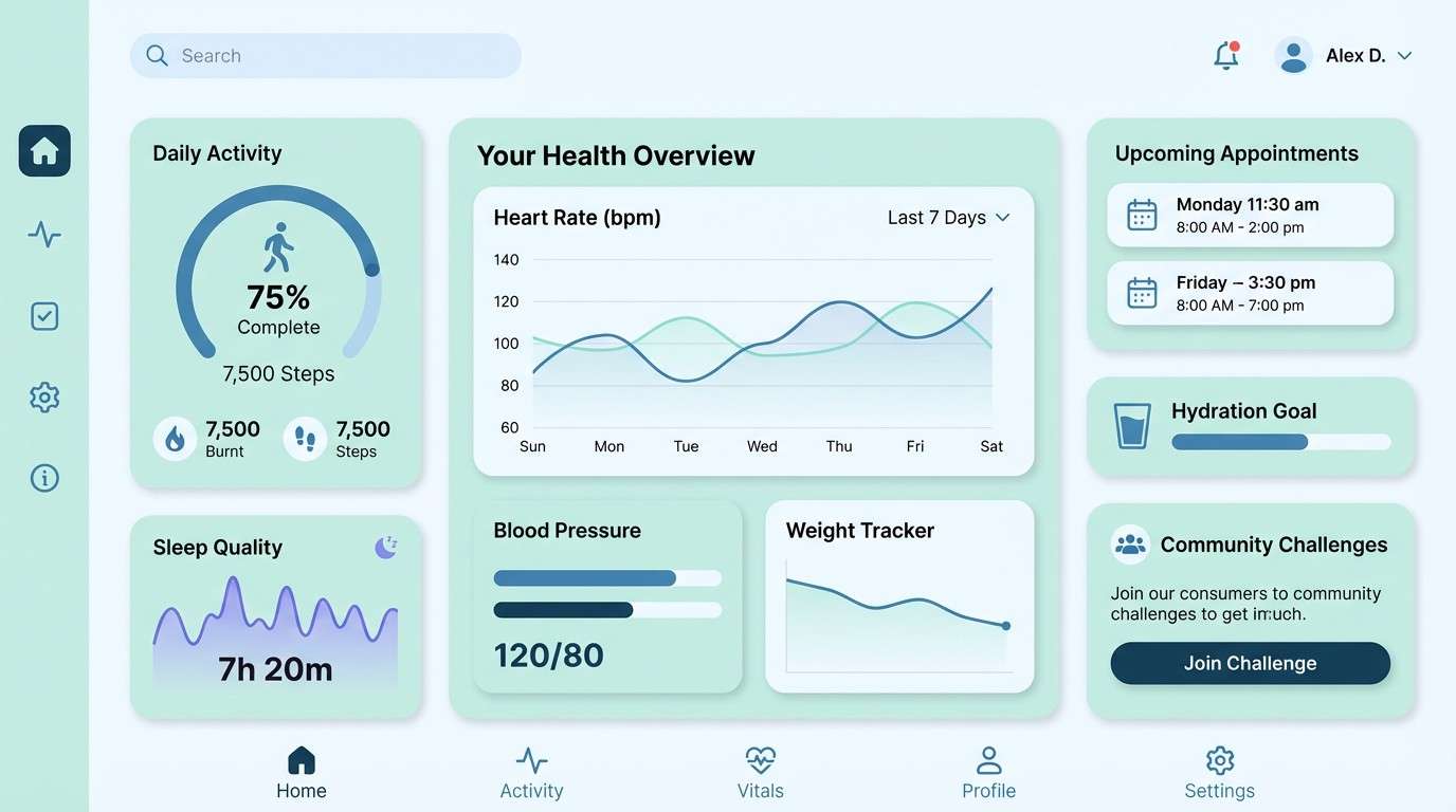
2) Glacier Mint
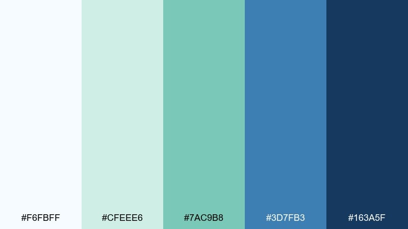
HEX: #f6fbff #cfeee6 #7ac9b8 #3d7fb3 #163a5f
Mood: crisp, calm, modern
Best for: health app dashboard UI
Cool mint and glacier blue feel like fresh air and steady routines. The tones are ideal for dashboards, progress states, and data cards where calm focus beats high contrast. Combine it with light gray dividers and rounded components for a friendly clinical look. Usage tip: use the deep blue only for key metrics and selected states to avoid visual heaviness.
Image example of glacier mint generated using media.io
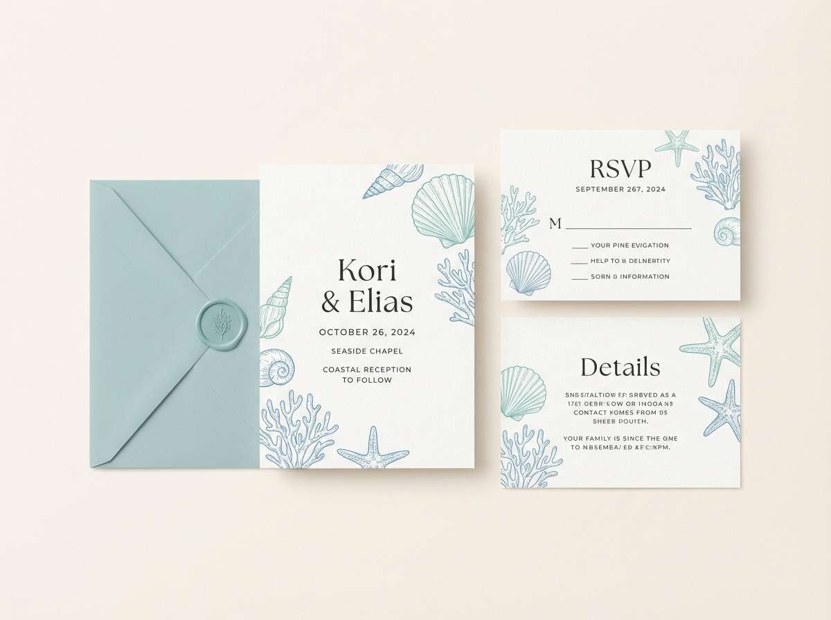
3) Coastal Linen
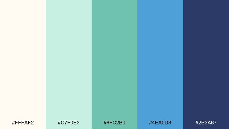
HEX: #fffaf2 #c7f0e3 #6fc2b0 #4ea0d8 #2b3a67
Mood: sunlit, relaxed, welcoming
Best for: beach wedding invitation suite
Warm linen white and airy aqua evoke a breezy shoreline with soft sunlight. These white green blue color combinations are perfect for invitations that need to feel elegant but not formal. Pair them with a sandy paper texture and a simple serif to keep it timeless. Usage tip: keep body copy in the deep indigo and use the aqua tones for borders and monograms.
Image example of coastal linen generated using media.io
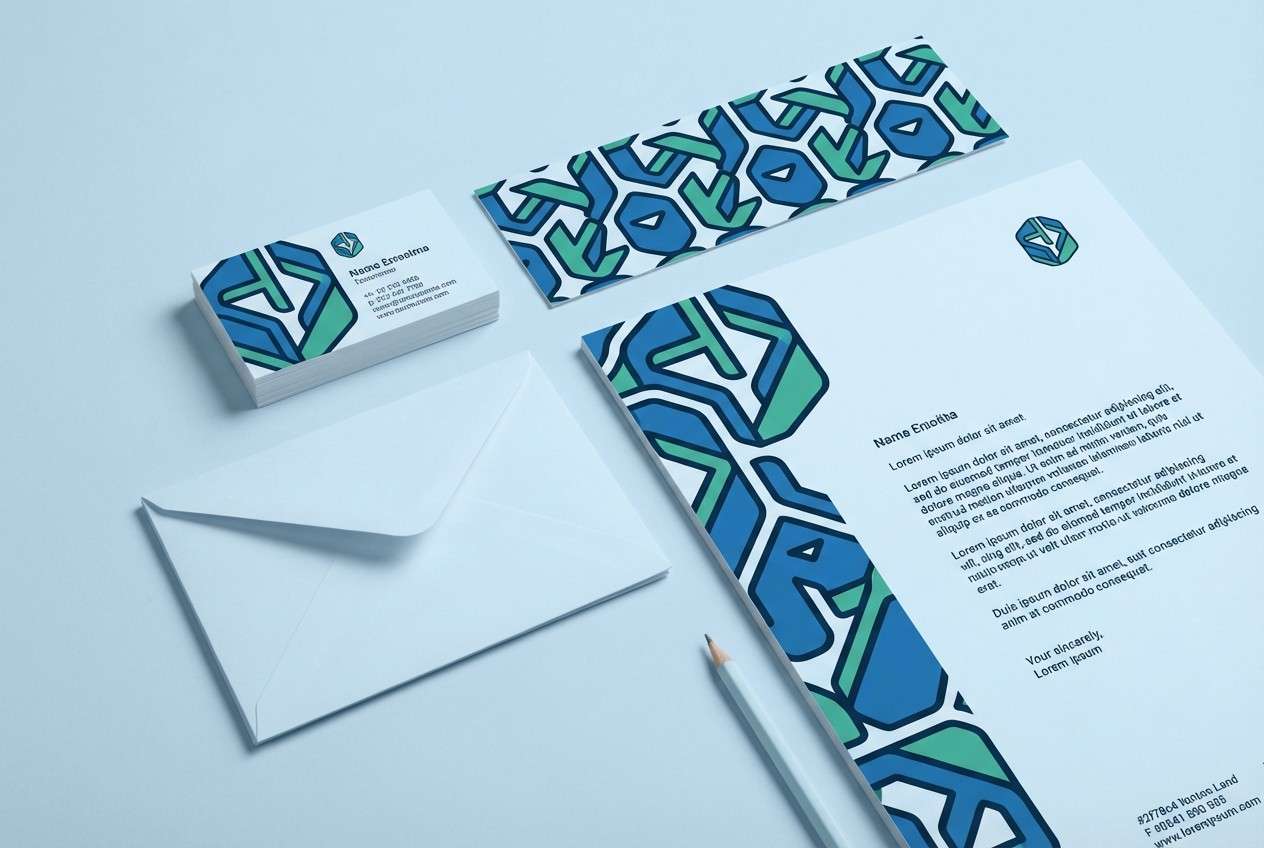
4) Alpine Lake
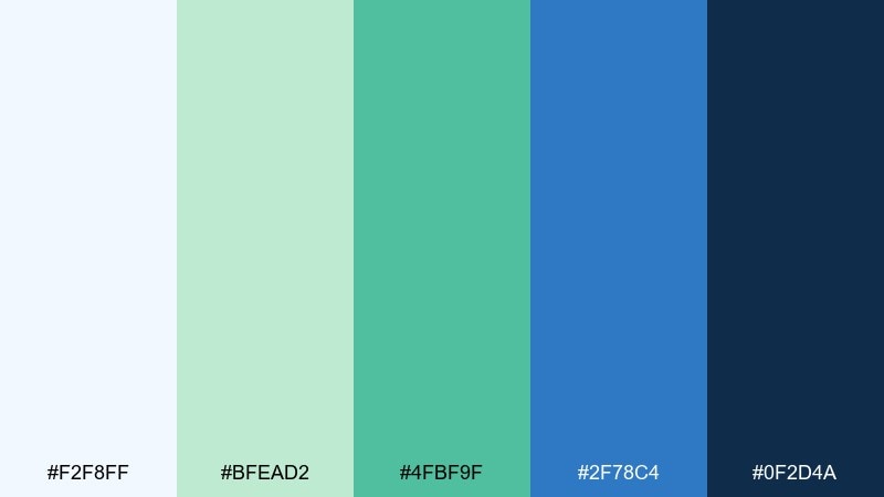
HEX: #f2f8ff #bfead2 #4fbf9f #2f78c4 #0f2d4a
Mood: fresh, outdoorsy, confident
Best for: outdoor brand logo and stationery
Bright lake blue and lively green bring to mind alpine trails and cold, clear water. The contrast gives logos a confident read while still feeling approachable. Pair it with a geometric sans font and simple badge shapes for a modern adventure identity. Usage tip: let the mid-blue lead, and use the green as a secondary accent to keep the mark versatile.
Image example of alpine lake generated using media.io
5) Garden Pool
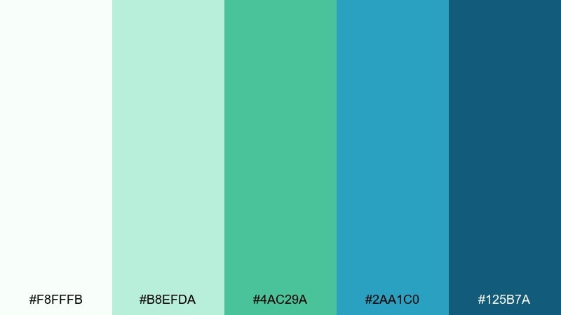
HEX: #f8fffb #b8efda #4ac29a #2aa1c0 #125b7a
Mood: playful, refreshing, bright
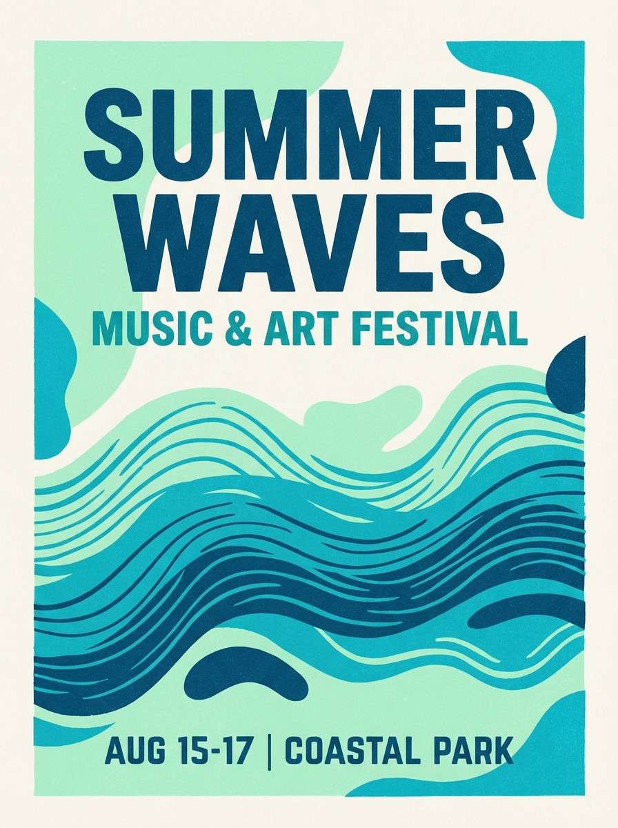
Best for: summer event poster
Sparkling aqua and pool-blue energy feels like a sunny afternoon with fresh-cut leaves nearby. It shines on posters where you want instant lift and easy readability from a distance. Pair with bold headlines and simple shapes to keep the message punchy. Usage tip: use the darker blue for the main title and keep the mint as large background blocks.
Image example of garden pool generated using media.io
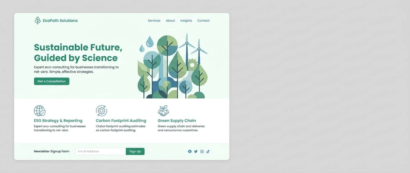
6) Spruce Sky
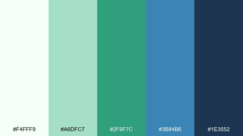
HEX: #f4fff9 #a6dfc7 #2f9f7c #3b84b6 #1e3552
Mood: grounded, clean, dependable
Best for: eco consulting website
Evergreen depth balanced with sky-blue clarity creates a trustworthy, nature-forward mood. It works well for service pages, case studies, and callout boxes where credibility is key. Pair it with natural photography and restrained iconography to avoid looking too techy. Usage tip: keep backgrounds pale and let the spruce green carry the brand accents.
Image example of spruce sky generated using media.io
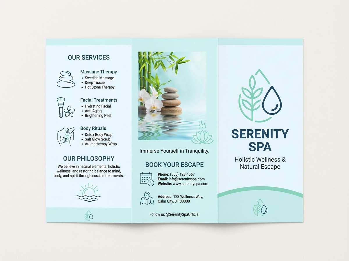
7) Misty Lagoon
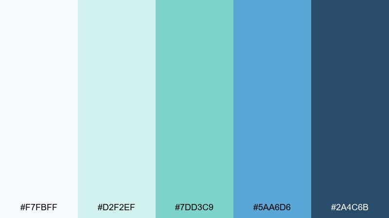
HEX: #f7fbff #d2f2ef #7dd3c9 #5aa6d6 #2a4c6b
Mood: soft, serene, airy
Best for: spa brochure layout
Foggy lagoon tones feel gentle and restorative, like warm steam against cool water. The palette is great for brochures and service menus that need calm hierarchy and plenty of breathing room. Pair with thin dividers, soft gradients, and light editorial photography. Usage tip: use the mid-teal for section headers and keep body text in the slate blue for comfort.
Image example of misty lagoon generated using media.io
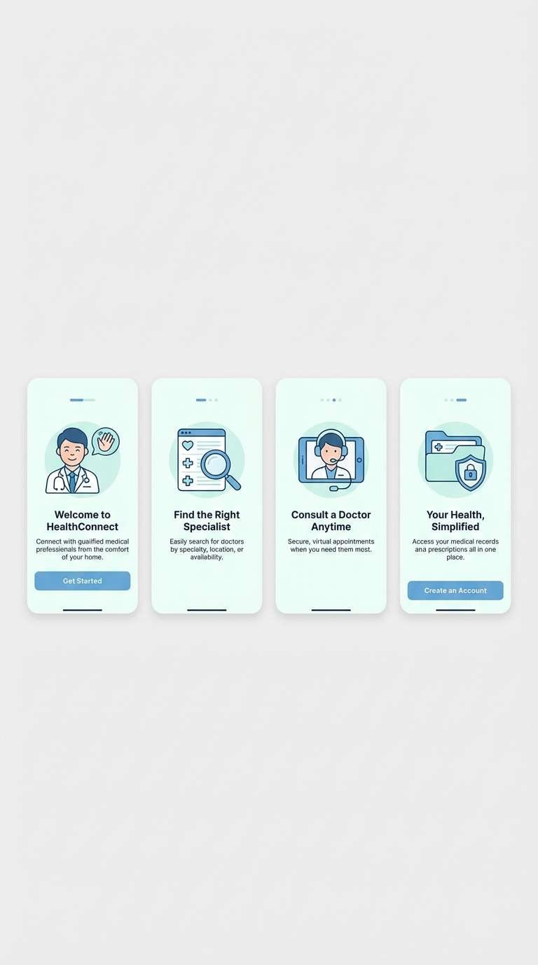
8) Modern Clinic
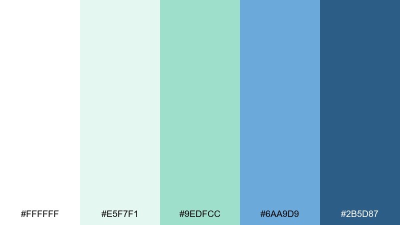
HEX: #ffffff #e5f7f1 #9edfcc #6aa9d9 #2b5d87
Mood: sterile, friendly, reassuring
Best for: telehealth app onboarding screens
Bright white and minty pastels feel clean without turning cold. The tones support onboarding flows, illustrations, and trust signals like badges and ratings. Pair with rounded illustrations and gentle shadows to keep it approachable. Usage tip: avoid using the darkest blue on large fills; keep it for buttons and key links.
Image example of modern clinic generated using media.io
9) Ocean Ceramic
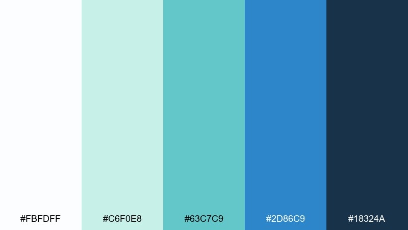
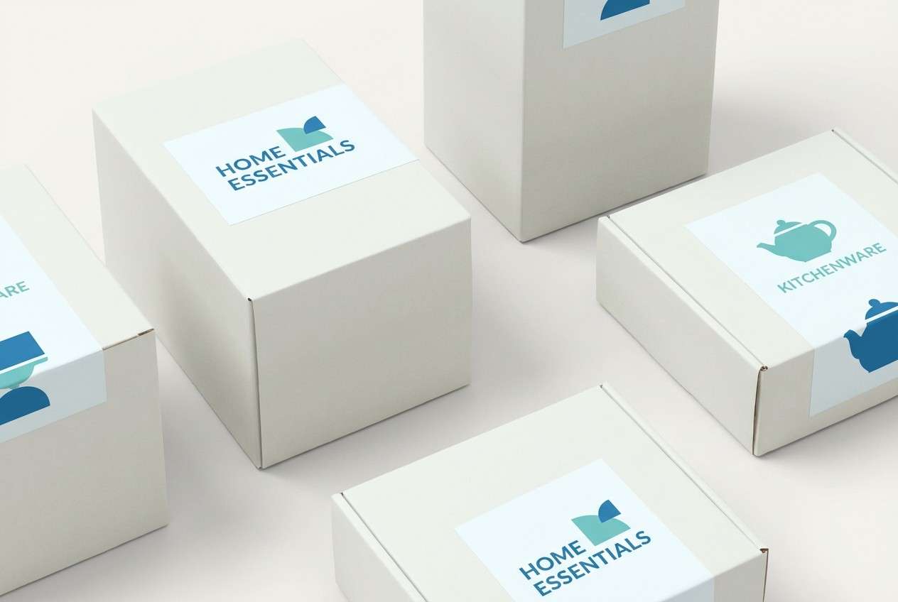
HEX: #fbfdff #c6f0e8 #63c7c9 #2d86c9 #18324a
Mood: polished, coastal, refined
Best for: home goods product packaging
Glossy sea tones and deep blue contrast feel like handcrafted ceramic glazed in ocean hues. This white green blue color palette suits premium labels, patterns, and brand marks for kitchen or bath goods. Pair it with a matte white box and minimal line art to keep it upscale. Usage tip: let the teal sit in small pattern repeats while the deep blue anchors the logo.
Image example of ocean ceramic generated using media.io
10) Fresh Tech
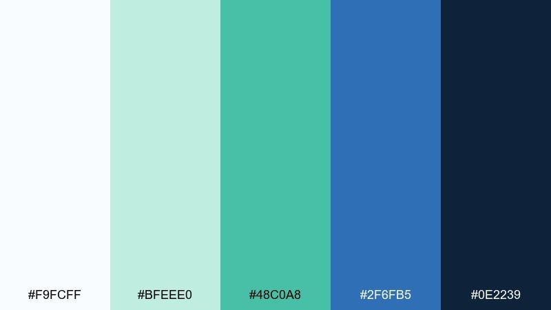
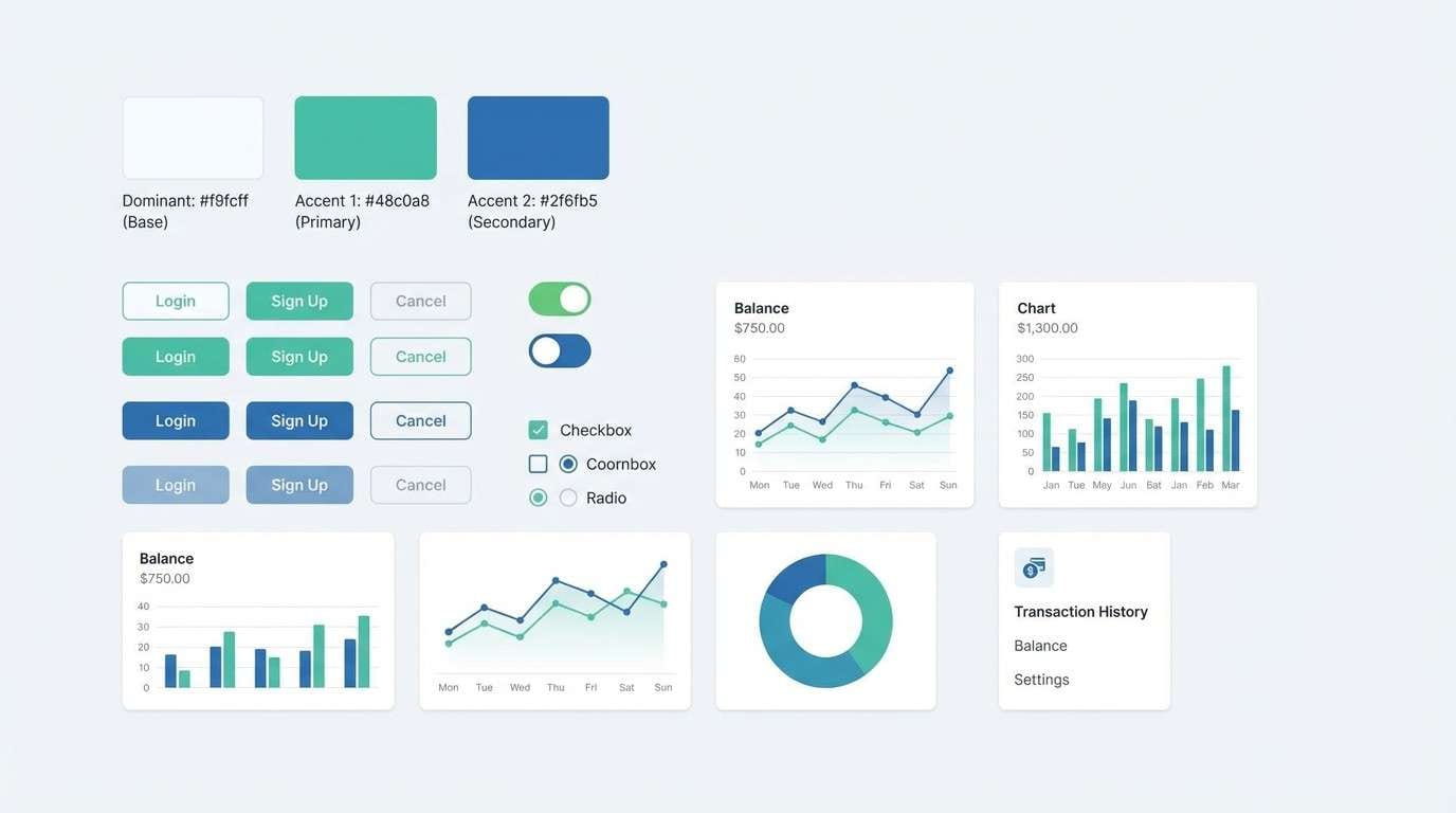
HEX: #f9fcff #bfeee0 #48c0a8 #2f6fb5 #0e2239
Mood: energetic, sleek, modern
Best for: fintech app UI kit
Bright mint paired with confident blue reads modern, fast, and reliable. It is a strong fit for UI kits with states, charts, and interactive components that need clear emphasis. Pair with a neutral gray scale and consistent spacing to keep screens from feeling busy. Usage tip: use the mint for success and positive trends, and reserve the navy for navigation and headers.
Image example of fresh tech generated using media.io
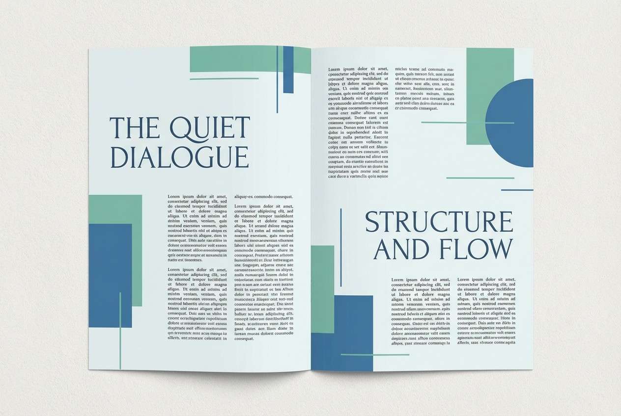
11) Rainy Conservatory
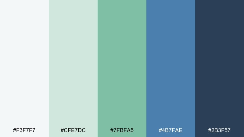
HEX: #f3f7f7 #cfe7dc #7fbfa5 #4b7fae #2b3f57
Mood: moody, natural, thoughtful
Best for: editorial magazine spread
Muted greens and stormy blue feel like glasshouse leaves on a rainy day. These tones work well in editorial layouts where imagery and typography need room to breathe. Pair with off-white margins, a classic serif for headlines, and subdued photo grading. Usage tip: keep the darker slate for captions and pull quotes to build quiet structure.
Image example of rainy conservatory generated using media.io
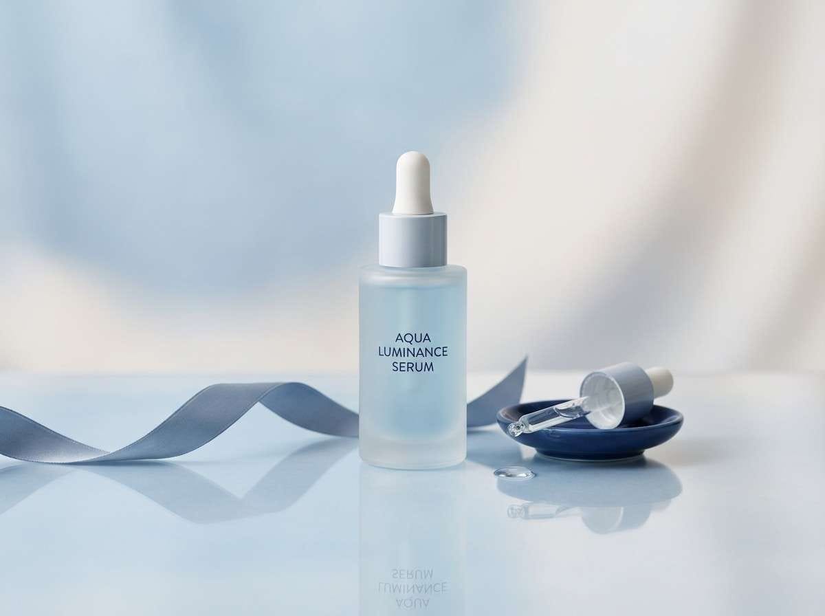
12) Nordic Spa
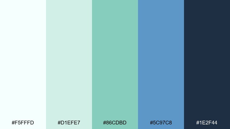
HEX: #f5fffd #d1efe7 #86cdbd #5c97c8 #1e2f44
Mood: minimal, soothing, premium
Best for: skincare product ad
Cool spa greens with soft blue feel minimalist and high-end, like a quiet Nordic retreat. The range is ideal for skincare ads where cleanliness and calm should dominate the frame. Pair it with frosted textures, simple sans typography, and subtle reflections. Usage tip: keep the background near-white and let one saturated accent carry the product name.
Image example of nordic spa generated using media.io
13) Blue Sprout
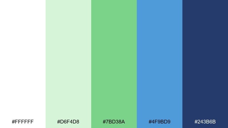
HEX: #ffffff #d6f4d8 #7bd38a #4f9bd9 #243b6b
Mood: cheerful, youthful, clean
Best for: kids learning app illustrations
Spring green pops against friendly blue, creating a bright and encouraging tone. It is a great match for learning apps that rely on icons, badges, and simple illustrations. Pair with rounded shapes and generous spacing to keep the interface playful but readable. Usage tip: use the sprout green for rewards and progress, and the deeper blue for navigation labels.
Image example of blue sprout generated using media.io
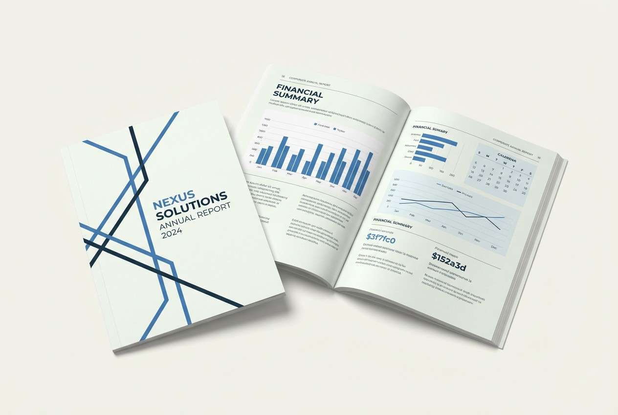
14) Harbor Green
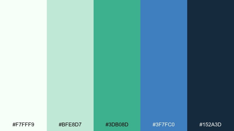
HEX: #f7fff9 #bfe8d7 #3db08d #3f7fc0 #152a3d
Mood: nautical, confident, structured
Best for: corporate annual report
Harbor blues and steady green bring a professional, maritime-inspired confidence. This white green blue color scheme works well for charts, section dividers, and cover elements where structure matters. Pair it with a crisp grid and a modern sans to keep it contemporary. Usage tip: use the darkest tone for text-heavy pages and keep teal for data highlights.
Image example of harbor green generated using media.io
15) Calm Classroom

HEX: #fcfffe #d9f3e7 #8dd2c3 #6a9fd0 #2b4a64
Mood: gentle, focused, friendly
Best for: education presentation template
Soft mint and calm blue feel organized and encouraging, like a bright classroom wall. The palette supports slides with lots of text, diagrams, and callouts without tiring the eyes. Pair with a legible sans font and simple two-tone icons for quick scanning. Usage tip: keep titles in the darker slate and use pastel fills only for highlight boxes.
Image example of calm classroom generated using media.io
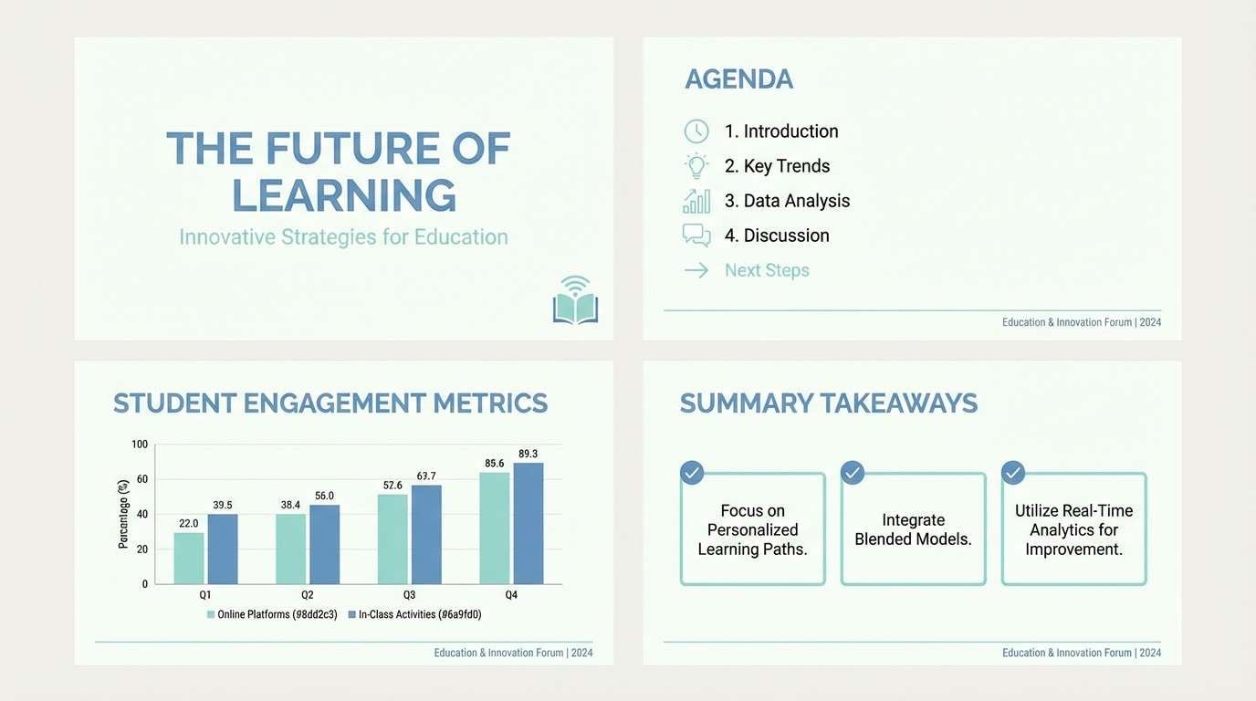
16) Marine Meadow
HEX: #f8fbf7 #bdebd8 #5fc7a7 #2e90c4 #164260
Mood: fresh, vibrant, balanced
Best for: restaurant menu design
Bright meadow green and marine blue feel crisp, appetizing, and modern. It is a smart fit for menus that want a fresh, healthy signal without leaning overly rustic. Pair it with clean food photography and simple category chips for quick navigation. Usage tip: use the green for section headers and the deep blue for prices and key details.
Image example of marine meadow generated using media.io
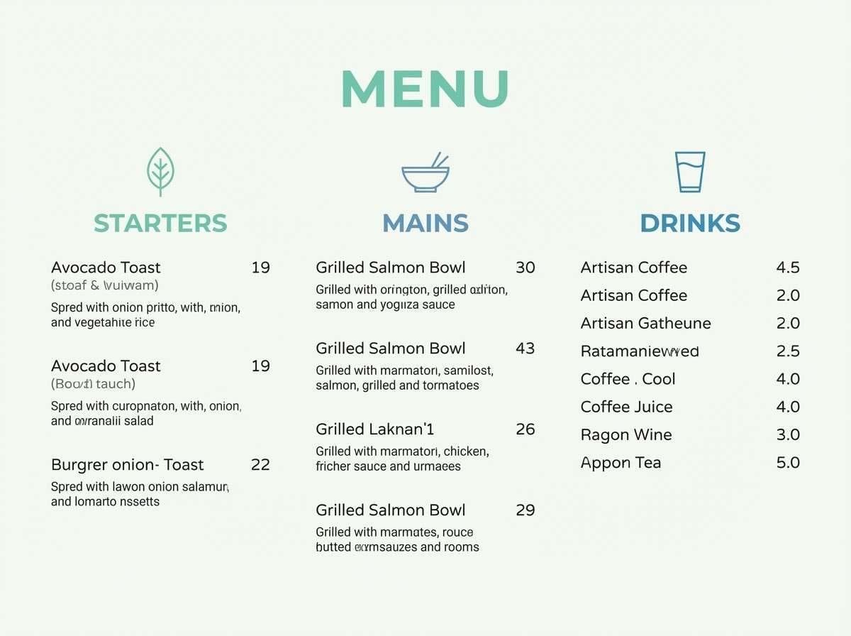
17) Winter Botanical
HEX: #f2fff7 #c9f2e1 #74bfa6 #5a8cc8 #22324e
Mood: cool, botanical, elegant
Best for: watercolor botanical wall art
Chilled greens and gentle blue feel like winter leaves and pale sky. These tones are perfect for botanical art where you want softness with a hint of depth. Pair with textured watercolor paper effects and fine ink outlines for definition. Usage tip: keep the darkest shade to a minimum so the artwork stays airy.
Image example of winter botanical generated using media.io
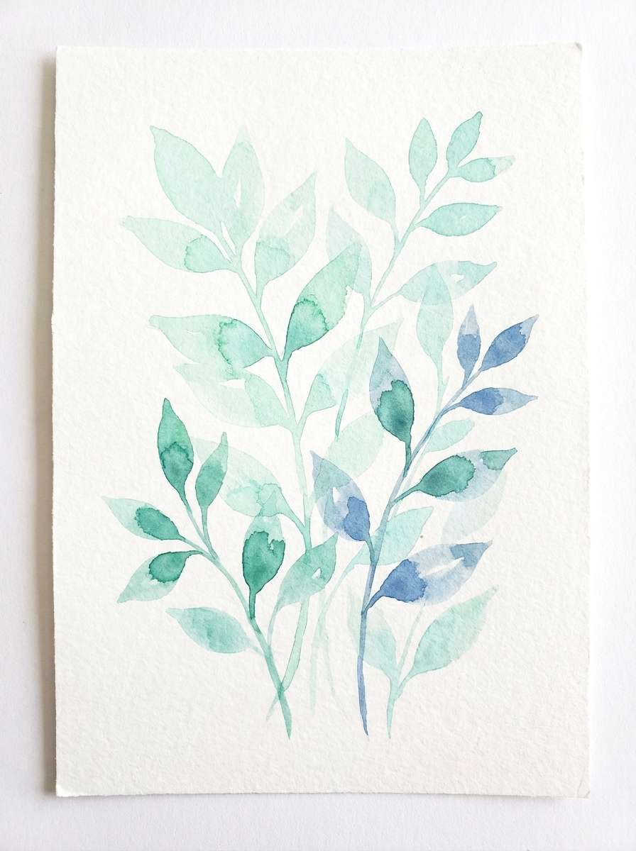
18) Aqua Draft
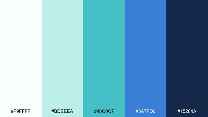
HEX: #f9ffff #bdeeea #46c0c7 #3a7fd6 #15284a
Mood: technical, bright, precise
Best for: data visualization dashboard
Clean aqua and blueprint blue feel precise, like a fresh technical drawing. These white green blue color combinations help charts look modern while keeping backgrounds light and readable. Pair with thin gridlines and consistent color mapping for series and categories. Usage tip: assign teal to primary data and use the darker navy only for axes, labels, and selected points.
Image example of aqua draft generated using media.io
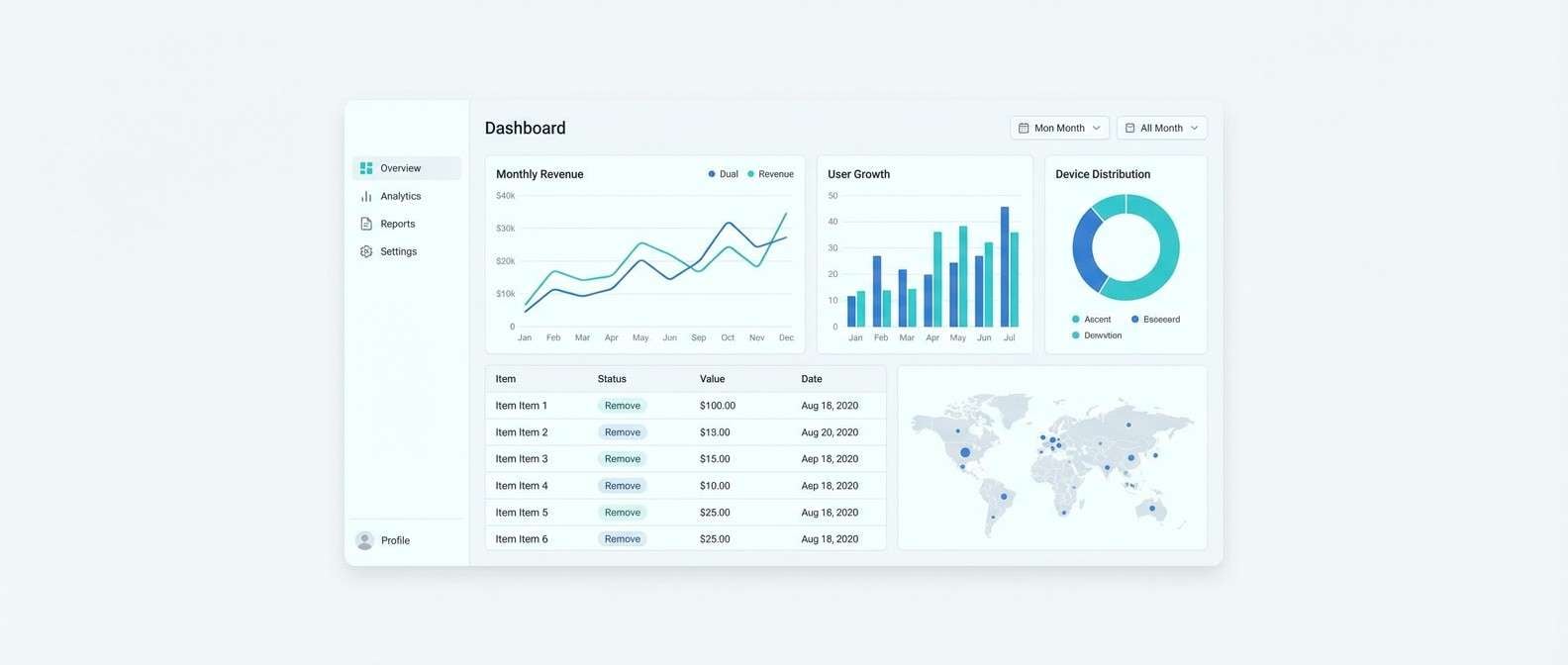
19) Soft Sportswear
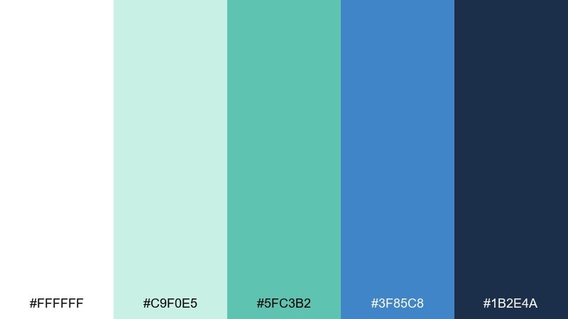
HEX: #ffffff #c9f0e5 #5fc3b2 #3f85c8 #1b2e4a
Mood: active, clean, upbeat
Best for: fitness brand social ad
Fresh mint and strong blue create a sporty, breathable energy that still feels polished. It is ideal for social ads where bold type and quick calls to action need high contrast. Pair with dynamic geometric blocks and minimal product silhouettes for a modern athletic look. Usage tip: keep backgrounds white and let the saturated blue carry the headline for instant scroll-stopping clarity.
Image example of soft sportswear generated using media.io

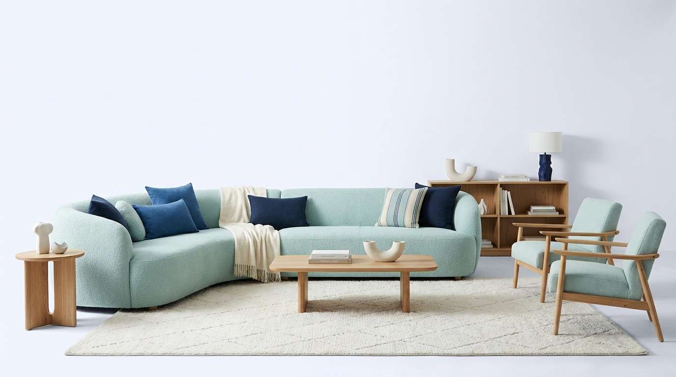
20) Cloudy Fjord
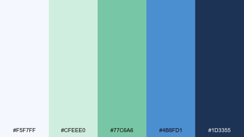
HEX: #f5f7ff #cfeee0 #77c6a6 #4b8fd1 #1d3355
Mood: cool, spacious, contemporary
Best for: modern living room interior styling
Cloudy whites and fjord blues feel spacious and quietly modern, like coastal architecture under soft light. This white green blue color palette works best with light woods, brushed metal, and simple textiles for a clean interior story. Pair it with warm neutrals such as oat or sand to prevent the room from skewing too cold. Usage tip: repeat the green in small decor pieces and keep larger surfaces in the lightest tones.
Image example of cloudy fjord generated using media.io
What Colors Go Well with White Green Blue?
Warm neutrals like sand, oat, beige, and light taupe pair beautifully with white green blue and keep the overall look from feeling too cold. They’re especially helpful in interiors, packaging, and lifestyle branding.
For contrast, try deep charcoal, ink, or espresso-brown in small doses for typography and outlines. If you want a pop accent, coral, apricot, or soft yellow can add energy without fighting the palette’s calm.
Metallics also work well: brushed silver pushes a clinical/tech vibe, while warm brass adds premium softness—great for spa or home goods designs.
How to Use a White Green Blue Color Palette in Real Designs
Start with white or near-white as your main background, then use pale green/blue tints for panels, cards, and sections. This creates gentle separation without heavy borders and helps your UI or layout feel open.
Assign roles to your mid and deep tones: one mid tone for primary accents (links, icons, charts), and the darkest blue for headings, navigation, and CTAs to protect readability. Keeping the darkest shade limited prevents the design from turning overly corporate.
In print or decor, repeat the green in small elements (patterns, plants, textiles) and use blue as the anchor color (frames, headings, key shapes). The repetition makes the scheme feel intentional rather than randomly “coastal.”
Create White Green Blue Palette Visuals with AI
If you already have HEX codes, you can turn them into consistent ad creatives, UI mockups, posters, and product shots by describing the scene and specifying your colors as “dominant” and “accent” tones.
To get cleaner results, keep prompts concrete (style + subject + background + typography notes) and limit to one main focal point. Reuse the prompts above as templates and swap the HEX values to match your brand.
Media.io makes it easy to generate and iterate visuals quickly, so you can test multiple white green blue color combinations before committing to a final direction.
White Green Blue Color Palette FAQs
-
What vibe does a white green blue color scheme create?
It usually feels clean, calm, and trustworthy. White adds space, green suggests freshness and wellness, and blue signals stability—popular for health, SaaS, finance, and eco brands. -
Which color should be the primary: green or blue?
For most interfaces, make blue the primary (buttons, links, key states) and use green as a secondary accent (success, highlights). For wellness or eco branding, you can flip that and let green lead while blue supports structure. -
How do I keep white green blue from looking too “clinical”?
Add a warm neutral (beige, sand, oat) and soften contrast with slightly off-white backgrounds. Rounded corners, friendly typography, and natural imagery also help prevent a hospital-like feel. -
What are the best text colors on pale mint backgrounds?
Use deep navy, slate, or charcoal for body text to maintain accessibility. Avoid mid blues/teals for long paragraphs; save them for short labels, icons, or small UI accents. -
Does white green blue work for logos?
Yes—especially for modern, outdoorsy, health, and tech identities. To improve versatility, design the mark to still work in one color (navy or charcoal) and use mint/teal as optional brand accents. -
What accent colors pop with white green blue palettes?
Coral, peach, soft yellow, or warm terracotta can add contrast and energy while staying balanced. Use accents sparingly—think badges, small buttons, or key highlights—so the calm base remains dominant. -
How can I generate matching visuals for my palette?
Use a text-to-image tool and include your HEX codes in the prompt as dominant and accent colors. Start from the sample prompts above, then iterate by changing the subject (UI, poster, packaging) while keeping your color instructions consistent.
Next: Pale Green Color Palette


