

Pale green is one of the easiest colors to live with: it feels fresh, natural, and quietly optimistic without demanding attention. Whether you’re building a brand, a UI, or a room, it brings calm structure and soft personality.
Below are 20 pale green color combinations with HEX codes, plus practical tips for pairing, contrast, and real-world use—so you can move from “pretty” to “polished” fast.
In this article
Why Pale Green Color Combinations Work So Well
Pale green sits in a sweet spot between “color” and “neutral.” It carries a clear nature association (plants, freshness, renewal) while still behaving gently enough to support typography, photography, and product details.
Because it’s soft, pale green reduces visual fatigue—especially in interfaces and long-form layouts. It also adapts to different aesthetics: pair it with warm creams for cozy, slate greens for premium minimalism, or brighter limes for energetic campaigns.
Most importantly, pale green makes it easier to build a usable hierarchy. With the right dark anchor shade, you can keep contrast strong for accessibility while letting lighter tints create calm space.
20+ Pale Green Color Palette Ideas (with HEX Codes)
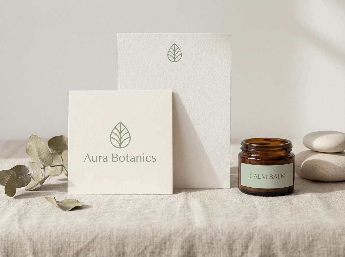
1) Sage Mist
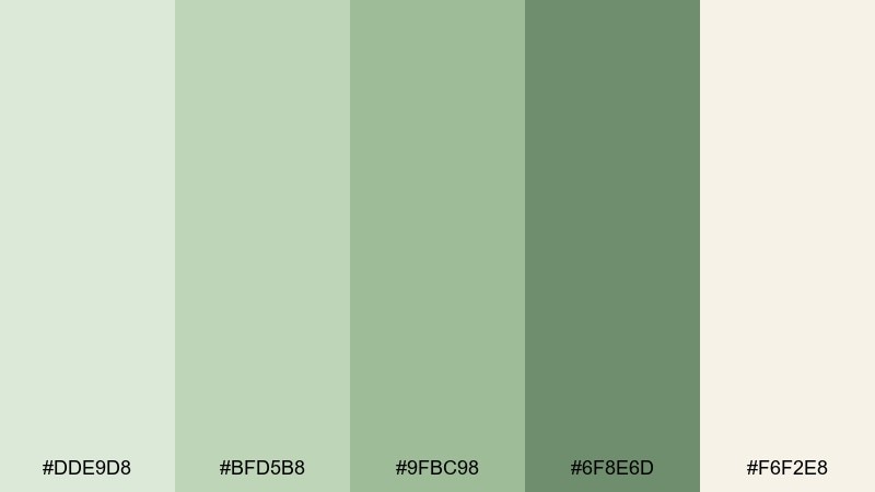
HEX: #DDE9D8 #BFD5B8 #9FBC98 #6F8E6D #F6F2E8
Mood: calm, airy, grounded
Best for: wellness brand identity
Calm and dewy like an early garden walk, these sage tones feel clean without going sterile. Use the deeper green as your anchor for logos and headings, then let the soft tints carry backgrounds and whitespace. Pair it with warm off-white and natural paper textures to keep the look organic. Tip: keep contrast high by reserving the darkest green for key text and buttons.
Image example of sage mist generated using media.io
Media.io is an online AI studio for creating and editing video, image, and audio in your browser.

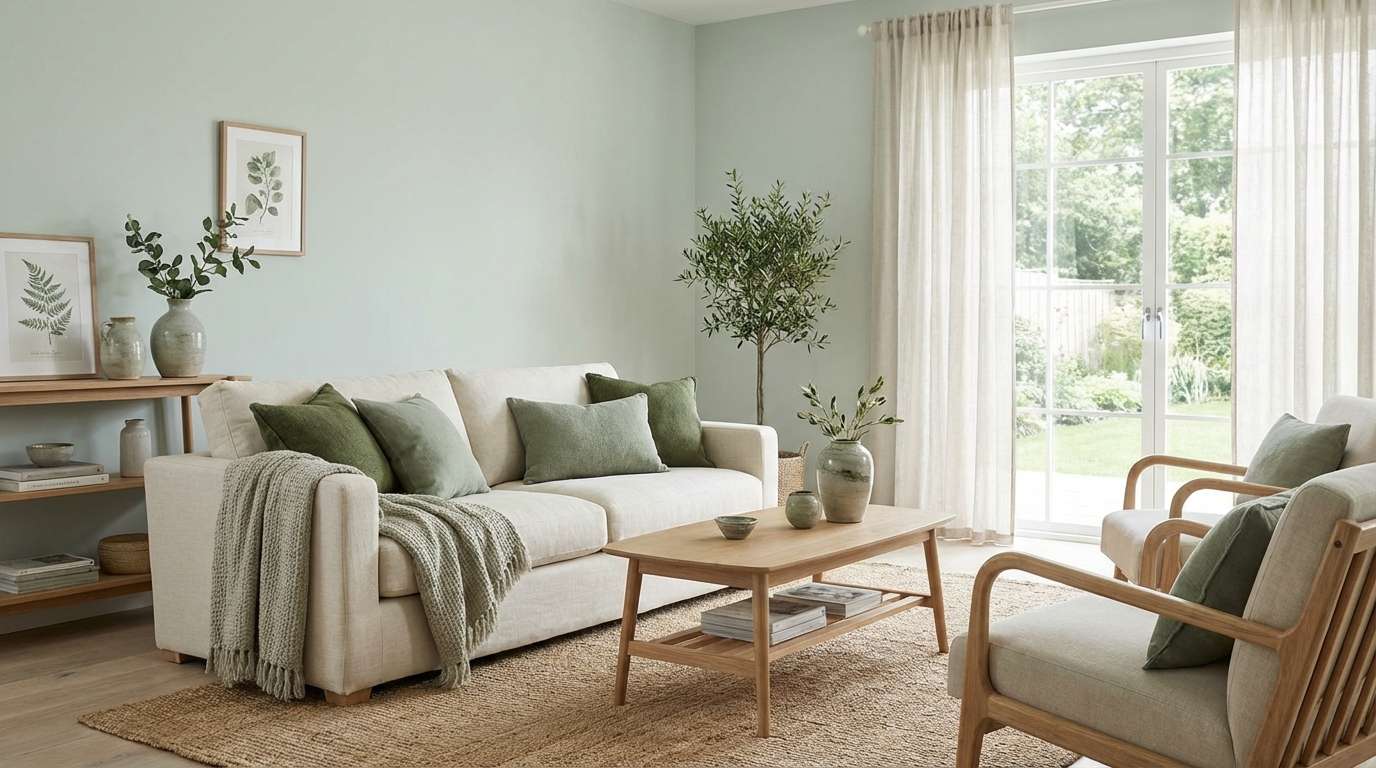
2) Celadon Cream
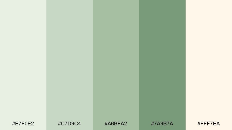
HEX: #E7F0E2 #C7D9C4 #A6BFA2 #7A9B7A #FFF7EA
Mood: soft, cozy, refined
Best for: scandinavian living room interior
Soft and creamy like sunlit linen, this mix reads gentle, tidy, and lived-in. Build walls and large surfaces with the palest celadon, then bring in mid greens through textiles or cabinetry. Creamy highlights keep it from feeling cold, especially with oak or birch woods. Tip: repeat the darkest green in two small accents (like frames and a vase) for balance.
Image example of celadon cream generated using media.io
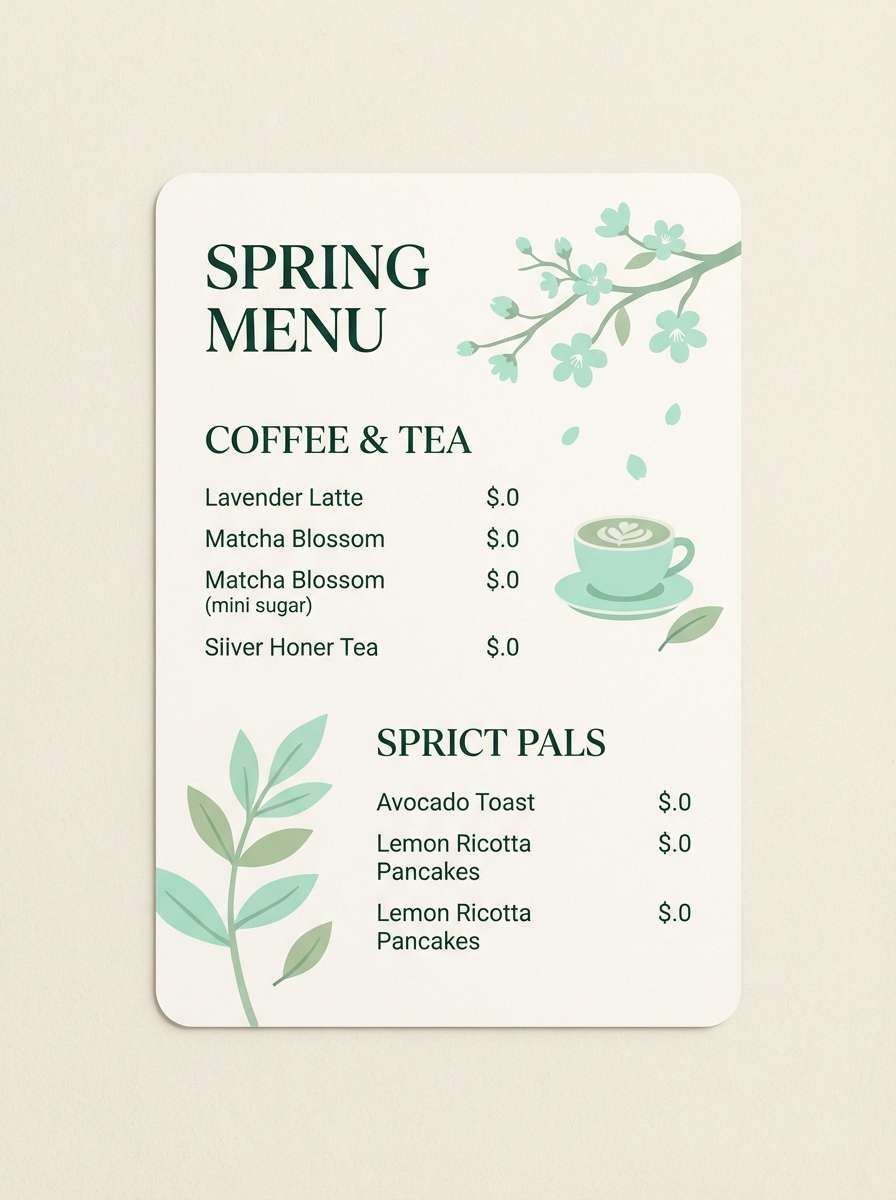
3) Mint Tea Break
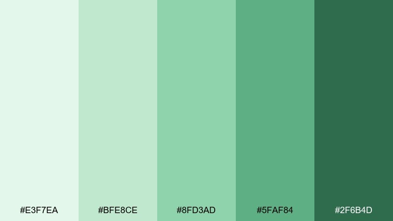
HEX: #E3F7EA #BFE8CE #8FD3AD #5FAF84 #2F6B4D
Mood: fresh, uplifting, breezy
Best for: spring cafe menu design
Fresh and sparkling like iced mint tea, these greens feel friendly and light on the eyes. Use the bright mint as the hero for headers and icons, then support it with the deeper greens for legible type. A pale background keeps layouts airy while still feeling seasonal. Tip: add plenty of spacing and thin rules to emphasize the crisp vibe.
Image example of mint tea break generated using media.io
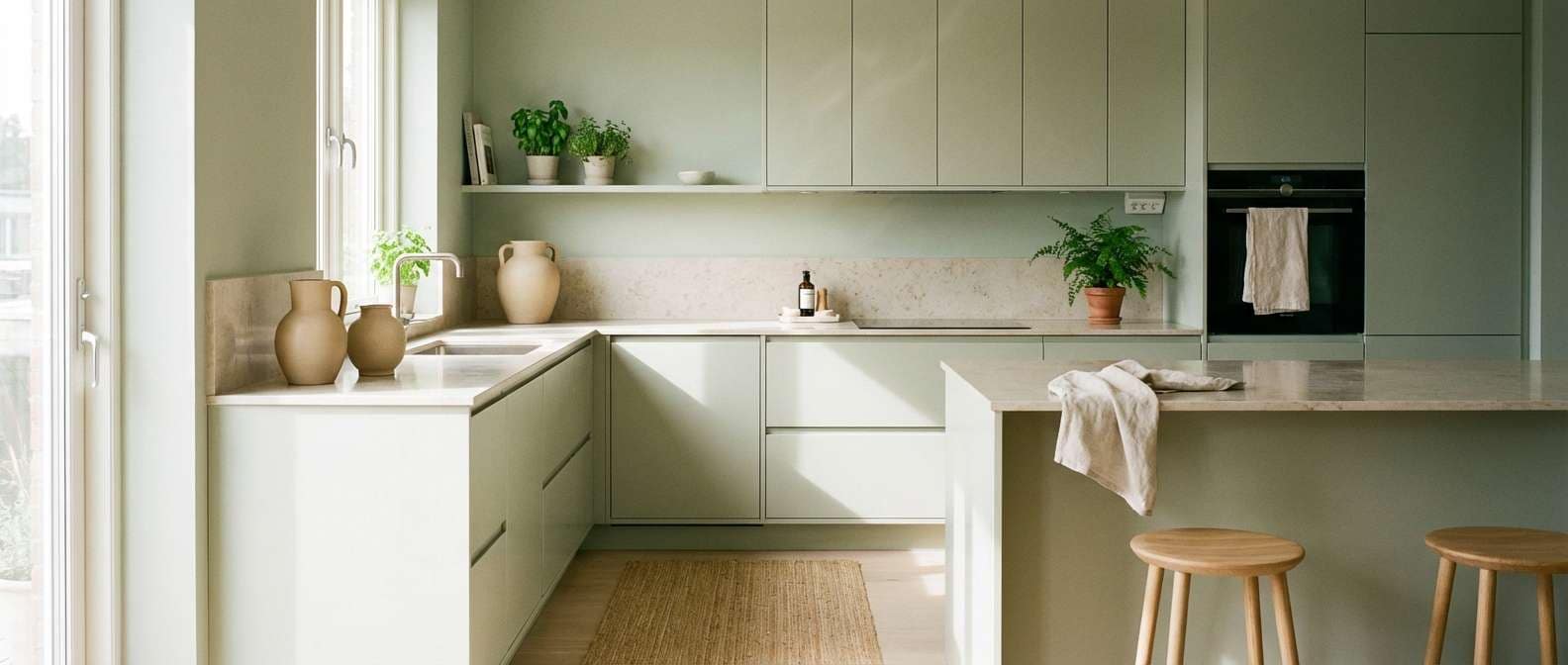
4) Garden Linen
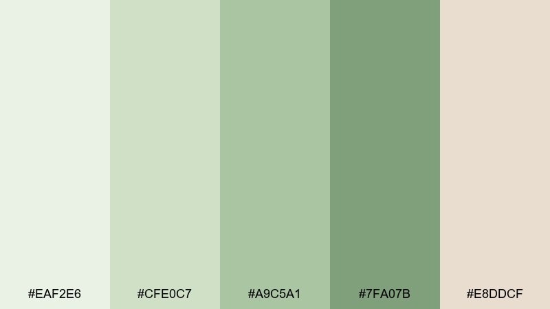
HEX: #EAF2E6 #CFE0C7 #A9C5A1 #7FA07B #E8DDCF
Mood: natural, tidy, comforting
Best for: minimalist kitchen makeover
Natural and neat like folded linen beside fresh herbs, this set feels quietly welcoming. Let the pale greens cover large areas such as paint or tile, and use the warmer beige as a soft counterpoint. It works beautifully with matte black hardware or brushed steel. Tip: keep the deepest green for a single focal element like lower cabinets or a pantry door.
Image example of garden linen generated using media.io
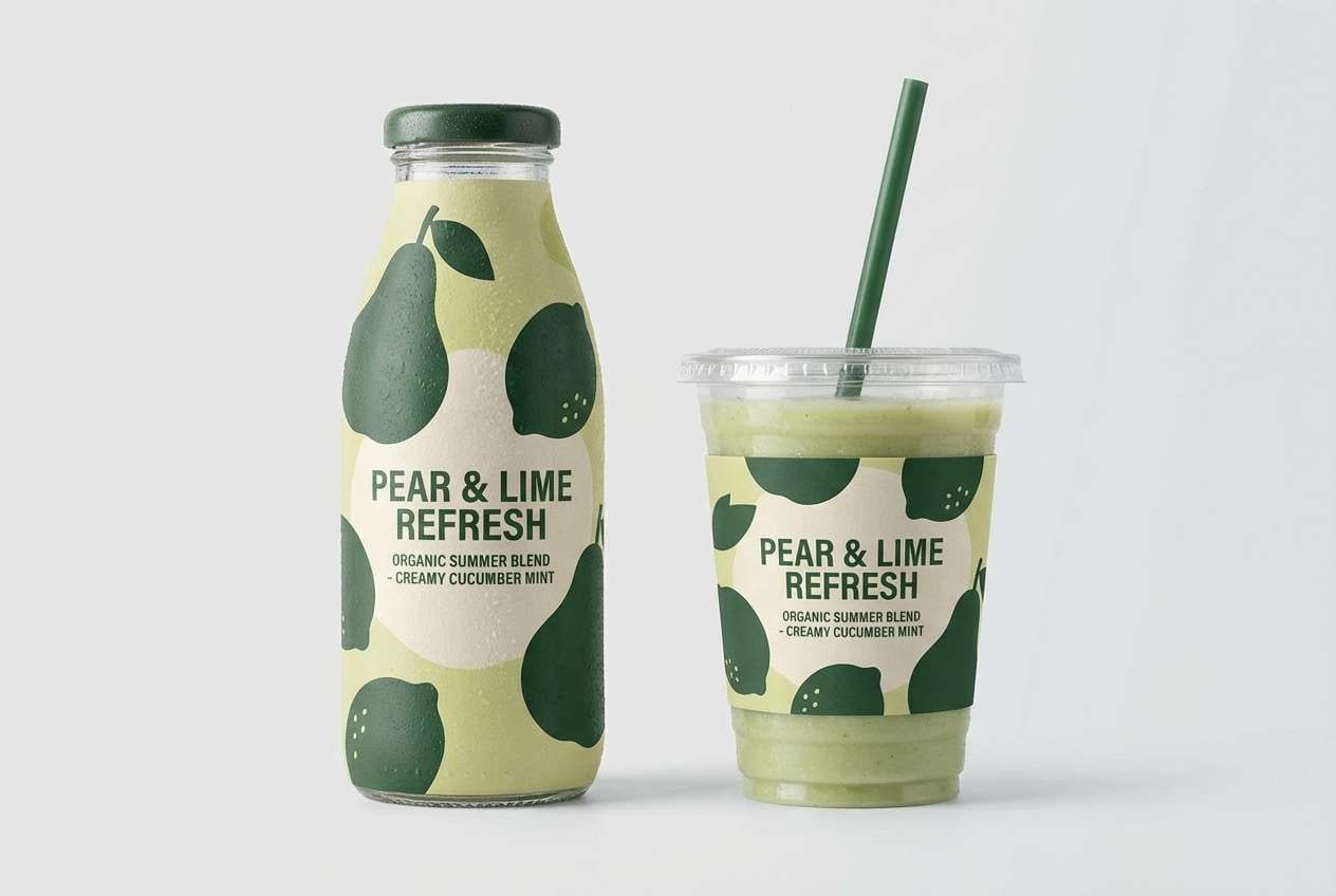
5) Pear Sorbet
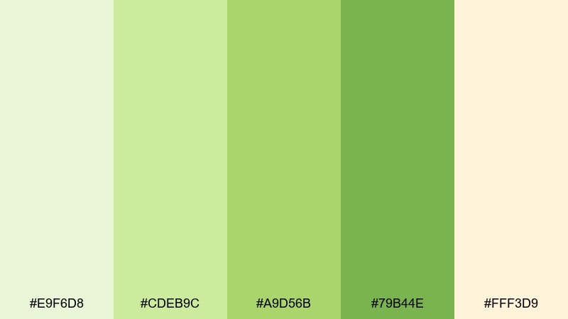
HEX: #E9F6D8 #CDEB9C #A9D56B #79B44E #FFF3D9
Mood: playful, sunny, juicy
Best for: summer smoothie packaging
Playful and juicy like pear sorbet, these bright greens bring a cheerful pop without going neon. Use the yellow-green as a highlight for flavor badges, then ground the layout with the darker leaf tone for text. The creamy light shade keeps the overall look approachable and clean. Tip: keep gradients subtle so the packaging stays modern and readable from a distance.
Image example of pear sorbet generated using media.io
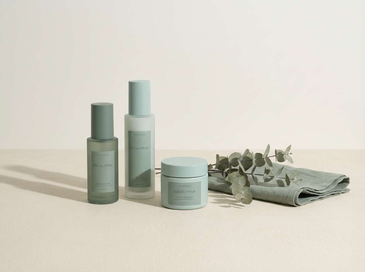
6) Eucalyptus Stone
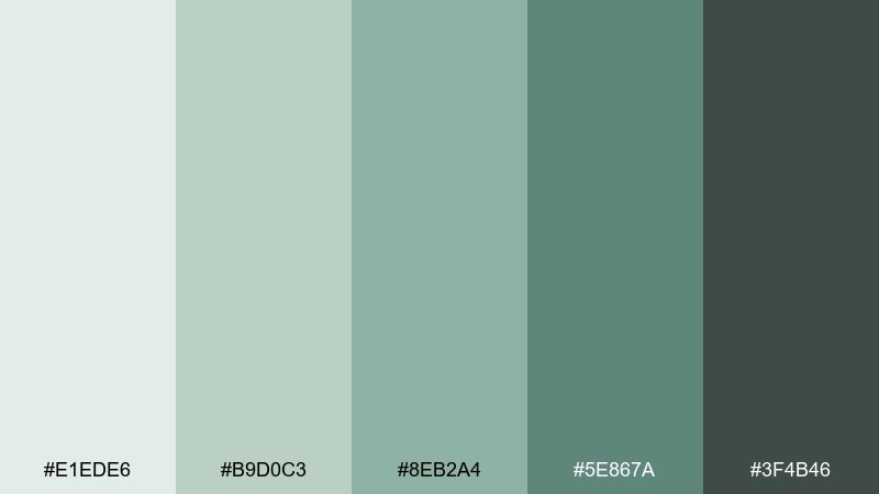
HEX: #E1EDE6 #B9D0C3 #8EB2A4 #5E867A #3F4B46
Mood: spa-like, muted, earthy
Best for: skincare product ad
Spa-like and grounded, these eucalyptus tones feel like smooth stones and steamed towels. Let the pale tint set a calm field, then bring in the slate green for product names and key claims. It pairs well with matte textures, concrete, and soft shadows for a premium look. Tip: use the dark charcoal-green sparingly to avoid making the ad feel heavy.
Image example of eucalyptus stone generated using media.io
7) Pistachio Clay
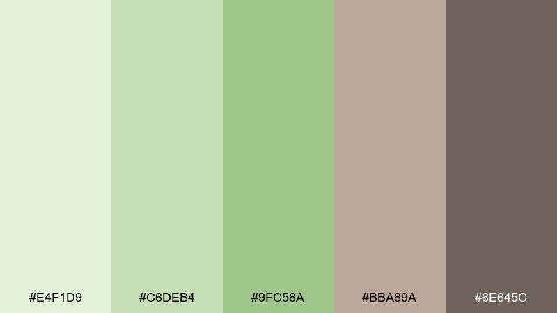
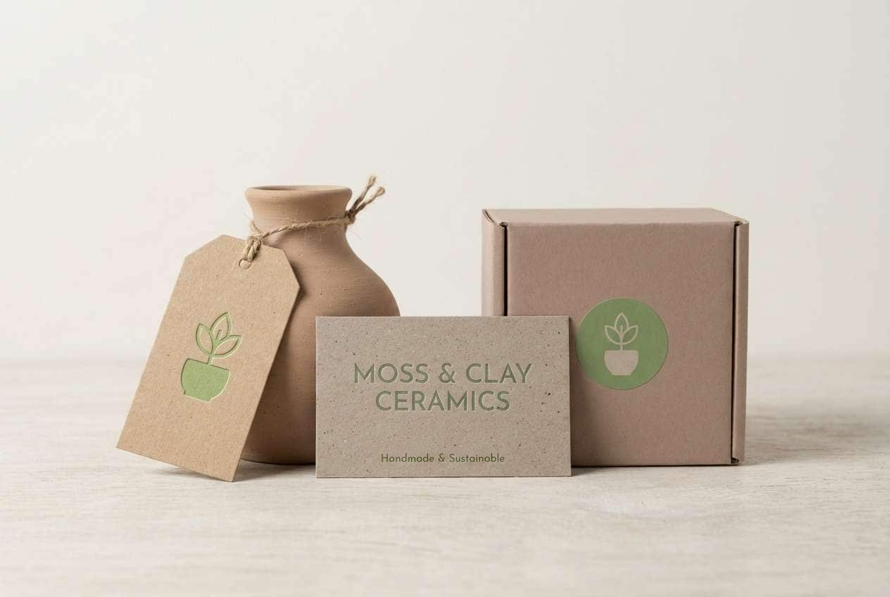
HEX: #E4F1D9 #C6DEB4 #9FC58A #BBA89A #6E645C
Mood: warm, rustic, modern
Best for: ceramic studio branding
Warm and tactile like pistachio glaze on handmade clay, this mix feels artisan and current. Keep the greens as your primary brand tones, then use the clay neutrals for backgrounds and packaging bases. The softer brown-gray is great for body text and pattern outlines. Tip: combine the mid green with uncoated paper to emphasize the handcrafted story.
Image example of pistachio clay generated using media.io
8) Fern and Fog
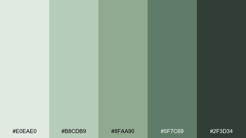
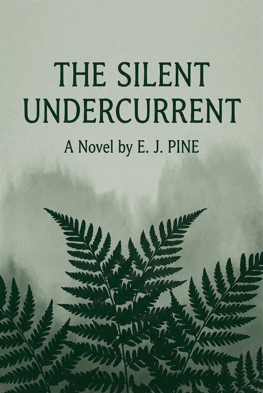
HEX: #E0EAE0 #B8CDB9 #8FAA90 #5F7C69 #2F3D34
Mood: moody, quiet, forested
Best for: book cover design
Moody and hushed like fog drifting through ferns, these greens feel literary and immersive. Use the foggy light green for negative space and title framing, then set the mood with deep forest accents. It pairs nicely with serif typography and subtle grain. Tip: keep imagery low-contrast so the palette remains the main emotional cue.
Image example of fern and fog generated using media.io
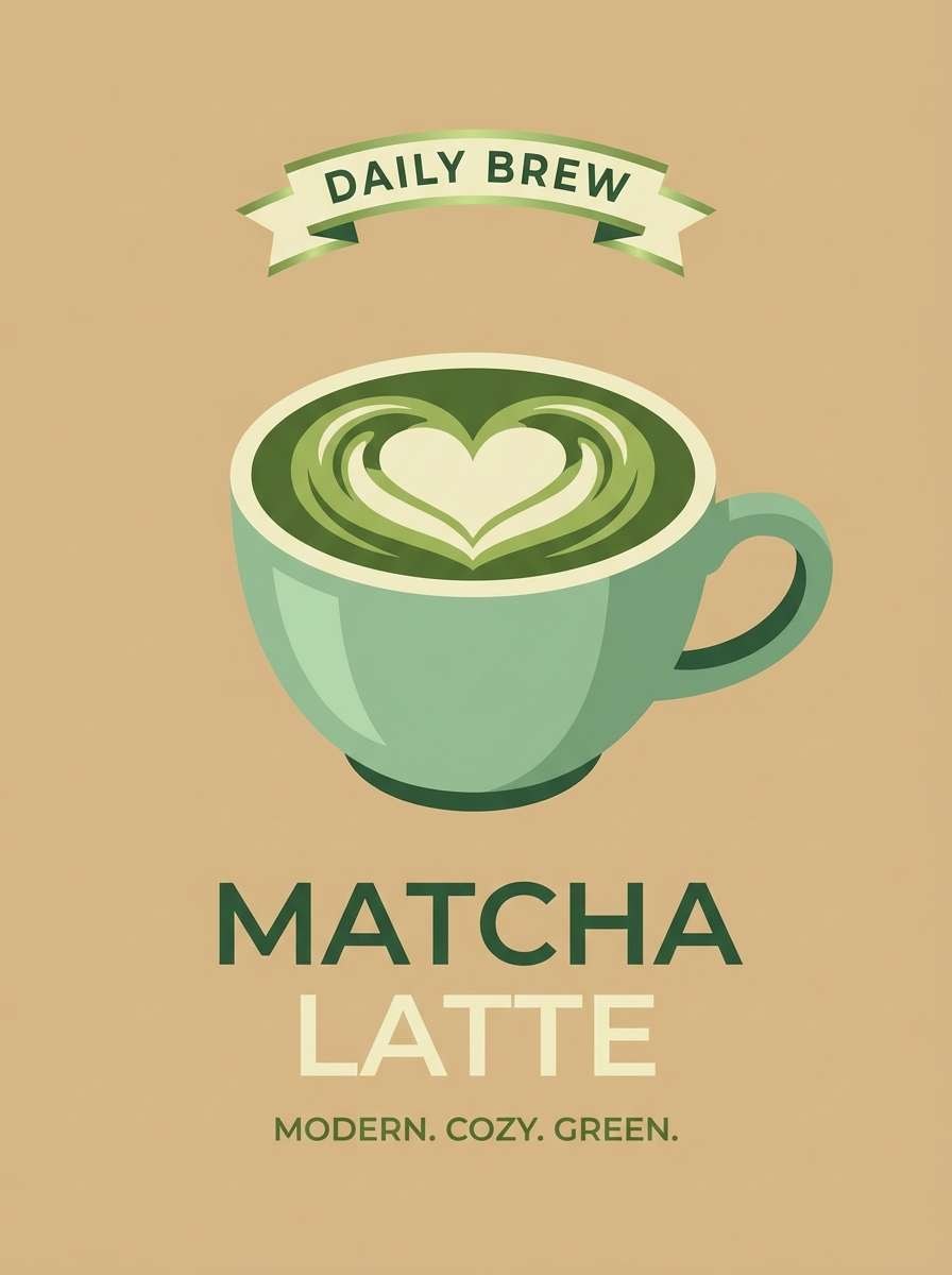
9) Matcha Latte
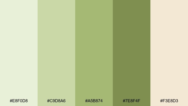
HEX: #E8F0D8 #C9D8A6 #A5B874 #7E8F4F #F3E8D3
Mood: cozy, organic, balanced
Best for: coffee shop poster
Cozy and balanced like a matcha latte, these tones feel nourishing and easygoing. Use the creamy beige as a base so the greens read softer and more natural. The olive tones are strong enough for headlines and pricing without shouting. Tip: add one simple line illustration to keep the poster charming rather than busy.
Image example of matcha latte generated using media.io
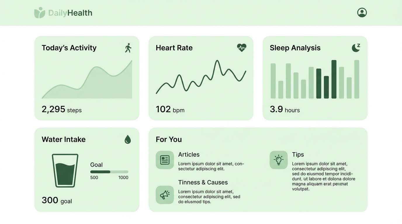
10) Soft Meadow UI
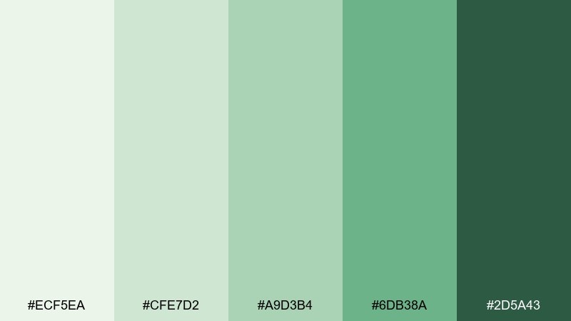
HEX: #ECF5EA #CFE7D2 #A9D3B4 #6DB38A #2D5A43
Mood: friendly, clear, modern
Best for: health app dashboard UI
Friendly and clear like a sunlit meadow, these greens keep screens feeling calm during daily check-ins. This pale green color scheme works best with lots of whitespace and a single strong accent for primary actions. Use the darkest green for text and navigation to maintain accessibility. Tip: reserve the brighter green for success states and progress indicators to avoid visual fatigue.
Image example of soft meadow ui generated using media.io
11) Sea Glass Minimal
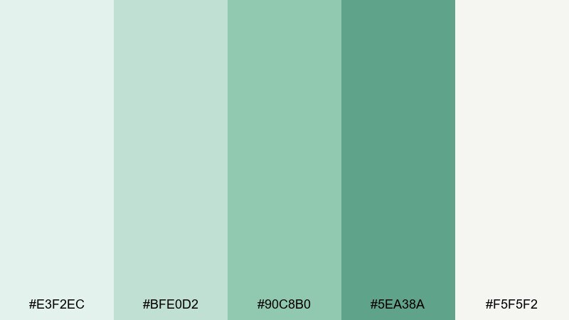
HEX: #E3F2EC #BFE0D2 #90C8B0 #5EA38A #F5F5F2
Mood: clean, coastal, minimal
Best for: landing page hero section
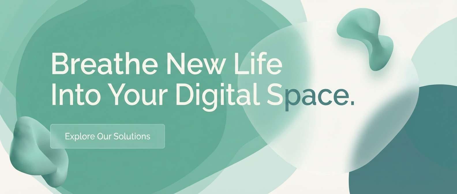
Clean and coastal like sea glass, this mix feels modern, light, and breathable. Use the near-white as the main canvas, then layer soft aquagreen blocks for sections and cards. The darker teal-green is ideal for CTAs and link states without turning harsh. Tip: keep shadows subtle and rounded corners consistent for a polished, minimal finish.
Image example of sea glass minimal generated using media.io
12) Aloe and Ivory
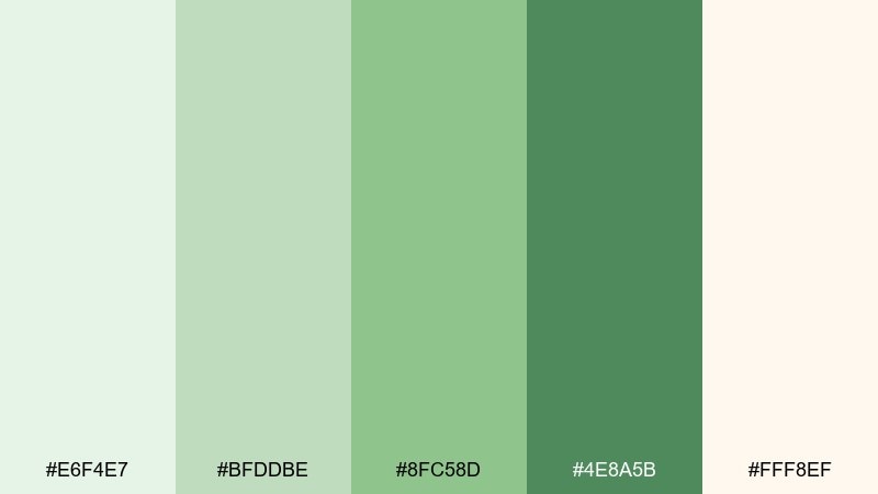
HEX: #E6F4E7 #BFDDBE #8FC58D #4E8A5B #FFF8EF
Mood: gentle, soothing, natural
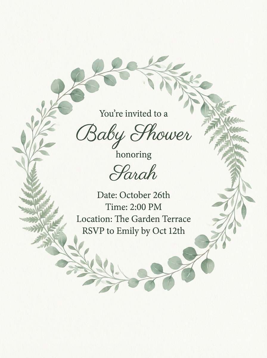
Best for: baby shower invitation
Gentle and soothing like aloe gel on warm skin, these tones feel tender and welcoming. The ivory base keeps text readable and adds a soft, celebratory glow. Use the mid green for borders, icons, or a small wreath motif, and keep the darker green for names and dates. Tip: choose a rounded serif or handwritten script and limit decorative elements to one corner.
Image example of aloe and ivory generated using media.io
13) Spring Paper
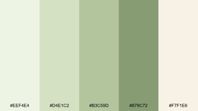
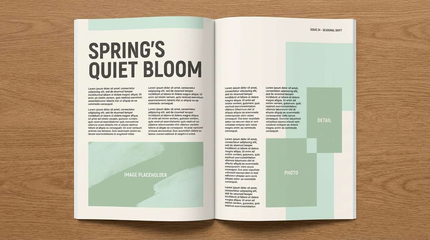
HEX: #EEF4E4 #D4E1C2 #B3C59D #879C72 #F7F1E6
Mood: fresh, light, editorial
Best for: magazine feature layout
Fresh and papery like a new seasonal issue, these colors feel clean, editorial, and calm. Use the lightest tones as margins and column backgrounds, and pull in the muted greens for pull quotes and section labels. It pairs beautifully with black typography and subtle photo borders. Tip: keep accent usage consistent across spreads so the layout feels intentional.
Image example of spring paper generated using media.io
14) Orchid Leaf
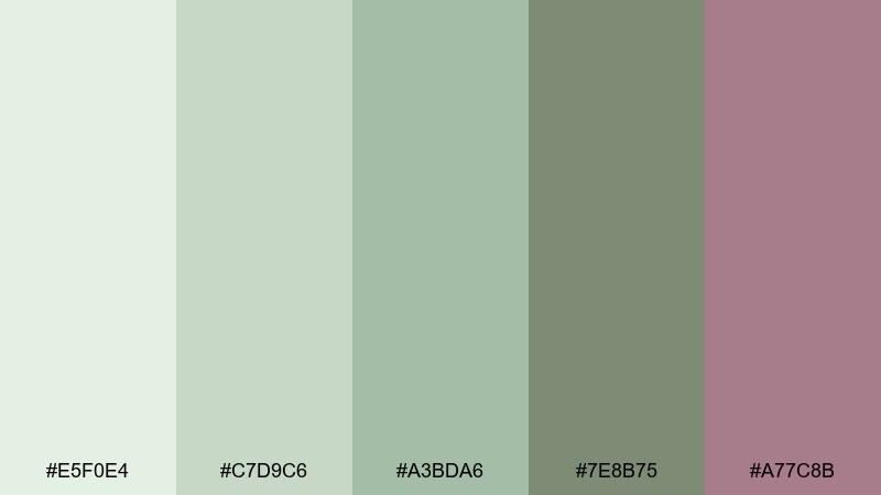
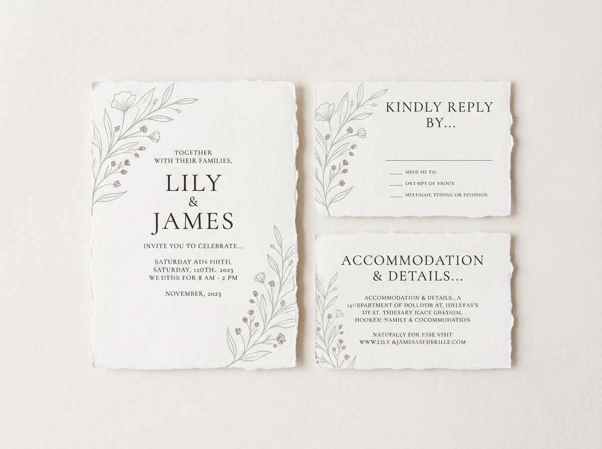
HEX: #E5F0E4 #C7D9C6 #A3BDA6 #7E8B75 #A77C8B
Mood: soft, romantic, modern
Best for: wedding stationery suite
Soft and romantic like orchid petals against leafy greens, this mix feels elegant without being sugary. These pale green color combinations shine when the mauve is used as a tiny accent for monograms, wax seal graphics, or RSVP highlights. Keep the greens as the main structure for borders and headings, and let plenty of off-white breathe. Tip: avoid large mauve blocks and use it like jewelry, not fabric.
Image example of orchid leaf generated using media.io
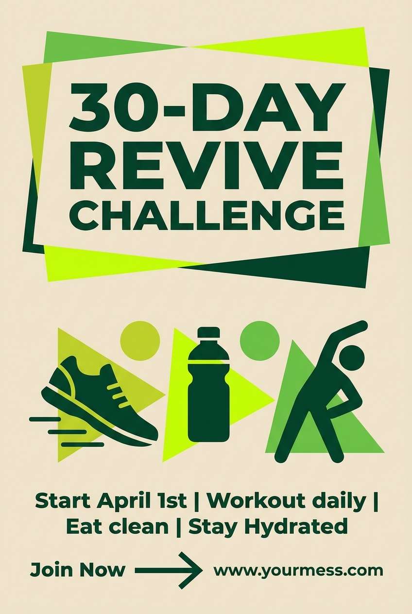
15) Citrus Grove
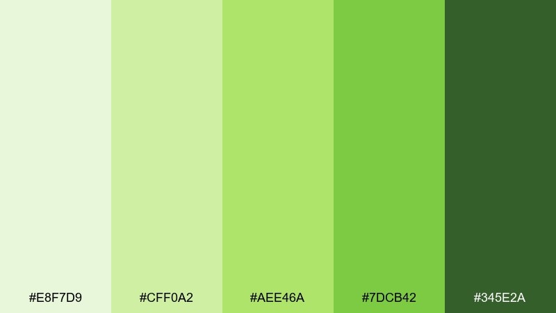
HEX: #E8F7D9 #CFF0A2 #AEE46A #7DCB42 #345E2A
Mood: energetic, zesty, bright
Best for: fitness challenge poster
Energetic and zesty like a citrus grove at noon, these greens feel bold yet still natural. Use the brightest lime as the headline driver, with the dark green for strong contrast in dates and rules. Keep backgrounds pale so the poster stays readable from afar. Tip: stick to big shapes and simple icons so the color does the heavy lifting.
Image example of citrus grove generated using media.io
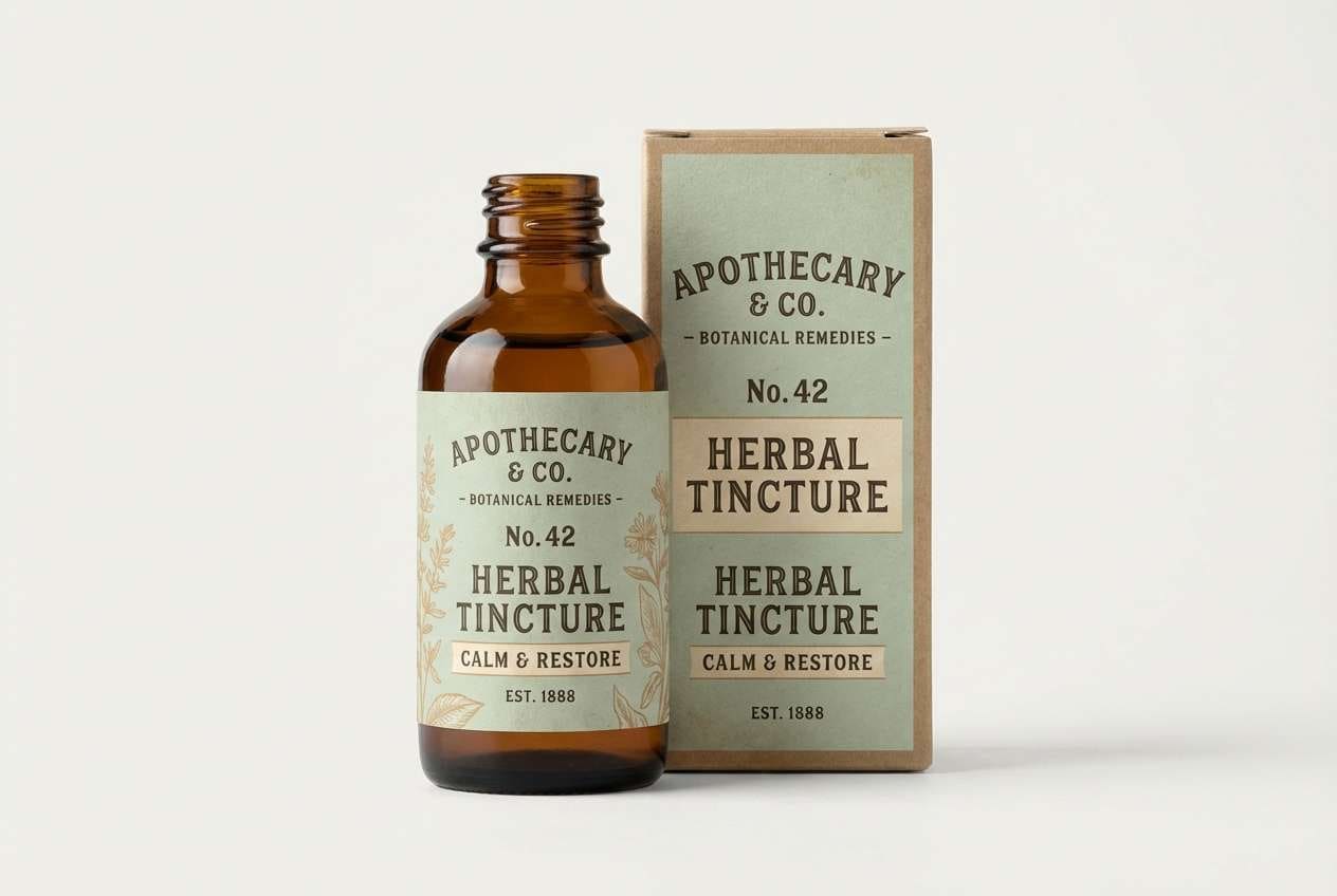
16) Vintage Apothekary
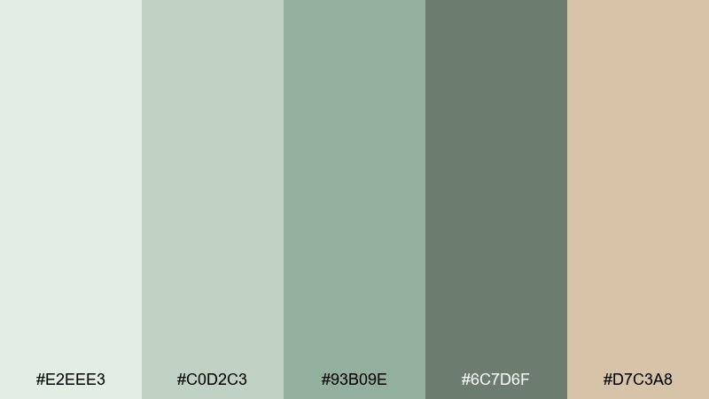
HEX: #E2EEE3 #C0D2C3 #93B09E #6C7D6F #D7C3A8
Mood: heritage, calm, curated
Best for: apothecary label design
Heritage and calm like an old apothecary shelf, this set feels curated and trustworthy. These pale green color combinations pair especially well with serif type, line engravings, and kraft or matte glass packaging. Use the warm beige for borders and stamp elements to add age and warmth. Tip: choose one ornate detail (like a frame) and keep everything else simple.
Image example of vintage apothekary generated using media.io
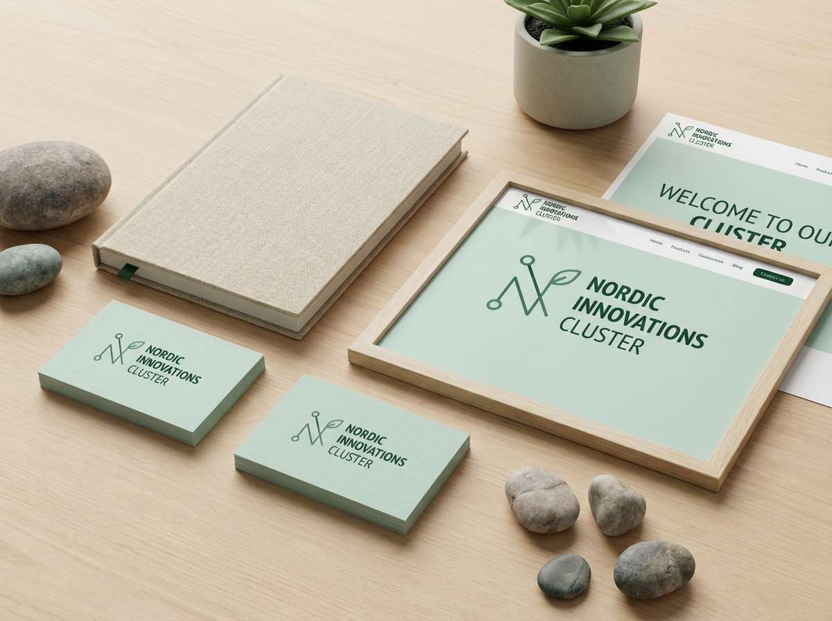
17) Nordic Herb
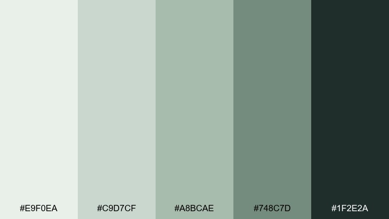
HEX: #E9F0EA #C9D7CF #A8BCAE #748C7D #1F2E2A
Mood: cool, minimalist, confident
Best for: tech startup branding
Cool and minimalist like Nordic herbs on stone, this mix feels modern and confident. Use the pale tones for spacious brand layouts, then lean on the near-black green for typography and wordmarks. It works nicely with geometric sans fonts and crisp icon sets. Tip: keep accent usage disciplined so the brand stays sharp rather than pastel.
Image example of nordic herb generated using media.io
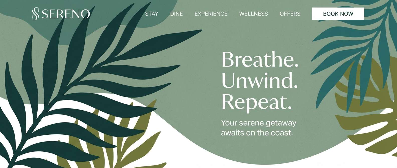
18) Coastal Palm
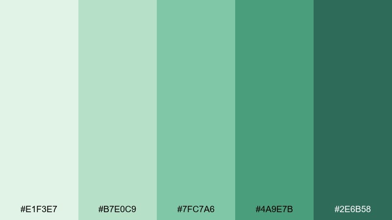
HEX: #E1F3E7 #B7E0C9 #7FC7A6 #4A9E7B #2E6B58
Mood: tropical, relaxed, fresh
Best for: resort website header
Tropical and relaxed like palms near the shore, these greens feel breezy and inviting. Use the lightest tone for sky-like space, then add seafoam blocks for sections and feature cards. The deeper greens bring clarity to navigation and calls to action. Tip: pair with lots of white and simple photography to keep it feeling premium.
Image example of coastal palm generated using media.io
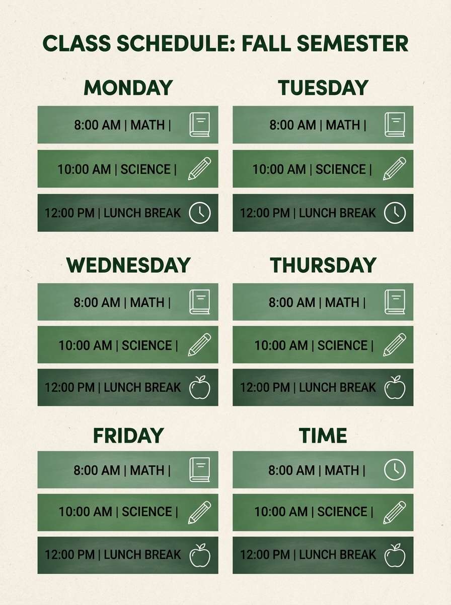
19) Chalkboard Greens
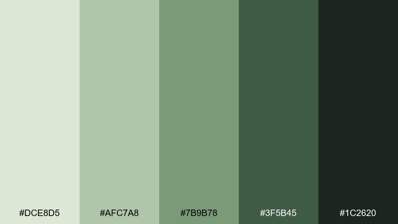
HEX: #DCE8D5 #AFC7A8 #7B9B78 #3F5B45 #1C2620
Mood: academic, grounded, bold
Best for: class schedule flyer
Grounded and bold like a well-used chalkboard, these greens feel structured and serious. Use the darkest shade for headings and key time blocks, while the lighter greens organize sections and highlight important notes. It pairs well with simple icons and a grid layout that feels easy to scan. Tip: avoid thin fonts and keep typography sturdy for contrast.
Image example of chalkboard greens generated using media.io
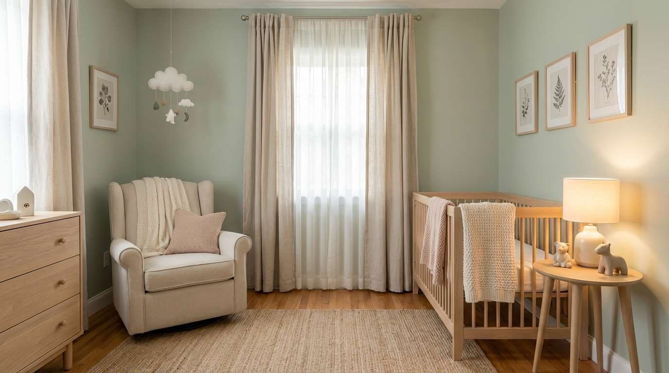
20) Lullaby Sage
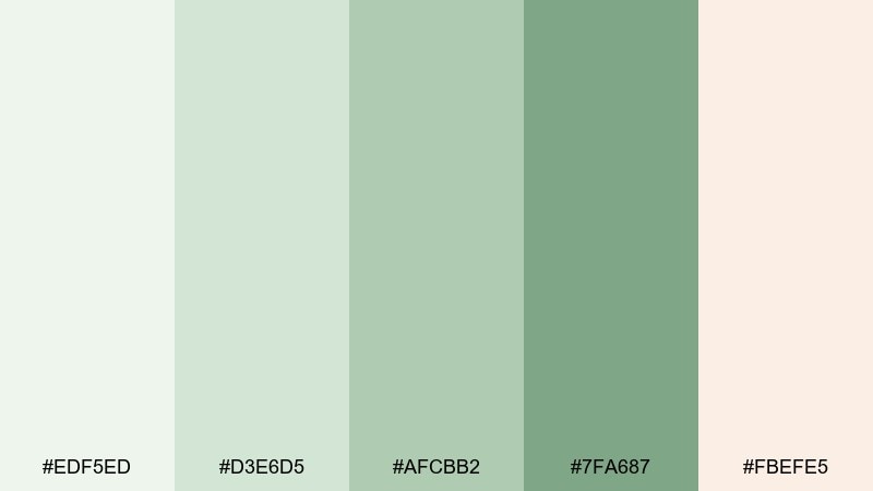
HEX: #EDF5ED #D3E6D5 #AFCBB2 #7FA687 #FBEFE5
Mood: gentle, sleepy, nurturing
Best for: nursery room decor
Gentle and sleepy like a lullaby at dusk, these tones feel nurturing and soft. Use the palest green for walls or large textiles, then layer in the mid sage through rugs, curtains, or storage pieces. The blush-tinted cream adds warmth and keeps the room from feeling chilly. Tip: repeat one sage tone across three items to make the space feel cohesive.
Image example of lullaby sage generated using media.io
What Colors Go Well with Pale Green?
Pale green pairs naturally with warm neutrals like ivory, cream, oat, sand, and light wood—these combinations keep the overall feel soft and organic. If you want a cleaner, more modern look, use cooler supports such as off-white, light gray, or a slate-charcoal anchor.
For accents, muted pinks/mauves add romance, while citrusy yellow-greens add energy. Deep greens (forest, pine, charcoal-green) are especially useful because they create readable contrast for text, buttons, and headings.
When in doubt, treat pale green as your background family and choose one dark anchor plus one small accent. That simple structure usually produces the most “designed” result.
How to Use a Pale Green Color Palette in Real Designs
For branding, start with a pale tint as the primary background, then pick a mid green for secondary blocks and a dark green for logo, titles, and UI states. This keeps your identity calm while still looking intentional and premium.
For UI, prioritize accessibility: reserve the darkest shade for body text/navigation and use brighter greens for success/progress only. Pale green is excellent for cards, panels, and subtle status surfaces because it reduces glare.
For interiors and packaging, scale matters. Use the lightest greens on large areas (walls, main label fields) and repeat one deeper shade in small accents (hardware, borders, icons) to keep the palette balanced.
Create Pale Green Palette Visuals with AI
If you already have HEX codes, the fastest way to validate a palette is to see it in context—on a label, a poster, a landing page hero, or a room mockup. Visuals quickly reveal whether your greens feel too cold, too minty, or not contrasted enough.
With Media.io’s text-to-image tool, you can generate realistic scenes or clean design mockups using prompts like the examples above. That makes it easy to iterate on mood (spa-like vs. zesty), materials (paper vs. glass), and lighting (bright vs. moody) before you commit.
Try generating 2–3 variations per concept and keep the best-performing dark anchor consistent for readability.
Pale Green Color Palette FAQs
-
What HEX code is considered “pale green”?
Pale green is a range rather than one code, but common pale green starting points include soft tints like #EAF2E6, #ECF5EA, or #E6F4E7. Pick your “pale” base first, then add a darker green for contrast and usability. -
How do I make pale green look modern (not childish)?
Use a restrained layout, plenty of whitespace, and a deep green or charcoal-green anchor for type (instead of pure black everywhere). Pair pale green with off-white, stone, or warm paper tones, and limit bright accents to small moments like buttons or badges. -
What colors complement pale green for branding?
Warm neutrals (ivory, cream, beige), deep greens (forest/pine), and soft pink-mauves are reliable complements. For a sharper tech feel, add near-black green and cool grays; for wellness and lifestyle, use warm paper whites and natural textures. -
Is pale green good for UI design and accessibility?
Yes—if you treat it as a background/surface color and use a dark anchor for text and interactive elements. Pale greens can reduce eye strain, but you still need strong contrast for readability, especially for buttons, links, and small labels. -
How many colors should a pale green palette include?
Five is a practical set: 1–2 pale tints for backgrounds, 1 mid green for sections/components, 1 dark green for text/CTAs, and 1 neutral (cream/white/stone) to keep everything breathable. -
What’s the difference between sage, celadon, and mint?
Sage is usually muted and slightly gray (grounded), celadon is pale green with a soft ceramic/creamy feel, and mint is brighter/cooler and often reads fresher and more energetic. Choosing among them is mainly about mood and temperature. -
How can I preview a pale green color scheme before designing?
Generate quick mockups (packaging, posters, UI screens, interiors) with an AI image tool, then compare versions for contrast and vibe. This helps you confirm whether the palette feels calm, premium, playful, or too washed out.
Next: Happy Color Palette


