


 ChatGPT
 Perplexity
 Gemini
 Claude
 Grok
Grok
Need kids color palette ideas that feel playful without looking chaotic? The right mix of bright and soft hues can make classroom posters, kids app UI, party prints, and nursery decor feel instantly friendly.
Below are 20 kids color combinations (with HEX codes), plus quick pairing tips and AI prompt examples you can use to generate matching visuals in minutes.
In this article
- Why Kids Palettes Work So Well
-
- sunshine sprinkles
- bubblegum playground
- minty storytime
- crayon carnival
- cloudy cotton candy
- rocket pop
- jungle giggles
- ocean pebbles
- lemonade stand
- teddy bear picnic
- rainbow blocks
- soft safari
- space bedtime
- art class apron
- peachy chalk
- dino daydream
- mermaid lagoon
- balloon parade
- cozy library
- firefly camp
- What Colors Go Well with Kids?
- How to Use a Kids Color Palette in Real Designs
- Create Kids Palette Visuals with AI
Why Kids Palettes Work So Well
Kids-friendly color palettes lean on clear contrast, simple shapes, and upbeat hues that feel approachable at a glance. That makes them perfect for designs where attention is short and the message needs to land fast.
They also create instant emotional cues: soft pastels can calm, while primary brights can energize. With the right balance (usually one “hero” color plus a few supporting accents), the look stays fun without becoming noisy.
Most importantly, kids palettes are versatile. The same set of colors can work across posters, apps, packaging, and social posts as long as you keep layout spacing generous and typography readable.
20+ Kids Color Palette Ideas (with HEX Codes)
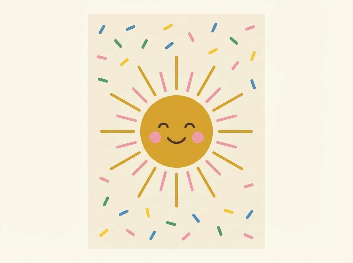
1) Sunshine Sprinkles
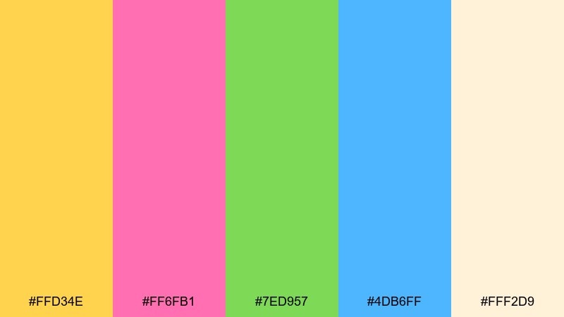
HEX: #FFD34E #FF6FB1 #7ED957 #4DB6FF #FFF2D9
Mood: cheerful, sunny, playful
Best for: nursery wall art posters
Sunny yellows and sherbet pinks feel like confetti on a bright morning. Use the warm yellow as the hero, then let blue and green pop in small shapes or icons. It works beautifully on nursery prints, growth charts, and name posters where readability matters. Tip: keep text in the deep blue or a soft charcoal so the fun stays crisp.
Image example of sunshine sprinkles generated using media.io
Create palette-perfect visuals with Media.io. Powered by Wan 2.7 Image, it helps you generate and edit images with precise color control, consistent tones, and ready-to-use styles in your browser.

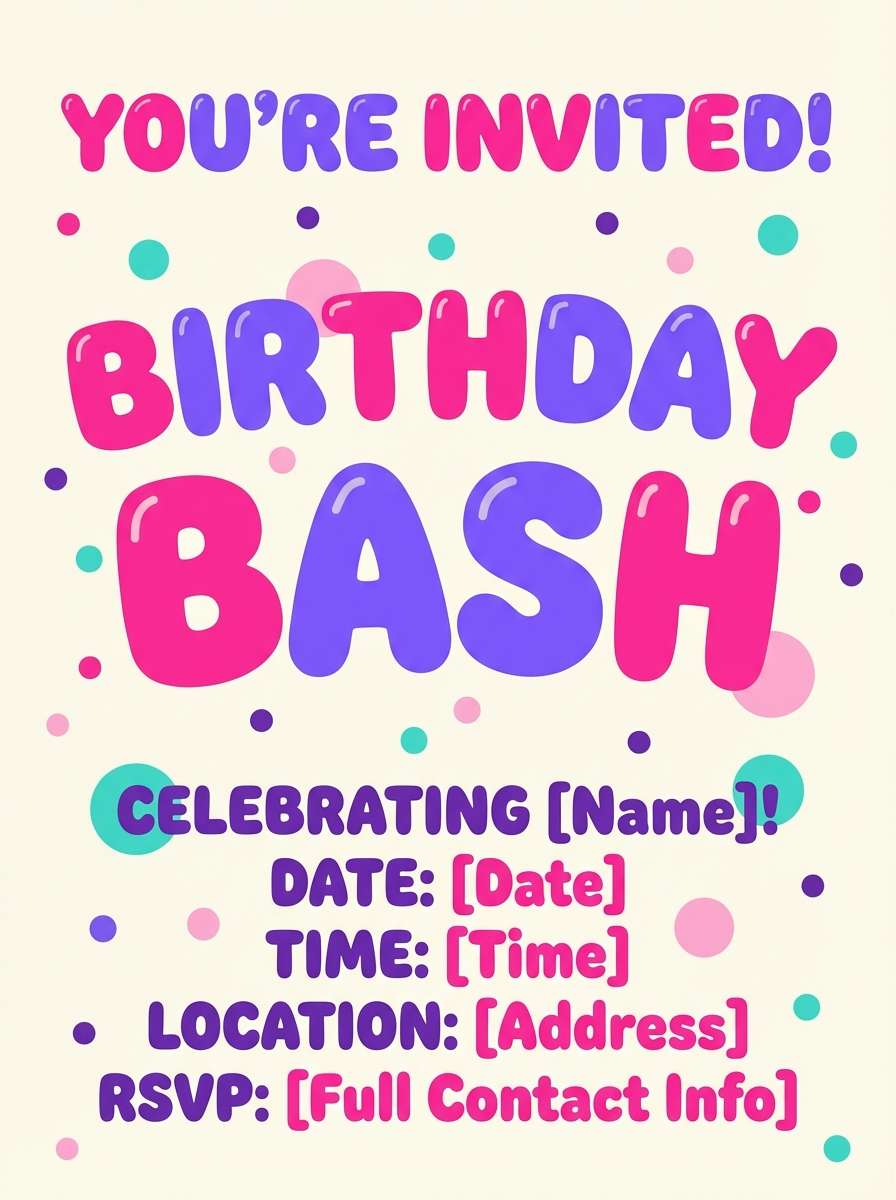
2) Bubblegum Playground
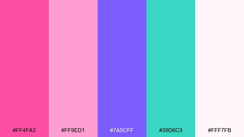
HEX: #FF4FA3 #FF9ED1 #7A5CFF #39D6C3 #FFF7FB
Mood: bubbly, energetic, sweet
Best for: birthday invitation designs
Bubblegum pinks with a punchy violet bring the bounce of a playground at recess. Let the hot pink lead, then balance it with airy blush and a cool teal accent to avoid overload. This pairing shines on birthday invites, party banners, and sticker-style graphics. Tip: use the pale blush as your background so the typography stays easy to read.
Image example of bubblegum playground generated using media.io
3) Minty Storytime
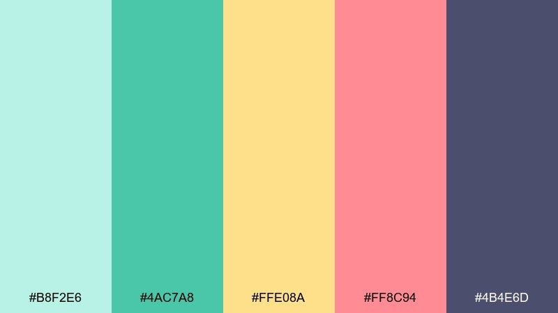
HEX: #B8F2E6 #4AC7A8 #FFE08A #FF8C94 #4B4E6D
Mood: calm, friendly, storybook
Best for: kids reading app UI
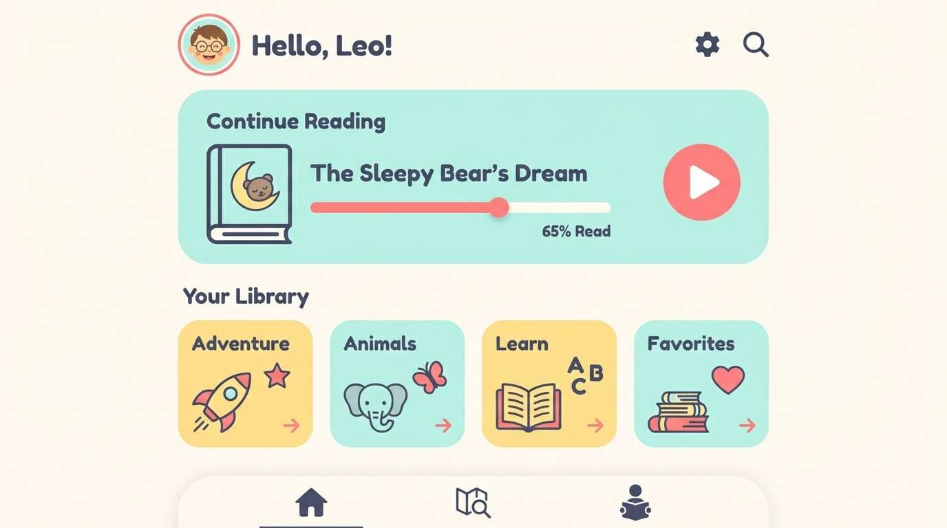
Mint and soft coral feel like a cozy library corner with illustrated bookmarks. Use the deep slate for headers and navigation so the screens stay structured, then layer mint and butter yellow for cards and badges. As a kids color scheme, it keeps the interface gentle while still feeling upbeat. Tip: reserve coral for active states like progress dots and primary buttons.
Image example of minty storytime generated using media.io
4) Crayon Carnival
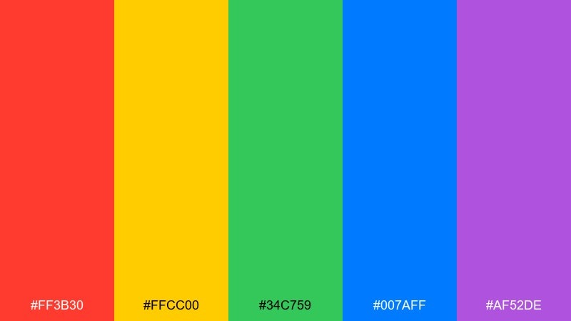
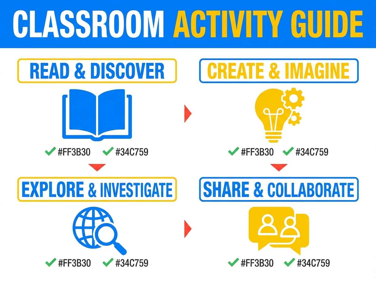
HEX: #FF3B30 #FFCC00 #34C759 #007AFF #AF52DE
Mood: bold, primary, high-energy
Best for: classroom activity posters
Punchy crayon brights evoke art time, paper scraps, and big imaginations. Keep layouts simple and use lots of white space so the saturated hues do not fight each other. It is ideal for classroom posters, chore charts, and reward trackers where quick scanning is key. Tip: pick one dominant color per section and repeat it for icons and headings.
Image example of crayon carnival generated using media.io
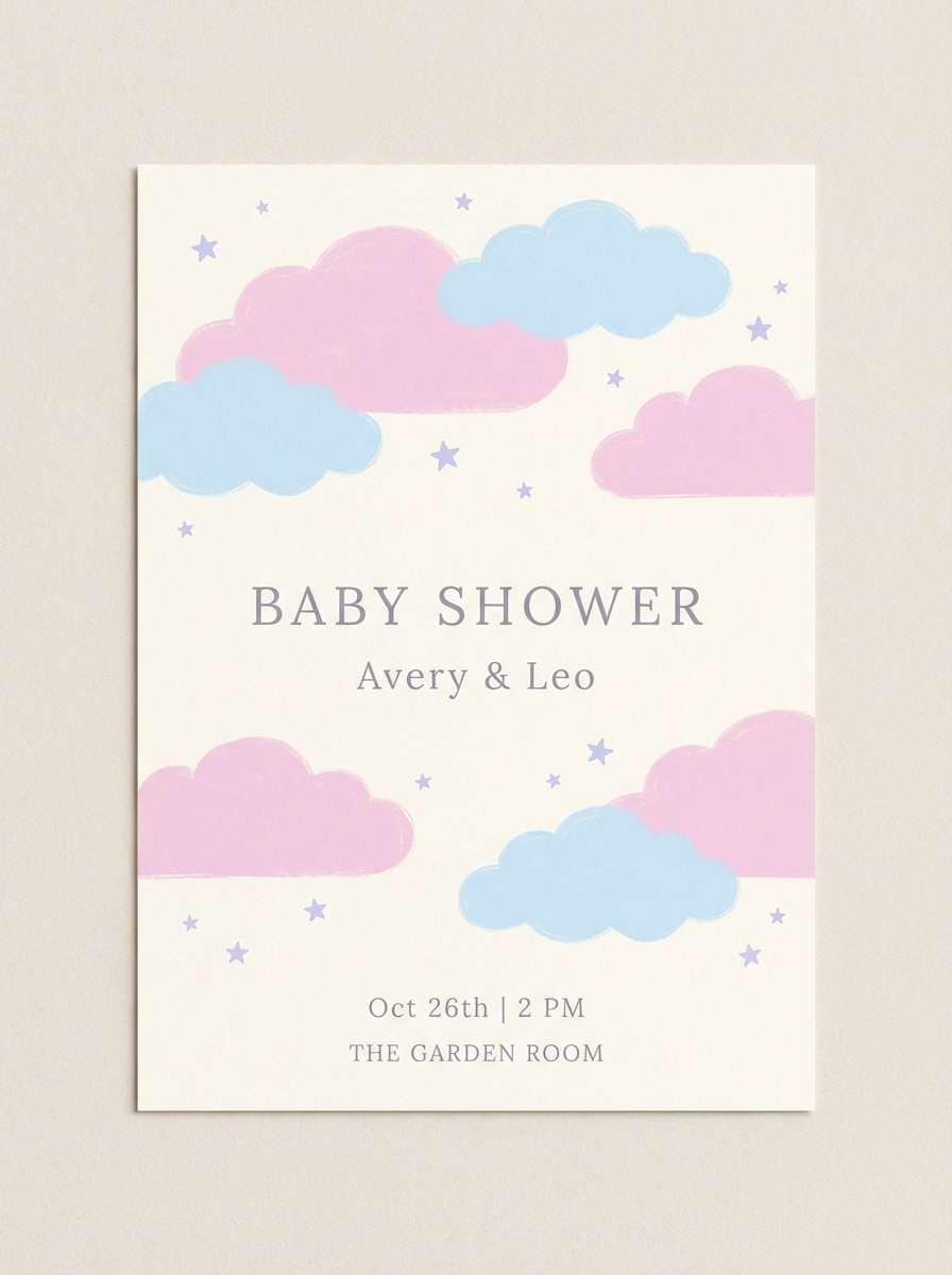
5) Cloudy Cotton Candy
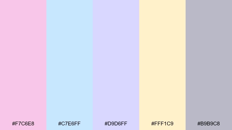
HEX: #F7C6E8 #C7E6FF #D9D6FF #FFF1C9 #B9B9C8
Mood: soft, dreamy, gentle
Best for: baby shower flyers
Powdery pastels feel like cotton candy clouds drifting across a quiet sky. Use the warm cream as the base, then layer pink and sky blue in big, airy blocks for an inviting look. This set works well on baby shower flyers, milestone cards, and delicate social posts. Tip: use the muted gray-lilac for body text so it reads without breaking the softness.
Image example of cloudy cotton candy generated using media.io
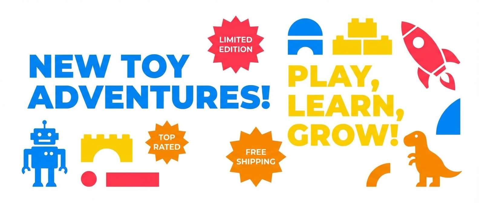
6) Rocket Pop
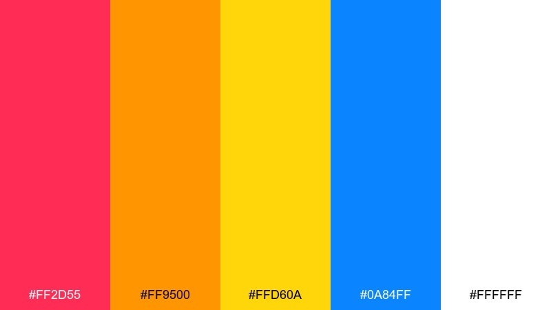
HEX: #FF2D55 #FF9500 #FFD60A #0A84FF #FFFFFF
Mood: summer, punchy, fun
Best for: toy product ad banners
Hot pink, electric blue, and sunny yellow bring the vibe of a rocket-pop on a warm day. Lean on white as breathing room, then use the brights for bursts like star shapes, tags, and price callouts. It is a great fit for toy ads and promo banners that need instant attention. Tip: keep the blue for key headlines to anchor the whole layout.
Image example of rocket pop generated using media.io
7) Jungle Giggles
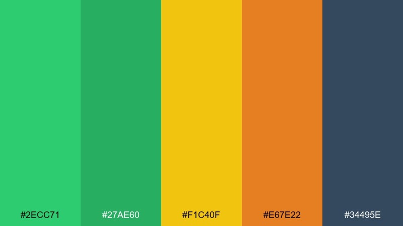
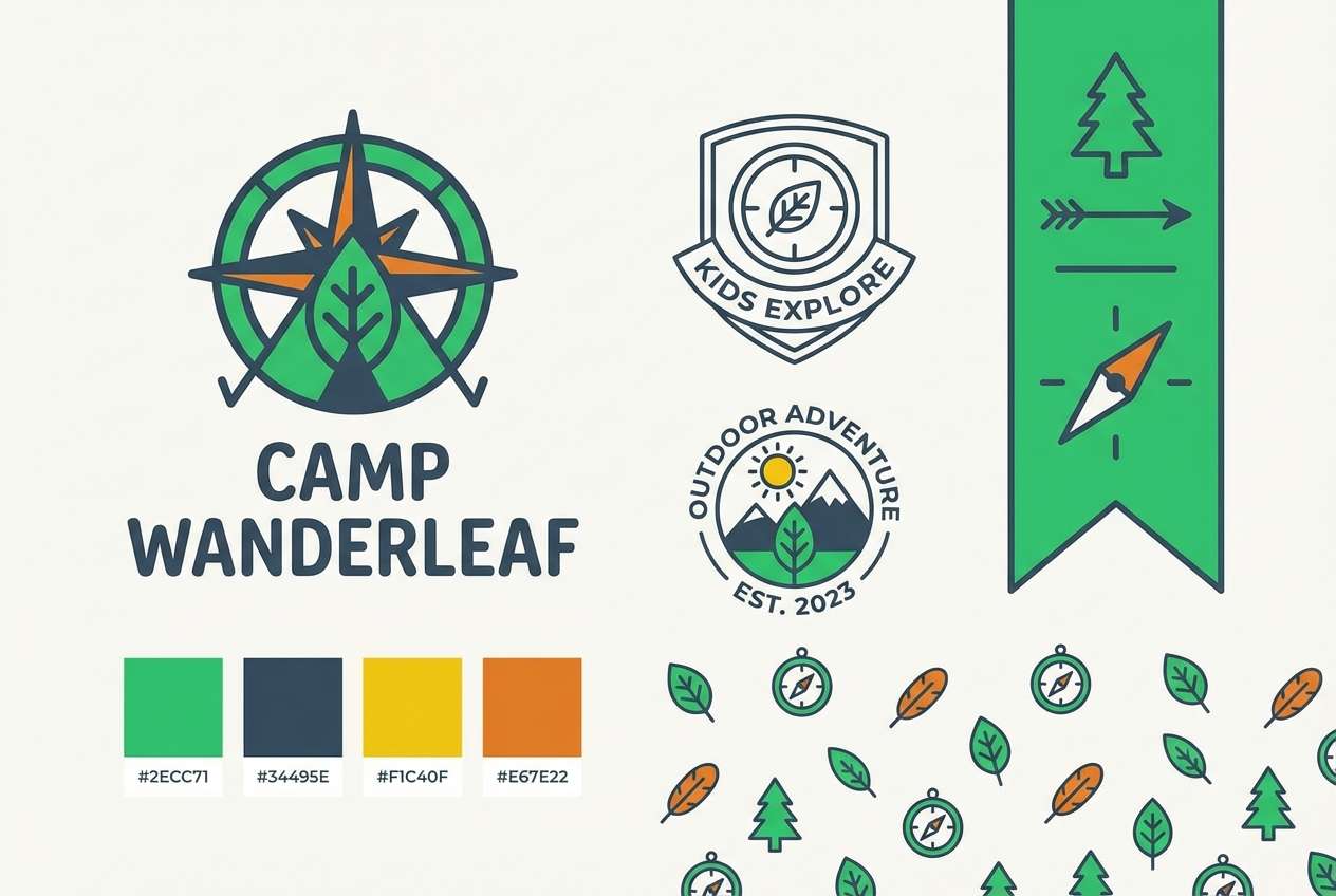
HEX: #2ECC71 #27AE60 #F1C40F #E67E22 #34495E
Mood: adventurous, outdoorsy, lively
Best for: kids camp logo and branding
Leafy greens and sunny golds feel like jungle trails and treasure hunts. Use the dark slate for outlines and wordmarks, then bring in yellow and orange for badges or patches. This kids color palette works especially well for camp branding, nature clubs, and outdoor event signage. Tip: keep gradients out and stick to solid fills for a clean, modern badge system.
Image example of jungle giggles generated using media.io
8) Ocean Pebbles
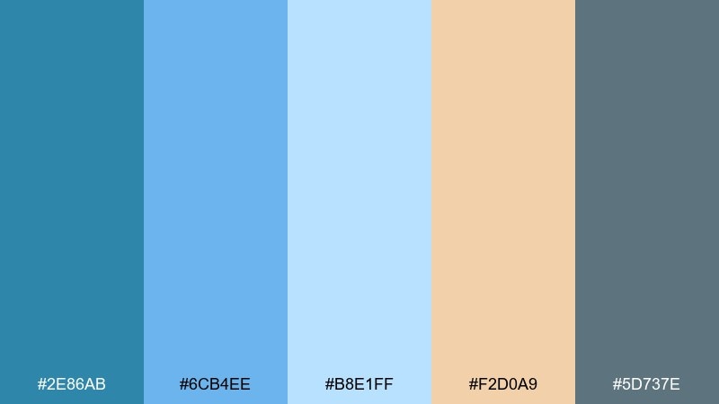
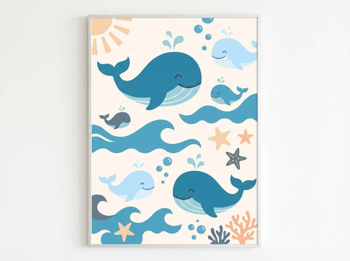
HEX: #2E86AB #6CB4EE #B8E1FF #F2D0A9 #5D737E
Mood: fresh, breezy, coastal
Best for: kids bathroom decor prints
Sea blues with sandy beige evoke smooth pebbles and gentle shoreline waves. Use the mid blue for large shapes, then soften the scene with pale blue backgrounds and beige accents. It is perfect for playful bathroom prints, routine charts, or splash-themed posters. Tip: keep the gray-blue for text and thin line icons so everything stays calm and tidy.
Image example of ocean pebbles generated using media.io
9) Lemonade Stand
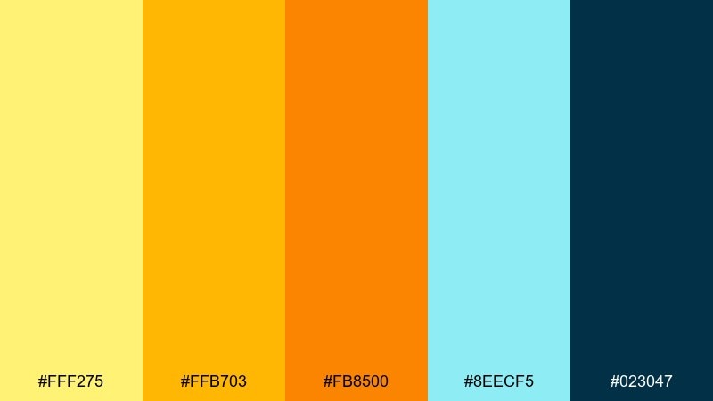
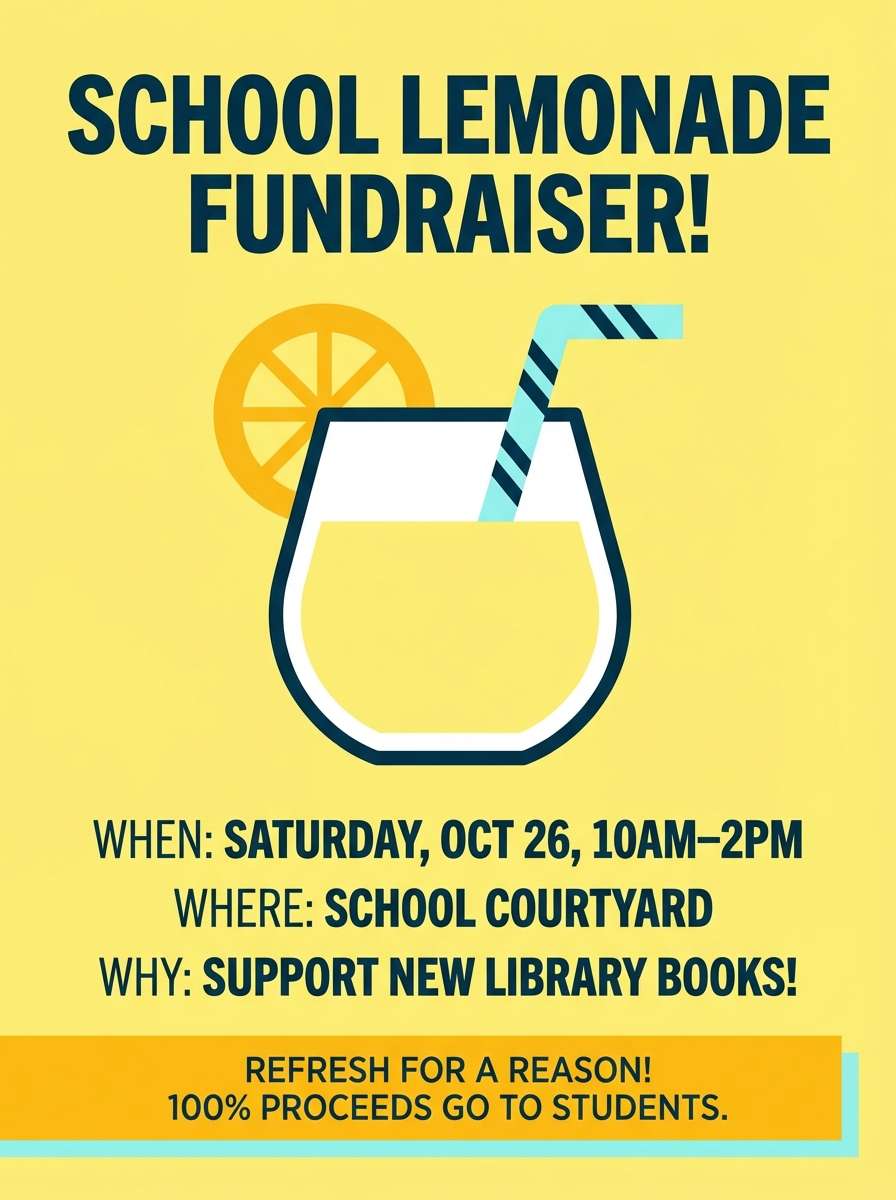
HEX: #FFF275 #FFB703 #FB8500 #8EECF5 #023047
Mood: summery, friendly, upbeat
Best for: school fundraiser poster
Zesty yellows and orange feel like fresh lemonade with a splash of sparkling water. Use the navy for bold headings and details, then let yellow carry the large background shapes. This palette is great for fundraiser posters and school event signage where information must pop from a distance. Tip: keep cyan to small highlights like arrows, dates, or QR callouts.
Image example of lemonade stand generated using media.io
10) Teddy Bear Picnic
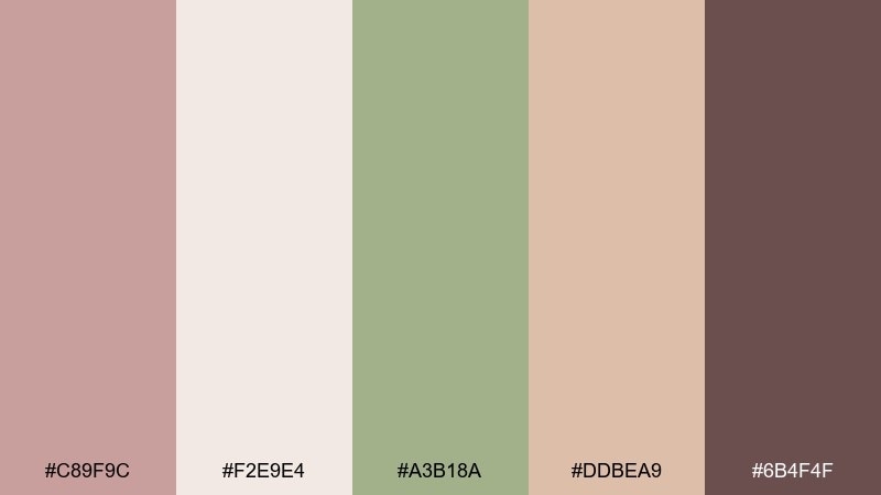
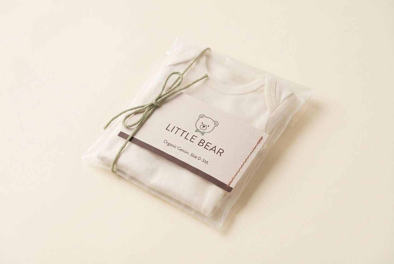
HEX: #C89F9C #F2E9E4 #A3B18A #DDBEA9 #6B4F4F
Mood: cozy, warm, gentle
Best for: baby clothing packaging
Soft browns and dusty rose feel like a picnic blanket and a well-loved teddy. Let the warm cream dominate, then use cocoa tones for type and small illustrations. It suits baby clothing tags and packaging where a calm, premium warmth matters. Tip: use the sage green sparingly as a quality seal or size badge to keep the look refined.
Image example of teddy bear picnic generated using media.io
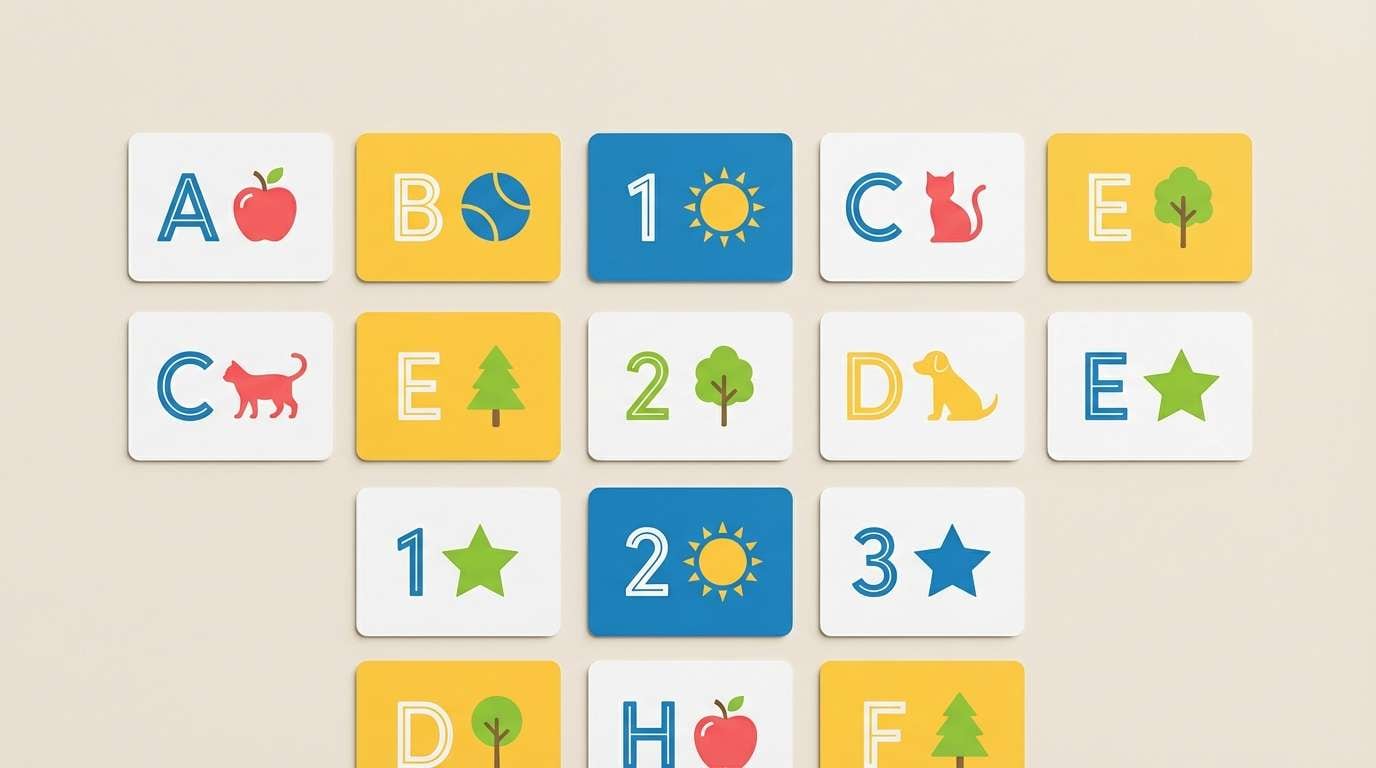
11) Rainbow Blocks
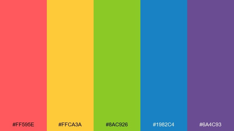
HEX: #FF595E #FFCA3A #8AC926 #1982C4 #6A4C93
Mood: playroom, bold, creative
Best for: educational flashcards
Bright block colors bring back stacking toys, building bricks, and playful learning. Use one color per card category so kids can recognize sets quickly, with blue for titles and purple for borders. This combination works especially well for alphabet or number flashcards and early learning kits. Tip: avoid tiny text and lean into chunky icons to match the energy.
Image example of rainbow blocks generated using media.io
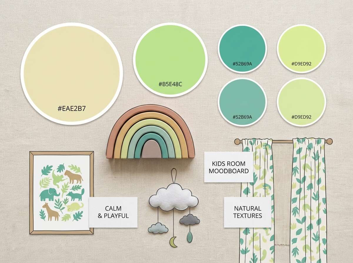
12) Soft Safari
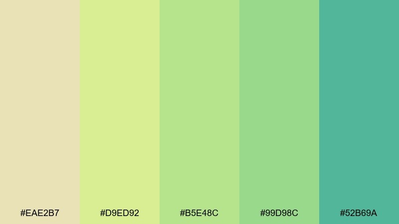
HEX: #EAE2B7 #D9ED92 #B5E48C #99D98C #52B69A
Mood: natural, mellow, fresh
Best for: kids room interior moodboard
Muted greens and warm sand tones feel like a gentle safari at sunset. Use the sand as your wall or background color, then layer greens in textiles, decals, or illustrated animals. It pairs beautifully with light wood, rattan, and soft white bedding for an easygoing look. Tip: add the teal-green only in a few focal points like a lamp, shelf, or rug edge.
Image example of soft safari generated using media.io
13) Space Bedtime

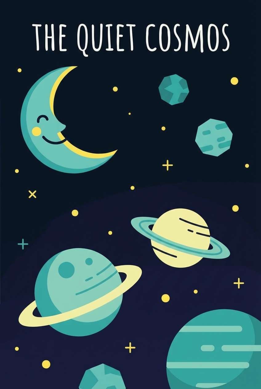
HEX: #0B1320 #1C2541 #5BC0BE #FDE74C #9BC53D
Mood: night-sky, curious, modern
Best for: kids bedtime storybook cover
Deep navy and teal feel like stargazing right before sleep, with a spark of comet yellow. Use the dark tones for the sky and typography, then add yellow for stars and small highlights. It is perfect for storybook covers, space-themed posters, and reading corner signage. Tip: keep the green as a tiny accent on planets or badges so the night mood stays intact.
Image example of space bedtime generated using media.io
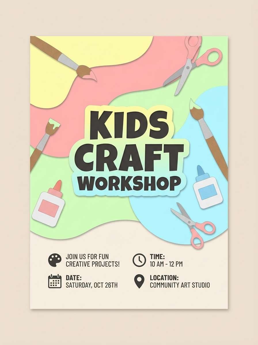
14) Art Class Apron
HEX: #FFADAD #FFD6A5 #FDFFB6 #CAFFBF #9BF6FF
Mood: light, crafty, optimistic
Best for: kids craft workshop flyer
Pastel brights feel like paint trays, paper cutouts, and a freshly tied apron. Use yellow as a soft background, then layer pink and mint for headings and section blocks. These kids color combinations are especially strong for craft workshop flyers and after-school club promos. Tip: add simple line icons in a dark neutral so the pastel text never gets washed out.
Image example of art class apron generated using media.io
15) Peachy Chalk
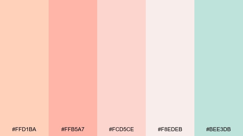
HEX: #FFD1BA #FFB5A7 #FCD5CE #F8EDEB #BEE3DB
Mood: soft, comforting, airy
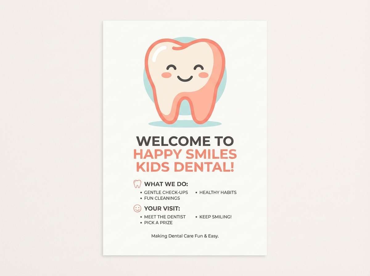
Best for: kids dental clinic waiting room posters
Powdery peach and blush feel like chalk dust and warm morning light. Use the off-white as the main canvas, then bring in peach for friendly headings and calming illustrations. It works well for waiting room posters and kid-focused health handouts that should feel reassuring. Tip: use the cool mint as a tiny pop for checkmarks, stickers, or small icons.
Image example of peachy chalk generated using media.io
16) Dino Daydream
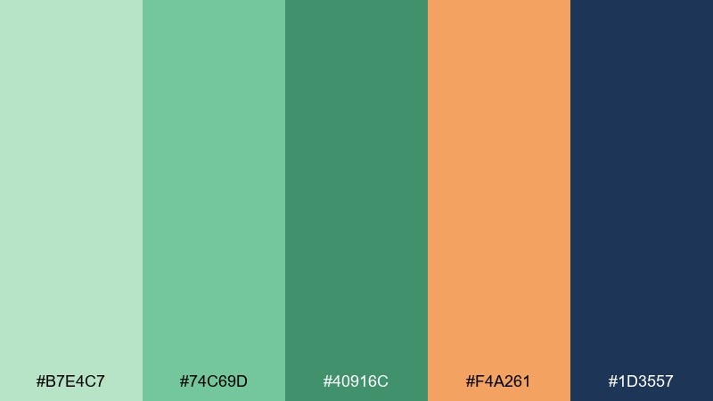
HEX: #B7E4C7 #74C69D #40916C #F4A261 #1D3557
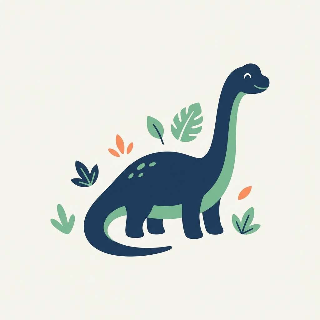
Mood: playful, earthy, adventurous
Best for: kids t-shirt graphic
Jungle greens with a warm orange feel like friendly dinosaurs roaming through lush leaves. Use the deep navy for outlines and type, then keep greens as the main body colors for characters. This set works great for t-shirt graphics, patches, and simple merch that needs to print cleanly. Tip: limit shading and rely on bold silhouettes for the best screen-print results.
Image example of dino daydream generated using media.io
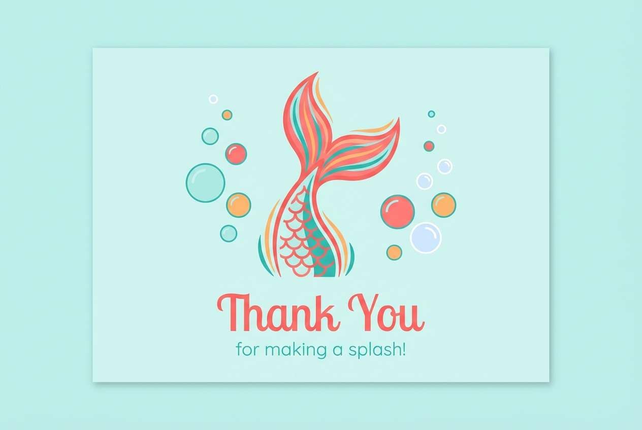
17) Mermaid Lagoon
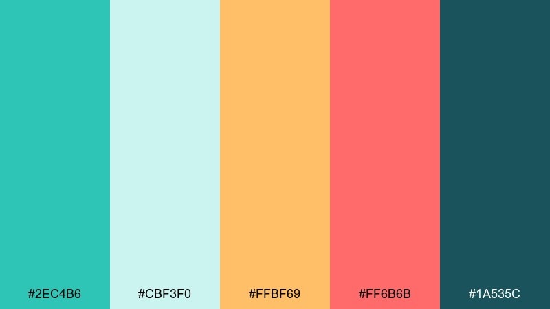
HEX: #2EC4B6 #CBF3F0 #FFBF69 #FF6B6B #1A535C
Mood: sparkly, aquatic, whimsical
Best for: kids party thank you card
Seafoam teal and coral bring a magical lagoon vibe with sunlit warmth. Use the pale aqua as a soft base and let coral carry the headline for a friendly, confident look. It is ideal for thank you cards, party follow-ups, and small keepsake prints. Tip: keep the dark teal for tiny details like borders, icons, and short lines of text.
Image example of mermaid lagoon generated using media.io
18) Balloon Parade
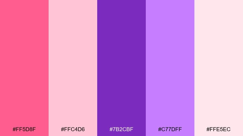
HEX: #FF5D8F #FFC4D6 #7B2CBF #C77DFF #FFE5EC
Mood: festive, sweet, modern
Best for: kids event social media posts
Pink and violet feel like balloons floating up a bright hallway. Use the pale pink as your main background, then stack purple shapes behind text to create instant hierarchy. It fits event posts, announcement tiles, and carousel graphics where you want a big, celebratory mood. Tip: keep spacing generous and use rounded corners so the look stays friendly.
Image example of balloon parade generated using media.io

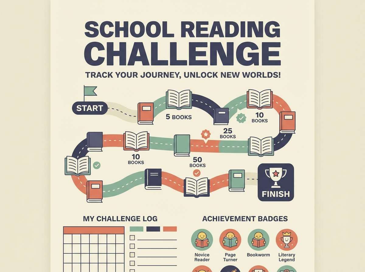
19) Cozy Library
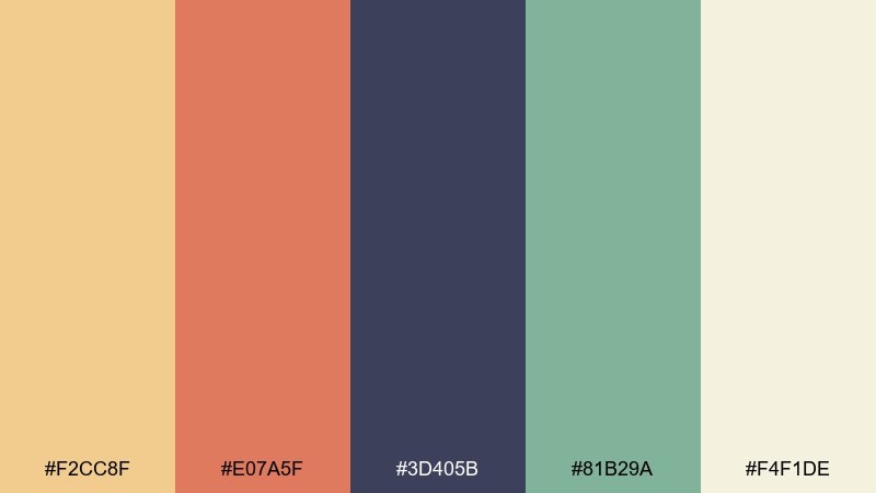
HEX: #F2CC8F #E07A5F #3D405B #81B29A #F4F1DE
Mood: warm, studious, inviting
Best for: school reading challenge poster
Warm sand and terracotta feel like book spines and reading nooks. Use the cream as your poster base, then bring in navy for typography and structure. This kids color palette works nicely for reading challenge posters, library signage, and classroom goals that should feel grown-up but welcoming. Tip: use the sage green only for progress markers so achievements stand out without shouting.
Image example of cozy library generated using media.io
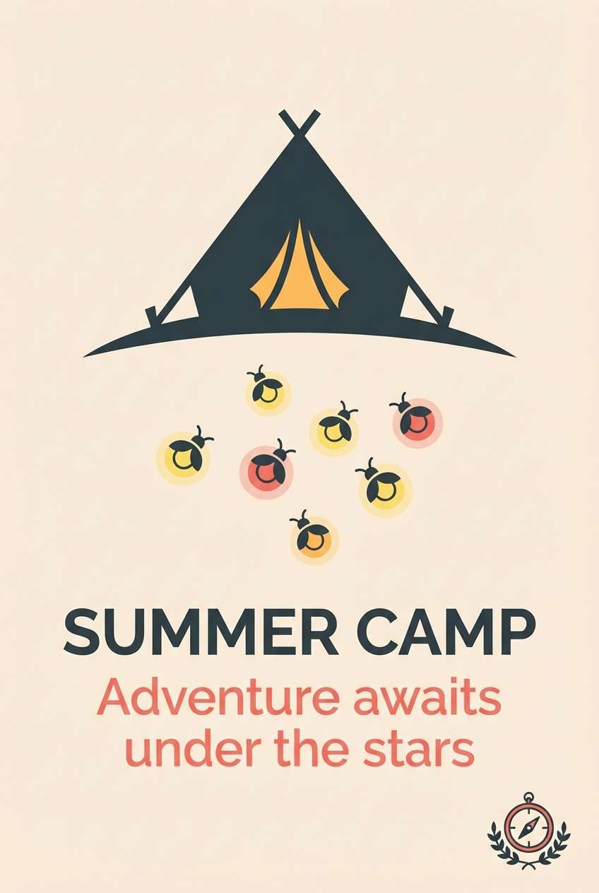
20) Firefly Camp
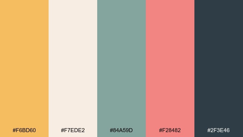
HEX: #F6BD60 #F7EDE2 #84A59D #F28482 #2F3E46
Mood: nostalgic, outdoors, cozy
Best for: kids summer camp brochure cover
Golden amber and dusty coral feel like lantern light and fireflies at dusk. Use the deep green-gray for titles and key info, then let amber and cream create warm blocks and margins. For brochure covers and program handouts, these kids color combinations keep the vibe adventurous while still polished. Tip: save coral for just one focal callout like dates or registration so the cover stays calm.
Image example of firefly camp generated using media.io
What Colors Go Well with Kids?
Kids color schemes usually work best when you combine one bright “lead” hue with a light neutral (cream or off-white) and a darker anchor for text. This keeps the design energetic while staying readable.
Classic pairings include sunny yellow + sky blue, bubblegum pink + violet, and mint + coral. If you want something calmer, swap in dusty pastels and use deep navy or slate for structure.
To prevent visual overload, repeat colors consistently: use the same shade for headings, the same shade for icons, and reserve the boldest accent for buttons or key callouts.
How to Use a Kids Color Palette in Real Designs
Start with a simple ratio: 60% background (light neutral), 30% main color, and 10% accent colors. That formula works for posters, flyers, packaging labels, and kids UI screens.
Keep typography high-contrast and chunky, especially for early readers. Dark blue, charcoal, or deep teal usually reads better than pure black while still feeling friendly.
For print, avoid ultra-thin lines and tiny details; for digital, keep interactive states clear (hover/active) by assigning one accent color specifically to buttons and highlights.
Create Kids Palette Visuals with AI
Once you pick a palette, you can generate matching illustrations, posters, invite layouts, and UI mockups by describing simple shapes, a clean background, and your dominant colors.
Use your HEX codes directly in prompts to keep the output consistent across assets. This is especially helpful when you need a whole set—like event posts, classroom charts, and stickers—in the same style.
With Media.io, you can turn each palette into cohesive visuals fast, then refine variations until the mood feels just right for kids.
Kids Color Palette FAQs
-
What makes a kids color palette feel “balanced” instead of chaotic?
Use one dominant bright color, support it with 1–2 softer tones, and keep a light neutral background. Add a dark anchor (navy/slate) for text so the design stays clear. -
Are pastel kids color palettes better than bright palettes?
Not always—pastels are calmer and great for nurseries or healthcare settings, while brights are ideal for posters, games, and party graphics. Choose based on the energy you want, then control it with whitespace. -
What colors are best for kids app UI?
Pick a soft background plus a high-contrast text color (deep blue/charcoal), then reserve a single bold accent for buttons and active states. Palettes like Minty Storytime work well because they’re playful but structured. -
How many colors should a kids brand use?
For most kids brands, 4–6 core colors is plenty. Keep 1–2 as primary brand colors, 1 dark neutral for type, and the rest as accents for icons, badges, and patterns. -
What’s a safe text color for colorful kids designs?
Deep navy, dark teal, and slate gray are usually safer than pure black and still deliver strong readability across bright backgrounds. Test contrast on your lightest and most saturated colors. -
How do I keep bright kids color combinations readable in print?
Use thicker type, avoid tiny text, and increase spacing. Let saturated colors live in larger shapes, and keep body text on light neutrals whenever possible. -
Can I generate kids palette images with AI using HEX codes?
Yes—include the HEX codes in your prompt and specify which colors should be dominant vs accents. Also describe a clean background and a flat vector style to keep results kid-friendly and consistent.


