

Gaming visuals thrive on contrast, clarity, and emotion—whether you’re building a dark-mode launcher, a punchy stream overlay, or an esports brand.
Below are 20+ gaming color combinations (with HEX codes) that stay readable under neon accents, glow effects, and fast-moving UI elements.
In this article
- Why Gaming Palettes Work So Well
-
- neon arcade
- midnight neon
- pixel pastels
- retro console
- boss fight red
- space loot
- neon jungle
- vaporwave grid
- dark mode pro
- loot box gold
- mystic rpg
- racing hud
- dungeon torch
- ice arena
- synthwave sunset
- tactical stealth
- fantasy tavern
- sci-fi lab
- cozy streamer
- alien invasion
- indie night market
- glitch cyber noir
- What Colors Go Well with Gaming?
- How to Use a Gaming Color Palette in Real Designs
- Create Gaming Palette Visuals with AI
Why Gaming Palettes Work So Well
Gaming design is read at speed—during matches, streams, menus, and HUD moments—so palettes are built around instant hierarchy and high legibility.
Most gaming color schemes pair a deep base (near-black or navy) with a few saturated accents that pop for CTAs, alerts, and “active” states.
They also translate well across branding touchpoints: UI kits, thumbnails, team logos, and social headers can share the same accent logic without losing clarity.
20+ Gaming Color Palette Ideas (with HEX Codes)
1) Neon Arcade
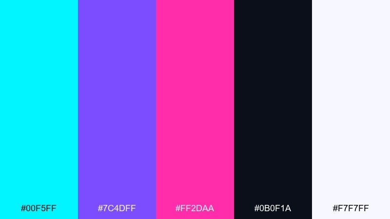
HEX: #00F5FF #7C4DFF #FF2DAA #0B0F1A #F7F7FF
Mood: electric, playful, high-contrast
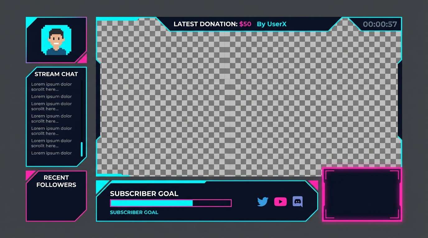
Best for: twitch stream overlay UI
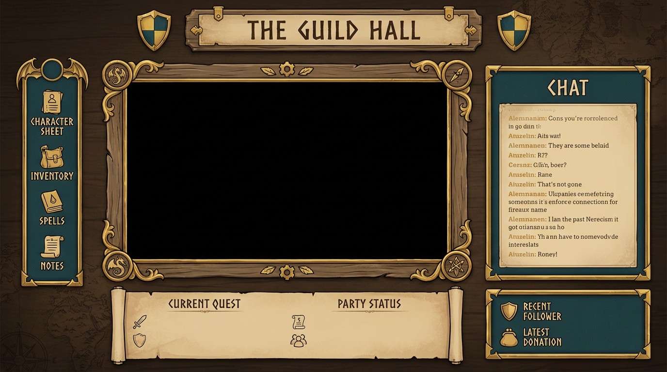
Electric neon lights and glossy arcade cabinets come to mind, with bright accents cutting through a deep night base. It works best when the dark tone leads and the neon hues are used as highlights for buttons, alerts, and progress bars. Pair it with simple sans typography and generous spacing to avoid visual fatigue. Usage tip: reserve #FF2DAA for the single most important action so the layout stays scannable.
Image example of neon arcade generated using media.io
Media.io is an online AI studio for creating and editing video, image, and audio in your browser.

2) Midnight Neon
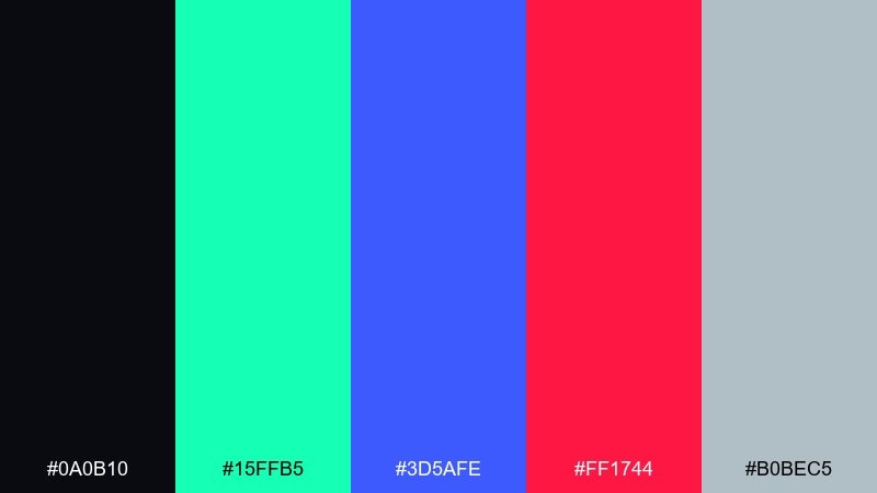
HEX: #0A0B10 #15FFB5 #3D5AFE #FF1744 #B0BEC5
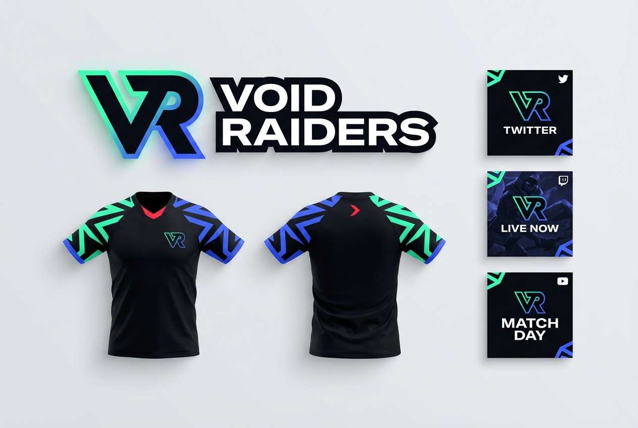
Mood: late-night, bold, techy
Best for: esports team branding
Late-night city glow and LED reflections set a confident, competitive tone. The mix of mint, cobalt, and red feels sharp when anchored by near-black and cooled down with steel gray. Use it for logos, jerseys, and social headers where punchy accents are a must. Usage tip: keep #FF1744 to small badges or score marks so it reads as urgency, not noise.
Image example of midnight neon generated using media.io
3) Pixel Pastels
HEX: #FFD6E8 #BDE0FE #CDB4DB #FFF1B6 #2B2D42
Mood: cute, nostalgic, soft
Best for: casual game UI skin
Soft candy tones evoke pixel pets, sticker packs, and cozy menu screens. The gentle pastels stay readable when the deep slate is used for text, icons, and outlines. Pair with rounded UI components and subtle drop shadows for a friendly feel. Usage tip: use #FFF1B6 as the primary surface color and keep pastel buttons slightly darker for clear affordance.
Image example of pixel pastels generated using media.io
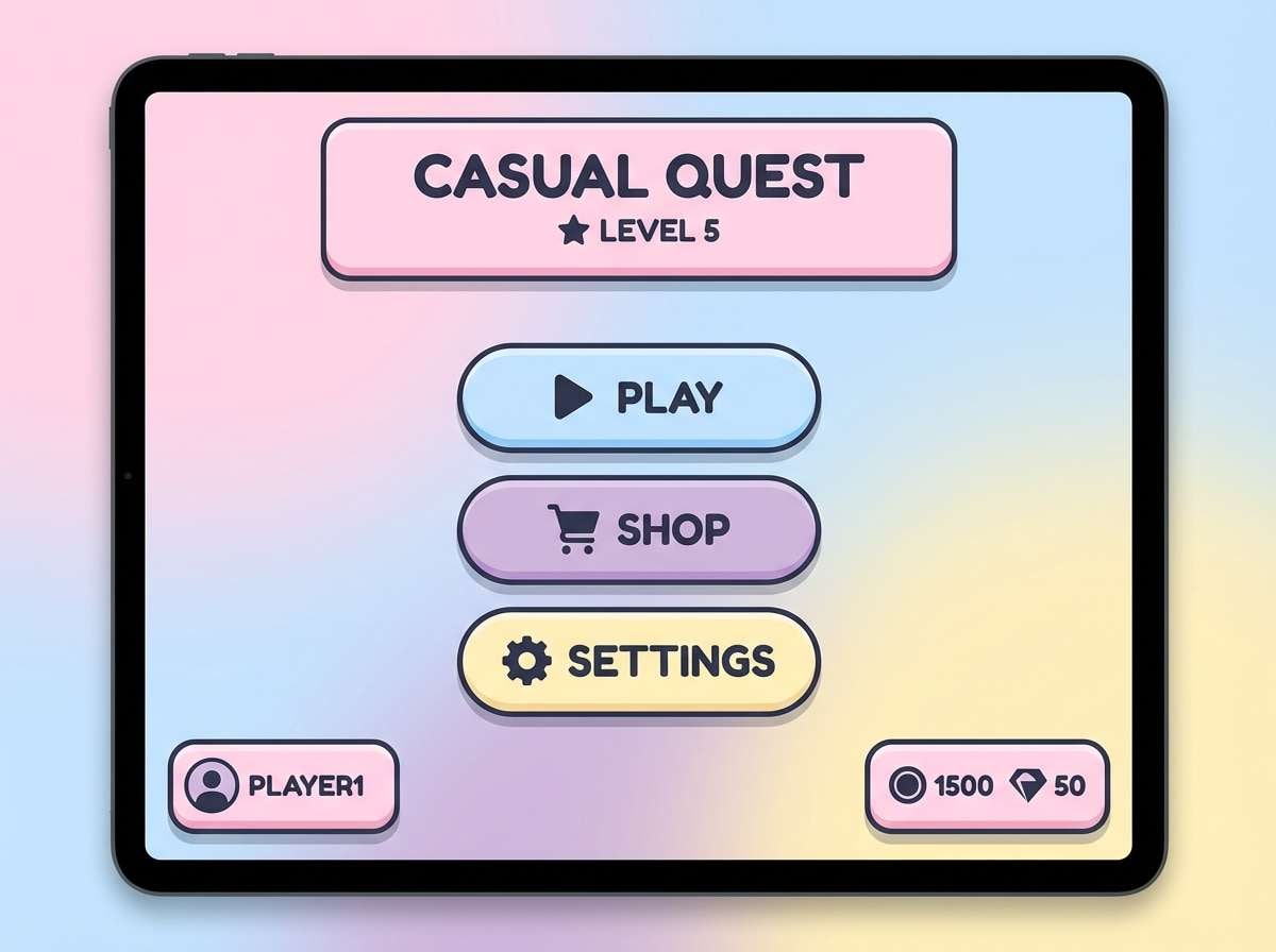
4) Retro Console
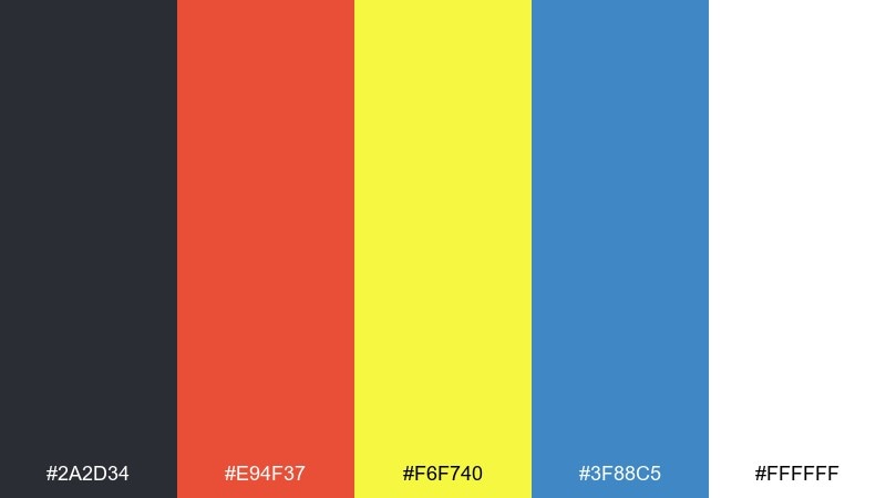
HEX: #2A2D34 #E94F37 #F6F740 #3F88C5 #FFFFFF
Mood: retro, energetic, clean
Best for: gaming poster design
Classic console era vibes show up in the crisp primary tones and bright white space. These gaming color combinations shine in bold shapes, chunky type, and simple iconography that feels instantly nostalgic. Pair the warm red and yellow with the cool blue to balance the layout and keep the gray for outlines. Usage tip: let #FFFFFF dominate the background so the poster stays bright and readable from a distance.
Image example of retro console generated using media.io
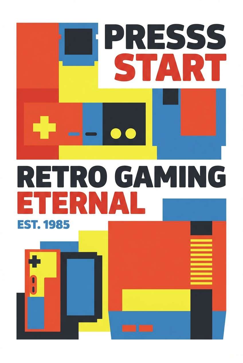
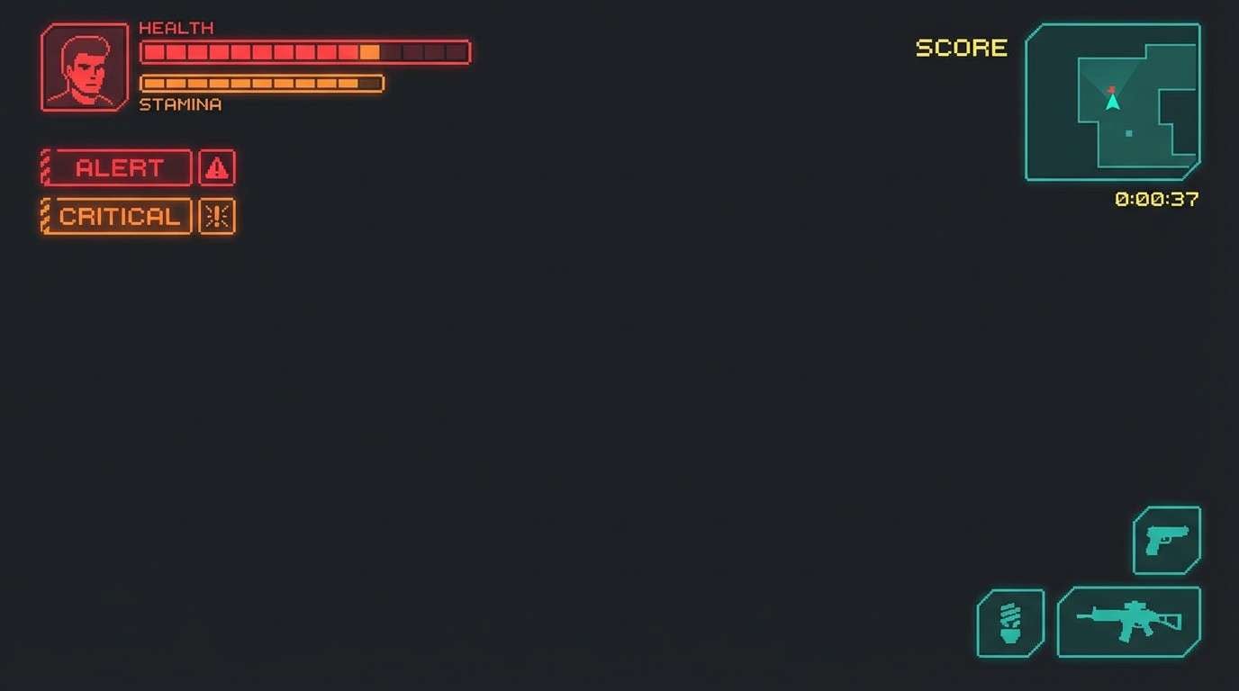
5) Boss Fight Red
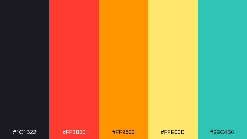
HEX: #1C1B22 #FF3B30 #FF9500 #FFE66D #2EC4B6
Mood: intense, dramatic, urgent
Best for: action game HUD
Heat, sparks, and warning lights create a high-stakes, adrenaline mood. The warm spectrum works well for health, damage, and alerts, while the teal is a clean counterpoint for cooldowns or defensive states. Pair it with thick icon strokes and strong contrast on the dark base. Usage tip: keep #FFE66D for brief flashes or highlights so it stays special, not distracting.
Image example of boss fight red generated using media.io
6) Space Loot
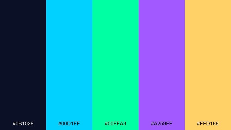
HEX: #0B1026 #00D1FF #00FFA3 #A259FF #FFD166
Mood: futuristic, optimistic, cosmic
Best for: sci-fi game landing page
Bright cosmic glow and clean sci-fi panels feel upbeat and premium. Use the cyan and mint as primary UI accents, with violet for rarity tiers or secondary actions. Pair with a deep navy background and thin dividers for a sleek, space-station look. Usage tip: apply #FFD166 only to rewards or key CTAs to instantly communicate value.
Image example of space loot generated using media.io
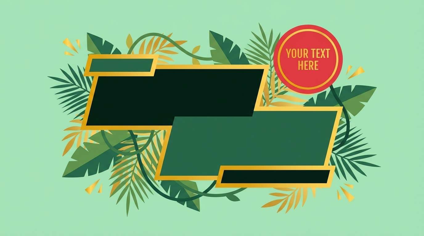
7) Neon Jungle
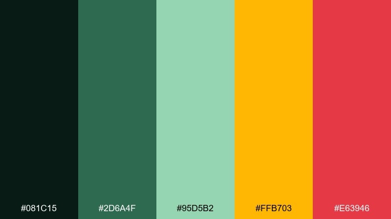
HEX: #081C15 #2D6A4F #95D5B2 #FFB703 #E63946
Mood: wild, vibrant, adventurous
Best for: battle royale thumbnail set
Dense foliage, humid air, and bright flare colors make this feel like a high-energy drop zone. The greens create a grounded base, while gold and red bring urgency for titles, borders, and callouts. Pair with gritty textures or grain overlays to keep it rugged rather than cute. Usage tip: limit #E63946 to one corner badge per thumbnail so the set stays consistent.
Image example of neon jungle generated using media.io
8) Vaporwave Grid
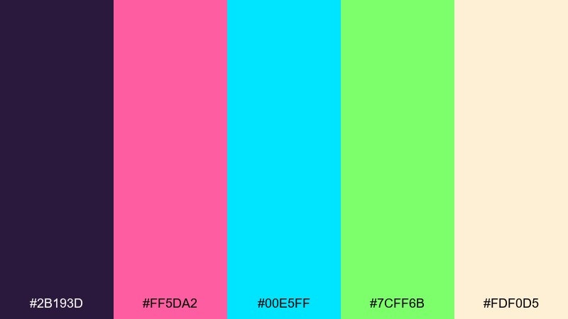
HEX: #2B193D #FF5DA2 #00E5FF #7CFF6B #FDF0D5
Mood: dreamy, neon, nostalgic
Best for: music stream overlay
Dreamy synth tones and neon haze evoke a late-night playlist over a glowing grid. The pink and cyan lead naturally, while the lime acts as a sparing, electric highlight for equalizers or live indicators. Pair with soft gradients and thin line art to keep it airy. Usage tip: use #FDF0D5 as a warm neutral for captions so they read smoothly against saturated accents.
Image example of vaporwave grid generated using media.io
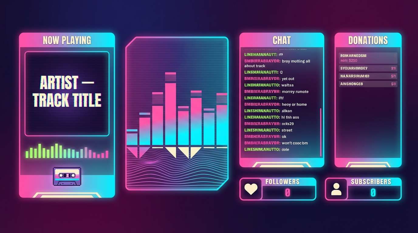
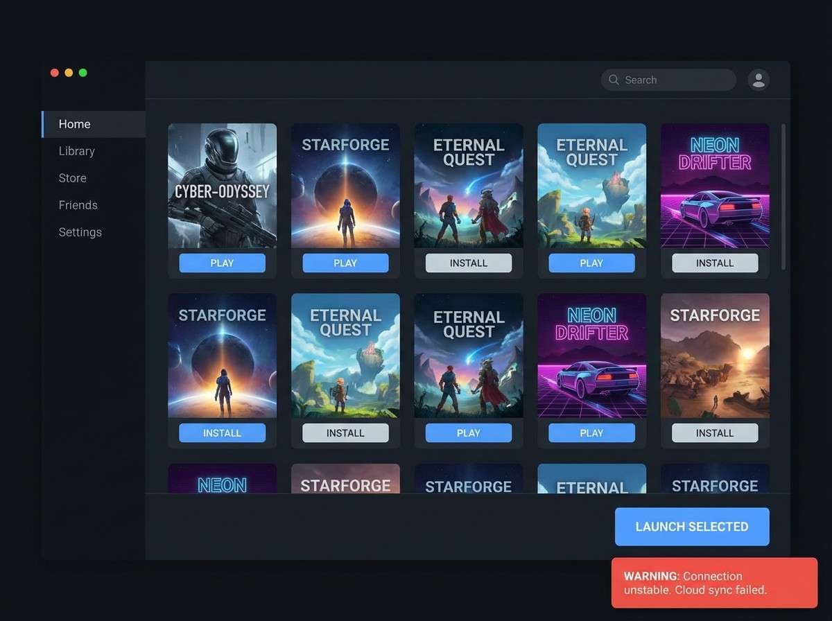
9) Dark Mode Pro
HEX: #0D1117 #161B22 #58A6FF #F85149 #C9D1D9
Mood: sleek, focused, professional
Best for: launcher app UI
Polished dark surfaces and crisp accents feel like a premium dashboard built for long sessions. As a gaming color palette for launchers, it keeps the interface calm while still giving clear signals through blue actions and red warnings. Pair with subtle borders and restrained shadows so the layers are readable without glare. Usage tip: set #C9D1D9 for body text and reserve pure whites for headlines only.
Image example of dark mode pro generated using media.io
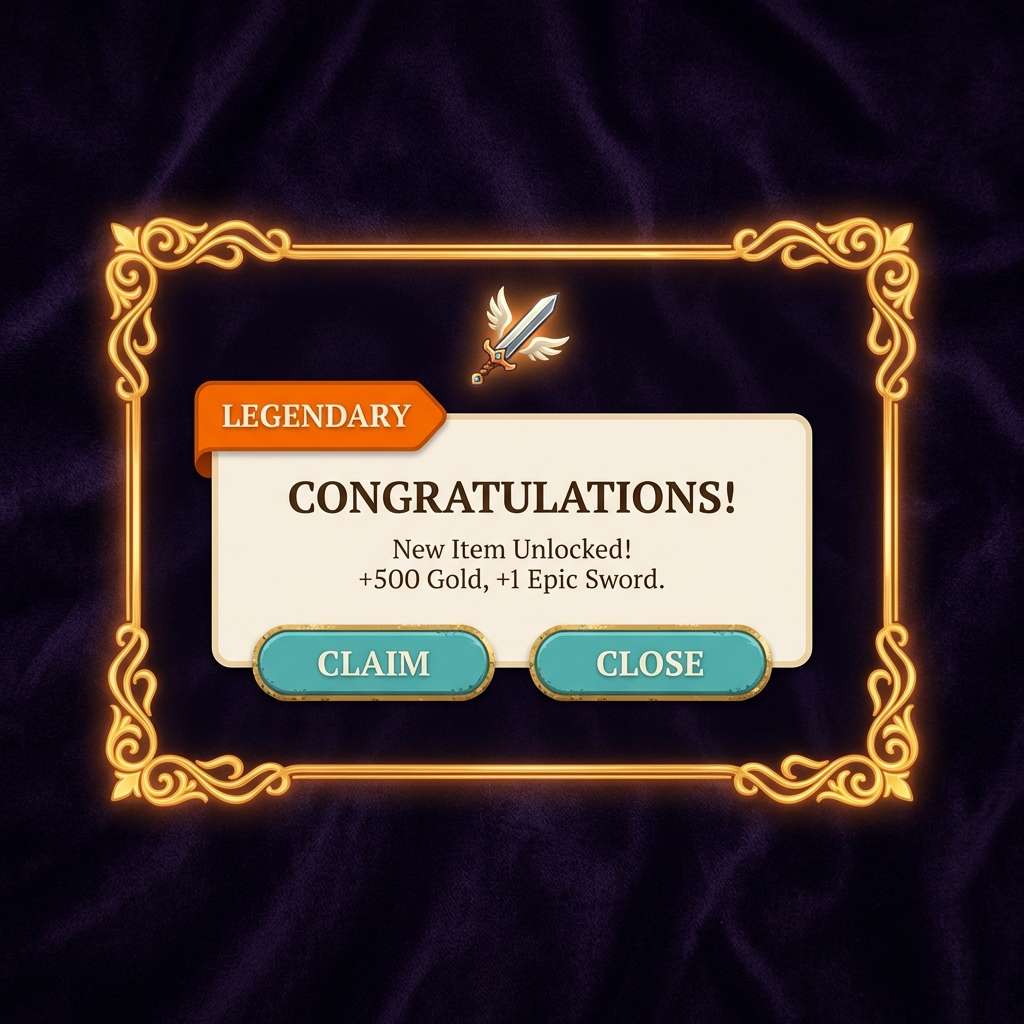
10) Loot Box Gold
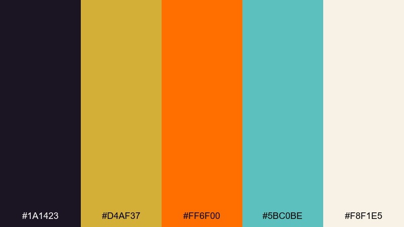
HEX: #1A1423 #D4AF37 #FF6F00 #5BC0BE #F8F1E5
Mood: premium, celebratory, bold
Best for: in-game reward popups
Shimmering gold and warm orange feel like a rare drop reveal with satisfying sparkle. The teal keeps the look modern and helps separate reward tiers from warnings or errors. Pair it with dark velvet backgrounds and a creamy neutral for readable copy. Usage tip: animate #D4AF37 with subtle glow while keeping the rest of the UI matte to sell the reward moment.
Image example of loot box gold generated using media.io
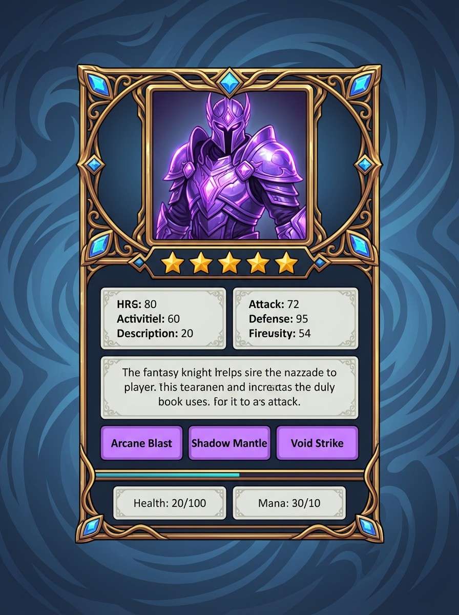
11) Mystic RPG
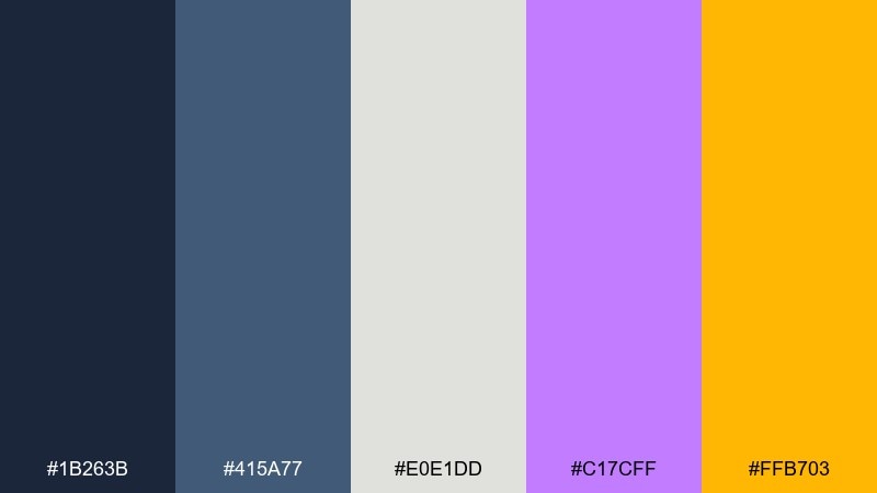
HEX: #1B263B #415A77 #E0E1DD #C17CFF #FFB703
Mood: mysterious, magical, cinematic
Best for: rpg character card UI
Moonlit armor, arcane runes, and a hint of treasure glow give this a cinematic fantasy vibe. The cool blues build atmosphere, while violet and gold highlight rarity, spells, or special abilities. Pair with serif display titles and thin ornament lines for an enchanted look. Usage tip: keep #FFB703 for rank stars and key stats so progression feels rewarding at a glance.
Image example of mystic rpg generated using media.io
12) Racing HUD
HEX: #0B0C10 #1F2833 #66FCF1 #45A29E #C5C6C7
Mood: fast, crisp, futuristic
Best for: racing game UI
Cold metallic tones and icy teal accents feel like speed, telemetry, and precision. The dark grays keep the HUD unobtrusive, while the bright teal reads instantly for lap timers and boost meters. Pair with condensed type and sharp icon shapes to reinforce the sense of motion. Usage tip: use #66FCF1 for only the active state, and #45A29E for idle to prevent constant visual shouting.
Image example of racing hud generated using media.io
13) Dungeon Torch
HEX: #2D1B0E #8D5524 #D4A373 #FFB703 #1B263B
Mood: gritty, warm, adventurous
Best for: fantasy game map UI
Torchlight on stone walls and aged parchment textures define this warm, gritty mood. The browns and tan work beautifully for map tiles and panels, while the gold accent marks quests and loot. Pair with desaturated blues for depth and to keep the warm tones from feeling flat. Usage tip: make #FFB703 your single highlight color for pins so navigation stays clear.
Image example of dungeon torch generated using media.io
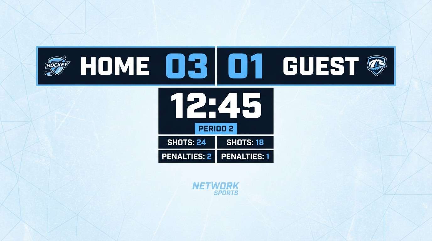
14) Ice Arena
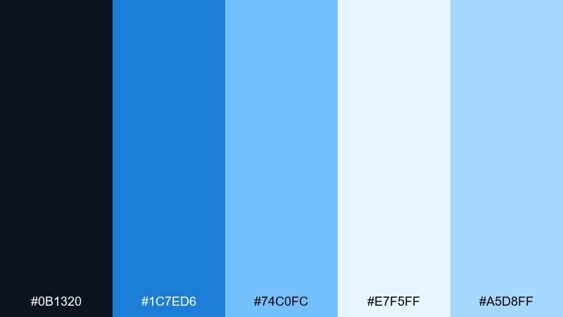
HEX: #0B1320 #1C7ED6 #74C0FC #E7F5FF #A5D8FF
Mood: cool, clean, competitive
Best for: sports game scoreboard UI
Frosty blues evoke stadium lights on ice and a crisp, competitive atmosphere. The light tints keep data-heavy layouts readable, while the deeper blue anchors team names and key numbers. Pair with bold numerals and simple dividers for a broadcast-ready look. Usage tip: use #1C7ED6 for the leading team highlight and keep the rest in pale tones to avoid clutter.
Image example of ice arena generated using media.io
15) Synthwave Sunset
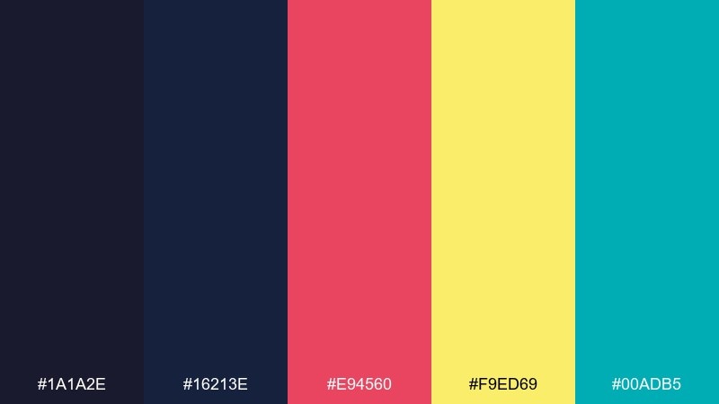
HEX: #1A1A2E #16213E #E94560 #F9ED69 #00ADB5
Mood: retro-futuristic, bold, lively
Best for: youtube gaming channel banner
Neon sunset energy and retro-futuristic contrast make the visuals feel loud in the best way. Pink and yellow pop against the dark blues, while teal adds a cool edge for secondary labels. Pair with big display type and simple geometric shapes so the colors do the heavy lifting. Usage tip: keep #F9ED69 to small highlight strokes around your channel name for instant focus.
Image example of synthwave sunset generated using media.io
16) Tactical Stealth
HEX: #050505 #2F2F2F #6C757D #A8DADC #E63946
Mood: stealthy, modern, serious
Best for: tactical shooter UI
Muted grays and deep black create a stealth-forward mood like night ops and quiet comms. The pale teal reads as a calm system accent, while the red is perfect for damage, enemy pings, or restricted states. Pair with minimal icon sets and tight spacing to keep it utilitarian. Usage tip: avoid large red fills and use it as an outline or small marker for maximum clarity.
Image example of tactical stealth generated using media.io
17) Fantasy Tavern
HEX: #2B1D0E #7F4F24 #C2A83E #E9C46A #264653
Mood: cozy, rustic, story-rich
Best for: tabletop stream overlay
Warm wood, lantern glow, and a cozy tavern corner set a story-first atmosphere. The gold tones feel inviting for headings and frames, while the deep teal provides a steady base for panels. Pair with textured borders and classic serif titles to enhance the fantasy vibe. Usage tip: keep the darkest shade for chat text and icons so readability holds over warm surfaces.
Image example of fantasy tavern generated using media.io
18) Sci-Fi Lab
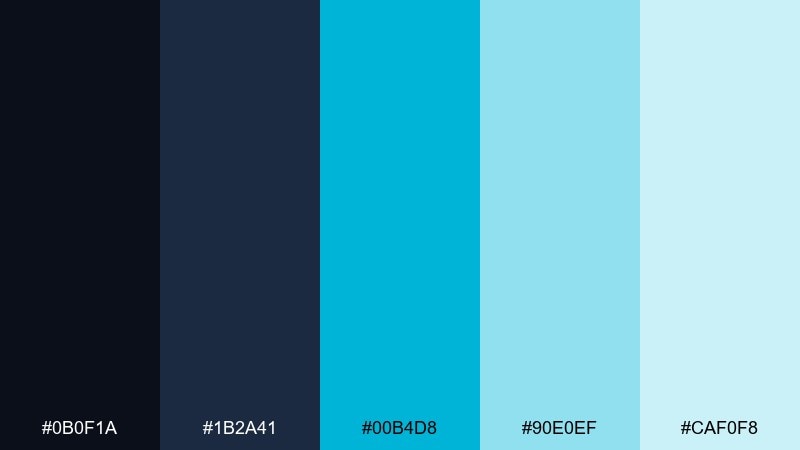
HEX: #0B0F1A #1B2A41 #00B4D8 #90E0EF #CAF0F8
Mood: clinical, futuristic, calm
Best for: tech product ad for gaming gear
Cool lab lighting and glassy interfaces give a clean, futuristic calm. The cyan family looks excellent on dark backgrounds for a premium tech feel without the harshness of neon. Pair with minimal layouts, plenty of negative space, and crisp product photography. Usage tip: use #00B4D8 for the call to action and keep the lighter blues for supporting labels and specs.
Image example of sci-fi lab generated using media.io
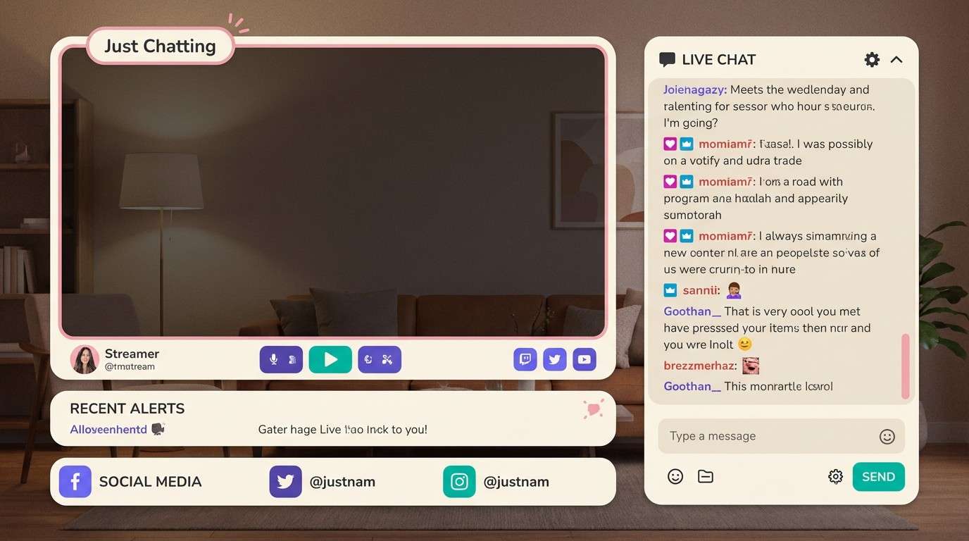
19) Cozy Streamer
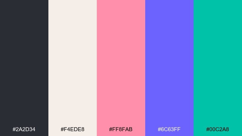
HEX: #2A2D34 #F4EDE8 #FF8FAB #6C63FF #00C2A8
Mood: friendly, modern, welcoming
Best for: just chatting overlay
Soft cream and cheerful accents feel welcoming, like a tidy desk setup with pastel LEDs. The purple and teal make great UI highlights while the charcoal keeps text sharp and grounded. Pair with rounded cards and gentle shadows for a modern creator look. Usage tip: use the cream as the main surface and keep saturation lower on large blocks to avoid glare on stream.
Image example of cozy streamer generated using media.io
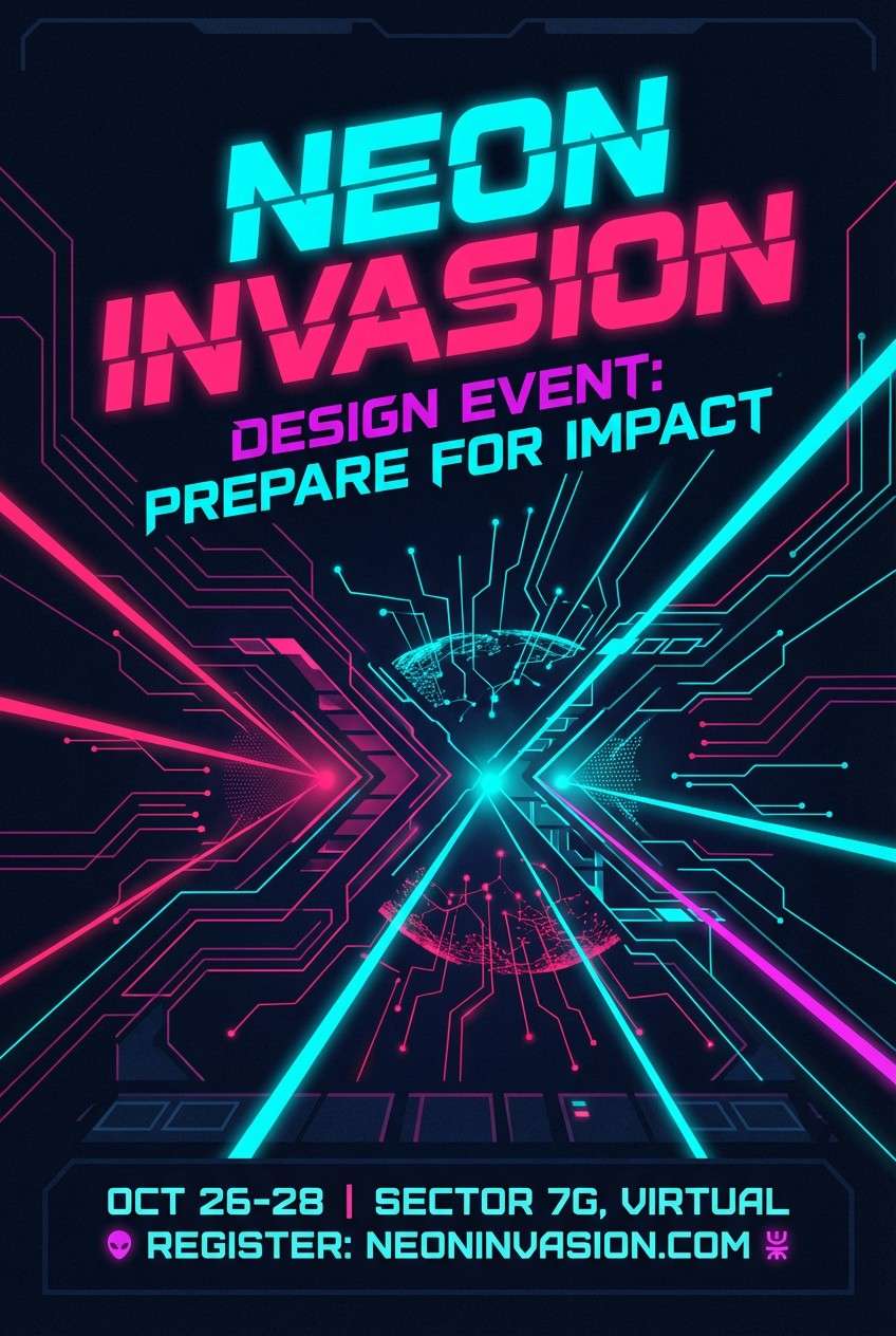
20) Alien Invasion
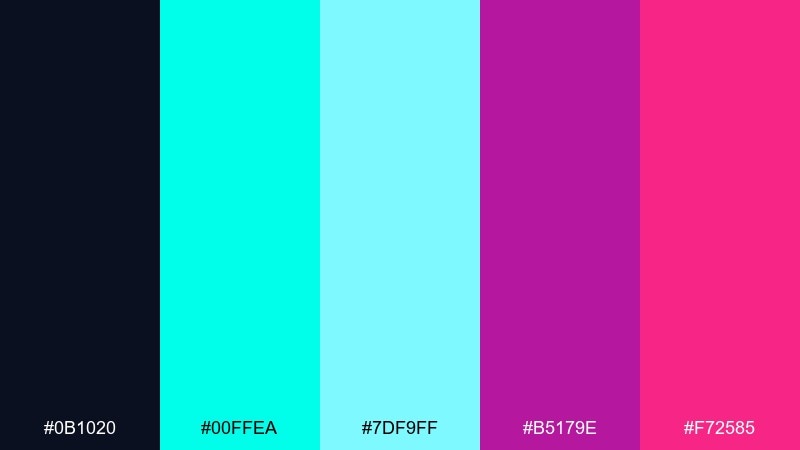
HEX: #0B1020 #00FFEA #7DF9FF #B5179E #F72585
Mood: otherworldly, neon, intense
Best for: sci-fi event flyer
Otherworldly neon signals and glitchy energy make the vibe feel like an incoming transmission. Cyan dominates cleanly, while magenta and hot pink add menace and excitement for headlines. Pair with sharp grid layouts and minimal iconography to keep it futuristic rather than messy. Usage tip: put the brightest pink only on the event date so the hierarchy is instant.
Image example of alien invasion generated using media.io
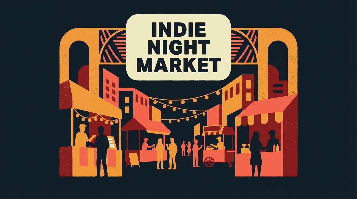
21) Indie Night Market
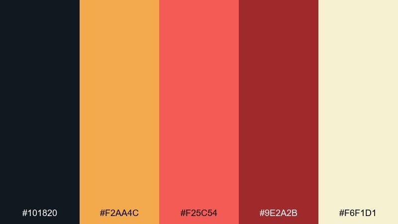
HEX: #101820 #F2AA4C #F25C54 #9E2A2B #F6F1D1
Mood: urban, warm, indie
Best for: indie game steam capsule art
Street food stalls at night and hand-painted signage come through in the warm, indie-friendly tones. The orange and coral feel energetic, while the deep reds add grit and a crafted look. Pair with paper textures and bold illustration for standout capsule art. Usage tip: keep #F6F1D1 behind the title text for a readable, storefront-style label.
Image example of indie night market generated using media.io
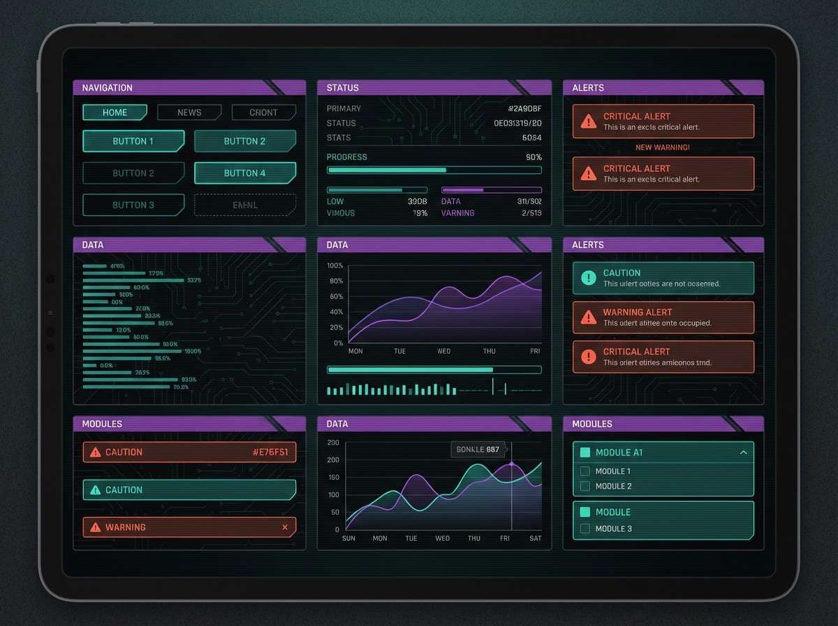
22) Glitch Cyber Noir
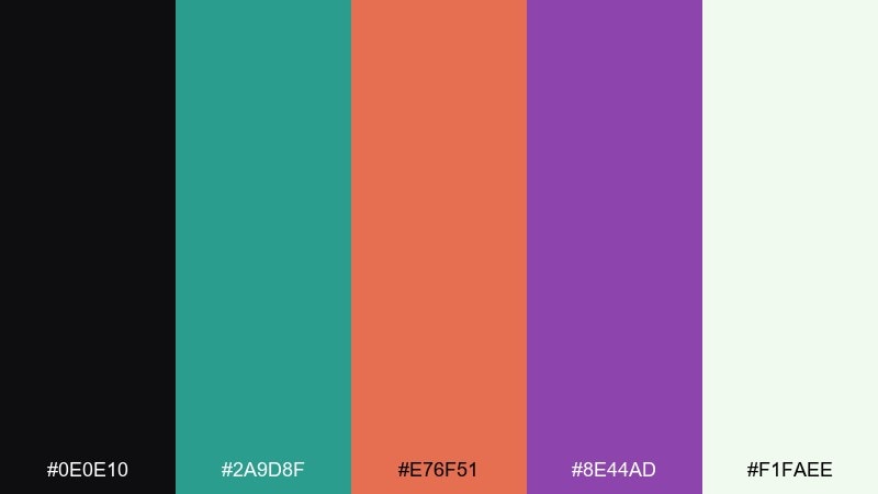
HEX: #0E0E10 #2A9D8F #E76F51 #8E44AD #F1FAEE
Mood: moody, cinematic, edgy
Best for: cyberpunk UI kit
Cinematic noir shadows with a hint of glitchy neon make everything feel tense and stylish. Teal and violet create a sleek base for tabs and toggles, while the orange-red is ideal for warnings or hot states. These gaming color combinations look best with thin dividers and deliberate spacing, not heavy gradients. Usage tip: set #F1FAEE for text and icons to keep legibility high on the near-black surfaces.
Image example of glitch cyber noir generated using media.io
What Colors Go Well with Gaming?
Dark bases (near-black, charcoal, deep navy) pair naturally with gaming aesthetics because they reduce glare and make accents feel brighter. Add a light neutral (off-white or cool gray) for readable text and UI labels.
For accents, choose one “hero” neon (cyan, magenta, electric green) and one secondary highlight (violet, gold, teal). This keeps your screens and overlays punchy without turning into noise.
If your design is content-heavy (scoreboards, settings, inventories), lean into cool blues/teals for actions and reserve warm reds/oranges for urgency, damage, or warnings.
How to Use a Gaming Color Palette in Real Designs
Start with roles, not vibes: assign a base background, surfaces, primary CTA, secondary CTA, and alert color. When every color has a job, your UI stays consistent across pages and states.
Use saturation strategically. Neon should be used for emphasis (buttons, badges, progress, live indicators), while large panels stay darker or more muted for comfort during long sessions.
Test readability in motion: overlays and HUDs often sit on top of gameplay. Make sure your text color and key accents still pass contrast when the background is bright, noisy, or fast-changing.
Create Gaming Palette Visuals with AI
If you want to preview a gaming palette in context (overlay, HUD, landing page, flyer, or UI kit), generate mockups from a simple text prompt. This helps you validate hierarchy, contrast, and “feel” before you commit to a full design system.
Try describing layout + style + where each color should dominate (base vs accents). Keep prompts explicit about readability: “clean panels,” “legible labels,” and “minimal background” usually produce better UI-like results.
Gaming Color Palette FAQs
-
What is a gaming color palette?
A gaming color palette is a set of coordinated colors designed for game UI, stream overlays, thumbnails, or esports branding—typically using a dark base plus high-contrast accents for fast readability. -
Why do gaming designs often use dark backgrounds?
Dark bases reduce glare, feel cinematic, and make bright accents (like cyan, magenta, or gold) stand out clearly for buttons, alerts, and highlights. -
What are the best neon UI colors for gaming?
Cyan, hot pink/magenta, electric green, and vivid violet are common picks. They read well as highlights when you keep most surfaces dark or muted. -
How many colors should a gaming palette have?
Five is a practical sweet spot: one deep base, one surface shade, one text neutral, and 1–2 accents. You can extend it later with tints for hover/disabled states. -
How do I keep a neon gaming palette readable?
Let dark tones dominate, reserve neon for UI states (active/hover/alerts), and use a light neutral for text. Avoid using multiple neons at full saturation on large blocks. -
What colors work best for esports branding?
High-contrast combinations like near-black + mint/cyan + cobalt, with a small red/orange accent, tend to feel competitive and reproduce well on jerseys, logos, and social graphics. -
Can I generate gaming palette mockups with AI?
Yes. Use an AI text-to-image tool to generate overlay/UI mockups by describing the layout, style, and exact HEX colors you want to feature.
Next: Boho Color Palette


