


 ChatGPT
 Perplexity
 Gemini
 Claude
 Grok
Grok
Cyberpunk color palettes mix neon intensity with deep, shadowy bases—perfect for designs that need instant contrast and a late-night, futuristic mood.
Below are 22 cyberpunk color palette ideas with HEX codes you can copy, plus AI image prompts to help you visualize each scheme fast.
In this article
- Why Cyberpunk Palettes Work So Well
-
- neon alley
- holo noir
- synthwave circuit
- rainy rooftop
- arcade glitch
- chrome orchid
- metro vapor
- biohazard bloom
- quantum dusk
- neon samurai
- plasma bazaar
- night market led
- data heist
- ultraviolet mist
- rusted neon
- carbon pink
- electric teal night
- laser lime grid
- magenta steel
- midnight neon
- neon lanterns
- circuit garden
- What Colors Go Well with Cyberpunk?
- How to Use a Cyberpunk Color Palette in Real Designs
- Create Cyberpunk Palette Visuals with AI
Why Cyberpunk Palettes Work So Well
Cyberpunk palettes are built around extreme contrast: inky darks for atmosphere, plus neon accents that read like signage, LEDs, and holograms. That push-pull gives designs an instant focal hierarchy.
They also translate well across mediums—UI, posters, thumbnails, packaging—because the bright colors pop even at small sizes while the dark foundations keep layouts controlled.
Most importantly, cyberpunk colors carry emotion fast: adrenaline, mystery, nightlife, and tech. With just a few swatches, you can signal “future city” without needing heavy illustration.
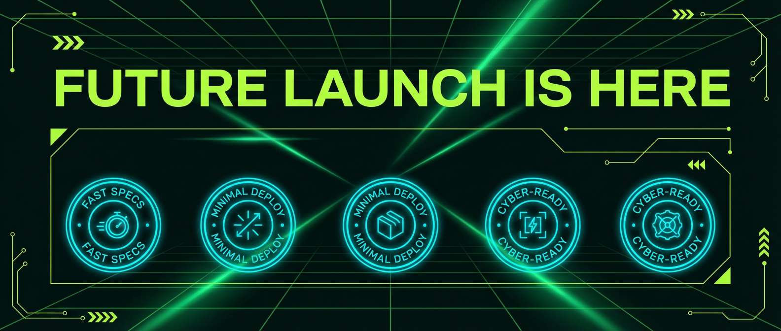
20+ Cyberpunk Color Palette Ideas (with HEX Codes)
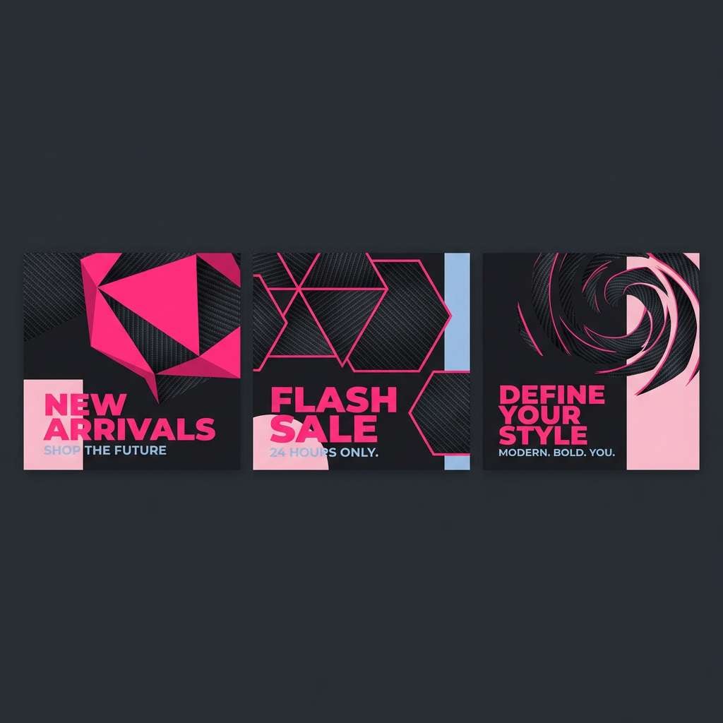
1) Neon Alley
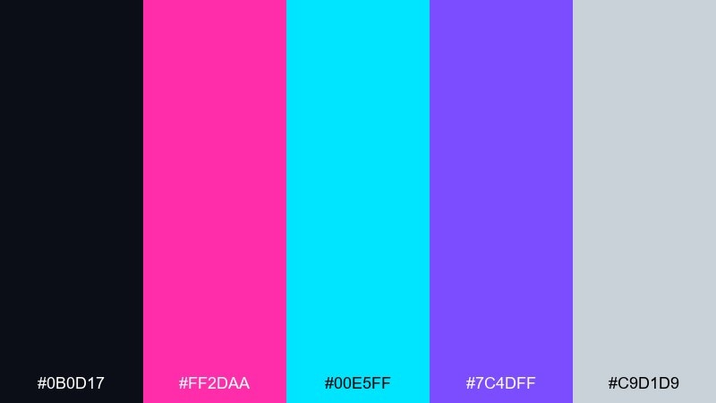
HEX: #0B0D17 #FF2DAA #00E5FF #7C4DFF #C9D1D9
Mood: electric, rainy, cinematic
Best for: gaming poster design
Electric and rain-slick, it feels like neon signage reflecting on asphalt at midnight. Use the hot magenta and cyan as the headline duo, then let the deep near-black carry the background. Purple bridges the two neons so gradients look intentional instead of noisy. Tip: keep body text in the pale gray for readability while saving the brightest accents for calls to action.
Image example of neon alley generated using media.io
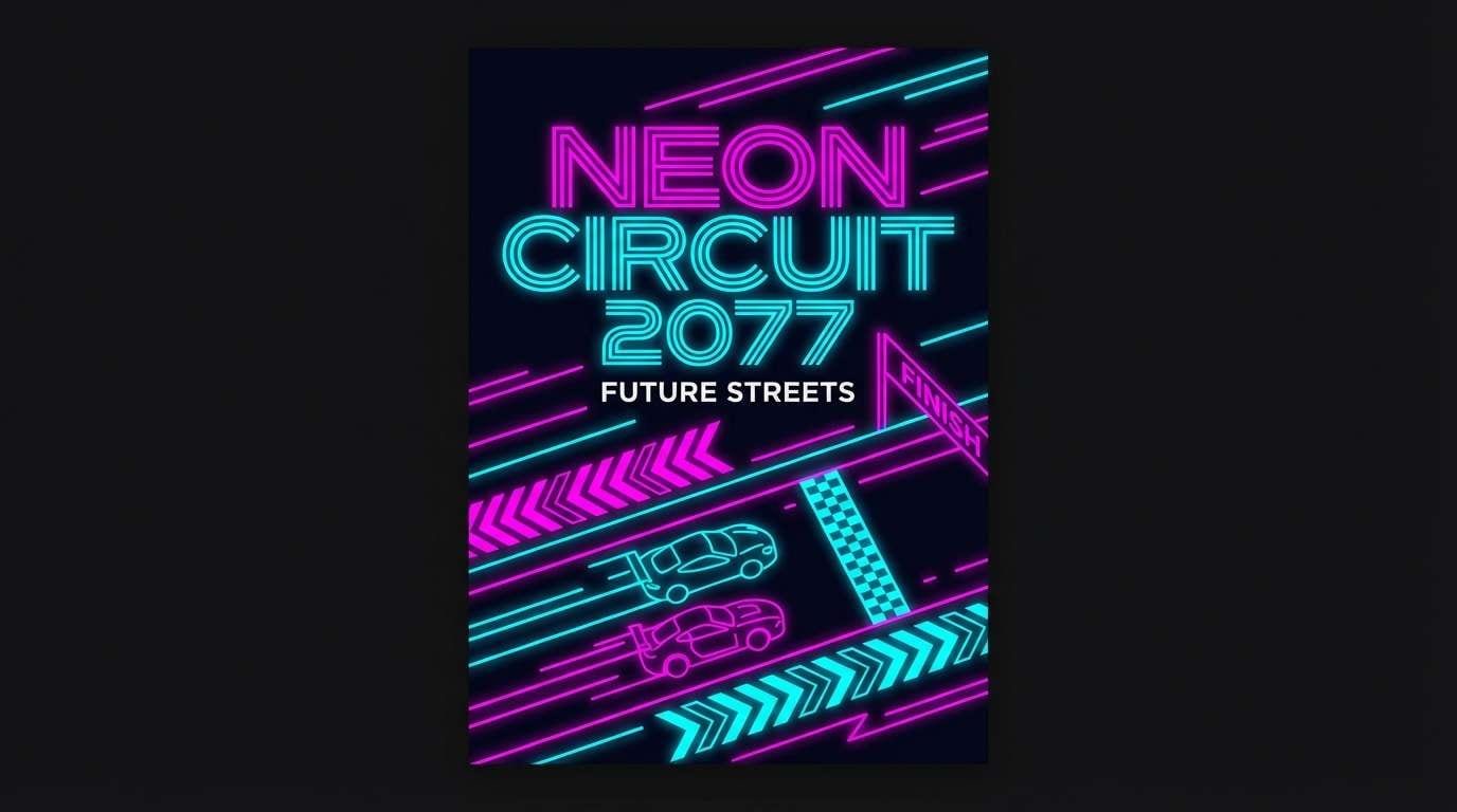
Create palette-perfect visuals with Media.io. Powered by Wan 2.7 Image, it helps you generate and edit images with precise color control, consistent tones, and ready-to-use styles in your browser.

2) Holo Noir
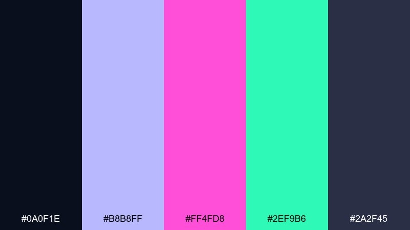
HEX: #0A0F1E #B8B8FF #FF4FD8 #2EF9B6 #2A2F45
Mood: sleek, mysterious, holographic
Best for: saas landing page hero UI
Sleek noir shadows meet holographic highlights, like a glassy interface floating in a dark room. Use the indigo-black and slate as your structure colors, then place lavender for panels and dividers. Magenta and mint work best as micro-accents for buttons, toggles, and key metrics. Tip: avoid equal saturation everywhere by reserving the mint for success states only.
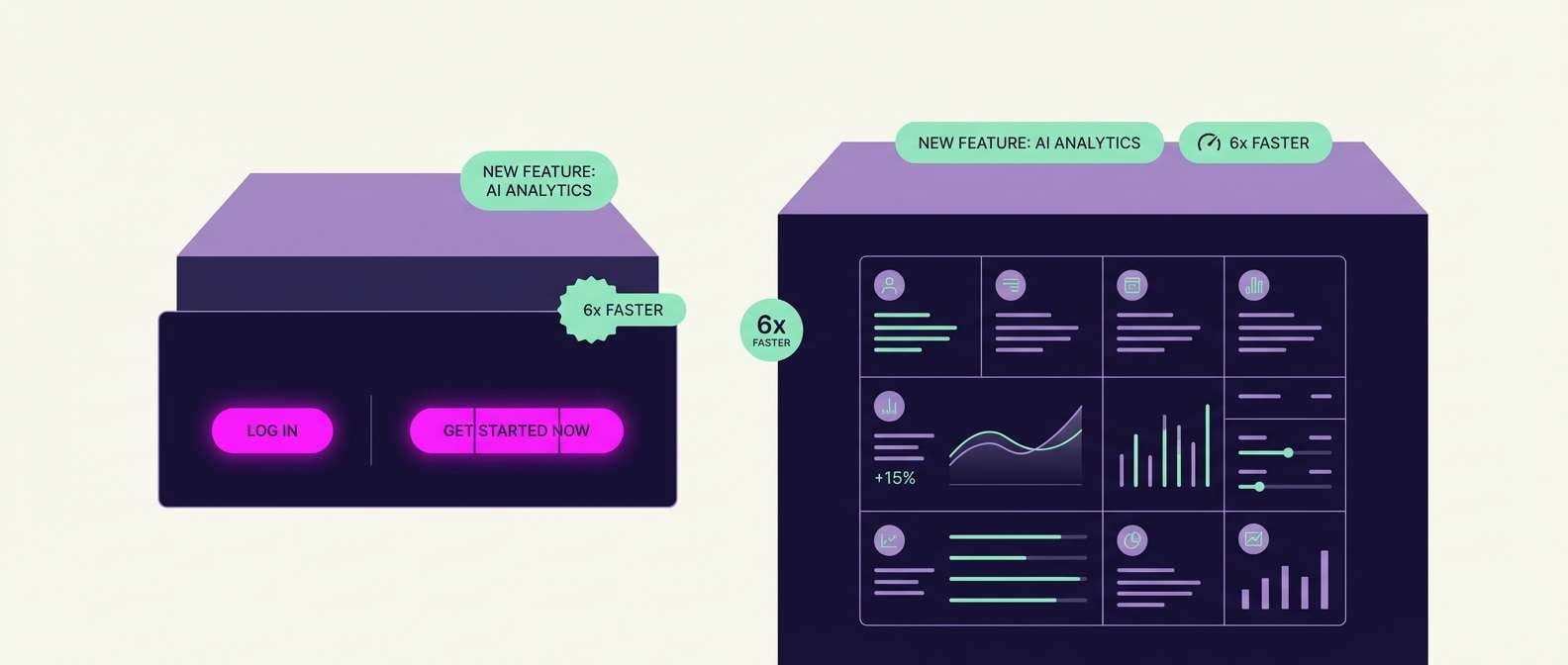
Image example of holo noir generated using media.io
3) Synthwave Circuit
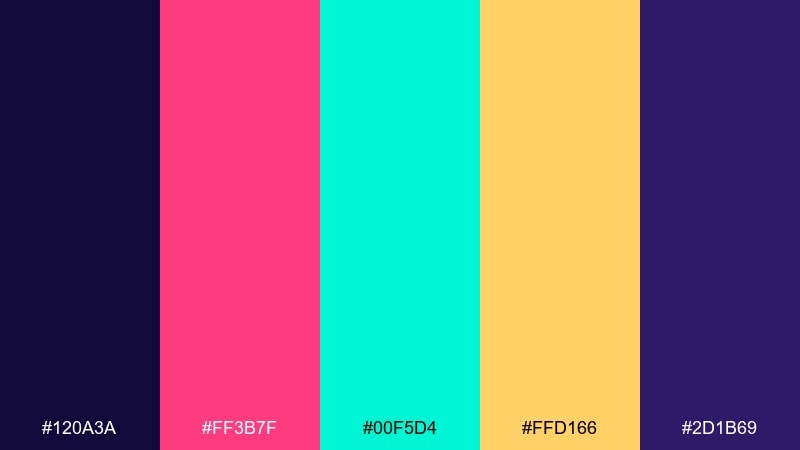
HEX: #120A3A #FF3B7F #00F5D4 #FFD166 #2D1B69
Mood: retro-futuristic, energetic, playful
Best for: album cover artwork
Retro-futuristic and punchy, it evokes arcade lights and pulsing circuitry lines. These cyberpunk color combinations shine when you pick one warm lead (magenta or gold) and back it with a single cool neon. Keep the two purples as the stage so the brights feel intentional rather than scattered. Tip: add subtle grain over the dark purples to make the neons pop without harsh edges.
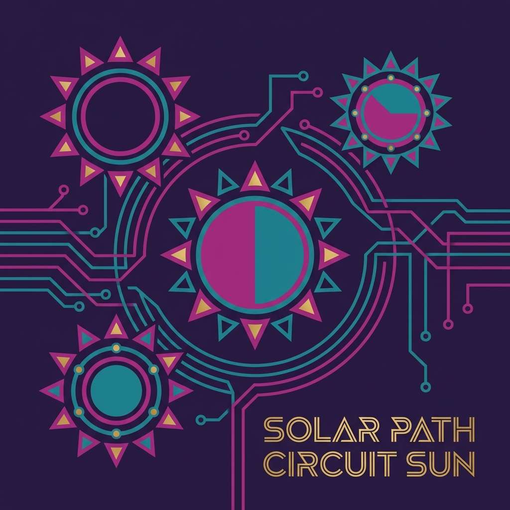
Image example of synthwave circuit generated using media.io
4) Rainy Rooftop
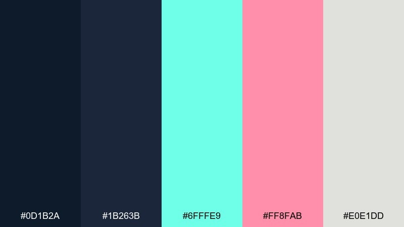
HEX: #0D1B2A #1B263B #6FFFE9 #FF8FAB #E0E1DD
Mood: cool, airy, night-rain calm
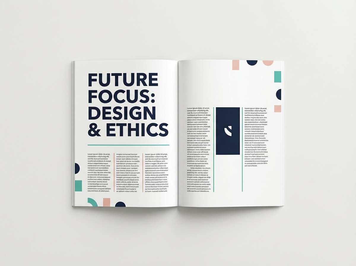
Best for: editorial magazine spread
Cool and airy, it suggests misty city air and soft neon leaking through fog. Build your layout on the two deep blues, then use the pale gray for spacious margins and captions. Teal and blush work best as section markers and pull-quote highlights. Tip: keep imagery slightly desaturated so the accents stay in control.
Image example of rainy rooftop generated using media.io
5) Arcade Glitch
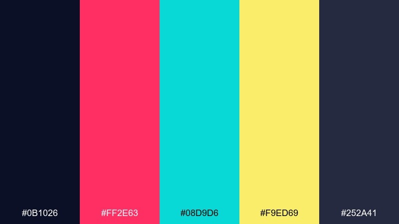
HEX: #0B1026 #FF2E63 #08D9D6 #F9ED69 #252A41
Mood: glitchy, bold, high-energy
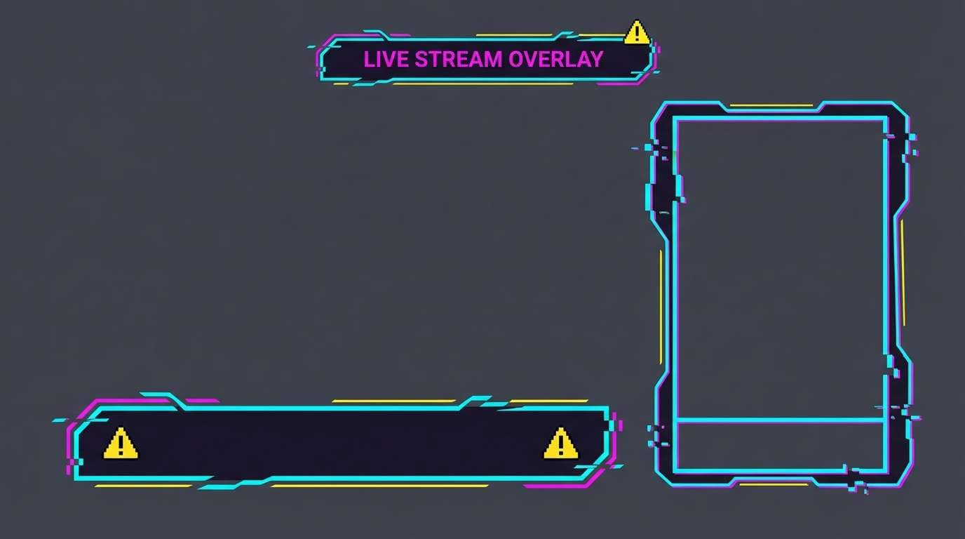
Best for: twitch overlay graphics
Glitchy and loud, it feels like a corrupted scoreboard flickering between frames. Let the near-black and charcoal set the canvas, then layer the cyan for lines, borders, and HUD elements. Use yellow sparingly for alerts and donations so it reads instantly. Tip: keep magenta for brand moments like the channel name and key buttons.
Image example of arcade glitch generated using media.io
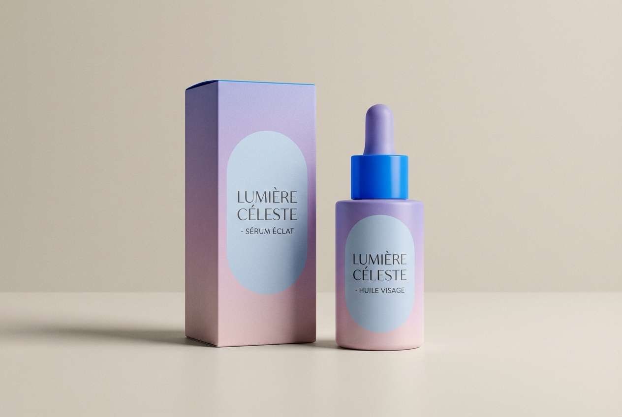
6) Chrome Orchid
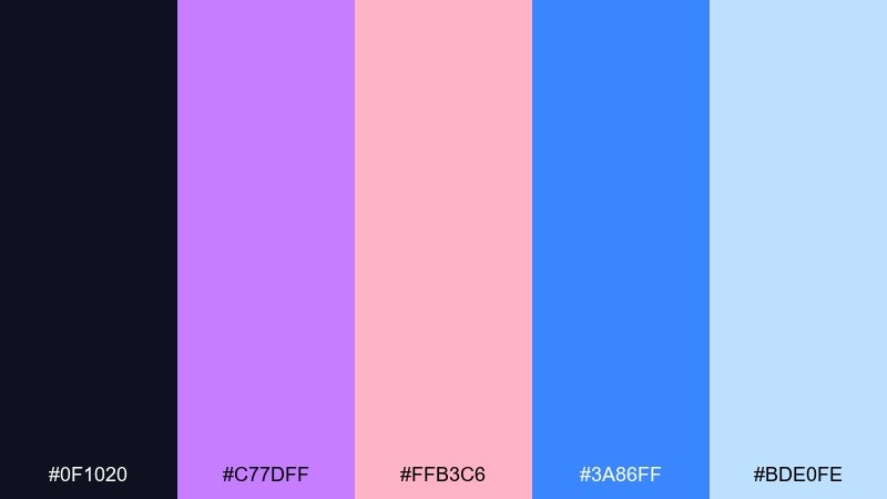
HEX: #0F1020 #C77DFF #FFB3C6 #3A86FF #BDE0FE
Mood: luxe, glossy, soft neon
Best for: beauty product packaging
Luxe and glossy, it reads like chrome reflections tinted with orchid light. Pair the violet with blush for the main brand duo, then use the bright blue for a modern, techy edge. The pale sky tone works well for labels and ingredient blocks without feeling sterile. Tip: print with a matte base and a spot-gloss on the violet to get that metallic pop.
Image example of chrome orchid generated using media.io
7) Metro Vapor
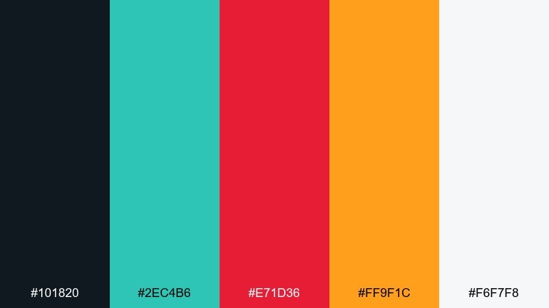
HEX: #101820 #2EC4B6 #E71D36 #FF9F1C #F6F7F8
Mood: urban, punchy, transit-signage
Best for: event flyer design
Urban and punchy, it calls up metro maps, hazard stripes, and late-night platform lights. This cyberpunk color palette works best with teal as the anchor, then red and orange as directional accents. Use the off-white for breathable negative space so the brights feel like signage, not clutter. Tip: stick to one accent per section to keep hierarchy crystal clear.
Image example of metro vapor generated using media.io

8) Biohazard Bloom
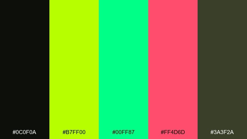
HEX: #0C0F0A #B7FF00 #00FF87 #FF4D6D #3A3F2A
Mood: toxic neon, edgy, high-alert
Best for: streetwear logo and tag set
Toxic neon and high-alert, it feels like warning stickers under UV light. Lime should lead the mark, with green as the secondary glow, while the dark olive keeps the set grounded. A small hit of hot pink adds attitude without turning everything candy-sweet. Tip: use thick strokes and simplified shapes so the neon reads cleanly on fabric.
Image example of biohazard bloom generated using media.io
9) Quantum Dusk
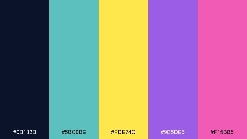
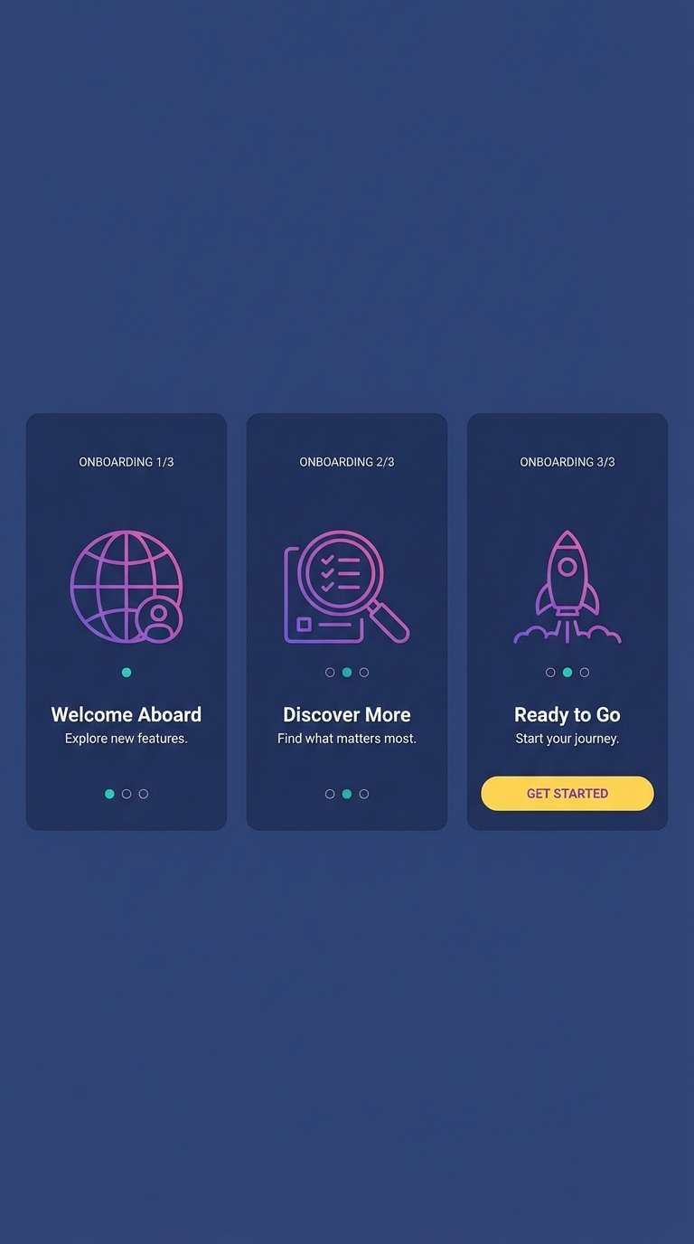
HEX: #0B132B #5BC0BE #FDE74C #9B5DE5 #F15BB5
Mood: dreamy, cosmic, luminous
Best for: app onboarding screens
Dreamy and cosmic, it suggests a dusk sky lit by floating UI holograms. Keep the navy as your base, then use teal for progress indicators and links so navigation feels calm. Yellow is perfect for one primary action per screen, while the purple and pink can carry illustrations or gradient highlights. Tip: limit gradients to two colors so onboarding stays readable.
Image example of quantum dusk generated using media.io
10) Neon Samurai
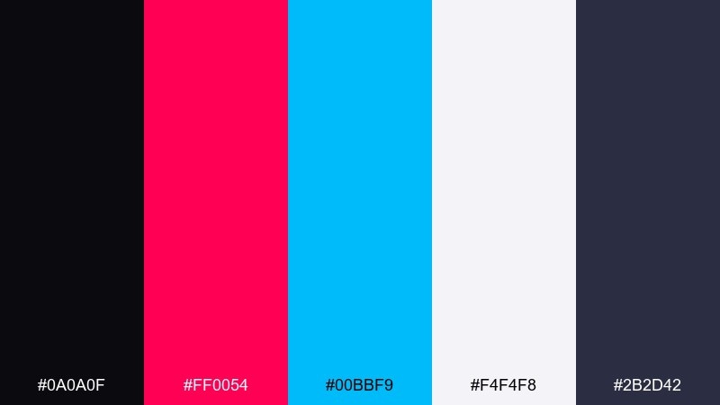
HEX: #0A0A0F #FF0054 #00BBF9 #F4F4F8 #2B2D42
Mood: sharp, heroic, high-contrast
Best for: esports team branding
Sharp and heroic, it looks like blade highlights cutting through a dark skyline. Use the icy near-white for type and negative space, and let charcoal panels keep everything readable. Magenta and electric blue make a strong two-color identity for badges, jerseys, and social headers. Tip: choose one neon for the primary logo fill and reserve the other for outlines and motion graphics.
Image example of neon samurai generated using media.io
11) Plasma Bazaar
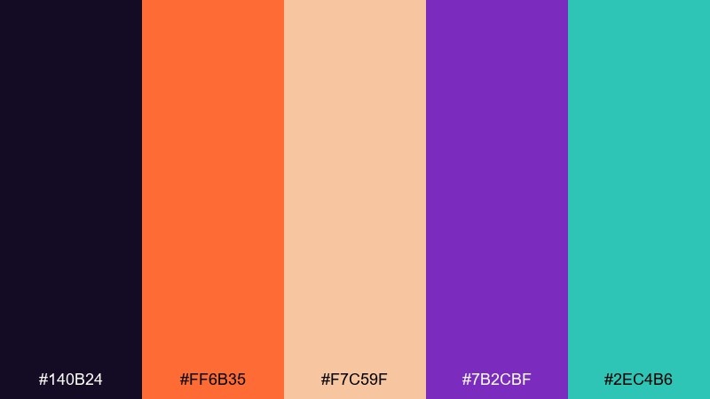
HEX: #140B24 #FF6B35 #F7C59F #7B2CBF #2EC4B6
Mood: warm neon, eclectic, market-night
Best for: restaurant menu redesign
Warm neon and eclectic, it feels like glowing stalls and signage in a crowded night bazaar. Orange and violet create the headline punch, while teal adds a fresh counterpoint for icons and section tabs. Use the pale peach for menu body text blocks so the page stays welcoming. Tip: keep backgrounds dark-purple and let the warm tones handle appetite appeal.
Image example of plasma bazaar generated using media.io
12) Night Market LED
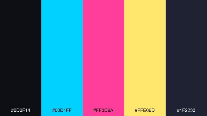
HEX: #0D0F14 #00D1FF #FF3D9A #FFE66D #1F2233
Mood: bright, lively, sign-lit
Best for: youtube thumbnail template
Bright and lively, it reads like LED boards stacked floor to ceiling. Put cyan and magenta in the title blocks and stickers, then use yellow as the single attention hook for numbers or key phrases. The two dark tones give you strong contrast for cutouts and shadows. Tip: keep outlines consistent so small text remains legible at thumbnail size.
Image example of night market led generated using media.io
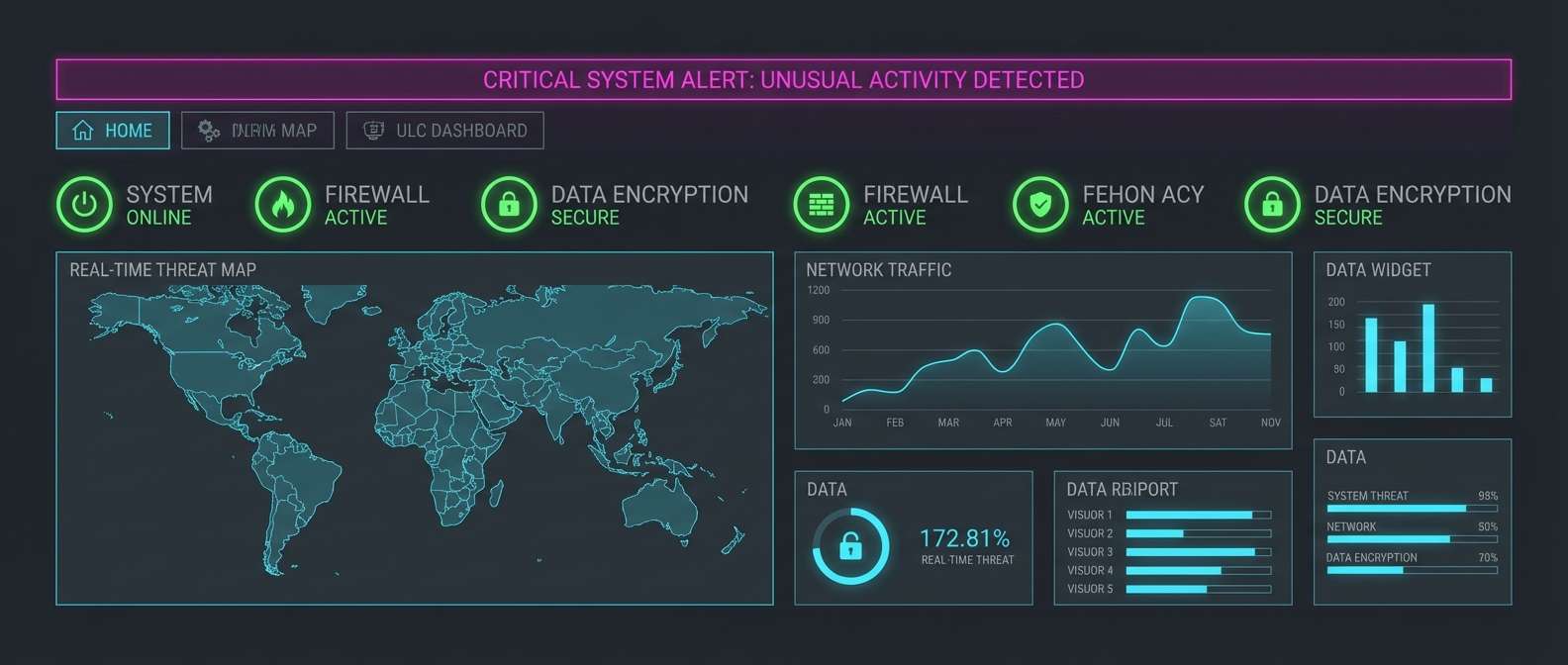
13) Data Heist
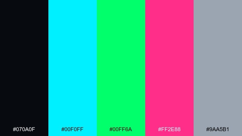
HEX: #070A0F #00F0FF #00FF6A #FF2E88 #9AA5B1
Mood: stealthy, technical, adrenaline
Best for: security dashboard UI
Stealthy and technical, it evokes terminal screens and a fast-moving breach map. These cyberpunk color combinations work well when cyan handles navigation and charts, while green signals safe states. Use magenta only for critical alerts so it never loses urgency. Tip: keep secondary text in the cool gray to reduce eye strain during long sessions.
Image example of data heist generated using media.io
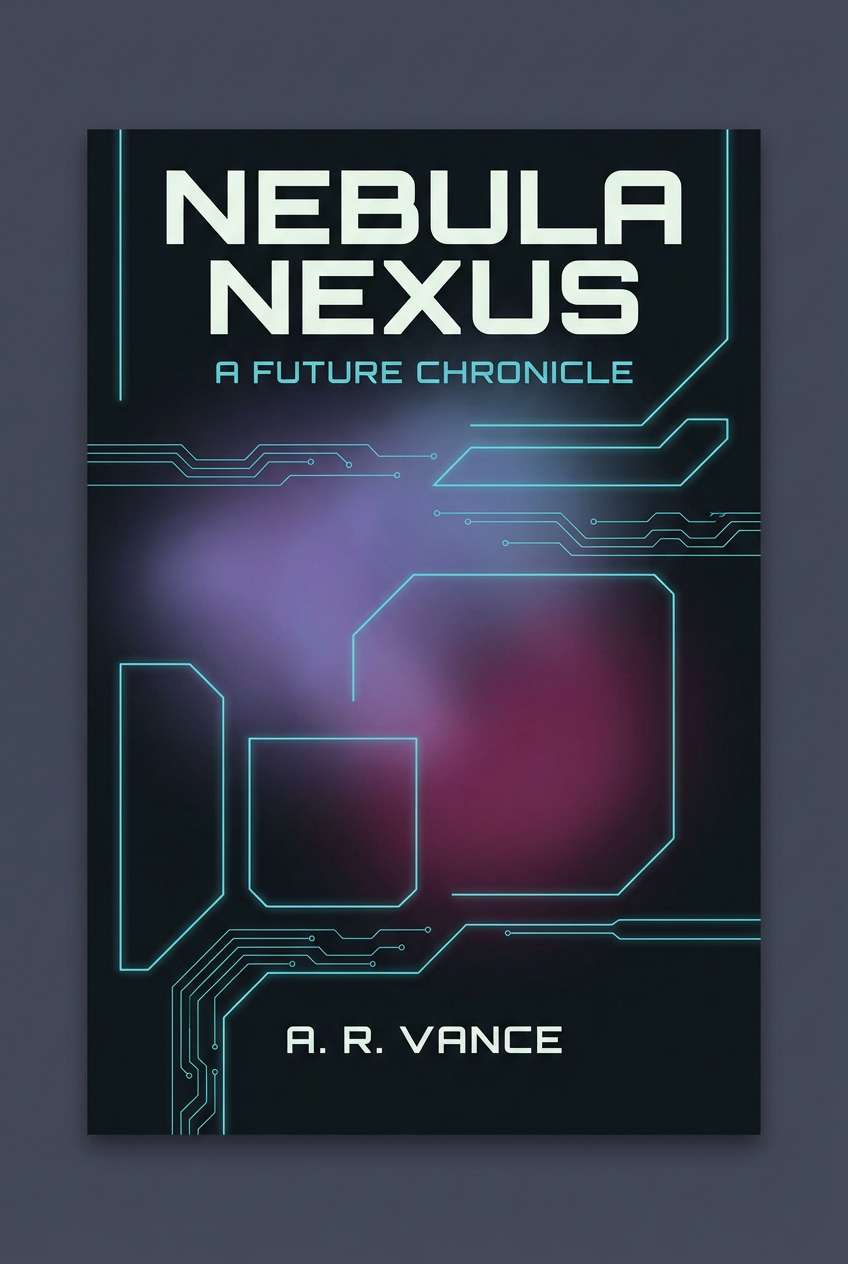
14) Ultraviolet Mist
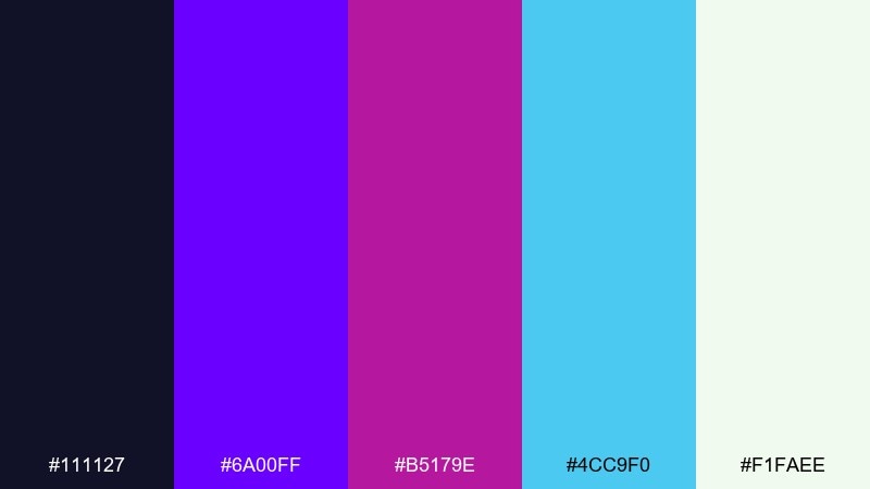
HEX: #111127 #6A00FF #B5179E #4CC9F0 #F1FAEE
Mood: moody, hazy, luminous
Best for: book cover design
Moody and hazy, it feels like ultraviolet fog rolling between towers. Violet and magenta make a dramatic title pairing, while cyan can highlight author name or small icons. Use the near-white sparingly to create crisp focal points against the dark base. Tip: a soft radial glow behind the title helps readability without flattening the mood.
Image example of ultraviolet mist generated using media.io
15) Rusted Neon
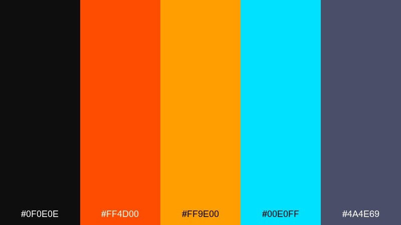
HEX: #0F0E0E #FF4D00 #FF9E00 #00E0FF #4A4E69
Mood: gritty, industrial, glowing
Best for: tech conference badge design
Gritty and industrial, it looks like neon tubing bolted onto worn metal. Use the black and steel-violet as your base, then treat orange and amber as the main brand warmth. A small cyan accent adds that unmistakable futuristic edge without fighting the warm tones. Tip: make QR codes and fine print sit on light orange panels for reliable scanning.
Image example of rusted neon generated using media.io
16) Carbon Pink
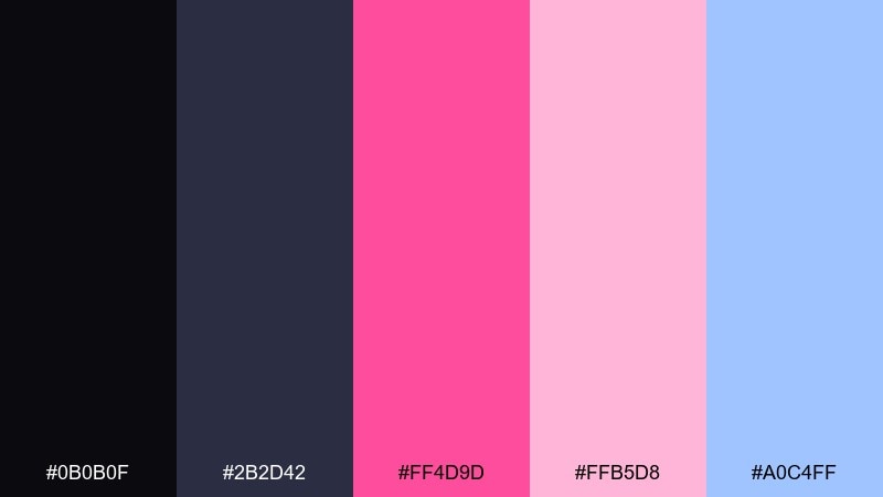
HEX: #0B0B0F #2B2D42 #FF4D9D #FFB5D8 #A0C4FF
Mood: sleek, stylish, nightlife glam
Best for: fashion brand social posts
Sleek and nightlife-glam, it feels like carbon fiber under pink neon. Use the two dark neutrals for frames and typography, then let the saturated pink carry the hero moments. The light pink and soft blue are ideal for backgrounds, stickers, and subtle gradients. Tip: keep photo overlays minimal so the palette stays the star.
Image example of carbon pink generated using media.io
17) Electric Teal Night
HEX: #05060A #00FFC6 #00A8E8 #7A7D7D #E8EDDF
Mood: clean, technical, cool neon
Best for: fintech app UI kit
Clean and technical, it suggests precision instruments lit by cool neon. The teal and bright blue make a confident pairing for buttons, charts, and active states. Support them with graphite gray for dividers and the off-white for cards and forms. Tip: reserve the brightest teal for primary actions to avoid a glowing overload.
Image example of electric teal night generated using media.io
18) Laser Lime Grid
HEX: #0A0C10 #D6FF00 #4DFF4D #00BBF9 #1B1F2E
Mood: sharp, geometric, high-voltage
Best for: tech product launch banner
Sharp and geometric, it feels like a laser grid cutting across a dark hangar. Lime should take the lead for headlines and feature callouts, while neon green can handle secondary highlights. Cyan is best used as a cool contrast for links or spec badges. Tip: add thin grid lines in the deep navy to reinforce the technical vibe without extra clutter.
Image example of laser lime grid generated using media.io
19) Magenta Steel
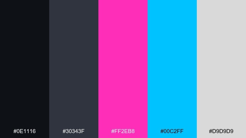
HEX: #0E1116 #30343F #FF2EB8 #00C2FF #D9D9D9
Mood: modern, metallic, confident
Best for: brand identity mini guide
Modern and metallic, it brings to mind brushed steel lit by a magenta sign. The dark grays create a sturdy foundation, while magenta and cyan deliver the personality. This cyberpunk color scheme is ideal for brands that want a tech edge without going full rainbow. Tip: define one neon as primary and keep the other for supporting highlights and charts.
Image example of magenta steel generated using media.io
20) Midnight Neon
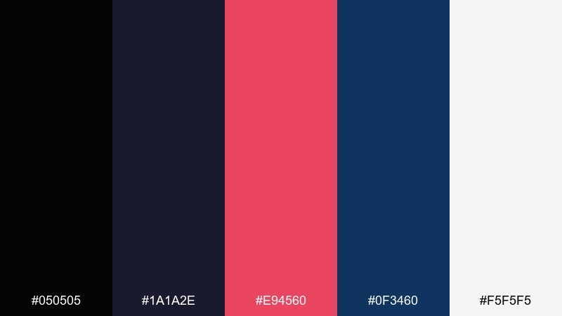
HEX: #050505 #1A1A2E #E94560 #0F3460 #F5F5F5
Mood: dramatic, moody, cinematic
Best for: movie title card design
Dramatic and cinematic, it feels like a title sequence emerging from deep midnight. Use the black and navy to build tension, then let the red-pink do the emotional punch. A crisp off-white is perfect for credits and small details that must stay readable. Tip: keep the red-pink slightly textured so it looks like light, not flat paint.
Image example of midnight neon generated using media.io
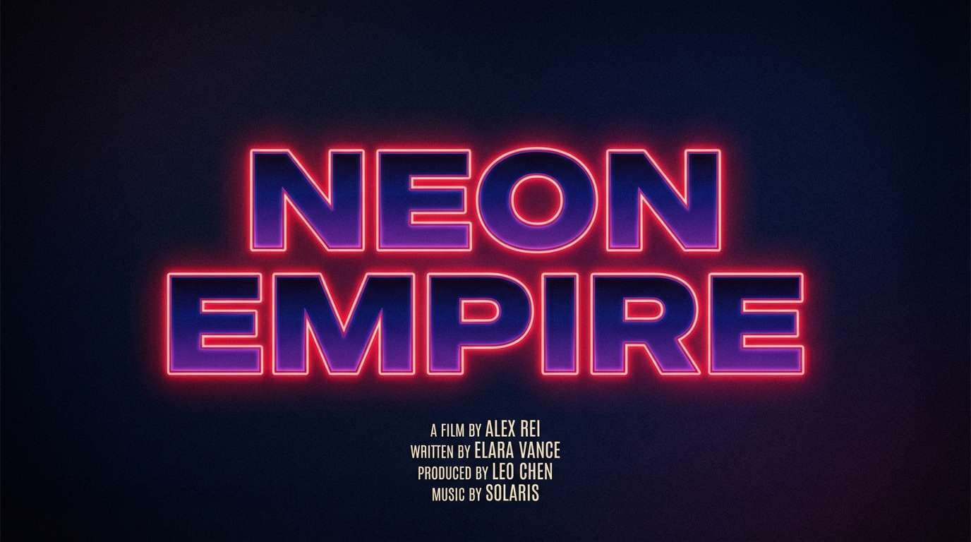
21) Neon Lanterns
HEX: #0C1021 #FF4E50 #FC913A #F9D423 #2B9EB3
Mood: warm, festive, night-street glow
Best for: festival invitation design
Warm and festive, it evokes lantern light and neon reflections on wet stone. Use coral and orange for the main invitation hierarchy, with yellow as the sparkle for dates and location icons. Teal balances the heat and works well for borders or secondary headings. Tip: keep the background deep and simple so the warm tones feel like light sources.
Image example of neon lanterns generated using media.io
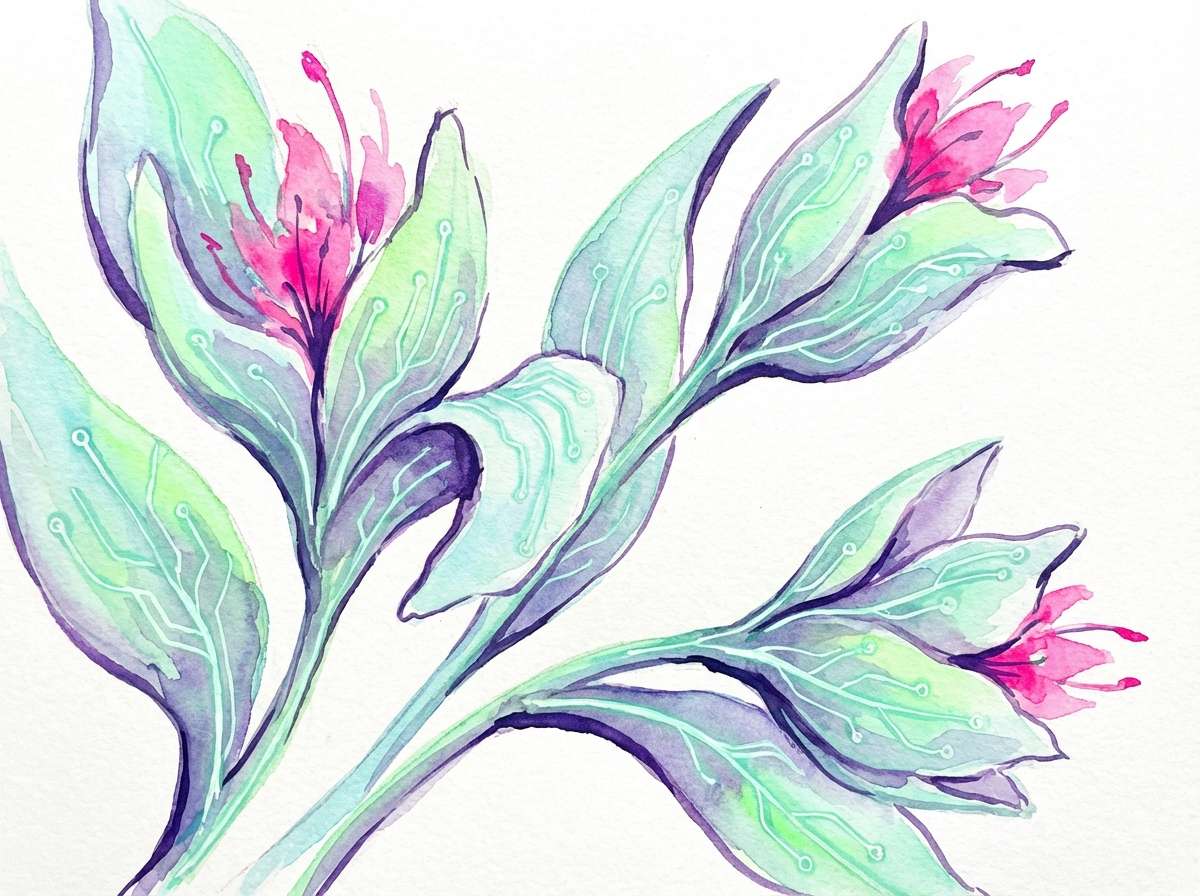
22) Circuit Garden
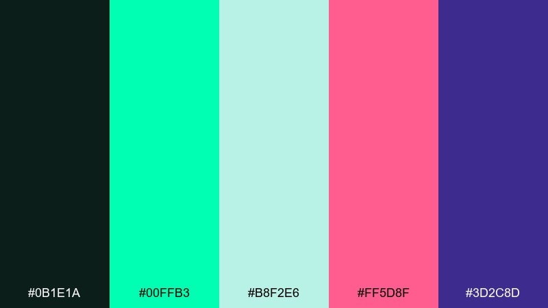
HEX: #0B1E1A #00FFB3 #B8F2E6 #FF5D8F #3D2C8D
Mood: fresh neon, botanical-tech, playful
Best for: watercolor botanical illustration
Fresh and playful, it feels like a greenhouse lit by LEDs and humming circuits. The mint and soft aqua can carry petals and leaves, while the dark teal anchors stems and shadows. Use pink as a blossom accent and purple for depth in the background wash. Tip: keep the watercolor edges loose and let the neon mint appear in small, concentrated highlights.
Image example of circuit garden generated using media.io
What Colors Go Well with Cyberpunk?
Cyberpunk colors pair best when you balance a near-black base (charcoal, navy, indigo) with 1–2 neon “sign” hues such as cyan, magenta, lime, or electric violet. The dark foundation gives the neons room to glow.
For readable layouts, add a desaturated neutral (cool gray or off-white) for body text, dividers, and UI surfaces. This keeps the palette from becoming visually exhausting.
If you want a more “street” or industrial vibe, introduce warm accents like hazard yellow, amber, or neon orange—then keep them sparse so they function like alerts and directional signage.
How to Use a Cyberpunk Color Palette in Real Designs
Start with role-based assignment: pick one base background, one surface color, one primary neon (brand), and one secondary neon (support). This makes cyberpunk color combinations feel designed rather than random.
Use saturation as hierarchy. Reserve the most saturated neon for the primary CTA, the logo, or the key headline; keep secondary elements slightly darker or less saturated to reduce glare.
For gradients and glows, limit blends to two hues (for example, magenta→violet or cyan→blue). Too many neon transitions can create noise, especially in UI and small-format graphics.
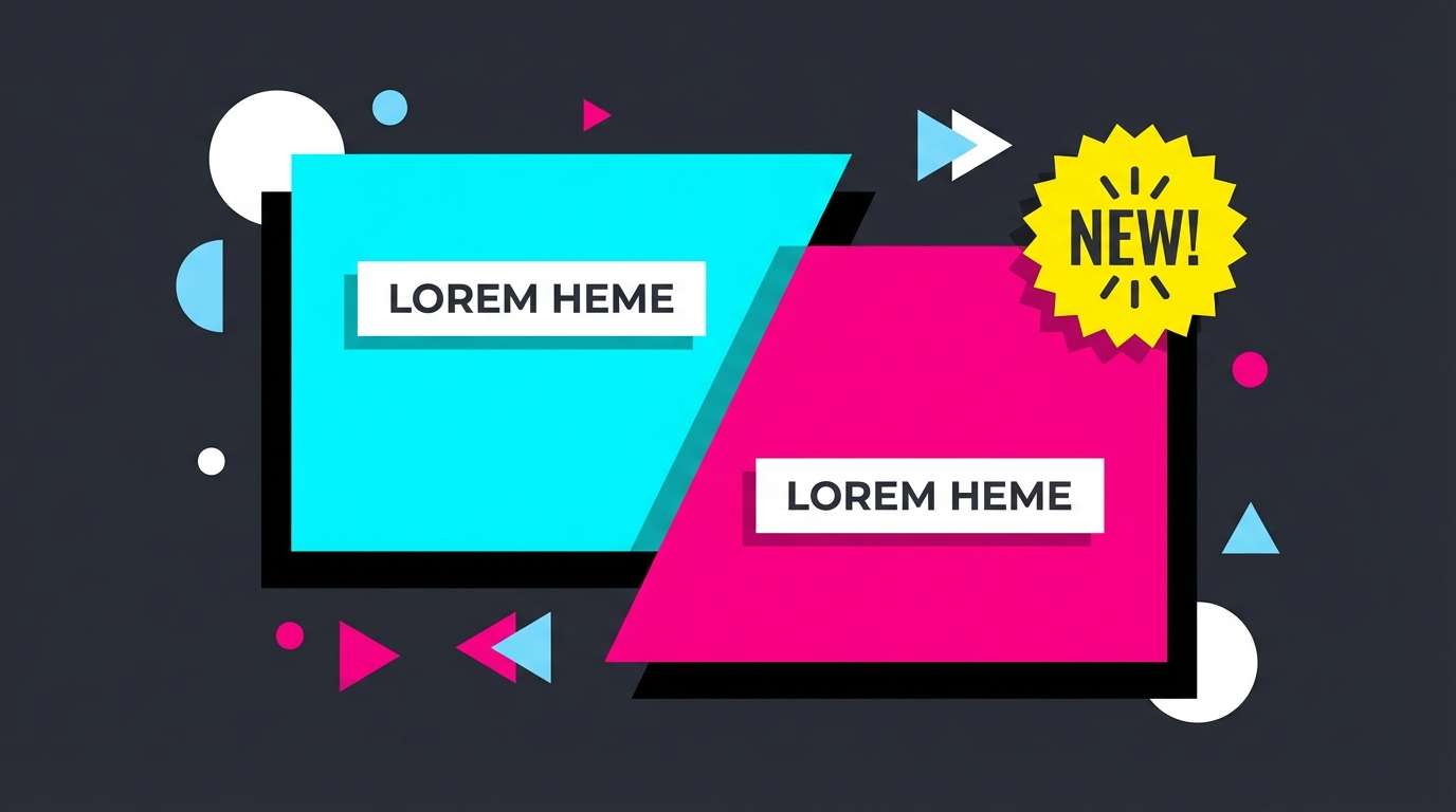
Create Cyberpunk Palette Visuals with AI
If you already have HEX codes, the fastest way to validate them is to generate a few mock visuals—posters, UI hero sections, covers, or thumbnails—and see how the contrast holds up in context.
With Media.io’s text-to-image tool, you can paste a prompt, specify a clean layout style, and iterate quickly until the neon-to-shadow balance feels right for your brand.
Try generating one concept per palette above, then swap which neon is “primary” to explore different identity directions without redesigning from scratch.
Cyberpunk Color Palette FAQs
-
What is a cyberpunk color palette?
A cyberpunk color palette typically combines deep, dark base tones (black, navy, charcoal) with high-saturation neon accents like cyan, magenta, lime, and violet to create a futuristic, night-city look. -
What are common cyberpunk HEX codes?
Popular cyberpunk HEX codes include neon cyan (#00E5FF, #00D1FF), hot magenta (#FF2DAA, #FF2E88), electric violet (#7C4DFF, #6A00FF), and near-black bases (#050505, #0B0D17). -
How many neon colors should I use in one design?
For most layouts, use 1 primary neon and 1 secondary neon. Add one neutral for text/surfaces and keep the rest dark foundations to prevent the design from feeling chaotic. -
Which cyberpunk colors are best for UI design?
Cyan and teal work well for navigation and data visuals, while magenta is strong for primary actions. Use off-white or cool gray for readable text and dark navy/charcoal for backgrounds. -
How do I keep cyberpunk palettes readable?
Maintain strong contrast (light text on dark backgrounds), reserve bright neons for emphasis, and use desaturated neutrals for paragraphs. Avoid placing neon text directly on another neon. -
What’s the difference between cyberpunk and synthwave palettes?
Synthwave often leans into retro sunsets (pink-purple gradients with warm yellows), while cyberpunk is more “neon signage in darkness,” using deeper blacks/navies and sharper, techy accents like cyan and lime. -
Can I use cyberpunk colors for branding?
Yes—pick one signature neon (for example, magenta or cyan) and support it with dark neutrals and a restrained secondary accent. This keeps the brand consistent while still feeling futuristic.


