

Sunset orange brings instant warmth, energy, and friendliness—without the harshness of pure neon orange. It’s a go-to for brands and visuals that want to feel human, optimistic, and bold.
Below are sunset orange color palette ideas with HEX codes, plus practical pairing notes for branding, UI, packaging, and seasonal campaigns.
In this article
- Why Sunset Orange Palettes Work So Well
-
- desert ember
- citrus dusk
- terracotta linen
- copper sunrise
- amber canyon
- coral horizon
- spiced apricot
- saffron toast
- burnt nectar
- pumpkin latte
- sunset studio ui
- retro motel sign
- autumn market
- minimal clay and cream
- coastal sunset
- festival marigold
- rustic brickwork
- peachy neon pop
- smoky sienna night
- golden persimmon
- sunlit clay garden
- ember and indigo ink
- What Colors Go Well with Sunset Orange?
- How to Use a Sunset Orange Color Palette in Real Designs
- Create Sunset Orange Palette Visuals with AI
Why Sunset Orange Palettes Work So Well
Sunset orange sits in a sweet spot between energetic orange and softer, more wearable terracotta/coral tones. That makes it versatile: it can feel playful in ads, premium in packaging, or confident in product UI.
It also pairs naturally with neutrals (cream, sand, warm gray) for breathable layouts, and with deep darks (charcoal, navy, indigo) for sharp contrast and readable typography.
Because it evokes golden-hour light, sunset orange tends to “humanize” modern design—helping digital products and brand visuals feel warmer, friendlier, and more memorable.
20+ Sunset Orange Color Palette Ideas (with HEX Codes)
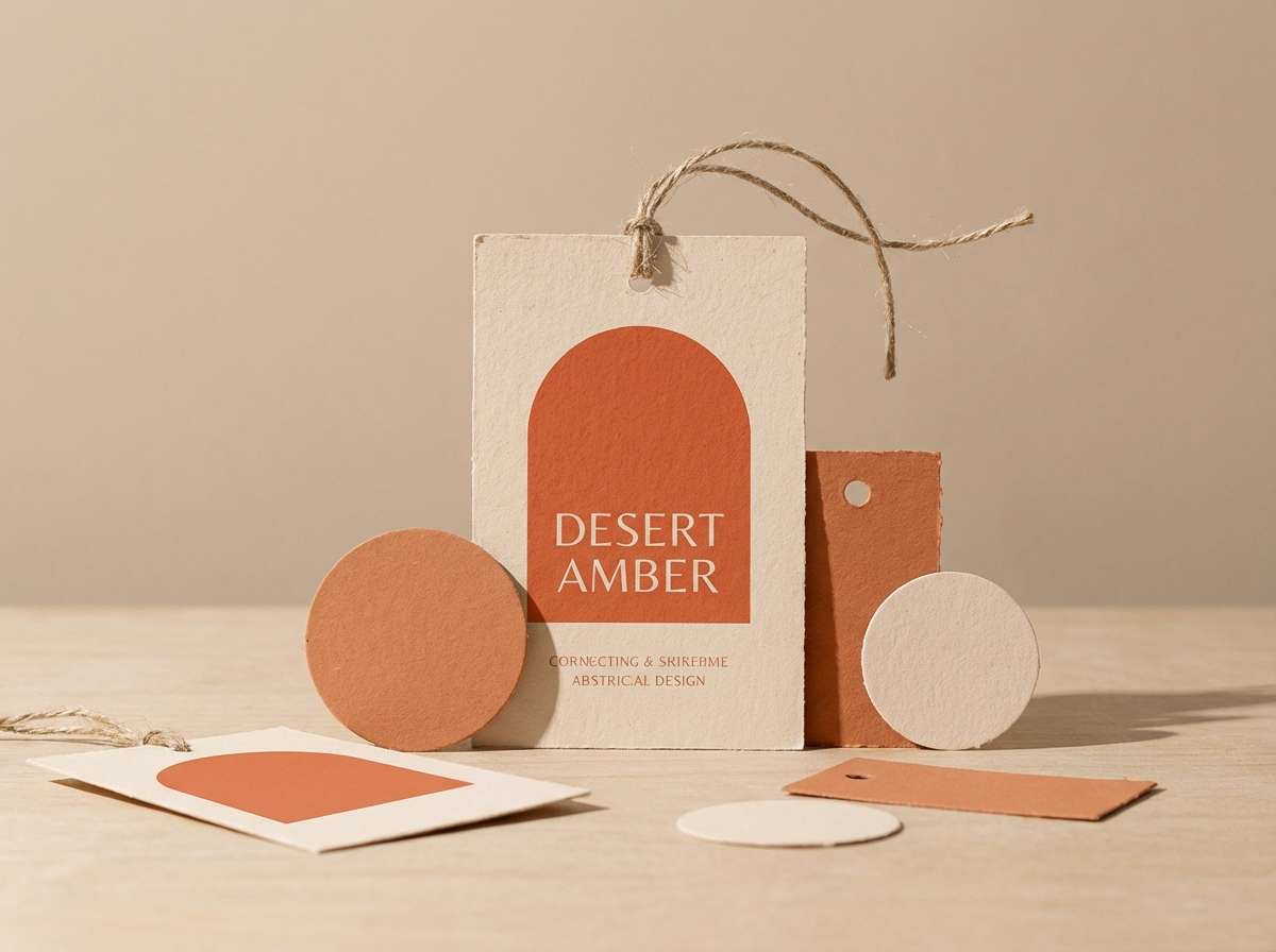
1) Desert Ember
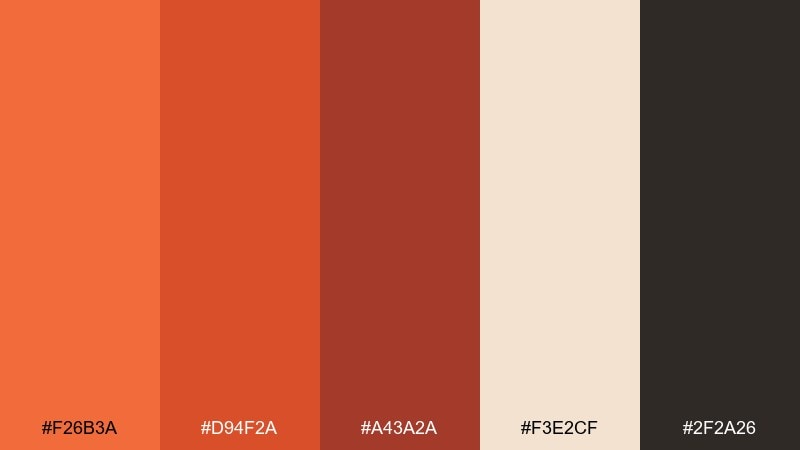
HEX: #f26b3a #d94f2a #a43a2a #f3e2cf #2f2a26
Mood: earthy, warm, grounded
Best for: craft branding and rustic product labels
Earthy heat and sunbaked sand come to mind, like late light on canyon walls. The orange and copper tones feel energetic without turning loud, while the deep charcoal keeps it mature. Use it for artisanal packaging, coffee bags, or handmade goods branding paired with uncoated paper textures. Tip: let the cream act as breathing room so the darker brown can carry your typography.
Image example of desert ember generated using media.io
Media.io is an online AI studio for creating and editing video, image, and audio in your browser.

2) Citrus Dusk

HEX: #ff7a3d #ffb000 #ffe2b3 #7a3f2f #1f2a44
Mood: bright, playful, punchy
Best for: social ads and event promos
Zesty citrus and twilight shadows give this mix a lively, modern pop. The navy adds contrast so the warm hues read crisp in feeds and banners. It works well for event promos, summer launches, and upbeat retail ads, especially when paired with bold sans-serif type. Tip: reserve the navy for headlines and use the pale peach for large background blocks to avoid visual fatigue.
Image example of citrus dusk generated using media.io

3) Terracotta Linen

HEX: #e86a4a #c24a3a #f6efe6 #d9c1a8 #3b2f2a
Mood: soft, cozy, timeless
Best for: interior mood boards and lifestyle brands
Cozy terracotta against linen neutrals feels like clay pots, warm textiles, and slow mornings. This sunset orange color palette stays calm thanks to the creamy base and muted brown anchors. It suits home decor mood boards, wellness packaging, and editorial lifestyle layouts paired with natural photography. Tip: keep the terracotta as a 20 to 30 percent accent so the neutrals remain the hero.
Image example of terracotta linen generated using media.io
4) Copper Sunrise
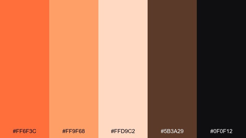
HEX: #ff6f3c #ff9f68 #ffd9c2 #5b3a29 #0f0f12
Mood: bold, confident, high-contrast
Best for: tech branding and hero headers
Bold copper light and deep shadows create a dramatic, premium feel. The peachy tints soften the orange so gradients look smooth in headers and banners. Use it for tech branding, landing pages, or keynote slides, pairing the near-black with crisp whitespace for readability. Tip: build a two-step gradient from the bright orange to the soft peach for buttons and badges.
Image example of copper sunrise generated using media.io
5) Amber Canyon
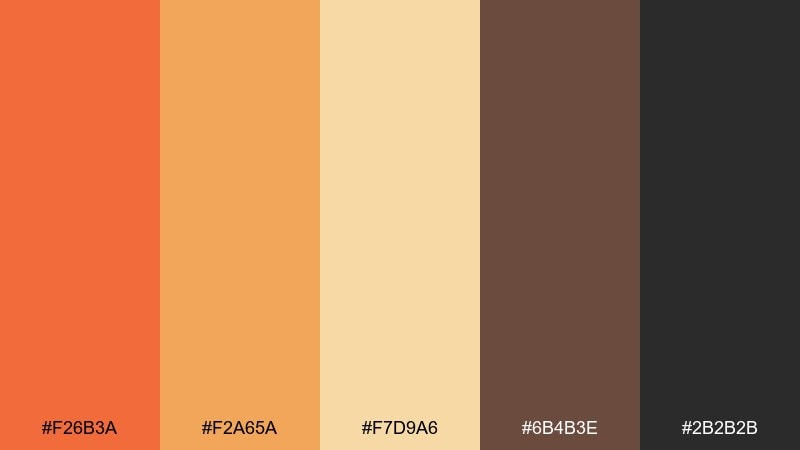
HEX: #f26b3a #f2a65a #f7d9a6 #6b4b3e #2b2b2b
Mood: adventurous, outdoorsy, warm
Best for: travel campaigns and outdoor gear
Adventure warmth shows up here, like golden hour on rocky trails. The amber midtone bridges bright orange and sandy highlights, making it friendly for big blocks of color. It fits travel campaigns, hiking brands, and outdoor gear ads paired with rugged textures and bold icons. Tip: use the sand tone for background maps and the dark gray for fine detail lines.
Image example of amber canyon generated using media.io

6) Coral Horizon
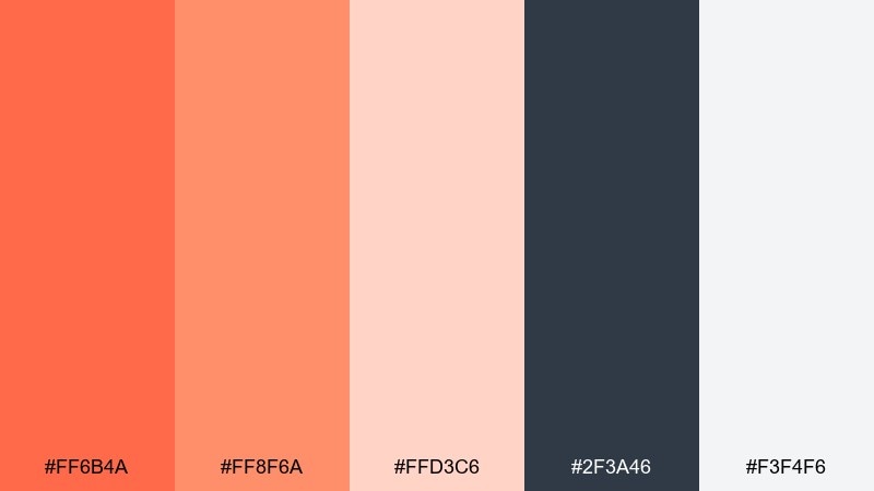
HEX: #ff6b4a #ff8f6a #ffd3c6 #2f3a46 #f3f4f6
Mood: fresh, airy, optimistic
Best for: beauty launches and wellness landing pages
Airy coral light feels like a clean horizon with soft clouds catching the last glow. These sunset orange color combinations stay modern thanks to cool slate contrast and near-white space. Use it for skincare campaigns, wellness landing pages, or minimal ads where you want warmth without heaviness. Tip: keep buttons in the coral and set body text in slate to maintain accessibility.
Image example of coral horizon generated using media.io
7) Spiced Apricot

HEX: #ff7c4a #ffb07a #ffe6cf #8a4f3b #4a6b5c
Mood: comforting, artisan, approachable
Best for: bakery branding and menu design
Spiced apricot warmth reads like fresh pastries and cinnamon steam. The dusty green adds a natural counterpoint that keeps the orange from feeling overly sweet. It works beautifully for bakery branding, cafe menus, and food packaging paired with hand-drawn illustrations. Tip: use the green sparingly for price tags or callouts to guide the eye.
Image example of spiced apricot generated using media.io
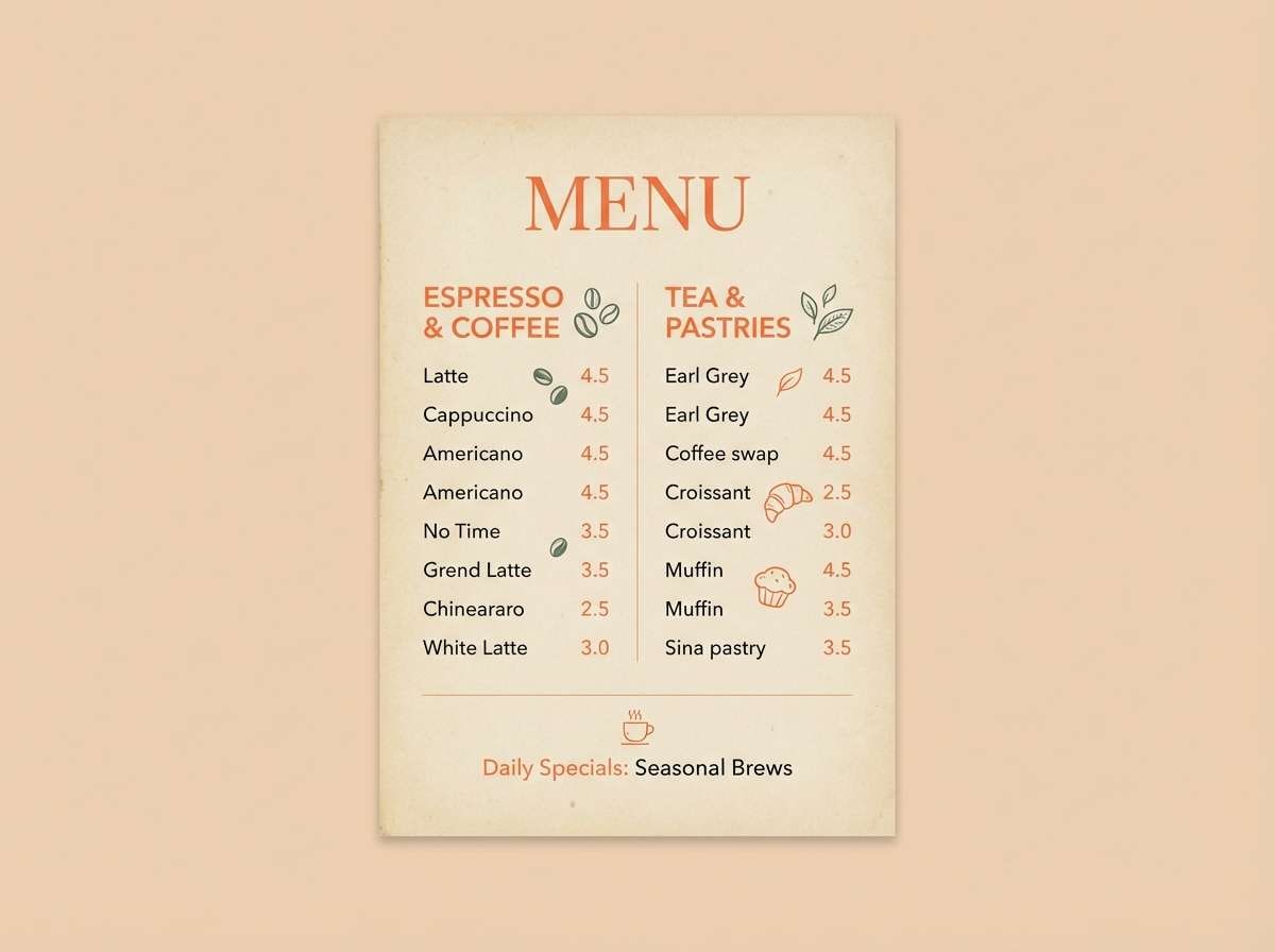
8) Saffron Toast
HEX: #f26b3a #ffb300 #fff1d6 #6a3e2f #2d5d6a
Mood: sunny, inviting, slightly retro
Best for: restaurant promos and food apps
Toasty saffron and warm orange feel like a cheerful brunch table in late afternoon. The teal brings a crisp, modern snap that helps icons and UI states stand out. Use it for restaurant promos, food app screens, or loyalty cards where warmth should feel clean and trustworthy. Tip: keep teal for navigation elements and let the pale cream carry most backgrounds.
Image example of saffron toast generated using media.io
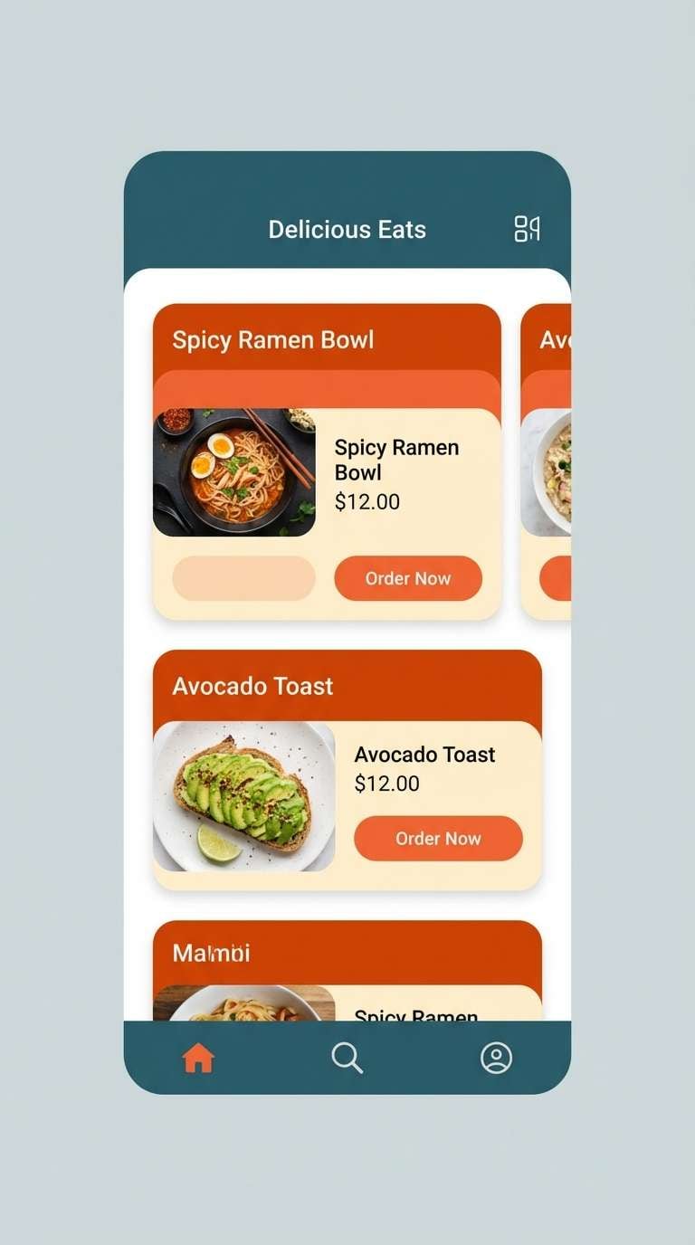
9) Burnt Nectar
HEX: #e85d2f #ff8b4a #f7c7a1 #3d2b24 #7c8a6a
Mood: moody, organic, premium
Best for: coffee packaging and artisan drinks
Moody sweetness like burnt caramel and dried botanicals gives this set a premium edge. The olive-gray hint adds a grounded, earthy accent that pairs well with kraft and matte finishes. Great for coffee packaging, cold brew labels, or boutique beverage ads with minimal photography. Tip: print the darkest brown as your primary ink to keep small text sharp.
Image example of burnt nectar generated using media.io
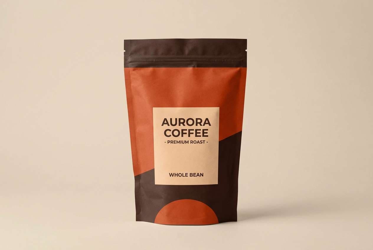
10) Pumpkin Latte
HEX: #ff6a3a #ff9a64 #ffd7b8 #7a4b3a #f5f2ee
Mood: seasonal, cozy, friendly
Best for: autumn campaigns and retail banners
Seasonal coziness shows up immediately, like pumpkin foam and warm knitwear. The soft cream keeps the palette light, while the brown makes it feel grounded and familiar. Use it for autumn campaigns, retail banners, and email headers paired with simple product photography. Tip: use the light peach as a subtle background tint to make the orange pop without harsh contrast.
Image example of pumpkin latte generated using media.io
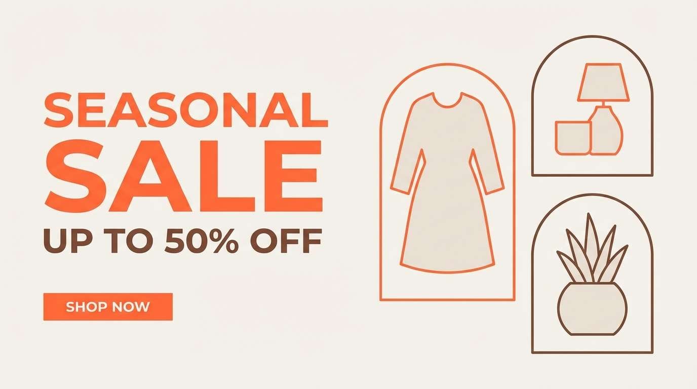
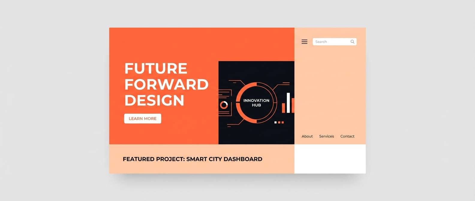
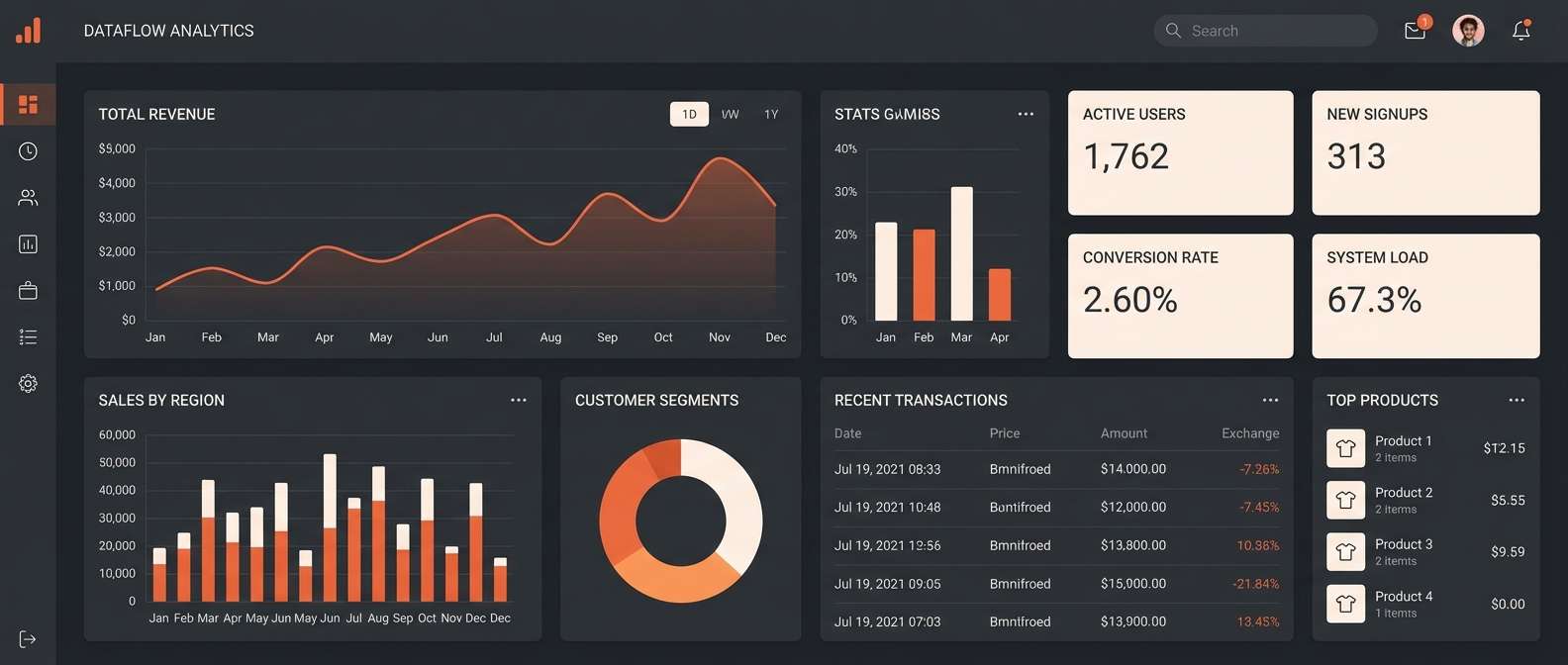
11) Sunset Studio UI
HEX: #f26b3a #ff8f5a #fff0e6 #2a2d34 #6c7a89
Mood: clean, modern, creative
Best for: dashboard UI and creative tools
Clean studio warmth feels like soft lamp light over a tidy workspace. This sunset orange color palette is ideal when you want energy for highlights without overwhelming long sessions. Use it for dashboards, creative tools, or SaaS onboarding, pairing charcoal text with warm accent states for buttons and alerts. Tip: apply the orange only to active states and key metrics so the interface stays calm.
Image example of sunset studio ui generated using media.io
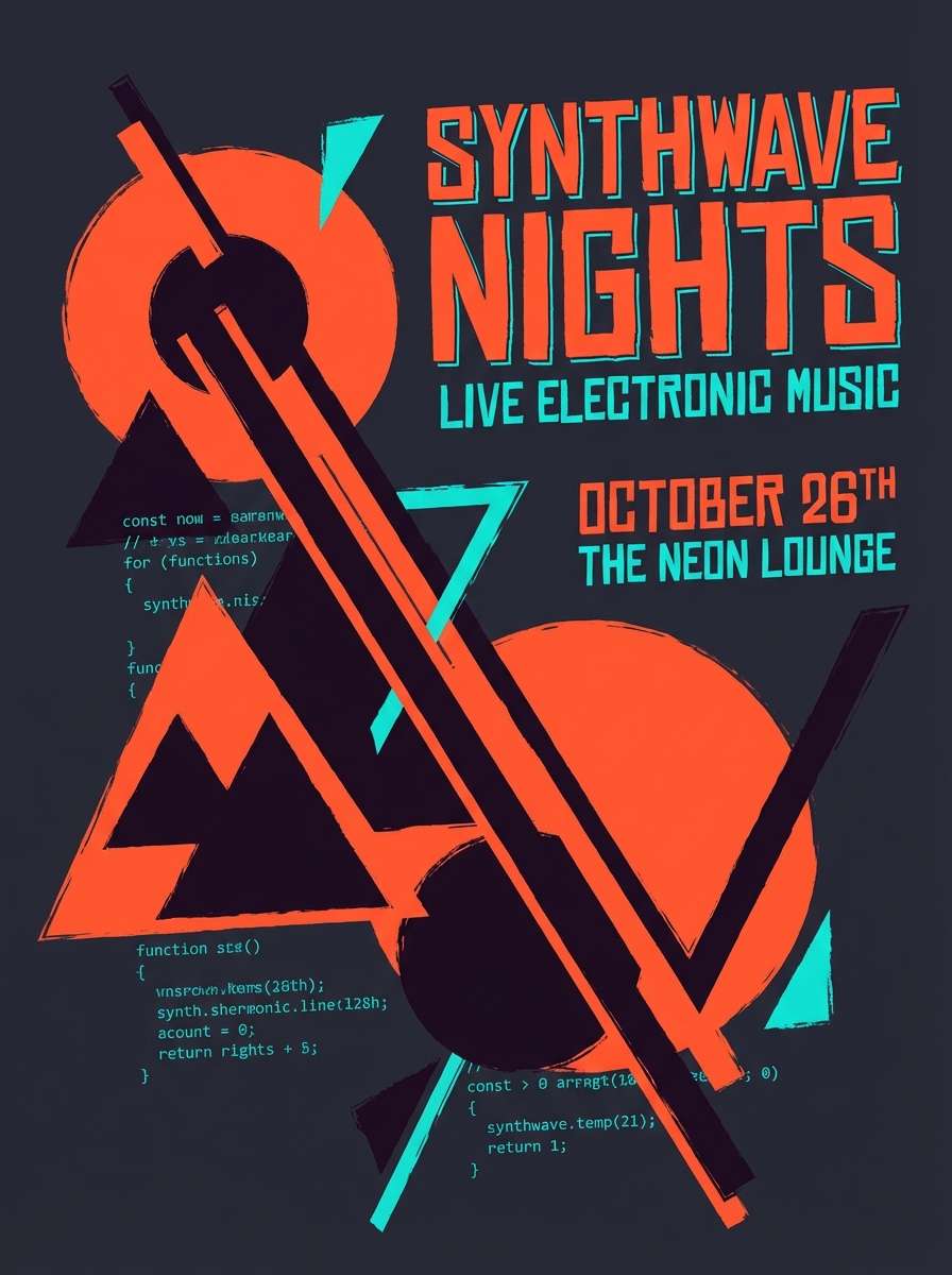
12) Retro Motel Sign

HEX: #ff5c3a #ffb000 #2c2a3a #f2e7d5 #4fd1c5
Mood: retro, neon-leaning, fun
Best for: music posters and nightlife flyers
Retro glow and roadside nostalgia make these colors feel electric without going full neon. The near-black purple keeps it night-ready, while the aqua adds an unexpected spark. Perfect for music posters, nightlife flyers, and merch graphics paired with chunky type and simple shapes. Tip: outline key text in cream so it stays readable against the darker base.
Image example of retro motel sign generated using media.io
13) Autumn Market

HEX: #f26b3a #c94c2a #f2c94c #6b705c #f7f3e8
Mood: harvest, wholesome, lively
Best for: farmers market flyers and community events
Harvest warmth and bustling stalls come to mind, with oranges and golden produce under soft daylight. The muted green keeps it wholesome and community-friendly, balancing the brighter yellow. Use it for farmers market flyers, community event graphics, and seasonal newsletters paired with simple illustrations. Tip: keep the yellow to small badges so it reads like a cheerful highlight, not a full background.
Image example of autumn market generated using media.io

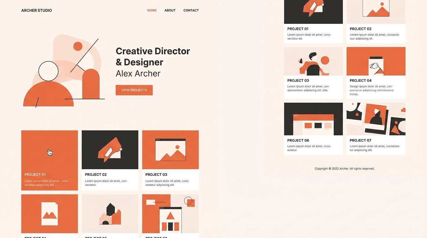
14) Minimal Clay and Cream
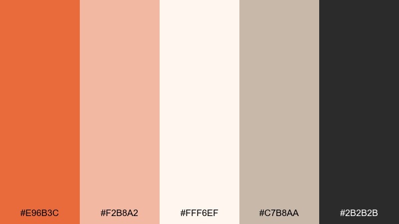
HEX: #e96b3c #f2b8a2 #fff6ef #c7b8aa #2b2b2b
Mood: minimal, calm, refined
Best for: portfolio sites and minimalist branding
Quiet clay warmth feels refined, like matte ceramics on a clean shelf. Cream and warm gray keep everything airy, while the dark neutral provides crisp legibility. Use it for portfolios, boutique studio branding, and product one-pagers paired with thin lines and generous margins. Tip: set backgrounds in cream and use clay only for key links and section dividers.
Image example of minimal clay and cream generated using media.io
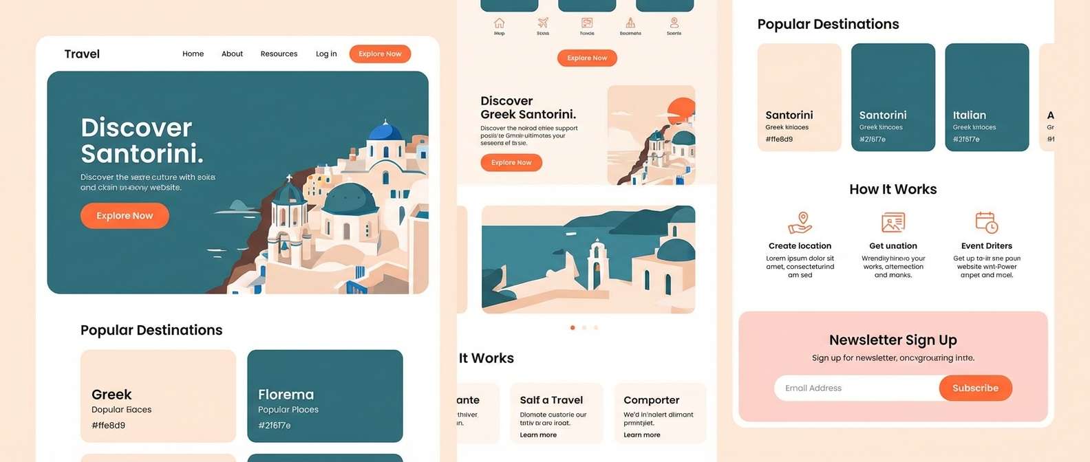
15) Coastal Sunset
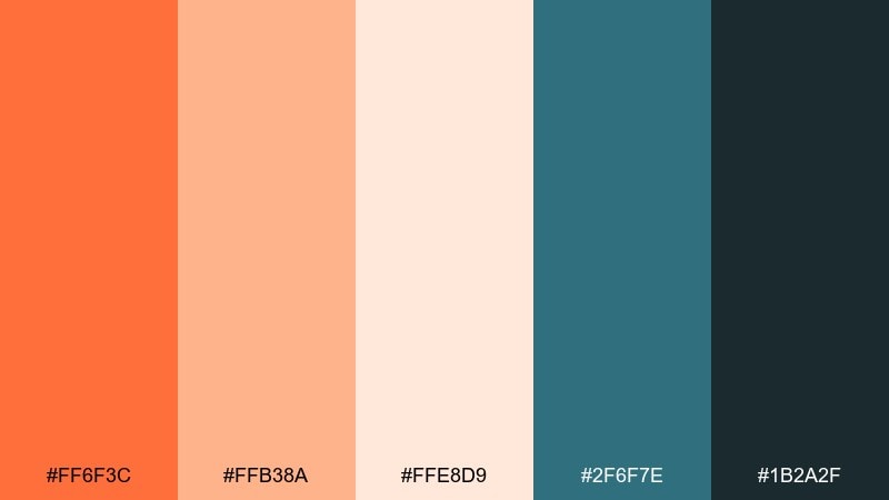
HEX: #ff6f3c #ffb38a #ffe8d9 #2f6f7e #1b2a2f
Mood: relaxed, breezy, scenic
Best for: travel websites and resort ads
Breezy warmth and sea air sit together here, like a shoreline at golden hour. The teal-blue tones cool the palette down and add a clean, coastal contrast. Use it for resort ads, travel websites, and destination email headers paired with wide photography and simple icon sets. Tip: let the deep teal handle navigation so the warm tones stay focused on CTAs.
Image example of coastal sunset generated using media.io
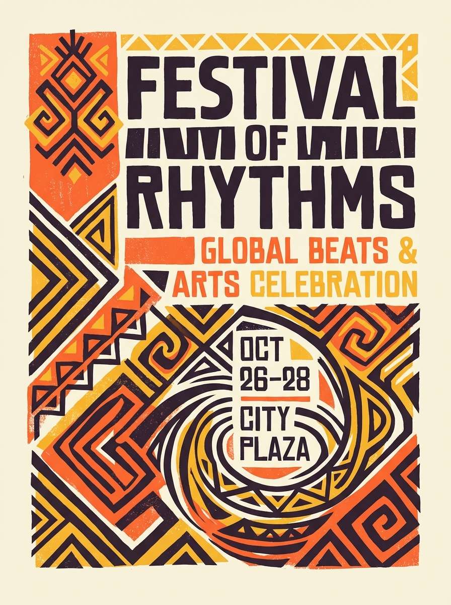
16) Festival Marigold

HEX: #ff6a3a #ffcc33 #ffefe0 #6a2c70 #2b1f2f
Mood: festive, bold, expressive
Best for: cultural event posters and merch
Festive marigold energy feels celebratory, like lanterns and bright fabrics at night. The purple adds drama and depth, turning warm tones into a stage-ready contrast. Use it for cultural event posters, merch prints, and punchy social tiles paired with big type and playful patterns. Tip: keep the darkest purple for background blocks so the marigold can shine as the focal accent.
Image example of festival marigold generated using media.io
17) Rustic Brickwork
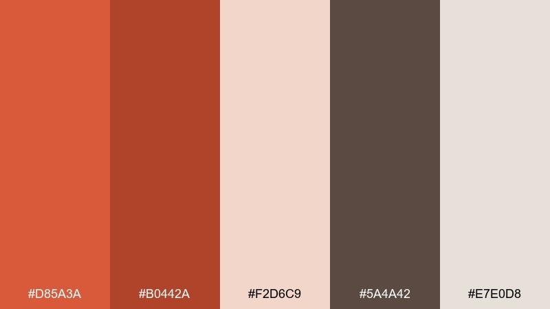
HEX: #d85a3a #b0442a #f2d6c9 #5a4a42 #e7e0d8
Mood: heritage, sturdy, traditional
Best for: real estate brochures and heritage brands
Heritage brick and worn plaster give this set a sturdy, dependable vibe. The dusty blush and warm grays make it easy to design long-form layouts without harsh contrast. Use it for real estate brochures, renovation branding, or local business identities paired with serif typography. Tip: set large background areas in the light gray-beige to keep print costs consistent and readable.
Image example of rustic brickwork generated using media.io
18) Peachy Neon Pop
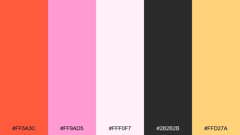
HEX: #ff5a3c #ff9ad5 #fff0f7 #2b2b2b #ffd27a
Mood: pop, youthful, trendy
Best for: beauty ads and creator merch
Playful pop energy feels like glossy stickers, candy packaging, and bright studio lights. These sunset orange color combinations get extra punch from the pink, while charcoal keeps the look sharp and readable. Use it for beauty ads, creator merch, or splashy promo graphics paired with bold shapes and tight layouts. Tip: keep backgrounds nearly white and let the orange and pink fight for attention only in small focal areas.
Image example of peachy neon pop generated using media.io

19) Smoky Sienna Night
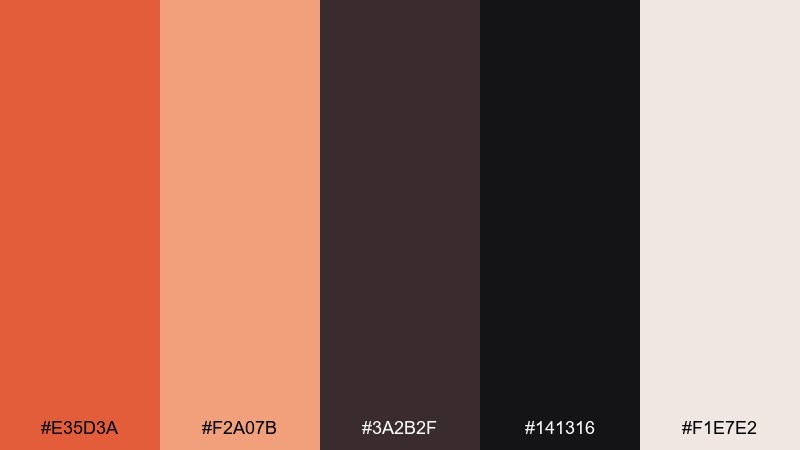
HEX: #e35d3a #f2a07b #3a2b2f #141316 #f1e7e2
Mood: moody, cinematic, luxe
Best for: nightlife branding and cinematic thumbnails
Smoky warmth and late-night shadows create a cinematic, luxe mood. The pale blush-white adds just enough lift for readable overlays and elegant spacing. Use it for nightlife branding, film-themed thumbnails, or premium seasonal campaigns paired with dramatic lighting and tight crops. Tip: place text in the blush-white and reserve sienna for glows, strokes, or small highlight details.
Image example of smoky sienna night generated using media.io

20) Golden Persimmon
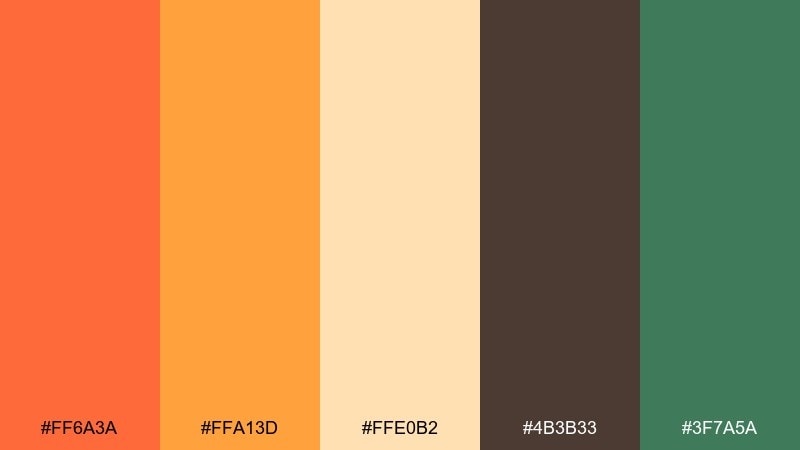
HEX: #ff6a3a #ffa13d #ffe0b2 #4b3b33 #3f7a5a
Mood: warm, natural, upbeat
Best for: eco packaging and organic products
Golden persimmon warmth feels natural and upbeat, like fresh fruit against leafy greens. The green adds an eco cue that supports sustainable positioning without turning the palette cold. Use it for organic product packaging, farmers co-ops, or clean ingredient landing pages paired with kraft textures and simple line icons. Tip: use the amber as a secondary accent so the orange remains your primary brand hook.
Image example of golden persimmon generated using media.io
21) Sunlit Clay Garden
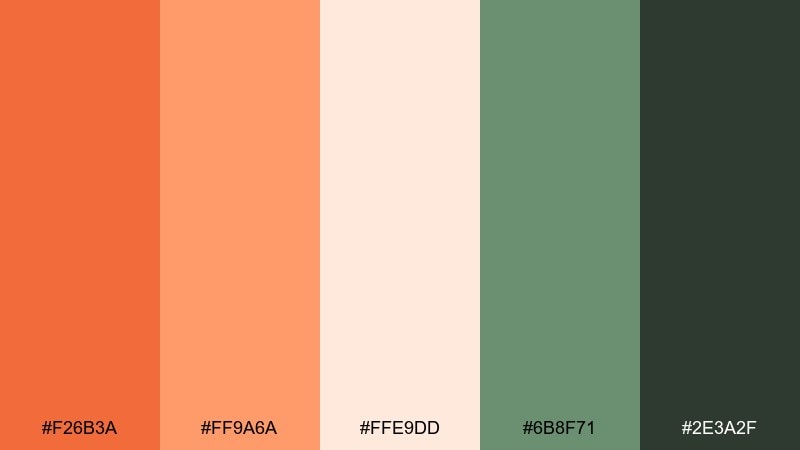
HEX: #f26b3a #ff9a6a #ffe9dd #6b8f71 #2e3a2f
Mood: fresh, botanical, comforting
Best for: botanical illustrations and spring invites
Fresh garden warmth feels like sunlit petals and terracotta planters after a light rain. The greens keep the palette grounded in nature and make the warm accents feel more alive. Use it for botanical illustrations, spring invitations, or plant shop branding paired with watercolor textures. Tip: paint large leaf shapes in the muted green and add orange only to blooms for a balanced composition.
Image example of sunlit clay garden generated using media.io
22) Ember and Indigo Ink

HEX: #ff6a3a #ffb38a #f6f0ea #25314a #111827
Mood: smart, modern, editorial
Best for: brand guidelines and editorial layouts
Smart warmth meets inky depth, like ember light on a dark desk. The indigo tones create a confident contrast that feels editorial and well-structured. Use it for brand guideline PDFs, thought-leadership reports, or blog visuals paired with clean grids and generous margins. Tip: keep indigo for headings and rules, and use orange only for pull quotes or key metrics.
Image example of ember and indigo ink generated using media.io
What Colors Go Well with Sunset Orange?
Sunset orange pairs beautifully with warm neutrals like cream, sand, beige, and linen. These soften the intensity and make it easy to design backgrounds, cards, and long-form layouts.
For contrast, lean into deep tones like charcoal, navy, indigo, and espresso brown. These darker anchors keep orange accents looking premium and help typography stay readable.
If you want a fresher, modern twist, try balancing sunset orange with cool accents like teal, slate, or muted greens. The warm/cool tension makes CTAs and highlights feel especially crisp.
How to Use a Sunset Orange Color Palette in Real Designs
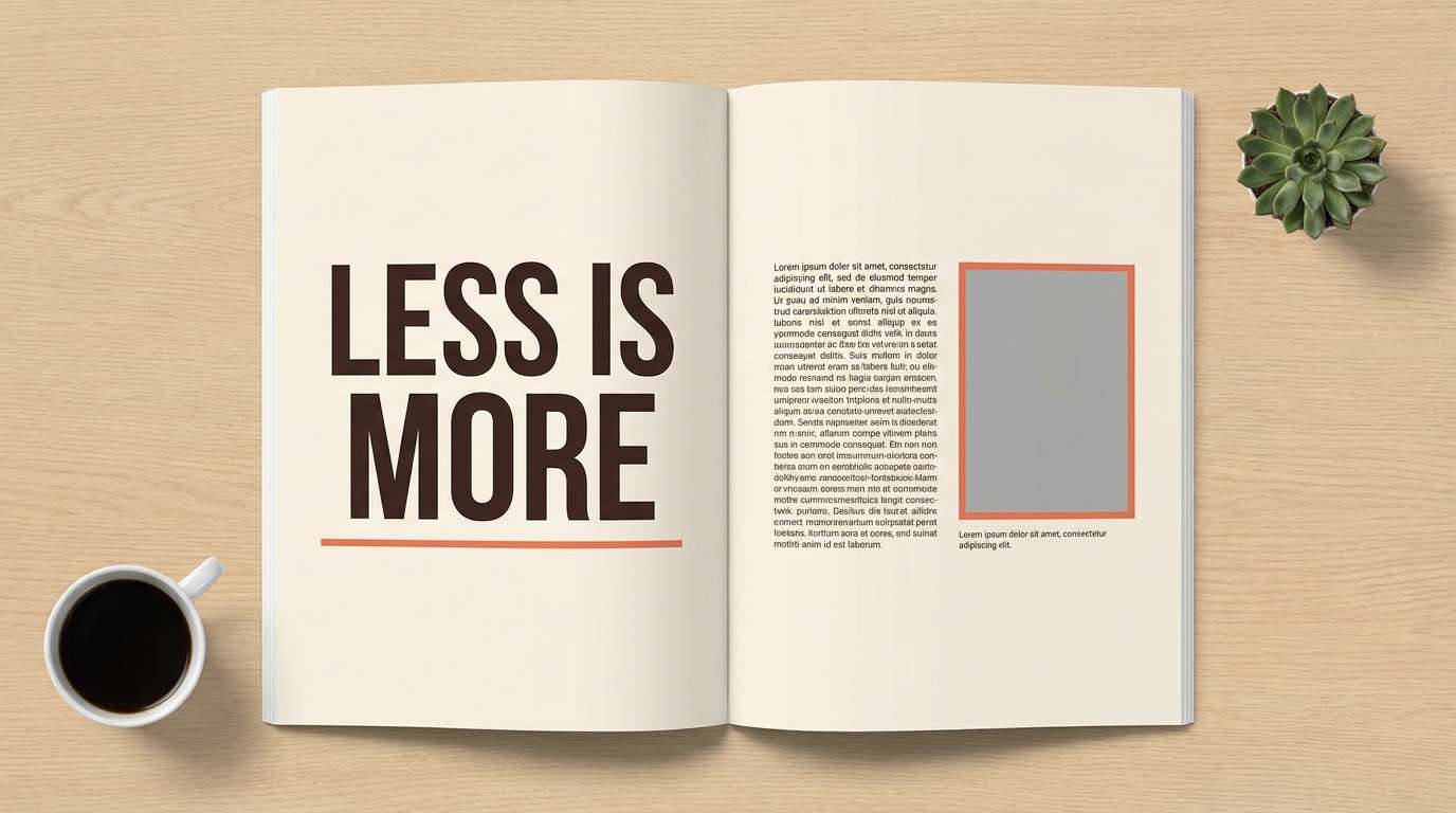
In branding, treat sunset orange as your “signature accent” rather than your full background color. Use it on logos, badges, callouts, and packaging highlights while letting neutrals carry most surfaces.
In UI, reserve orange for action states: primary buttons, toggles, progress, and key metrics. Pair it with off-white panels and a dark text color (charcoal/navy) to maintain accessibility and reduce fatigue.
For seasonal visuals (summer launches or autumn campaigns), shift the supporting colors to match the vibe: peaches and creams for airy warmth, or deeper browns and purples for a moody, cinematic look.
Create Sunset Orange Palette Visuals with AI
If you have HEX codes but need real-world visuals—posters, packaging mockups, UI hero headers, or social creatives—AI can help you preview the palette instantly.
Start with a simple composition prompt, then add your sunset orange HEX as the dominant color and specify the style (minimal, editorial, watercolor, vector poster, studio product photo). Generate a few variations and keep the one that best matches your brand tone.
With Media.io’s text-to-image, you can iterate fast and keep your color scheme consistent across assets.
Sunset Orange Color Palette FAQs
-
What HEX code is “sunset orange”?
There isn’t one single standard, but popular sunset-orange anchors include #ff6a3a and #f26b3a. Choose the exact shade based on whether you want a brighter pop (more saturated) or a more terracotta, earthy feel (more muted). -
What colors complement sunset orange best?
Deep neutrals (charcoal, espresso, navy/indigo) provide strong contrast, while warm neutrals (cream, sand, beige) keep it soft and premium. Teal and muted greens can add a modern, balanced cool counterpoint. -
Is sunset orange good for branding?
Yes—sunset orange signals warmth, energy, and approachability. It works especially well for lifestyle, food, travel, beauty, and creator brands, and it can also feel premium when paired with dark anchors and clean typography. -
How do I use sunset orange in UI without overpowering the design?
Use it sparingly for primary actions and active states (buttons, highlights, progress). Keep most surfaces neutral (off-white/cream) and use dark text (charcoal/navy) to maintain readability and reduce visual fatigue. -
Does sunset orange work for autumn designs only?
No. With peaches, creams, and slate/teal accents, sunset orange reads fresh and summery. With browns, deep purples, and near-black, it becomes moody and fall-ready. -
What’s the difference between coral, terracotta, and sunset orange?
Coral leans pink and feels airy and modern; terracotta is earthier and more muted; sunset orange sits between them—often brighter than terracotta but warmer and softer than pure orange. -
Can I generate palette-based mockups with AI?
Yes. Use Media.io text-to-image prompts that specify your dominant sunset orange HEX, add supporting HEX accents, and describe the format (poster, UI hero, packaging, watercolor illustration) to quickly preview consistent visuals.


