

A purple red orange color palette blends mystery (purple), emotion (red), and energy (orange) into one warm, dramatic spectrum. It’s a go-to for brands and visuals that need instant impact without feeling neon or overly playful.
Below are 20 curated purple red orange palette ideas with HEX codes, plus practical usage tips and AI prompts you can paste into Media.io to generate matching visuals fast.
In this article
Why Purple Red Orange Palettes Work So Well
Purple red orange palettes feel naturally cinematic because they sit in the same warm-to-hot family while still spanning a wide range of lightness. That gives you both drama (deep purples) and clarity (bright oranges) in a single set.
They also create easy hierarchy: purple anchors backgrounds and navigation, red carries emotion and emphasis, and orange becomes an intuitive call-to-action color. The result is a scheme that looks premium but still energetic.
Most importantly, these tones stay memorable across mediums. Whether you’re designing a UI, packaging, a poster, or a hero banner, this warm spectrum holds contrast well and translates nicely to print when balanced with soft creams or warm grays.
20+ Purple Red Orange Color Palette Ideas (with HEX Codes)
1) Sunset Ember
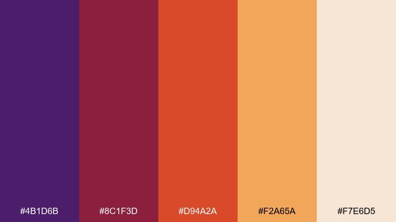
HEX: #4b1d6b #8c1f3d #d94a2a #f2a65a #f7e6d5
Mood: bold, warm, cinematic
Best for: brand moodboards and hero banners
Bold and cinematic, like a skyline fading into ember-lit clouds. Use this purple red orange color palette for hero sections, campaign headers, and landing page accents that need instant heat. Pair it with clean white space and a deep charcoal for readable type and a premium feel. Tip: keep the orange as the main call-to-action color and reserve the purple for background gradients.
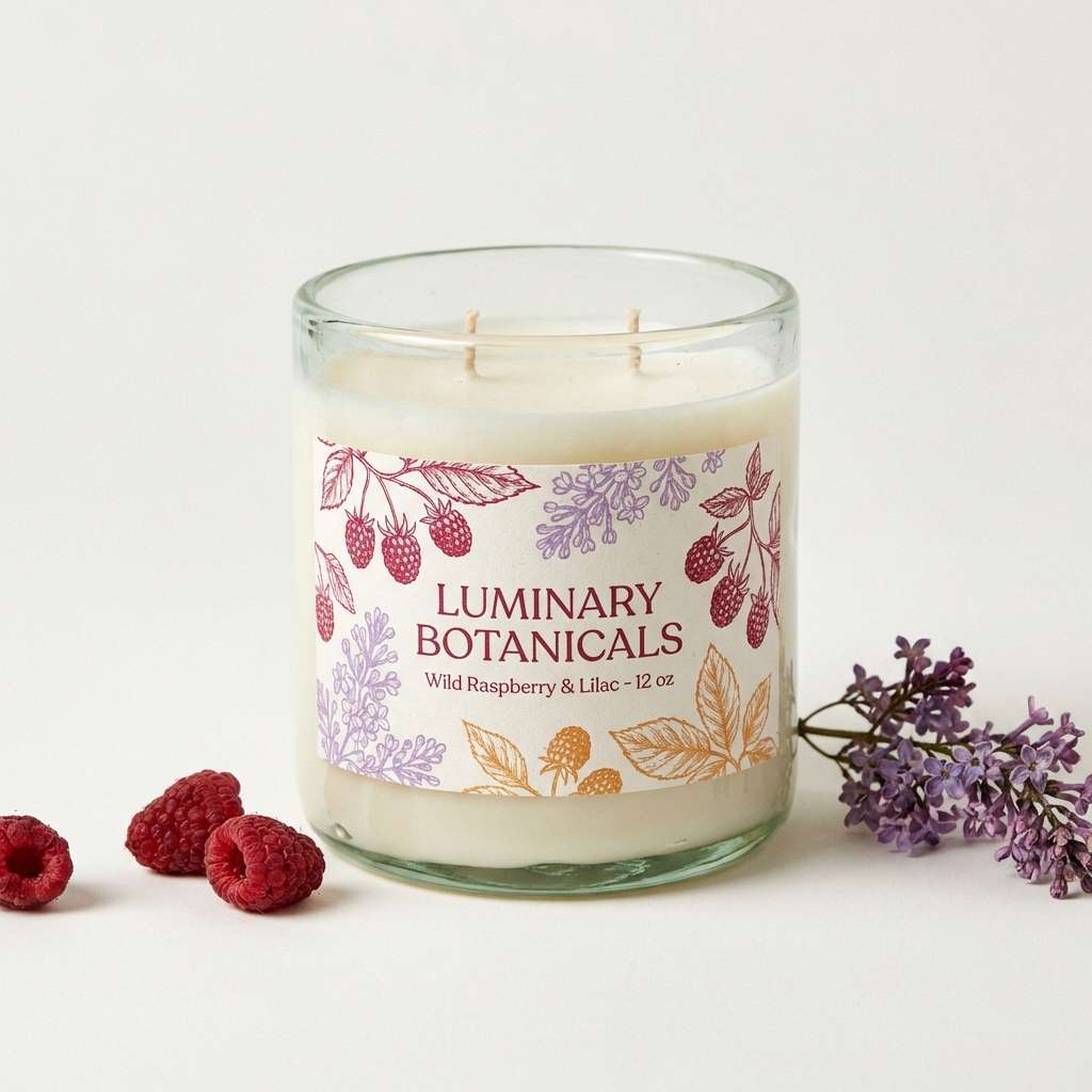
Image example of sunset ember generated using media.io

Media.io is an online AI studio for creating and editing video, image, and audio in your browser.

2) Garnet Orchid
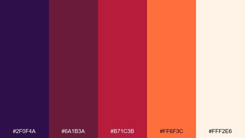
HEX: #2f0f4a #6a1b3a #b71c3b #ff6f3c #fff2e6
Mood: lush, elegant, romantic
Best for: beauty product packaging
Lush and romantic, like orchids in candlelight with a splash of citrus. It shines on cosmetic boxes, perfume labels, and premium skincare sets where you want depth without looking heavy. Pair with matte black type and subtle foil details for a luxury finish. Tip: use the pale cream as negative space so the reds and oranges stay refined, not loud.
Image example of garnet orchid generated using media.io
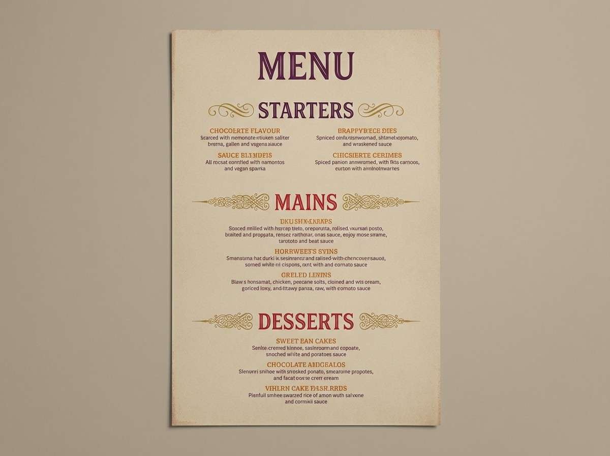
3) Spiced Plum
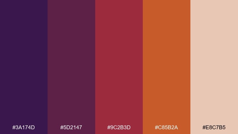
HEX: #3a174d #5d2147 #9c2b3d #c85b2a #e8c7b5
Mood: cozy, savory, inviting
Best for: restaurant menu design
Cozy and savory, like mulled wine and roasted spices on a cool night. These tones work beautifully for menus, table tents, and food brand collateral that needs warmth without feeling rustic. Pair with textured paper backgrounds and a restrained serif for a bistro vibe. Tip: keep the darkest plum for headings and let the terracotta do the highlighting.
Image example of spiced plum generated using media.io
4) Citrus Merlot
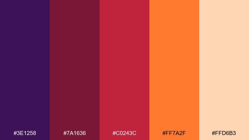
HEX: #3e1258 #7a1636 #c0243c #ff7a2f #ffd6b3
Mood: energetic, punchy, modern
Best for: social media ad creatives
Energetic and punchy, like a merlot spritz with a citrus peel twist. It is built for scroll-stopping social ads, promo tiles, and highlight cards where contrast matters. Pair with bold sans-serif type and simple geometric shapes to keep the message clear. Tip: set the orange as the price tag or sticker element for instant emphasis.
Image example of citrus merlot generated using media.io

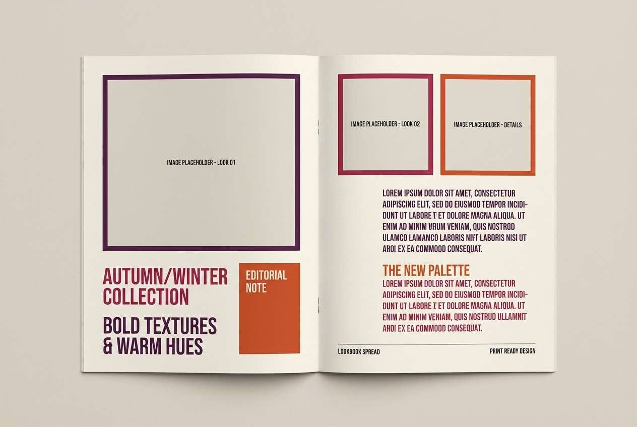
5) Velvet Paprika
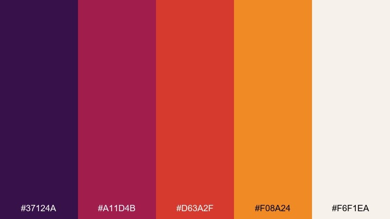
HEX: #37124a #a11d4b #d63a2f #f08a24 #f6f1ea
Mood: rich, editorial, fashion-forward
Best for: fashion lookbook editorial spreads
Rich and editorial, like velvet fabric lit by warm studio lamps. These purple red orange color combinations feel premium on lookbooks, magazine-style layouts, and campaign one-pagers. Pair with lots of cream space and high-contrast black text to keep it runway-clean. Tip: let paprika orange appear only in small accents such as page numbers, rules, and buttons.
Image example of velvet paprika generated using media.io
6) Festival Dusk
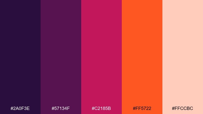
HEX: #2a0f3e #57134f #c2185b #ff5722 #ffccbc
Mood: electric, playful, night-out
Best for: event posters and lineup announcements
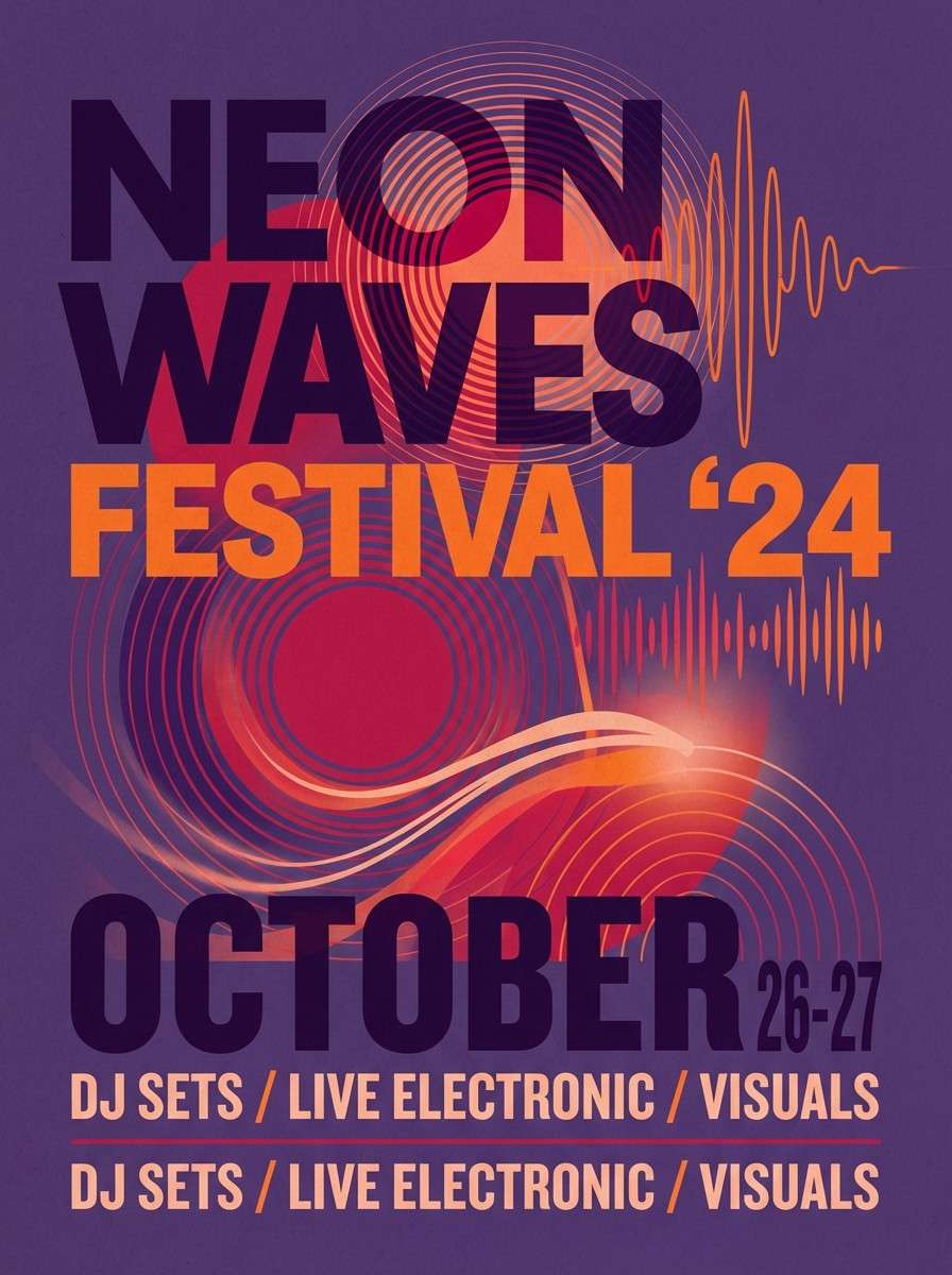
Electric and playful, like neon signage at dusk before the music starts. Use it for event posters, lineup announcements, and ticket promos that need high energy. Pair with bold type, simple icons, and a dark base so the hot accents pop. Tip: keep gradients subtle and use flat blocks for a more modern look.
Image example of festival dusk generated using media.io
7) Terracotta Bloom
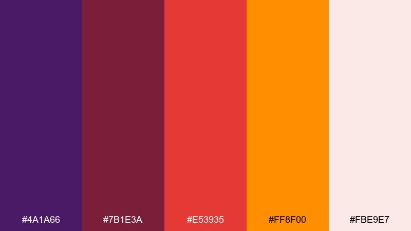
HEX: #4a1a66 #7b1e3a #e53935 #ff8f00 #fbe9e7
Mood: romantic, sunlit, celebratory
Best for: wedding invitations and RSVP cards
Romantic and sunlit, like terracotta pottery surrounded by late-summer flowers. It works well on wedding invitations, RSVP cards, and save-the-dates where warmth feels welcoming. Pair with delicate line art and a soft off-white background for an airy finish. Tip: use the brighter orange sparingly as a seal, monogram, or small border.
Image example of terracotta bloom generated using media.io

8) Molten Berry
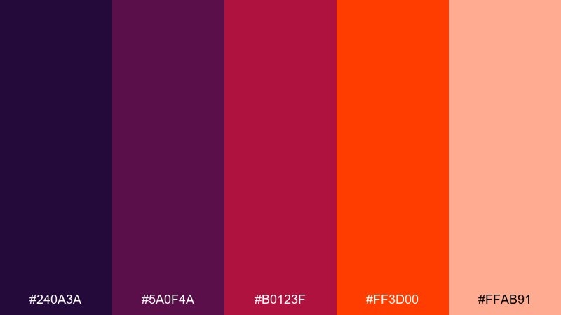
HEX: #240a3a #5a0f4a #b0123f #ff3d00 #ffab91
Mood: dramatic, glossy, high-contrast
Best for: podcast cover art
Dramatic and glossy, like molten lava cutting through dark berry syrup. These tones make podcast covers and album-style artwork feel bold, modern, and easy to spot at small sizes. Pair with big lettering and simple shapes to avoid clutter. Tip: keep the brightest orange as a single focal element for maximum legibility.
Image example of molten berry generated using media.io
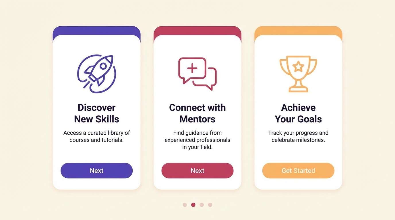
9) Apricot Royale
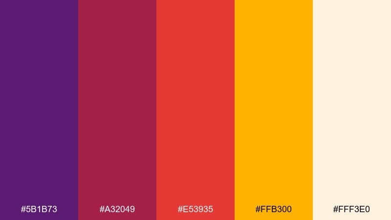
HEX: #5b1b73 #a32049 #e53935 #ffb300 #fff3e0
Mood: bright, friendly, optimistic
Best for: app onboarding screens
Bright and optimistic, like apricot light hitting jewel-toned glass. It is a great fit for onboarding screens, feature walkthroughs, and friendly product tours. Pair with rounded UI components and plenty of cream background to keep it approachable. Tip: use the golden apricot for progress indicators and highlights to guide the eye.
Image example of apricot royale generated using media.io
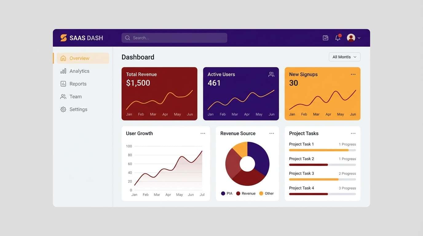
10) Saffron Violet
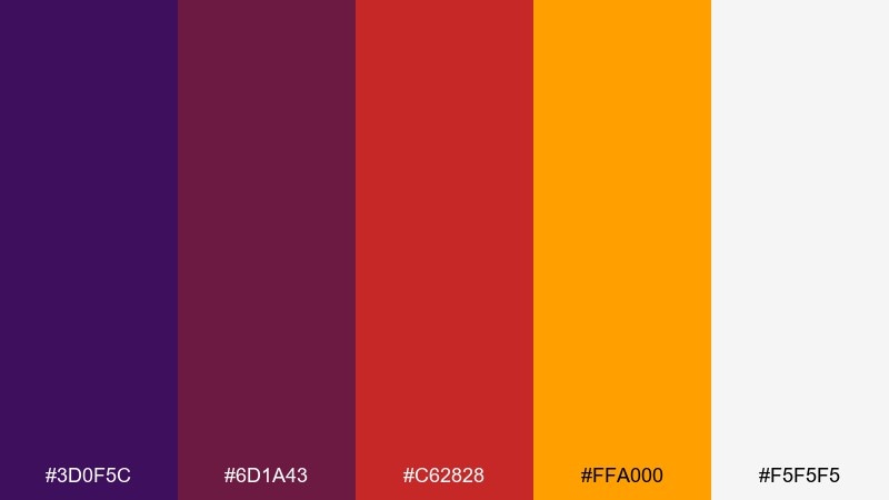
HEX: #3d0f5c #6d1a43 #c62828 #ffa000 #f5f5f5
Mood: confident, clean, tech-forward
Best for: SaaS dashboard UI themes
Confident and tech-forward, like violet ink warmed by saffron light. This purple red orange color scheme is strong for dashboards, analytics views, and data-heavy screens that still need personality. Pair with neutral grays, thin dividers, and clear hierarchy to prevent visual fatigue. Tip: reserve orange for alerts and key KPIs so it always signals importance.
Image example of saffron violet generated using media.io
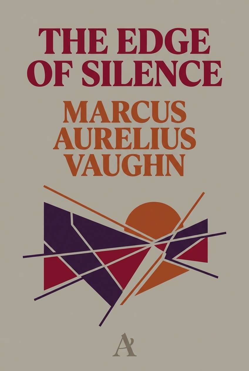
11) Rusty Amethyst
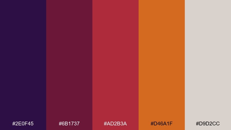
HEX: #2e0f45 #6b1737 #ad2b3a #d46a1f #d9d2cc
Mood: moody, literary, sophisticated
Best for: book cover design
Moody and literary, like an amethyst ring set against weathered leather. It fits book covers, long-form reports, and cultural posters where you want depth and restraint. Pair with warm grays and a classic serif for an intelligent tone. Tip: use the rusty orange for one small emblem or subtitle line to create a clear focal point.
Image example of rusty amethyst generated using media.io
12) Cranberry Zest
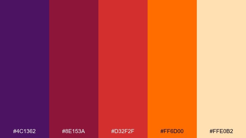
HEX: #4c1362 #8e153a #d32f2f #ff6d00 #ffe0b2
Mood: festive, bold, cheerful
Best for: holiday email headers and promos
Festive and cheerful, like cranberry glaze with a bright citrus kick. These colors are ideal for holiday email headers, limited-time promos, and seasonal announcement banners. Pair with simple iconography and generous padding so the palette reads cleanly across devices. Tip: keep text mostly dark purple to improve contrast on the lighter peach tone.
Image example of cranberry zest generated using media.io

13) Firelight Lilac
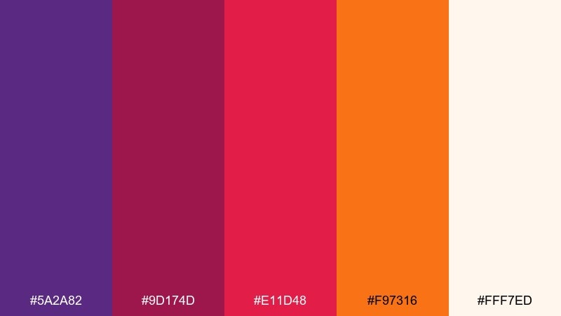
HEX: #5a2a82 #9d174d #e11d48 #f97316 #fff7ed
Mood: warm, artisanal, glowing
Best for: candle labels and artisan goods
Warm and artisanal, like lilac dusk lit by a small fire. It is perfect for candle labels, handmade goods, and boutique packaging that wants to feel cozy yet modern. Pair with uncoated paper textures and minimal line illustrations. Tip: print the darkest purple as the base and add orange as a tiny stamp-style accent.
Image example of firelight lilac generated using media.io
14) Autumn Neon
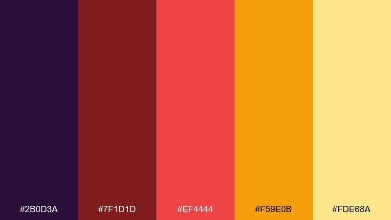
HEX: #2b0d3a #7f1d1d #ef4444 #f59e0b #fde68a
Mood: loud, youthful, high-impact
Best for: streetwear drop posters
Loud and youthful, like autumn leaves under neon streetlights. These purple red orange color combinations are made for streetwear drops, launch posters, and bold announcement graphics. Pair with chunky type, stickers, and simple halftone textures to lean into the energy. Tip: keep the background dark so the yellow-orange reads like a highlight, not noise.
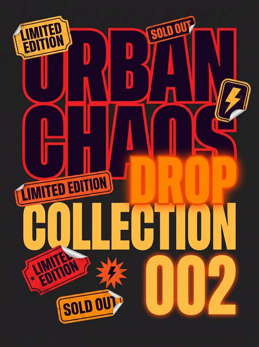
Image example of autumn neon generated using media.io
15) Rosewood Tangerine
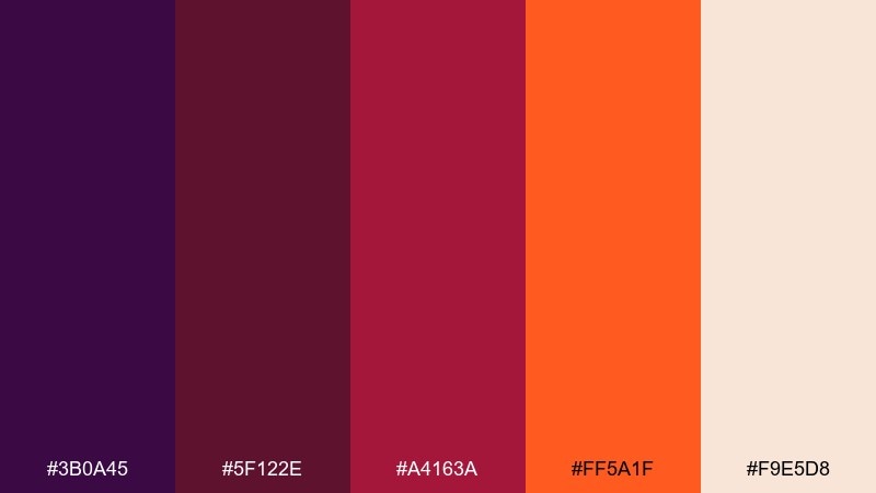
HEX: #3b0a45 #5f122e #a4163a #ff5a1f #f9e5d8
Mood: boutique, intimate, upscale
Best for: boutique hotel website headers
Boutique and intimate, like rosewood panels warmed by a tangerine glow. It works well for hospitality websites, booking banners, and experiential brands that want drama without harsh contrast. Pair with elegant photography overlays and restrained buttons for a calm premium look. Tip: use the cream as the main canvas and bring in the darker tones for navigation and footer.
Image example of rosewood tangerine generated using media.io

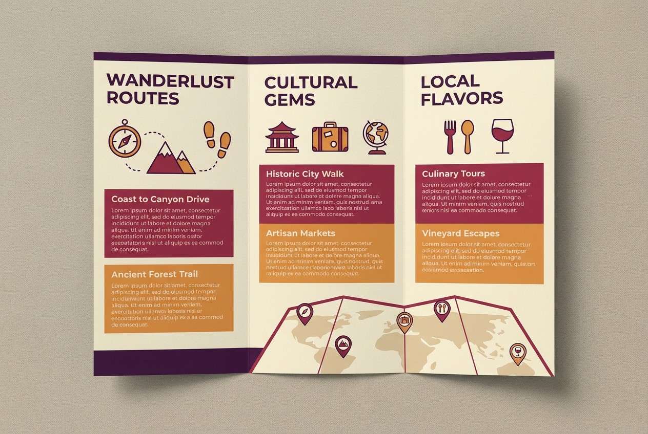
16) Desert Sangria
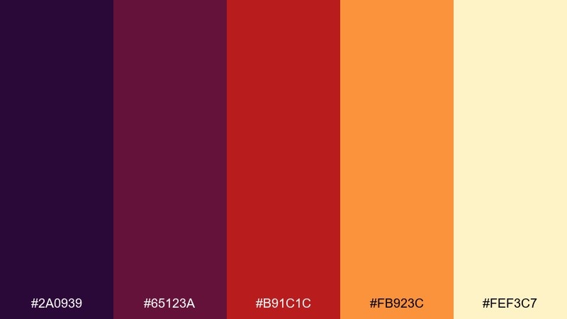
HEX: #2a0939 #65123a #b91c1c #fb923c #fef3c7
Mood: sunbaked, adventurous, inviting
Best for: travel brochures and tour flyers
Sunbaked and adventurous, like sangria shared after a desert hike. The mix suits travel brochures, tour flyers, and destination guides that need warmth and appetite appeal. Pair with sandy neutrals and clean map-style icons for clarity. Tip: use orange for route highlights and calls to action, while purple anchors headings and section bars.
Image example of desert sangria generated using media.io
17) Poppy Aubergine
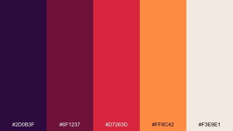
HEX: #2d0b3f #6f1237 #d7263d #ff8c42 #f3e9e1
Mood: clear, informative, energetic
Best for: infographic templates
Clear and energetic, like poppy petals against a deep aubergine backdrop. It is a strong choice for infographics, charts, and explainer visuals that need high contrast. Pair with simple icon sets and consistent line weights to keep data readable. Tip: use the off-white for chart backgrounds and reserve the orange for the most important data series.
Image example of poppy aubergine generated using media.io
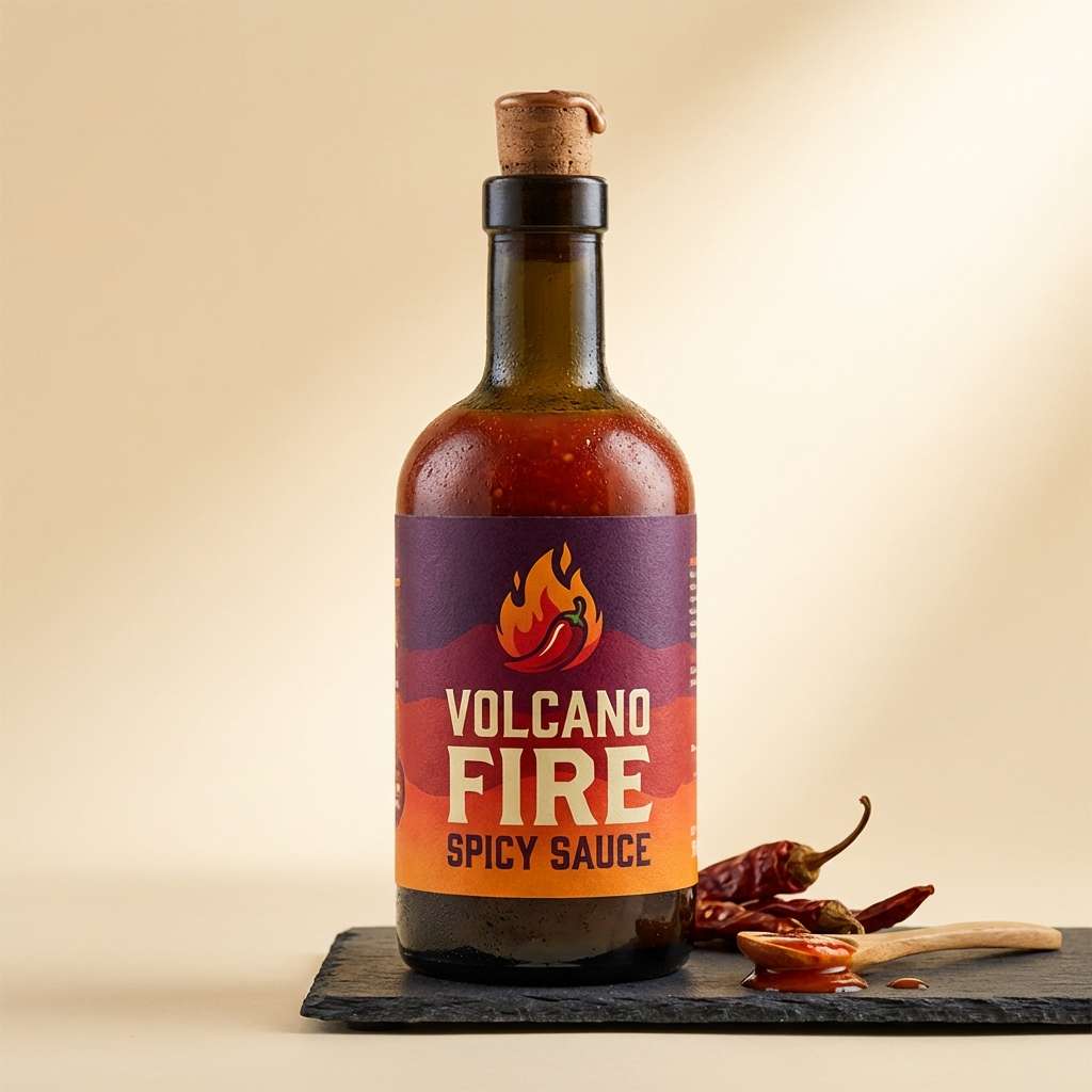
18) Lantern Glow
HEX: #4a0f63 #9f1239 #dc2626 #f97316 #ffedd5
Mood: bold, appetizing, energetic
Best for: spicy sauce product ads
Bold and appetizing, like lantern light reflecting off a glossy glaze. Use this purple red orange color palette for punchy product ads, especially food and beverage where heat and flavor should be obvious at a glance. Pair with a clean cream background and tight typography to keep it premium, not chaotic. Tip: add a small purple shadow or outline to orange elements so they stay readable in bright compositions.
Image example of lantern glow generated using media.io
19) Mulberry Sunrise
HEX: #3a0c59 #7c1446 #be123c #f97316 #ffd8a8
Mood: soft, artistic, sunrise-warm
Best for: watercolor botanical illustrations
Soft and artistic, like a mulberry-toned sunrise behind warm petals. It is ideal for botanical illustration, stationery patterns, and gentle social graphics that still feel vibrant. Pair with fine ink outlines and lots of breathing room so the washes look natural. Tip: let peach be the paper tone and layer purple sparingly to keep the piece luminous.
Image example of mulberry sunrise generated using media.io
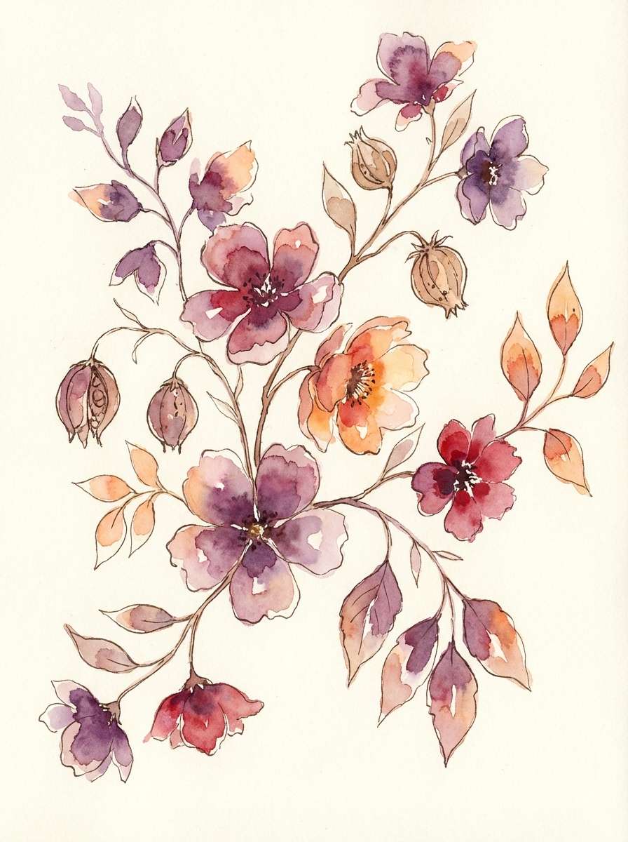
20) Phoenix Petal
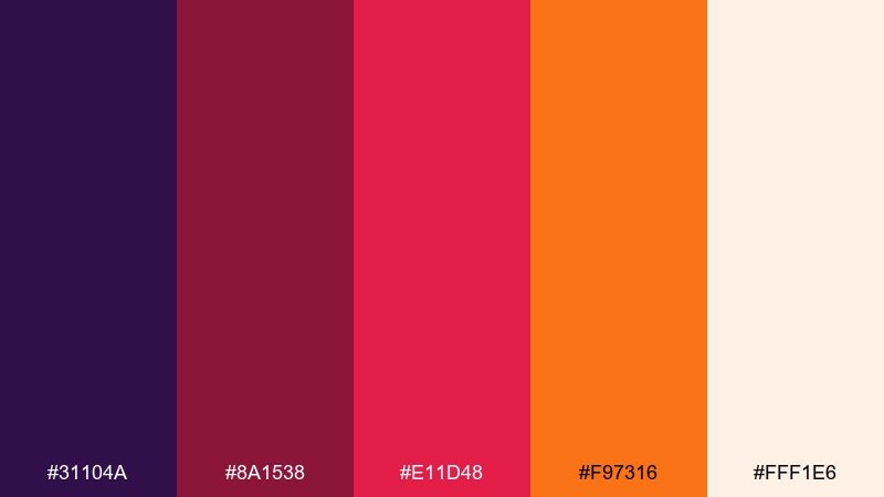
HEX: #31104a #8a1538 #e11d48 #f97316 #fff1e6
Mood: uplifting, modern, presentation-ready
Best for: presentation slide templates
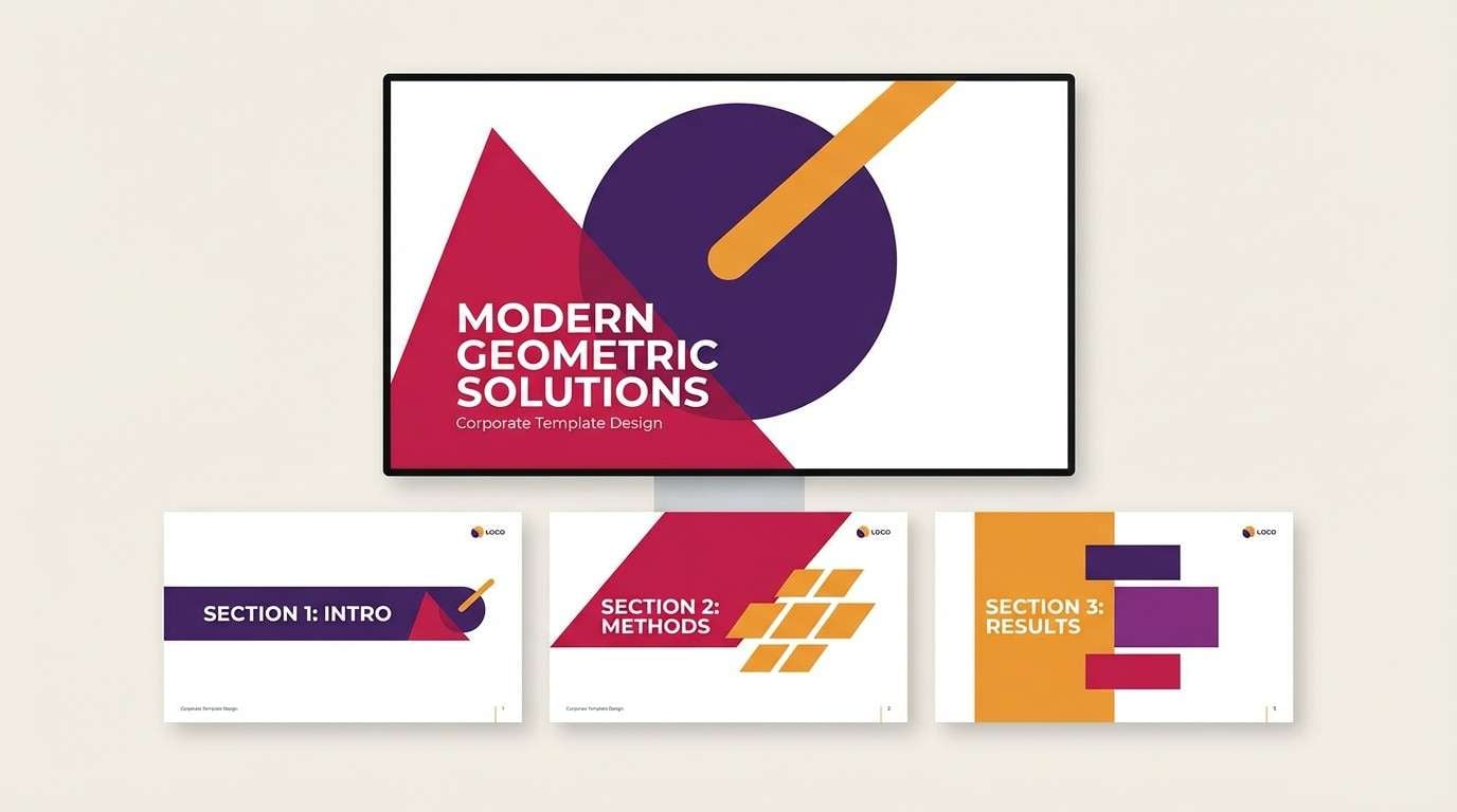
Uplifting and modern, like petals caught in a warm updraft. These purple red orange color combinations are excellent for slide templates, keynote covers, and section dividers that need momentum and clarity. Pair with simple grid layouts and light backgrounds to keep the content in control. Tip: make orange your highlight color for key numbers and keep magenta for secondary emphasis.
Image example of phoenix petal generated using media.io
What Colors Go Well with Purple Red Orange?
To keep a purple red orange color scheme usable across layouts, add soft neutrals like warm white, cream, or light beige. They act as breathing room so the warm accents feel intentional rather than overwhelming.
For typography and UI structure, deep charcoal, near-black, and warm gray pair especially well with purple. They preserve contrast, reduce eye strain, and make oranges and reds read as “signals” instead of constant noise.
If you want a sharper modern edge, try cool counterpoints in tiny amounts: slate blue, muted teal, or desaturated navy. A little cool support can make warm oranges (like #ff6d00) pop even more.
How to Use a Purple Red Orange Color Palette in Real Designs
Start with role assignment: use purple as the base (backgrounds, headers, navigation), red for emphasis (badges, highlights, secondary buttons), and orange for primary actions (CTAs, price tags, key stats). This keeps the palette consistent and easy to scan.
In print and packaging, watch ink density and contrast. Deep purples can swallow fine text, so lean on cream paper tones and reserve saturated reds/oranges for logos, seals, or a single hero element.
For digital products, keep large areas neutral and use orange sparingly for states that matter (active, warning, success highlight). That way the palette stays dramatic while still feeling professional in day-to-day UI.
Create Purple Red Orange Palette Visuals with AI
When you need matching mockups fast, generate visuals that already “speak” purple-red-orange—then drop your HEX colors into overlays, buttons, and typography. This is especially useful for hero banners, poster concepts, and packaging previews.
In Media.io, paste any palette prompt above and iterate by changing the subject (banner, UI, bottle, invitation) while keeping the same color direction. You’ll get cohesive options that are easy to refine into production designs.
To stay on-brand, keep your brightest orange (like #ff6d00) as a controlled accent and let purples do the heavy lifting in backgrounds and shadows.
Purple Red Orange Color Palette FAQs
-
What vibe does a purple red orange color palette create?
It typically feels warm, bold, and dramatic—mixing purple’s depth with red’s intensity and orange’s energetic “heat.” It’s great when you want visuals to look premium but still lively. -
Is #ff6d00 a good accent color with purple and red?
Yes. #ff6d00 is bright enough to cut through dark purples and rich reds, which makes it ideal for CTAs, badges, price tags, and key highlights—especially on cream or warm-gray backgrounds. -
How do I keep a purple red orange palette from looking too loud?
Use neutrals (cream, warm white, light beige) for most of the canvas, then limit orange to small high-priority elements. Keep red for secondary emphasis and let purple anchor large areas. -
What text color works best on these warm palettes?
For light backgrounds, use deep purple or charcoal for body text. On dark purple backgrounds, use warm white/cream for readability and avoid placing red text on orange (low contrast). -
Do purple red orange color schemes work for UI and dashboards?
They can, as long as you reserve orange for alerts/KPIs and keep most UI surfaces neutral or lightly tinted. Use purple for navigation and structure, and red for status or secondary emphasis. -
What are common industries that use purple red orange combinations?
Entertainment and events, beauty and fashion, food and beverage, and travel brands often use these combinations because they feel energetic, emotional, and memorable across digital and print. -
How can I generate on-style images for a purple red orange palette?
Use Media.io’s text-to-image tool and include subject + design context (poster, packaging, dashboard) + the color direction (deep purple, garnet red, bright orange, cream). Then iterate by adjusting lighting, layout, and “no photos”/studio constraints.


