

A soft color palette uses gentle, low-saturation hues that feel calm, modern, and easy on the eyes. It’s a go-to choice for UI design, branding, and print pieces where you want warmth without visual noise.
Below are 20+ soft color combinations with HEX codes, mood notes, and practical pairing tips you can apply to real projects.
In this article
- Why Soft Palettes Work So Well
-
- cloud milk tea
- blush linen
- mint macaron
- lavender haze
- peach sorbet
- seafoam studio
- powder rose
- oat cream
- pale sandstone
- quiet citrus
- misty lilac
- coastal chalk
- sakura dawn
- frosted pistachio
- vintage nursery
- dusty rainbow
- cotton candy editorial
- calm clay
- snowy orchid
- whispering meadow
- hushed apricot
- silver petal
- dewy hydrangea
- vanilla rosewater
- What Colors Go Well with Soft?
- How to Use a Soft Color Palette in Real Designs
- Create Soft Palette Visuals with AI
Why Soft Palettes Work So Well
Soft palettes reduce visual fatigue by keeping saturation and contrast under control, which makes them especially friendly for interfaces, long-form reading, and information-heavy layouts.
They also feel more “designed” with less effort: gentle hues naturally blend, so you can build cohesive systems (backgrounds, surfaces, borders, states) without harsh transitions.
Finally, soft color schemes photograph well and pair nicely with modern typography—helping brands look premium, approachable, and consistent across web and print.
20+ Soft Color Palette Ideas (with HEX Codes)
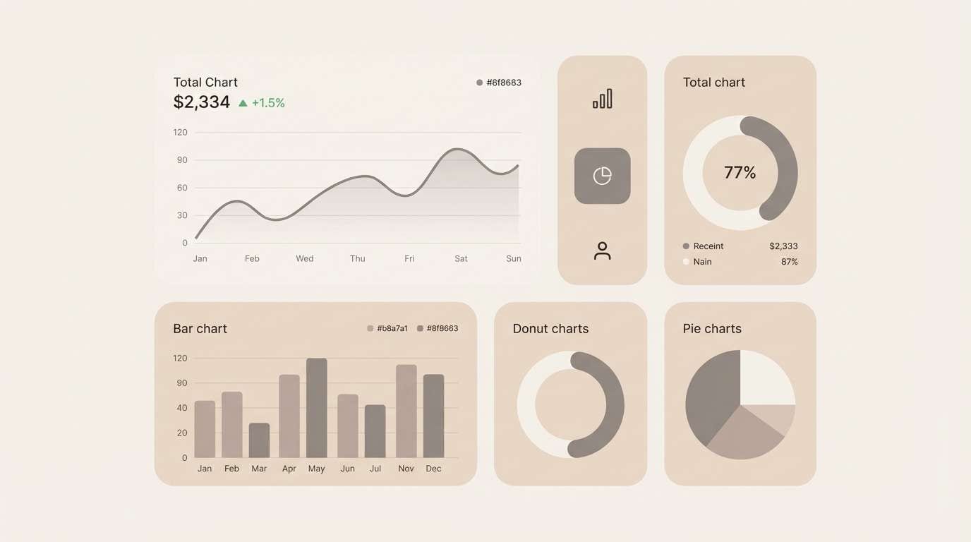
1) Cloud Milk Tea
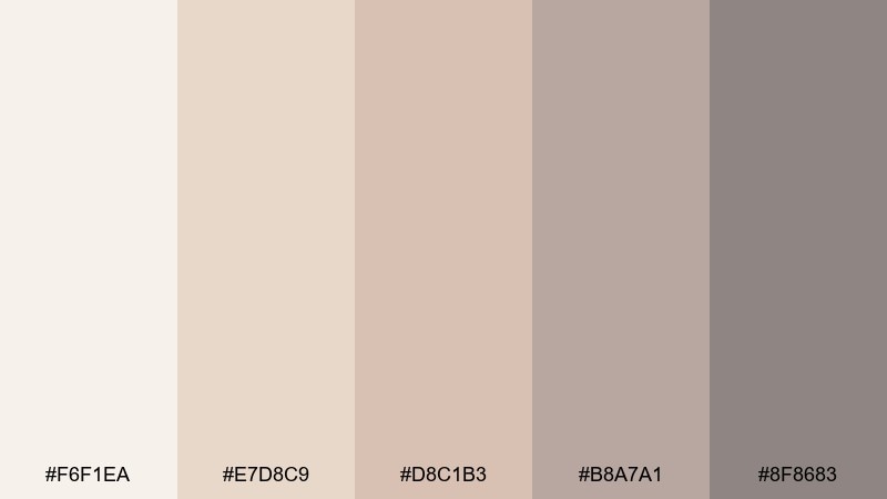
HEX: #f6f1ea #e7d8c9 #d8c1b3 #b8a7a1 #8f8683
Mood: cozy, airy, understated
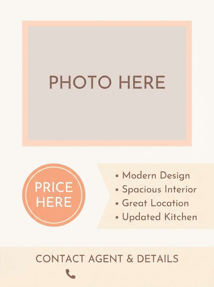
Best for: 2d ui dashboard mockup
Cozy café tones and a light, foggy warmth make this feel calm and approachable. It works beautifully for SaaS dashboards, settings pages, and onboarding screens where you want low visual noise. Pair the darker taupe with crisp white for readable hierarchy, then use the dusty rose-beige as a gentle highlight. Usage tip: reserve the deepest neutral for typography and icons so the interface stays clean.
Image example of cloud milk tea generated using media.io
Media.io is an online AI studio for creating and editing video, image, and audio in your browser.

2) Blush Linen

HEX: #fff4f6 #f3d9df #e7b8c3 #caa0a8 #8f6a72
Mood: romantic, airy, refined
Best for: wedding invitation design
Romantic blush and linen-like neutrals evoke fresh florals and soft daylight. These tones shine on wedding suites, bridal shower stationery, and elegant RSVP cards with plenty of breathing room. Pair the pale pink base with warm gray-brown for type, and let the deeper mauve act as a tasteful divider line. Usage tip: use subtle texture or letterpress-style embossing to add depth without darkening the palette.
Image example of blush linen generated using media.io

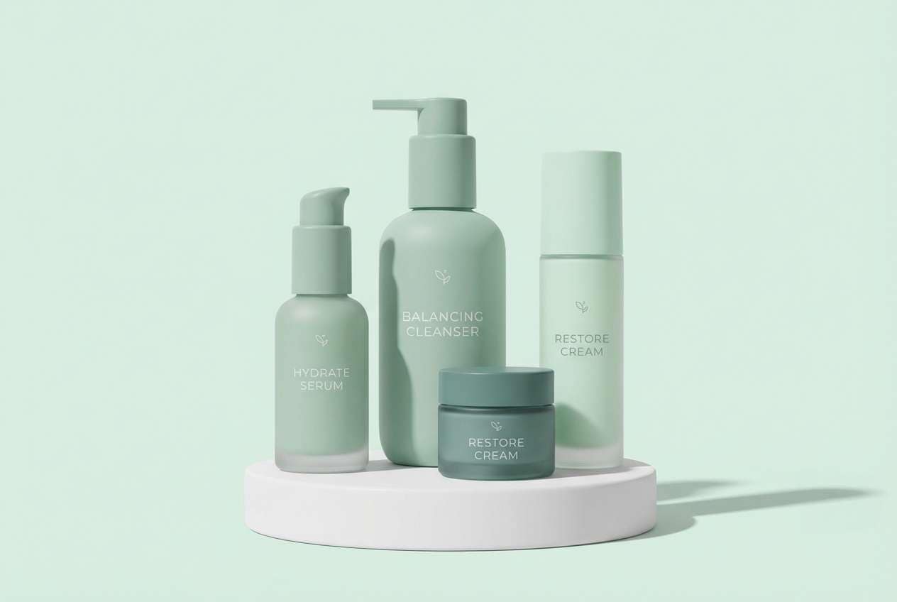
3) Mint Macaron

HEX: #f7fbf7 #dff3ea #bfe7d9 #a8cbbf #7f9f93
Mood: fresh, clean, friendly
Best for: skincare product packaging
Fresh mint and creamy whites feel like a spring breeze and a clean countertop. These soft color combinations are perfect for skincare labels, bath products, and wellness packaging that needs to look gentle and trustworthy. Keep the mint midtone as the hero color, then ground it with the muted green-gray for ingredient text. Usage tip: add plenty of whitespace and use matte finishes to keep the look soothing, not candy-bright.
Image example of mint macaron generated using media.io
4) Lavender Haze

HEX: #fbf7ff #e7dcf7 #cdb9ea #a79ad1 #6e5f9e
Mood: dreamy, modern, slightly mysterious
Best for: music playlist cover art
Dreamy lavender haze feels like twilight clouds and quiet synths. Use it for playlist covers, podcast art, and digital posters where you want softness with a hint of drama. Pair the lightest lilac with the deep violet for high-contrast titles, and keep midtones for shapes or gradients. Usage tip: try a subtle grain overlay so the purples feel velvety rather than glossy.
Image example of lavender haze generated using media.io

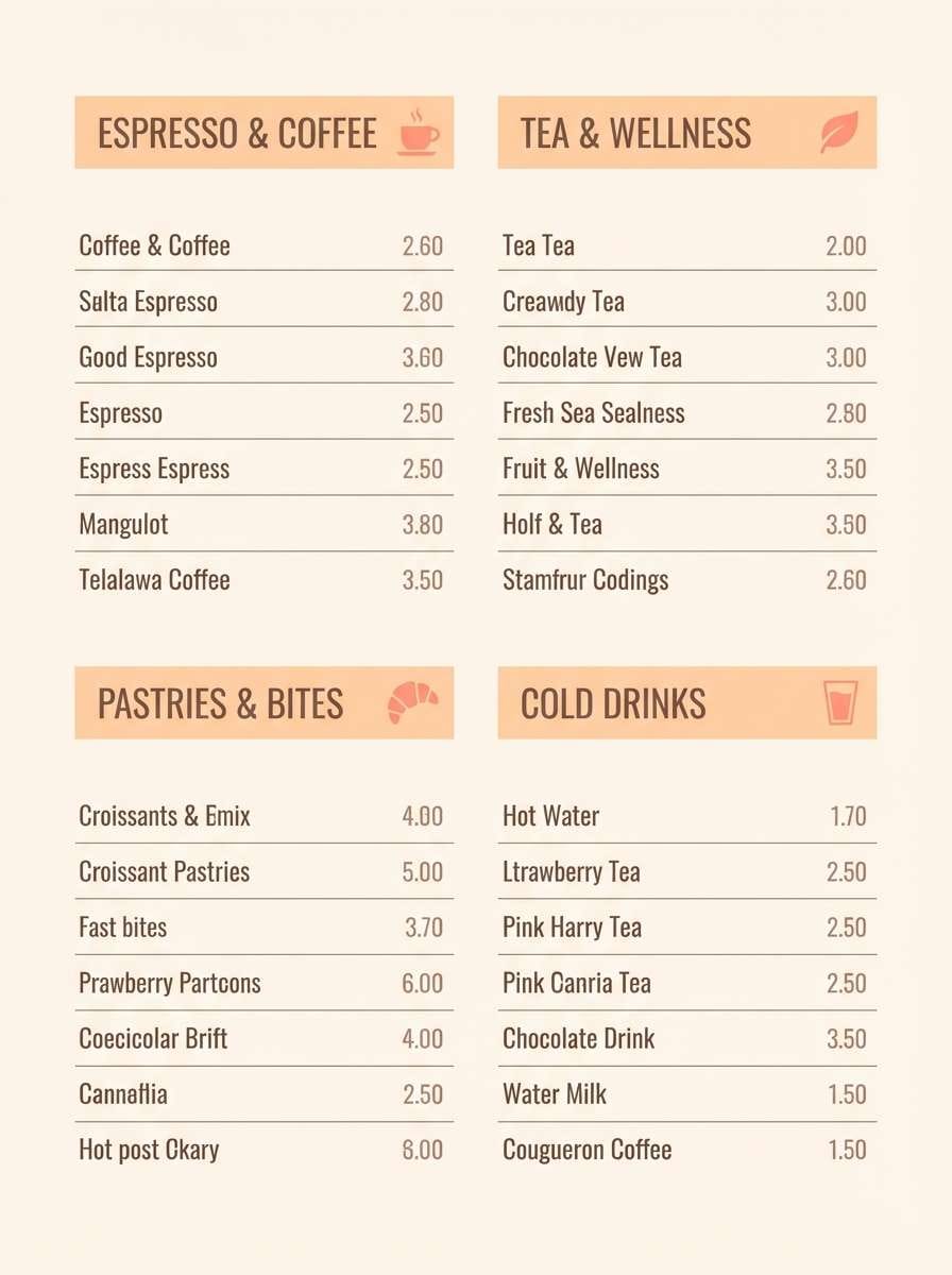
5) Peach Sorbet

HEX: #fff6ef #ffd9c2 #ffbfa3 #e4a08a #9e6a5f
Mood: sunny, welcoming, playful
Best for: cafe menu flyer
Sunny peach tones bring to mind sorbet, warm pastries, and late-morning light. They work well for café menus, bakery flyers, and seasonal promos that should feel friendly and approachable. Pair the creamy base with the cocoa-brown for legible pricing, then use the coral-peach as a highlight bar for specials. Usage tip: keep typography simple and let color blocks do the organizing.
Image example of peach sorbet generated using media.io
6) Seafoam Studio

HEX: #f3fbfb #cfeeee #a8dddd #7fb9b8 #4b7d7c
Mood: breezy, calm, professional
Best for: presentation slide template
Breezy seafoam and cool teals evoke coastal air and tidy workspaces. Use these shades for pitch decks, strategy presentations, and reports where clarity matters more than flash. Pair the light aqua background with the deeper teal for section headers and charts, keeping contrast accessible. Usage tip: limit gradients to small accents so the slides stay crisp in projectors.
Image example of seafoam studio generated using media.io

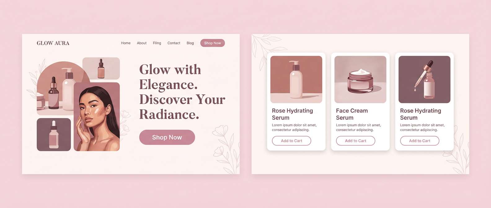
7) Powder Rose

HEX: #fff7f9 #f2d7e1 #d9aebc #b78798 #6f4b58
Mood: soft, elegant, timeless
Best for: beauty brand landing page
Powdery rose and muted mauve feel like satin ribbons and a gentle blush. A soft color palette like this suits beauty landing pages, boutique skincare, and editorial-style hero sections. Pair the pale blush with charcoal-free deep plum for headlines, and keep midtones for buttons and badges. Usage tip: choose warm, minimal photography and apply a light tint overlay for consistency.
Image example of powder rose generated using media.io
8) Oat Cream

HEX: #fbf7f0 #efe2cf #dbcbb6 #b6a796 #7a6f64
Mood: natural, grounded, minimalist
Best for: ceramic product ad
Warm oat and creamy beige tones suggest handmade paper and sunlit clay. They are ideal for artisan product ads, ceramics, and lifestyle branding that leans calm and tactile. Pair the pale base with the deeper brown-gray for copy, and let mid-beige carry large shapes or backdrops. Usage tip: use soft shadows and minimal props to keep the ad feeling premium.
Image example of oat cream generated using media.io

9) Pale Sandstone

HEX: #faf6f2 #e9dccf #d4c1b1 #b8a293 #7e6a60
Mood: quiet, earthy, contemporary
Best for: architecture portfolio website
Quiet sandstone neutrals feel like clean concrete, linen curtains, and sun-warmed stone. They fit architecture portfolios, interior design sites, and case studies where the work should be the focus. Pair the light base with the warm gray-brown for navigation and captions, keeping images full-bleed for impact. Usage tip: use a single accent line weight and consistent spacing to reinforce the minimalist vibe.
Image example of pale sandstone generated using media.io

10) Quiet Citrus

HEX: #fffdf6 #fff1c9 #ffe0a6 #d2c4a0 #7c705e
Mood: cheerful, mellow, optimistic
Best for: email newsletter template
Mellow citrus and warm creams feel like morning light through a kitchen window. They are great for newsletters, lifestyle announcements, and community updates that need to feel upbeat without screaming. Pair the butter-yellow with the earthy taupe for headings, and keep the lightest cream for generous margins. Usage tip: use yellow sparingly for callouts and buttons so the layout remains readable.
Image example of quiet citrus generated using media.io

11) Misty Lilac

HEX: #f8f6fb #e3deef #c7bddb #a6a0bf #6a647f
Mood: serene, polished, introspective
Best for: journal app ui
Serene lilac fog and cool grays create a calm, private atmosphere. These soft color combinations work well for journal apps, meditation tools, and reading interfaces where comfort is key. Pair the lightest violet-gray with the deep slate for text, and keep the mid lilac for toggles and progress states. Usage tip: increase line-height and use rounded components to match the gentle tone.
Image example of misty lilac generated using media.io

12) Coastal Chalk
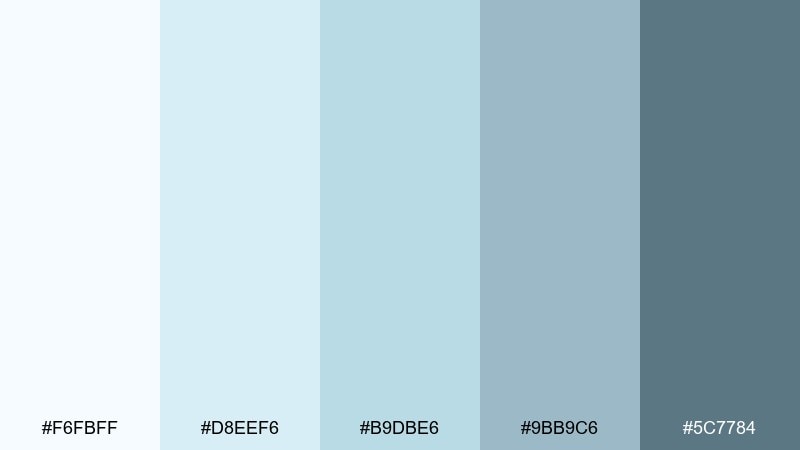
HEX: #f6fbff #d8eef6 #b9dbe6 #9bb9c6 #5c7784
Mood: crisp, coastal, trustworthy
Best for: medical clinic brochure
Crisp chalky blues evoke clean air and a reassuring, clinical calm. Use these tones for healthcare brochures, appointment cards, and patient education pages where trust and readability matter. Pair the pale blue-white with the deep steel for body text, and keep mid blues for diagrams and callout panels. Usage tip: stick to simple iconography and avoid heavy gradients to maintain clarity.
Image example of coastal chalk generated using media.io

13) Sakura Dawn

HEX: #fff7f2 #ffe2e8 #f6bfc9 #d39aa6 #7c5660
Mood: sweet, uplifting, delicate
Best for: spring botanical watercolor illustration
Sweet sakura pinks and warm cream feel like petals drifting at sunrise. They suit spring botanical artwork, gift cards, and gentle social posts with a romantic edge. Pair the pale base with the berry-mauve for focal details, and keep the mid pink for washes and gradients. Usage tip: use watercolor textures and let edges stay imperfect for a natural look.
Image example of sakura dawn generated using media.io

14) Frosted Pistachio

HEX: #f7fbf5 #e2f1d9 #c7e3b8 #a8c59a #6b8a61
Mood: fresh, wholesome, relaxed
Best for: healthy food label design
Fresh pistachio greens and creamy off-whites suggest garden ingredients and a light, clean taste. They work well for healthy food labels, tea tins, and organic product packaging. Pair the pale minty base with the deeper green for nutrition info and ingredient lists, keeping contrast clear. Usage tip: combine with simple line illustrations to reinforce the natural feel without adding clutter.
Image example of frosted pistachio generated using media.io

15) Vintage Nursery

HEX: #fff8f0 #f2e2d2 #e8c7c0 #c7b2bf #7a6e78
Mood: nostalgic, gentle, comforting
Best for: baby shower invitation
Nostalgic creams and dusty pinks feel like heirloom quilts and quiet lullabies. They are ideal for baby shower invitations, milestone cards, and keepsake prints with a warm, vintage touch. Pair the creamy base with the soft plum-gray for readable text, and use the dusty rose for borders or icons. Usage tip: choose rounded type and simple motifs like stars or moons to keep it sweet, not busy.
Image example of vintage nursery generated using media.io

16) Dusty Rainbow

HEX: #f7f5f8 #d9d1e8 #c7d8e8 #d7e5d2 #e9d7c9
Mood: playful, airy, modern
Best for: creative portfolio hero banner
Playful, dusty pastels read like a rainbow seen through morning mist. This soft color palette is great for creative portfolio hero banners, illustration sites, and makers who want personality without loud saturation. Pair one cool tone as the main background, then pick a single warm beige-pink for buttons or badges. Usage tip: keep typography dark and simple so the multi-tone backdrop stays sophisticated.
Image example of dusty rainbow generated using media.io

17) Cotton Candy Editorial
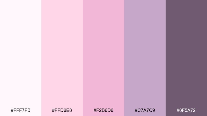
HEX: #fff7fb #ffd6e8 #f2b6d6 #c7a7c9 #6f5a72
Mood: fashion-forward, sweet, polished
Best for: magazine layout spread
Fashion-forward pinks with a mauve-gray anchor feel like runway lights and glossy pages. Use them for editorial spreads, lookbooks, and beauty articles that need softness without losing contrast. Pair the palest pink with the deep plum for headings and pull quotes, and keep mid pinks for section tabs. Usage tip: add thin rules and generous margins to make the layout breathe.
Image example of cotton candy editorial generated using media.io

18) Calm Clay

HEX: #fbf4ee #ead9cf #d3b8ad #b09188 #6d544f
Mood: earthy, calm, artisanal
Best for: handmade soap product photo
Earthy clay and warm blush-beige tones feel like pottery studios and natural oils. They fit handmade soap photography, craft shop banners, and slow-living branding with an artisanal edge. Pair the light cream with the rich brown for label text, and let the mid clay shade dominate props or packaging. Usage tip: use diffused lighting and avoid glossy reflections to keep the scene grounded.
Image example of calm clay generated using media.io

19) Snowy Orchid

HEX: #fbf9ff #eadff7 #d2c1eb #b5a2d6 #6f5a9a
Mood: delicate, cool, elegant
Best for: event poster design
Delicate orchid purples over a snowy base evoke winter florals and silk lighting. These tones are great for gallery nights, talks, and classy event posters that need a gentle presence. Pair the deep violet with the near-white background for crisp typography, and use the mid lavender for date blocks or subtle shapes. Usage tip: keep artwork minimal and rely on spacing to feel premium.
Image example of snowy orchid generated using media.io

20) Whispering Meadow

HEX: #f7fbf3 #dfead6 #c2d7bc #a3b69f #6f7f6b
Mood: peaceful, outdoorsy, balanced
Best for: eco brand logo and stationery
Peaceful meadow greens feel like quiet trails and breathable linen. For eco brands and sustainable stationery, this mix communicates care without leaning overly rustic. Pair the light green-white with the deepest olive for logo marks, and use the sage midtone for envelopes or backing cards. Usage tip: keep the logo shapes simple and test the mark at small sizes for legibility.
Image example of whispering meadow generated using media.io
21) Hushed Apricot

HEX: #fff7f1 #fde1cf #f6c3a8 #cfa08e #7b5d56
Mood: warm, inviting, modern classic
Best for: real estate listing flyer
Warm apricot and muted clay tones feel like freshly painted walls and late-afternoon sun. They suit real estate flyers, open house signage, and neighborhood announcements where you want friendly professionalism. Pair the creamy base with the deep cocoa for address lines, and use apricot midtones for feature callouts. Usage tip: keep photos neutral-warm so the color grading stays consistent.
Image example of hushed apricot generated using media.io
22) Silver Petal

HEX: #fbfbfd #e7e8ee #d2cfe0 #b8b6c7 #6c6b78
Mood: calm, sleek, understated
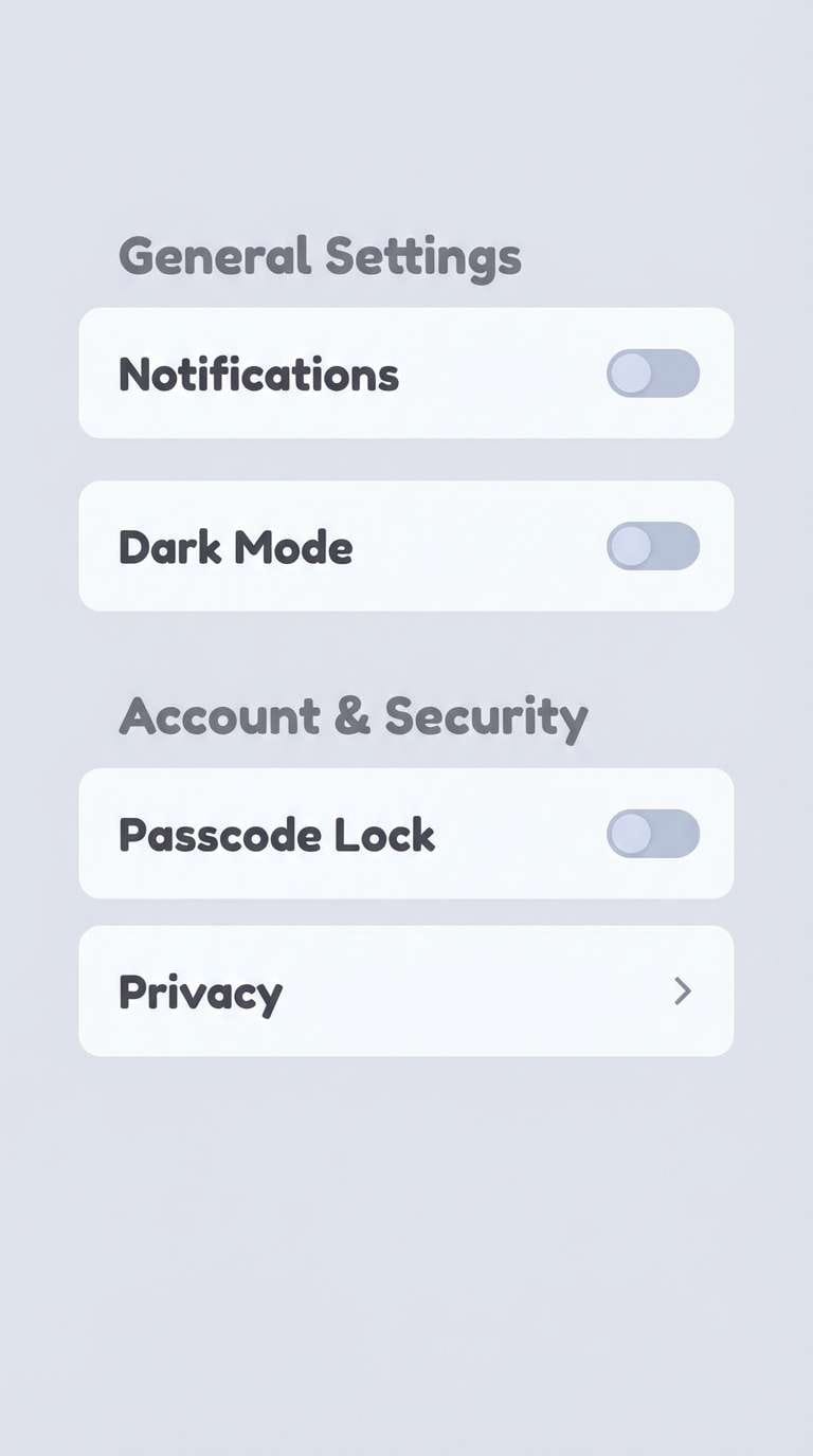
Best for: app settings screen ui
Calm silvers with a faint lilac petal hint feel tidy and quietly premium. Use this for settings screens, account pages, and productivity apps that need structure without harsh contrast. Pair the near-white background with the graphite-gray for labels, and reserve the lilac-gray for selected states. Usage tip: add subtle dividers and consistent icon weights to keep everything scannable.
Image example of silver petal generated using media.io
23) Dewy Hydrangea

HEX: #f6fbff #ddeafb #c1d4f4 #a6b7dd #64769a
Mood: fresh, uplifting, airy
Best for: summer sale banner
Fresh hydrangea blues feel dewy and airy, like a cool breeze on a warm day. A soft color palette like this makes sale banners and web promos feel friendly, not aggressive. Pair the pale sky base with the denim-gray for readable pricing, and use the mid blue as the CTA highlight. Usage tip: keep the discount badge simple and avoid heavy outlines so the banner stays light.
Image example of dewy hydrangea generated using media.io

24) Vanilla Rosewater

HEX: #fffaf5 #f9e4da #f0c8bf #d1a8a5 #7a5d60
Mood: sweet, soothing, elegant
Best for: bakery box packaging
Vanilla cream with rosewater pink feels like delicate desserts and ribbon-wrapped boxes. These soft color combinations are perfect for bakery packaging, pastry labels, and gift sets that should look handcrafted and premium. Pair the creamy base with the cocoa-mauve for stamps and ingredients, and keep the mid pink for patterns or tissue paper. Usage tip: use a single repeating motif, like tiny dots or florals, to add charm without clutter.
Image example of vanilla rosewater generated using media.io

What Colors Go Well with Soft?
Soft palettes pair best with grounded neutrals: warm off-whites, oatmeal beiges, gentle grays, and softened charcoals. These “quiet anchors” keep the scheme readable and prevent pastels from feeling washed out.
For contrast, choose one deeper accent in the same temperature family (e.g., deep mauve with blush, slate with lilac, or deep teal with seafoam). This creates hierarchy for buttons, headings, and icons while staying cohesive.
If you want a modern twist, add a tiny touch of a crisp bright (like a small coral, cobalt, or lime detail) as a micro-accent—used sparingly, it keeps the design contemporary without breaking the soft vibe.
How to Use a Soft Color Palette in Real Designs
Start with roles, not colors: pick a near-white background, a surface color for cards, a muted border tone, and one darker “text/ink” shade. Soft UI works when hierarchy comes from spacing, type scale, and subtle tonal shifts.
Keep accessibility in mind by testing contrast for text and controls; many pastel midtones won’t pass for body text. A reliable approach is using the deepest palette color for typography and icons, and reserving midtones for fills and states.
In branding and print (invites, packaging, flyers), add depth through texture (paper grain, emboss, matte finishes) and layout discipline. Soft colors look premium when the composition is clean and intentional.
Create Soft Palette Visuals with AI
If you’re presenting a soft color scheme to a client or team, mockups and examples help the palette “click” faster than swatches alone. Generating on-style visuals is also a quick way to validate contrast, mood, and typography pairing.
With Media.io text-to-image, you can turn any palette into UI screens, posters, packaging shots, or banners by describing the layout and listing your HEX colors as the dominant tones.
Try creating several variations (same palette, different use case) so you can pick the version that best matches your brand’s voice and audience.
Soft Color Palette FAQs
-
What is a soft color palette?
A soft color palette is a set of low-saturation, gentle hues (often pastels, muted tones, and modern neutrals) designed to feel calm, airy, and approachable while still supporting readable hierarchy. -
Are soft colors the same as pastel colors?
Not always. Pastels are typically light and tinted with white, while soft colors can include muted midtones and dusty shades (like sage, mauve, or taupe) that aren’t necessarily very light. -
How do I keep a soft color scheme from looking washed out?
Use one deeper anchor color for text and key UI elements, add structured spacing, and rely on subtle value contrast (light vs. mid vs. deep) instead of saturation to create hierarchy. -
What text color works best on soft backgrounds?
Soft palettes usually need a deeper neutral for typography—think slate, deep taupe, charcoal-leaning plum, or deep teal. Avoid using pale midtones for body text because contrast often becomes too low. -
How many colors should a soft palette include?
Five is a practical set: one background, one surface, one secondary surface/border, one accent, and one deep anchor. You can expand later, but a small system keeps designs consistent. -
What’s the best way to use soft palettes in UI design?
Assign colors by function (background, card, border, states, CTA) and test contrast for accessibility. Soft palettes shine when paired with clear typography, generous whitespace, and minimal shadows. -
Can I generate soft palette mockups quickly for presentations?
Yes—use Media.io’s text-to-image tool to generate banners, posters, UI screens, or packaging scenes by describing the design and listing your palette HEX codes as dominant colors.


