

Deep sky blue is a high-clarity, high-energy blue that instantly reads as modern, digital-friendly, and optimistic. It’s bold enough to lead a UI, but flexible enough to pair with neutrals, navies, and warm accents for balance.
Below are 20 deep sky blue color palette ideas with HEX codes, mood notes, and practical pairing tips for branding, web design, UI kits, print, and more.
In this article
Why Deep Sky Blue Palettes Work So Well
Deep sky blue is saturated and luminous, so it stays readable on screens and punches through busy layouts. That makes it a natural fit for primary actions (buttons, links, highlights) where you want fast recognition.
It also plays nicely with dark foundations like navy and charcoal, giving you easy contrast for typography and UI chrome. Add a near-white background and it looks instantly crisp and “designed.”
Because it sits between cyan and classic blue, it can lean tech-forward, coastal, sporty, or playful depending on your supporting colors. A single warm accent (gold, coral, amber) often creates the perfect balance.
20+ Deep Sky Blue Color Palette Ideas (with HEX Codes)
1) Neon Marina

HEX: #00BFFF #001F3F #00E5FF #F7F9FC #FFB703
Mood: electric, coastal, modern
Best for: app UI dashboard
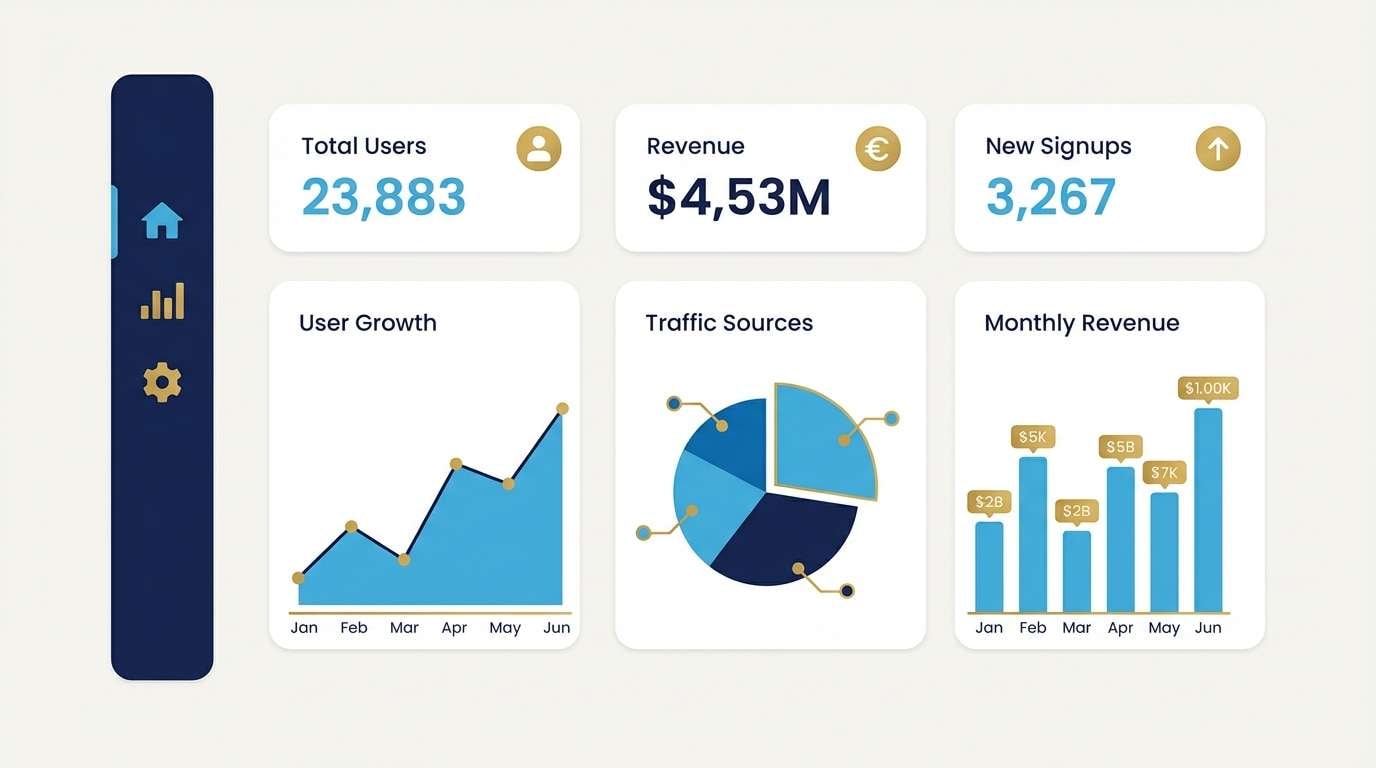
Electric and sunlit, this mix feels like marina lights reflecting on midnight water. Use it for dashboards and product screens where clarity matters, letting the deep navy carry headers and the bright blue handle primary actions. Warm gold works best as a small accent for notifications or highlights. Tip: keep the background near-white so the blue stays crisp instead of noisy.
Image example of neon marina generated using media.io
Media.io is an online AI studio for creating and editing video, image, and audio in your browser.

2) Arctic Minimal
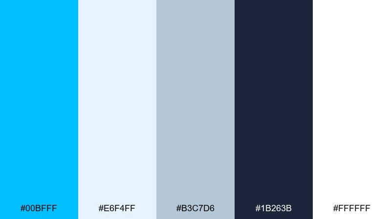
HEX: #00BFFF #E6F4FF #B3C7D6 #1B263B #FFFFFF
Mood: clean, airy, precise
Best for: SaaS landing page hero
Crisp and weightless, these tones read like polar air and fresh snow. They shine on SaaS hero sections, especially when you need a high-contrast headline and a calm supporting layout. Pair the bright blue with graphite for CTAs and navigation, then soften everything with pale ice backgrounds. Tip: reserve the darkest tone for typography to keep accessibility strong.
Image example of arctic minimal generated using media.io

3) Sunset Surf
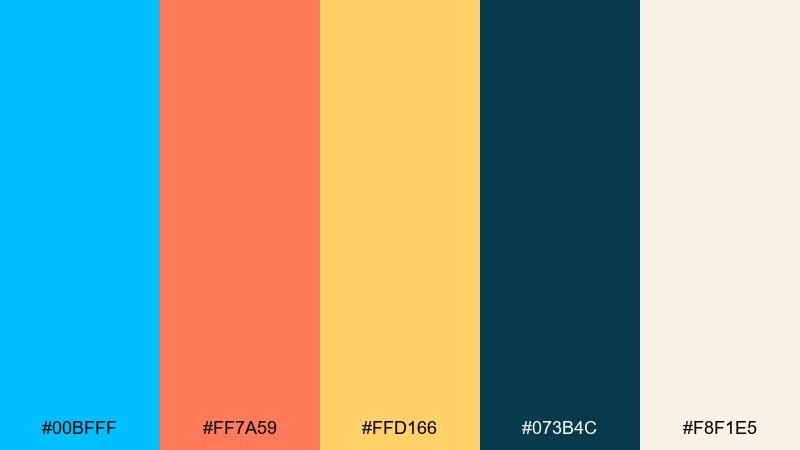
HEX: #00BFFF #FF7A59 #FFD166 #073B4C #F8F1E5
Mood: playful, summery, energetic
Best for: summer event poster
Bright and beachy, it feels like surf spray under a tangerine sunset. Use it on posters or social graphics where you want instant energy without losing legibility. The dark teal anchors text while coral and sunshine yellow handle headlines and shapes. Tip: limit coral to one focal element so the blue stays the main signal color.
Image example of sunset surf generated using media.io
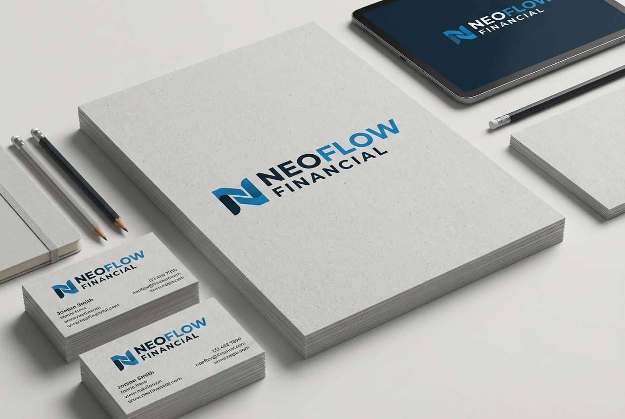
4) Ink and Ice
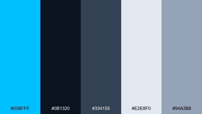
HEX: #00BFFF #0B1320 #334155 #E2E8F0 #94A3B8
Mood: confident, sleek, professional
Best for: fintech branding kit
Sharp and composed, it evokes inked contracts and cold glass architecture. It works beautifully for fintech identity systems, with the bright blue delivering trust while charcoal and slate keep things serious. Use the pale grays for backgrounds and packaging stock colors to create a premium feel. Tip: keep gradients subtle or skip them entirely for a more regulated, dependable look.
Image example of ink and ice generated using media.io
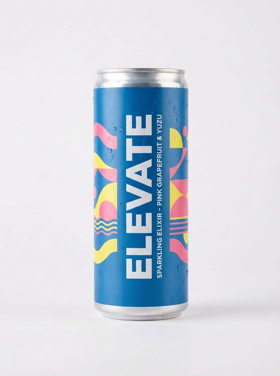
5) Tropical Punch

HEX: #00BFFF #00C48C #FF4D6D #FFE66D #1F2937
Mood: bold, fruity, upbeat
Best for: beverage can packaging
Loud and juicy, it brings to mind sparkling drinks and poolside shade. Use it for packaging where shelf impact matters, letting the bright blue and pink do the heavy lifting and keeping text in the deep graphite. The mint green is perfect for secondary flavor cues or badges. Tip: balance the hot accents with generous negative space so the design stays premium, not chaotic.
Image example of tropical punch generated using media.io
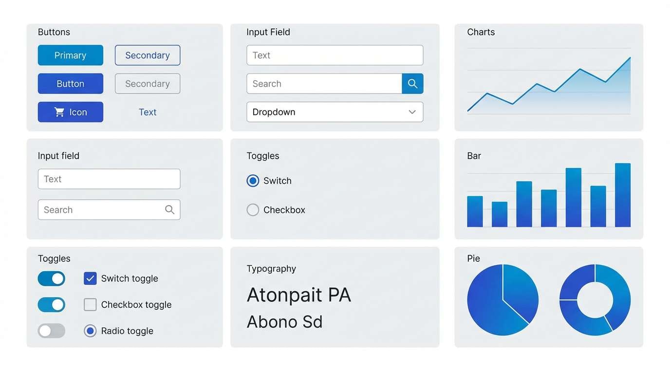
6) Cloudy Blueprint
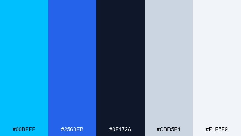
HEX: #00BFFF #2563EB #0F172A #CBD5E1 #F1F5F9
Mood: technical, structured, modern
Best for: product UI kit
Clever and engineered, it feels like a blueprint drawn on a bright day. These tones fit component libraries and design systems, where multiple blues help separate primary actions from secondary states. Pair the darkest shade with body text and keep grays for surfaces and dividers. Tip: use one blue for links and a different blue for buttons to reduce cognitive friction.
Image example of cloudy blueprint generated using media.io
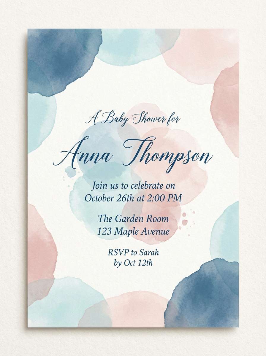
7) Powdered Sky
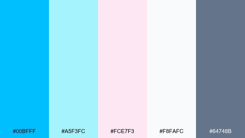
HEX: #00BFFF #A5F3FC #FCE7F3 #F8FAFC #64748B
Mood: soft, sweet, airy
Best for: baby shower invitation
Gentle and dreamy, it looks like cotton candy clouds drifting across a bright sky. Use it for invitations and stationery where you want warmth without going overly pastel. The slate tone helps keep names and dates readable while the pale cyan and blush build a soft backdrop. Tip: add texture like subtle paper grain to make the light colors feel richer in print.
Image example of powdered sky generated using media.io
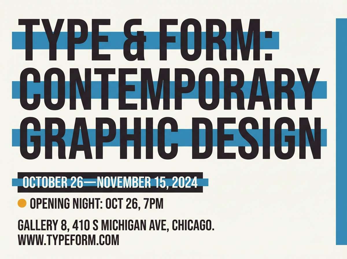
8) Museum Night

HEX: #00BFFF #111827 #F59E0B #E5E7EB #6B7280
Mood: dramatic, cultured, high-contrast
Best for: exhibition flyer
Moody and curated, it suggests gallery spotlights and polished stone floors. Use it for exhibition flyers or lecture series promos, where strong contrast keeps text crisp from a distance. The amber tone is best as a single spotlight accent on dates or callouts. Tip: set typography in clean sans-serif and keep spacing generous to maintain the premium feel.
Image example of museum night generated using media.io
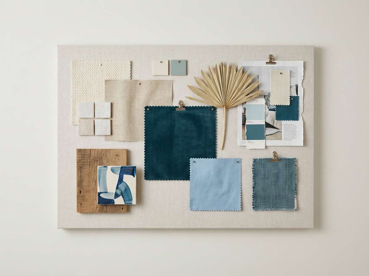
9) Seaside Neutrals
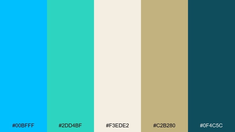
HEX: #00BFFF #2DD4BF #F3EDE2 #C2B280 #0F4C5C
Mood: relaxed, natural, coastal
Best for: interior design mood board
Calm and tactile, it reads like driftwood, sea glass, and sandy linen. It fits interior mood boards and lifestyle lookbooks, where the neutrals carry most surfaces and the blue arrives as a refreshing accent. Pair the teal with natural textures like rattan or light oak to keep it grounded. Tip: use the cream tone as the dominant background for a breathable, editorial layout.
Image example of seaside neutrals generated using media.io
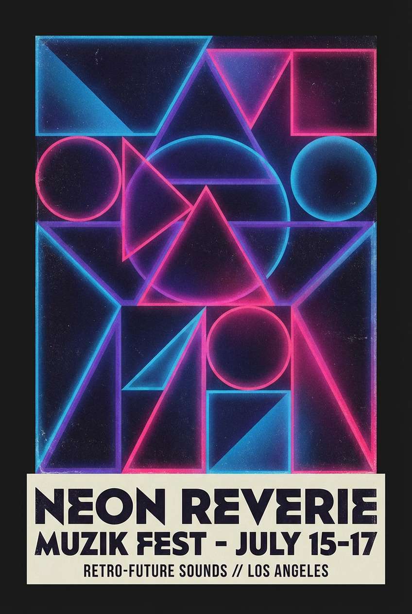
10) Retro Arcade Splash
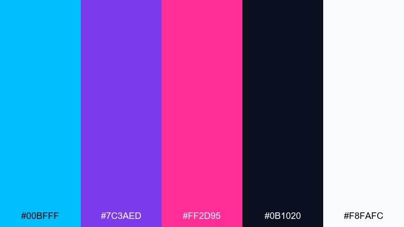
HEX: #00BFFF #7C3AED #FF2D95 #0B1020 #F8FAFC
Mood: retro, neon, high-energy
Best for: music festival poster
Vibrant and nostalgic, it feels like arcade lights and synth riffs. Use it on festival posters and digital ads where you want punchy contrast and bold shapes. Keep the dark base for type and let the purple and pink frame the focal areas. Tip: use a limited set of geometric patterns so the neon accents do not compete with the headline.
Image example of retro arcade splash generated using media.io
11) Calm Clinic
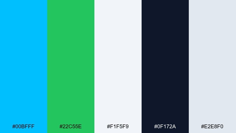
HEX: #00BFFF #22C55E #F1F5F9 #0F172A #E2E8F0
Mood: reassuring, clean, friendly
Best for: healthcare appointment UI
Fresh and reassuring, it recalls clean linens and clear water. It works well for healthcare and wellness interfaces, where the blue can guide primary actions and the green signals success states. Use the pale grays for cards and form fields to reduce glare. Tip: keep icon styles simple and consistent so the calm color story does the communicating.
Image example of calm clinic generated using media.io

12) Denim and Clay
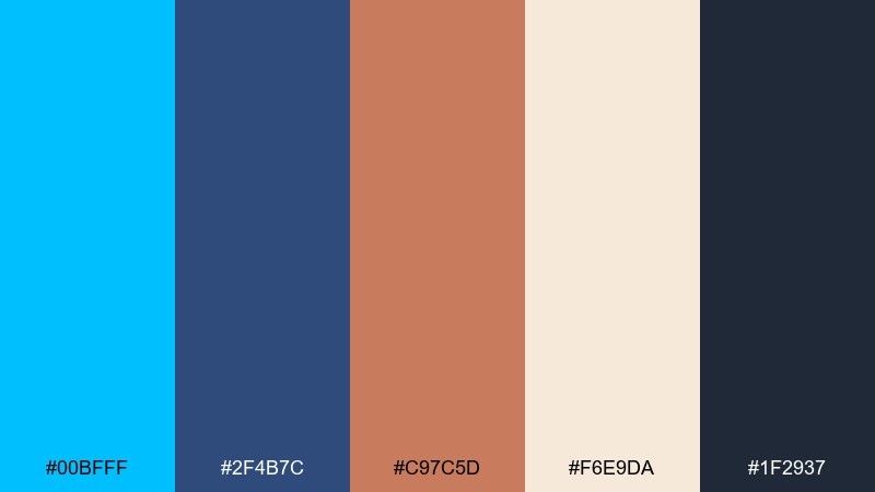
HEX: #00BFFF #2F4B7C #C97C5D #F6E9DA #1F2937
Mood: grounded, handmade, modern rustic
Best for: lifestyle product packaging
Warm and grounded, it feels like worn denim next to sun-baked clay. Use it for lifestyle packaging, especially if you want a crafted look that still feels contemporary. The cream tone is ideal for labels, while clay adds warmth to icons or pattern details. Tip: pair with uncoated paper textures to make the palette feel more tactile.
Image example of denim and clay generated using media.io

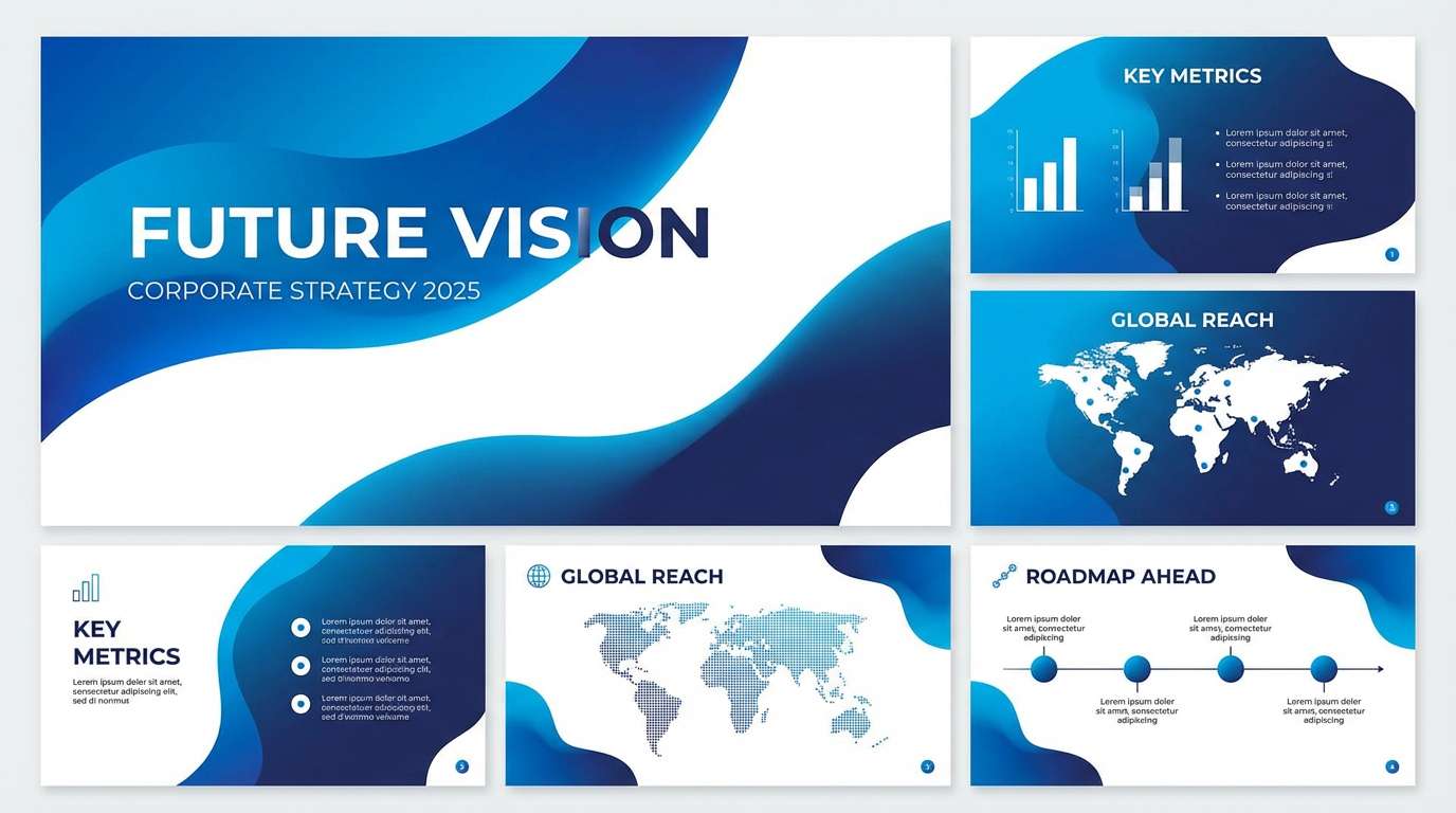
13) Oceanic Gradient
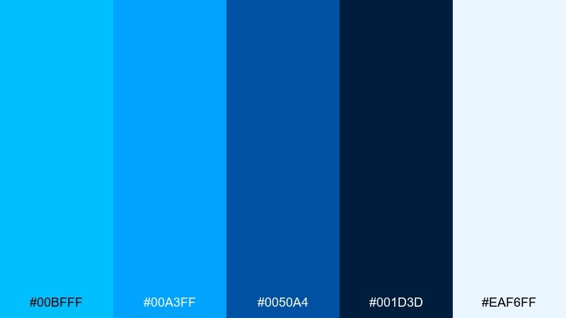
HEX: #00BFFF #00A3FF #0050A4 #001D3D #EAF6FF
Mood: immersive, confident, fluid
Best for: presentation slide deck
Deep and immersive, it looks like a dive from bright surface water into the open sea. This deep sky blue color palette is ideal for slide decks, where layered blues create depth without distracting from charts and headlines. Pair it with clean whites for breathing room and use the darkest navy for titles and axis labels. Tip: apply gradients only to large background shapes, not to text or icons.
Image example of oceanic gradient generated using media.io
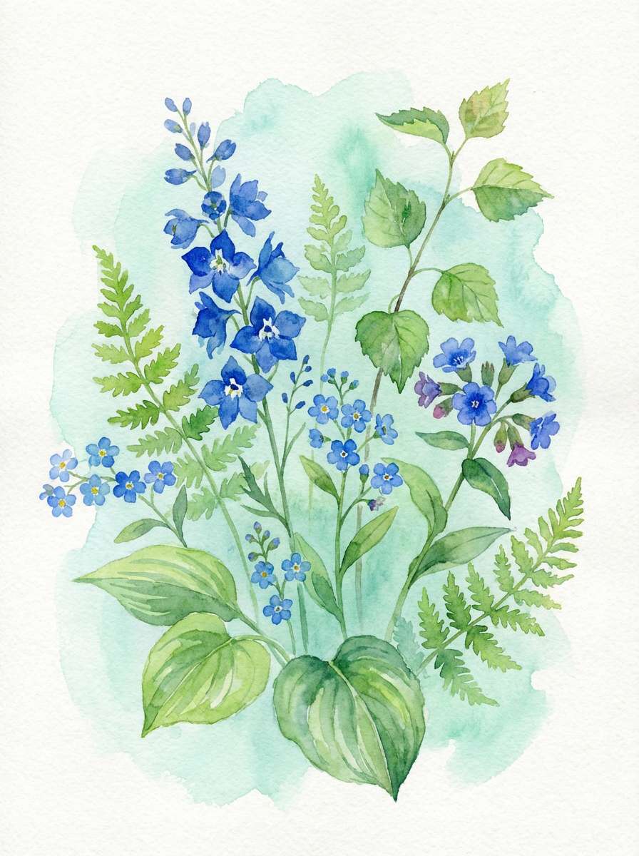
14) Botanical Bluebell
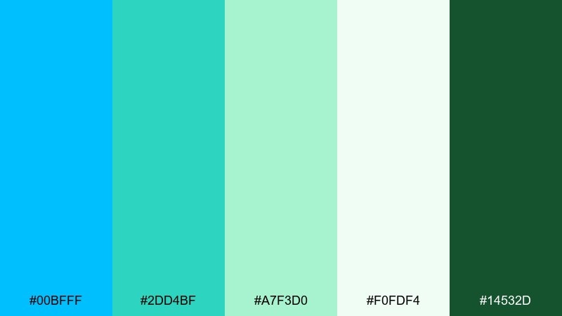
HEX: #00BFFF #2DD4BF #A7F3D0 #F0FDF4 #14532D
Mood: fresh, botanical, springy
Best for: watercolor botanical illustration
Fresh and garden-like, it brings to mind dew, new leaves, and bluebell petals. Use it for botanical illustrations, eco packaging, or seasonal campaigns that need a bright but natural feel. The greens keep the blue from feeling too techy, while the pale mint makes space for details. Tip: let the darker green define stems and shadows, and keep the blue for blooms and accents.
Image example of botanical bluebell generated using media.io
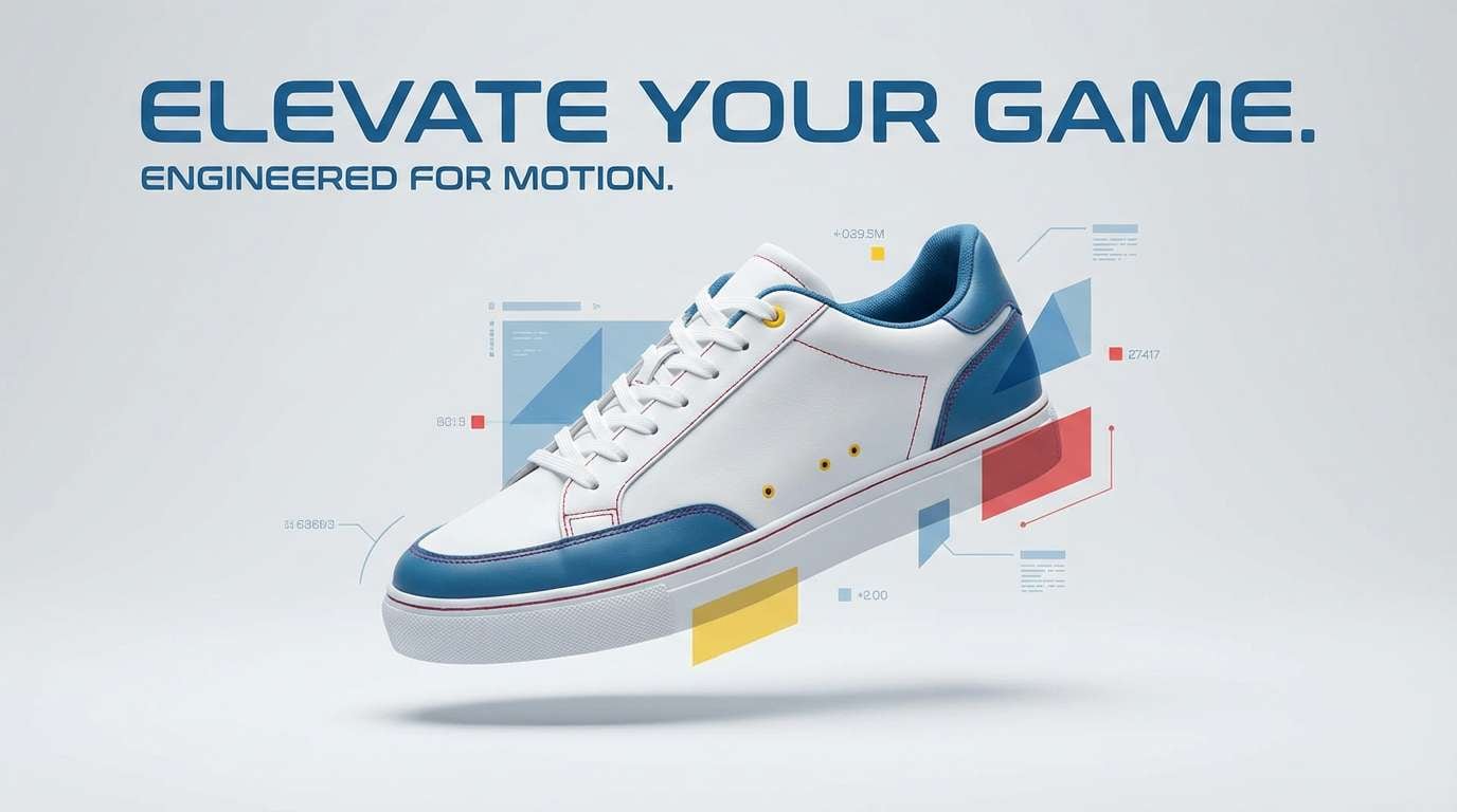
15) Sporty Sprint
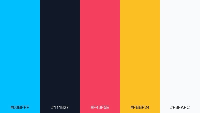
HEX: #00BFFF #111827 #F43F5E #FBBF24 #F8FAFC
Mood: fast, sporty, attention-grabbing
Best for: sneaker product ad
Fast and punchy, it feels like a starting whistle and a burst of speed. These deep sky blue color combinations work great in sports ads, using the blue for energy and the near-black for strong contrast around product details. Keep the red for one bold callout and use yellow sparingly for price or limited-time badges. Tip: use directional shapes or motion lines to amplify the sprint-like vibe without adding clutter.
Image example of sporty sprint generated using media.io
16) Midnight Aurora
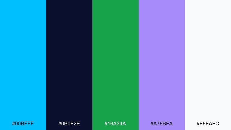
HEX: #00BFFF #0B0F2E #16A34A #A78BFA #F8FAFC
Mood: mysterious, luminous, futuristic
Best for: album cover artwork
Mysterious and luminous, it evokes aurora streaks cutting across a night sky. Use it for album covers or motion graphics, where the contrast between electric blue and deep midnight creates drama. The violet can act as a secondary glow, while green adds a rare, modern twist. Tip: keep the brightest tones on the edges or highlights so the center focus stays readable.
Image example of midnight aurora generated using media.io
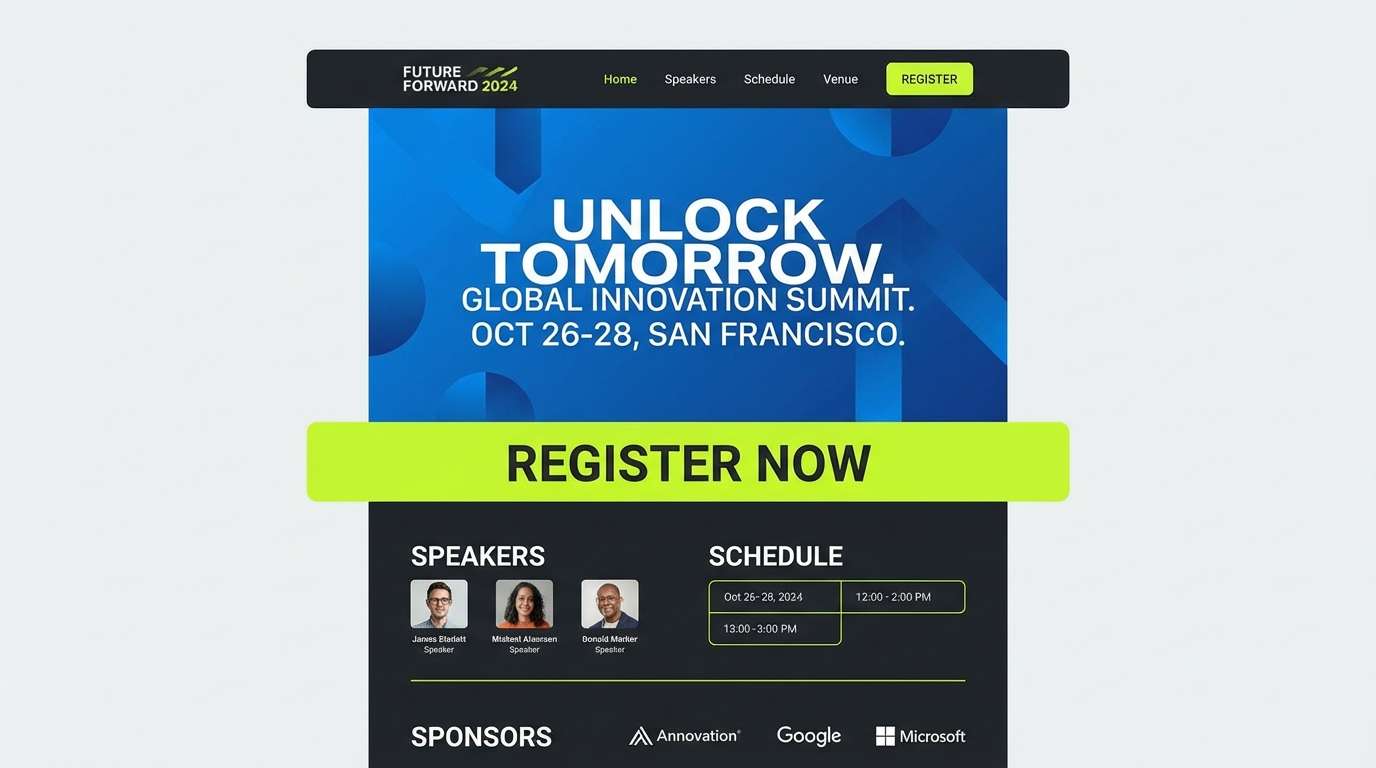
17) Tech Conference
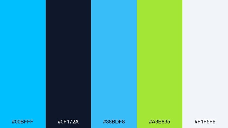
HEX: #00BFFF #0F172A #38BDF8 #A3E635 #F1F5F9
Mood: innovative, sharp, high-clarity
Best for: conference landing page UI
Bright and forward-looking, it feels like stage LEDs and crisp screen light. Use it on landing pages for conferences or webinars, where the blue family keeps the design cohesive and the lime adds a modern spark. Keep the darkest tone for navigation and long-form text, and let the lighter blue handle hover states. Tip: treat lime as a single-purpose accent for tickets or register buttons to avoid visual fatigue.
Image example of tech conference generated using media.io
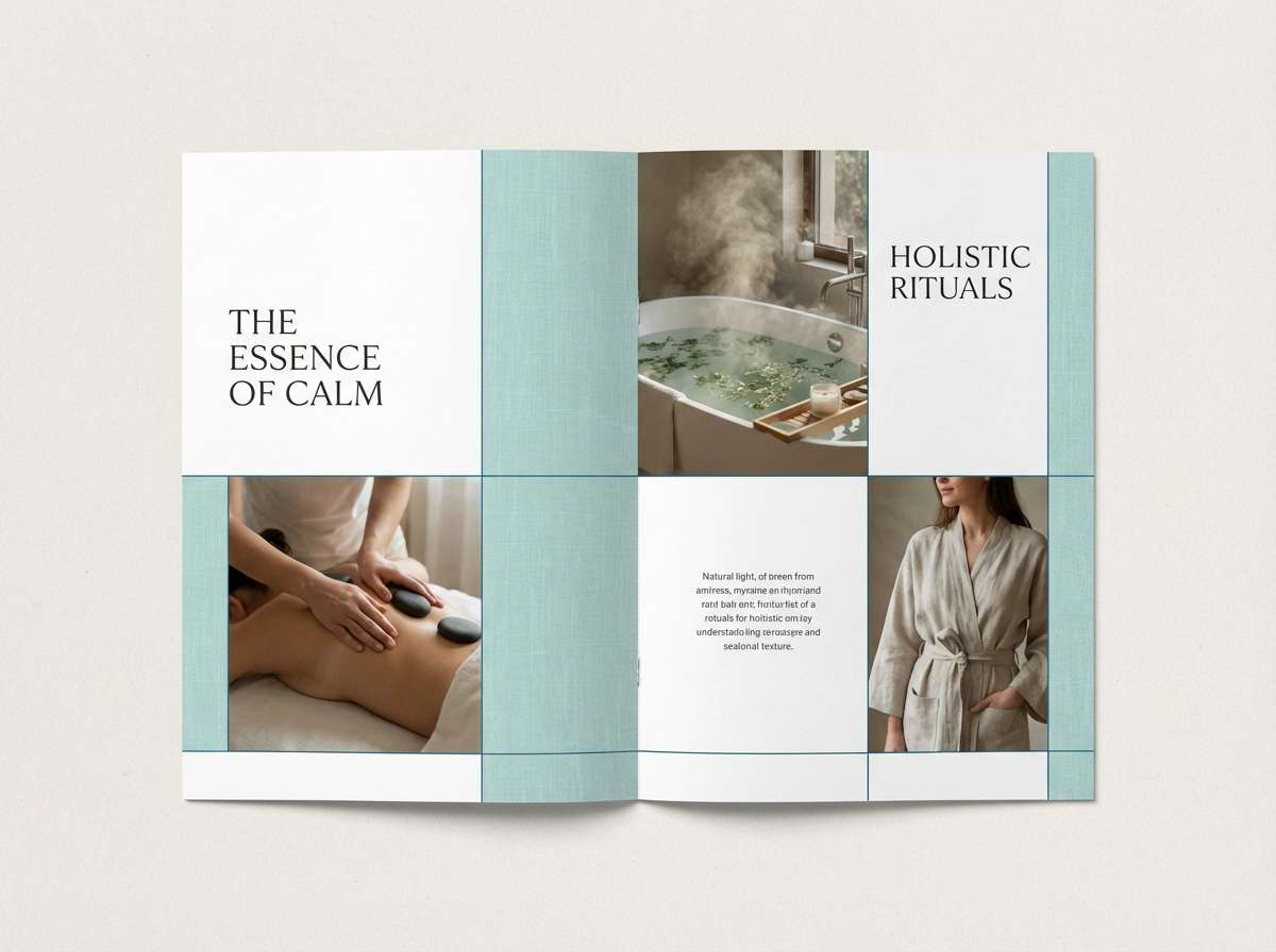
18) Ceramic Spa
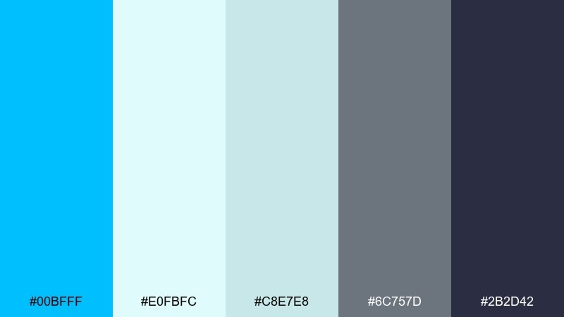
HEX: #00BFFF #E0FBFC #C8E7E8 #6C757D #2B2D42
Mood: soothing, refined, airy
Best for: spa brochure editorial layout
Soothing and refined, it suggests ceramic tiles, steam, and cool water. Use it for brochures and editorial layouts in wellness brands, keeping the pale aquas as backgrounds and the darker tones for headings. The bright blue works best as a small accent for section dividers or callout icons. Tip: choose lots of white space and soft photography overlays to maintain the spa-like quiet.
Image example of ceramic spa generated using media.io
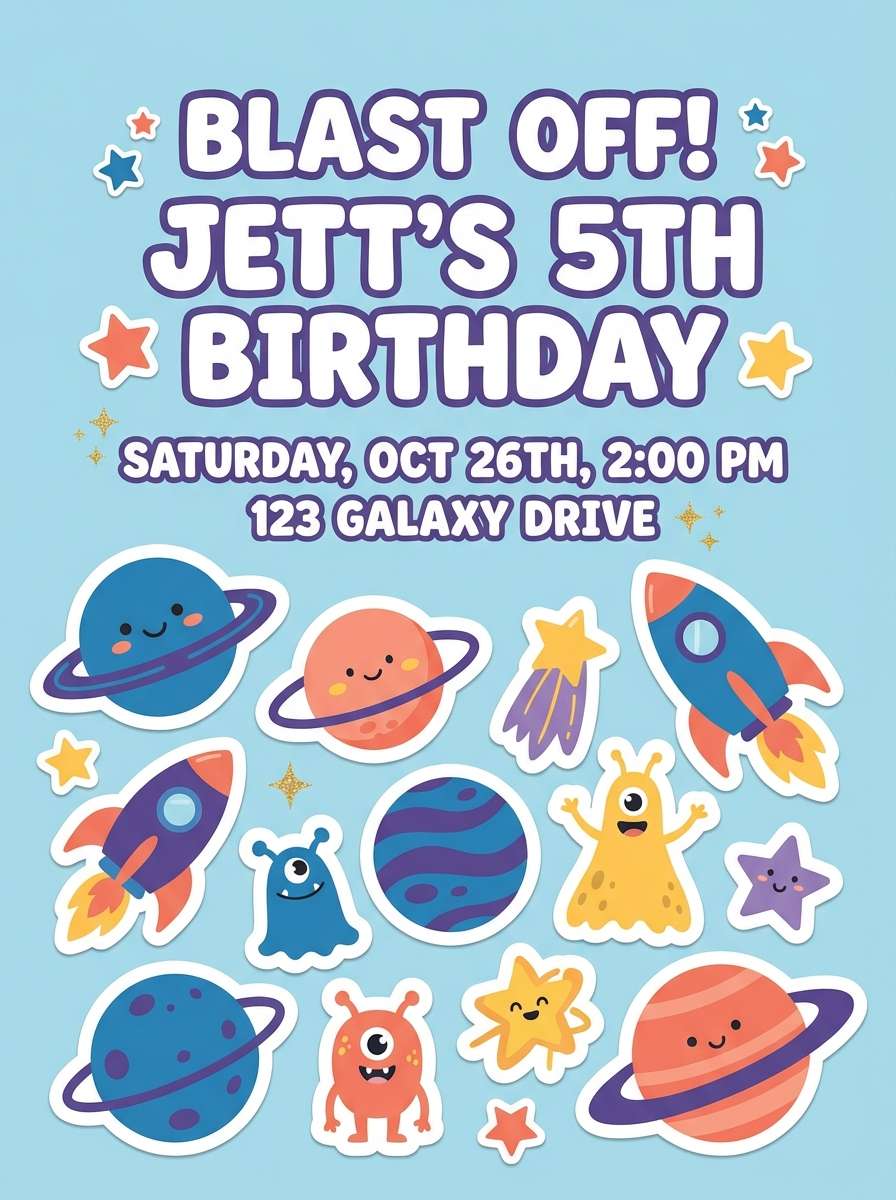
19) Cosmic Pop
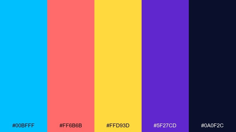
HEX: #00BFFF #FF6B6B #FFD93D #5F27CD #0A0F2C
Mood: fun, cosmic, youthful
Best for: kids party invitation
Fun and cosmic, it feels like a cartoon galaxy with bright comets and candy stars. These deep sky blue color combinations are perfect for kids party invites, using the blue and purple for the night-sky base and the warm tones for playful highlights. Keep text in the darkest navy to stay readable over busy shapes. Tip: use stars, dots, and bold stickers, but keep the layout simple so parents can scan the details quickly.
Image example of cosmic pop generated using media.io
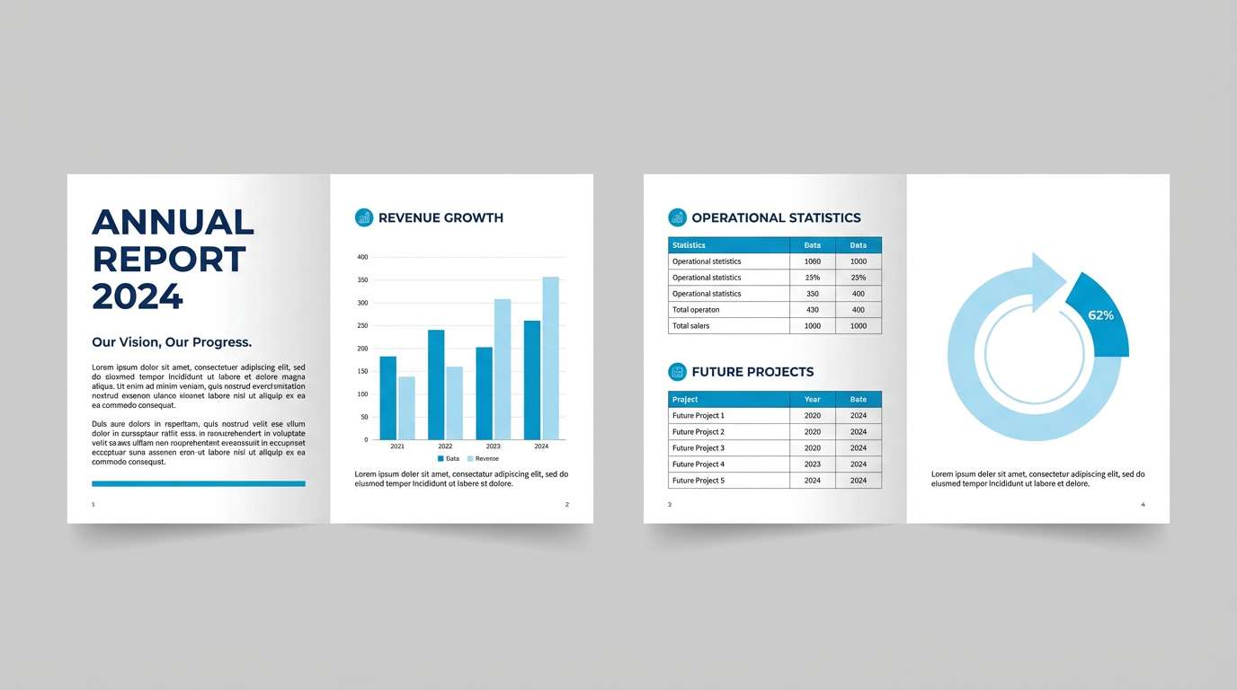
20) Classic Corporate

HEX: #00BFFF #1E3A8A #0F172A #E5E7EB #FFFFFF
Mood: trustworthy, classic, executive
Best for: annual report template
Polished and dependable, it brings to mind boardrooms, crisp charts, and clear decisions. Use this deep sky blue color scheme for annual reports and proposals, letting the bright blue highlight key metrics while navy and charcoal handle hierarchy. The light grays keep pages from feeling stark and help tables read cleanly. Tip: keep accents consistent across charts so readers learn the visual language fast.
Image example of classic corporate generated using media.io
What Colors Go Well with Deep Sky Blue?
Deep sky blue pairs cleanly with dark anchors like navy, charcoal, and near-black because the contrast is immediate and reliable. This is one of the easiest ways to keep typography accessible while letting the blue stay vivid.
For a softer, editorial feel, combine it with cool whites, pale grays, and icy tints. These backgrounds make deep sky blue look sharper and more premium, especially in UI surfaces and print layouts.
If you want more personality, add one warm accent—gold, amber, coral, or sunny yellow. Use that accent sparingly (badges, highlights, key icons) so it reads as intentional rather than noisy.
How to Use a Deep Sky Blue Color Palette in Real Designs
Start by assigning roles: one deep sky blue for primary actions, one dark tone for text/navigation, and one light neutral for backgrounds. This structure keeps your interface consistent across pages and components.
In branding, deep sky blue works best when it has “breathing room.” Give it generous whitespace or calm neutrals, then use a secondary accent color for key moments like promotions, notifications, or hero highlights.
For print, test saturation and paper stock early. Deep sky blue can shift on uncoated paper, so pair it with stable dark inks and light neutrals, and use textures (grain, matte finishes) to keep the palette feeling rich.
Create Deep Sky Blue Palette Visuals with AI
If you want to preview how a palette behaves in a real layout, generating quick mockups is the fastest path. You can test contrast, hierarchy, and the “temperature” of your accents before committing to production design.
With Media.io, you can turn a prompt into on-brand visuals—UI screens, posters, packaging mockups, slide templates, and more—then iterate until the colors feel right for your project.
Deep Sky Blue Color Palette FAQs
-
What is the HEX code for deep sky blue?
A commonly used HEX for deep sky blue is #00BFFF. It’s a vivid, cyan-leaning blue that stays bright and readable on screens. -
Is deep sky blue good for UI and app design?
Yes. Deep sky blue is excellent for UI because it creates clear visual hierarchy for links and primary buttons, especially when paired with dark text colors and light neutral surfaces. -
What colors pair best with deep sky blue?
Navy/charcoal for contrast, whites and cool grays for clean backgrounds, and warm accents like gold, amber, coral, or yellow for highlights and callouts. -
How do I keep a deep sky blue palette from feeling too “neon”?
Use near-white or soft gray backgrounds, add a deep navy anchor for typography, and keep bright accents limited to small areas. Avoid using multiple saturated brights at equal weight. -
Can I use deep sky blue in corporate branding?
Absolutely. Combined with navy, charcoal, and light grays, deep sky blue reads as trustworthy and modern—great for reports, fintech, SaaS, and professional services. -
Does deep sky blue print accurately?
It can shift depending on paper and ink (especially on uncoated stock). For best results, test prints, consider CMYK conversions, and rely on darker blues/charcoals for critical text elements. -
How many colors should a deep sky blue palette include?
For most brands and UI systems, 4–6 colors is ideal: one primary blue, one dark anchor, one background neutral, and 1–2 accents for states or emphasis.
Next: Fun Color Palette


