

Sienna is a warm, earthy orange-brown that instantly adds grounded comfort to a design. It’s a go-to choice for rustic-modern branding, interiors, packaging, and UI accents because it feels natural without being boring.
Below are curated sienna color palette ideas with HEX codes, plus practical pairing tips and AI image prompts you can use to generate matching visuals in seconds.
In this article
- Why Sienna Palettes Work So Well
-
- desert adobe
- clay and cream
- canyon sunset
- copper sage
- mocha linen
- terra bloom
- rustic minimal
- spiced navy
- autumn library
- brandy rose
- tuscan kitchen
- studio leather
- botanical terracotta
- warm concrete
- sienna and ink
- vintage postcard
- festival spice
- quiet hearth
- modern southwest
- chocolate citrus
- terrace evening
- dried citrus bouquet
- sunlit workshop
- earthen typeface
- What Colors Go Well with Sienna?
- How to Use a Sienna Color Palette in Real Designs
- Create Sienna Palette Visuals with AI
Why Sienna Palettes Work So Well
Sienna sits in that sweet spot between orange and brown: warm enough to feel inviting, but muted enough to read as sophisticated. It adds emotional warmth to layouts without the loudness of bright oranges.
Because sienna is naturally associated with clay, leather, wood, and sunbaked landscapes, it pairs easily with warm neutrals (cream, sand, taupe) and also balances beautifully with cool contrasts like navy, teal, and blue-green.
From a usability angle, sienna also works well as an accent color: it draws attention for CTAs, tags, and highlights while still feeling organic in UI and print.
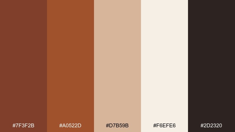
20+ Sienna Color Palette Ideas (with HEX Codes)
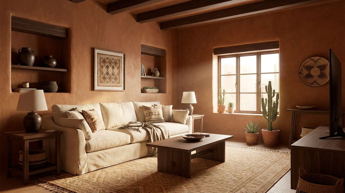
1) Desert Adobe
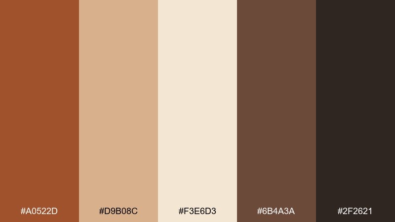
HEX: #A0522D #D9B08C #F3E6D3 #6B4A3A #2F2621
Mood: sunbaked, grounded, calm
Best for: southwest living room interior concept
Sunbaked clay walls and soft sand dunes set a grounded, calming tone. Use the light cream as the base, then layer sienna and cocoa for furniture, textiles, or feature walls. Pair it with raw wood, woven textures, and matte black hardware to keep it contemporary. Usage tip: reserve the near-black for small accents like frames and lighting to avoid heavy contrast.
Image example of desert adobe generated using media.io
Media.io is an online AI studio for creating and editing video, image, and audio in your browser.

2) Clay And Cream
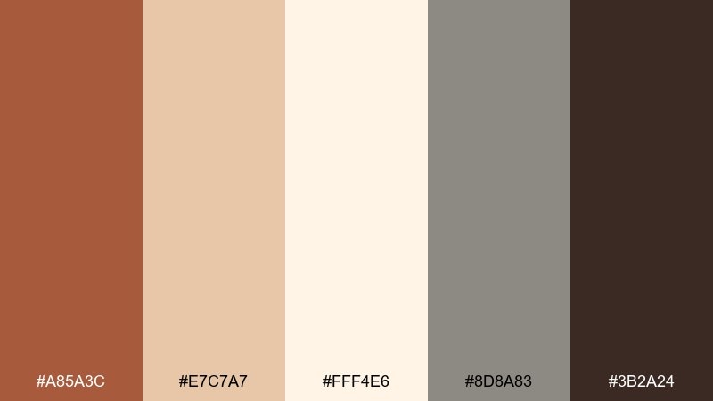
HEX: #A85A3C #E7C7A7 #FFF4E6 #8D8A83 #3B2A24
Mood: soft, airy, approachable
Best for: minimal brand identity kit
Soft clay and whipped cream tones feel friendly, modern, and easy to live with. Build the identity around the creamy background and let clay lead in the logo mark or key shapes. The warm gray is ideal for secondary text and grids, while espresso adds weight for headlines. Usage tip: keep contrast high by using #3B2A24 for body copy on #FFF4E6.
Image example of clay and cream generated using media.io
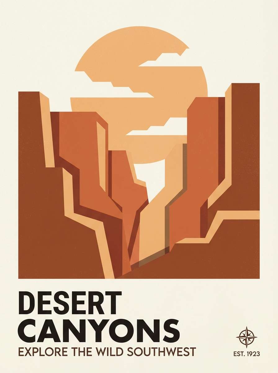
3) Canyon Sunset
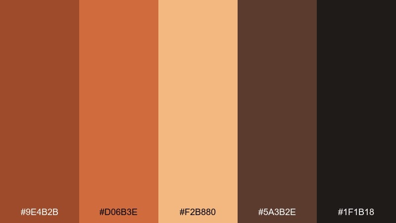
HEX: #9E4B2B #D06B3E #F2B880 #5A3B2E #1F1B18
Mood: bold, radiant, cinematic
Best for: travel poster design
A canyon-at-dusk glow brings bold energy with a cinematic warmth. Use the bright orange and apricot for hero shapes and gradients, then ground the layout with deep bark and charcoal. It works beautifully for tourism campaigns, outdoor events, and statement posters. Usage tip: set type in #1F1B18 on #F2B880 for legible, sunlit contrast.
Image example of canyon sunset generated using media.io
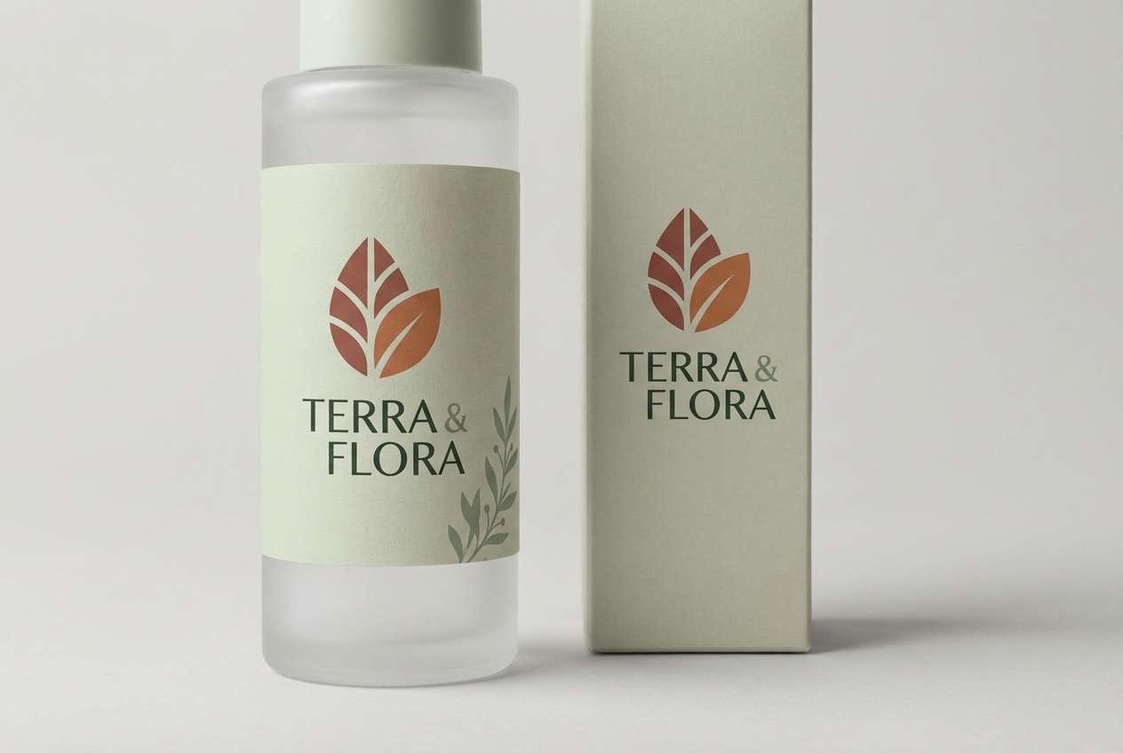
4) Copper Sage
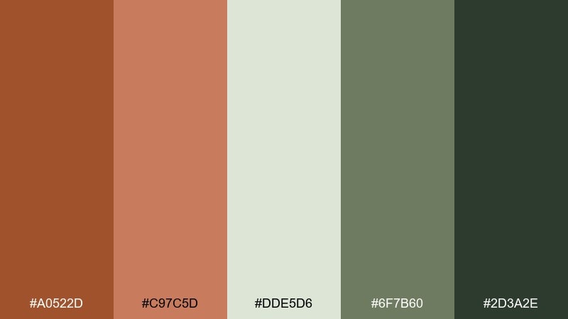
HEX: #A0522D #C97C5D #DDE5D6 #6F7B60 #2D3A2E
Mood: fresh, earthy, balanced
Best for: skincare product packaging
Copper warmth paired with airy sage feels fresh, grounded, and quietly premium. These sienna color combinations shine on minimalist skincare labels where botanical cues matter without going overtly green. Use the pale sage as the label base, copper for the brand mark, and deep forest for ingredients and regulatory text. Usage tip: keep the copper at 10 to 20 percent coverage so the package still reads clean on shelf.
Image example of copper sage generated using media.io
5) Mocha Linen
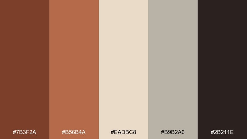
HEX: #7B3F2A #B56B4A #EADBC8 #B9B2A6 #2B211E
Mood: cozy, refined, timeless
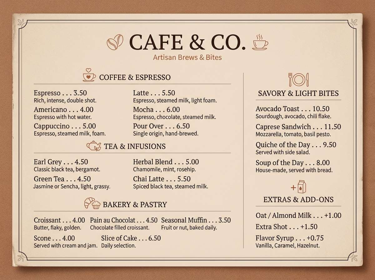
Best for: cafe menu design
Mocha and toasted linen create a cozy, refined mood that feels like a quiet neighborhood cafe. Use the linen tone for the menu background and mocha for section headers and icons. The warm gray helps structure pricing and notes without turning cold. Usage tip: print tests matter here, so slightly lighten #7B3F2A if your paper stock runs absorbent.
Image example of mocha linen generated using media.io
6) Terra Bloom
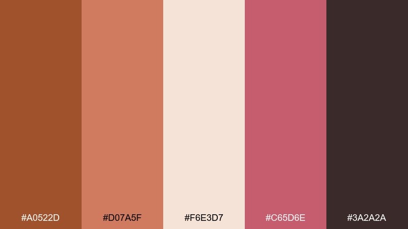
HEX: #A0522D #D07A5F #F6E3D7 #C65D6E #3A2A2A
Mood: romantic, warm, artistic
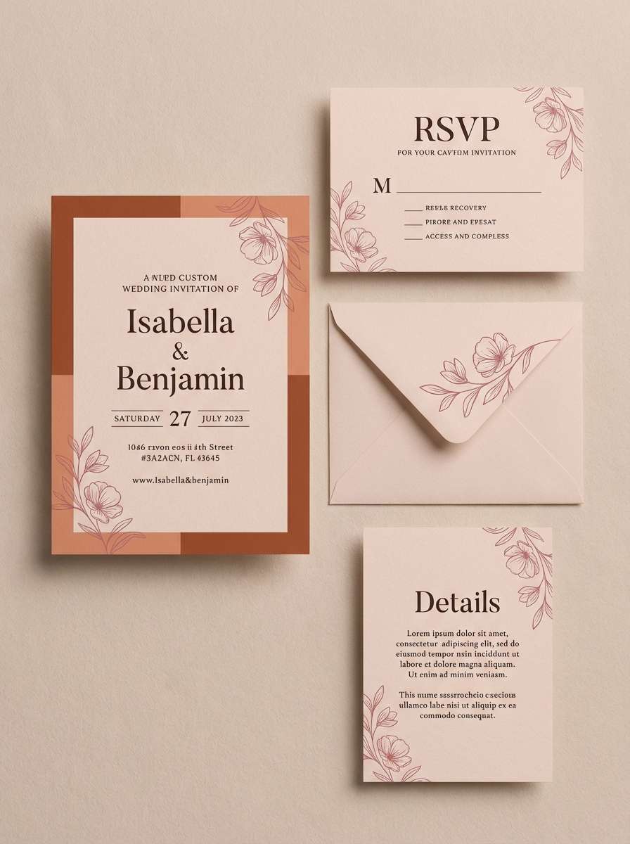
Best for: wedding invitation suite
Romantic terracotta and rose feel like dried florals and warm candlelight. This sienna color palette works especially well for wedding stationery that wants warmth without looking rustic. Pair it with textured paper, deckled edges, and simple line florals in the darkest shade for contrast. Usage tip: keep the rose (#C65D6E) to small highlights like monograms and RSVP details.
Image example of terra bloom generated using media.io
7) Rustic Minimal
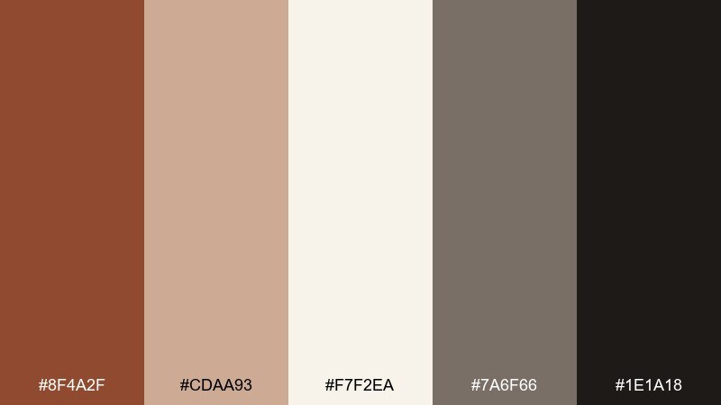
HEX: #8F4A2F #CDAA93 #F7F2EA #7A6F66 #1E1A18
Mood: minimal, warm, confident
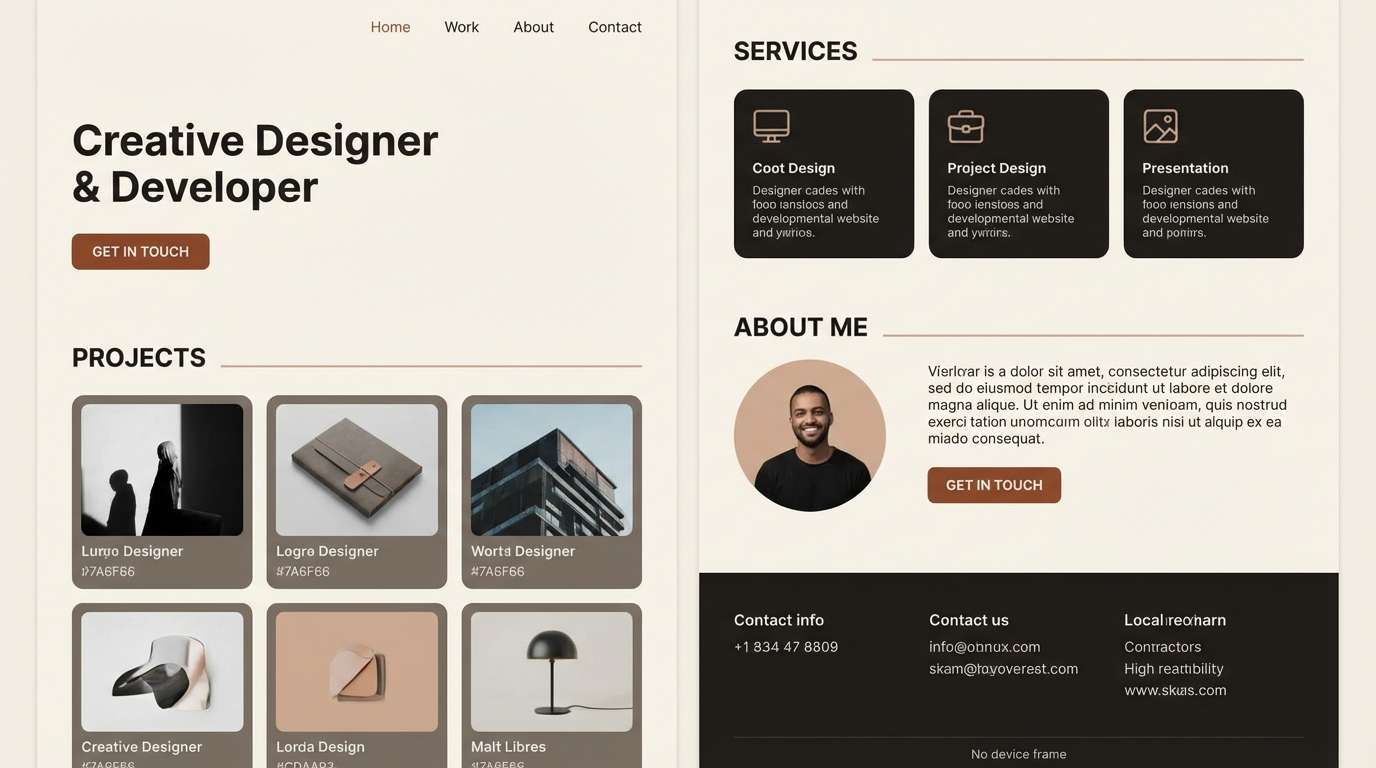
Best for: portfolio website UI
Clean neutrals with a rust accent feel minimal yet confident, like a well-edited studio space. Use off-white for the canvas, warm gray for UI dividers, and rust for CTAs and hover states. The near-black keeps typography crisp and accessible. Usage tip: limit rust buttons to one primary action per screen to maintain a calm hierarchy.
Image example of rustic minimal generated using media.io
8) Spiced Navy
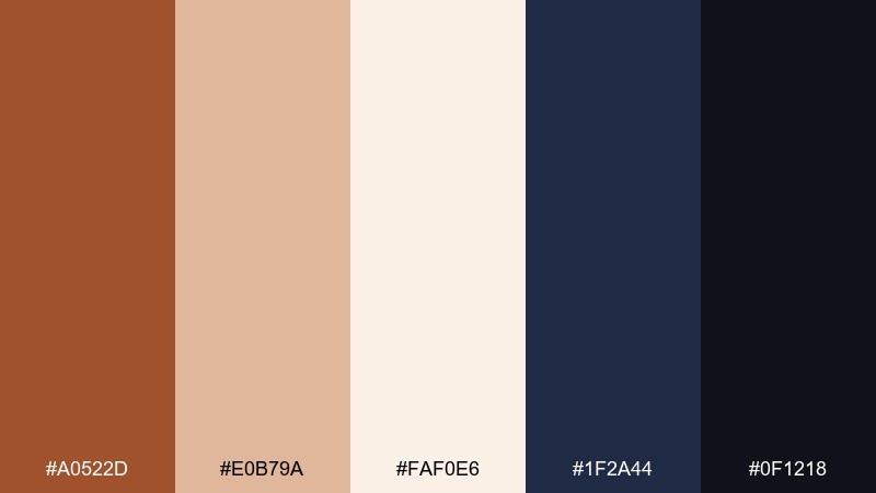
HEX: #A0522D #E0B79A #FAF0E6 #1F2A44 #0F1218
Mood: classic, bold, upscale
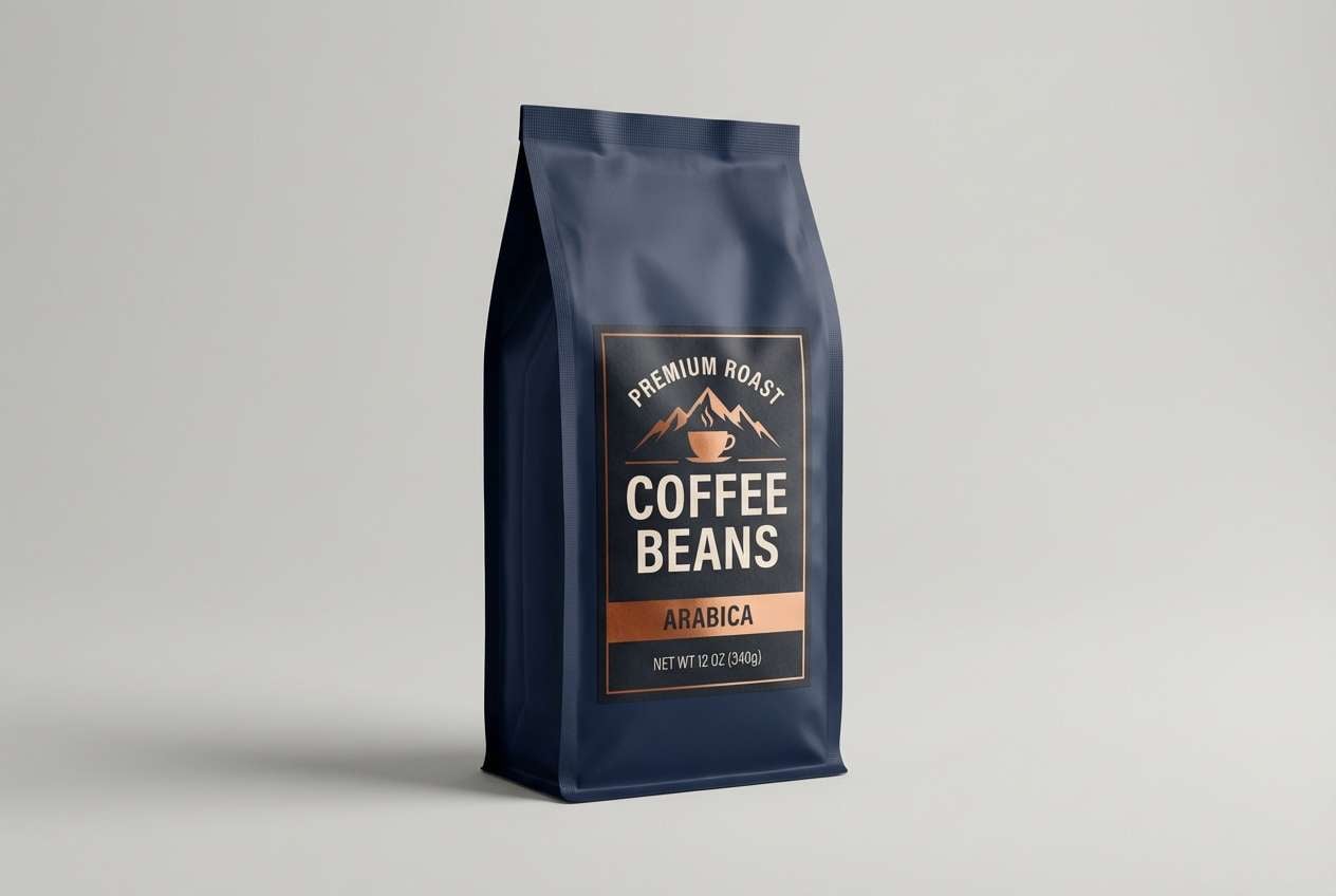
Best for: premium coffee packaging
Spiced sienna against inky navy feels classic and upscale, like a heritage roaster with modern taste. Use navy for the main pack color, then bring sienna forward in badges, origins, and roast notes. Cream keeps the typography friendly without losing contrast. Usage tip: add a thin #E0B79A border to separate dark blocks and avoid a heavy look.
Image example of spiced navy generated using media.io
9) Autumn Library
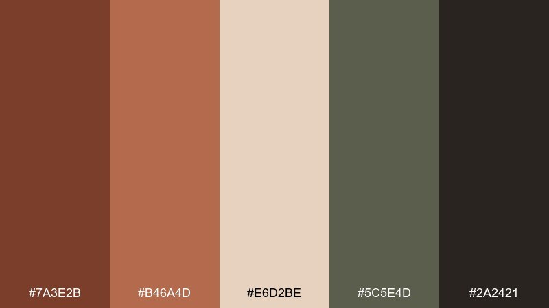
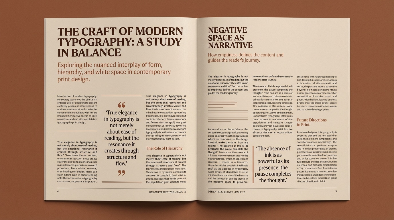
HEX: #7A3E2B #B46A4D #E6D2BE #5C5E4D #2A2421
Mood: studious, vintage, inviting
Best for: editorial magazine spread
Worn leather, paper edges, and olive shadows bring a studious, vintage calm. Use the paper beige for page backgrounds and the olive tone for pull quotes and rules. Sienna and brandy shades work best as section markers or drop caps. Usage tip: keep body text in #2A2421 for a softer read than pure black.
Image example of autumn library generated using media.io
10) Brandy Rose
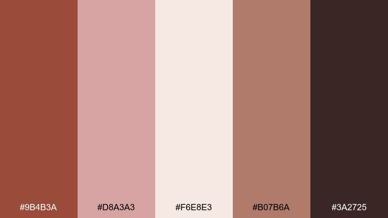
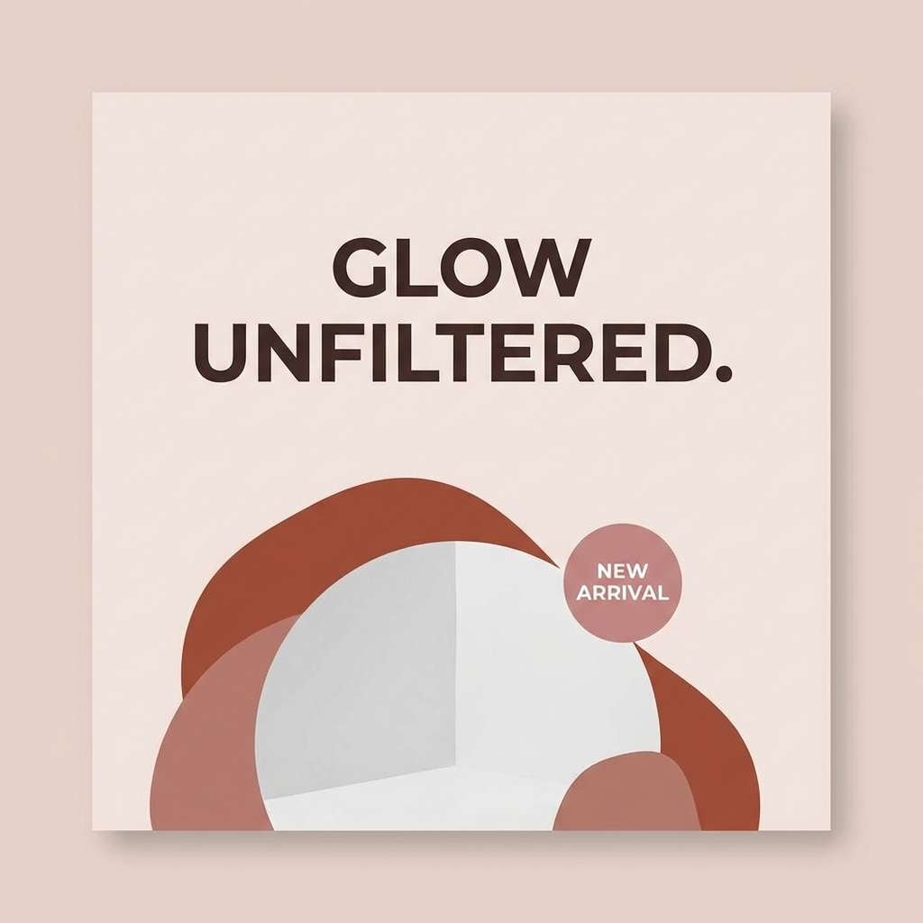
HEX: #9B4B3A #D8A3A3 #F6E8E3 #B07B6A #3A2725
Mood: soft, nostalgic, elegant
Best for: beauty brand social post
A blushy brandy tone with dusty rose feels soft, nostalgic, and elegant. Use the pale base for airy negative space, then lean on #9B4B3A for titles and product callouts. The muted tan keeps layouts cohesive when you add texture or grain. Usage tip: choose one rose accent element per post to keep the feed consistent.
Image example of brandy rose generated using media.io
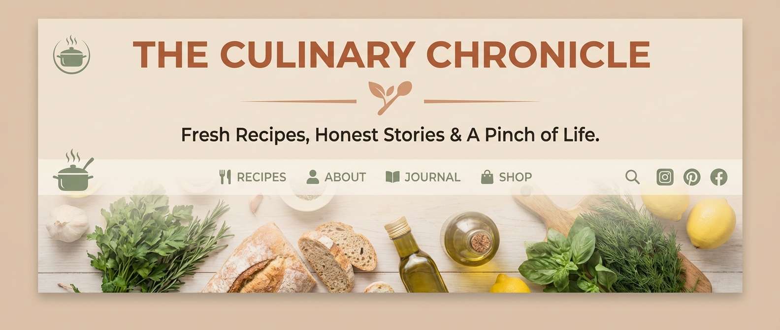
11) Tuscan Kitchen
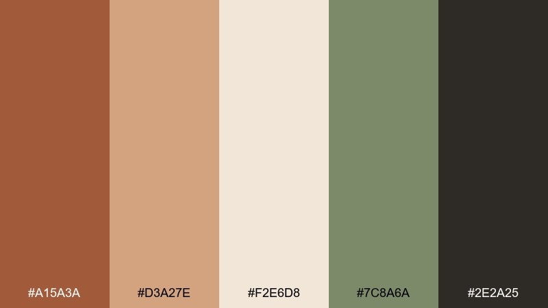
HEX: #A15A3A #D3A27E #F2E6D8 #7C8A6A #2E2A25
Mood: homey, sunlit, wholesome
Best for: recipe blog header design
Sunlit terracotta, flour-dust neutrals, and garden herb greens feel homey and wholesome. Use the cream as the header canvas and terracotta for the blog title and category tabs. The herb green works well for icons, links, and ingredient callouts. Usage tip: apply #D3A27E as a soft overlay behind text to improve readability on food photos.
Image example of tuscan kitchen generated using media.io
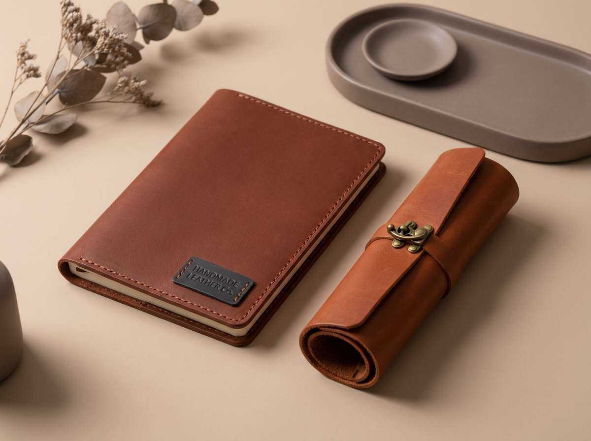
12) Studio Leather
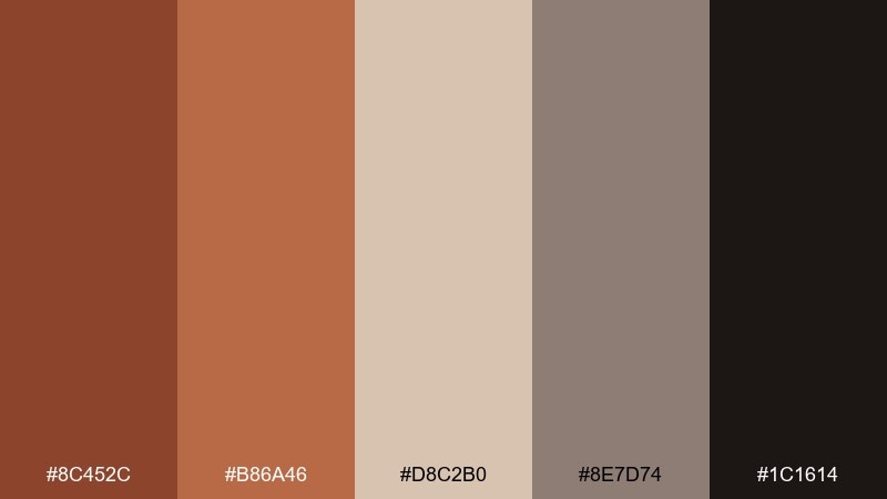
HEX: #8C452C #B86A46 #D8C2B0 #8E7D74 #1C1614
Mood: craft, masculine, premium
Best for: handmade goods product ad
Warm leather tones and dusty neutrals evoke a craft studio and premium materials. Use the mid sienna as the hero color for backgrounds or product wraps, then bring in taupe for secondary copy. The deep brown adds luxury when used sparingly in logos and price tags. Usage tip: a subtle grain texture in #D8C2B0 can make flat layouts feel tactile without clutter.
Image example of studio leather generated using media.io
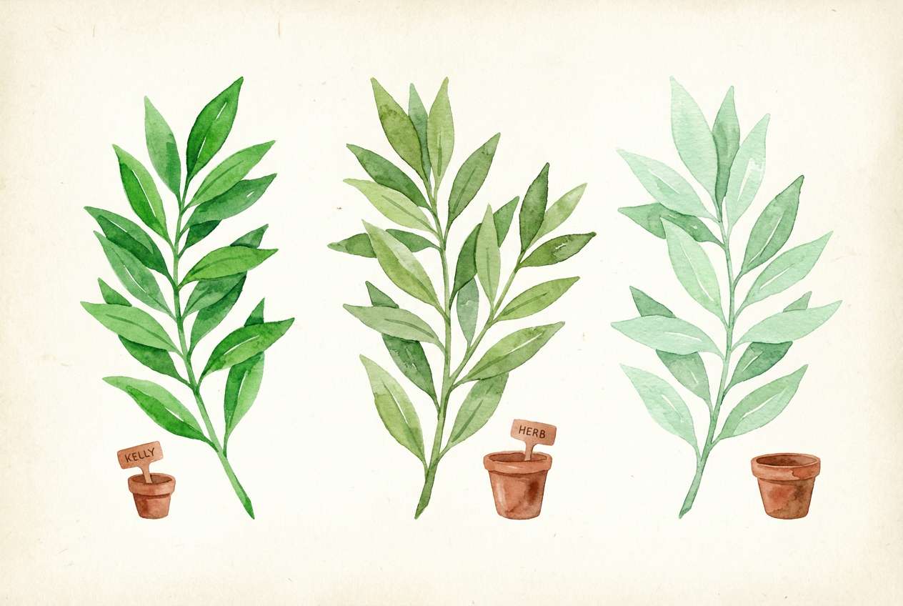
13) Botanical Terracotta
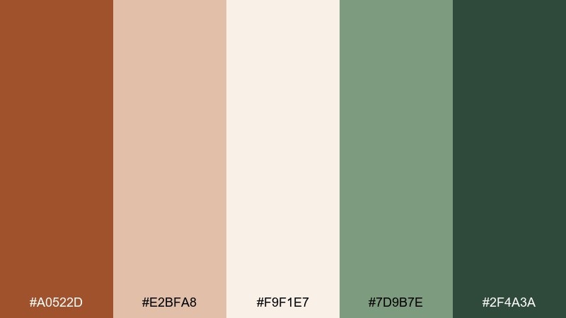
HEX: #A0522D #E2BFA8 #F9F1E7 #7D9B7E #2F4A3A
Mood: fresh, natural, soothing
Best for: watercolor botanical illustration
Terracotta warmth with leafy greens feels fresh and soothing, like a sunroom full of potted plants. Use the creamy tone as paper, then paint foliage in the two greens to add depth. Sienna and sand make perfect pots, stems, and shadow washes. Usage tip: keep edges soft and let #A0522D show up in small, repeated touches for cohesion.
Image example of botanical terracotta generated using media.io
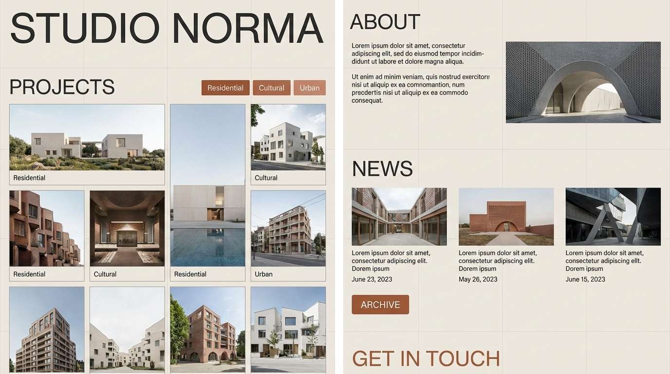
14) Warm Concrete
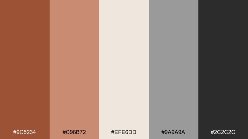
HEX: #9C5234 #C98B72 #EFE6DD #9A9A9A #2C2C2C
Mood: urban, warm, understated
Best for: architecture studio website UI
Warm clay tones against concrete grays feel urban, understated, and design-forward. Use the near-white for page backgrounds and the medium gray for grids, cards, and captions. Sienna shades add personality to links, tags, and key project metrics. Usage tip: keep #2C2C2C for long-form text so the site stays crisp and accessible.
Image example of warm concrete generated using media.io
15) Sienna And Ink
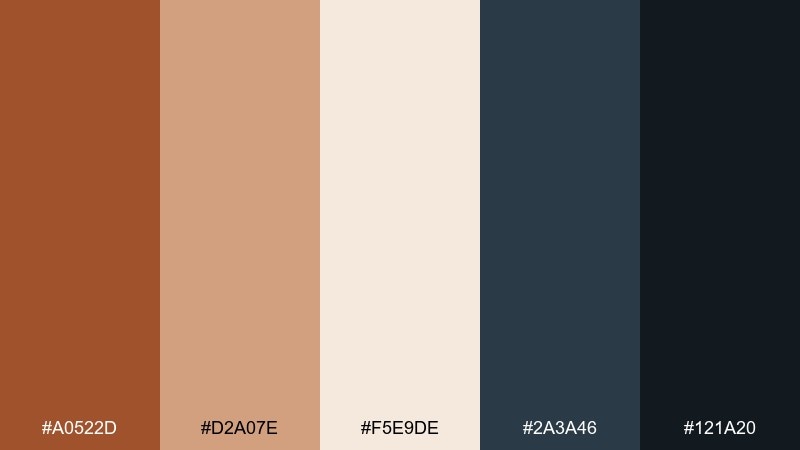
HEX: #A0522D #D2A07E #F5E9DE #2A3A46 #121A20
Mood: sharp, editorial, modern
Best for: tech conference flyer
Sharp ink blues with warm clay highlights feel modern and editorial, like a high-end brochure. These sienna color combinations are ideal for tech event materials that want warmth without losing authority. Use the darkest ink for titles, the pale cream for negative space, and sienna for dates and key CTAs. Usage tip: highlight only one element per section in #A0522D to keep the hierarchy obvious.
Image example of sienna and ink generated using media.io

16) Vintage Postcard
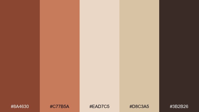
HEX: #8A4630 #C77B5A #EAD7C5 #D8C3A5 #3B2B26
Mood: nostalgic, sun-faded, charming
Best for: retro postcard print design
Sun-faded browns and sandy paper tones feel nostalgic, like a postcard found in an old drawer. Use the light paper shades for the background and keep typography in deep cocoa for that printed look. The mid sienna works beautifully in stamp shapes, borders, and illustrated highlights. Usage tip: add subtle halftone shading in #D8C3A5 to enhance the retro vibe without muddying the palette.
Image example of vintage postcard generated using media.io

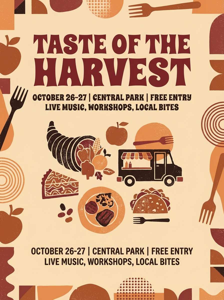
17) Festival Spice
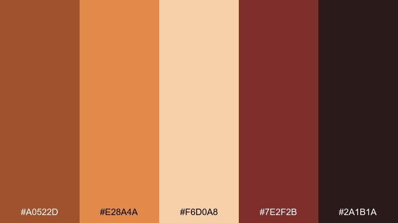
HEX: #A0522D #E28A4A #F6D0A8 #7E2F2B #2A1B1A
Mood: lively, bold, celebratory
Best for: food festival poster
Spice-market warmth and bold paprika reds bring a lively, celebratory punch. Use the bright orange for hero headlines and the pale peach as a background to keep it upbeat. The deep maroon anchors the layout for sponsor rows and footer details. Usage tip: keep #2A1B1A for small text only, so the poster stays light and energetic from a distance.
Image example of festival spice generated using media.io
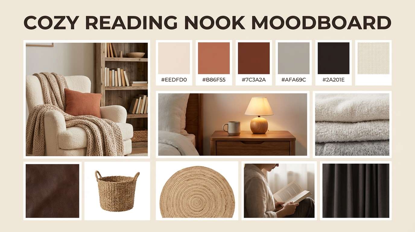
18) Quiet Hearth
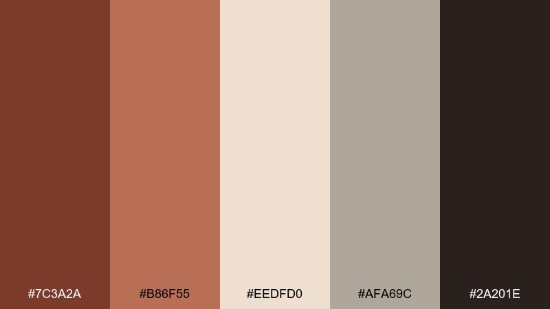
HEX: #7C3A2A #B86F55 #EEDFD0 #AFA69C #2A201E
Mood: quiet, comforting, homey
Best for: cozy reading nook interior moodboard
Muted hearth tones feel quiet and comforting, like a wool blanket by the fire. Use the warm beige as your wall or backdrop color, then introduce sienna through throws, ceramics, and framed art. The soft gray-taupe keeps the look modern and prevents it from skewing too orange. Usage tip: repeat #B86F55 in two or three small accessories to make the space feel intentionally styled.
Image example of quiet hearth generated using media.io
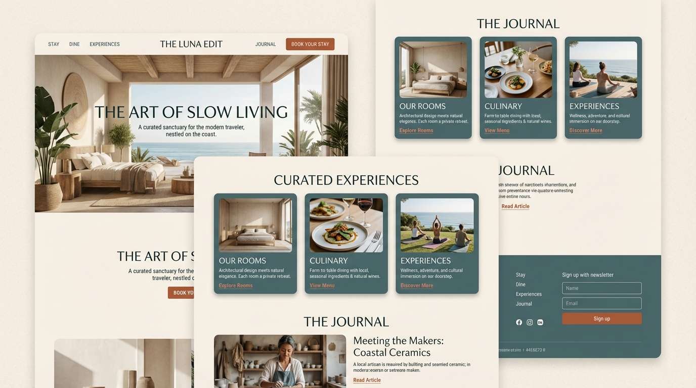
19) Modern Southwest
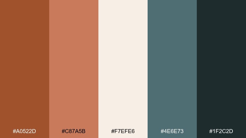
HEX: #A0522D #C87A5B #F7EFE6 #4E6E73 #1F2C2D
Mood: modern, airy, adventurous
Best for: boutique hotel landing page UI
Warm desert clay with cool teal-gray feels modern and adventurous, like a boutique hotel with great light. Use the off-white for spacious sections and let sienna carry primary buttons and highlights. The two blue-green tones are perfect for navigation, cards, and subtle background blocks. Usage tip: apply teal-gray to large UI surfaces and save sienna for interactions so the page stays breathable.
Image example of modern southwest generated using media.io
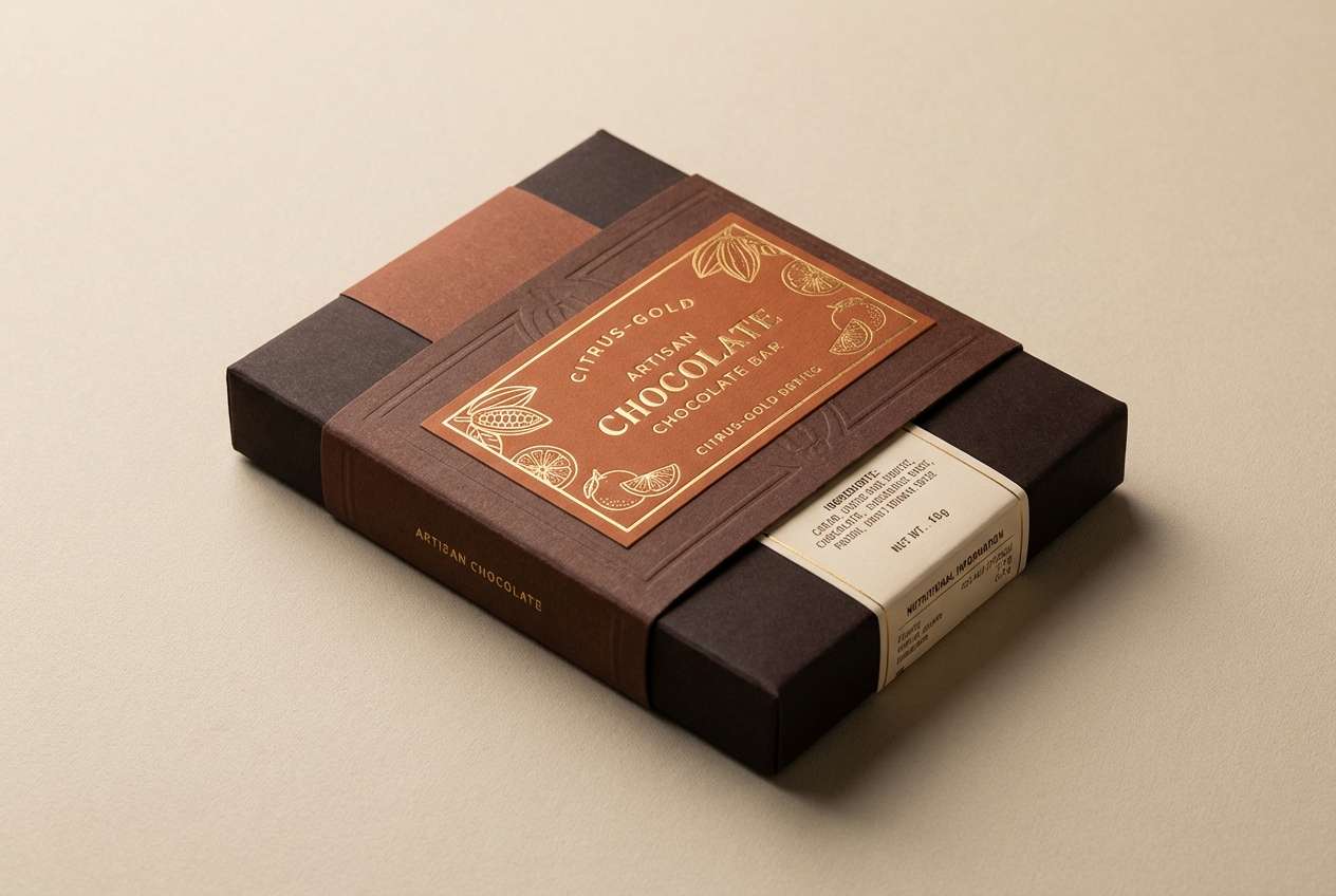
20) Chocolate Citrus
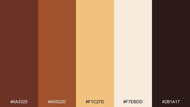
HEX: #6A3325 #A0522D #F1C27D #F7EBDD #2B1A17
Mood: rich, zesty, appetizing
Best for: artisan chocolate bar packaging
Rich chocolate browns with a citrus-gold pop feel indulgent and appetizing. Use the darkest brown for the main wrapper, then bring in gold for flavor cues and small pattern details. The pale cream keeps nutrition and copy areas readable without looking stark. Usage tip: use gold (#F1C27D) as a thin foil-like accent line to signal premium quality.
Image example of chocolate citrus generated using media.io
21) Terrace Evening
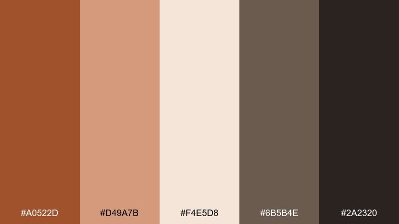
HEX: #A0522D #D49A7B #F4E5D8 #6B5B4E #2A2320
Mood: relaxed, intimate, elegant
Best for: restaurant menu cover
A terrace-at-dusk warmth feels relaxed and intimate, with just enough elegance for fine dining. The pale neutral makes a great base, while sienna and dusty peach set a welcoming tone for the cover. Use the deep taupe for typography and small decorative rules. Usage tip: emboss the title in #A0522D and keep the rest of the cover minimal for a premium finish.
Image example of terrace evening generated using media.io
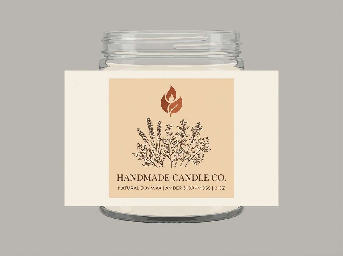
22) Dried Citrus Bouquet
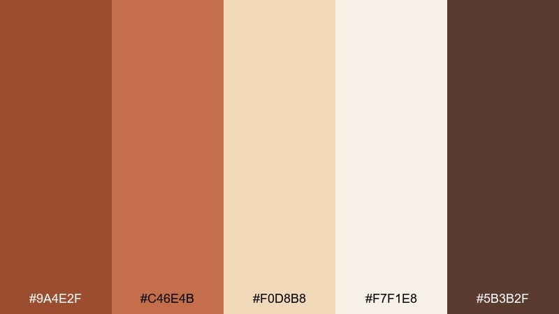
HEX: #9A4E2F #C46E4B #F0D8B8 #F7F1E8 #5B3B2F
Mood: artisanal, bright, cozy
Best for: handmade candle label design
Dried orange slices and warm spice notes create an artisanal, cozy brightness. Use the light cream for the label base and the tan for secondary panels and scent notes. Sienna and copper bring warmth to the brand mark and small illustrations. Usage tip: keep label illustration strokes in #5B3B2F to maintain clarity at small sizes.
Image example of dried citrus bouquet generated using media.io
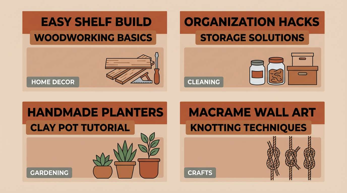
23) Sunlit Workshop
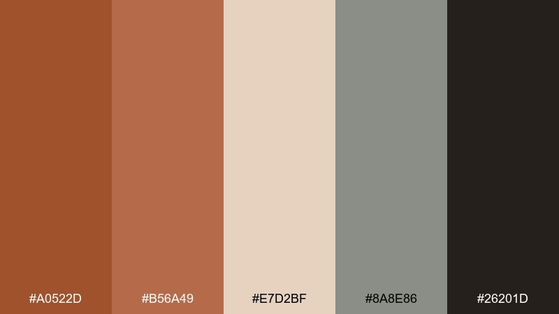
HEX: #A0522D #B56A49 #E7D2BF #8A8E86 #26201D
Mood: practical, warm, modern
Best for: DIY tutorial thumbnail set
Warm workshop woods and sunlit dust give a practical, modern vibe. Use the light beige as a consistent thumbnail background, then apply sienna for bold titles and tool icons. The cool gray helps separate series categories without clashing. Usage tip: keep a single accent color per thumbnail so the set looks cohesive in a grid.
Image example of sunlit workshop generated using media.io
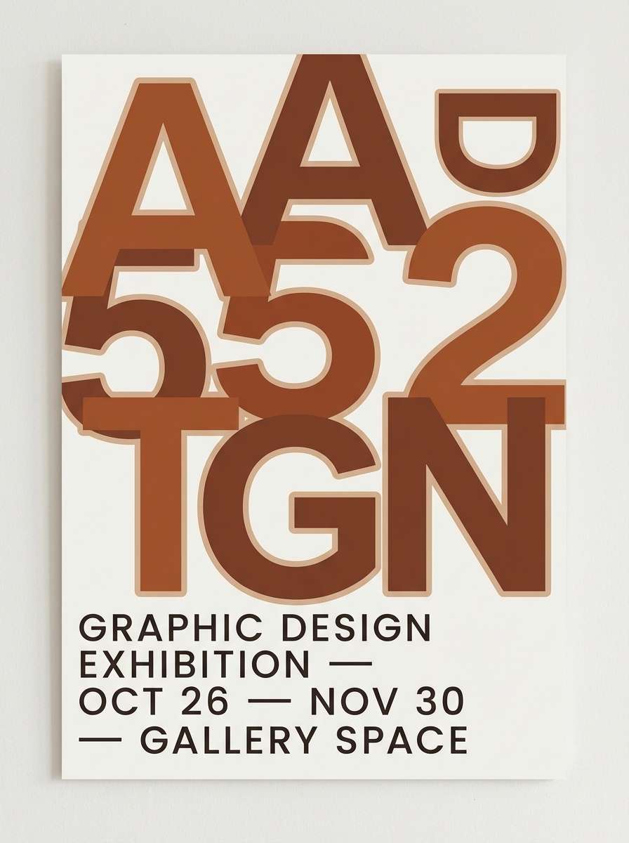
24) Earthen Typeface
HEX: #7F3F2B #A0522D #D7B59B #F6EFE6 #2D2320
Mood: artful, grounded, confident
Best for: typography poster
Bold, earthen tones make typography feel artful and grounded, like ink on textured paper. This sienna color palette is perfect for type-led posters where contrast and warmth matter equally. Use the cream as negative space, keep the darkest shade for body lines, and let sienna drive the main letterforms. Usage tip: introduce #D7B59B as a shadow or outline to add depth without adding new colors.
Image example of earthen typeface generated using media.io
What Colors Go Well with Sienna?
Warm neutrals are the easiest match: cream, ivory, sand, linen, and warm gray make sienna feel softer and more modern. These pairings are ideal when you want a calm, premium base with just enough warmth.
For contrast, pair sienna with cool darks like navy, ink blue, charcoal, or deep teal. The temperature split keeps designs crisp and “designed,” which is why sienna works so well in editorial layouts and UI.
For accents, muted rose, paprika red, or botanical greens can add personality without overpowering the earthy core. The key is to keep one accent role (badges, icons, highlights) so the palette stays cohesive.
How to Use a Sienna Color Palette in Real Designs
Start with a light neutral background (cream, off-white, pale beige), then assign sienna to key brand moments: logo mark, buttons, section headers, or packaging badges. This keeps warmth intentional instead of everywhere.
Use a deep brown or near-black for typography to maintain readability, especially in web and print. If your palette includes a cool counterpart (navy/teal), let it carry larger surfaces like nav bars, cards, or hero blocks.
For interiors and product visuals, repeat sienna in small, consistent touches (two to three items) rather than one big splash. Repetition builds “designed” harmony while still feeling natural and lived-in.
Create Sienna Palette Visuals with AI
If you already have HEX codes, you can turn them into matching mockups fast by prompting an AI image generator with materials, lighting, and where each color should appear. That’s perfect for moodboards, client pitches, and quick A/B concepts.
Use the prompts under each palette above as a starting point, then swap the subject (UI, packaging, interior, poster) while keeping the same color assignments. You’ll get a consistent visual system that matches your palette.


