

A blue dark green color palette combines the stability of deep blues with the grounded calm of forest greens. The result is a moody, premium look that works across branding, UI, posters, and packaging.
Below are 20+ ready-to-use blue and dark green palette ideas with HEX codes, plus AI image prompts you can copy to create matching visuals fast.
In this article
- Why Blue Dark Green Palettes Work So Well
-
- midnight kelp
- deep sea library
- stormy harbor
- arctic pine
- ink and juniper
- northern lights denim
- oceanic slate
- nautical evergreen
- alpine dusk
- marine moss
- petrol forest
- rainy city park
- vintage teal study
- deep lagoon marble
- cosmic tide
- emerald blueprint
- seagrass noir
- blue spruce velvet
- harbor fog
- dark aqua botanica
- tidal workshop
- sapphire grove
- evergreen bay contrast
- What Colors Go Well with Blue Dark Green?
- How to Use a Blue Dark Green Color Palette in Real Designs
- Create Blue Dark Green Palette Visuals with AI
Why Blue Dark Green Palettes Work So Well
Blue brings clarity and trust, while dark green adds a natural, steady presence. Together, they feel confident without being loud, which is why they’re popular in UI, tech, finance, and outdoor brands.
This combo also handles contrast well: deep navy can anchor typography and headers, and dark green can define states (hover, success, navigation) without introducing “warning” vibes like bright reds.
Finally, blue-dark-green schemes pair easily with neutrals—cool grays for modern interfaces or warm creams for print—so your designs can shift from minimal to luxurious with just one background change.
20+ Blue Dark Green Color Palette Ideas (with HEX Codes)
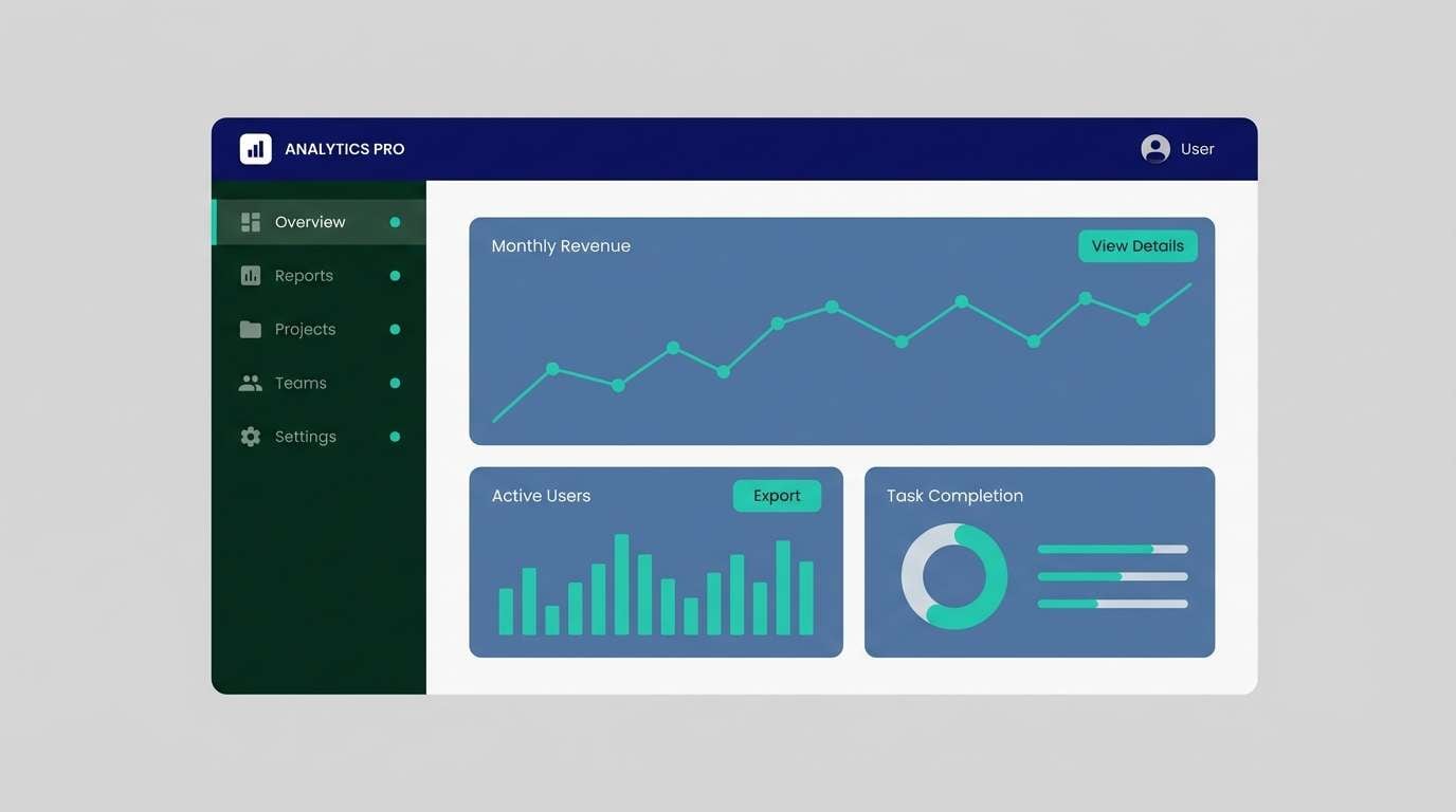
1) Midnight Kelp
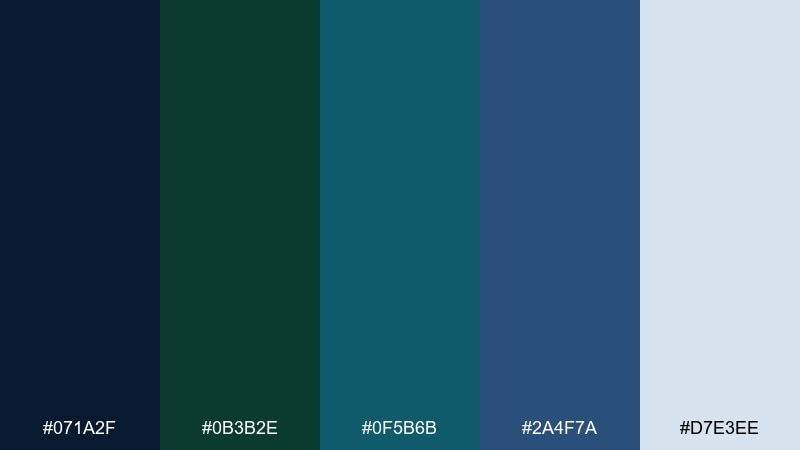
HEX: #071a2f #0b3b2e #0f5b6b #2a4f7a #d7e3ee
Mood: moody, coastal, refined
Best for: saas dashboard ui
Moody coastal tones like midnight water and kelp forests set a calm, premium vibe. Use the deep navy for headers, the dark green for navigation states, and teal as a small highlight. Pair with cool light gray backgrounds to keep readability high. Tip: reserve the teal for active icons and primary buttons so the interface feels intentional.
Image example of midnight kelp generated using media.io
Media.io is an online AI studio for creating and editing video, image, and audio in your browser.

2) Deep Sea Library
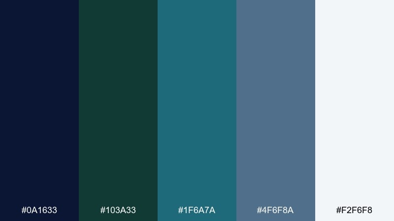
HEX: #0a1633 #103a33 #1f6a7a #4f6f8a #f2f6f8
Mood: quiet, academic, elegant
Best for: editorial magazine layout
Quiet and scholarly, these tones feel like a late-night reading room by the sea. Dark navy and evergreen make confident headlines, while the softer slate blue supports body text and pull quotes. Keep plenty of white space so the palette reads crisp rather than heavy. Tip: use teal sparingly for section markers or page numbers to guide scanning.
Image example of deep sea library generated using media.io
3) Stormy Harbor
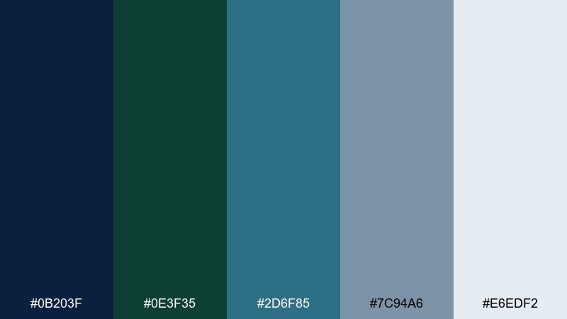
HEX: #0b203f #0e3f35 #2d6f85 #7c94a6 #e6edf2
Mood: dramatic, modern, confident
Best for: brand identity system
Dramatic harbor blues and deep greens bring the energy of wind, steel, and seawater. As a blue dark green color scheme, it feels trustworthy for tech, finance, or outdoor brands without turning cold. Pair the darker shades with soft foggy grays to keep logos and typography crisp. Tip: make the light gray your primary canvas and let the navy do the heavy lifting in headlines.
Image example of stormy harbor generated using media.io
4) Arctic Pine
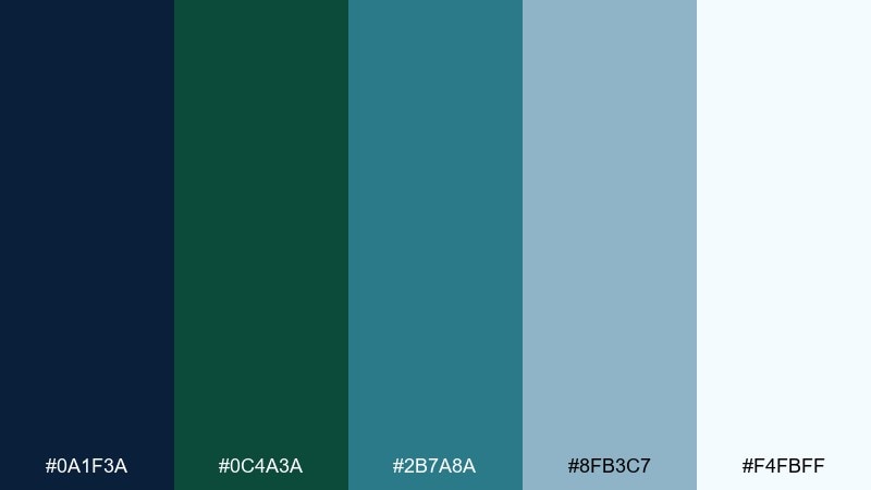
HEX: #0a1f3a #0c4a3a #2b7a8a #8fb3c7 #f4fbff
Mood: fresh, outdoorsy, clean
Best for: travel website hero section
Fresh and outdoorsy, it evokes snowy air against dark pine and distant blue ridgelines. Use the pale icy tint as a spacious background, then layer navy for headings and deep green for buttons. A touch of teal keeps the look lively without losing the calm. Tip: add soft gradients only between the two lightest colors to avoid muddiness.
Image example of arctic pine generated using media.io

5) Ink and Juniper
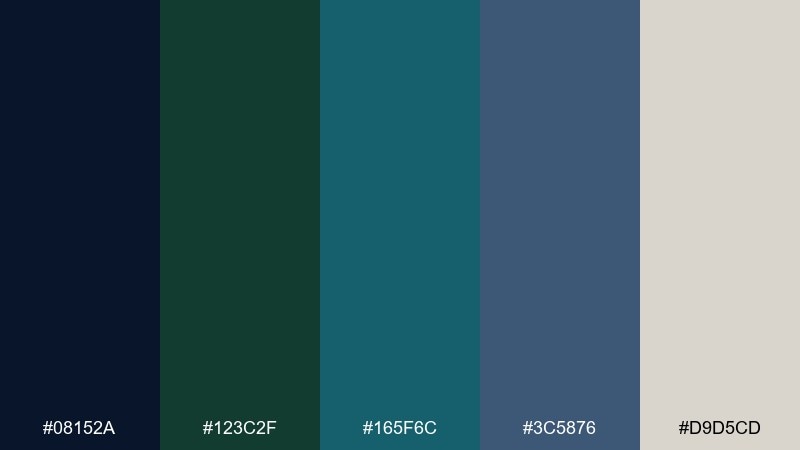
HEX: #08152a #123c2f #165f6c #3c5876 #d9d5cd
Mood: classic, botanical, understated
Best for: luxury skincare packaging
Classic and botanical, it feels like ink sketches on juniper branches. The warm off-white softens the dark tones, making packaging look premium rather than harsh. Pair with matte finishes and minimal typography for a clean shelf presence. Tip: keep teal to small seals or ingredient highlights so the label stays elegant.
Image example of ink and juniper generated using media.io
6) Northern Lights Denim

HEX: #0c2140 #0f4b3a #1f7785 #4c86b5 #eaf1f6
Mood: energized, crisp, contemporary
Best for: sportswear product ad
Crisp and energized, it looks like aurora light over dark evergreens and worn denim. Use the bold blue for the hero background, then bring in green for product callouts and teal for motion lines. Keep text in near-white for strong contrast and legibility. Tip: add a single gradient from denim blue to teal to create depth without adding extra colors.
Image example of northern lights denim generated using media.io
7) Oceanic Slate

HEX: #0a1d33 #0d3f34 #2a6a78 #6e8796 #f0f3f5
Mood: minimal, grounded, professional
Best for: corporate slide deck
Minimal and grounded, these shades feel like slate cliffs beside deep water. Use slate gray-blue for charts and dividers, with navy for titles and evergreen for key numbers. A pale background keeps slides clean and boardroom-friendly. Tip: limit each slide to two dominant tones plus one accent to avoid visual clutter.
Image example of oceanic slate generated using media.io
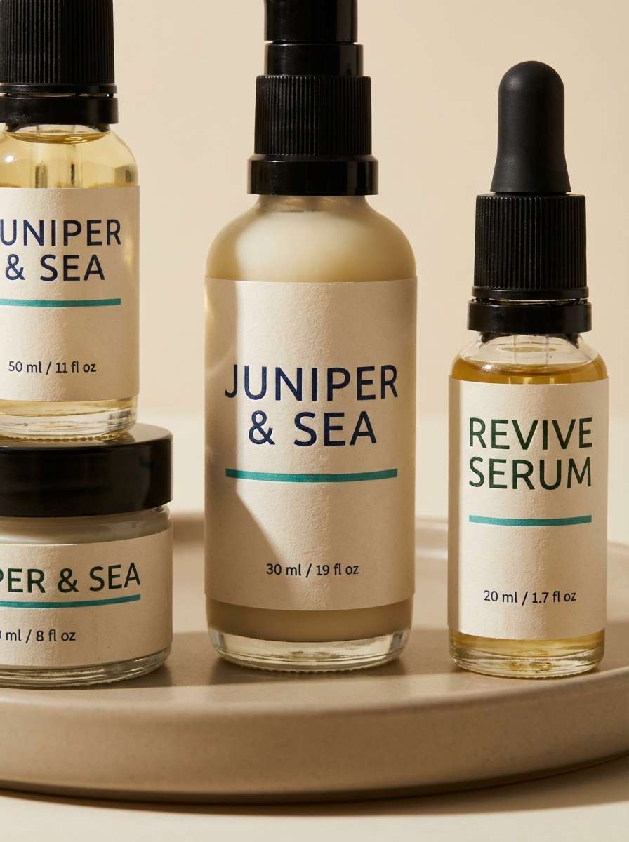
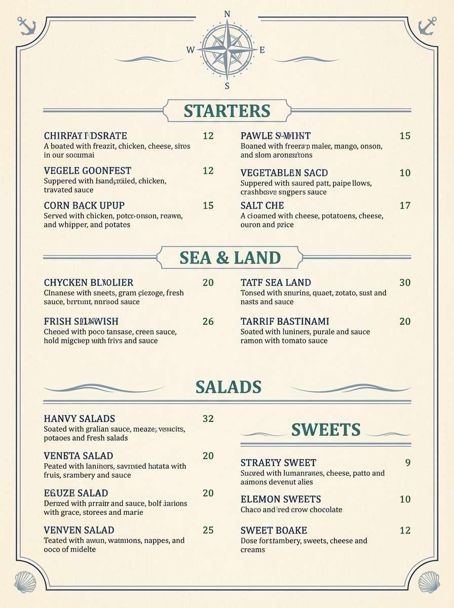
8) Nautical Evergreen
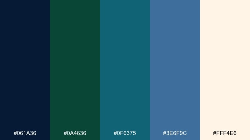
HEX: #061a36 #0a4636 #0f6375 #3e6f9c #fff4e6
Mood: nautical, bold, welcoming
Best for: restaurant menu design
Nautical and welcoming, it brings to mind rope, sea glass, and an evergreen shoreline. This blue dark green color palette works beautifully for menus where you want a premium look without feeling too formal. Pair the dark shades with a warm cream paper tone and simple serif typography. Tip: use teal for section headers so guests can scan quickly.
Image example of nautical evergreen generated using media.io
9) Alpine Dusk
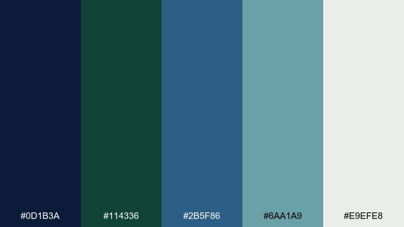
HEX: #0d1b3a #114336 #2b5f86 #6aa1a9 #e9efe8
Mood: serene, adventurous, balanced
Best for: outdoor event poster
Serene like dusk settling over alpine lakes, the mix balances cool blues with grounded forest green. Use navy for the poster title and let the airy mint-gray background keep it readable from a distance. Teal works well for dates, location badges, and small icons. Tip: add a simple two-tone mountain silhouette using the two darkest colors for instant theme.
Image example of alpine dusk generated using media.io

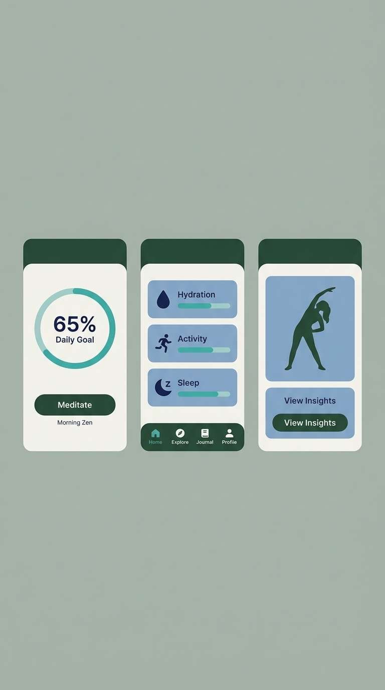
10) Marine Moss
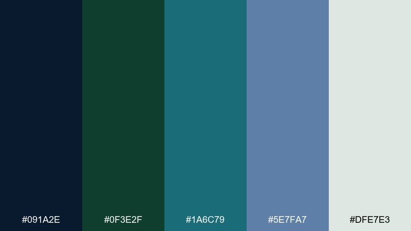
HEX: #091a2e #0f3e2f #1a6c79 #5e7fa7 #dfe7e3
Mood: natural, calm, restorative
Best for: wellness app ui
Natural and restorative, it feels like marine moss swaying under clear water. Make the light gray-green your base and bring in navy for text to keep accessibility strong. Use teal for progress rings and gentle highlights, while muted blue supports secondary cards. Tip: keep animations slow and subtle so the palette reads calming, not sporty.
Image example of marine moss generated using media.io
11) Petrol Forest
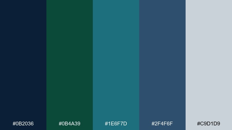
HEX: #0b2036 #0b4a39 #1e6f7d #2f4f6f #c9d1d9
Mood: industrial, strong, modern
Best for: product landing page
Strong and industrial, it suggests petrol blue metal with a deep forest undertone. Use the darker pair for your header and footer, then open up content areas with the cool light gray. Teal makes a sharp, modern accent for links and key features. Tip: add subtle line icons in slate blue to keep the page informative without feeling busy.
Image example of petrol forest generated using media.io
12) Rainy City Park
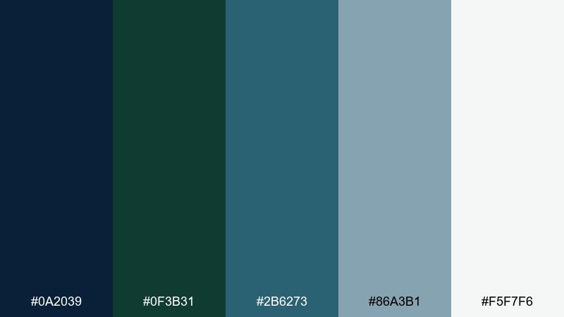
HEX: #0a2039 #0f3b31 #2b6273 #86a3b1 #f5f7f6
Mood: soft, urban, introspective
Best for: book cover design
Soft and introspective, it evokes rainy sidewalks and evergreens in a city park. Use navy for the title to command attention, while the misty blue-gray can carry the background blocks. Dark green adds a grounded accent for author name or small motifs. Tip: keep textures subtle, like fine grain, so the palette stays modern.
Image example of rainy city park generated using media.io
13) Vintage Teal Study
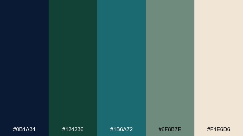
HEX: #0b1a34 #124236 #1b6a72 #6f8b7e #f1e6d6
Mood: vintage, cozy, intellectual
Best for: cafe brand kit
Vintage and cozy, it feels like a teal study room with worn notebooks and warm paper. The creamy beige softens the cool tones, making it great for logos, labels, and small signage. Pair with classic serif type and simple line illustrations in navy. Tip: use dark green for stamps or badges to add a handcrafted touch.
Image example of vintage teal study generated using media.io
14) Deep Lagoon Marble
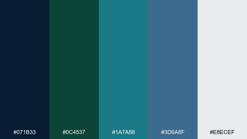
HEX: #071b33 #0c4537 #1a7a88 #3d6a8f #e8ecef
Mood: luxurious, cool, polished
Best for: jewelry product packaging
Luxurious and cool, it suggests deep lagoon marble with crisp, polished edges. Use the pale gray as the box base and bring in navy for the logo so it prints sharply. Dark green adds richness, while teal is perfect for foil accents or inner tissue patterns. Tip: keep finishes consistent, like matte outside with a single glossy accent color.
Image example of deep lagoon marble generated using media.io
15) Cosmic Tide
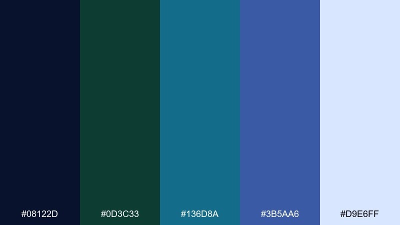
HEX: #08122d #0d3c33 #136d8a #3b5aa6 #d9e6ff
Mood: futuristic, vivid, deep
Best for: music festival flyer
Futuristic and deep, it feels like a cosmic tide rolling under starlight. These blue dark green color combinations shine on flyers when you push contrast with a bright icy tint. Pair with bold sans-serif type and simple geometric shapes in cobalt for energy. Tip: keep backgrounds mostly navy so teal and ice highlights pop from a distance.
Image example of cosmic tide generated using media.io

16) Emerald Blueprint
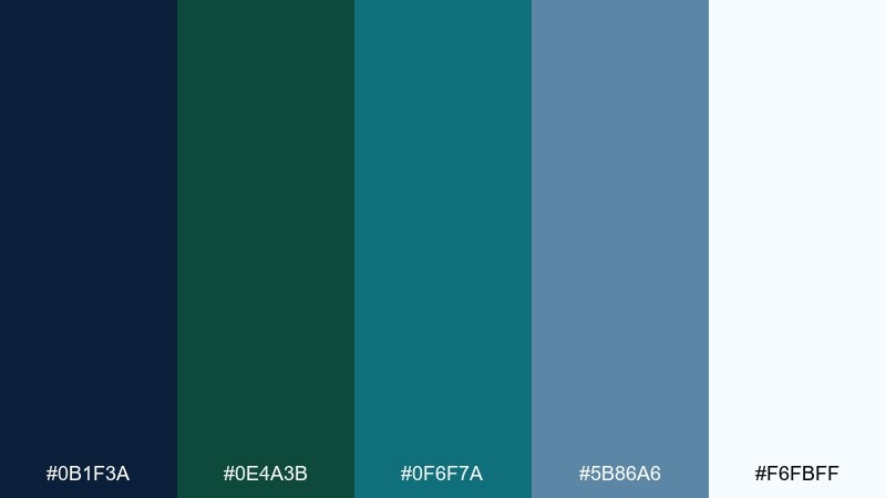
HEX: #0b1f3a #0e4a3b #0f6f7a #5b86a6 #f6fbff
Mood: precise, techy, trustworthy
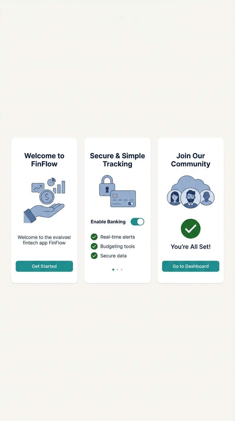
Best for: fintech app onboarding
Precise and techy, it reads like a blueprint drawn in sea tones. Use the lightest tint for onboarding screens to feel approachable, then anchor key steps with navy headings. Emerald green can signal success states, while teal highlights interactive elements. Tip: keep icons single-color to maintain that blueprint clarity.
Image example of emerald blueprint generated using media.io
17) Seagrass Noir
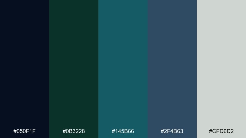
HEX: #050f1f #0b3228 #145b66 #2f4b63 #cfd6d2
Mood: dark, cinematic, stylish
Best for: film poster
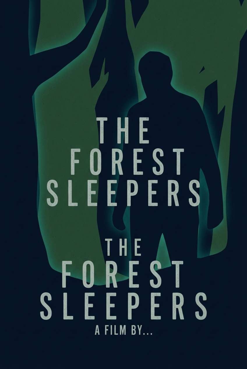
Dark and cinematic, it looks like seagrass silhouettes against near-black water. Use the near-black navy as the background and keep typography in the pale gray for legibility. Teal and deep green work best as minimal glow accents or small graphic shapes. Tip: use large negative space so the poster feels intentional and high-end.
Image example of seagrass noir generated using media.io
18) Blue Spruce Velvet
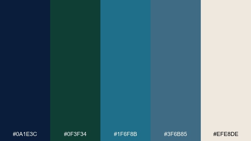
HEX: #0a1e3c #0f3f34 #1f6f8b #3f6b85 #efe8de
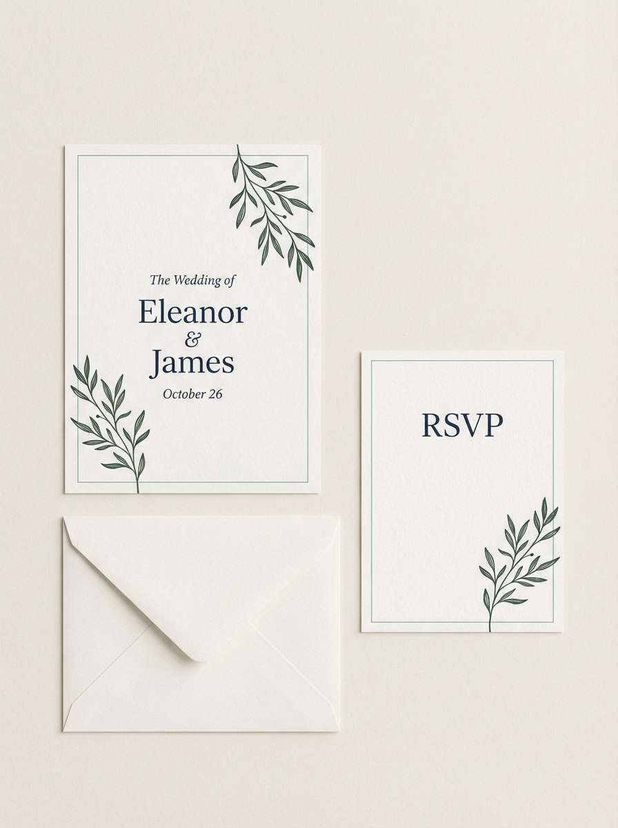
Mood: plush, wintery, upscale
Best for: wedding invitation suite
Plush and wintery, it feels like blue velvet paired with spruce branches. The warm ivory keeps the suite romantic, while navy and deep green add formality. Teal can be used for subtle borders or monograms without stealing attention. Tip: choose letterpress or embossed details in the darkest shade for a tactile finish.
Image example of blue spruce velvet generated using media.io
19) Harbor Fog
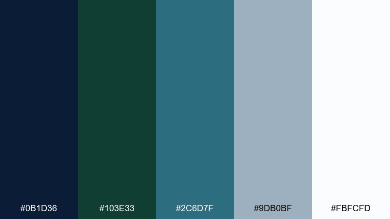
HEX: #0b1d36 #103e33 #2c6d7f #9db0bf #fbfcfd
Mood: airy, calm, modern
Best for: portfolio website ui
Airy and calm, it captures fog rolling across a quiet harbor. Build the page on near-white and light blue-gray, then use navy for headings and dark green for hover states. Teal is best as a small accent for links or tags. Tip: keep imagery desaturated so it harmonizes with the misty tones.
Image example of harbor fog generated using media.io
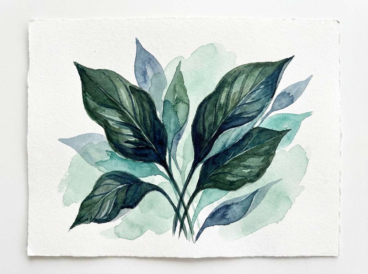
20) Dark Aqua Botanica
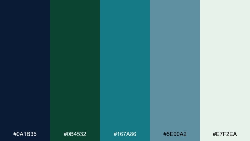
HEX: #0a1b35 #0b4532 #167a86 #5e90a2 #e7f2ea
Mood: lush, fresh, calming
Best for: botanical watercolor illustration
Lush and calming, it evokes dark aqua shadows under glossy leaves. This blue dark green color palette is ideal for botanical work when you want depth without going fully black. Pair the deepest navy for outlines, use green for leaf bodies, and add teal washes for watery highlights. Tip: keep the light mint as untouched paper areas to preserve that airy feel.
Image example of dark aqua botanica generated using media.io
21) Tidal Workshop
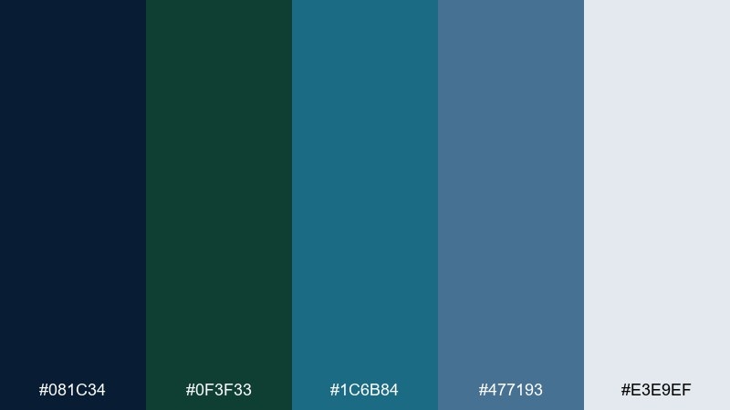
HEX: #081c34 #0f3f33 #1c6b84 #477193 #e3e9ef
Mood: practical, creative, focused
Best for: workshop event landing page
Practical and focused, it feels like a tidal workshop with tools neatly arranged beside the water. The darker base colors add structure to headers and navigation, while the light gray keeps forms approachable. Teal is a strong accent for sign-up buttons and key steps. Tip: use muted blue for secondary cards so the primary call to action stands out.
Image example of tidal workshop generated using media.io
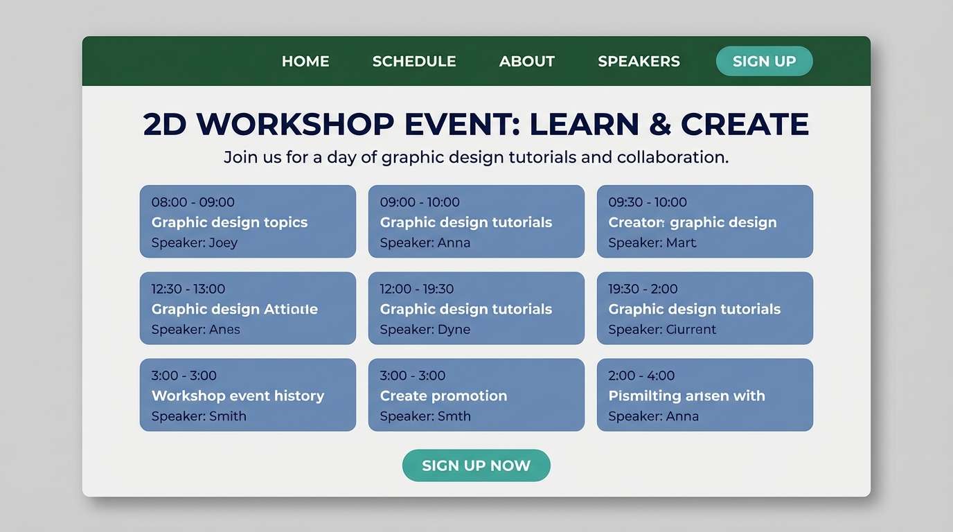
22) Sapphire Grove
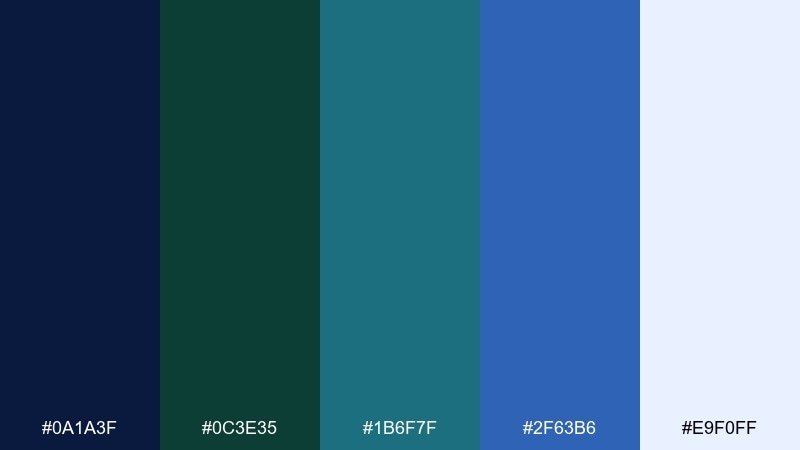
HEX: #0a1a3f #0c3e35 #1b6f7f #2f63b6 #e9f0ff
Mood: bold, youthful, vibrant
Best for: social media carousel design
Bold and youthful, it mixes sapphire punch with a grounded grove of green. Use the vibrant blue for feature slides, then balance with navy and dark green for typography blocks. Teal works well for icons and small dividers so the carousel feels cohesive. Tip: keep each slide to one hero color plus neutrals for a clean swipe rhythm.
Image example of sapphire grove generated using media.io
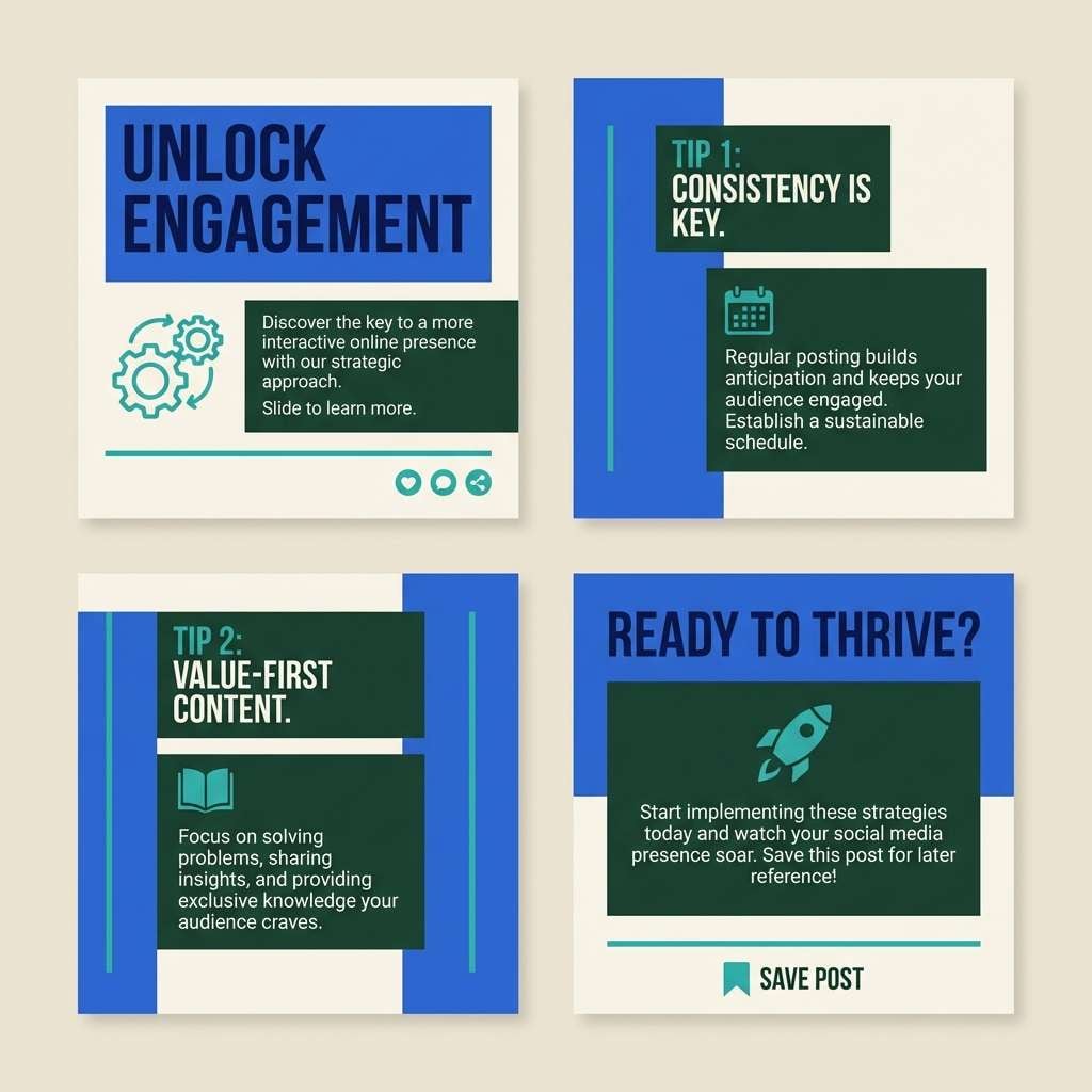
23) Evergreen Bay Contrast
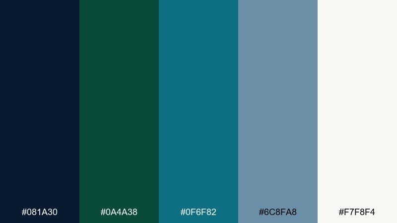
HEX: #081a30 #0a4a38 #0f6f82 #6c8fa8 #f7f8f4
Mood: crisp, high-contrast, contemporary
Best for: app icon and splash screen
Crisp and contemporary, it looks like evergreen cliffs against a bright bay. These blue dark green color combinations create strong icon contrast when you keep shapes simple and edges clean. Pair the darkest navy with the warm off-white for the splash screen, then add teal as a small glow or ring. Tip: avoid gradients in the icon itself, and save them for the background only.
Image example of evergreen bay contrast generated using media.io
What Colors Go Well with Blue Dark Green?
Neutrals are the easiest match: cool whites, foggy grays, and slate tones keep blue and dark green feeling modern and readable. For print, warm off-whites and creams can make the palette feel more inviting and premium.
For accents, teal and icy light blue add clarity without breaking the mood. If you want a richer finish, metallics like brushed silver (cool) or muted gold/bronze (warm) can elevate dark navy and evergreen.
To avoid heaviness, keep one “air” color (near-white/very light gray) as a main background, then use the two darkest colors for structure and type.
How to Use a Blue Dark Green Color Palette in Real Designs
In UI design, treat navy as your typographic anchor (headers, titles, key UI chrome) and use dark green for states (hover, selected, success) so interactions feel consistent. Reserve teal for primary actions to keep the interface focused.
For branding, make sure your logo works in one dark color (navy or near-black) and one light neutral. Then introduce dark green as a supporting brand color in packaging, patterns, or secondary marks.
In posters and social graphics, push contrast: keep backgrounds mostly navy, use a light neutral for big type, and add teal as a small “signal” color for dates, badges, or icons.
Create Blue Dark Green Palette Visuals with AI
If you already have HEX codes, you can generate matching mockups by describing the layout (poster, app screen, packaging) and calling out where each color should appear—background, headline, buttons, accents.
For consistent results, reuse the same prompt structure across a campaign and only swap the subject (menu, flyer, onboarding screens). This keeps lighting, spacing, and style cohesive while your palette stays on-brand.
Blue Dark Green Color Palette FAQs
-
What does a blue dark green color palette communicate?
It usually communicates trust, calm, and competence (blue) combined with nature, stability, and depth (dark green). Together, it reads premium and grounded—often used in tech, finance, wellness, and outdoor branding. -
Is blue and dark green a good combination for UI design?
Yes—especially when you add a light neutral background for readability. Use navy for text and structure, dark green for navigation or states, and a teal accent for primary buttons to keep hierarchy clear. -
Which neutral background works best with navy and dark green?
Cool light grays and near-whites keep the look modern and reduce heaviness. For warmer print designs (menus, invitations, packaging), cream or ivory backgrounds make the palette feel more welcoming. -
What accent colors pair well with blue dark green palettes?
Teal, icy blue, and muted slate blues are the most natural accents. For a luxe touch, try restrained metallics like silver, champagne, or antique gold—used sparingly for lines, icons, or foil details. -
How do I keep a dark, moody palette from looking too heavy?
Increase negative space, use a light canvas color as the dominant background, and limit accents to one bright-ish hue (often teal). Also avoid using all dark shades at equal weight—pick one “hero” dark and one supporting dark. -
Can I use blue dark green palettes for print like posters or invitations?
Absolutely. Choose an off-white/ivory base for the paper tone, keep typography high-contrast (light text on navy or navy on ivory), and use teal or metallic accents for small details like dates, borders, or monograms. -
How can I generate visuals that match my HEX palette?
Use a text-to-image tool and describe the design type plus where each color should be used (background, headings, buttons, accents). Reusing the same prompt format helps maintain consistency across multiple images.
Next: Camel Color Palette


