Saffron is a warm, golden-yellow hue that instantly adds energy, appetite appeal, and a sunlit premium feel. It’s a favorite for brands that want to look optimistic, handcrafted, or modern without leaning neon.
Below are ready-to-use saffron color combinations with HEX codes, plus practical contrast tips and AI prompt examples you can reuse for packaging, UI, print, and branding.
In this article
- Why Saffron Color Combinations Work So Well
-
- spice market glow
- marigold linen
- saffron citrus pop
- desert sunset clay
- honeyed stone
- vintage curry poster
- golden olive grove
- sunlit brass and ink
- apricot silk contrast
- sand and sunbeam ui
- paprika and parchment
- mustard noir editorial
- autumn orchard
- saffron teal balance
- buttercream wedding
- candlelit copper
- sunflower classroom
- gilded botanical
- chai latte neutrals
- solar tech accent
- festival lantern night
- soft clay and sky
- What Colors Go Well with Saffron?
- How to Use a Saffron Color Palette in Real Designs
- Create Saffron Palette Visuals with AI
Why Saffron Color Combinations Work So Well
Saffron sits between yellow and orange, so it reads as sunny and energetic, but still grounded and mature when paired with earthy browns, charcoal, and creamy neutrals. That balance makes it versatile for both playful and premium design directions.
In branding and packaging, saffron naturally draws the eye, which helps with hierarchy: headlines, key benefits, badges, and highlights pop without requiring heavy effects. It also pairs beautifully with natural textures (kraft paper, linen, matte stock), reinforcing an artisanal feel.
In digital UI, saffron is most effective as an accent rather than a full background. Combined with teal, navy, or deep gray, it creates strong contrast for calls-to-action while keeping the overall interface clean and accessible.
20+ Saffron Color Palette Ideas (with HEX Codes)
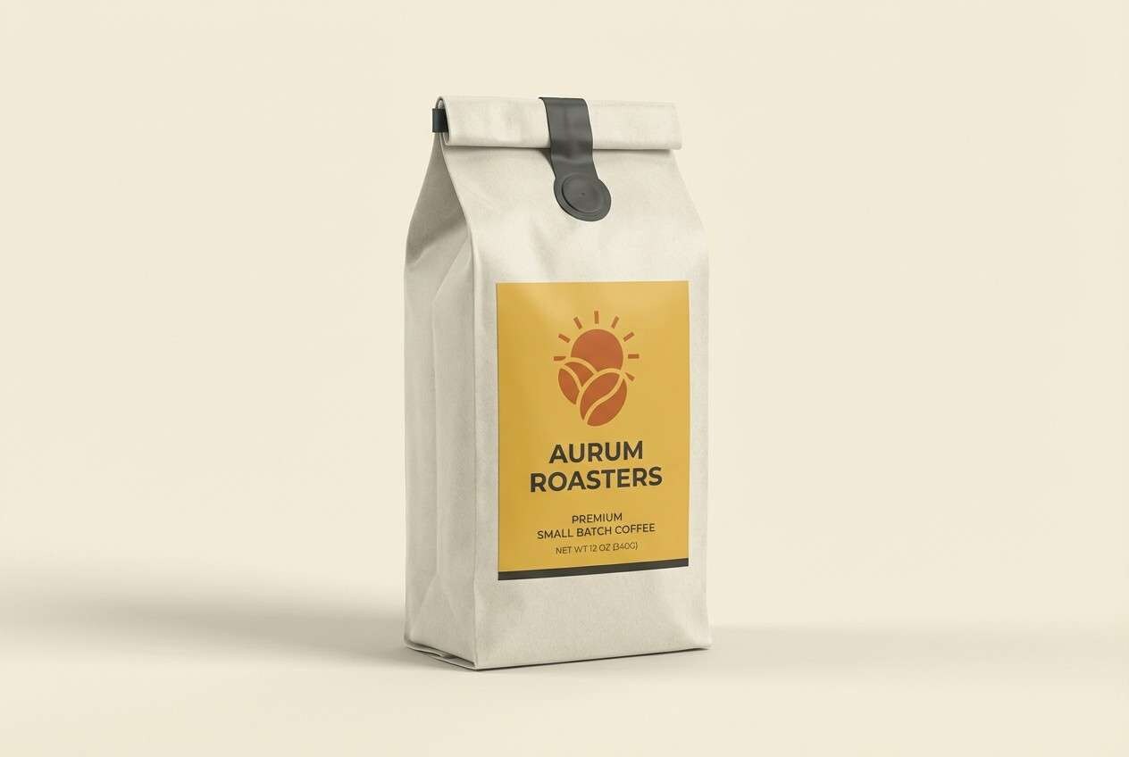
1) Spice Market Glow
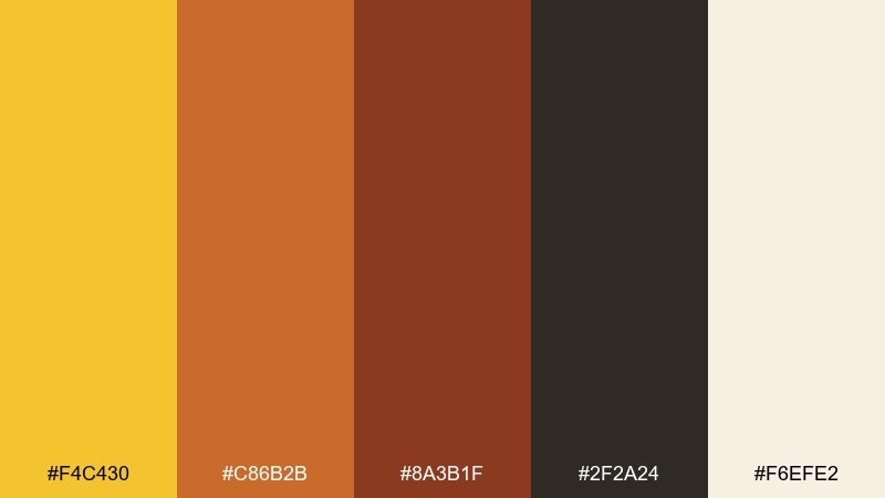
HEX: #F4C430 #C86B2B #8A3B1F #2F2A24 #F6EFE2
Mood: rich, energetic, artisanal
Best for: coffee bag packaging and product labels
Rich and bustling like a sunlit spice stall, this saffron mix feels handcrafted and flavorful. Use the saffron yellow as the hero color, then ground it with deep cocoa and brick accents for a premium look. It works beautifully on kraft textures, matte finishes, and minimalist label layouts. Tip: keep small text on the cream tone for readability while using the dark brown for key headings.
Image example of spice market glow generated using media.io
Media.io is an online AI studio for creating and editing video, image, and audio in your browser.

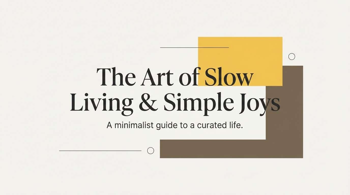
2) Marigold Linen
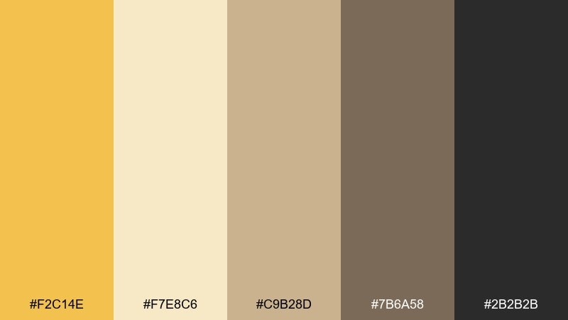
HEX: #F2C14E #F7E8C6 #C9B28D #7B6A58 #2B2B2B
Mood: soft, cozy, natural
Best for: minimal lifestyle blog header and typography
Soft and sun-warmed like linen by the window, these saffron color combinations read calm but still optimistic. Pair the golden note with creamy neutrals for a clean editorial feel, then use charcoal for crisp type and icons. This set shines in airy layouts with generous spacing and subtle textures. Tip: use the darker taupe for secondary text to keep contrast gentle without going muddy.
Image example of marigold linen generated using media.io
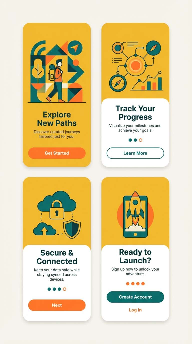
3) Saffron Citrus Pop
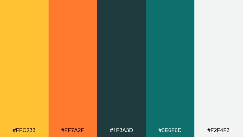
HEX: #FFC233 #FF7A2F #1F3A3D #0E6F6D #F2F4F3
Mood: bold, fresh, playful
Best for: mobile app onboarding screens
Bright and zesty like citrus peel, this saffron palette feels upbeat and modern. The teal tones add a cool counterpoint, creating saffron color combinations that stay lively without looking childish. Use the light neutral as breathing room so the warm accents feel intentional rather than loud. Tip: reserve the deepest teal for buttons to make warm illustrations pop.
Image example of saffron citrus pop generated using media.io
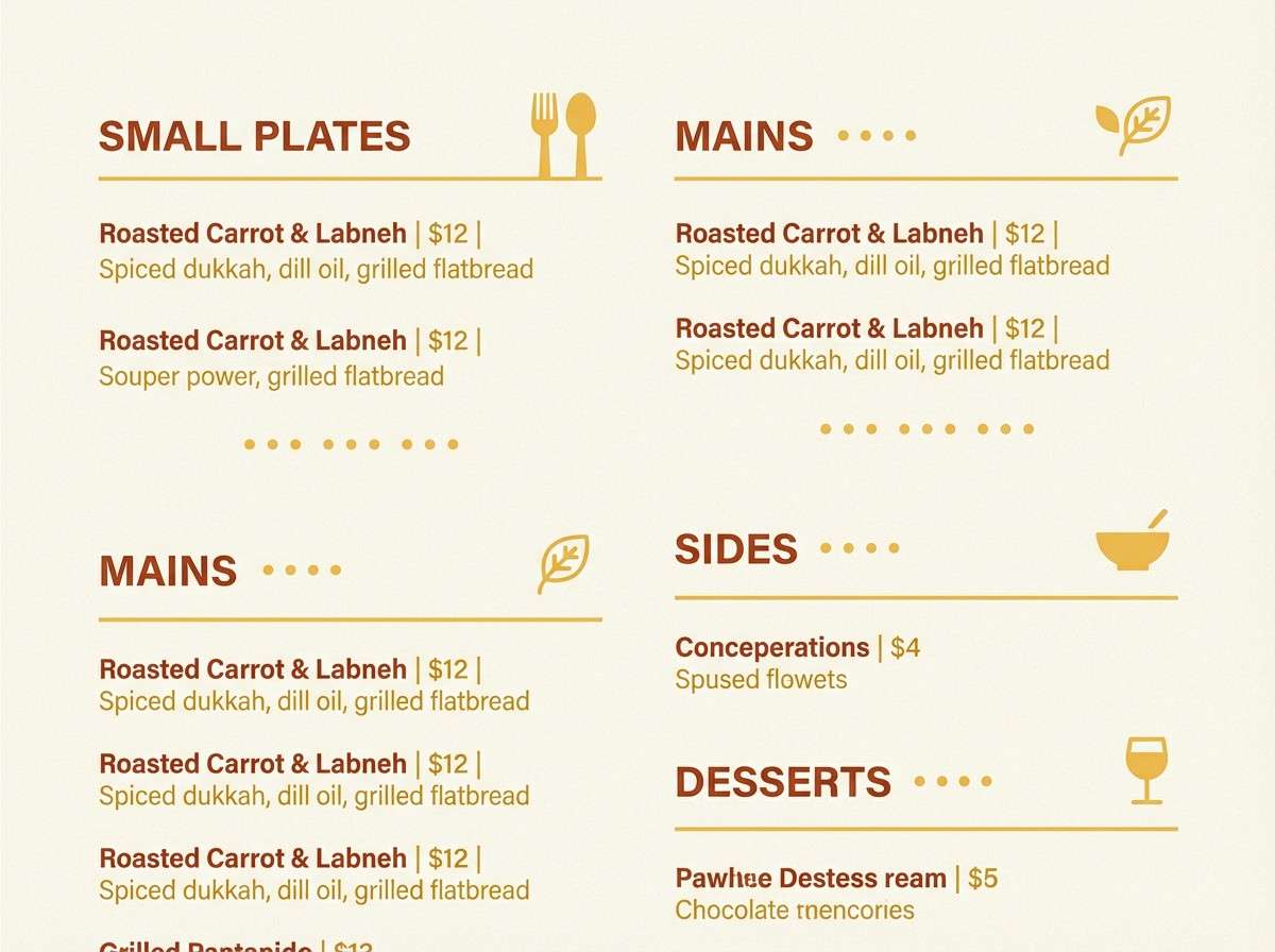
4) Desert Sunset Clay
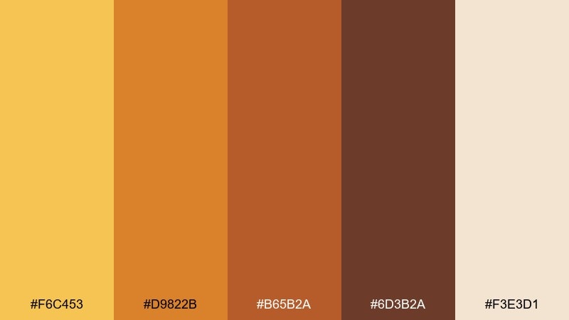
HEX: #F6C453 #D9822B #B65B2A #6D3B2A #F3E3D1
Mood: warm, grounded, rustic
Best for: restaurant menu and table tent design
Warm and earthy like clay walls at dusk, these saffron hues feel inviting and hearty. Keep the golden tone for highlights and section headers, then lean on terracotta and brown for structure. It suits menus with simple iconography and plenty of white space. Tip: print tests matter here, so slightly deepen the brown to avoid low-contrast text on creamy stock.
Image example of desert sunset clay generated using media.io
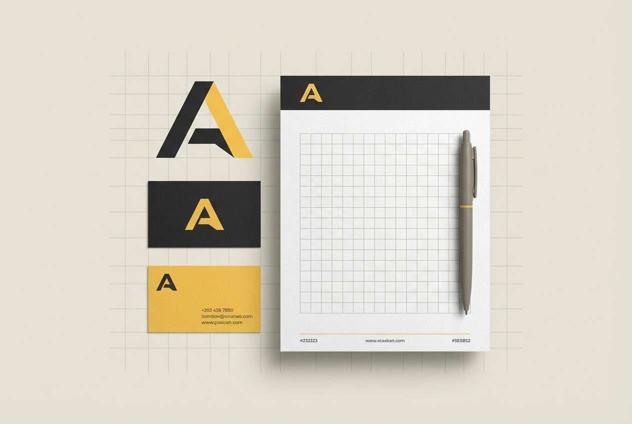
5) Honeyed Stone
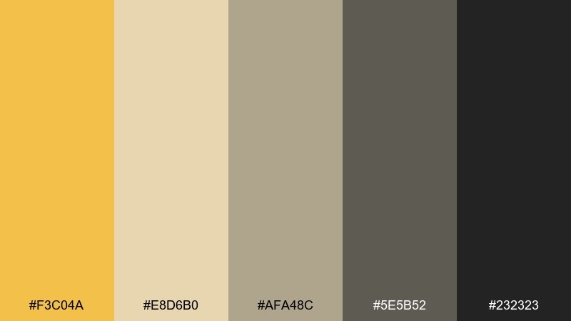
HEX: #F3C04A #E8D6B0 #AFA48C #5E5B52 #232323
Mood: mature, minimal, architectural
Best for: brand identity for interior design studio
Minimal and architectural, like honey light on concrete, this set feels refined. Use the yellow as a sparing accent against stone neutrals to signal warmth without losing sophistication. It fits logos, stationery, and portfolio sites that lean on grids and typography. Tip: keep the darkest tone for primary text and use the mid-gray for subtle rules and captions.
Image example of honeyed stone generated using media.io
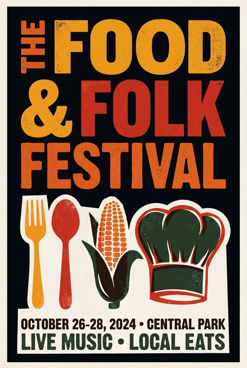
6) Vintage Curry Poster
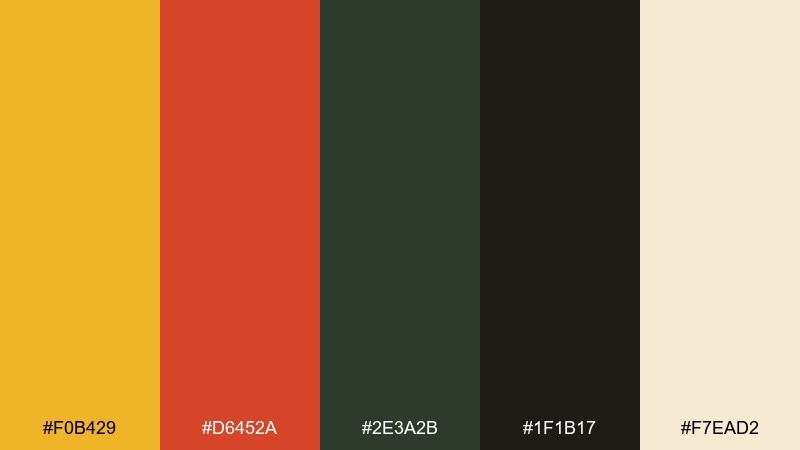
HEX: #F0B429 #D6452A #2E3A2B #1F1B17 #F7EAD2
Mood: retro, punchy, cinematic
Best for: food festival poster design
Retro and punchy like a screen-printed poster, these saffron tones feel bold and nostalgic. Let the warm yellow lead, then use tomato red as a secondary accent for calls to action. Deep olive and near-black keep the layout anchored and readable. Tip: try a two-color illustration style and save the red only for dates and ticket info.
Image example of vintage curry poster generated using media.io
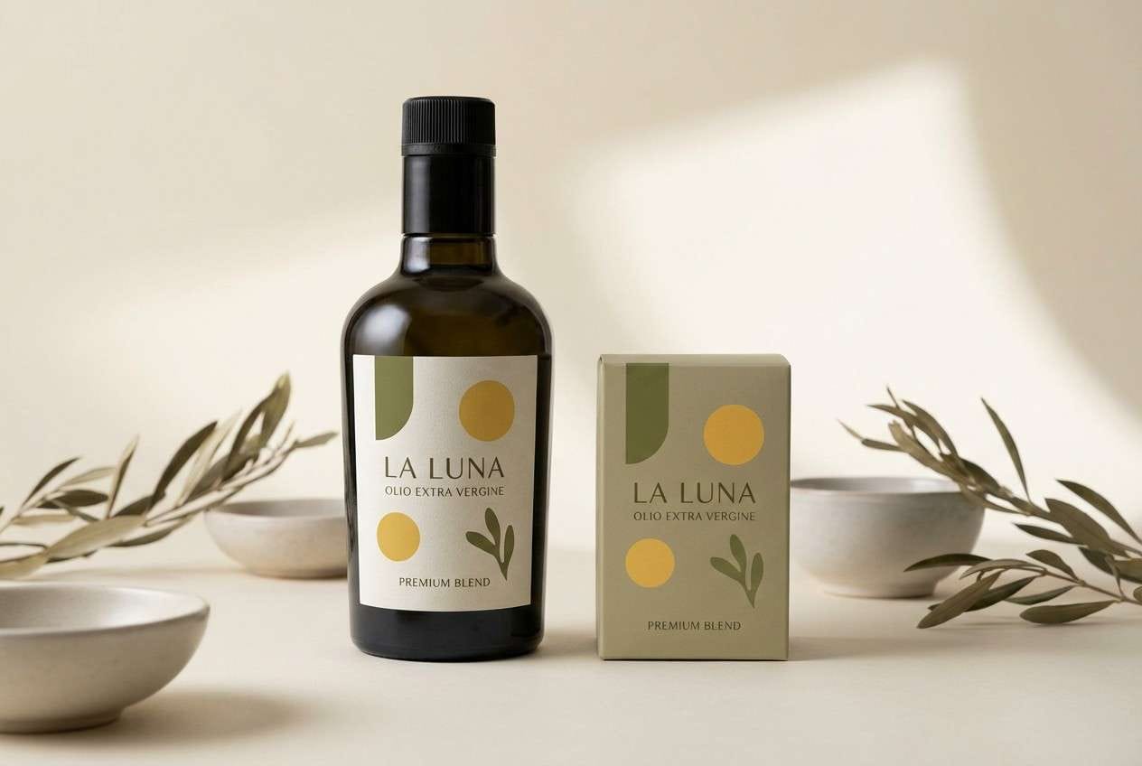
7) Golden Olive Grove
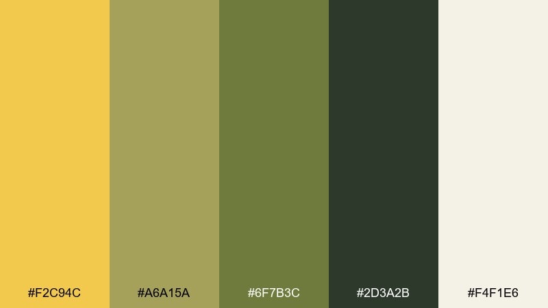
HEX: #F2C94C #A6A15A #6F7B3C #2D3A2B #F4F1E6
Mood: organic, calm, Mediterranean
Best for: olive oil bottle label and box
Organic and calm like an olive grove in late summer, this saffron color palette feels authentic. The warm yellow reads like sunlight, while the greens add a natural, savory depth. Use the cream tone for negative space so the label stays premium rather than busy. Tip: emboss the darker green for a tactile detail that still prints cleanly.
Image example of golden olive grove generated using media.io
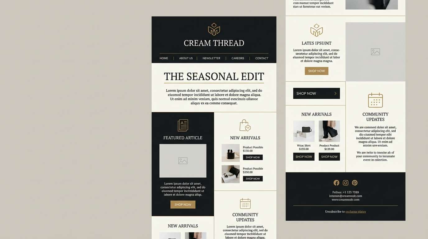
8) Sunlit Brass and Ink
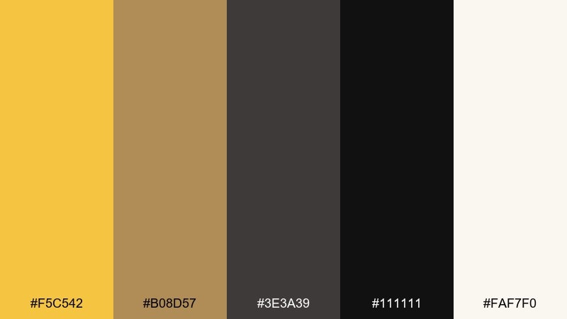
HEX: #F5C542 #B08D57 #3E3A39 #111111 #FAF7F0
Mood: elegant, luxe, confident
Best for: premium newsletter template
Elegant and polished like brass details on dark ink, this set feels confident and upscale. Use the golden tone for dividers, icons, and subtle highlights, while the deep blacks carry headings and body text. It is ideal for newsletters with strong typography and restrained imagery. Tip: keep accents under 15 percent so the gold reads intentional, not decorative clutter.
Image example of sunlit brass and ink generated using media.io
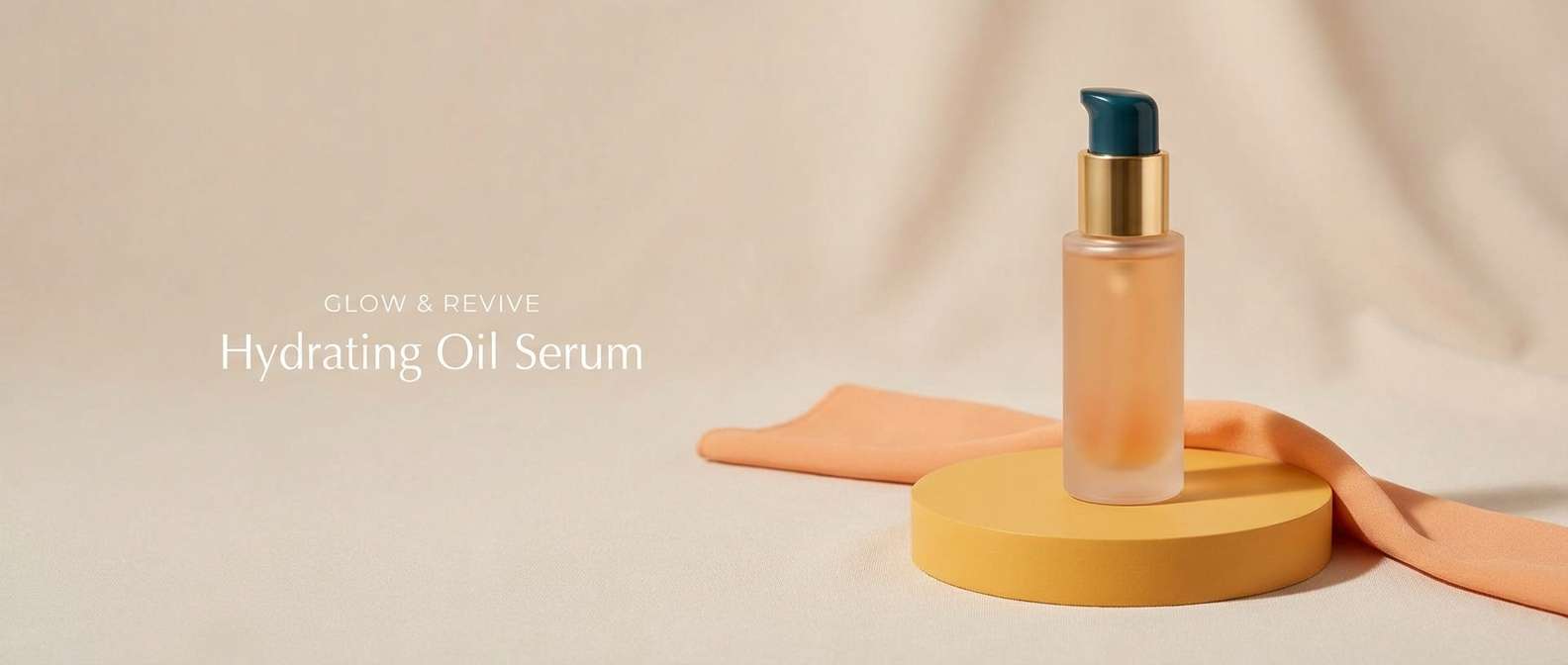
9) Apricot Silk Contrast
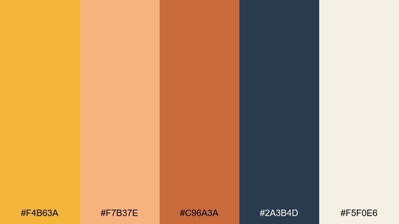
HEX: #F4B63A #F7B37E #C96A3A #2A3B4D #F5F0E6
Mood: warm, modern, fashion-forward
Best for: beauty product ad banner
Warm and fashion-forward like apricot silk against a cool shadow, these tones feel modern and editorial. The navy creates instant contrast, making the saffron color palette look cleaner and more premium. Use the cream for background space and reserve the bright yellow for the main benefit line. Tip: keep gradients subtle so the colors read rich rather than neon.
Image example of apricot silk contrast generated using media.io
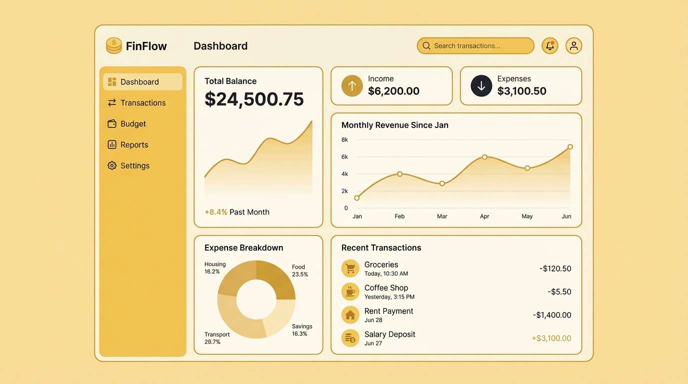
10) Sand and Sunbeam UI
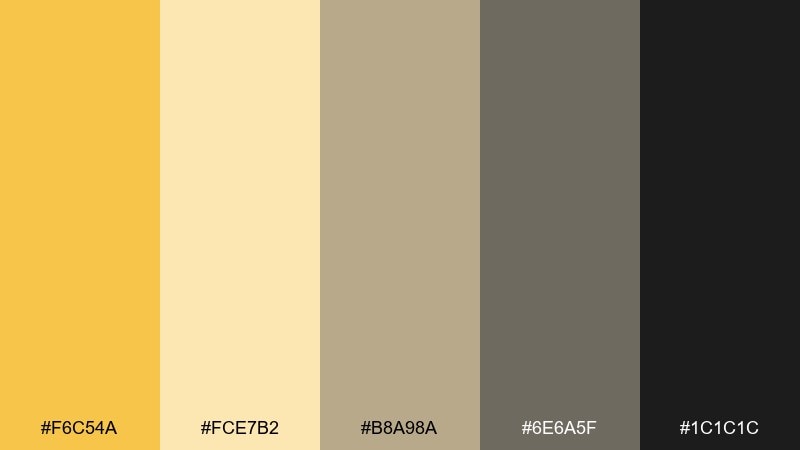
HEX: #F6C54A #FCE7B2 #B8A98A #6E6A5F #1C1C1C
Mood: clean, friendly, accessible
Best for: dashboard UI for finance app
Clean and friendly like sunbeams on soft sand, these saffron color combinations feel approachable and trustworthy. Use the pale yellow for panels and cards, then bring in the brighter gold for key stats and badges. The neutral grays keep the interface calm and legible. Tip: use the darkest tone only for text and essential icons to maintain accessibility contrast.
Image example of sand and sunbeam ui generated using media.io
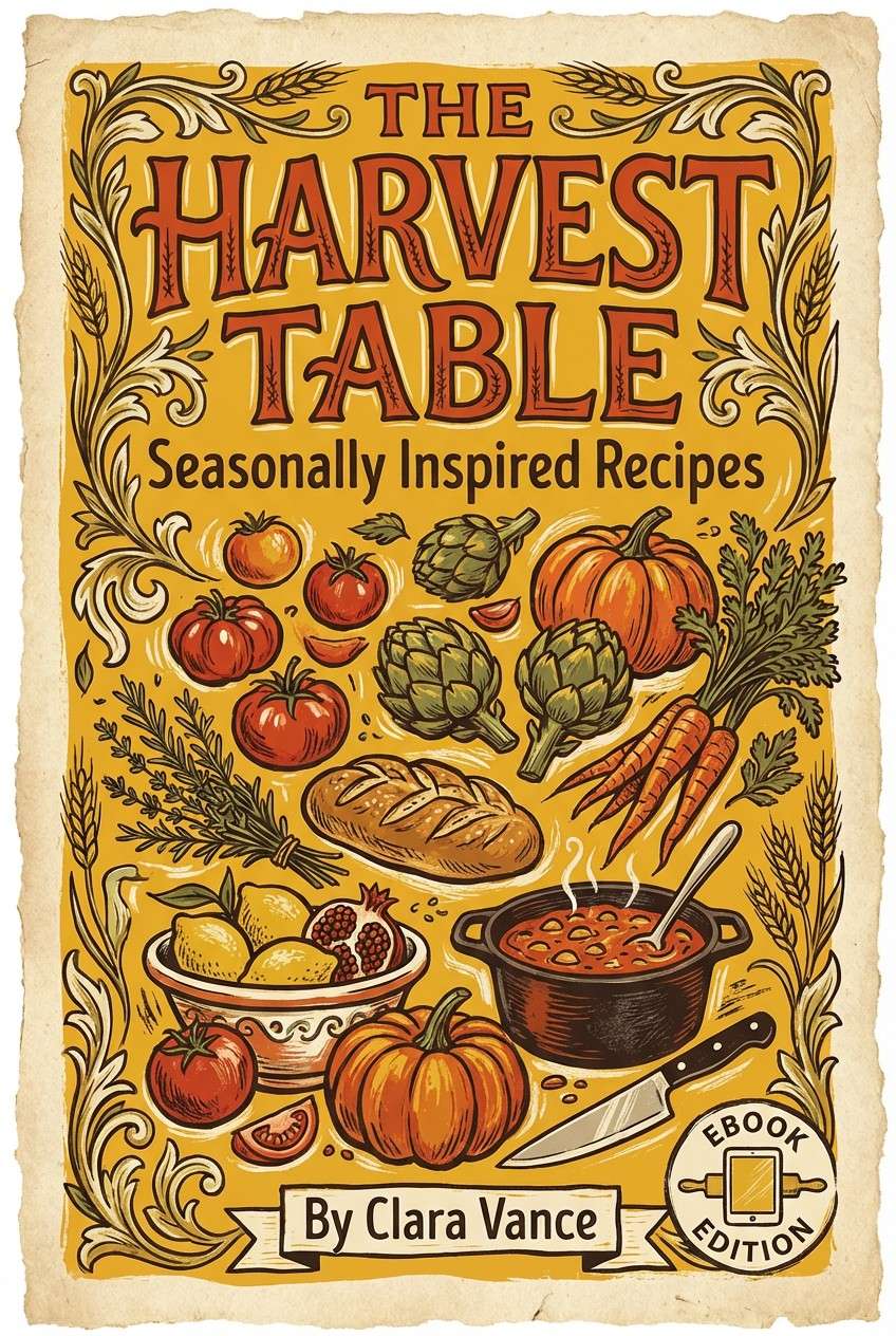
11) Paprika and Parchment
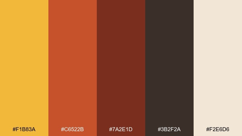
HEX: #F1B83A #C6522B #7A2E1D #3B2F2A #F2E6D6
Mood: hearty, traditional, inviting
Best for: recipe ebook cover design
Hearty and traditional like paprika dust on parchment paper, this set feels homey and appetizing. Use the golden tone for the title and small graphic flourishes, then balance it with deeper reds for warmth. It works well with serif type and hand-drawn food illustrations. Tip: keep background textures very light so the cover stays crisp in thumbnail size.
Image example of paprika and parchment generated using media.io
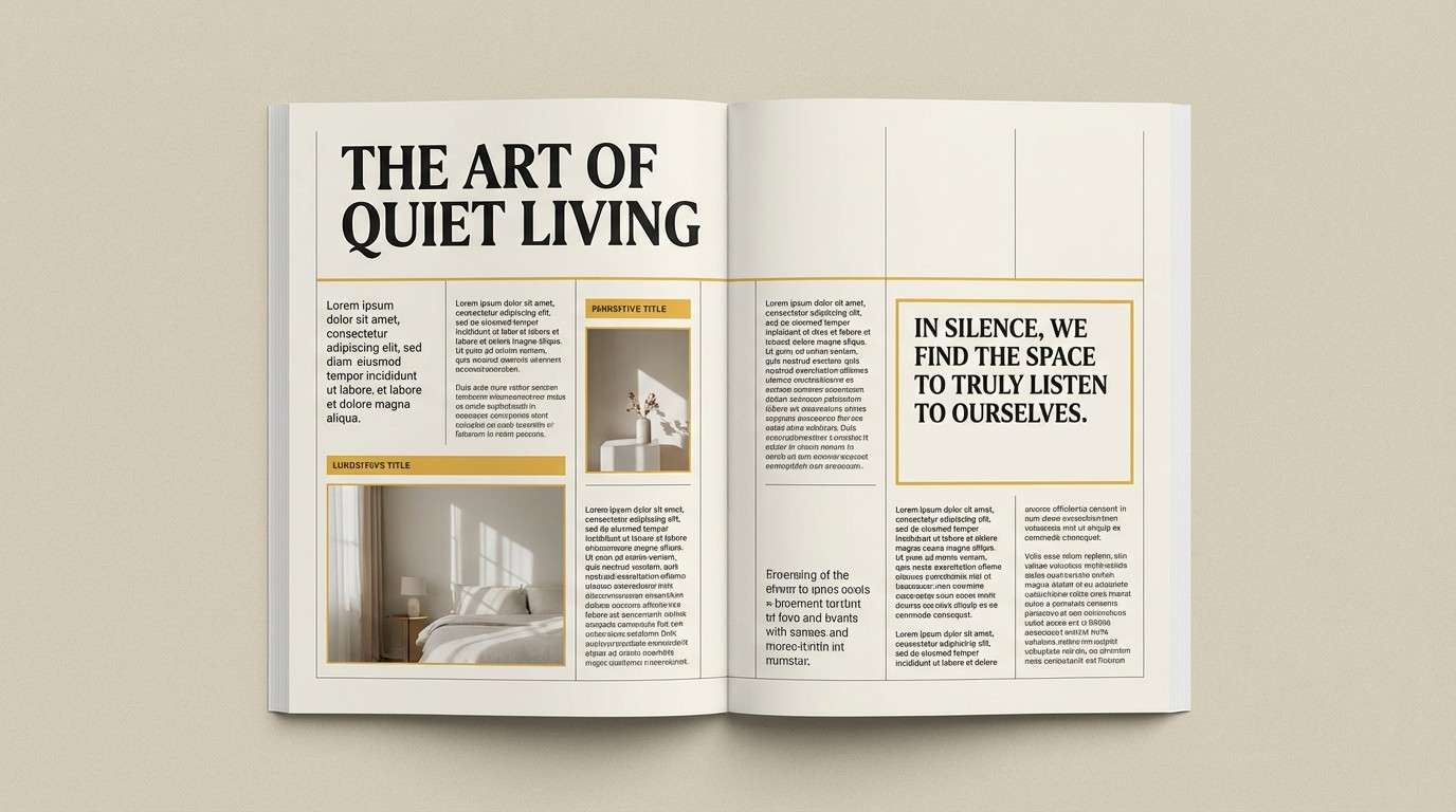
12) Mustard Noir Editorial
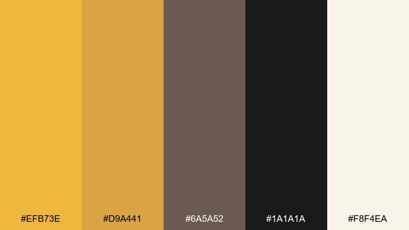
HEX: #EFB73E #D9A441 #6A5A52 #1A1A1A #F8F4EA
Mood: editorial, moody, sophisticated
Best for: magazine feature spread layout
Moody and sophisticated like mustard accents on a noir wardrobe, this saffron palette feels editorial and sharp. Use near-black for dominant type and structure, then add warm gold for pull quotes and section markers. It pairs well with monochrome photography and bold grids. Tip: limit the mid-gray to supporting captions so the page stays high-contrast and premium.
Image example of mustard noir editorial generated using media.io
13) Autumn Orchard
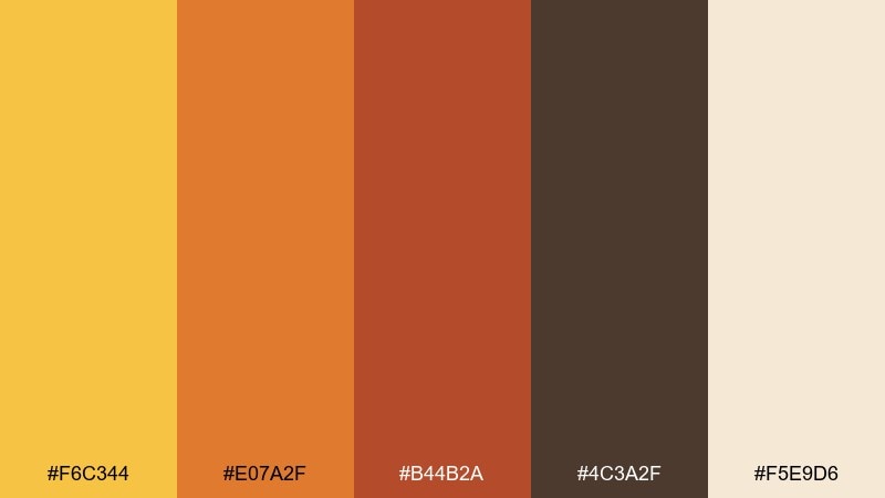
HEX: #F6C344 #E07A2F #B44B2A #4C3A2F #F5E9D6
Mood: seasonal, cozy, welcoming
Best for: fall event invitation card
Seasonal and welcoming like an orchard at harvest, these saffron color combinations feel cozy without getting heavy. Use warm gold and orange for the headline and decorative leaves, then rely on deeper browns for the fine print. It is a great fit for rustic events, community gatherings, and seasonal promos. Tip: choose one bold accent color for the RSVP line so the hierarchy stays clear.
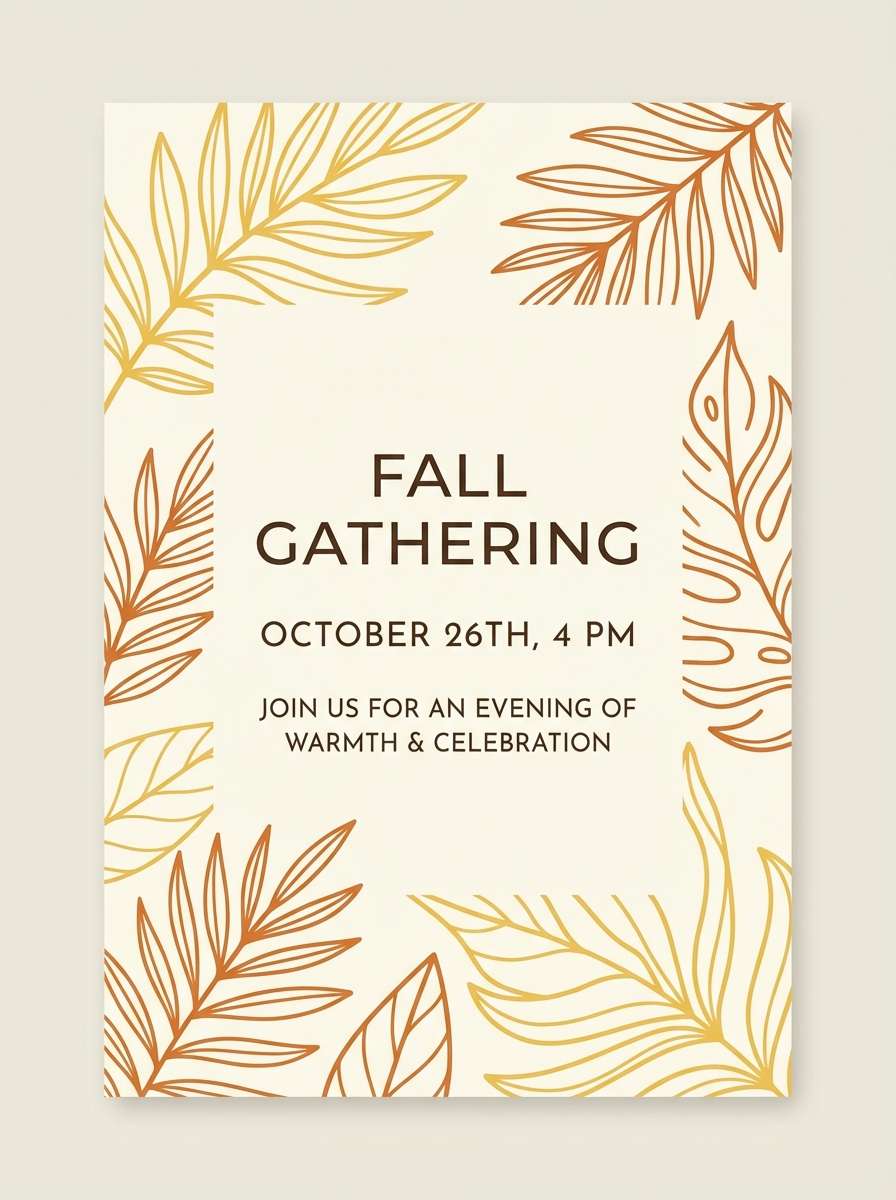
Image example of autumn orchard generated using media.io
14) Saffron Teal Balance
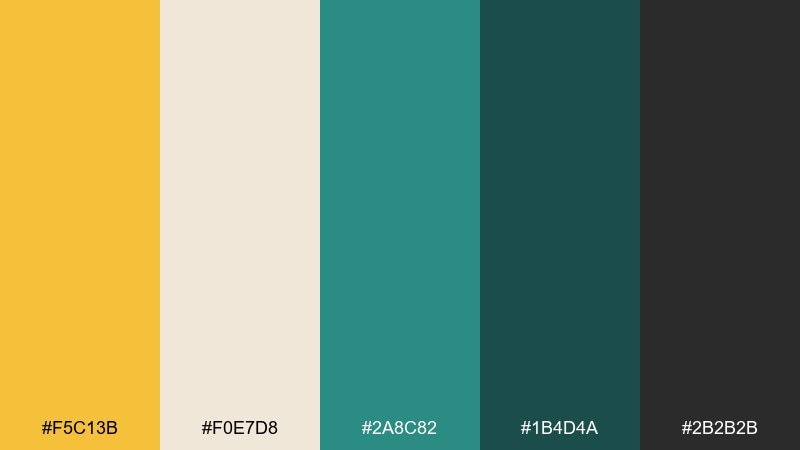
HEX: #F5C13B #F0E7D8 #2A8C82 #1B4D4A #2B2B2B
Mood: balanced, modern, confident
Best for: SaaS landing page hero section
Balanced and modern like warm sunlight against cool sea glass, this saffron pairing feels confident. The teal tones provide structure, making saffron color combinations especially strong for buttons, badges, and feature highlights. Keep the off-white as your main canvas to avoid a crowded hero area. Tip: use the darker teal for navigation and the gold only for one primary call-to-action.
Image example of saffron teal balance generated using media.io

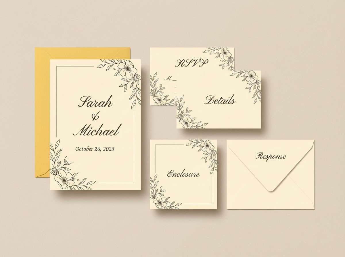
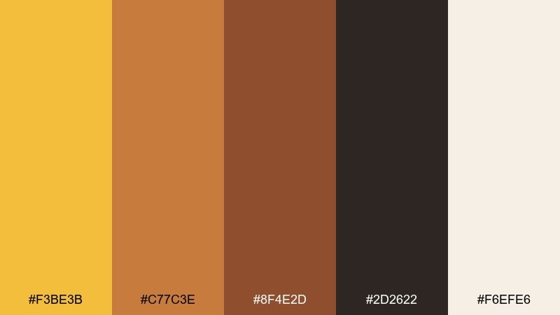
15) Buttercream Wedding
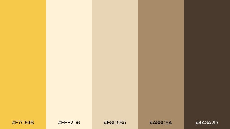
HEX: #F7C94B #FFF2D6 #E8D5B5 #A88C6A #4A3A2D
Mood: romantic, soft, celebratory
Best for: wedding invitation suite
Romantic and soft like buttercream frosting with a golden glow, this set feels celebratory yet refined. Use the light cream for the base, then bring in warm gold for monograms and border details. The tan and cocoa tones add an elegant, vintage touch without overpowering the page. Tip: foil-stamp the gold and keep body text in the dark brown for classic readability.
Image example of buttercream wedding generated using media.io
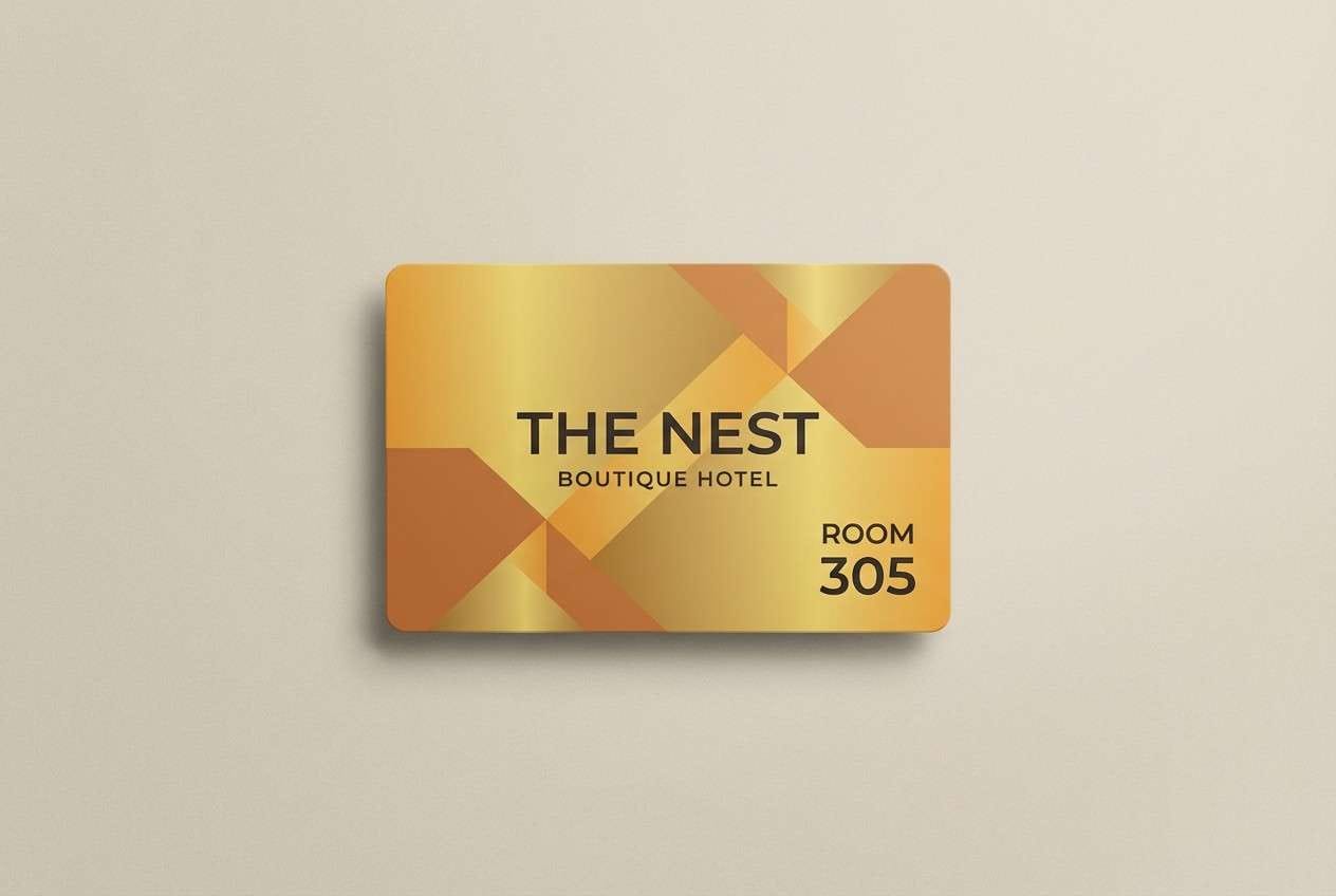
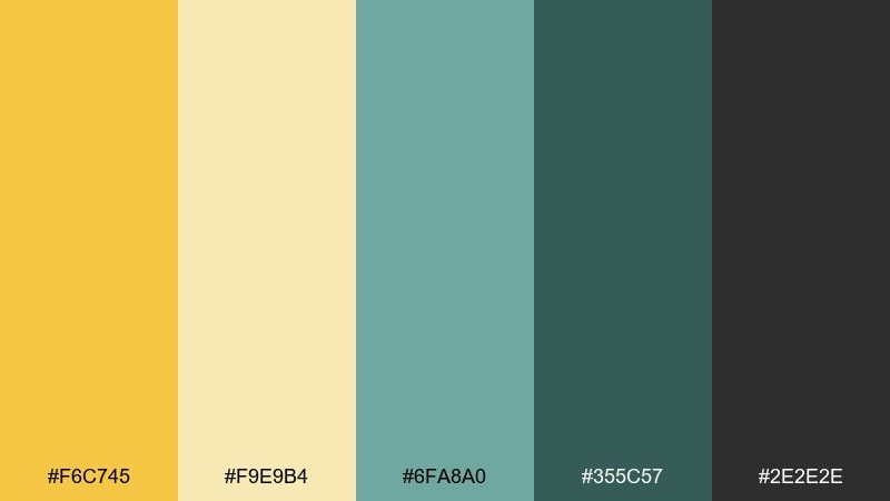
16) Candlelit Copper
HEX: #F3BE3B #C77C3E #8F4E2D #2D2622 #F6EFE6
Mood: cozy, intimate, upscale
Best for: boutique hotel room key card design
Cozy and intimate like candlelight on copper, these tones feel upscale and welcoming. Let the warm gold and copper lead, then use the deep brown for type and small patterns. It suits hospitality materials where texture and subtle shine matter. Tip: keep the background light and add copper as a thin border to avoid over-dark prints.
Image example of candlelit copper generated using media.io
17) Sunflower Classroom
HEX: #F6C745 #F9E9B4 #6FA8A0 #355C57 #2E2E2E
Mood: friendly, clear, educational
Best for: online course slide template
Friendly and clear like a bright classroom poster, this mix feels optimistic and easy to follow. Use the pale yellow for slide backgrounds and the deeper gold for emphasis and section titles. The teal greens help organize charts and callouts without feeling corporate. Tip: keep text in dark charcoal and use teal for bullets to reduce visual fatigue.
Image example of sunflower classroom generated using media.io

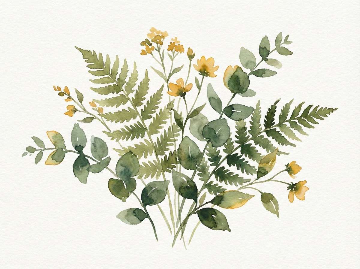
18) Gilded Botanical
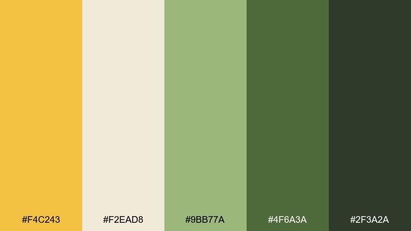
HEX: #F4C243 #F2EAD8 #9BB77A #4F6A3A #2F3A2A
Mood: fresh, natural, handcrafted
Best for: botanical watercolor print
Fresh and handcrafted like a gilded herbarium page, these saffron tones feel calm and alive. Let the greens dominate the leaves, then add warm gold as small highlights for stems and labels. The creamy paper tone keeps the art airy and print-friendly. Tip: avoid heavy outlines and rely on layered washes to keep the palette soft.
Image example of gilded botanical generated using media.io
19) Chai Latte Neutrals
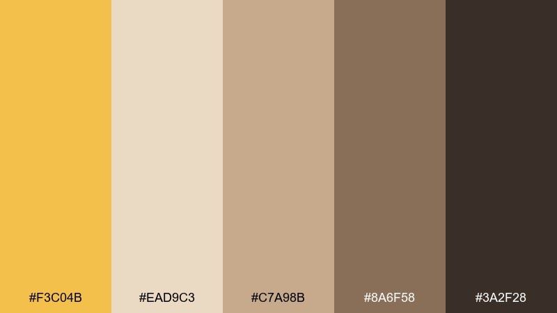
HEX: #F3C04B #EAD9C3 #C7A98B #8A6F58 #3A2F28
Mood: comforting, mellow, grounded
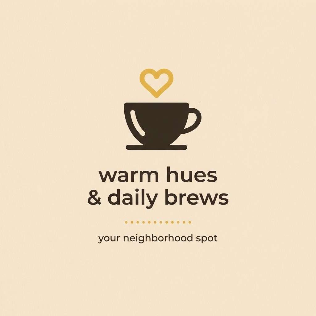
Best for: cozy cafe social media post
Comforting and mellow like a chai latte swirl, these neutrals feel grounded and inviting. Use the gold for a small banner or price highlight, then lean on the coffee browns for type and framing. These saffron color combinations work especially well with minimal photography and warm lighting. Tip: keep backgrounds light so the mid-browns do not flatten your layout on small screens.
Image example of chai latte neutrals generated using media.io
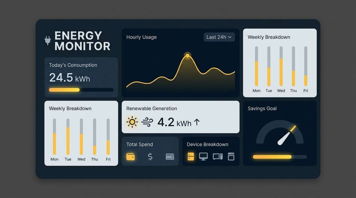
20) Solar Tech Accent
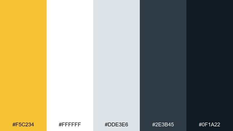
HEX: #F5C234 #FFFFFF #DDE3E6 #2E3B45 #0F1A22
Mood: sleek, technical, high-contrast
Best for: product UI for energy monitoring app
Sleek and technical like a solar readout at noon, this set is crisp and high-contrast. Use the gold as a status accent for alerts, savings, or key metrics, while cool grays handle panels and charts. The deep navy tones keep the interface serious and readable. Tip: pair gold with white only for small elements so the highlight stays sharp rather than glaring.
Image example of solar tech accent generated using media.io
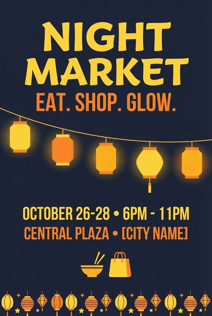
21) Festival Lantern Night
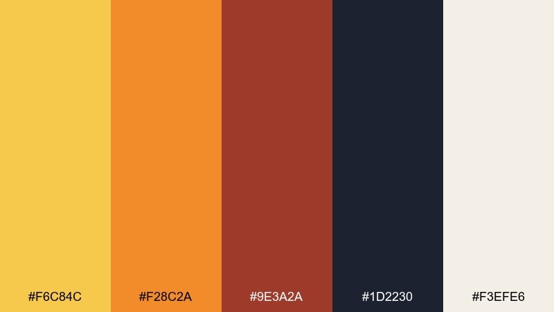
HEX: #F6C84C #F28C2A #9E3A2A #1D2230 #F3EFE6
Mood: festive, dramatic, lively
Best for: night market flyer
Festive and dramatic like lantern light against night sky, these saffron hues feel lively and memorable. The dark navy creates instant depth, while gold and orange bring the glow forward for headlines and icons. Use the cream tone for small text blocks so information stays readable. Tip: try a dark background version with gold type for a premium night-event look.
Image example of festival lantern night generated using media.io
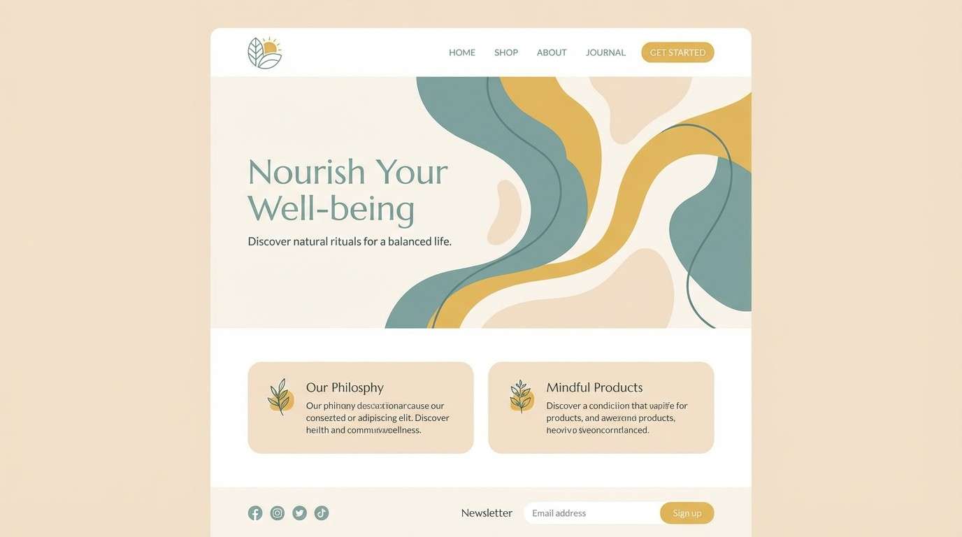
22) Soft Clay and Sky
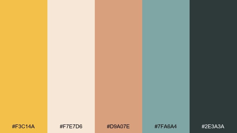
HEX: #F3C14A #F7E7D6 #D9A07E #7FA6A4 #2E3A3A
Mood: serene, airy, contemporary
Best for: wellness brand landing page
Serene and airy like soft clay beside a cool morning sky, this saffron color palette feels contemporary and calming. The muted teal brings balance, creating saffron color combinations that read gentle rather than loud. Use the cream as your main background and layer clay accents for warmth in illustrations or section dividers. Tip: keep CTAs in the deeper charcoal-teal so they stand out without breaking the calm mood.
Image example of soft clay and sky generated using media.io
What Colors Go Well with Saffron?
Saffron pairs best with colors that either cool it down (teal, deep green, navy) or ground it (charcoal, espresso brown, stone gray). These combinations keep the warmth intentional and prevent a palette from feeling overly bright.
For softer looks, add creamy off-whites, parchment tones, and muted taupes. For bolder contrast, introduce near-black, deep olive, or a confident blue-green—ideal when you need readable UI buttons and clear hierarchy.
If you want a festive or food-forward vibe, saffron also plays well with paprika reds, terracotta, and warm oranges—just keep one warm tone dominant and let the others support it.
How to Use a Saffron Color Palette in Real Designs
Use saffron as an accent color first: CTAs, price tags, section markers, icons, or small headline highlights. This gives you the “golden glow” without sacrificing legibility or making the layout feel too saturated.
For packaging and print, saffron looks especially premium on textured materials and matte finishes. Pair it with dark cocoa/charcoal typography for strong readability, and use cream backgrounds to keep labels clean.
For web and app UI, reserve saffron for key states (active, success, savings, featured). Back it up with deep teal/navy for buttons and headers, and check contrast for accessibility—especially if you’re placing saffron text on light backgrounds.
Create Saffron Palette Visuals with AI
If you already have HEX codes, you can turn them into real mockups fast by generating visuals that match your palette—like posters, UI screens, labels, and brand flat lays. This helps you validate mood, contrast, and hierarchy before you commit to production.
To keep results consistent, mention your dominant saffron HEX, one dark anchor color (charcoal/teal/navy), a light neutral background, and the design format (menu, landing page hero, onboarding screens, packaging photo, etc.).
Saffron Color Palette FAQs
-
What is the HEX code for saffron?
Saffron can vary by palette, but common saffron-like HEX values in this guide include #F4C430, #F5C13B, and #F6C54A—golden yellows that sit between yellow and orange. -
Is saffron more yellow or orange?
Saffron is typically a yellow-orange. It reads warmer than a pure yellow and less red than a true orange, which is why it works well as a “gold” accent in branding and UI. -
What colors complement saffron the best?
Cool complements like teal, blue-green, and navy create crisp contrast, while charcoal and deep brown add a grounded, premium feel. Cream and parchment tones soften the overall look. -
How do I keep a saffron palette from looking too bright?
Use saffron as an accent (not the main background), add plenty of off-white/cream negative space, and anchor the palette with a dark neutral like charcoal, espresso, or deep teal. -
Does saffron work for professional UI design?
Yes—especially as a highlight color for key metrics, badges, and CTAs. Pair it with cool grays or deep navy/teal and ensure text contrast meets accessibility standards. -
What’s a good saffron palette for packaging?
Try “Spice Market Glow” for coffee or artisanal goods, “Golden Olive Grove” for Mediterranean food packaging, or “Candlelit Copper” for hospitality and premium product presentation. -
Can I generate brand mockups using these saffron HEX codes?
Yes. Use the palette HEX codes in your prompt and specify the product or layout (label, poster, landing page, UI). Media.io’s text-to-image tool can generate consistent visual concepts quickly.