Teal and copper is a modern contrast that feels both cool and crafted—like water next to warm metal. It’s a reliable pairing for branding, interiors, and UI because it balances clarity with personality.
Below are 20 curated teal copper color palette ideas with HEX codes, plus practical tips for accents, neutrals, and readability.
In this article
Why Teal Copper Palettes Work So Well
Teal brings stability and calm, while copper adds a handcrafted warmth that feels premium without becoming flashy. Together, they create a high-impact contrast that still reads natural and approachable.
This combo also spans styles easily: brighter teals and orange-coppers feel energetic and coastal, while deeper teals and bronzy coppers feel editorial, heritage, or luxe. That range makes it easy to tailor the mood without changing the “signature” pairing.
From a practical design standpoint, teal often performs well as a primary brand or UI color, and copper works best as an accent that guides attention. With the right neutral (cream, sand, or slate), the palette stays readable and balanced.
20+ Teal Copper Color Palette Ideas (with HEX Codes)
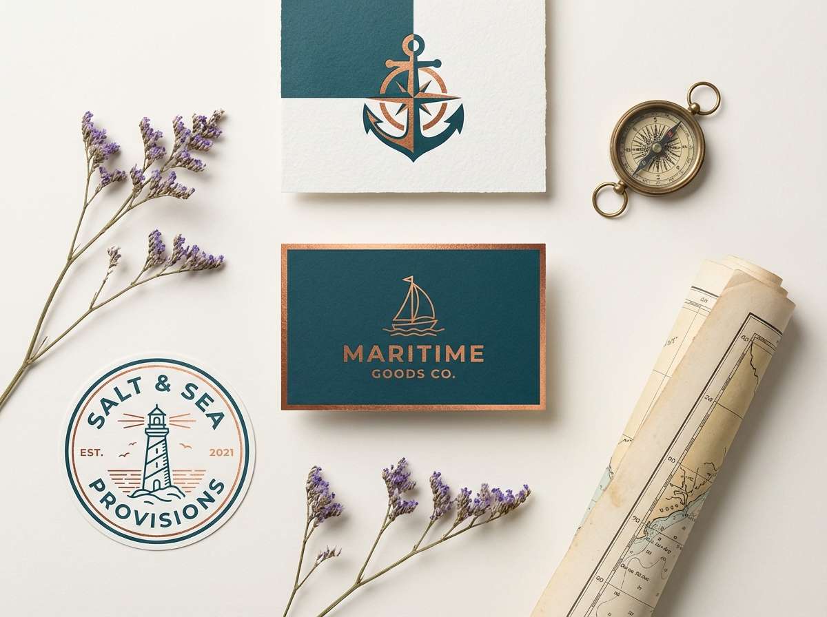
1) Harbor Patina
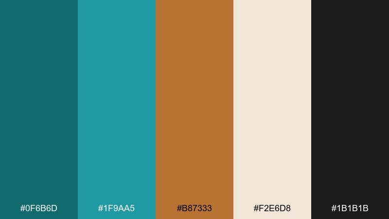
HEX: #0f6b6d #1f9aa5 #b87333 #f2e6d8 #1b1b1b
Mood: nautical, refined, confident
Best for: brand identity for marine, craft, or heritage businesses
Nautical patina and warm metalwork give this set a confident, found-by-the-sea feel. Use the deep teal for primary headers, then bring in copper for badges, icons, or key calls to action. Cream keeps layouts breathable while near-black grounds typography and logos. Tip: keep copper accents under 15% so the teal stays in charge.
Image example of harbor patina generated using media.io
Media.io is an online AI studio for creating and editing video, image, and audio in your browser.

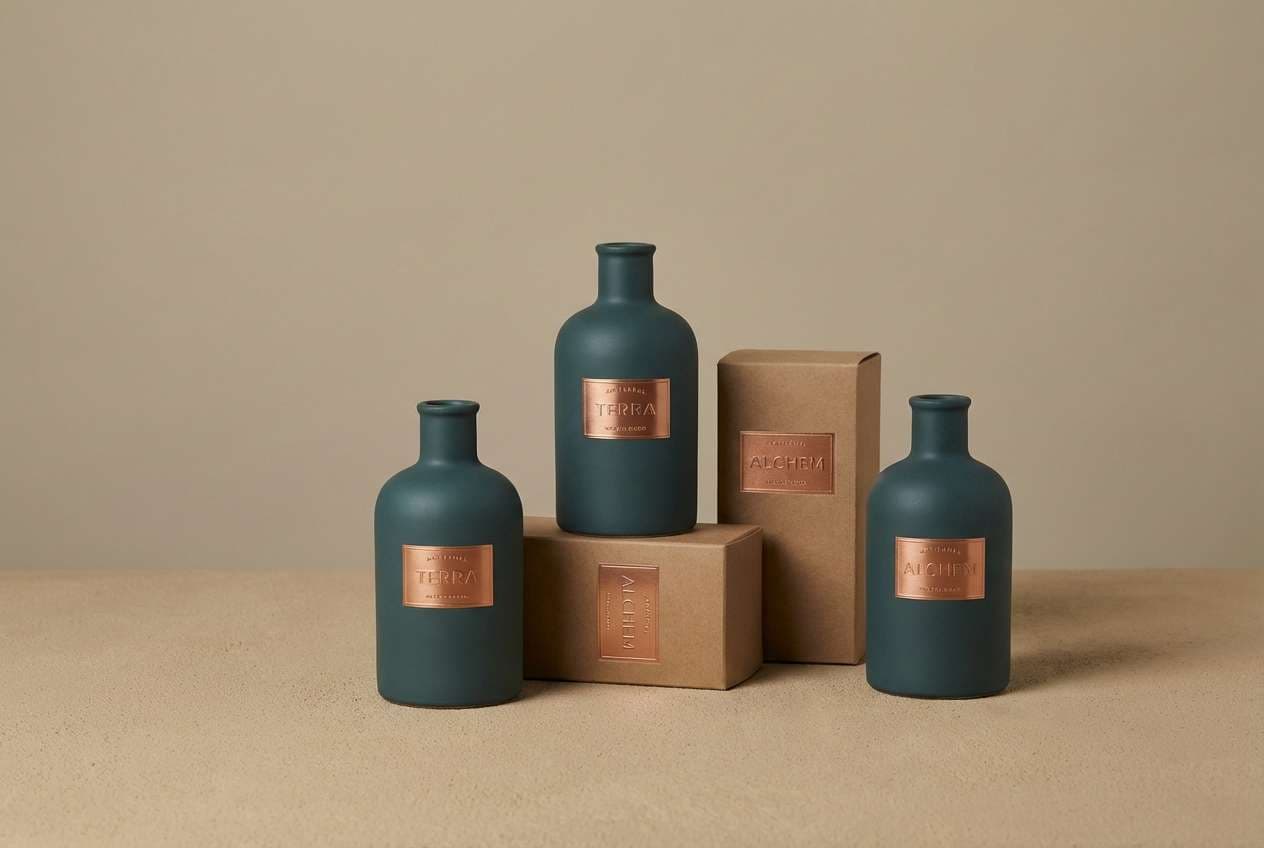
2) Desert Verdigris
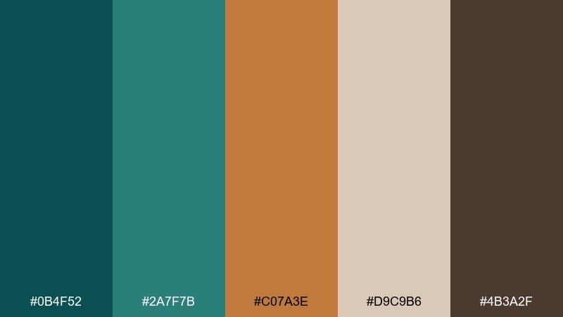
HEX: #0b4f52 #2a7f7b #c07a3e #d9c9b6 #4b3a2f
Mood: earthy, grounded, artisanal
Best for: boutique packaging and labels for skincare or candles
Earthy teal and sun-baked copper read like patinated pottery and desert stone. Make the dark teal the base for premium packaging, then add copper as a warm seal, stripe, or stamped logo. The sandy neutral works well for background panels and ingredient blocks. Tip: pair with uncoated paper textures to amplify the handcrafted vibe.
Image example of desert verdigris generated using media.io
3) Vintage Compass
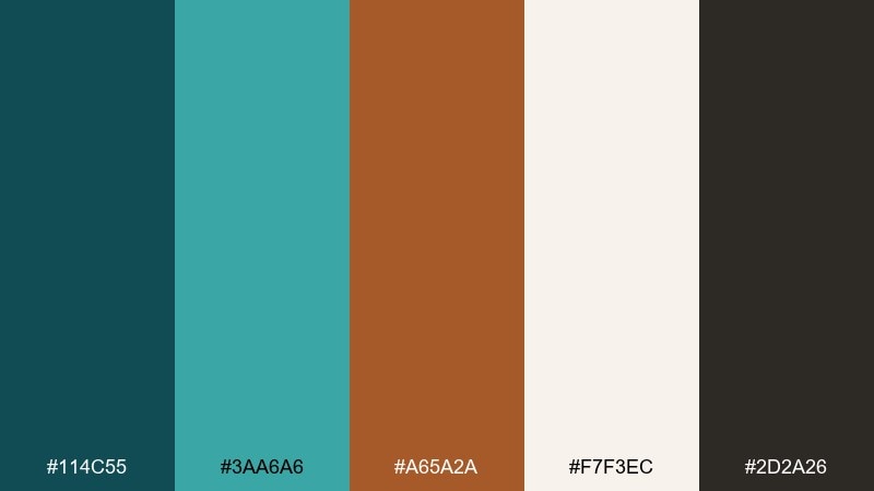
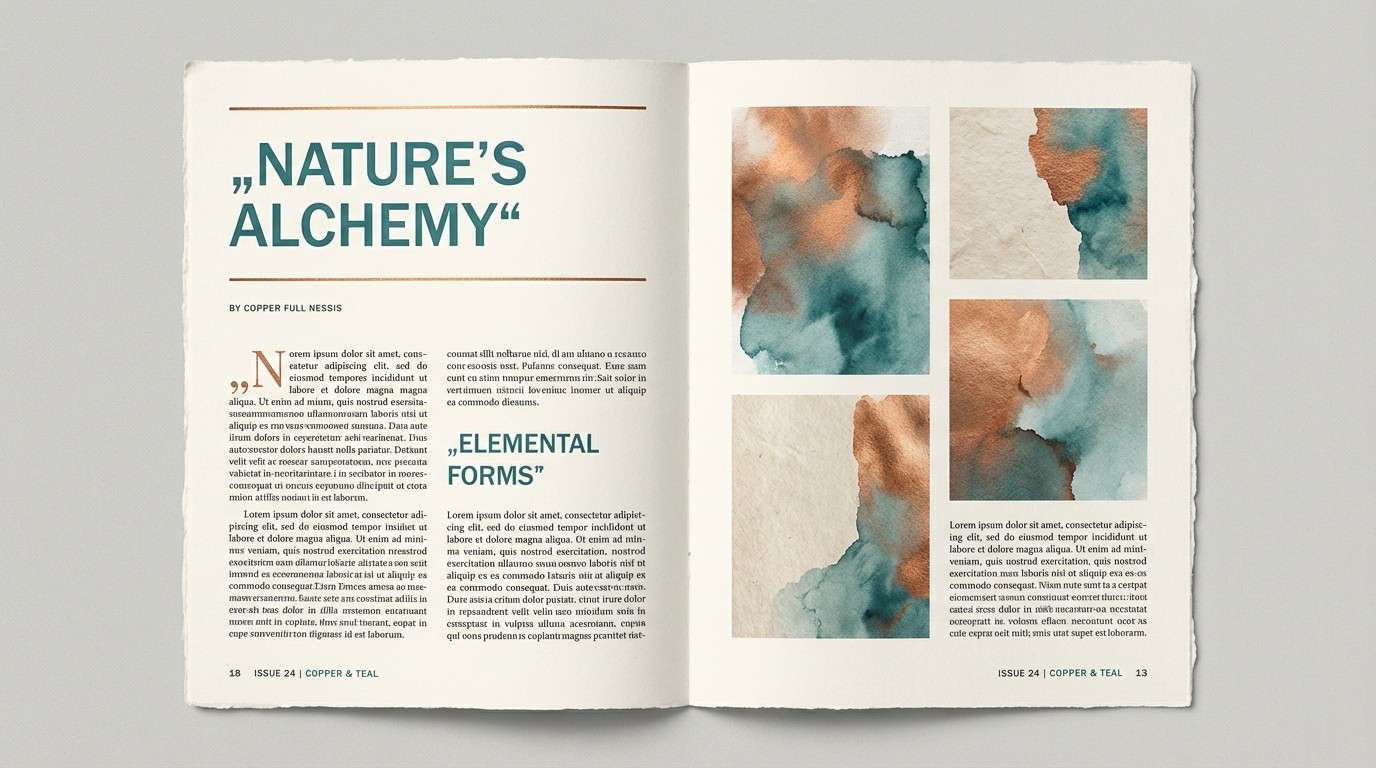
HEX: #114c55 #3aa6a6 #a65a2a #f7f3ec #2d2a26
Mood: classic, curious, editorial
Best for: magazine layouts and blog headers
Classic teal with a compass-like copper accent feels curious and slightly old-world. Use the pale ivory for page backgrounds and let the brighter teal highlight pull quotes or section dividers. Copper works best for small ornaments, drop caps, or category tags. Tip: keep body text in the deep charcoal so the page reads clean and modern.
Image example of vintage compass generated using media.io
4) Copper Reef
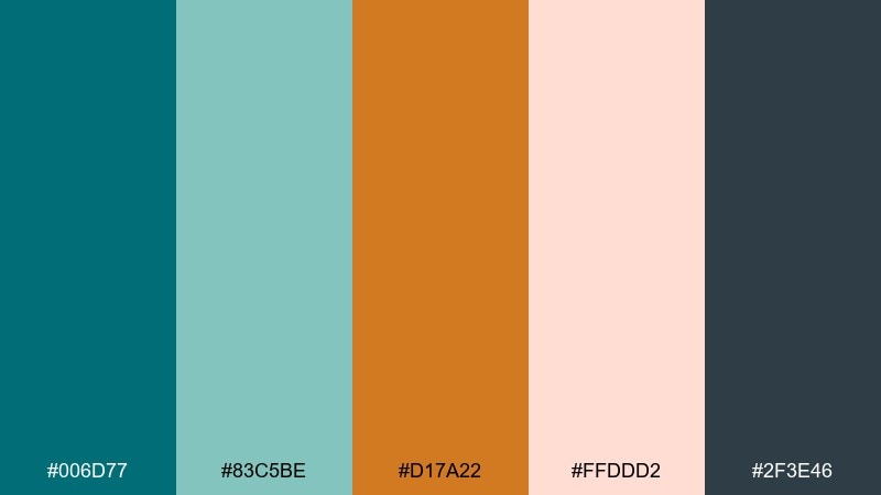
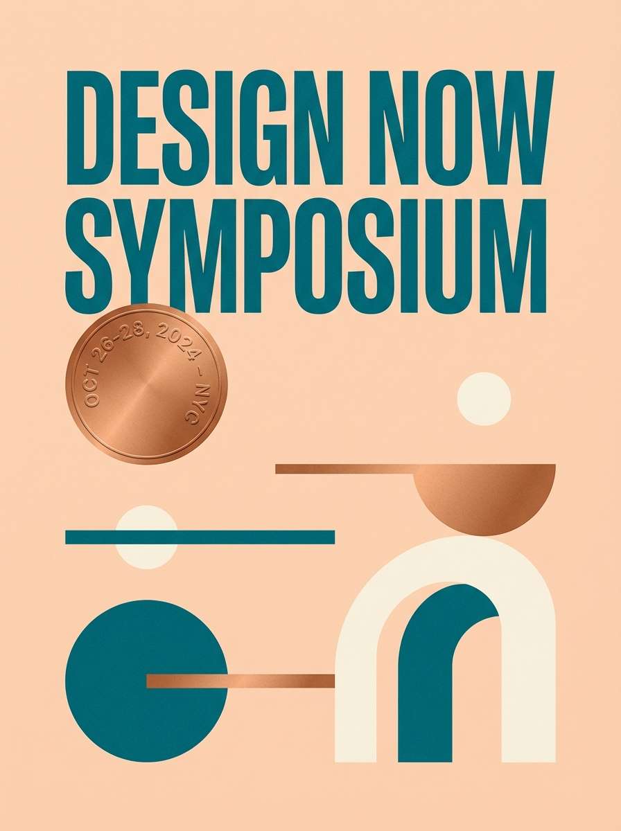
HEX: #006d77 #83c5be #d17a22 #ffddd2 #2f3e46
Mood: bright, coastal, upbeat
Best for: summer event posters and social graphics
Bright coastal tones evoke sunlit water and warm reef rock. This teal copper color palette shines in big blocks of color, especially for headers and poster backgrounds. Use the peachy tint to soften negative space and keep dark slate for readable copy. Tip: reserve copper for a single focal element like the date or main CTA button.
Image example of copper reef generated using media.io
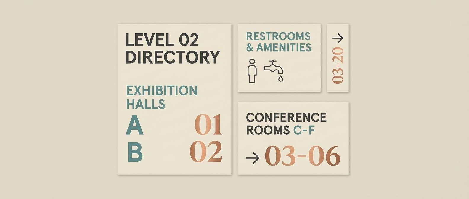
5) Museum Label
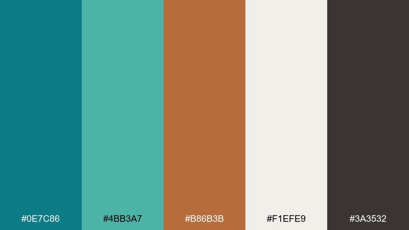
HEX: #0e7c86 #4bb3a7 #b86b3b #f1efe9 #3a3532
Mood: curated, calm, intelligent
Best for: exhibit signage and wayfinding systems
Curated teal and warm copper feel like a quiet museum gallery with polished plaques. Use the creamy neutral for sign panels and let the saturated teal carry arrows, headings, and location blocks. Copper is ideal for numbering systems or section markers that need quick recognition. Tip: standardize teal as primary and limit copper to one hierarchy level for consistency.
Image example of museum label generated using media.io
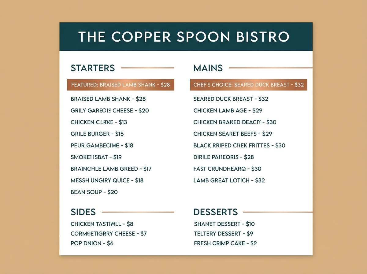
6) Night Market
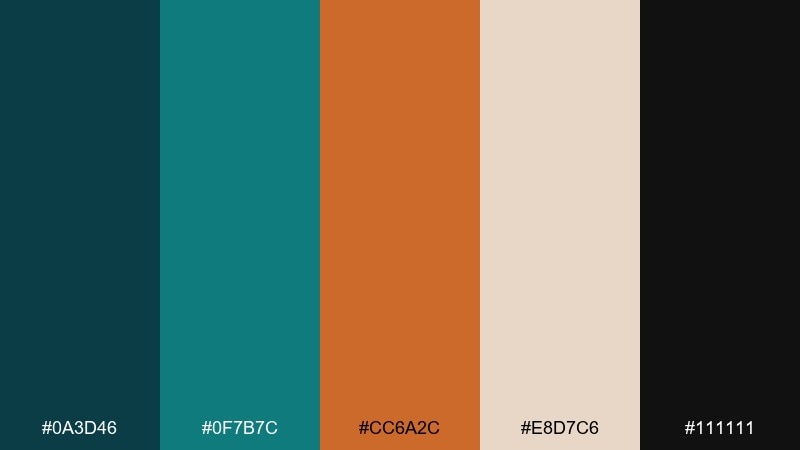
HEX: #0a3d46 #0f7b7c #cc6a2c #e8d7c6 #111111
Mood: moody, urban, energetic
Best for: restaurant menus and street-food branding
Moody teal with spicy copper reads like neon reflections and sizzling pans after dark. Put the deepest tones behind your logo or menu headings for instant drama, then use copper for dish highlights and price chips. The warm beige keeps longer text blocks inviting instead of harsh. Tip: use copper sparingly on dark backgrounds to avoid a muddy look and keep contrast crisp.
Image example of night market generated using media.io
7) Soft Spa Tile
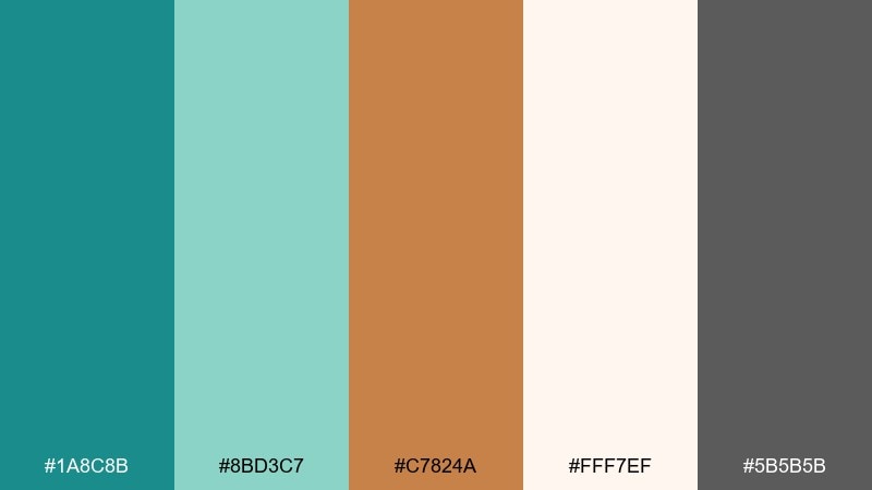
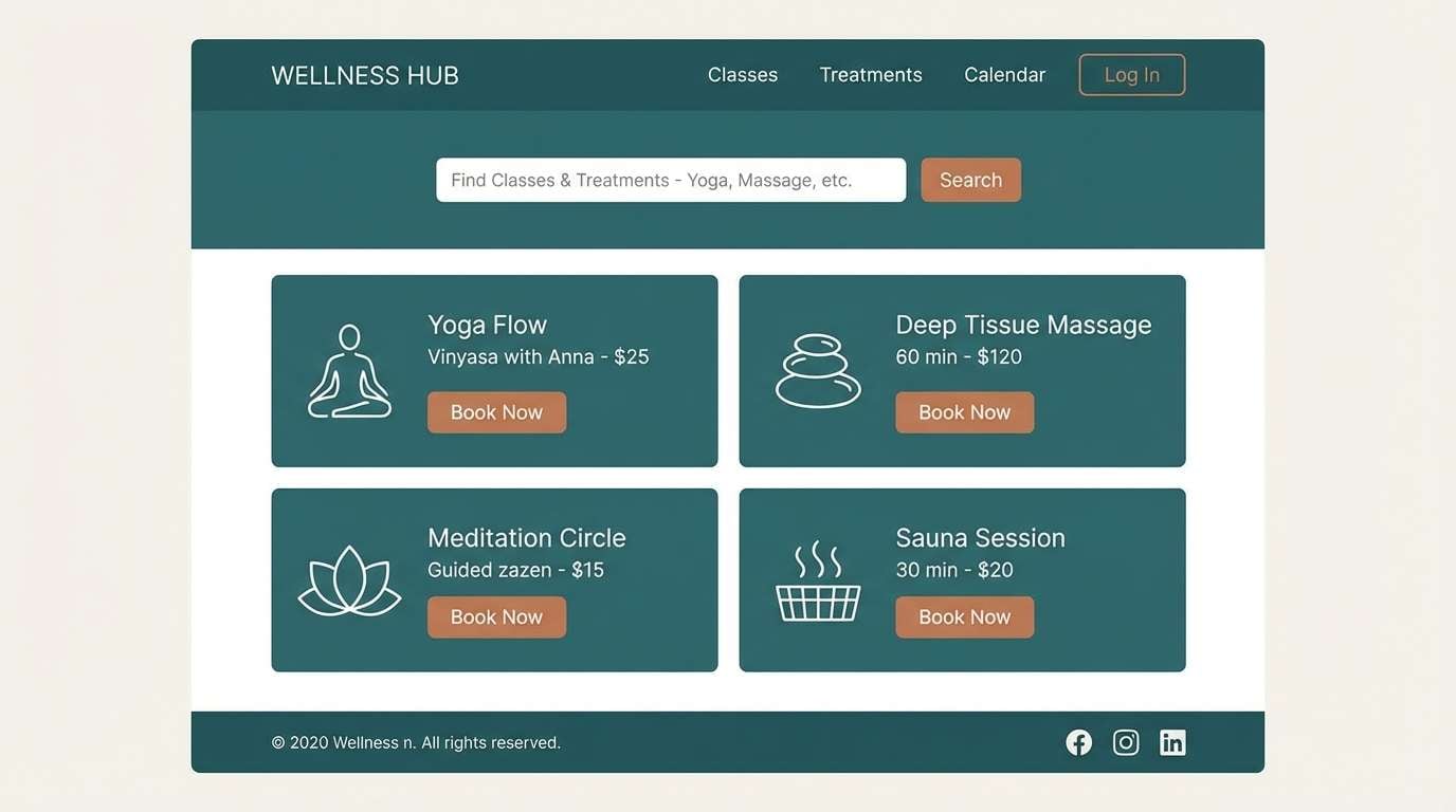
HEX: #1a8c8b #8bd3c7 #c7824a #fff7ef #5b5b5b
Mood: soothing, airy, restorative
Best for: wellness websites and appointment booking UI
Soothing teal and milky neutrals bring to mind spa tiles and gentle steam. Use the lighter teal for cards and input fields, then anchor navigation in the deeper teal for clarity. Copper adds a friendly warmth for active states, icons, and small highlights. Tip: keep backgrounds off-white and reduce shadows so the interface feels calm and breathable.
Image example of soft spa tile generated using media.io
8) Industrial Loft
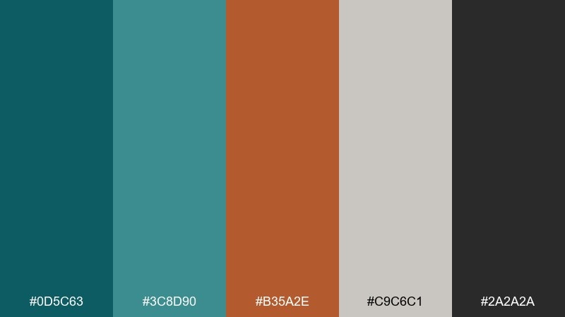
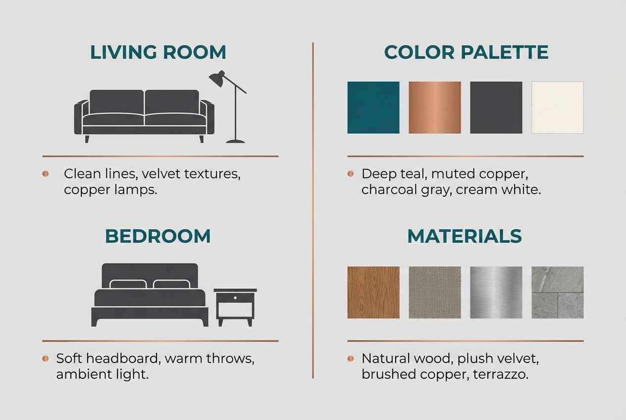
HEX: #0d5c63 #3c8d90 #b35a2e #c9c6c1 #2a2a2a
Mood: rugged, modern, architectural
Best for: interior design presentations and lookbooks
Rugged teal and oxidized copper feel like beams, pipes, and polished concrete. These teal copper color combinations work well for lookbooks where you need strong section breaks and a modern, industrial edge. Use the warm gray for backgrounds and the near-black for captions and dimensions. Tip: let copper appear as a thin line or small marker so pages stay sleek, not heavy.
Image example of industrial loft generated using media.io
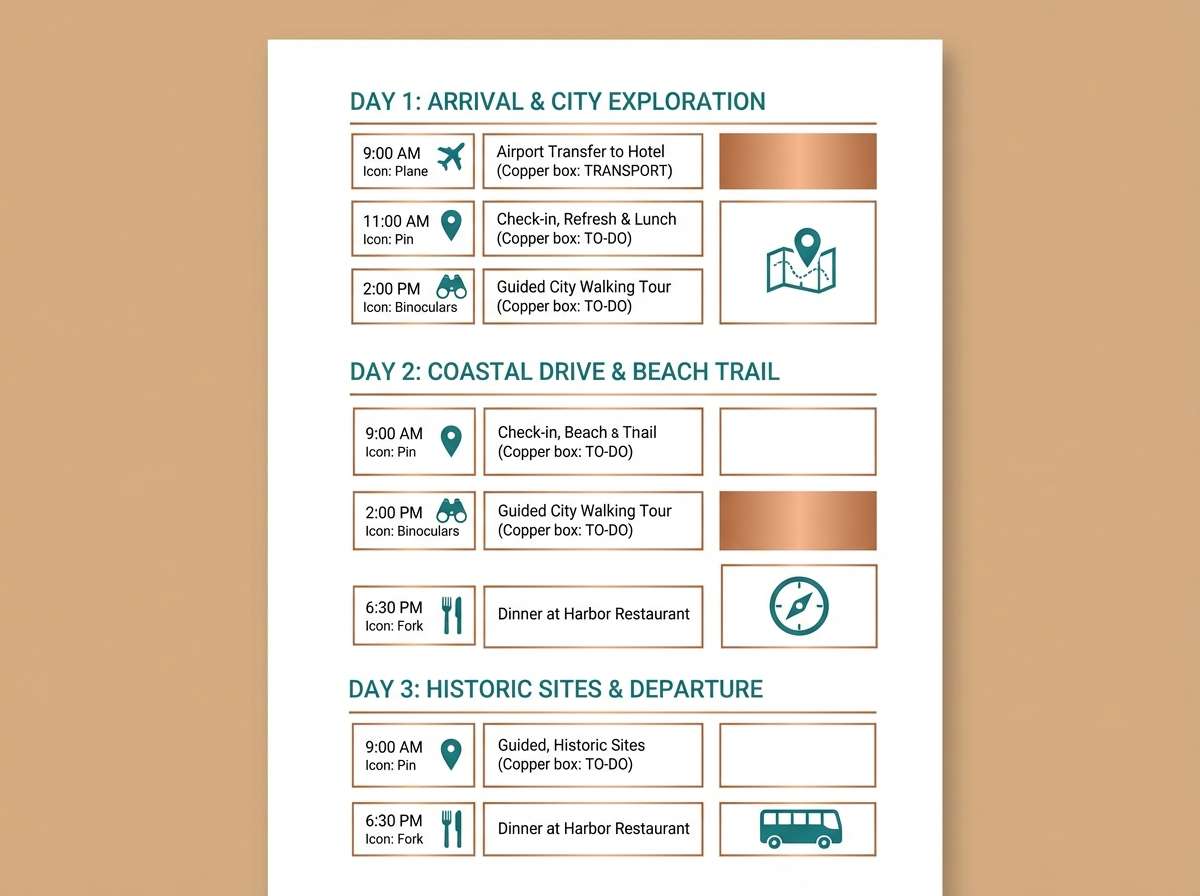
9) Autumn Marina
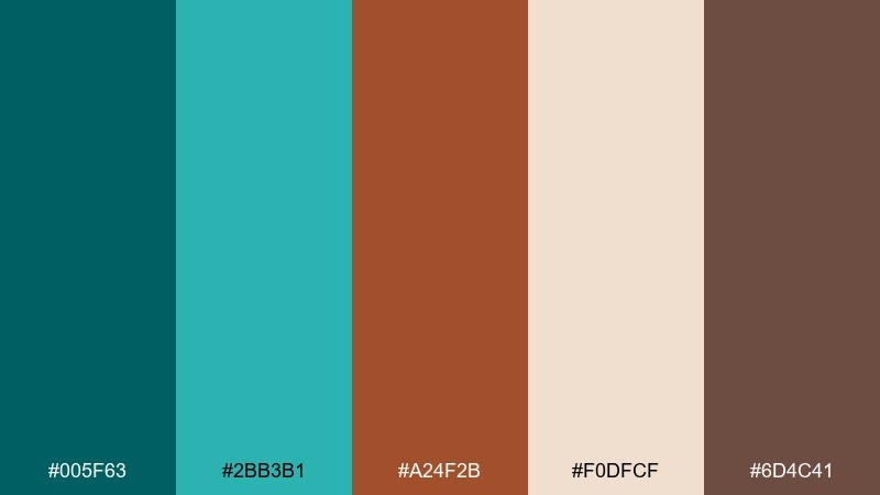
HEX: #005f63 #2bb3b1 #a24f2b #f0dfcf #6d4c41
Mood: seasonal, friendly, outdoorsy
Best for: travel blog graphics and itinerary PDFs
Seasonal teal and copper feel like marina water beside autumn docks. Use the bright teal for map pins, highlights, and links, while the darker teal anchors titles and dividers. The warm beige makes long-form itinerary pages easy on the eyes. Tip: keep brown as a secondary text tone for captions to add warmth without losing readability.
Image example of autumn marina generated using media.io
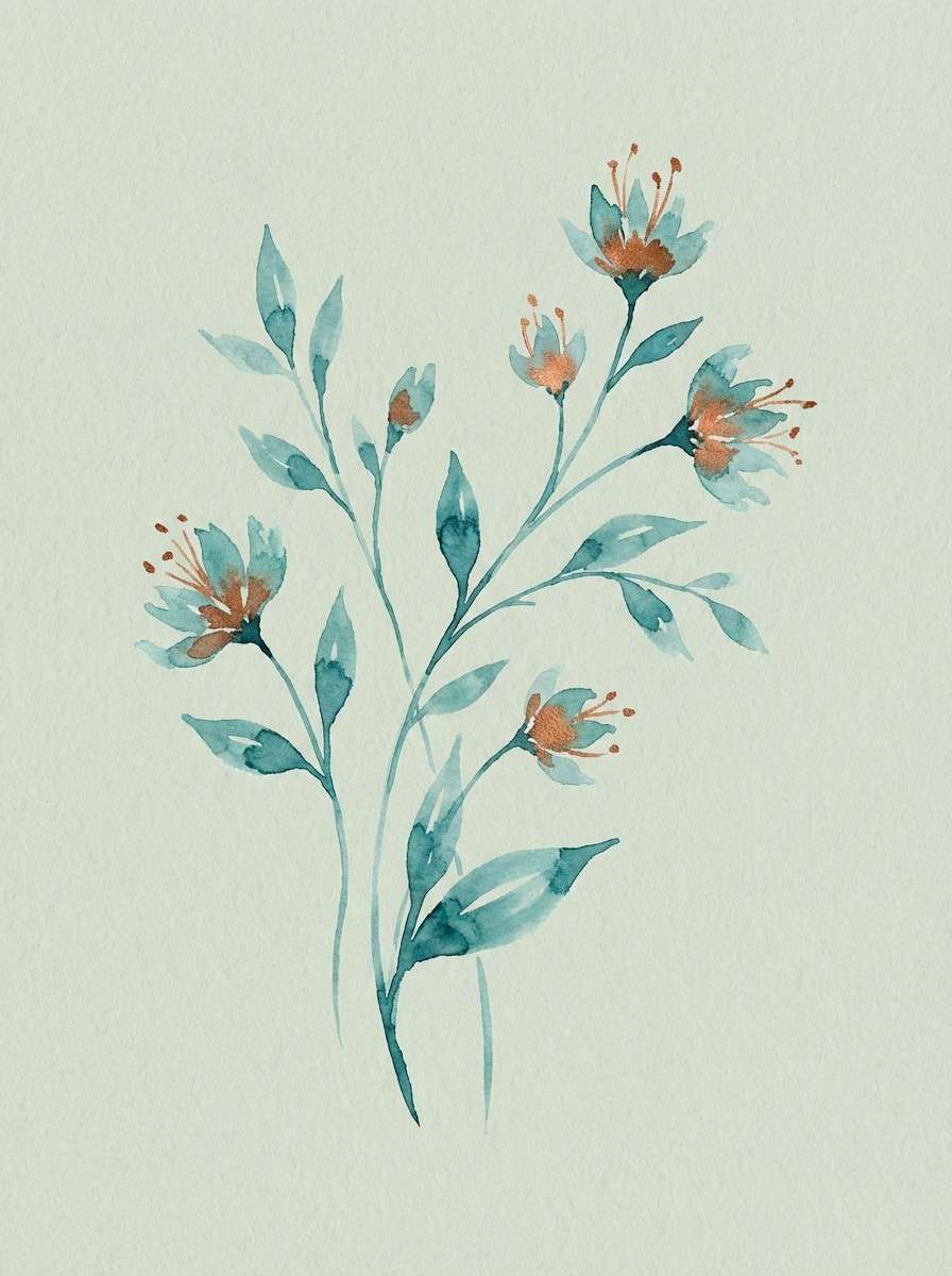
10) Copper Botanica
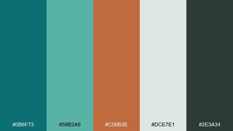
HEX: #0b6f73 #58b2a6 #c06b3e #dce7e1 #2e3a34
Mood: fresh, botanical, balanced
Best for: watercolor botanical illustrations and spring promotions
Fresh teal with copper warmth suggests greenhouse glass and terracotta pots. Use the pale sage-teal as a paper-like wash, then deepen shadows with the darker teal for leaves and stems. Copper works beautifully for floral centers, labels, and small ornamental borders. Tip: add plenty of negative space so the palette stays light and botanical.
Image example of copper botanica generated using media.io
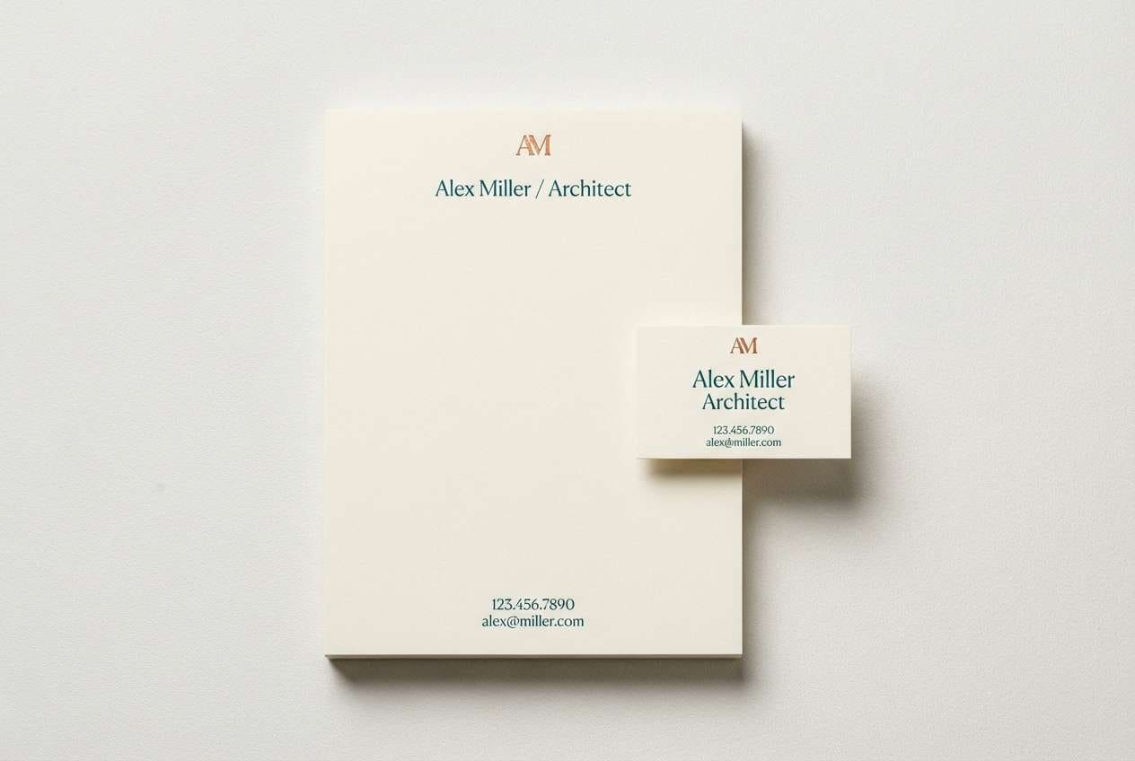
11) Minimal Stationery
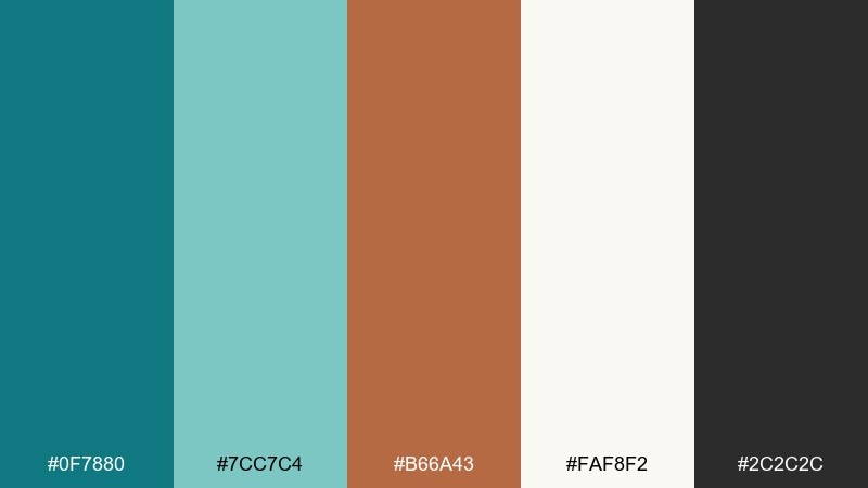
HEX: #0f7880 #7cc7c4 #b66a43 #faf8f2 #2c2c2c
Mood: clean, premium, understated
Best for: letterhead, invoices, and business stationery
Clean teal and copper accents feel like crisp paper with a subtle foil stamp. Keep the background nearly white for a premium look, then use deep teal for headings and rules. Copper is best for a small monogram, seal, or signature line. Tip: choose one teal for the whole document system to maintain consistency across PDFs and print.
Image example of minimal stationery generated using media.io
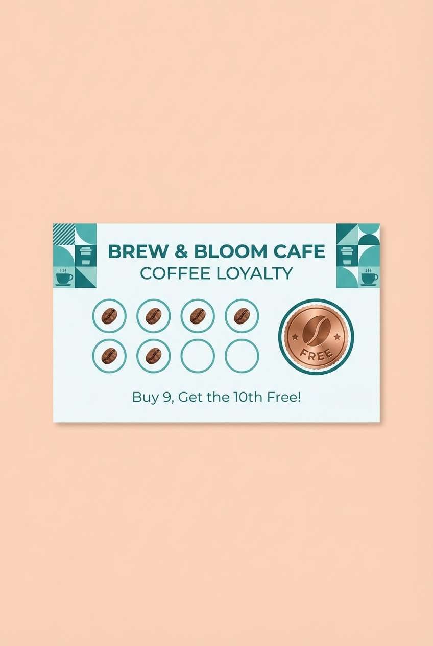
12) Sunlit Terracotta
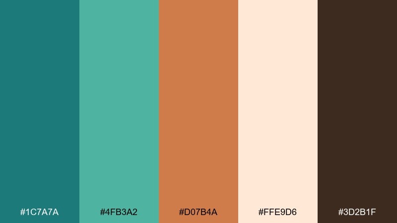
HEX: #1c7a7a #4fb3a2 #d07b4a #ffe9d6 #3d2b1f
Mood: warm, optimistic, welcoming
Best for: cafe posters, loyalty cards, and small ads
Warm teal and sunlit copper feel like terracotta walls meeting cool shade. These teal copper color combinations are great when you want energy without going neon, especially for small-format print pieces. Use the peachy background for friendliness, and keep the darkest brown for type and fine details. Tip: make copper your hero color on one element only, like a loyalty stamp or discount badge.
Image example of sunlit terracotta generated using media.io
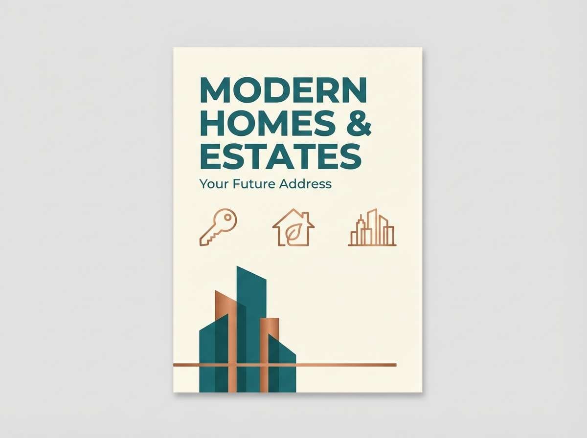
13) Coastal Bronze
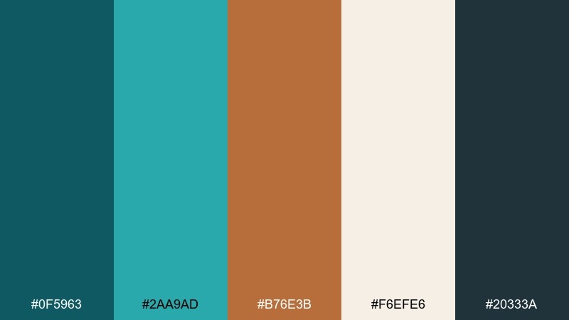
HEX: #0f5963 #2aa9ad #b76e3b #f6efe6 #20333a
Mood: breezy, mature, trustworthy
Best for: real estate branding and brochure design
Breezy teals with bronze-copper notes feel like seaside architecture and weathered fixtures. Use the lighter teal for secondary panels and infographics, while the deeper teal handles logos and headlines. Cream keeps brochures bright and upscale, and the dark slate keeps small text sharp. Tip: let copper appear in one repeating motif, like a keyline border or icon set.
Image example of coastal bronze generated using media.io
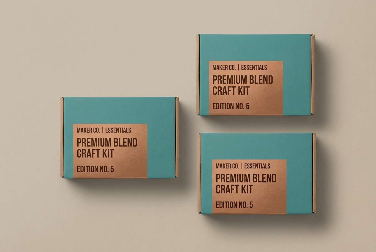
14) Retro Hardware
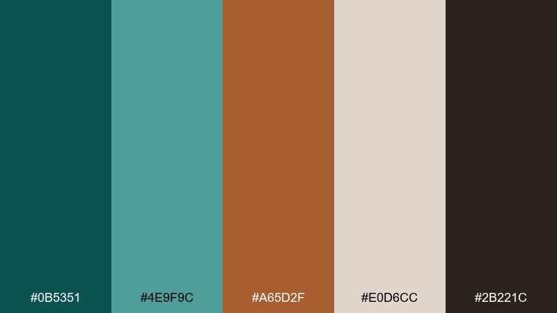
HEX: #0b5351 #4e9f9c #a65d2f #e0d6cc #2b221c
Mood: retro, sturdy, practical
Best for: tool, workshop, and maker brand packaging
Sturdy teal and copper-brown feel like vintage toolboxes and well-worn leather gloves. Use the mid teal for large fields on packaging and keep the darkest brown for bold, legible type. The dusty neutral works nicely for instruction panels and spec callouts. Tip: add simple geometric shapes and thick lines to lean into the retro hardware vibe.
Image example of retro hardware generated using media.io
15) Winter Cabin
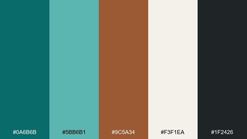
HEX: #0a6b6b #5bb6b1 #9c5a34 #f3f1ea #1f2426
Mood: cozy, quiet, inviting
Best for: holiday cards and seasonal email headers
Cozy teal and softened copper feel like a warm mug by a foggy window. Use the cream background to keep the design airy, then layer teal for typography and simple winter motifs. Copper is perfect for a small greeting line or decorative border. Tip: avoid heavy gradients and keep shapes simple so it prints cleanly on textured stock.
Image example of winter cabin generated using media.io

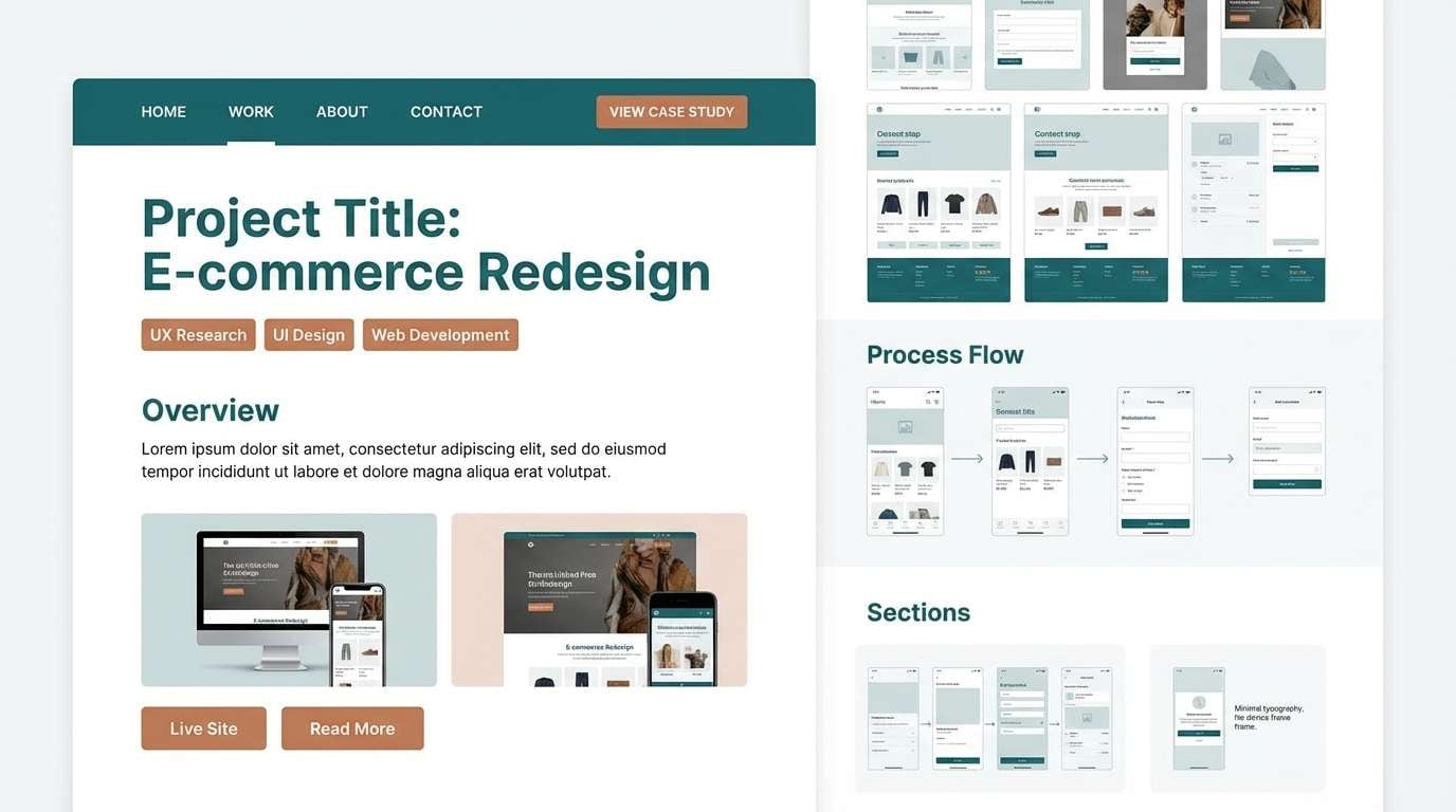
16) Gallery Wall
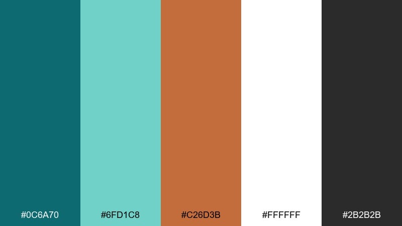
HEX: #0c6a70 #6fd1c8 #c26d3b #ffffff #2b2b2b
Mood: modern, airy, gallery-like
Best for: portfolio websites and case study pages
Airy teal and copper accents evoke a clean gallery wall with curated pieces. This teal copper color palette is ideal for portfolios where you want strong navigation without distracting from the work. Use white as the dominant canvas, deep teal for headings and links, and copper for small highlights like tags or hover states. Tip: keep imagery framed by plenty of whitespace so the palette feels intentional and premium.
Image example of gallery wall generated using media.io
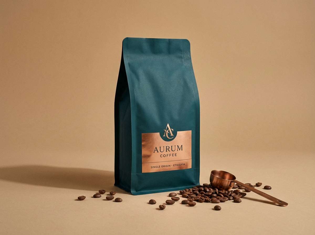
17) Copper Espresso
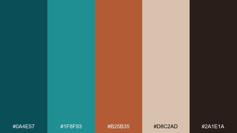
HEX: #0a4e57 #1f8f93 #b25b35 #d8c2ad #2a1e1a
Mood: rich, intimate, sophisticated
Best for: coffee packaging and cafe product ads
Rich teal and copper feel like espresso crema against dark roast depth. Use deep teal for the main pack color to communicate quality, then add copper for roast labels and premium callouts. The warm tan works well for background cards, tasting notes, and secondary panels. Tip: keep typography bold and simple so the dark tones stay crisp at a distance.
Image example of copper espresso generated using media.io
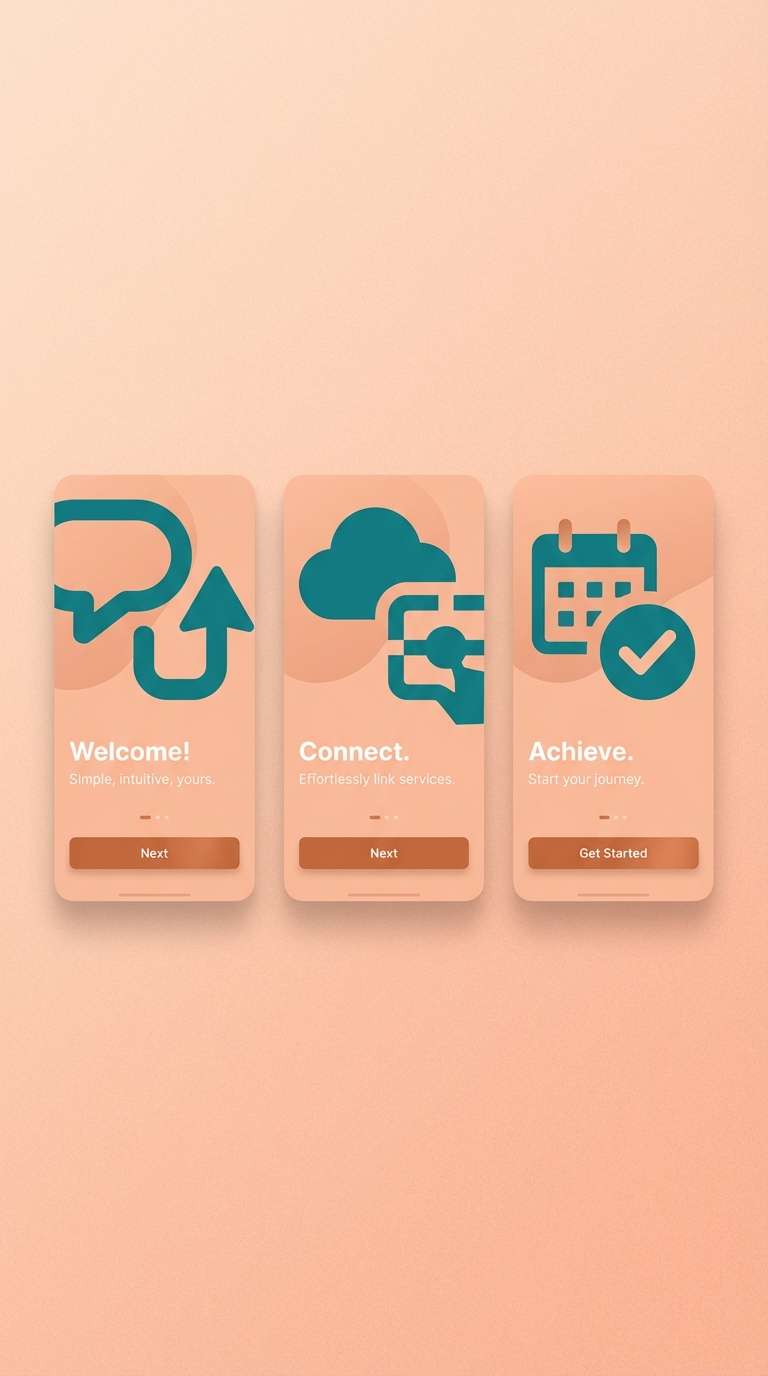
18) Playful Dusk
HEX: #006b6b #7fd8c8 #d46f3a #f8d9c0 #3c3c3c
Mood: playful, bold, contemporary
Best for: app onboarding screens and illustration-led UI
Playful dusk tones mix cool teal with a punch of copper-orange for instant personality. Use the bright teal for large illustration shapes and keep the darker teal for navigation and key text. Copper makes a strong primary button color when paired with the soft peach background. Tip: limit the palette to two dominant tones per screen to keep onboarding steps clean and readable.
Image example of playful dusk generated using media.io
19) Heritage Textile
HEX: #0d6466 #3e9e9a #8f4e2d #e9e0d7 #1e2b2a
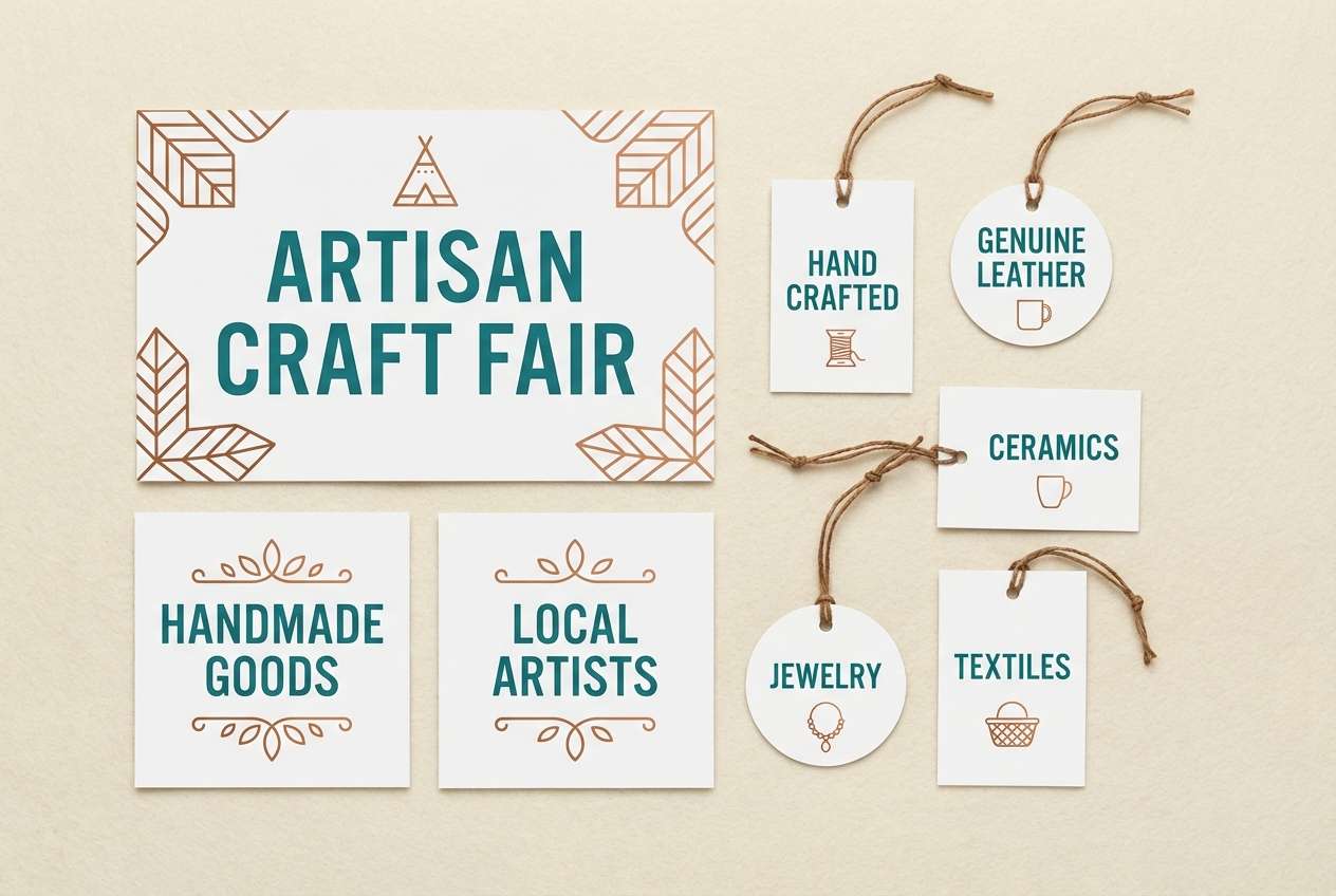
Mood: heritage, tactile, timeless
Best for: fabric tags, craft fairs, and maker signage
Heritage teal and copper-brown feel like woven textiles and hand-stitched labels. Use the pale neutral as a canvas for tag designs, then print teal as the main ink for clarity. Copper works nicely for pattern details, small icons, or a stitched border motif. Tip: try a slightly rough paper stock or a subtle grain overlay to enhance the tactile story.
Image example of heritage textile generated using media.io
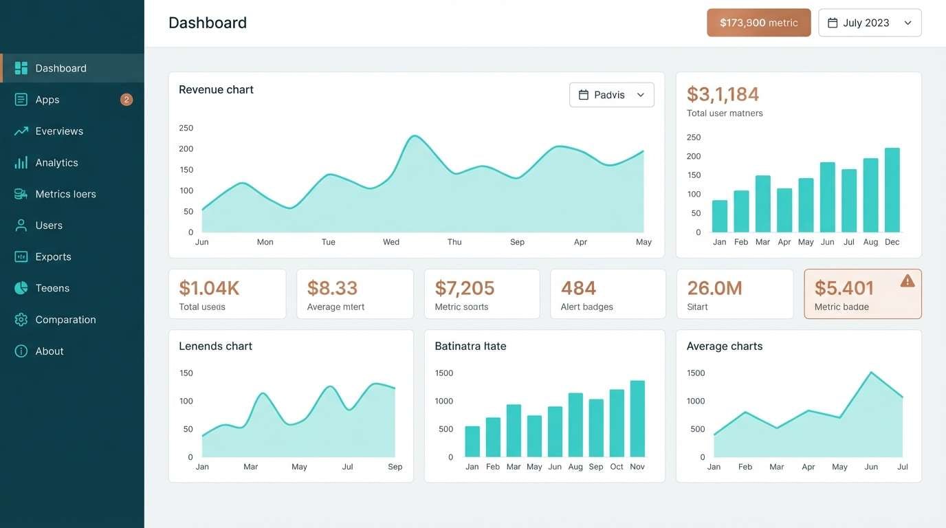
20) Clean Dashboard
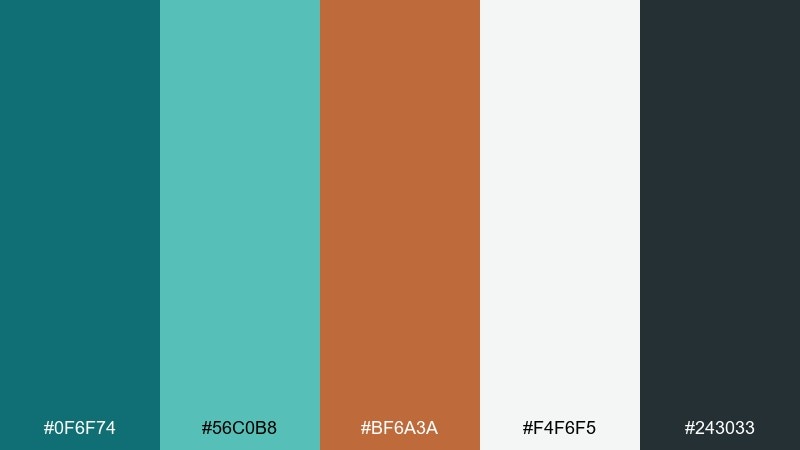
HEX: #0f6f74 #56c0b8 #bf6a3a #f4f6f5 #243033
Mood: clear, professional, data-ready
Best for: SaaS dashboards and analytics UI
Clear teals with a copper accent feel like calm focus and quick insights. Use the light gray-green background for dashboards, deep teal for navigation, and aqua for charts or active filters. Copper is a great signal color for alerts, toggles, or key metrics that need emphasis without screaming. Tip: keep chart palettes limited and reuse copper only for one semantic meaning to avoid confusion.
Image example of clean dashboard generated using media.io
What Colors Go Well with Teal Copper?
Soft neutrals are the easiest win: cream, ivory, sand, and warm gray keep teal crisp and make copper feel like a premium accent rather than an extra “third color.” For text and UI, charcoal and deep slate are often cleaner than pure black.
If you want extra depth, pair teal-copper with forest green, deep navy, or espresso brown—these keep the palette grounded and sophisticated. For a brighter, fresher look, add pale aqua or seafoam highlights, but keep them subtle so copper stays special.
To avoid visual noise, keep supporting colors low-saturation and let teal (primary) and copper (accent) do the attention work. This is especially helpful in dashboards, posters, and brand systems.
How to Use a Teal Copper Color Palette in Real Designs
Use teal as the “system color” (navigation, headers, key surfaces) and treat copper as an accent for moments that need emphasis: a CTA button, a badge, a price chip, or a key metric. This keeps the design structured and prevents copper from overwhelming the layout.
Choose your neutral intentionally: white/ivory for a gallery-like premium feel, sand/tan for artisanal warmth, or light gray for modern SaaS interfaces. Then pick a dark anchor (charcoal or slate) for typography and small UI details.
When printing, copper-like hues look best when used sparingly as solid shapes, thin rules, or foil-style accents. In digital design, ensure contrast remains readable—especially when placing copper text on teal backgrounds.
Create Teal Copper Palette Visuals with AI
If you’re presenting a teal copper color scheme to a client or team, visuals help more than swatches. Generate mockups like brand moodboards, UI screens, posters, or packaging concepts so the palette feels “real” in context.
With Media.io, you can turn a short prompt into consistent, on-style images—then iterate fast by tweaking lighting, materials, or layout. It’s a practical way to explore multiple directions without rebuilding everything from scratch.
Start with one palette above, reuse the HEX codes in your prompt, and keep the scene minimal so teal and copper remain the focal point.
Teal Copper Color Palette FAQs
-
What does a teal and copper color palette communicate?
Teal often signals clarity, calm, and trust, while copper adds warmth and a crafted, premium feel. Together they create a modern contrast that can feel coastal, industrial, or heritage depending on the neutrals you choose. -
Is copper best as a primary color or an accent?
In most brand and UI systems, copper works best as an accent (buttons, badges, icons, highlights). Using too much copper can make layouts feel heavy, while teal is usually strong enough to carry primary surfaces. -
What neutrals pair best with teal copper?
Cream/ivory for premium editorial looks, sand/tan for artisanal warmth, and light gray for clean dashboards. Add charcoal or slate for text to keep contrast sharp. -
Can I use teal copper palettes for websites and apps?
Yes—use teal for navigation and structure, then reserve copper for CTAs, alerts, or selected states. Always test contrast, especially copper text on teal backgrounds, to maintain accessibility. -
How do I keep teal copper designs from looking “muddy”?
Limit copper to small, intentional areas; increase whitespace; and use clear neutrals (cream/white/light gray). Also avoid stacking multiple dark tones together—separate them with a light background when possible. -
What’s a good teal-copper ratio for branding?
A common approach is teal as the dominant base (about 60–80%), neutrals as support, and copper as a small highlight (often 5–15%). This keeps copper feeling special and improves consistency. -
How can I generate teal copper palette images quickly?
Use Media.io’s text-to-image tool: describe the design scenario (UI, packaging, poster), specify teal and copper accents, and keep the scene minimal. Then iterate by adjusting materials (matte, foil, ceramic) and lighting to match your brand mood.
Next: Celadon Color Palette