

Yellow is one of the fastest ways to make a design feel optimistic, energetic, and attention-grabbing. From soft buttercream backgrounds to bold taxi-sign accents, the right yellow palette can instantly set a tone.
Below are 20 curated yellow color palette ideas with HEX codes, plus practical pairing notes and AI prompts you can use to generate matching visuals in minutes.
In this article
- Why Yellow Palettes Work So Well
-
- sunlit citrus
- honey linen
- marigold market
- lemon sorbet
- golden hour sand
- mustard studio
- daffodil breeze
- saffron spice
- buttercream minimal
- sunflower field notes
- amber & ink
- ochre clay
- pineapple pop
- warm straw & sage
- retro taxi sign
- desert pollen
- champagne glow
- solar tech ui
- banana split pastels
- prairie harvest
- What Colors Go Well with Yellow?
- How to Use a Yellow Color Palette in Real Designs
- Create Yellow Palette Visuals with AI
Why Yellow Palettes Work So Well
Yellow naturally signals warmth, optimism, and movement, which is why it performs so well for call-to-action elements, highlights, and brand moments that need quick attention. Even small amounts can lift a layout and improve visual hierarchy.
Yellow also adapts to many styles: lemony tints feel fresh and modern, mustard and ochre feel heritage and artisanal, while high-saturation yellows read bold and urban. The key is choosing the right temperature and saturation for your audience.
Because yellow can be intense on large surfaces, the best yellow palettes include stabilizers—deep navies, charcoals, muted greens, or creamy off-whites—to maintain readability and keep the design feeling premium.
20+ Yellow Color Palette Ideas (with HEX Codes)
1) Sunlit Citrus
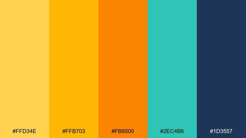
HEX: #FFD34E #FFB703 #FB8500 #2EC4B6 #1D3557
Mood: bright, energetic, playful
Best for: summer beverage packaging and social ads
Bright and zesty like fresh citrus in direct sun, this mix feels upbeat and punchy. It shines on packaging, promo banners, and snack branding where you want instant shelf impact. Pair the warm yellows with deep navy for legibility, then use teal as a crisp, modern counterpoint. Tip: keep the navy for type and use the orange as a small call to action accent.
Image example of sunlit citrus generated using media.io
Media.io is an online AI studio for creating and editing video, image, and audio in your browser.

2) Honey Linen
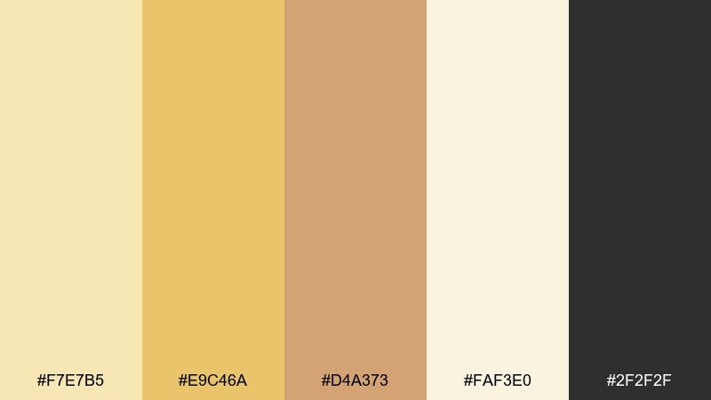
HEX: #F7E7B5 #E9C46A #D4A373 #FAF3E0 #2F2F2F
Mood: warm, cozy, natural
Best for: lifestyle blog headers and cozy brand identity
Warm and soft like honey on linen, these tones feel comforting and approachable. They work beautifully for lifestyle branding, café menus, and blog hero sections that need warmth without shouting. Pair with charcoal type for clarity and let the off-white breathe as negative space. Tip: use the mid honey tone for buttons and the palest cream for backgrounds to keep contrast clean.
Image example of honey linen generated using media.io
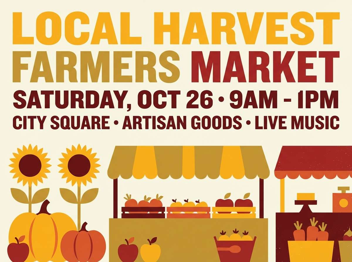
3) Marigold Market
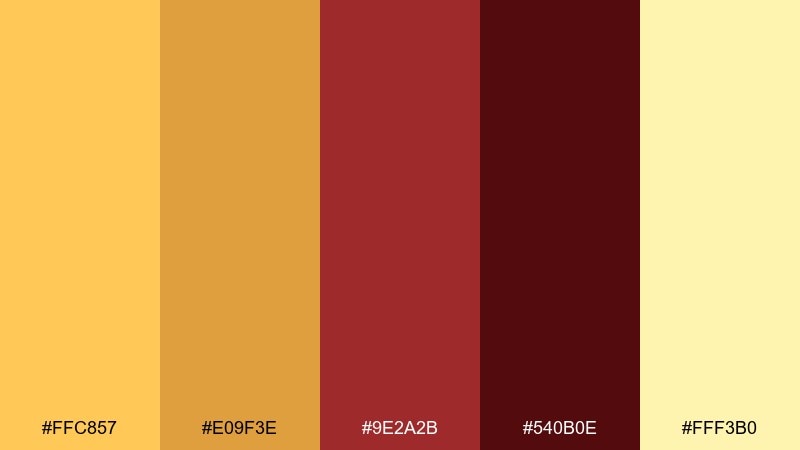
HEX: #FFC857 #E09F3E #9E2A2B #540B0E #FFF3B0
Mood: bold, rustic, festive
Best for: farmers market posters and event flyers
Bold and rustic like marigolds beside wooden crates, this palette feels handmade and festive. It is one of those yellow color combinations that reads loud and friendly from a distance, perfect for posters and seasonal event graphics. Pair the deep reds with creamy paper tones to keep it grounded and readable. Tip: set headings in the darkest maroon and reserve marigold for price tags or dates.
Image example of marigold market generated using media.io
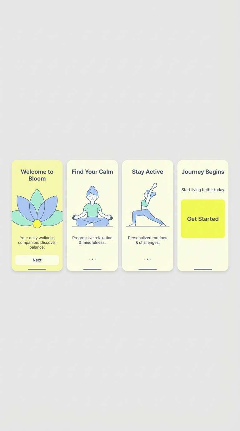
4) Lemon Sorbet
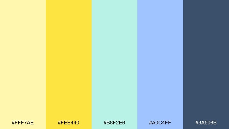
HEX: #FFF7AE #FEE440 #B8F2E6 #A0C4FF #3A506B
Mood: fresh, airy, sweet
Best for: wellness app onboarding screens
Fresh and airy like lemon sorbet on a hot day, these colors feel clean and optimistic. They suit onboarding flows, wellness dashboards, and gentle callouts where you want calm energy. Pair the pale yellow with cool blues for balance, then anchor key labels in the slate tone. Tip: keep saturation low on large panels and use the brighter lemon only for highlights and progress states.
Image example of lemon sorbet generated using media.io
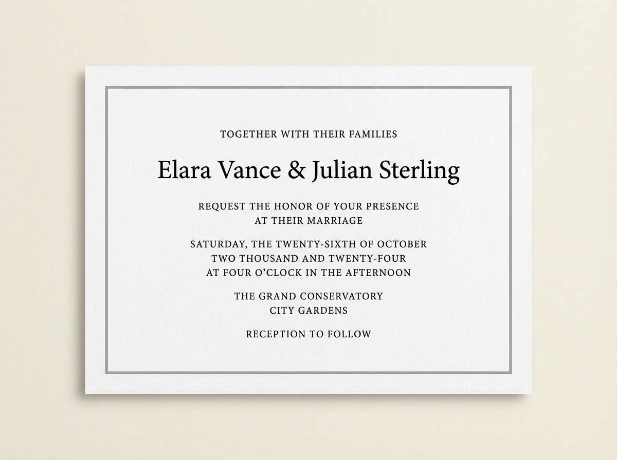
5) Golden Hour Sand
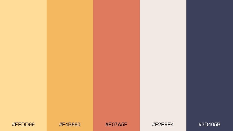
HEX: #FFDD99 #F4B860 #E07A5F #F2E9E4 #3D405B
Mood: romantic, sun-kissed, calm
Best for: wedding invitations and save the dates
Romantic and sun-kissed like a beach at golden hour, this mix feels soft yet elevated. It works well for invitations, stationery, and minimal wedding websites where warmth matters. Pair the sandy neutrals with deep indigo type to keep text crisp and premium. Tip: print the peach tone as a light wash behind details, and keep the darkest shade for names and dates.
Image example of golden hour sand generated using media.io
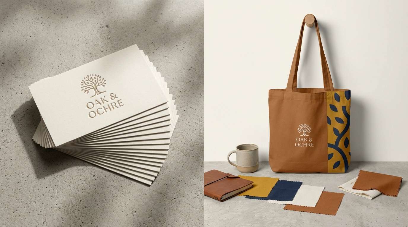
6) Mustard Studio
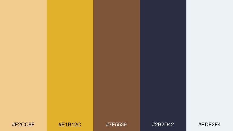
HEX: #F2CC8F #E1B12C #7F5539 #2B2D42 #EDF2F4
Mood: creative, confident, vintage-modern
Best for: brand identity systems and merch
Creative and confident with a vintage-modern edge, these tones feel like a well-lit design studio. A yellow color palette like this holds up across logos, labels, and merch because the navy keeps everything sharp. Pair mustard with off-white for clean space, then use the brown sparingly for warmth and texture. Tip: make mustard your hero block color, but switch to off-white backgrounds for long-form readability.
Image example of mustard studio generated using media.io
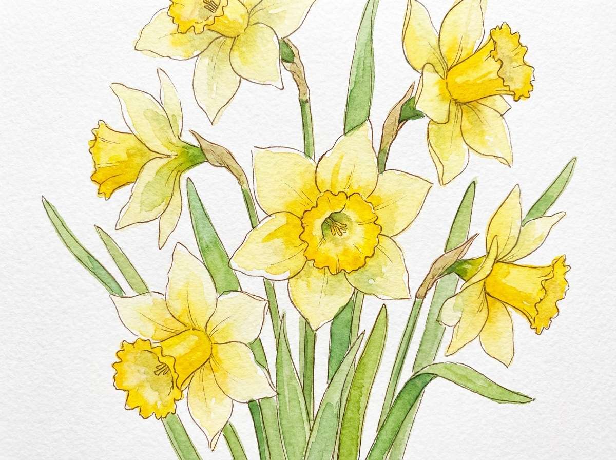
7) Daffodil Breeze
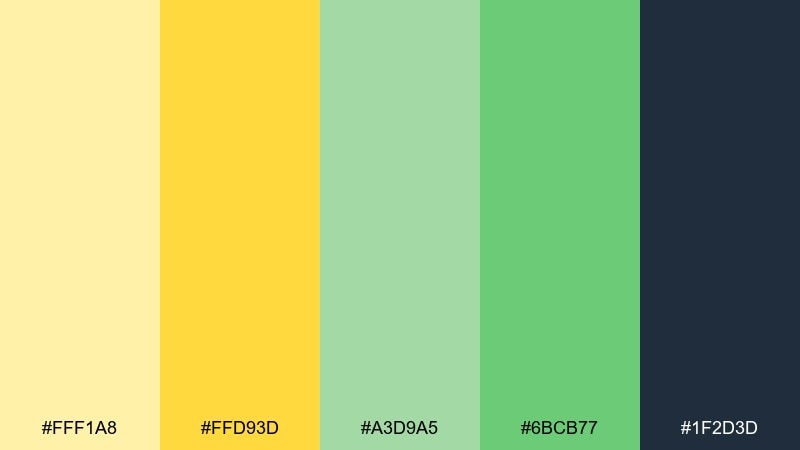
HEX: #FFF1A8 #FFD93D #A3D9A5 #6BCB77 #1F2D3D
Mood: cheerful, outdoorsy, lively
Best for: spring botanical illustrations and stickers
Cheerful and outdoorsy like daffodils in a light breeze, these colors feel instantly seasonal. They are ideal for botanical prints, sticker packs, and kid-friendly illustrations. Pair the bright yellow with fresh greens and keep outlines in the deep slate for a clean finish. Tip: let yellow dominate petals and use the pale tint for gentle highlights instead of pure white.
Image example of daffodil breeze generated using media.io
8) Saffron Spice
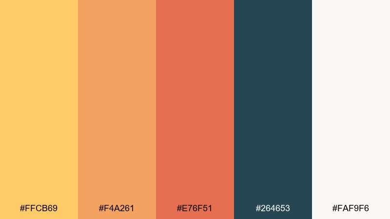
HEX: #FFCB69 #F4A261 #E76F51 #264653 #FAF9F6
Mood: warm, bold, appetizing
Best for: restaurant menus and food photography overlays
Warm and appetizing like saffron and toasted spices, this palette feels rich without getting heavy. It works beautifully for menus, recipe cards, and social templates where you want color that flatters food. Pair the deep teal with the creamy off-white for structure, then use the orange-red as a small highlight. Tip: keep headings teal, body text dark, and reserve saffron for section dividers and icons.
Image example of saffron spice generated using media.io
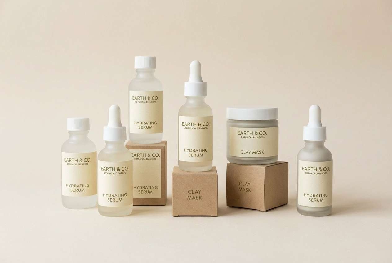
9) Buttercream Minimal
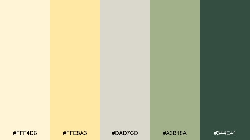
HEX: #FFF4D6 #FFE8A3 #DAD7CD #A3B18A #344E41
Mood: minimal, soft, earthy
Best for: skincare packaging and calm ecommerce
Minimal and soft like buttercream against matte paper, this mix reads clean and premium. It is a strong fit for skincare labels, wellness ecommerce, and calming product pages. Pair the pale yellows with forest green for contrast and use the gray-green as a gentle secondary. Tip: choose one dominant light background and keep the darker green only for key claims and ingredient callouts.
Image example of buttercream minimal generated using media.io
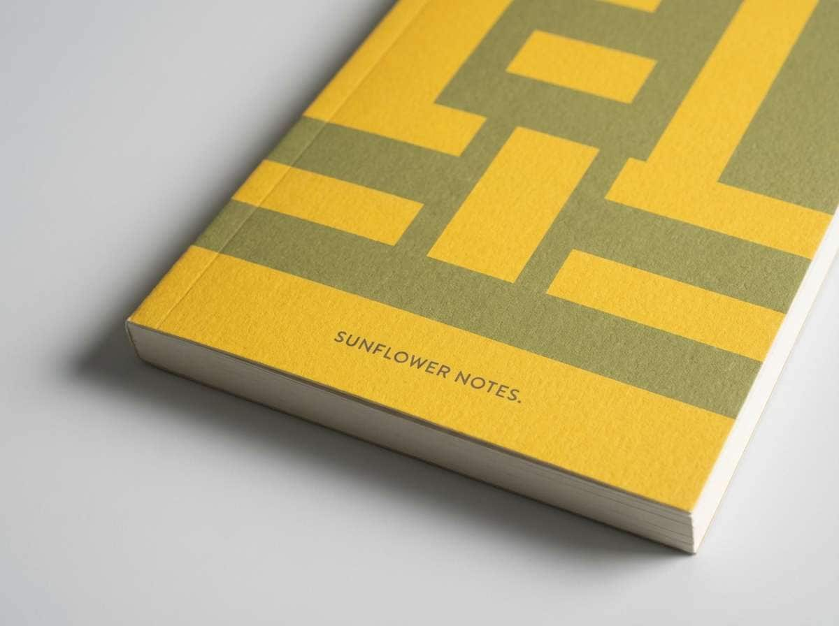
10) Sunflower Field Notes
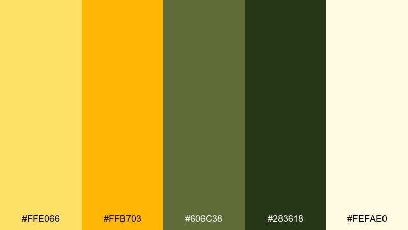
HEX: #FFE066 #FFB703 #606C38 #283618 #FEFAE0
Mood: wholesome, rustic, outdoors
Best for: notebook covers and stationery
Wholesome and rustic like a sunflower field journal, this palette feels grounded and hand-crafted. It works well for notebook covers, stationery sets, and packaging that leans natural. Pair the warm yellows with olive greens and use the cream as paper tone for an authentic look. Tip: add tiny line details in the darkest green to keep the design crisp without harsh black.
Image example of sunflower field notes generated using media.io
11) Amber & Ink
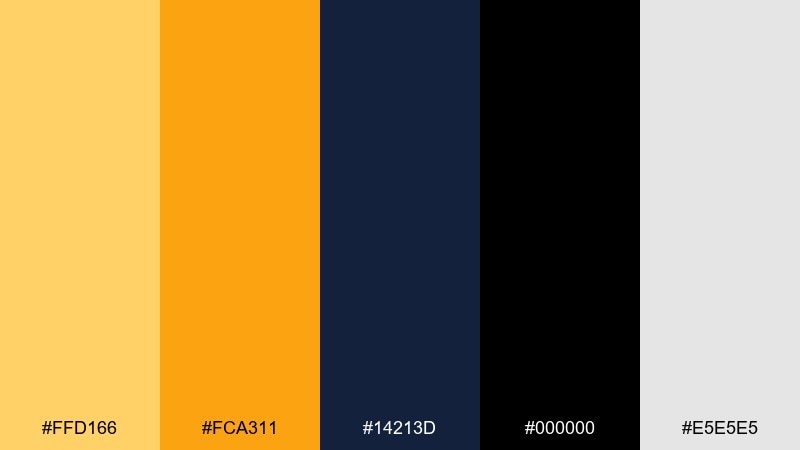
HEX: #FFD166 #FCA311 #14213D #000000 #E5E5E5
Mood: high-contrast, modern, editorial
Best for: magazine spreads and bold landing pages
High-contrast and modern like amber highlights on wet ink, this set feels sharp and editorial. The yellow color scheme is perfect for hero sections, feature callouts, and punchy headlines that need instant hierarchy. Pair the warm amber with near-black for typography, and let the light gray soften large blocks. Tip: keep yellow to one or two emphasis areas per screen so the contrast stays premium, not noisy.
Image example of amber & ink generated using media.io
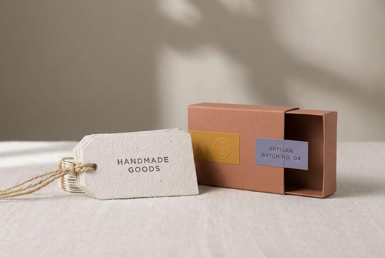
12) Ochre Clay
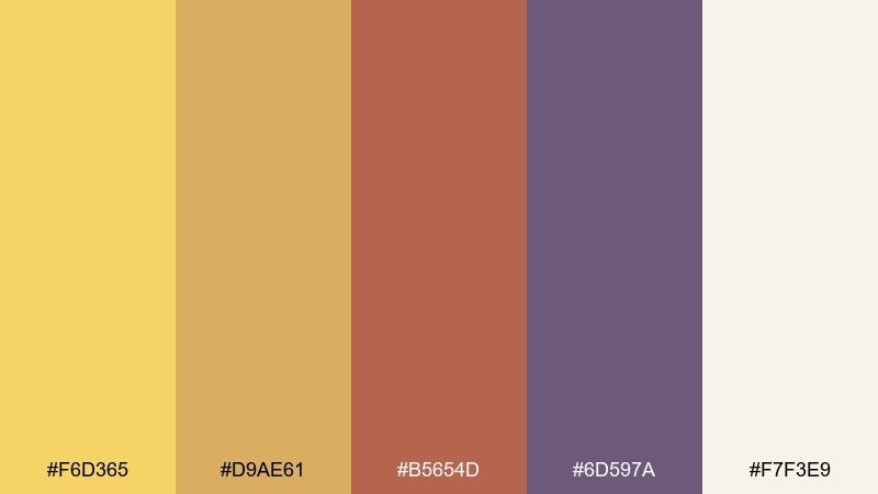
HEX: #F6D365 #D9AE61 #B5654D #6D597A #F7F3E9
Mood: artisanal, earthy, calm
Best for: ceramics branding and handmade product tags
Artisanal and earthy like ochre pigment in wet clay, these tones feel tactile and calm. They are great for handmade brands, ceramics shops, and product tags where warmth should feel natural. Pair the muted yellow with dusty violet for a modern twist, and keep the cream as your base. Tip: use the clay tone for small stamps or seals to create a handcrafted signature.
Image example of ochre clay generated using media.io
13) Pineapple Pop
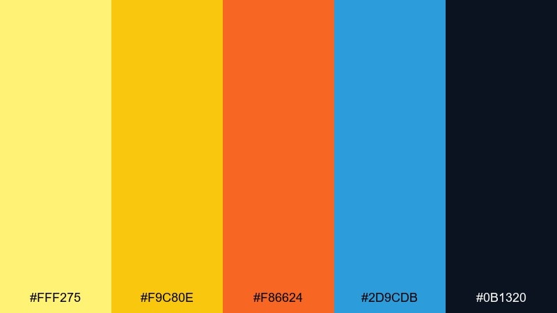
HEX: #FFF275 #F9C80E #F86624 #2D9CDB #0B1320
Mood: fun, pop, youthful
Best for: creator thumbnails and social graphics
Fun and poppy like pineapple candy, this set feels youthful and high-impact. It is ideal for thumbnails, social templates, and promo tiles that must stand out fast. Pair the bright yellow with a deep near-black for readable text, then use blue as a cool counterbalance. Tip: limit the orange to small badges so the overall look stays punchy, not chaotic.
Image example of pineapple pop generated using media.io
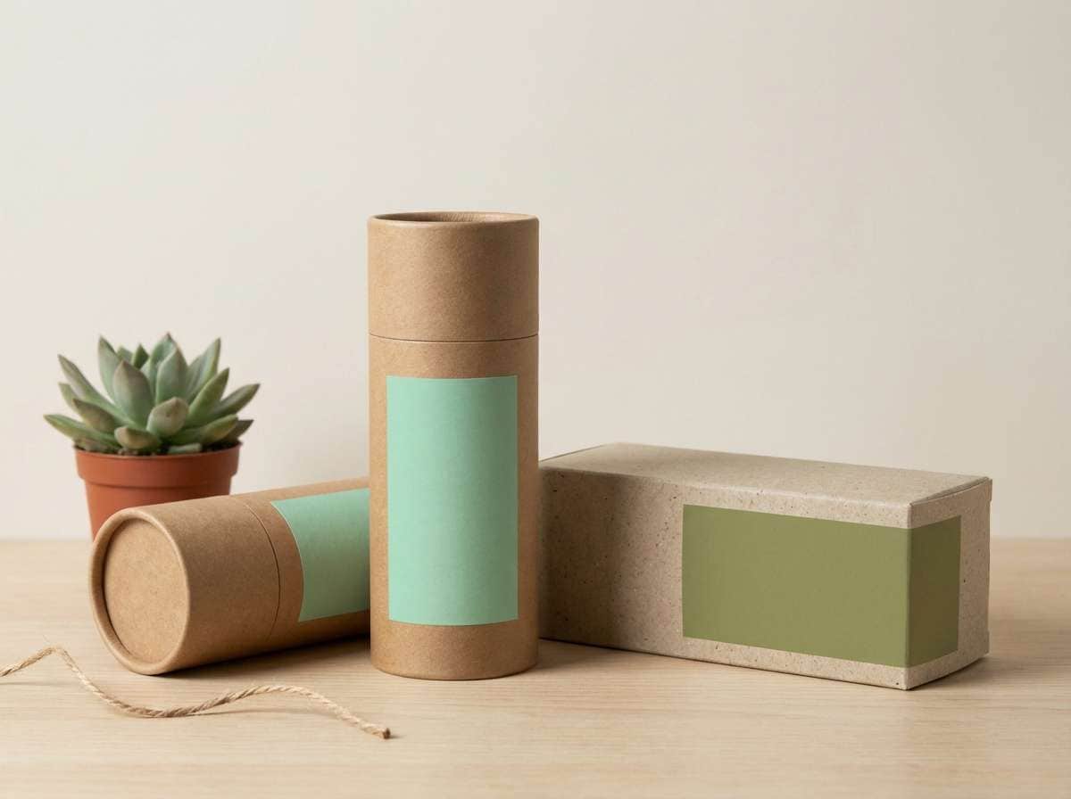
14) Warm Straw & Sage
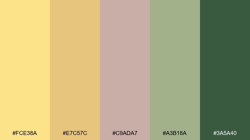
HEX: #FCE38A #E7C57C #C9ADA7 #A3B18A #3A5A40
Mood: relaxed, organic, understated
Best for: eco product labels and sustainable brands
Relaxed and organic like straw baskets and garden sage, these tones feel understated and trustworthy. They suit eco labels, sustainable packaging, and calm brand systems where color should signal nature, not neon. Pair the straw yellow with deep green for contrast and use the mauve neutral to soften transitions. Tip: print the lighter yellows on uncoated stock for a more natural, less glossy finish.
Image example of warm straw & sage generated using media.io
15) Retro Taxi Sign
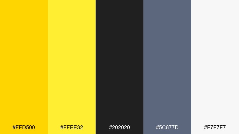
HEX: #FFD500 #FFEE32 #202020 #5C677D #F7F7F7
Mood: retro, urban, graphic
Best for: streetwear graphics and bold stickers
Retro and urban like a taxi sign at night, this palette hits with graphic clarity. It works for streetwear prints, sticker packs, and punchy labels where contrast does the heavy lifting. Pair the bright yellow with near-black for crisp edges, then bring in steel gray for secondary text. Tip: use the pale yellow as a buffer around black shapes to prevent harsh visual vibration.
Image example of retro taxi sign generated using media.io
16) Desert Pollen
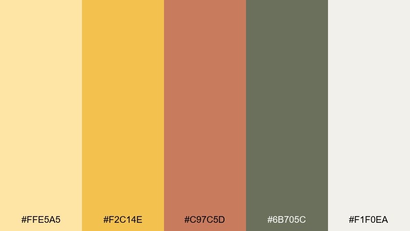
HEX: #FFE5A5 #F2C14E #C97C5D #6B705C #F1F0EA
Mood: dusty, warm, natural
Best for: travel blog visuals and desert photography presets
Dusty and warm like pollen on desert air, these tones feel sun-worn and calming. They are great for travel blog graphics, lookbooks, and photo overlays where you want warmth without oversaturation. Pair the muted yellow with olive-gray for typography and use the clay tone as an accent for pins or labels. Tip: keep overlays semi-transparent so photos stay natural and not overly tinted.
Image example of desert pollen generated using media.io
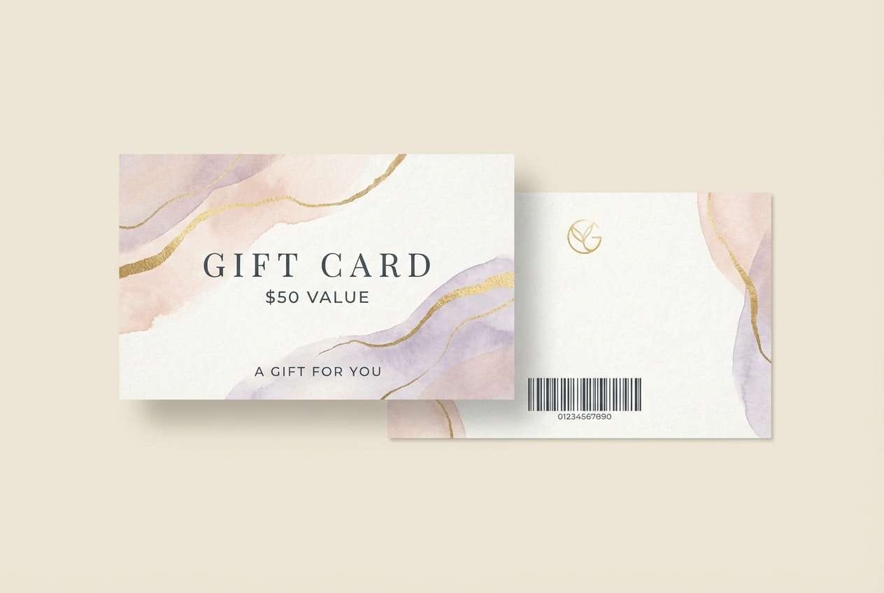
17) Champagne Glow
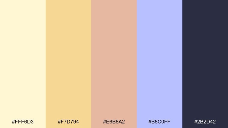
HEX: #FFF6D3 #F7D794 #E6B8A2 #B8C0FF #2B2D42
Mood: soft, celebratory, elegant
Best for: beauty promos and gift card designs
Soft and celebratory like champagne glow, this mix feels elegant and flattering. It is ideal for beauty promos, gift cards, and seasonal campaigns where you want a hint of luxury. Pair the warm creams with deep slate text, and use the lavender-blue as a cool, modern accent. Tip: keep gradients subtle and prefer large, airy margins for a premium feel.
Image example of champagne glow generated using media.io
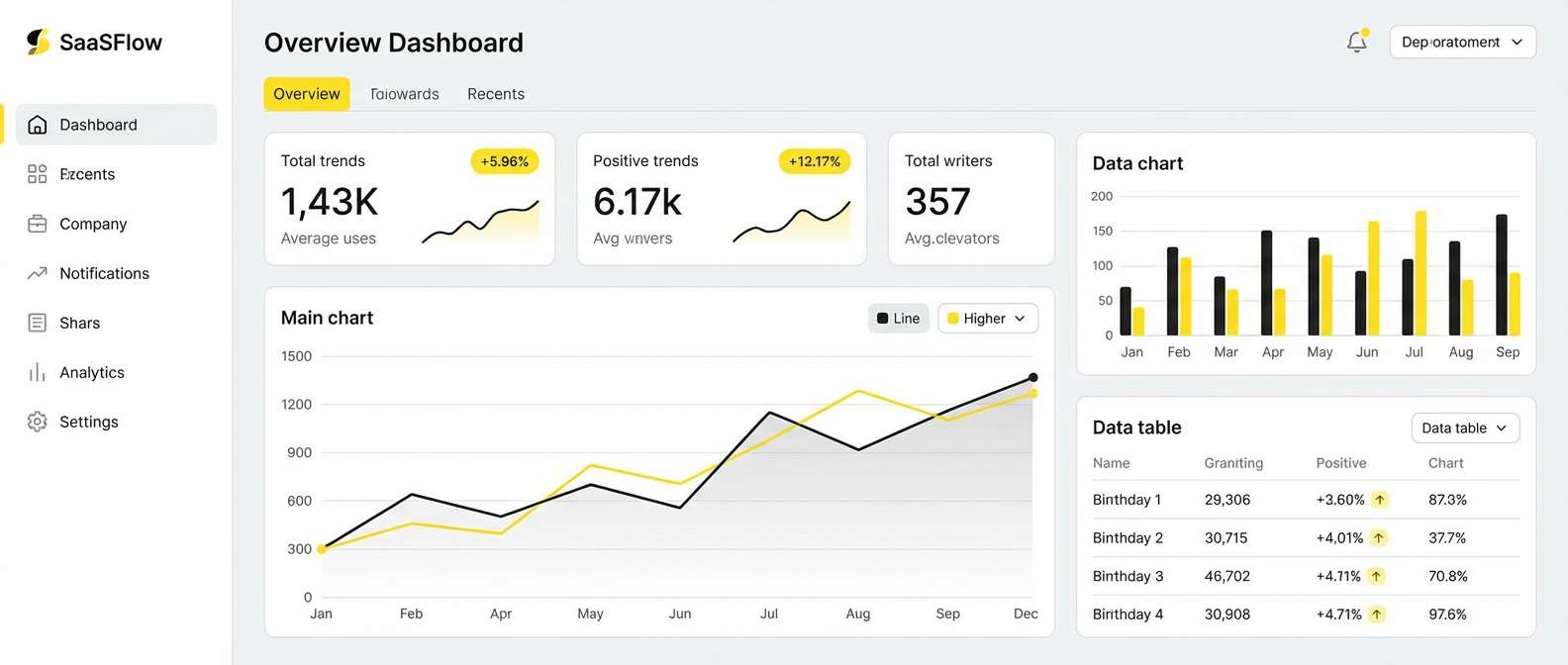
18) Solar Tech UI
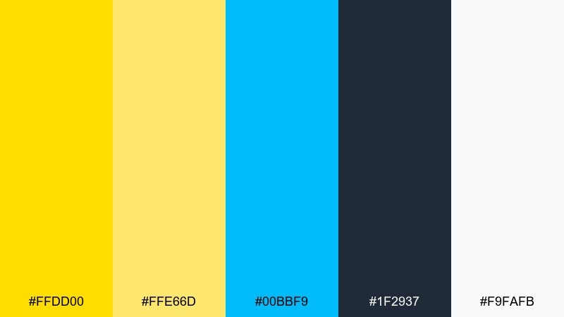
HEX: #FFDD00 #FFE66D #00BBF9 #1F2937 #F9FAFB
Mood: clean, futuristic, confident
Best for: SaaS dashboards and fintech UI
Clean and futuristic like sunlight on brushed metal, these tones feel confident and precise. For modern interfaces, yellow color combinations like this work best when yellow is an accent and neutrals carry the layout. Pair the bright yellow with slate UI chrome and use the cyan for secondary states such as links or info badges. Tip: reserve the purest yellow for status highlights and keep body text on white or light gray for accessibility.
Image example of solar tech ui generated using media.io
19) Banana Split Pastels
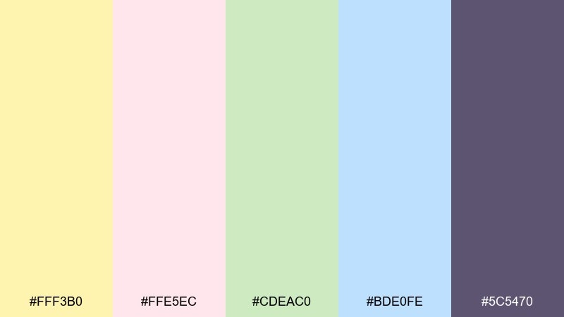
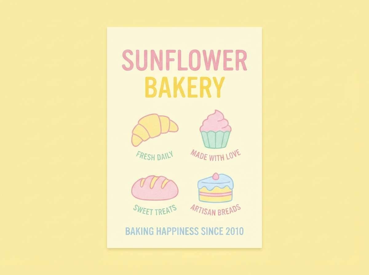
HEX: #FFF3B0 #FFE5EC #CDEAC0 #BDE0FE #5C5470
Mood: cute, soft, nostalgic
Best for: bakery branding and pastel posters
Cute and nostalgic like a banana split on a summer afternoon, these pastels feel friendly and sweet. They work well for bakery branding, pastel posters, and playful packaging where softness is part of the charm. Pair the gentle yellow with the muted purple for readable type, and use the blue and green as secondary color blocks. Tip: keep the pink as a small accent so the overall look stays balanced and not overly sugary.
Image example of banana split pastels generated using media.io
20) Prairie Harvest
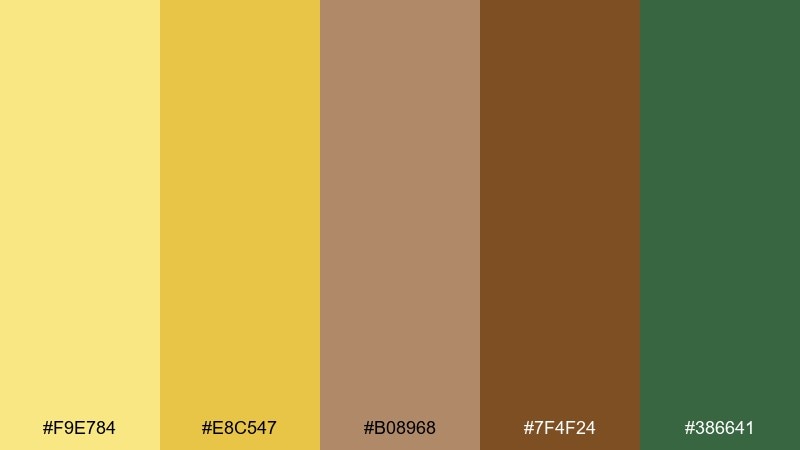
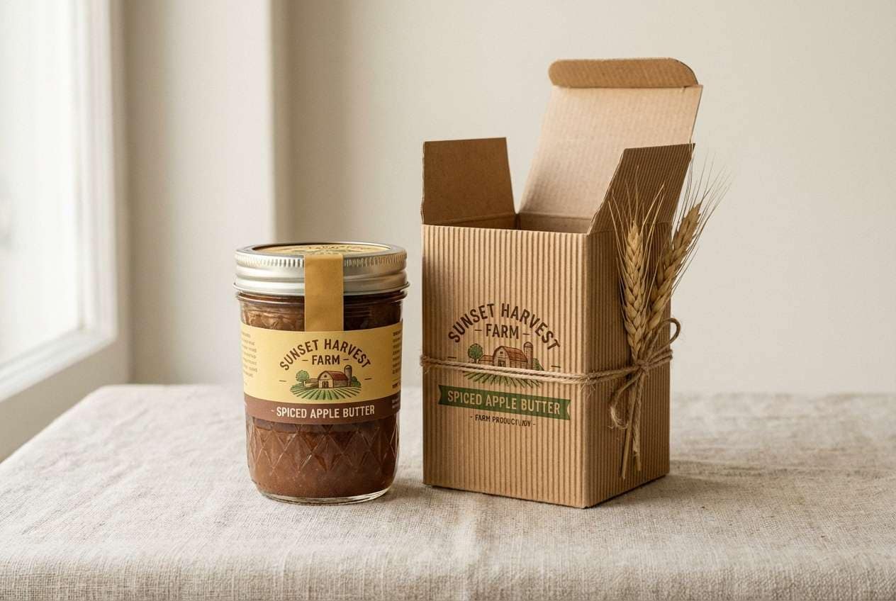
HEX: #F9E784 #E8C547 #B08968 #7F4F24 #386641
Mood: wholesome, heritage, grounded
Best for: farm brand labels and rustic web design
Wholesome and grounded like a prairie harvest, these tones feel heritage and dependable. They suit farm labels, rustic landing pages, and product storytelling where authenticity matters. Pair the golden yellows with deep brown for type and use green as a nod to freshness. Tip: add small iconography in the darkest brown and keep the mid tan for background panels to maintain warmth.
Image example of prairie harvest generated using media.io
What Colors Go Well with Yellow?
Deep neutrals like navy, charcoal, and near-black pair exceptionally well with yellow because they stabilize its brightness and make text highly legible. This is why many modern UI and editorial layouts use yellow as an accent against dark type.
For softer looks, combine yellow with creamy whites, beige, and warm grays to keep the palette airy and premium. If you want a nature-forward feel, greens (sage, olive, forest) harmonize with yellow and make it feel organic rather than neon.
To add contrast without harshness, cool accents like teal, cyan, or periwinkle can balance warm yellows. Muted reds, terracotta, and clay tones also create a rustic, appetizing warmth for packaging and print.
How to Use a Yellow Color Palette in Real Designs
Use yellow strategically for hierarchy: buttons, badges, highlights, icons, and key numbers typically benefit most. For large surfaces (hero backgrounds or full panels), choose a lighter tint like buttercream or champagne so the layout remains comfortable to read.
Plan contrast early—yellow can reduce readability if paired with white text or placed behind thin fonts. Anchor your system with a dark text color (navy/charcoal) and keep yellow for emphasis, not body copy.
In print, test swatches before final production because yellow shifts noticeably across paper types and coatings. Uncoated stock often makes warm yellows feel more natural, while glossy stock can push them brighter.
Create Yellow Palette Visuals with AI
If you already have a palette, you can quickly generate consistent mockups—packaging, UI screens, posters, and branding scenes—by describing the subject and listing your color intent (e.g., “mustard and navy with off-white space”). This helps you validate mood and contrast before committing to final design work.
Start with one of the prompts above, then iterate by adjusting lighting (studio/softbox/natural), materials (paper, matte plastic, metal), and composition (minimal, editorial grid, bold shapes). Keep the aspect ratio flag as-is to match the layout you need.
When you like a result, reuse the same prompt structure across multiple assets to keep your yellow brand system cohesive across social, web, and print.
Yellow Color Palette FAQs
-
What does yellow communicate in branding?
Yellow commonly communicates optimism, friendliness, warmth, and energy. Brighter yellows feel playful and attention-grabbing, while muted mustard/ochre tones feel dependable, heritage, and artisanal. -
What is the best text color on a yellow background?
For readability, dark neutrals are safest: charcoal, near-black, or deep navy. White text on yellow often fails contrast unless the yellow is very dark and the type is large/bold. -
How do I keep yellow from looking too neon?
Choose a warmer, slightly muted yellow (mustard, honey, sand) and pair it with soft neutrals like cream, beige, or warm gray. Limit highly saturated yellow to small accents instead of full-page backgrounds. -
What colors go with mustard yellow?
Mustard pairs especially well with navy, charcoal, off-white, warm browns, and olive greens. These combinations keep mustard feeling mature and stylish rather than overly bright. -
Is yellow a good choice for UI design?
Yes—when used as an accent. Yellow is excellent for status highlights, notifications, and key CTAs, but large yellow panels can create fatigue. Balance it with light backgrounds and dark text for accessibility. -
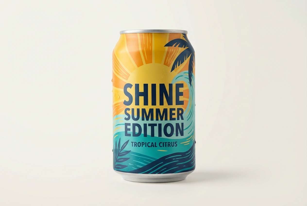
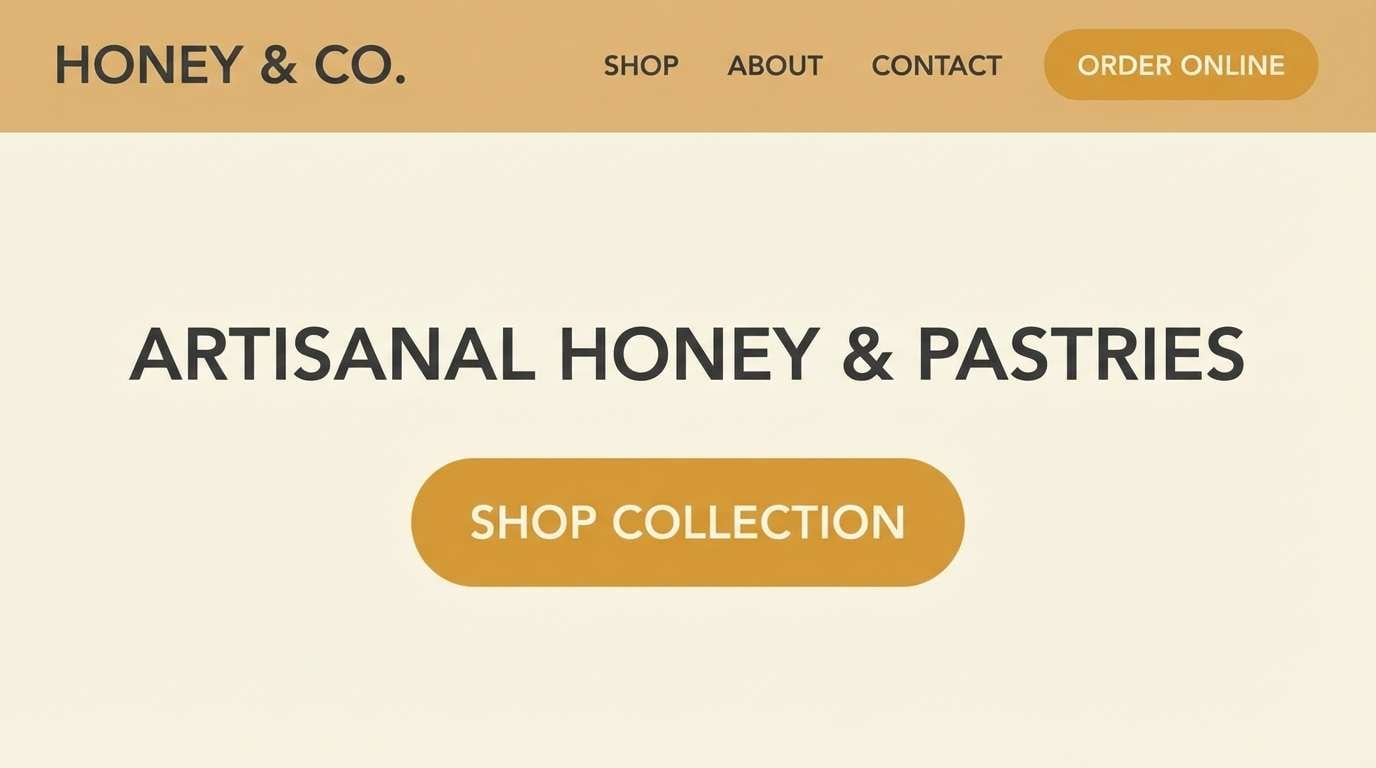
Which yellow palette works best for packaging?
For high shelf impact, try a punchy set like Sunlit Citrus or Pineapple Pop. For premium or natural packaging, Honey Linen, Buttercream Minimal, or Prairie Harvest tend to feel more refined and trustworthy. -
How can I generate matching images for a yellow color scheme?
Use a text-to-image generator and describe the design type (poster, UI, packaging), your lighting/material style, and the palette vibe (e.g., “buttercream minimal with forest green typography”). Reuse the same prompt structure to keep a consistent look across assets.
Next: Galaxy Color Palette


